TYPE DESIGN INFORMATION PAGE last updated on Mon Jun 8 18:00:08 EDT 2026
FONT RECOGNITION VIA FONT MOOSE

|
|
|
|
Kimera Type (was: Diseño Kimera)
[Gabriel Martinez Meave]
Kimera Type (was: Diseño Kimera) is a commercial Mexican design firm founded in 1994 by Gabriel Martinez Meave (b. Mexico City, 1972), who is by far Mexico's most prolific and talented type designer. The only freebie is Presidencia at the Mexican Government site. Meave.org deals with illustrations and other occult arts. Behance link. Speaker at ATypI 2009 in Mexico City. Interview. Some of his early typefaces were published at Tiypo. Diseño Kimera has made numerous custom fonts for Mexican clients. His typefaces:
|
EXTERNAL LINKS |
| | |


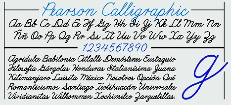
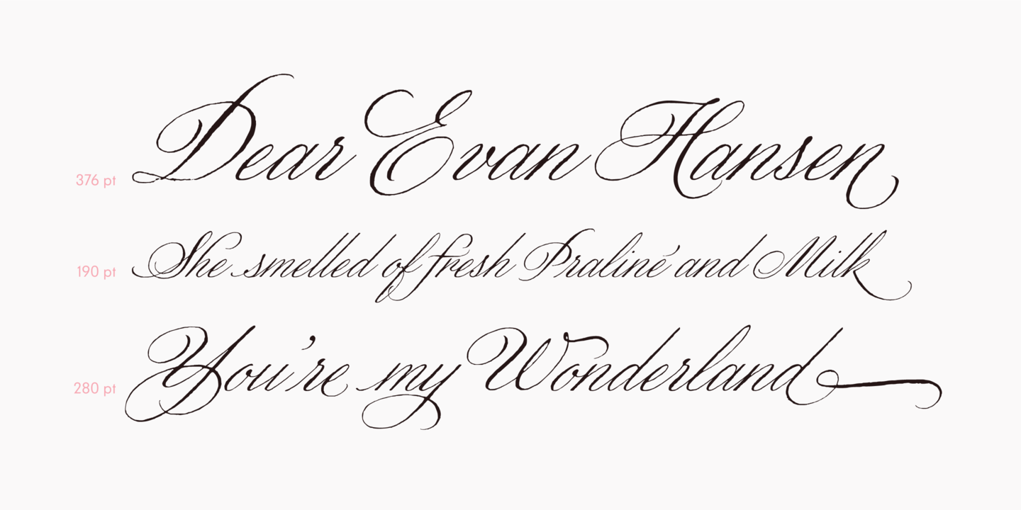
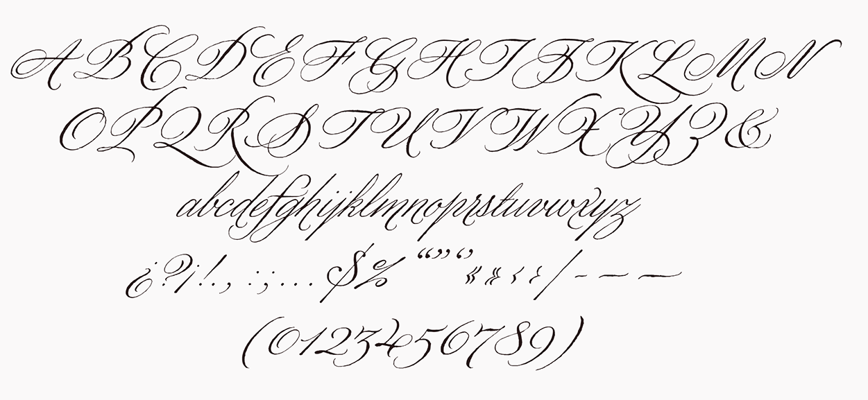
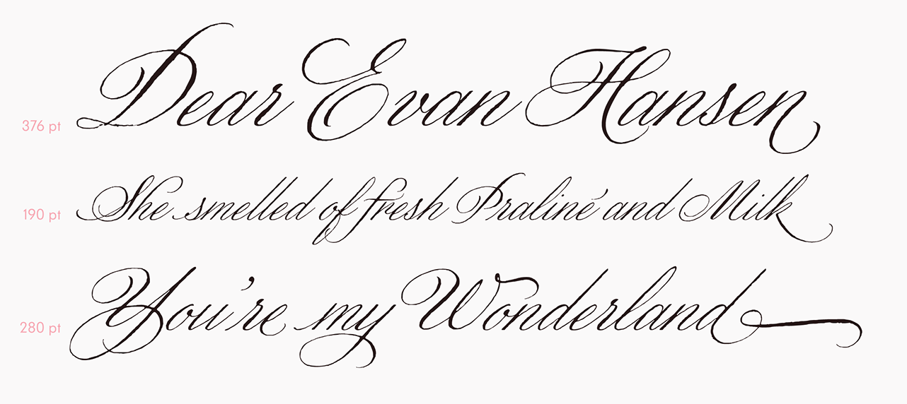
file name: Gabriel Martinez Meave Wordless Script 2019

file name: Gabriel Martinez Meave Wordless Script 2019

file name: Gabriel Martinez Meave Wordless Script 2019

file name: Gabriel Martinez Meave Wordless Script 2019

file name: Gabriel Martinez Meave Wordless Script 2019
file name: Sudtipos Wordless Script 2019 301714

file name: Sudtipos Wordless Script 2019

file name: Gabriel Martinez Meave Wordless Script 2019

file name: Gabriel Martinez Meave Wordless Script 2019

file name: Gabriel Martinez Meave Wordless Script 2019
file name: Gabriel Martinez Meave Wordless Script 2019

file name: Gabriel Martinez Meave Wordless Script 2019

file name: Gabriel Martinez Meave Wordless Script 2019
file name: Gabriel Martinez Meave Wordless Script 2019

file name: Gabriel Martinez Meave Wordless Script 2019
file name: Gabriel Martinez Meave Fulgora 2019 306153

file name: Gabriel Martinez Meave Fulgora 2019 306154 002
file name: Gabriel Martinez Meave Fulgora 2019 306155 002

file name: Gabriel Martinez Meave Fulgora 2019 306156 002

file name: Gabriel Martinez Meave Fulgora 2019 306157

file name: Gabriel Martinez Meave Fulgora 2019

file name: Sudtipos Integra 2019 305349 002

file name: Sudtipos Integra 2019
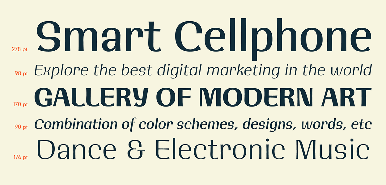
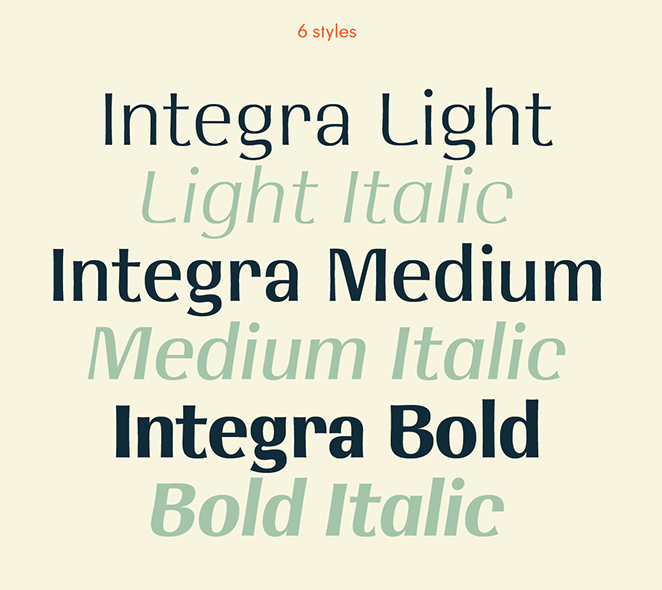
file name: Gabriel Martinez Meave Integra 2019

file name: Gabriel Martinez Meave Integra 2019
file name: Gabriel Martinez Meave Integra 2019

file name: Gabriel Martinez Meave Integra 2019

file name: Gabriel Martinez Meave Integra 2019

file name: Gabriel Martinez Meave Integra 2019

file name: Gabriel Martinez Meave Integra 2019
file name: Gabriel Martinez Meave Integra 2019

file name: Gabriel Martinez Meave Integra 2019
file name: Gabriel Martinez Meave Integra 2019

file name: Gabriel Martinez Meave Integra 2019

file name: Gabriel Martinez Meave Integra 2019
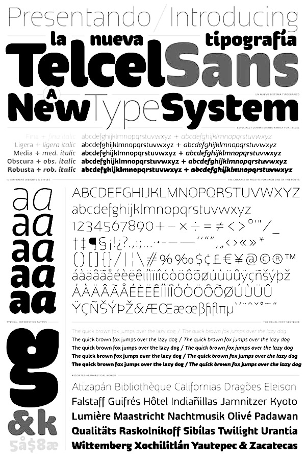
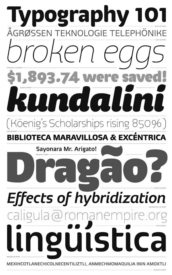
file name: Gabriel Martinez Meave Telcel Sans 2011
file name: Gabriel Martinez Meave Telcel Sans 2011b

file name: Gabriel Martinez Meave Telcel Sans 2012
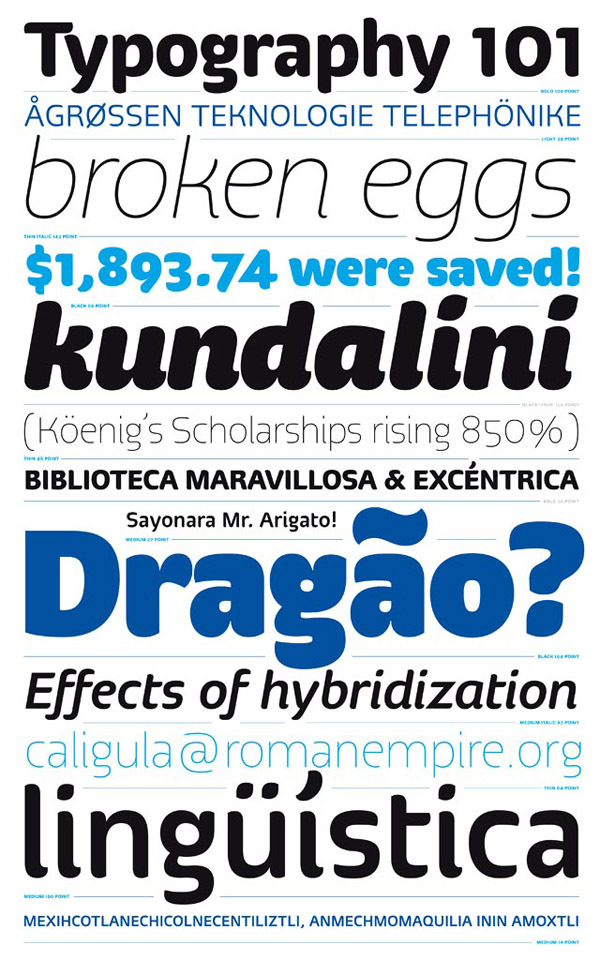
file name: Gabriel Martinez Meave Telcel Sans
file name: Gabriel Martinez Meave Telcel Sans 2012
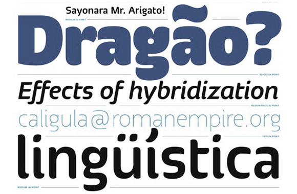
file name: Gabriel Martinez Meave Telcel Sans 2011c
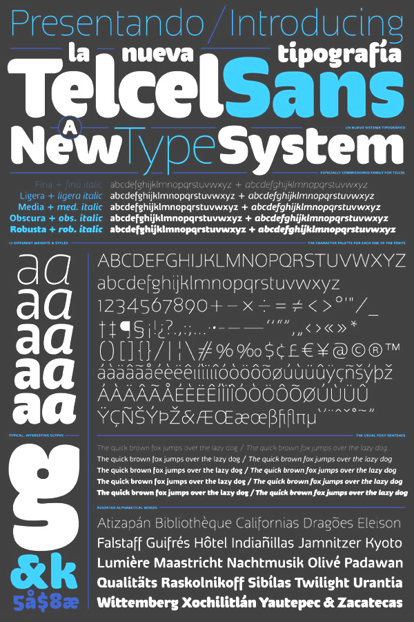
file name: Gabriel Martinez Meave Telcel Sans
file name: Gabriel Martinez Meave T D C55 Letterpic.

file name: Pic atypi02 Hrant Papazian Martinez Meave

file name: Gabriel Martinez Meave Darka 2019 302914 002
file name: Gabriel Martinez Meave Darka 2019 302915
file name: Gabriel Martinez Meave Darka 2019 302917 002

file name: Gabriel Martinez Meave Darka 2019 302918 002

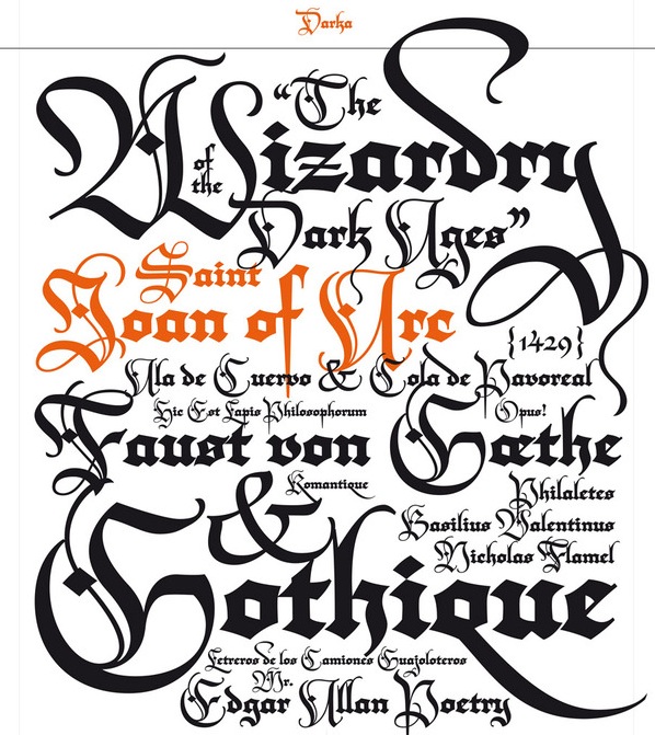
file name: Gabriel Martinez Meave Darka 2019
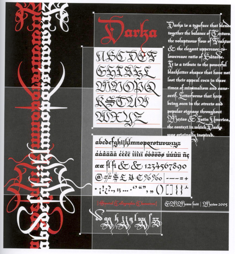
file name: T D C2006 Gabriel Meave Darka

file name: Gabriel Martinez Meave Darka 2006 Graphic By Isaias Loaiza2007
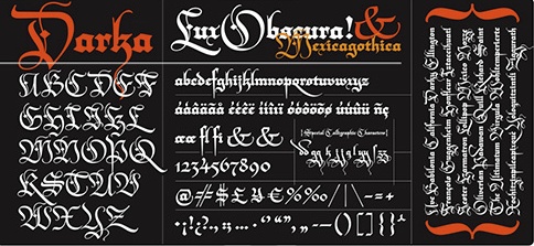
file name: Gabriel Martinez Meave Darka 2006
file name: Gabriel Martinez Meave K T F Darka 2012

file name: Gabriel Martinez Meave K T F Darka 2012a

file name: Gabriel Martinez Meave K T F Darka 2012b

file name: Gabriel Martinez Meave Liverpool Sans 2015

file name: Gabriel Martinez Meave Liverpool Sans 2015b

file name: Gabriel Martinez Meave Liverpool Sans 2015c

file name: Gabriel Martinez Meave T D C65 Illustration

file name: Gabriel Martinez Meave Arcana 2003
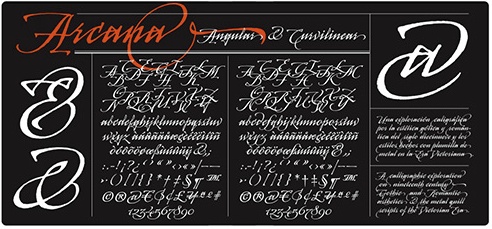
file name: Gabriel Martinez Meave Arcana 2000

file name: Gabriel Meave Arcana

file name: Gabriel Martinez Meave K T F Arcana 2012

file name: Gabriel Martinez Meave K T F Arcana 2012a

file name: Gabriel Martinez Meave K T F Arcana 2012b

file name: Gabriel Martinez Meave T D C65 Illustration 2014

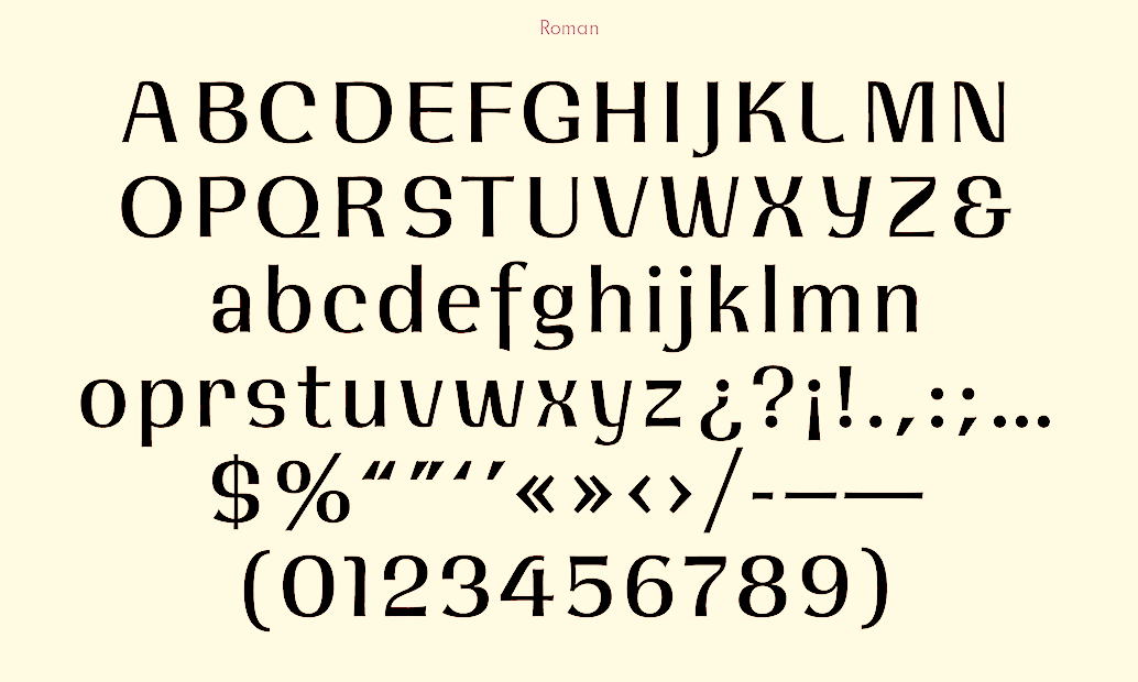
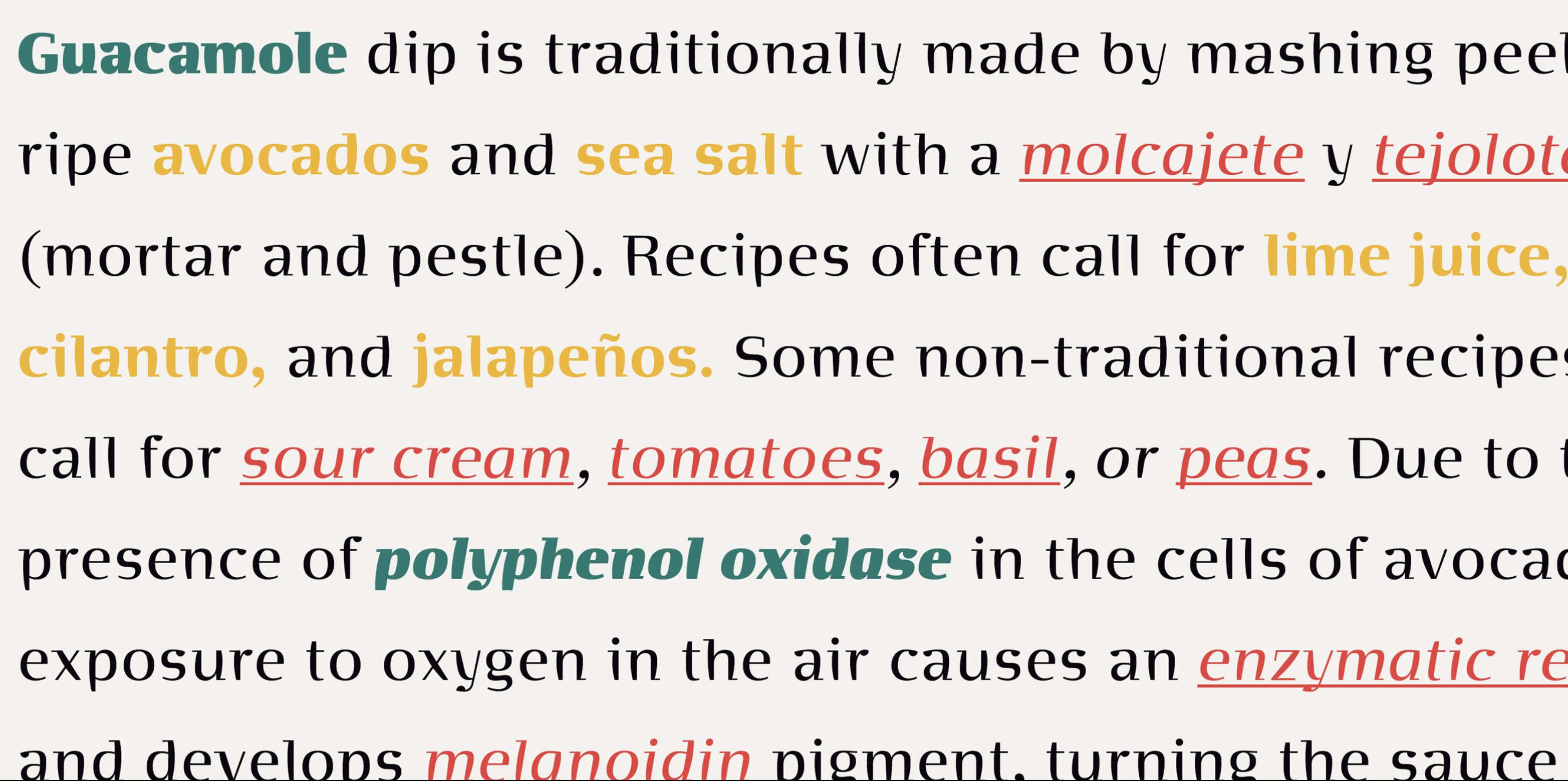
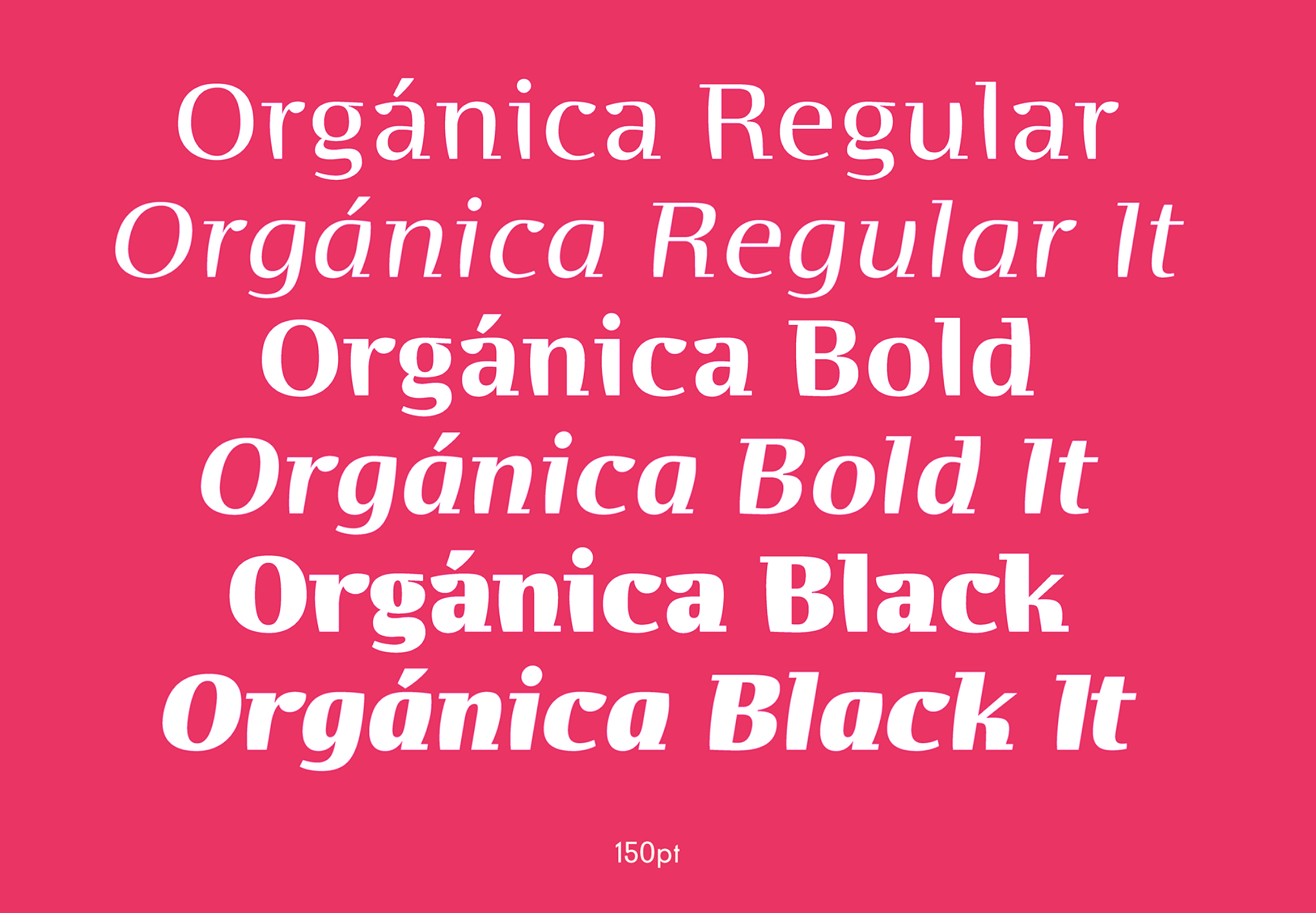
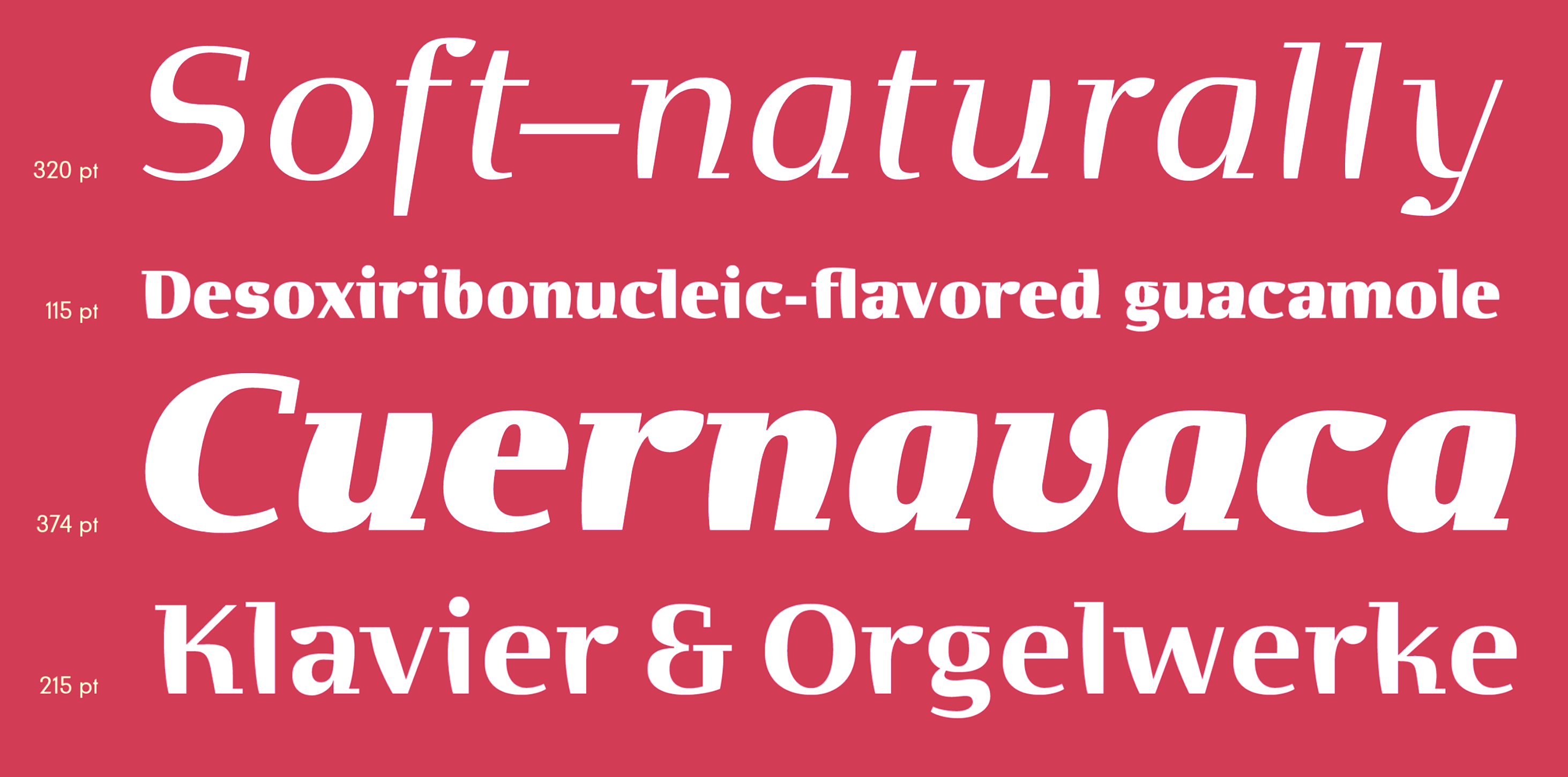
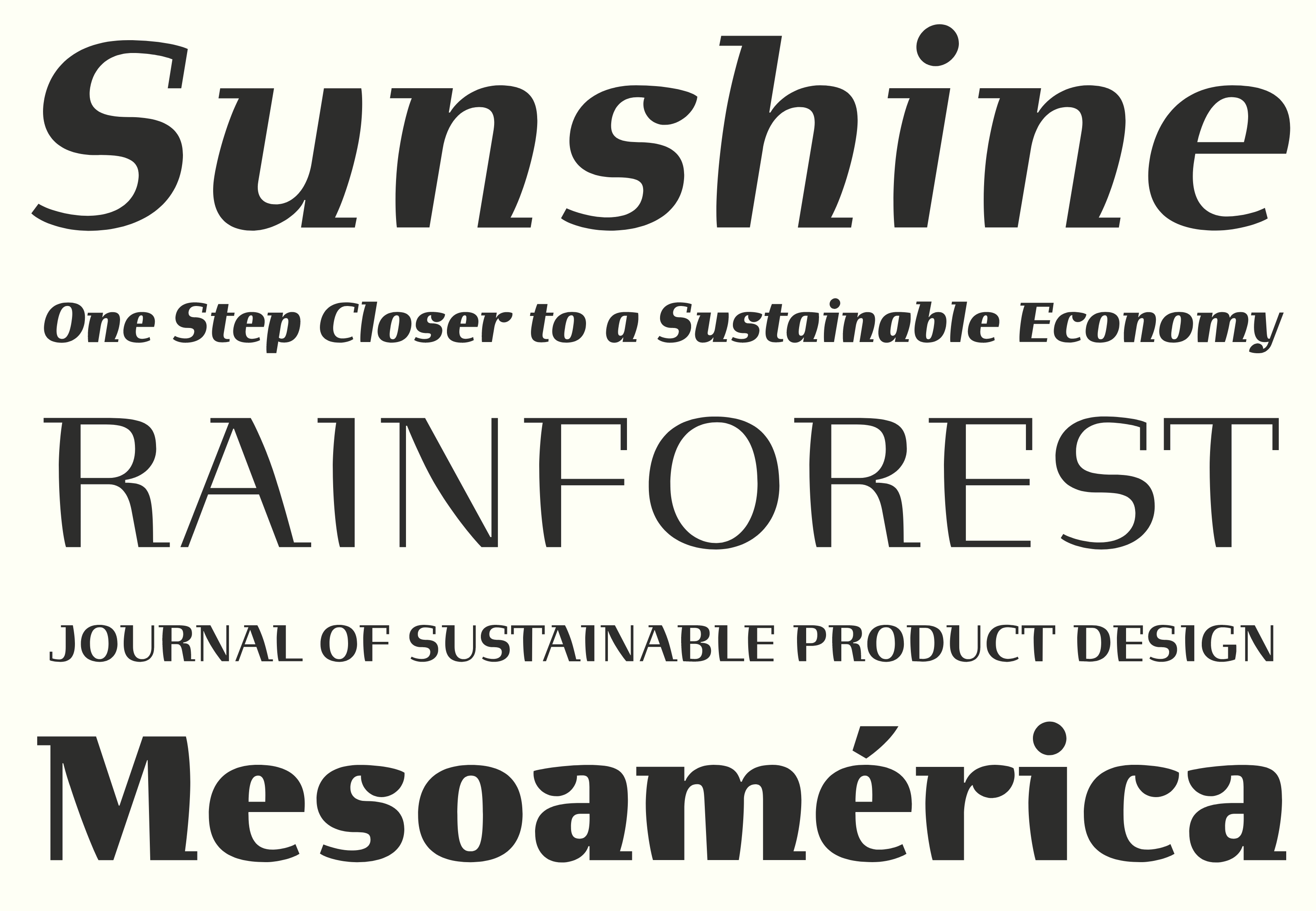
file name: Sudtipos Organica Pro 2021 1
file name: Sudtipos Organica Pro 2021 3
file name: Sudtipos Organica Pro 2021 4

file name: Sudtipos Organica Pro 2021

file name: Gabriel Martinez Meave Organica Pro 2021

file name: Gabriel Martinez Meave Organica Pro 2021
file name: Gabriel Martinez Meave Organica Pro 2021
file name: Gabriel Martinez Meave Organica Pro 2021
file name: Gabriel Martinez Meave Organica Pro 2021
file name: Gabriel Martinez Meave Organica Pro 2021

file name: Gabriel Martinez Meave Organica Pro 2021
file name: Gabriel Martinez Meave Organica Pro 2021

file name: Gabriel Martinez Meave Organica Pro 2021
file name: Gabriel Martinez Meave Organica Pro 2021

file name: Gabriel Martinez Meave Organica Pro 2021

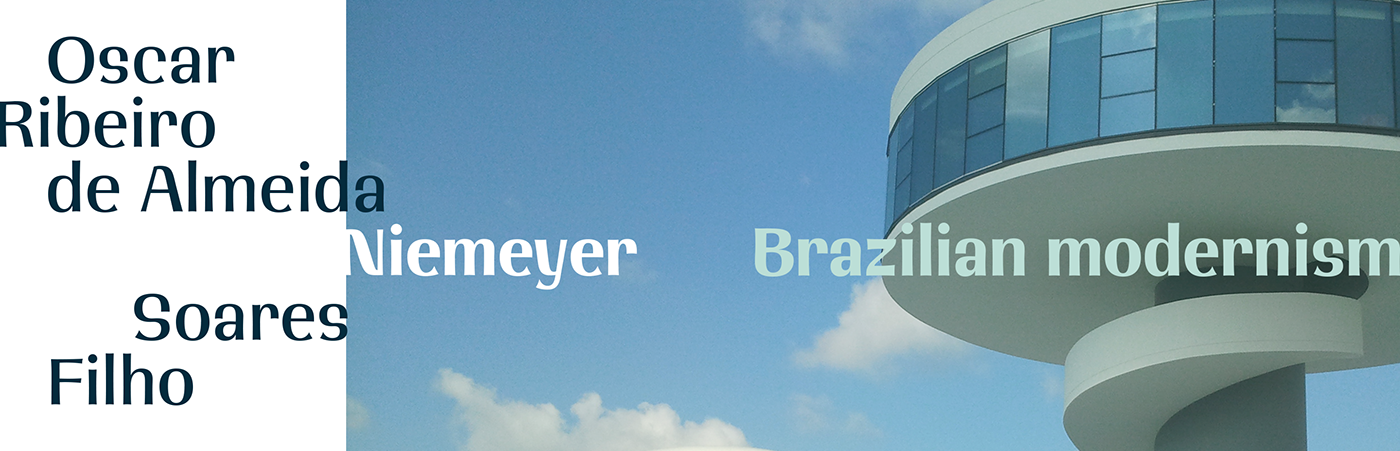
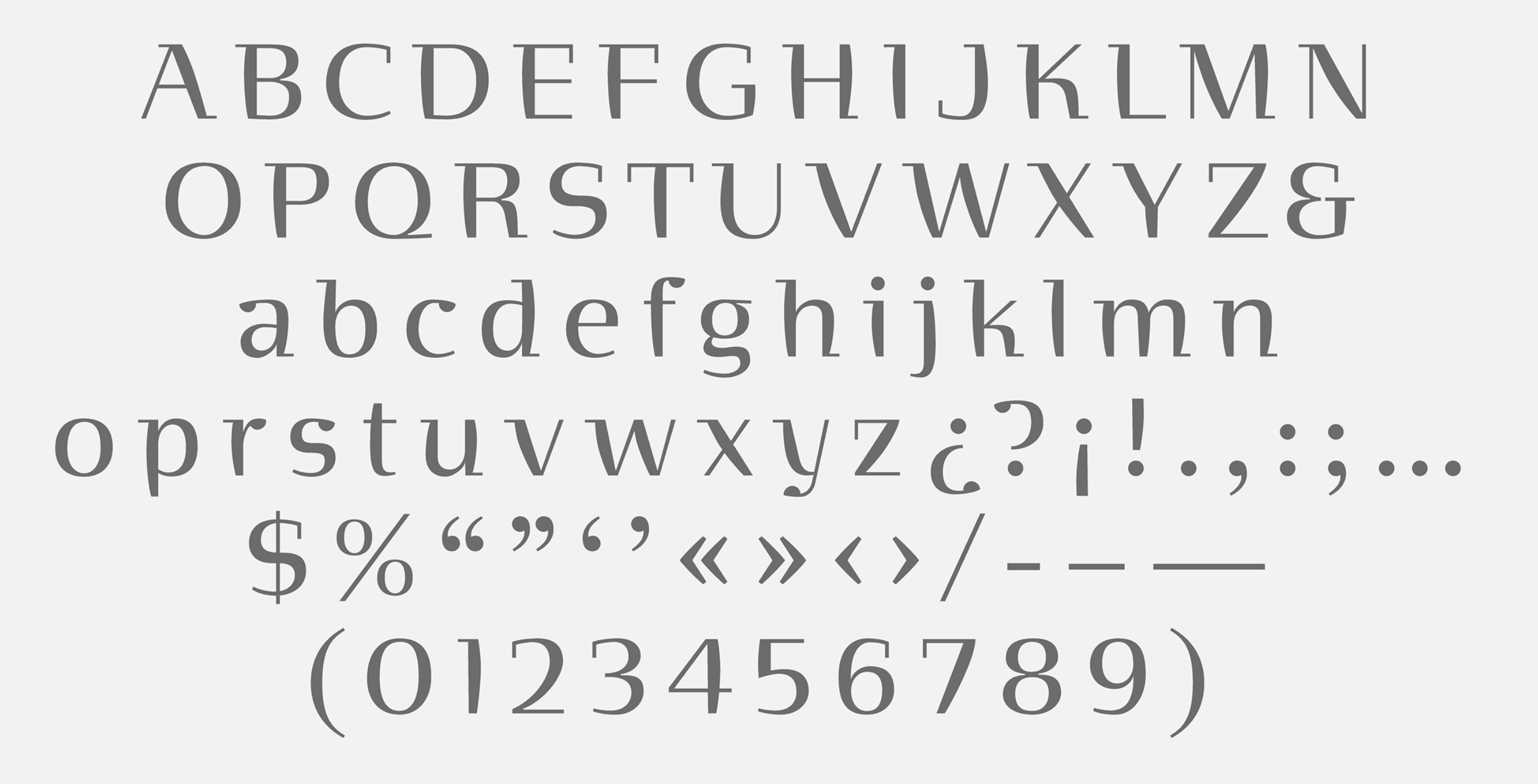
file name: Gabriel Martinez Meave Organica G M M Semi Serif 2000 2003

file name: Gabriel Martinez Meave Organica 2003

file name: Gabriel Meave Neruda Poster
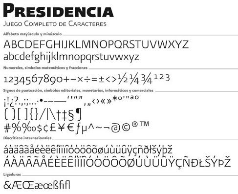
file name: Gabriel Meave Presidencia Sans 2011
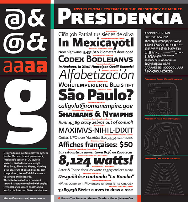
file name: Gabriel Meave Presidencia Sans 2011b
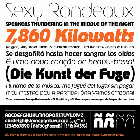
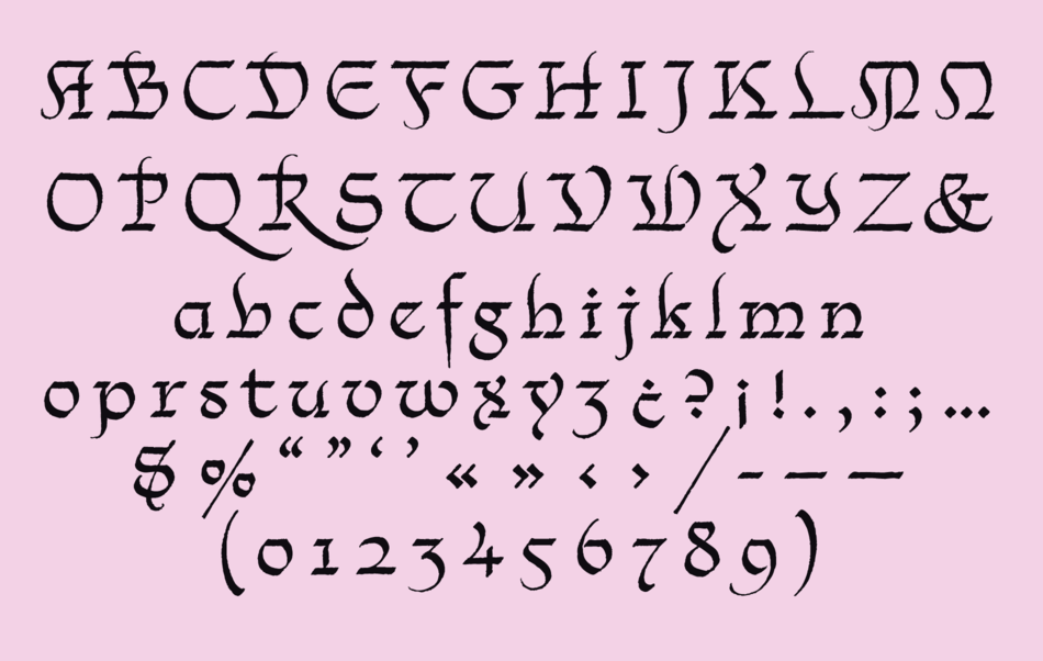
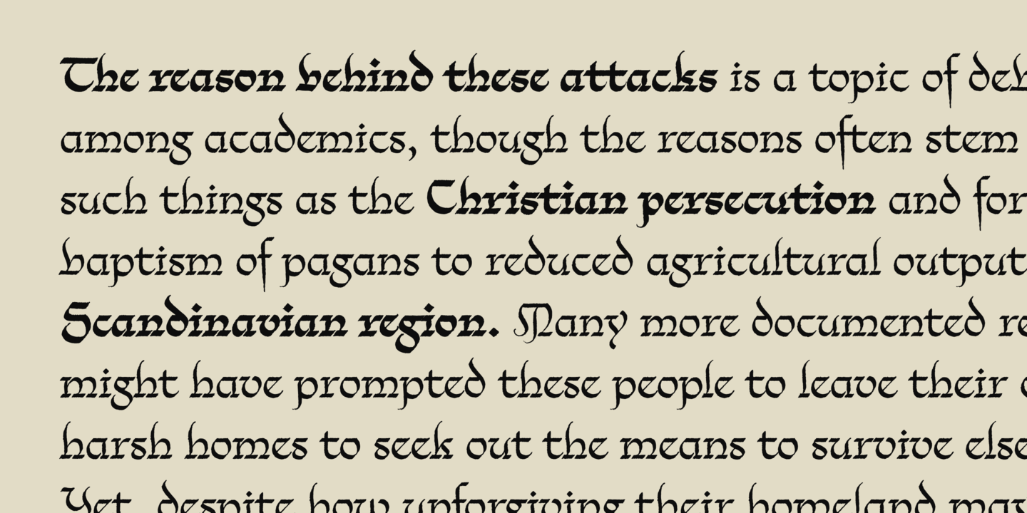
file name: Gabriel Martinez Meave Rondana

file name: Sudtipos Rondana 2019

file name: Gabriel Martinez Meave Rondana 2002 2019
file name: Gabriel Martinez Meave Rondana 2002 2019
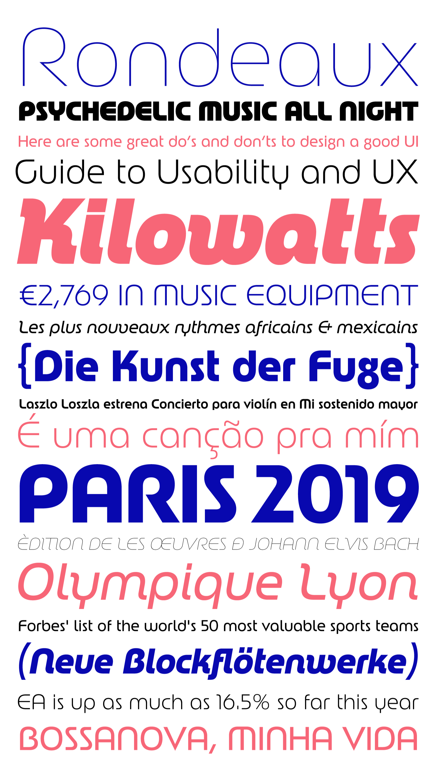
file name: Gabriel Martinez Meave Rondana 2002 2019
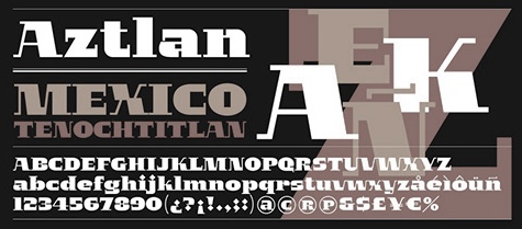
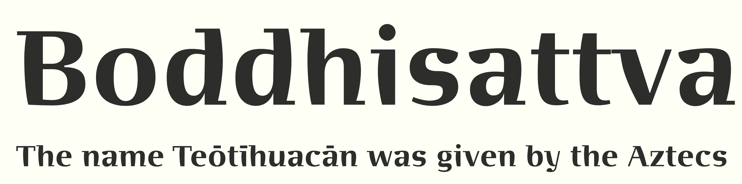
file name: Gabriel Martinez Meave Aztlan 1998

file name: Gabriel Martinez Meave Aztlan 1998b

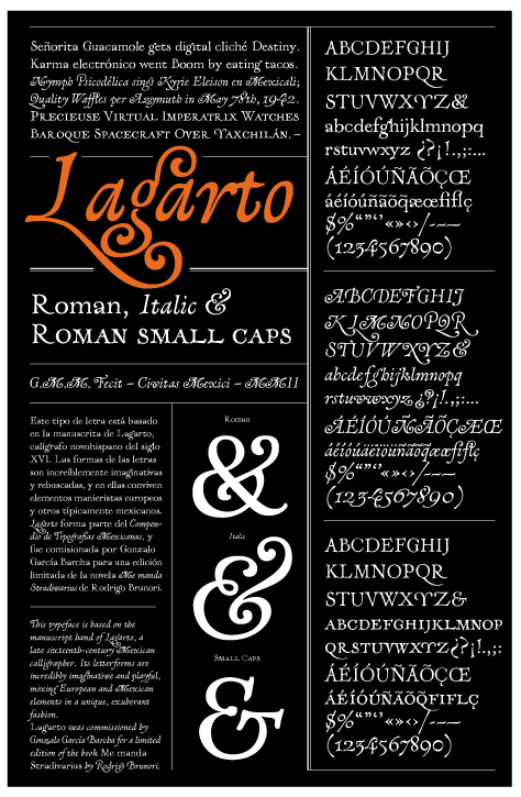
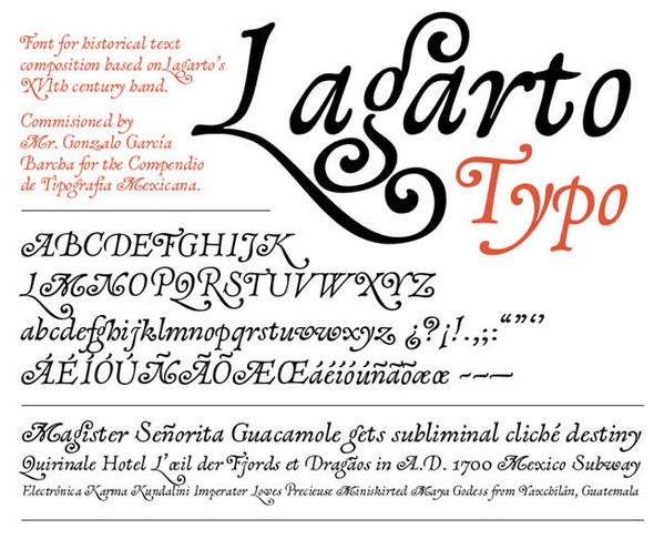
file name: Sudtipos Lagarto 2019 304215

file name: Sudtipos Lagarto 2019 304216 002

file name: Sudtipos Lagarto 2019 304217

file name: Sudtipos Lagarto 2019 304218

file name: Sudtipos Lagarto 2019 304219

file name: Sudtipos Lagarto 2019

file name: Gabriel Martinez Meave Lagarto 2001
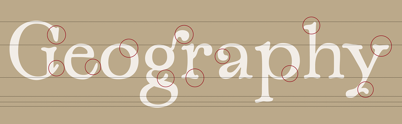
file name: Gabriel Martinez Meave Lagarto 2001

file name: Gabriel Martinez Meave Lagarto 2001

file name: Gabriel Martinez Meave Lagarto 2001

file name: Gabriel Martinez Meave Lagarto 2001

file name: Gabriel Martinez Meave Lagarto 2001

file name: Gabriel Martinez Meave Lagarto 2001

file name: Gabriel Martinez Meave Lagarto 2001
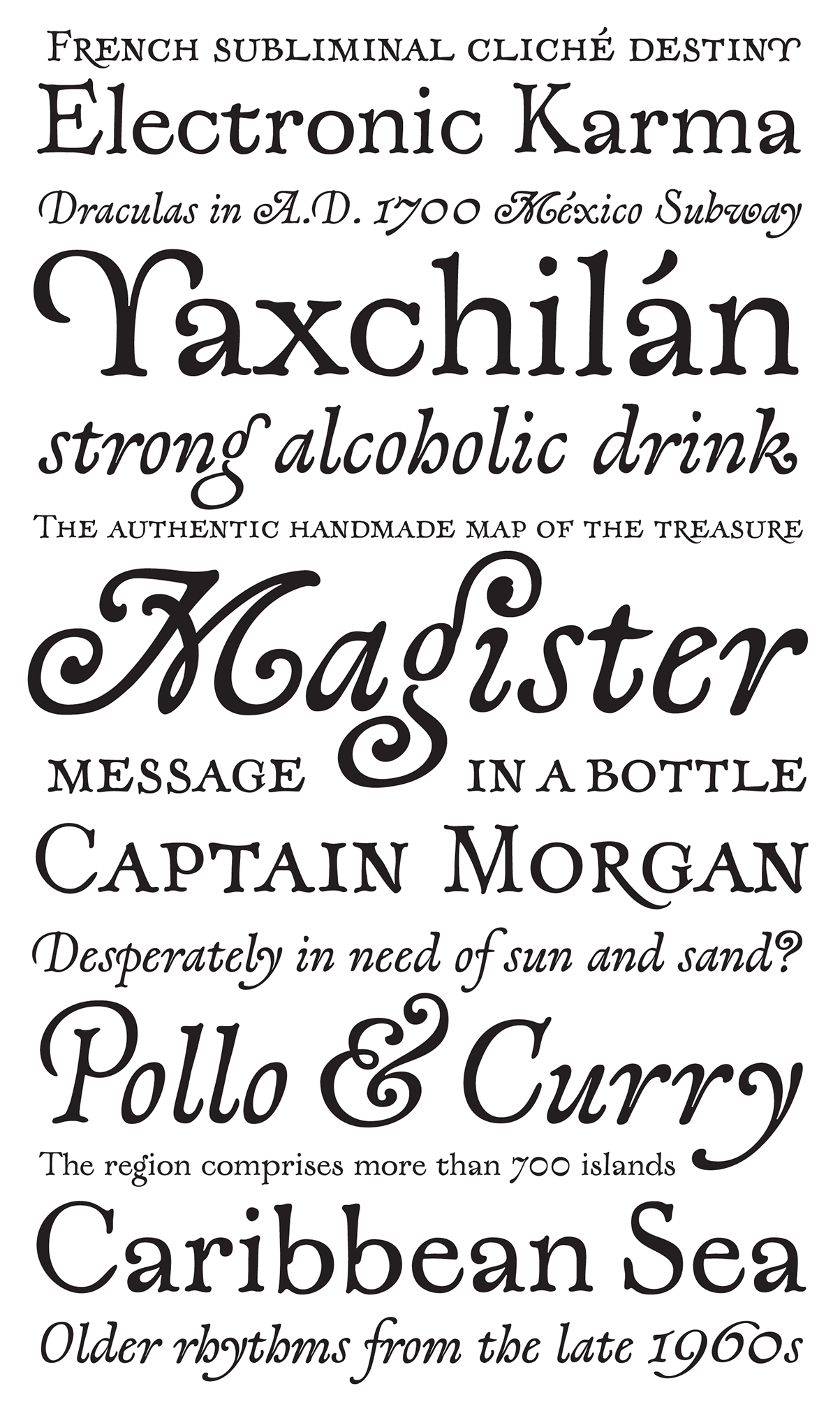
file name: Gabriel Martinez Meave Lagarto 2001

file name: Gabriel Martinez Meave Lagarto 2001

file name: Gabriel Martinez Meave Lagarto 2001
file name: Gabriel Matinez Meave Lagarto 2002
file name: Gabriel Martinez Meave Lagarto 2001c

file name: Gabriel Martinez Meave Lagarto 2001d

file name: Gabriel Martinez Meave Lagarto 2001e

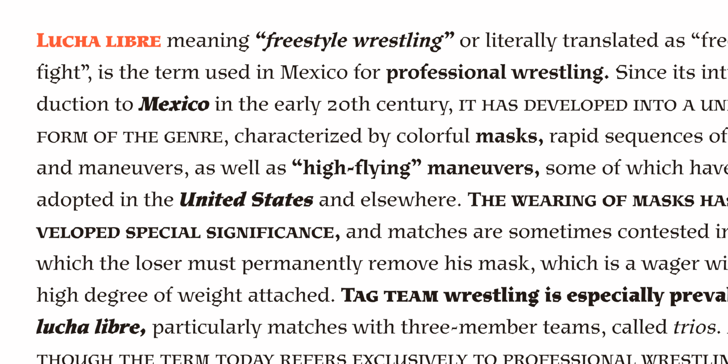
file name: Gabriel Martinez Meave Mexica 1996 3

file name: Gabriel Martinez Meave Mexica 1996 30

file name: Gabriel Martinez Meave Mexica 1996 304605

file name: Gabriel Martinez Meave Mexica 1996 304608
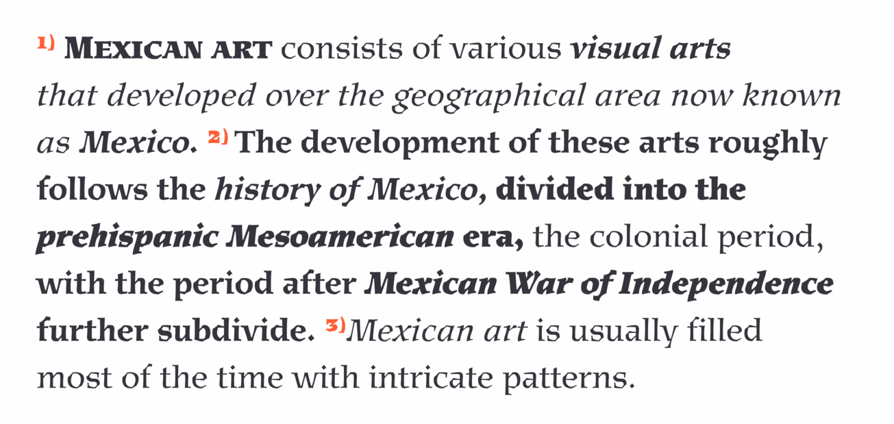
file name: Gabriel Martinez Meave Mexica 1996 304609

file name: Gabriel Martinez Meave Mexica 1996 304611
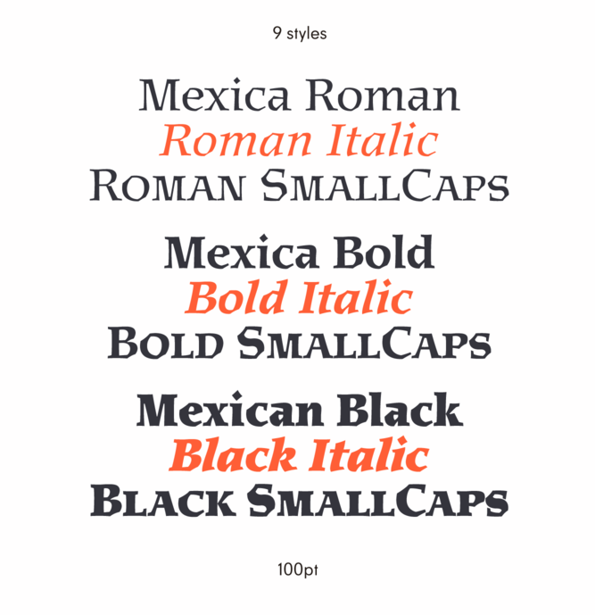
file name: Gabriel Martinez Meave Mexica 1996 304613

file name: Gabriel Martinez Meave Mexica 1996 31

file name: Gabriel Martinez Meave Mexica 1996 32

file name: Gabriel Martinez Meave Mexica 1996 33

file name: Gabriel Martinez Meave Mexica 2019 304614

file name: Gabriel Martinez Meave Mexica 2019 304615 002

file name: Gabriel Martinez Meave Mexica 2019 304616 002
file name: Gabriel Martinez Meave Mexica 2019 304617

file name: Gabriel Martinez Meave Mexica 2019 304618 002

file name: Gabriel Martinez Meave Mexica 2019
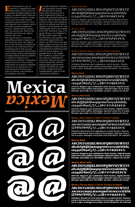
file name: Gabriel Matinez Meave Mexica 2002

file name: Gabriel Martinez Meave Mexica 2002b

file name: Gabriel Martinez Meave Artifex 2006b
file name: Gabriel Martinez Meave Artifex 2006

file name: Gabriel Martinez Meave Cybertoltecayotl Illustration 2012
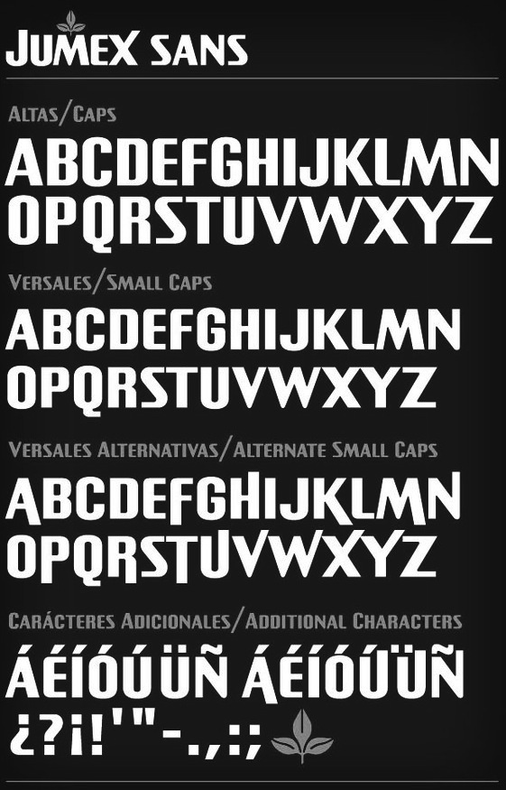
file name: Gabriel Martinez Meave Jumex Sans 2012
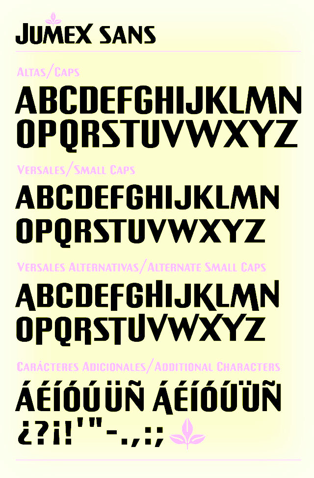
file name: Gabriel Martinez Meave Jumex Sans

file name: Gabriel Martinez Meave Liverpool Sans

file name: Gabriel Martinez Meave Liverpool Sans

file name: Gabriel Martinez Meave Liverpool Sans

file name: Gabriel Martinez Meave Basilica 1999c
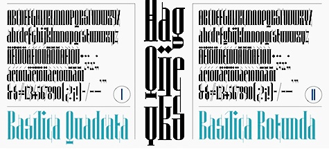
file name: Gabriel Martinez Meave Basilica 1999
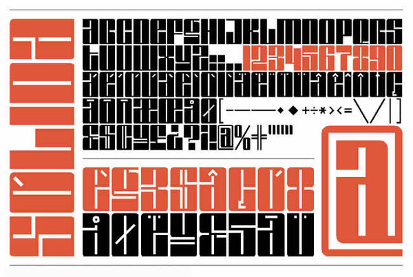
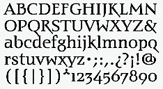
file name: Gabriel Martinez Meave Solida
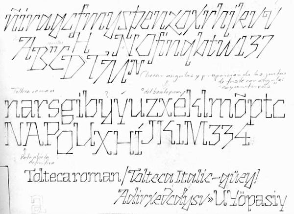
file name: Gabriel Martinez Meave Tolteca
| | |
|
Luc Devroye ⦿ School of Computer Science ⦿ McGill University Montreal, Canada H3A 2K6 ⦿ lucdevroye@gmail.com ⦿ https://luc.devroye.org ⦿ https://luc.devroye.org/fonts.html |