|
George William Jones

British printer and typographer (born 1860 in Upton-on-Severn, died 1942 in Worcestershire). From 1921 until his retirement in 1938, he was "printing adviser" to Linotype&Machinery Ltd in Britain. He was director of typography for the British Printer, and reached the acme of his career as Printer to the King and Queen of Belgium. All his typefaces except Venezia are Linotype typefaces. His typographic work includes these typefaces: - About 1913, when at the press "At the Sign of the Dolphin" located in Gough Square off Fleet Street, he developed Venezia, a new typeface exclusive to his press. He retained Edward Prince to cut the punches and based his design on a Jenson precedent found in Caesar's "Commentaries" printed around 1470. Jones had the matching italic designed by Frederic Goudy. He sold the punches and matrices to Stephenson Blake in 1927. MacMcGrew: Venezia was produced by Keystone Type Foundry and first shown in 1899. It appears to have been inspired by the same models as Jenson Oldstyle, but features more generously bracketed serifs and a generally more pleasing appearance. Except for the unusual link between the bowls of the g, it is very agreeable. For a later modification of this design, see Laureate.
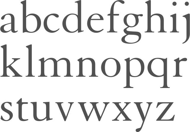
- Granjon Old Face, first shown in the British trade press of December 1924. He based this on books produced by the Parisian printers Jacques Dupuys in 1554 and Jean Poupy in 1582 (according to Lawrence Wallis). Its roman is a true Garamond. Linotype states that it was based on the typeface sample of the Frankfurt font foundry Egenolff from the year 1592, with the romans by Claude Garamond and the italics by Robert Granjon. Linotype's Granjon gets a date of 1928, and is attributed jointly to George W. Jones and Chauncey H. Griffith. Image of Linotype Granjon. Berry, Johnson and Jaspert write: [Mergenthaler Linotype; Linotype (London) 1928-1931] Designed for Linotype under the supervision of George W. Jones. Although named after another French type designer, Robert Granjon, this roman is the best reproduction of the Garamond type we have. It was based on a sixteenth century Paris book printed in a roman which appears under the name Garamond on a specimen sheet of the Egenolff-Berner foundry at Frankfurt, 1592. The capitals are tall in comparison with Bembo, but sufficiently narrow and light to prevent their being too conspicuous. The middle strokes of the M are slightly overhanging, the bowl of the P is not closed, the R ends in a foot serif on the line. The lower-case Garamond g with a small bowl is well reproduced. The italic is less distinguished than the true old-face italics. The A is rather like CASLON. There is a straight shanked h and a number of swash capitals. The large bowl of the g differentiates this design from the Garamond, so-called, italics.
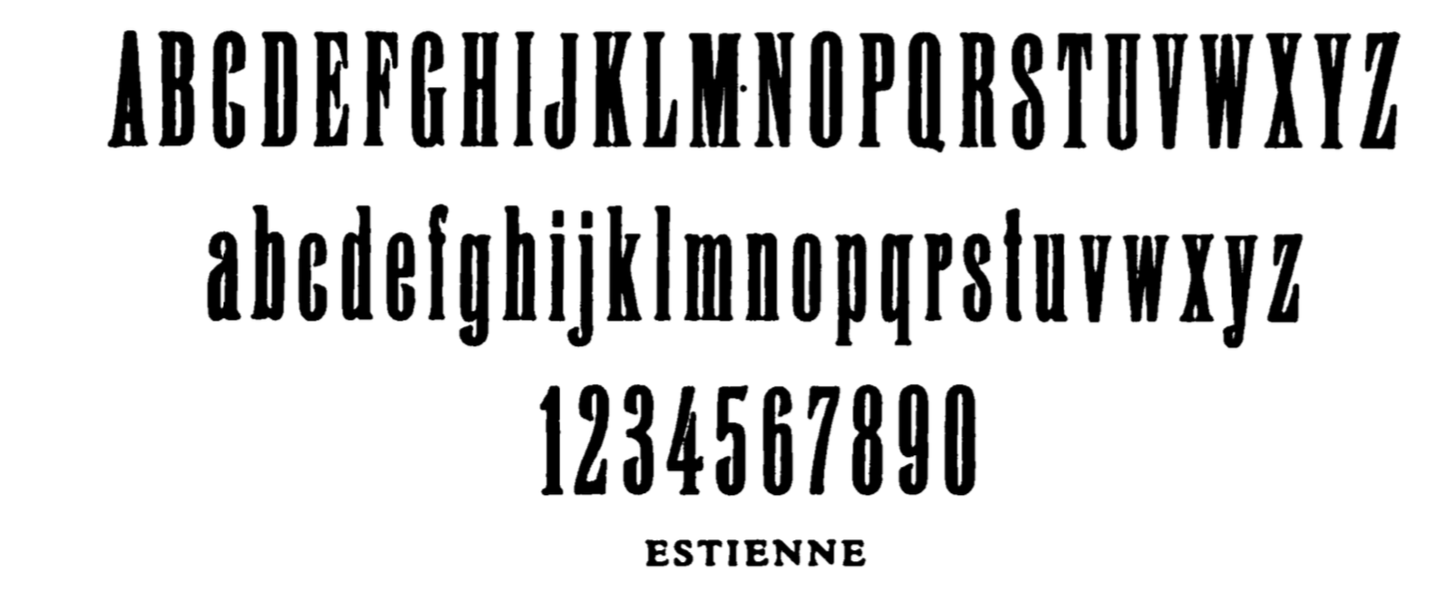
- Estienne (1928-1929, Linotype London and Mergenthaler Linotype). Berry, Johnson and Jaspert write: Another Garamond design due to G.W. Jones, named after the famous family of Paris printers. This roman differs from Granjon in the greater height of the ascenders and length of the descenders. It is also lighter in colour. Other distinguishing marks are, the R which tapers off and descends below the line, and the g with a larger bowl. The italic has less inclination than the Granjon. The Q has a tail after the Goudy model. In the lower case the serifs on the tops of ascenders are inclined; the curve of the bowl of the p continues beyond the main stroke. The Haas Estienne is an entirely different design. Mac McGrew: Estienne is a distinguished book typeface designed by George W. Jones, the eminent English printer, and released by Linotype in 1930. It is related to Garamond but more delicate, with longer ascenders and descenders. The roman makes a distinctive and very attractive appearance in text, but the italic is rather loosely fitted, necessitated by fitting the long ascenders and descenders to straight matrices. It is named for a distinguished sixteenth- century French printing family. Compare Granjon, Garamond.
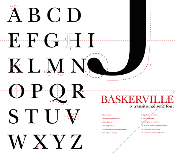
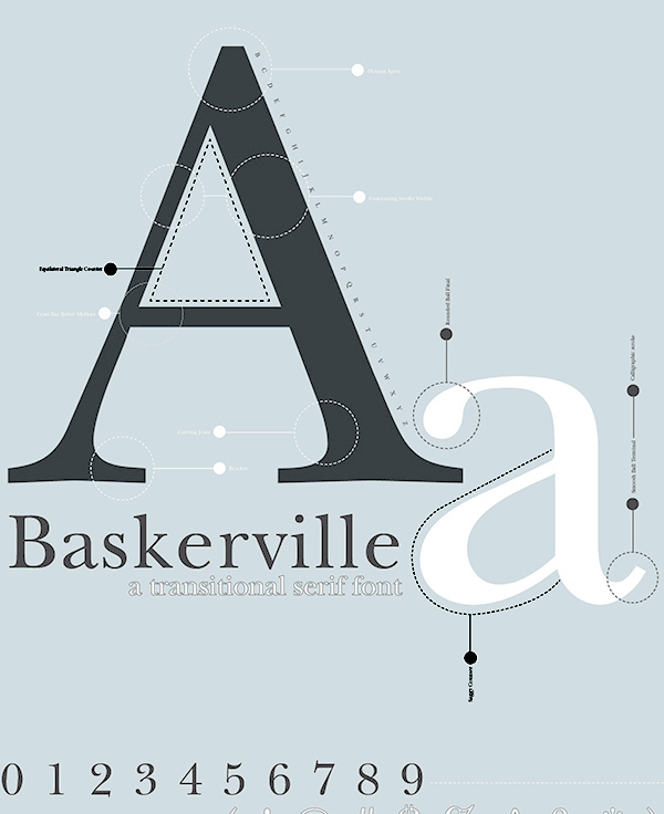
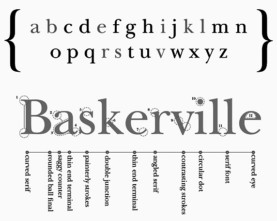
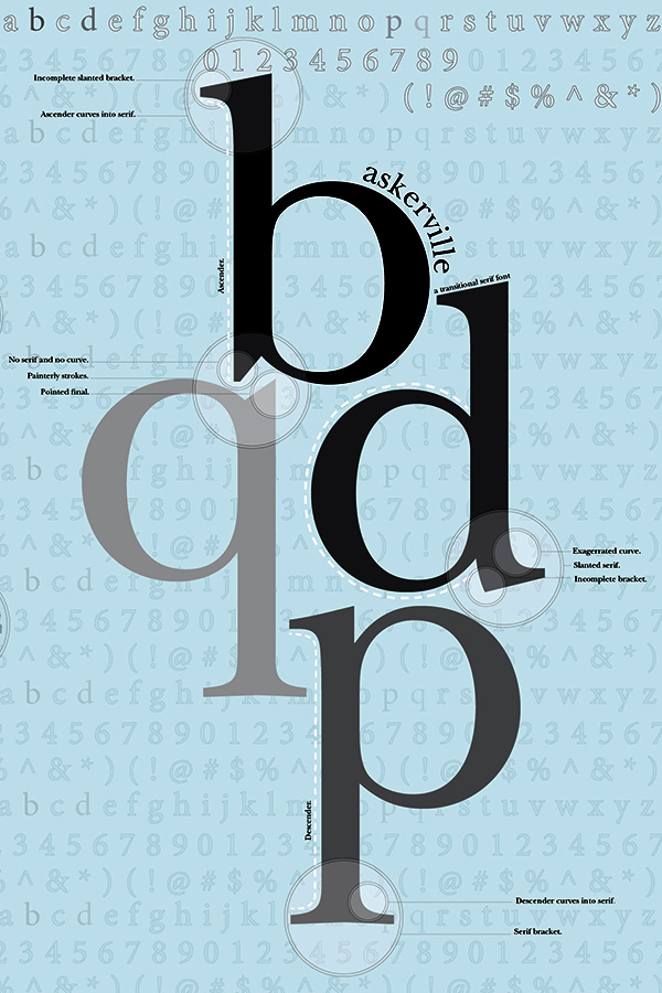
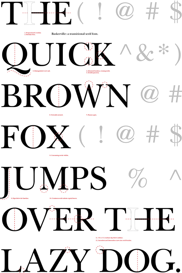
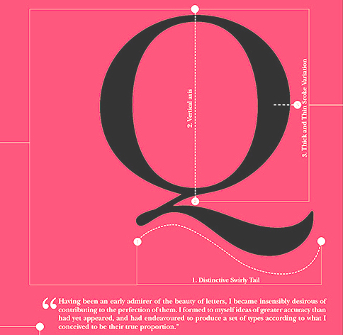
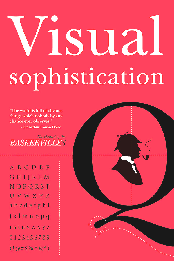
- Drawings for Linotype Baskerville are dated 1930 and the first public showing occurred in The London Mercury of November 1931. Jones wanted this to be a true revival, as close to the original as possible. Also, see ITC New Baskerville.
- (Linotype) Georgian (1931-1932) goes back to 18th century type by Alexander Wilson in Scotland. It was probably never digitized. Berry, Johnson and Jaspert relate it to Stephenson Blake font, and write about it: A transitional roman dating from c. 1790, perhaps from the Fry Foundry, but its early history is obscure. The serif formation and differentiation of colour are approaching the modern face. The capitals, in larger sizes, are rather heavy. Descenders are short. The g has a curled ear. The italic supplied with Georgian seems to be an earlier design, a Fry copy of Caslon's italic. Cf. the slope of the A, the swash J and T. Linotype Georgian is similar to the Stephenson Blake design, but there are a number of small differences, e.g., the serif on the lower arc of the C and the straight serifs on the arms of the E.
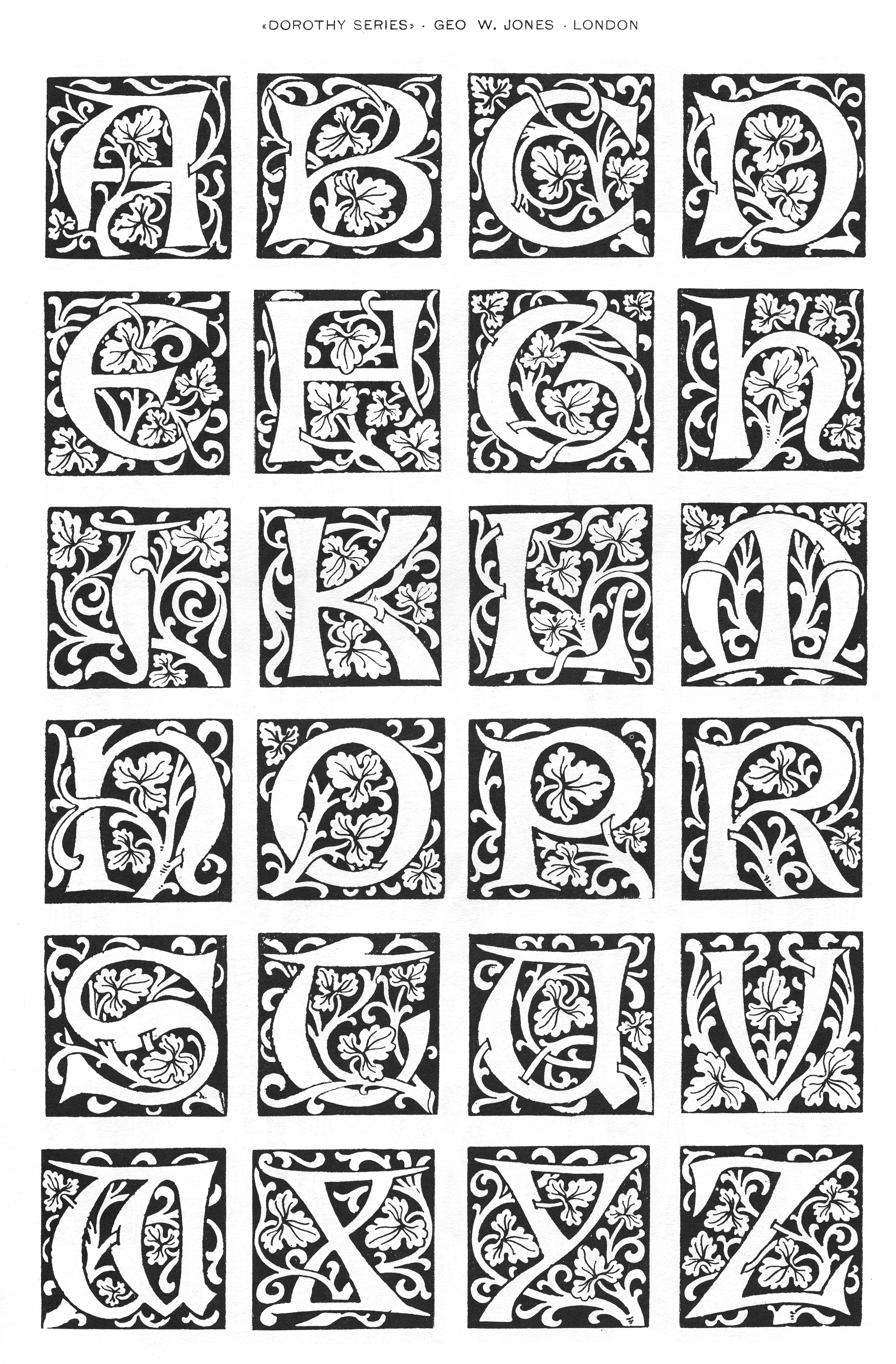
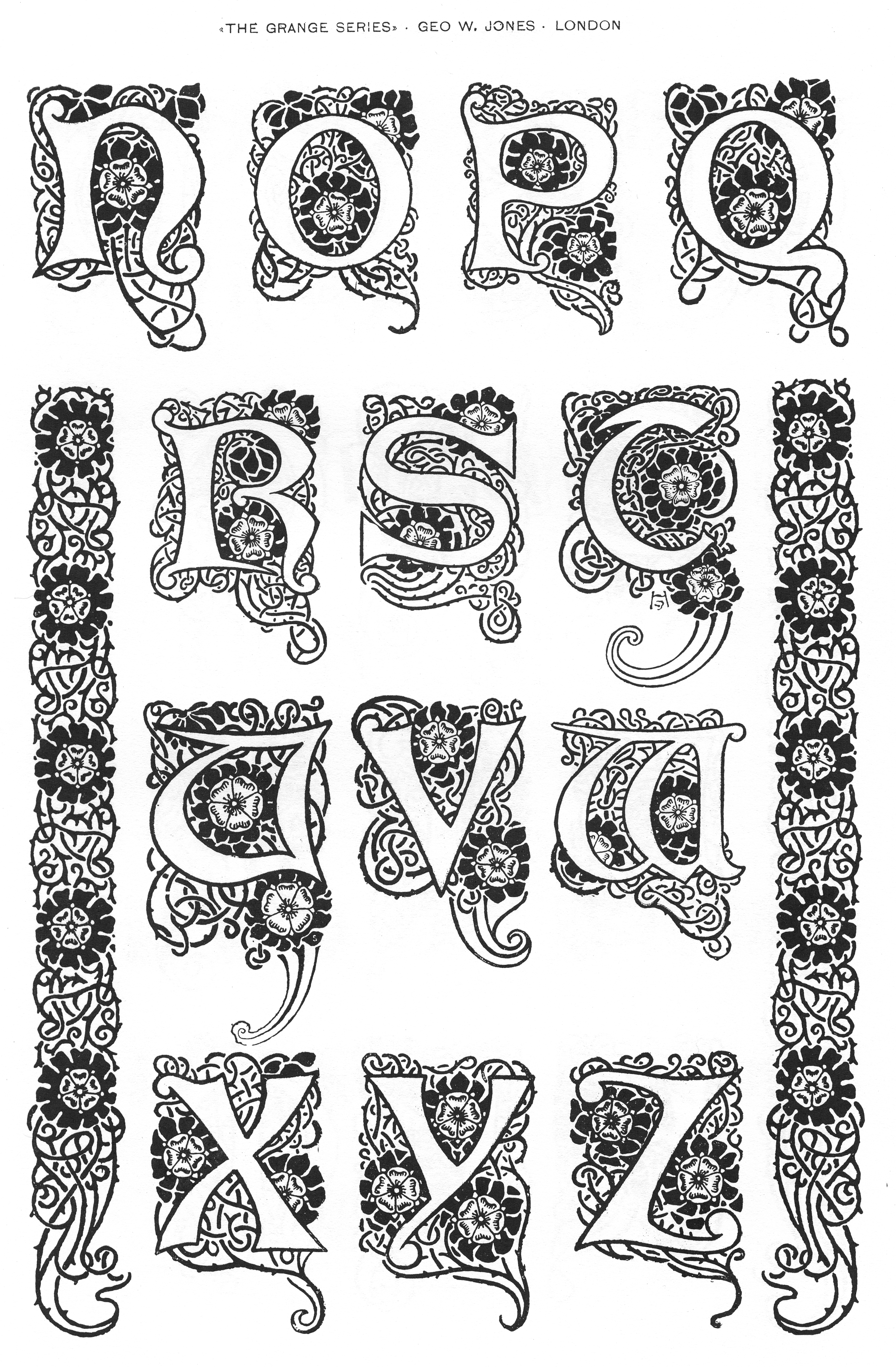
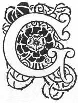
- Early on in his career, he designed a number of decorative caps alphabets, including the art nouveau style Grange and Dorothy.
Adobe write-up. Bio by Lawrence Wallis. Klingspor link. View typefaces designed by George William Jones.
|
EXTERNAL LINKS
George William Jones
 [Designer info] [Designer info]
Monotype link
Klingspor Museum page
MyFonts search
Monotype search
Fontspring search
Google search
INTERNAL LINKS
Type designers ⦿
Type designers ⦿
Art Nouveau typefaces ⦿
Ornamental caps typefaces ⦿
Type design in the United Kingdom ⦿
Garalde or Garamond typefaces ⦿
Frederic William Goudy ⦿
Baskerville ⦿
|


