TYPE DESIGN INFORMATION PAGE last updated on Sat May 16 08:27:27 EDT 2026
FONT RECOGNITION VIA FONT MOOSE

|
|
|
|
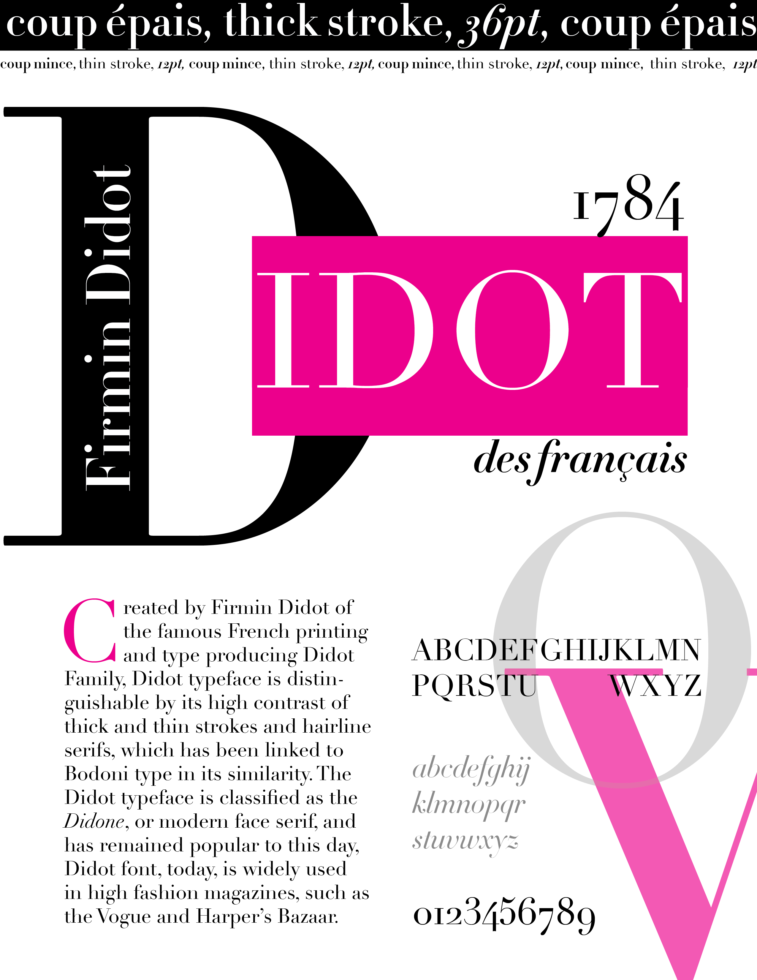
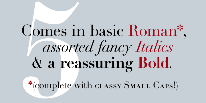
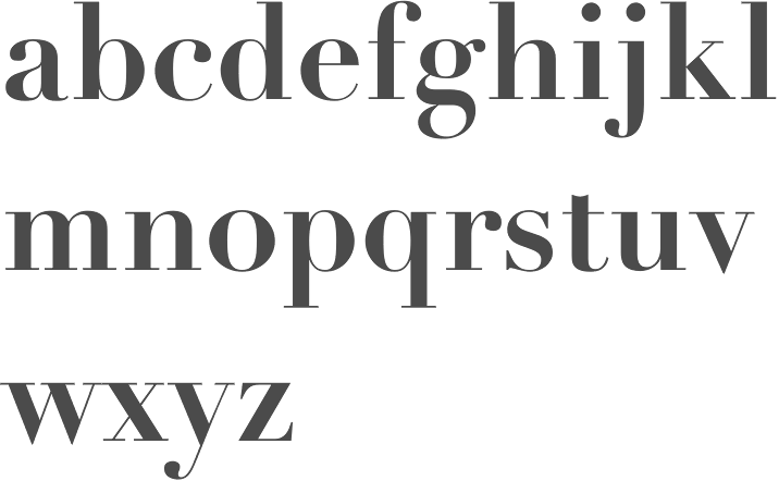
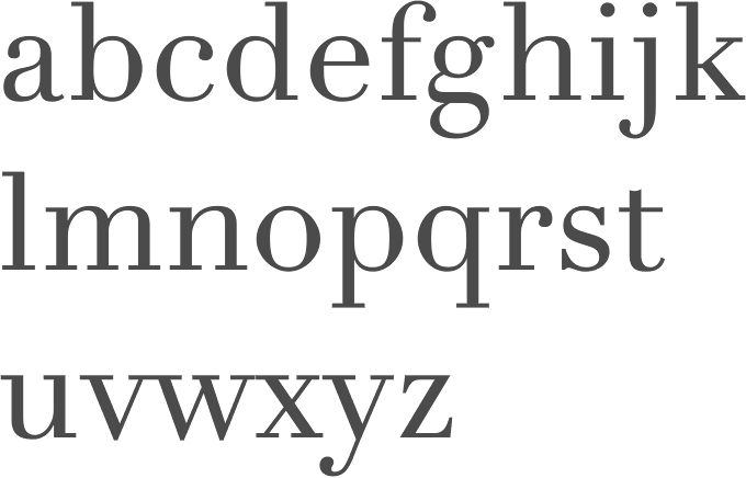
Bodoni: Thierry Bouche
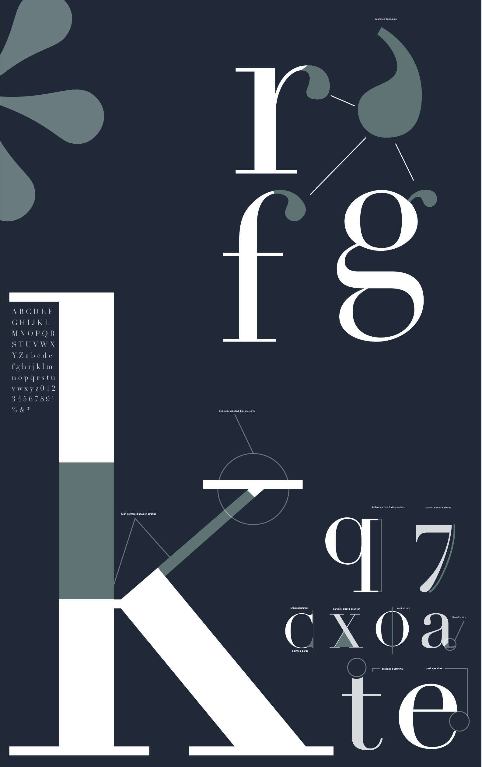
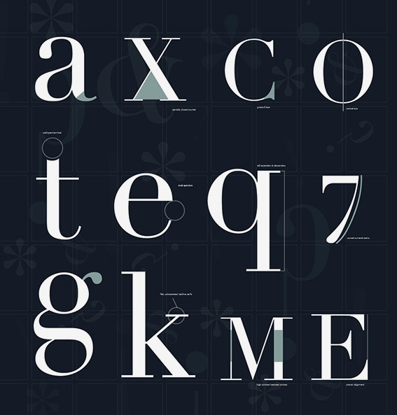
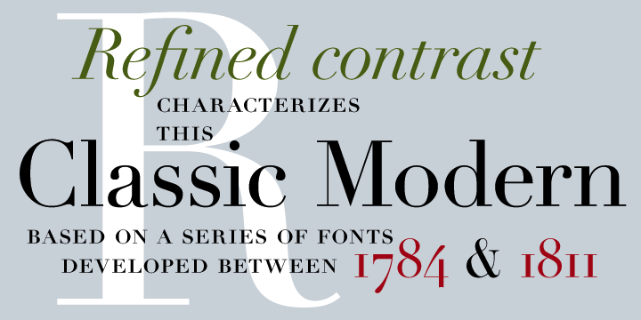
Thierry Bouche's opinion on Bodoni: Digital prepress must have lost something on the road. Personally, the digital didone I prefer is Linotype Didot by Frutiger, although it's somewhat suboptimally spaced, the letter shapes are brilliant (including the italics). It works well for text and has very nice display caps for titling or dropping. Most other didots/bodonis are either draft-horses which correspond to some low contrast unelegant newspaper typefaces, or luxury toys like hoefler's. I liked very much the Oldface concept by Berthold, but never found any use to it: if somebody could point me towards some interesting&effective use of it, I'd be glad. He continues: Most of XIXth century books and even newspapers were printed using didones (well, newspapers rapidly evolved towards what blackwell calls transitional mécanes). On some great works by Firmin-Didot (like Racine's complete theater work orginal edition) for which he designed the most excessive and radical didone with hair-thin serifs, the 10 pt text is a pure pleasure to read at length. This required a very smooth paper and careful printing, but it worked. It is strange to see that the digital technology has not found yet the way to this level of quality. Yes, digital didots are hard to use as text typefaces; they're superb at very high res&large point size, but fail to work for text. This is not the design's fault, but technology's (or implementation?). Erich Alb adds about Linotype Didot: I like that one too. The story is, that after the possibility of high resolution on Printers Adrian Frutiger decided together with Linotype, to produce a new Didot. AF [Adrian Frutiger] became from an Antique Book dealer in Pairs an original copy of a Didot Book, (printed letterpress of course) and took the forms from there, but gave a personal note to his new typeface. He wanted to have the greatest contrast as possible in |
EXTERNAL LINKS |
| | |
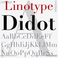
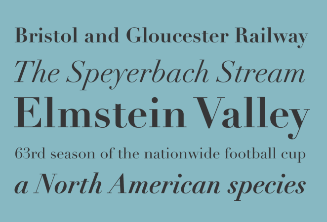
file name: Linotype Didot Poster by Martina Rodriguez Saavedra 2015
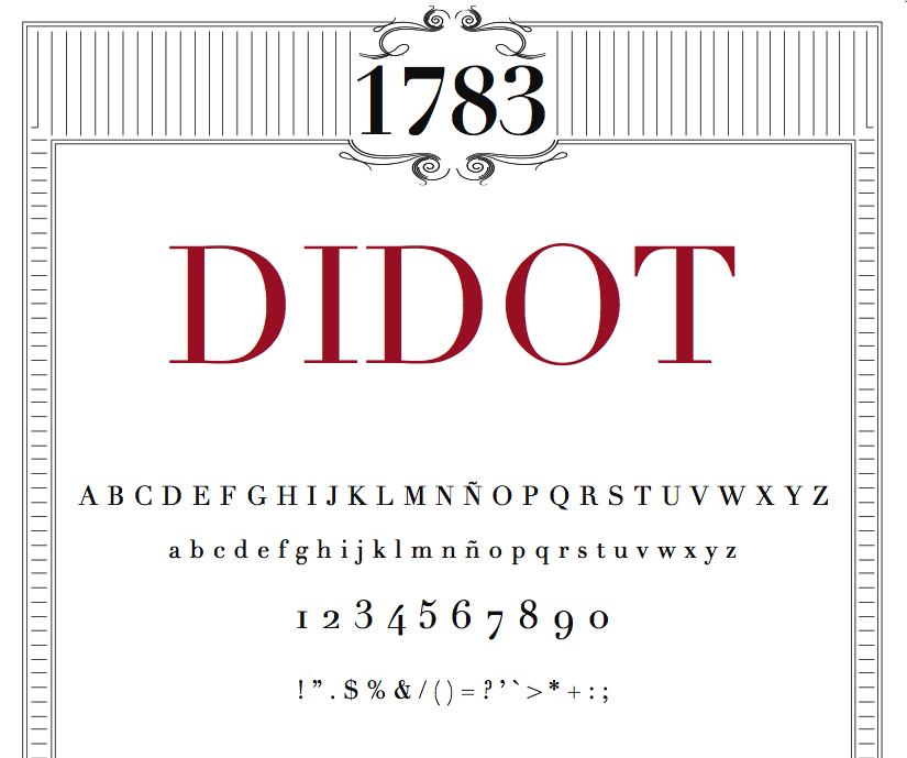
file name: Adrian Frutiger Linotype Didot 1991 Poster by Emma Froberg 2017
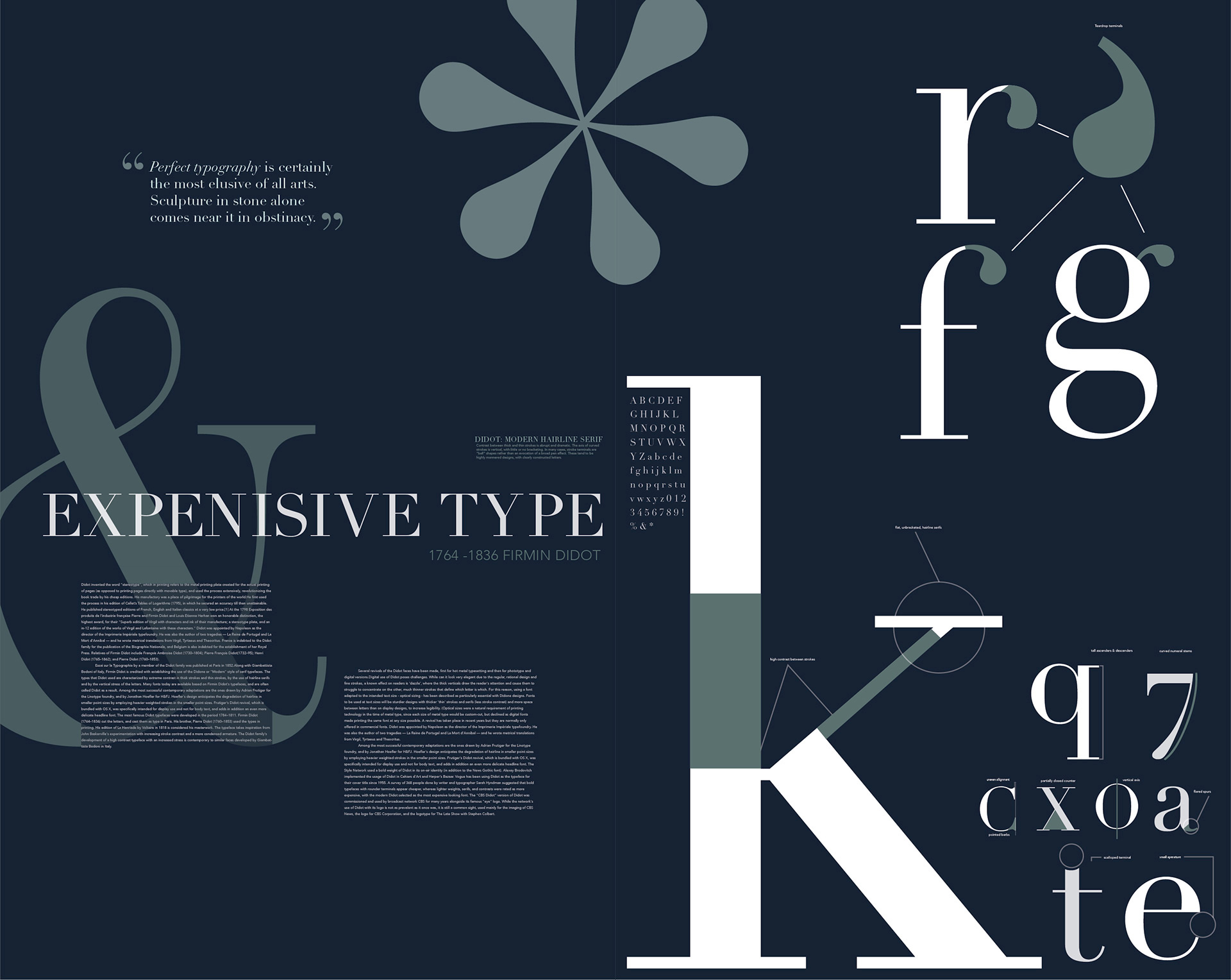
file name: Adrian Frutiger Linotype Didot 1991 Poster by Emma Froberg 2017b
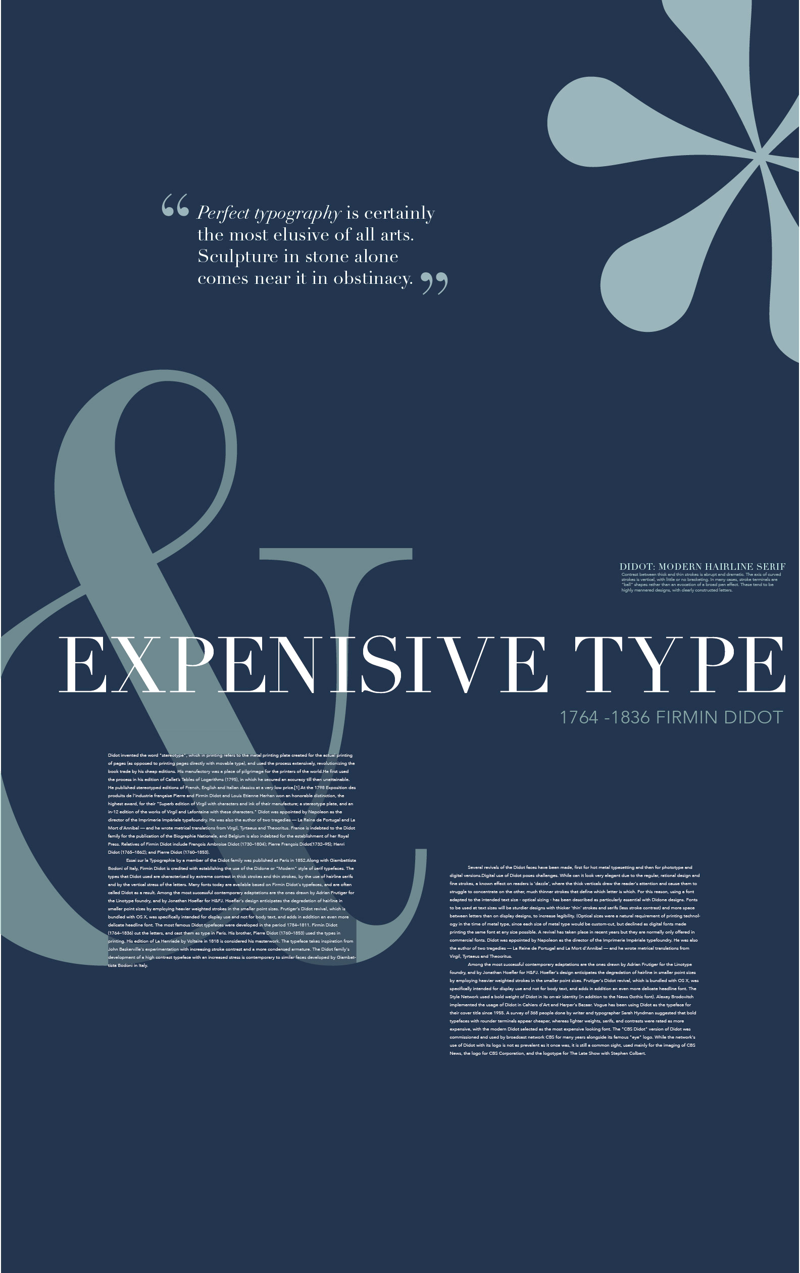
file name: Adrian Frutiger Linotype Didot 1991 Poster by Emma Froberg 2017c
file name: Adrian Frutiger Linotype Didot 1991 Poster by Emma Froberg 2017d
file name: Adrian Frutiger Linotype Didot 1991 Poster by Helen Ju 2017
file name: Adrian Frutiger Didot L T Pro Headline 1991

file name: Adrian Frutiger Linotype Didot 1991 197914

file name: Adrian Frutiger Linotype Didot 1991 197914
file name: Adrian Frutiger Linotype Didot 1991 198942
file name: Adrian Frutiger Linotype Didot 1991 198942
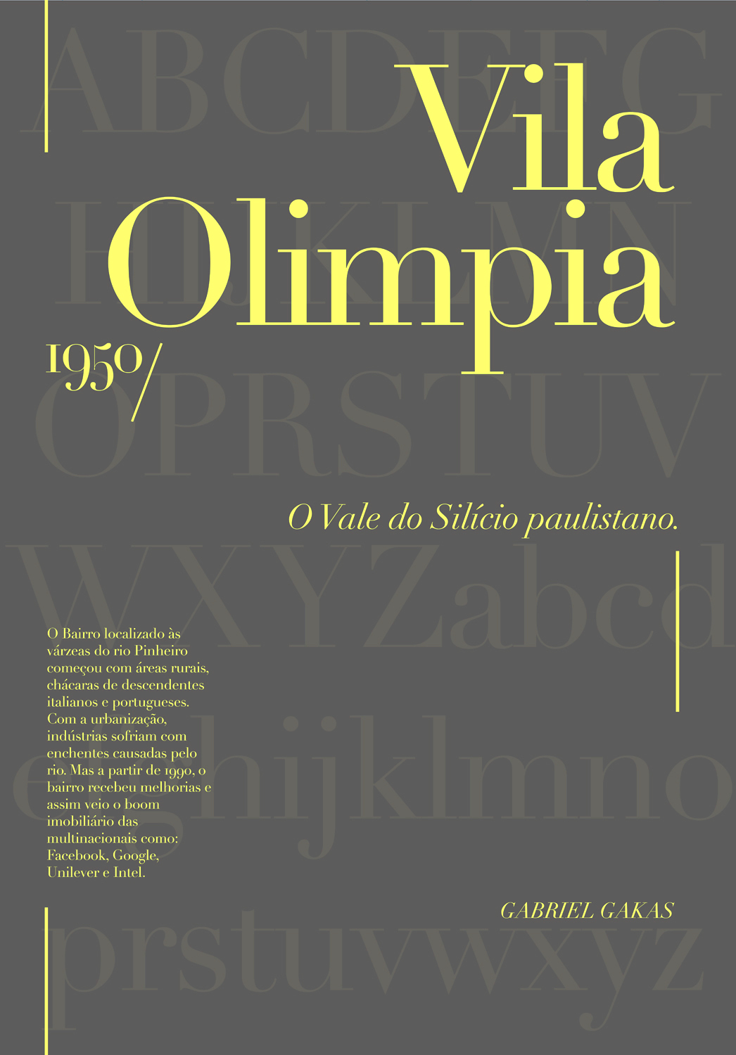
file name: Adrian Frutiger Linotype Didot 1991 Poster by Gabriel Gakas 2016
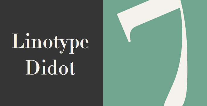
file name: Adrian Frutiger Linotype Didot 1991
file name: Adrian Frutiger Linotype Didot 1991b
file name: Adrian Frutiger Linotype Didot Bold 1991
file name: Adrian Frutiger Linotype Didot Etext Pro 2013
| | |
|
Luc Devroye ⦿ School of Computer Science ⦿ McGill University Montreal, Canada H3A 2K6 ⦿ lucdevroye@gmail.com ⦿ https://luc.devroye.org ⦿ https://luc.devroye.org/fonts.html |