TYPE DESIGN INFORMATION PAGE last updated on Sat May 16 08:27:39 EDT 2026
FONT RECOGNITION VIA FONT MOOSE

|
|
|
|
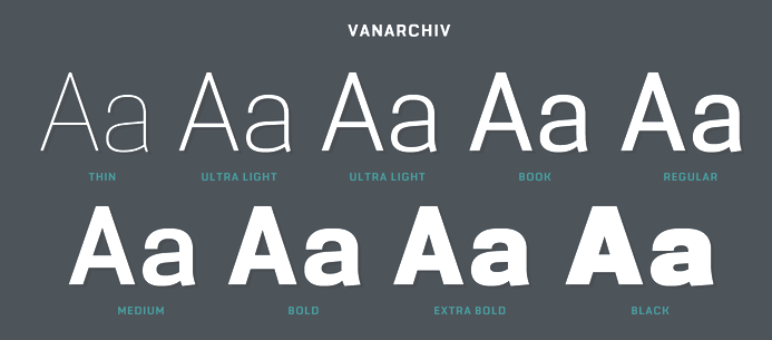
Vanarchiv
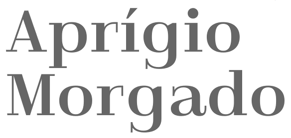
[Ricardo Rodrigues dos Santos]
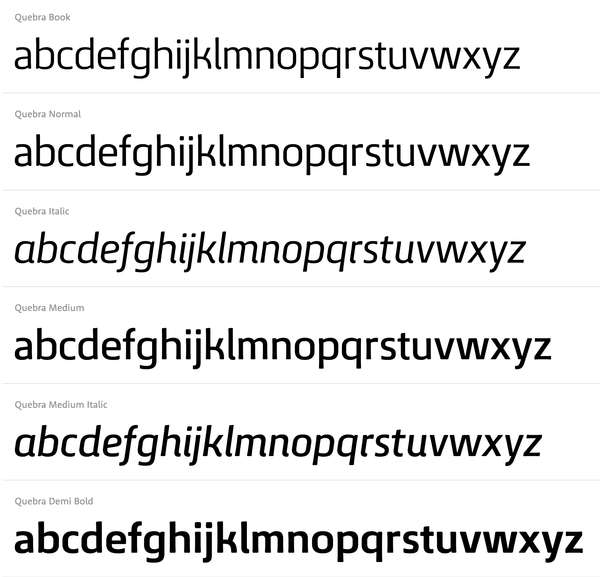
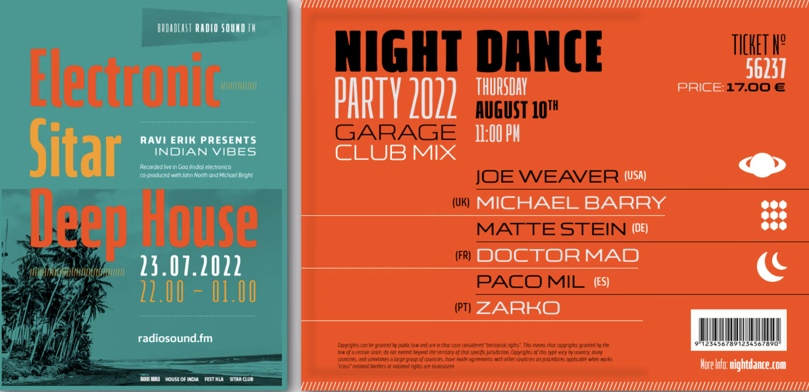
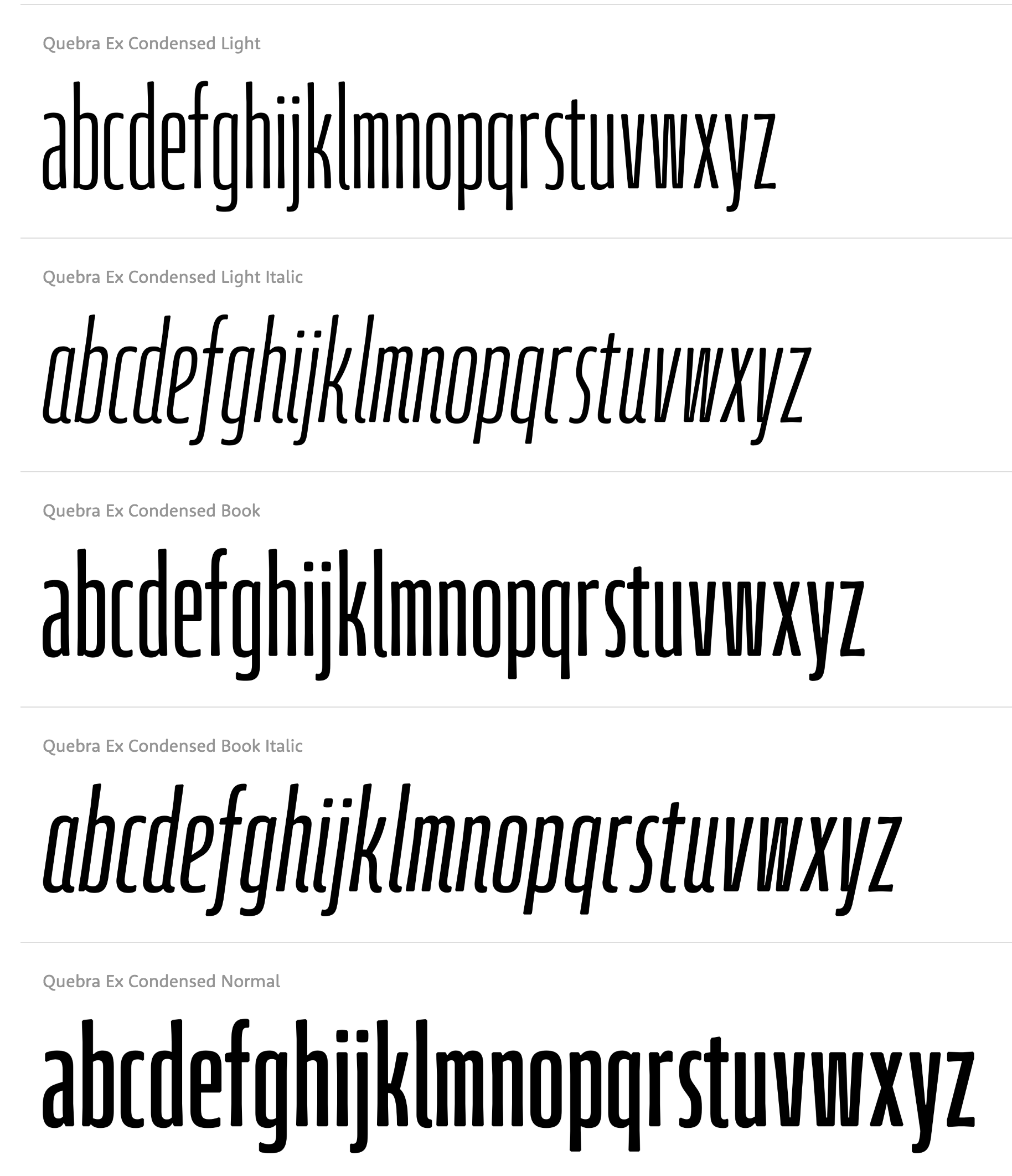
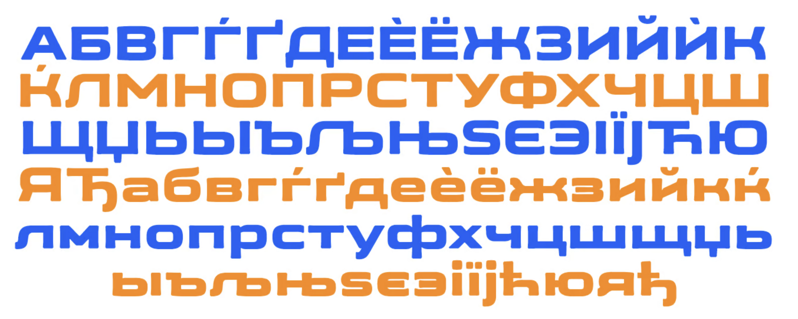
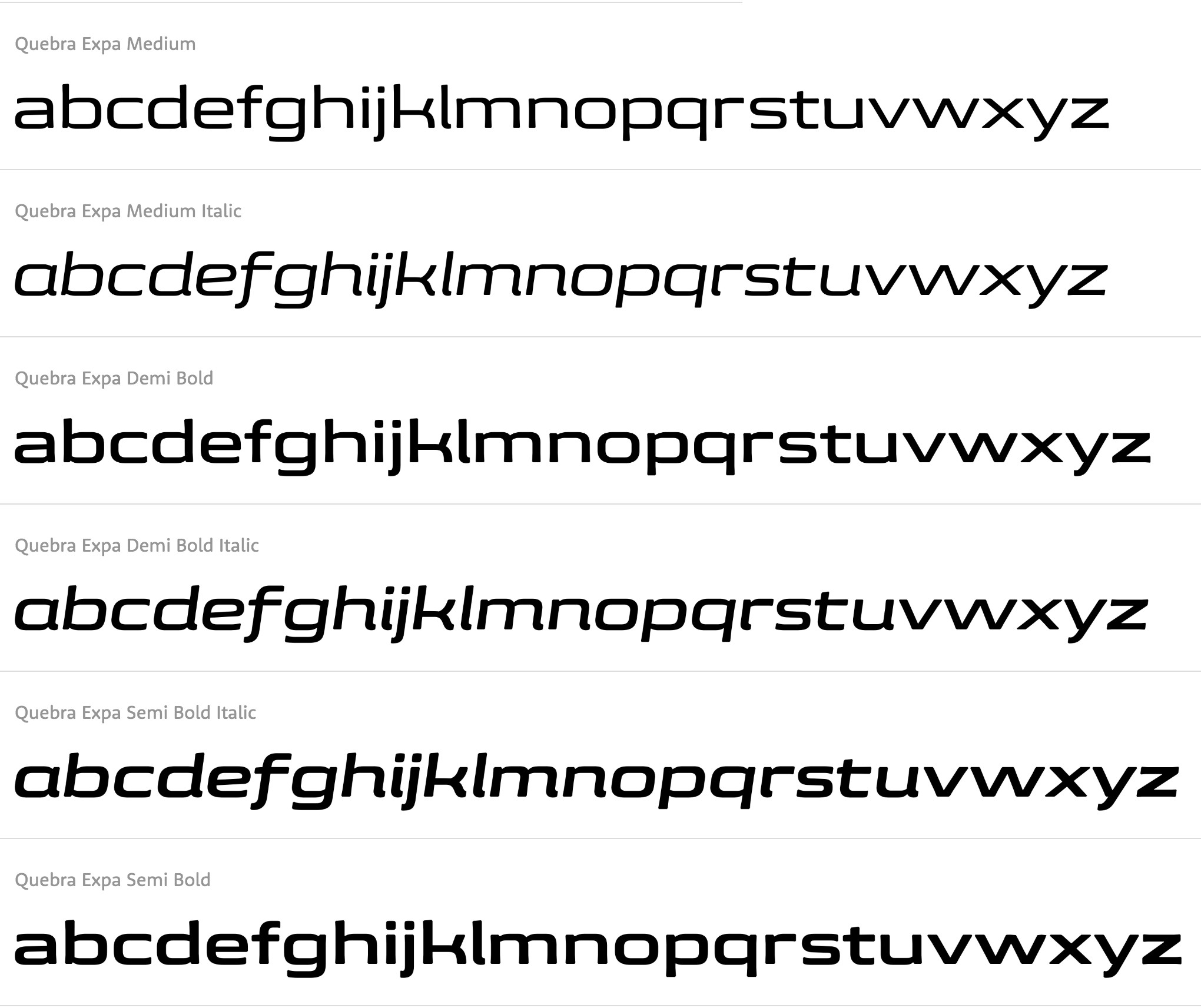
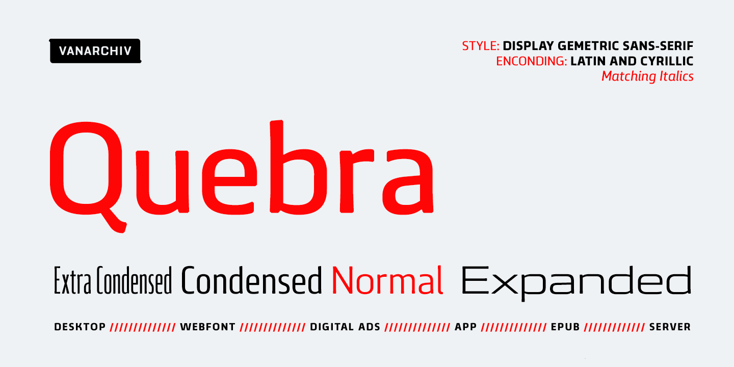
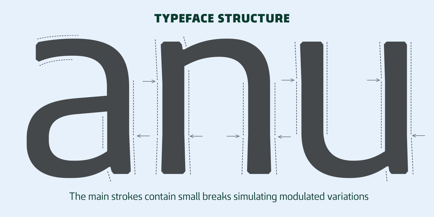
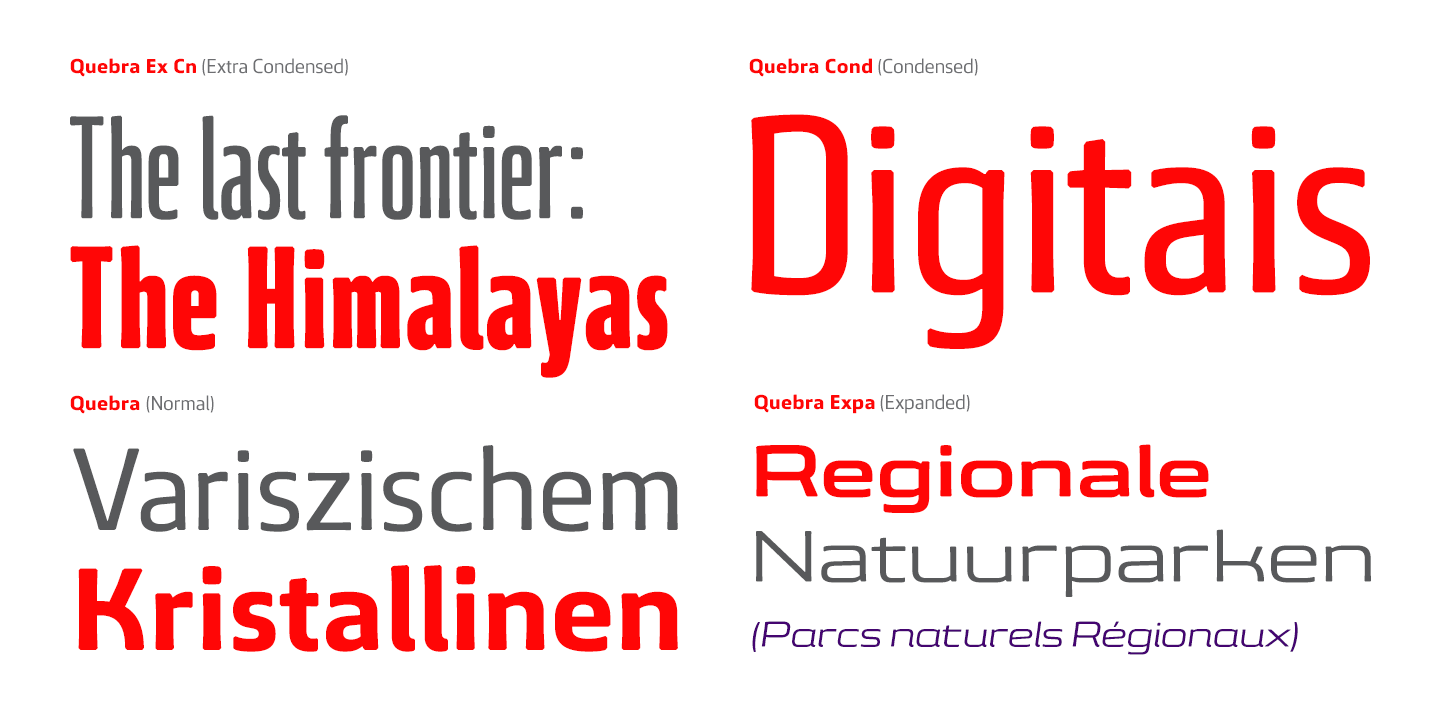
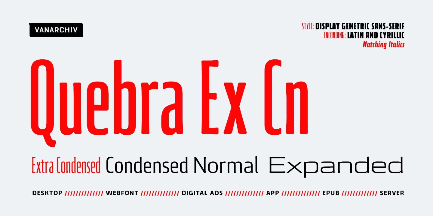
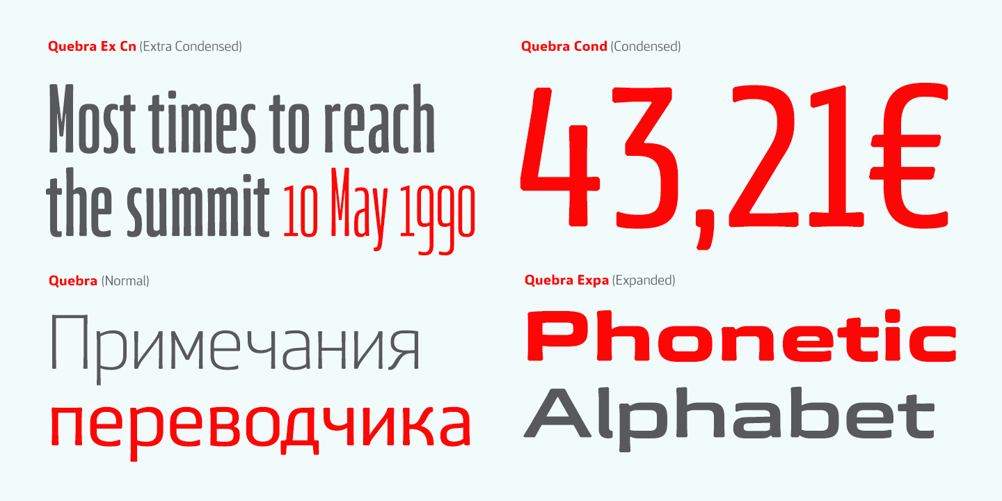
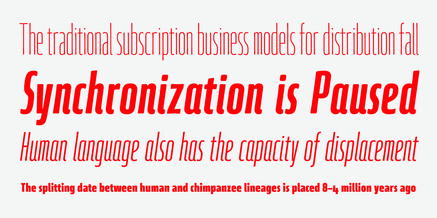
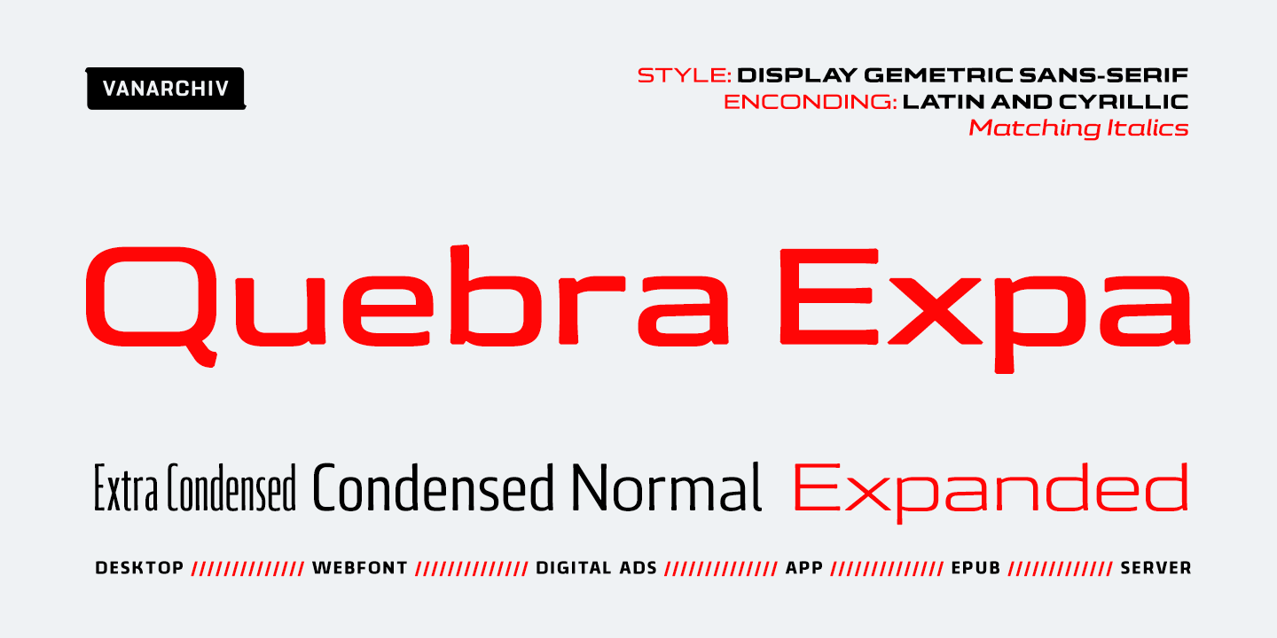
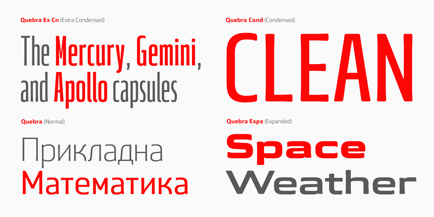
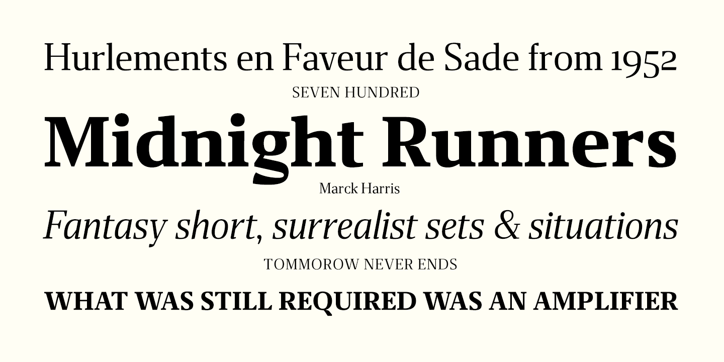
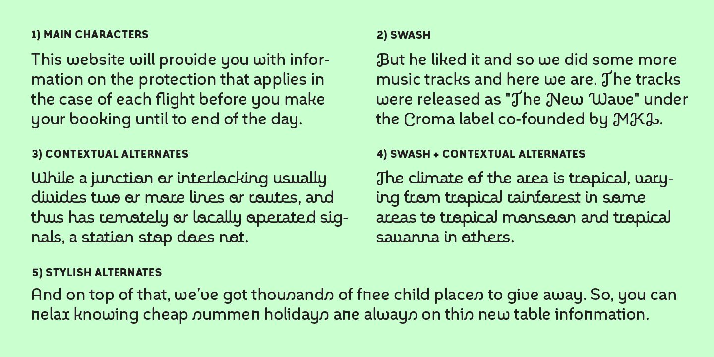
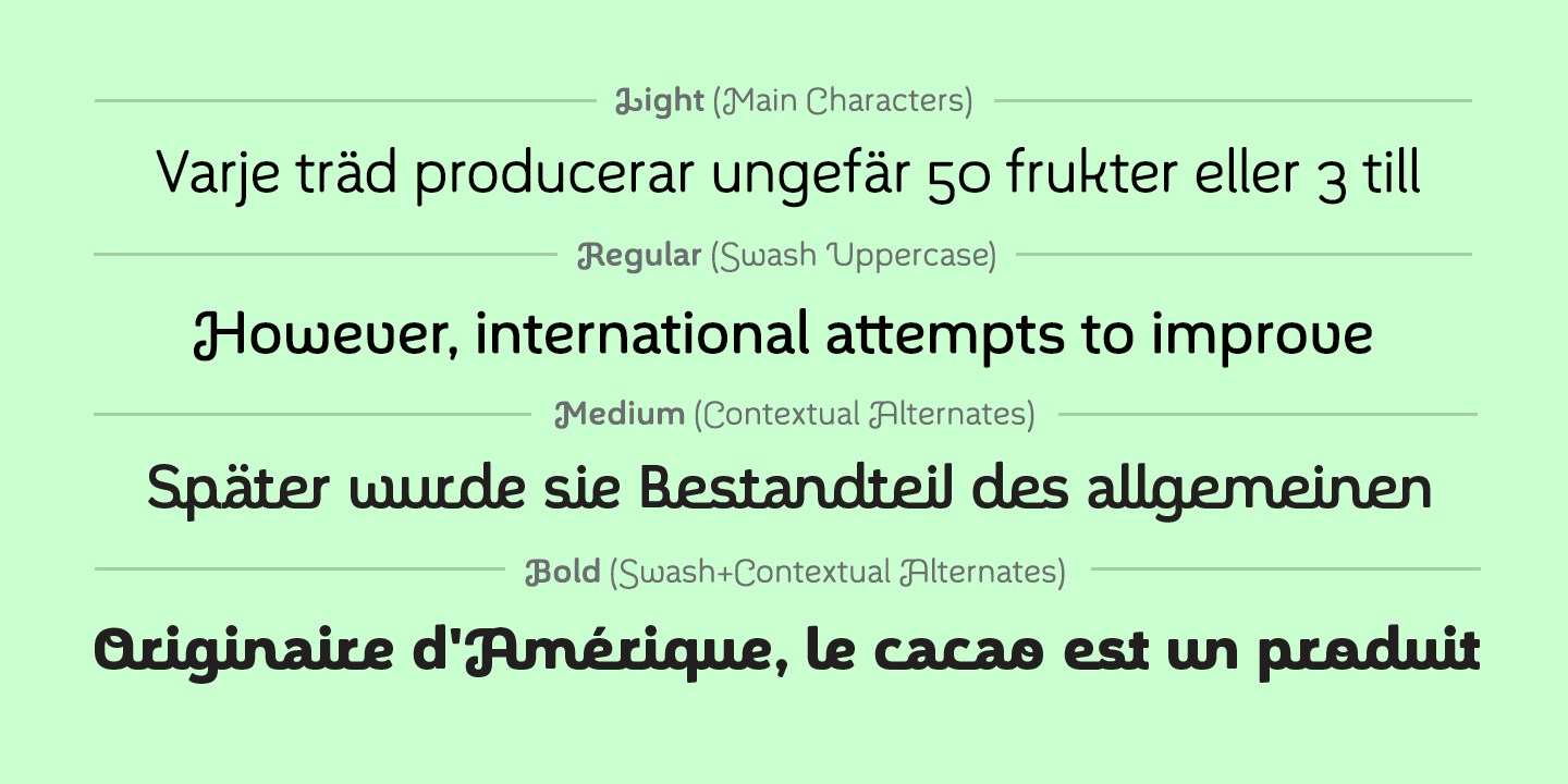
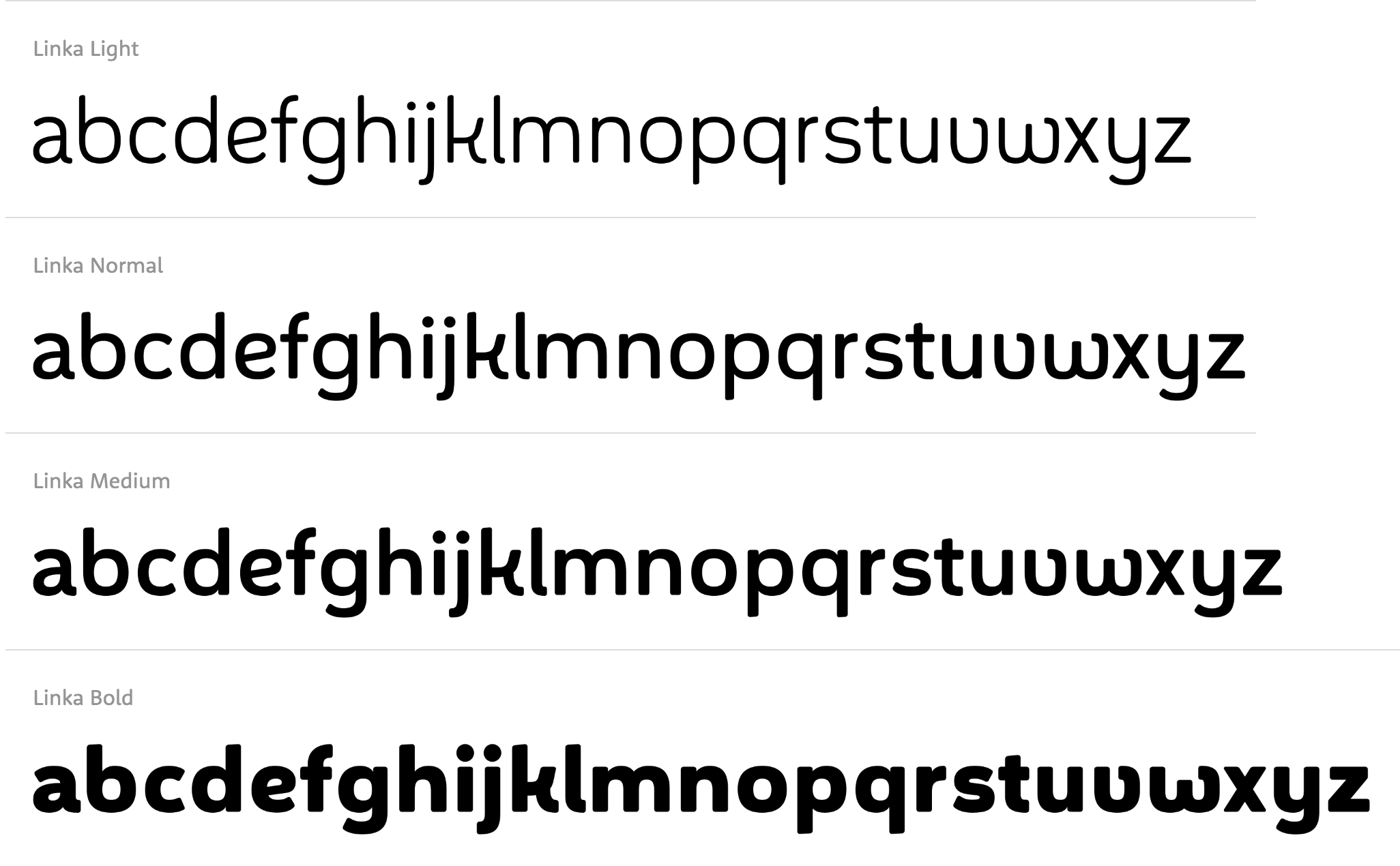
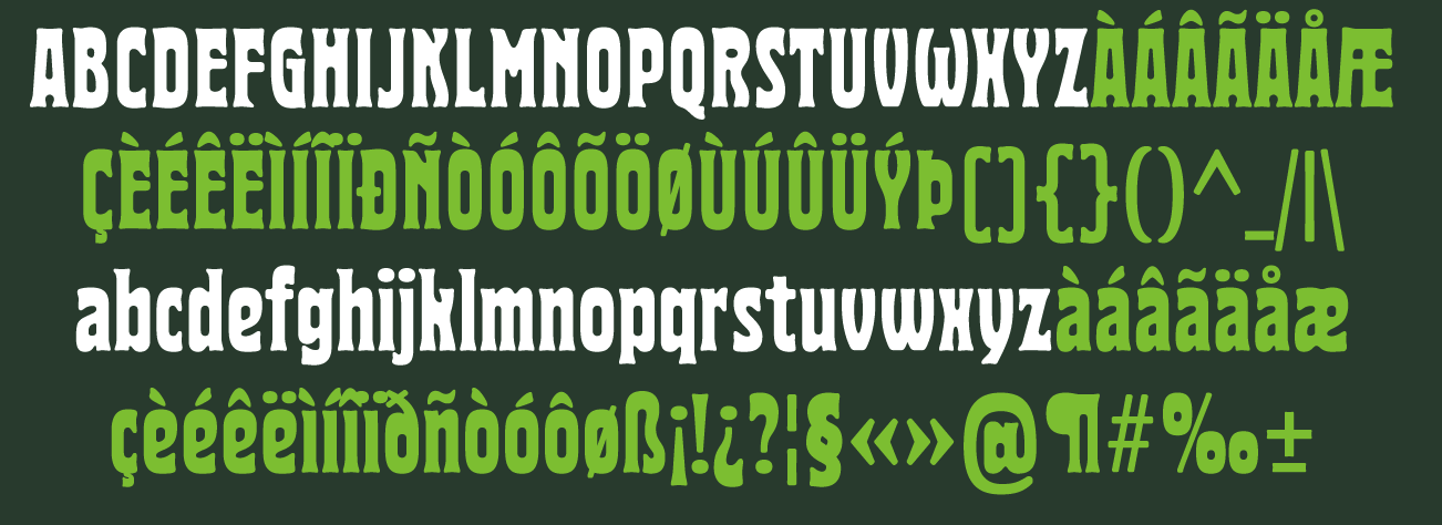
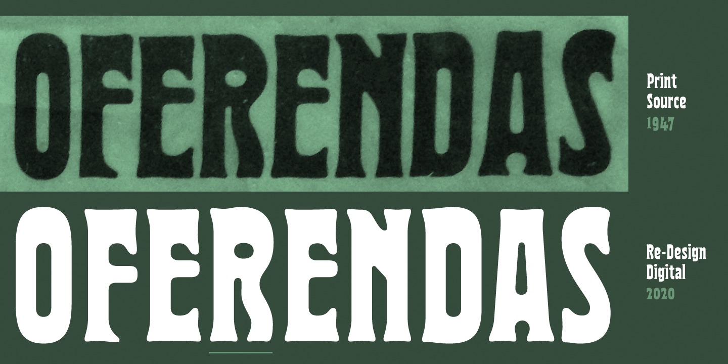
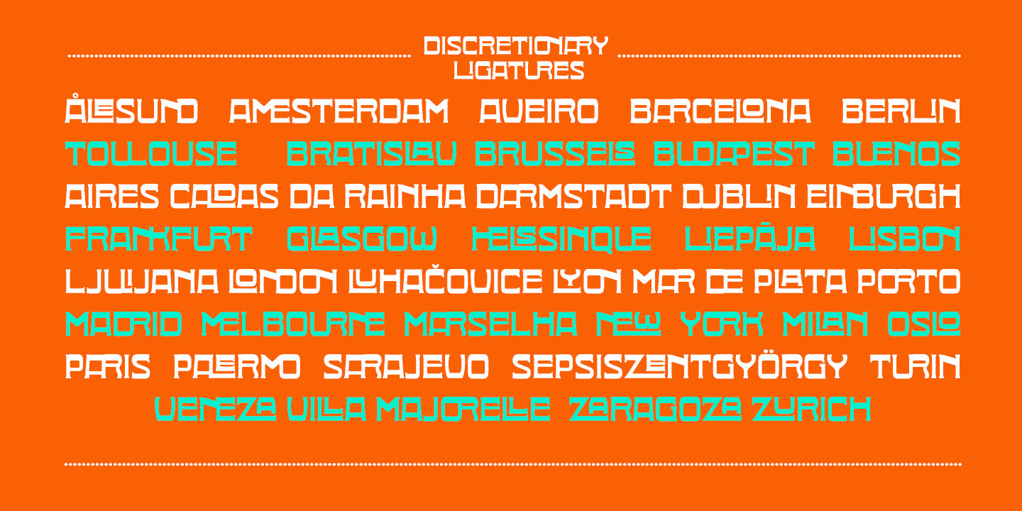
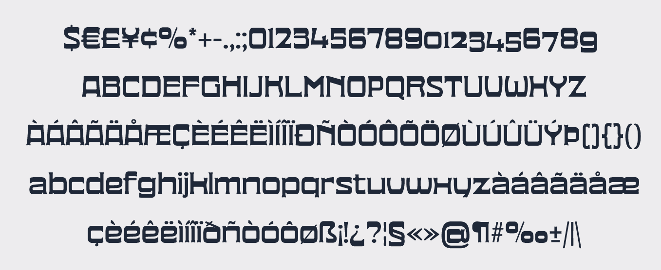
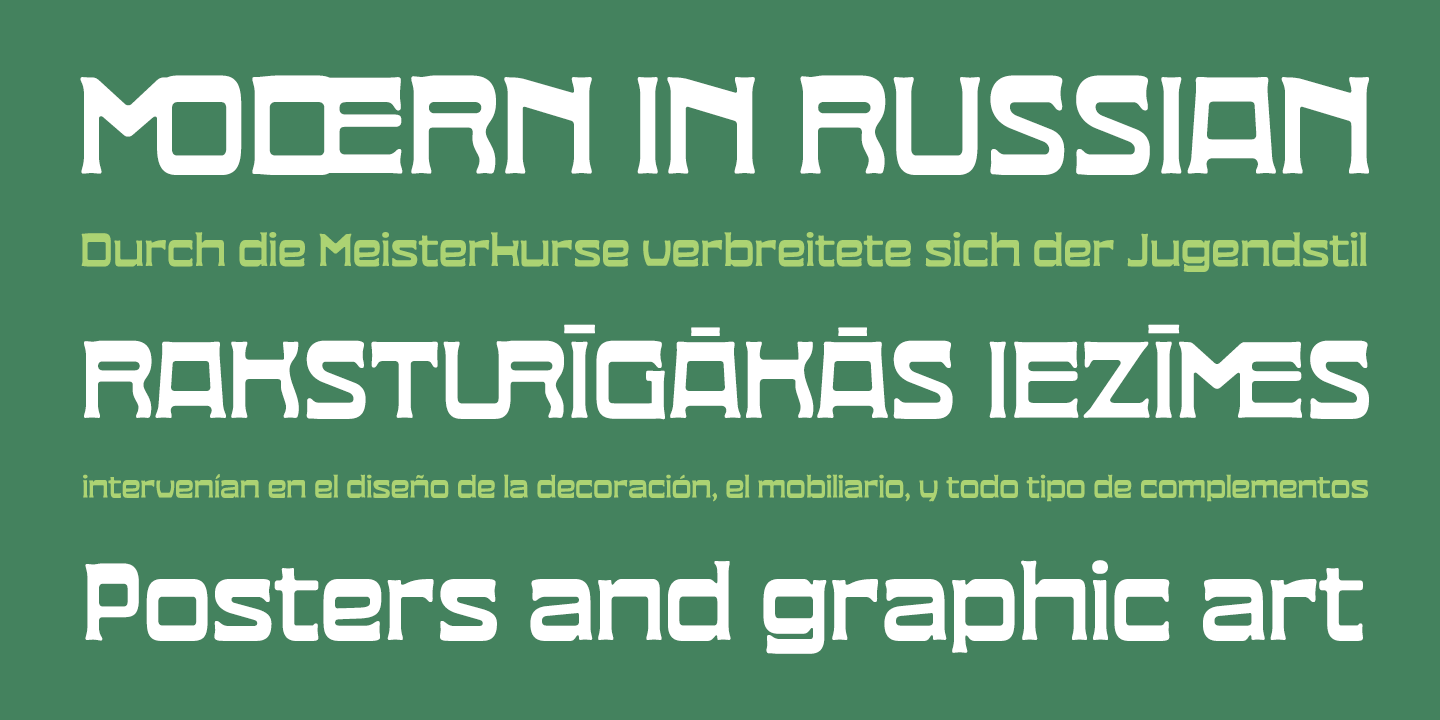
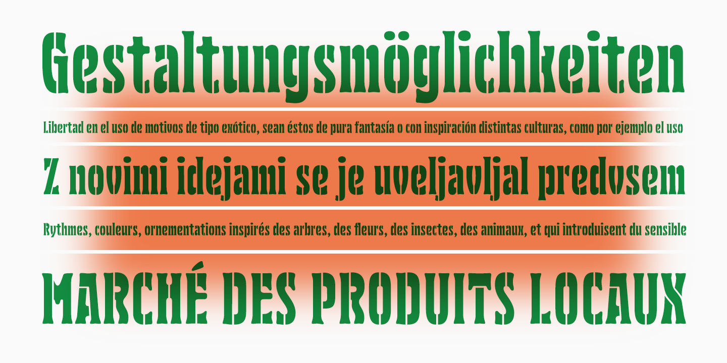
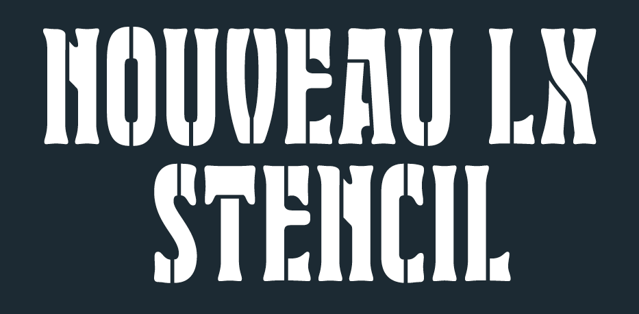
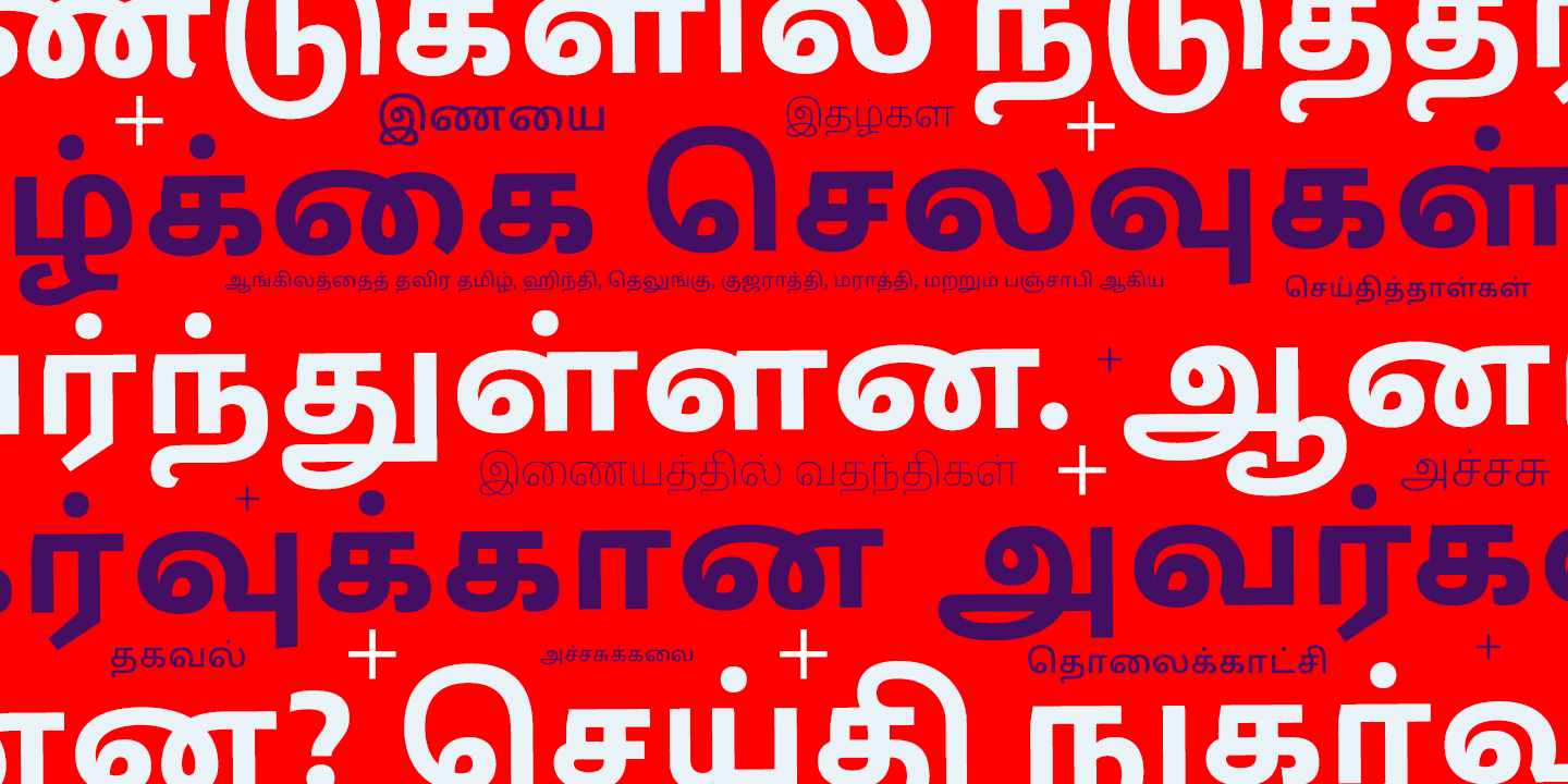
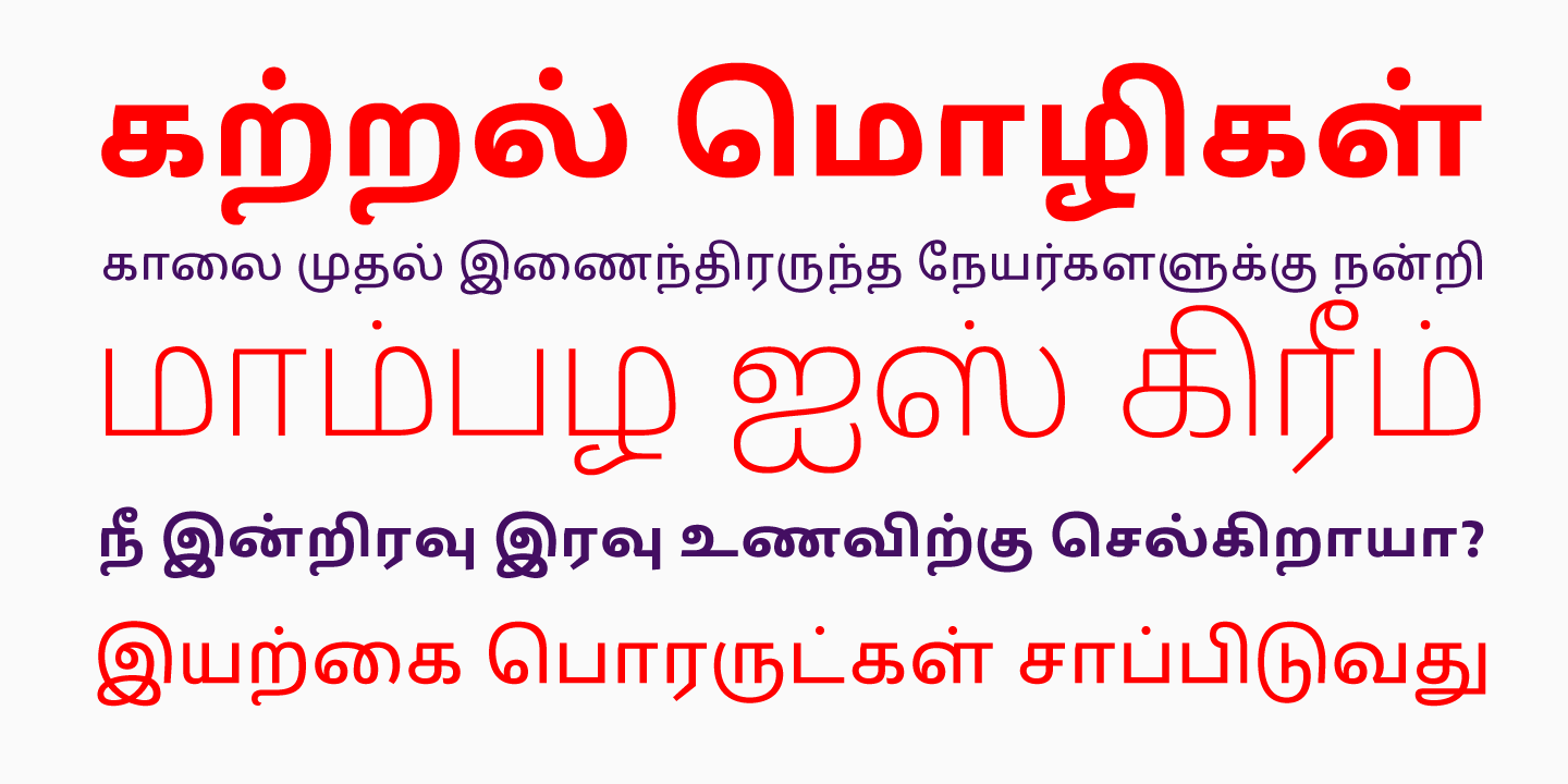
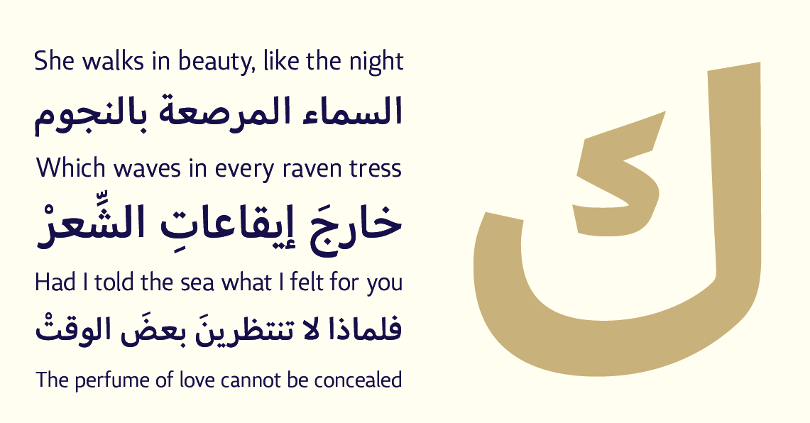
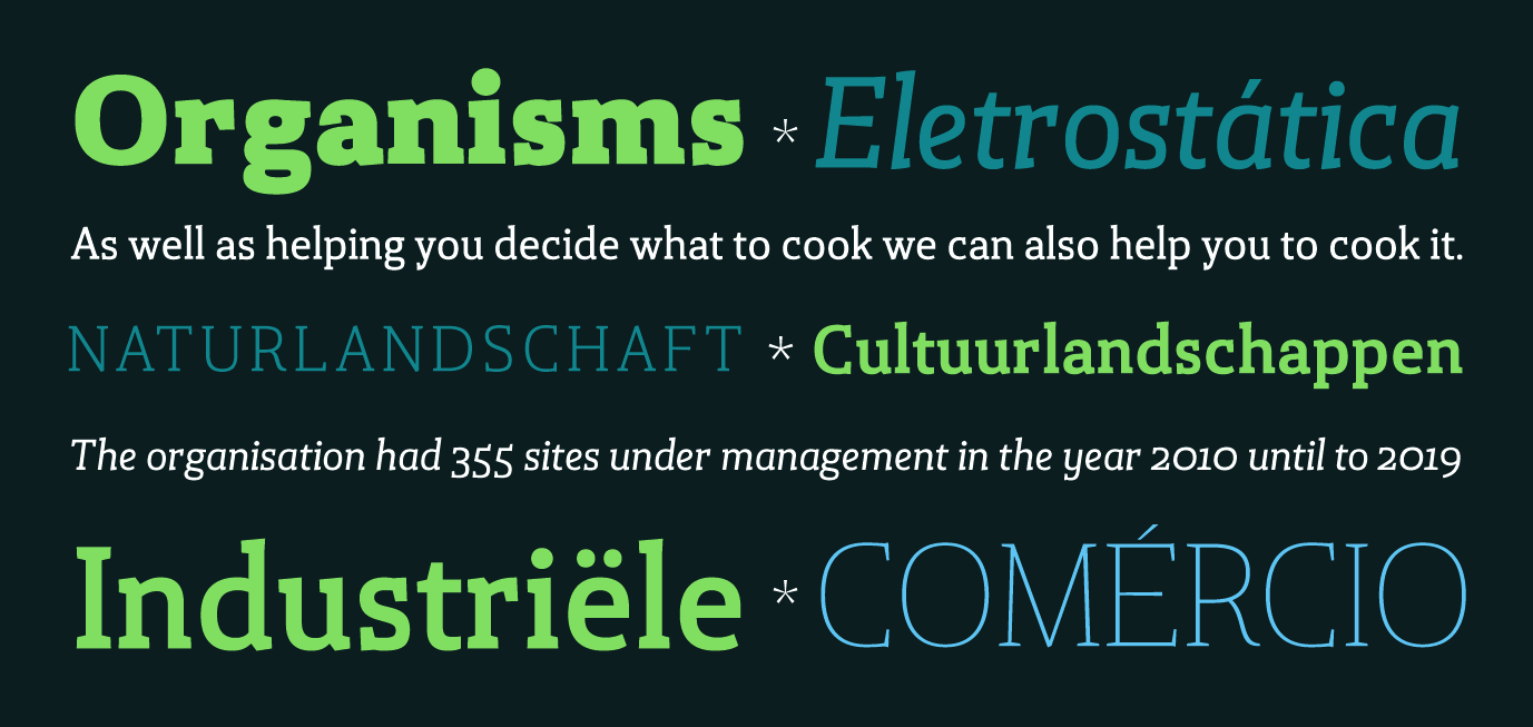
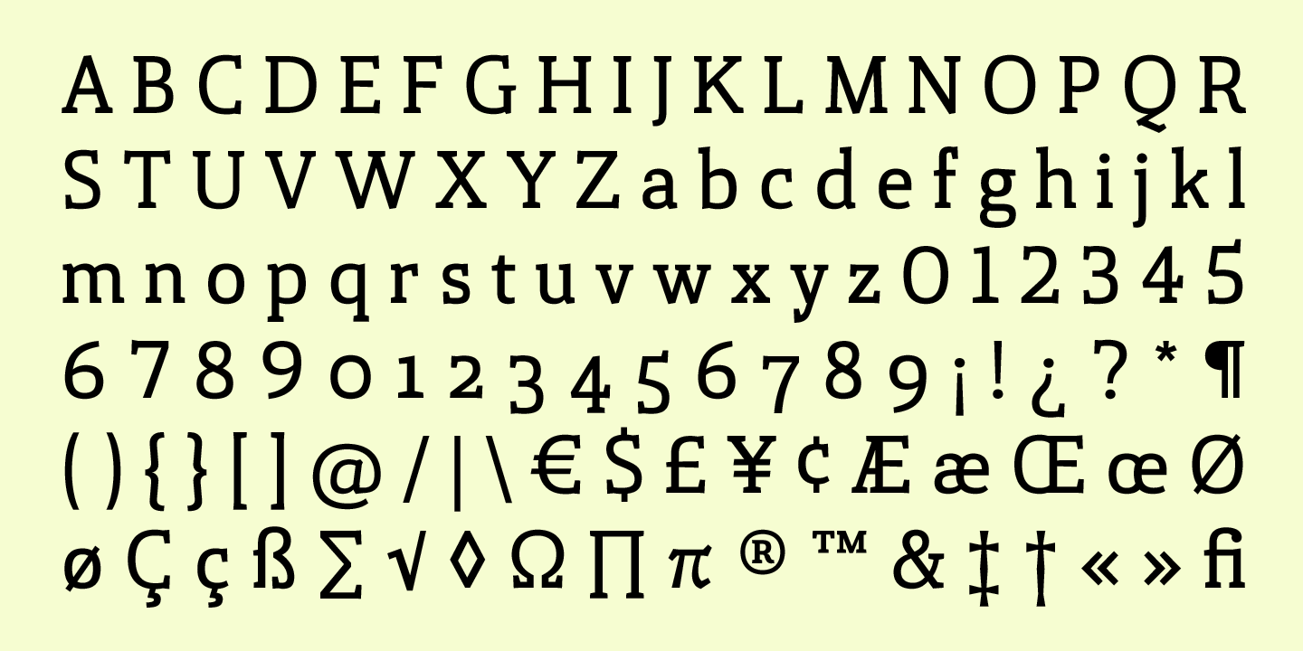
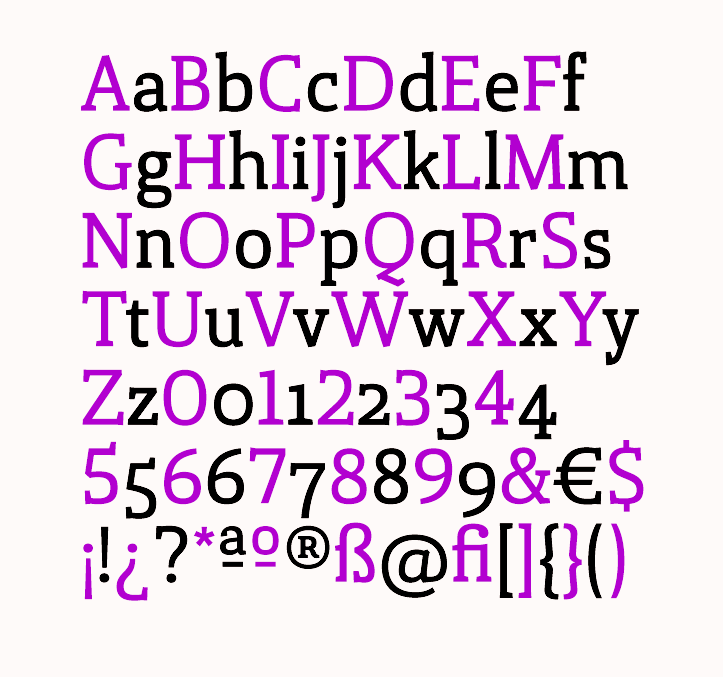
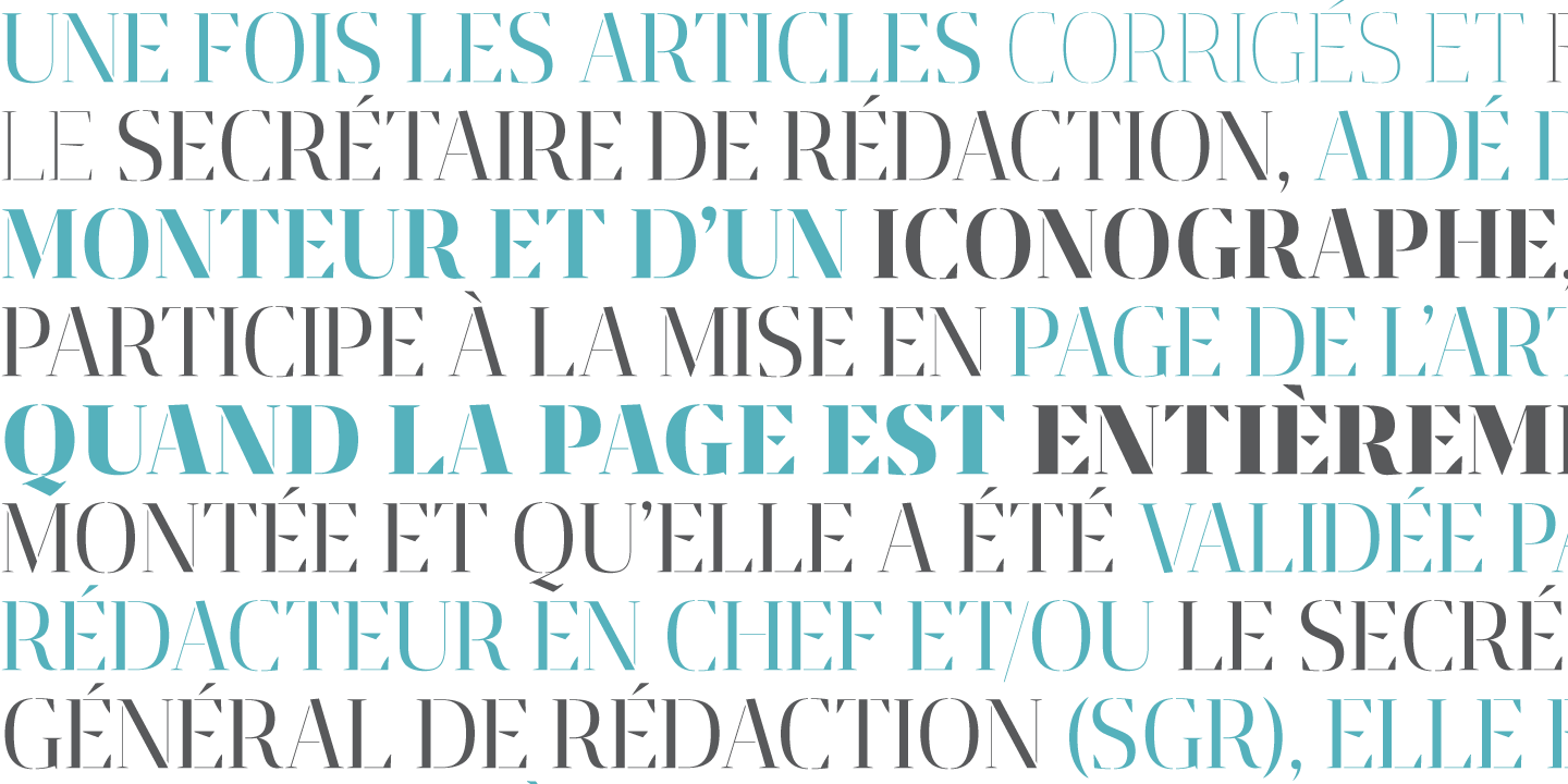
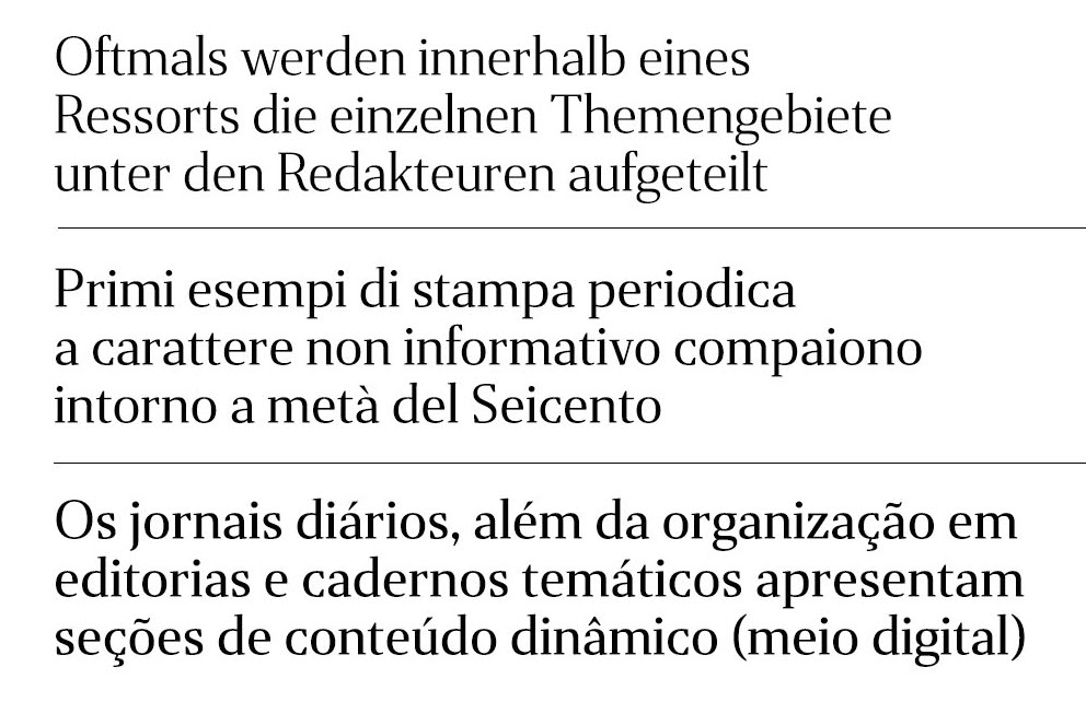
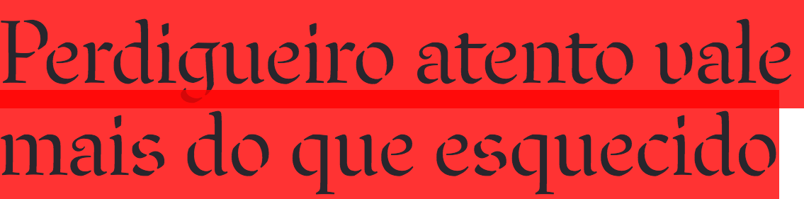
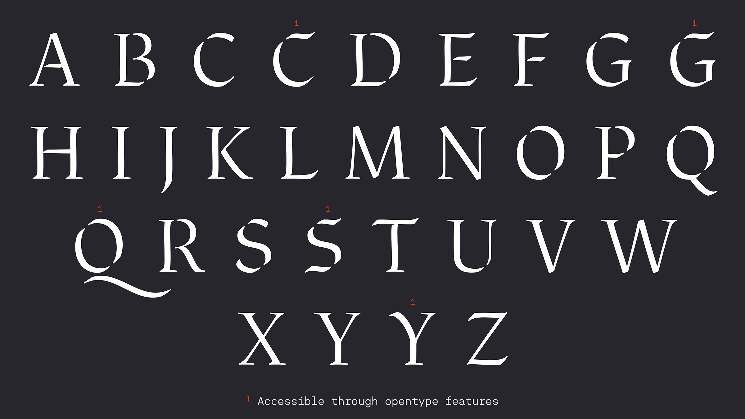
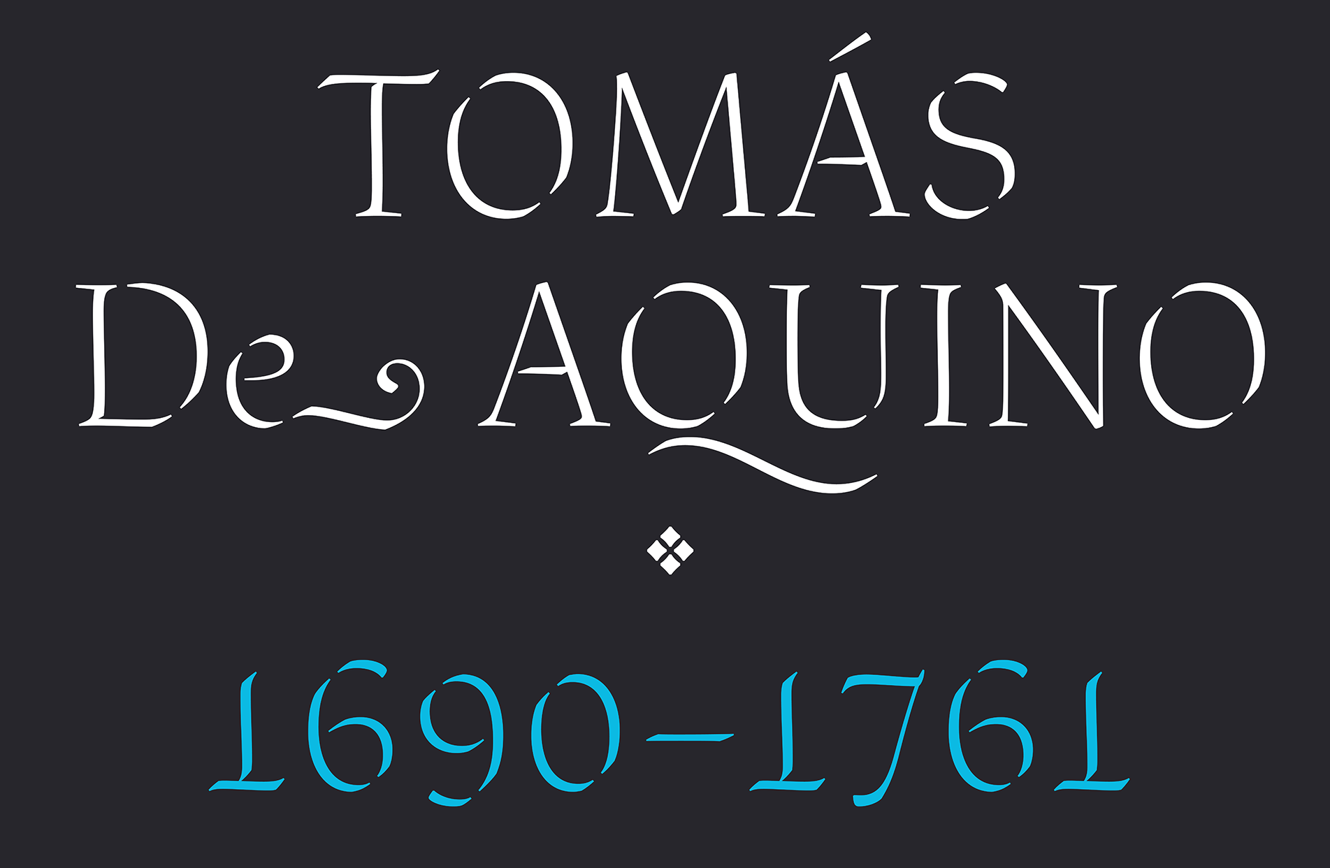
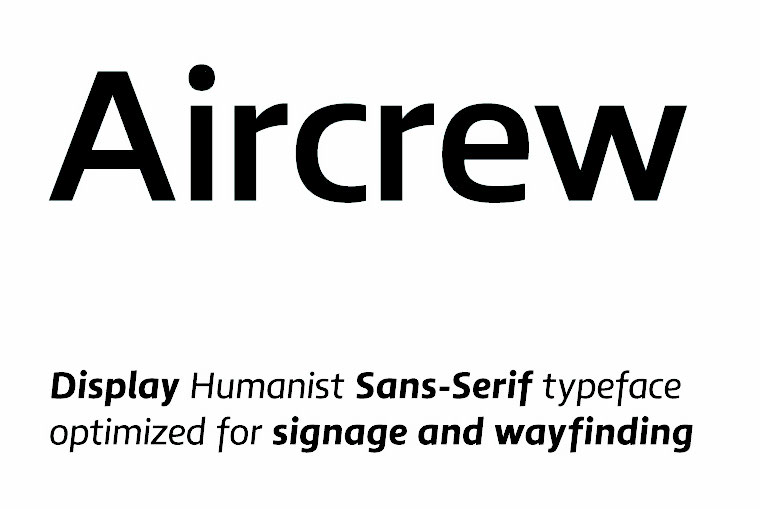
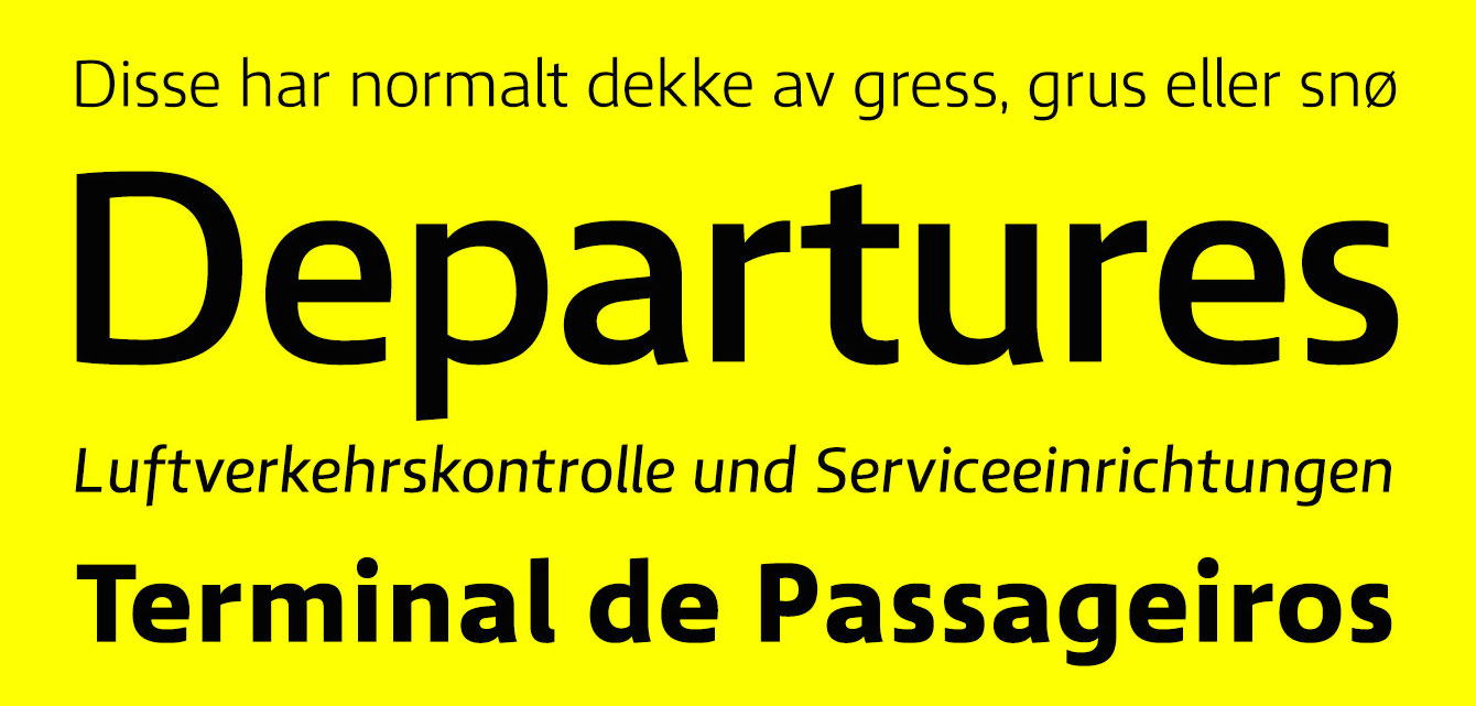
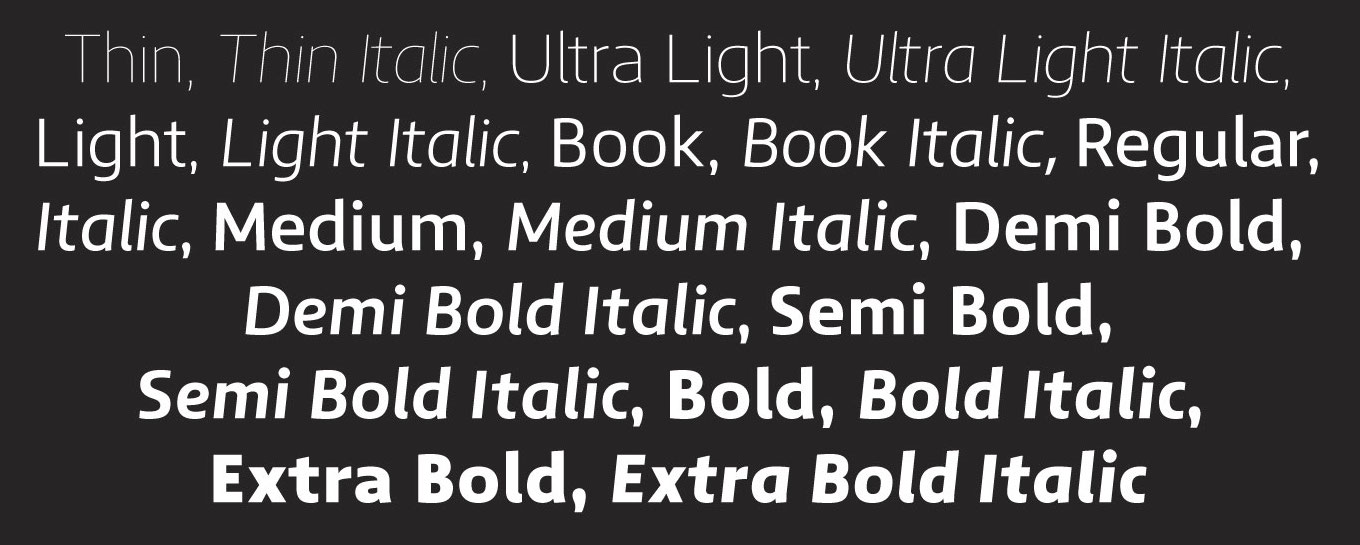
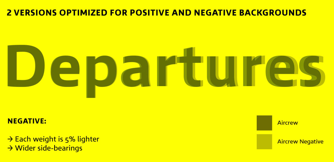
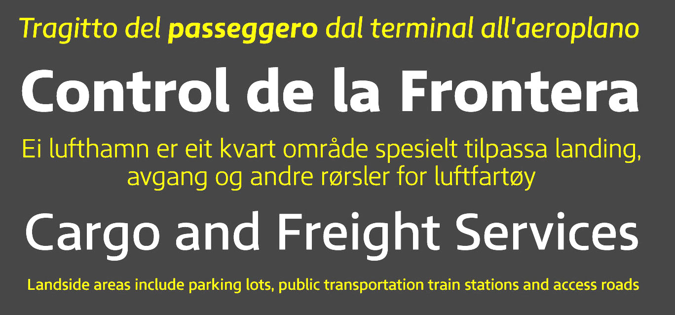
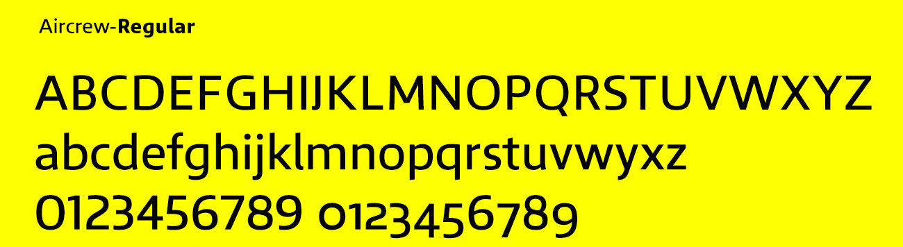
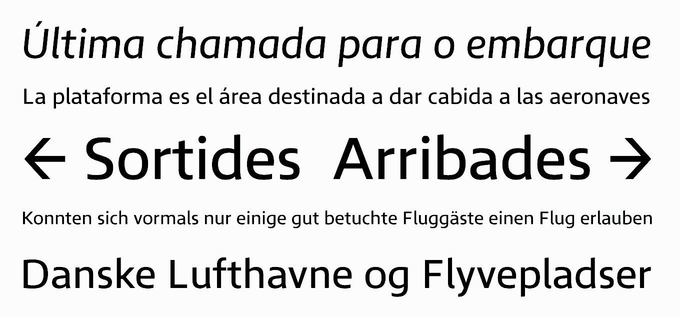
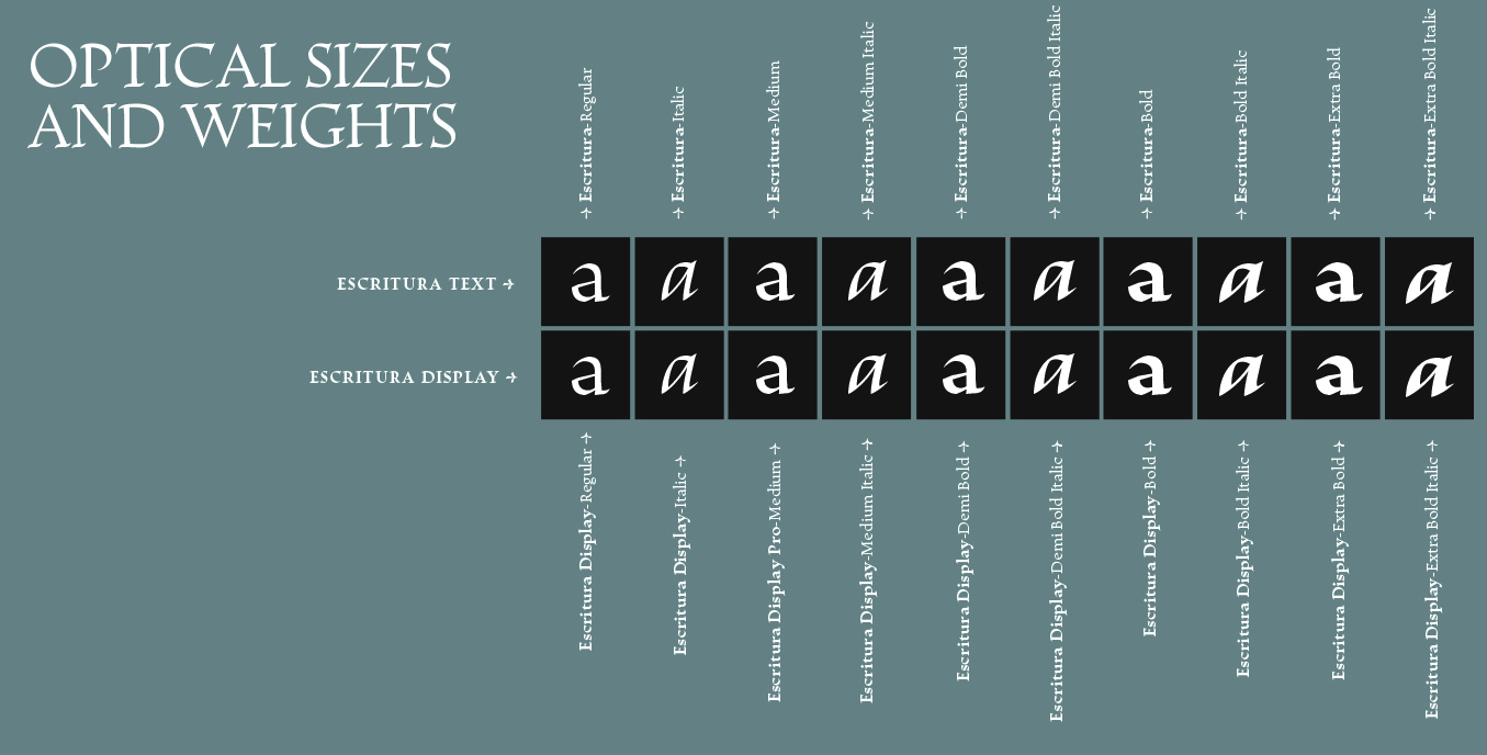
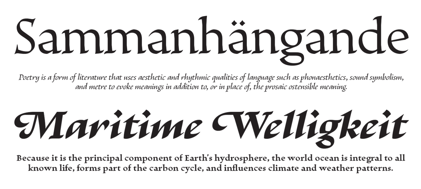
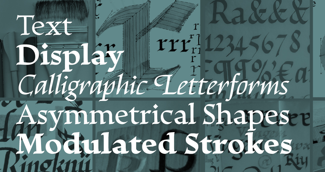
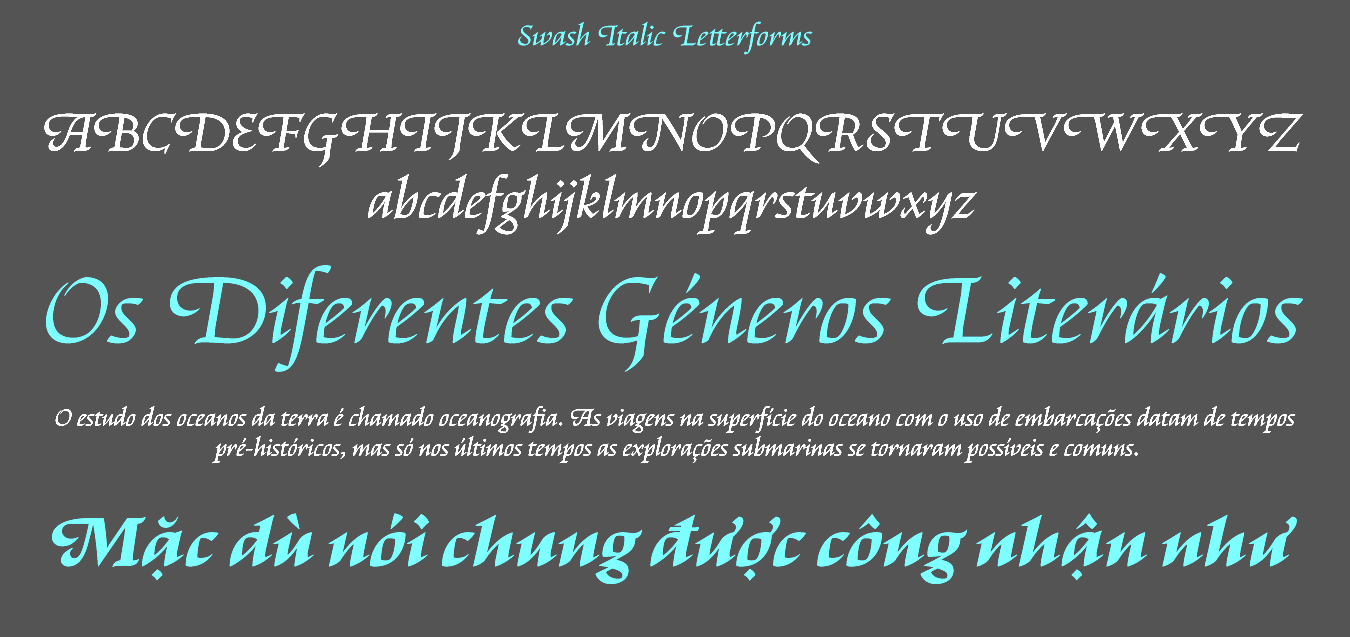
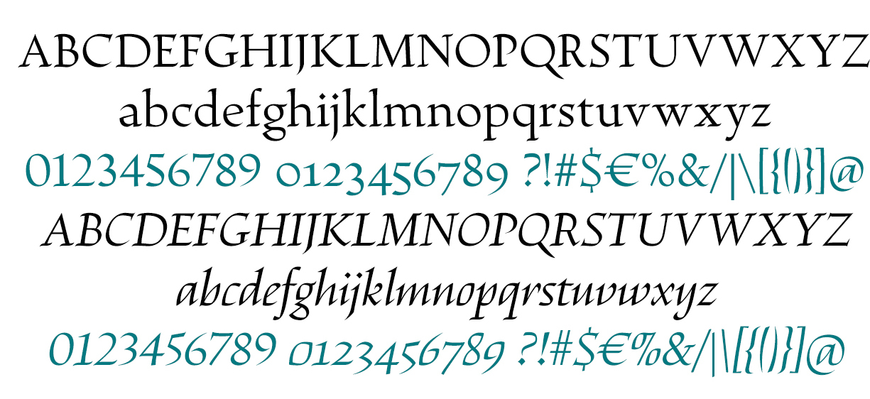
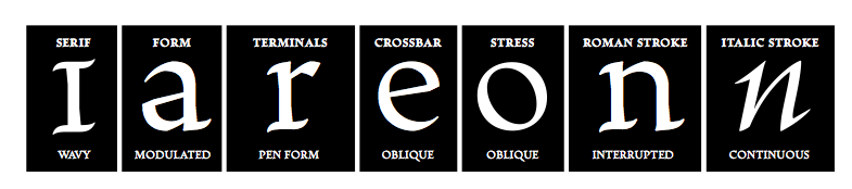
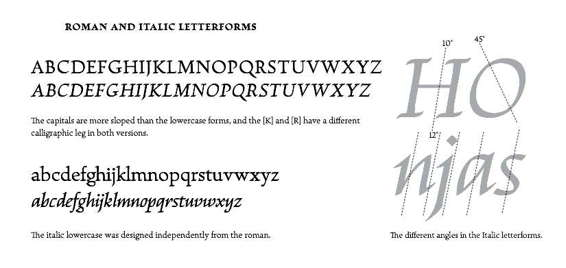
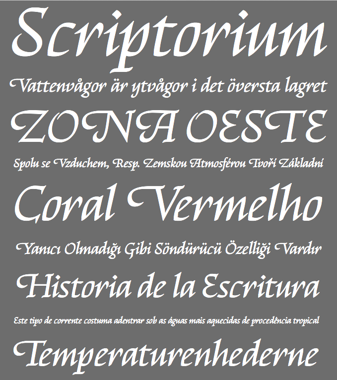
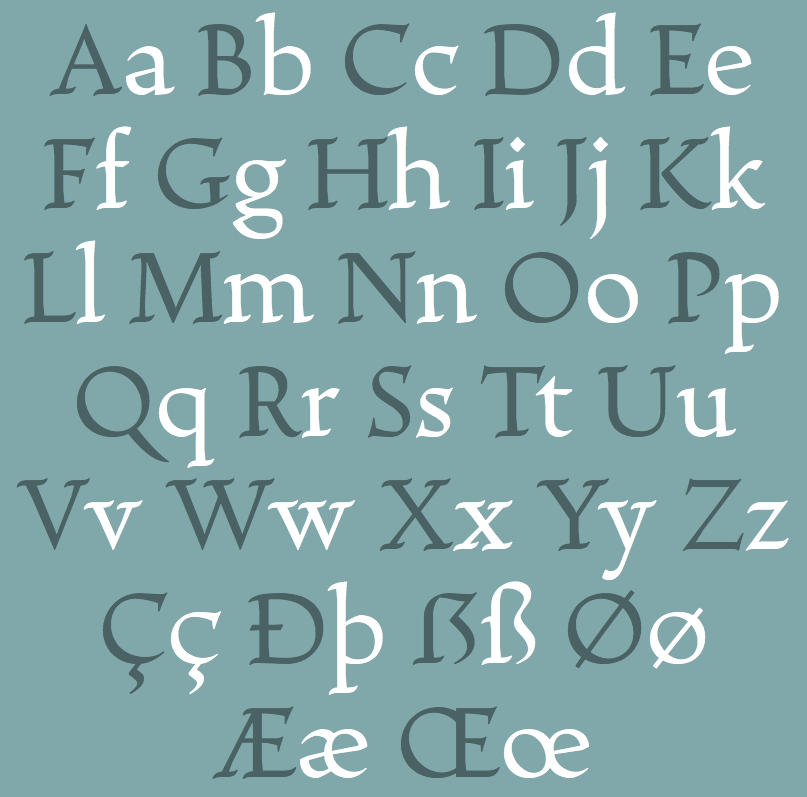
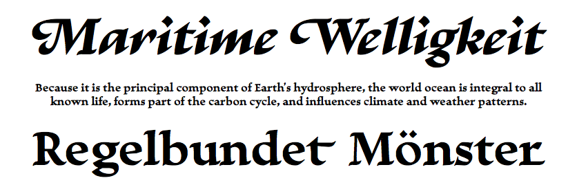
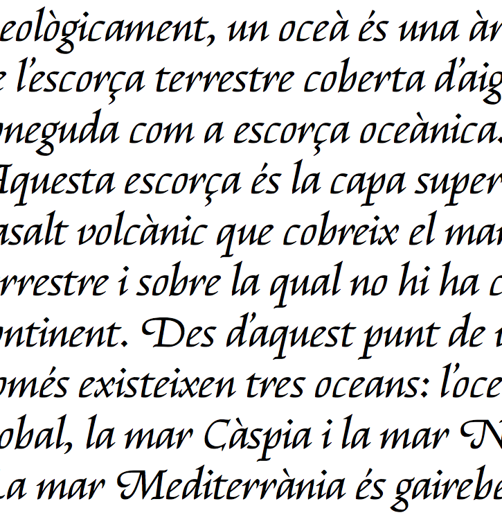
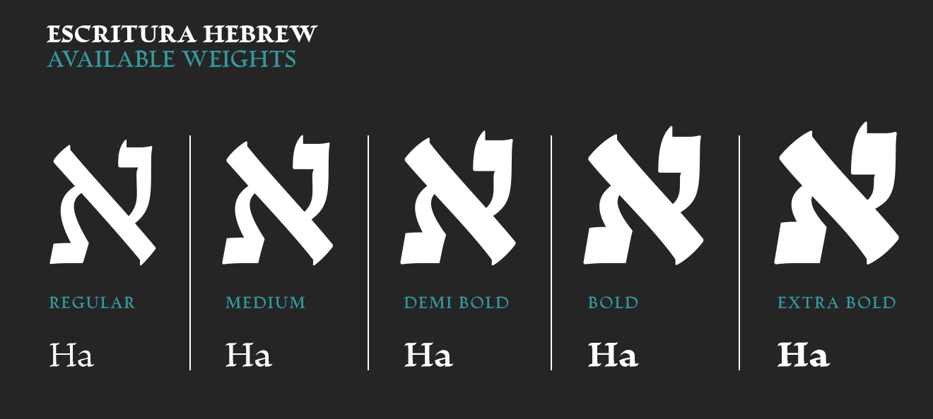
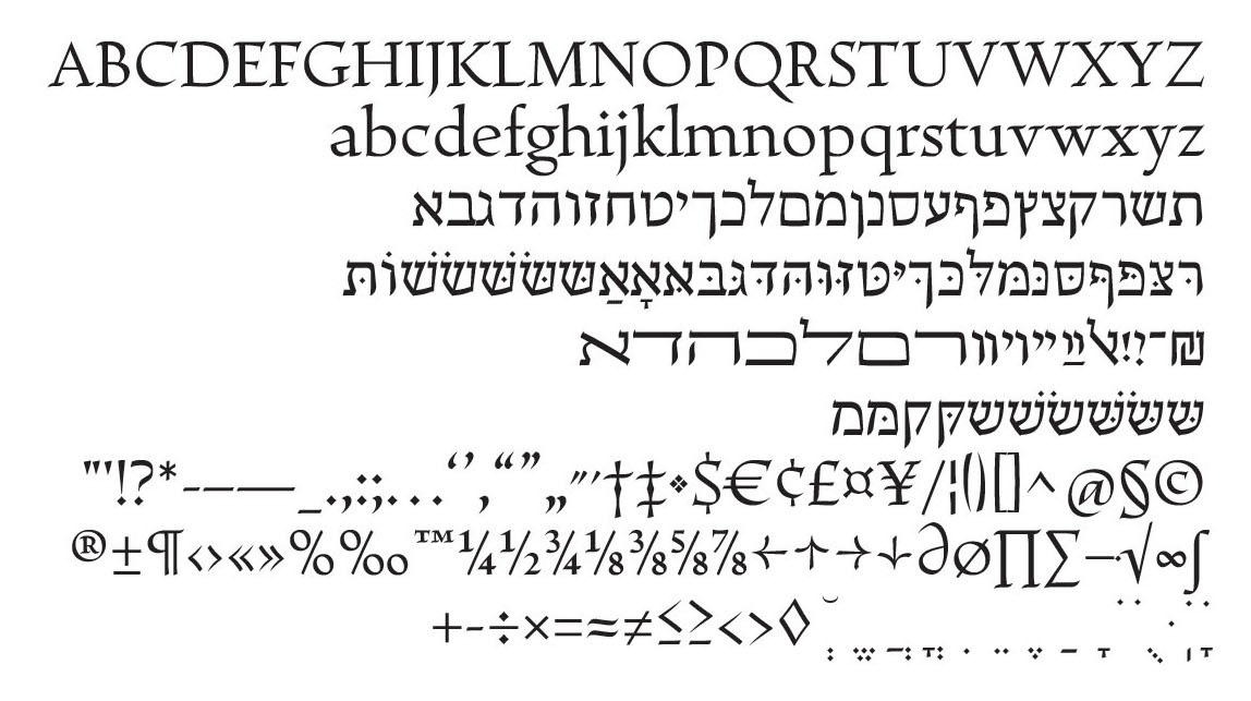
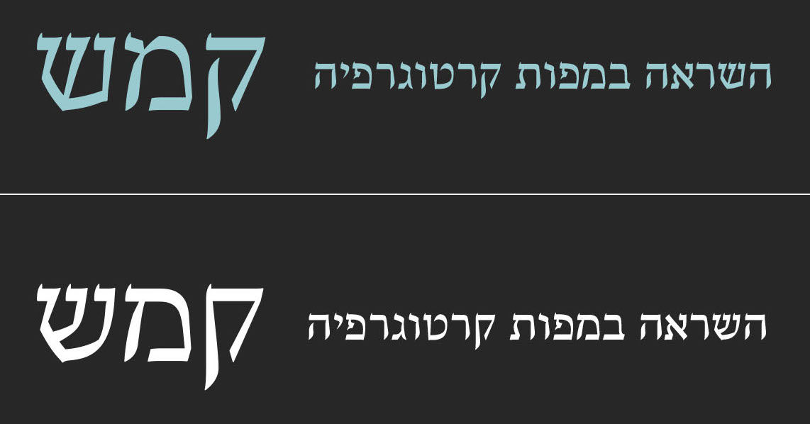
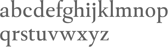
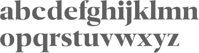
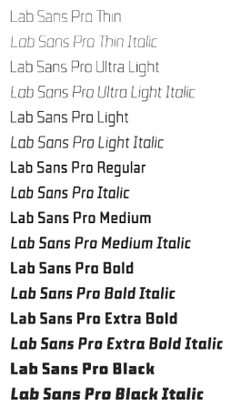
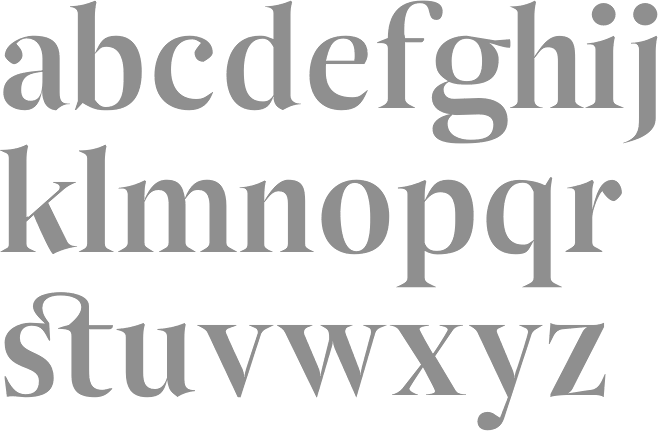
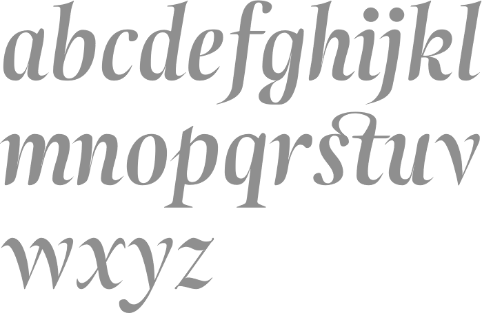
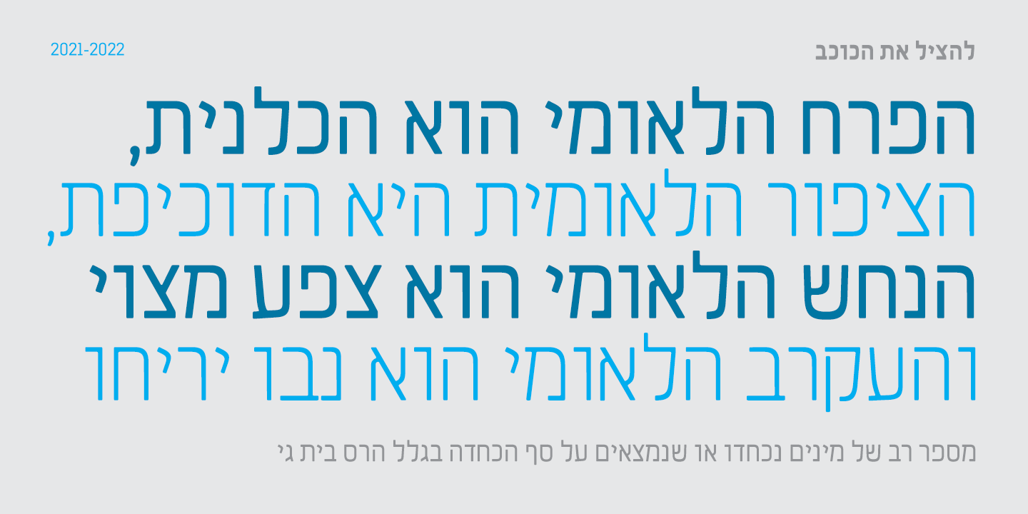
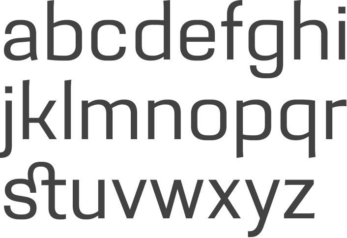
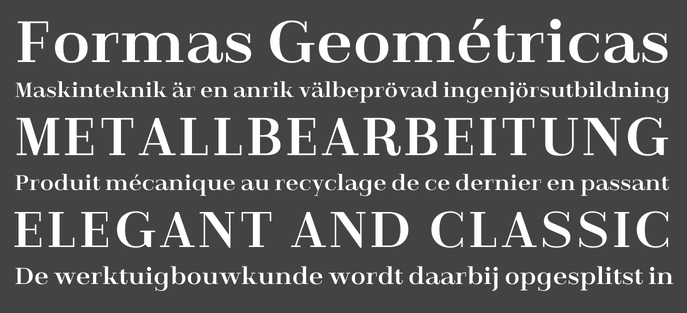
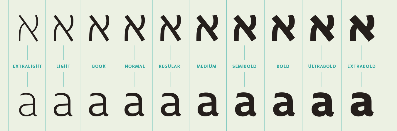
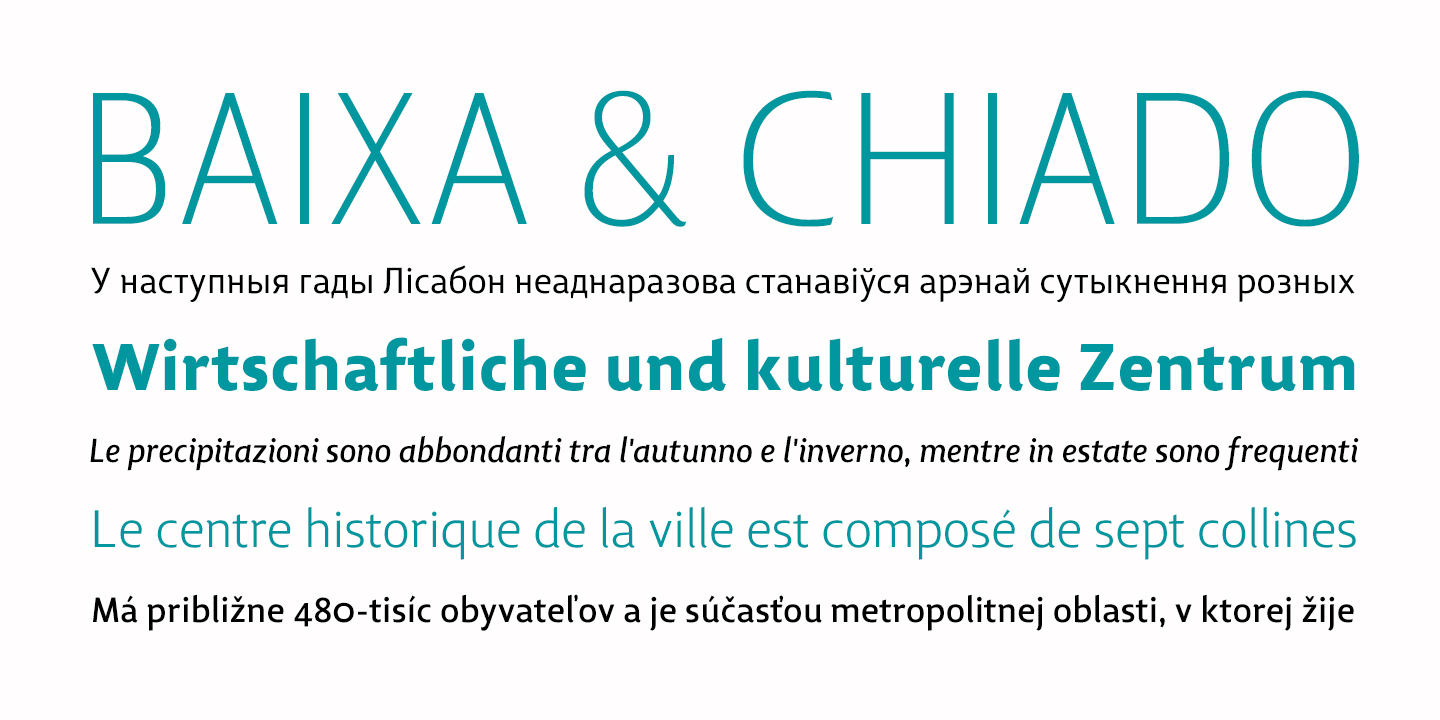
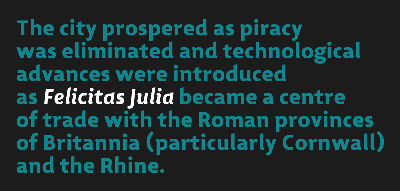
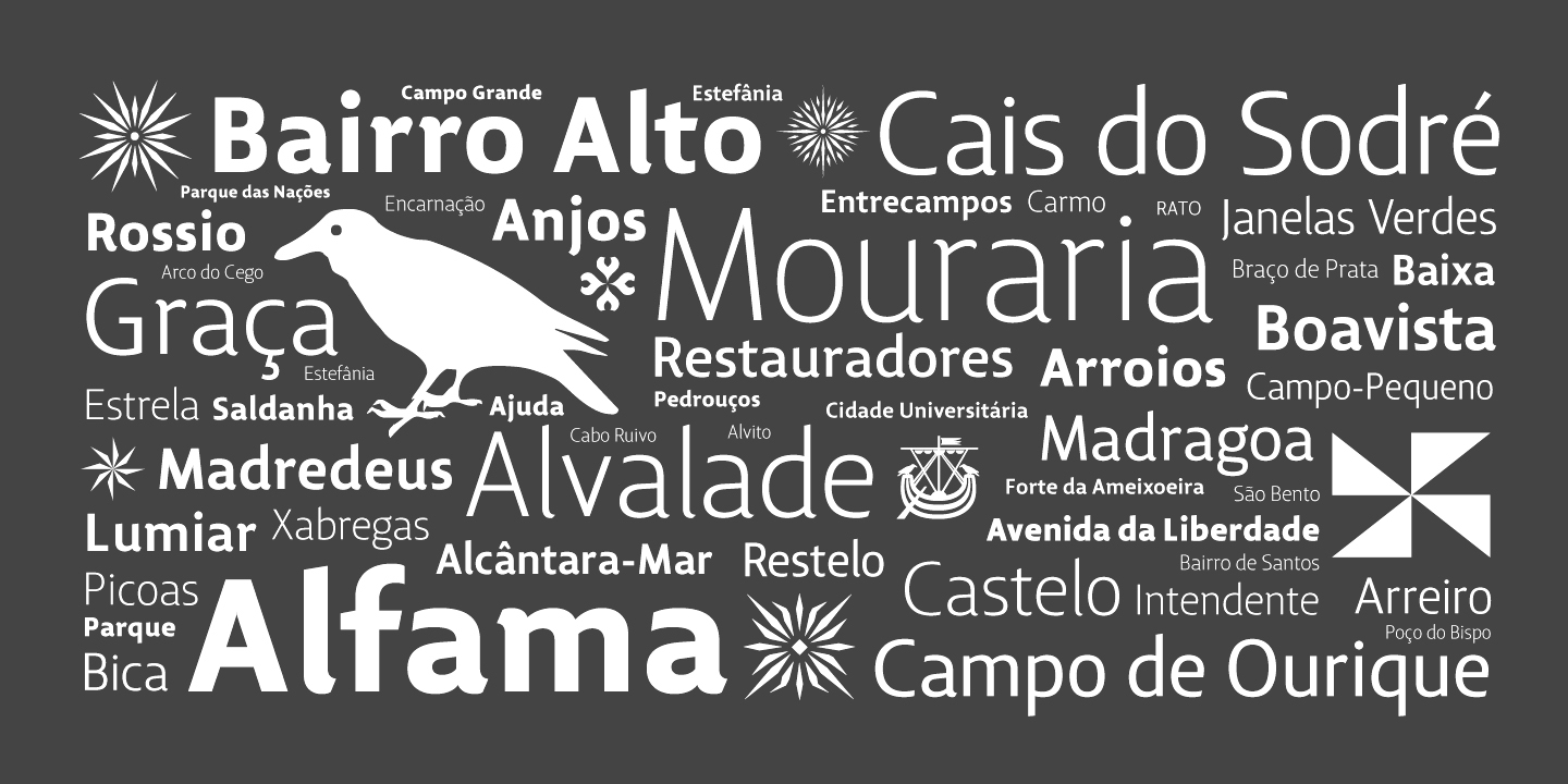
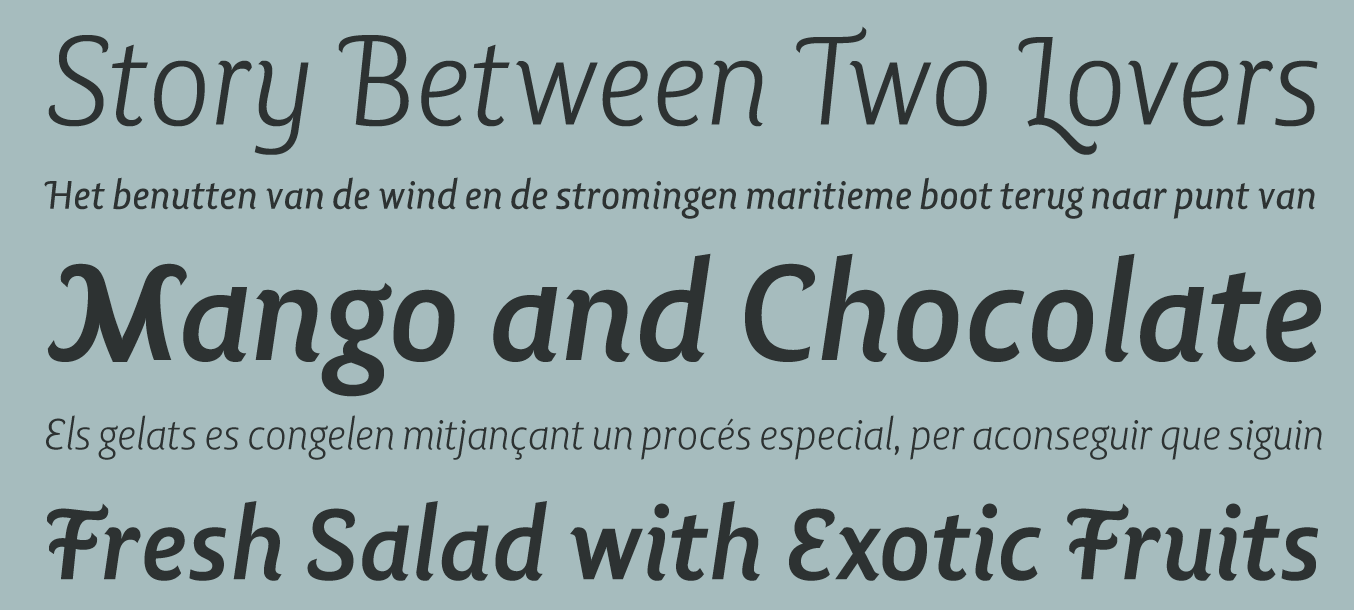
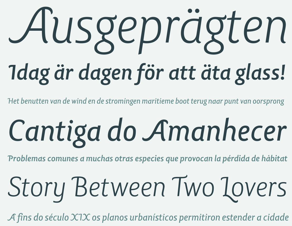
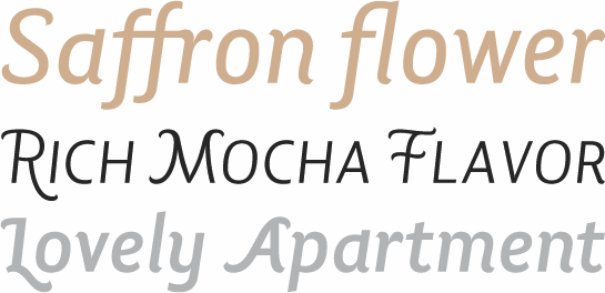
Ricardo Rodrigues dos Santos (or just Ricardo Santos, b. 1976 in Lisbon) is a Portuguese type designer. He ran VanArchiv (est. 2000) from Loures, Portugal. He changed the name to Ricardo Santos and sells his work through MyFonts. In 2014, Aprígio Morgado, Ricardo Santos and Rúben Dias cofounded Tipos dasLetras in Lisbon. Klingspor link. Behance link. FontShop link. Ricardo's early masterpiece is Atlantica (2005), a 28-weight transitional family. His typefaces Insectos Project (1997, geometric sans) Base Geometric Sans Serif (1998, geometric sans) Focus (1999, geometric sans) and Zeit Geist (2000, decorative) are discussed by a type forum. He made the sans families Boom (1997, decorative), Van (1998-2001, geometric sans) Urbis (2001, geometric sans) Baseniv (2001), geometric sans) RS1 (1998, decorative), Mitron (2001, decorative) Van Condensed (1998-2004, geometric sans), Van Dingbats (2004, travel dingbats), Focus and Focus Dingbats (2006, sans), and Lisboa (2000-2005, a humanist sans, with dingbats based on the symbology of Lisbon city, published with Fountain, and later at Vanarchiv as Lisboa Swash (2015), Lisboa (2017), Lisboa Sans (2017), Lisboa Tamil (2018). Lisboa Sans Tamil (2019), and Lisboa Hebrew (2018)). At Tiponautas: Lab Sans Pro (LuisAlonso+RicardoSantos--LabSlabPro-2011b.png">2011, by Luis Alonso and Ricardo Santos) is a geometric sans-serif typeface with a technological and minimalist look and is suitable for use in large sizes. Tramuntana 1 Pro (2012) was inspired by the late Renaissance and Manneiist spirit during 2009 for his Masters in Advanced Typography (Eina-Barcelona). This project was also inspired by Robert Granjon, Garamond and Sabon typefaces. The name tramuntana (Tramontane) is the Catalonian word for the cold wind that comes from the Pyrenees mountains and goes as far as the Balearic Islands. It was designed for editorial proposes (books and magazines). Tramuntana Dingbats (2012) is a set of artistic arrows. Typefaces at Tipos da Letras: TDL Ruha Hairline and Latin (2014, with Abrígio Morgada and Rúben Dias: a modern slab and wedge serif pair). See also TDL Ruha Crown (2017). In 2014, Ricardo Santos designed the geometric humanist sans typeface family Grafia Sans. Typefaces from 2015, at Tiponautas: Xaloc (a Latin text typeface with flaring and stroke modulation, divided over subfamilies called Caption, Text, Subhead and Display). At Vanarchiv, still in 2015, he published the 20-style calligraphic text families Escritura and Escritura Display. In Escritura, Santos worked in elements of chancery and renaissance writing, Its angular open letters make this typeface useful for texts. It was extended in 2017 to Escritura Hebrew. Typefaces from 2016: Aircrew (published at Tiponautas), which is a neutral, humanist sans-serif family optimized for wayfinding and signage applications in display sizes. Aircrew features large x-height, vertical terminals, low contrast, and short ascenders and descenders. Typefaces from 2017: Aquino (by Rui Abreu and Ricardo Santos; a display calligraphic stencil typeface inspired by a liturgic book made by Portuguese friar Tomas Aquino in 1735), Gazeta (text and editorial use). Typefaces from 2019: Gazeta Slab, Gazeta Stencil Ds, Lisboa Sans Hebrew, Lishbona Naskh (an Arabic typeface based on Lisboa Sans). Typefaces from 2020: Linka (2020: a rounded organic sans that can be morphed into a linked cursive script, complete with initial, medial and final forms), Linka Stencil (2020), Nouveau LX Expanded, Nouveau LX Stencil, Nouveau LX (based on Hermann Hoffmann's Herold (1913, Berthold), but with a different capital R). Typefaces from 2021: Miragem (an 18-style serif typeface with wedgy terminals), Typefaces from 2022: Quebra Expa, Quebra Ex Condensed, Quebra (a large slightly techno sans family with large squarish counters), Van Condensed Hebrew. |
EXTERNAL LINKS |
| | |


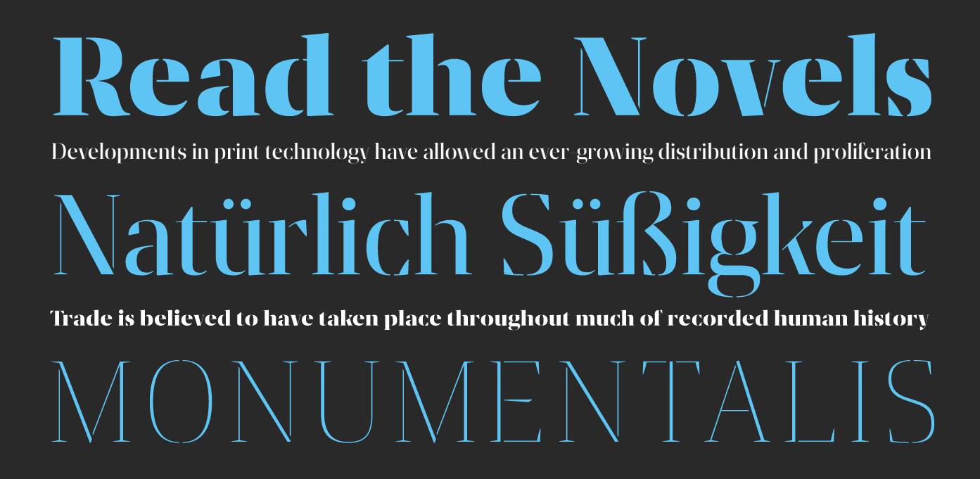
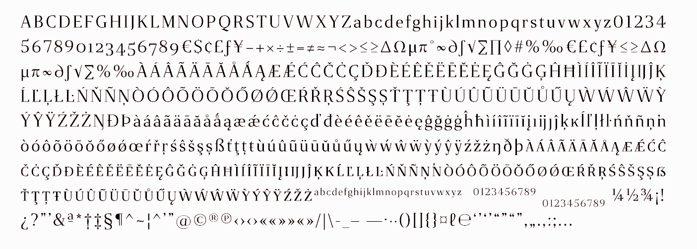
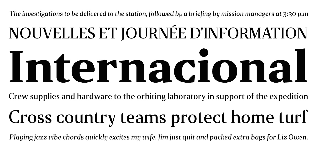
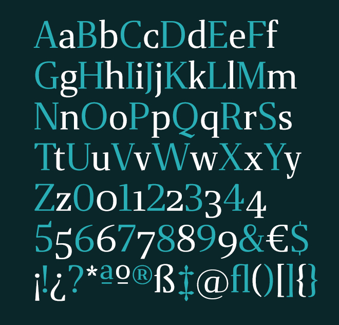
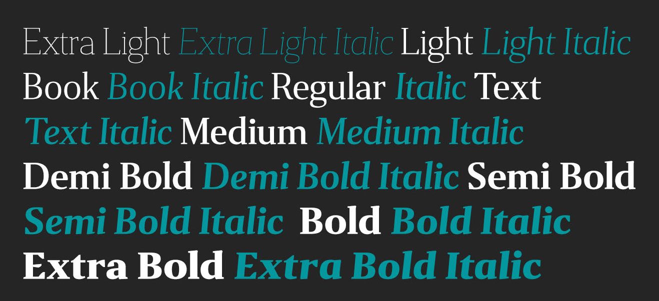
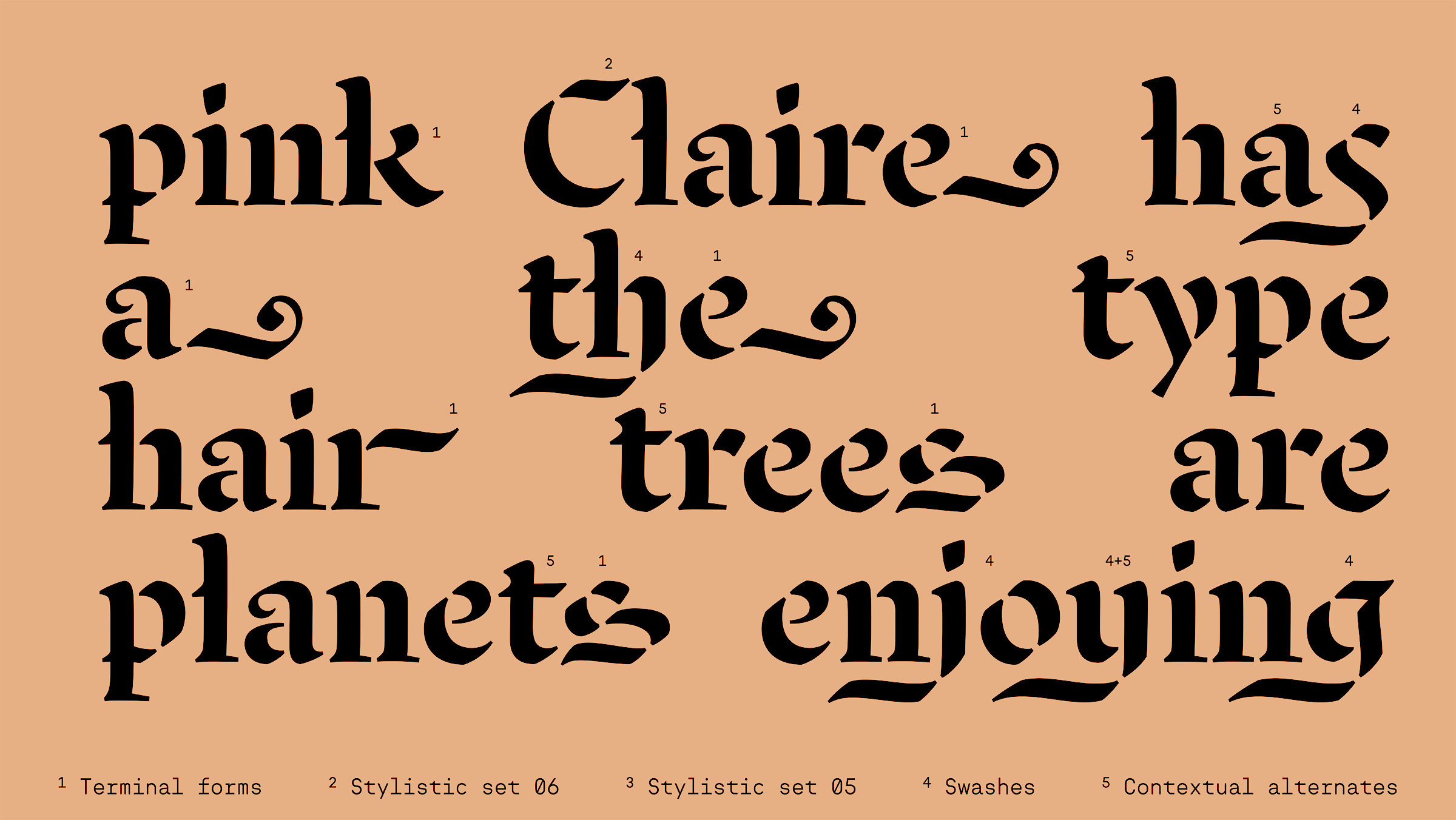
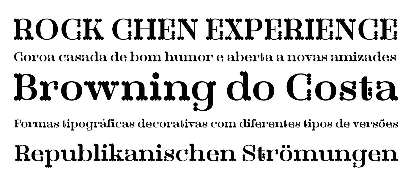
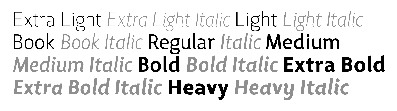
file name: Ricardo Santos Quebra 2022
file name: Ricardo Santos Quebra 2022
file name: Ricardo Santos Quebra Ex Condensed 2022

file name: Ricardo Santos Quebra Ex Condensed 2022
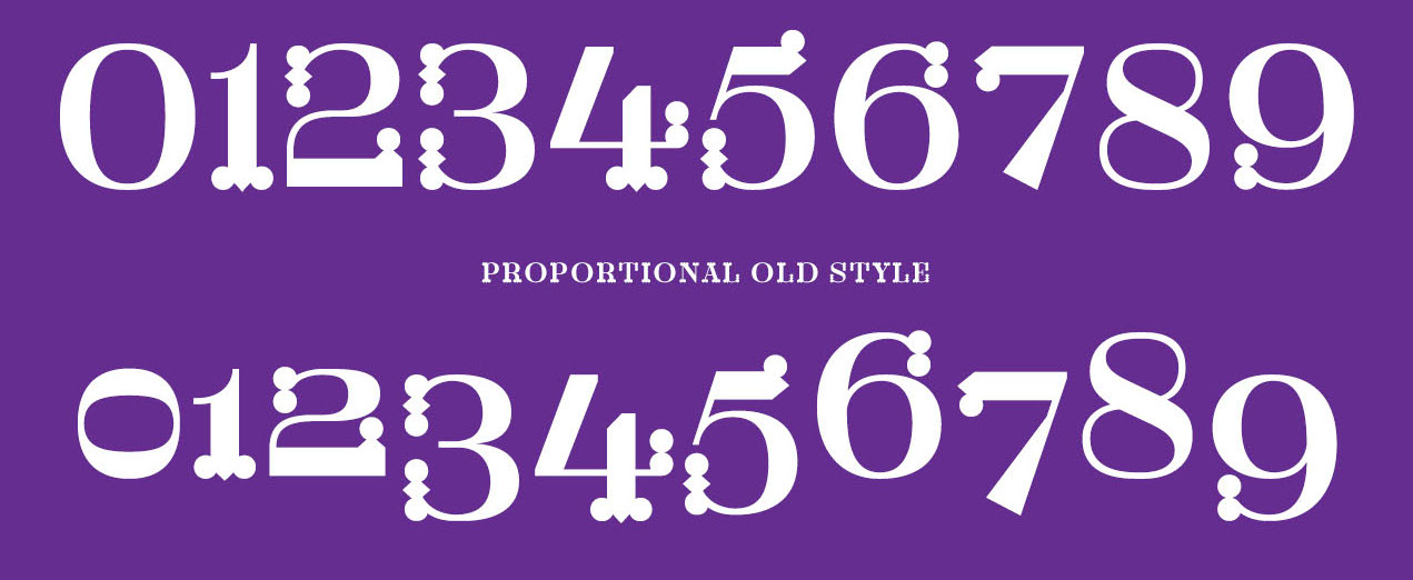
file name: Ricardo Santos Quebra Expa 2022

file name: Ricardo Santos Quebra Expa 2022
file name: Ricardo Santos Quebra Expa 2022
file name: Vanarchiv Quebra 2022 1
file name: Vanarchiv Quebra 2022 2
file name: Vanarchiv Quebra 2022 3
file name: Vanarchiv Quebra 2022 5

file name: Vanarchiv Quebra 2022
file name: Vanarchiv Quebra Ex Condensed 2022 1
file name: Vanarchiv Quebra Ex Condensed 2022 2

file name: Vanarchiv Quebra Ex Condensed 2022 3
file name: Vanarchiv Quebra Ex Condensed 2022 4
file name: Vanarchiv Quebra Ex Condensed 2022 5

file name: Vanarchiv Quebra Ex Condensed 2022
file name: Vanarchiv Quebra Expa 2022 1
file name: Vanarchiv Quebra Expa 2022 3

file name: Vanarchiv Quebra Expa 2022 4

file name: Vanarchiv Quebra Expa 2022 5

file name: Vanarchiv Quebra Expa 2022
file name: Yoga Letter Cute Easter 2022

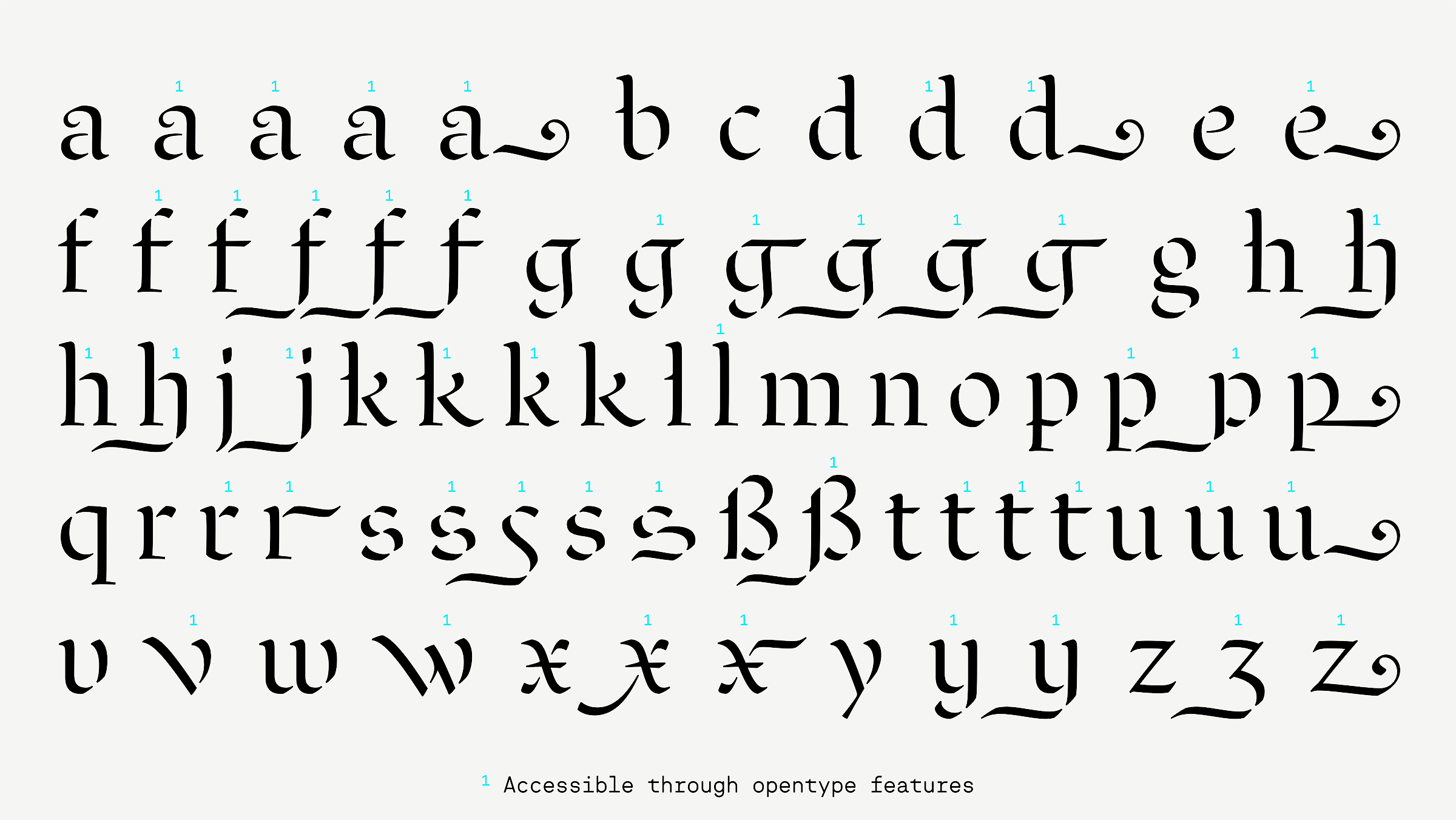
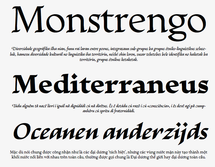
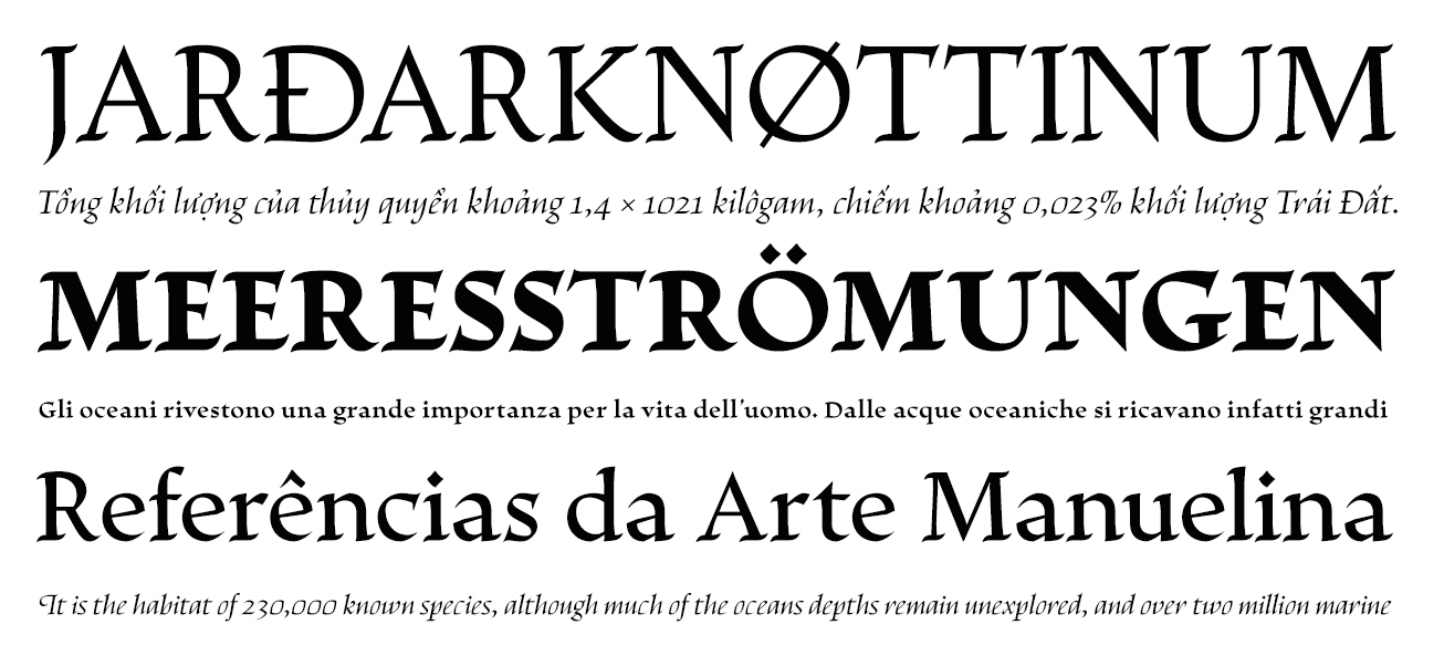
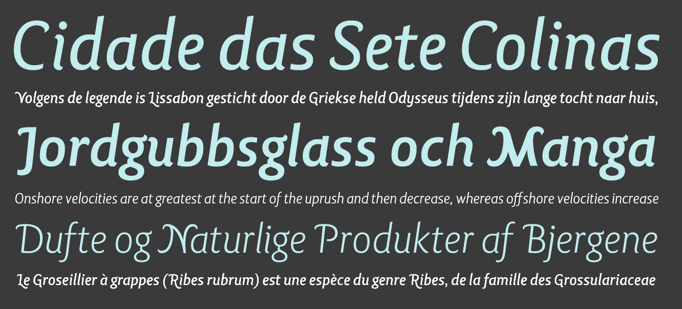
file name: Vanarchiv Miragem 2021 1
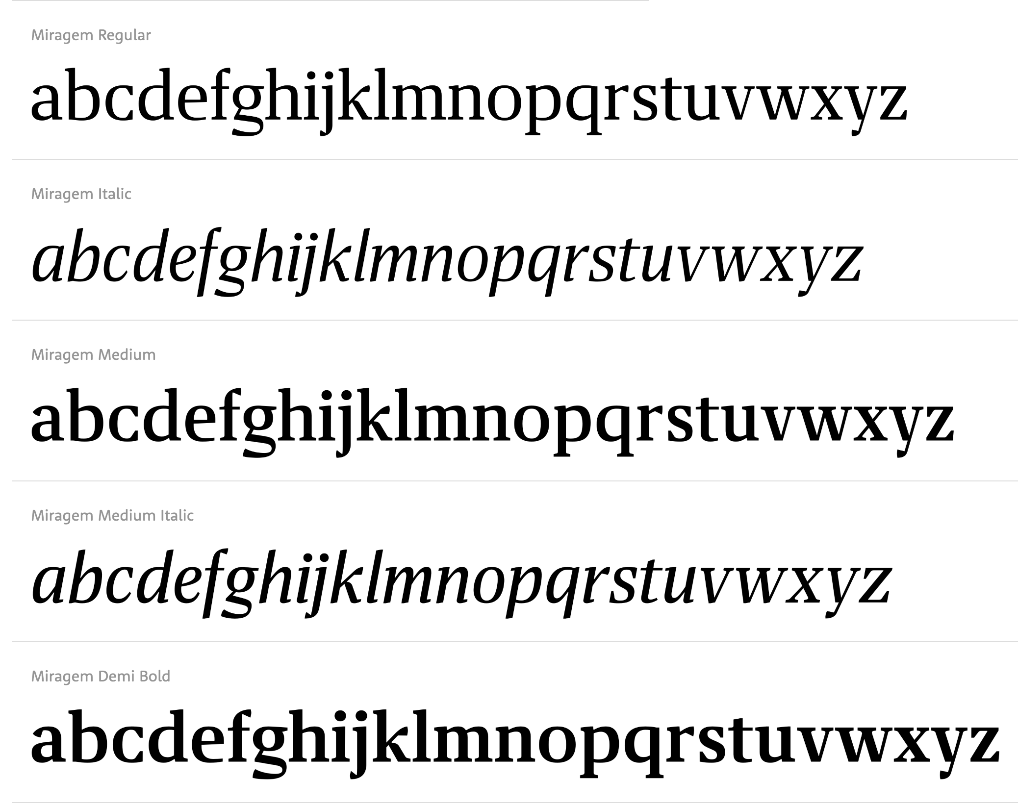
file name: Ricardo Santos Miragem 2021

file name: Vanarchiv Miragem 2021
file name: Vanarchiv Miragem 2021 2
file name: Vanarchiv Miragem 2021 3
file name: Vanarchiv Miragem 2021 4
file name: Vanarchiv Miragem 2021 5
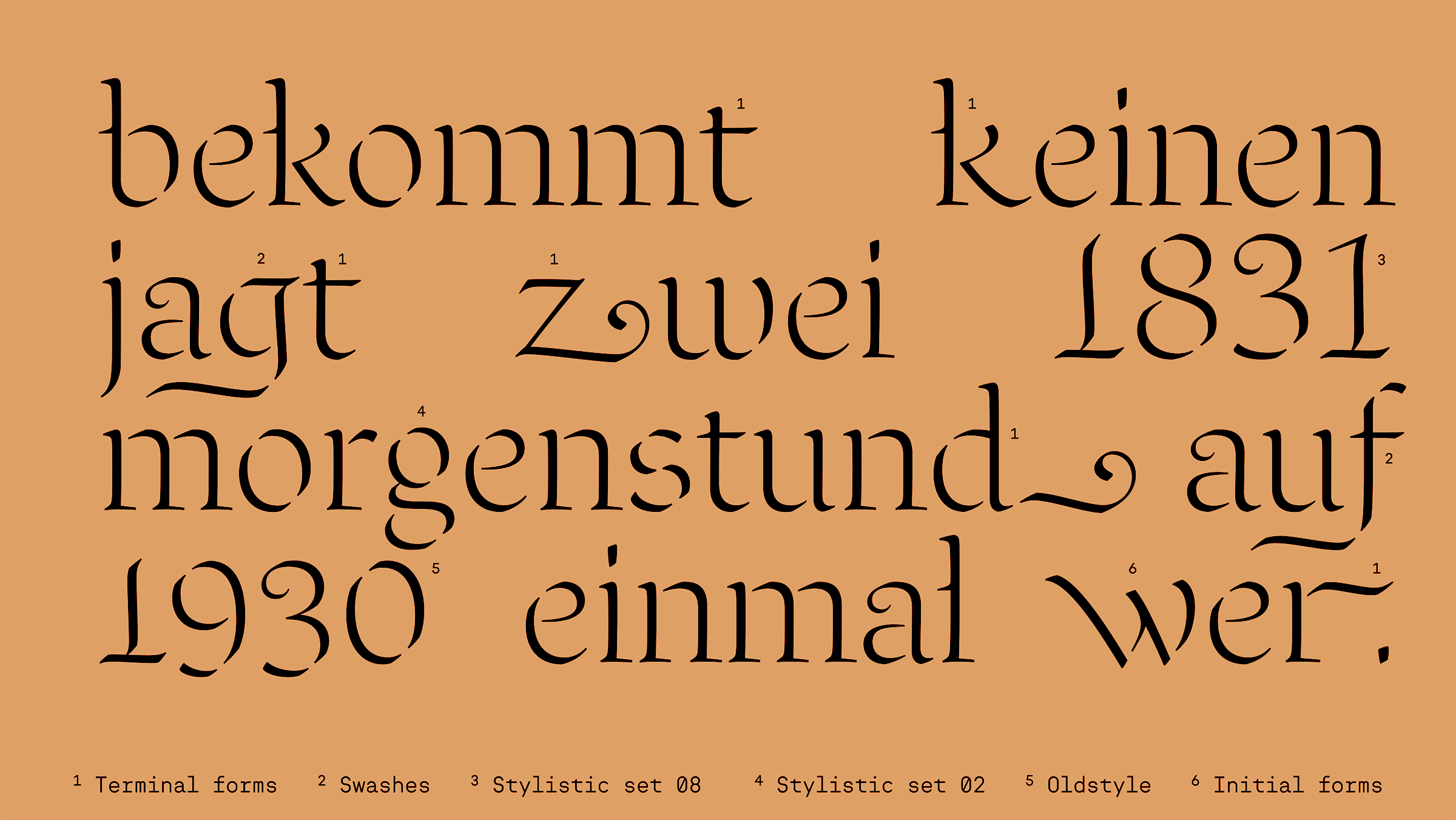
file name: Vanarchiv Linka 2020 368166
file name: Vanarchiv Linka 2020 368168

file name: Vanarchiv Linka 2020 368170

file name: Vanarchiv Linka 2020
file name: Ricardo Santos Linka 2020

file name: Vanarchiv Linka Stencil 2020 368173
file name: Vanarchiv Linka Stencil 2020 368174
file name: Vanarchiv Linka Stencil 2020 368175

file name: Vanarchiv Linka Stencil 2020
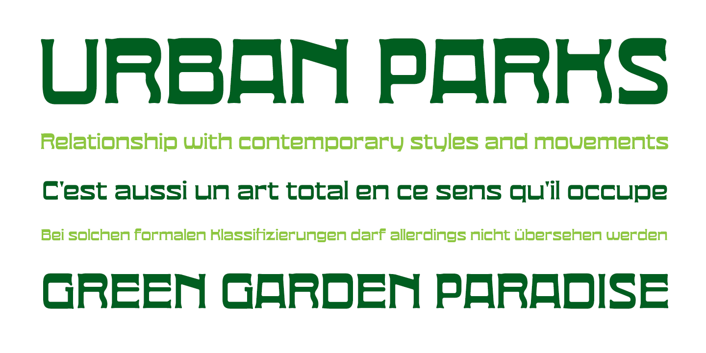
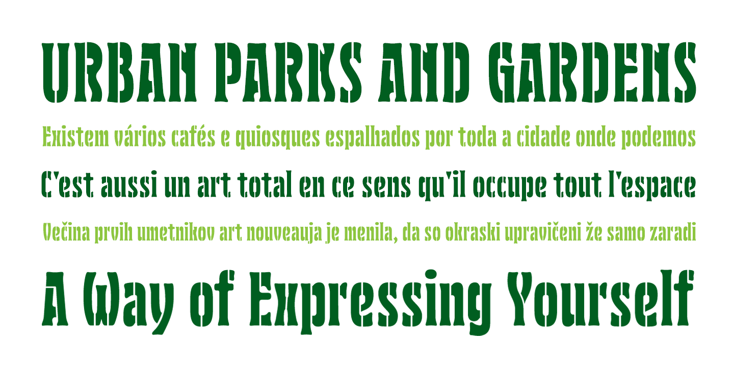
file name: Vanarchiv Nouveau L X 2020 341764

file name: Vanarchiv Nouveau L X 2020 341765
file name: Vanarchiv Nouveau L X 2020 341766
file name: Vanarchiv Nouveau L X 2020 341767

file name: Vanarchiv Nouveau L X 2020 341768

file name: Vanarchiv Nouveau L X 2020
file name: Vanarchiv Nouveau L X Expanded 2020 341769
file name: Vanarchiv Nouveau L X Expanded 2020 341770
file name: Vanarchiv Nouveau L X Expanded 2020 341771
file name: Vanarchiv Nouveau L X Expanded 2020 341772

file name: Vanarchiv Nouveau L X Expanded 2020 341773

file name: Vanarchiv Nouveau L X Expanded 2020
file name: Vanarchiv Nouveau L X Stencil 2020 341774
file name: Vanarchiv Nouveau L X Stencil 2020 341775
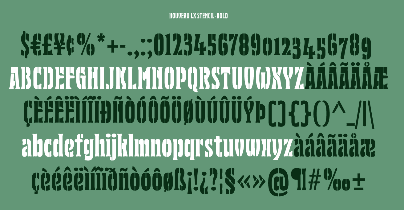
file name: Vanarchiv Nouveau L X Stencil 2020 341776
file name: Vanarchiv Nouveau L X Stencil 2020 341777
file name: Vanarchiv Nouveau L X Stencil 2020 341778

file name: Vanarchiv Nouveau L X Stencil 2020
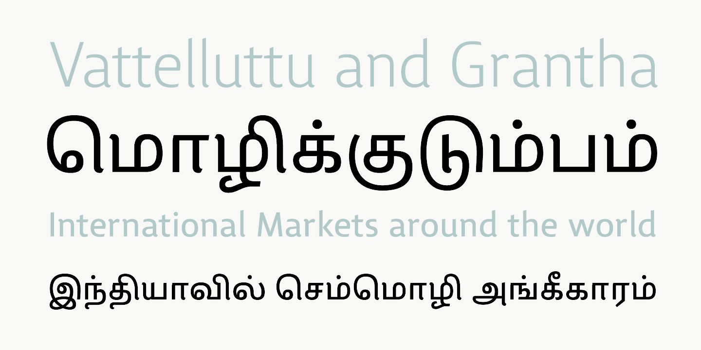
file name: Vanarchiv Lisboa Sans Tamil 2019 318279
file name: Vanarchiv Lisboa Sans Tamil 2019 318280 002
file name: Vanarchiv Lisboa Sans Tamil 2019 318281 002

file name: Vanarchiv Lisboa Sans Tamil 2019 318282 002

file name: Vanarchiv Lisboa Sans Tamil 2019 318283 002

file name: Vanarchiv Lisboa Sans Tamil 2019

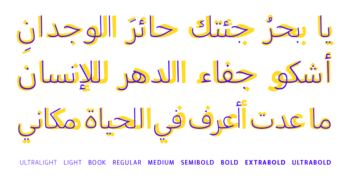
file name: Vanarchiv Lishbona Naskh 2019
file name: Vanarchiv Lishbona Naskh 2019 327178
file name: Vanarchiv Lishbona Naskh 2019 327179
file name: Vanarchiv Lishbona Naskh 2019 327180
file name: Vanarchiv Lishbona Naskh 2019 327181

file name: Vanarchiv Lishbona Naskh 2019 327182
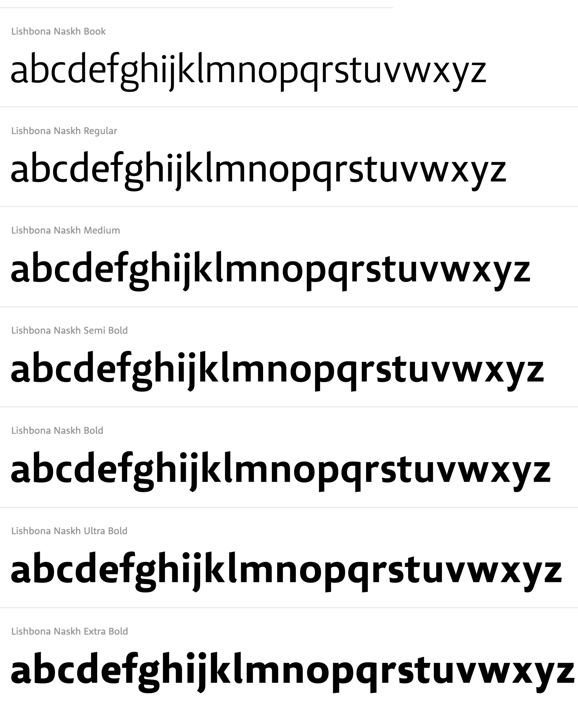
file name: Ricardo Santos Lishbona Naskh 2019
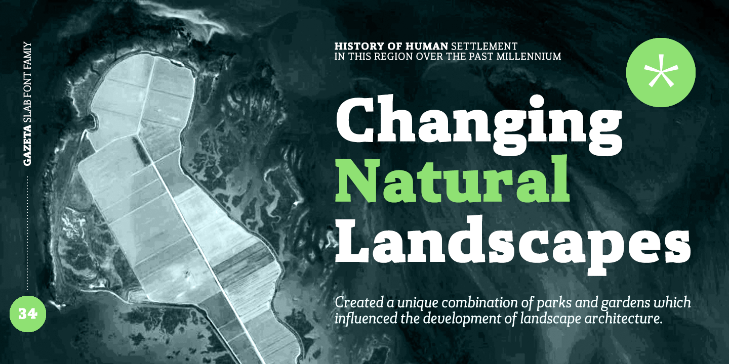
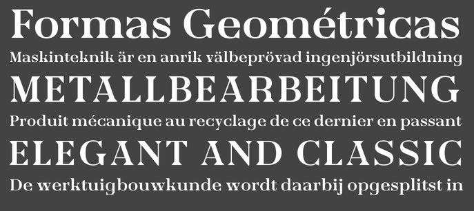
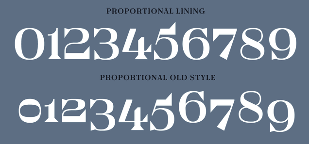
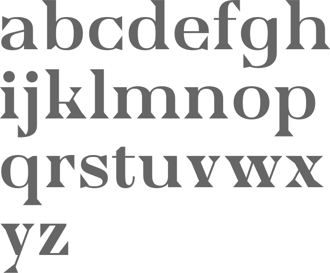
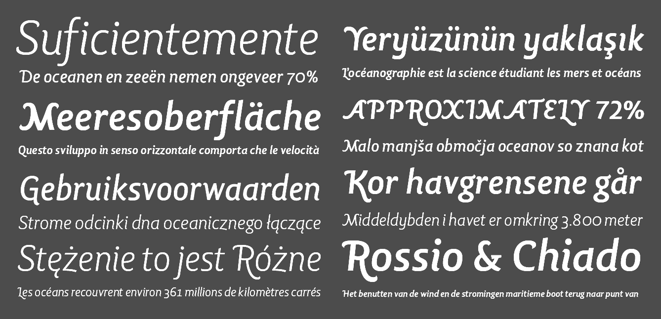
file name: Vanarchiv Gazeta Slab 2019 317787
file name: Vanarchiv Gazeta Slab 2019 317788
file name: Vanarchiv Gazeta Slab 2019 317789
file name: Vanarchiv Gazeta Slab 2019 317790
file name: Vanarchiv Gazeta Slab 2019 317791 002

file name: Vanarchiv Gazeta Slab 2019

file name: Vanarchiv Gazeta Stencil Ds 2019 317777
file name: Vanarchiv Gazeta Stencil Ds 2019 317778 002
file name: Vanarchiv Gazeta Stencil Ds 2019 317779
file name: Vanarchiv Gazeta Stencil Ds 2019 317780
file name: Vanarchiv Gazeta Stencil Ds 2019 317781 002

file name: Vanarchiv Gazeta Stencil Ds 2019
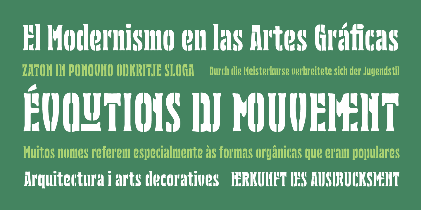
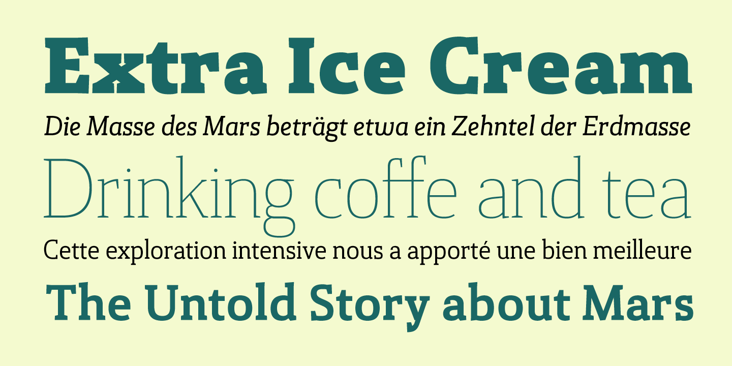
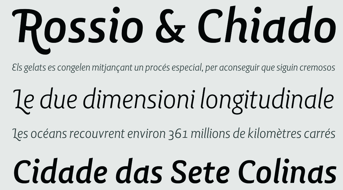
file name: Vanarchiv Gazeta 2017 245158
file name: Vanarchiv Gazeta 2017 245160
file name: Vanarchiv Gazeta 2017 245162
file name: Vanarchiv Gazeta 2017 245163
file name: Vanarchiv Gazeta 2017 245164
file name: Rui Abreu Ricardo Santos Aquino 2017
file name: Rui Abreu Ricardo Santos Aquino 2017a

file name: Rui Abreu Ricardo Santos Aquino 2017b
file name: Rui Abreu Ricardo Santos Aquino 2017c

file name: Rui Abreu Ricardo Santos Aquino 2017d
file name: Rui Abreu Ricardo Santos Aquino 2017e
file name: Rui Abreu Ricardo Santos Aquino 2017f
file name: Rui Abreu Ricardo Santos Aquino 2017g
file name: Rui Abreu Ricardo Santos Aquino 2017h
file name: Rui Abreu Ricardo Santos Aquino 2017j
file name: Rui Abreu Ricardo Santos Aquino 2017k
file name: Tiponautas Aircrew 2016 218496
file name: Tiponautas Aircrew 2016 218497
file name: Tiponautas Aircrew 2016 218498
file name: Tiponautas Aircrew 2016 218499
file name: Tiponautas Aircrew 2016 218500
file name: Tiponautas Aircrew 2016 218501
file name: Tiponautas Aircrew 2016 218502

file name: Tiponautas Aircrew 2016

file name: Tipos Das Letras T D L Ruha Crown 2017 235743
file name: Tipos Das Letras T D L Ruha Crown 2017 235744

file name: Tipos Das Letras T D L Ruha Crown 2017 235745
file name: Tipos Das Letras T D L Ruha Crown 2017 235746

file name: Tipos Das Letras T D L Ruha Crown 2017
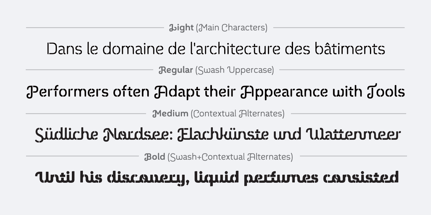
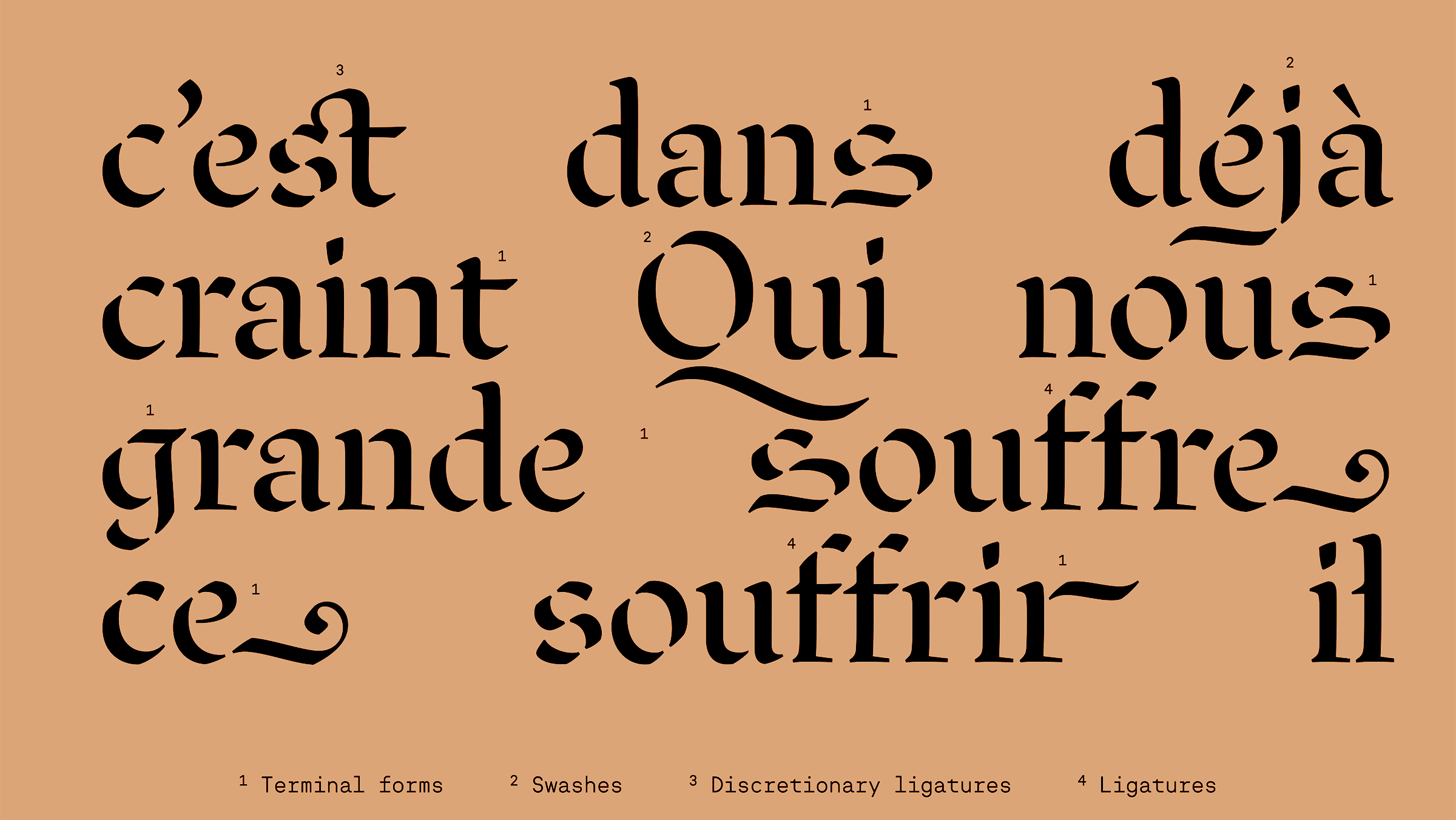
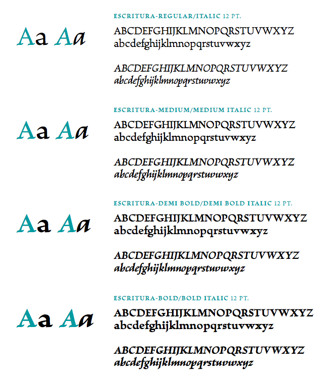
file name: Ricardo Santos Escritura 2015
file name: Ricardo Santos Escritura 2015 174280
file name: Ricardo Santos Escritura 2015 174281
file name: Ricardo Santos Escritura 2015 174282
file name: Ricardo Santos Escritura 2015 174283
file name: Ricardo Santos Escritura 2015 174286
file name: Ricardo Santos Escritura 2015 174288
file name: Ricardo Santos Escritura 2015 b
file name: Ricardo Santos Escritura 2015 c
file name: Ricardo Santos Escritura 2015 d
file name: Ricardo Santos Escritura 2015 h
file name: Ricardo Santos Escritura 2015 j
file name: Ricardo Santos Escritura 2015 k
file name: Ricardo Santos Escritura 2015 l

file name: Ricardo Santos Escritura 2015
file name: Ricardo Santos Escritura Hebrew 2018 246937

file name: Ricardo Santos Escritura Hebrew 2018 246939
file name: Ricardo Santos Escritura Hebrew 2018 246940
file name: Ricardo Santos Escritura Hebrew 2018 246943
file name: Ricardo Santos Escritura Hebrew 2018 246944

file name: Ricardo Santos Escritura Hebrew 2018
file name: Ricardo Santos Escritura Hebrew 2018246938
file name: Ricardo Santos Escritura Hebrew 2018246942
file name: Ricardo Santos Escritura Hebrew 2018246943
file name: Sahar El Meligy Circtor 2014
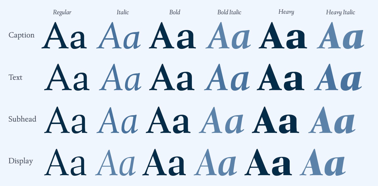
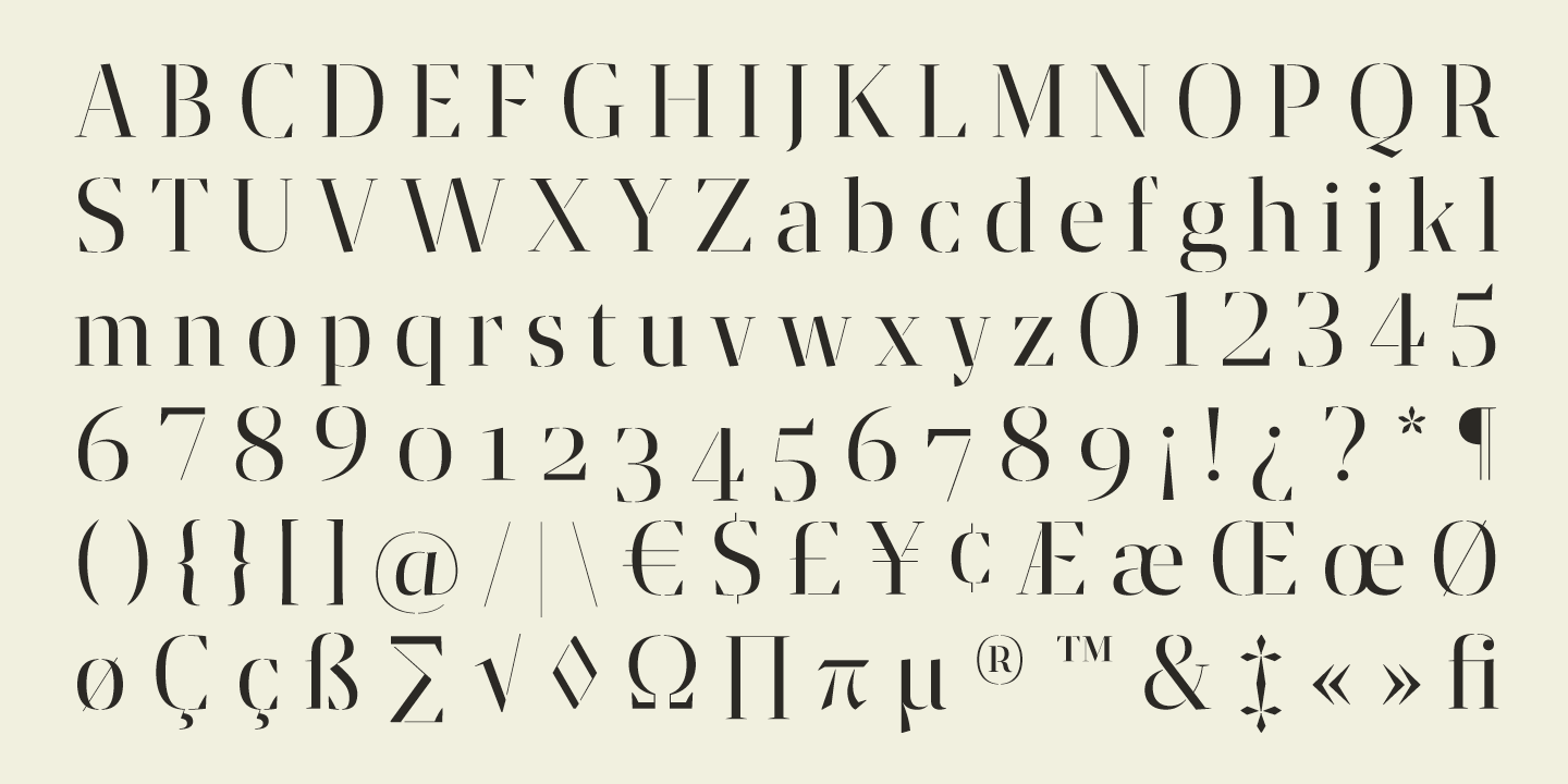
file name: Ricardo Santos Xaloc 2015
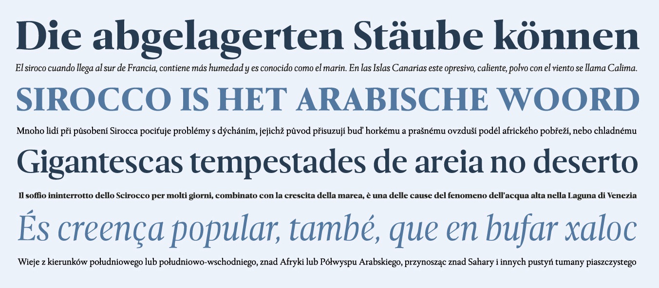
file name: Ricardo Santos Xaloc 2015b
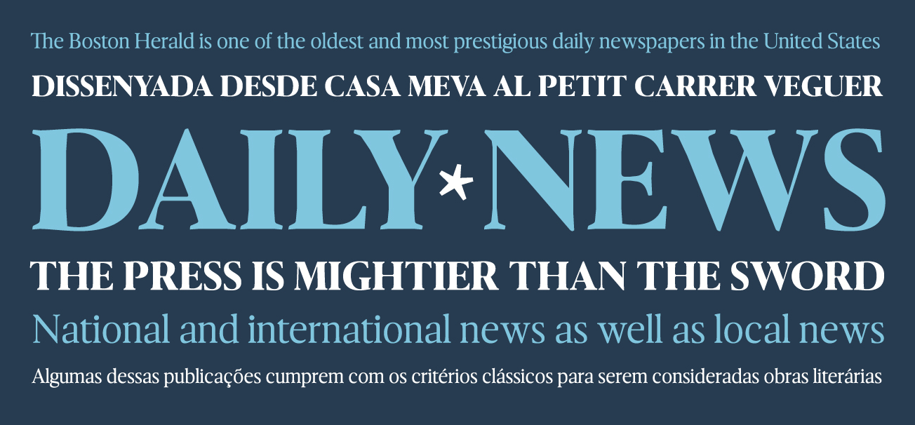
file name: Ricardo Santos Xaloc 2015c
file name: Ricardo Santos Xaloc Caption 2015
file name: Ricardo Santos Xaloc Display Heavy 2015
file name: Luis Alonso Ricardo Santos Lab Sans 2011
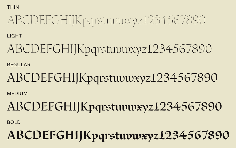
file name: Ricardo Santos Atlantica Display Bold 2005
file name: Ricardo Santos Atlantica Display O S F Bold 2005
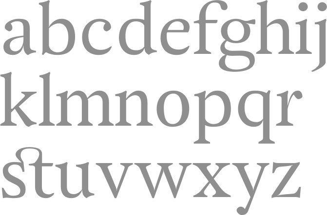
file name: Ricardo Santos Atlantica L F 2005

file name: Vanarchiv Van Condensed Hebrew 2022 1
file name: Vanarchiv Van Condensed Hebrew 2022 2

file name: Vanarchiv Van Condensed Hebrew 2022 4

file name: Vanarchiv Van Condensed Hebrew 2022 5

file name: Vanarchiv Van Condensed Hebrew 2022

file name: Ricardo Santos Van Dingbats
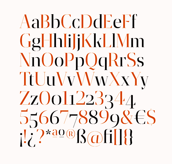
file name: Ricardo Santos Grafia Sans Pro 2014

file name: Ricardo Santos Grafia Sans Pro 2014b
file name: Ricardo Santos Grafia Sans Pro Book 2014
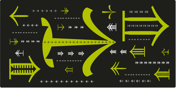
file name: Ricardo Santos Tramuntana Dingbats 2012

file name: Ricardo Santos Tramuntana Dingbats 2012b
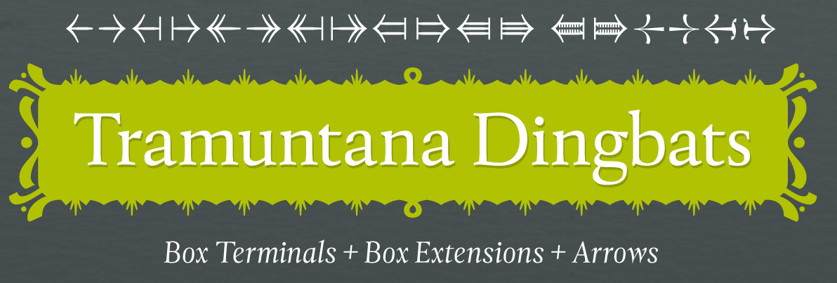
file name: Ricardo Santos Tramuntana Dingbats 2012
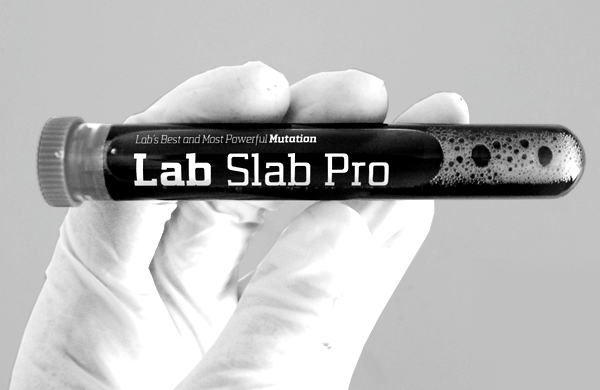
file name: Luis Alonso Ricardo Santos Lab Slab Pro 2011

file name: Luis Alonso Ricardo Santos Lab Slab Pro 2011b

file name: Luis Alonso Ricardo Santos Lab Slab Pro 2011c
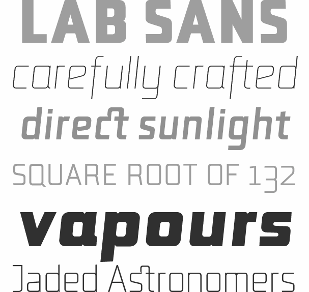
file name: Luis Alonso Ricardo Santos Lab Sans Pro 2012
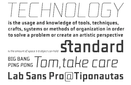
file name: Ricardo Santos Lab Sans Pro 2011
file name: Aprigio Morgado Ricardo Santos Ruben Dias T D L Ruha Hairline 2014
file name: Aprigio Morgado Ricardo Santos Ruben Dias T D L Ruha Hairline 2014b
file name: Aprigio Morgado Ricardo Santos Ruben Dias T D L Ruha Hairline 2014c
file name: Aprigio Morgado Ricardo Santos Ruben Dias T D L Ruha Hairline 2014e
file name: Aprigio Morgado Ricardo Santos Ruben Dias T D L Ruha Hairline 2014f
file name: Aprigio Morgado Ricardo Santos Ruben Dias T D L Ruha Hairline 2014h
file name: Aprigio Morgado Ricardo Santos Ruben Dias T D L Ruha Latin Semibold 2014
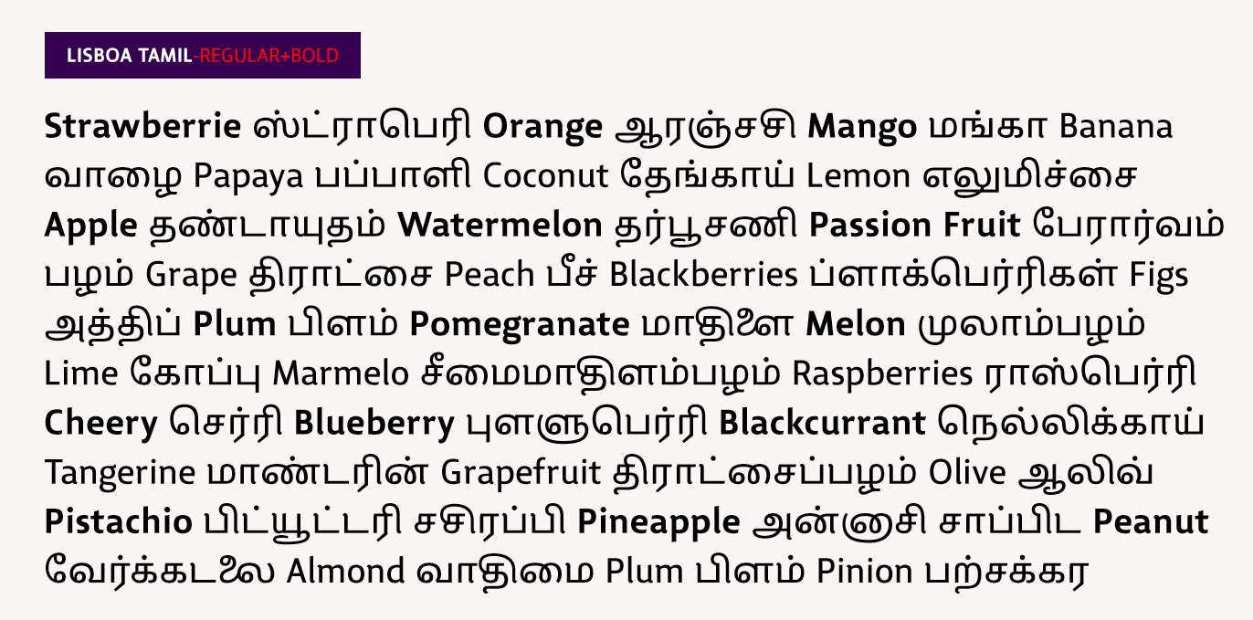
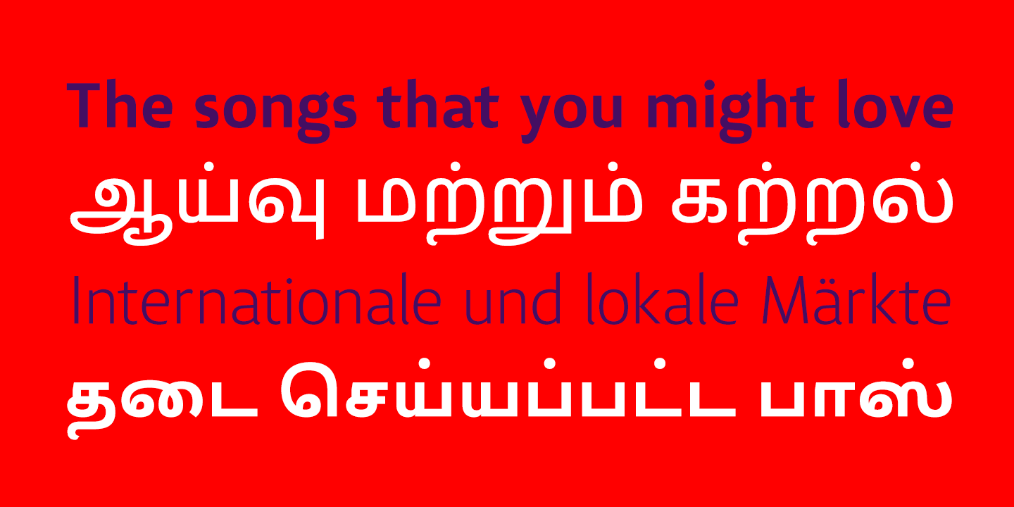
file name: Ricardo Santos Lisboa Tamil 2018 275969
file name: Ricardo Santos Lisboa Tamil 2018 275970 002
file name: Ricardo Santos Lisboa Tamil 2018 275971 002
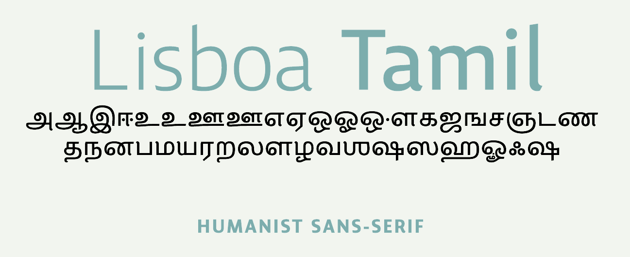
file name: Ricardo Santos Lisboa Tamil 2018 275972 002

file name: Ricardo Santos Lisboa Tamil 2018
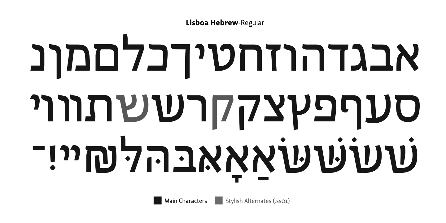
file name: Ricardo Santos Lisboa Hebrew 2018 275974

file name: Ricardo Santos Lisboa Hebrew 2018 275975 002
file name: Ricardo Santos Lisboa Hebrew 2018 275976
file name: Ricardo Santos Lisboa Hebrew 2018 275977 002
file name: Ricardo Santos Lisboa Hebrew 2018 275978 002

file name: Ricardo Santos Lisboa Hebrew 2018 275979 002

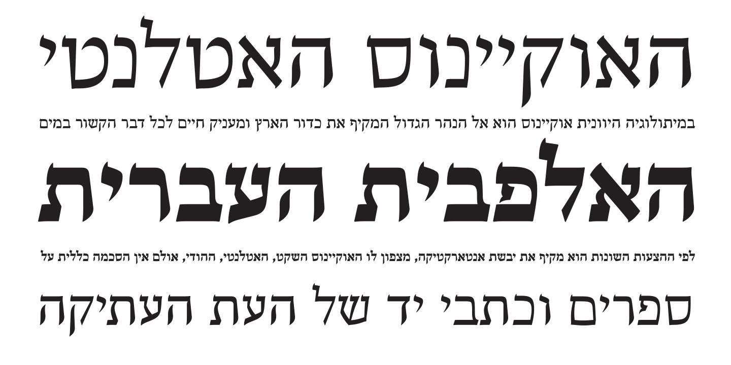
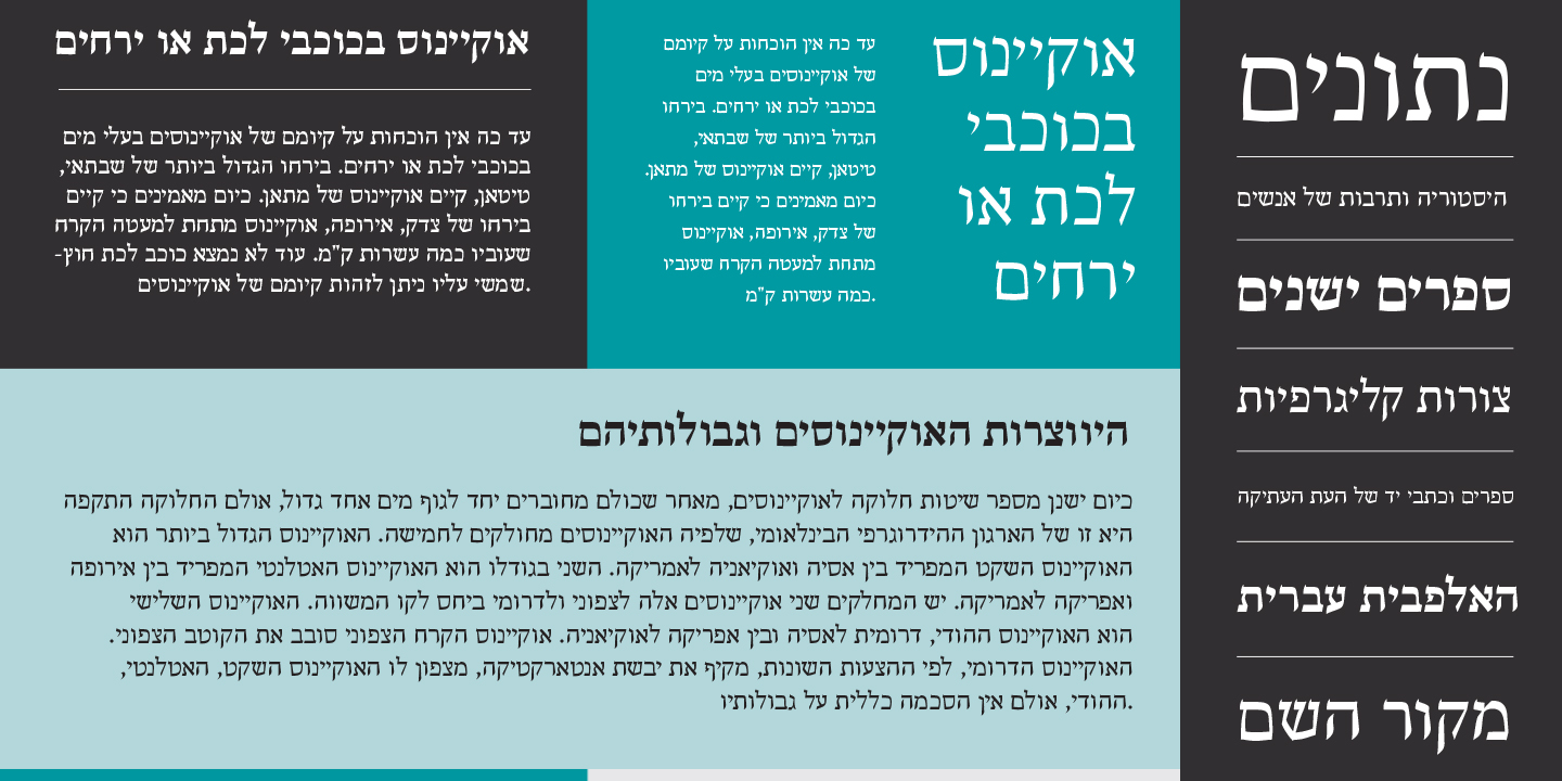
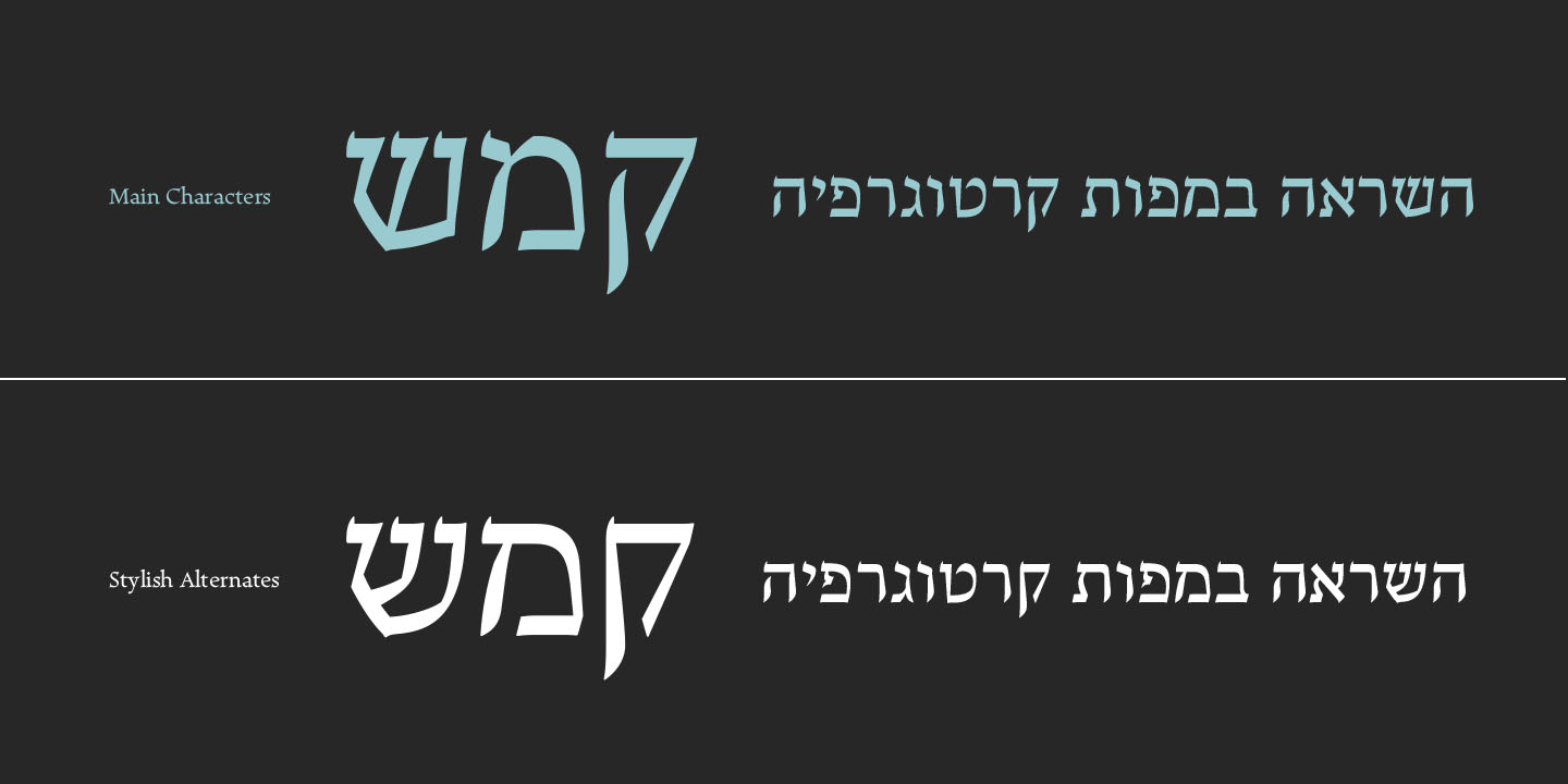
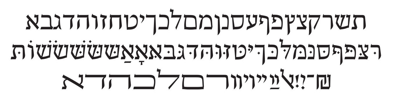
file name: Ricardo Santos Lisboa Hebrew 2018

file name: Ricardo Santos Lisboa 2015 189092
file name: Ricardo Santos Lisboa 2015 189093
file name: Ricardo Santos Lisboa 2015 189096
file name: Ricardo Santos Lisboa 2015 189100
file name: Ricardo Santos Lisboa 2015 189101

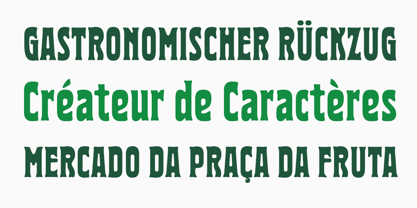
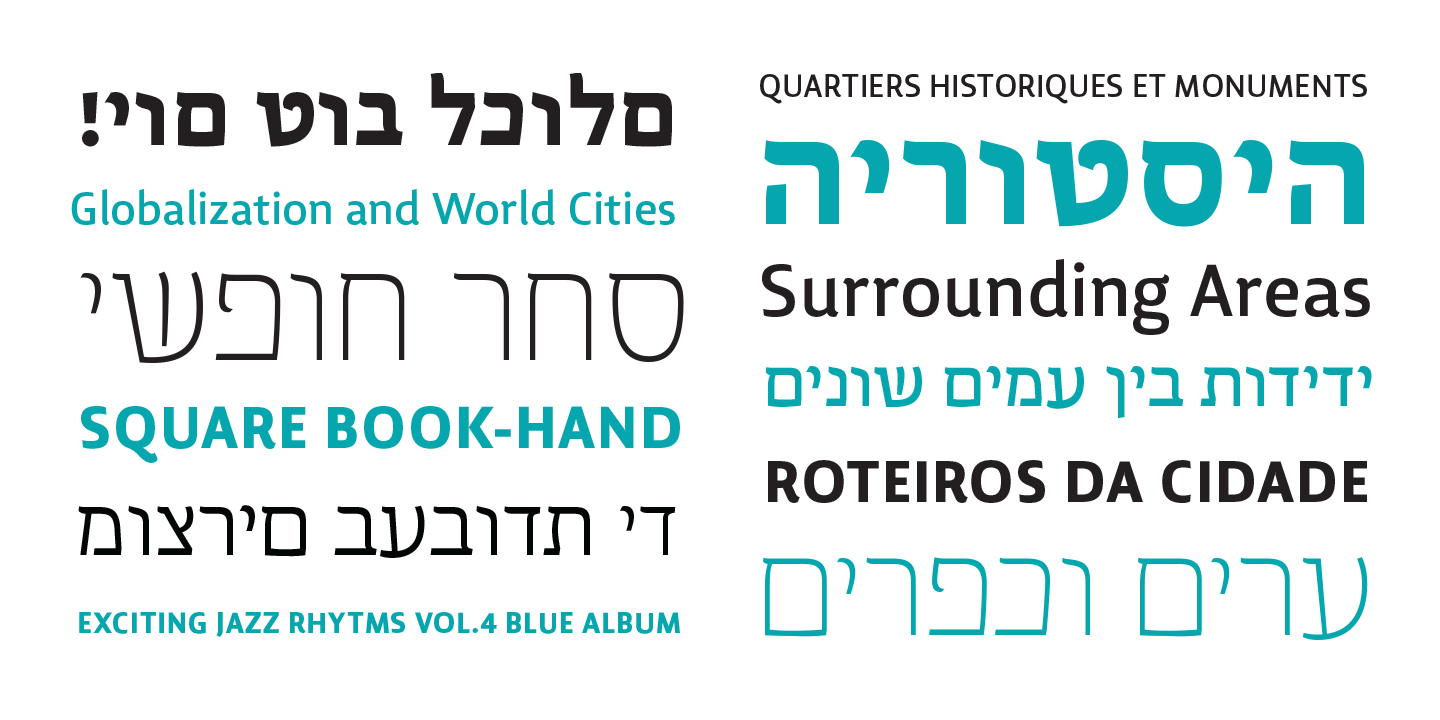
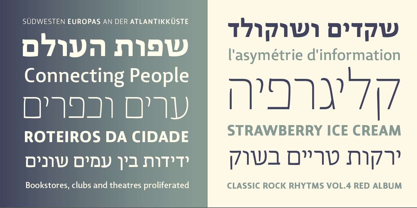
file name: Ricardo Santos Lisboa 2015
file name: Ricardo Santos Lisboa Sans 2015 189105
file name: Ricardo Santos Lisboa Sans 2015 189107
file name: Ricardo Santos Lisboa Sans 2015 189108
file name: Ricardo Santos Lisboa Sans 2015 189110

file name: Ricardo Santos Lisboa Sans 2015 189177

file name: Ricardo Santos Lisboa Sans 2015
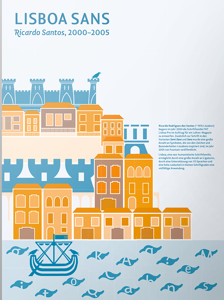
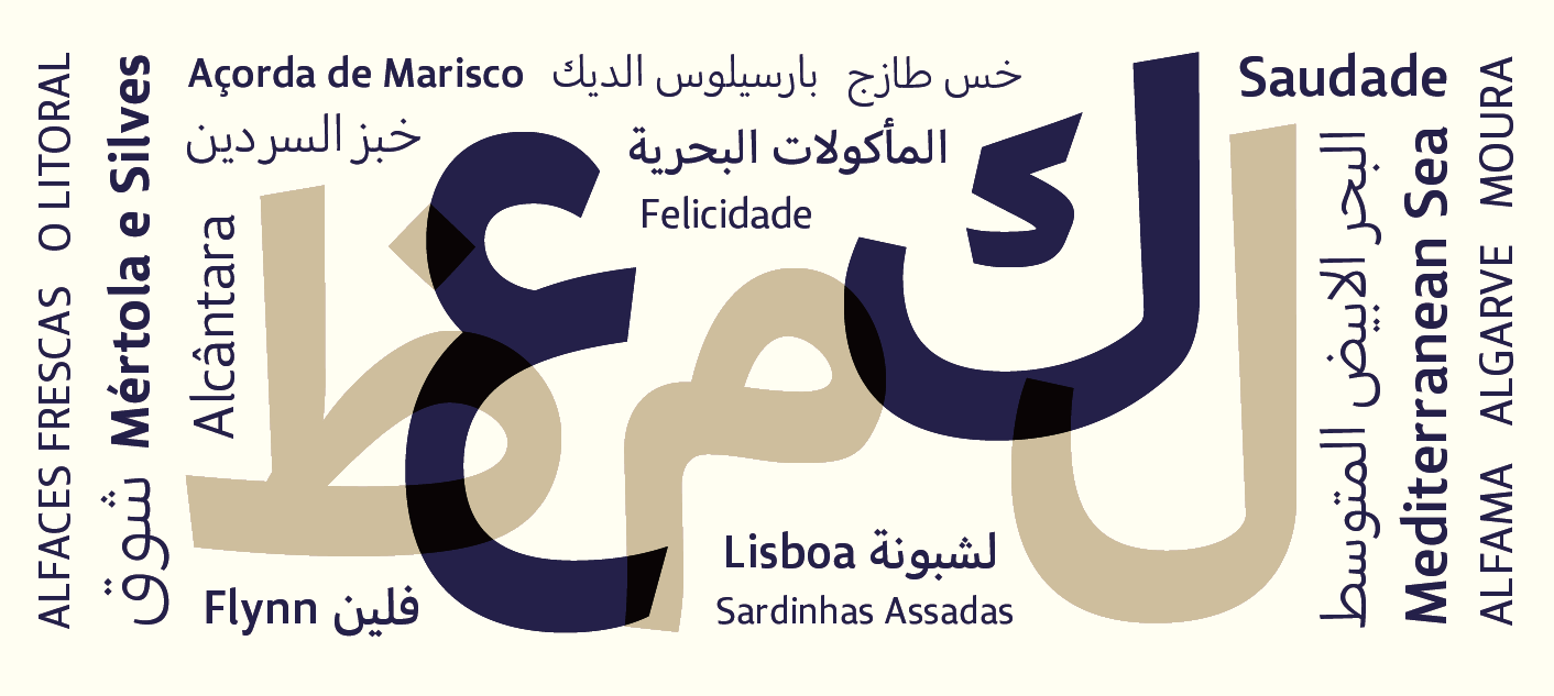
file name: Ricardo Santos Lisboa Sans 2000 2005 Poster by Katrin Beste 2016
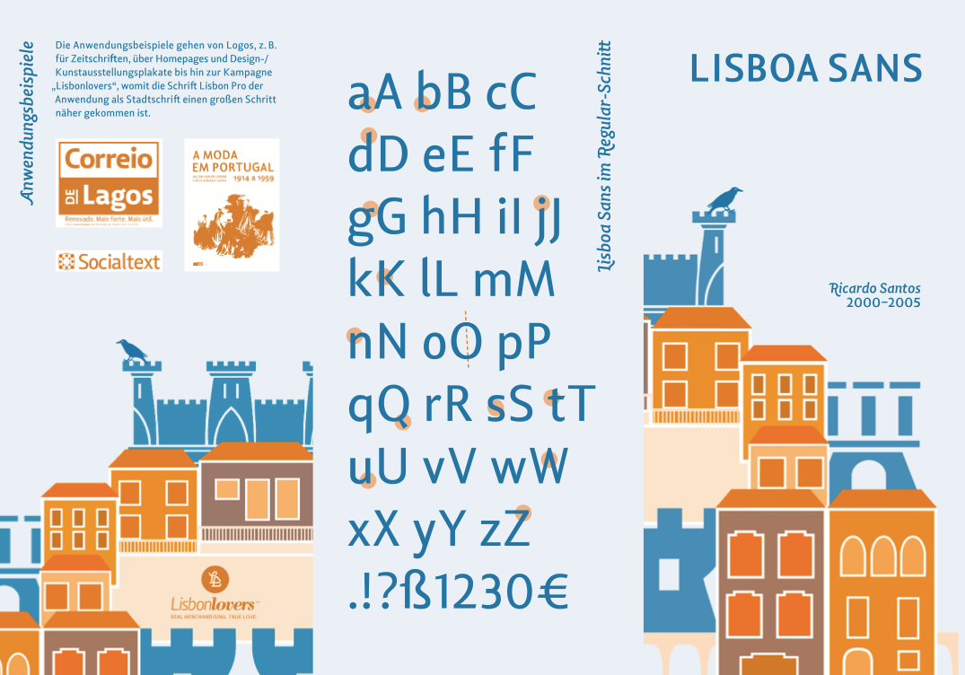
file name: Ricardo Santos Lisboa Sans 2000 2005 Poster by Katrin Beste 2016b
file name: Ricardo Santos Lisboa Swash 2015
file name: Ricardo Santos Lisboa Swash 2015a
file name: Ricardo Santos Lisboa Swash 2015b
file name: Ricardo Santos Lisboa Swash 2015e
file name: Ricardo Santos Lisboa Swash 2015c
file name: Ricardo Santos Lisboa Swash 2015d
| | |
|
Luc Devroye ⦿ School of Computer Science ⦿ McGill University Montreal, Canada H3A 2K6 ⦿ lucdevroye@gmail.com ⦿ https://luc.devroye.org ⦿ https://luc.devroye.org/fonts.html |