TYPE DESIGN INFORMATION PAGE last updated on Fri Feb 27 18:12:05 EST 2026
FONT RECOGNITION VIA FONT MOOSE
|
|
|
|
Jonas Hecksher
Jonas Hecksher holds a degree from The Royal Danish Academy of Fine Arts and The School of Design and Ecole supérieure d'arts graphiques et d'architecture in Paris, where he specialized in graphic design and typography design. Heckscher is Partner and Creative Director at design agency e-Types which he co-founded in 1997 and co-founder of type foundry and type design brand Playtype. He is a 5-time recipient of the Danish Design Award, a winner of two gold Creative Circle awards, a silver award winner at the Britsh D&AD, a winner in 2014 of the Knud V. Engelhardt Memorial Award, and the recipient of a certificate of excellence in type design from Type Directors Club N.Y. Playtype is currently based in Vesterbro, Denmark. He designed fonts such as Movie (2001, a very black condensed movie generics sans), iD:00 (2001, a large sans and serif family), Fletch Text (1998, a sans), DeLuca (Bodoni-like, 2001), NinetySix K (2001, a serif), Underton (1998), Point Sans (1999), Point Serif (1999), Cendia (1997), DenmarkSerif (1998), Mega (1999), Olic (1999), Arch Sans (2003), Arch Serif (2003), Arch Stencil (2003), Arch Pattern (2003). In the 2011 Playtype on-line catalog, it seems that several of his early designs have been renamed, and many others have been added. So here is the on-line list of his fonts there as of February 2011: AbidaleBook, AcademySans, AcademySerif, BingoSans, BingoSerif, DeArchie (didone), DeArchieDisplay, FletchText, FruOlsen (1998: a condensed display serif inspired by the old streets signs of Copenhagen, featuring tall x-heights, shaped drops and curved numbers), Geometric, Hall, HomeDisplay, Hazelwood, HermesBaby (old typewriter), Hill (2005: grotesque), HomeText, ID00 Sans (large family), ID00 Serif, ItalianPlate, JPSpecial Sans, JPSpecial Serif, JazzHouse (2007: a neo-grotesque), Mari (2006: a monolinear modern sans serif with a sense of nordic simplicity), MoviePlaytype, New Press, Noir Text, Nord Dingbats (circled letters), Norwegian, Play (2011, a minimalistic sans serif typeface, free at Google Fonts; CTAN TeX support), PrimoSerif (2000), Republic, SymphonyDisplay, TheWave, Trood, VentiQuattro (didone), Vertigo, Willumsen, ZettaSans. Later in 2011, he published the modern sans family Metro. In 2010, Hecksher created the 21-weight custom typeface family Berlingske for the newspaper by that name. It was extended over the years to a whopping 227 weights / 2100 glyphs-per-font in 2014, the year in which it was released as a regular retail font at Playtype, with Sans, Serif and Slab versions. Typefaces from 2013 include the large sans typeface family Nationale (Playtype) done for the National Museum of Denmark. See here. In 2014, an earlier typeface by e-types, Italian Plate, was releases in two monoline sans subfamilies, Italian Plate No. 1 and No. 2, and two serif versions, No. 3 and No. 4. In 2015, he published the extensive sans typeface family DuNord at Playtype. Typefaces from 2016: Hafnia Sans, La Fontaine. Typefaces from 2018: The Wave (sans). Typefaces from 2019: Melanzine (sans). Typefaces from 2020: Royal Theatre Serif (a didone), Royal Theatre Sans. Klingspor link. Google Plus link. |
EXTERNAL LINKS |
| | |

file name: Jonas Hecksher Bingo Sans 2003
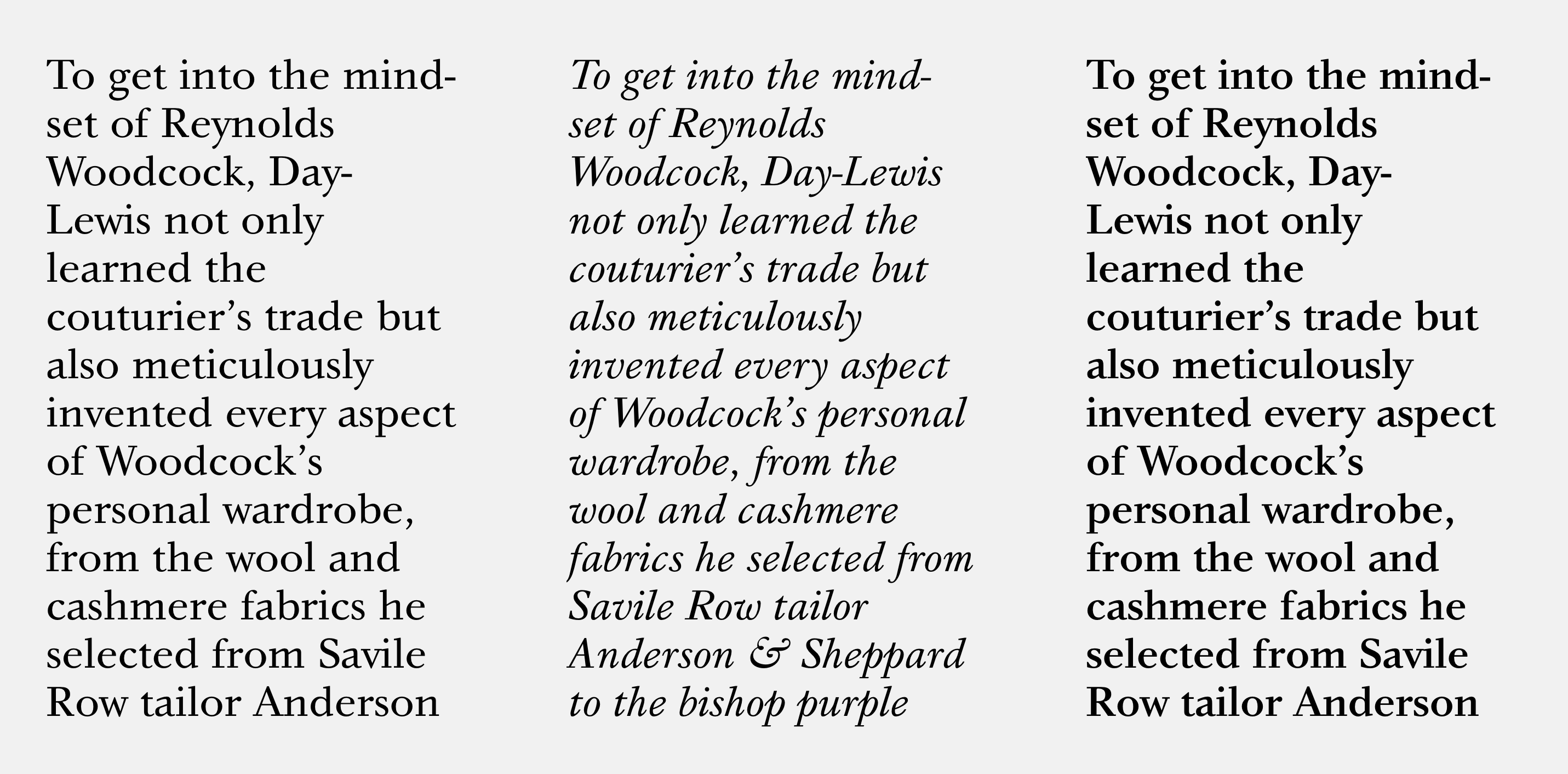
file name: Jonas Hecksher Bingo Serif 2003

file name: Jonas Hecksher Play 2011

file name: Jonas Hecksher Elephant 2004

file name: Jonas Hecksher Royal Theatre Sans 2020

file name: Jonas Hecksher Royal Theatre Serif 2020

file name: Jonas Hecksher Melanzane 2019

file name: Jonas Hecksher Melanzane 2019

file name: Jonas Hecksher Exit

file name: Jonas Hecksher Juli Sans

file name: Jonas Hecksher Noir No1

file name: Jonas Hecksher Norwegian
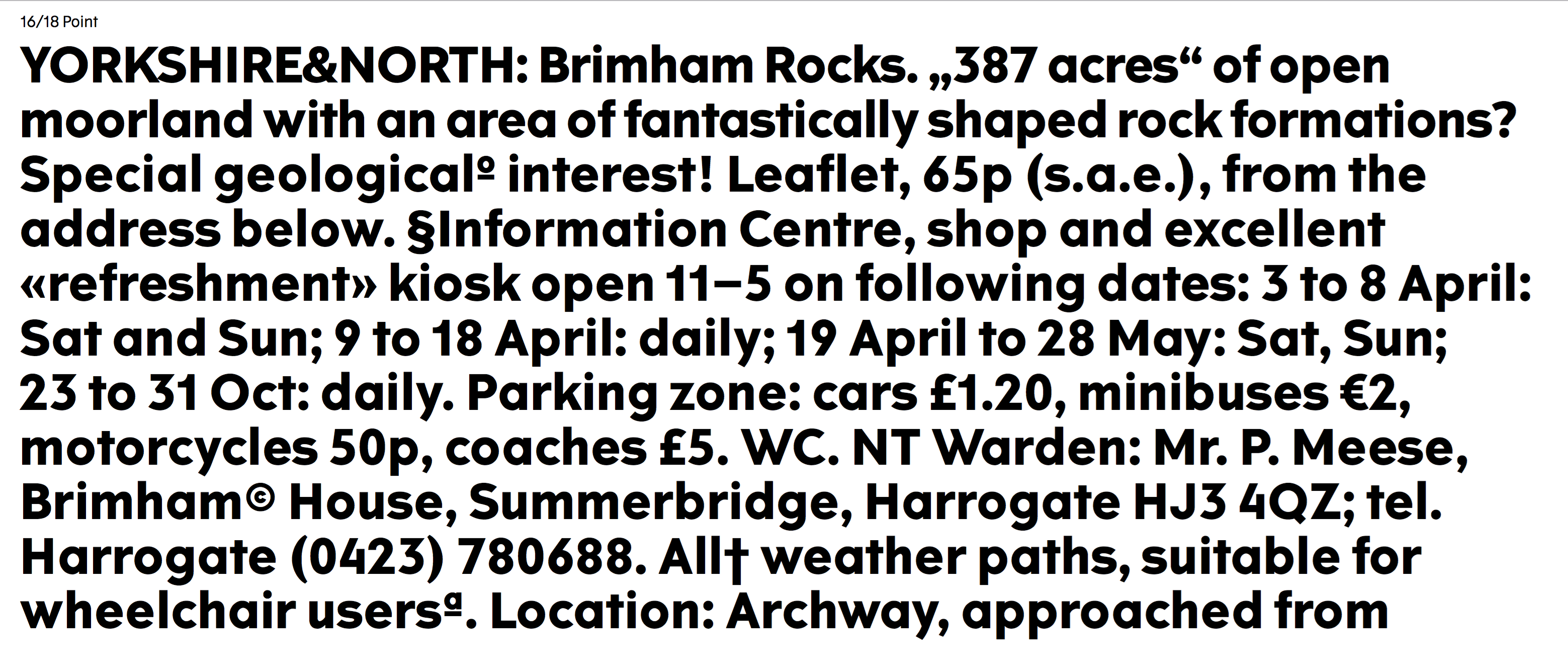
file name: Jonas Hecksher The Wave 2018

file name: Jonas Hecksher The Wave 2018
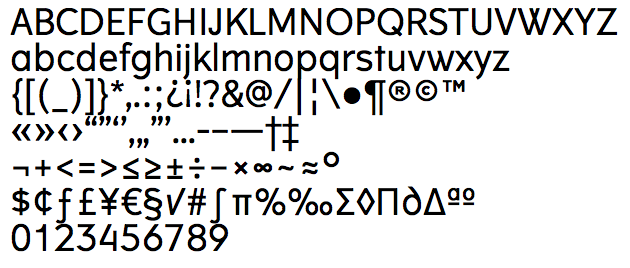
file name: Jonas Hecksher The Wave
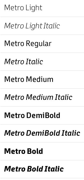
file name: Jonas Hecksher Metro 2011
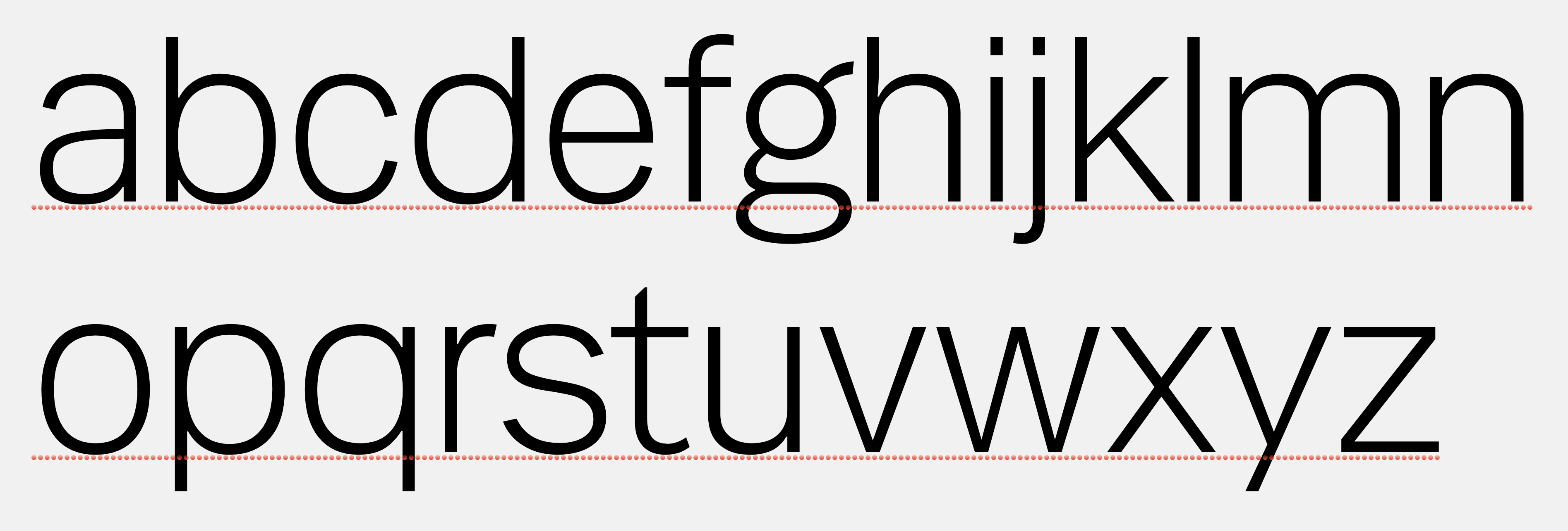
file name: Jonas Hecksher Mari 2006

file name: Jonas Hecksher Mari
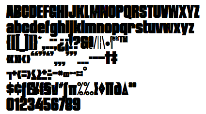
file name: Jonas Hecksher Movie Playtype
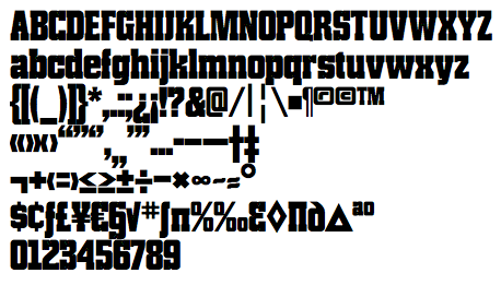
file name: Jonas Hecksher New Press Bold
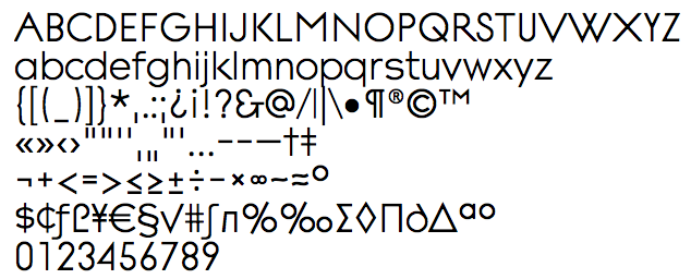
file name: Jonas Hecksher Noir Text
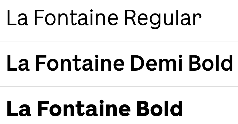
file name: Jonas Hecksher La Fontaine 2016

file name: Jonas Hecksher Hafnia Sans 2016

file name: Jonas Hecksher Nationale Black 2013

file name: Jonas Hecksher Nationale Medium 2013
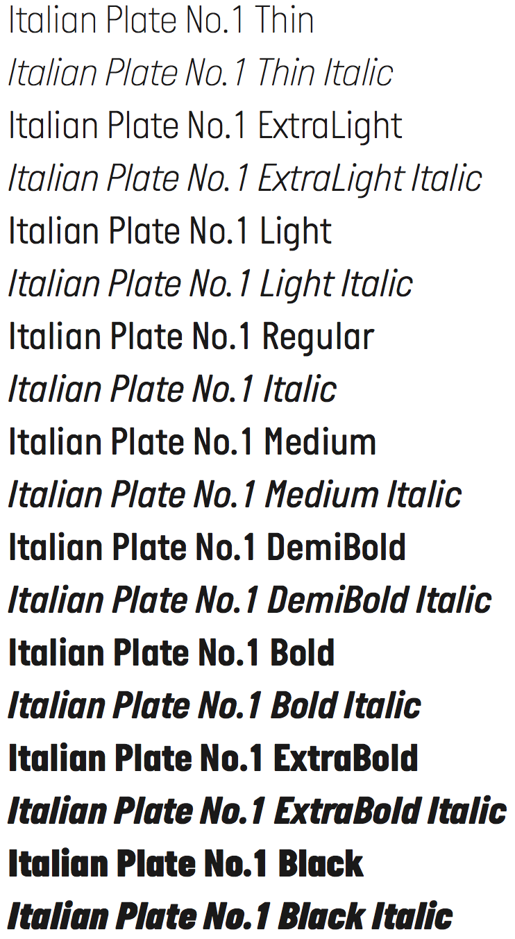
file name: Jonas Hecksher Italian Plate No1 2014
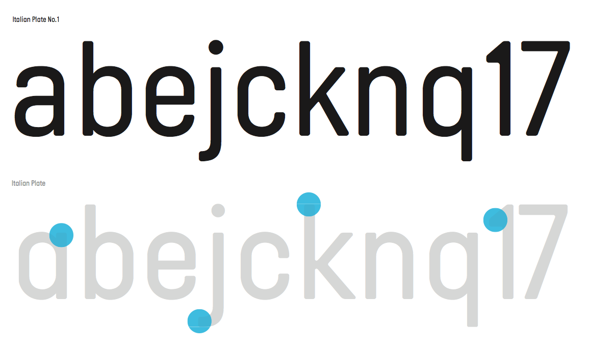
file name: Jonas Hecksher Italian Plate No1 2014b

file name: Jonas Hecksher Italian Plate No1 2014c

file name: Jonas Hecksher Italian Plate No1 2014d

file name: Jonas Hecksher Italian Plate No1 2014e
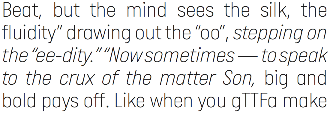
file name: Jonas Hecksher Italian Plate No1 2014f
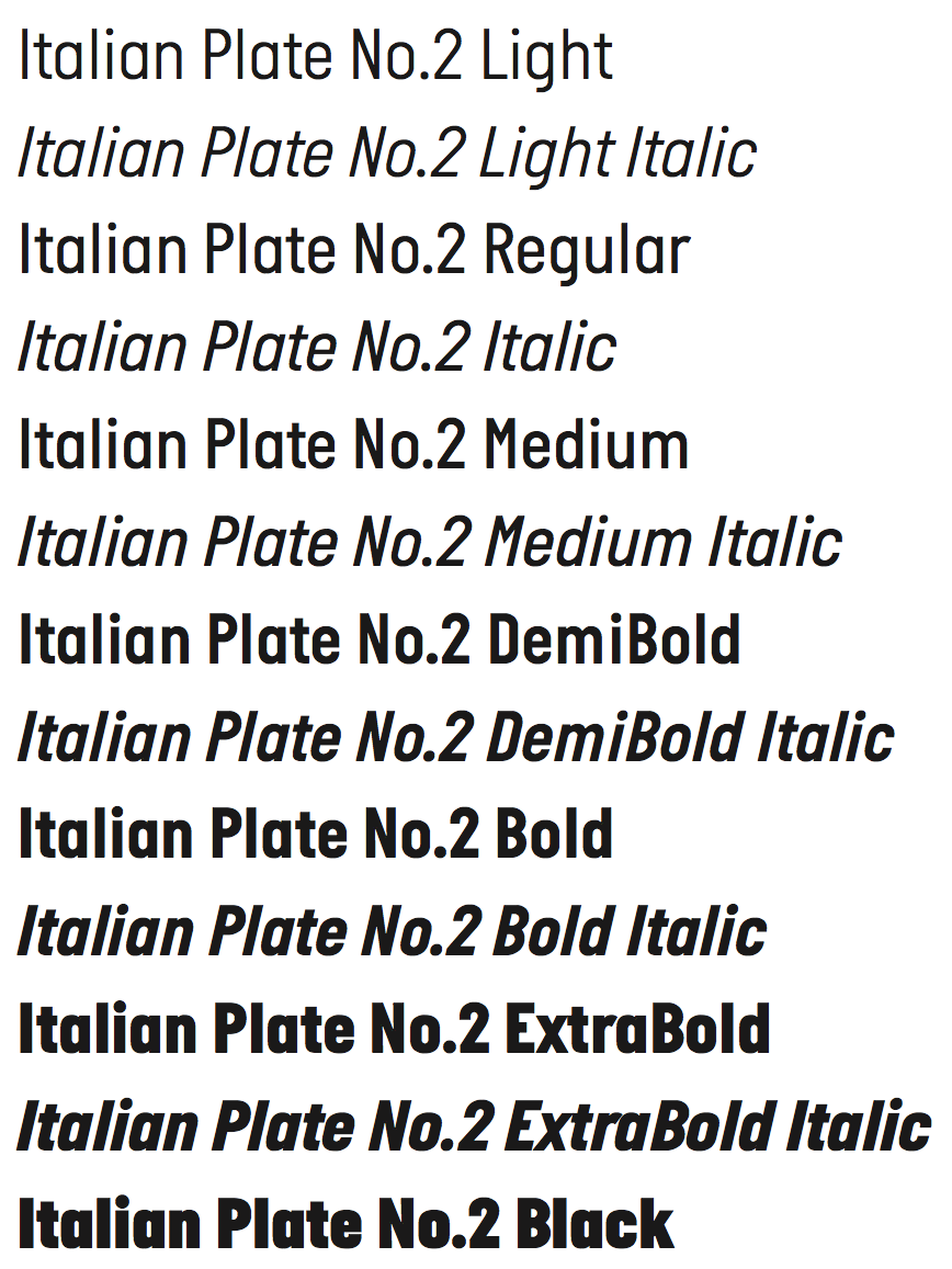
file name: Jonas Hecksher Italian Plate No2 2014

file name: Jonas Hecksher Italian Plate No2 2014b

file name: Jonas Hecksher Italian Plate No2 2014c

file name: Jonas Hecksher Italian Plate Noe Display
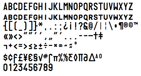
file name: Jonas Hecksher Italian Plate

file name: Jonas Hecksher Du Nord 2015
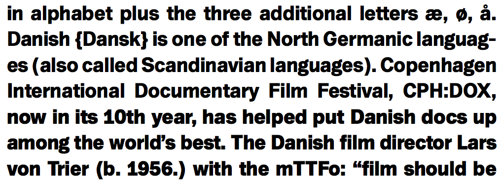
file name: Jonas Hecksher Du Nord 2015b

file name: Jonas Hecksher Du Nord 2015c

file name: Jonas Hecksher Du Nord 2015d

file name: Jonas Hecksher Du Nord 2015e
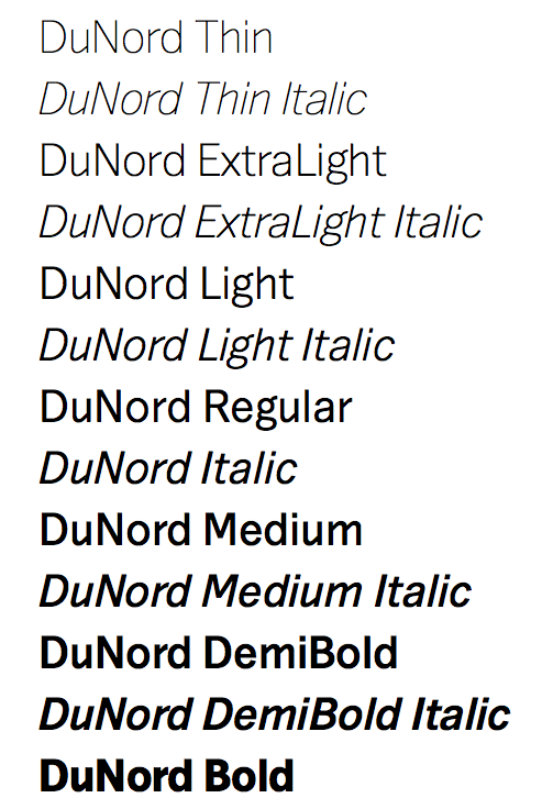
file name: Jonas Hecksher Du Nord 2015f
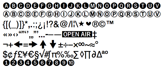
file name: Jonas Hecksher Du Nord Dingbats
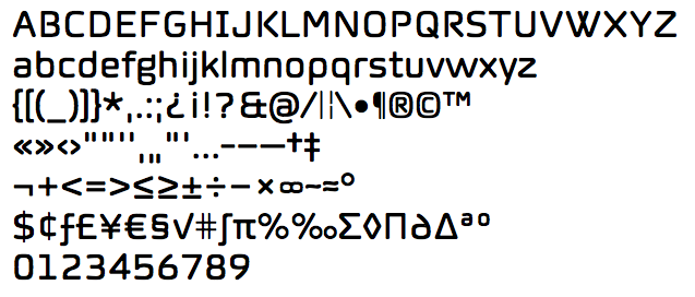
file name: Jonas Hecksher Norwegian
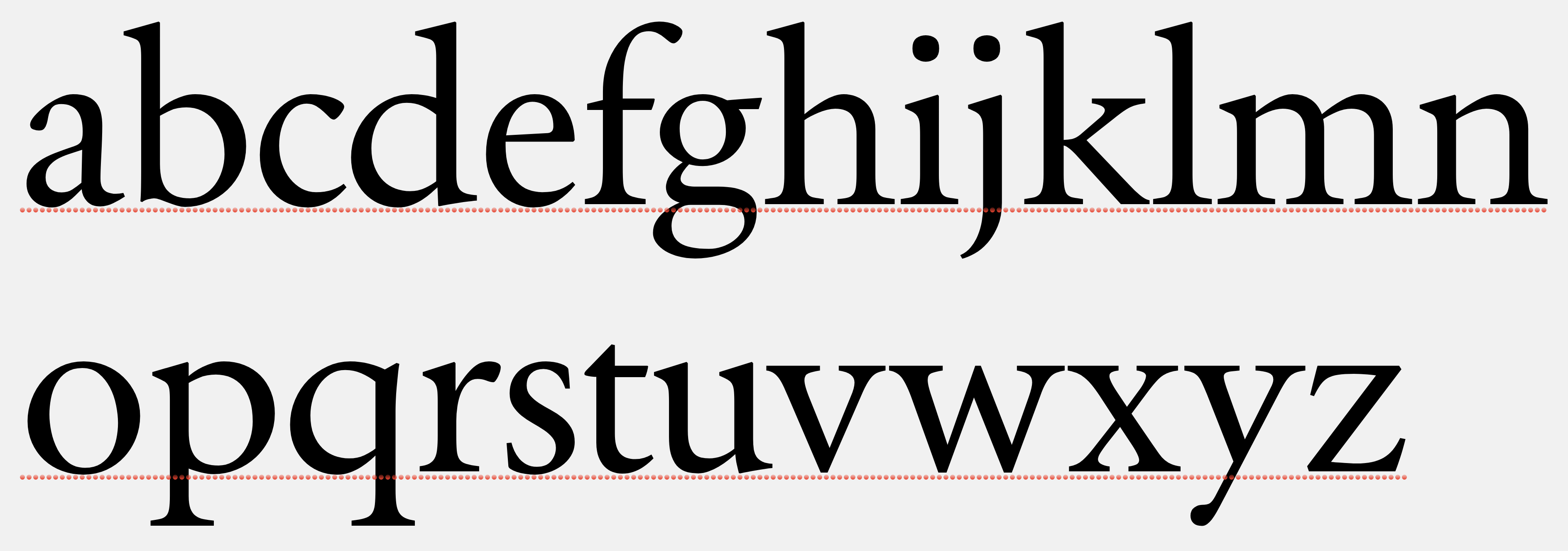
file name: Jonas Hecksher Primo Serif 2000
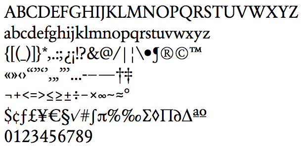
file name: Jonas Hecksher Primo Serif
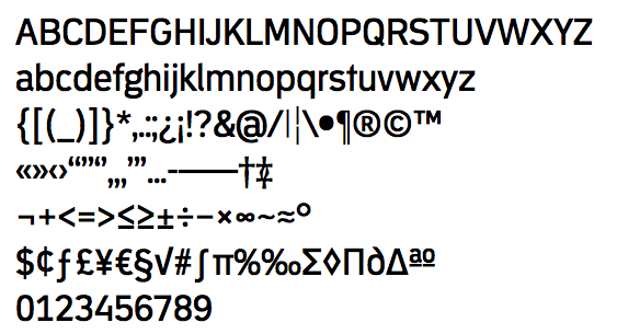
file name: Jonas Hecksher Republic

file name: Jonas Hecksher Vertigo

file name: Jonas Hecksher Berlingske Slab 2014
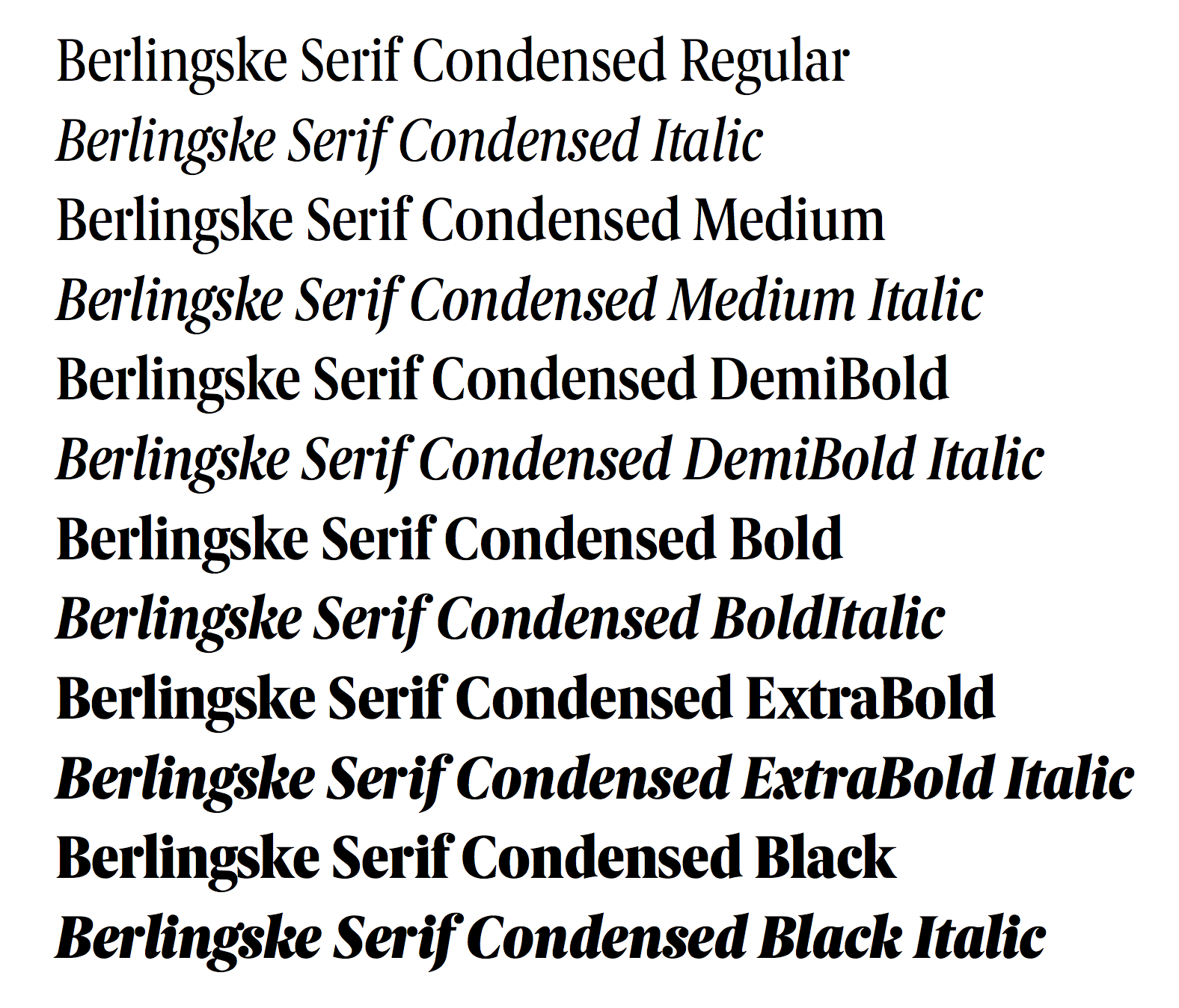
file name: Jonas Hecksher Berlingske Serif 2014

file name: Jonas Hecksher Berlingske Serif 2014b

file name: Jonas Hecksher Berlingske Serif 2014c

file name: Jonas Hecksher Berlingske 2014
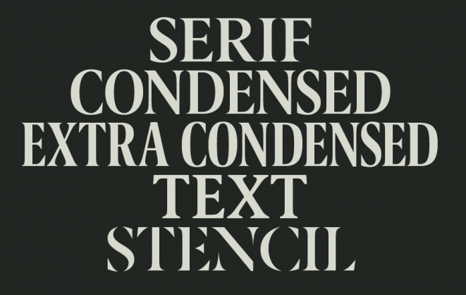
file name: Jonas Hecksher Berlingske 2014b
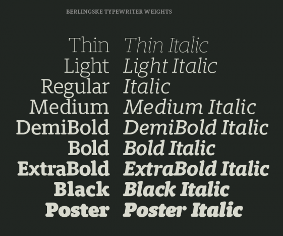
file name: Jonas Hecksher Berlingske 2014c
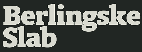
file name: Jonas Hecksher Berlingske 2014d
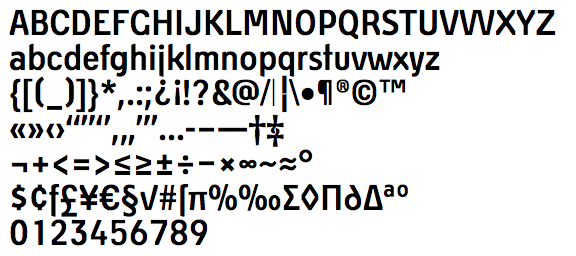
file name: Jonas Hecksher Willumsen

file name: Jonas Hecksher Zetta Sans

file name: Jonas Hecksher Abidale Book
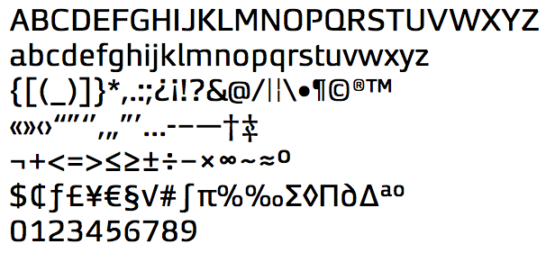
file name: Jonas Hecksher Hall
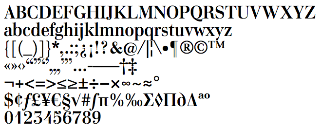
file name: Jonas Hecksher Home Display Demibold

file name: Jonas Hecksher J P Special Serif
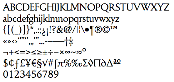
file name: Jonas Hecksher Symphony Display
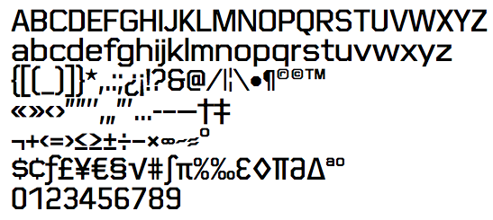
file name: Jonas Hecksher Trood
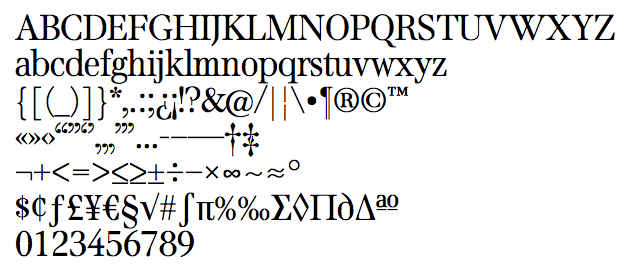
file name: Jonas Hecksher Venti Quattro
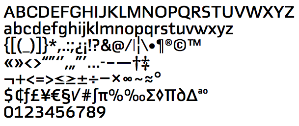
file name: Jonas Hecksher Fletch Text

file name: Jonas Hecksher Academy Sans Condensed 2018

file name: Jonas Hecksher Academy Sans
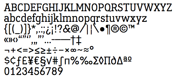
file name: Jonas Hecksher Academy Serif
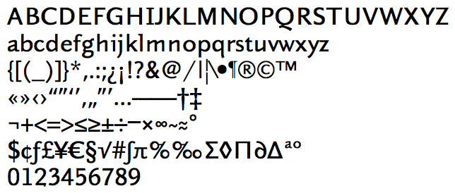
file name: Jonas Hecksher Bingo Sans
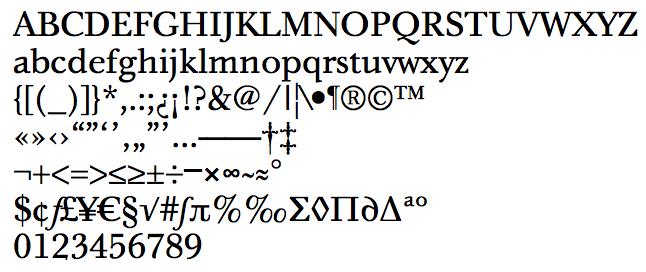
file name: Jonas Hecksher Bingo Serif
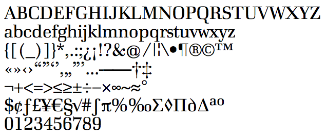
file name: Jonas Hecksher De Archie
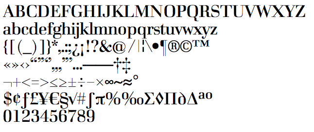
file name: Jonas Hecksher De Archie Display
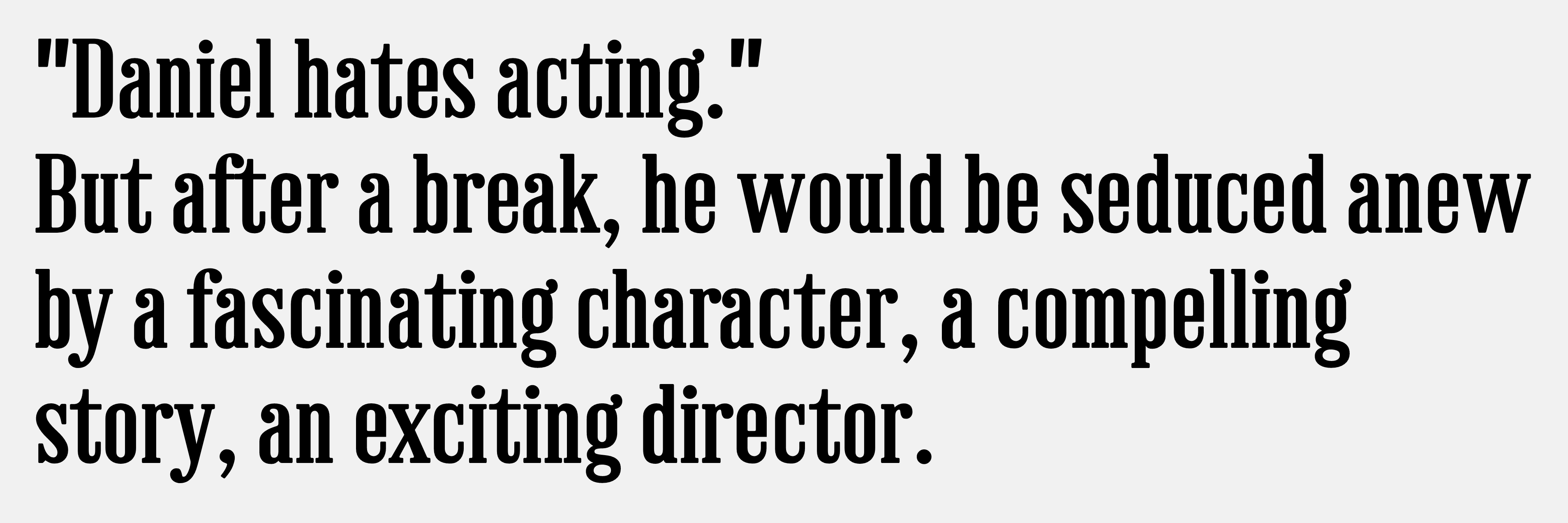
file name: Jonas Hecksher Fru Olsen 1998

file name: Jonas Hecksher Fru Olsen
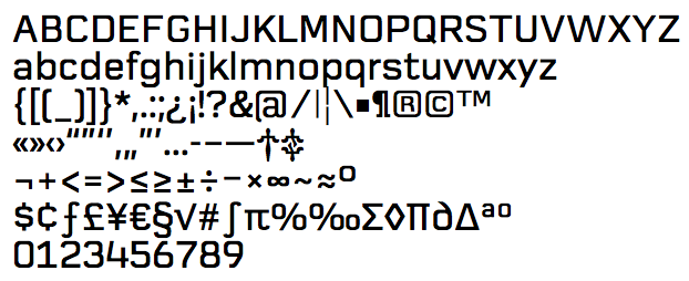
file name: Jonas Hecksher Geometric
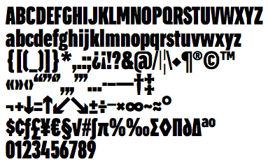
file name: Jonas Hecksher Hazelwood Condensed
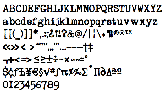
file name: Jonas Hecksher Hermes Baby
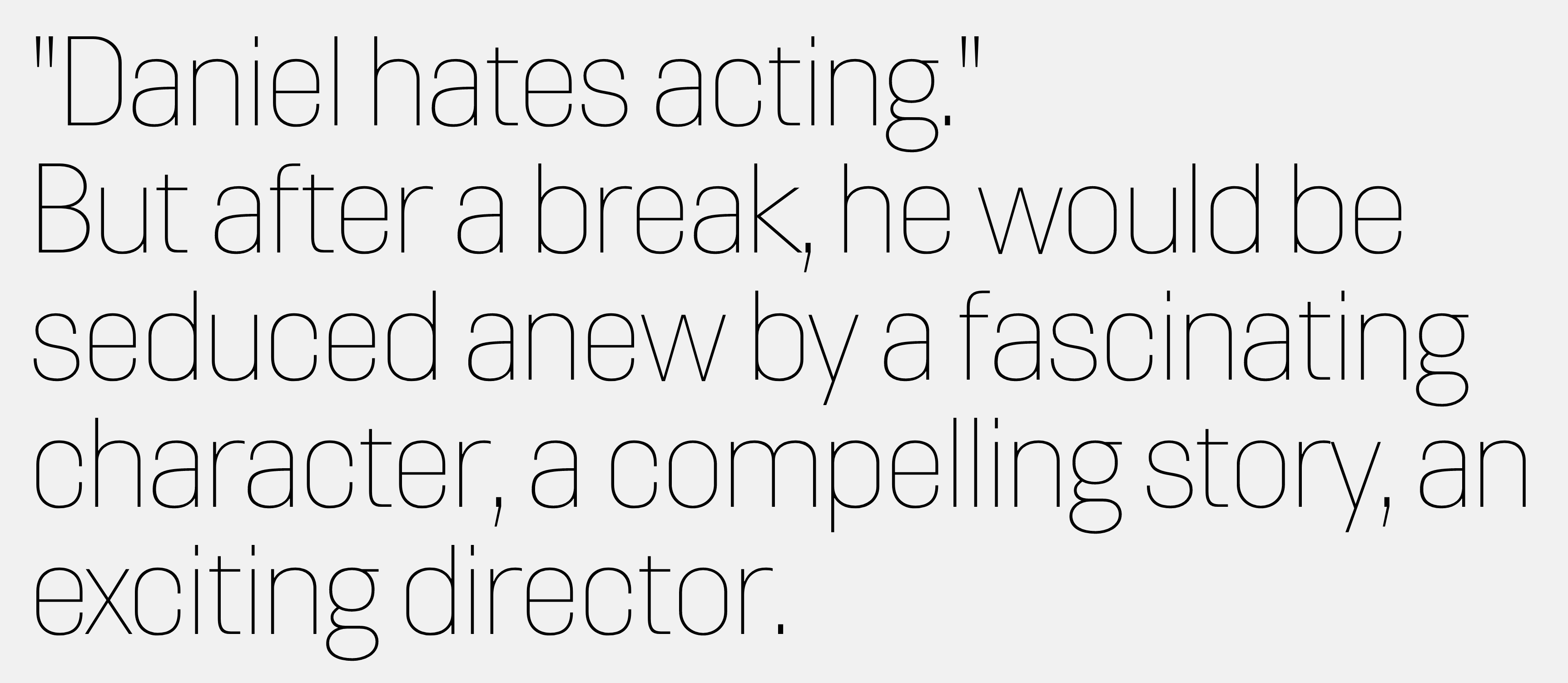
file name: Jonas Hecksher Hill 2005
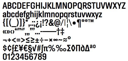
file name: Jonas Hecksher Hill Demi Bold
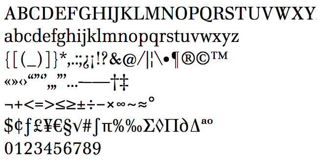
file name: Jonas Hecksher Home Text

file name: Jonas Hecksher I D00 Sans
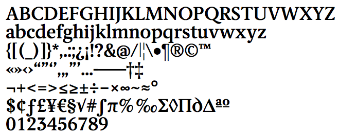
file name: Jonas Hecksher I D00 Serif Demi Bold

file name: Jonas Hecksher J P Special Sans
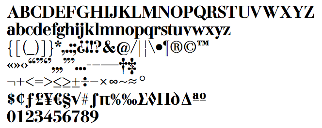
file name: Jonas Hecksher J P Special Serif Bold

file name: Jonas Hecksher Jazz House 2007
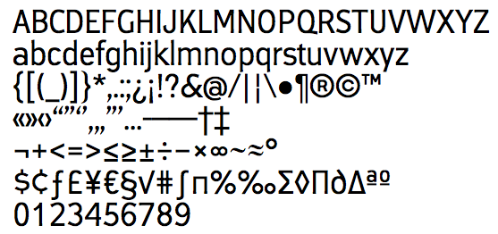
file name: Jonas Hecksher Jazz House
| | |
|
Luc Devroye ⦿ School of Computer Science ⦿ McGill University Montreal, Canada H3A 2K6 ⦿ lucdevroye@gmail.com ⦿ https://luc.devroye.org ⦿ https://luc.devroye.org/fonts.html |

