TYPE DESIGN INFORMATION PAGE last updated on Thu Apr 16 22:01:47 EDT 2026
FONT RECOGNITION VIA FONT MOOSE

|
|
|
|
Inland Type Foundry
[A.V. Haight]
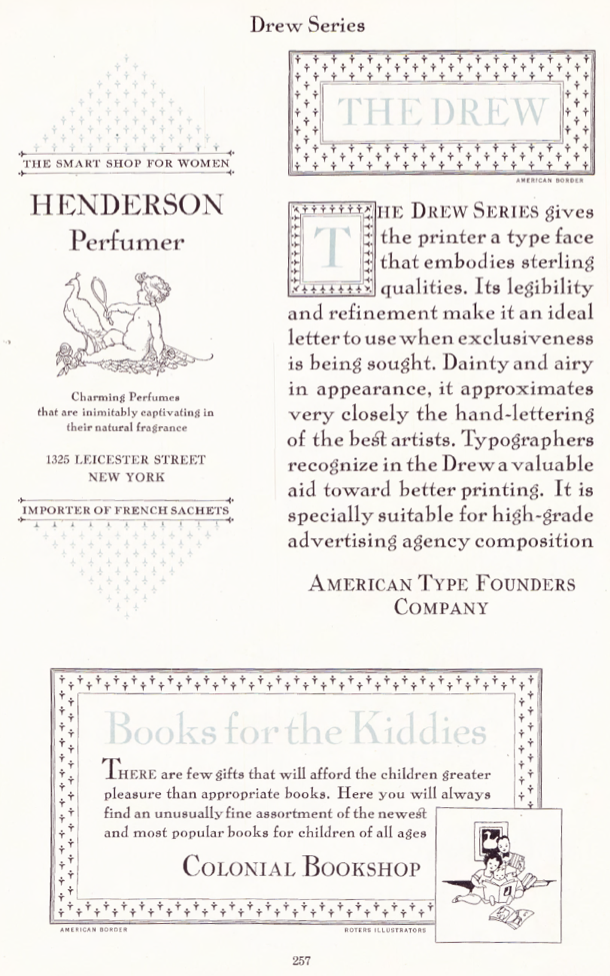
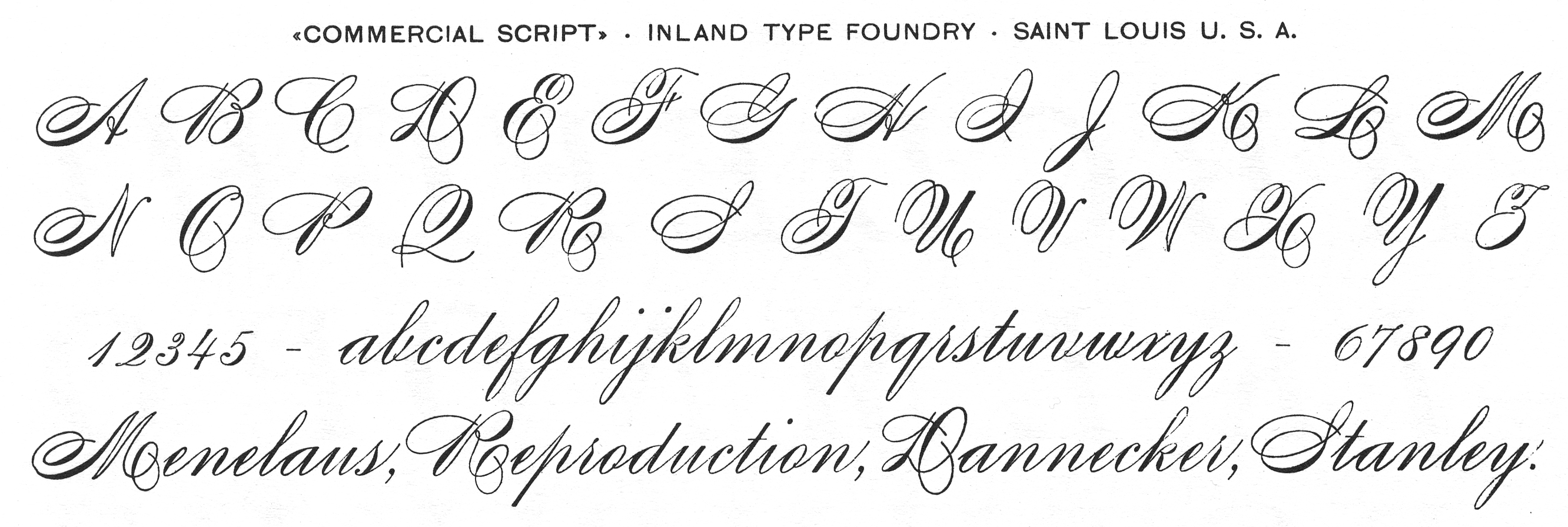
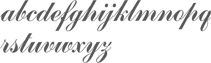
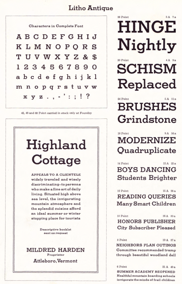
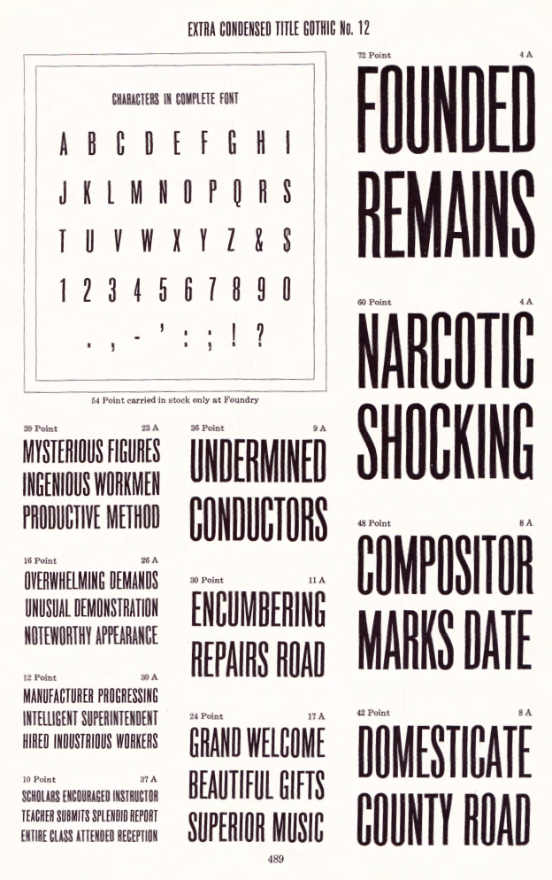
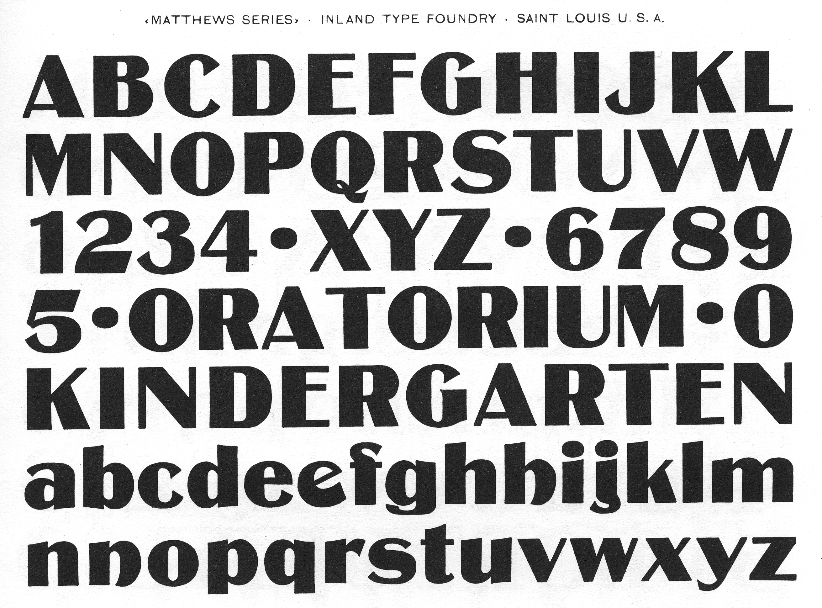
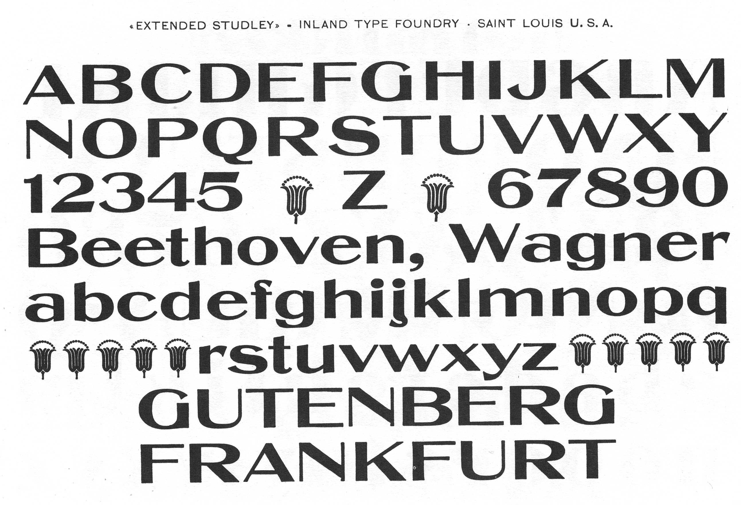
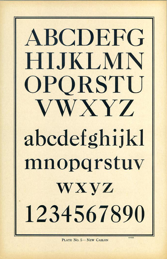
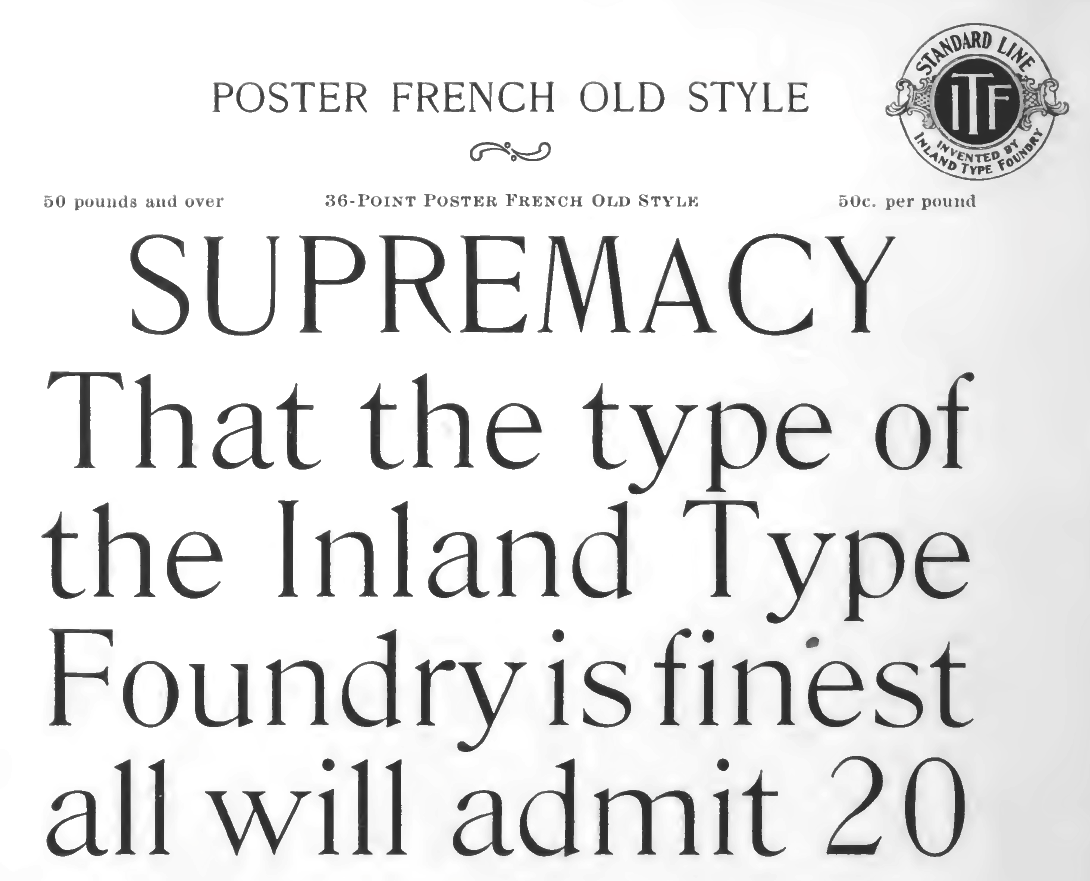
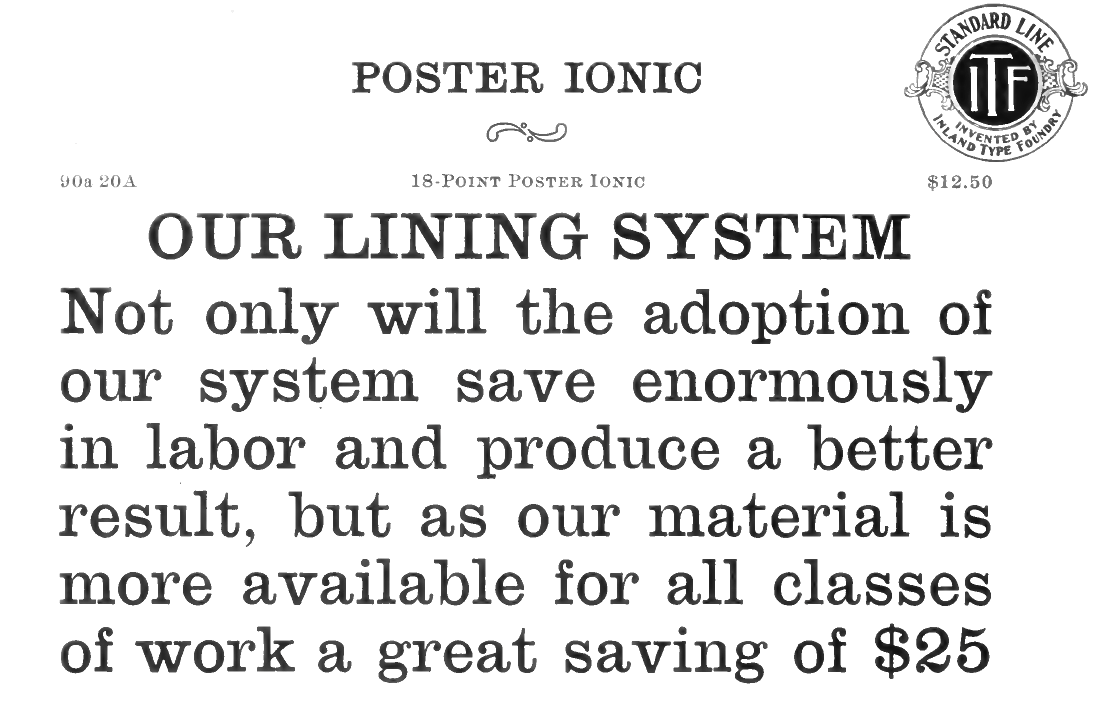
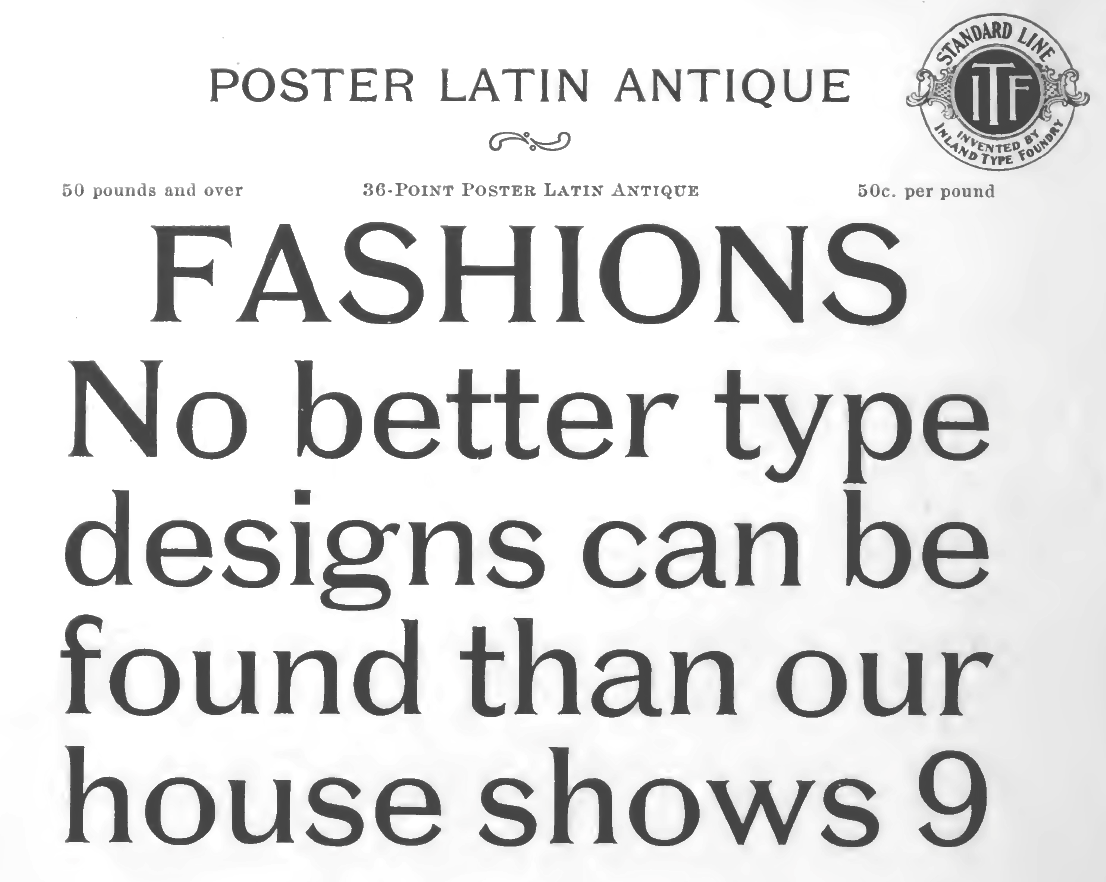
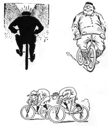
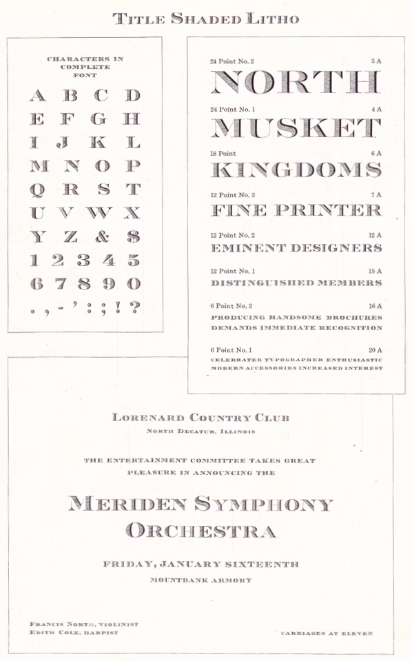
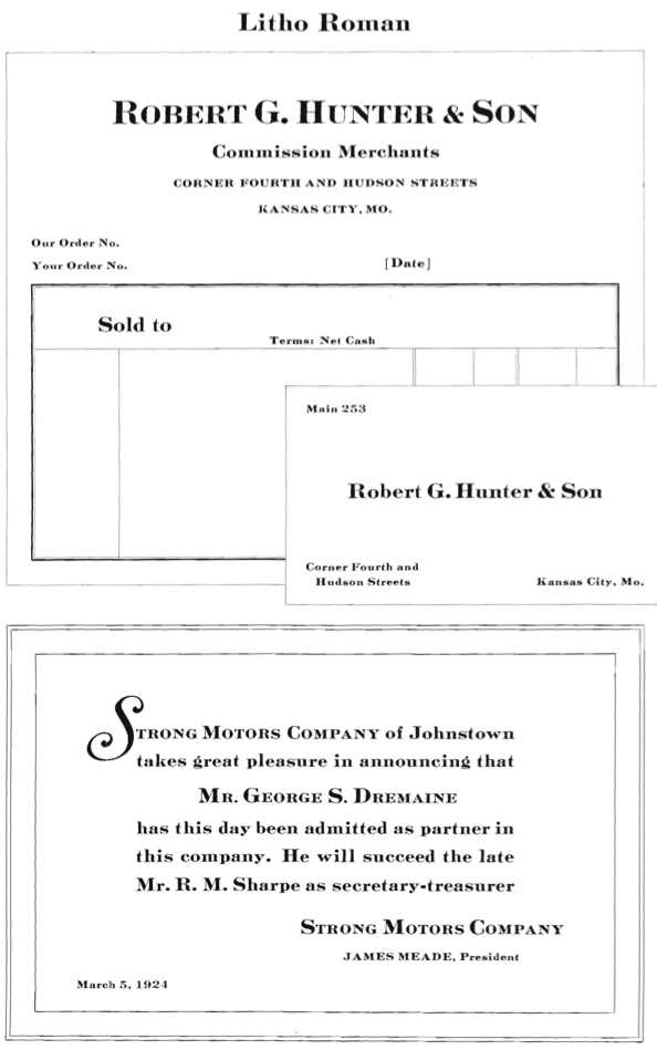
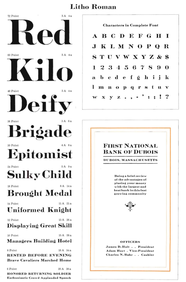
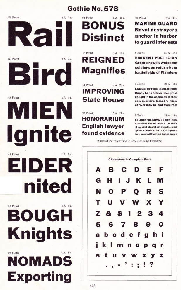
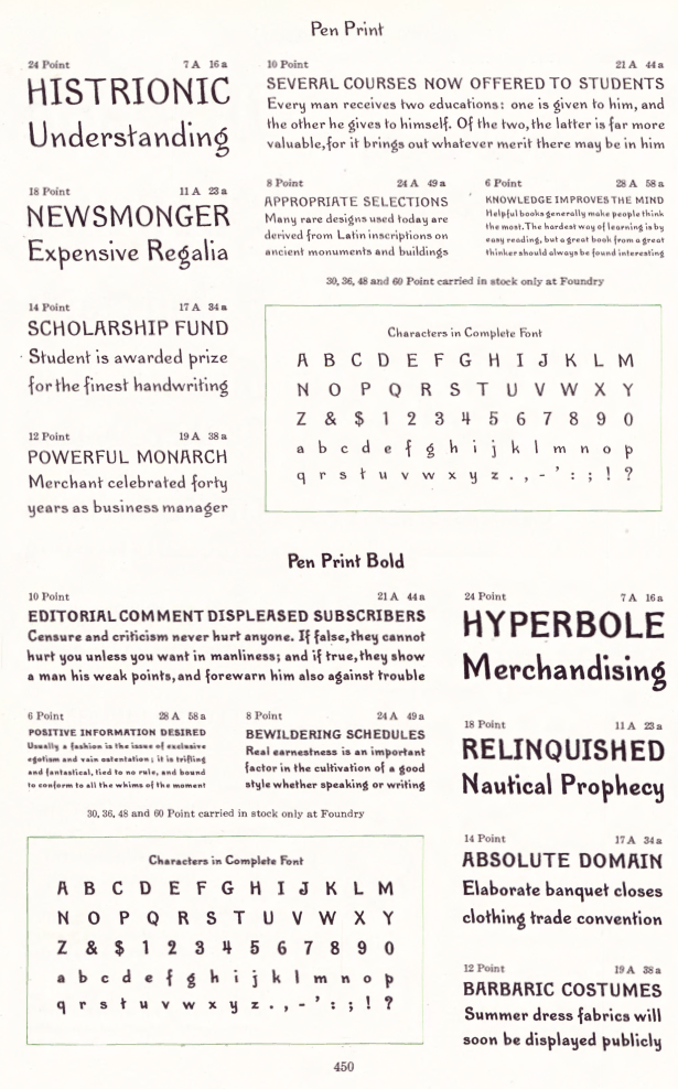
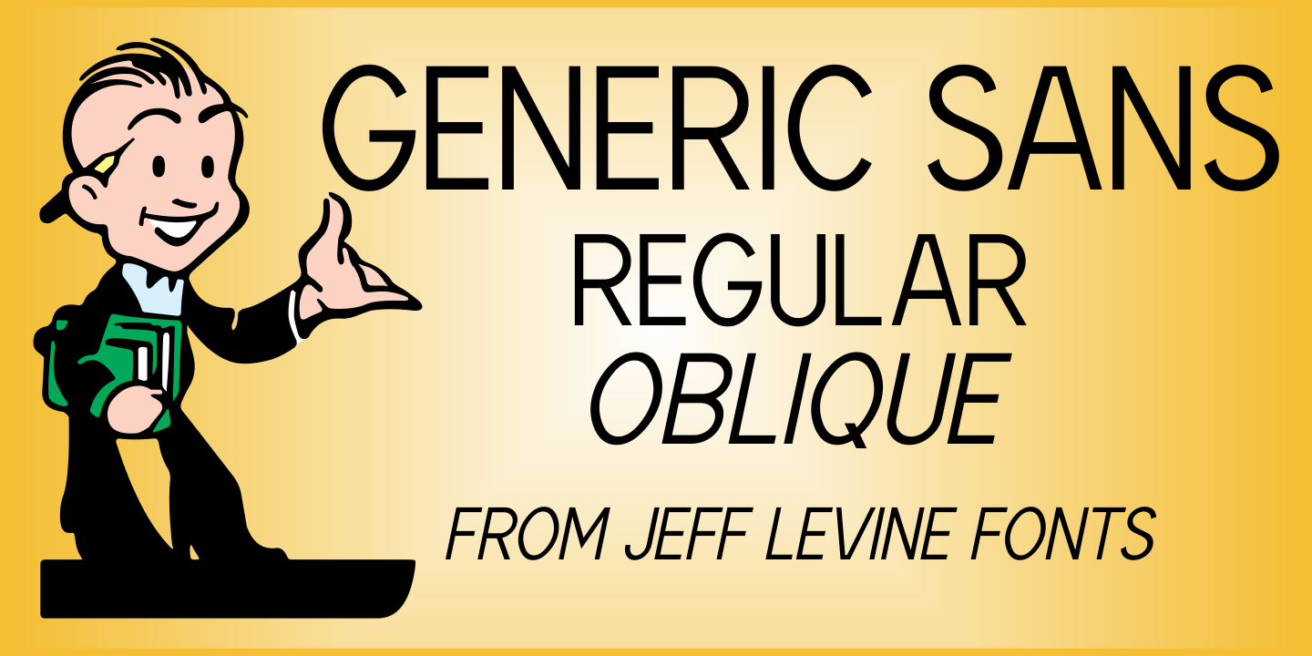
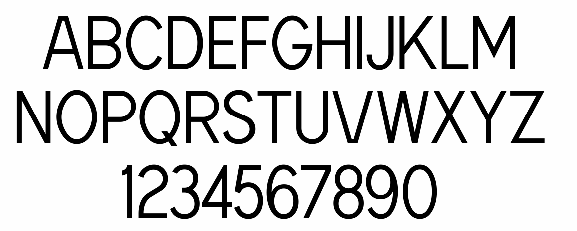
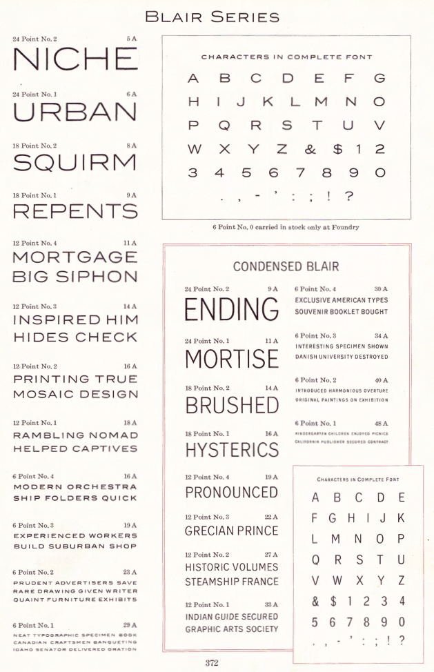
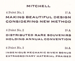
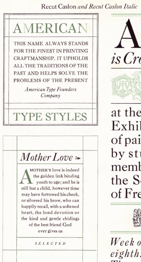
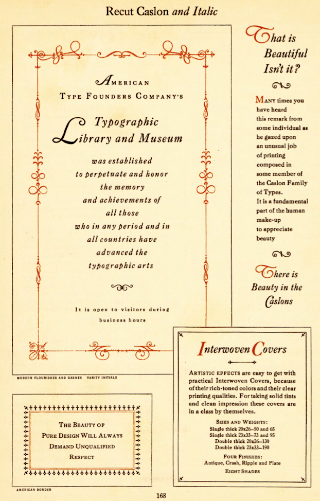
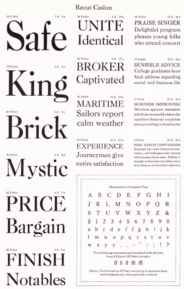
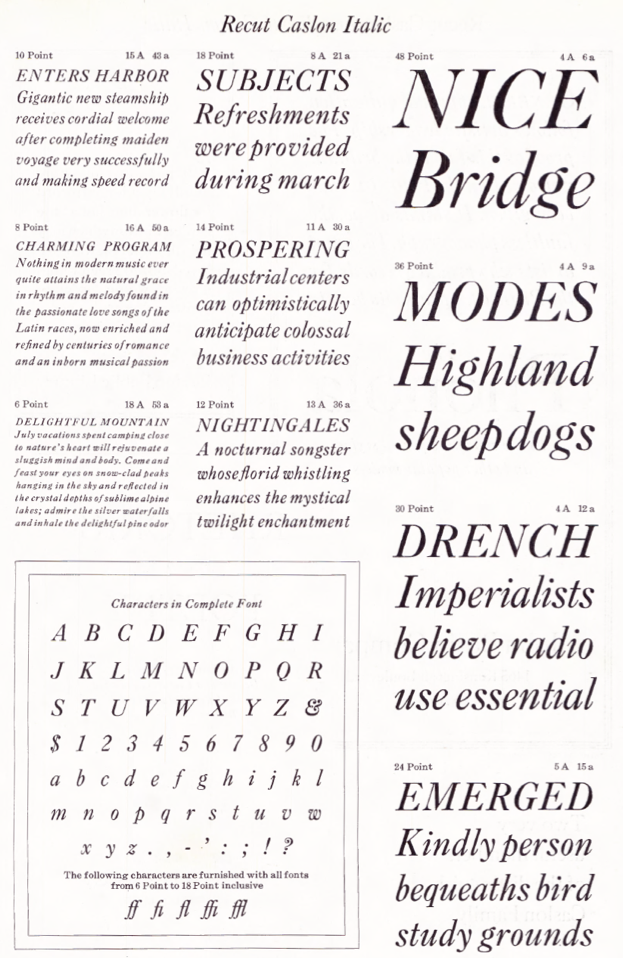
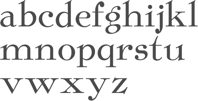
The Inland Type Foundry in Saint Louis was established in 1892 by the three sons of Carl Schraubstadter (1827-1897), William A. Schraubstadter (1864-1957), Oswald Schraubstadter (1868-1955) and Carl Schraubs Jr. (1862-1947). Carl had run the Central Type Foundry in Saint Louis and sold it to ATF (American Type Founders) in 1892, and the sons reacted by setting up Inland. Until 1911, Inland was one of the most successful foundries in the United States. In 1911 Inland was purchased by ATF and its equipment divided between that foundry and Barnhart Brothers and Spindler (BBS). A.V. Haight (Poughkeepsie) designed Rogers (art nouveau) at Inland Type foundry in 1902. He also designed Haight. Nicholas J. Werner, who used to work for Central, also created many designs at Inland. Look for "Specimen book and catalog, a price list of printers' supplies, showing types and rules in which are embodied all the latest styles ... among which ... may be especially mentioned the casting of types on standard line and unit sets." (1902, 464 pages), Specimen Book and Catalog. A Price List of Printers Supplies, Showing Types and Rules in which Are Embodied all the Latest Ideas that Enable the Printer to Produce Superior Work in a most Economical Manner Among which Betterments May Be Especially Mentioned the Casting of Types on Standard Line and Unit Sets (St. Louis, 1897) (a free copy is here and here) and Specimen Book and Catalog. A Price List of Printers Supplies, Type, Rules and Accessories of the Very Latest Designs which Facilitate the Economical Production of Superior Printing. A Notable Improvement Is the Casting of All Type on Standard Line&Unit Sets (St. Louis, 1907). MyFonts page. Scans of some typefaces: Becker (art nouveau), Blanchard Italic [Blanchard was revived in 2013 by Paulo W as Blanchard Inland], Commercial Script, Edwards (art nouveau), Inland, Lightface Blanchard, Matthews (1902: revived in 2019 by Chuck Mountain as Cotrell CF), Extended Studley (revived by Chuck Mountain in 2019 as Dukas CF, and by Jeff Levine in 2008 as Bayview JNL), Rogers (art nouveau), Poster French Oldstyle (1897 catalog), Poster Ionic (1897 catalog), Poster Latin Antique (1897 catalog), Pacific Bikes (ornaments, 1897 catalog), Recut Caslon (1907, as taken from the 1923 ATF catalog), Drew (1910, from the 1923 ATF catalog: a digital version called Droobie NF was created by Nick Curtis in 2014), Title Shaded Litho (1911), Litho Roman (1907), Gothic No.578 (1898), Pen Print (1911), Blair (1900; Condensed Blair was revived in 2022 by Jeff Levine as Generic Sans JNL), Mitchell (1906, a bold version of the all caps grotesque face Blair; digitally revived by Nick Curtis in 2015 as Mitchell NF), Comstock (1902), Inland Copperplate (1901), Shaw Text (1907). Commentaries by Mac McGrew on some of the typefaces:
|
EXTERNAL LINKS |
| | |

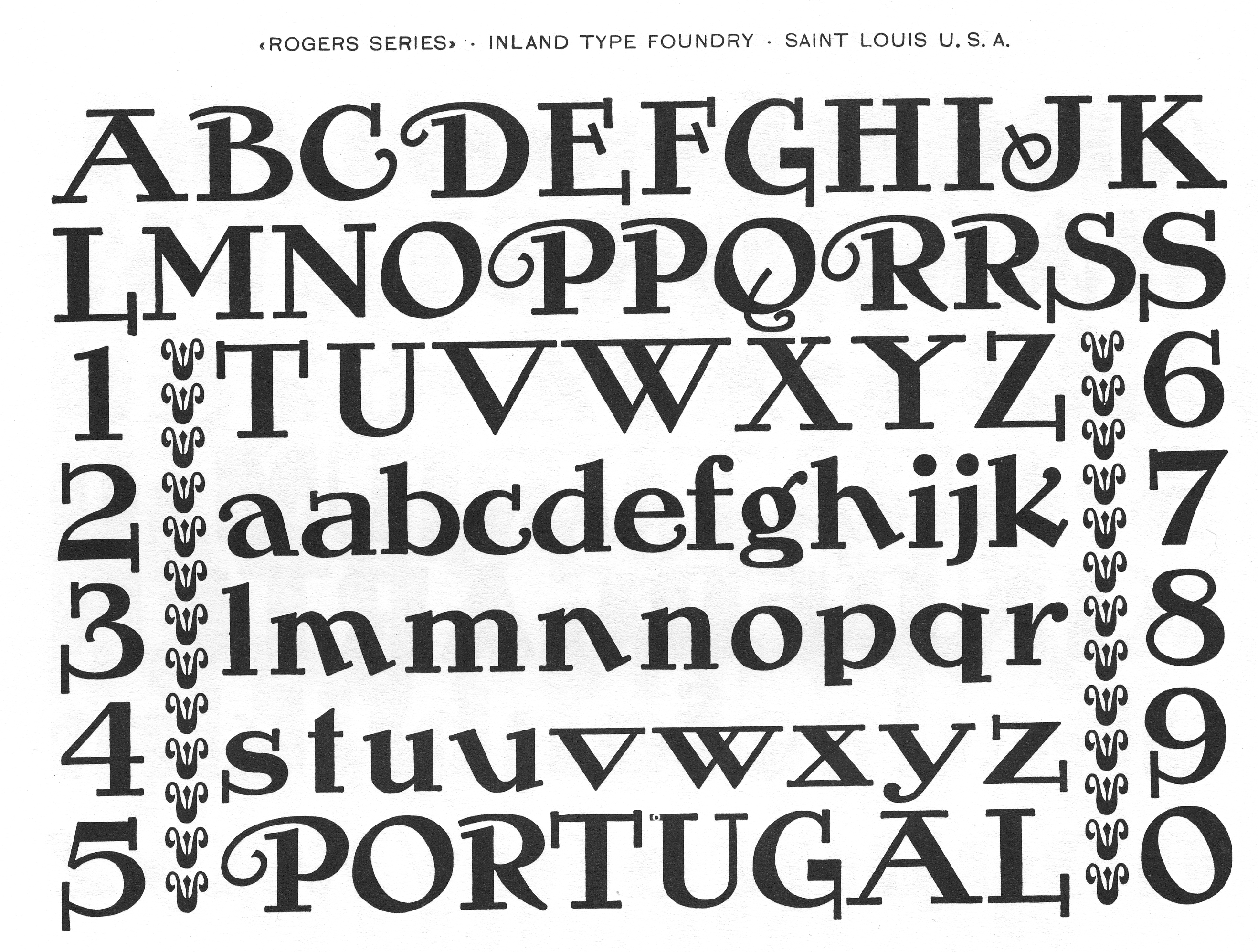
file name: Inland Rogers
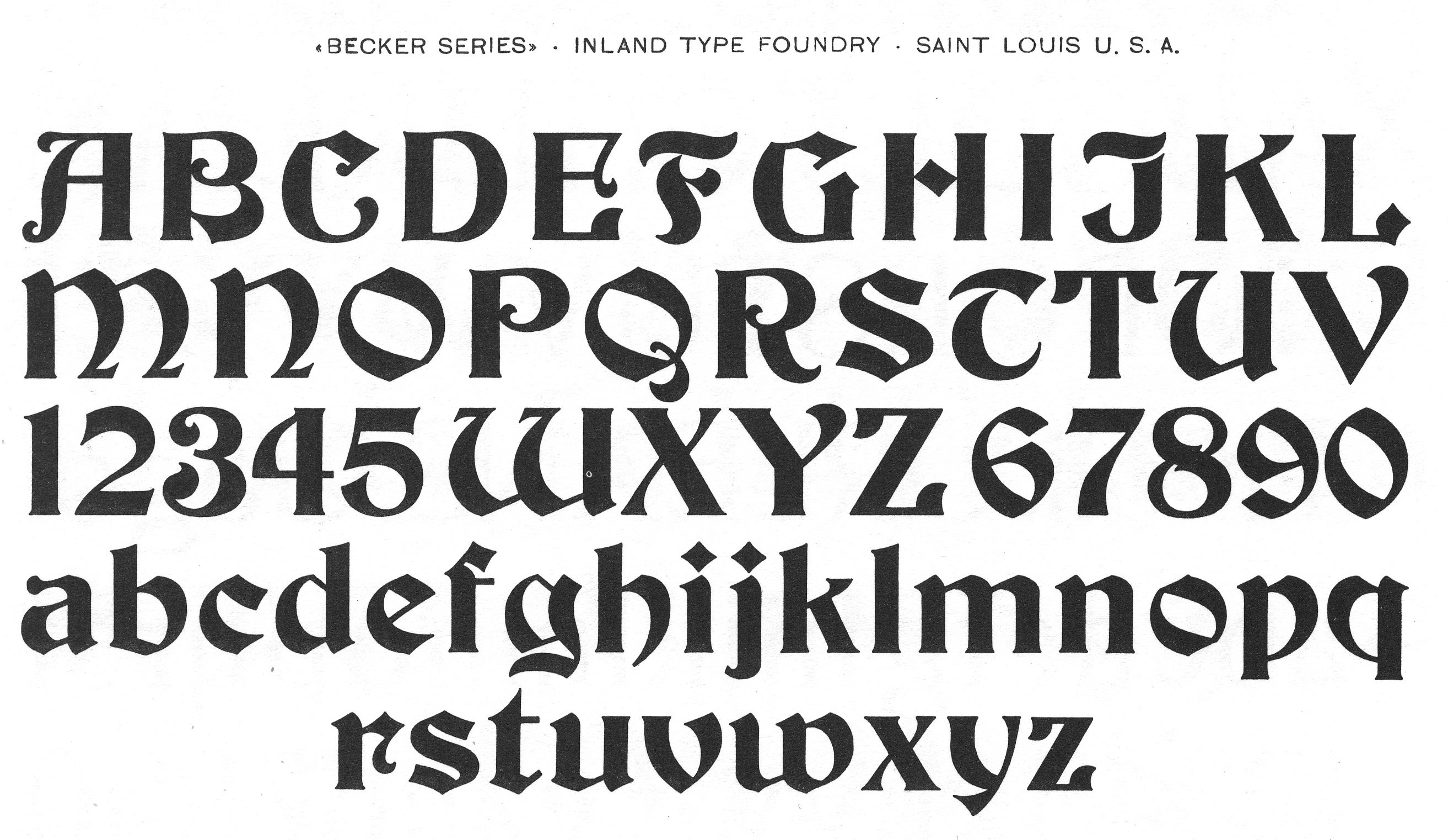
file name: Inland Becker
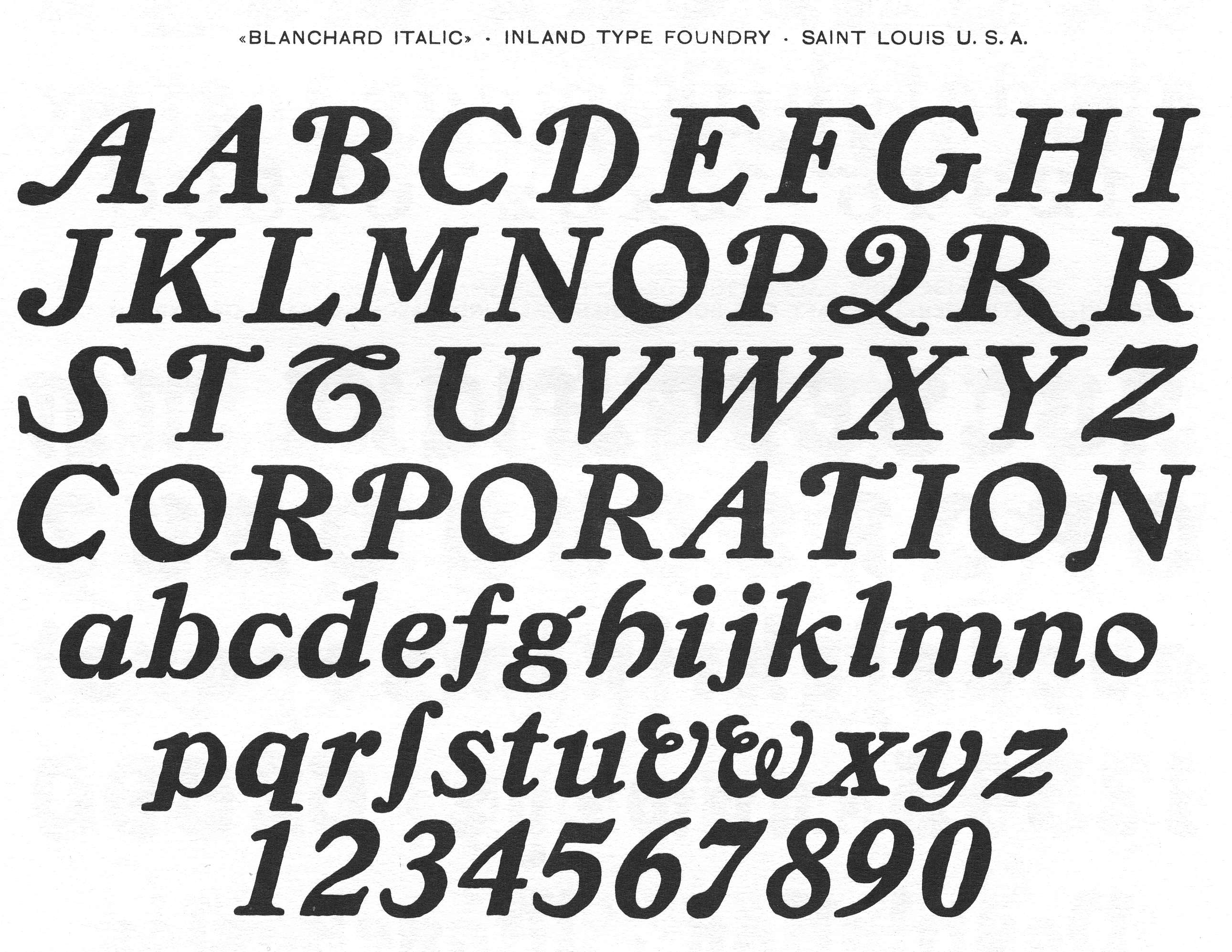
file name: Inland Blancharditalic

file name: Paulo W Blanchard Inland 2013
file name: Inland Commercial Script
file name: U R W Commercial Script
file name: Inland Litho Antique 1910
file name: Inland Extra Condensed Title Gothic No12
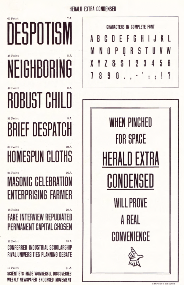
file name: Inland Herald Extra Condensed 1909
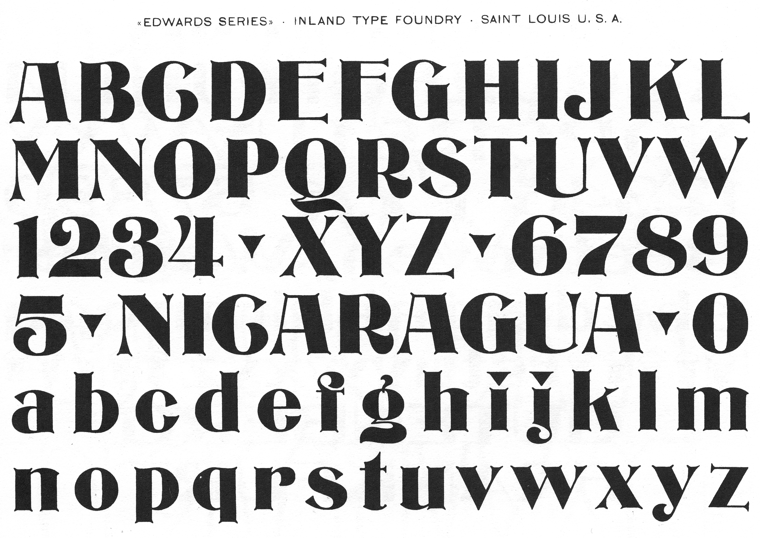
file name: Inland Edwards
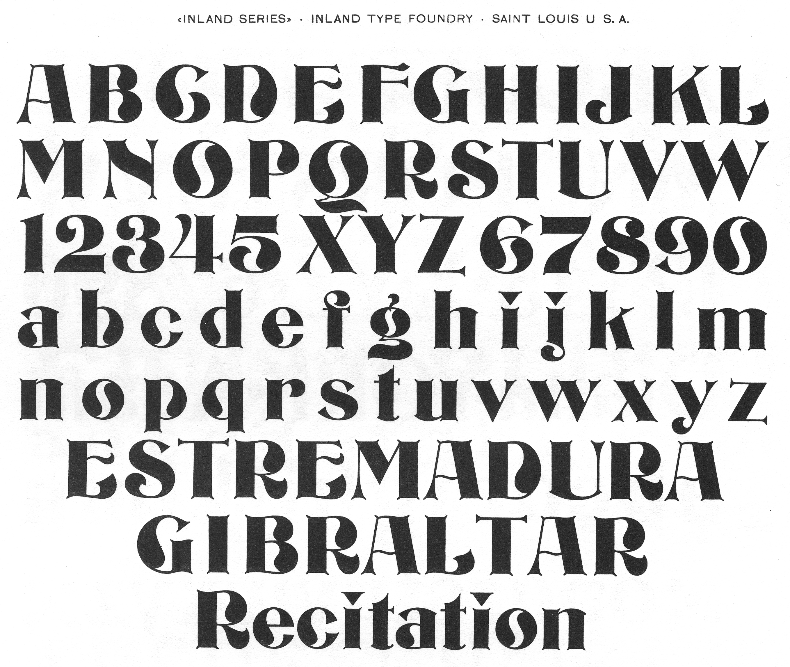
file name: Inland Inland
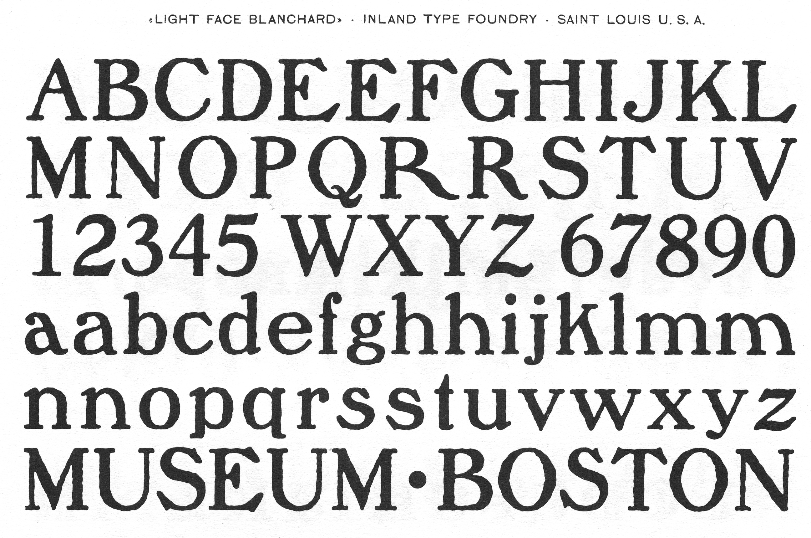
file name: Inland Lightface Blanchard
file name: Inland Matthews

file name: Jeff Levine Merchant Trade J N L 2020
file name: Inland Rogers Extended Studley
file name: Inland Type Foundry New Caslon 1905
file name: Inland Type Foundry Poster French Old Style 1897 Catalog
file name: Inland Type Foundry Poster Ionic 1897 Catalog
file name: Inland Type Foundry Poster Latin Antique 1897 Catalog
file name: Inland Type Foundry Pacific Bikes 1897
file name: Inland Title Shaded Litho 1911

file name: Chuck Mountain Dukas C F 2019

file name: Chuck Mountain Dukas C F 2019
file name: A T F1923 Litho Roman b
file name: A T F1923 Litho Roman
file name: Inland Gothic No578 1898
file name: Inland Pen Print 1911
file name: Jeff Levine Generic Sans J N L 2022 1
file name: Jeff Levine Generic Sans J N L 2022 3

file name: Jeff Levine Generic Sans J N L 2022
file name: Inland Blair 1900
file name: Inland Mitchell 1906

file name: Nick Curtis Mitchell N F 2015 after Inland Type Foundry Mitchell 1906
file name: Chuck Mountain Cotrell C F 2019
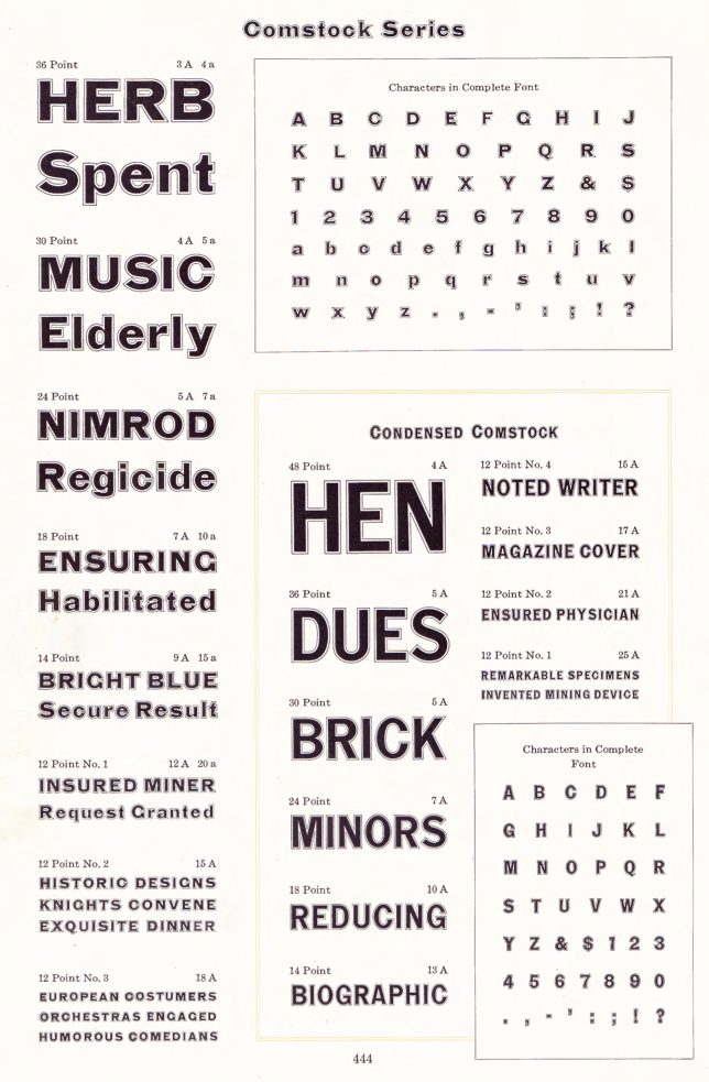
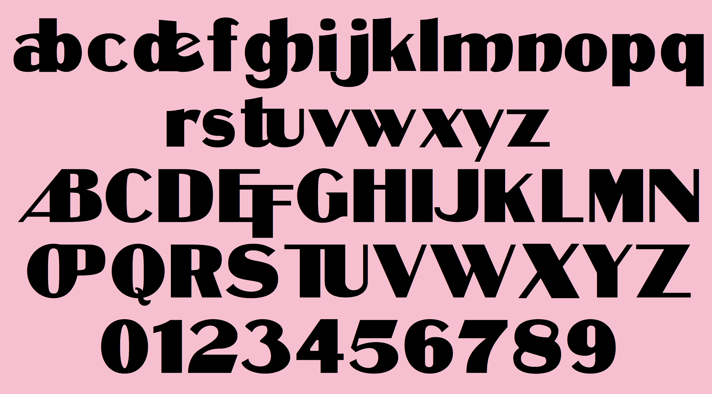
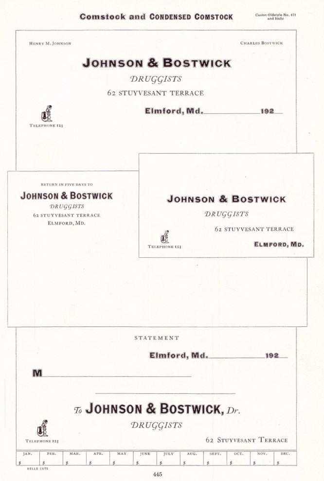
file name: Inland Comstock 1902
file name: Inland Comstock 1902b
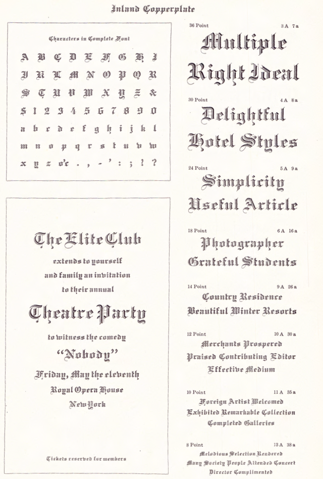
file name: Inland Inland Copperplate 1901
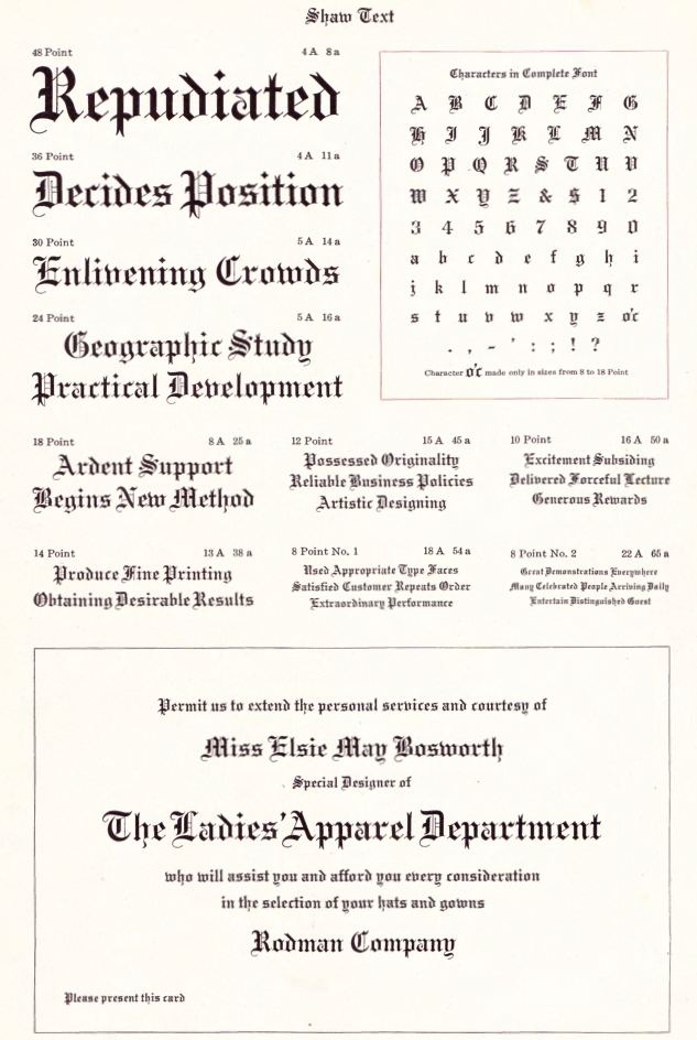
file name: Inland Shaw Text 1907
file name: Inland Shaw Text 1907b
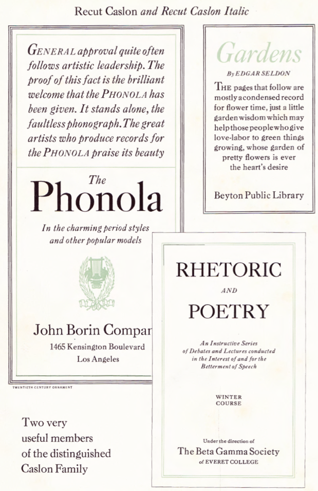
file name: A T F1923 Recut Caslon b
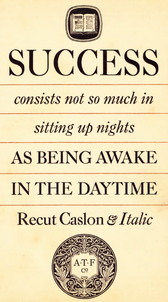
file name: A T F1923 Recut Caslon c
file name: A T F1923 Recut Caslon d
file name: A T F1923 Recut Caslon e
file name: A T F1923 Recut Caslon
file name: A T F1923 Recut Caslon Italic
file name: Nick Curtis Droobie N F 2014 after Inland Type Foundry Drew 1910
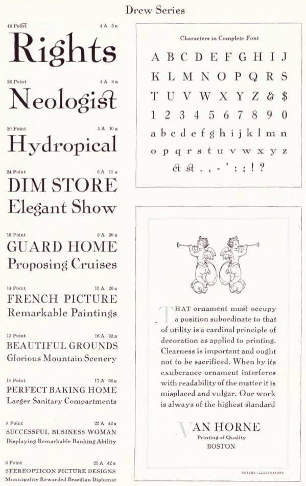
file name: Inland Drew 1910
file name: Inland Drew 1910b
| | |
|
Luc Devroye ⦿ School of Computer Science ⦿ McGill University Montreal, Canada H3A 2K6 ⦿ lucdevroye@gmail.com ⦿ https://luc.devroye.org ⦿ https://luc.devroye.org/fonts.html |