TYPE DESIGN INFORMATION PAGE last updated on Mon Jun 8 18:00:55 EDT 2026
FONT RECOGNITION VIA FONT MOOSE

|
|
|
|
British Letter Foundry
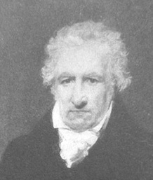
[John Bell]
John Bell (1746-1831) was a London-based publisher of several periodicals and newspapers. He founded the British Letter Foundry in 1788, with Richard Austin as punchcutter. The foundry closed in 1798. John Tranter tells the story: John Bell, an English publisher and bookseller, advertised a book called The Way to Keep Him in The World newspaper in London in June 1787, saying: 'J. Bell flatters himself that he will be able to render this the most perfect and in every respect the most beautiful book, that was ever printed in any country.' That was a tall order. In his quest for perfection he set up a type foundry, and hired a young punchcutter named Richard Austin to cut a new typeface for him. The face, named after Bell, was based on a typeface designed some thirty years before by John Baskerville, another perfectionist. Baskerville had said 'Having been an early admirer of the beauty of Letters, I became insensibly desirous of contributing to the perfection of them.' Though Baskerville went broke eventually, his typeface was indeed very close to perfection, and went on to become one of the most popular typefaces of all time. John Bell's type foundry didn't do well. He closed down his shop within two years and went on to other things, and his typeface sank almost without trace in England. Newer trends in typefaces (Didot in France, and Bodoni in Italy) eclipsed the modest elegance of Richard Austin's design. The Americans, though, took a shine to it. It was copied as early as 1792, and always remained popular there. A complete set of type cast from Bell's original matrices was purchased by the American Henry Houghton in 1864 and installed at his Riverside Press. He thoughtlessly labelled it 'English Copperplate'. Later, the distinguished American book designer Bruce Rogers used the typeface frequently, naming it 'Brimmer', after the author of a book he'd seen the typeface used for when he worked as a young man at the Riverside Press. The designer Daniel Updike also worked at Riverside, and also used the 'English Copperplate' type extensively in later years, naming his version of it 'Mountjoye'. Bell's type would have remained obscured by these disguises perhaps forever, but for the alert eye of Stanley Morison. He was doing research at the Bibliothèque Nationale in Paris in 1926 when he came across a copy of the first specimen sheet of type samples issued from John Bell's foundry in 1788. No copy of it existed in England at that time, and Morison recognised the typeface immediately as the original of the 'Brimmer' and 'Mountjoye' fonts used in America. He researched the matter and in 1931 published an important monograph which, as the type scholar Alexander Lawson says, 'returned the name of John Bell to its proper place in the pantheon of English printers'. The typeface was unique in another way. Until Richard Austin cut the typeface in 1788, all numerals were traditionally written like lower-case letters -- small, with some numerals hanging below the line. Bell is the first typeface to break with that tradition cleanly: Austin's numerals are larger than lower-case letters (at two-thirds the height of the capitals) and sit evenly along the line. The trend was taken up. These days the numerals in most printed matter are (unfortunately) the full size of the capital letter, and are called titling figures, ranging figures, or lining figures. See also here. FontShop link. |
EXTERNAL LINKS |
| | |

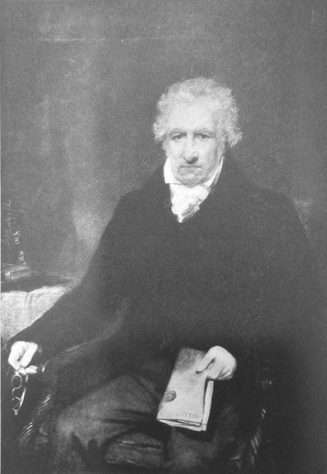
file name: John Bell Oil Painting
| | |
|
Luc Devroye ⦿ School of Computer Science ⦿ McGill University Montreal, Canada H3A 2K6 ⦿ lucdevroye@gmail.com ⦿ https://luc.devroye.org ⦿ https://luc.devroye.org/fonts.html |