TYPE DESIGN INFORMATION PAGE last updated on Wed May 6 16:12:48 EDT 2026
FONT RECOGNITION VIA FONT MOOSE


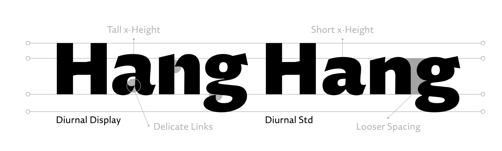
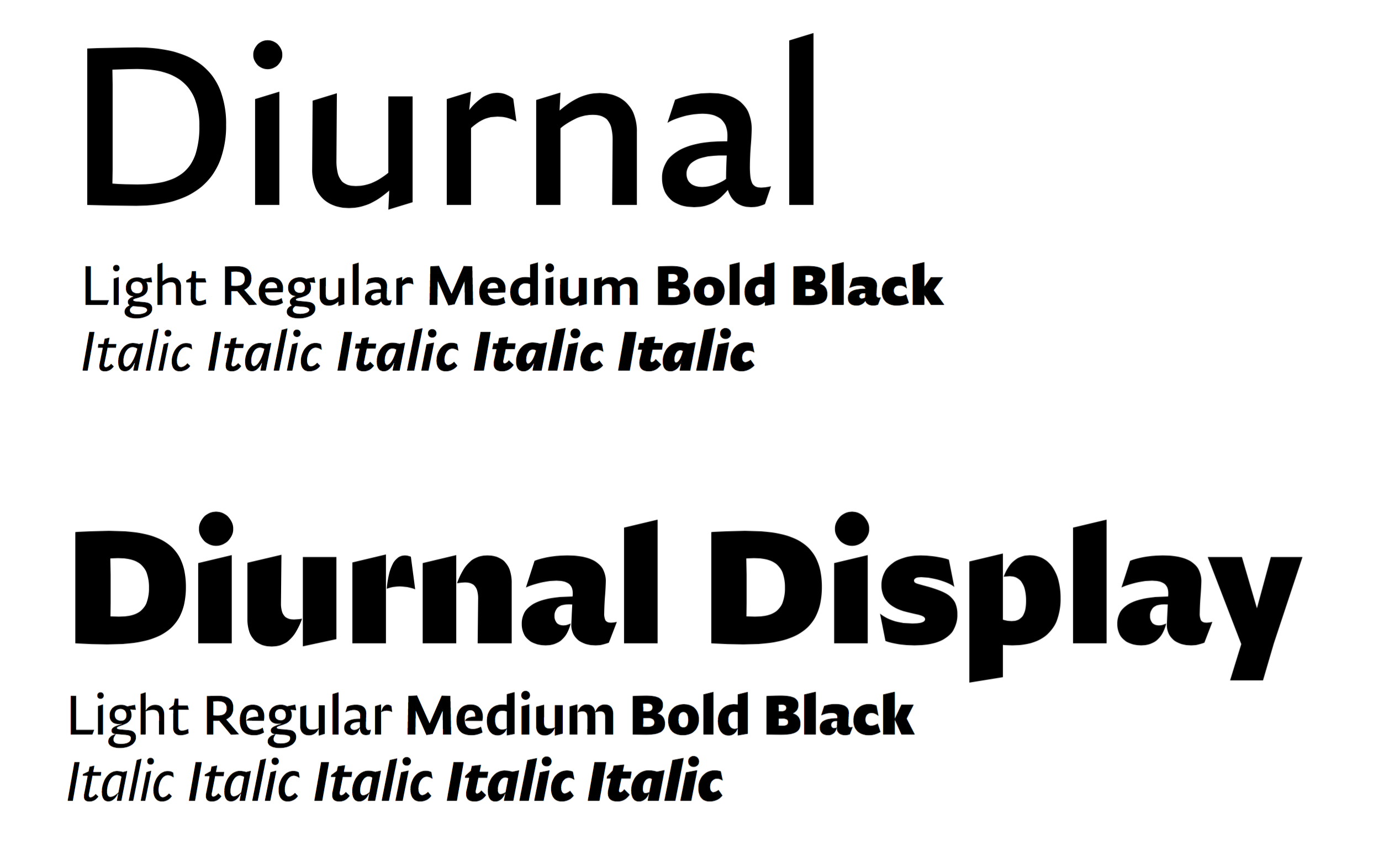
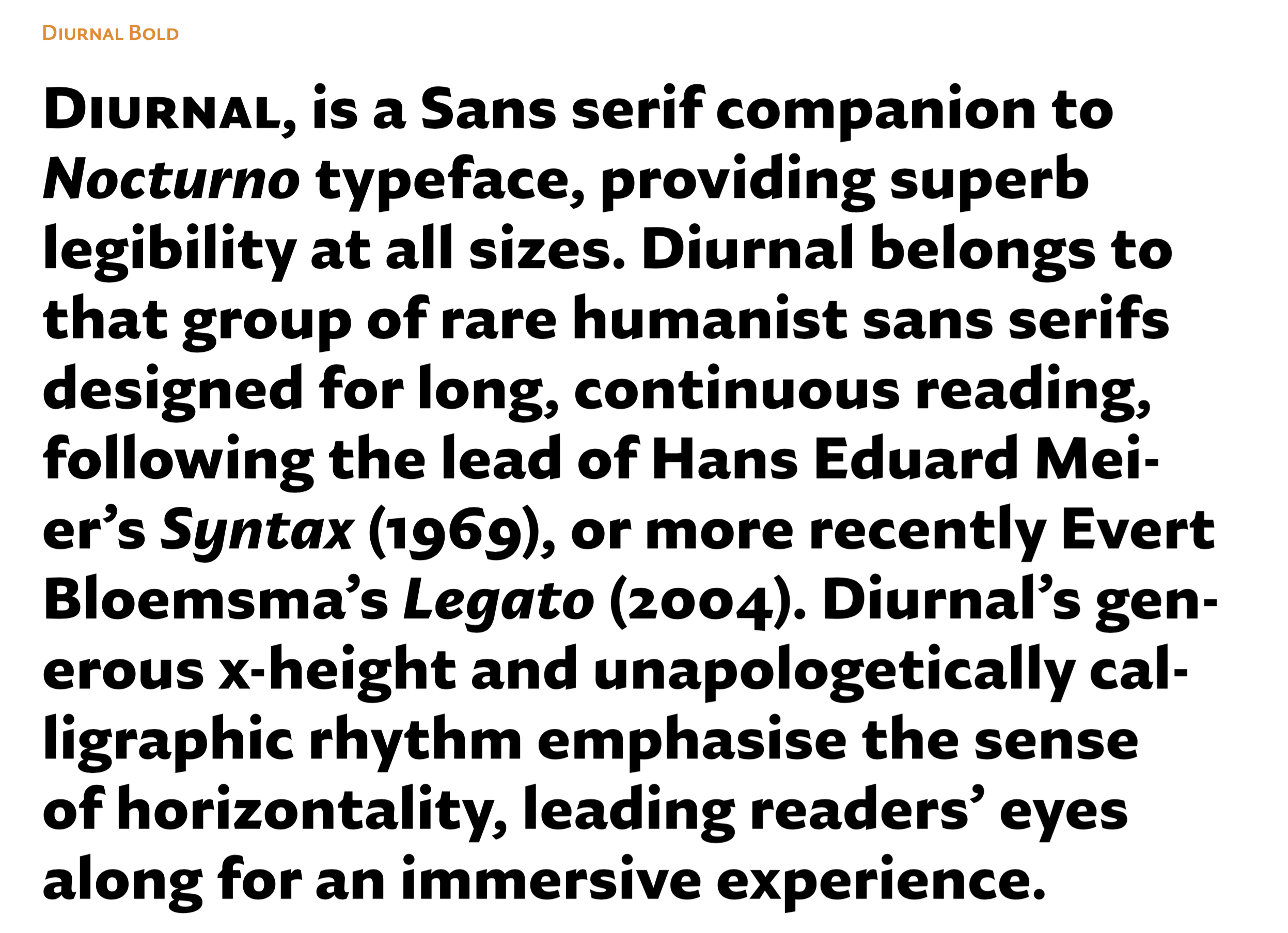
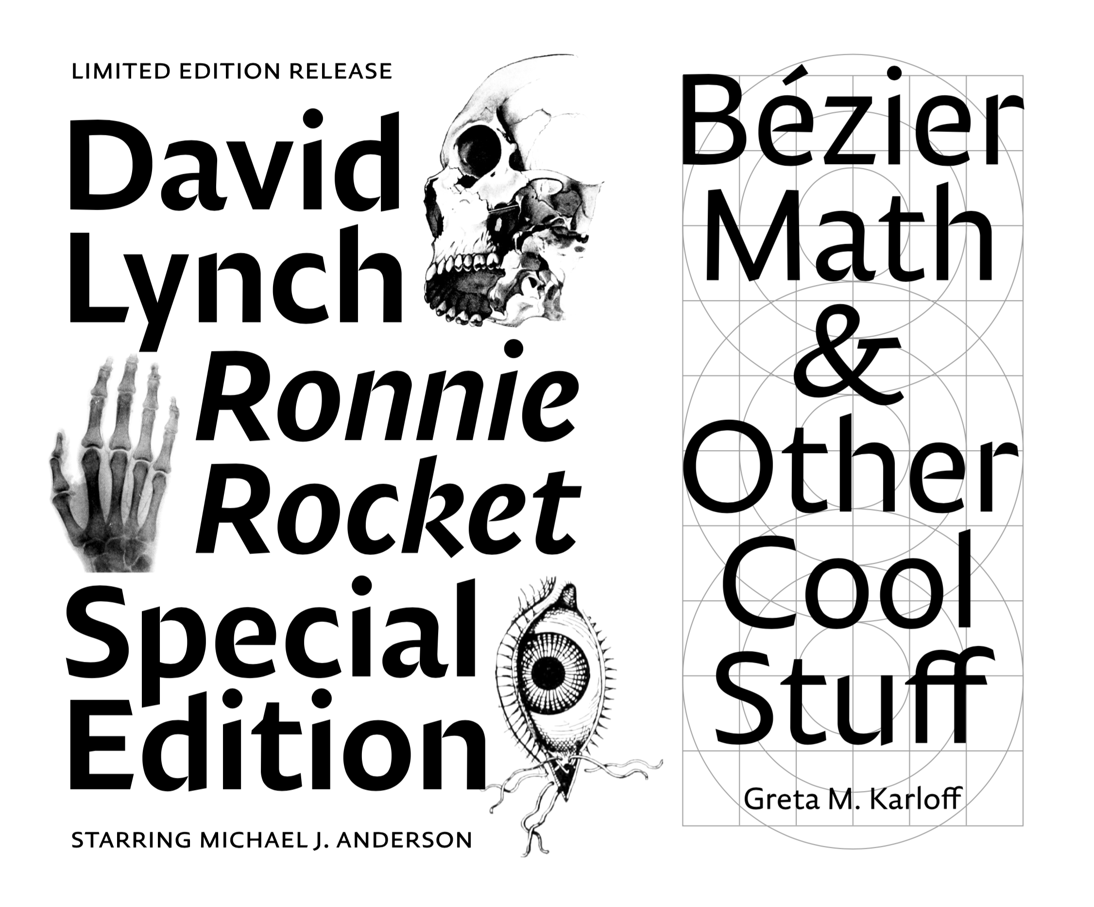
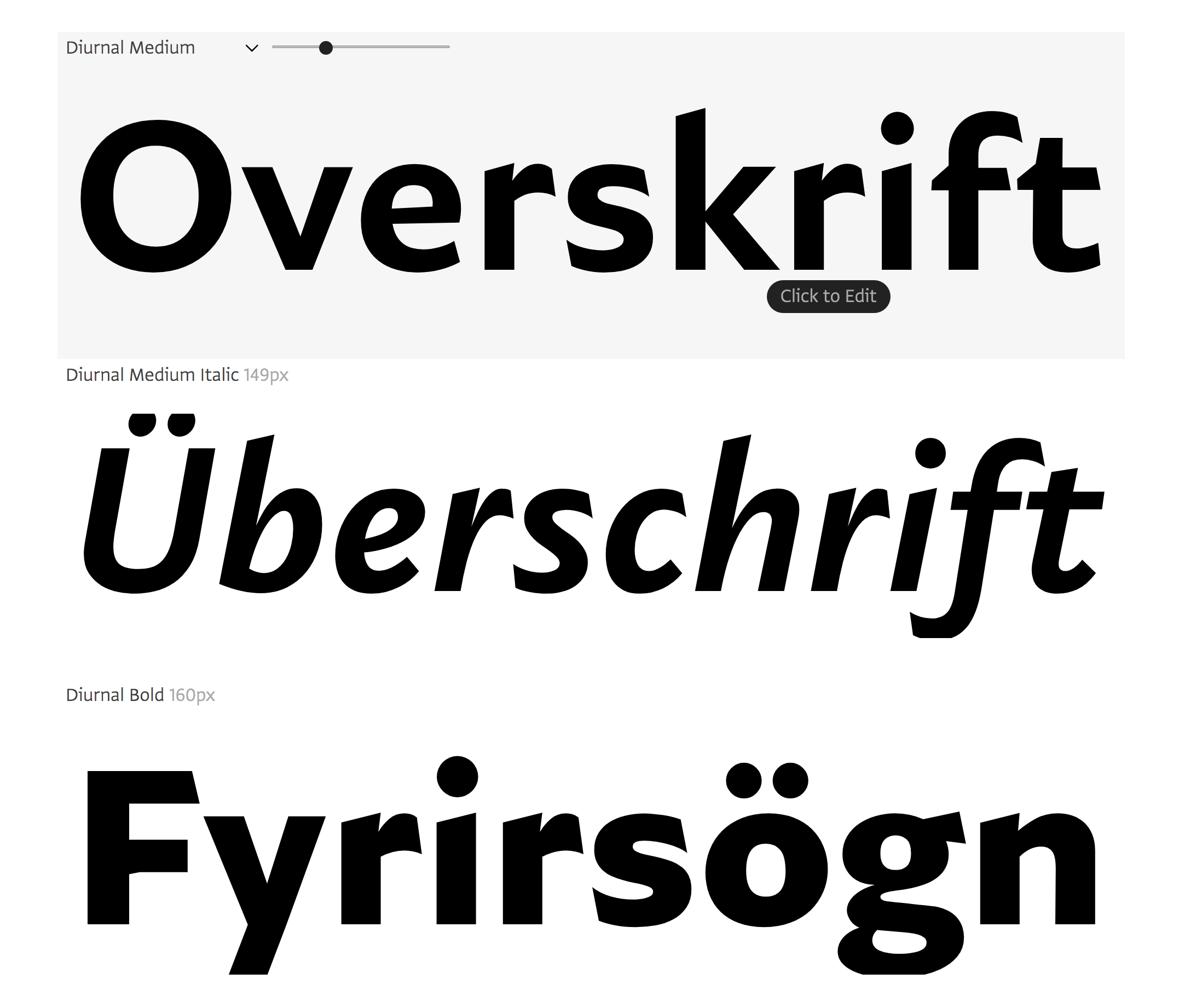
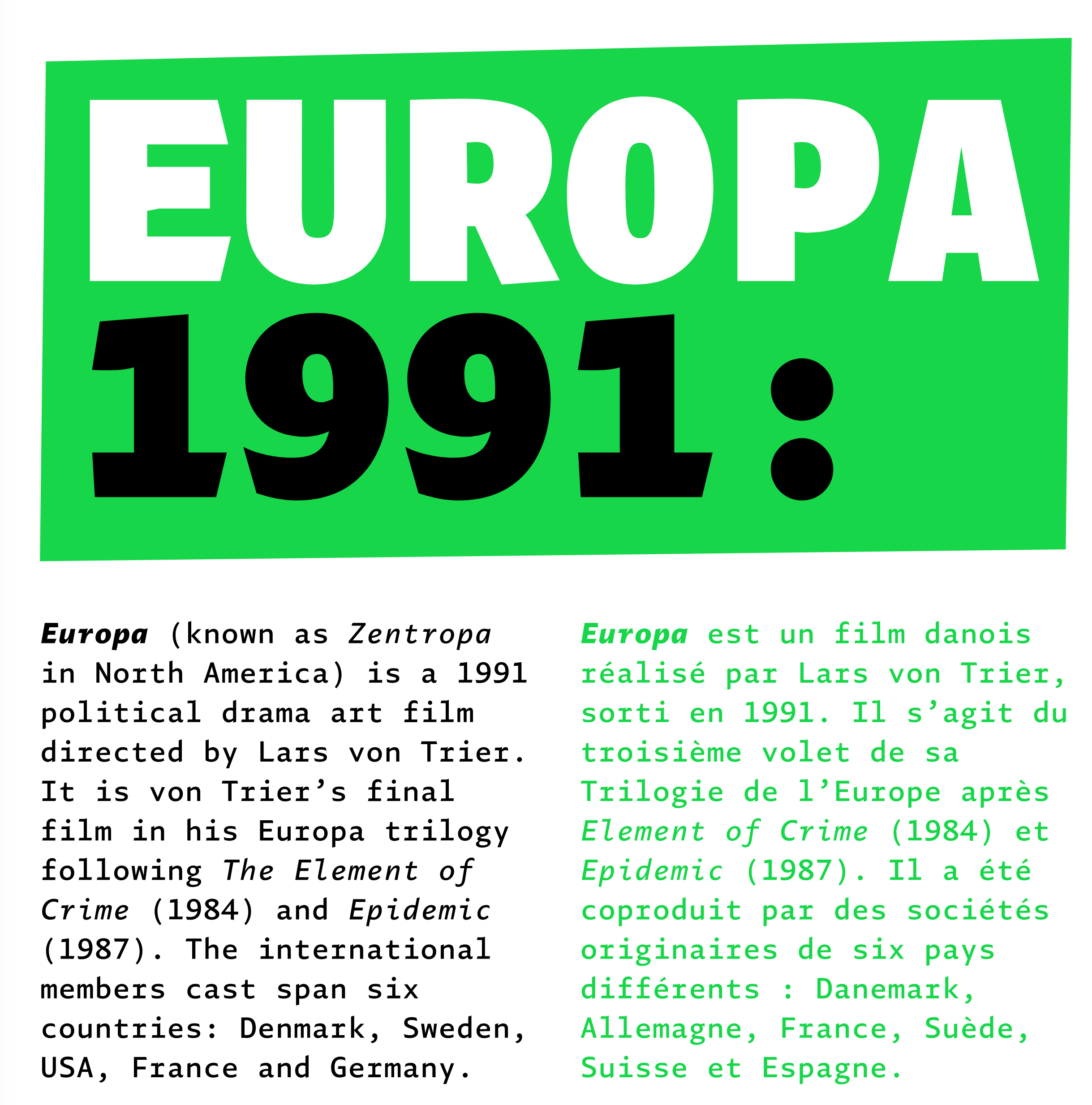
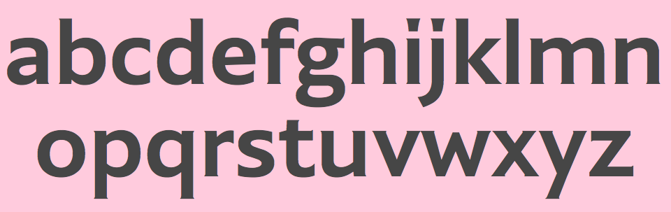
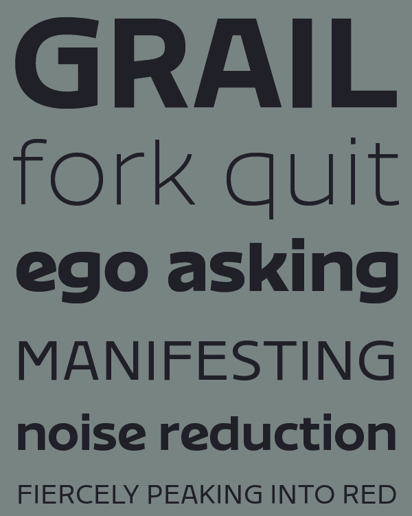
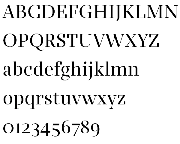
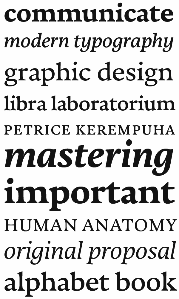
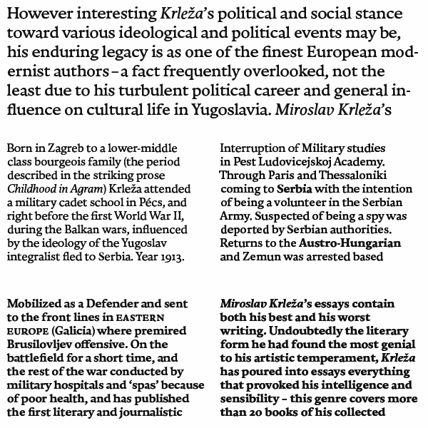
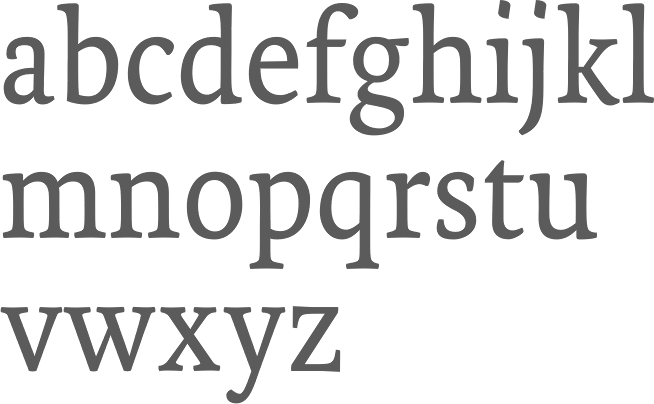
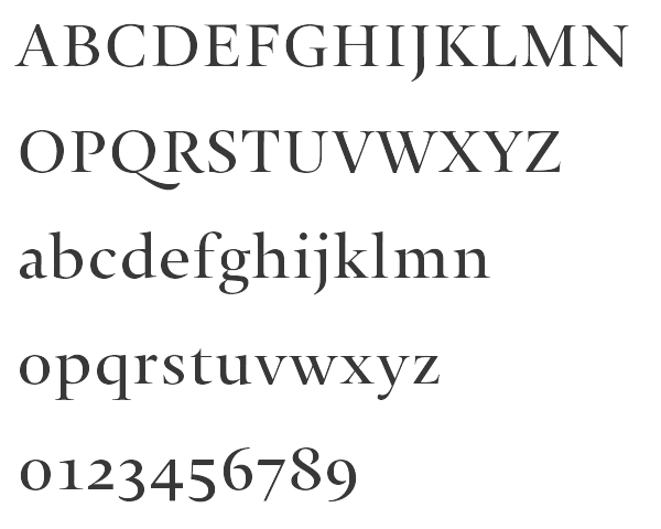
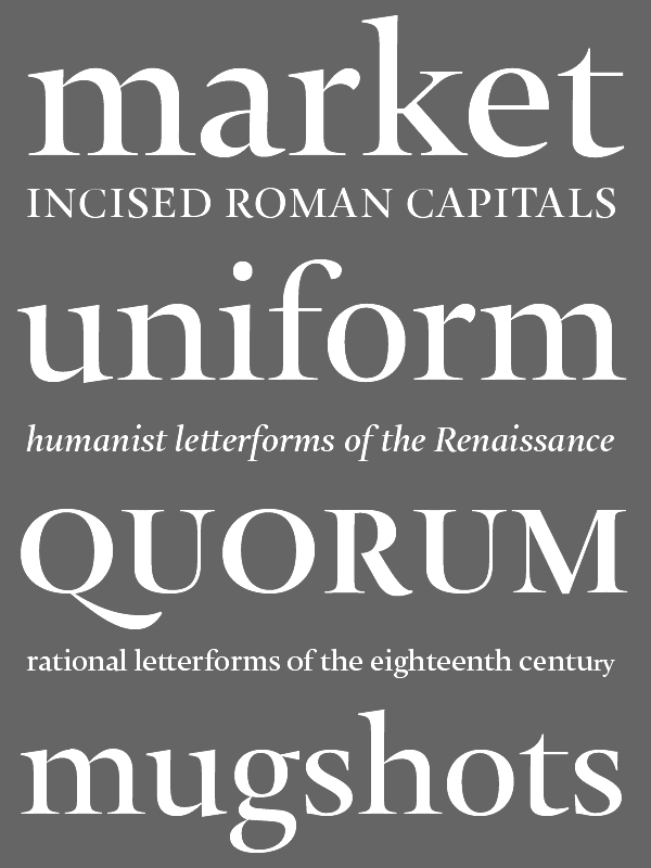
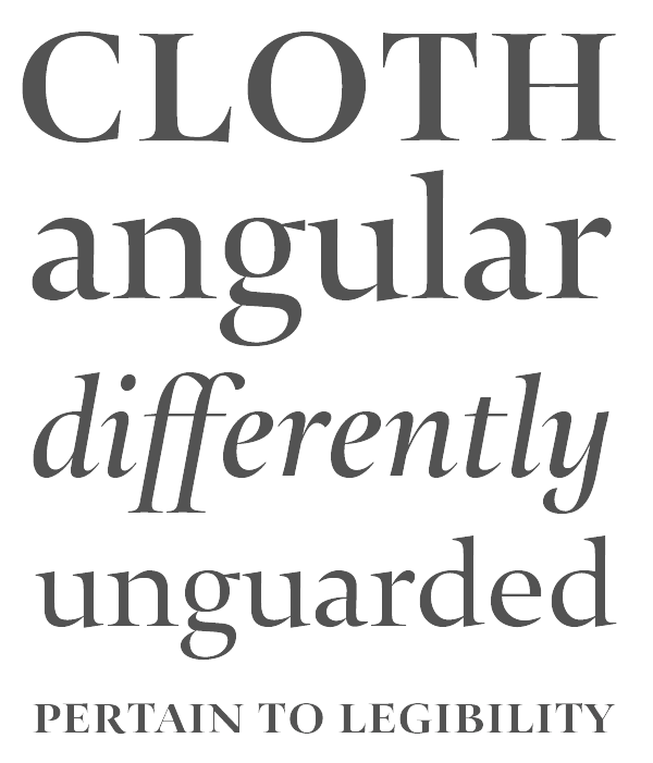
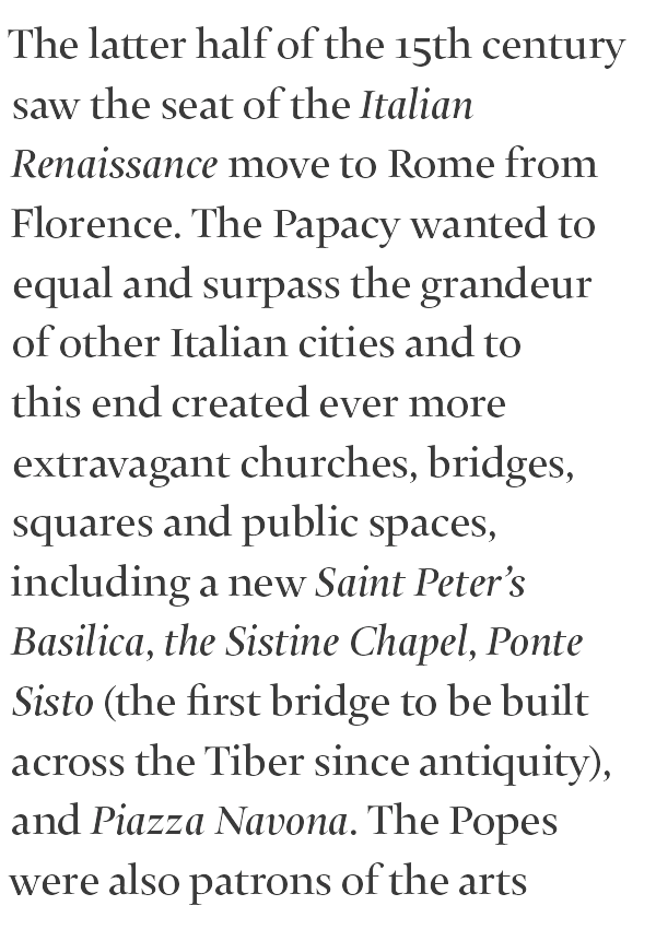
file name: Nikola Djurek Diurnal 2017
file name: Nikola Djurek Diurnal 2017

file name: Nikola Djurek Diurnal 2017
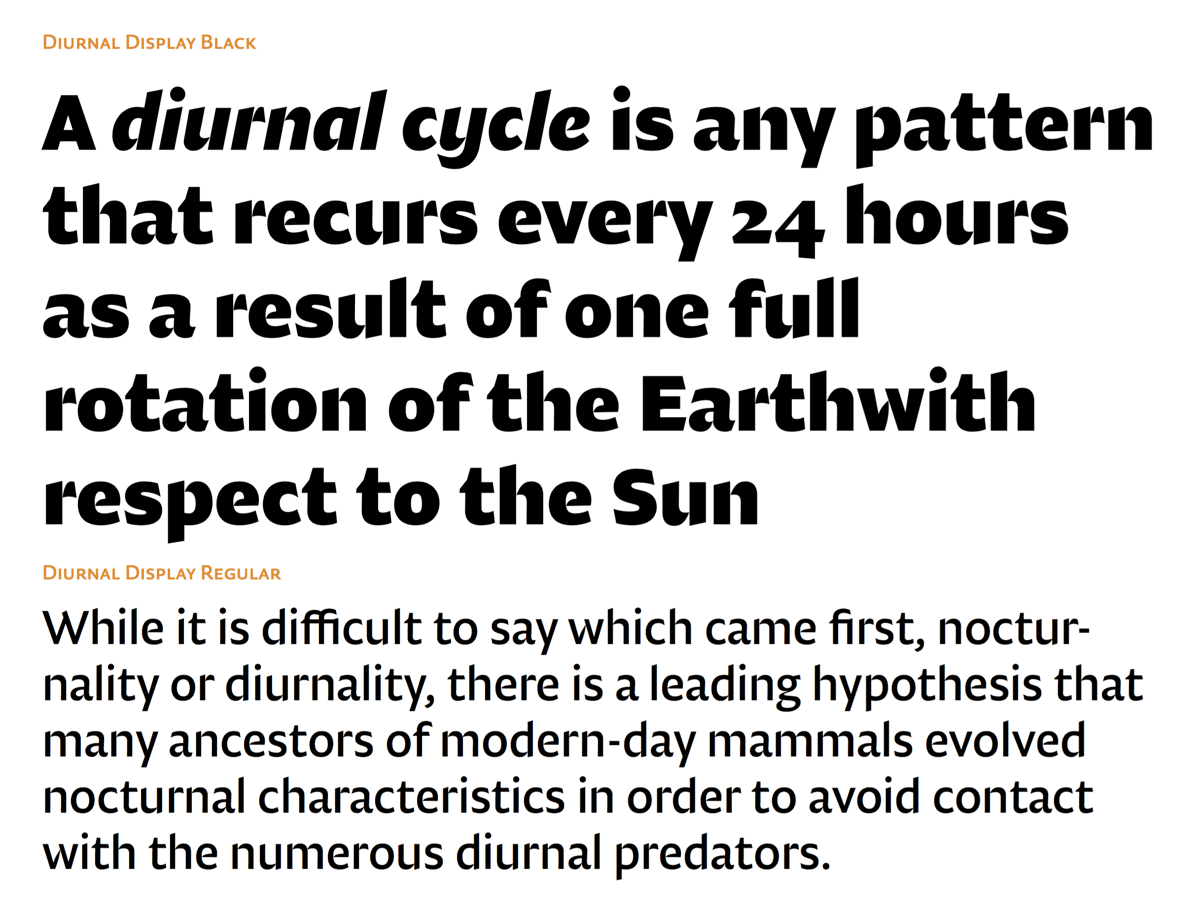
file name: Nikola Djurek Diurnal 2017
file name: Nikola Djurek Diurnal 2017
file name: Nikola Djurek Diurnal 2017
file name: Nikola Djurek Diurnal 2017

file name: Nikola Djurek Diurnal 2017
file name: Nikola Djurek Diurnal 2017
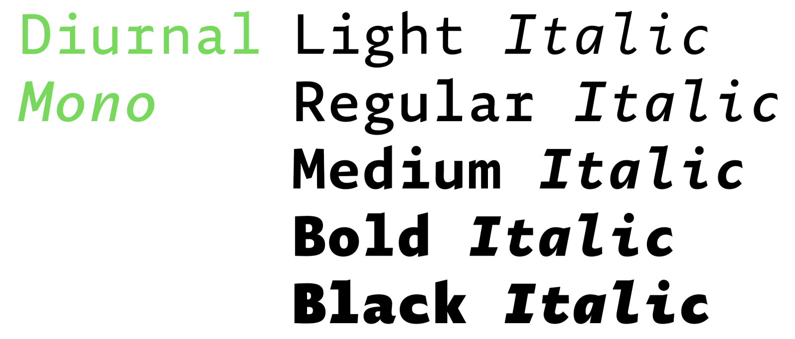
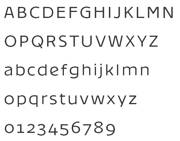
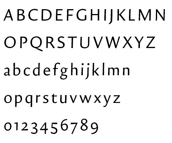
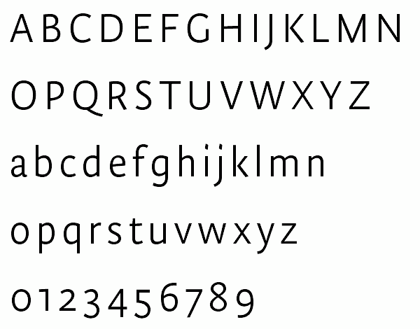
file name: Nikola Djurek Diurnal Mono 2022
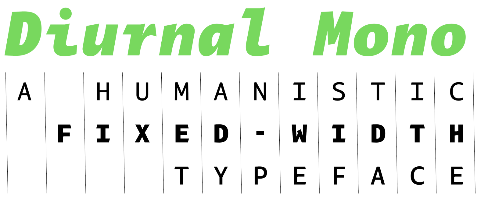
file name: Nikola Djurek Diurnal Mono 2022

file name: Nikola Djurek Diurnal Mono 2022
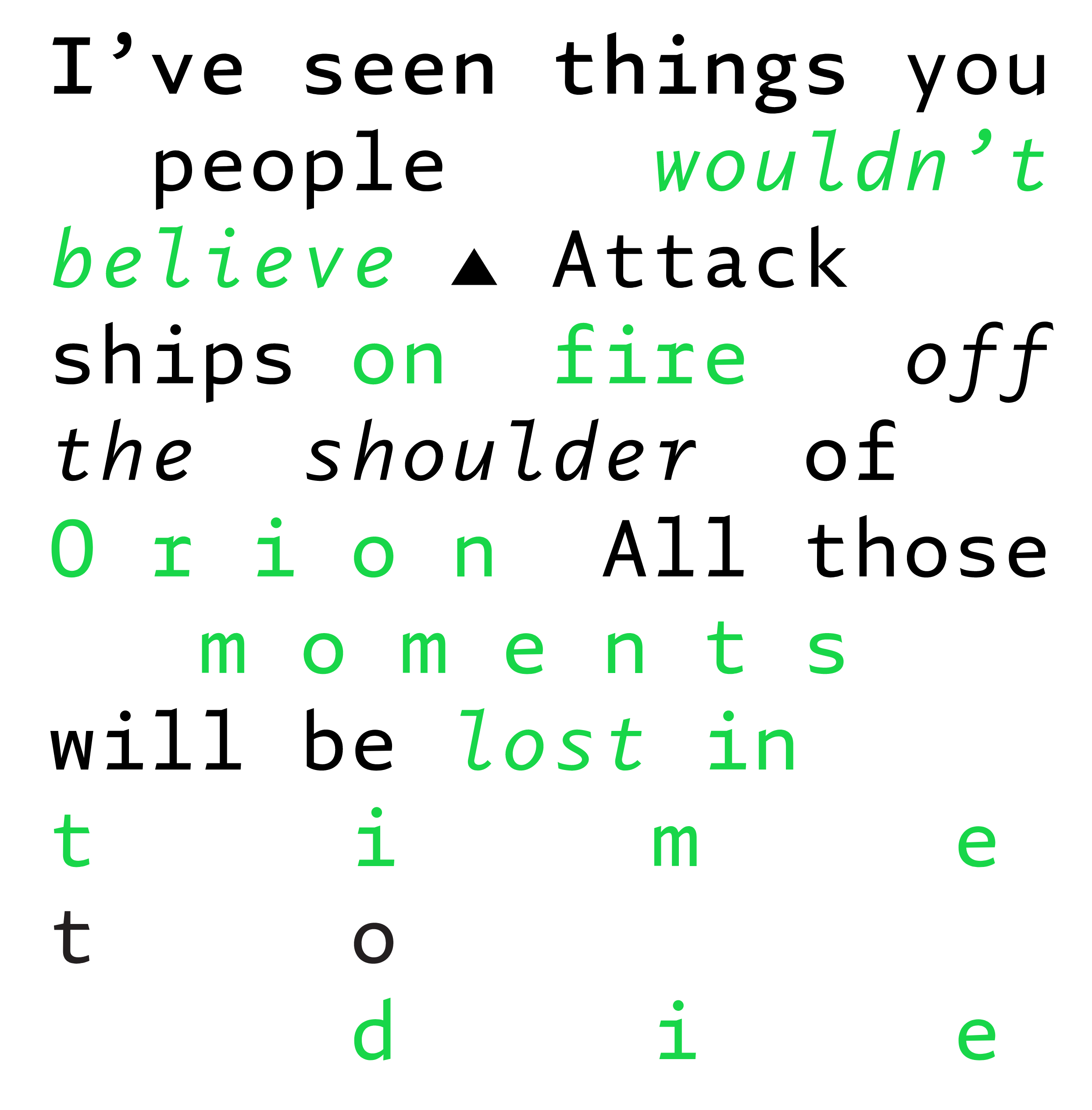
file name: Nikola Djurek Diurnal Mono 2022
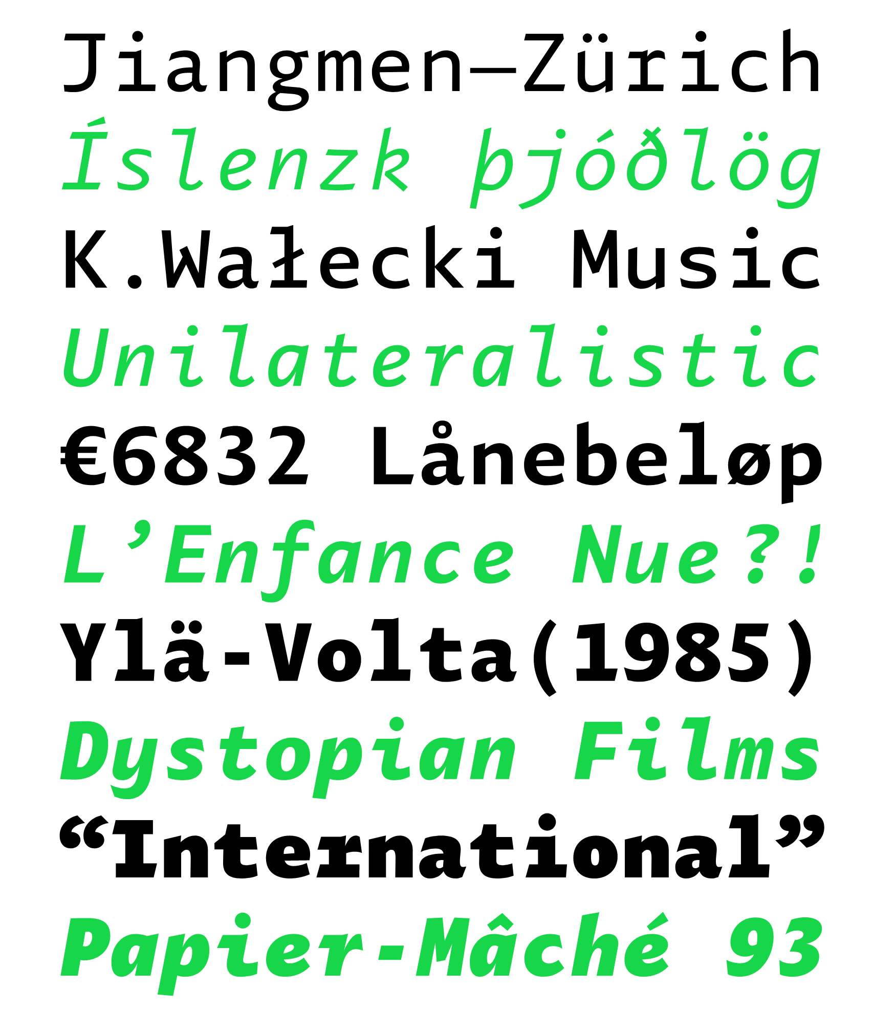
file name: Nikola Djurek Diurnal Mono 2022
file name: Nikola Djurek Diurnal Mono 2022
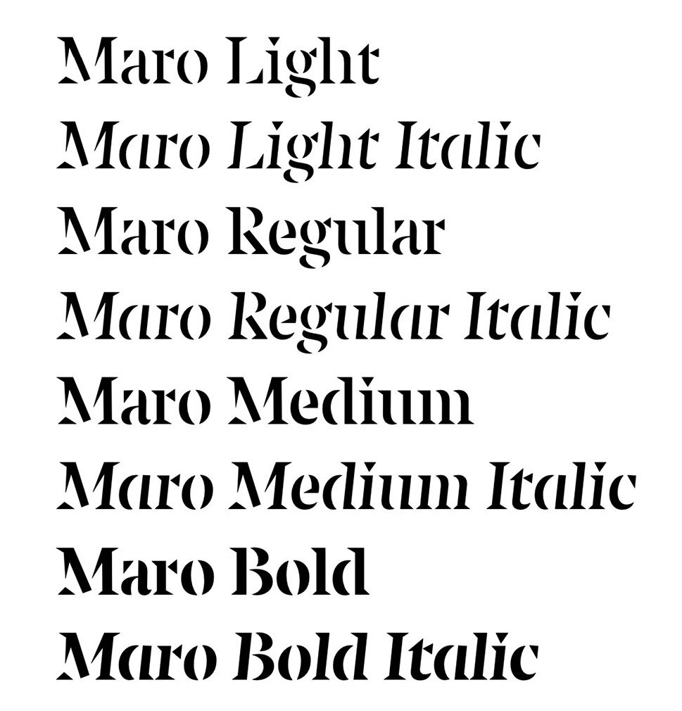
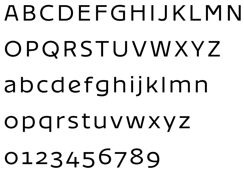
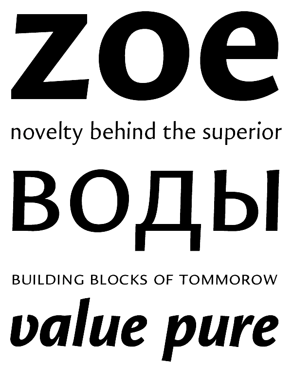
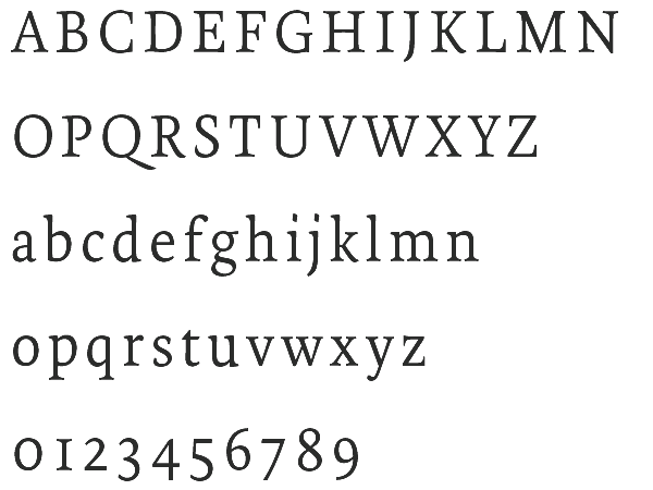
file name: Nikola Djurek Maro 2021

file name: Nikola Djurek Maro 2021

file name: Nikola Djurek Maro 2021
file name: Nikola Djurek Maro 2021
file name: Nikola Djurek Maro 2021
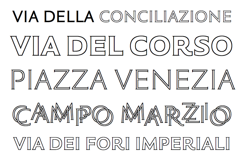
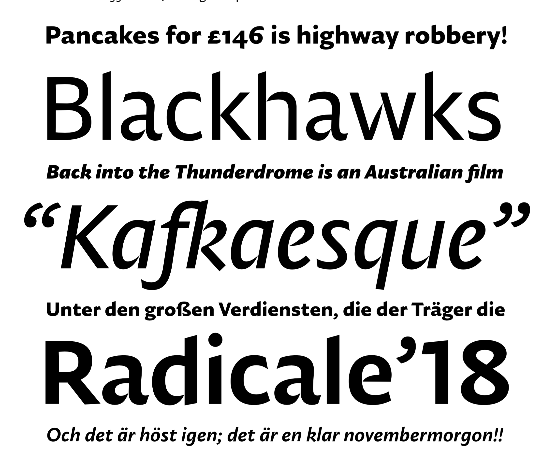
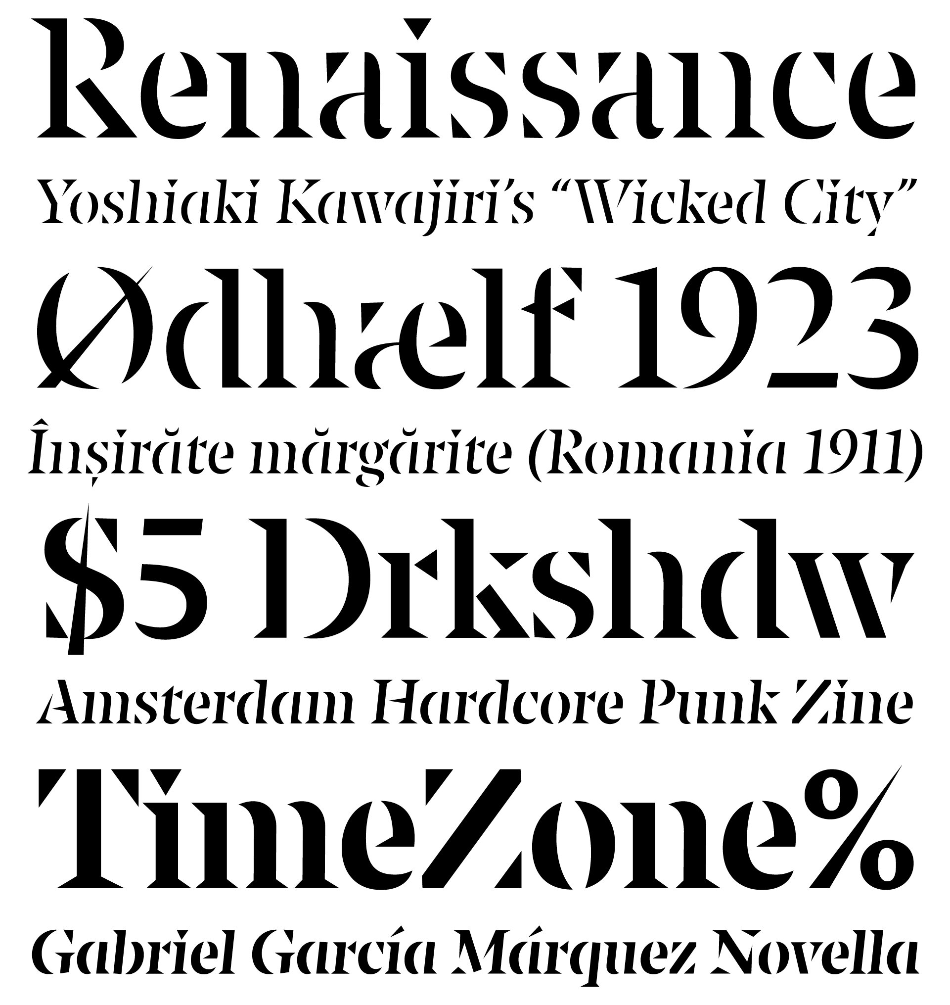
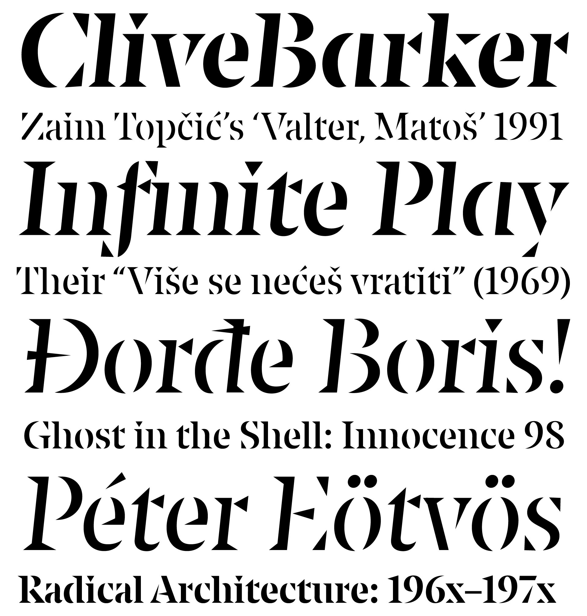
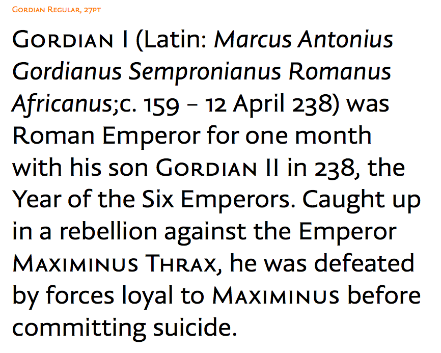
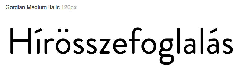
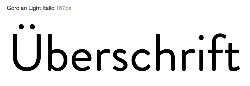
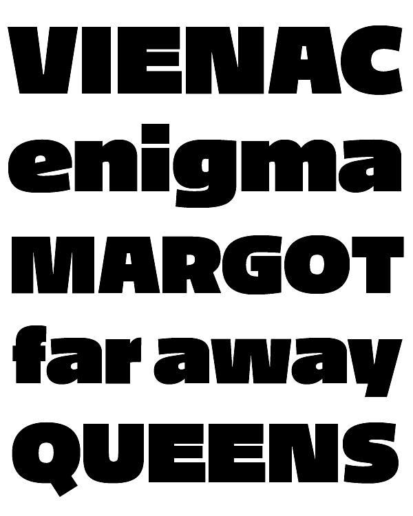
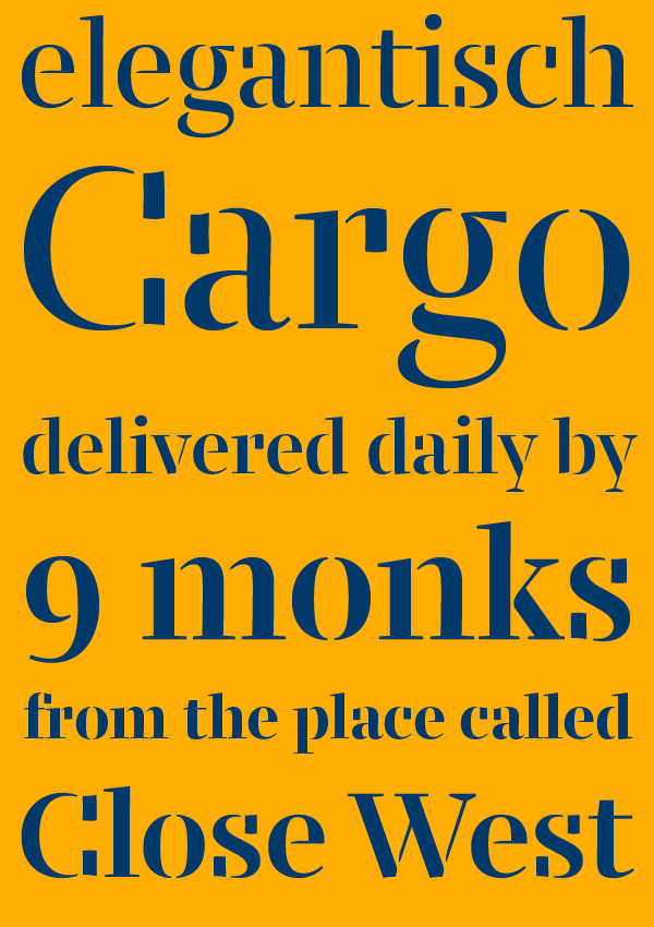
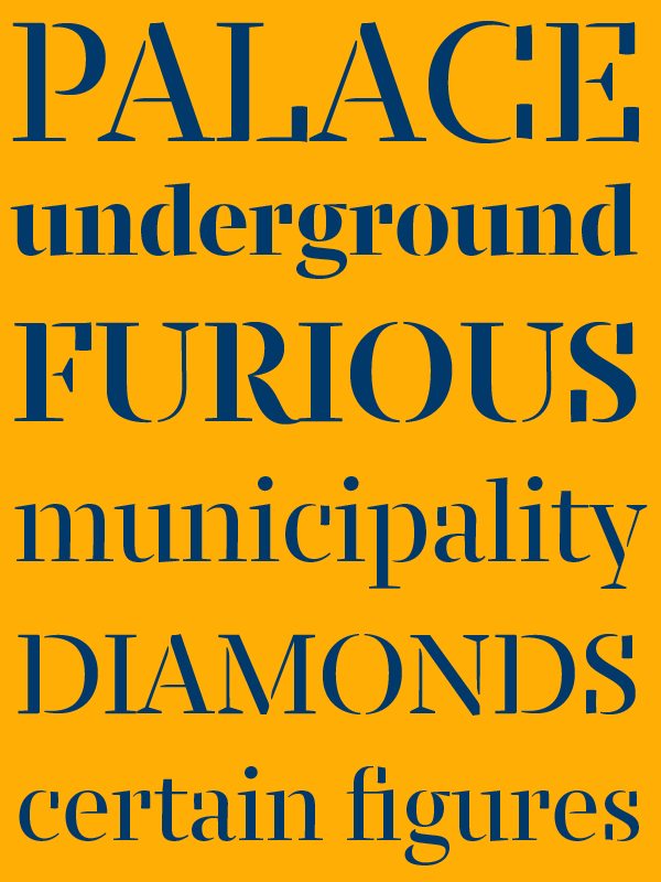
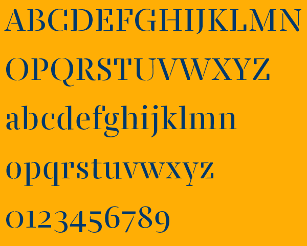
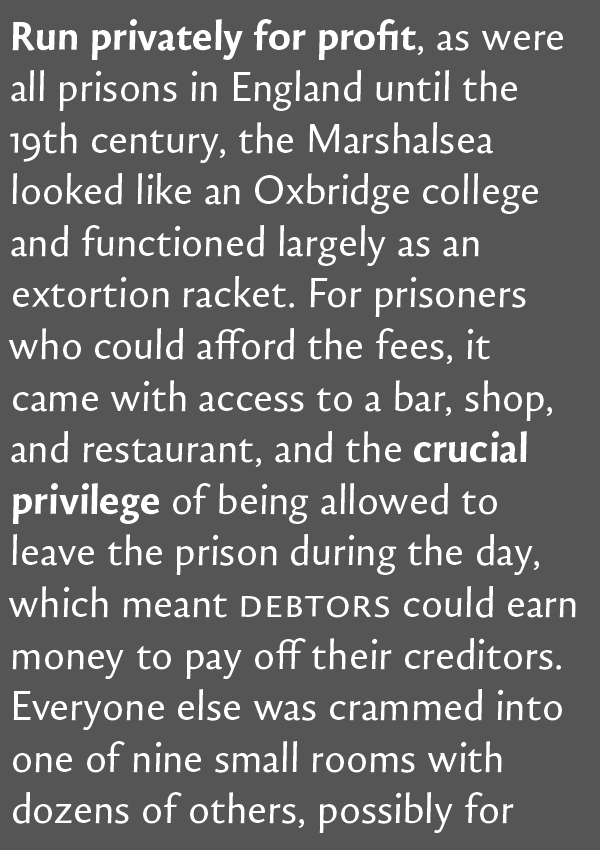
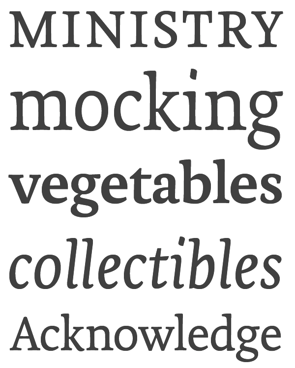
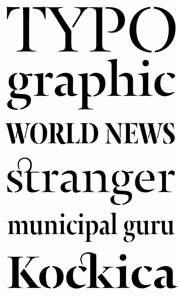
file name: Nikola Djurek Gordian 2017
file name: Nikola Djurek Gordian 2017
file name: Nikola Djurek Gordian 2017
file name: Nikola Djurek Gordian 2017
file name: Nikola Djurek Gordian 2017

file name: Nikola Djurek Gordian 2017
file name: Nikola Djurek Gordian 2017

file name: Nikola Djurek Gordian 2017

file name: Nikola Djurek Gordian 2017
file name: Nikola Djurek Gordian Kapitalen 2018
file name: Nikola Djurek Gordian Kapitalen 2018b
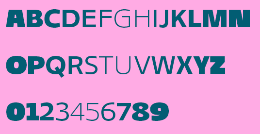
file name: Nikola Djurek Gordian Std Medium 2017

file name: Nikola Djurek Tesla Dynamo Pro 2008
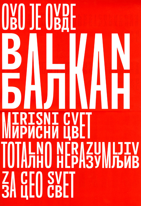
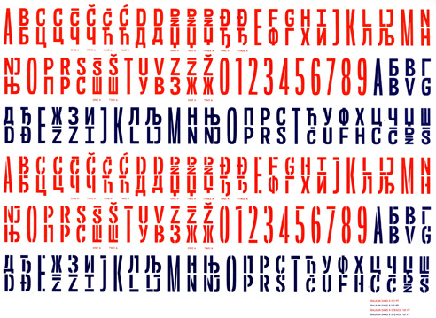
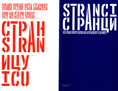
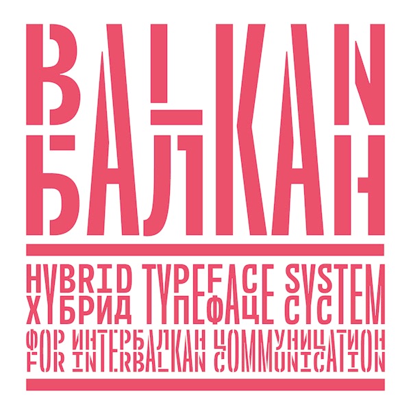
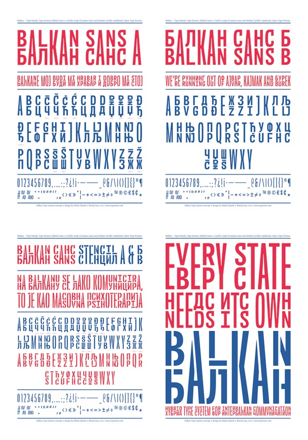
file name: Marija Juza Nikola Djurek Balkan 2012
file name: Marija Juza Nikola Djurek Balkan 2012b
file name: Marija Juza Nikola Djurek Balkan 2012c
file name: Marija Juza Nikola Djurek Balkan 2012d
file name: Marija Juza Nikola Djurek Balkan 2012e
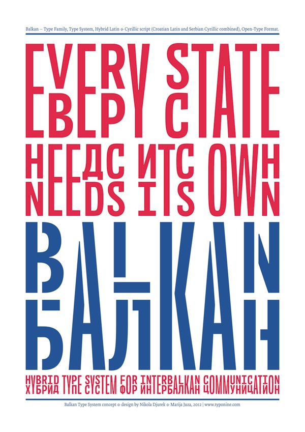
file name: Marija Juza Nikola Djurek Balkan 2012f

file name: Nikola Djurek Francis Gradient 2016b
file name: Nikola Djurek Francis Gradient 2016c

file name: Nikola Djurek Francis Gradient 2016d
file name: Nikola Djurek Francis Gradient 2016e

file name: Nikola Djurek Francis Gradient 2016f

file name: Nikola Djurek Francis Gradient 2016g

file name: Nikola Djurek Francis Gradient 2016h

file name: Nikola Djurek Francis Gradient 2016i
file name: Nikola Djurek Tremolo Sans 2020
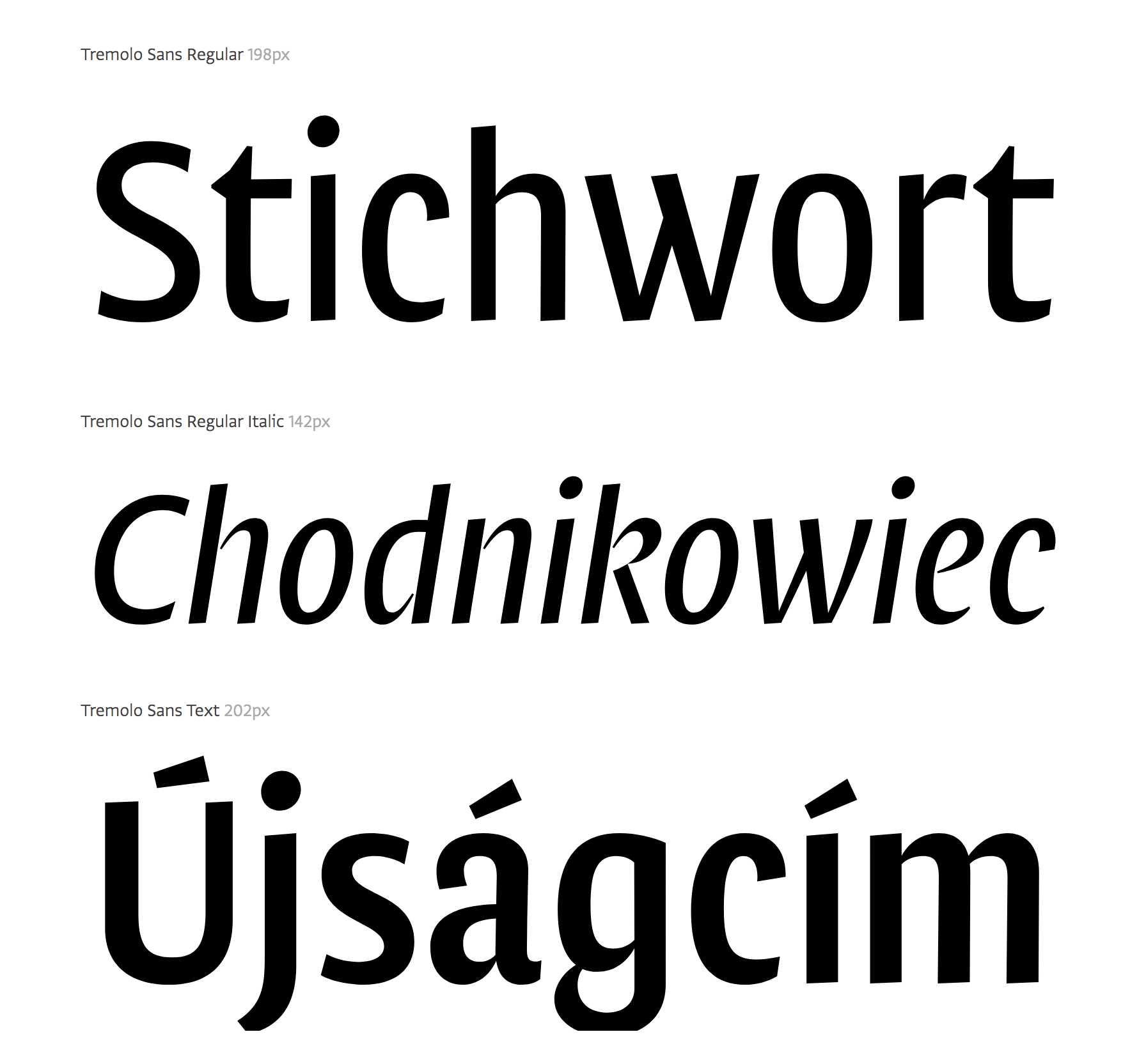
file name: Nikola Djurek Tremolo Sans 2020

file name: Nikola Djurek Tremolo 2015
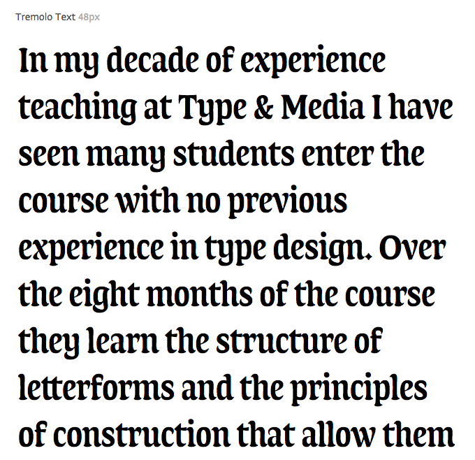
file name: Nikola Djurek Tremolo 2015
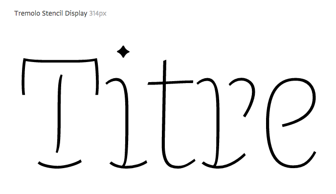
file name: Nikola Djurek Tremolo 2015b
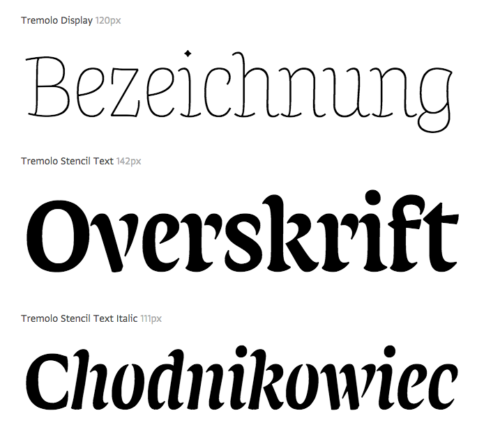
file name: Nikola Djurek Tremolo 2015c
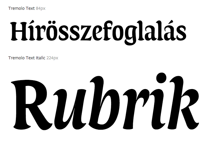
file name: Nikola Djurek Tremolo 2015d
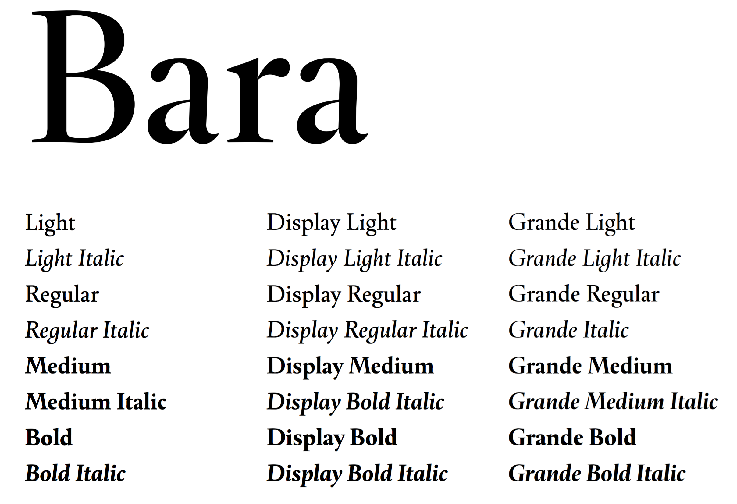
file name: Nikola Djurek Bara 2016

file name: Nikola Djurek Bara 2016b
file name: Nikola Djurek Bara 2016c
file name: Nikola Djurek Bara 2016d

file name: Nikola Djurek Bara 2016e

file name: Nikola Djurek Bara 2016f

file name: Nikola Djurek Bara 2016g

file name: Nikola Djurek Bara 2016i

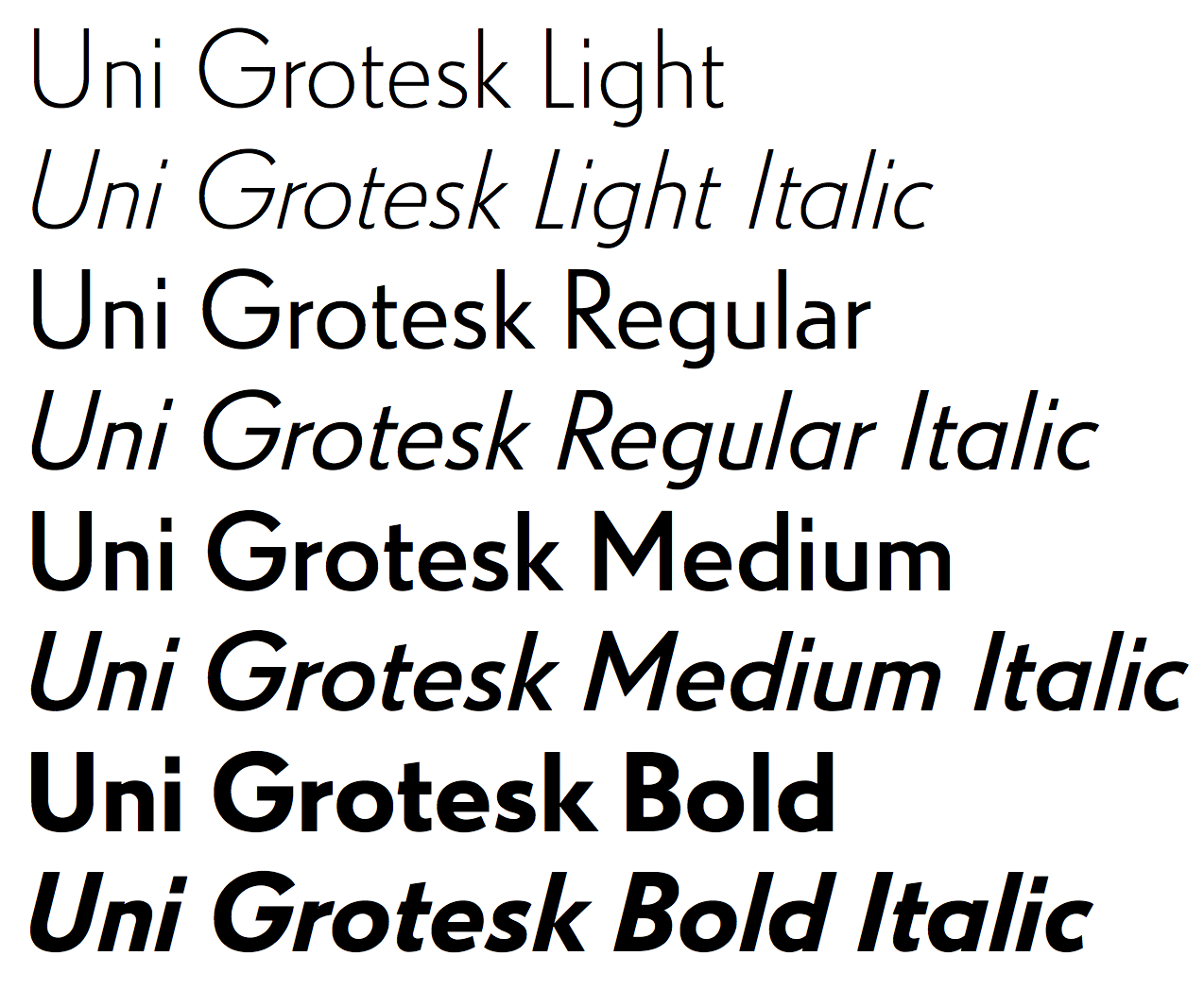
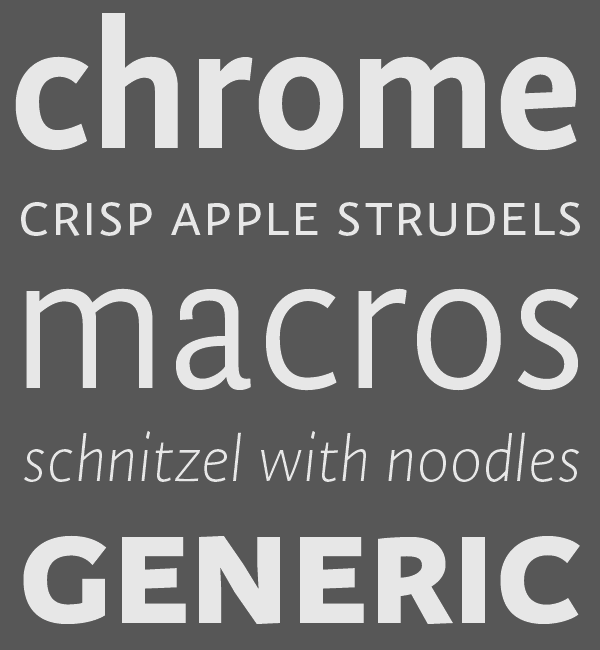
file name: Peter Bilak Nikola Djurek Hrvoje Zivcic Uni Grotesk 2016

file name: Peter Bilak Nikola Djurek Hrvoje Zivcic Uni Grotesk 2016b
file name: Peter Bilak Nikola Djurek Hrvoje Zivcic Uni Grotesk 2016c
file name: Peter Bilak Nikola Djurek Hrvoje Zivcic Uni Grotesk 2016d
file name: Peter Bilak Nikola Djurek Hrvoje Zivcic Uni Grotesk 2016e
file name: Peter Bilak Nikola Djurek Hrvoje Zivcic Uni Grotesk 2016f
file name: Peter Bilak Nikola Djurek Hrvoje Zivcic Uni Grotesk 2016g
file name: Peter Bilak Nikola Djurek Hrvoje Zivcic Uni Grotesk Cond Std Med 2016h

file name: Peter Bilak Nikola Djurek Hrvoje Zivcic Uni Grotesk Display 2016

file name: Peter Bilak Nikola Djurek Hrvoje Zivcic Uni Grotesk Display 2016c
file name: Peter Bilak Nikola Djurek Hrvoje Zivcic Uni Grotesk Display 2016d
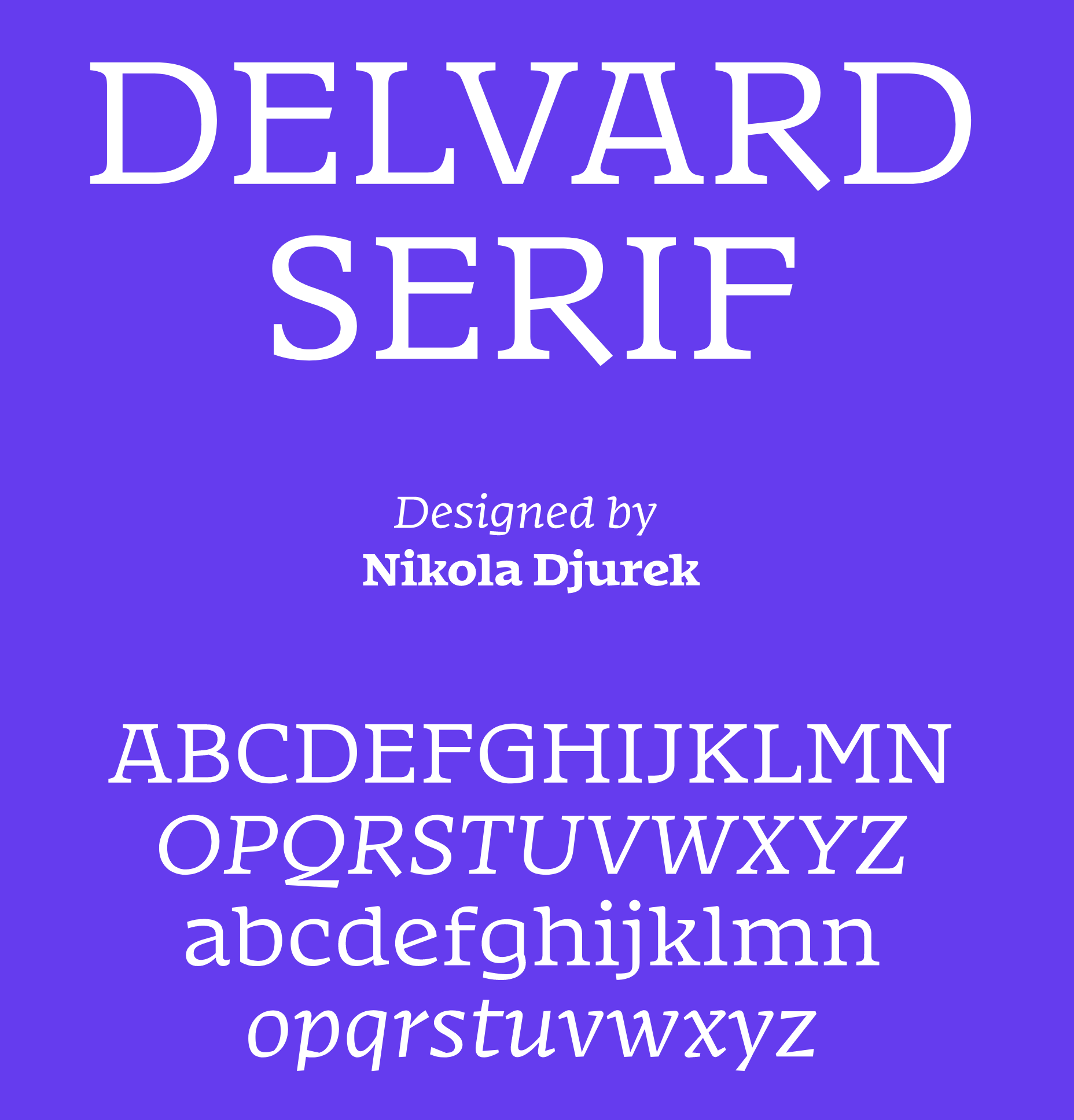
file name: Nikola Djurek Delvard Serof 2022
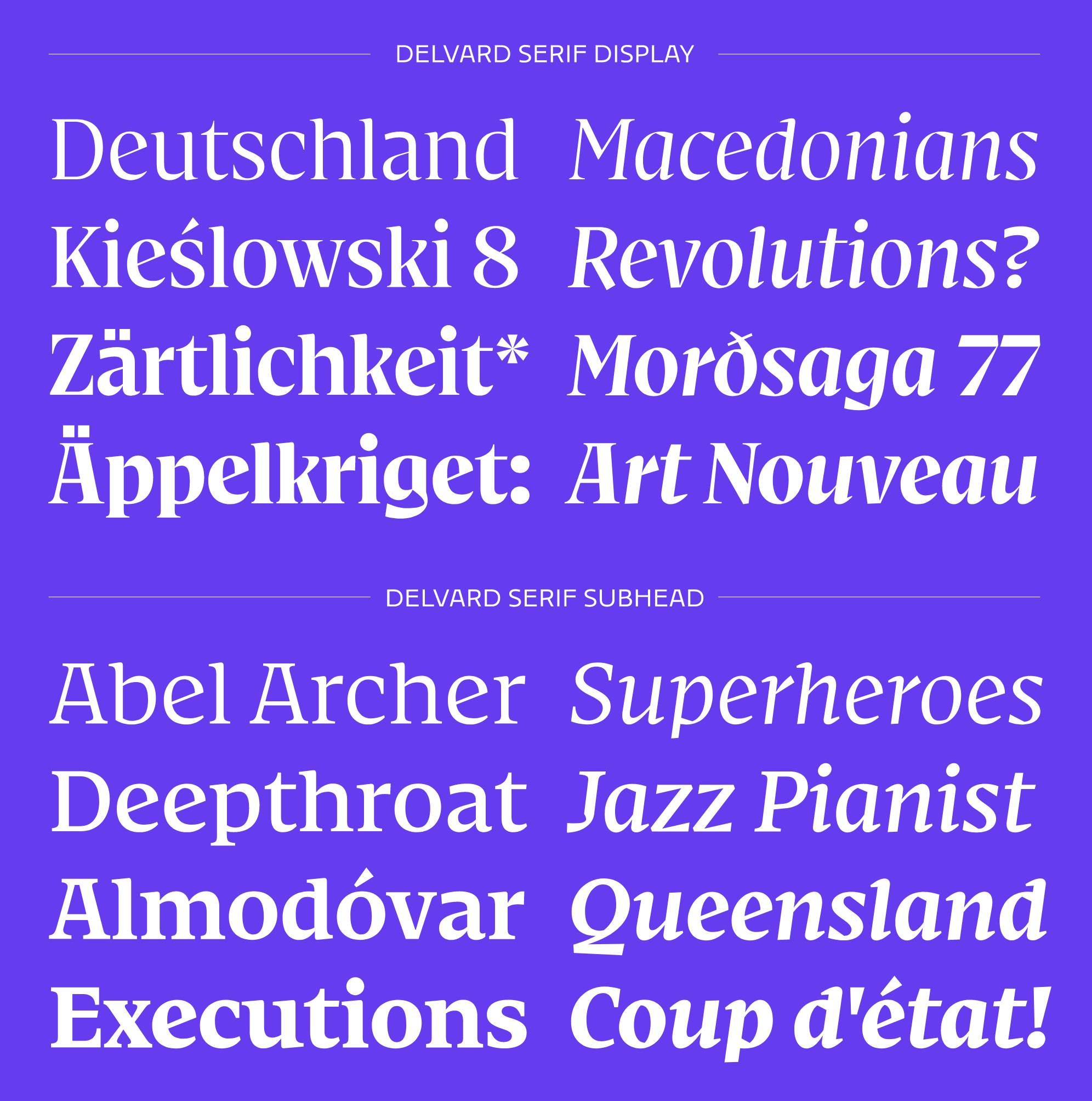
file name: Nikola Djurek Delvard Serof 2022
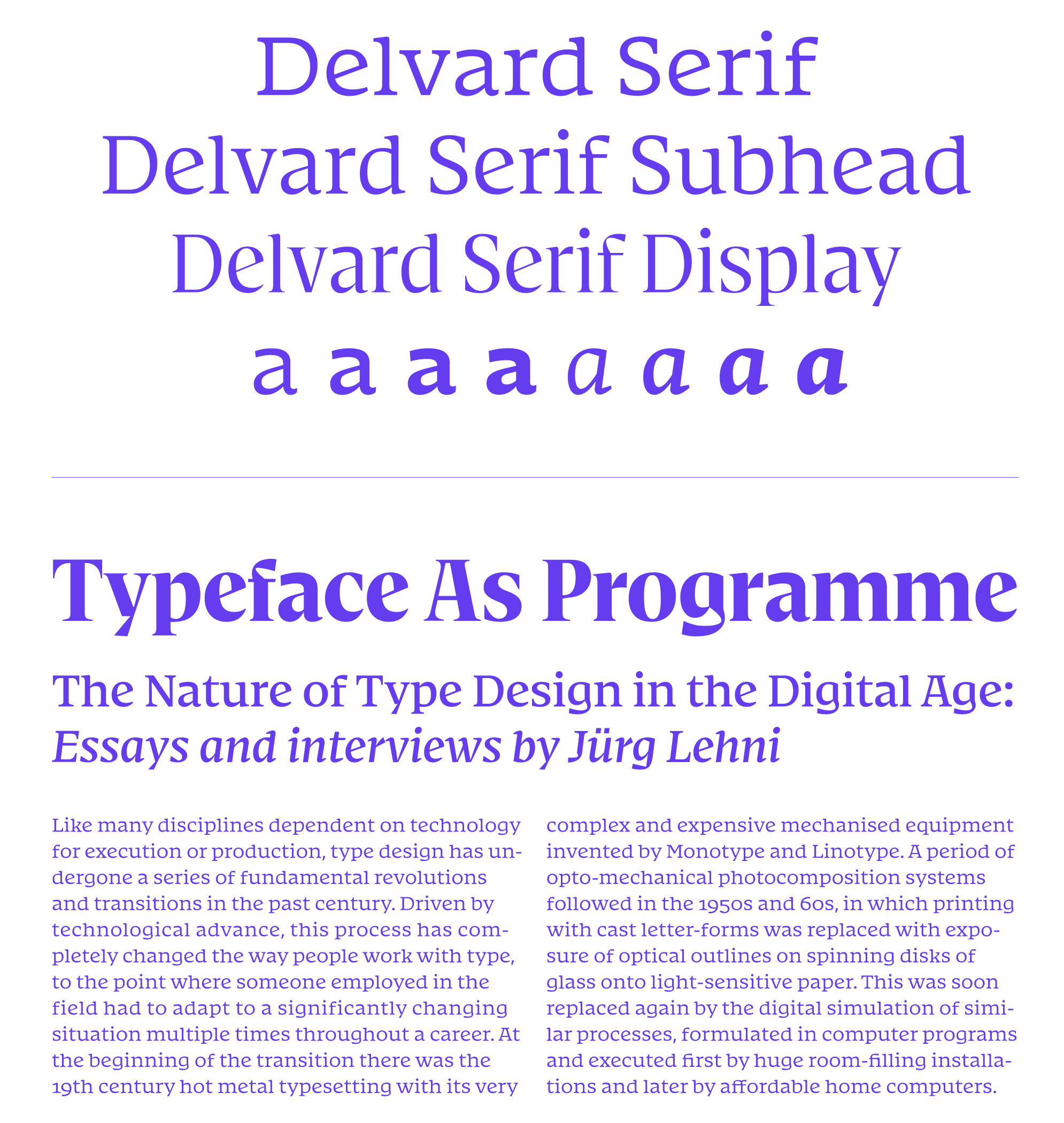
file name: Nikola Djurek Delvard Serof 2022

file name: Nikola Djurek Delvard Serof 2022

file name: Nikola Djurek Delvard Serof 2022
file name: Nikola Djurek Delvard 2011c

file name: Nikola Djurek Delvard 2011d
file name: Nikola Djurek Delvard 2011e

file name: Nikola Djurek Delvard 2011
file name: Nikola Djurek Delvard 2011b
file name: Nikola Djurek Delvard Display 2011

file name: Nikola Djurek Delvard Display 2011b
file name: Nikola Djurek Delvard Display 2011c

file name: Nikola Djurek Delvard Gradient 2011

file name: Nikola Djurek Delvard Gradient 2011b
file name: Nikola Djurek Delvard Gradient 2011c
file name: Nikola Djurek Delvard Gradient 2011d
file name: Nikola Djurek Delvard Gradient 2011e
file name: Nikola Djurek Delvard Gradient 2011g
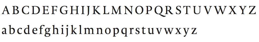
file name: Martina Flor Nikola Djurek Talk A Typ I 2014

file name: Nikola Djurek D T L Porta 2013
file name: Nikola Djurek D T L Porta 2013b

file name: Nikola Djurek D T L Porta 2013c
file name: Nikola Djurek D T L Porta 2013f

file name: Nikola Djurek D T L Porta 2013k
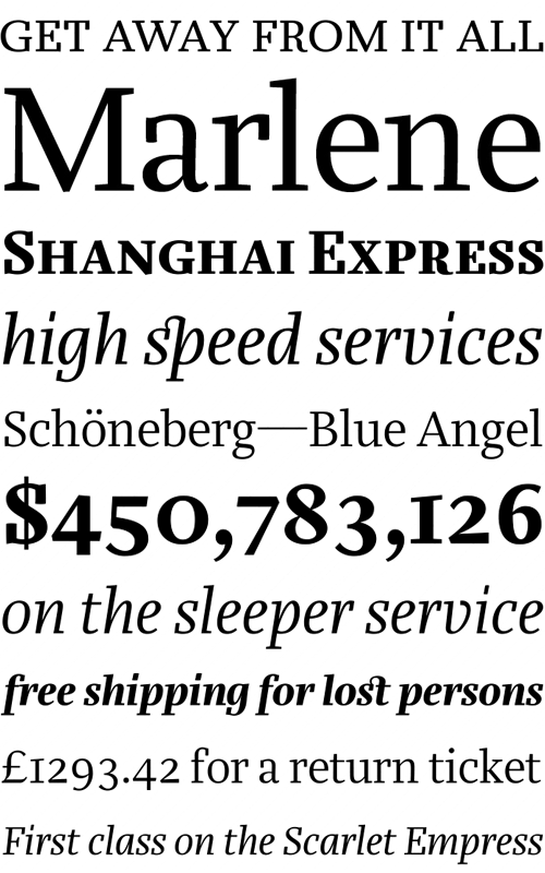
file name: Nikola Djurek Marlene 2008b
file name: Nikola Djurek Marlene 2008c
file name: Nikola Djurek Marlene Display 2008

file name: Nikola Djurek Marlene Display 2008b
file name: Nikola Djurek Marlene High 2008
file name: Nikola Djurek Marlene High 2008b
file name: Nikola Djurek Marlene2008

file name: Nikola Djurek Marlene 2011
file name: Pic Nikola Djurek01
file name: Nikola Djurek Marlene Stencil 2008
file name: Nikola Djurek Marlene Stencil 2008b
file name: Nikola Djurek Marlene Stencil 2008c
file name: Nikola Djurek Nocturno 2013h
file name: Nikola Djurek Nocturno 2013i
file name: Nikola Djurek Nocturno 2013
file name: Nikola Djurek Nocturno 2013b

file name: Nikola Djurek Nocturno 2013c

file name: Nikola Djurek Nocturno 2013d

file name: Nikola Djurek Nocturno 2013e

file name: Nikola Djurek Nocturno 2013f
file name: Nikola Djurek Nocturno 2013g
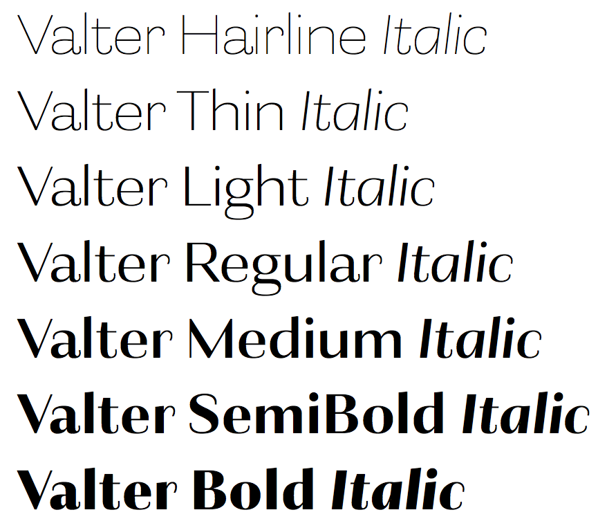
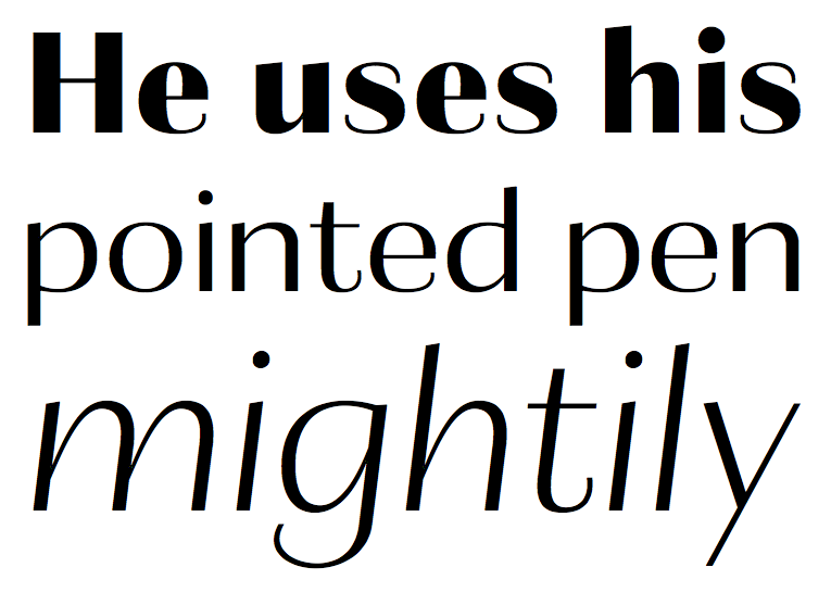
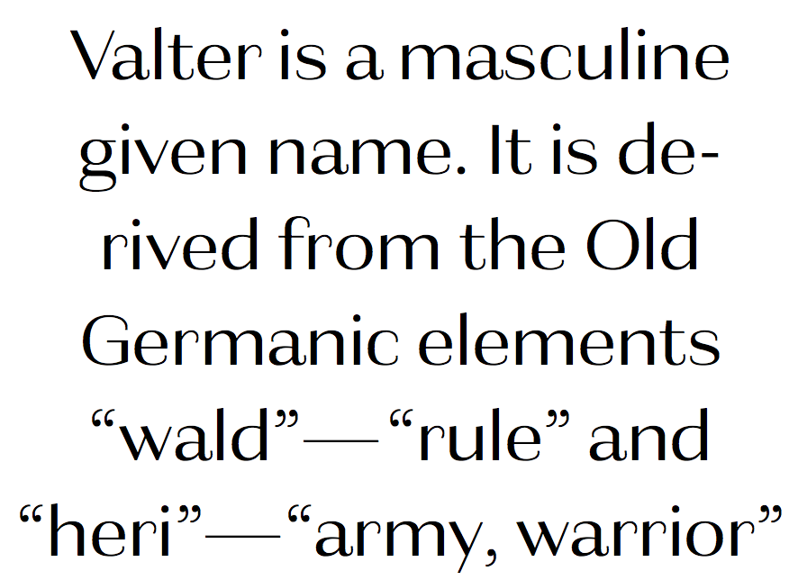
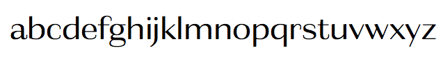
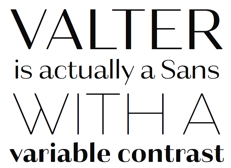
file name: Nikola Djurek Valter 2014
file name: Nikola Djurek Valter 2014c

file name: Nikola Djurek Valter 2014d
file name: Nikola Djurek Valter 2014d

file name: Nikola Djurek Valter 2014e

file name: Nikola Djurek Valter 2014f

file name: Nikola Djurek Valter 2014g
file name: Nikola Djurek Valter 2014h

file name: Nikola Djurek Valter 2014j

file name: Nikola Djurek Valter 2014k
file name: Nikola Djurek Valter 2014vb
file name: Nikola Djurek Nota 2009
file name: Nikola Djurek Nota 2009b

file name: Nikola Djurek Nota 2009c
file name: Nikola Djurek Nota 2009d
file name: Nikola Djurek Tempera 2007 2008
file name: Nikola Djurek Tempera 2007 2008b

file name: Nikola Djurek Tempera 2007 2008c
file name: Nikola Djurek Tempera Biblio Book B 2008
file name: Nikola Djurek Tempera Biblio 2007 2008
file name: Nikola Djurek Tempera Biblio 2007 2008b
file name: Nikola Djurek Thema 2012
file name: Nikola Djurek Thema 2012b
file name: Nikola Djurek Thema 2012c
file name: Nikola Djurek Thema 2012d
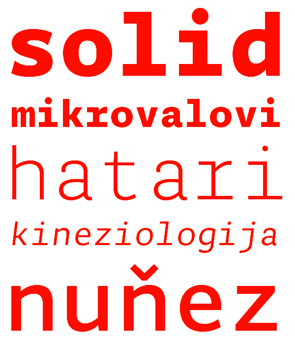
file name: Nikola Djurek Typonine Sans 2008
file name: Nikola Djurek Typonine Sans 2008b

file name: Nikola Djurek Typonine Sans Hairline 2008
file name: Nikola Djurek Typonine Sans Hairline 2008b

file name: Nikola Djurek Typonine Sans Hairline 2008c
file name: Nikola Djurek Typonine Sans Hairline 2008d
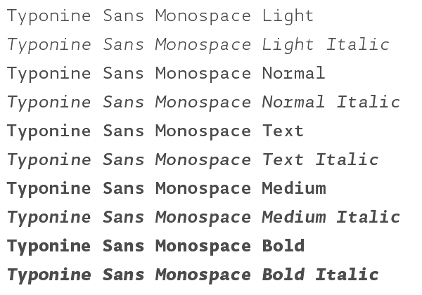
file name: Nikola Djurek Typonine Sans Monospace Pro 2008
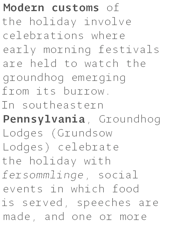
file name: Nikola Djurek Typonine Sans Monospace Pro 2008b

file name: Nikola Djurek Typonine Sans Monospace Pro 2008c
file name: Nikola Djurek Typonine Sans Monospace Pro 2008d
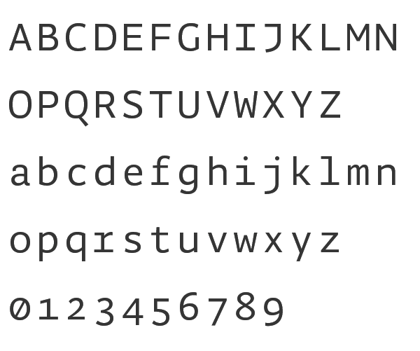
file name: Nikola Djurek Typonine Sans Monospace Pro 2008e

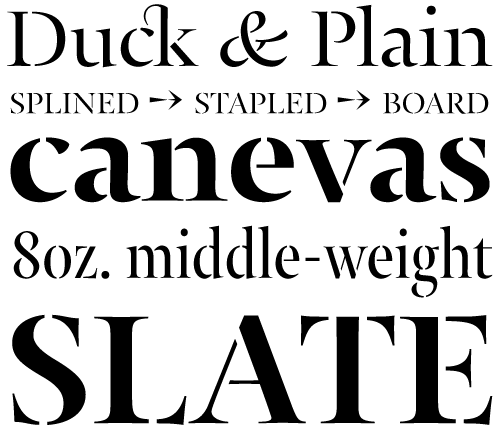
file name: Nikola Djurek Typonine Stencil 2008

file name: Nikola Djurek Typonine Stencil 2008b
file name: Nikola Djurek Typonine Stencil 2008c
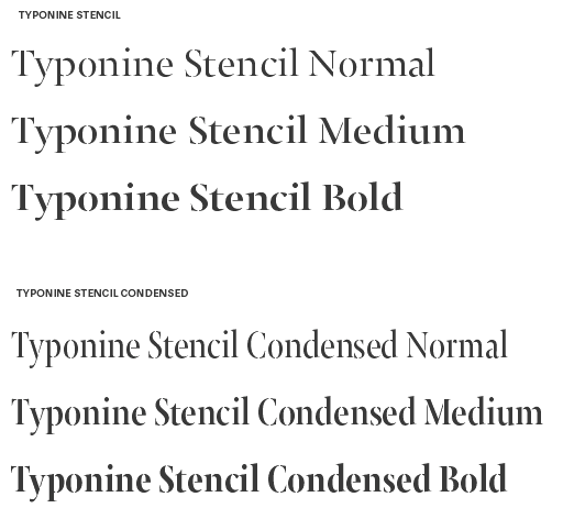
file name: Nikola Djurek Typonine Stencil 2008d
file name: Typonine Stencil 2009
file name: Typonine Stencil 2009b

file name: Typonine Stencil 2009c
file name: Typonine Stencil 2009d
file name: Nikola Djurek Typonine Stencil Pro Cond Bold 2009
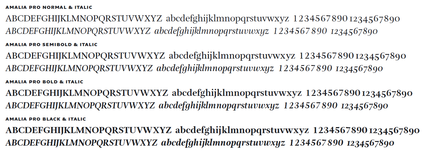
file name: Nikola Djurek Amalia 2006

file name: Nikola Djurek Plan Grotesque 2010

file name: Nikola Djurek Plan Grotesque Stencil 2010
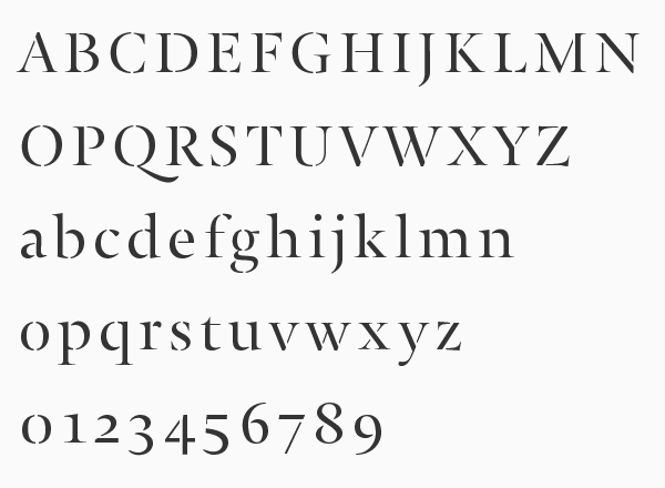
file name: Nikola Djurek Jan 2002

file name: Nikola Djurek Brioni Brioni Text 2008 Fists
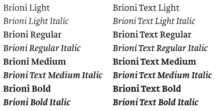
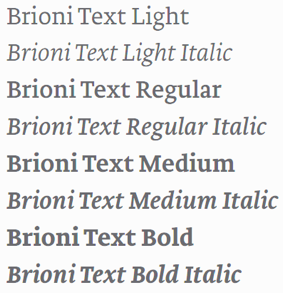
file name: Nikola Djurek Brioni Brioni Text 2008
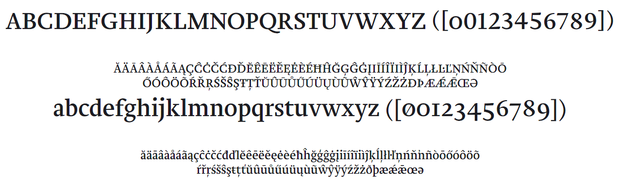
file name: Nikola Djurek Brioni Brioni Text 2008b

file name: Nikola Djurek Lumin 2013

file name: Nikola Djurek Lumin 2013b

file name: Nikola Djurek Lumin 2013c

file name: Nikola Djurek Lumin 2013d

file name: Nikola Djurek Lumin 2013e

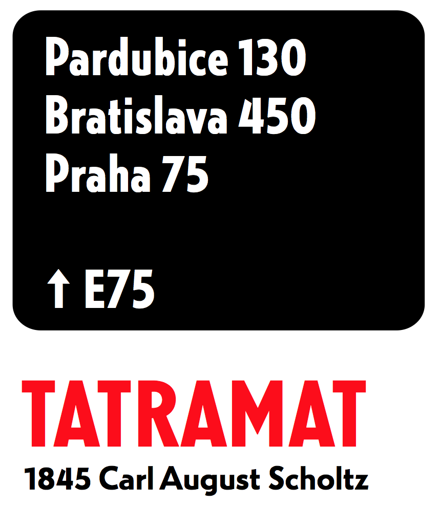
file name: Nikola Djurek Pic

file name: Nikola Djurek Pic
| | |
|
Luc Devroye ⦿ School of Computer Science ⦿ McGill University Montreal, Canada H3A 2K6 ⦿ lucdevroye@gmail.com ⦿ https://luc.devroye.org ⦿ https://luc.devroye.org/fonts.html |