TYPE DESIGN INFORMATION PAGE last updated on Mon Jul 13 21:21:27 EDT 2026
FONT RECOGNITION VIA FONT MOOSE

|
|
|
|
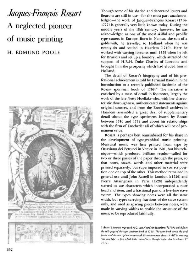
Jacques-François Rosart
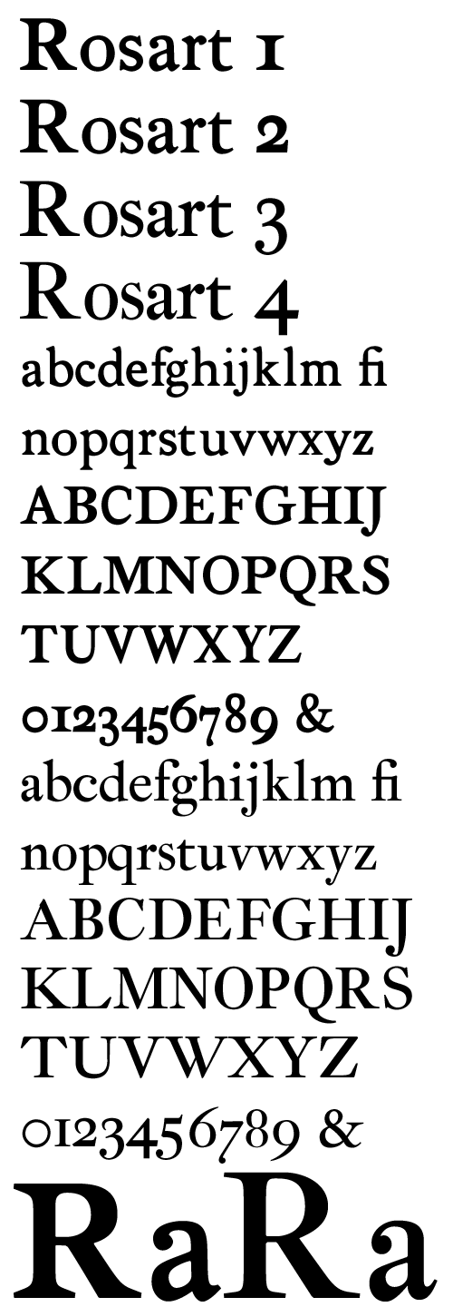
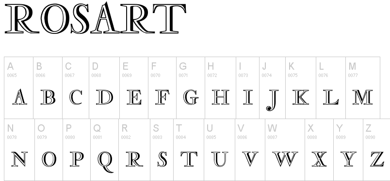
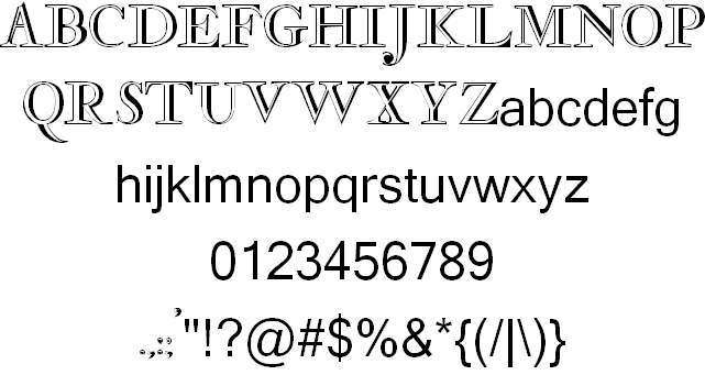
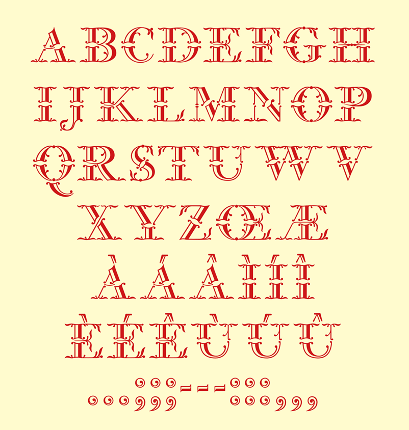
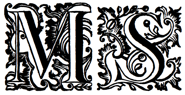
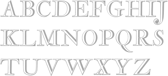
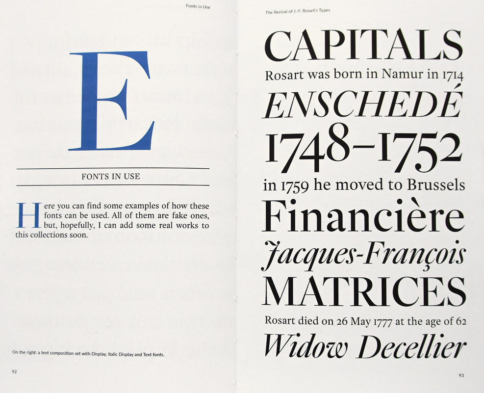
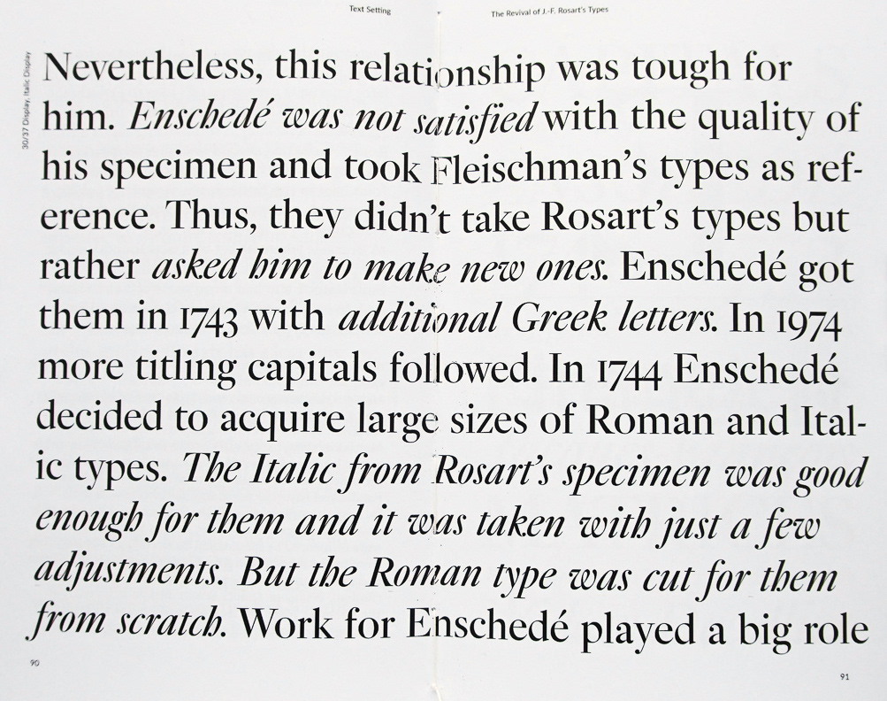
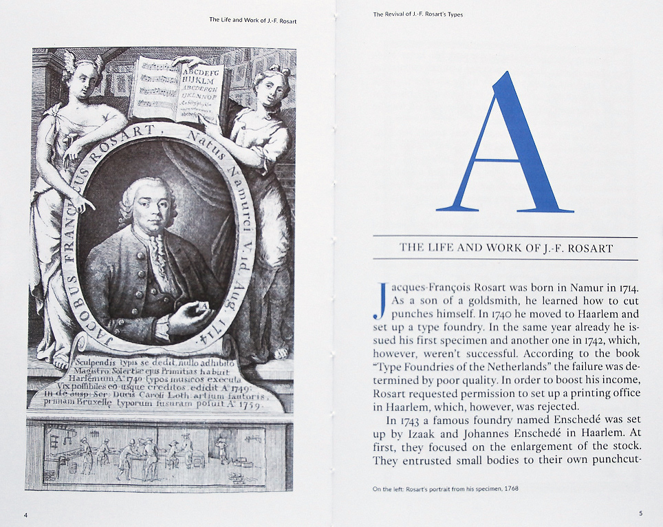
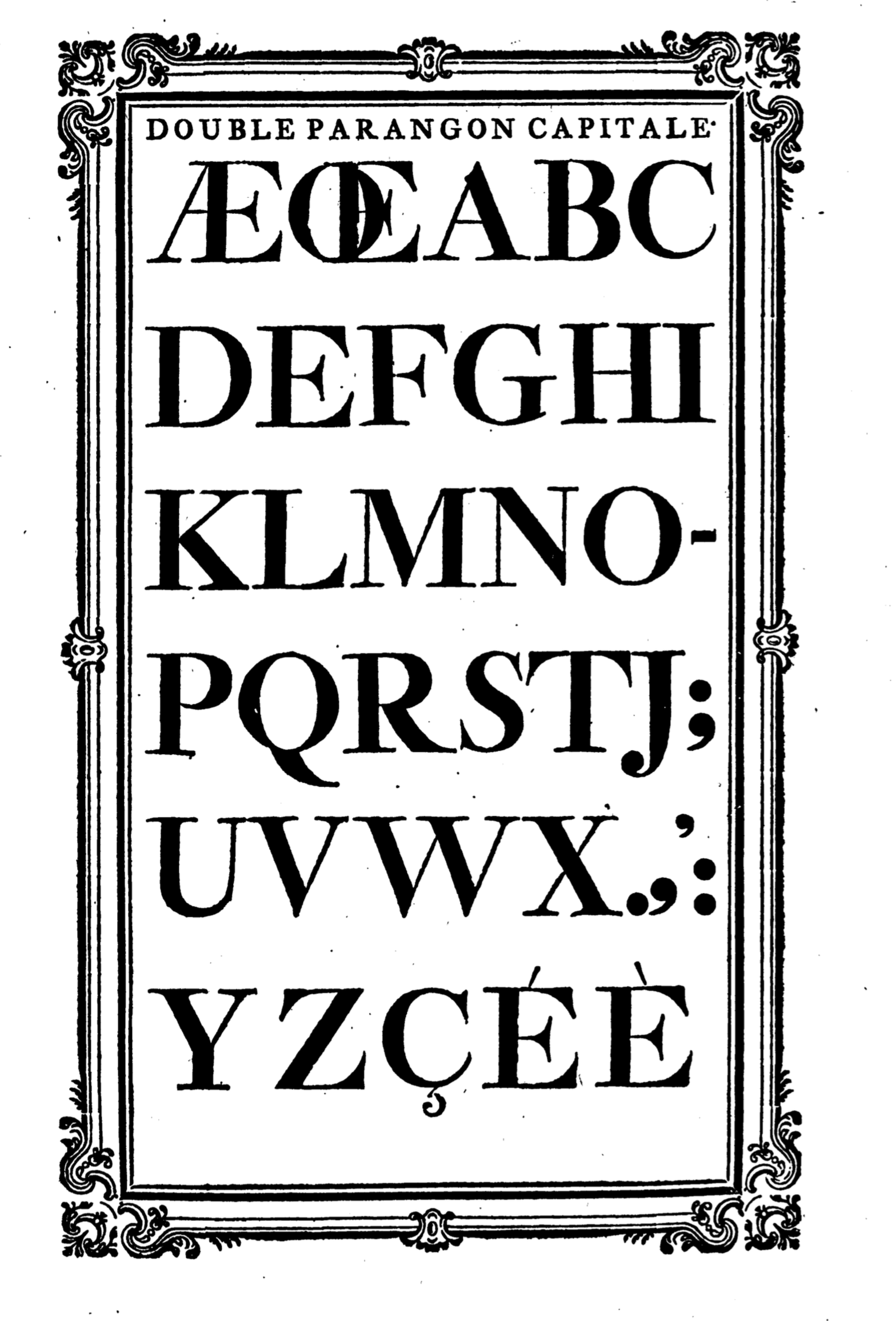
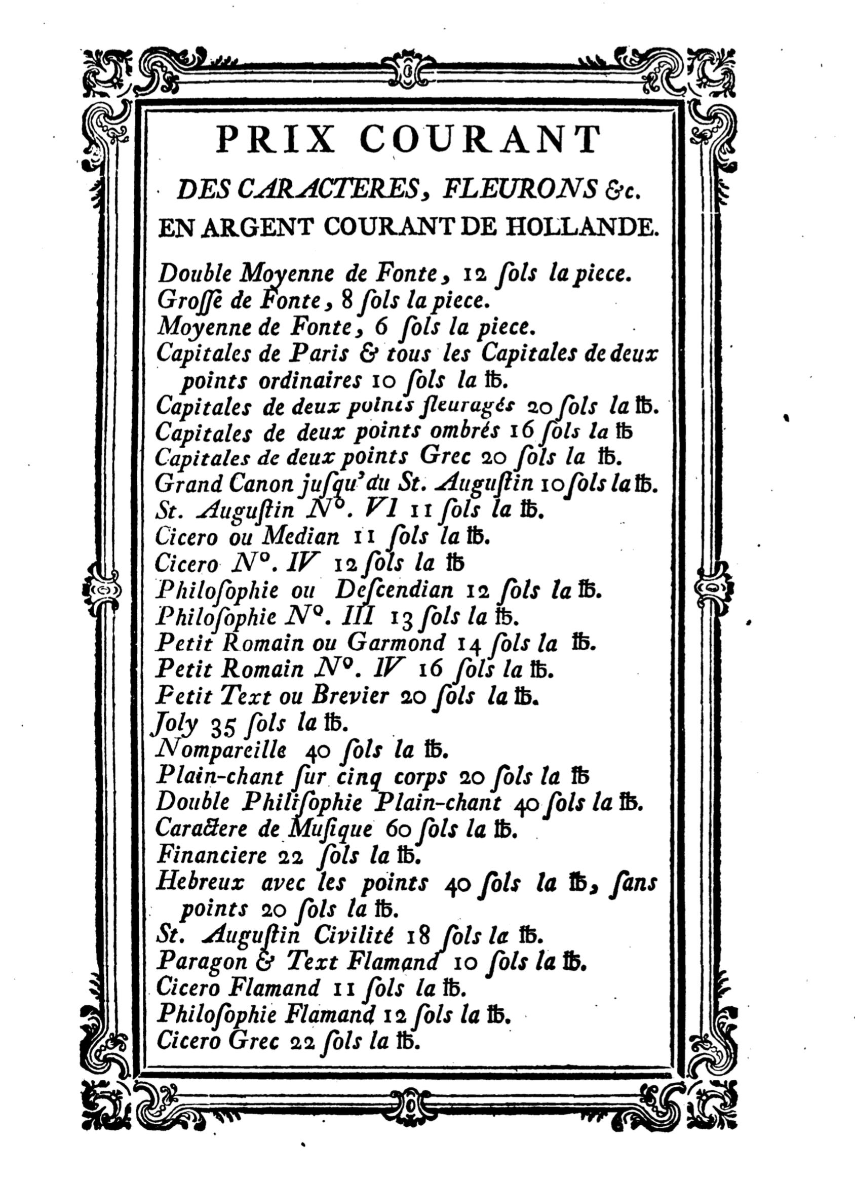
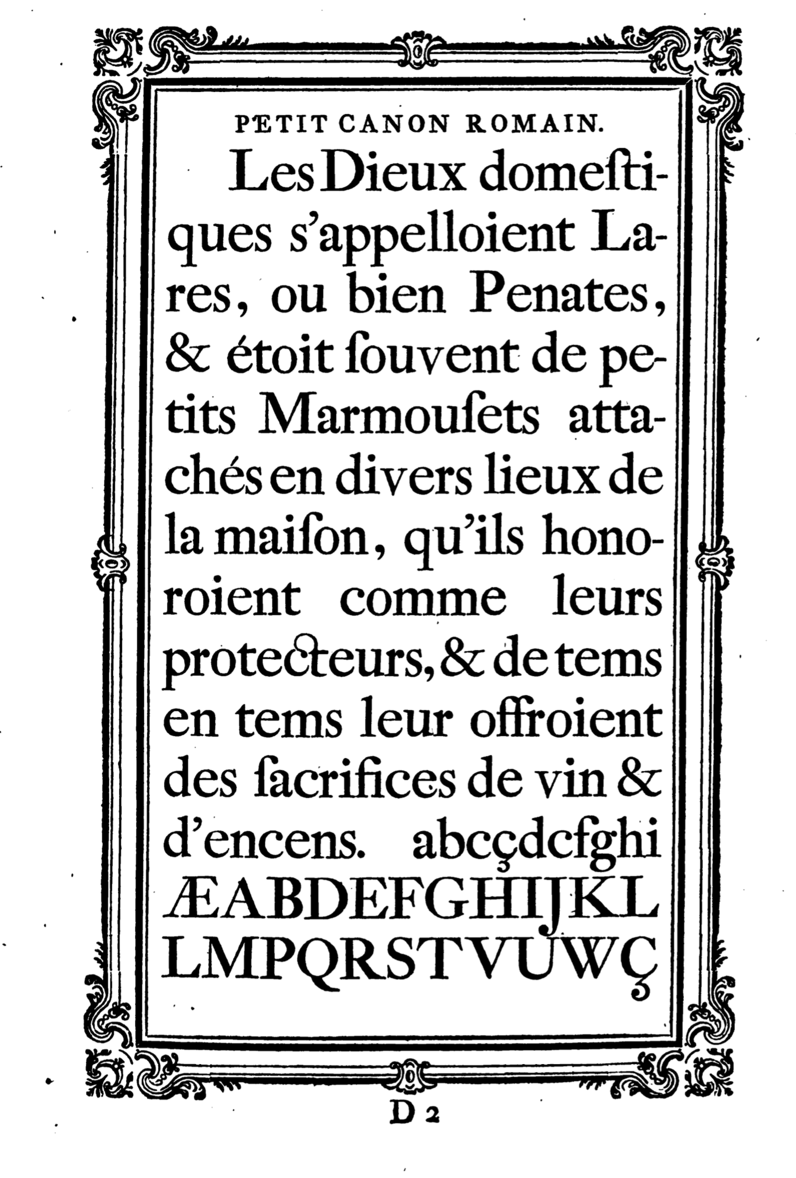
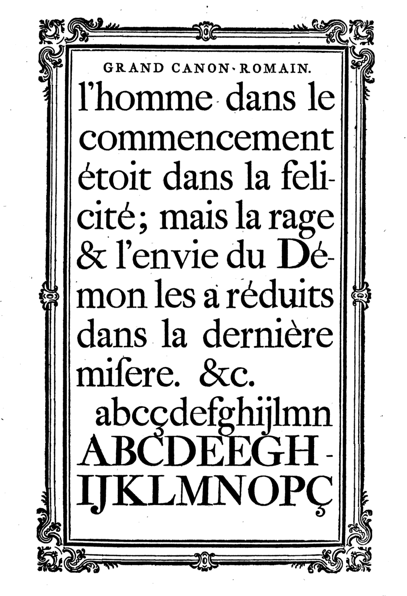
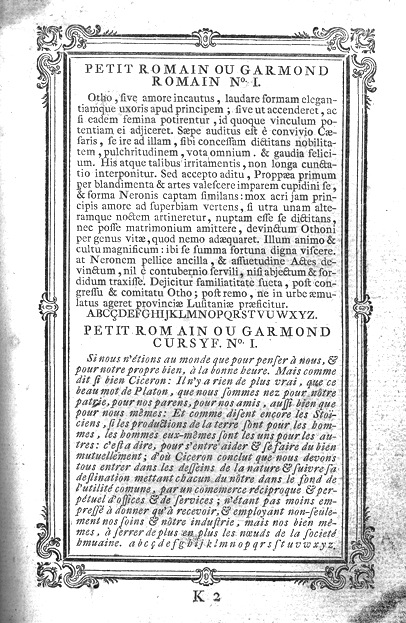
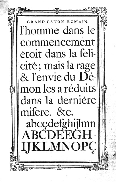
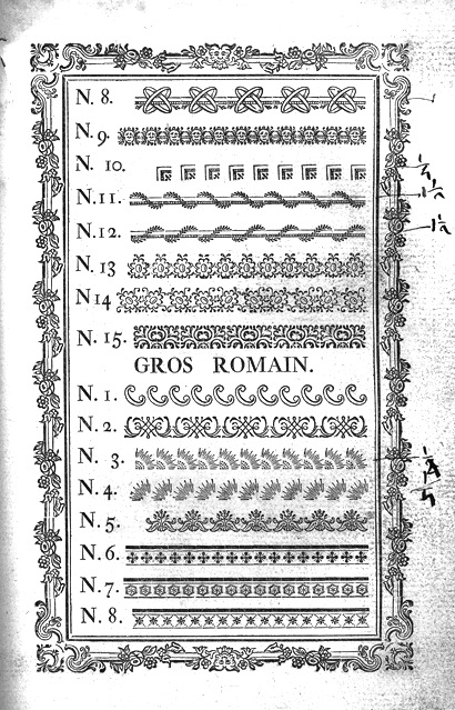
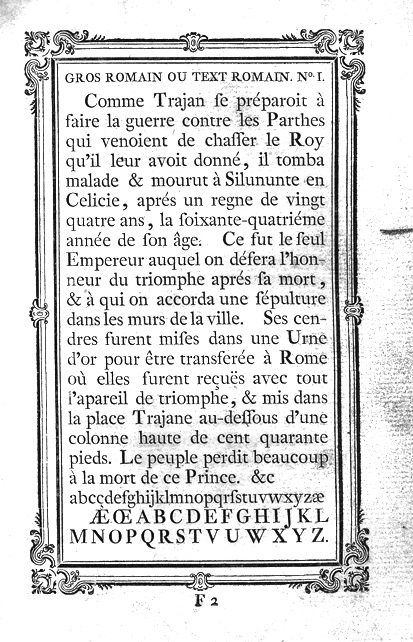
Belgian punchcutter and typefounder (b. Namur, 1714, d. Brussels, 1777). His early life was spent in Namur, Belgium. In 1740, he started out in Haarlem as a punchcutter, and published twelve type specimens in 1741, as well as 14 ornaments. From 1746 until 1752, he cut another thirteen different alphabets. In 1749, he cut several sets of musical characters. He had a contract with Enschedé, where he made the gorgeous shaded capital typeface Rosart in 1759, aka Enschedé no. 811. He moved back to Brussels in 1759 where he ran his own foundry. He published books with specimens in 1752, 1761 and 1768. F. Baudin and N. Hoeflake published the facsimile The Type Specimen of J.F. Rosart, Brussels, 1768 (Amsterdam, London, New York, 1973). The original book by Rosart, Epreuve des caractères, qui se gravent et fondent dans la nouvelle fonderie de Jacques François Rosart has been scanned in. Download his 1761 specimen book. Download his 1768 specimen book. Local downlload of his 1768 book. Metal typefaces influenced by Rosart include a couple of typefaces by Douglas C. McMurtrie, McMurtrie Title (1922) and Vanity Fair Capitals (1923), and Stuyvesant (1942-1947) by W.A. Dwiggins. Mac McGrew: Stuyvesant and Stuyvesant Italic were designed in 1942-47 by William A. Dwiggins, inspired by a quaint Dutch type cut by J. F. Rosart about 1750, and used in 1949 in The Shelby Letters, from the California Mines, 1851-1852, published by Alfred Knopf. An entirely different Stuyvesant, a novelty design, was made by Keystone before 1906, perhaps before 1900. Mac McGrew: McMurtrie Title is a font of highlighted roman capitals, based on a typeface created by the eighteenth-century Dutch founder, J. F. Rosart. The source of the first line of the specimen, a major typographer, shows no characters except the alphabet and three points. But the cases of a prominent printer include the points and figures shown on the second line. Although the letters seem to be identical, each size is on the next larger body compared to the first showing (thus the second specimen line is on 30-point body). The second line seems to be a little less compatible with the capitals, and perhaps was substituted from another source. Compare Caslon Shaded, Cameo. Mac McGrew: Vanity Fair Capitals were adapted by Douglas C. McMurtrie in 1923, from a type of J. F. Rosart, an eighteenth-century Dutch typefounder, and were privately cast for distribution by Continental Typefounders Association. They are a set of shaded italic capitals, with tendril designs used as serifs and breaking the main stems. John S. Carroll, then operating a private type foundry in Miami Beach, cut much the same typeface in 1964-65; the specimens here show both cuttings. Carroll's cutting is closer to the original, and true to the Dutch originals, smaller sizes are simpler, lacking the mid-stem ornamentation. List of digital typefaces based on Rosart's work:
|
EXTERNAL LINKS |
| | |

file name: Aiko Oshima Vincent Ciccone Franck Kauffamn Delphine Cordier Rosart 2002

file name: Lars Bergquist Rococo Titling 2001
file name: Roger White Rosart
file name: Roger White Rosart 1995
file name: Michel Pare Rosart Initials 2017
file name: Dick Pape Rosart Initials 2010
file name: A R Types Rosart
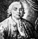
file name: J F Rosart1749 portrait
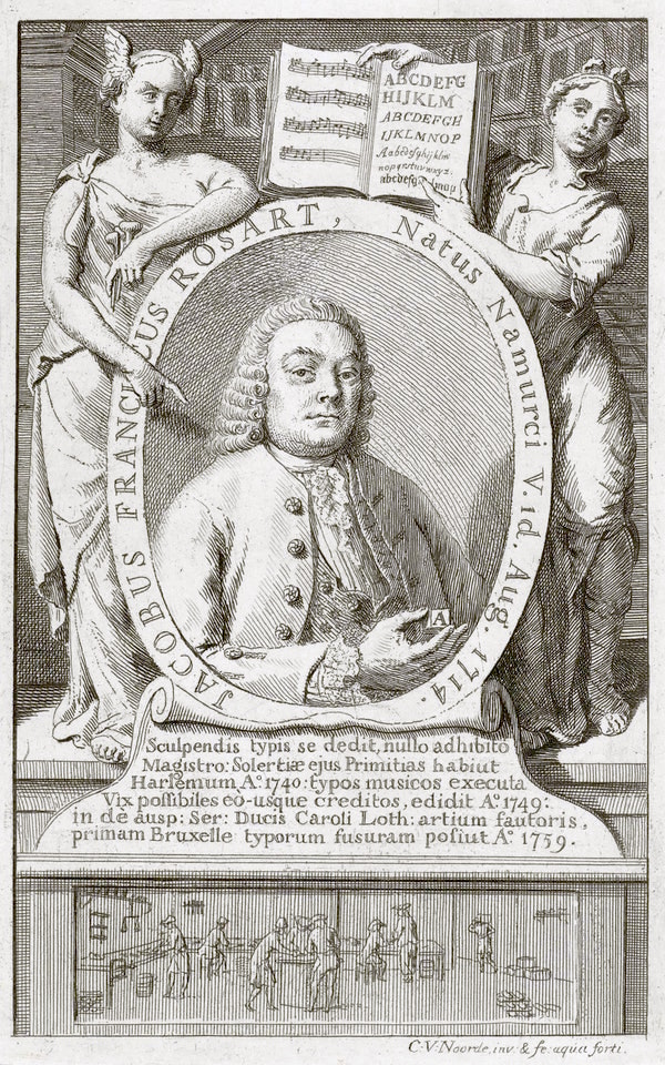
file name: Jacques Francois Rosart portrait by Cornelis van Noorde 1759.
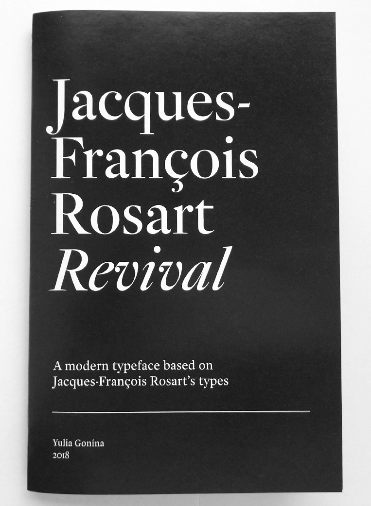
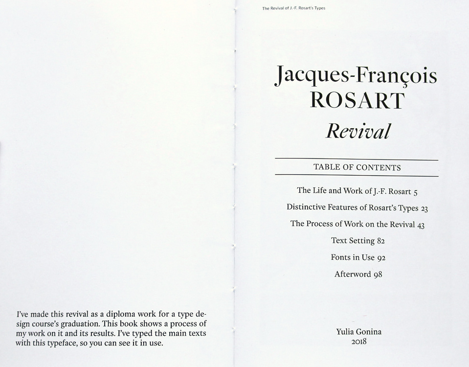
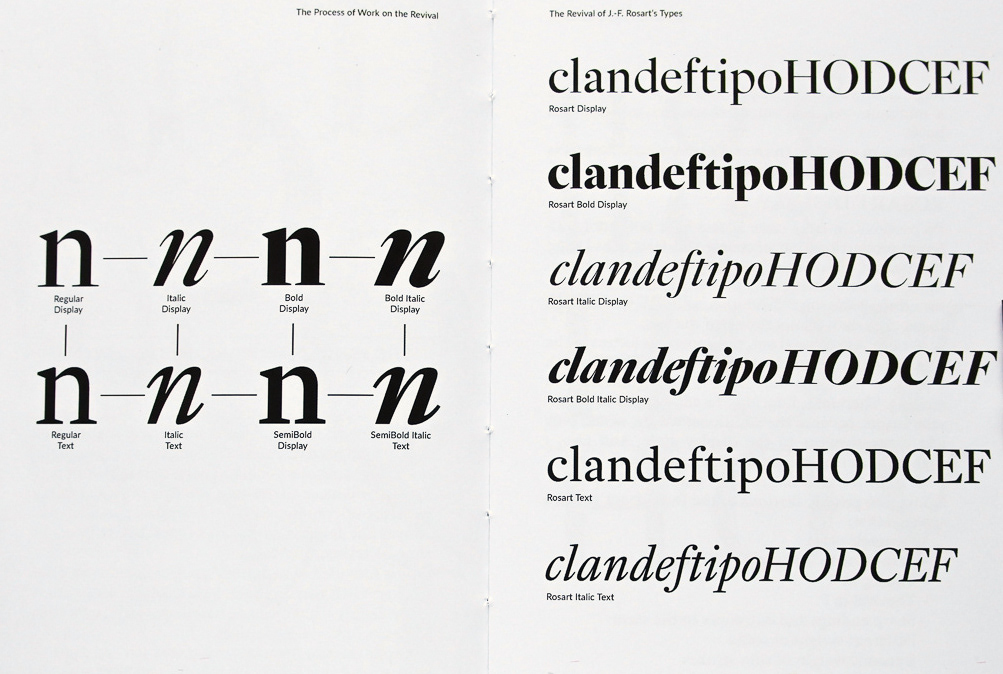
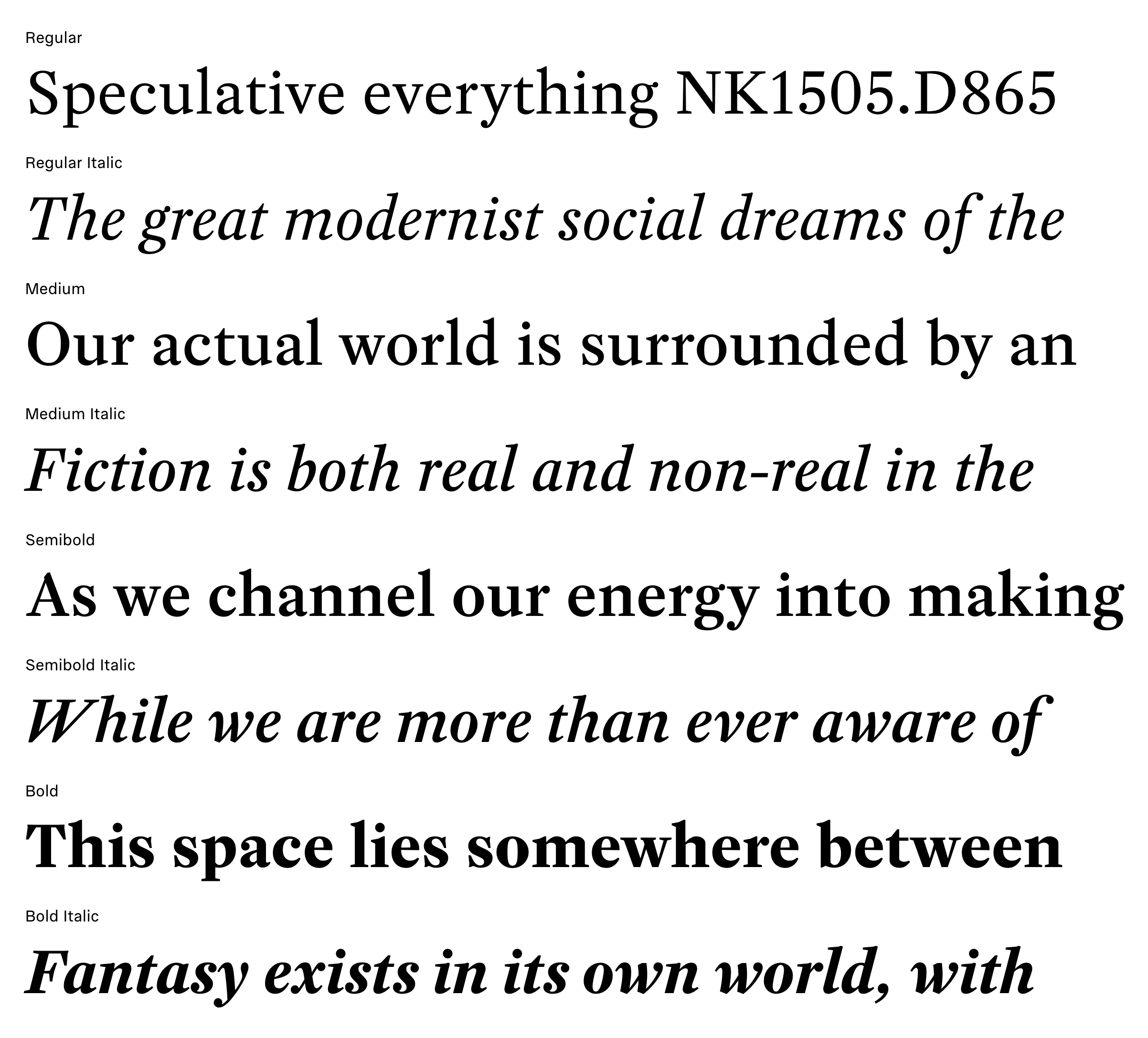
file name: Yulia Gonina Rosart 2018b
file name: Yulia Gonina Rosart 2018c
file name: Yulia Gonina Rosart 2018j
file name: Yulia Gonina Rosart 2018k
file name: Yulia Gonina Rosart 2018l
file name: Yulia Gonina Rosart 2018r
file name: Yulia Gonina Rosart 2018t
file name: Yulia Gonina Rosart 2018u
file name: Yulia Gonina Rosart 2018w
file name: Katharina Koehler Rosart 2011
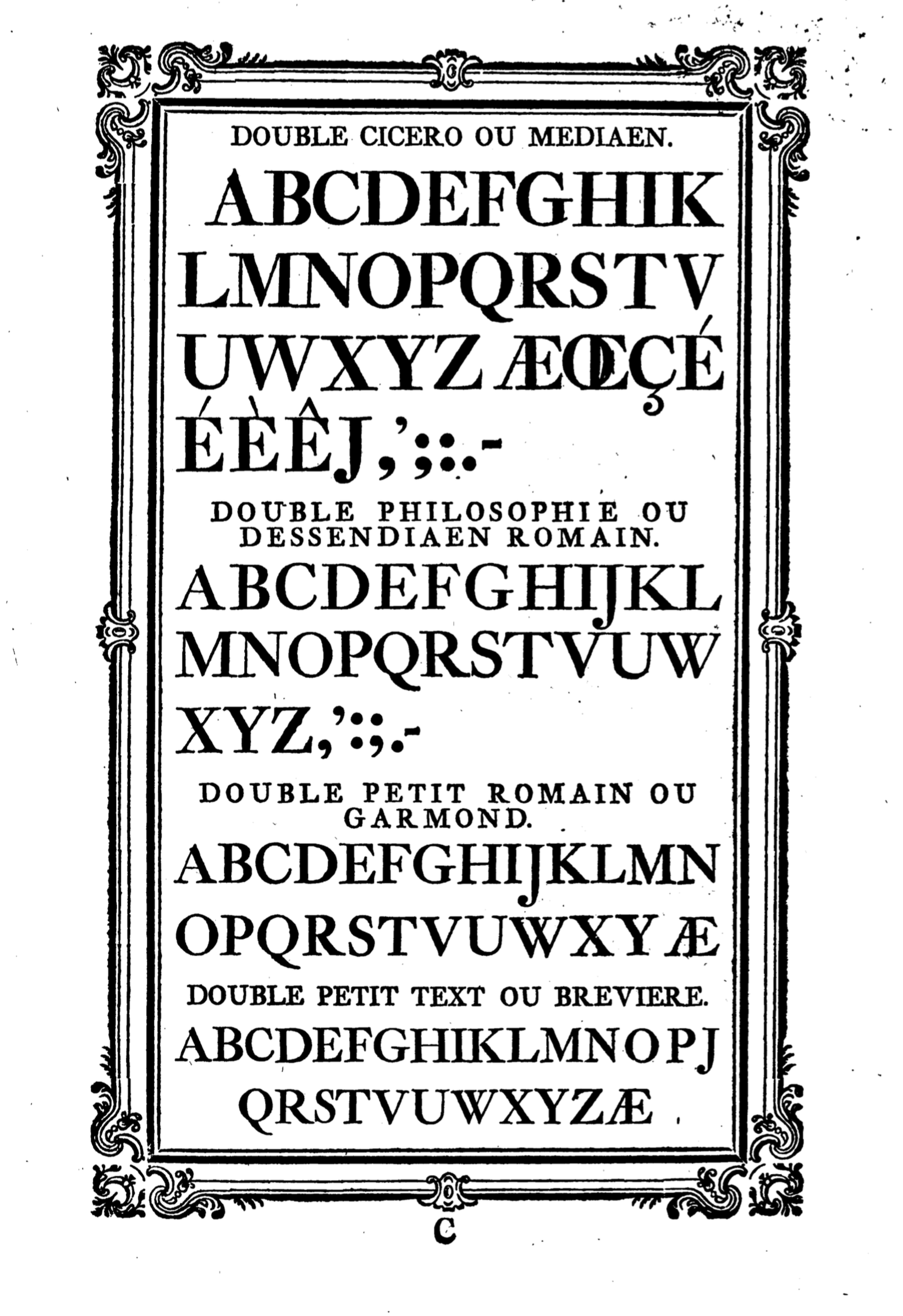
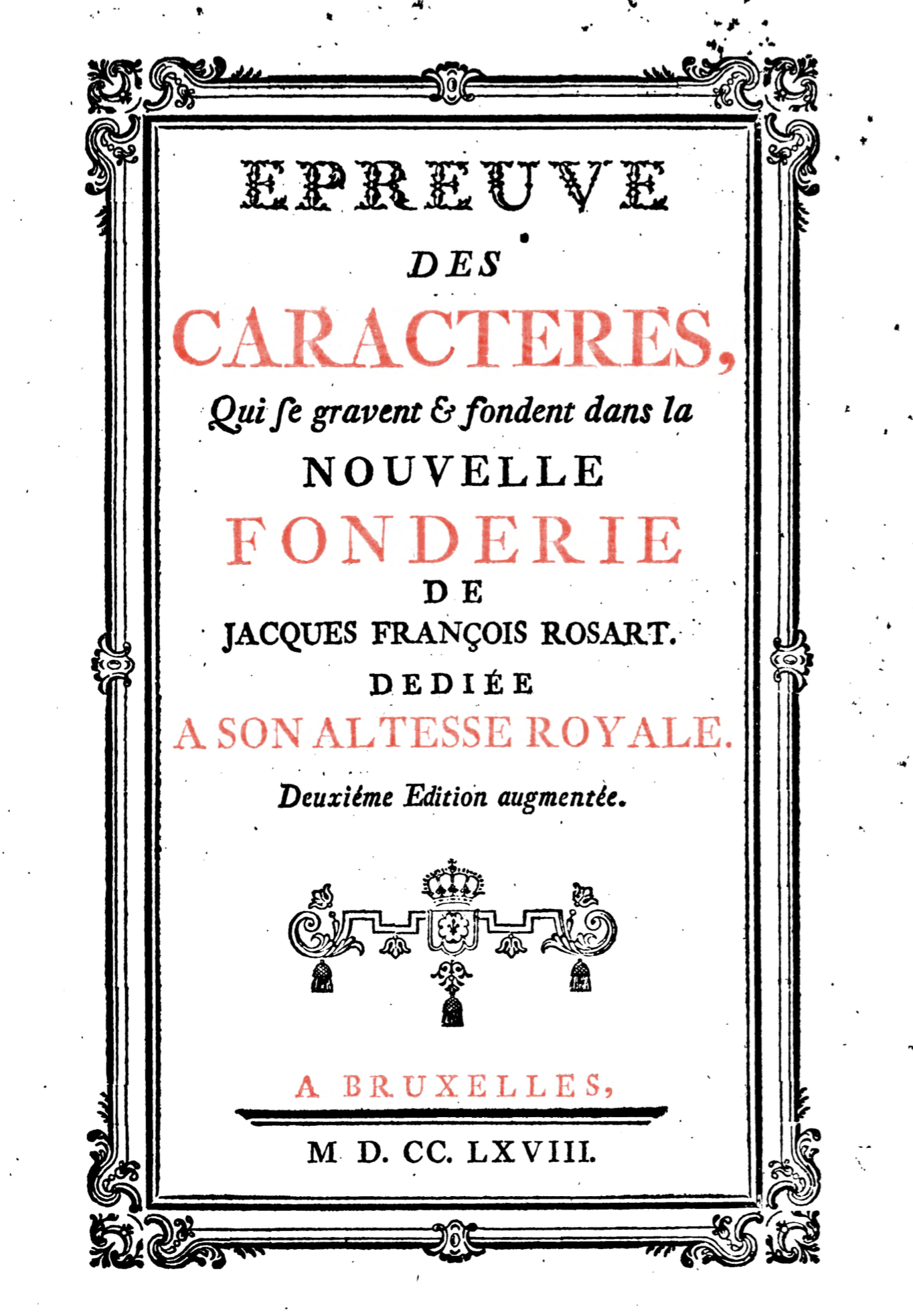
file name: Jacques Francois Rosart Epreuves 1768
file name: Jacques Francois Rosart Epreuves 1768
file name: Jacques Francois Rosart Epreuves 1768
file name: Jacques Francois Rosart Epreuves 1768
file name: Jacques Francois Rosart Epreuves 1768
file name: Jacques Francois Rosart Epreuves 1768
file name: Jacques Francois Rosart Epreuves 1768
file name: Jacques Francois Rosart Epreuves 1768
file name: Jacques Francois Rosart Epreuves 1768
file name: Jacques Francois Rosart Epreuves 1768
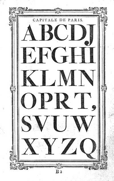
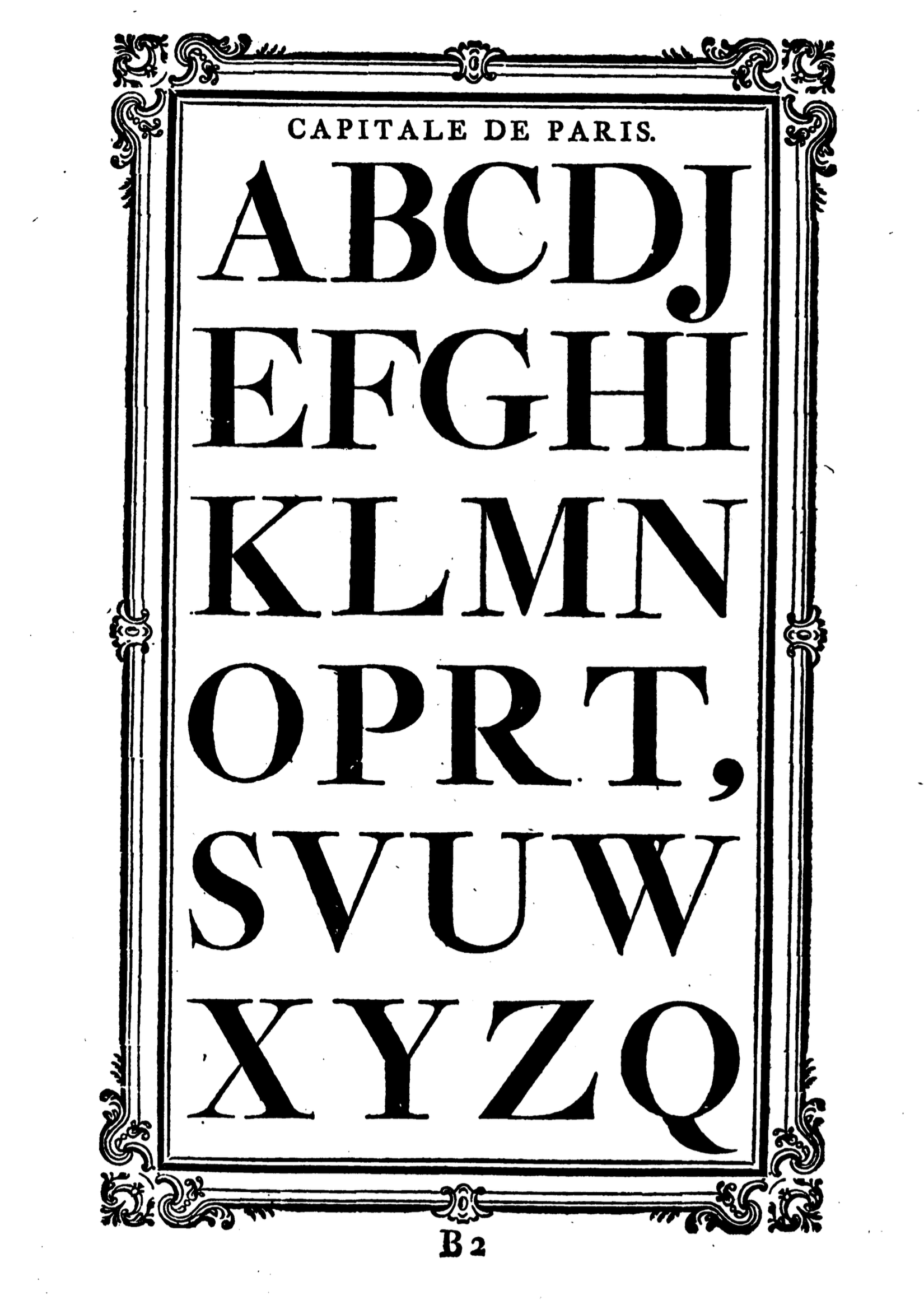
file name: Jacques Francois Rosart Capitale De Paris 1768
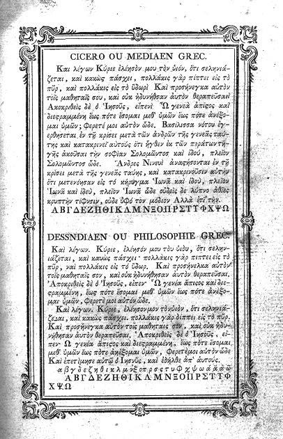
file name: Jacques Francois Rosart Cicero Mediaen Grec 1768
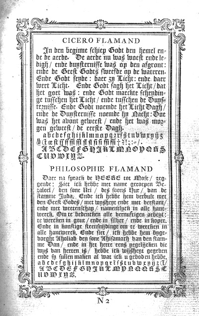
file name: Jacques Francois Rosart Cicero Flamand 1768
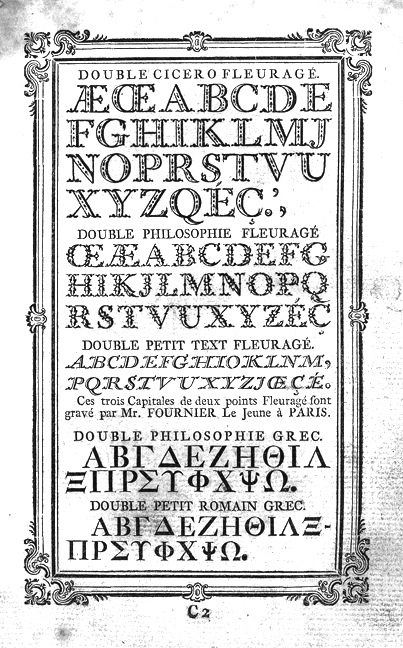
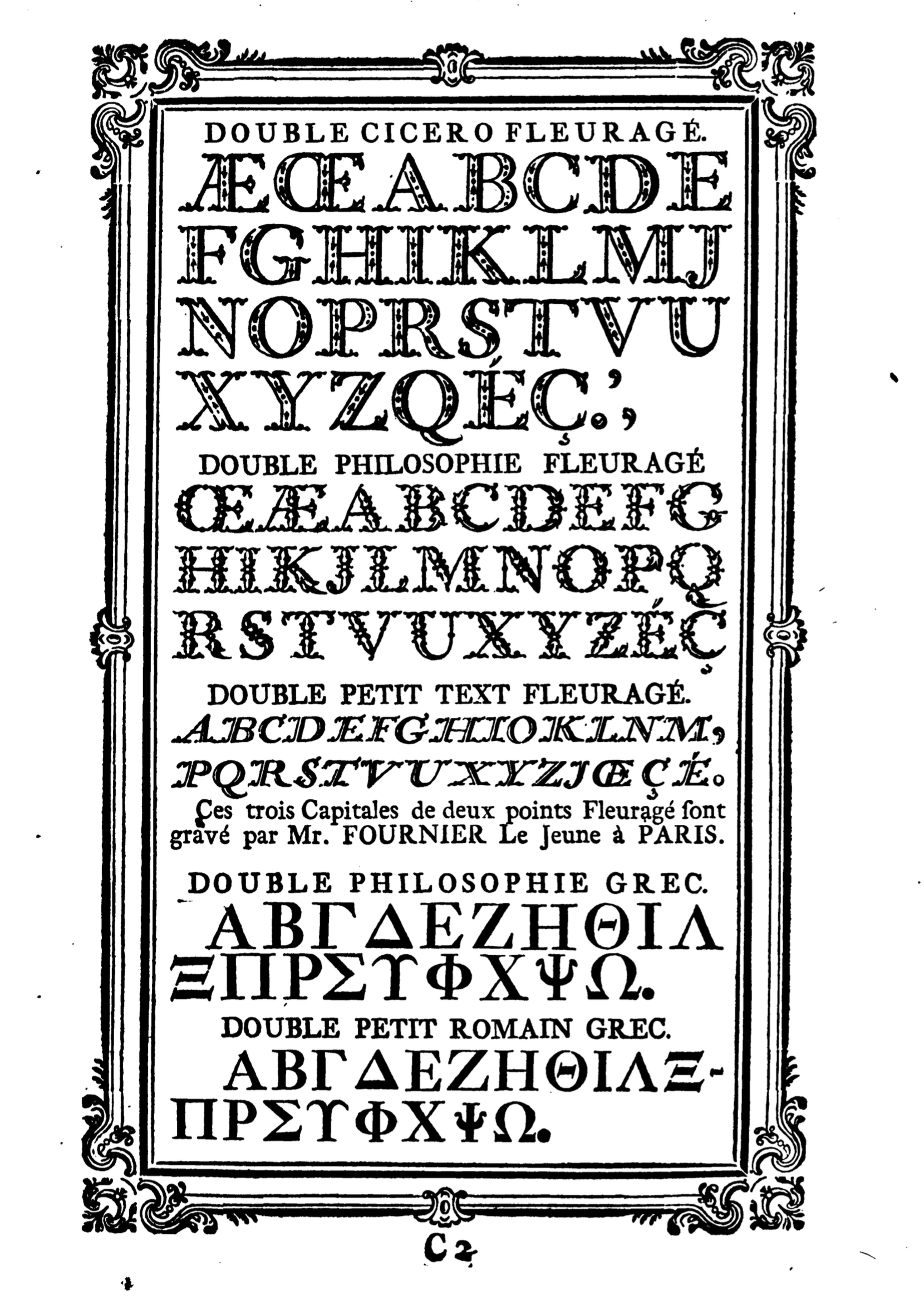
file name: Jacques Francois Rosart Double Cicero Fleurage 1768
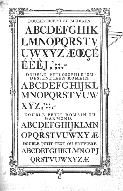
file name: Jacques Francois Rosart Double Cicero Mediaen 1768
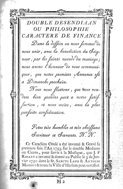
file name: Jacques Francois Rosart Double Desendiaan 1768
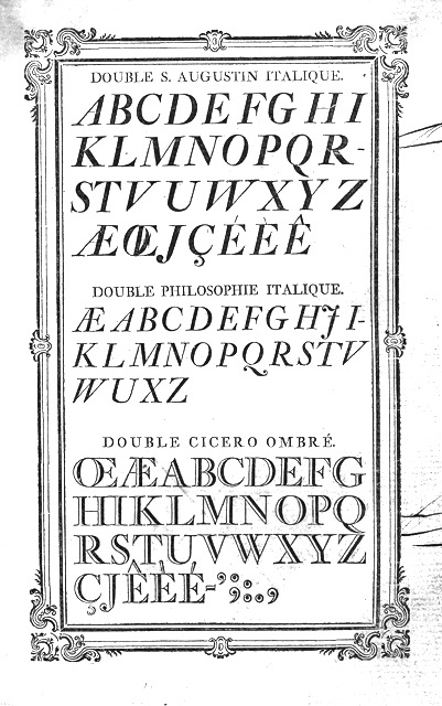
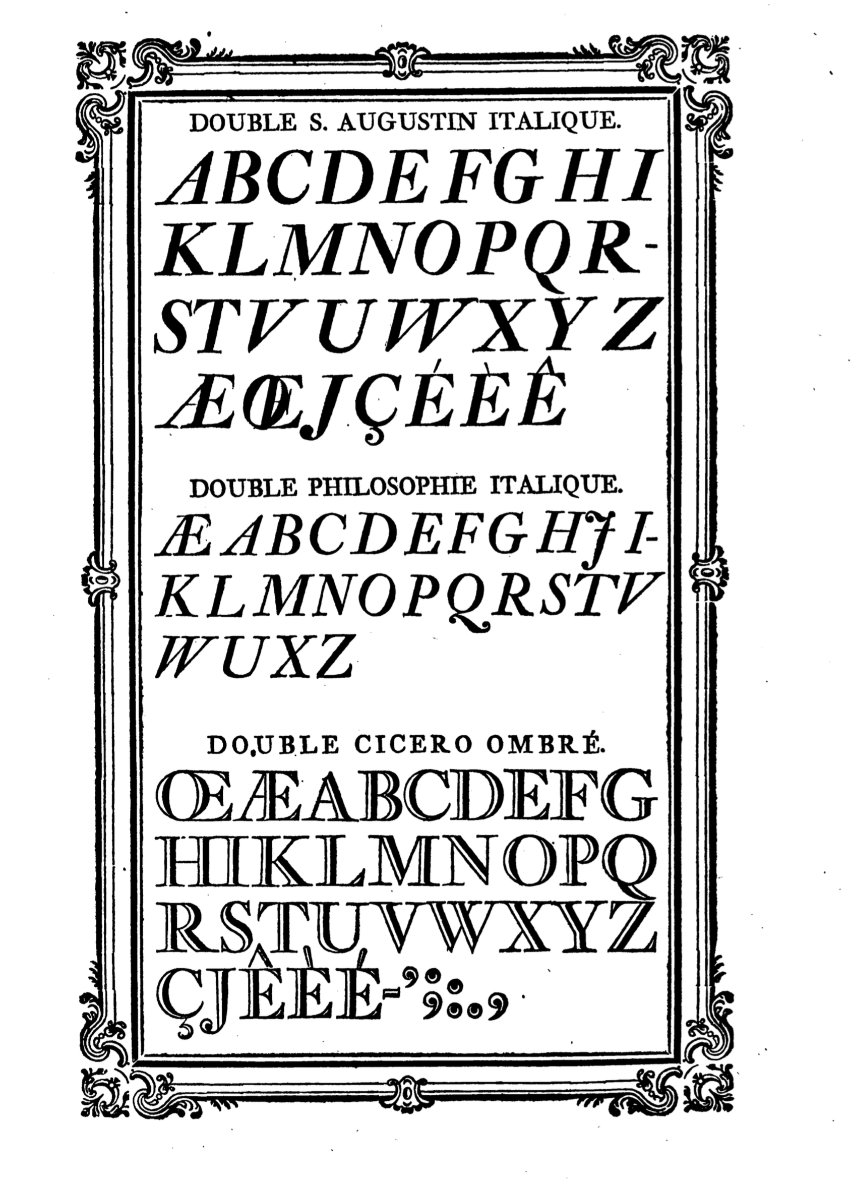
file name: Jacques Francois Rosart Double St Augustin Italique 1768
file name: Jacques Francois Rosart Garmond 1768
file name: Jacques Francois Rosart Grand Canon Romain 1768
file name: Jacques Francois Rosart Gros Romain 1768
file name: Jacques Francois Rosart Gros Romain 1768c
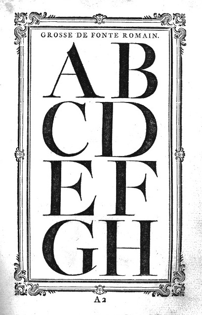
file name: Jacques Francois Rosart Grosse De Fonte Romain 1768
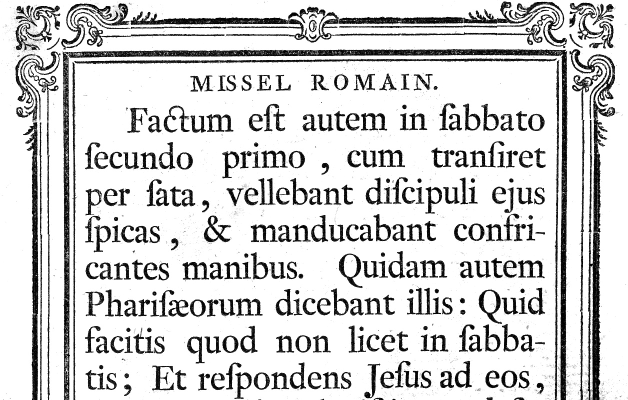
file name: Jacques Francois Rosart Missel Romain 1768
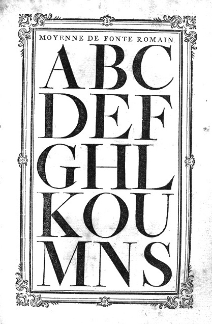
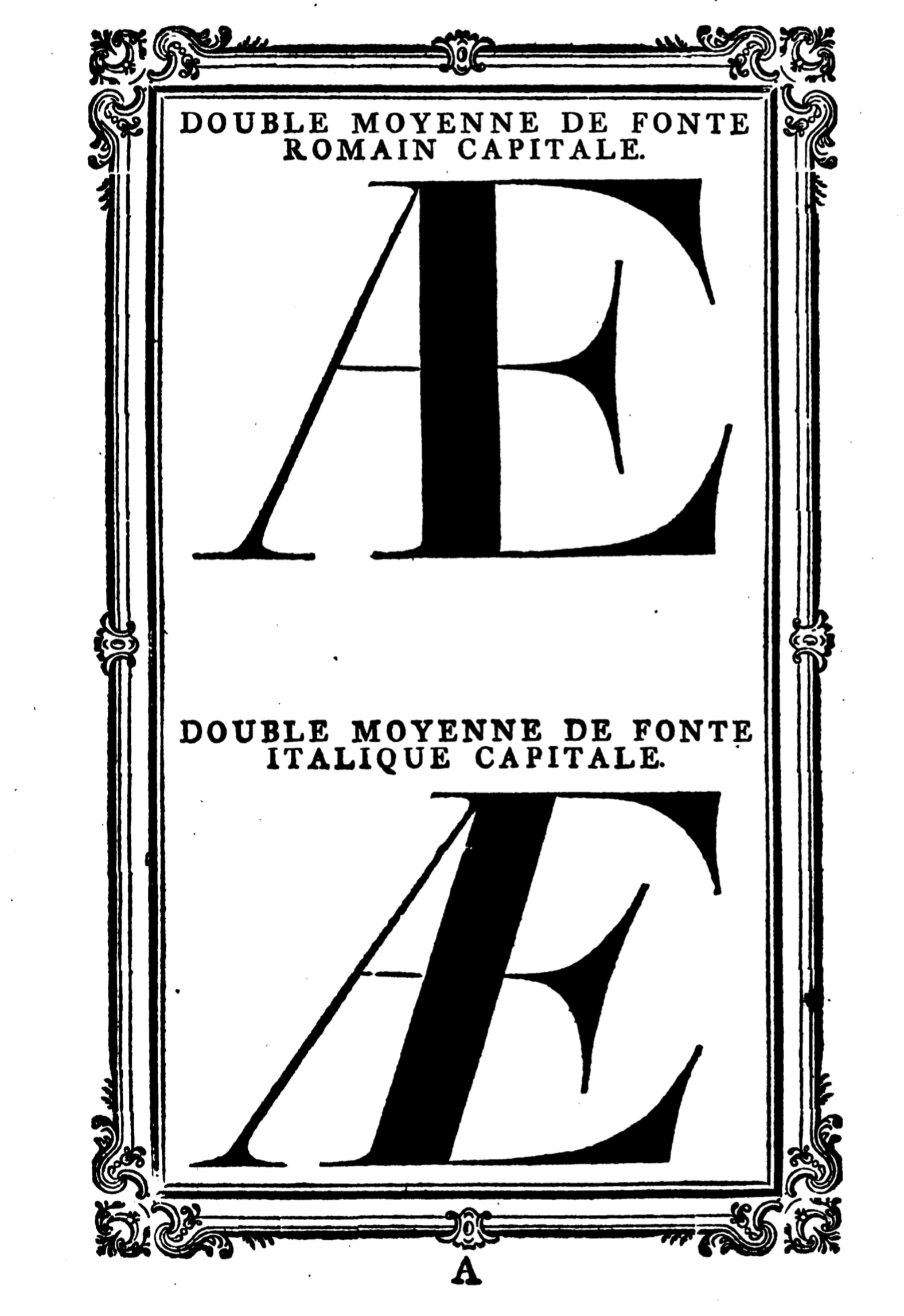
file name: Jacques Francois Rosart Moyenne De Fonte Romain 1768
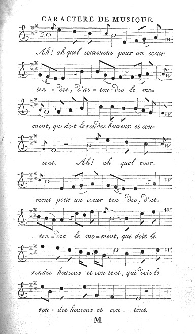
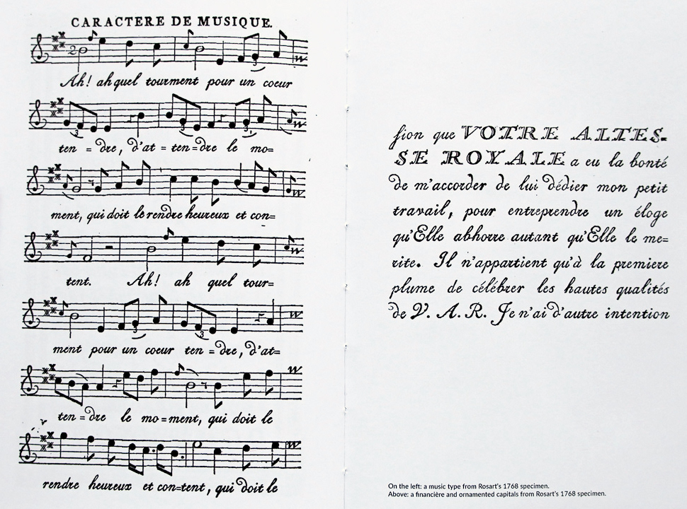
file name: Jacques Francois Rosart Musique 1768
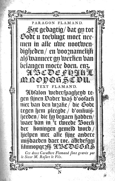
file name: Jacques Francois Rosart Paragon Flamand 1768
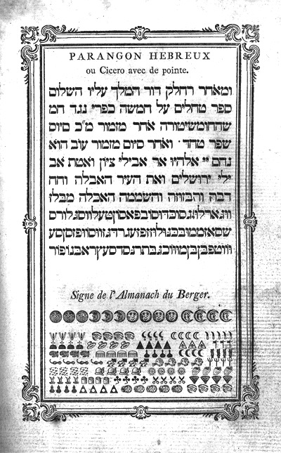
file name: Jacques Francois Rosart Parangon Hebreux 1768
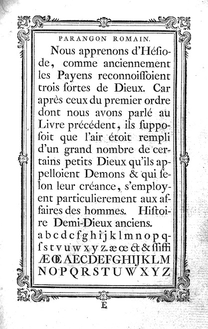
file name: Jacques Francois Rosart Parangon Romain 1768
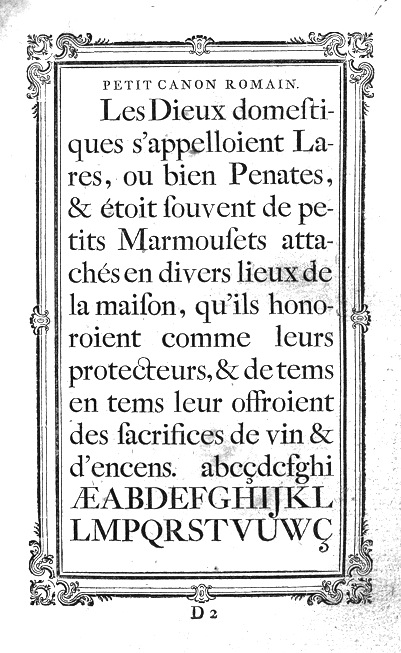
file name: Jacques Francois Rosart Petit Canon Romain 1768
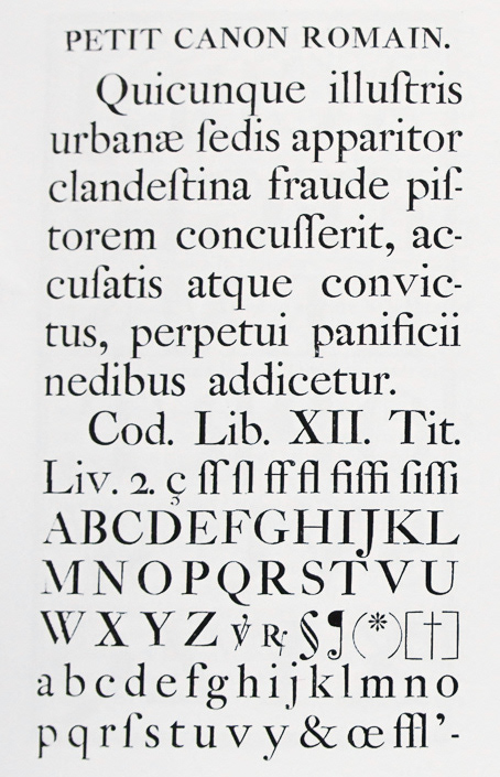
file name: Jacques Francois Rosart Petit Canon Romain 1747
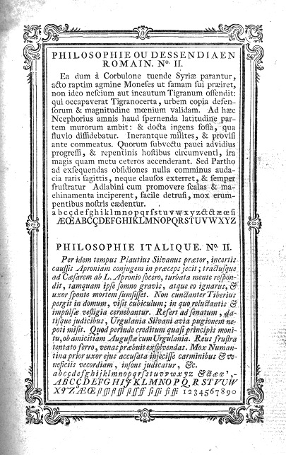
file name: Jacques Francois Rosart Philosophie 1768
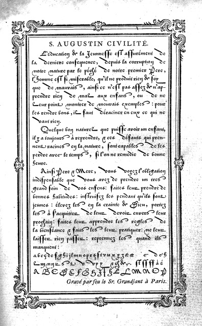
file name: Jacques Francois Rosart St Augustin Civilite 1768
file name: Jacques Francois Rosart Typefaces 1768
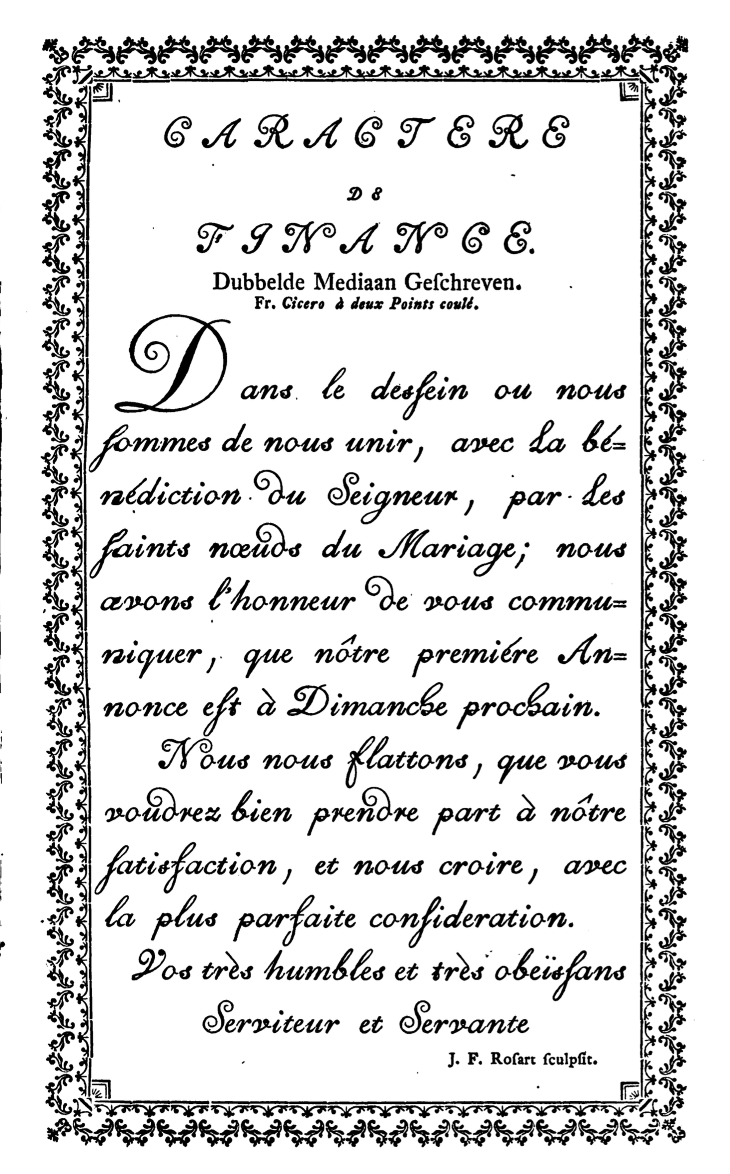
file name: Johan Enschede Proef Van Letteren 1768 Jean Francois Rosart Dubbelde Mediaan Geschreven
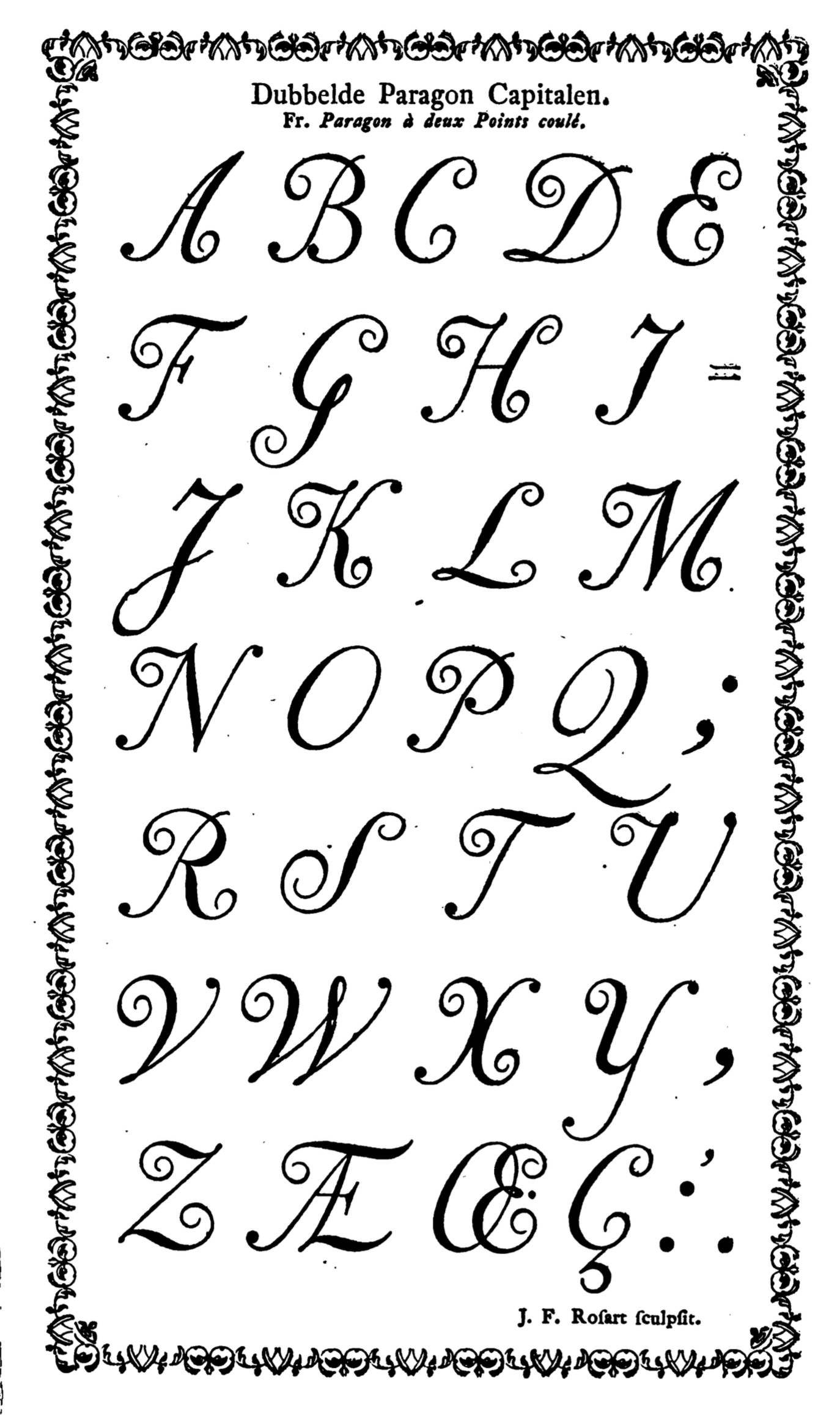
file name: Johan Enschede Proef Van Letteren 1768 Jean Francois Rosart Dubbelde Paragon Capitalen
| | |
|
Luc Devroye ⦿ School of Computer Science ⦿ McGill University Montreal, Canada H3A 2K6 ⦿ lucdevroye@gmail.com ⦿ https://luc.devroye.org ⦿ https://luc.devroye.org/fonts.html |