TYPE DESIGN INFORMATION PAGE last updated on Thu Jul 16 06:50:58 EDT 2026
FONT RECOGNITION VIA FONT MOOSE

|
|
|
|
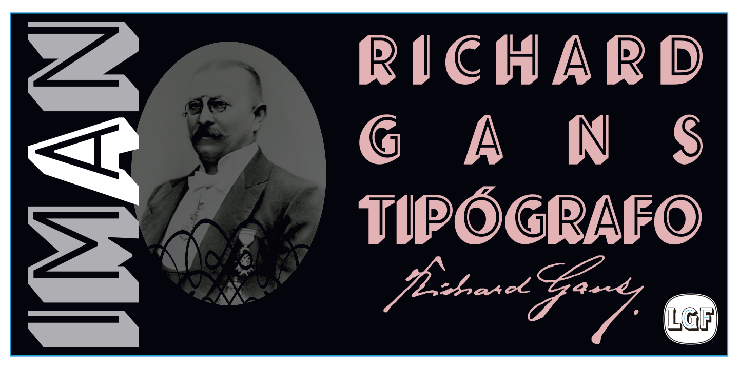
Fundicion Tipografica Richard Gans
[Richard Gans]
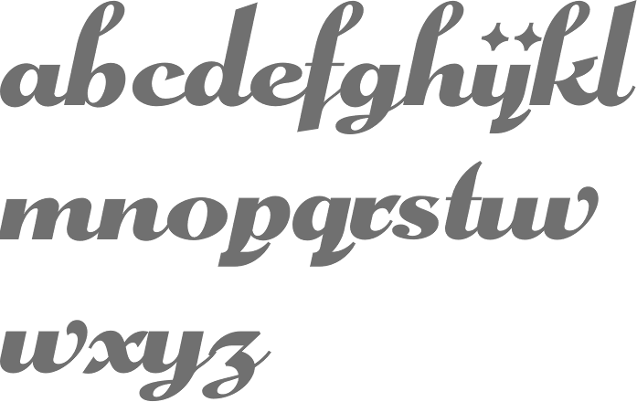
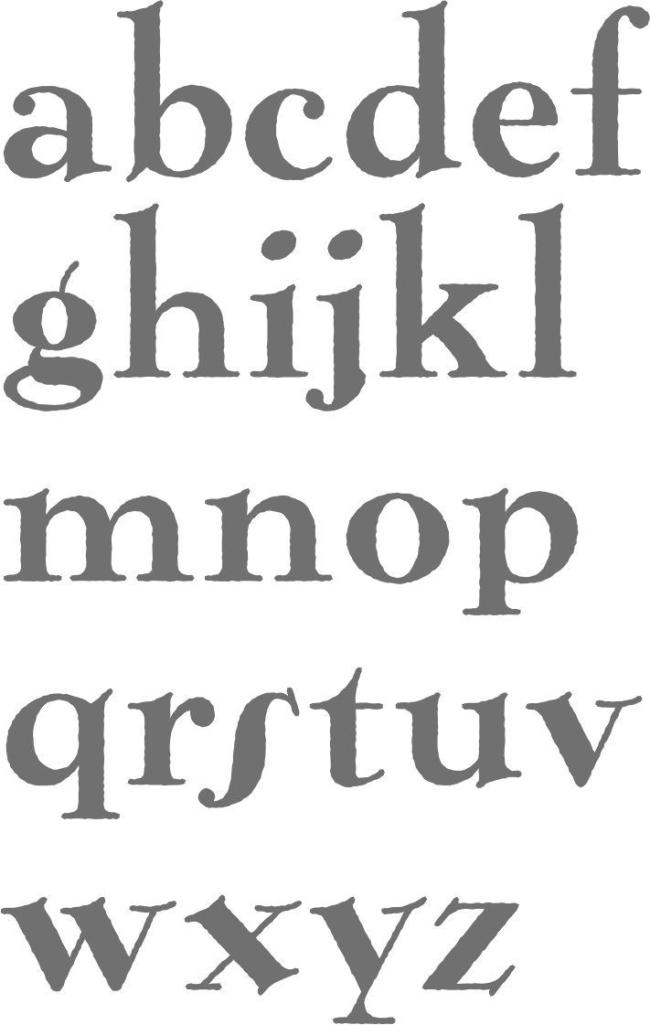
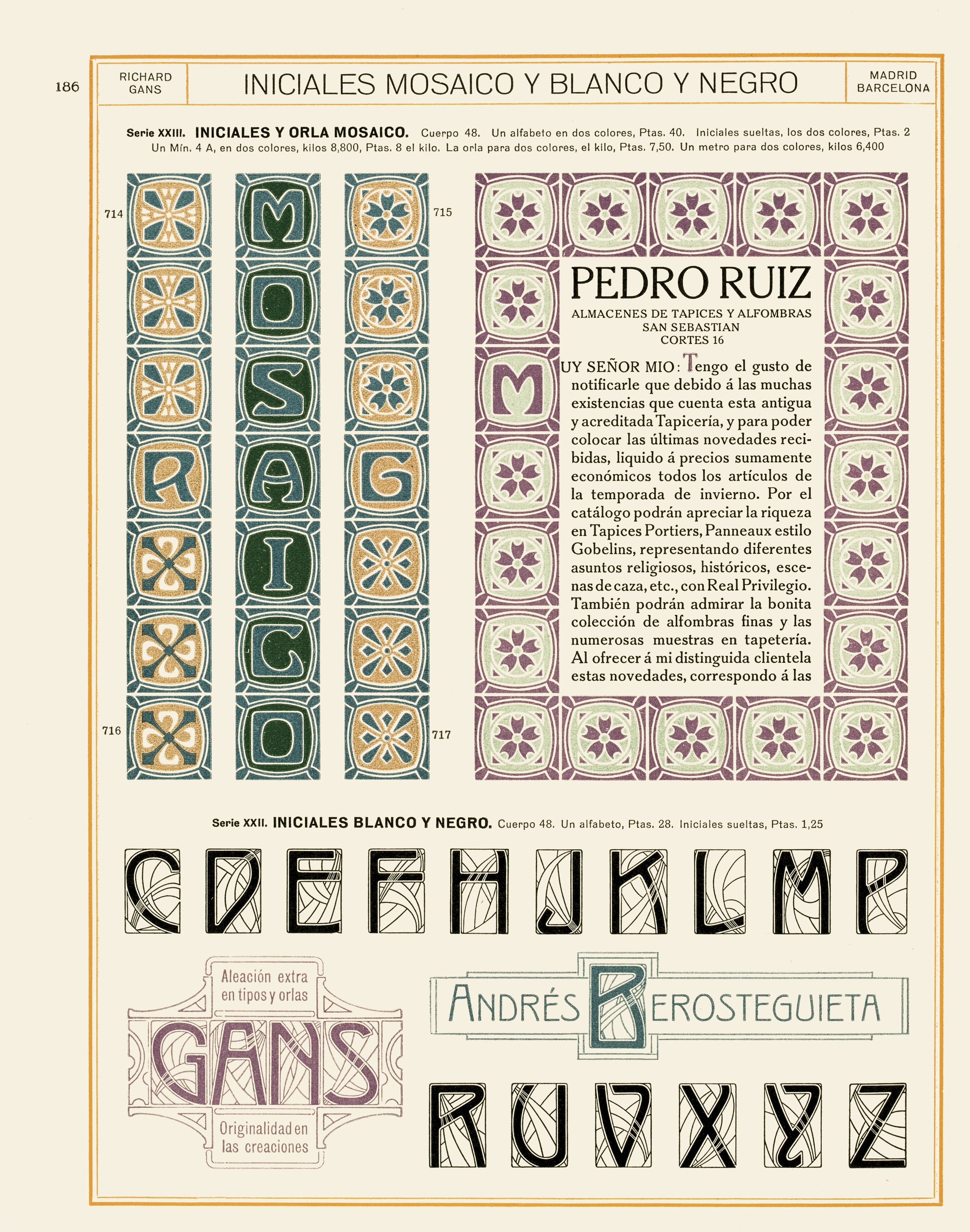
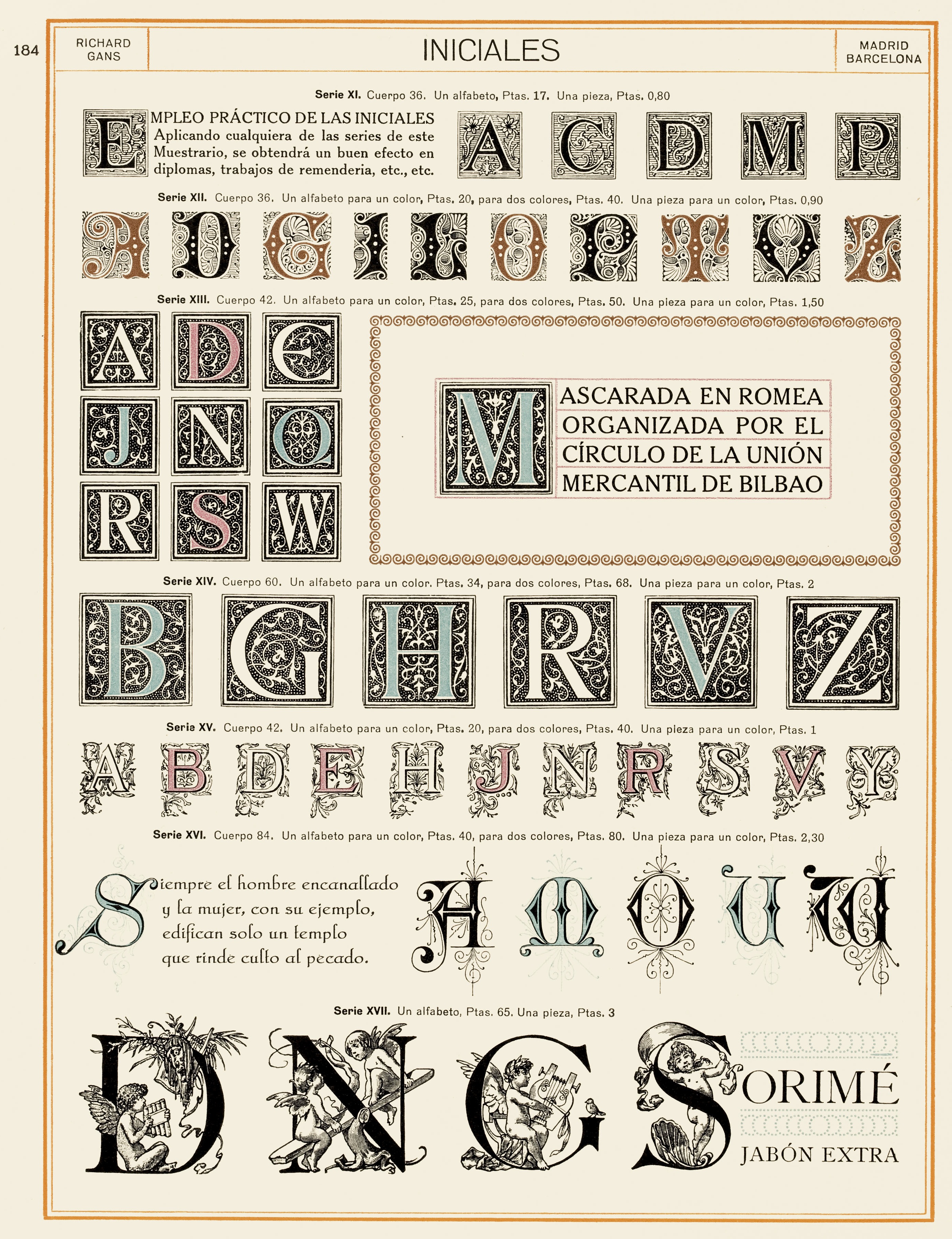
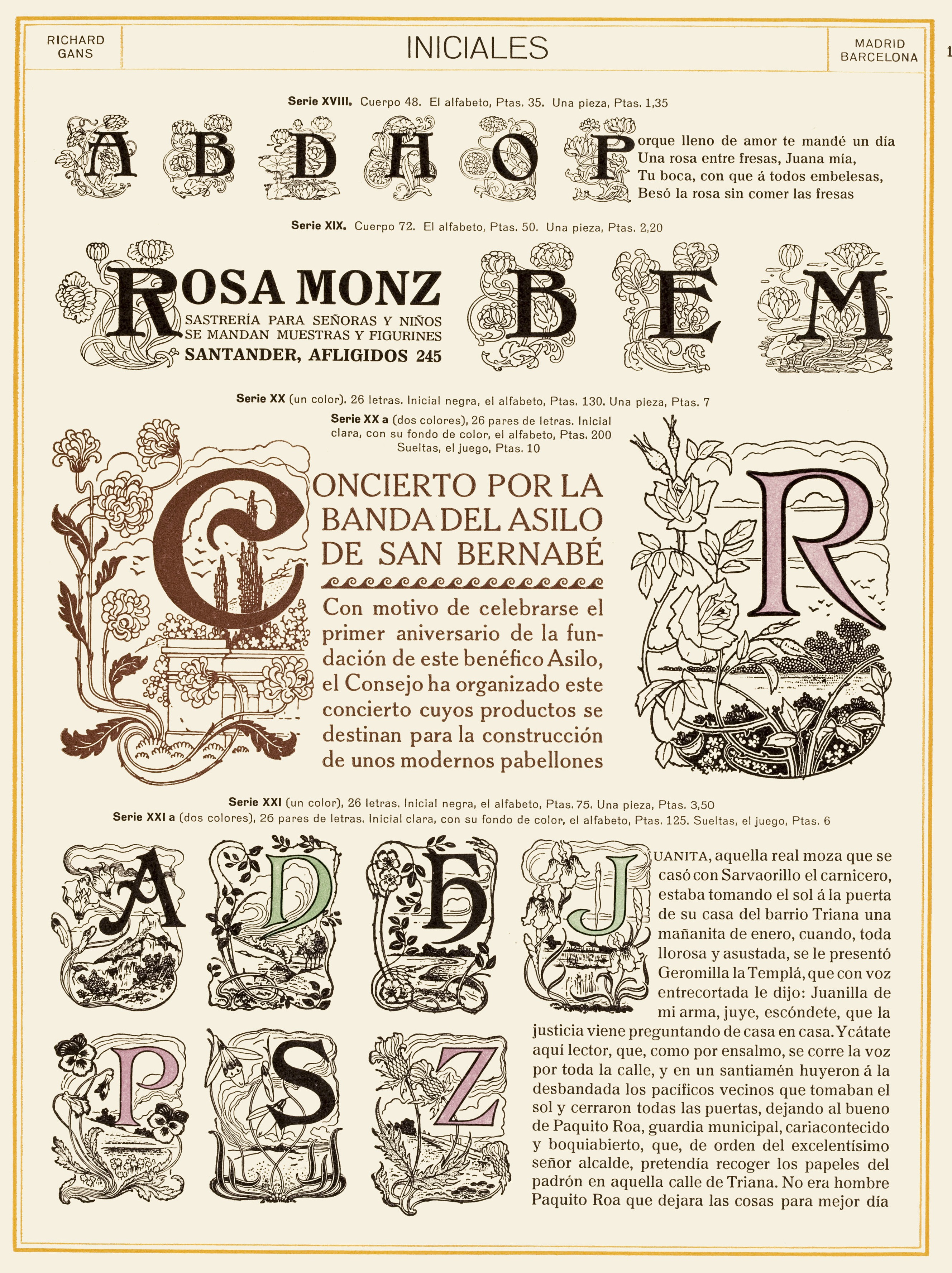
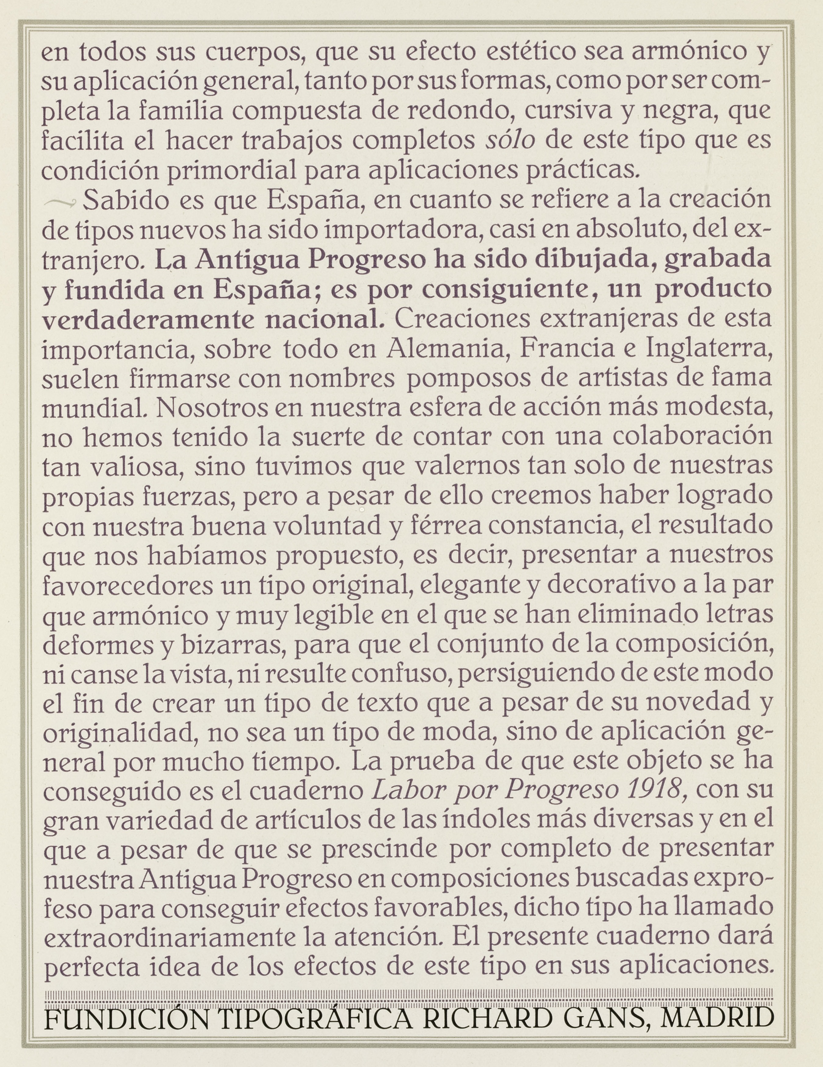
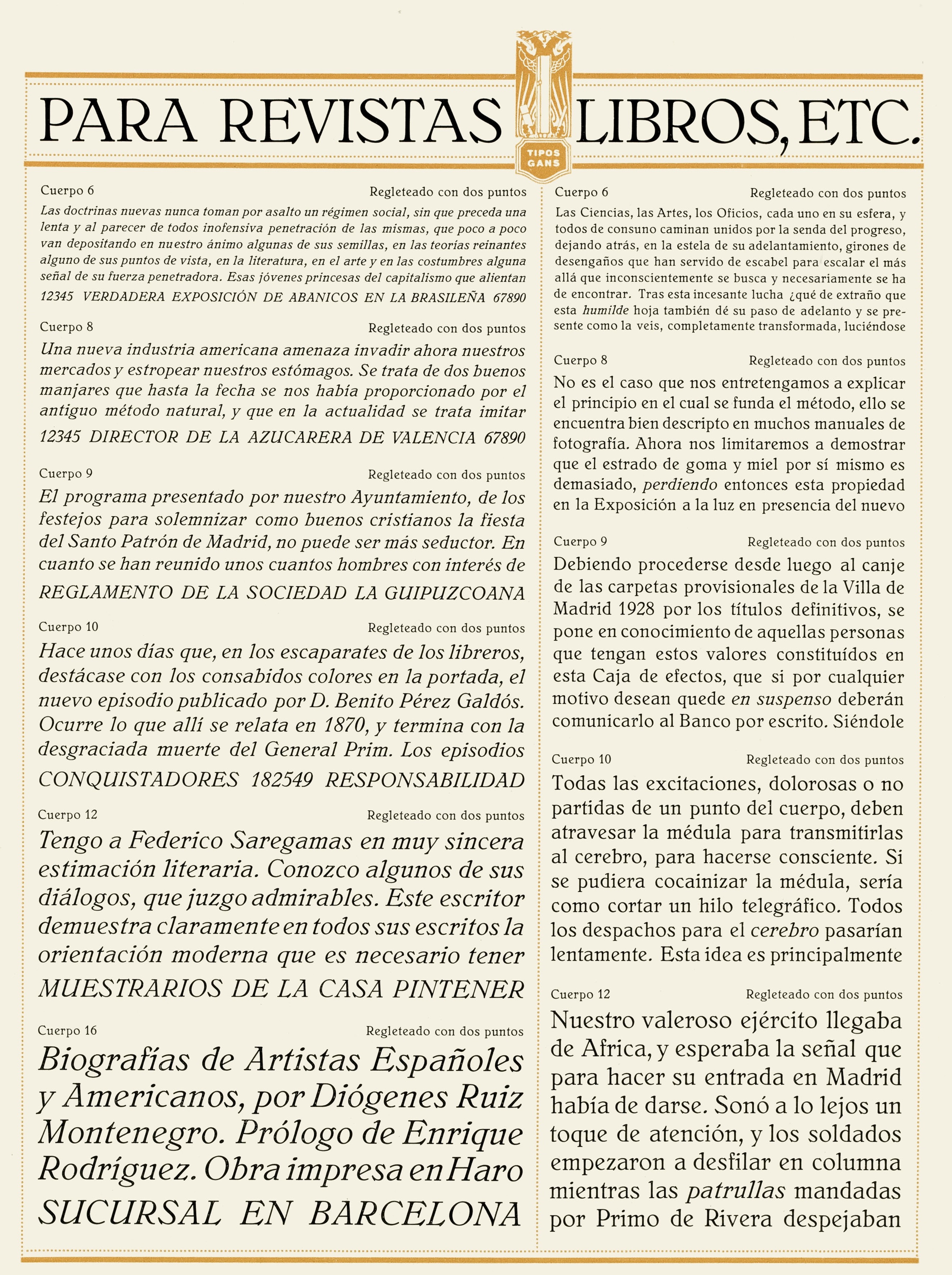
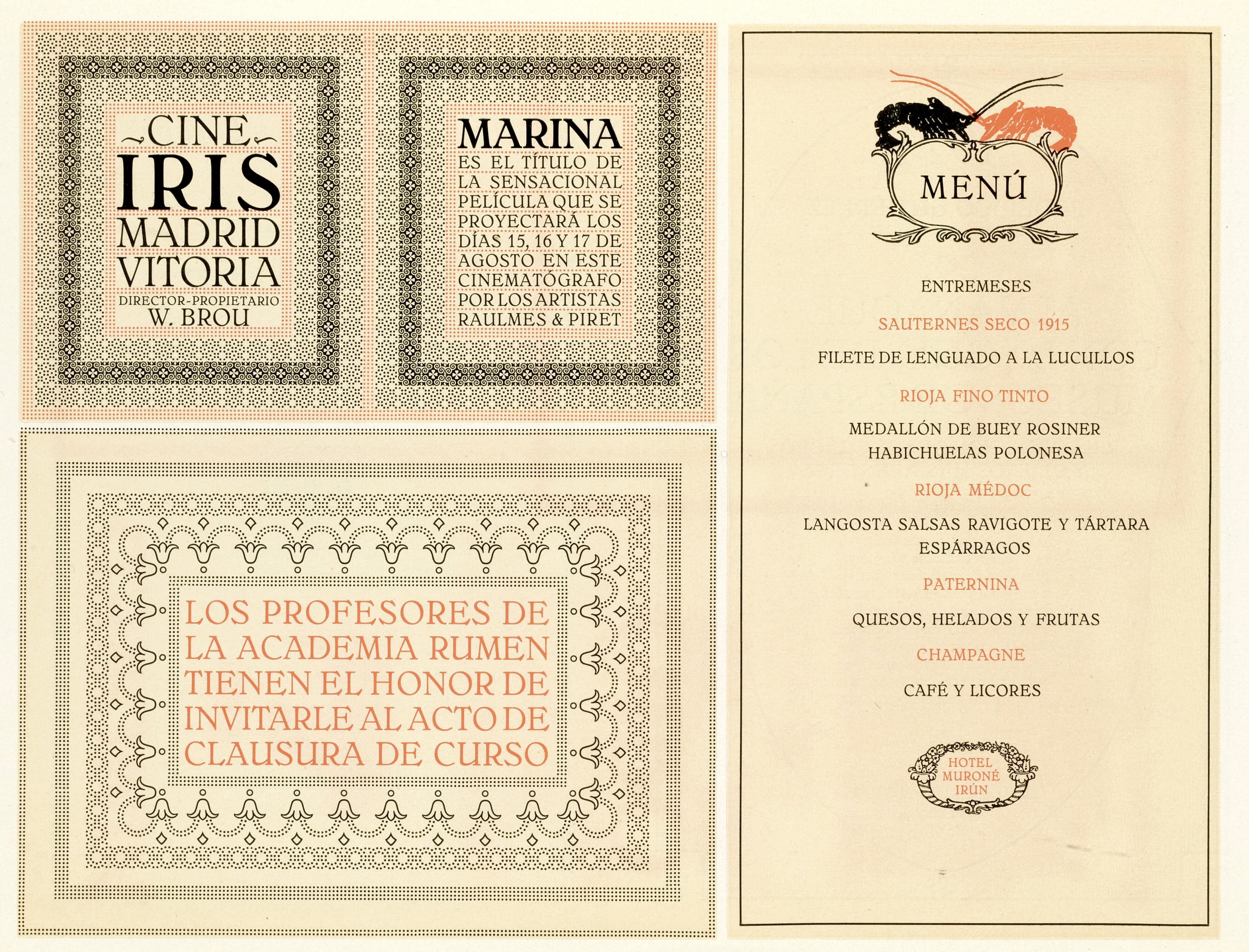
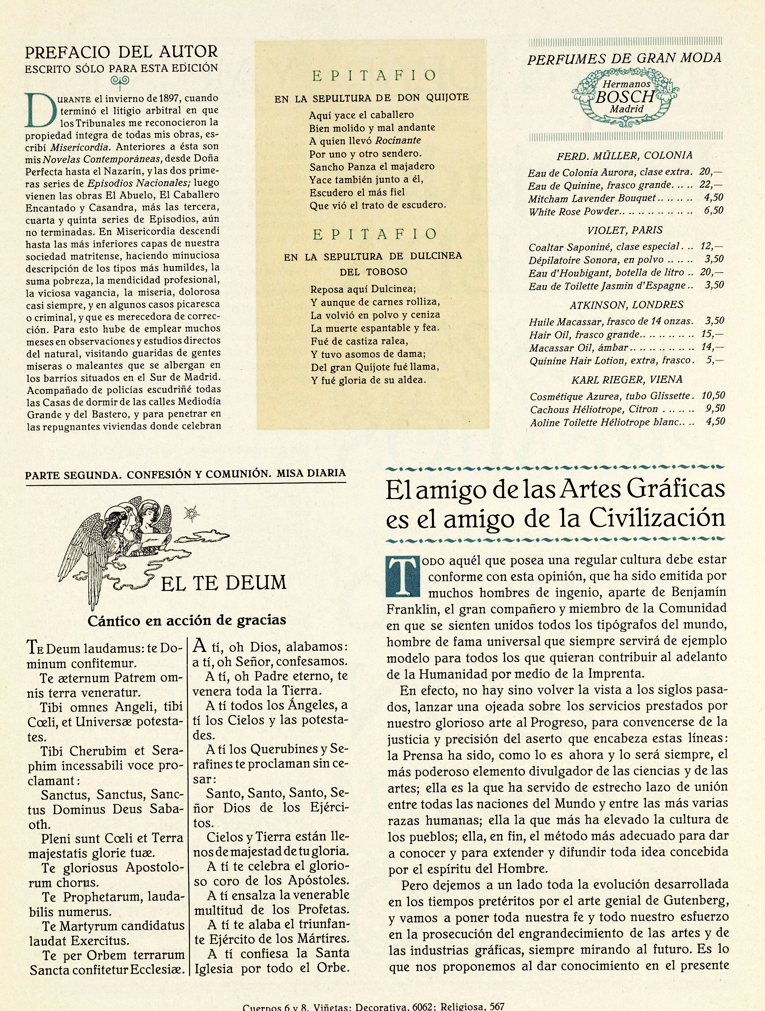
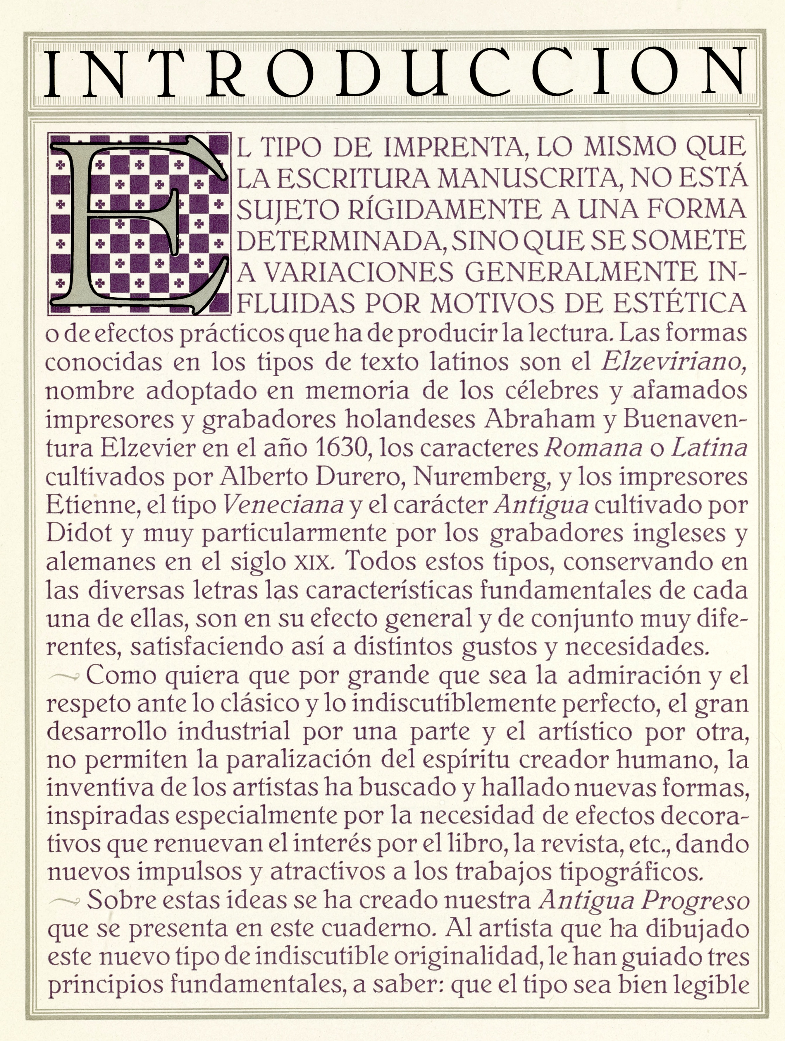
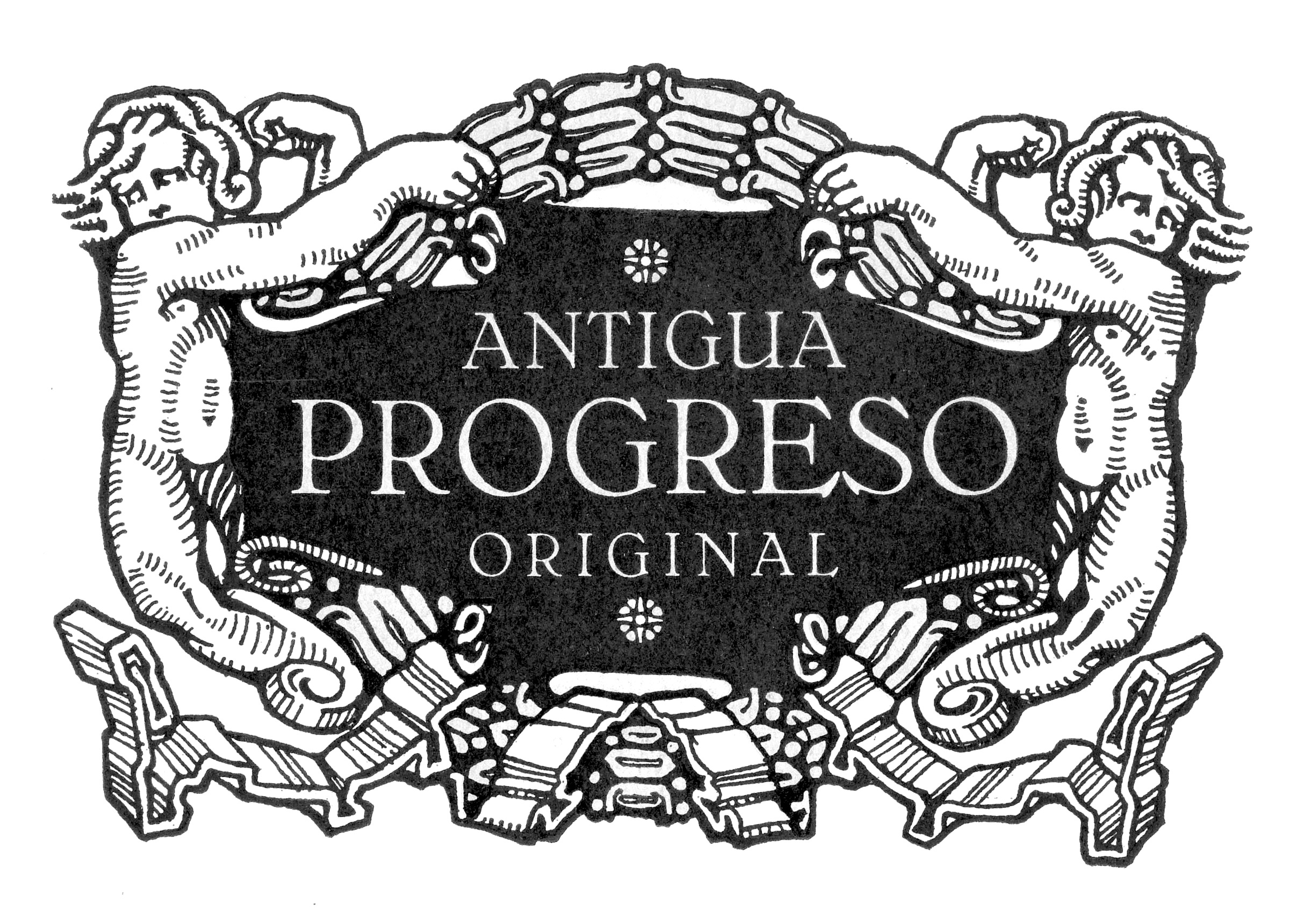
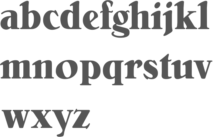
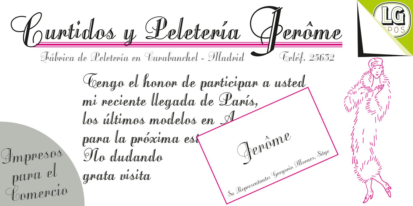
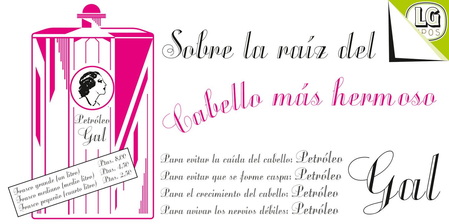
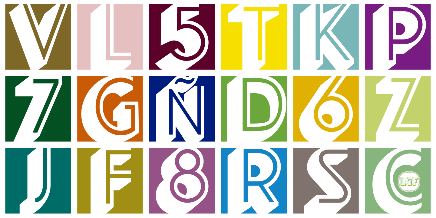
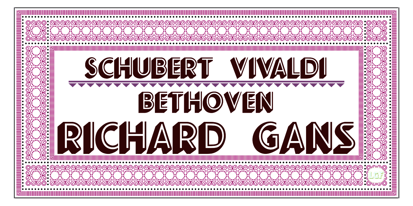
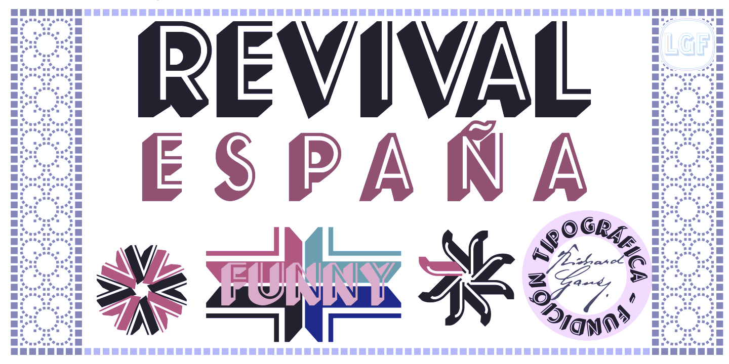
The Richard Gans Foundry is a defunct Spanish foundry which existed from 1888-1975. Richard Gans was the son of a medic from Karlsbad, Austria. He emigrated to Spain in 1874, and died in 1925. Until 1936 the foundry was led by Mauricio Wiesenthal, but in 1936, his children, Ricardo, Manuel and Amalia Gans Gimeno, now adults, took over. Ricardo and Manuel were assassinated during the Civil War. The foundry was used to make ammunition, and after the war, Amalia Gans and then Reinaldo Leger Tittel started anew in run-down buildings. The foundry operated roughly from 1881-1975. Throughout its existence, types were designed by a number of people from within and outside the foundry. Designers included José Ausejo Matute (d. 1998), Antonio Bilbao (who created Escorial in 1960), the son Ricardo Gans, and Carl Winkow. In the post-war era, Reinaldo Leger and Amalia Garcia Gans made typographic decisions on which types to produce, and acted as typographic directors. Richard Gans' grandson, José Antonio Gans García, is still alive today. Manuel Lage informed me in 2017 that he has inherited the Richard Gans collection. Six specimen books were published with titles like Fundicion Richard Gans Muestrario Edicion V. The first and second editions, rare books indeed, were published between 1883 and 1903. Editions 3 through 6 appeared in the period 1903-1922. The 1922 edition is here in its entirety (thanks to J.R. Penela). See also here. In 1965, a small catalog was published under the name Tipos Gans. The National Library in Madrid has Muestrario de Richard Gans (Madrid, Richard Gans, 1903, 410 pages) and Catalogo provisional (Madrid, 1950). On the web, the most complete discussion of Richard Gans is in the PDF file Fundicion Tipografica Richard Gans Historia y Actividad 1888-1975 (2004) by Dimas García Moreno and José Ramón Penela. Fonts: Until 1925, there were basically no original types. Almost everything in the specimen books of that era is due to German foundries, principally those of Wilhelm Woellmer in Berlin and Edmund Koch in Magdeburg. Some of those typefaces in common with Koch include Grotesca Chupada Redonda, Ronda Universal. Early types in this category also include Escritura Selecta, Escritura Favorita, Escritura Luis XV (it is being digitally revived by Manuel Lage), Gótico Globo (blackletter), Gótico Uncial (blackletter), Nueva Titular Adornada, Tipos de Adorno, Latina Moderna, Grotesca Ancha, Grotesca and Grotesca Chupada. Many, if not most of these, saw the light at the end of the 19th century and survived until 1965. It is fashionable now to revive all the typefaces. Nick Curtis created a few (see below), and Paulo W (Intellecta Design, Brazil) did many more. Intellecta Designs revivals include Gans Tipo Adorno, Gans Lath Modern, Gans Titular Adornada, Gans Ibarra, Gans Antigua, Gans Antigua Manuscrito, Gans Fulgor, Gans Radio Lumina, Gans Carmem Adornada, Gans Animals, Gans Italiana, and Gans Titania. The original Gans types can be categorized as follows:
showcase-gans/">View the digital revivals of typefaces by Gans. |
EXTERNAL LINKS |
| | |

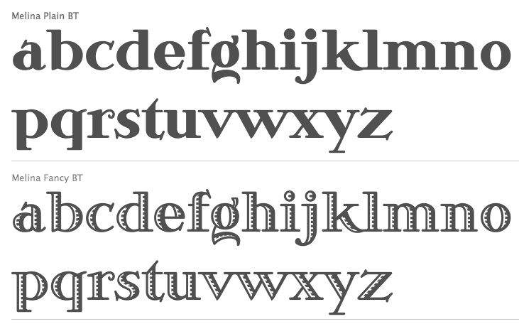
file name: Nick Curtis Melina B T 2003 after Richard Gans Greco 1924
file name: Nick Curtis Pismo Clambake N F 2005 after Richard Gans Gloria 1933
file name: Nick Curtis Kifisia Antigua N F 2005 after Richard Gans El Greco Antigua 1930s

file name: Nick Curtis Kifisia Antigua N F 2005 after Richard Gans El Greco Antigua 1930sb
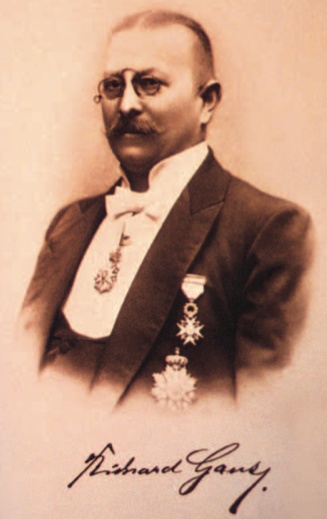
file name: Richard Gans Portrait

file name: Richard Gans Fundicion Tipografica Richard Gans1881 1975
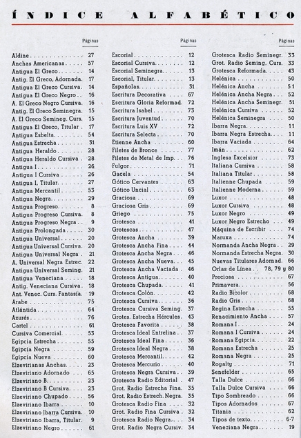
file name: Richard Gans Catalog
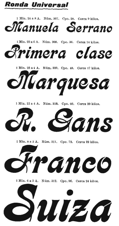
file name: Richard Gans Ronda Universal
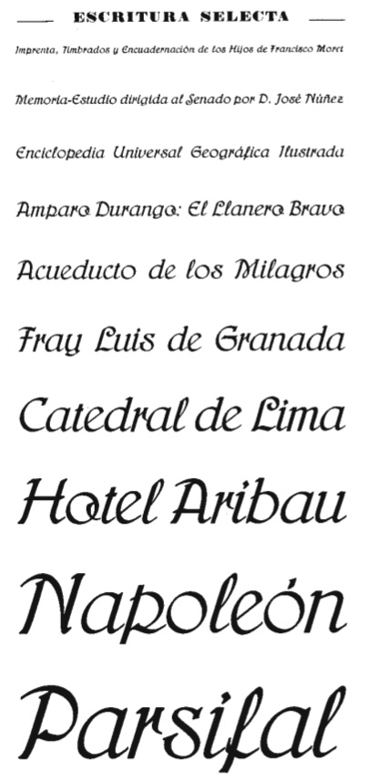
file name: Richard Gans Escritura Selecta
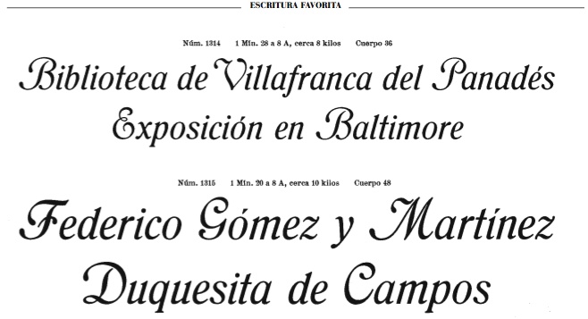
file name: Richard Gans Escritura Favorita
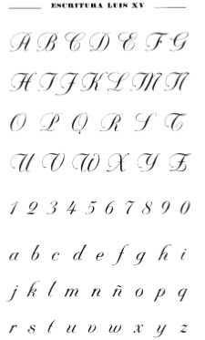
file name: Richard Gans Escritura Luis X V
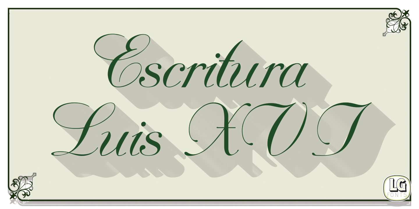
file name: Manuel Lage Fonts Escritura Luis X V I 2017 after Richard Gans

file name: Richard Gans Escritura Gloria Reformada
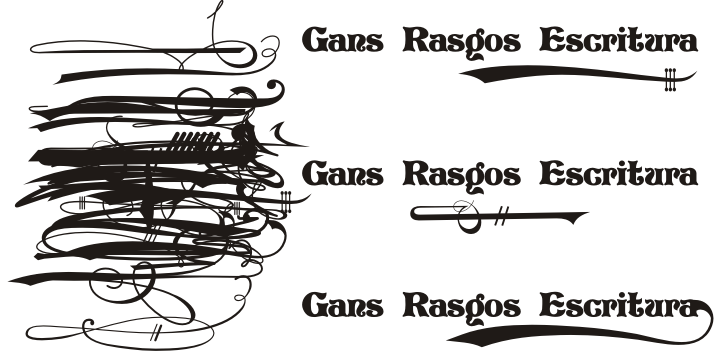
file name: Gans Rasgos Escritura banner

file name: Gans Rasgos Escritura flag
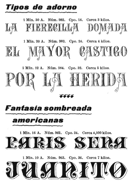
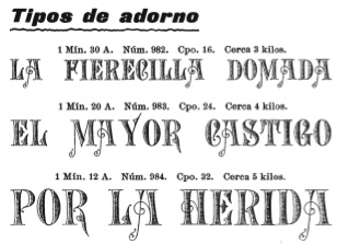
file name: Richard Gans Tipos De Adorno 2
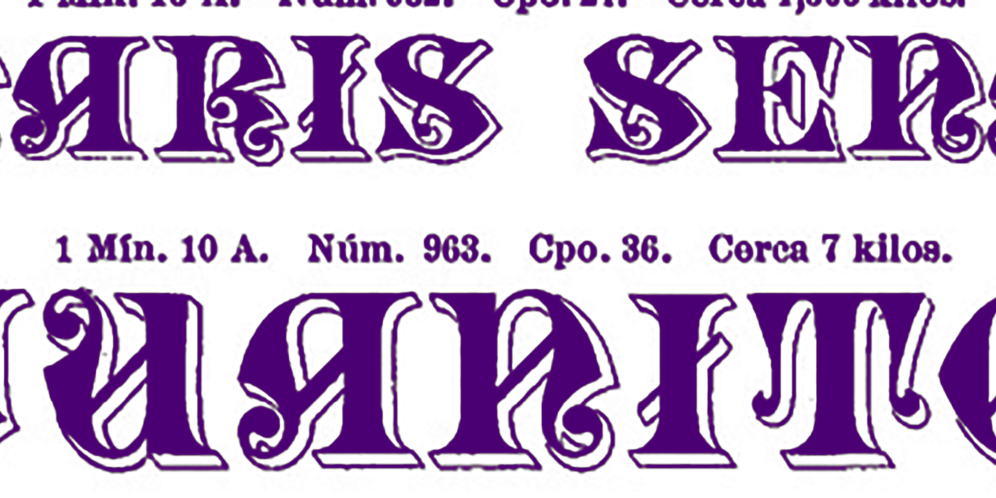
file name: Richard Gans Tipos De Adorno
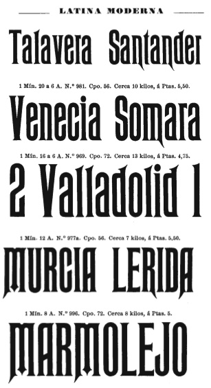
file name: Richard Gans Latina Moderna
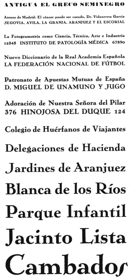
file name: Richard Gans Anigua El Greco Seminegro1924
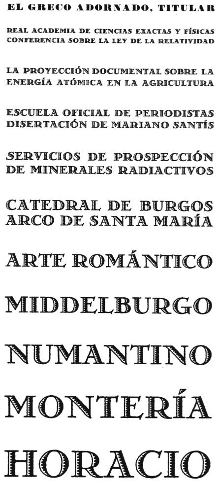
file name: Richard Gans El Greco Adornado Titular
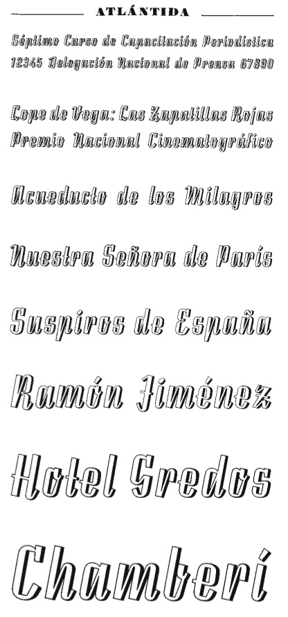
file name: Richard Gans Atlantida
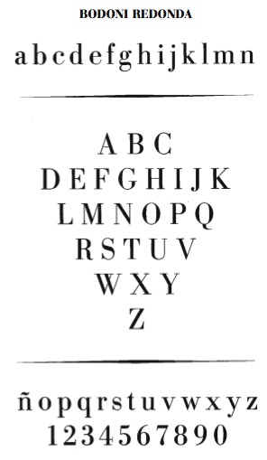
file name: Richard Gans Bodoni Redonda
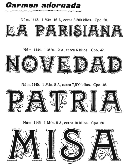
file name: Richard Gans Carmen Adornada
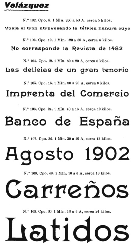
file name: Richard Gans Velazquez
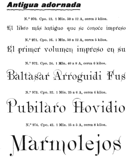
file name: Richard Gans Antigua Adornada
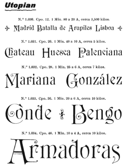
file name: Richard Gans Utopian
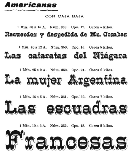
file name: Richard Gans Americanas
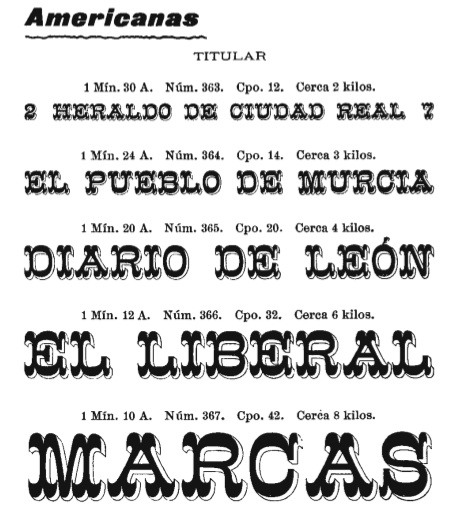
file name: Richard Gans Americanas Titular

file name: Richard Gans Egipcia Progreso 1923
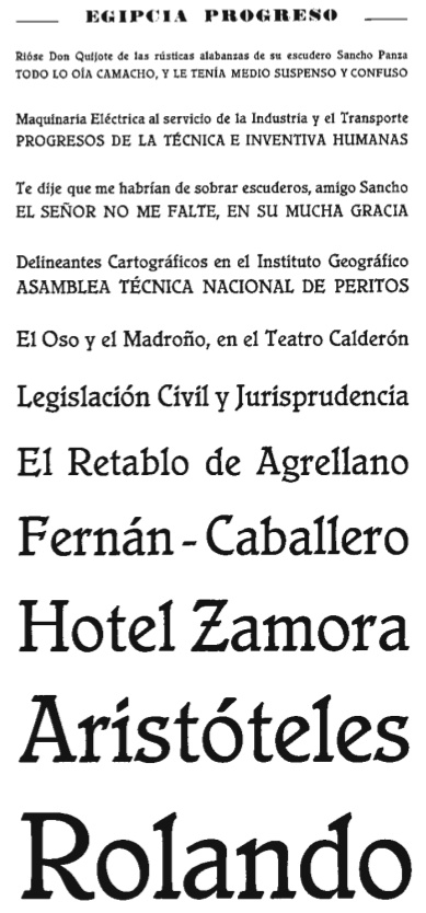
file name: Richard Gans Egipcia Progreso 1923
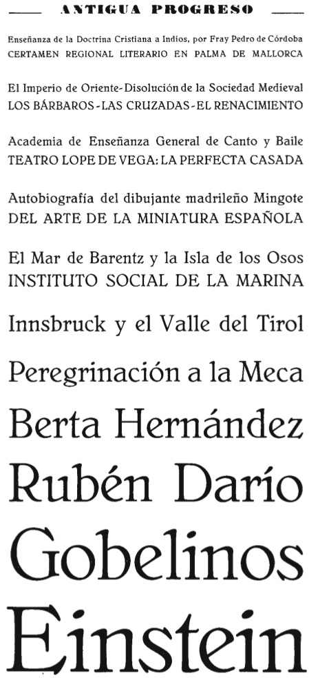
file name: Richard Gans Antigua Progreso1923
file name: Richard Gans 1922
file name: Richard Gans 1922b
file name: Richard Gans Iniciales 1922
file name: Richard Gans Iniciales 1922b
file name: Richard Gans Iniciales 1922c

file name: Richard Gans Iniciales 1922d
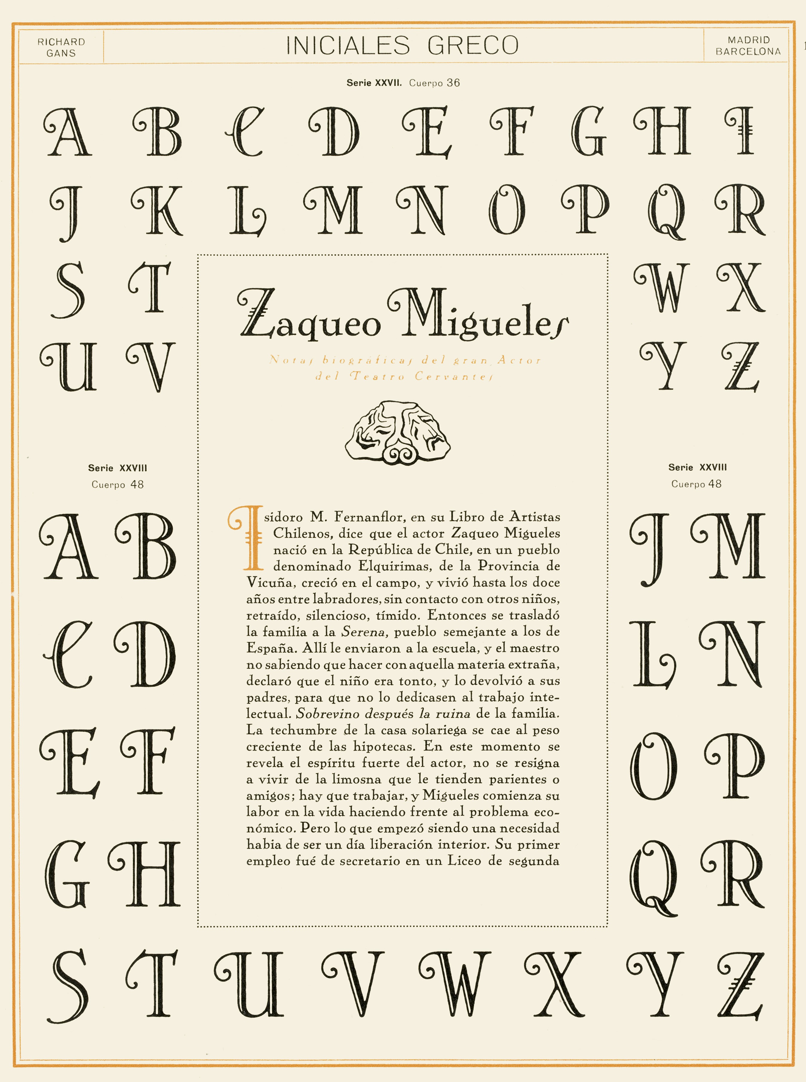
file name: Richard Gans Iniciales Greco 1922
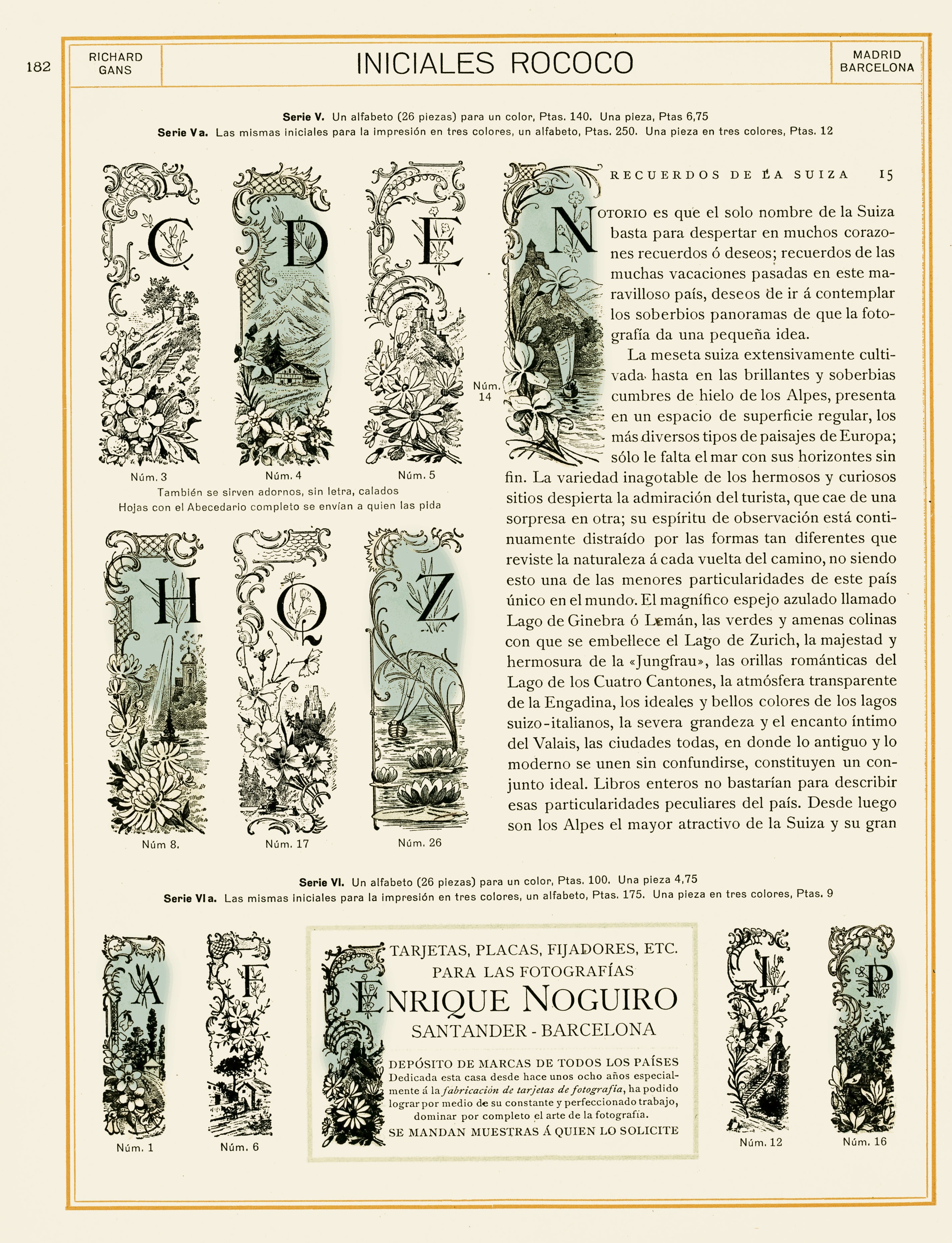
file name: Richard Gans Iniciales Rococo 1922
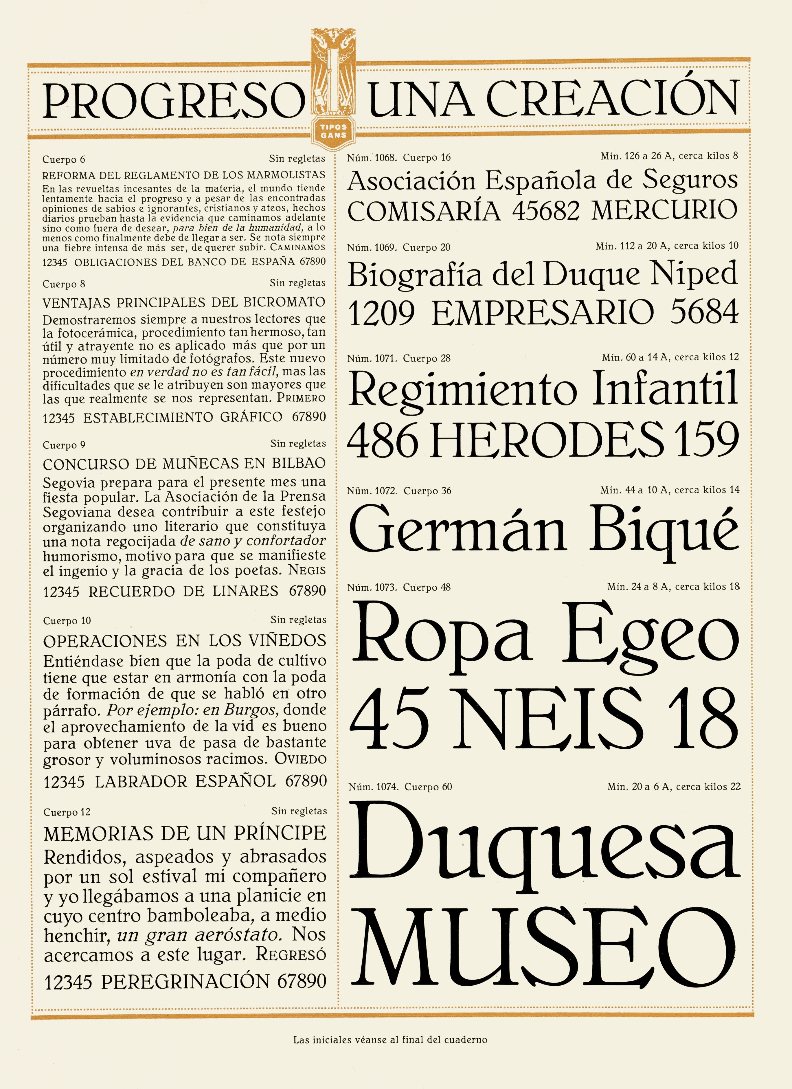
file name: Richard Gans Progreso 1922
file name: Richard Gans Progreso 1922b
file name: Richard Gans Progreso 1922c
file name: Richard Gans Progreso 1922d
file name: Richard Gans Progreso 1922e
file name: Richard Gans Progreso 1922f
file name: Richard Gans Progreso 1922h
file name: Richard Gans Progreso 1922i
file name: Richard Gans Progreso 1922j
file name: Richard Gans Progreso 1922k
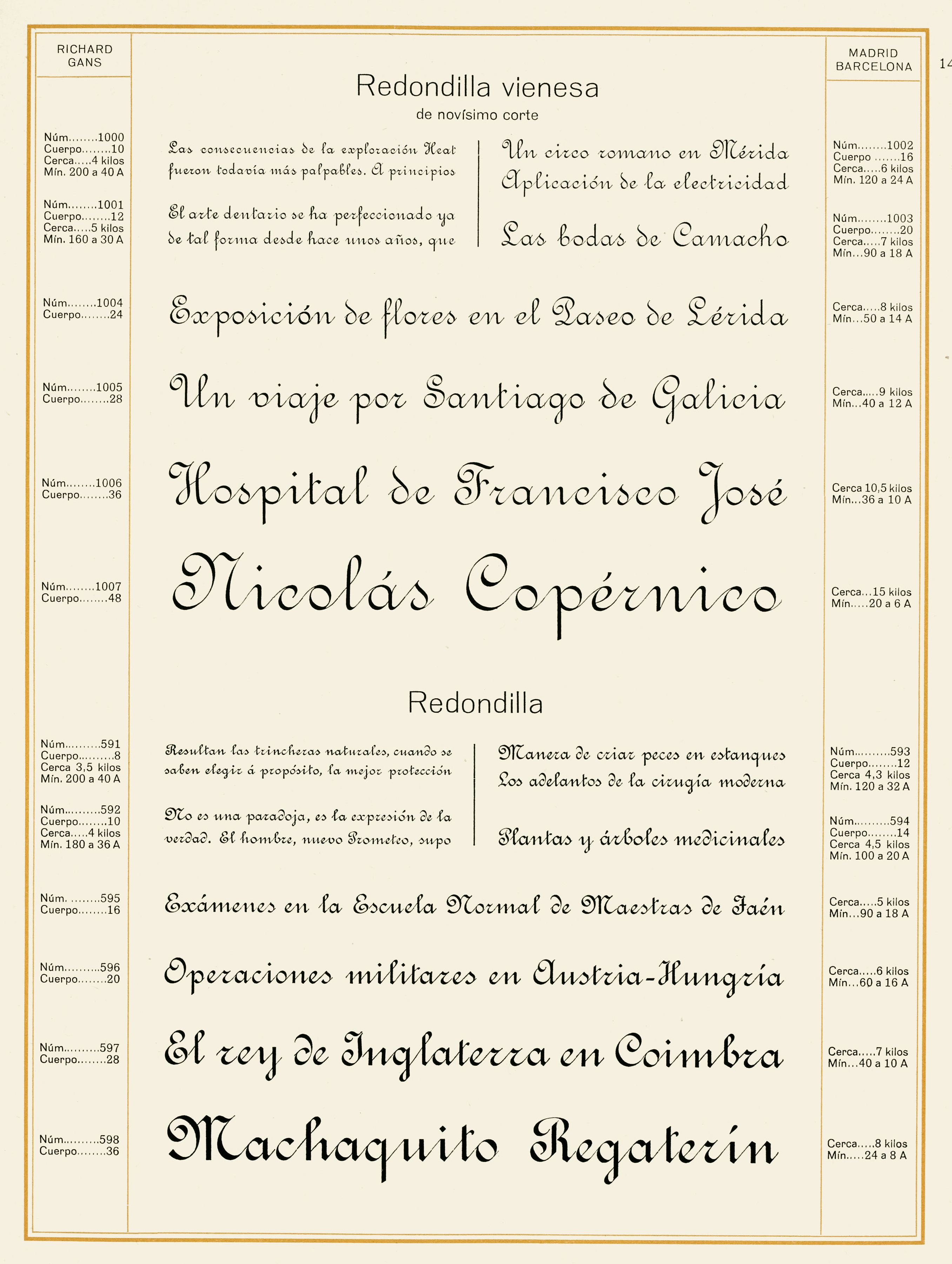
file name: Richard Gans Redondilla Vienesa 1922
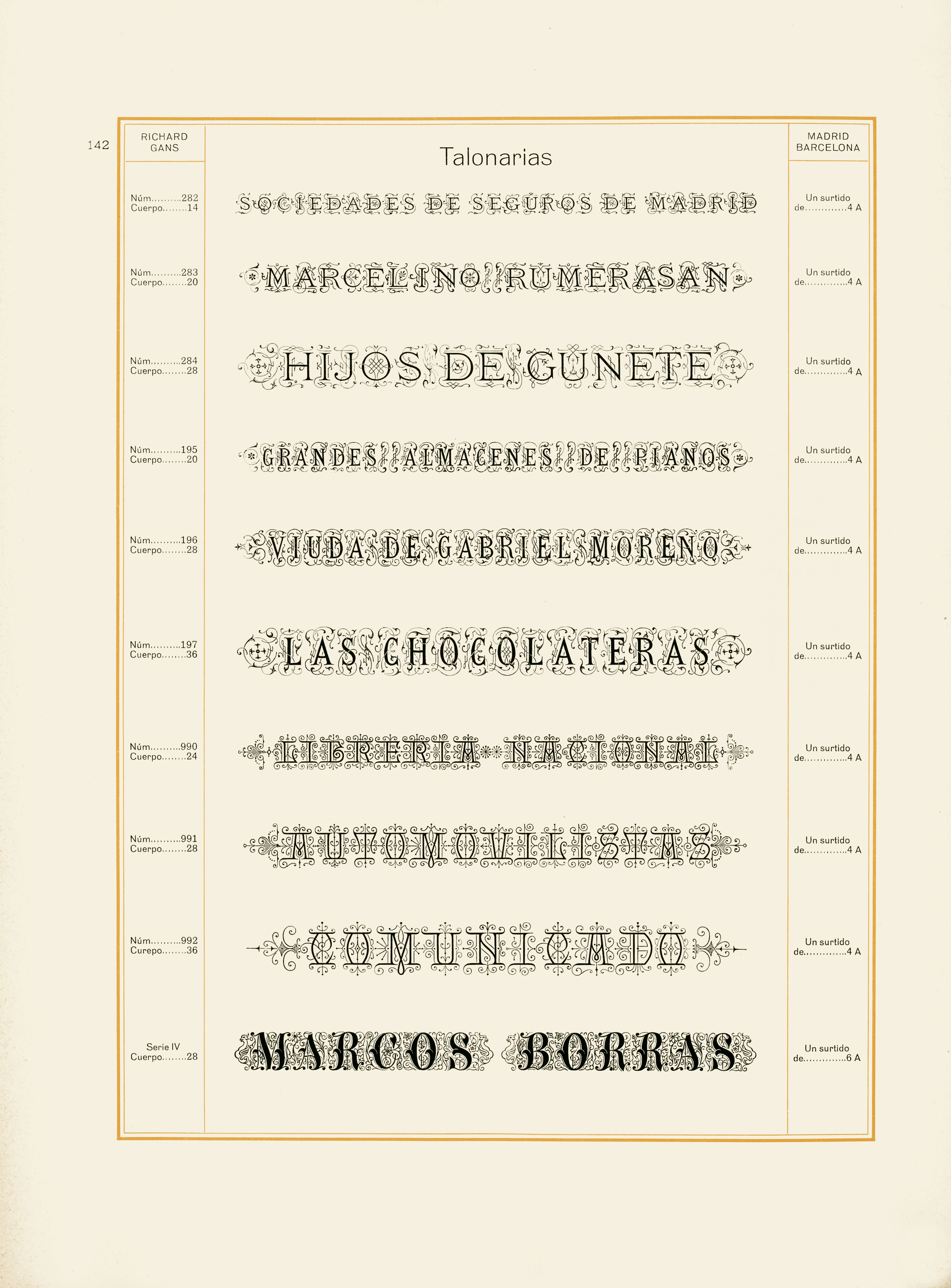
file name: Richard Gans Talonarias 1922
file name: Richard Gans Tipos Gans 1922
file name: Pat Hickson Bellini Condensed R R Bold 2000 after Gans Progreso 1923b

file name: Pat Hickson Bellini Condensed R R Bold 2000 after Gans Progreso 1923c
file name: Pat Hickson Bellini R R Medium 2000 after Gans Progreso 1923
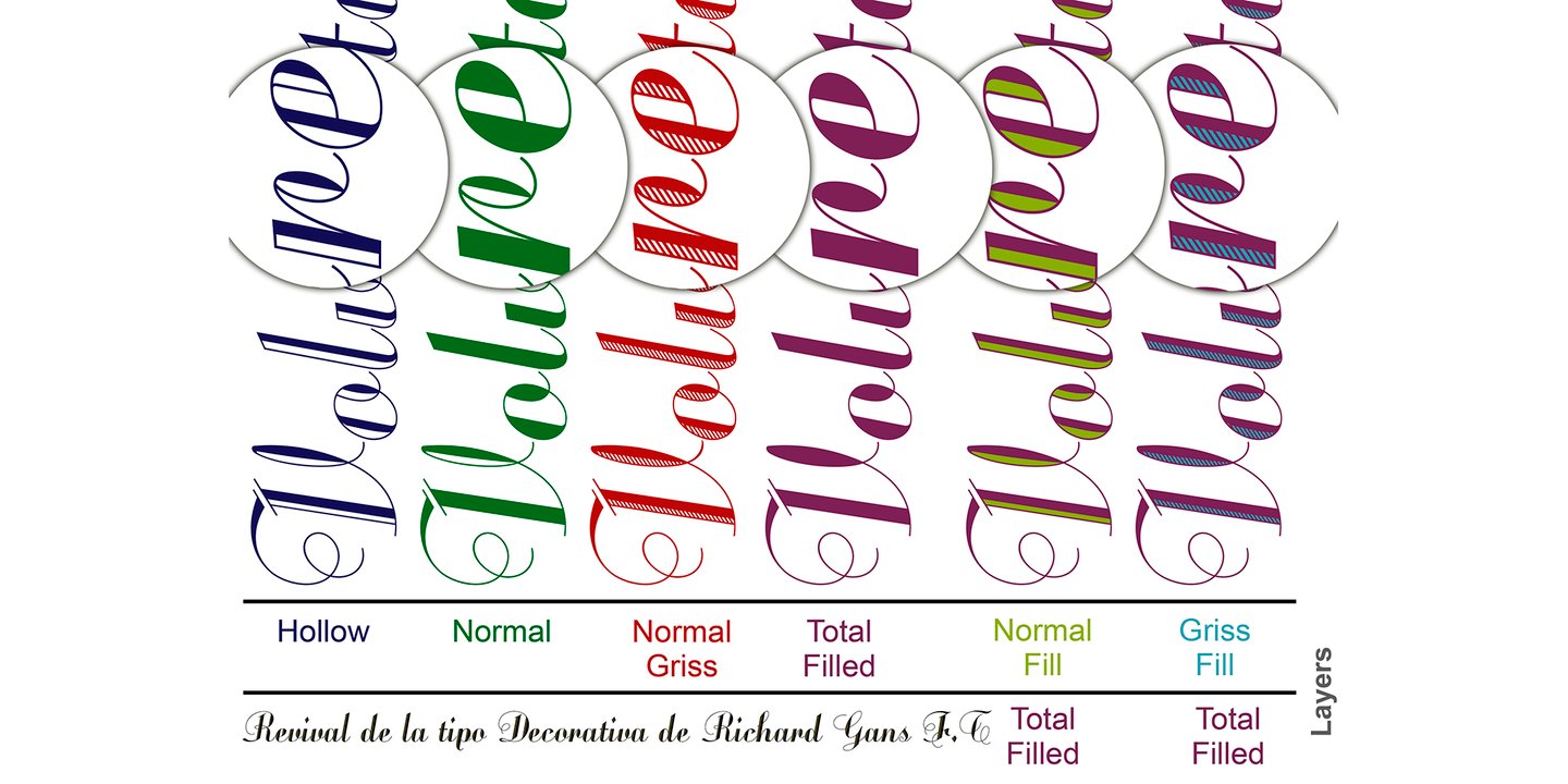
file name: L G F Fonts Volvoreta R G L G 2021 1
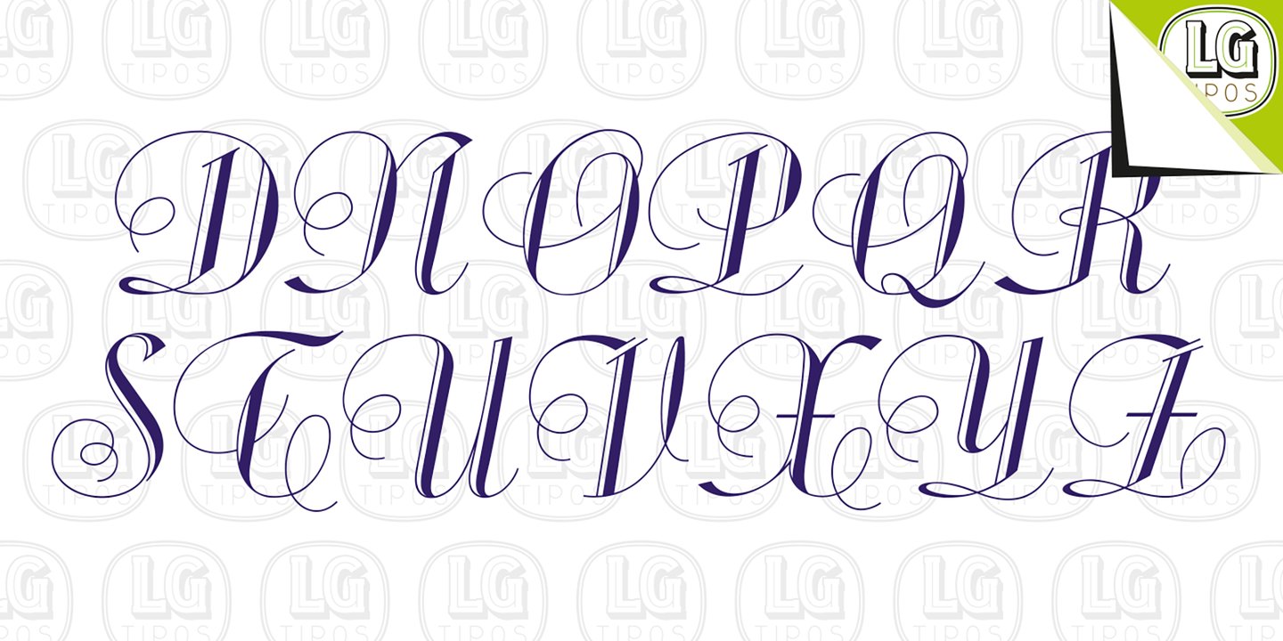
file name: L G F Fonts Volvoreta R G L G 2021 2
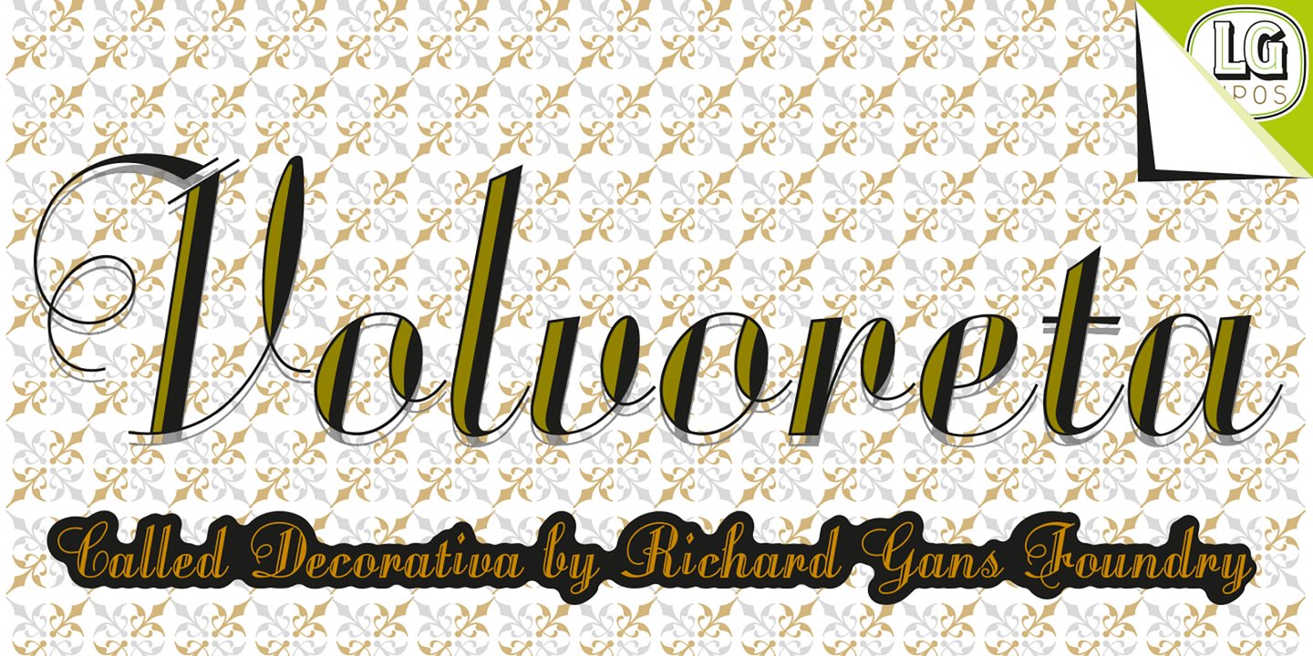
file name: L G F Fonts Volvoreta R G L G 2021 3

file name: L G F Fonts Volvoreta R G L G 2021 4
file name: L G F Fonts Volvoreta R G L G 2021 5
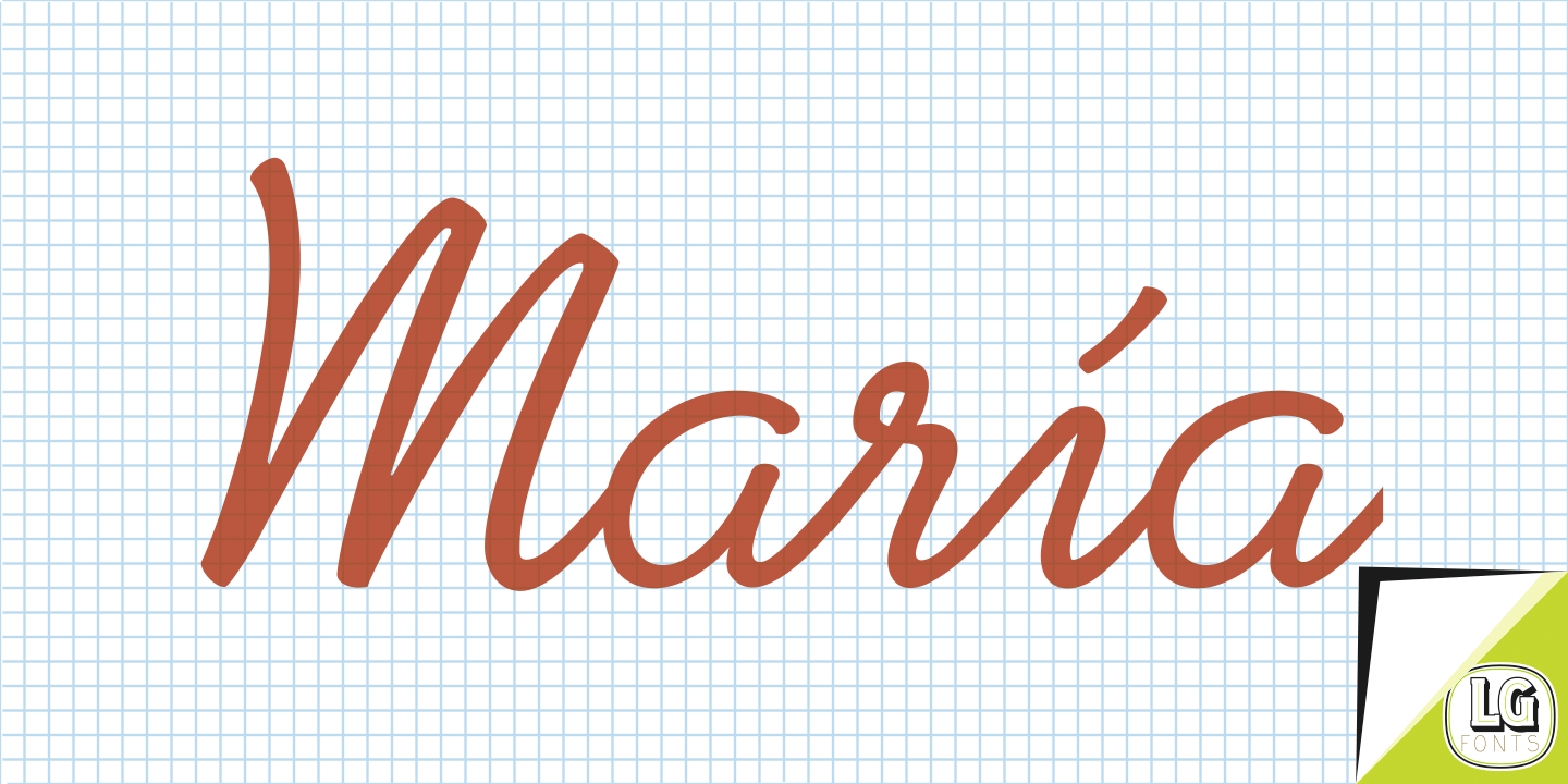
file name: Manuel Lage Volvoreta 2021 after Richard Gans Decorativa
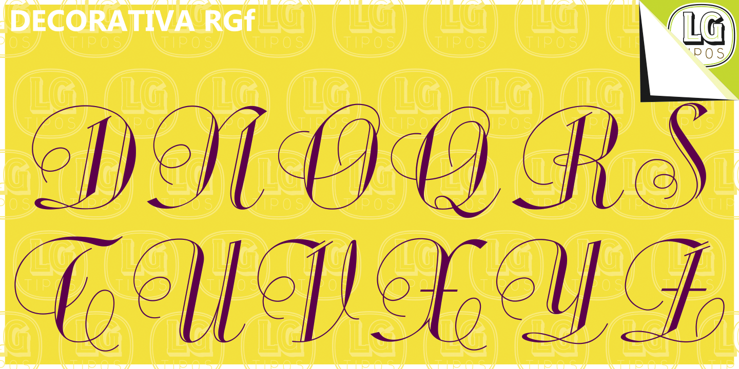
file name: Manuel Lage Fonts Decorativa 2017 after Richard Gans
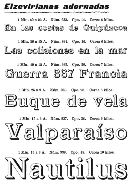
file name: Richard Gans Elzevirianas Adornadas
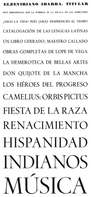
file name: Richard Gans Elzeviiriano Ibarra Titular
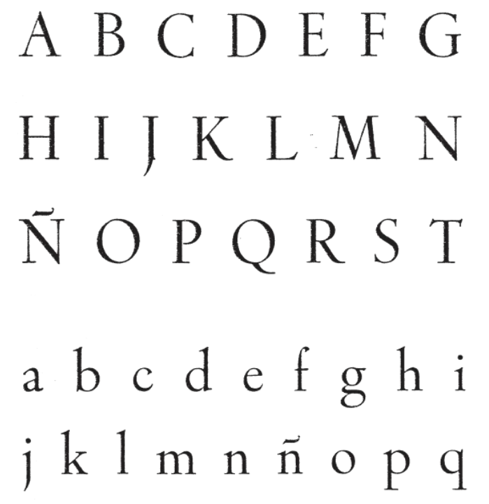
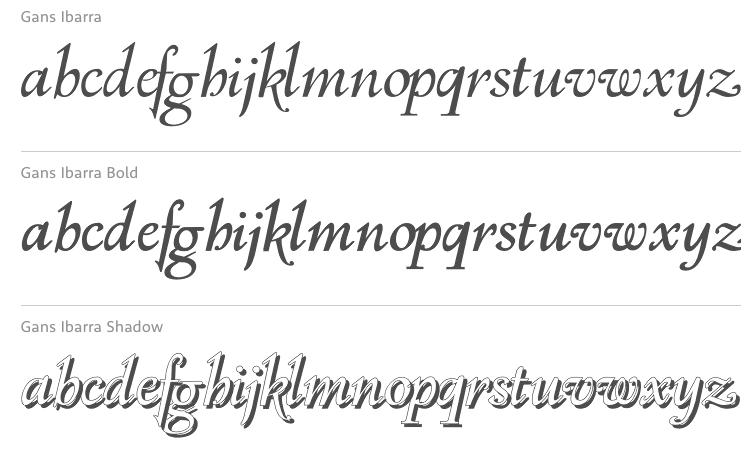
file name: Ricardo Gans Elzeviriano Ibarra

file name: Richard Gans Ibarra Cursiva
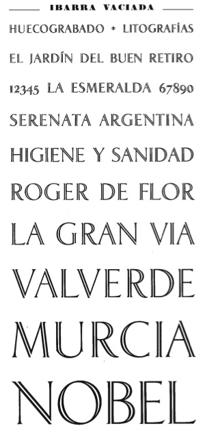
file name: Richard Gans Ibarra Vaciada Dalia

file name: Richard Gans Ibarra Redonda
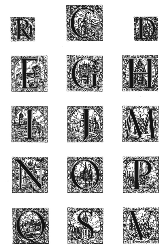
file name: Richard Gans Iniciales Ibarra
file name: Ibarra Typeface

file name: Paulo W Gans Ibarra 2006
file name: Paulo W Gans Ibarra 2006
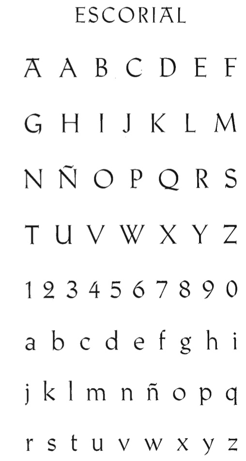
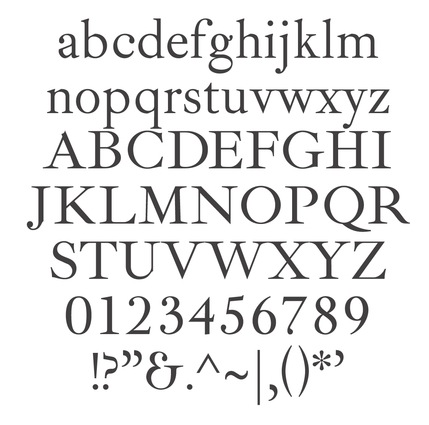
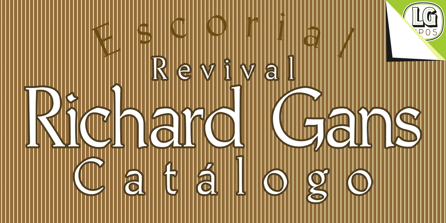
file name: Richard Gans Antonio Bilbao Escorial 1960

file name: Manuel Lage Fonts Escorial 2017 after Richard Gans
file name: Manuel Lage Fonts Escorial 2017 after Richard Gans

file name: Manuel Lage Fonts Escorial 2017 after Richard Gans
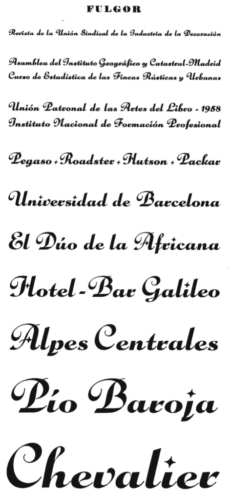
file name: Richard Gans Fulgor 1930
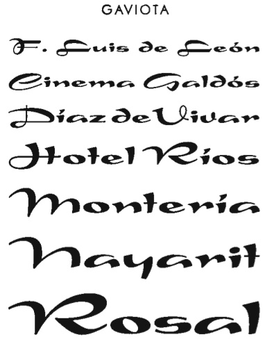
file name: Richard Gans Gaviota
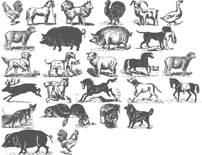
file name: Iza W Gans Animals 2008b
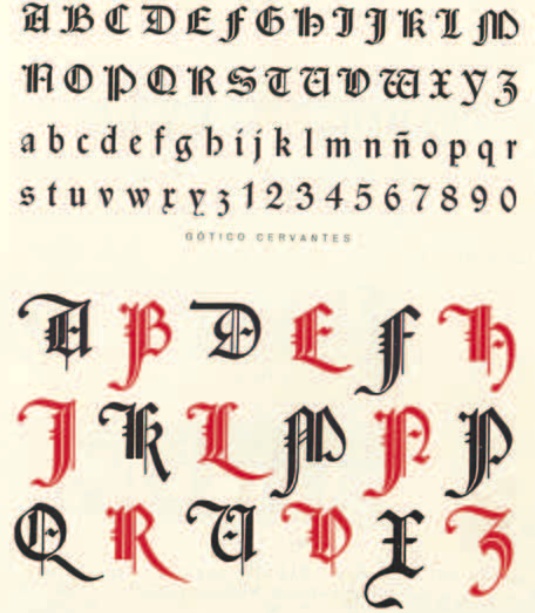
file name: Richard Gans Gotico Cervantes
file name: Ricardo Gans Gotico Cervantes
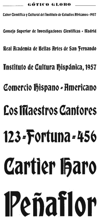
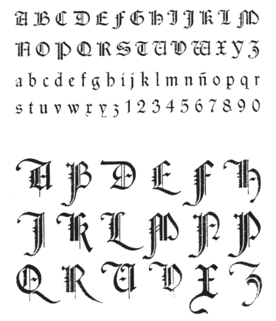
file name: Richard Gans Gotico Globo

file name: Iza W Gans Gotico Globo 2007d
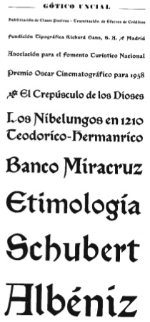
file name: Richard Gans Gotico Uncial

file name: Manuel Lage Fonts Greco 2017 after Richard Gans

file name: Richard Gans Grotesca Chupada Redonda

file name: Richard Gans Grotesca Compacta
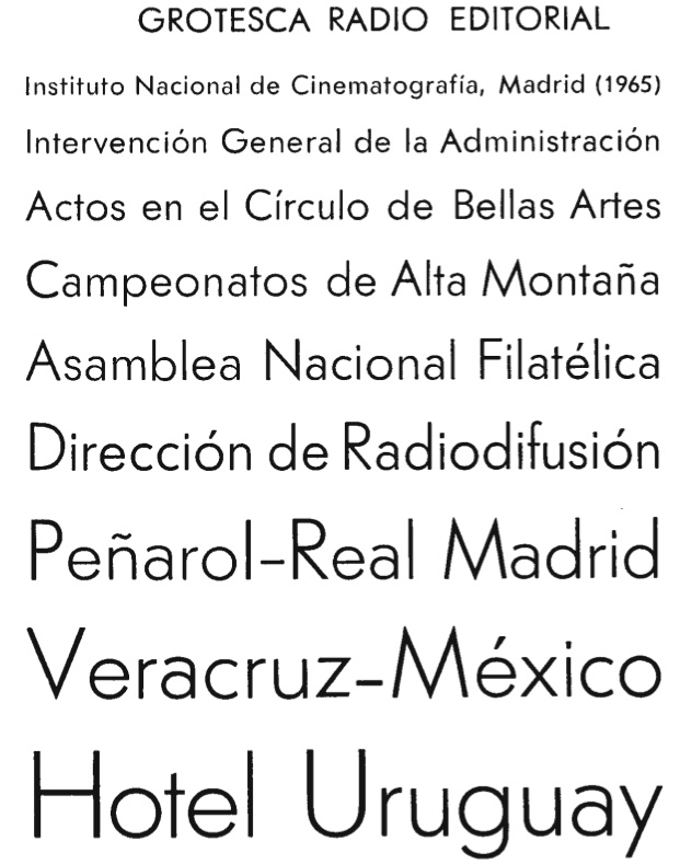
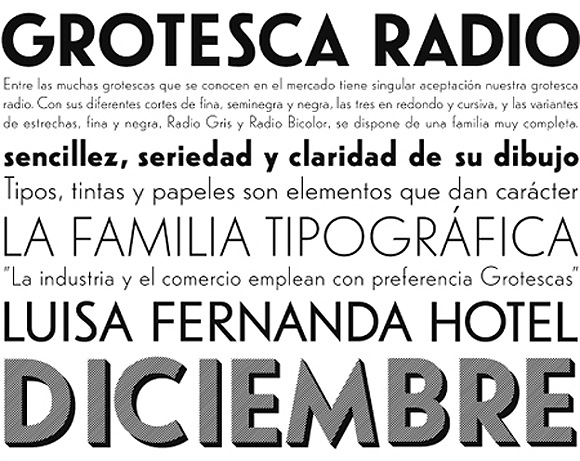
file name: Richard Gans Grotesca Radio Editorial
file name: Ricardo Gans Grotesca Radio

file name: Ricardo Gans Helios
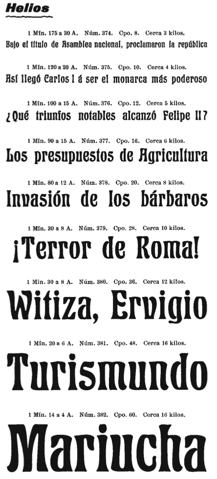
file name: Richard Gans Helios
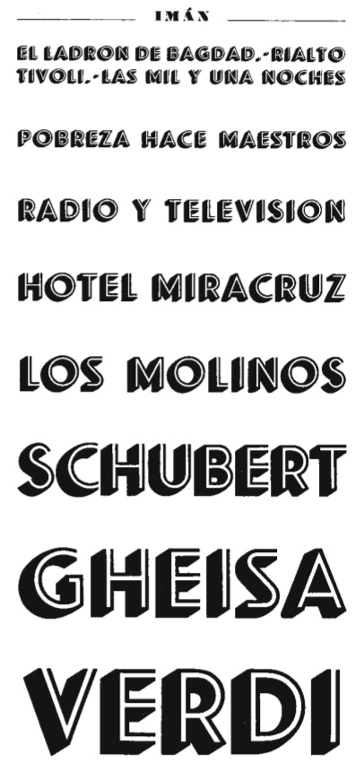
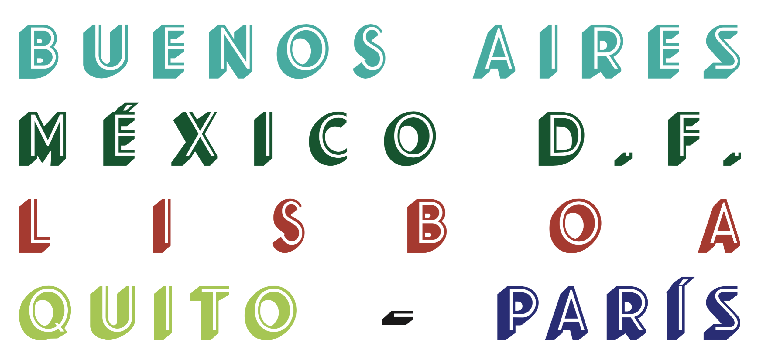
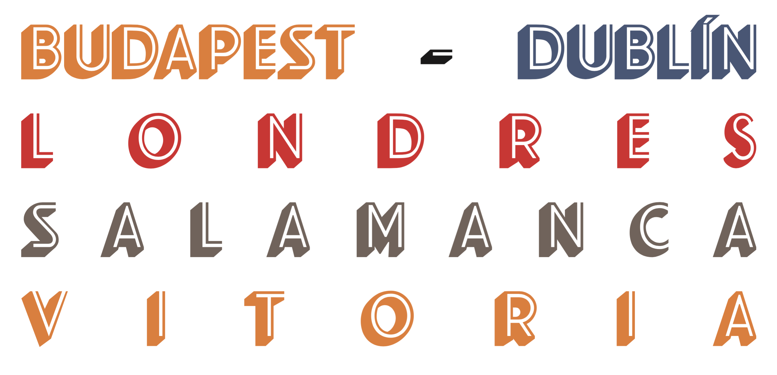
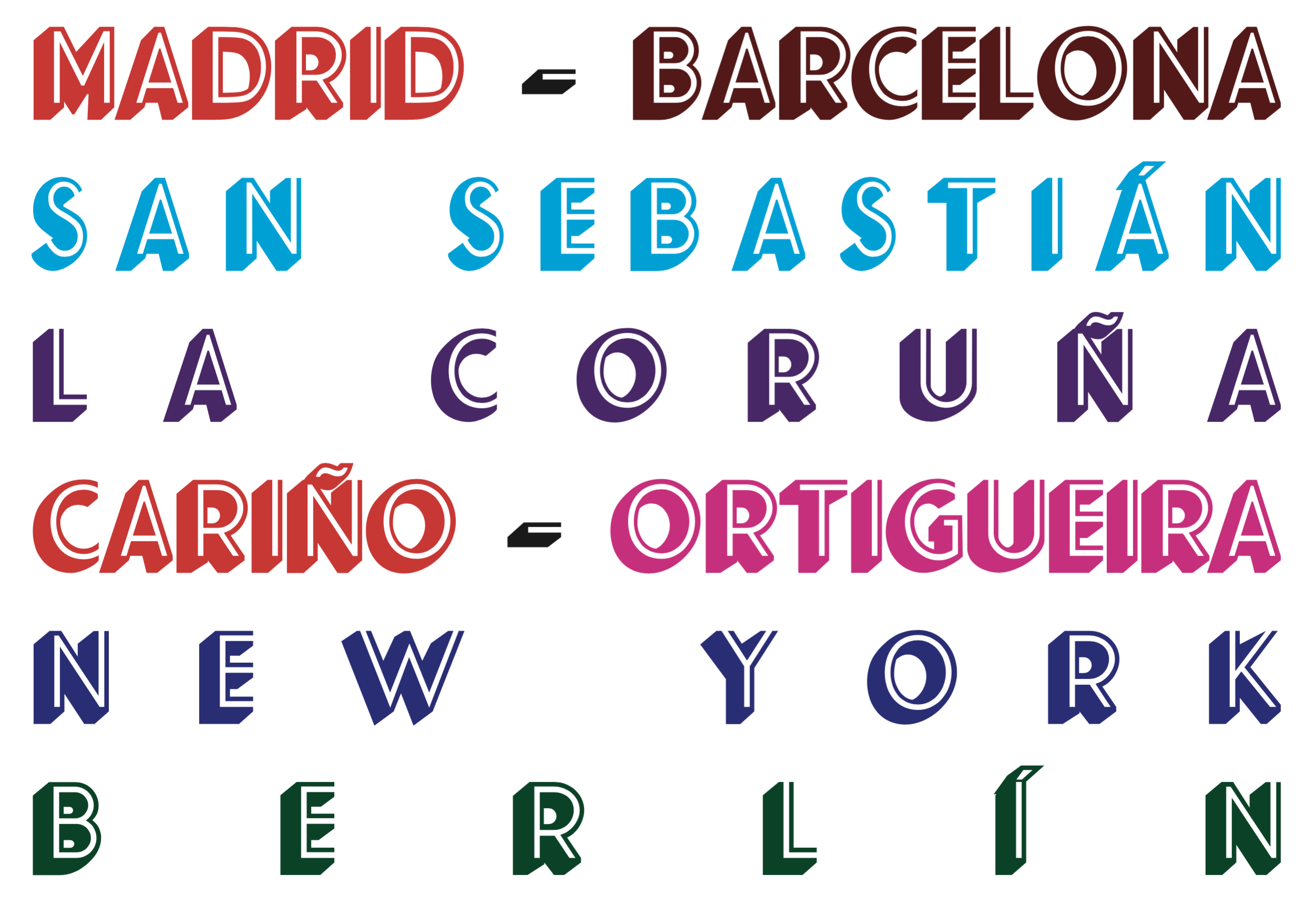
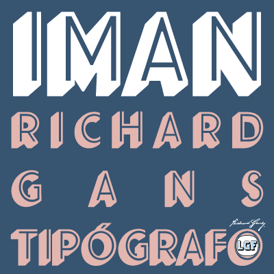
file name: Richard Gans Iman

file name: Manuel Lage Iman R G 2016 after Richard Gans Iman
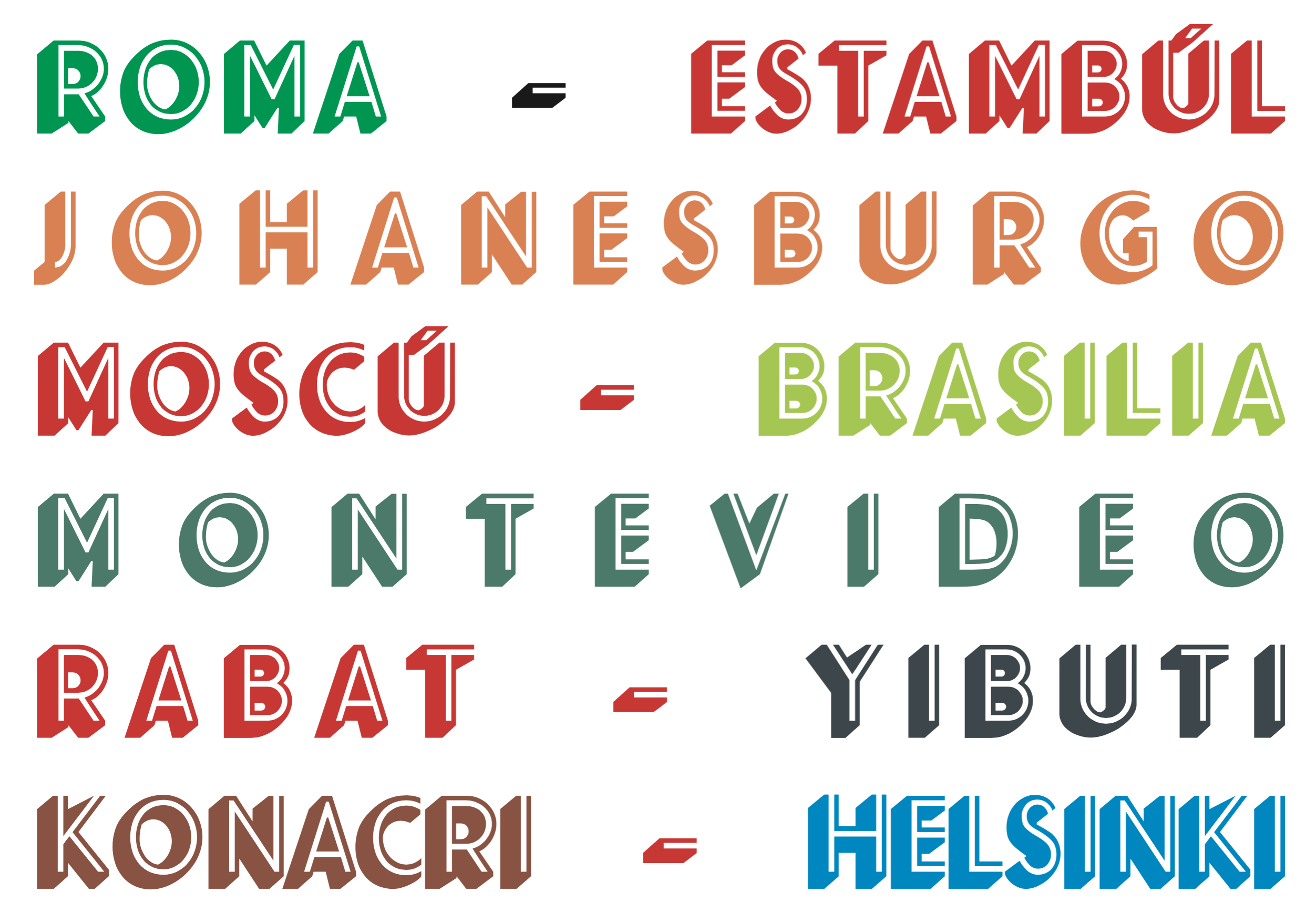
file name: Manuel Lage Iman R G 2016 after Richard Gans Iman
file name: Manuel Lage Iman R G 2016 after Richard Gans Iman
file name: Manuel Lage Iman R G 2016 after Richard Gans Iman
file name: Manuel Lage Iman R G 2016 after Richard Gans Iman
file name: Manuel Lage Iman R G 2016 after Richard Gans Iman 203548
file name: Manuel Lage Iman R G 2016 after Richard Gans Iman 203549
file name: Manuel Lage Iman R G 2016 after Richard Gans Iman 203550

file name: Manuel Lage Iman R G 2016 after Richard Gans Iman 203551

file name: Manuel Lage Iman R G 2016 after Richard Gans Iman 203552
file name: Manuel Lage Iman R G 2016 after Richard Gans Iman 203553

file name: Manuel Lage Iman R G 2016 after Richard Gans Iman 203554
file name: Manuel Lage Iman R G 2016 after Richard Gans Iman 203555

file name: Manuel Lage Iman R G 2016 after Richard Gans Iman
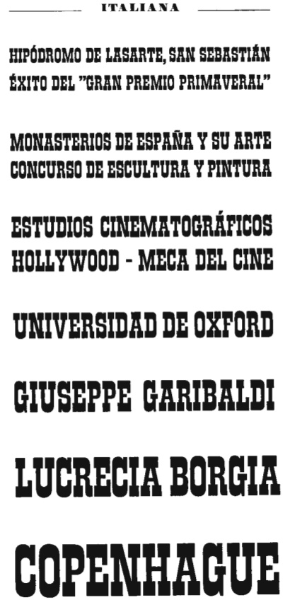
file name: Richard Gans Italiana1951
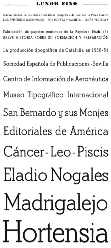
file name: Richard Gans Luxor Fino
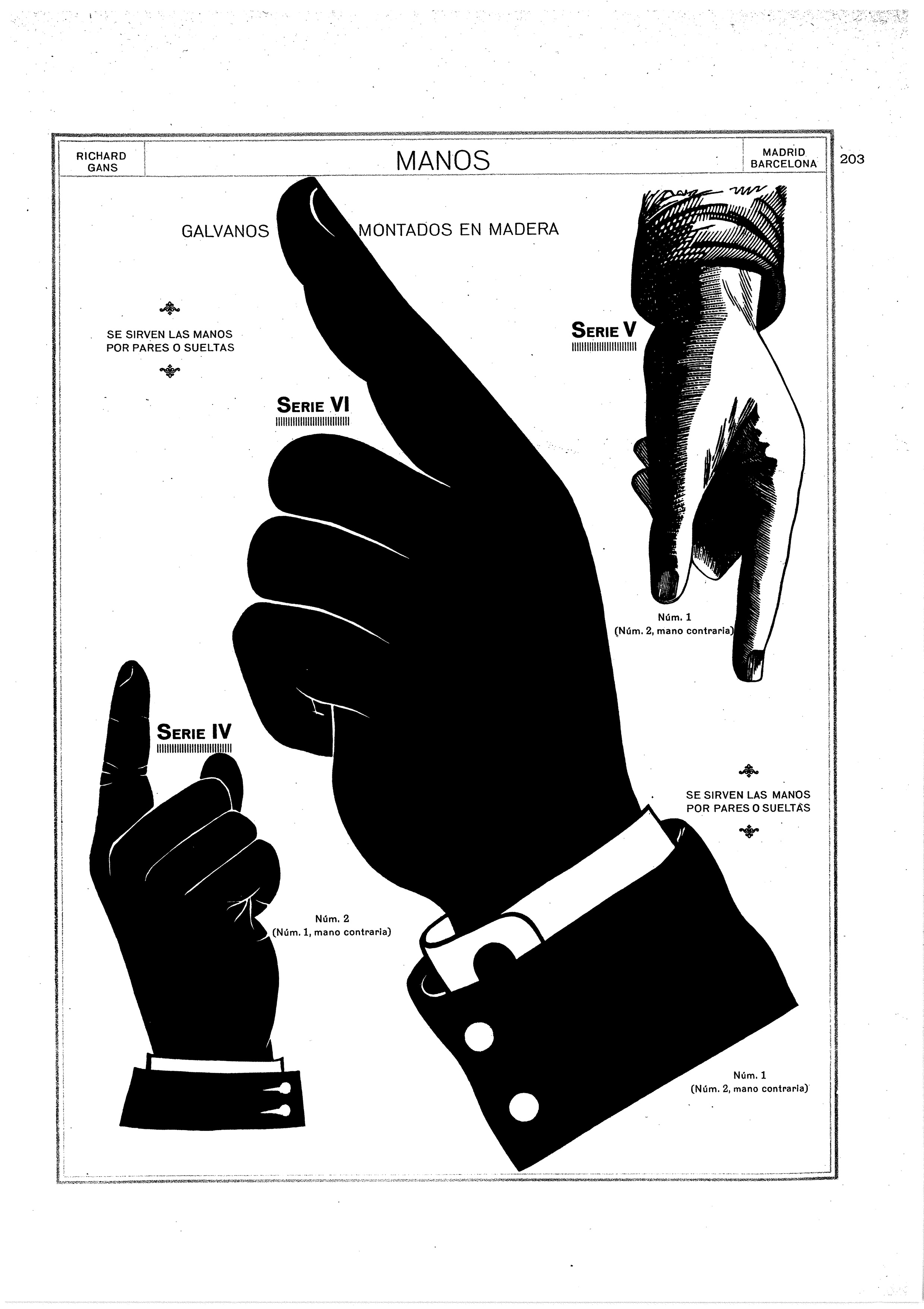
file name: Richard Gans Manos
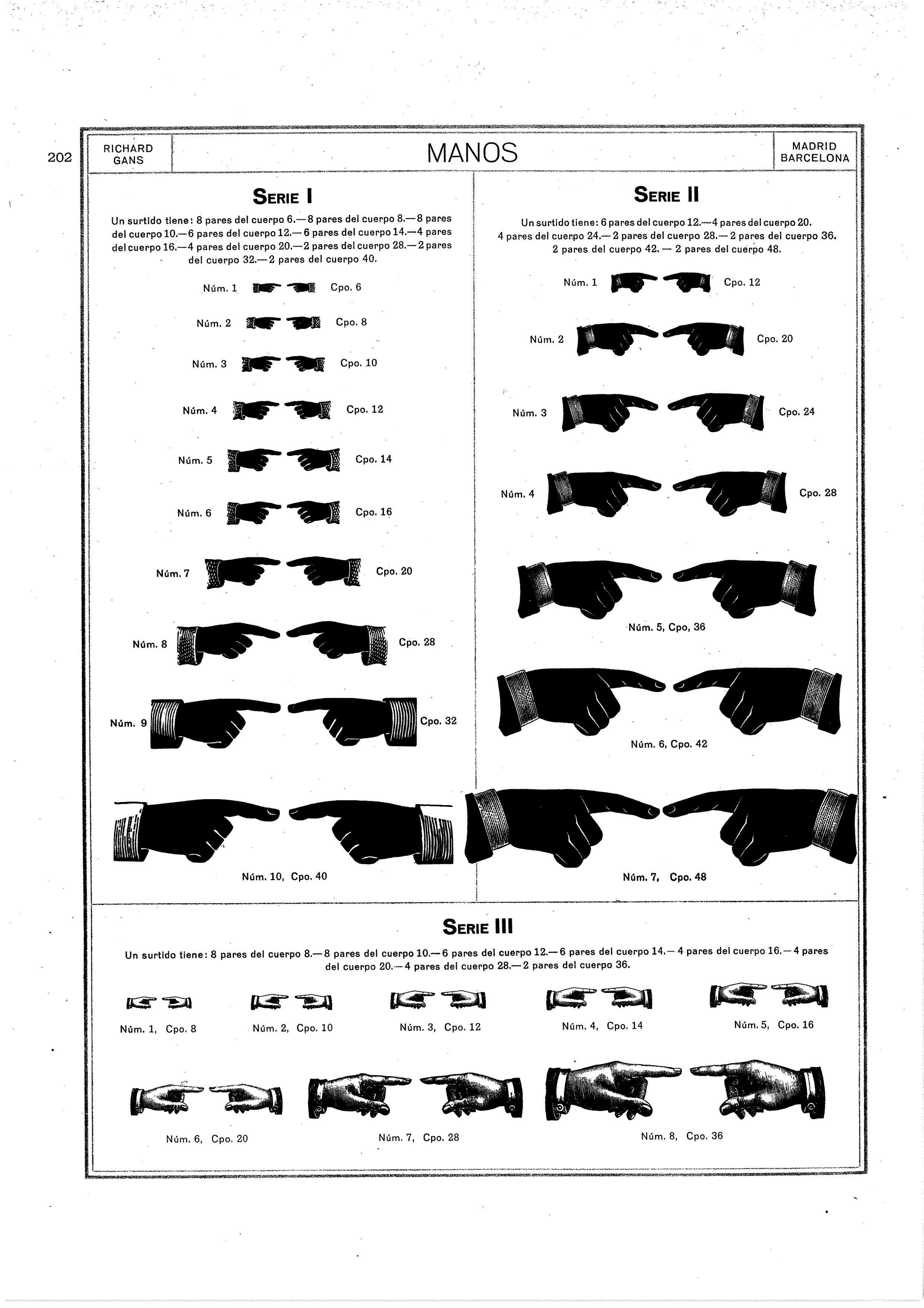
file name: Richard Gans Manos 2
file name: Manuel Lage Fonts Maruxa 2017 after Richard Gans
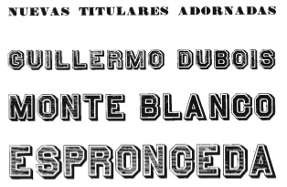
file name: Richard Gans Nuevas Titulares Adornadas
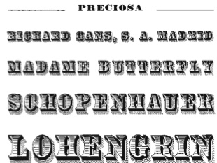
file name: Richard Gans Preciosa

file name: Richard Gans Preciosa 2
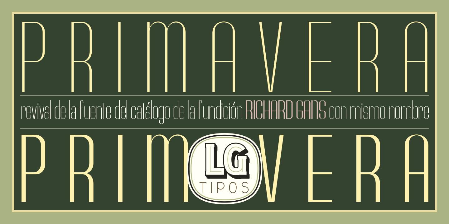
file name: Manuel Lage Primavera L G F 2016 219184 after Richard Gans
file name: Manuel Lage Primavera L G F 2016 219185 after Richard Gans
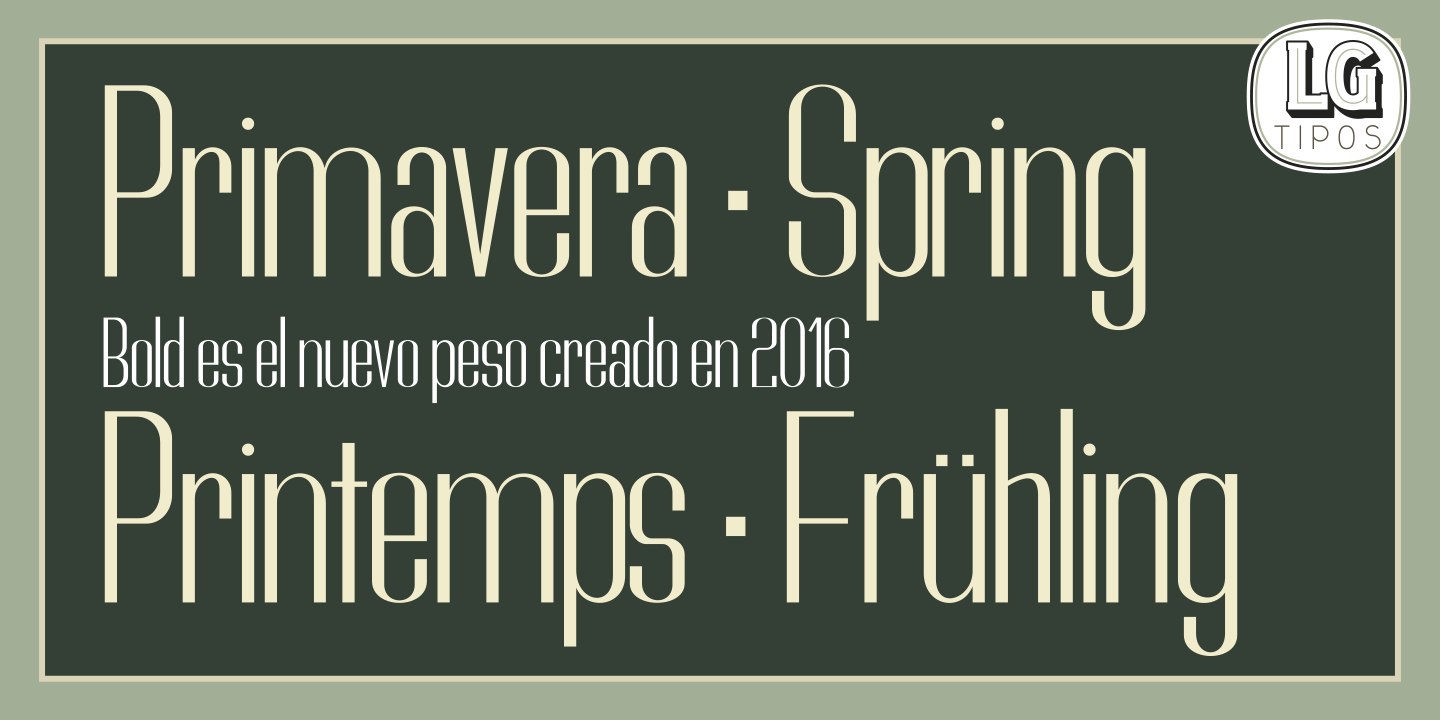
file name: Manuel Lage Primavera L G F 2016 219186 after Richard Gans

file name: Manuel Lage Primavera L G F 2016 219187 after Richard Gans

file name: Manuel Lage Primavera L G F 2016 after Richard Gans

file name: Richard Gans Radio Lumina
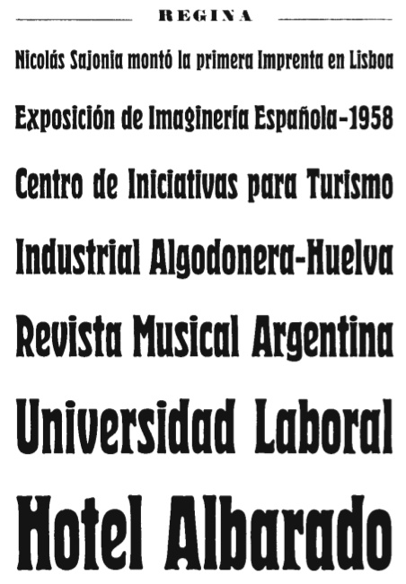
file name: Richard Gans Regina
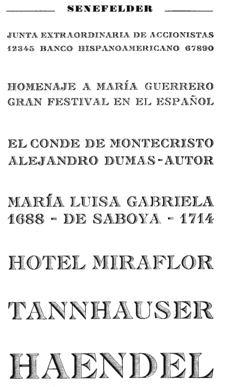
file name: Richard Gans Senefelder 2
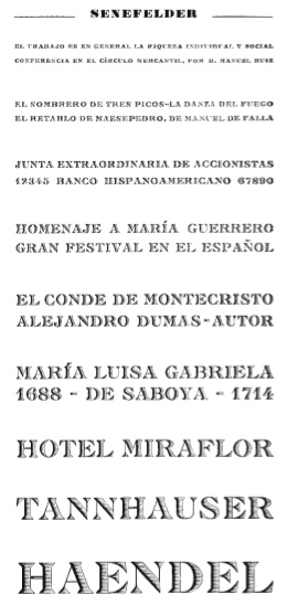
file name: Richard Gans Senefelder

file name: Richard Gans Titania

file name: Nick Curtis Faerie Queen N F 2006 after Richard Gans Titania 1933

file name: Nick Curtis Faerie Queen N F 2006 after Richard Gans Titania 1933b

file name: Richard Gans Vinetas
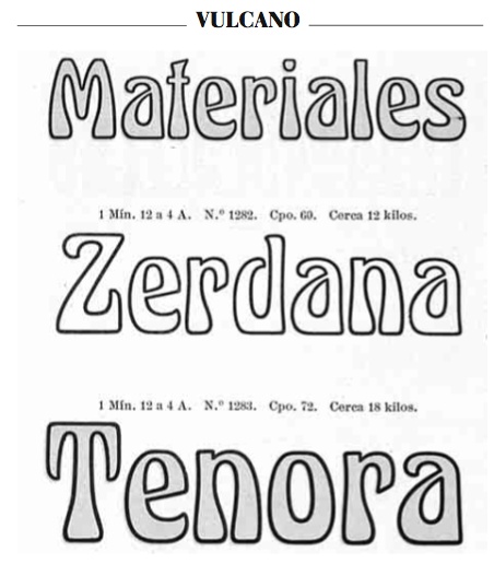
file name: Richard Gans Vulcano
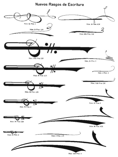
file name: Richard Gans Muevos Rasgos De Escritura

file name: Pretoria Gross Gans Rasgos Escritura

file name: Gans Blasones banner
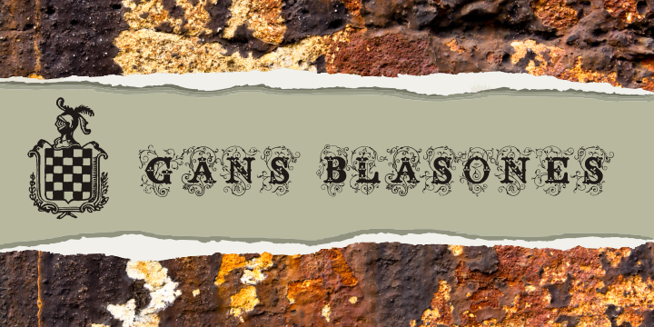
file name: Gans Blasones banner2
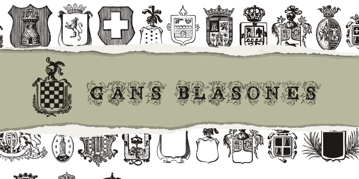
file name: Gans Blasones banner3

file name: Gans Blasones flag

file name: Gans Esquinazos banner
file name: Gans Esquinazos flag
| | |
|
Luc Devroye ⦿ School of Computer Science ⦿ McGill University Montreal, Canada H3A 2K6 ⦿ lucdevroye@gmail.com ⦿ https://luc.devroye.org ⦿ https://luc.devroye.org/fonts.html |