|
Samuel Winfield Tommy Thompson
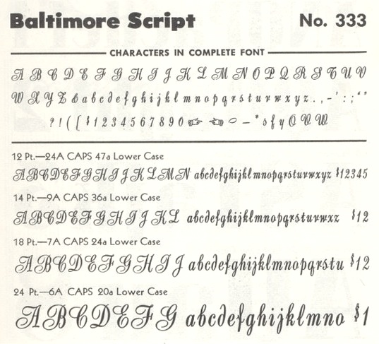
New York-based letterer and type designer, b. 1906, Blue Point, NY, who was also known as "Tommy". [Some sources have 1905]. He had a studio in New York City and was the author of several books on type and lettering. He died in 1967 in New York. His oeuvre includes - Baltimore Script (1955). Matrices cut by George Battee. Mac McGrew: Baltimore Script is a fancy style designed by Tommy Thompson and cut by George Battee for Baltimore Type in 1955. The lowercase follows the general style of a script letter hand-written with a broad pen, although the inclination is slight and the letters don't quite connect. Capitals are flourished. It is suitable for stationery, announcements, and greeting cards, but its range of small sizes is hardly enough for advertising use.
- Collier Heading. McGrew: Collier Heading was designed by Tommy Thompson in 1946 for Collier's magazine. It is an adaptation of an eighteenth-century style known generally as Grecian, and was cut by Monotype in a considerable range of sizes. Other Collier or Collier Heading types have turned up; one was designed by Tommy Thompson for Collier's magazine, but not identified otherwise. It was probably also cut by Monotype. One of these could possibly be the Bert Black mentioned previously.
- Various weights of Futura (later digitized by URW).
- Mademoiselle (1953, baltimore Type Foundry). Mac McGrew writes about Mademoiselle: Mademoiselle was designed by Tommy Thompson in 1953 as a display typeface for Mademoiselle magazine. It was cut by Herman Schnorr at Baltimore Type, which also offered fonts for general sale. It is a delicate, narrow modern roman, with long ascenders and short descenders, rather loosely fitted, and works well for display with transitional text typefaces such as Bulmer and Scotch Roman.
- Post Headletter (1943). Privately cast for the Saturday Evening Post.
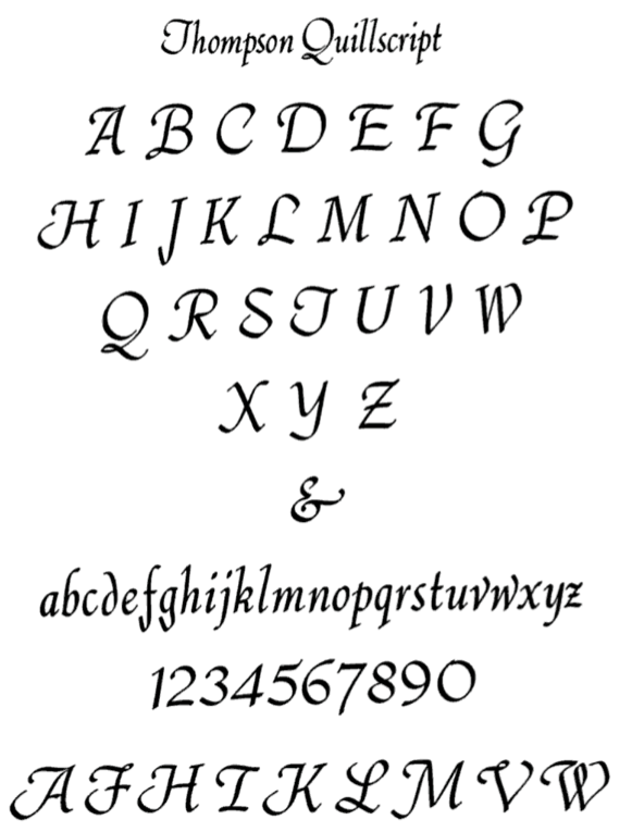
- Thompson Quillscript (1953, ATF): a 50s version of a chancery hand. McGrew: Thompson Quillscript was designed by Tommy Thompson for ATF about 1952. It is an attractive cursive letter with the appearance of lettering with a broad pen. Letters slope moderately and are not joining. The general effect is less formal than most other such typefaces. Capitals are rather reserved, but a font of alternate characters, mostly more informal capitals, was available separately until 1968. Compare Heritage, Lydian Cursive, Park Avenue, Raleigh Cursive. This typeface made it to the PhotoLettering collection.
- The following typefaces for Photo Lettering: Thompson Buccaneer Thompson Cable, Thompson Coliseum, Thompson Colonial Wide 8, Thompson English, Thompson Federal, Thompson Federal Italic, Thompson Federal Open, Thompson Georgian 2, Thompson Georgian Semi Condensed 2, Thompson Georgian 3, Thompson Georgian 4, Thompson Glasgow Italic 4, Thompson Gross Bold 9, Thompson Headline Casoni, Thompson Logotype, Thompson Pegasus Stencil, Thompson Penscript, Thompson Railway Stencil, Thompson Scribe, Thompson Stencil 8, Thompson Stencil 10, Thompson Trend Extra Cd 3.
Author of these books: The ABC of our Alphabet (1942, London), The Script Letter: Its Form, Construction, and Application (1939, New York), How to render roman letter forms (1946, New York), Basic layout design; a pattern for understanding the basic motifs in design and how to apply them to graphic art problems (1950, New York), Script Lettering for Artist (1969, New York).
|
EXTERNAL LINKS
Samuel Winfield Tommy Thompson
Klingspor Museum page
MyFonts search
Monotype search
Fontspring search
Google search
INTERNAL LINKS
Type designers ⦿
Type designers ⦿
Type scene in New York ⦿
Chancery hand, cancellaresca ⦿
Books on type design ⦿
Photo and film type era ⦿
Scotch Roman ⦿
|