|
Baltimore Type Foundry (or: Baltotype)
[Herbert F. Czarnowsky]
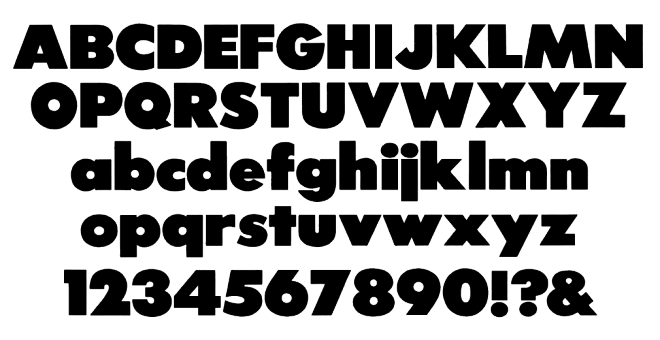
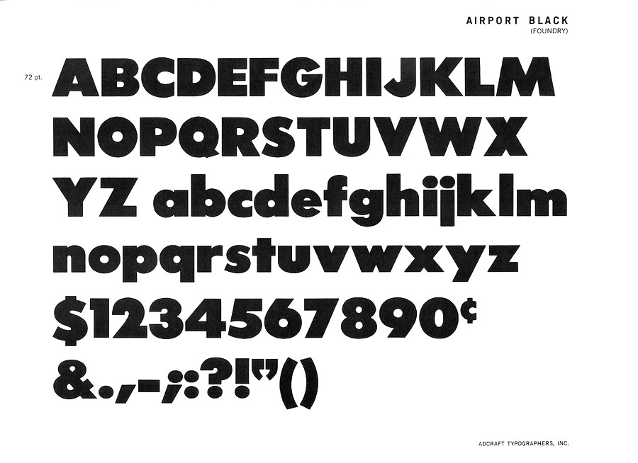
Also known as Fielding Lucas, Jr., Lucas Bros., H.L. Pelouze&Son, and Chas. J. Cary&Co. Specimen may be found in Convenient Specimen Book of Type, Rules, Borders, and Electrotype Cuts from the Baltimore Type Foundry (Baltimore: Chas. J. Cary&Co., 1888. Banta Book of Types&Typographical Tips. Menasha: George Banta, 1961). The company existed until well into the 20th century, and published a catalog as late as 1957 called Type and Rule Catalogue 13, Baltotype. A selected list of typefaces: - Airport Gothic: Turista Gorda NF (2009, Nick Curtis) is based on Baltimore Type Foundry's Airport Tourist which in turn used ideas from Renner's 1932 typeface Futura Display. Mc McGrew on Airport Gothic: Most of this series is the first American copy of Futura, which originated in Germany in 1927, designed by Paul Renner for Bauer. One source says it was cut from original Futura drawings, smuggled out of that country, but it seems more likely that matrices were made by electrotyping the imported type. An extrabold weight, Airport Black, was cut by Baltimore about 1943; information on this cutting is scarce and contradictory- one account says it was designed by Bill Stremic or Bill Blakefield, another that it was designed by Carl Hupie (or Hooper), and cut by Herman Schnoor. There is also Airport Black Condensed Title and Airport Broad. The latter is a modification of Airport Black, cut 50 percent wider on the pantagraph by Herman Schnoor. Baltimore later cast some of its Airport series from Monotype Twentieth Century matrices, and in a few cases listed both series. Airport Relief, Baltimore 299, is English Monotype Gill Sans Cameo Ruled, while Airport Tourist, Baltimore 602, is Futura Display, cast from electrotype mats of the German foundry type.
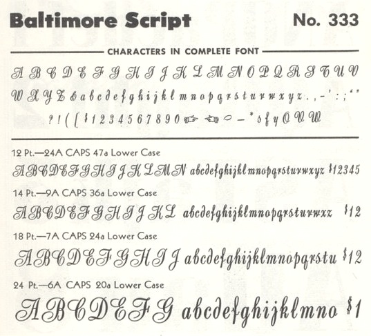
- Baltimore Script (1955). Mac McGrew: Baltimore Script is a fancy style designed by Tommy Thompson and cut by George Battee for Baltimore Type in 1955. The lowercase follows the general style of a script letter hand-written with a broad pen, although the inclination is slight and the letters don't quite connect. Capitals are flourished. It is suitable for stationery, announcements, and greeting cards, but its range of small sizes is hardly enough for advertising use.
- Mac McGrew: Czarin and Czarin Title were produced by Baltimore Type&Composition Corporation about 1948, the name being derived from the Czarnowsky family which owned the foundry. Czarin Title, issued first, is a copy of Offenbach Medium, a set of pen-drawn capitals designed by Rudolf Koch about 1935 for the Klingspor foundry in Germany. Czarin has minor changes in a few characters, but adds a lowercase, designed by Edwin W. Shaar, that is substantially different from that of Steel, the cap-and-lowercase version of Offenbach. The new lowercase harmonizes well with the capitals, and makes a handsome appearance. Compare Lydian. Footnote: McGrew spelled the name of the owner as Czarnowski. Irene Traeger, the granddaughter of Herbert F. Czarnowsky, pointed out the incorrect spelling to me.
- Mac McGrew: Elegante is a decorative, nearly monotone typeface cut by George Battee for Baltimore Type, after the German typeface Sensation of 1913, from Foundry Heinrich Hoffmeister. It is upright, with flourished caps and loops on some of the ascenders and descenders, and is suitable particularly for announcements and personal stationery. Compare Greeting Monotone.
- Mac McGrew: Emperor is a 1957 adaptation by Baltimore Type of Wide Latin which was cut by Stephenson Blake in England and related to nineteenth-century typefaces under other names. However, this Baltimore Type version has been modified and resized, and is less successful due to excess space between letters (although not as much as in the specimen shown here, which is letterspaced). Emperor was originally shown as Imperial.
- Their geometric series from 1884 became famous, and was often imitated. HiH created two font families based on it: Teutonia (2007) and Baltimore Geometric (2008, a revival of Antique Geometric by Baltimore Type Foundry, 1883). HiH writes: Roos&Junge of Offenbach am Main in Germany produced Teutonia in a "back-to-basics" effort that has seen many quite similar attempts in the field of topography. In 1883, Baltimore Type Foundry released its Geometric series. In 1910, Geza Farago in Budapest used a similar letter design on a Tungsram light bulb poster. In 1919 Theo van Doesburg, a founder with Mondrian and others of the De Stijl movement, designed an alphabet using rectangles only -- no diagonals. In 1923 Joost Schmidt at Bauhaus in Weimar took the same approach for a Constructivist exhibit poster. The 1996 Agfatype Collection catalog lists a Geometric in light, bold and italic that is very close to the old Baltimore version. Even though none of these designs took the world by storm, they all made a contribution to our understanding of letterforms and how we use them.
- Mac McGrew: Greco Bold and Italic are Spanish typefaces of the mid-1920s. They are very heavy, with long ascenders and small x-height, and have a hand-lettered appearance. Linotype Vulcan (q.v.) is equivalent. National Matrix&Type Co. in Baltimore, one of several independent companies which made matrices for the popular casting machines, offered Greco Bold in 1929 as its series 100; this was the source of Baltimore Type's mats, but Baltimore and some other sources cast Greco Bold and Italic as series 326-3261. These numbers have not been found in Monotype literature; perhaps another independent source also made mats. Notice the figures, which are termed hanging or old style, although they do not follow the usual form. However, taller 1, 2, and 0 are also available to convert the set to lining figurees. Compare Hess Monoblack. Greco Adornado, an ornamented version, has also been imported.
- Mac McGrew: Homewood is a recutting by Baltimore Type of Metropolis Lined, a German typeface of the 1930s. It was made from a large size of Metropolis Bold, with the fine white lines cut in, and differs from the original in minor details of the curves. Other sizes were cut by pantagraph and do not necessarily match original sizes.
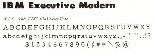
- IBM Executive Modern, a typewriter type.
- Mac McGrew: Mademoiselle was designed by Tommy Thompson in 1953 as a display typeface for Mademoiselle magazine. It was cut by Herman Schnoor at Baltimore Type, which also offered fonts for general sale. It is a delicate, narrow modern roman, with long ascenders and short descenders, rather loosely fitted, and works well for display with transitional text typefaces such as Bulmer and Scotch Roman. Both lining and oldstyle figures are provided, along with several pointing hands as shown.
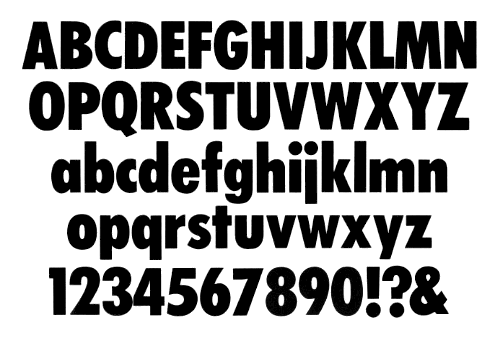
- Tourist Extra Condensed. Turista Flaca NF (2009, Nick Curtis) is based on Tourist Extra Condensed. McGrew: Tourist Extra Condensed of Baltimore Type is a copy of Phenix (q.v.) in 24- to 48-point sizes, and is Jefferson Gothic (q.v.) in larger sizes. Phenix is a 1935 ATF typeface by Morris Fuller Benton.
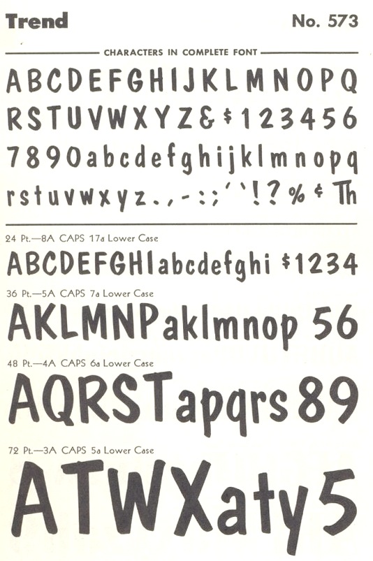
- Mac McGrew: Trend is a brush-lettered typeface cut by Baltimore in 1953. It is very similar to Dom Casual (q.v.), but has a slight back slant.
- Mac McGrew: Trylon as made by Baltimore Type was a 1949 copy of Stephenson Blake's Playbill (see Imports in Appendix), but Trylon Shaded and Trylon Shaded Oblique were designed and cut by George Battee of the Baltimore foundry. The solid version has lowercase in some sizes; it is somewhat similar to P. T. Barnum, with greatly exaggerated horizontal strokes and serifs at top and bottom, but is heavier and narrower. The Shaded versions are more properly outlines of the same design, with a small shadow effect at the top (which is unusual) and right of each letter, but without lowercase.
- Mac McGrew: Vernen is essentially a copy of Huxley Vertical (q.v.), but omitting the round characters AKMNWY and using the alternate pointed characters instead. In addition, the slight extensions of cross strokes to the left of stems have been omitted, and a few other characters have been redrawn. It was offered by Baltimore in 1953.
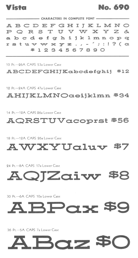
- Mc McGrew: Vista is a very wide square-serif face, cut by Baltimore Type in 1956. It is said to be a pantagraphic modification of Hellenic Wide from Bauer in Germany; actually it does not match that typeface in details, though it has the same general effect.
- Mac McGrew: Wide Line Gothic is a creation of Herman Schnoor for Baltimore Type, modified by pantagraph from Philadelphia Lining Gothic, increasing the width by about 50 percent. The flat sides of round letters. acceptable in the moderately condensed original, make awkward shapes in this extended version. Compare Franklin Gothic Wide, Tempo Black Extended.
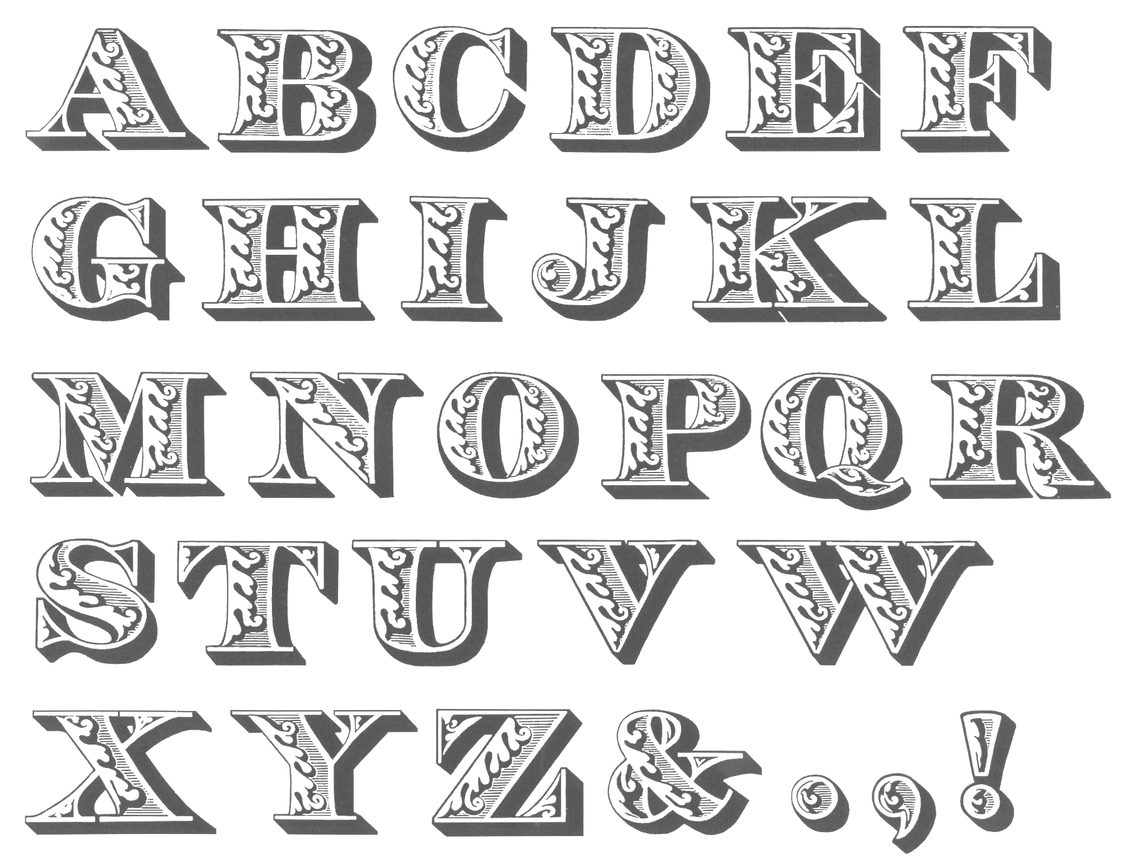
- Among the wood types, we have Oak Leaf (1832, ornamental caps).
Rich Hopkins, a printing historian, acquired Baltotype ca. 1993. Based on drawings from the 1950s in the Baltotype material, Miranda Roth at P22 designed LTC Athena, a narrow art deco typeface, in 2013.
|
EXTERNAL LINKS
MyFonts search
Monotype search
Fontspring search
Google search
INTERNAL LINKS
Foundries of the 19th century ⦿
Type scene in Maryland ⦿
Type design and constructivism ⦿
Nick Curtis ⦿
Typewriter fonts ⦿
Bauhaus and type design ⦿
De Stijl and type design ⦿
Art deco typefaces ⦿
Scotch Roman ⦿
Ornamental caps typefaces ⦿
Wood Type ⦿
Circus fonts ⦿
|