TYPE DESIGN INFORMATION PAGE last updated on Mon Jun 8 18:01:45 EDT 2026
FONT RECOGNITION VIA FONT MOOSE

|
|
|
|
Intertype
[Gilbert Powderly Farrar]
Defunct foundry. One of its typographic directors was Gilbert Powderly Farrar (1886-1957), who designed Bert Black. Intertype's typefaces include Monterey (1958, Rand Holub, its "version" of Murray Hill; available from Bitstream now), Imperial (designed by Ed Schaar; now a Bitstream font), Intertype Vogue (ca. 1930, see Am Sans by Volker Busse for a free digital version), Stuyvesant (1940, now available from Bitstreeam), and Nuptial Script (now an Adobe font). MyFonts writes: Harris inherited the Harris-Intertype library, made up of the typefaces cut by Intertype to compete with Mergenthaler from the First World War. A small group of original typefaces centers on newspaper typefaces and scripts. In the thirties C.H. Griffith at Mergenthaler believed the linecaster to be unsuitable for the development of scripts, which led Ed Schaar at Intertype to claim this market as their own. Intertype became Harris-Intertype ca. 1960, and Harris ca. 1975. Cyrillic typefaces in their library, ca. 1930. The firm still exists as Harris Corporations in Melbourne, FL, but is no longer producing fonts. Leonard Spencer, in his article Linotype / Intertype Linecasting Machines How They Differ writes: Intertype started as International Typesetting Machine Company in 1911. Many of first machines were rebuilt Linotype bases with improvements patented by the new company. When World War I broke out, International Typesetting Machine Company was reorganized as the Intertype Corporation, and by 1917 had three machines for sale: Model A one magazine, Model B two magazine, Model C three magazine. Intertype was first in cold type with its Fotosetter in 1950. This machine continued the circulating matrix principle but had film image instead of the punched character. Stuart Sandler adds this piece of information: The Harris-Intertype Fotosetter was the first photo typesetting machine invented. It marks the beginning of the Cold Type era and is the machine responsible for it . . . Incidentally this is the machine that inspired the creation of the Filmotype by its inventor Allan Friedman when he saw it unveiled to US audiences in 1948. Instead of lead slugs, the Intertype which was a Linotype machine had replaced them with small film negatives and proceeded to set type as you would imagine the bastardization of a lead type and photo type machine only could. There are many reasons Cold Type caught on and it became the standard some time after that period till digital typesetting machines like the Alphatype came into their own. It wasn't until the release of the first MacIntosh in 1984 when Cold Type was eclipsed by desktop publishing. Mac McGrew: Ideal (originally called Ideal News) was designed by Herman R. Freund for Intertype in 1926, for the New York Times. It has much the appearance of Century Schoolbook, but with shorter ascenders and squattier capitals. The italic is a little closer to Century Expanded Italic, providing more contrast with the roman. Sturdy serifs, substantial hairlines, and open loops make it a practical typeface for the demanding production requirements of high-speed newspaper use. Ideal Bold is heavier than the Century bold typefaces. View a few digital typefaces with roots in the Intertype collection. Another famous type is Cairo. Mac McGrew: Cairo is Intertype's adaptation of Memphis, originally designed by Rudolf Weiss for Stempel in Germany about 1929, and first imported into the United States as Girder. Except for Litho Antique, this was the first of the modern square-serif typefaces, which are revivals of older typefaces known as Egyptians. The Intertype typefaces appeared in 1933 to 1940. Lining Cairo features several sizes of caps on 6- and 12-point bodies in the manner of Copperplate Gothic. Compare Memphis, Stymie, Karnak. Farrar is also the author of The Typography of Advertisements That Pay (1917, D. Appleton and Co., New York). Local download. |
EXTERNAL LINKS |
| | |


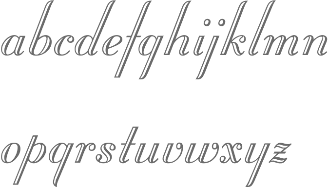
file name: Intertype Monterey 1958
file name: Bitstream Stuyvesant based on Intertype Stuyvesant 1940
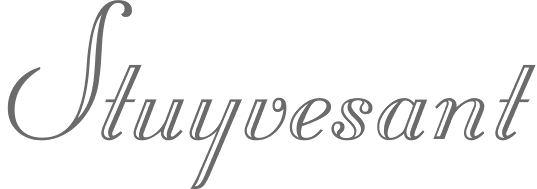
file name: Bitstream Stuyvesant based on Intertype Stuyvesant 1940b
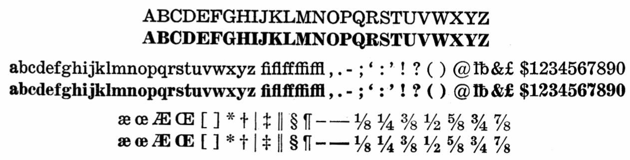
file name: Intertype Ideal 1928
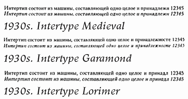
file name: Intertype 1930 Cyrillic Faces
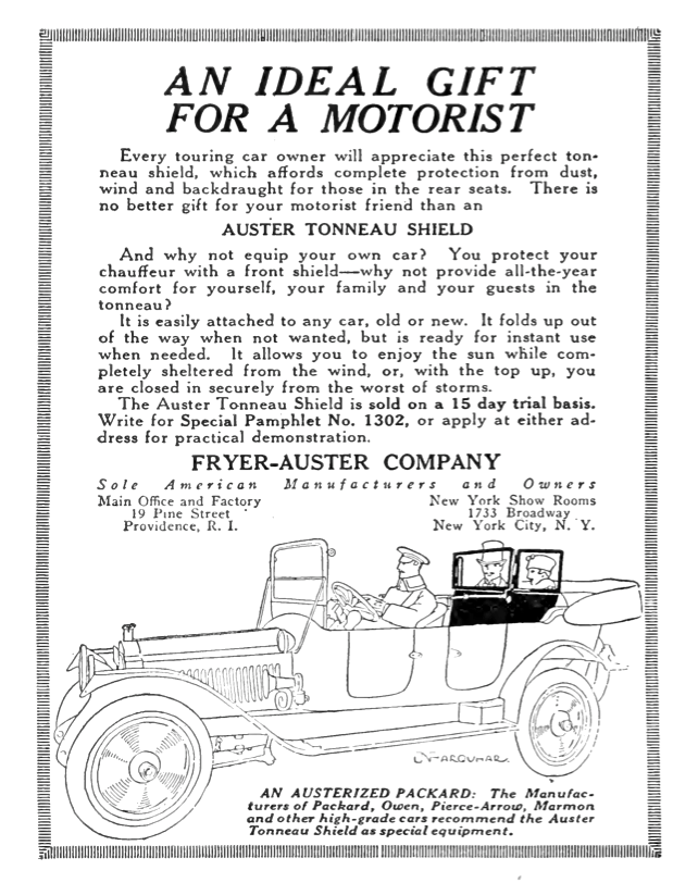
file name: Gilbert Farrar Auster Tonneau Shield Advertisement 1917
file name: Gilbert Farrar Banking Advertisement 1917
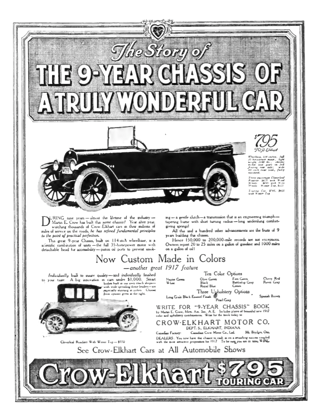
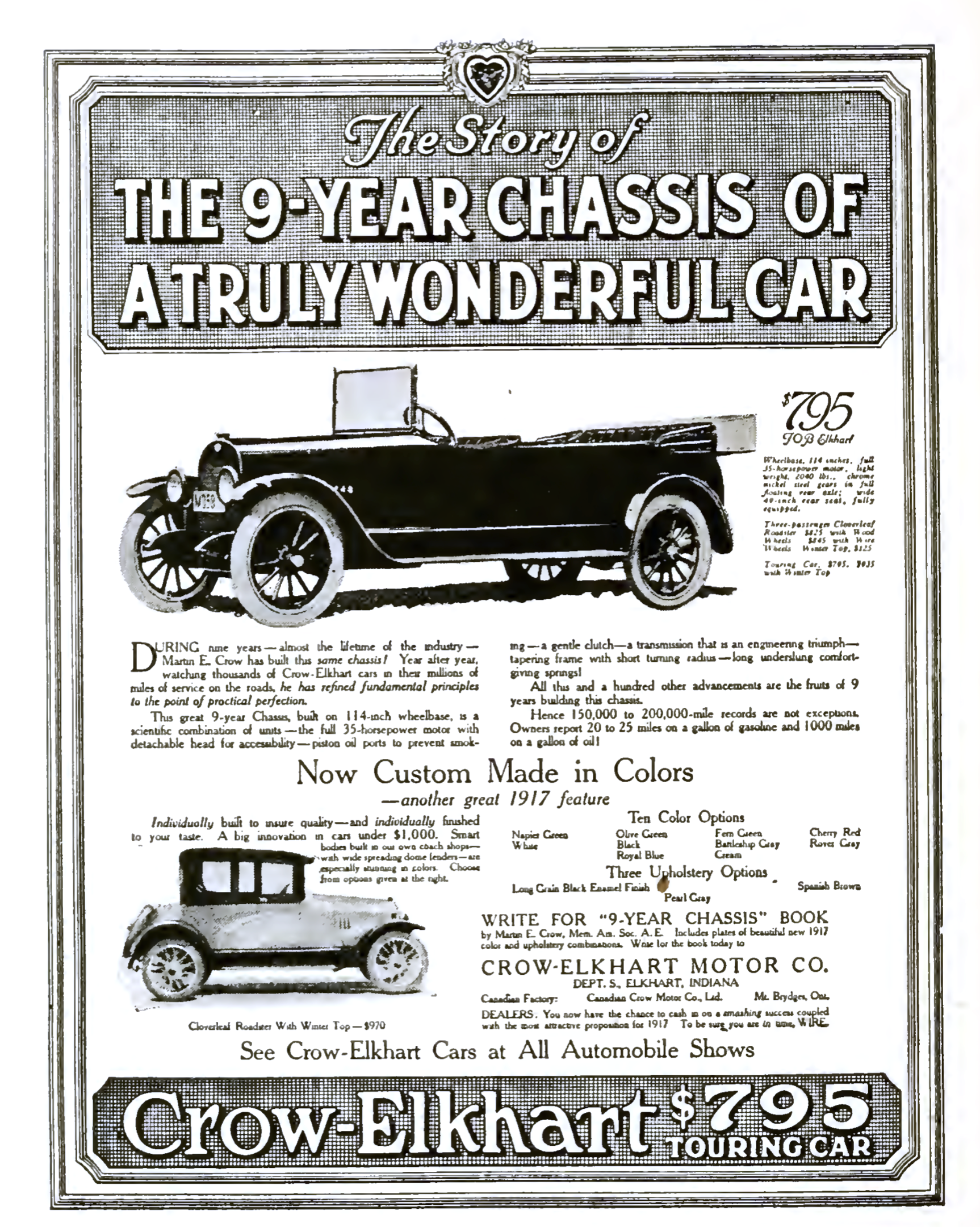
file name: Gilbert Farrar Crow Elkhart Car Advertisement 1917
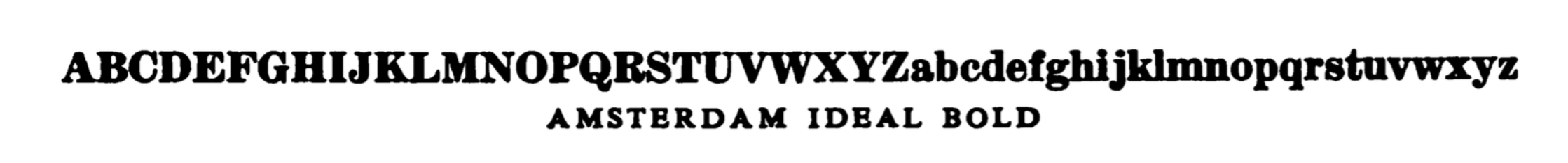
file name: Amsterdam Ideal Bold 1926
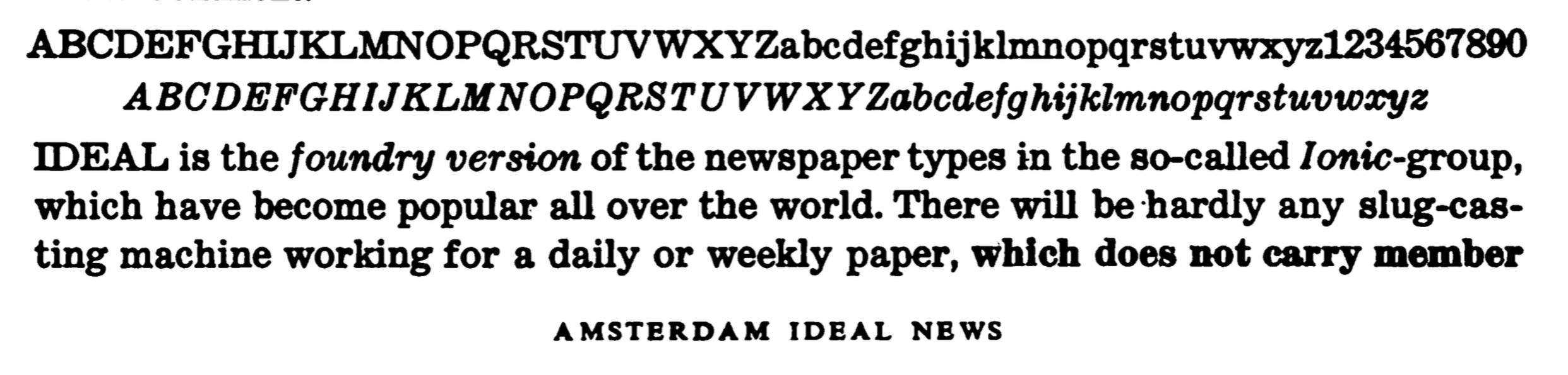
file name: Amsterdam Ideal News 1926
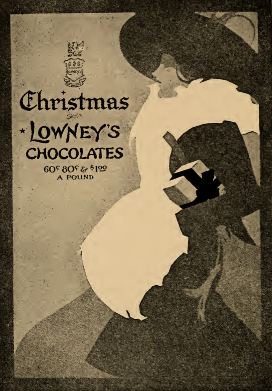
file name: Gilbert Farrar Lowneys Advertisement 1917
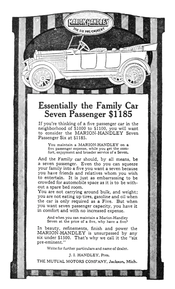
file name: Gilbert Farrar Marion Handley Advertisement 1917
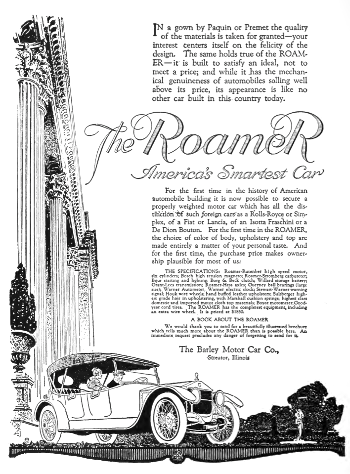
file name: Gilbert Farrar The Roamer Barley Motor Car Advertisement 1917
file name: Gilbert P Farrar The Typography Of Advertisements That Pay 1917b
file name: Gilbert P Farrar The Typography Of Advertisements That Pay 1917c
file name: Gilbert P Farrar The Typography Of Advertisements That Pay 1917d
| | |
|
Luc Devroye ⦿ School of Computer Science ⦿ McGill University Montreal, Canada H3A 2K6 ⦿ lucdevroye@gmail.com ⦿ https://luc.devroye.org ⦿ https://luc.devroye.org/fonts.html |