TYPE DESIGN INFORMATION PAGE last updated on Sat Jan 10 12:03:17 EST 2026
FONT RECOGNITION VIA FONT MOOSE

|
|
|
|
Robert Besley
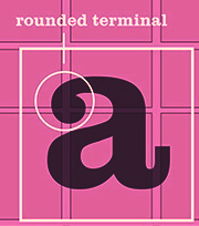
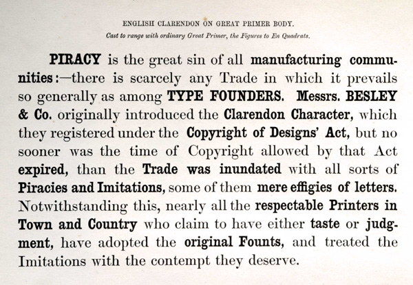
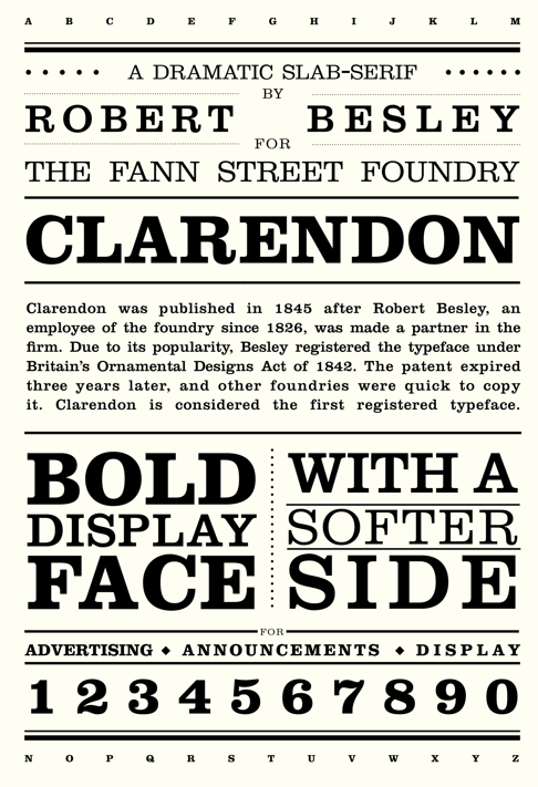
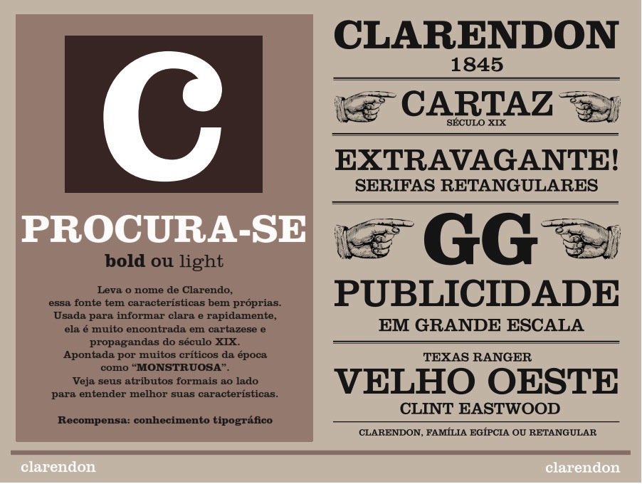
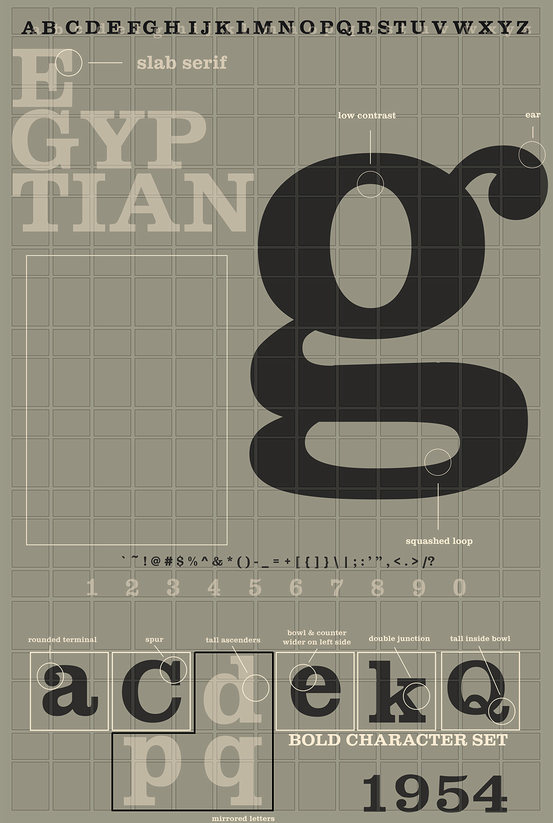
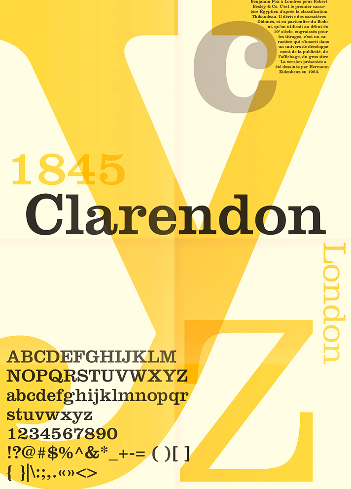
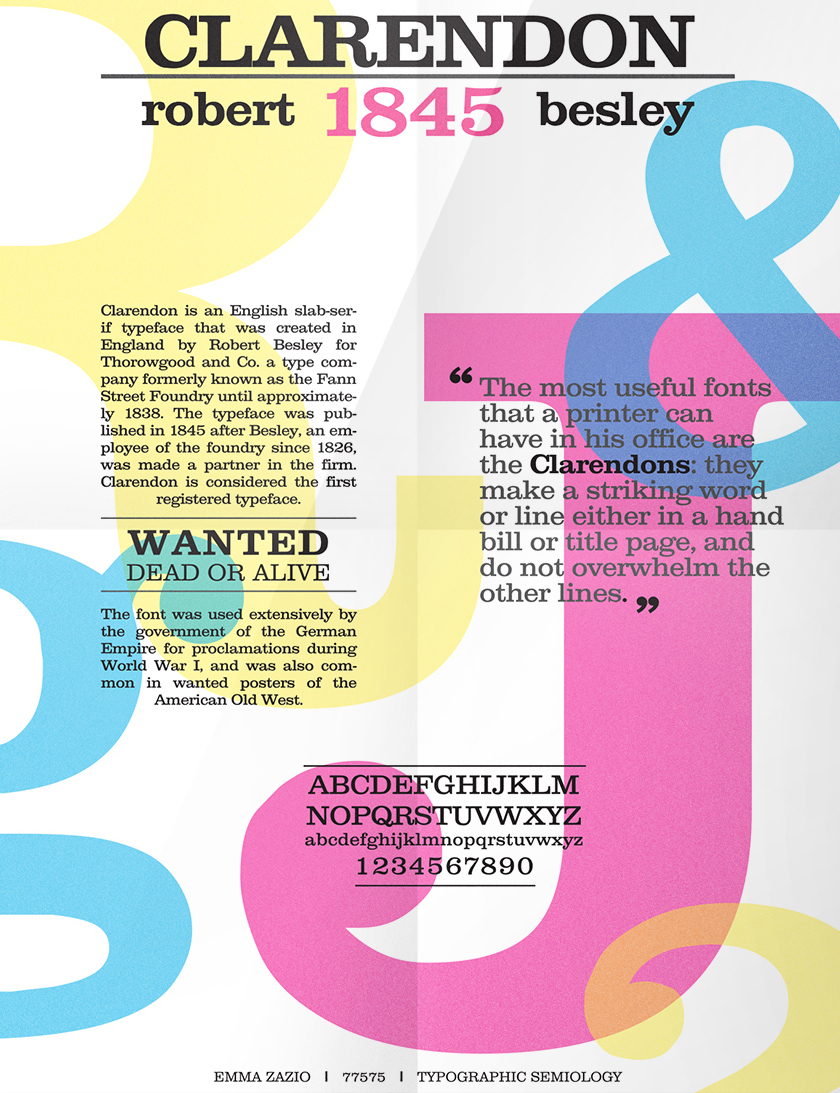
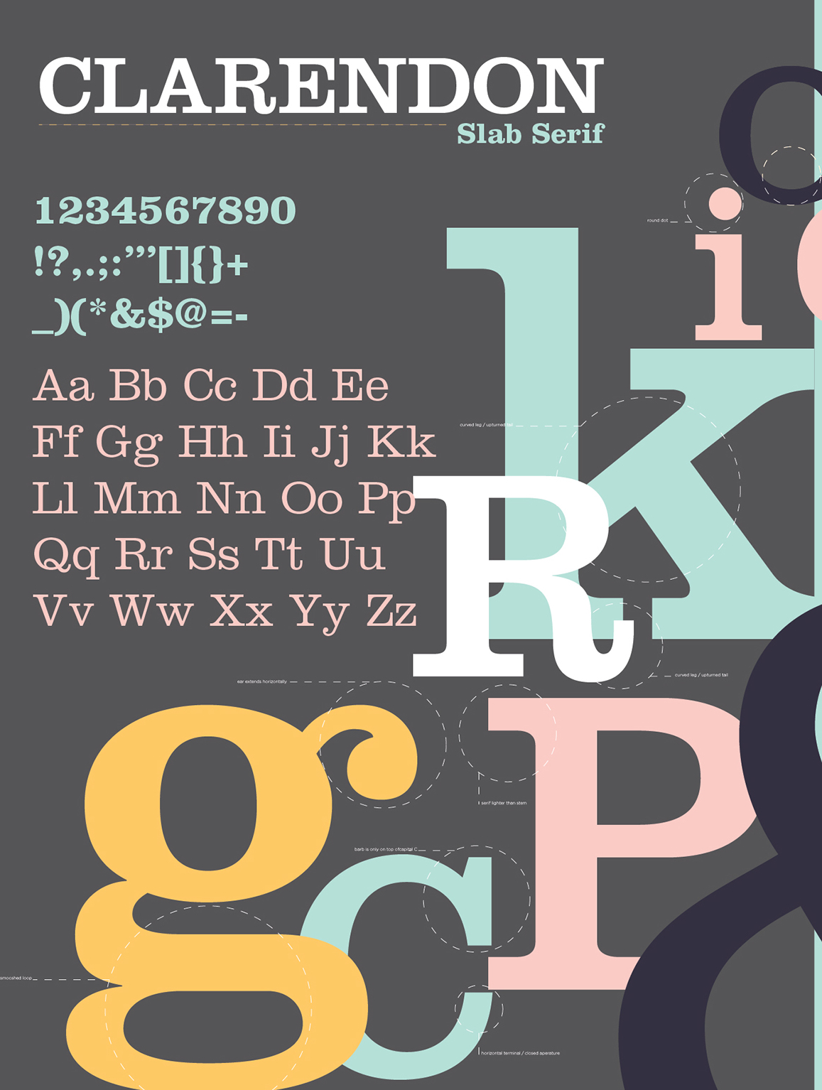
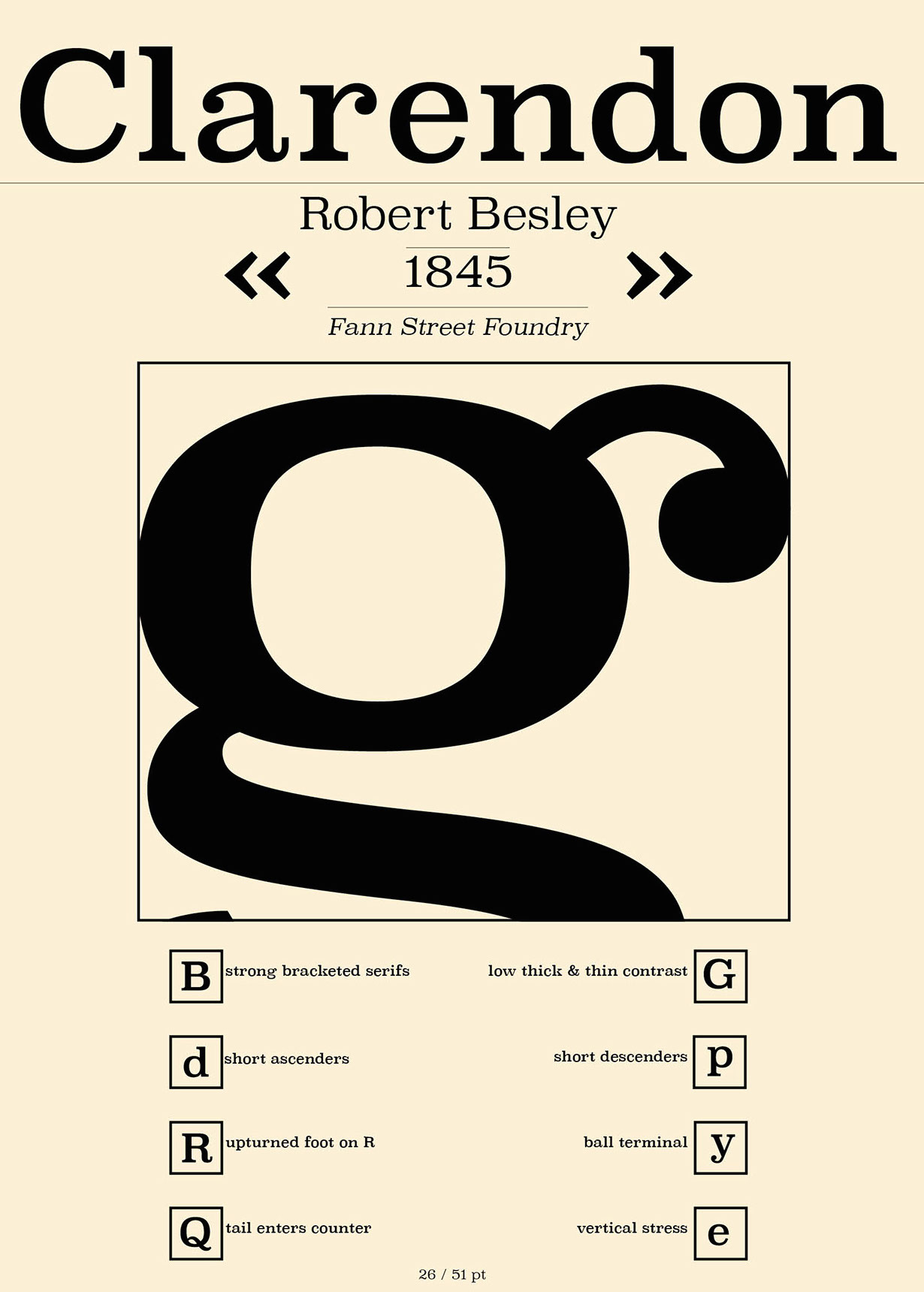
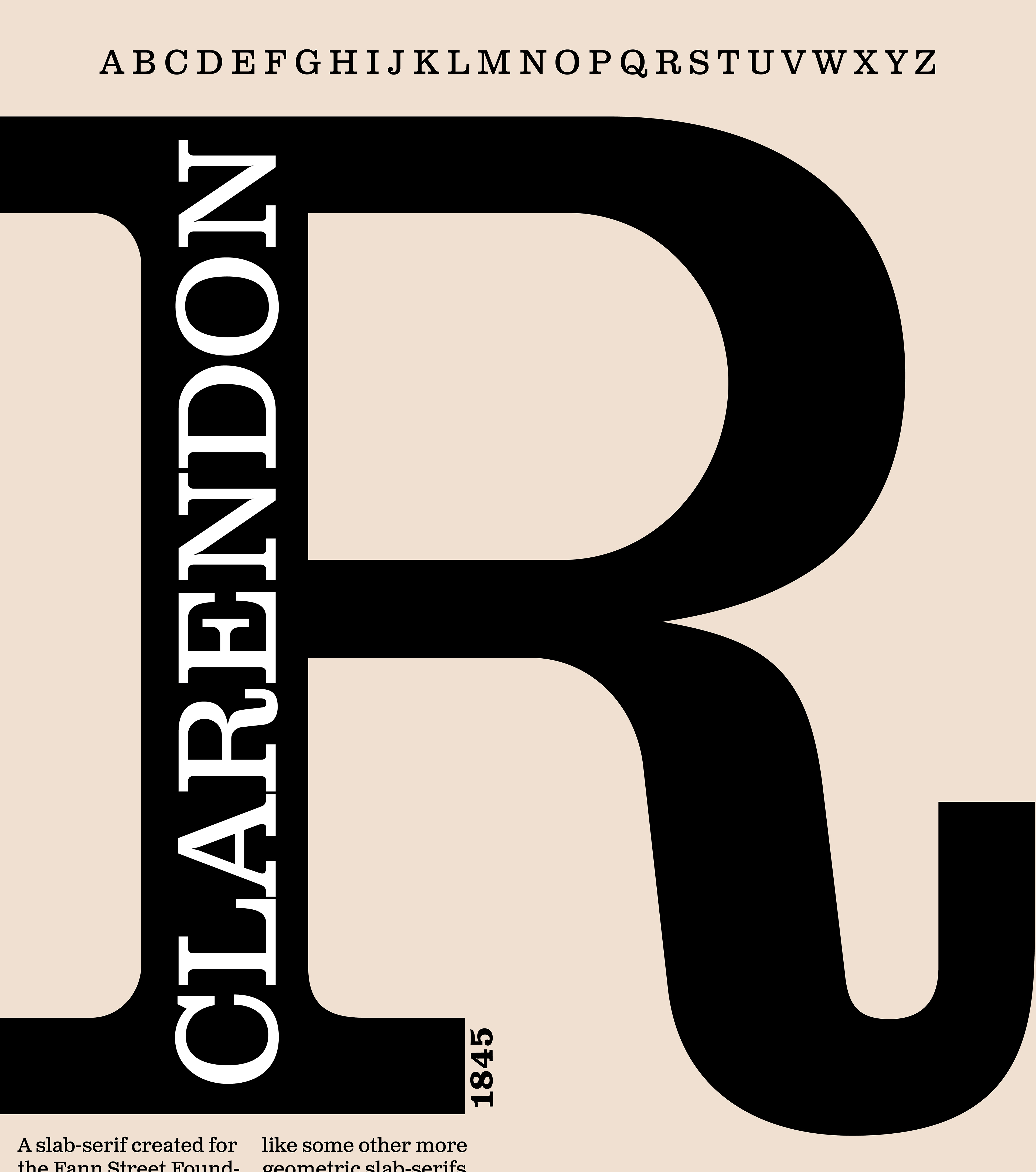
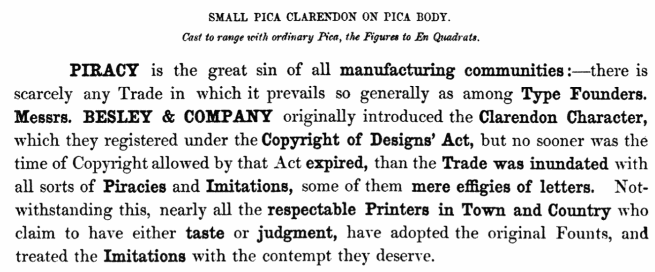
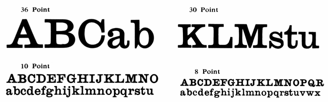
British typefounder and punchcutter, active from about 1840-1860. He succeeded William Thorowgood at the Fann Street Foundry in 1849. Credited with cutting the first Clarendon (1845), a fat typeface with thick slabs. This was also the first registered typeface, ever. See also here. Stephenson Blake acquired Clarendon when it bought the Sir Charles Reed type foundry, and issued the typeface as Consort. Typophile discussion on Besley's Clarendon from which I quote a few passages.
|
EXTERNAL LINKS |
| | |

file name: Fann Street Besley Clarendon1845
file name: Robert Besley Clarendon 1845 Poster by Gabriel Rose 2014
file name: Robert Besley Clarendon L T Poster by Igor Goncalves 2014
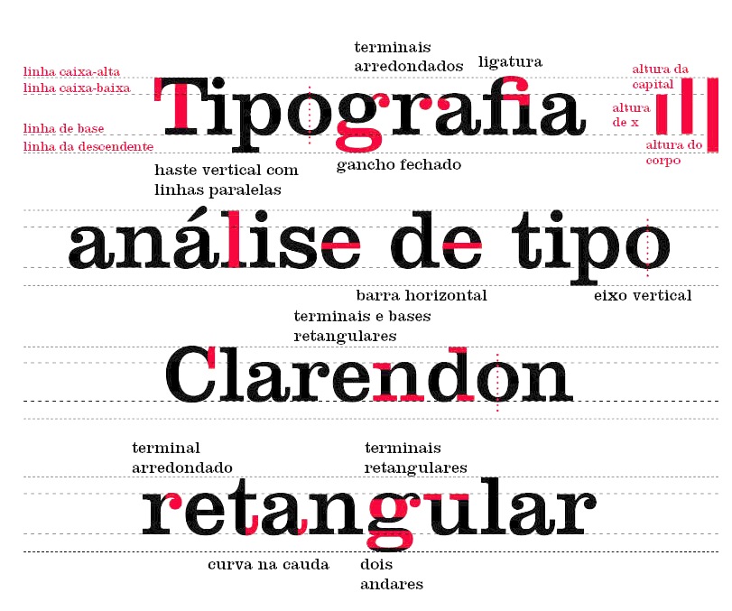
file name: Robert Besley Clarendon L T Poster by Igor Goncalves 2014

file name: Robert Besley Clarendon L T Poster by Igor Goncalves 2014c
file name: Robert Besley Clarendon 1845 Poster by Kyleigh Rowe 2015b
file name: Robert Besley Clarendon 1845 Poster by Renaud Giuliano 2016
file name: Robert Besley Clarendon 1845 Poster by Emma Zazio 2015

file name: Robert Besley Clarendon 1845 Poster by Emma Zazio 2015b
file name: Robert Besley Clarendon 1845 Poster by Chloe Hubler 2015
file name: Robert Besley Clarendon 1845 Poster by Dom Vacchiano 2015

file name: Robert Besley Clarendon 1852 Poster by Alan Walker 2014
file name: Robert Besley Clarendon 1845 Poster by Alivia Chenoweth 2019
file name: Fann Street Foundry Original Clarendon 1852
file name: Stephenson Blake Consort 1953 1954
| | |
|
Luc Devroye ⦿ School of Computer Science ⦿ McGill University Montreal, Canada H3A 2K6 ⦿ lucdevroye@gmail.com ⦿ https://luc.devroye.org ⦿ https://luc.devroye.org/fonts.html |