TYPE DESIGN INFORMATION PAGE last updated on Wed May 6 16:13:25 EDT 2026
FONT RECOGNITION VIA FONT MOOSE
|
|
|
|
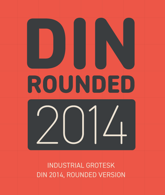
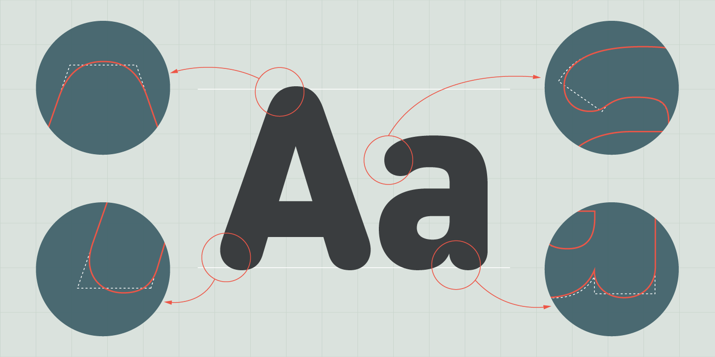
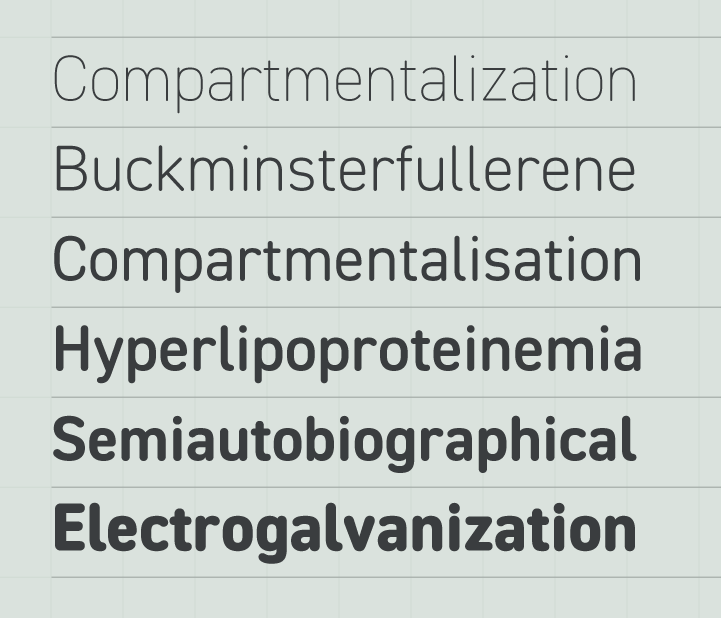
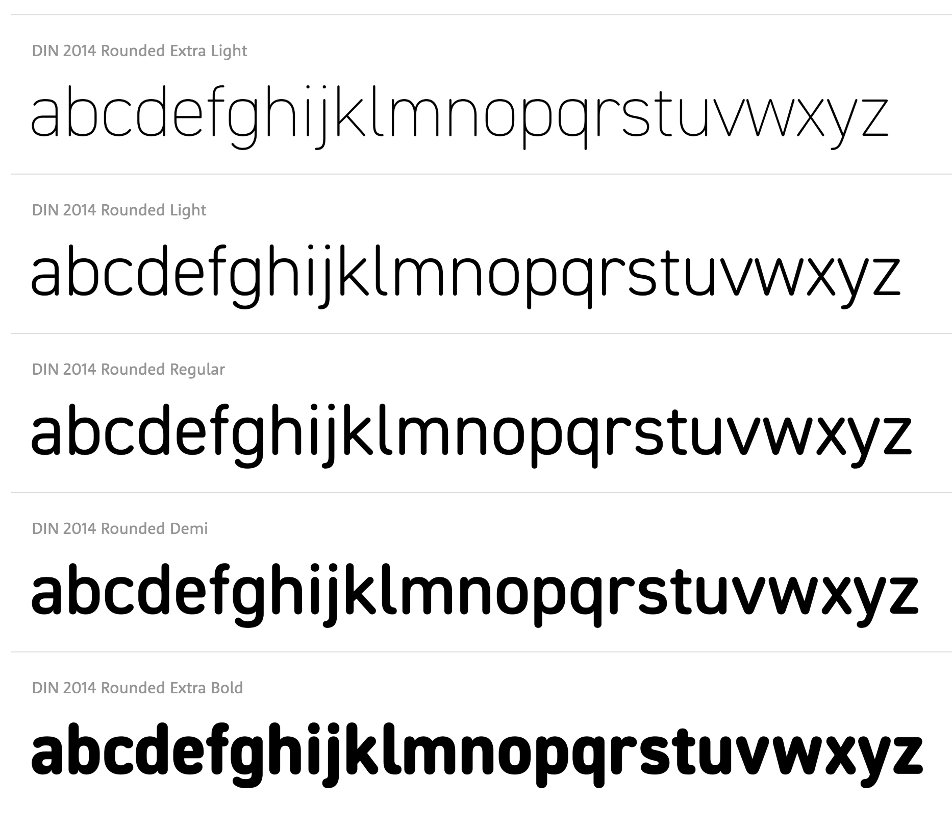
Russian type designer called Olga Chaeva at MyFonts. She graduated from Moscow Academy of Print (former Moscow Printing Institute, now Moscow State University of Printing). Staff type designer of ParaType, where she worked on Pragmatica. Paratype writes: The typeface was designed at ParaType (ParaGraph) in 1989-2004 by Vladimir Yefimov and Olga Chaeva. A spin-off from Encyclopedia-4 type family of the Polygraphmash type design bureau (1987, Vladimir Yefimov and Isay Slutsker). Inspired by Helvetica (Neue Haas Grotesk) of Haas type foundry, 1957 by Eduard Hoffman and Max Miedinger. Based on the 19th century Grotesque designs, Helvetica brought a new level of mathematical accuracy to the sans serif category. Widely used for many applications, from magazines and books to advertising and headlines. Four basic styles of Pragmatica were developed in 1989 by Vladimir Yefimov. Eight additional styles were developed in 2003 by Olga Chaeva. Condensed styles were developed in 1993-2004 by Vladimir Yefimov, Alexander Tarbeev and Manvel Shmavonyan, with participation of Dmitry Kirsanov. Extended styles were developed in 2004 by Olga Chaeva and Manvel Shmavonyan. She made the Cyrillic version of Licko's Quartet (2003). She also created Engravers Gothic, an extended grotesque family (Paratype) based on the Bitstream original. In 2003, Isabella Chaeva added a Bold version. Other cyrillizations include FF Meta, ITC Officina Sans and Serif, and Bell Gothic (1999; after Bell Gothic, 1938, Chauncey H. Griffith). About Pragmatica, Paratype writes: The typeface was designed at ParaType (ParaGraph) in 1989-2004 by Vladimir Yefimov and Olga Chaeva. A spin-off from Encyclopedia-4 type family of the Polygraphmash type design bureau (1987, Vladimir Yefimov and Isay Slutsker). Inspired by Helvetica (Neue Haas Grotesk) of Haas type foundry, 1957 by Eduard Hoffman and Max Miedinger. Based on the 19th century Grotesque designs, Helvetica brought a new level of mathematical accuracy to the sans serif category. Widely used for many applications, from magazines and books to advertising and headlines. 4 basic styles of Pragmatica were developed in 1989 by Vladimir Yefimov. Eight additional styles were developed in 2003 by Olga Chaeva. Condensed styles were developed in 1993-2004 by Vladimir Yefimov, Alexander Tarbeev and Manvel Shmavonyan, with participation of Dmitry Kirsanov. Extended styles were developed in 2004 by Olga Chaeva and Manvel Shmavonyan. In 2006, she created the jagged script Jaggy (Paratype). In 2007, she added Vermicello (Paratype). Textbook New (2008, Paratype) is based on Bukvarnaya (TextBook) photocomposing version designed in 1987 by Emma Zakharova. The initial Bukvarnaya for metal composition was created at Polygraphmash in 1958 by Elena Tsaregorodtseva. It was developed for primers and the first level school textbooks. An early sans serif (Grotesque) with half-closed static letterforms. Kuenstler 165 (2008, Paratype) was extended by Isabella Chaeva: Two weights of Cyrillic version including alternative lc characters were developed by Isabella Chaeva and released in 2008 by ParaType. In 2010, Vladimir Yefimov and Isabella Chaeva extended and cyrillicized Kuenstler 480 (Bitstream) at Paratype, which in turn was the digital version of Trump Mediaeval (Georg Trump, 1954-1960). In 2011, she created the lovely curly swashy script typeface Rosabella (ParaType). Together with Isabella Chaeva, she made PT Mono (2012, Google Web Fonts). In 2013, Isabella Chaeva and Vladimir Yefimov created a Cyrillic version of Roundhand BT (1966, Matthew Carter) for ParaType. In 2014, she co-designed Stem, a geometric large x-height Latin / Cyrillic sans serif with optical sizing, with Alexandra Korolkova and Maria Selezeneva at Paratype. This was followed in 2015 by Stem Text. Codesigner of Kudryashev Display (2015, Isabella Chaeva, Alexandra Korolkova and Olga Umpeleva). Kudryashev Display is a set of light and high-contrast typefaces based on Kudryashev text typeface. In addition to Kudryashev Display and Kudryashev Headline typefaces, the type family includes also two Peignotian sans-serif typefaces of the same weight and contrast, with some alternates. The serif styles were designed by Olga Umpeleva in 2011, the sans styles were created by Isabella Chaeva in 2015 with the participation of Alexandra Korolkova. In 2020, she released the chancery-style humanist italic typeface Reed and Titul (a titling font family that includes an engraved money font, and solid and blackboard bold styles) at Paratype. In 2021, Paratype designers Isabella Chaeva, Vasily Biryukov and Alexander Lubovenko created DIN 2014 Rounded, an extension of the industrial sans serif DIN 2014. The six-style typeface supports all European languages based on Latin, Cyrillic, and Asian Cyrillic (Tatar, Kazakh and Kyrgyz) and has a variable version. |
EXTERNAL LINKS |
| | |
file name: Para Type D I N2014 Rounded 2021 1
file name: Para Type D I N2014 Rounded 2021 2

file name: Para Type D I N2014 Rounded 2021 3

file name: Para Type D I N2014 Rounded 2021 4
file name: Para Type D I N2014 Rounded 2021 5

file name: Para Type D I N2014 Rounded 2021
file name: Isabella Chaeva Vasily Biryukov Alexander Lubovenko D I N2014 Rounded 2021
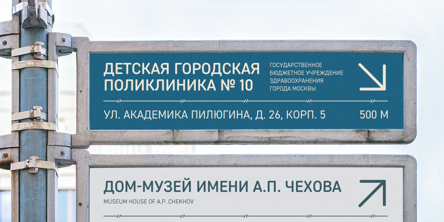
file name: Isabella Chaeva Vasily Biryukov Alexander Lubovenko D I N2014 Rounded 2021

file name: Para Type Titul 2020 1
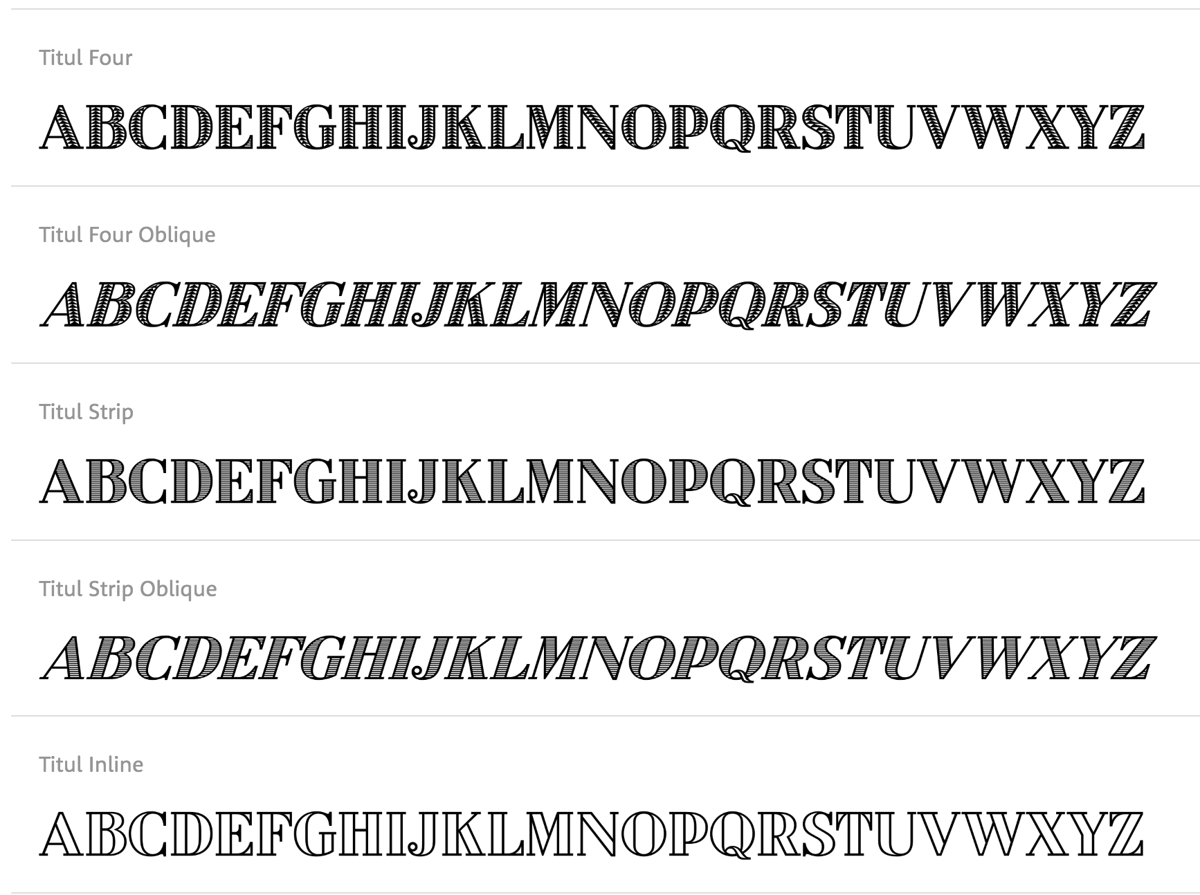
file name: Isabella Chaeva Titul 2020
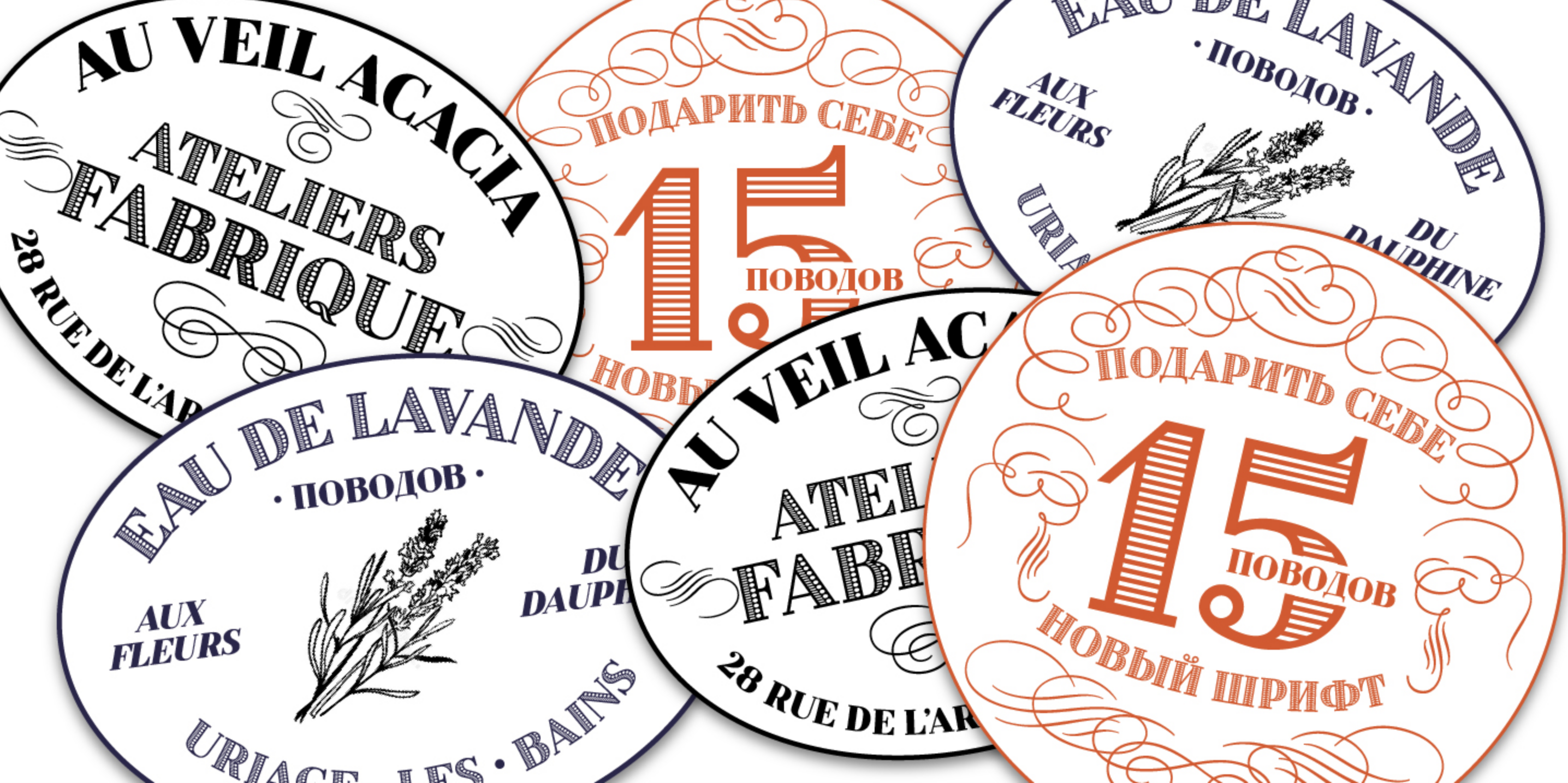
file name: Isabella Chaeva Titul 2020
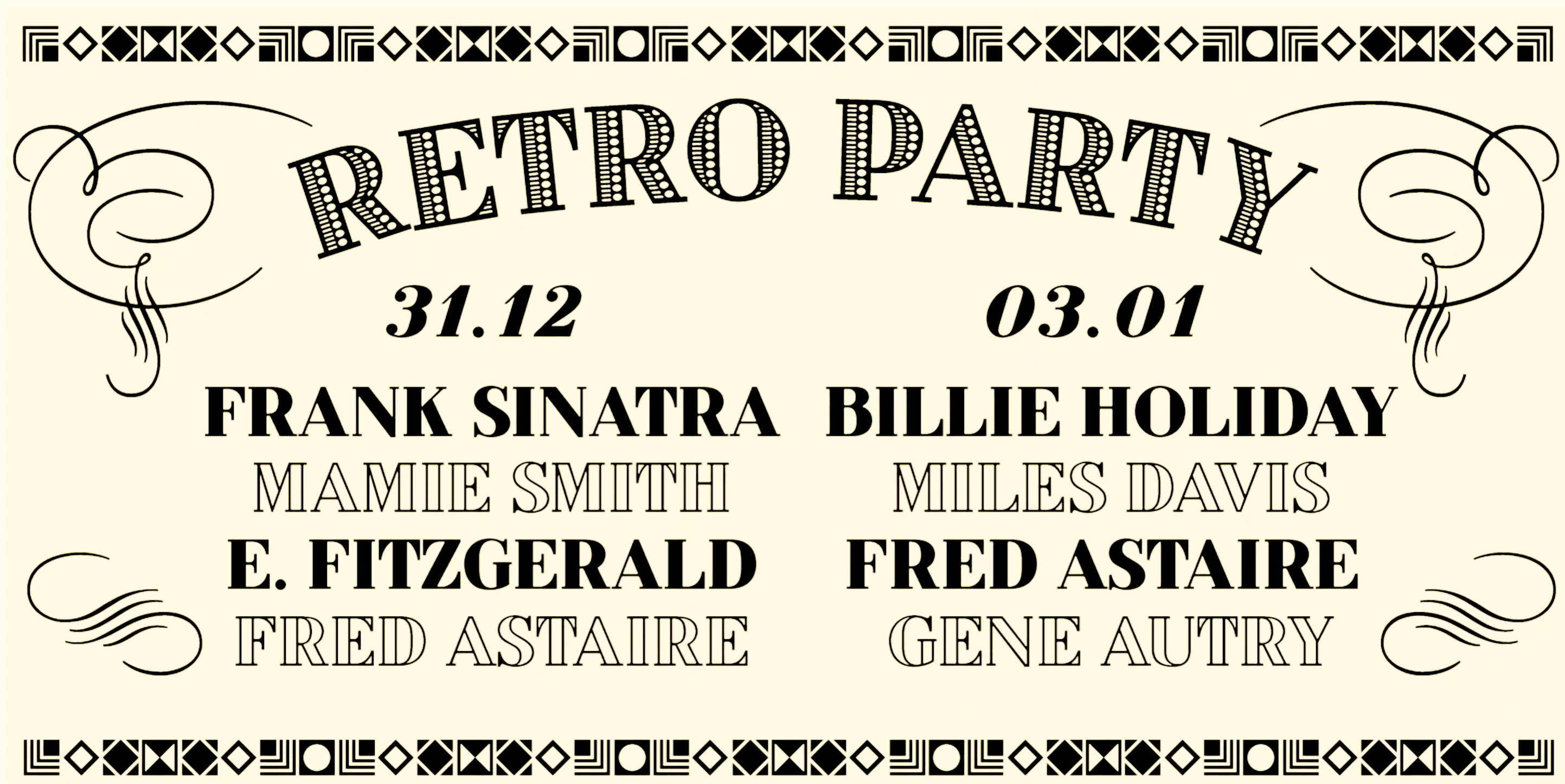
file name: Isabella Chaeva Titul 2020
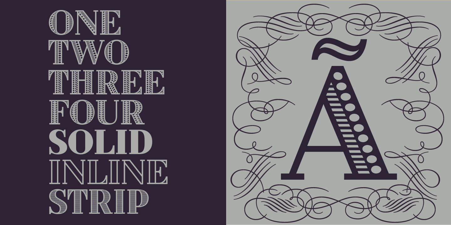
file name: Para Type Titul 2020 2
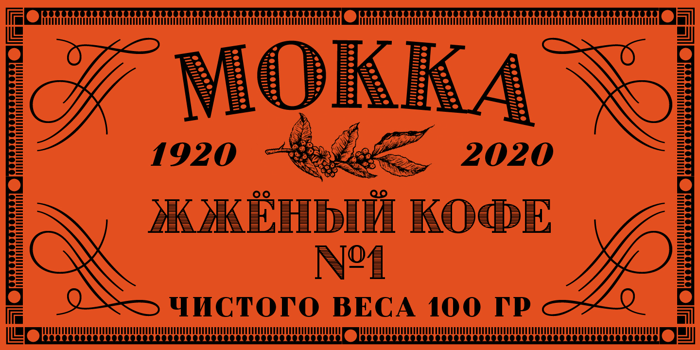
file name: Para Type Titul 2020 3
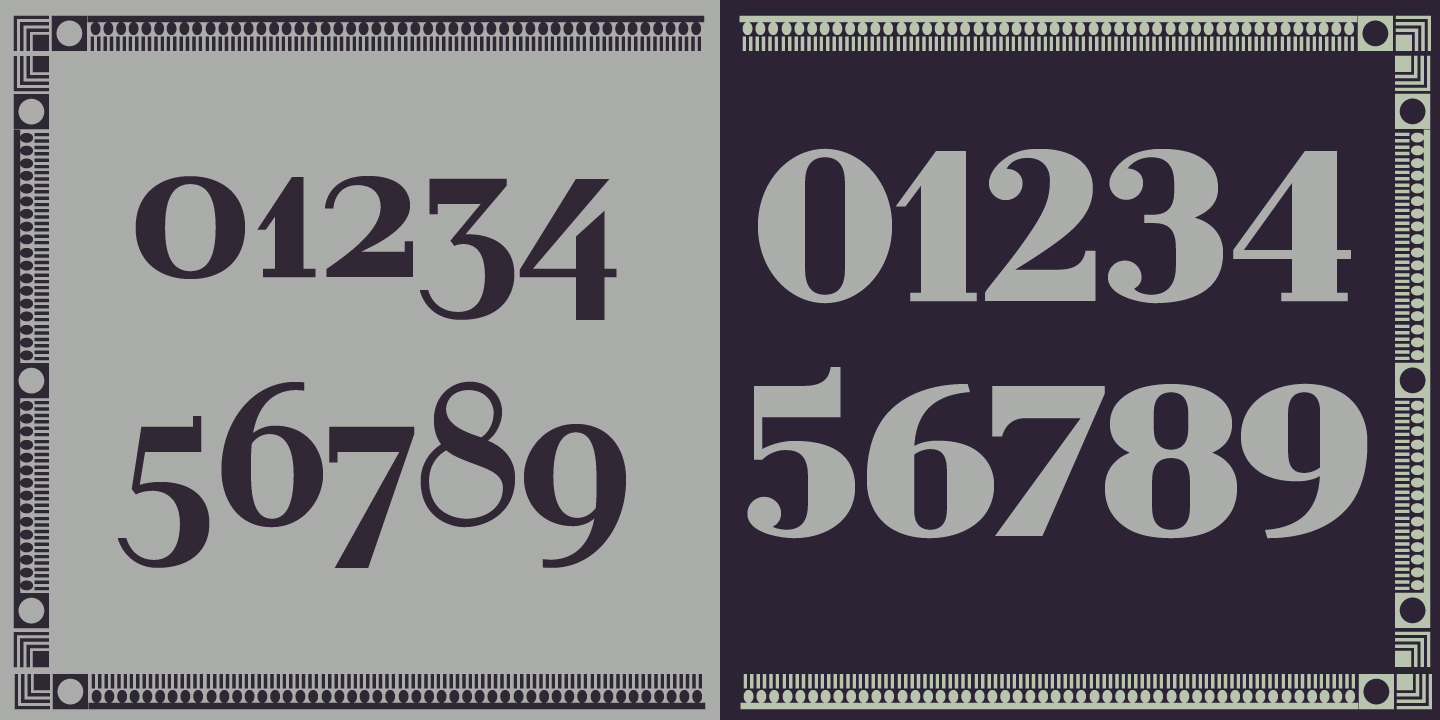
file name: Para Type Titul 2020 5

file name: Para Type Titul 2020

file name: Isabella Chaeva Reed 2020 358114

file name: Isabella Chaeva Reed Medium 2020
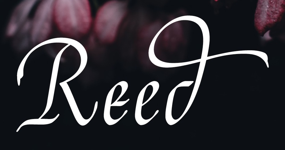
file name: Para Type Reed 2020 358118

file name: Para Type Reed 2020
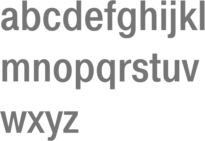
file name: Vladimir Yefimov Alexander Tarbeev Isabella Chaeva Pragmatica Cond Medium 1989
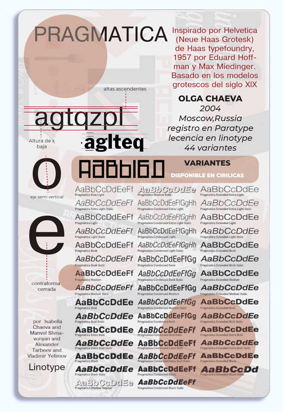
file name: Vladimir Yefimov Alexander Tarbeev Isabella Chaeva Pragmatica 1989 poster by Cristobal Maturena2019
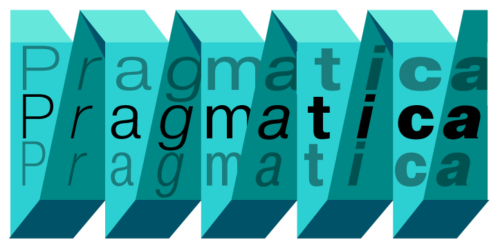
file name: Vladimir Yefimov Alexander Tarbeev Isabella Chaeva Pragmatica 1989
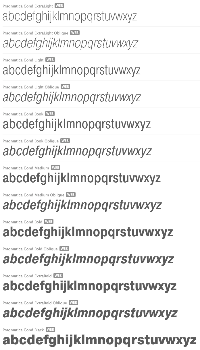
file name: Vladimir Yefimov Alexander Tarbeev Isabella Chaeva Pragmatica 1989b
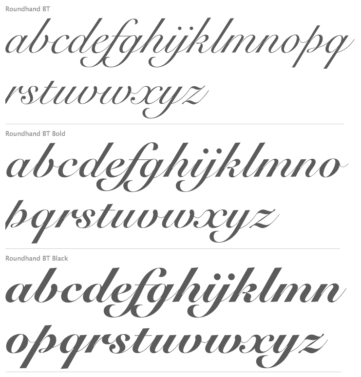
file name: Isabella Chaeva Vladimir Yefimov Roundhand B T Cyrillic 2013 after Matthew Carter Roundhand 1966

file name: Isabella Chaeva Vladimir Yefimov Roundhand B T Cyrillic 2013 after Matthew Carter Roundhand B T Black 1966
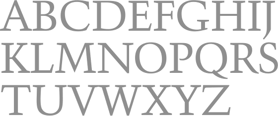
file name: Paratype Kuenstler480 2010
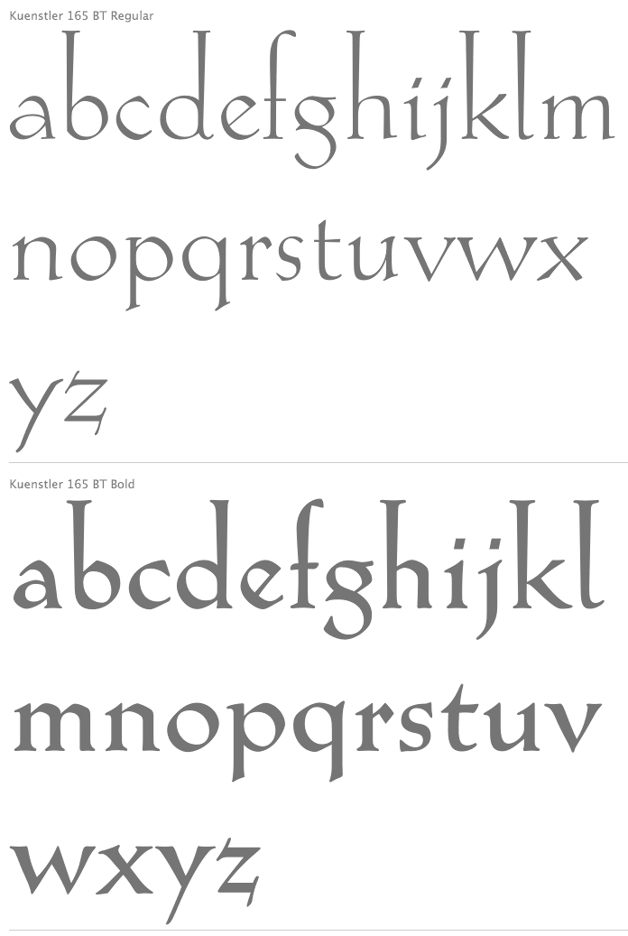
file name: Isabella Chaeva Kuenstler165 2008
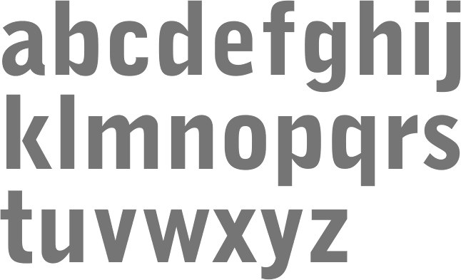
file name: Isabella Chaeva Bell Gothic Black 1999
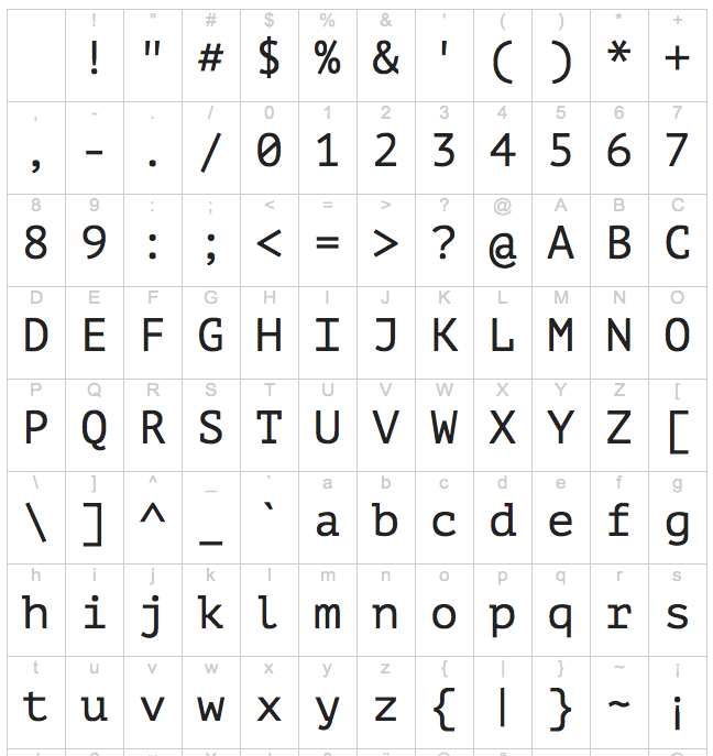
file name: Alexandra Korolkova Isabella Chaeva P T Mono 2012
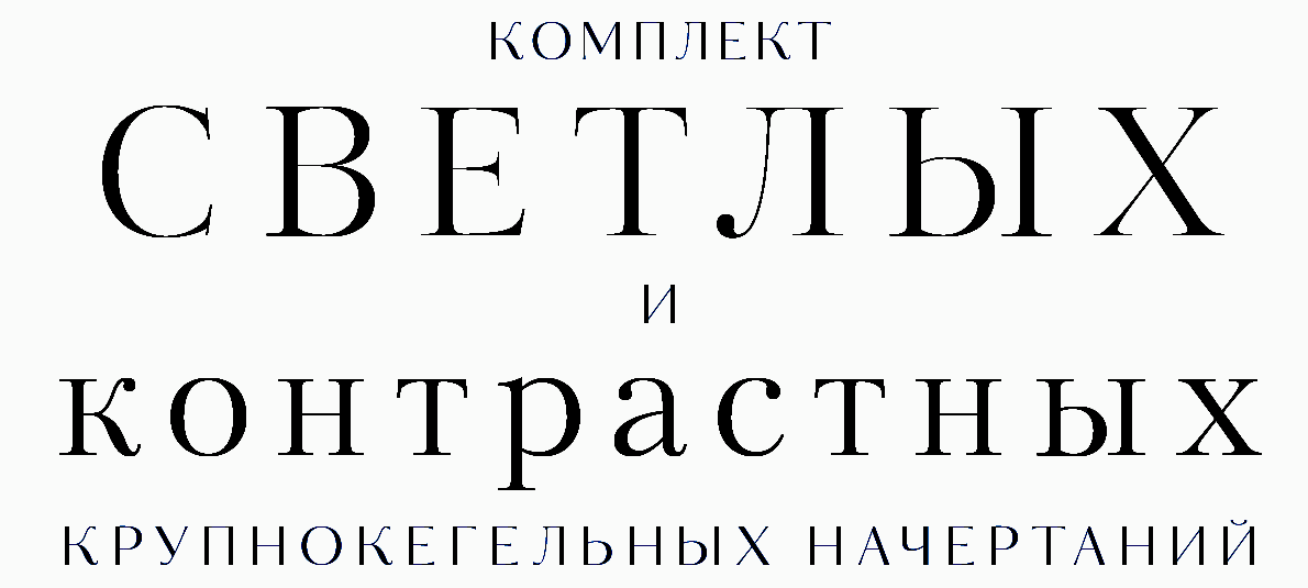
file name: Para Type Kudryashev Display 2015 188120
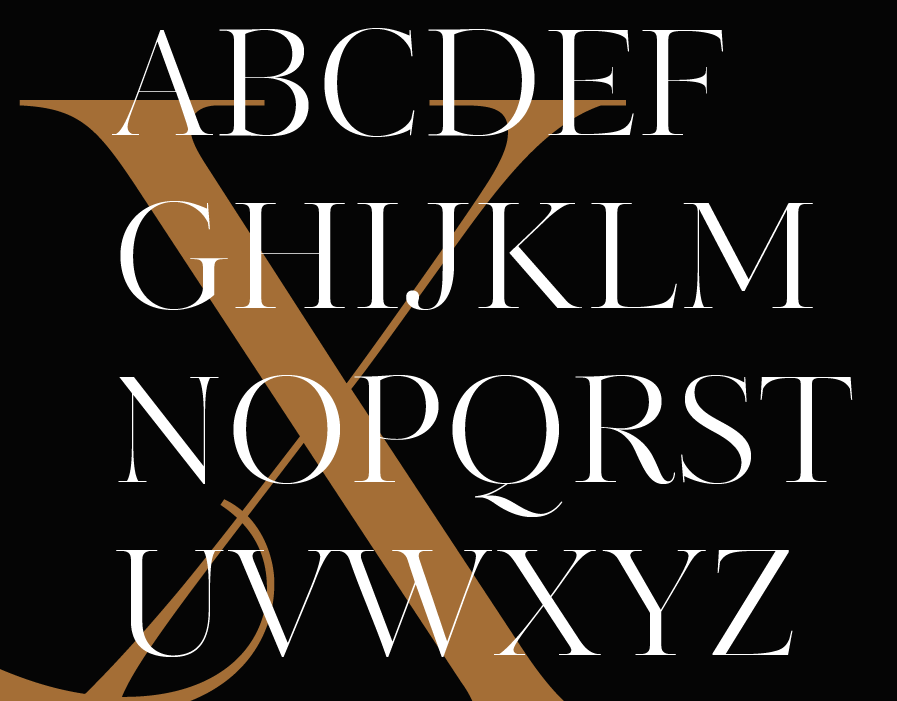
file name: Para Type Kudryashev Display 2015 188121
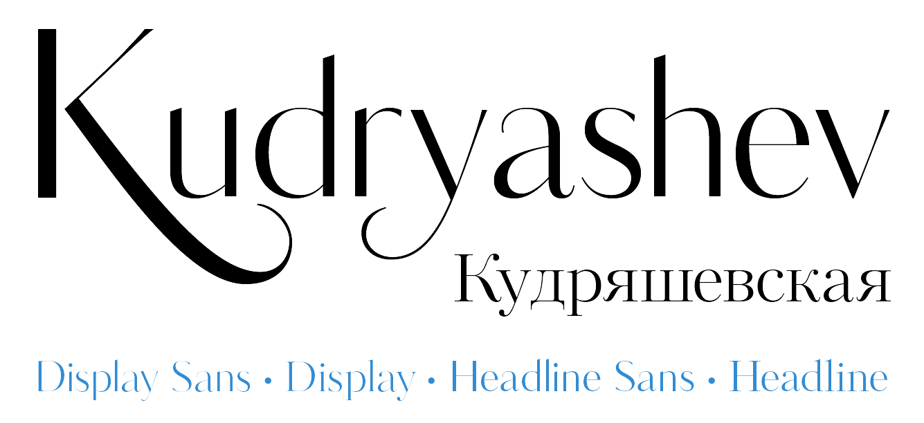
file name: Para Type Kudryashev Display 2015 188122
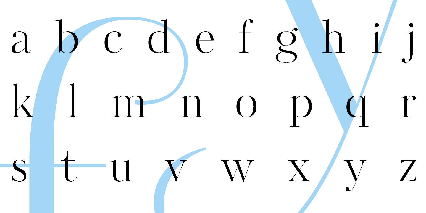
file name: Para Type Kudryashev Display 2015 188123
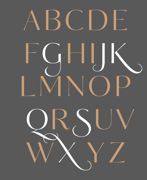
file name: Para Type Kudryashev Display 2015 188124

file name: Para Type Kudryashev Display 2015
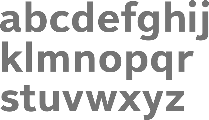
file name: Isabella Chaeva Yelena Tzaregorodtseva Emma Zakharova Textbook New Bold 2008
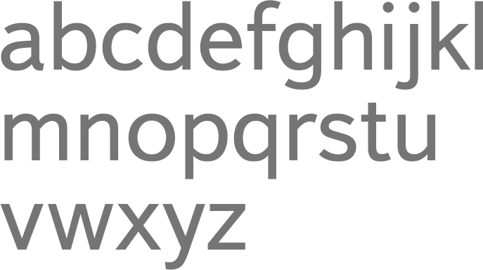
file name: Isabella Chaeva Yelena Tzaregorodtseva Emma Zakharova Textbook New Regular 2008
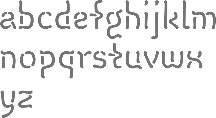
file name: Isabella Chaeva Vermicello 2007
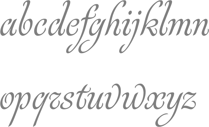
file name: Isabella Chaeva Rosabella 2011
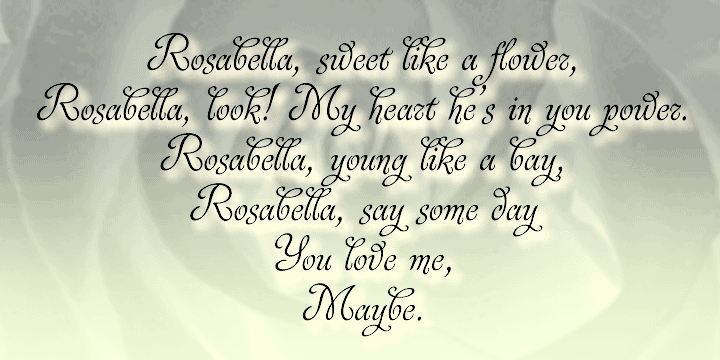
file name: Isabella Chaeva Rosabella 2011b

file name: Alexandra Korolkova Maria Selezeneva Isabella Chaeva Stem Text 2015
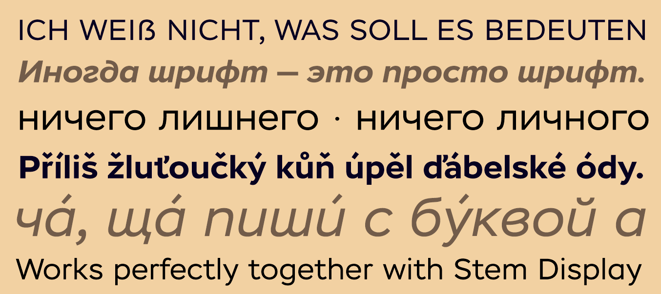
file name: Alexandra Korolkova Maria Selezeneva Isabella Chaeva Stem Text 2015 197212
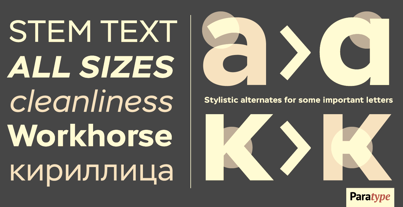
file name: Alexandra Korolkova Maria Selezeneva Isabella Chaeva Stem Text 2015 197213
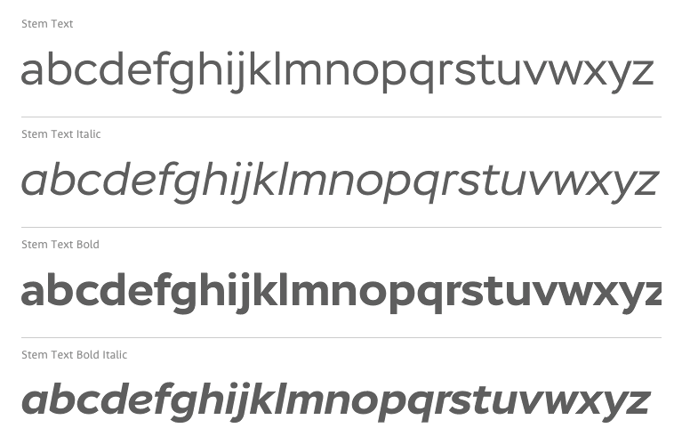
file name: Alexandra Korolkova Maria Selezeneva Isabella Chaeva Stem Text 2015b
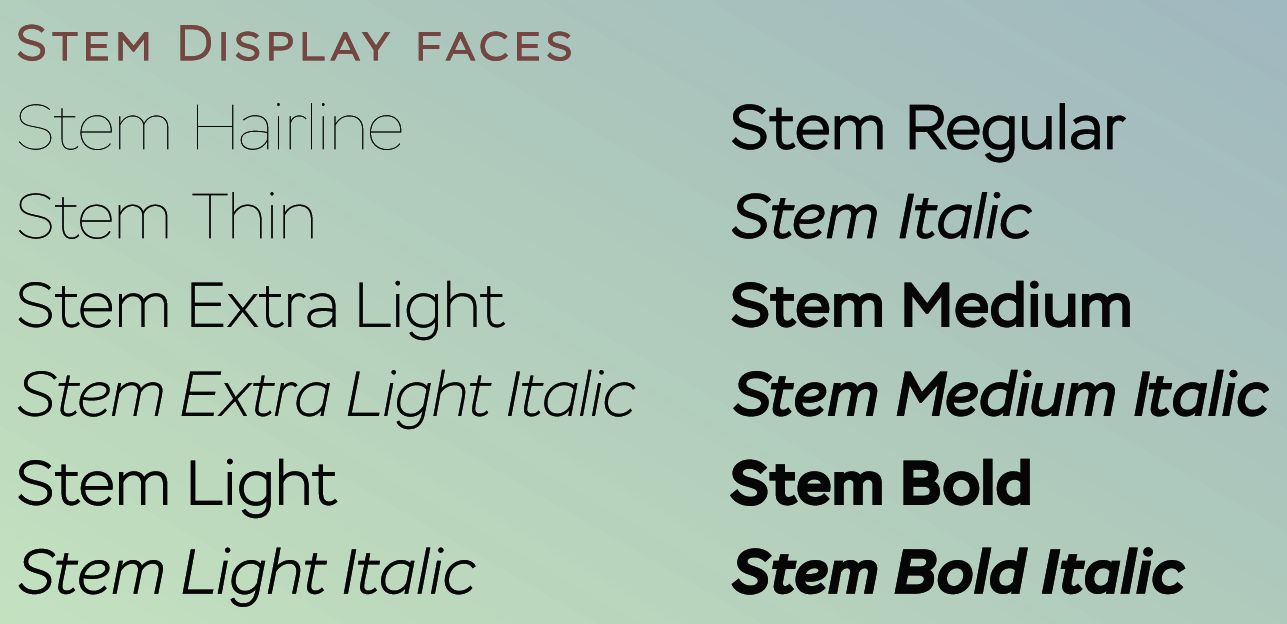
file name: Alexandra Korolkova Maria Selezeneva Isabella Chaeva Stem 2014
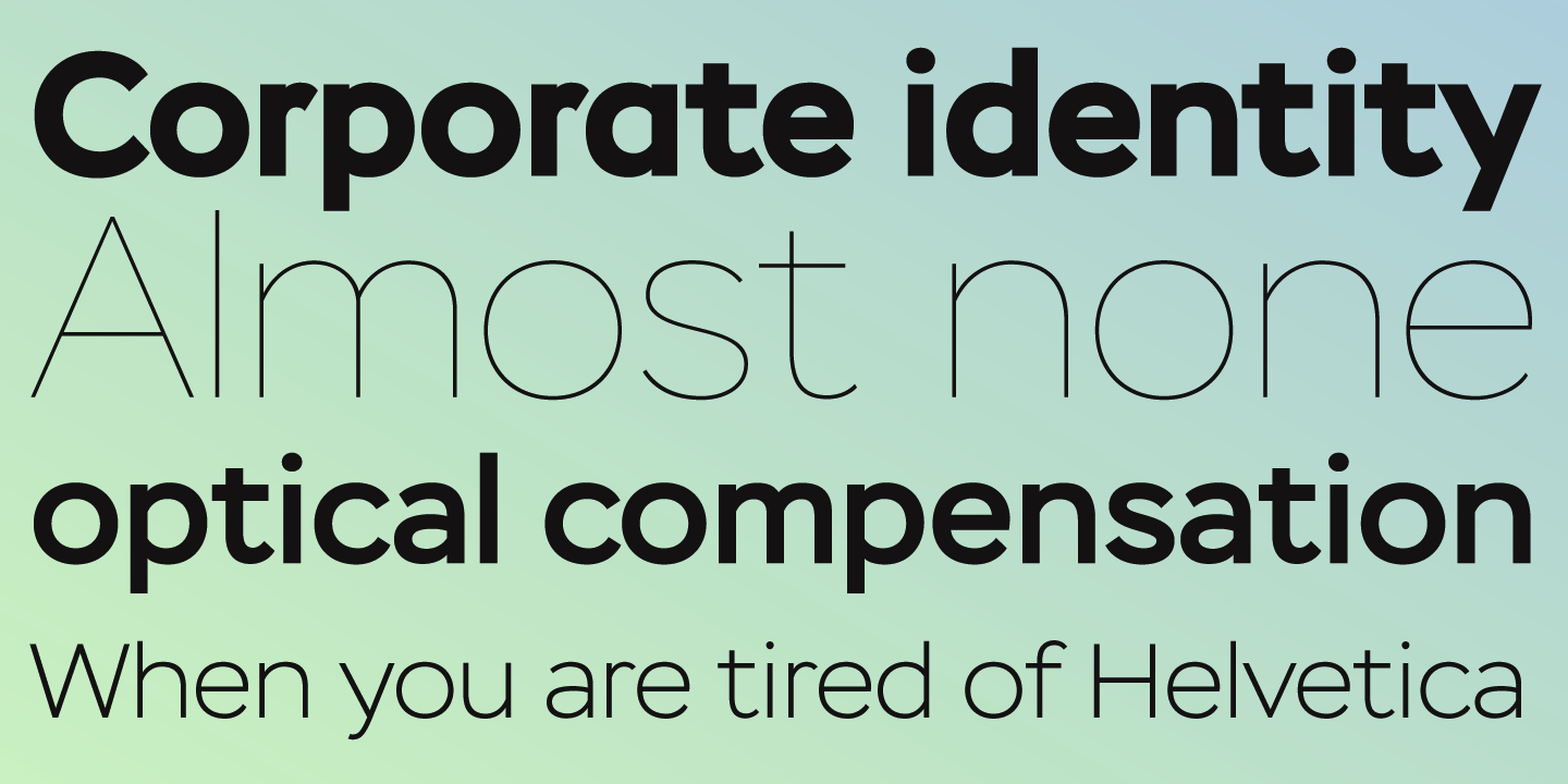
file name: Alexandra Korolkova Maria Selezeneva Isabella Chaeva Stem 2014b

file name: Alexandra Korolkova Maria Selezeneva Isabella Chaeva Stem Medium 2015

file name: Alexandra Korolkova Maria Selezeneva Isabella Chaeva Stem 2014c

file name: Alexandra Korolkova Maria Selezeneva Isabella Chaeva Stem 2014d

file name: Alexandra Korolkova Maria Selezeneva Isabella Chaeva Stem Hairline 2014
| | |
|
Luc Devroye ⦿ School of Computer Science ⦿ McGill University Montreal, Canada H3A 2K6 ⦿ lucdevroye@gmail.com ⦿ https://luc.devroye.org ⦿ https://luc.devroye.org/fonts.html |


