TYPE DESIGN INFORMATION PAGE last updated on Mon Jun 8 18:02:11 EDT 2026
FONT RECOGNITION VIA FONT MOOSE

|
|
|
|
Anatoliy Vasilyevich Shchukin
Russian type designer, b. 1906, Moscow, d. 1994, Moscow. He was also a graphic artist. He designed type and was project manager at VNII Polygraphmash. His typeface oeuvre either as a designer or project manager:
|
EXTERNAL LINKS |
| | |


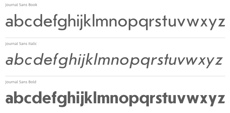
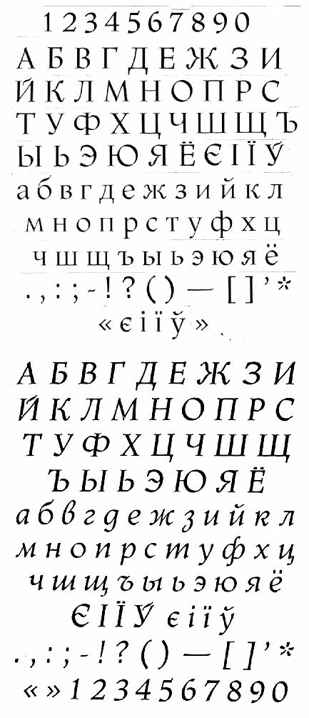
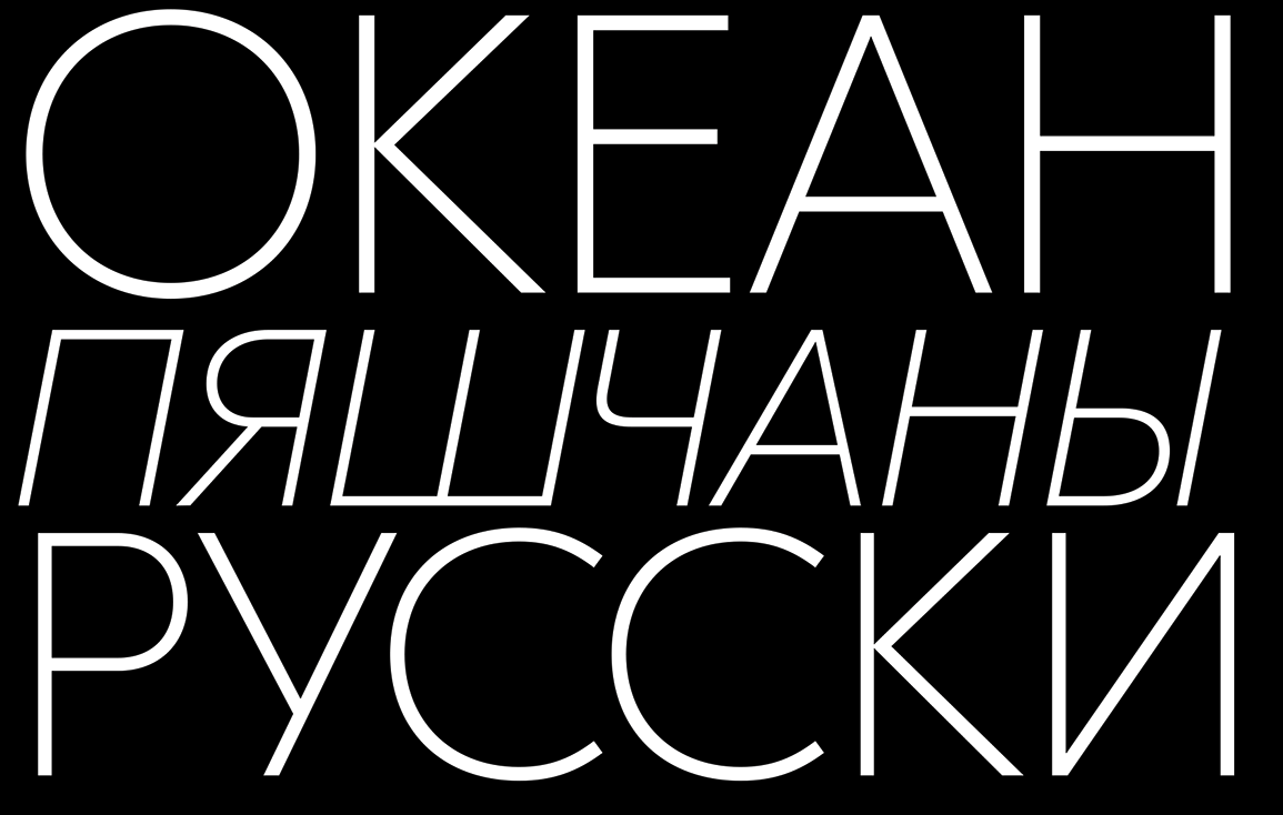
file name: Olexa Volochay Journal Sans 2014 based on Anatoly Shchukin Journal Sans 1940 1956
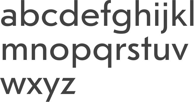
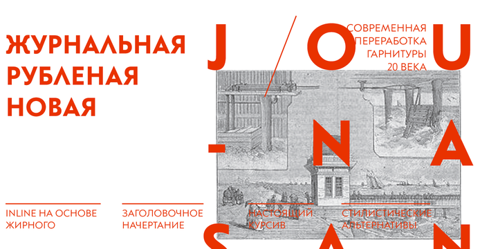
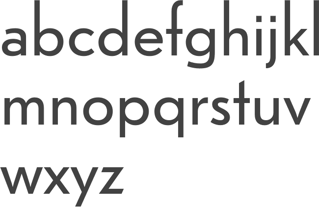
file name: Alexandra Korolkova Maria Selezeneva Journal Sans New 2014
file name: Alexandra Korolkova Maria Selezeneva Journal Sans New 2014a

file name: Alexandra Korolkova Maria Selezeneva Journal Sans New 2014b
file name: Alexandra Korolkova Maria Selezeneva Journal Sans New 2014c
file name: Alexandra Korolkova Maria Selezeneva Journal Sans New 2014d
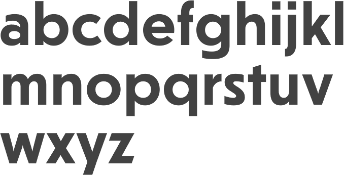
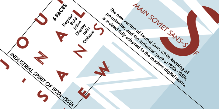
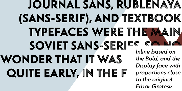
file name: Alexandra Korolkova Maria Selezeneva Journal Sans New Bold 2014
file name: Alexandra Korolkova Maria Selezeneva Journal Sans New Display 2014
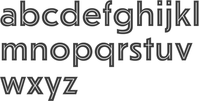
file name: Alexandra Korolkova Maria Selezeneva Journal Sans New Inline 2014
file name: Anatoliy Shchukin Titling 1967

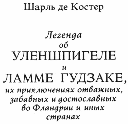
file name: Literaturnaya 1996 L Kuznetsova 1937original by A Shchukin T Breyev G Bannikova
file name: Anatoliy Shchukin Ladoga original

file name: Viktor Kharyk Ladoga Display 2006 2010

file name: Viktor Kharyk Ladoga Text 2006 2010
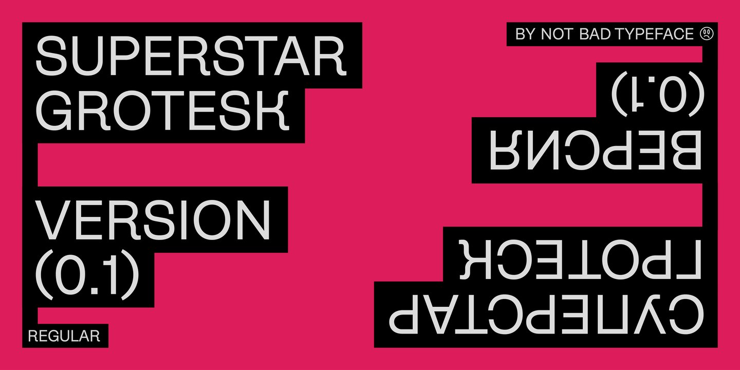
file name: Not Bad Typeface Superstar Grotesk 2022 1
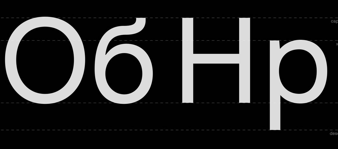
file name: Not Bad Typeface Superstar Grotesk 2022 3
file name: Not Bad Typeface Superstar Grotesk 2022 4
file name: Not Bad Typeface Superstar Grotesk 2022 5

file name: Not Bad Typeface Superstar Grotesk 2022

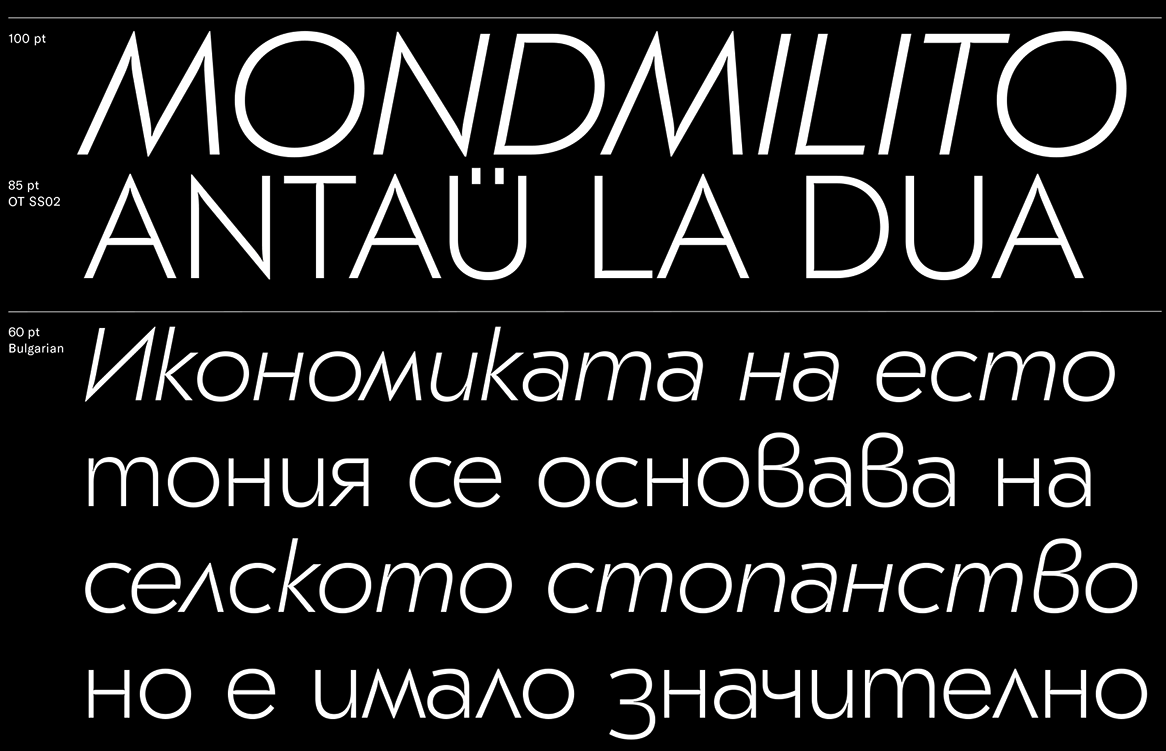
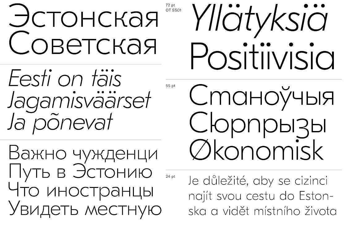
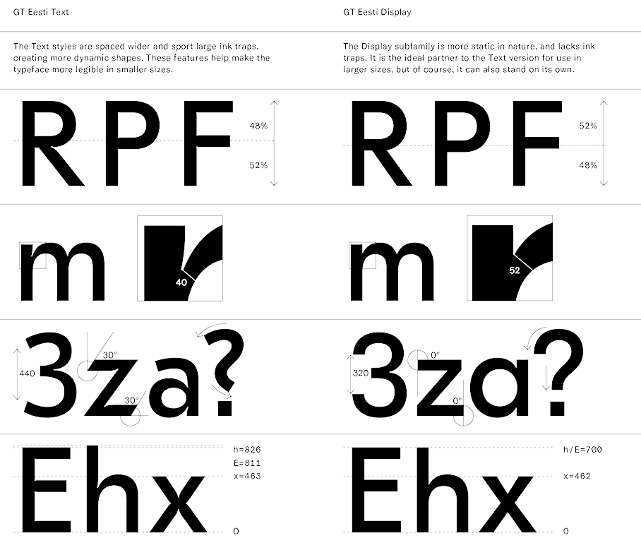
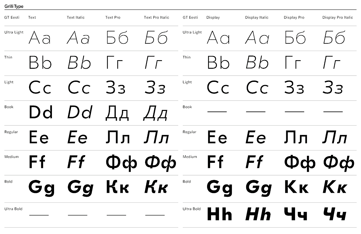
file name: Reto Moser G T Eesti 2015 2016 after Anatoly Shchukin Zhurnalnaya Rublennaya

file name: Reto Moser G T Eesti 2015 2016 after Anatoly Shchukin Zhurnalnaya Rublennaya
file name: Reto Moser G T Eesti 2015 2016 after Anatoly Shchukin Zhurnalnaya Rublennaya
file name: Reto Moser G T Eesti 2015 2016 after Anatoly Shchukin Zhurnalnaya Rublennaya

file name: Reto Moser G T Eesti 2015 2016 after Anatoly Shchukin Zhurnalnaya Rublennaya
file name: Reto Moser G T Eesti 2015 2016 after Anatoly Shchukin Zhurnalnaya Rublennaya
file name: Reto Moser G T Eesti 2015 2016 after Anatoly Shchukin Zhurnalnaya Rublennaya
file name: Reto Moser G T Eesti 2015 2016 after Anatoly Shchukin Zhurnalnaya Rublennaya
file name: Reto Moser G T Eesti 2015 2016 after Anatoly Shchukin Zhurnalnaya Rublennaya
file name: Reto Moser G T Eesti 2015 2016 after Anatoly Shchukin Zhurnalnaya Rublennaya

file name: Reto Moser G T Eesti 2015 2016 after Anatoly Shchukin Zhurnalnaya Rublennaya
| | |
|
Luc Devroye ⦿ School of Computer Science ⦿ McGill University Montreal, Canada H3A 2K6 ⦿ lucdevroye@gmail.com ⦿ https://luc.devroye.org ⦿ https://luc.devroye.org/fonts.html |