|
George F. Trenholm
American type designer (b. Cambridge, MA, 1886, d. Weston, MA, 1958). He designed Nova Script at Intertype in 1937. Other typefaces: Cornell (incl. Italic), Egmont Decorative Initials, Georgian Cursive, Trenholm Old Style&Cursive, Trenholm-Bold, Trenholm-Shaded Capitals, Waverly (incl. Italic). Some of his ornaments that appeared in ATF catalogs were digitized in American Pi NF (2006, Nick Curtis). Nova Script Recut One&Two (2011, Jim Spiece) revives Nova Script. Mac McGrew writes: - Cornell is an original, contemporary roman typeface of distinctive character. designed for Intertype by George Trenholm, who was typeface design coun- selor for that company. The roman and italic were introduced in 1948, with Cornell Bold in 1955.
- Georgian Cursive is a script typeface designed by George F. Trenholm in 1934; it was cast by Machine Composition Company in Boston in one size. It has some resemblance to Coronet and to Trafton Script, but is a little less formal; letters do not connect.
- Trenholm is an oldstyle type family designed by George F. Trenholm, Boston artist and designer, for BB&S. That company's specimen book of 1925 shows the series as being in preparation, but it was 1927 before the roman and bold were advertised as being completed, and at that time the Cursive was still being cut. In 1928 the Shaded Capitals were still listed as being cut. In 1929 BB&S was merged with ATF, and no evidence that this series was cast by ATF after that time has been found, although matrices were later listed in ATF's vaults. The roman and bold were rather conventional oldstyle designs, with sharply inclined serifs on the top of lowercase strokes, but no great distinction. The cursive was a mixture of that and italic, with no serifs at the top of ascenders. Cursive caps were distinctly that, and the shaded capitals even more so. Perhaps the series would have been successful if it had been available for a longer time, but it quickly became a rarity.
- Nova Script was designed by George F. Trenholm in 1937 for Intertype. It is a monotone cursive design, with narrow lowercase and unusual capitals. and has small serifs on some of the letters. The inclination is slight, to keep it within the limitations of straight matrices, and it was made only in one size. Compare Camera, Card Italic.
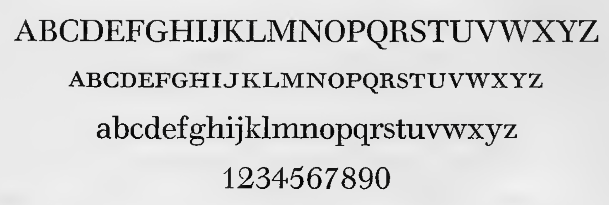
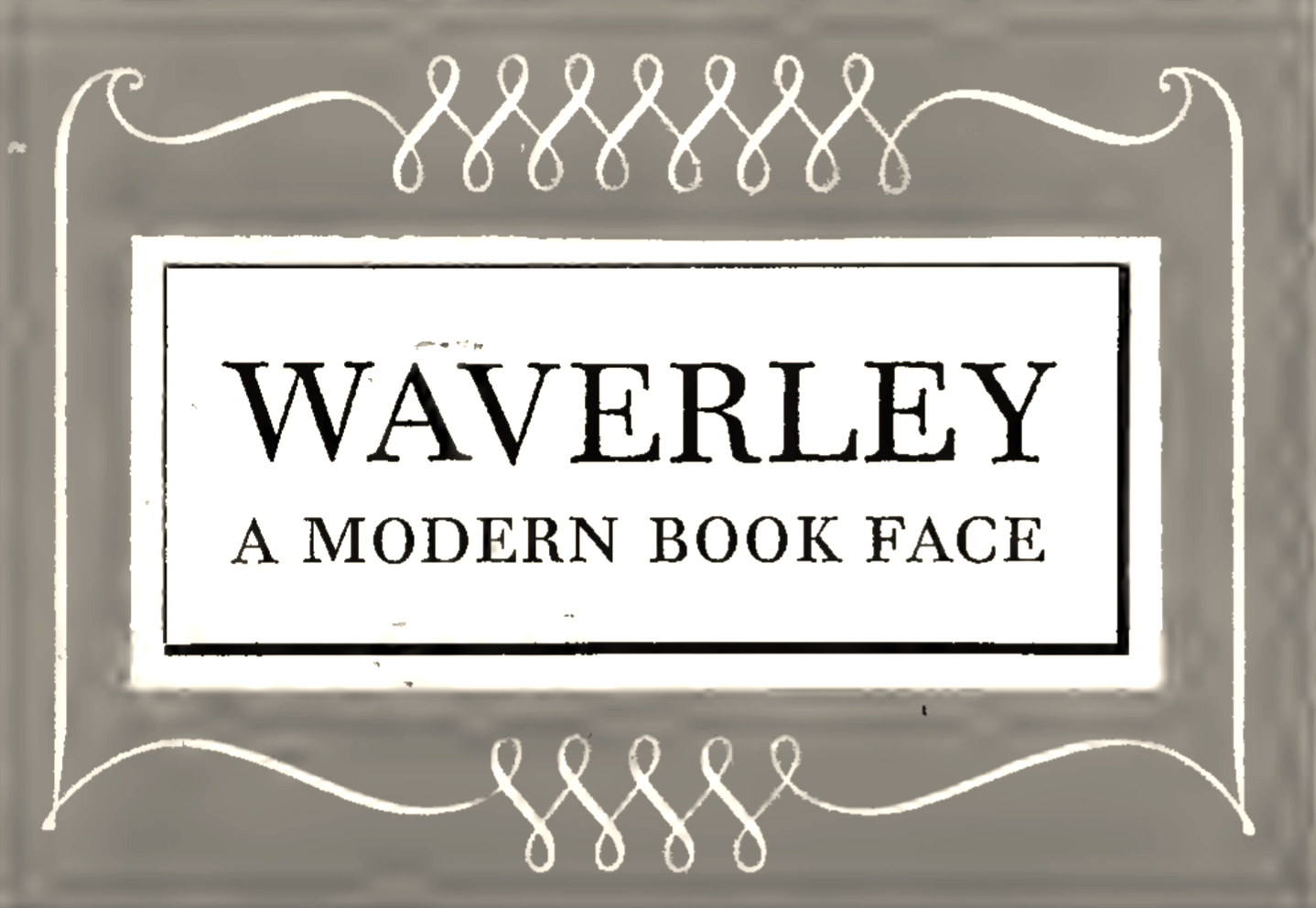
- Waverley was drawn by George Trenholm and introduced by Intertype 1 in 1940 as a modern roman that is less severe than Bodoni. It is derived from Walbaum, from the Berthold foundry in Germany, but is not a close copy. Alternate characters available include long descenders, oldstyle figures, a slightly descending cap J, and a K with a curved taillike the R. There are also several swash capitals for the italic. Compare Baskerville, Bell, Bodoni, Caledonia, Clarion, Scotch Roman.
Klingspor link.
|
EXTERNAL LINKS
George F. Trenholm
 [Designer info] [Designer info]
Klingspor Museum page
MyFonts search
Monotype search
Fontspring search
Google search
INTERNAL LINKS
Type designers ⦿
Type designers ⦿
Type scene in Massachusetts ⦿
Nick Curtis ⦿
Modern style [Bodoni, Didot, Walbaum, Thorowgood, Computer Modern, etc.] ⦿
|