|
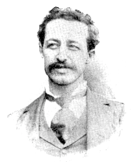
Nicholas Joseph Werner
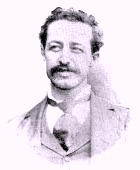
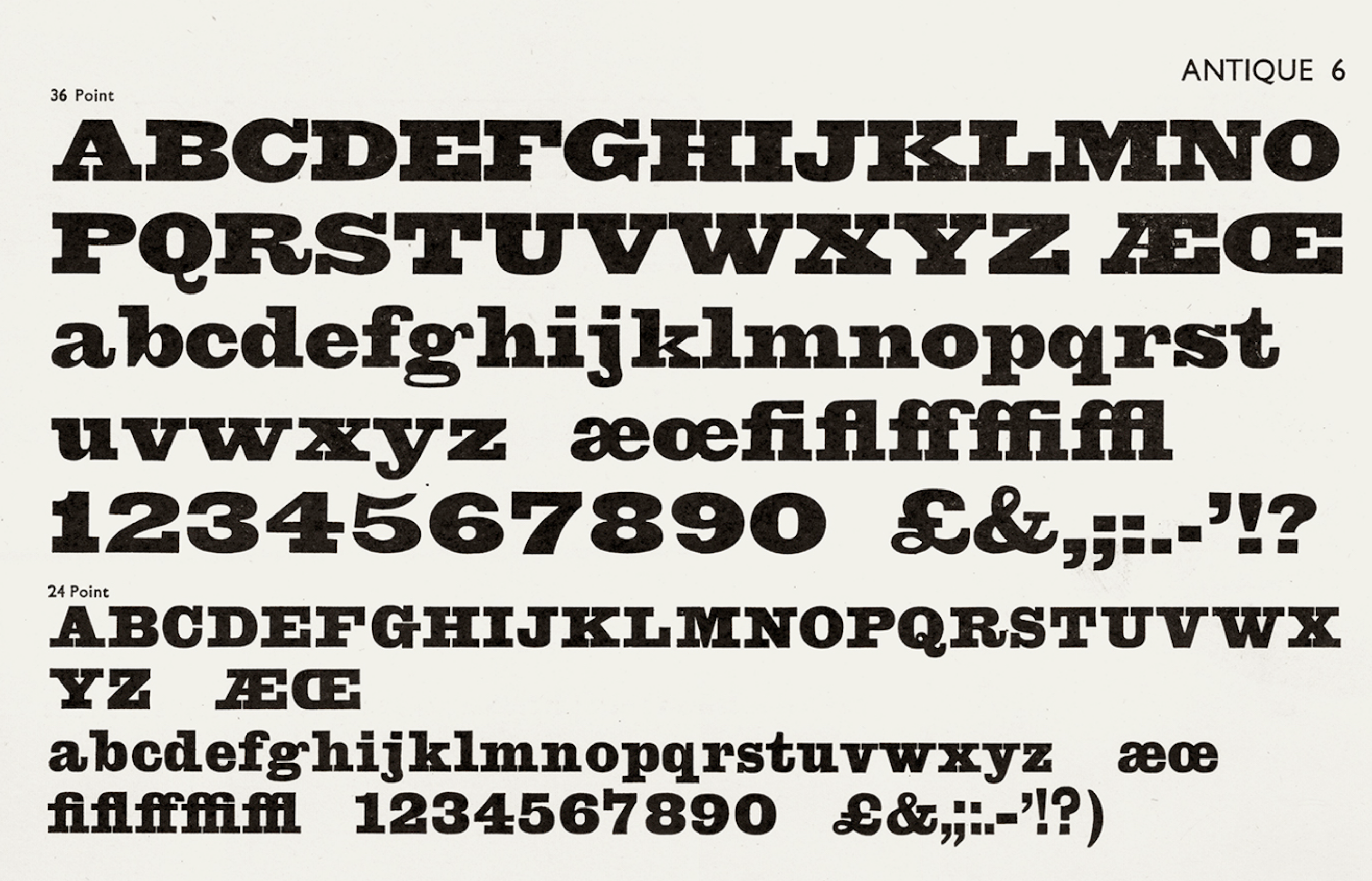
Born in Belleville, IL, in 1858. He died in 1940. Typefounder, author, artist, editor and printer, all in one. Involved at some point with the Inland Type foundry and the Central Type Foundry. His typefaces: - Antique No. 6 (ca. 1883, Inland Type Foundry).
- Avil (1904, Inland Type Foundry).
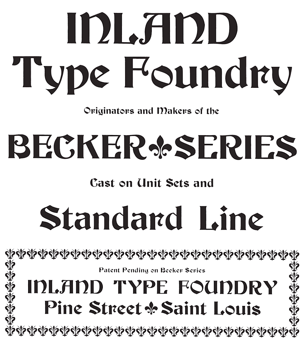
- Becker Series (1899, Inland Type Foundry), blackletter face.
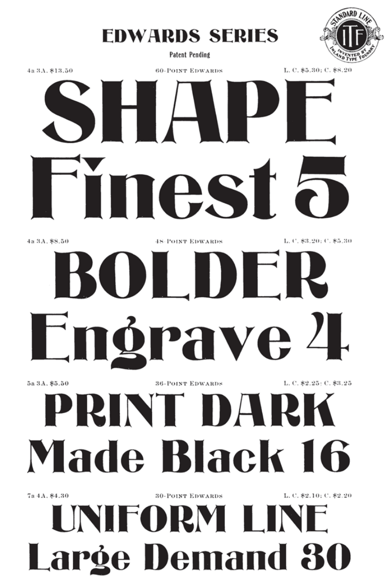
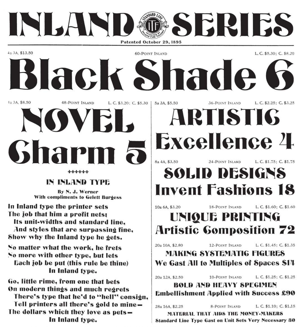
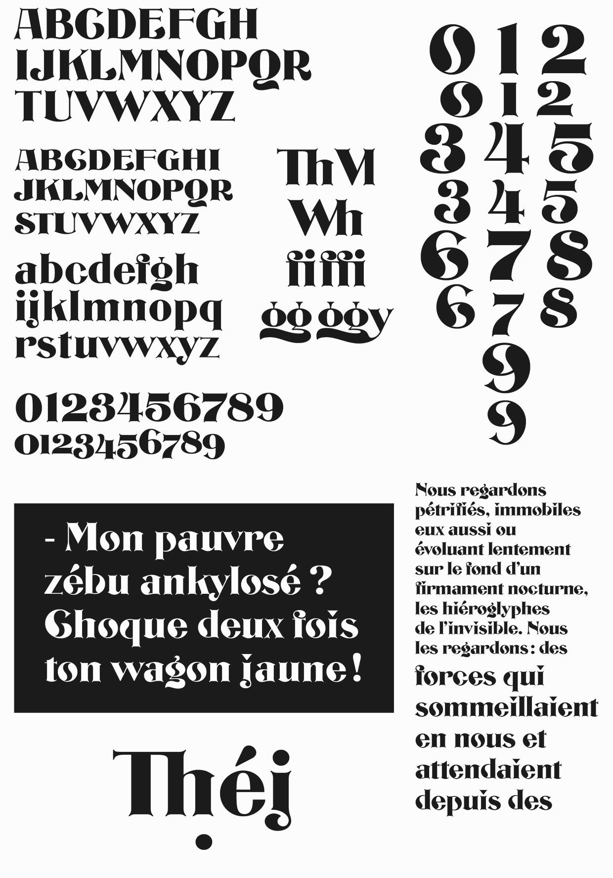
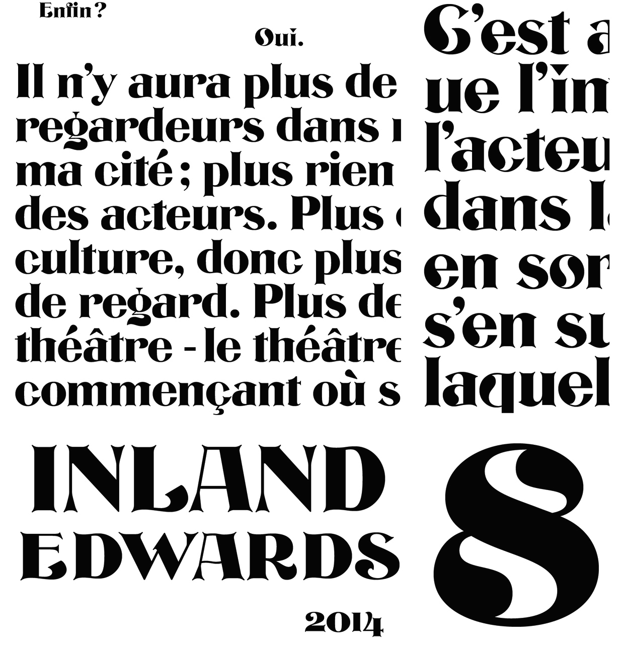
- Bizarre Bold (1895, Inland Type Foundry) oe Edwards (the original name) or Inland Series. This typeface adds many Victorian or steampunk elements to a didone skeleton. McGrew says: It was renamed, most appropriately, by BB&S in 1925 after that foundry took over Inland. A companion typeface called Inland, by the same designer, was produced at the same time using some of the same characters but with even more unusual twists to others. Compare Francis. In 2010, Claude Pelletier made two digital versions, called Bizarre and Bizarrerie. Vivien Gorse (Toulouse, France) revived Inland Series in 2014-2015.
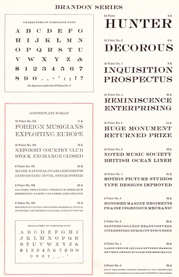
- Brandon (1898, Inland Type Foundry): According to McGrew, "a thick-and-thin title face, similar to Engravers Roman, named for a printer in Nashville, Tennessee. Like a number of other such typefaces, it has no lowercase but was cast in several sizes on each of several bodies so numerous cap-and-small-cap combinations could easily be made. This style was popular for stationery and business forms. Hansen called the typeface Plate Roman. On Linotype and Intertype Bold Face No.9 is essentially the same typeface but a little narrower; typesetters not infrequently call it Engravers Roman. There was also a Brandon Gothic, cut only in two small 6-point sizes, which was similar to Combination Gothic, but with a letterspaced effect."
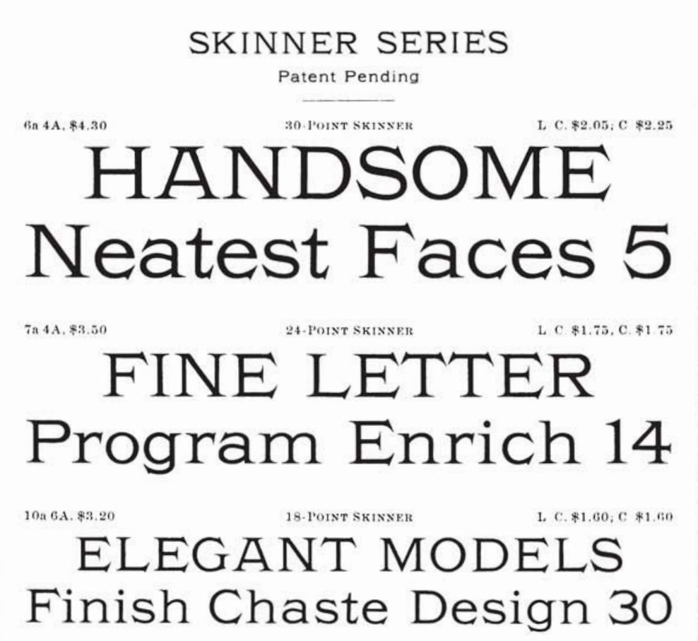
- Bruce Title / Menu Roman / Skinner: McGrew reports that Menu Roman is the BB&S rename, for the 1925 specimen book, of Skinner, which was shown by Inland Type Foundry about 1885, and ascribed to John K. Rogers as well as to Nicholas J. Werner. Menu Title, formerly Lining Menu, was Inland's Bruce Title, by Werner. Menu Shaded was Acme, designed in 1886 or earlier. The latter has only a very general relationship to the other typefaces which are nearly monotone, with long serifs tapering to sharp points. Compare Paragon.
- Caxton Bold (Marder, Luse). Codesigned with William F. Capitain.
- Central Lining Antique (ca. 1892, Central Type Foundry).
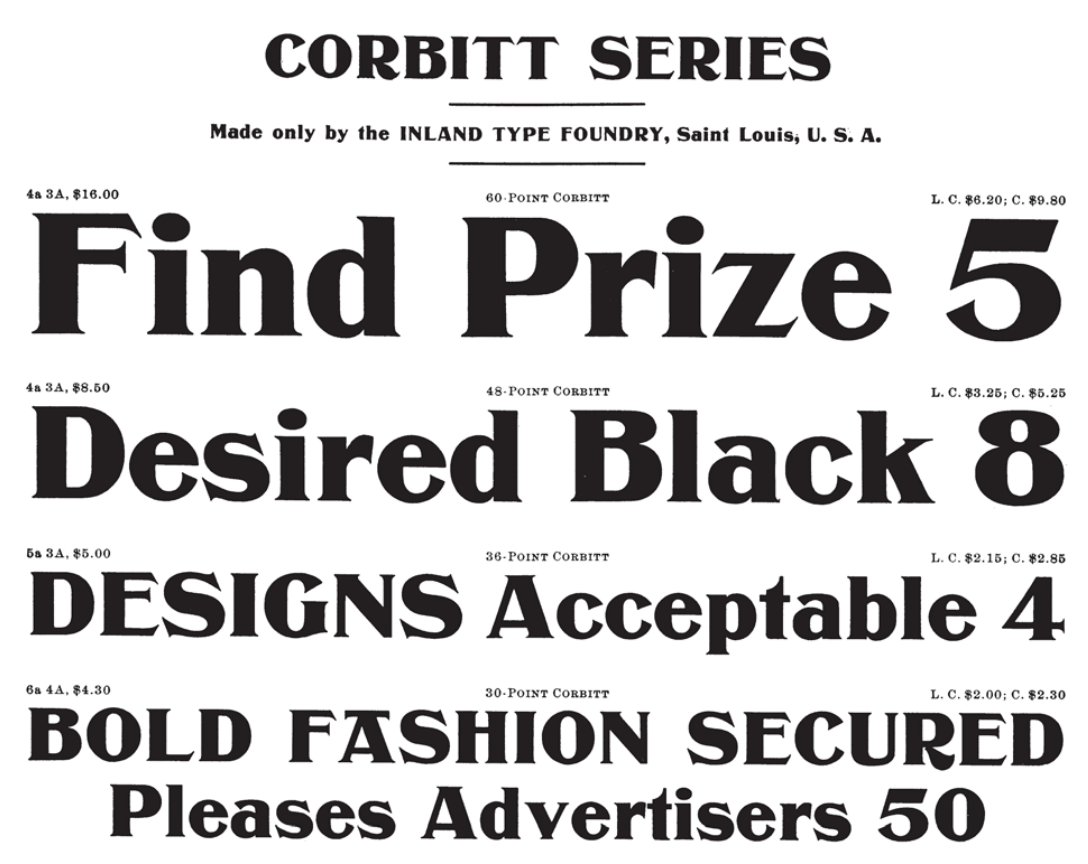
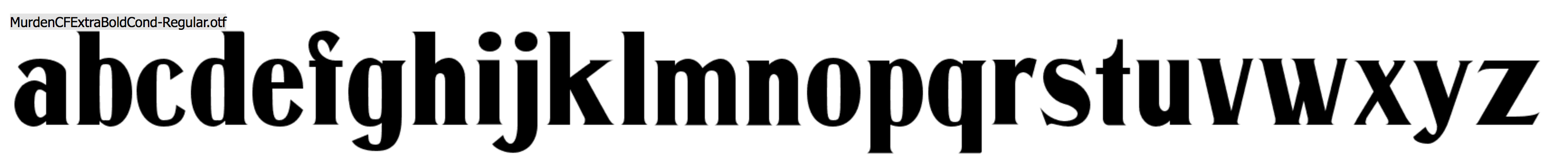
- Corbitt (1900, Inland): McGrew states [...] a heavy, thick-and-thin typeface with tiny serifs [...] Although still showing many of the quaint design details of nineteenth-century types, it is somewhat more mature. Condensed Corbitt was advertised by Inland in 1902 as their "latest addition." Both versions were cast by ATF after Inland merged with that foundry in 1911, but only the Condensed seems to have survived until matrices were inventoried in 1930. Digital revival by Chuck Mountain in 2020 as Murden CF.
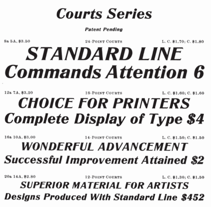
- Courts (1900, Inland): later renamed DeVinne Recut Italic.
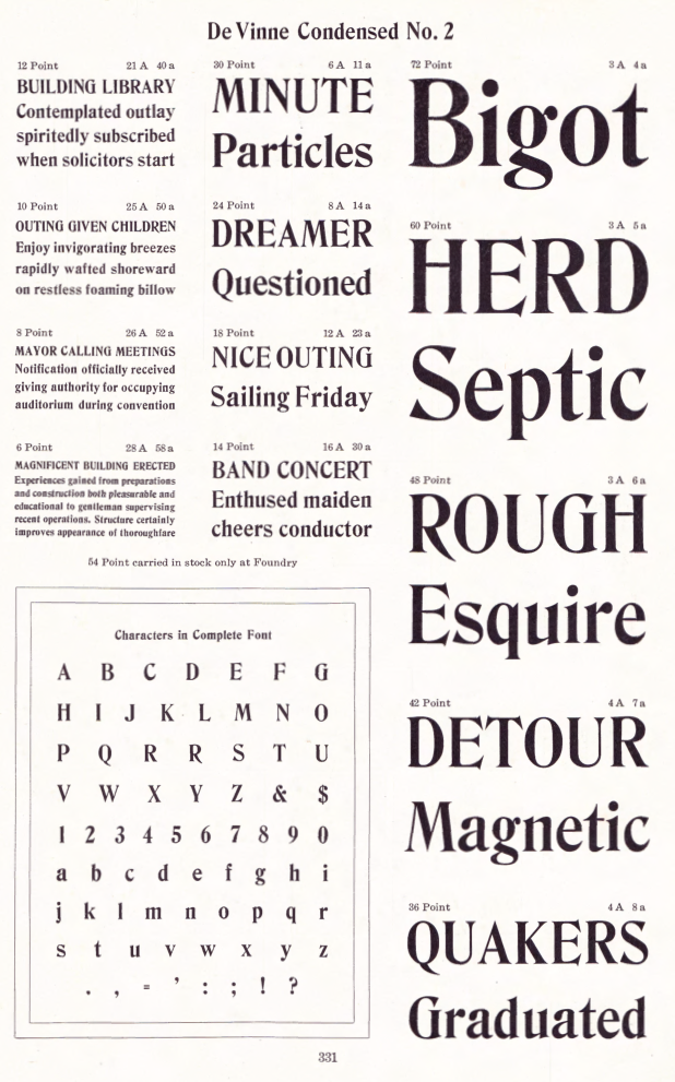
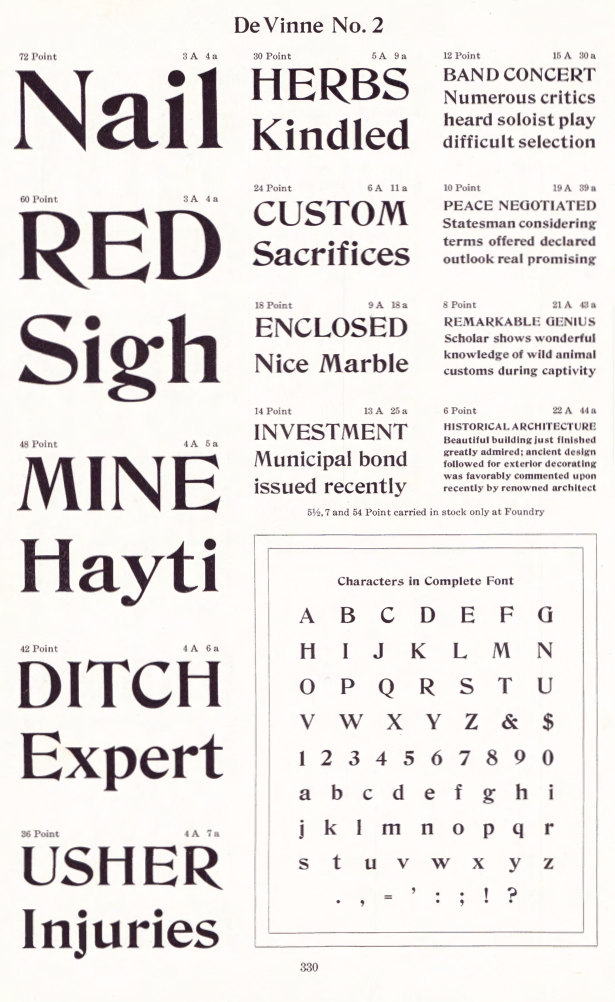
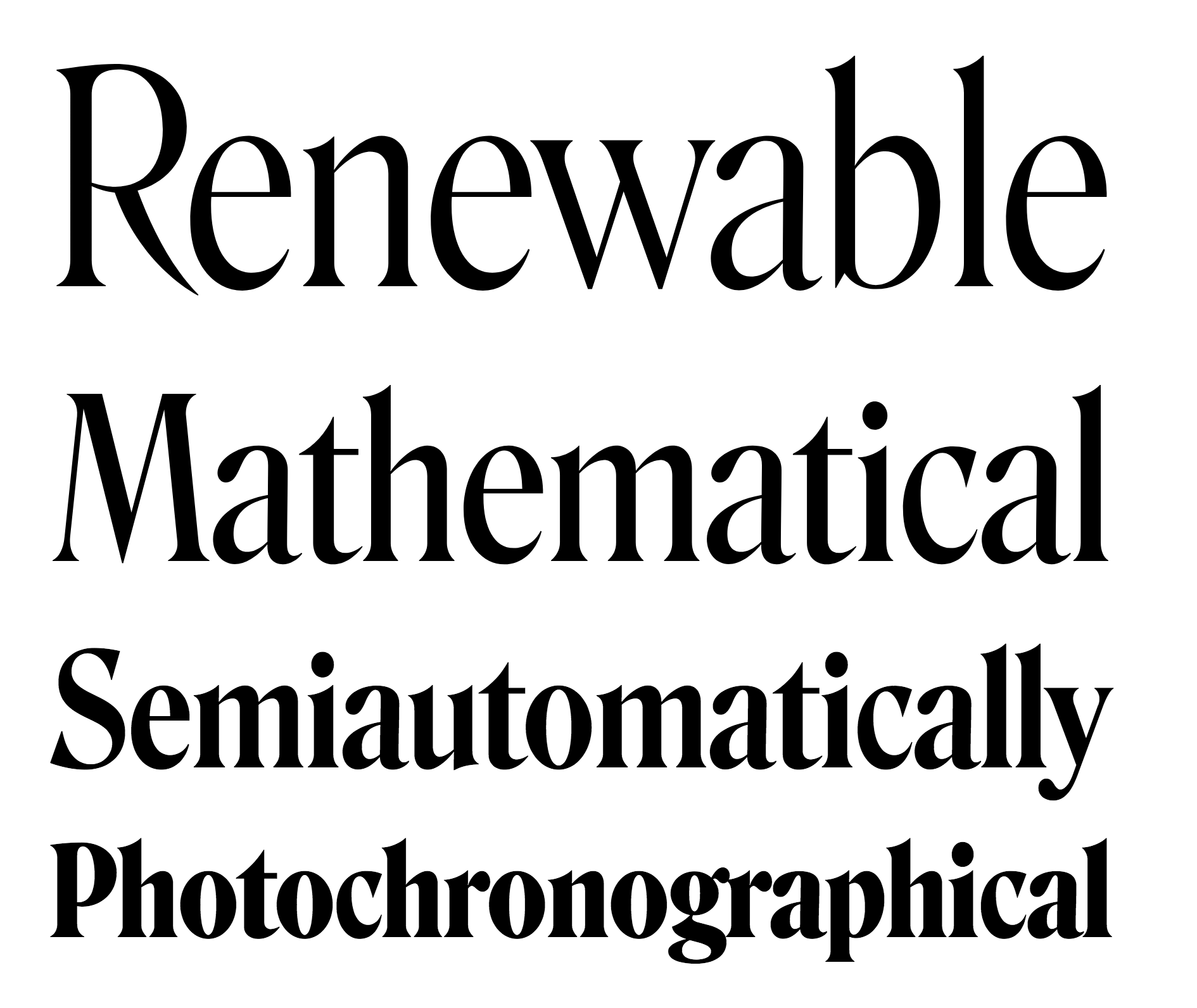
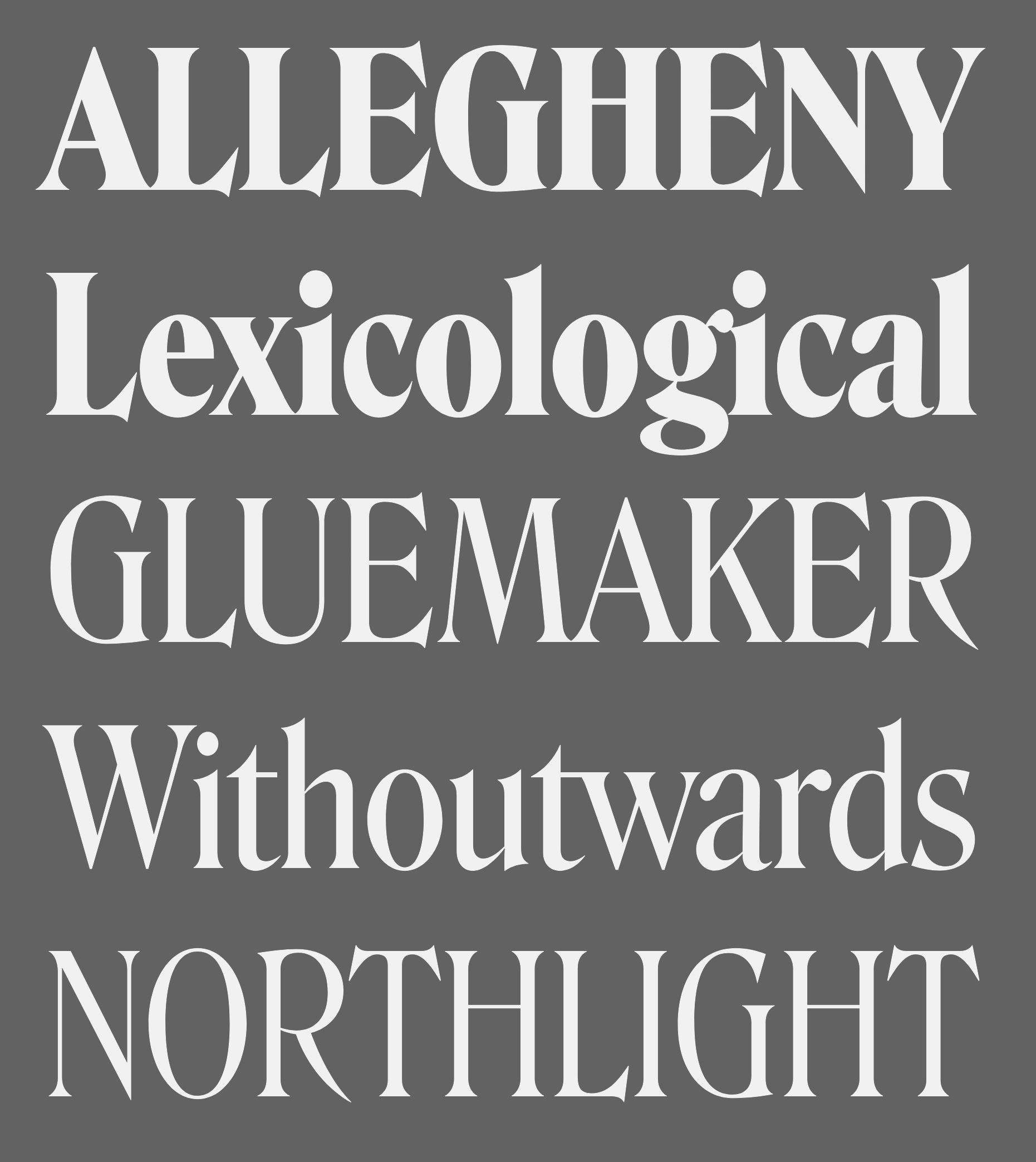
- De Vinne: McGrew writes about this: DeVinne, the display face, is credited with bringing an end to the period of overly ornate and fanciful display typefaces of the nineteenth century, and with restoring the dignity of plain roman types. It is derived from typefaces generally known as Elzevir or French Oldstyle (q.v.). DeVinne says of it, "This typeface is the outcome of correspondence (1888-90) between the senior of the De Vinne Press (meaning himself) and Mr. J. A. St. John of the Central Type Foundry of St. Louis, concerning the need of plainer types of display, to replace the profusely ornamented types in fashion, of which the printers of that time had a surfeit. The DeVinne Press suggested a return to the simplicity of the true old-style character, but with the added features of thicker lines and adjusted proportion in shapes of letters. Mr. St. John approved, but insisted on grotesques to some capital letters in the belief that they would meet a general desire for more quaintness. Mr. Werner of the Central Type Foundry was instructed to draw and cut the proposed typeface in all sizes from 6- to 72-point, which task he executed with great ability. "The name given to this typeface by Mr. St. John is purely complimentary, for no member of the DeVinne Press has any claim on the style as inventor or designer. Its merits are largely due to Mr. Werner; its few faults of uncouth capitals. ..show a desire to please eccentric tastes and to conform to old usage. The new typeface found welcome here and abroad; no advertising typeface of recent production had a greater sale. Thus De Vinne himself credits the typeface to Central Type Foundry and its design to Nicholas J. Werner, but Werner says, "To correct the general impression that Theodore L. De Vinne was the designer of the typeface named after him, I would state that it was the creation of my partner, Mr. (Gustav) Schroeder." The design was patented under Schroeder's name in 1893. Central was part of the merger that formed American Type Founders Company in 1892, but continued to operate somewhat independently for a few more years. Meanwhile, DeVinne was copied by Dickinson, BB&S, Hansen, and Keystone foundries, and perhaps others-in fact, Keystone advertised that it patented the design in 1893, Connecticut Type Foundry copied it as Saunders, and Linotype as Title No.2. Dickinson called it "a companion series to Howland" (q.v.). When Monotype developed an attachment in 1903 to cast display sizes, DeVinne was the first type shown in their first announcement. Later ATF specimens showed this typeface and several derivatives as DeVinne No.2, probably because of adjustments to conform with standard alignment. DeVinne Italic and DeVinne Condensed were drawn by Werner and produced by Central in 1892 and copied by some other sources. Howland, shown by Dickinson in 1892, is essentially the same as DeVinne Condensed No.3, later shown by Keystone. ATF introduced DeVinne Extended in 1896, while BB&S showed DeVinne Compressed, Extra Compressed, and Rold in 1898-99. Keystone's DeVinne Title is another version of bold, not as wide as that of BB&S. In 1898 Frederic W. Goudy was asked to take the famous display type and make a book typeface of it. The resulting DeVinne Roman, Goudy's second type design, was cut the following year by the Central branch of ATF. DeVinne Slope, essentially the same design but sloped rather than a true italic, was cut by the foundry about the same time, perhaps from the same patterns as the roman. DeVinne Open or Outline and Italic also originated with Central. In the roman and smaller sizes of italic only the heavy strokes are outlined; in larger sizes of italic, certain thin strokes are also outlined. Monotype cut the open typefaces in 1913. DeVinne Shaded is another form of the outline, created by Dickinson in 1893; parts of the outline are much thicker than others. DeVinne Recut and Recut Outline, shown by BB&S, are not true members of this family, but are a revival of Woodward and Woodward Outline, designed by William A. Schraubstadter for Inland Type Foundry in 1894; there were also condensed, extra condensed, and extended versions, all "original" by Inland. DeVinneRecutItalic was a rename of Courts, by Werner about 1900, also from Inland. Compare McNally. There are several modern day interpretations, such as C790 (Softamker), Columbus, Roslindale (2018, David Jonathan Ross) and ITC Bernase (1970, Thomas Paul Carnase).
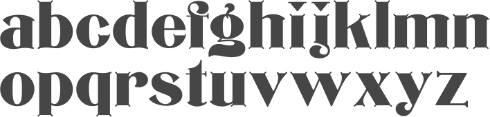
- Edwards (1895, Inland Type Foundry). Revived and interpreted in digital version by Nick Curtis as Inland Edwards NF.
- Era Condensed No. 5 (with Gustav F. Schroeder) (1891, Barnhart Bros & Spindler).
- Flemish Condensed (1905), a typeface bought by Stephenson Blake from the Inland Type Foundry. Flemish Expanded (1890, Stephenson Blake; co-designed with Eleisha Pechev).
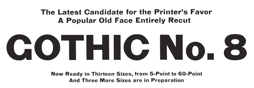
- Gothic No. 8 (1890, Inland Type Foundry).
- Hermes (1887, Central Type Foundry). This pure art nouveau typeface was co-designed with Gustav F. Schroeder.
- Inland (1895, Inland Type Foundry).
- Johnston Gothic (1892, Central Type Foundry). A pre-art nouveau typeface codeveloped with Gustav F. Schroeder.
- Mid-Gothic (1892, Central Type Foundry): According to McGrew, Mid Gothic was designed by Nicholas J. Werner for Central Type Foundry, probably just before that St. Louis foundry joined the merger that formed American Type Founder s in 1892. It is an undistinguished gothic of nineteenth-century style, but is an intere sting example of the way many of the earlier types were modified for Monotype. The original copy of this typeface for machine typesetting (6- to 12-point) was necessarily reproport ioned to meet mechanical requirements; the same patterns were then used for display size s and the result is series 176. Later the foundry design was copied much more exactly, w ith little or no modification, as series 276. Both versions have been shown in Monotype literature as Lining Gothic, Mid-Gothic, or Mid-Gothic No.2 at various times. The No.2 designation was applied to many foundry typefaces around the turn of the century when they were adapted to standard alignment or when other slight changes were made. Hansen copied this typeface as Medium Gothic No. 7, and made an inline version as Boston Gothic (q.v.).
- Multiform No. 1 through No. 4, with Gustav F. Schroeder (1892, Central Type Foundry).
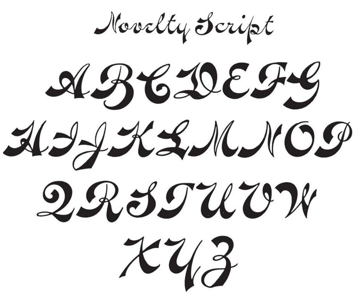
- Novelty Script (ca. 1891, Central Type Foundry). An Arabic simulation typeface co-designed with Gustav F. Schroeder.
- Pastel series: according to McGrew, "Pastel began as Era, designed for BB&S about 1892 by Nicholas J. Werner and Gustav Schroeder. Lightface Era and Era Open were added about 1895, and Era Condensed about 1898. Around the turn of the century the name was changed to Pastel, perhaps when Pastel Bold was added in 1903. Era and Pastel are identical, except that Era had only the characters with extended strokes, shown as Auxiliaries with Pastel, where they were replaced with more conventional characters in regular fonts. Pastel is virtually a monotone design, with tiny, pointed serifs. There are several unusual characters, including the splayed M and the N with the curved diagonal. Pastel was quite popular for subtitles in motion pictures, before the advent of sound. It was recast by ATF in 1954. Intertype's cutting of Pastel is essentially the same as the foundry's Pastel Lightface. Intertype also cut a sloped version as Pastel Italic."
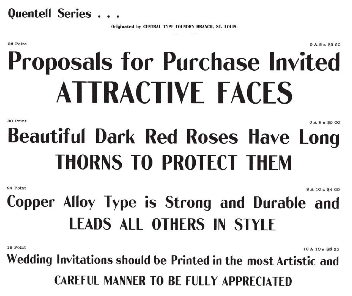
- Quentell (1894, Central Type Foundry): Quentell was drawn for ATF's Central Type Foundry branch in St. Louis; it has been ascribed to N. J. Werner, but a design patent was issued in 1895 to William S. Quentell, advertising manager of Armour&Company of Chicago, for whom the typeface was made. Two years later it was redrawn as Taylor Gothic by Joseph W. Phinney for ATF, and later redesigned as Globe Gothic (q.v.). Meanwhile, the original Quentell was slightly modified as Quentell No.2, and in that form continued to be shown in specimens along with its altered forms. See Pontiac. (McGrew)
- Skinner (1896, Inland Type Foundry).
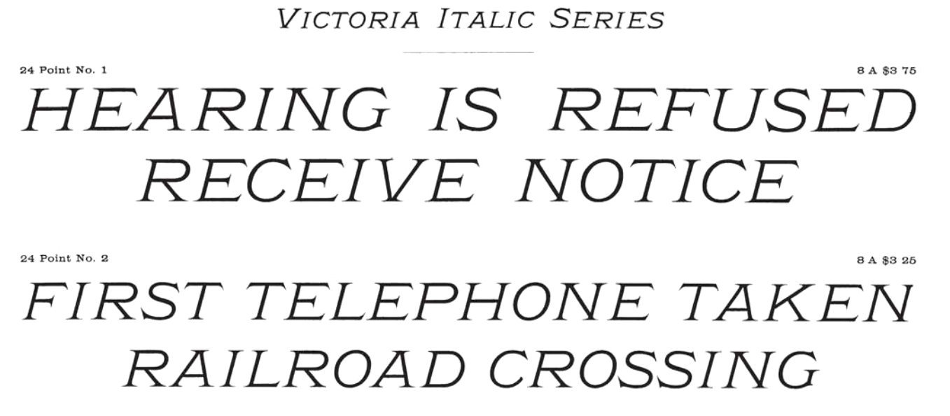
- Victoria Italic (1891, Central Type Foundry). With Gustav F. Schroeder. Mac McGrew: Victoria Italic is a nineteenth-century design that retained its popularity for many years, and has been made under several names by a number of sources. ATF's Central Type Foundry branch showed it as early as 1893, in usual form without lowercase, but with several sizes on each of several bodies in the manner of Copperplate Gothic. In 1898 the Pacific States Type Foundry in San Francisco showed the typeface with lowercase as Pacific Victoria Italic, and about the same time ATF showed Regal Italic with essentially the same lowercase. Victoria Italic without lowercase has also been shown by Keystone and Hansen, as well as Monotype and Ludlow. It is a wide, monotone design with thin, pointed serifs, and was popular for a time for business forms and stationery as well as general printing. Compare Paragon Plate Italic. Keystone also had Keystone Victoria, a similar upright design, without lowercase.
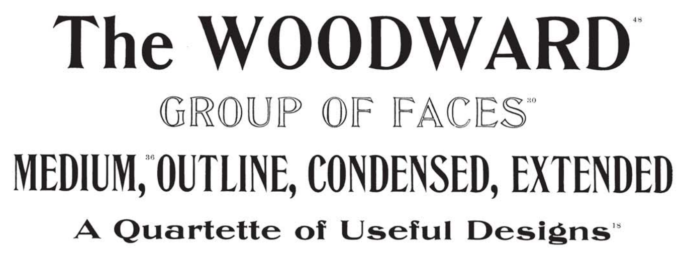
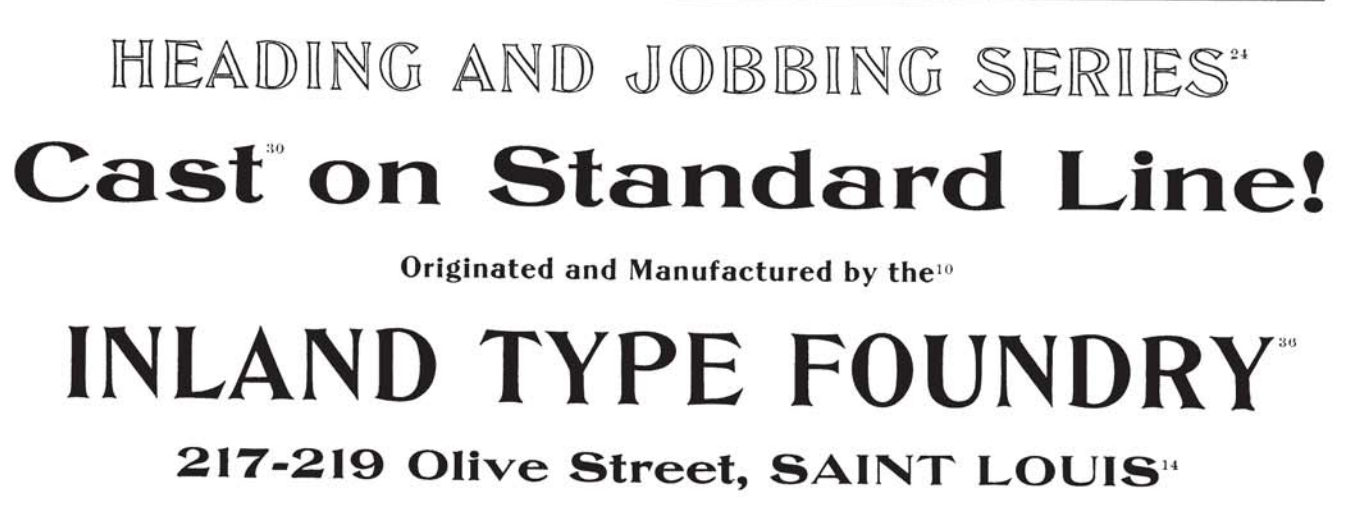
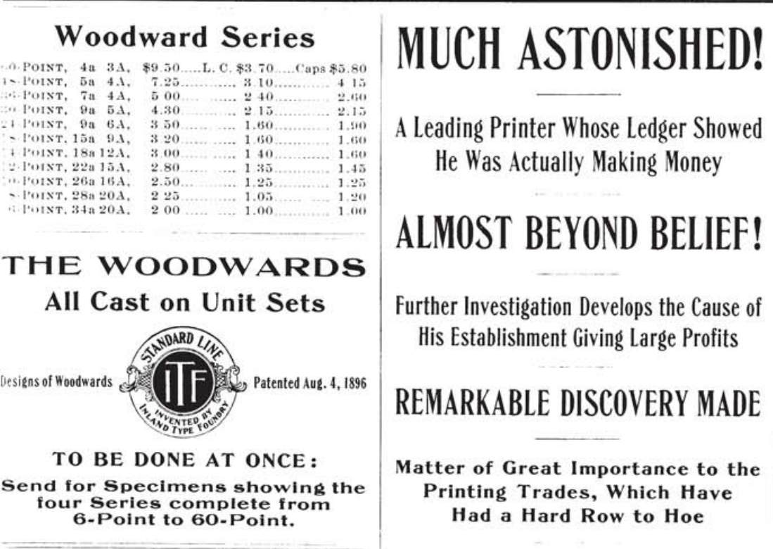
- Woodward Condensed and Extended (1894) and Woodward Extra Condensed (1901), all published by Inland Type Foundry.
Klingspor link. Read about Werner in The Inland Printer in 1898-1899, in an article by William E. Loy entitled Designers and Engravers of Type. No. XIX, Nicholas Joseph Werner.
|
EXTERNAL LINKS
Monotype link
Behance page
Klingspor Museum page
MyFonts search
Monotype search
Fontspring search
Google search
INTERNAL LINKS
Nicholas Joseph Werner
Type designers ⦿
Type designers ⦿
Blackletter fonts ⦿
Type scene in Illinois ⦿
Frederic William Goudy ⦿
Elzevir ⦿
Nick Curtis ⦿
Victorian typefaces ⦿
Art Nouveau typefaces ⦿
Arabic simulation typefaces ⦿
|