TYPE DESIGN INFORMATION PAGE last updated on Thu Apr 16 22:03:35 EDT 2026
FONT RECOGNITION VIA FONT MOOSE

|
|
|
|
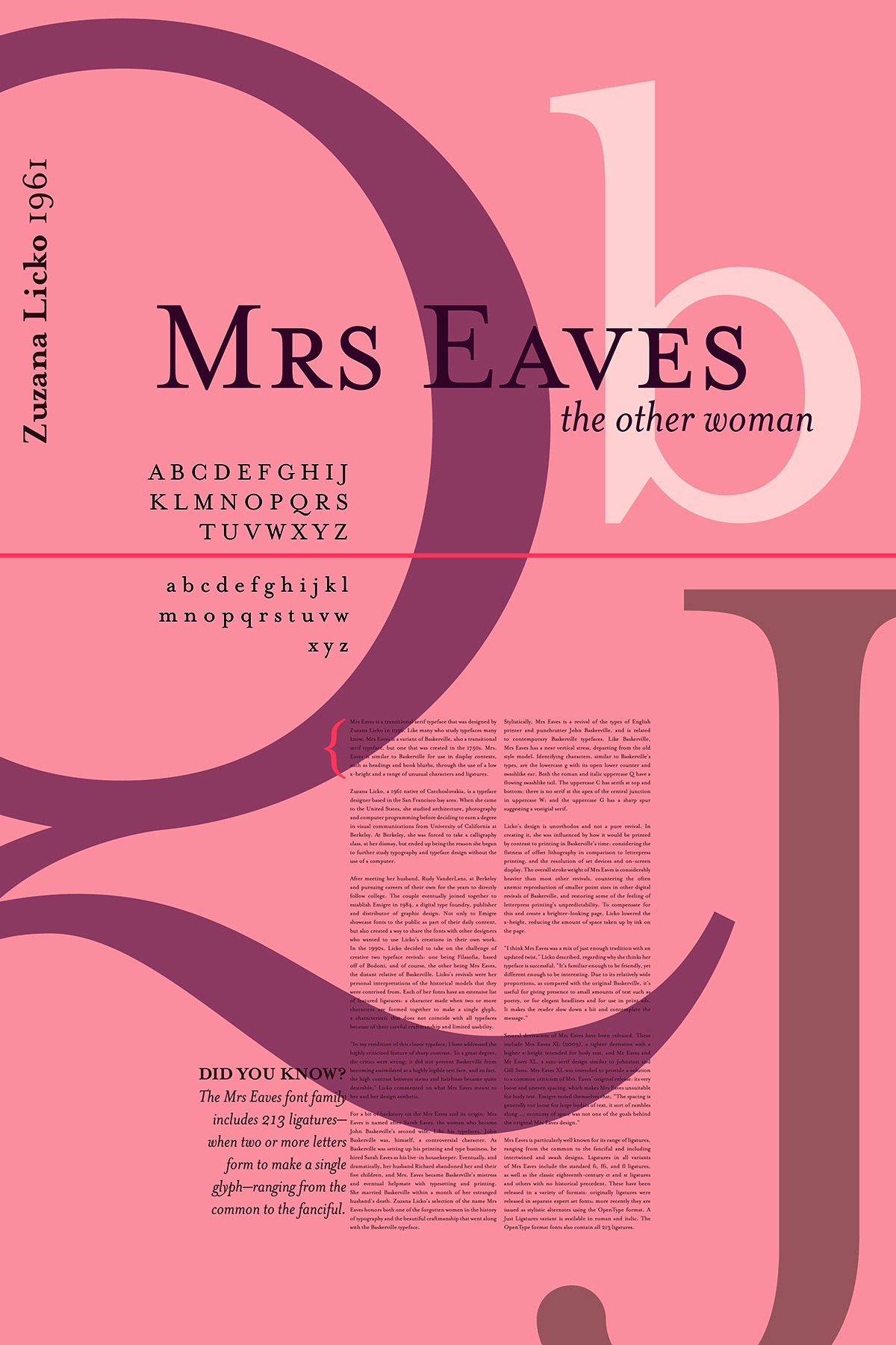
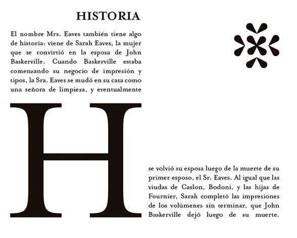
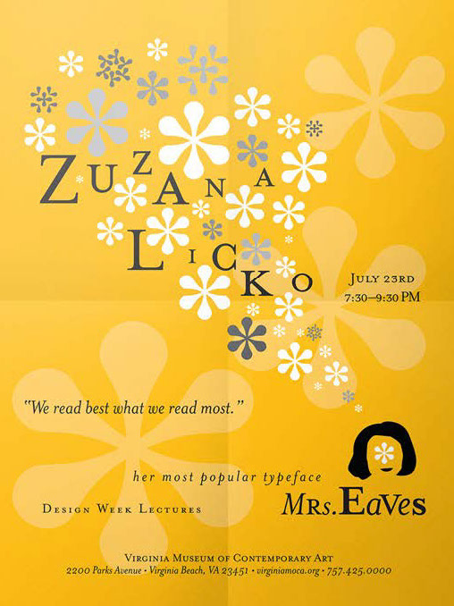
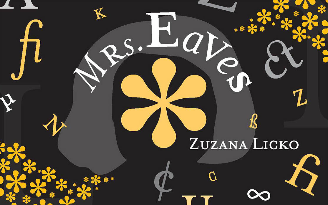
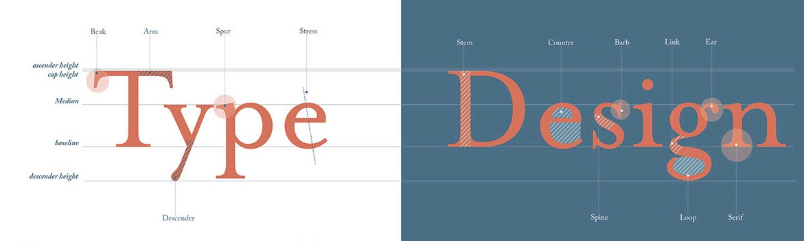
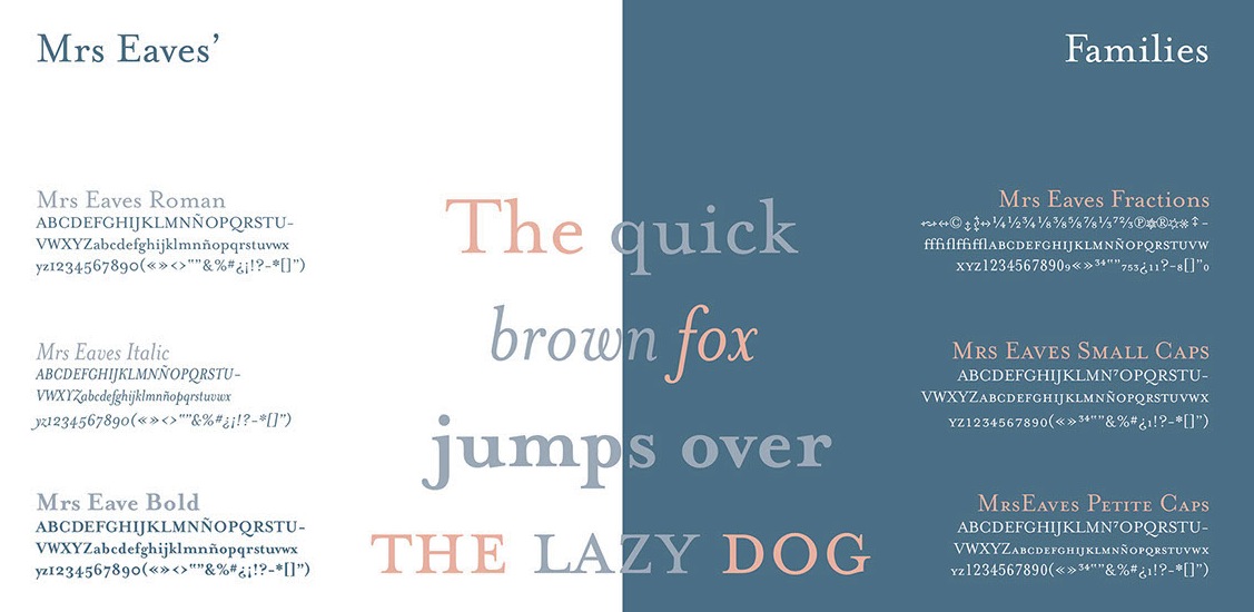
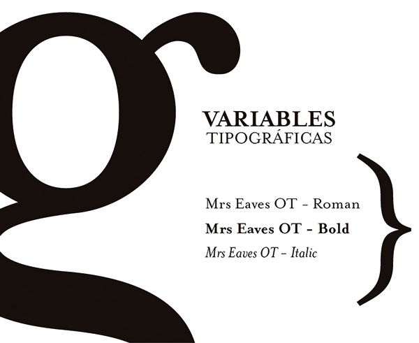
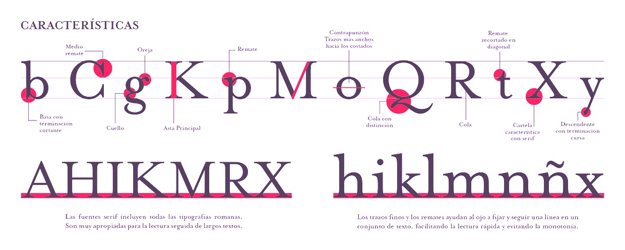
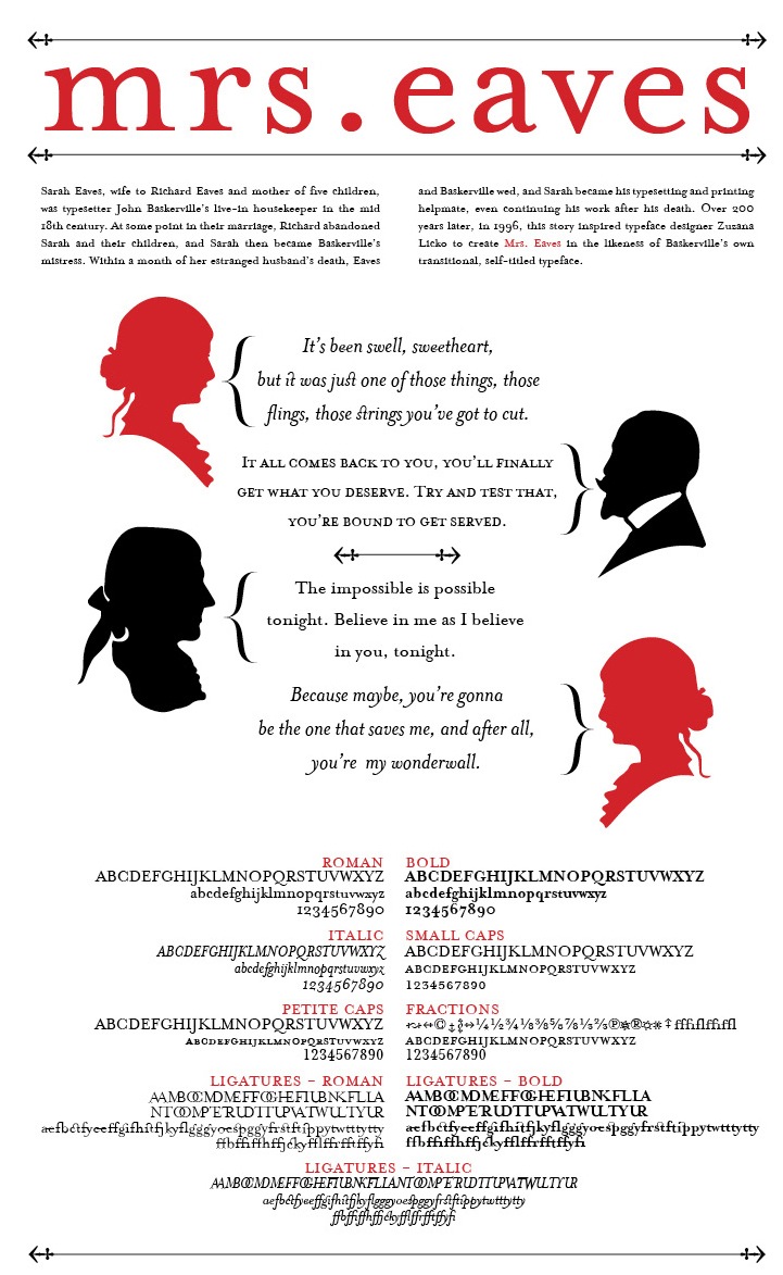
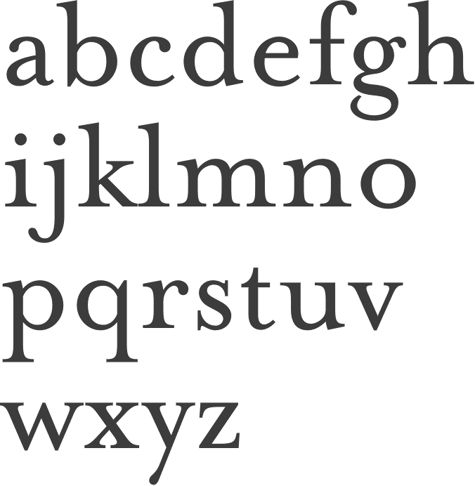
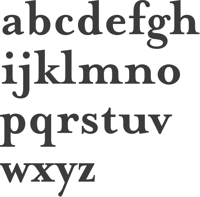
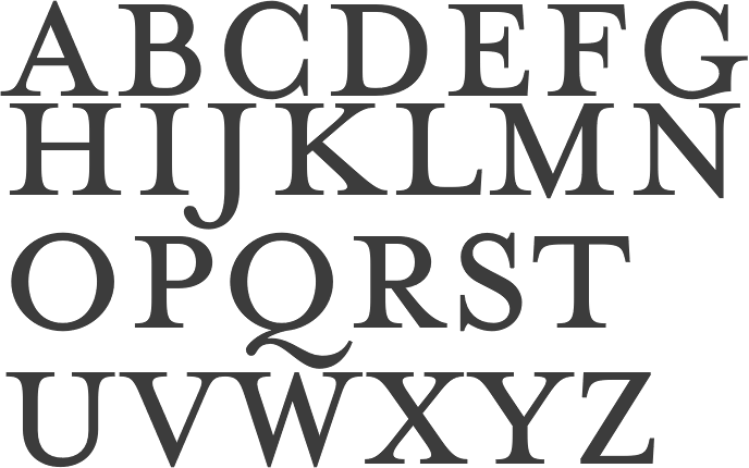
Mrs. Eaves
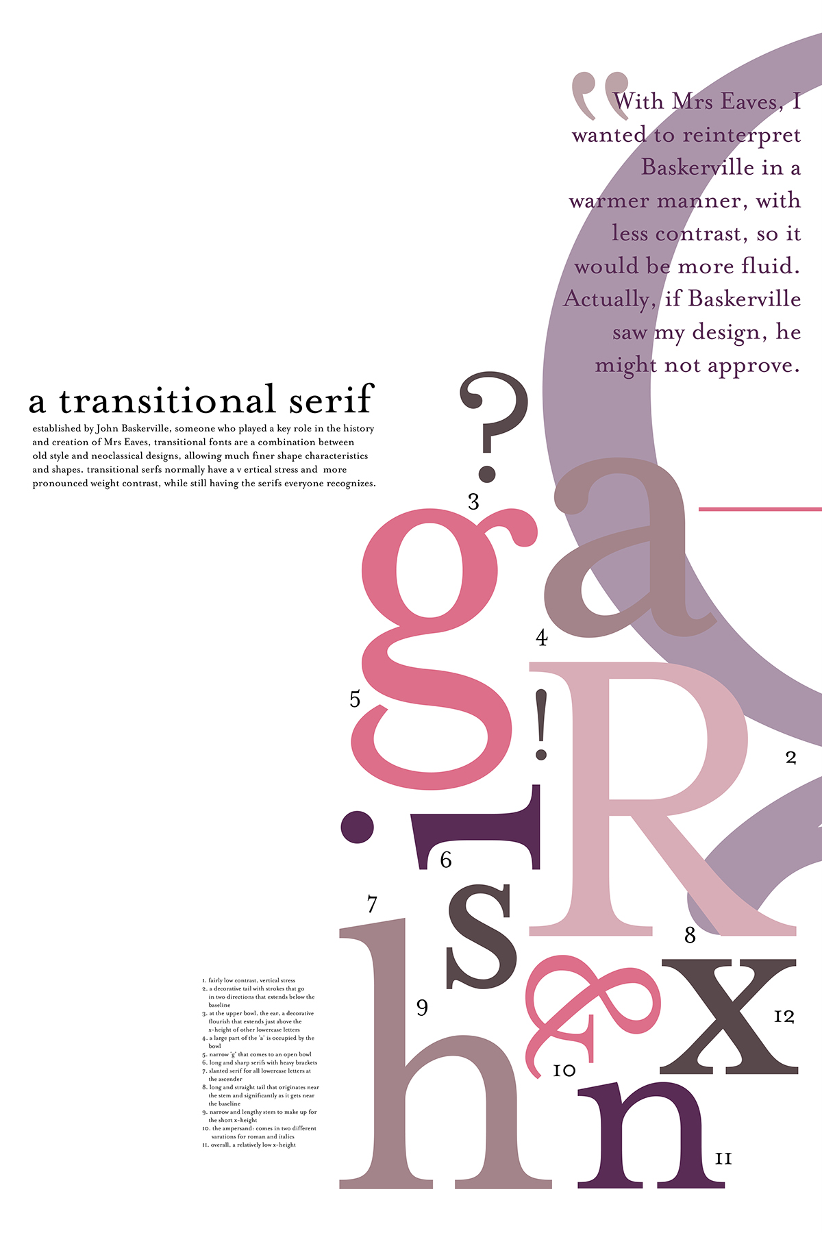
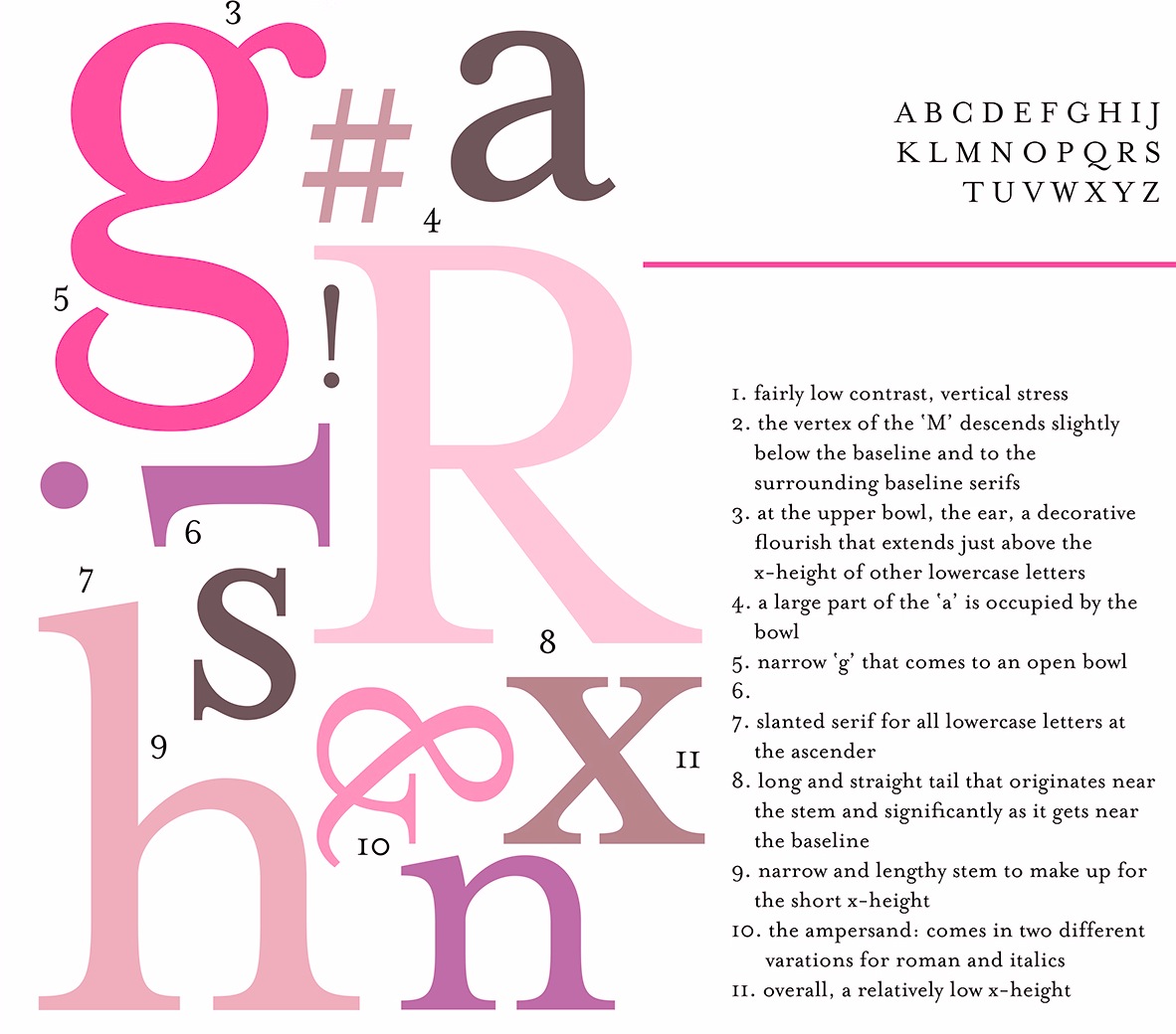
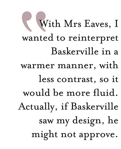
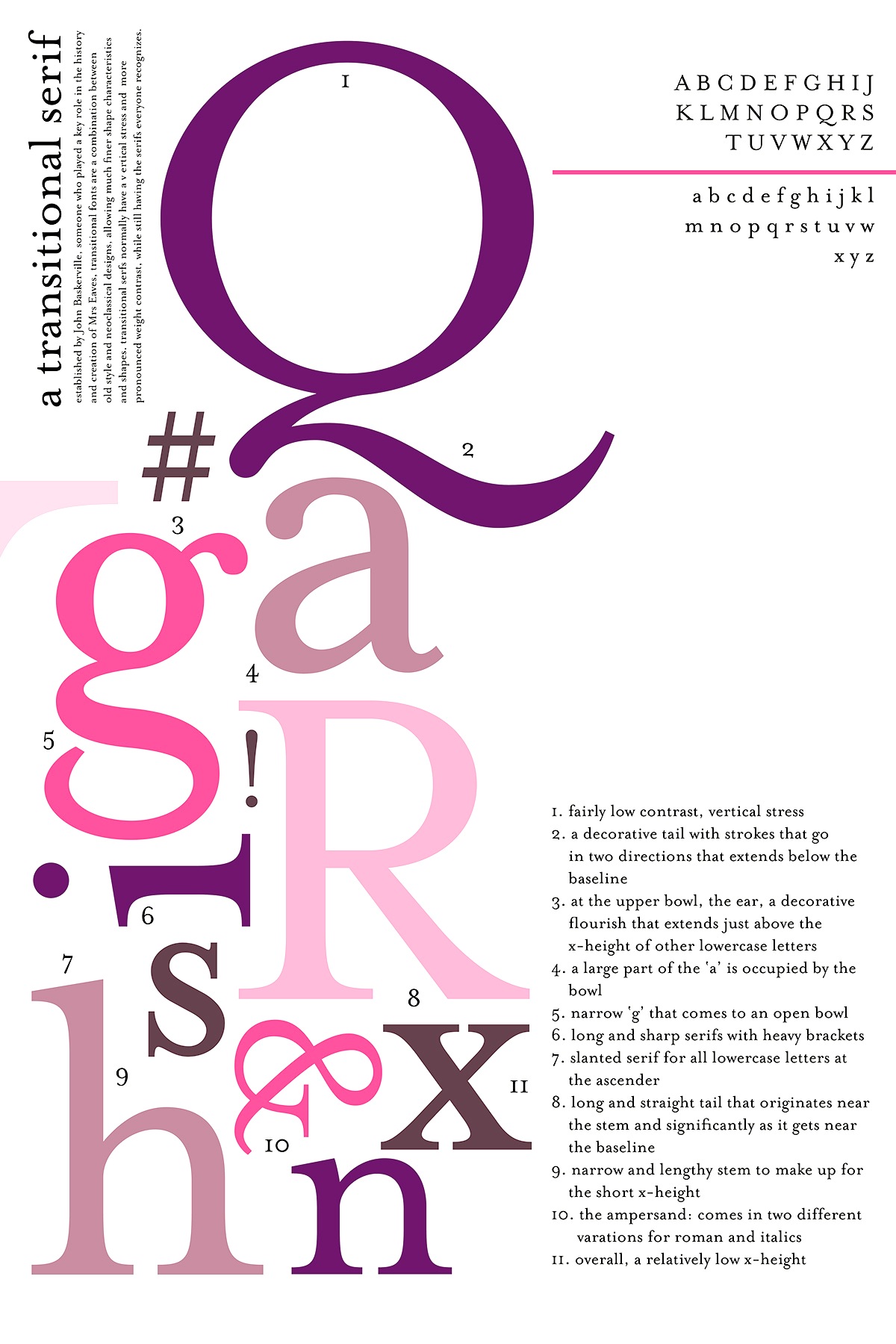
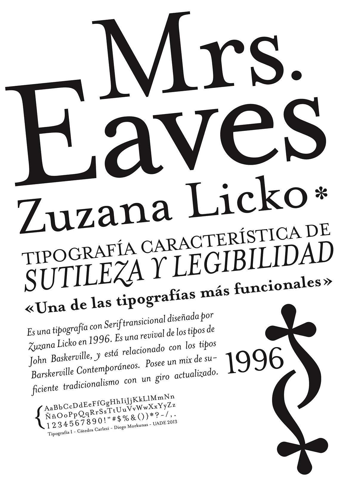
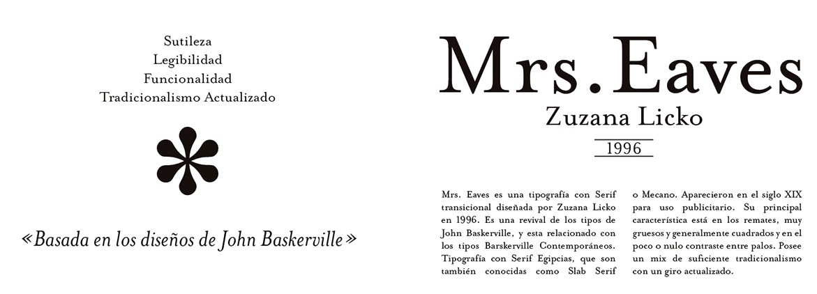
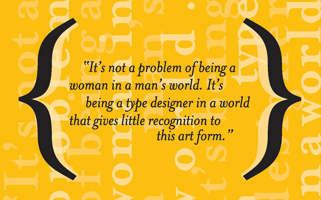
The type and design communities react to Mrs. Eaves, Zuzana Licko's version of Baskerville. Of those comments, Keith Tam's is the winner: " Mrs Eaves was a typeface designed by a graphic design-driven type designer for graphic designers. Yes, it may have been inspired by Baskerville, but I'm afraid it is no Baskerville. This is by no means a demeaning comment. While Baskerville has a calculated, crisp and stately charm to it that evokes neoclassical architecture, Mrs Eaves is soft spoken, warm, low contrast and has a distinct feminine touch to it. This subtle femininity is very rarely seen in contemporary type design, except perhaps some (almost stereotypical) script typefaces. I think Mrs Eaves is probably a typeface for graphic designers rather than typographers, as are many other Émigré fonts. Rebecca wrote that Mrs Eaves is perhaps a 'tolerable' display face, but not for text. I can't make up my mind. Mrs Eaves's distinctive features and small x-height certainly makes it tough to use for continuous text in most cases (not 'invisible' enough); on the other hand the generous spacing, robust serifs and low think-thin contrast make it somewhat unrefined for display use and lend it more towards the league of typefaces for small sizes. Perhaps it is this paradox that makes Mrs Eaves so appealing to graphic designers? I think that's Émigré's mission: to design typefaces that are on the threshold between text and display. Wait, it's the ligatures! They are simply delicious. Who can resist...? The best piece I've ever seen set in Mrs Eaves is their specimen booklet. I've only seen the offset lithographed version, but I imagine the letterpressed one would be quite exquisite. I don't think Mrs Eaves became popular because of trend. For a contemporary seriffed typeface to become a classic, that's quite something. I do think Mrs Eaves have some uniquely distinctive attributes that stand on her own two feet. It really can't be compared with ephemeral typefaces like Template Gothic, though also by Émigré. They are not really in the same league. Overused typefaces by graphic designers are quite different from overused typefaces by general users. The former became overused because of the aesthetics/formal characteristics, while the latter became overused simply because they are widely available. Whether they are inherently good typefaces is another matter. I disagree with the comment that Georgia should only be used for screen. It is an extremely good workhorse typeface for general used, in my opinion, for print, made by a master type designer, Matthew Carter. It should replaced Times New Roman as the default typeface for general office correspondence and documents. It is probably the best free font there is." |
EXTERNAL LINKS |
| | |
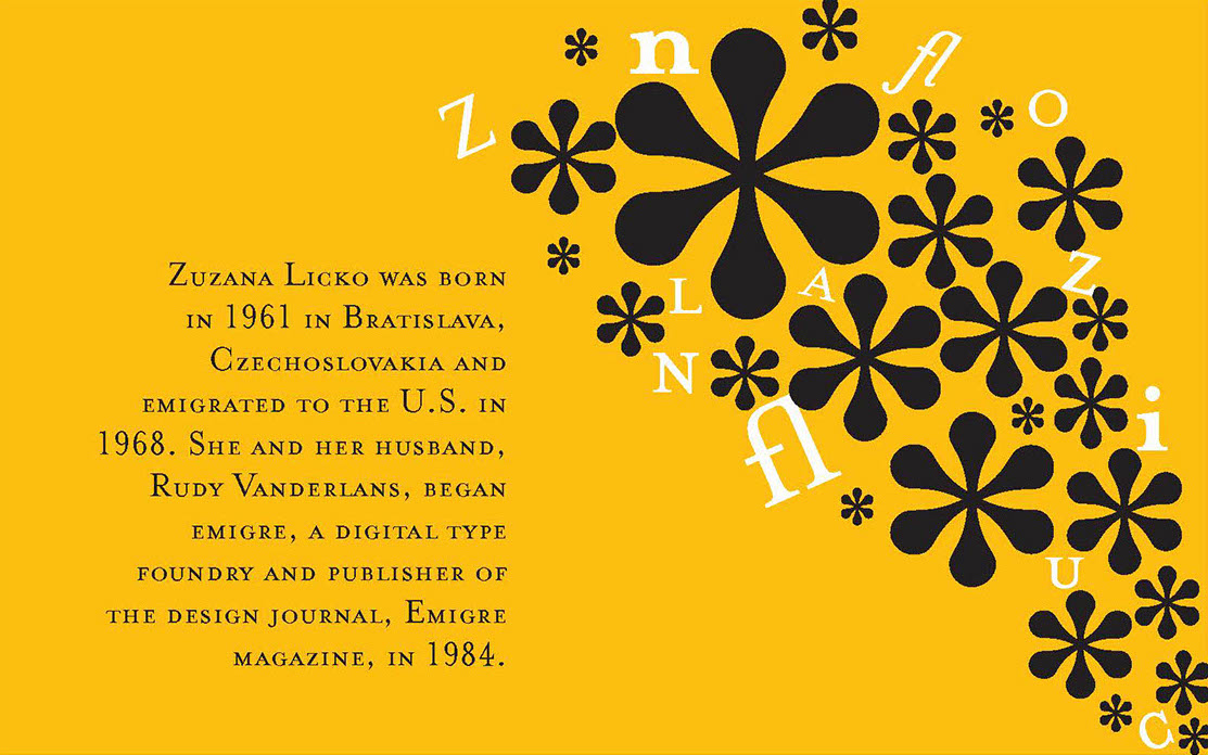
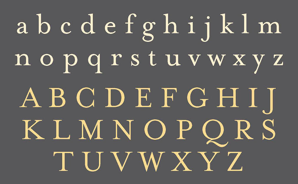
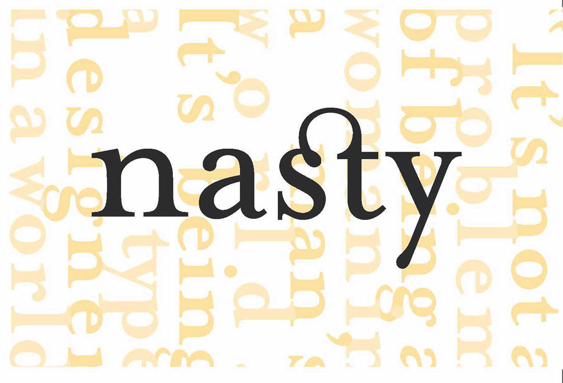
file name: Zuzana Licko Mrs Eaves 1996
file name: Zuzana Licko Mrs Eaves 1996 Poster by Rachel Donovan 2015
file name: Zuzana Licko Mrs Eaves 1996 Poster by Rachel Donovan 2015b
file name: Zuzana Licko Mrs Eaves 1996 Poster by Rachel Donovan 2015c
file name: Zuzana Licko Mrs Eaves 1996 Poster by Rachel Donovan 2015d
file name: Zuzana Licko Mrs Eaves 1996 Poster by Rachel Donovan 2015e
file name: Zuzana Licko Mrs Eaves 1996 Poster by Rachel Donovan 2015f
file name: Zuzana Licko Mrs Eaves 1996 Poster by Rachel Donovan 2015g
file name: Zuzana Licko Mrs Eaves 1996 Poster by Diego Morkunas 2013
file name: Zuzana Licko Mrs Eaves 1996 Poster by Diego Morkunas 2013a
file name: Zuzana Licko Mrs Eaves 1996 Poster by Diego Morkunas 2013c
file name: Zuzana Licko Mrs Eaves 1996 Poster by Diego Morkunas 2013e
file name: Zuzana Licko Mrs Eaves 1996 Poster by Karin Kleps 2016
file name: Zuzana Licko Mrs Eaves 1996 Poster by Karin Kleps 2016b
file name: Zuzana Licko Mrs Eaves 1996 Poster by Karin Kleps 2016c
file name: Zuzana Licko Mrs Eaves 1996 Poster by Karin Kleps 2016d
file name: Zuzana Licko Mrs Eaves 1996 Poster by Karin Kleps 2016e
file name: Zuzana Licko Mrs Eaves 1996 Poster by Karin Kleps 2016f

file name: Zuzana Licko Mrs Eaves 1996 Poster by Adriana Ozawa Rodrigues 2015
file name: Zuzana Licko Mrs Eaves 1996 Poster by Adriana Ozawa Rodrigues 2015b
file name: Zuzana Licko Mrs Eaves 1996 Poster by Adriana Ozawa Rodrigues 2015c
file name: Zuzana Licko Mrs Eaves 1996 Poster by Adriana Ozawa Rodrigues 2015d
file name: Zuzana Licko Mrs Eaves 1996 Poster by Diego Morkunas 2013f
file name: Zuzana Licko Mrs Eaves 1996 Poster by Diego Morkunas 2013g
file name: Zuzana Licko Mrs Eaves 1996 Poster by Diego Morkunas 2013h
file name: Zuzana Licko Mrs Eaves 1996 Poster by Craig Johnston 2015
file name: Zuzana Licko Mrs Eaves 2002
file name: Zuzana Licko Mrs Eaves Bold 2002
file name: Zuzana Licko Mrs Eaves Caps 2002
| | |
|
Luc Devroye ⦿ School of Computer Science ⦿ McGill University Montreal, Canada H3A 2K6 ⦿ lucdevroye@gmail.com ⦿ https://luc.devroye.org ⦿ https://luc.devroye.org/fonts.html |