|
Sidney Clyde Gaunt
Artist and type designer at Barnhart Brothers&Spindler, 1874-1932, who lived in Chicago. Creator of many typefaces: - Adstyle&Italic (plus Condensed, Extra Condensed&Headletter, Wide, Lightface, Black, Black Outline, Shaded: 1906-1920, BB&S).
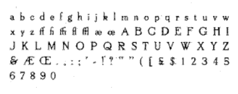
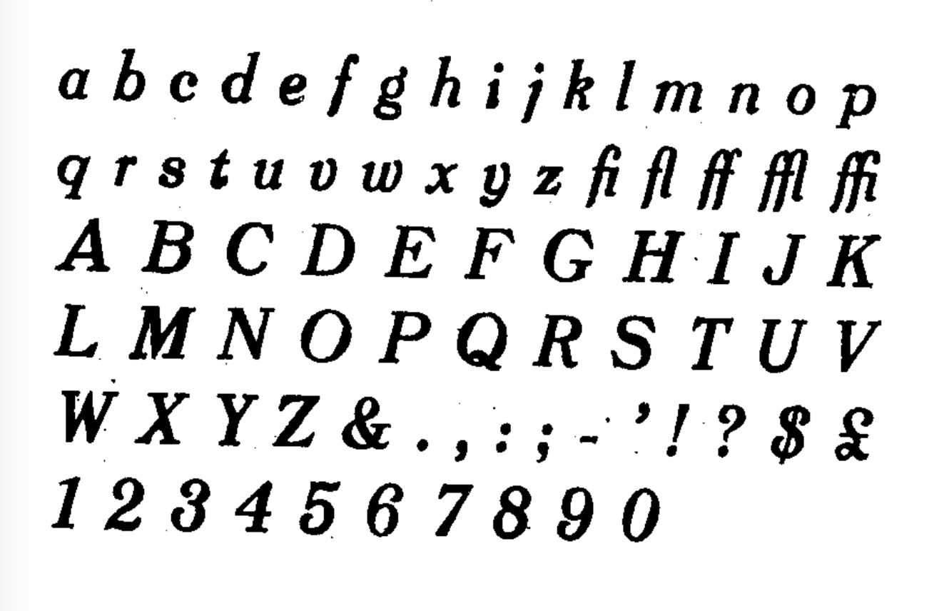
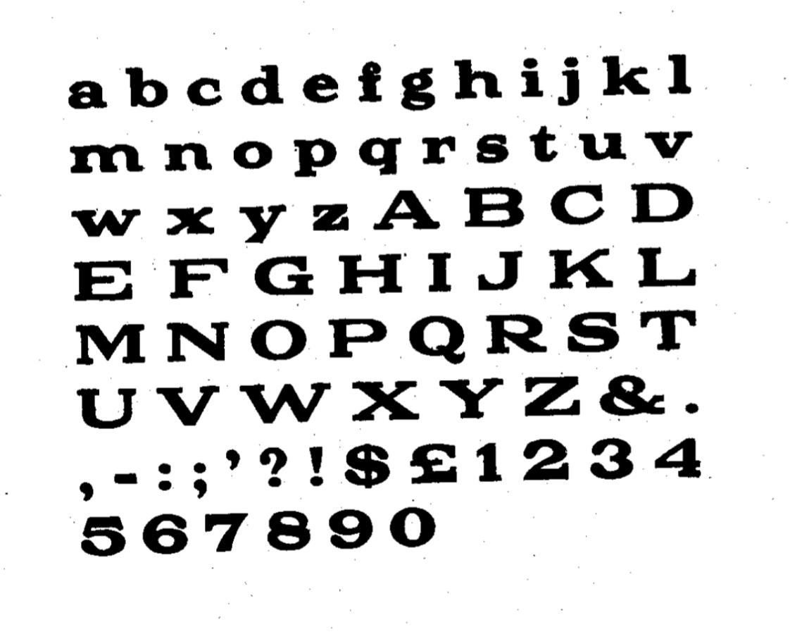
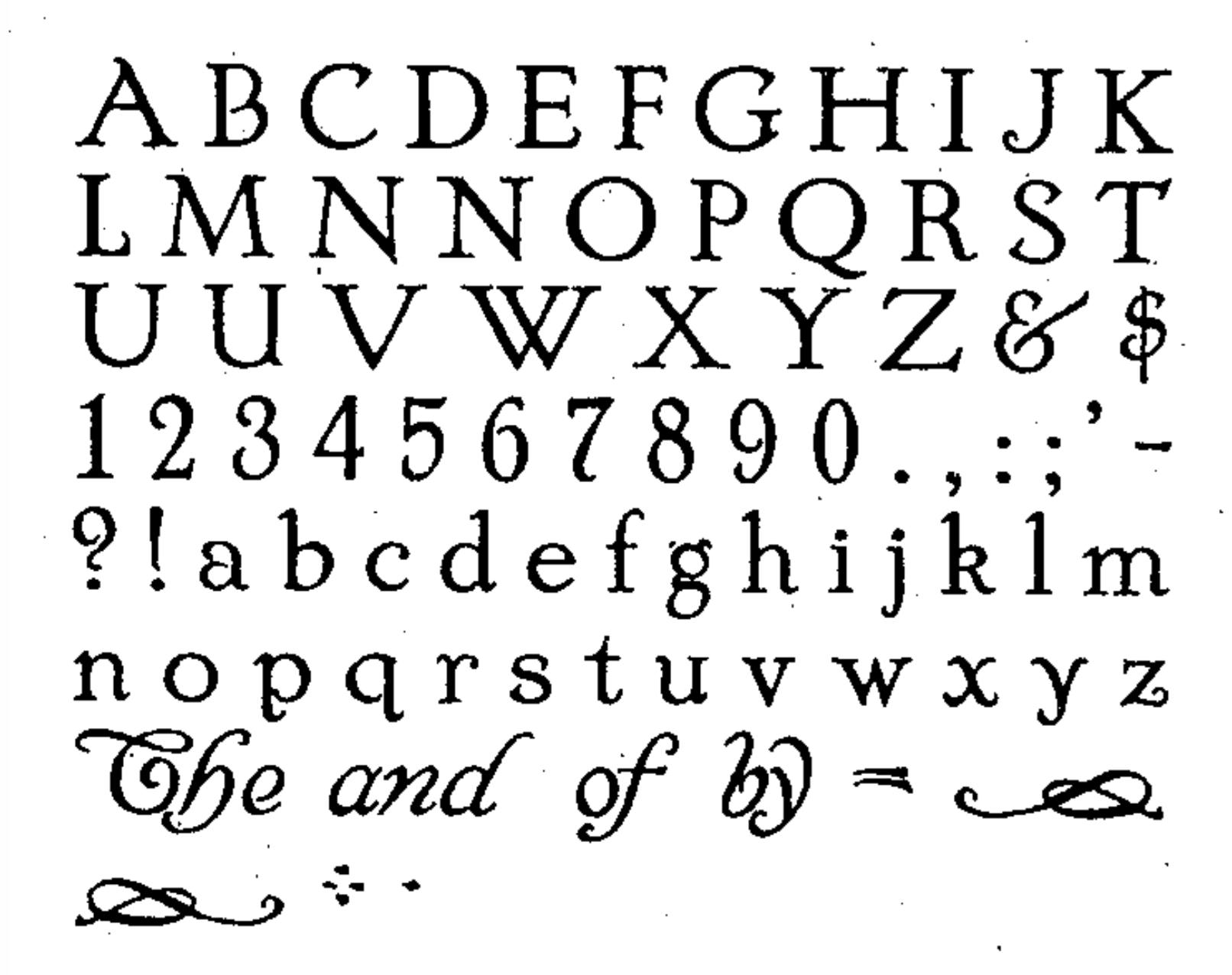
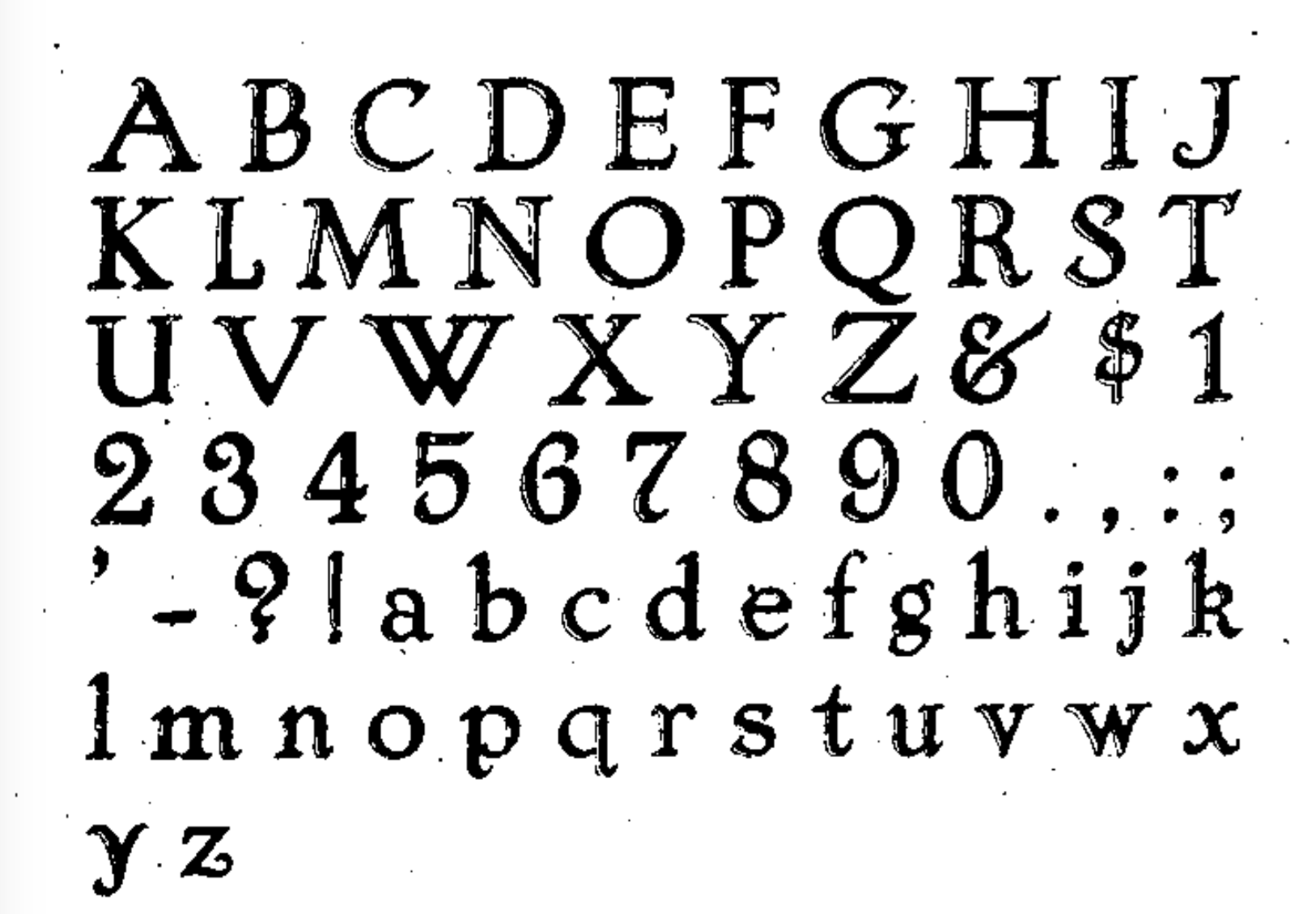
- Authors Oldstyle&Italic, Authors Oldstyle Bold, Authors Roman&Italic (plus Condensed, Wide, Bold, Bold Condensed). Mac McGrew writes: Authors Roman Italic, and Authors Roman Wide were designed by Sidney Gaunt for BB&S in 1902, with other versions added in 1909 to 1915. It is a legible but generally undistinguished face, perhaps best in the Wide version. The italic includes a number of quaint swash characters. and was one of the first BB&S italics to be cast on its offset body, described elsewhere (see "The Third Dimension of Type" in the Introduction); the bold typefaces provide restrained complementary display for headlines. Authors Oldstyle, shown by BB&S in 1912, bears little resemblance to Authors Roman.
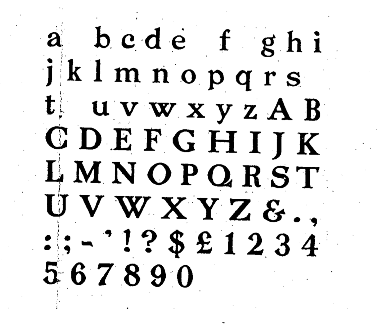
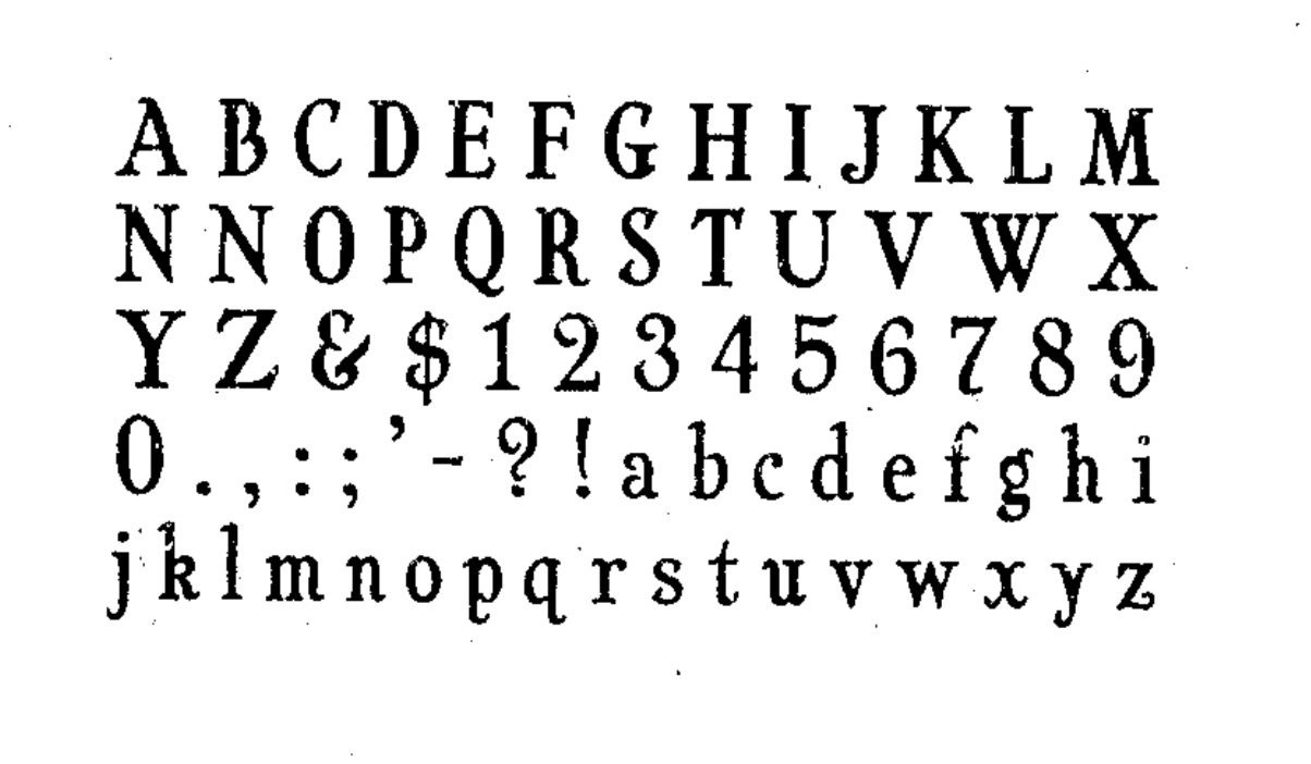
- Barnhart Oldstyle&Italic (and a No. 2 version). Mac McGrew writes: Barnhart Oldstyle was designed in 1906 by Sidney Gaunt for BB&S, followed by the italic and Barnhart Oldstyle No.2 the next year. The latter appears to have the same caps as the first typeface but larger lowercase with shorter ascenders. There is also Barnhart Lightface, advertised in 1914 but perhaps designed earlier. This series seems undistinguished, but the original roman and italic were popular enough to be shown as much as twenty years later. Ascenders are long, and some characters have a bit of the irregularity that was popular at that time. The italic apparently was one of the first typefaces cast by BB&S on its offset body, which provided mortises to avoid overhanging kerns in italic designs.
- Barnhart Lightface.
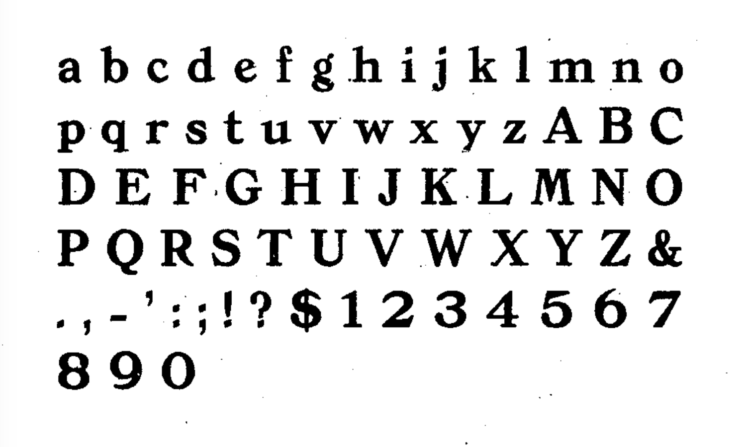
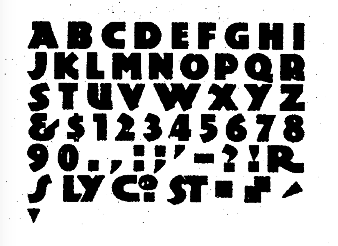
- Cardstyle. Mac McGrew writes: Cardstyle is an unusual typeface designed in 1914 by Sidney Gaunt for BB&S. It is a medium weight monotone, rather narrow, with tiny serifs, and was intended for use on announcements. There is no lowercase, but caps are cast in several sizes on each of three bodies, for cap-and-small-cap combinations. Notice the logotypes, which were more common around the turn of the century.
- Chester Text (1914, blackletter). Mac McGrew writes: Chester Text is a fancy shaded letter designed by Sidney Gaunt in 1914 for BB&S. It features caps and small caps, and is intended for stationery and social work, but is hard to read and not suited to anything but a few simple names or words.
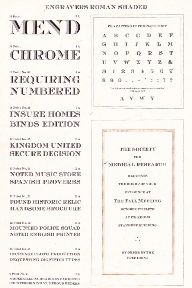
- Engravers Old Black, Engravers Roman Shaded (1914, BBS, formerly Chester Title).
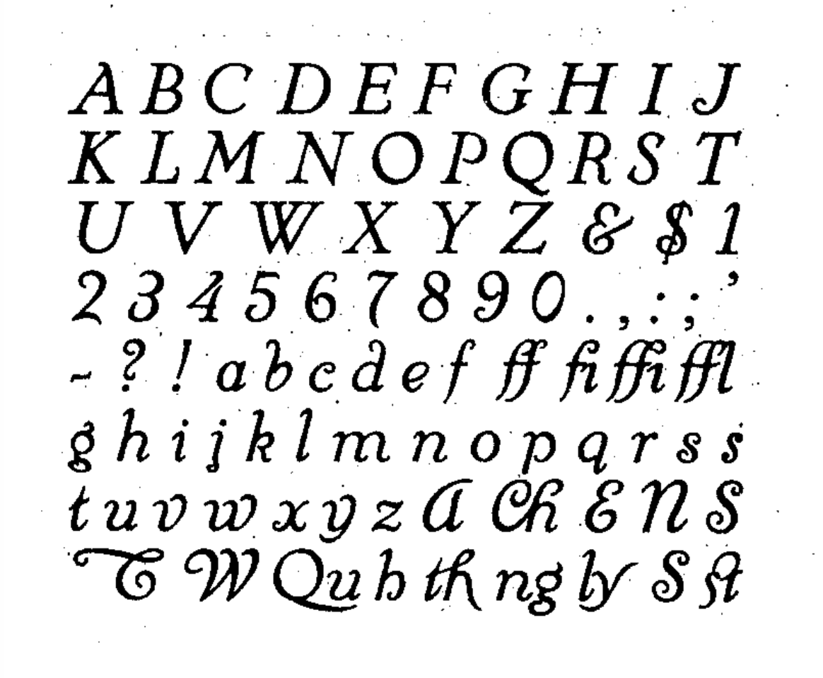
- French Plate Script. Mac McGrew writes: French Plate Script (or French Plate) was designed by Sidney Gaunt for BB&S in 1904. It is an upright script, otherwise similar to the same founder's Wedding Plate Script, both derived from types cut by Mayeur of Paris which were based on eighteenth-century engraving. Both are connecting scripts, the former being similar to Typo Upright (q.v.). Inland Type Foundry showed a similar French Script in 1905, patented by William Schraubstadter, and later listed by ATF. Douglas C. McMurtrie, in his book Type Designs, calls this "one of the finest script types ever produced."
- Mission. Mac McGrew writes: Mission was designed for BB&S by Sidney Gaunt in 1905, but patented by George Oswald Ottley. It is a rather novel face, with long ascenders and short ascenders. Serifs are triangular, like some members of the Latin series. Most noticeable is the way some strokes in the capital letters are joined with curves, especially in the B. Compare Viking.
- Old Roman Condensed (plus Bold, Bold Condensed, Black&Italic, Semitone).
- Parsons Swash Initials.
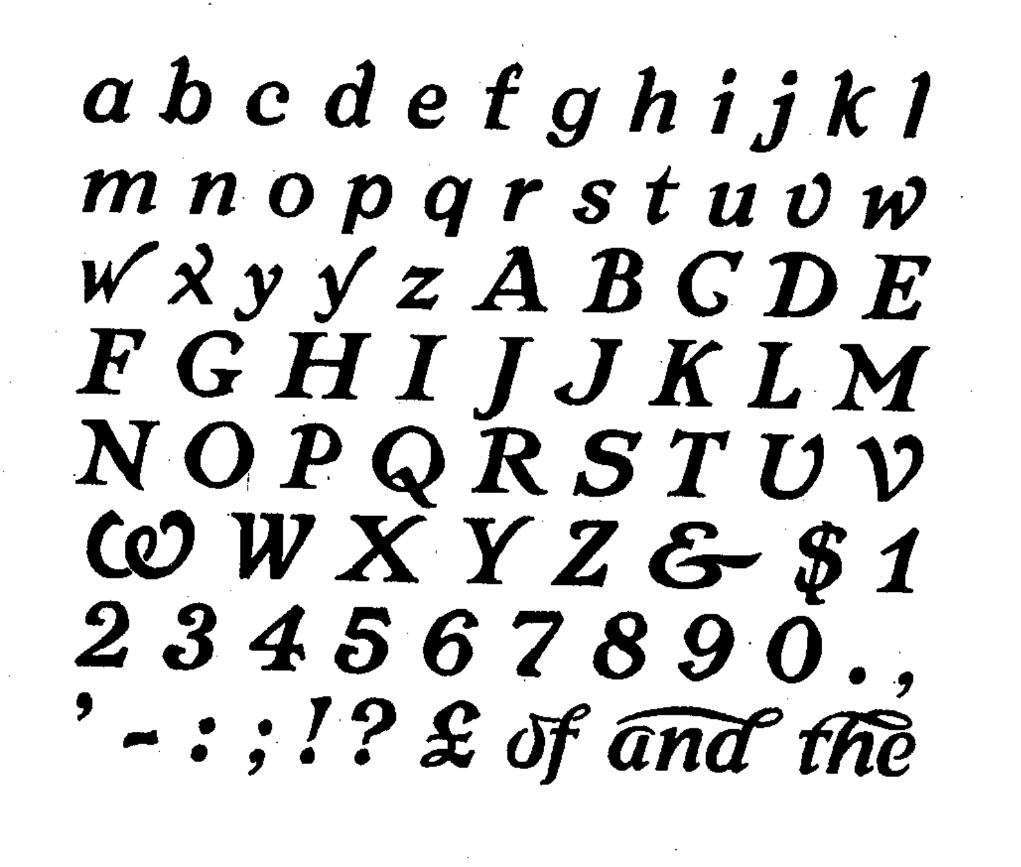
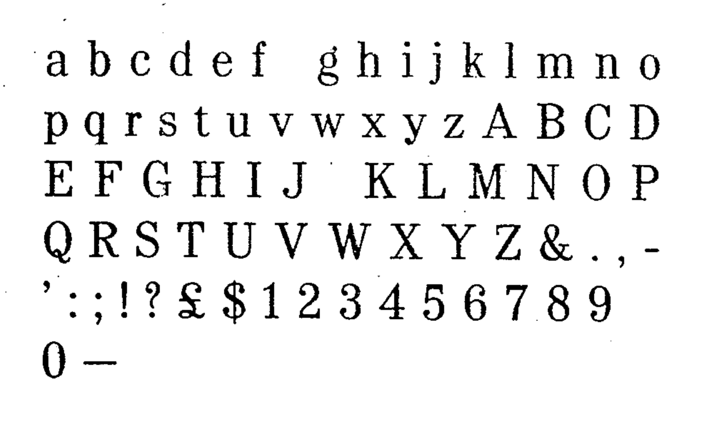
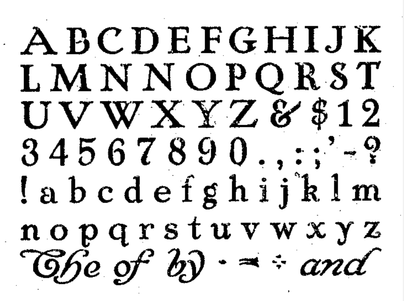
- Pencraft Oldstyle&Italic (1914, plus Bold, Shaded), Pencraft Text (1916, blackletter). Pencraft Oldstyle and its ornamental version (Pencraft Specials), as printed in the 1922 BBS catalog, inspired the lowercase of Pencraft (2010, Chyrllene K, Intellecta Design). Mac McGrew writes: Pencraft Text was designed by Sidney Gaunt for BB&S in 1916. It has somewhat the character of Pencraft Oldstyle, by the same artist at about the same time, but it can hardly be considered a part of that family. It has just a suggestion of the angularity of Text or Old English typefaces, but retains more of the character of simple hand-lettering. Mac McGrew writes: Pencraft Old Style and Pencraft Italic were designed by Sidney Gaunt for BB&S in 1914, with the bold and shaded versions following over the next two years. The Oldstyle is a rather charming interpretation of lettering styles popular at that time, but the other versions are not as impres- sive. Pencraft Oldstyle is notable for the large number of Auxiliary charac- ters, some of which were commonly included with other similar typefaces, and the unique Pencraft Specials, which consisted of a variety of swash strokes to be used to extend the special ascending and descending letters. Pencraft Italic included several swash caps among its Auxiliaries, and Pencraft Bold had Auxiliaries comparable to the roman, but without the flourishes or Specials. Compare the long ascenders and descenders of Parsons and Stymie.
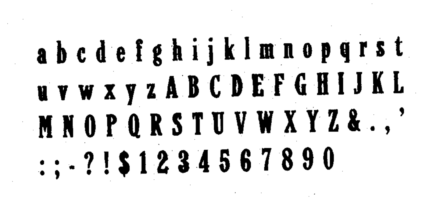
- Publicity Gothic (1916). Free versions called Lemiesz by David Rakowski and Dieter Steffmann. Publicity Gothic was digitally extended to a commercial all-caps face, Publicity Headline, in 2006 by Tom Wallace (HiH). See also the revival in 1995 by Image Club Graphics: Publicity Gothic ICG Out and Solid. Holy Ravioli NF (Nick Curtis) is also based on Publicity Gothic. Library Book Initials JNL (2018, Jeff Levine) was modeled after examples of Sidney Gaunt's Publicity Initials, which was originally sold in metal type by Barnhart Brothers and Spindler as a companion to the Publicity Gothic typeface. Other digital versions: OPTI Publicity Gothic (Castcraft), Publicity Gothic (by SoftMaker). Mac McGrew writes: Publicity Gothic was designed by Sidney Gaunt in 1916 for BB&S. It is basically a bold gothic, but with many deep irregularities designed into the edges of strokes, which are the same in all sizes. There are no descenders. characters which normally have descenders being designed within the x- height. Caps and ascenders are nearly the full body size, making the typeface considerably oversize by usual standards. Lowercase q has a capital form and is made only in combination with u. The colon and semicolon are full cap height, and there are a number of special characters as shown. ATF revived it for a short time about 1933. Compare Advertisers Gothic.
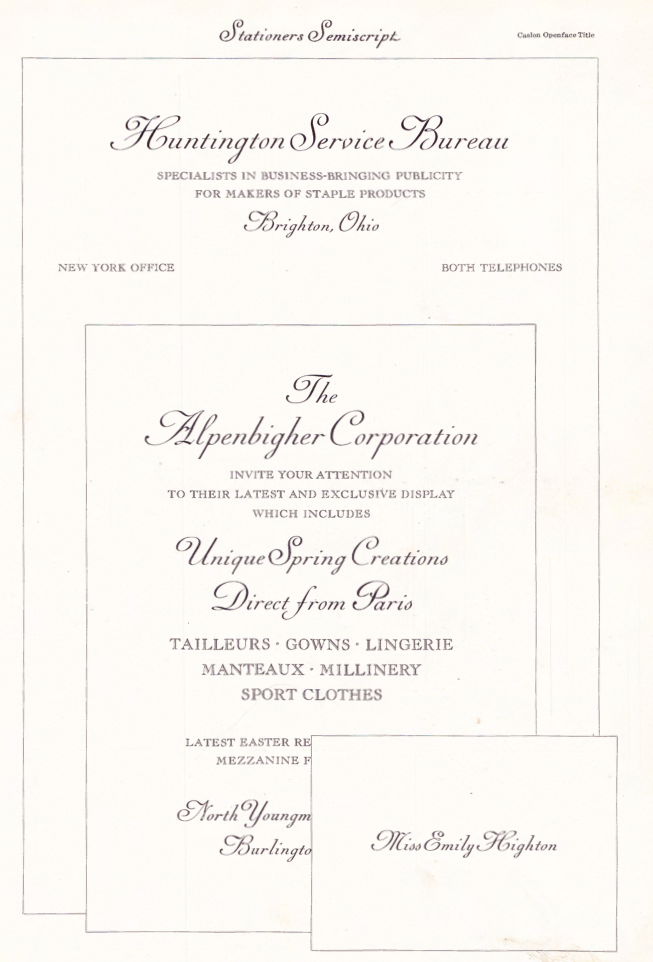
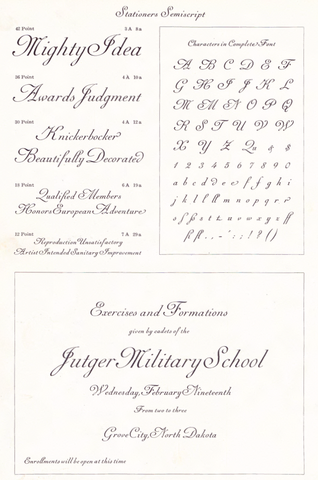
- Stationers Semiscript. McGrew: Stationers Semiscript as offered by BB&S was a renaming of Palmer Series, introduced by Inland Type Foundry in 1899. It has been ascribed to Sidney Gaunt. It is similar to the BB&S Wedding Plate Script in slope, proportions, and general appearance, but characters do not join. This typeface was revived and extended by Canada Type in 2010 as Siren Script.
- Talisman&Italic. Patented in 1903 and 1904 resopectively.
- Wedding Plate Script. Mac McGrew writes: Wedding Plate Script was designed by Sidney Gaunt for BB&S in 1904. It is much like the same founder's French Plate Script, but sloped, and similar to Typo Slope, produced the following year by ATF.
Images of some of his typefaces when they were patented by BBS: 1908, 1908, 1908, 1906. Klingspor link.
|
EXTERNAL LINKS
Sidney Clyde Gaunt
 [Designer info] [Designer info]
Klingspor Museum page
MyFonts search
Monotype search
Fontspring search
Google search
INTERNAL LINKS
Type designers ⦿
Type designers ⦿
Blackletter fonts ⦿
Type scene in Illinois ⦿
Penmanship ⦿
Nick Curtis ⦿
Ronde (Rondo, Rundschrift): Upright scripts ⦿
Dieter Steffmann ⦿
|