|
What makes a good typeface?
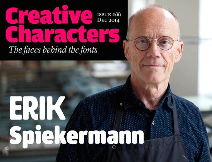
[Erik Spiekermann]
Erik Spiekermann reveals his rules for a good typeface: - What makes a good typeface is decided by the users, not the designer.
- Most good typefaces have been designed for one purpose, they do not come from a designers whim: Bodoni designed all his typefaces for specific books, Times was designed for the newspaper, Frutiger for signage at Charles de Gaulle airport, Helvetica to appeal to certain graphic designers, Bell Gothic for the American telephone books, Gill for a shopfront, Century for a magazine, and Meta for the German post office.
- There are certain laws of perception as well as cultural traditions which a typeface has to adhere to: it has to look almost like all the others.
- Just be a little different.
|
EXTERNAL LINKS
What makes a good typeface?
MyFonts search
Monotype search
Fontspring search
Google search
INTERNAL LINKS
Typography ⦿
Modern style [Bodoni, Didot, Walbaum, Thorowgood, Computer Modern, etc.] ⦿
Telephone directory typefaces ⦿
Eric Gill and his typefaces ⦿
|
