TYPE DESIGN INFORMATION PAGE last updated on Mon Mar 9 16:33:44 EDT 2026
FONT RECOGNITION VIA FONT MOOSE
|
|
|
|
Engraver, b. Macon (1666), d. Paris (1714). In 1695, king Louis XIV of France commissioned a typeface, which until today is described as the first digital font, and at least as the first mathematicallly defined type, the Romain du roi (1702), used by Grandjean in Médailles sur les principaux énvenémens du règne de Louis-le-Grand, avec des explications historiques. (1702). This text was illustrated by sebastien Leclerc (1637-1714). See here and here for background. A specimen is here. Discussion at typophile. Romain du roi was digitized by Frank Jalleau under the name Grandjean and in 2008 by Gert Wiescher as Royal Romain (link). Wiescher writes: Royal Romain was commissioned by the most famous king of France, Louis XIV the Sun King. A group of Scientists set off to work on the task of producing the ultimate font for the king of all kings. After years of elaborations Philippe Grandjean then started to cut the final punches for the Imprimerie Royale and finished his part of the work with the fonts first appearance in the magnificent Médailles sur les principaux énvenémens du règne de Louis-le-Grand, avec des explications historiques. (1702). The complete set of 21 sizes of roman and italic letters was finished by Grandjean's successor Jean Alexandre and completed by Louis Luce in 1745. The font went by the name of Romain du Roi and was for the exclusive use of the Louis XIV. It was never sold or given to any other king or government. The king of Sweden tried to scrounge a set, but the king refused. This font is the basic design for Fournier and Bodoni. Another digital versuion exists, Romain BP and Romain BP Headline (2007), by Ian Party of B&P Typefaces. Ian Party writes: Based on the Commission Jeaugeon's models and on Philippe Grandjean's classic character, the Romain BP celebrates the marriage of geometric rationality and elegance, of science and craftsmanship. The Romain BP Text is actually closer to the Commission's model than Grandjean's Romain du Roi. It is more synthetic in its structure, more radical, and thus, more modern. It is a contemporary text typeface based on a structure that was created in 1690, not a revival mimicking Greandjean's shapes.. |
EXTERNAL LINKS |
| | |
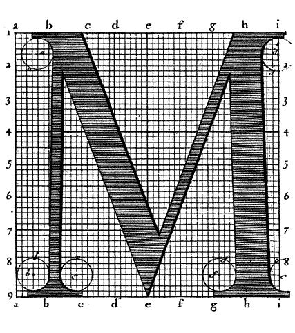
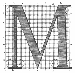
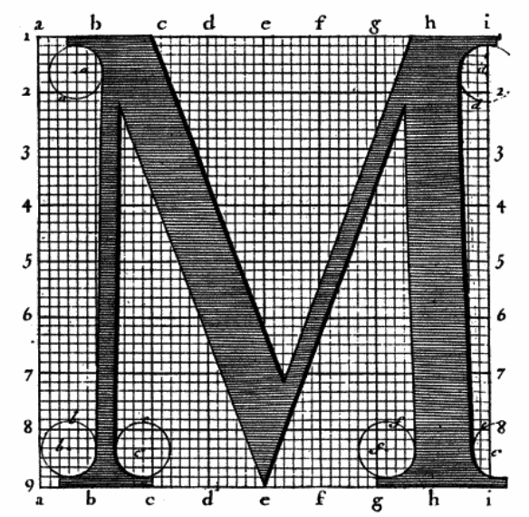
file name: Romain Du Roi M
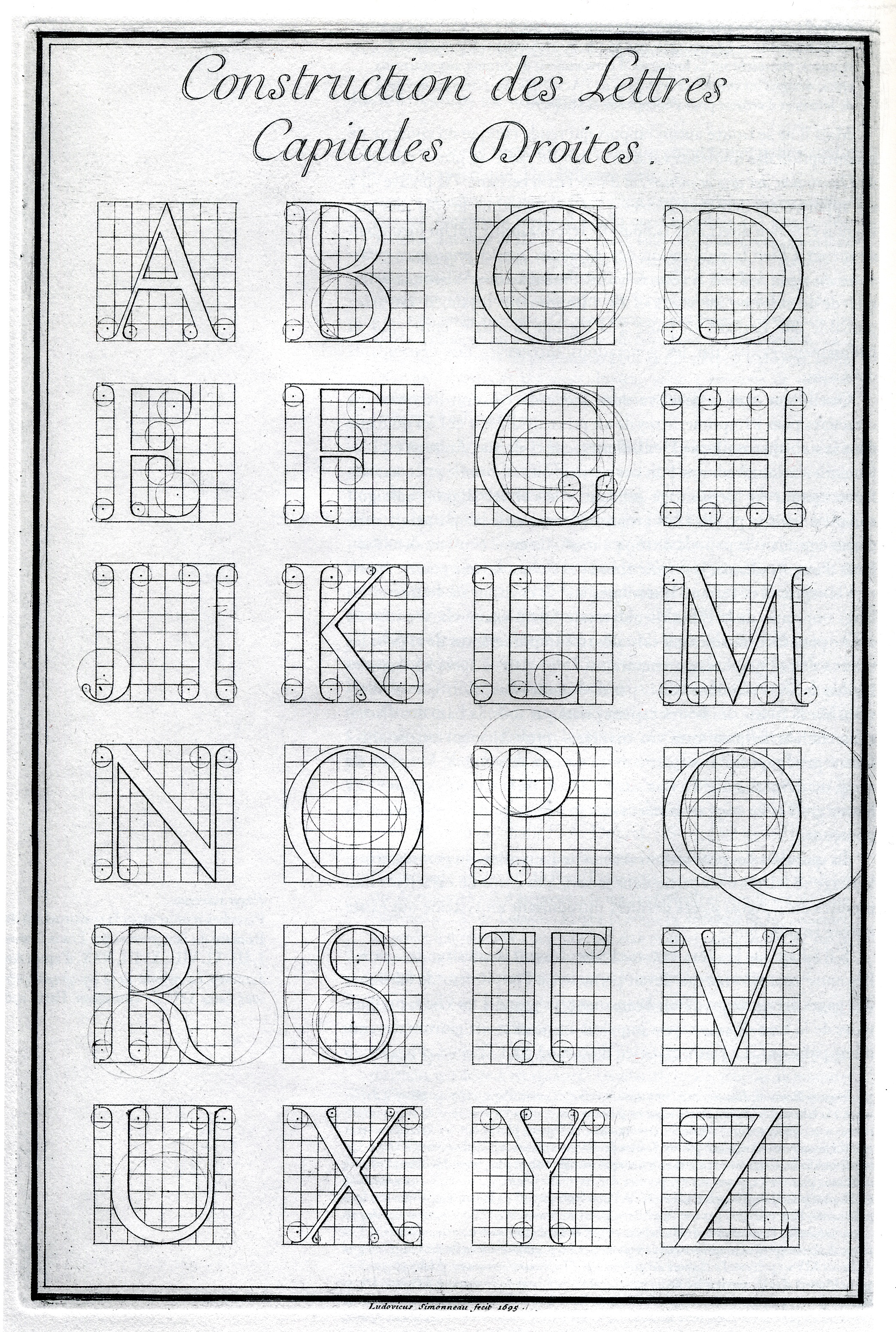
file name: Romain Du Roi page
file name: Romain Du Roi 1692 1702

file name: Ian Party Romain B P 2007

file name: Ian Party Romain B P 2007b

file name: Medailles1723
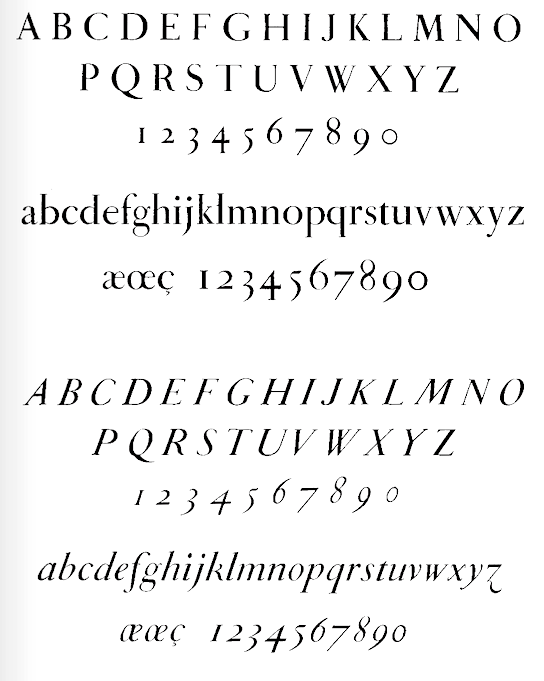
file name: Grandjean Metal
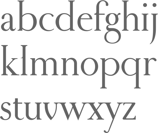
file name: Gert Wiescher Royal Romain 2005 after Philippe Grandjean Jean Alexandre Louis Luce Romain Du Roi 1745
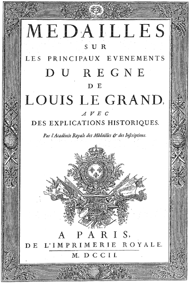
file name: Imprimerie Royale Medailles Coverpage 1702
| | |
|
Luc Devroye ⦿ School of Computer Science ⦿ McGill University Montreal, Canada H3A 2K6 ⦿ lucdevroye@gmail.com ⦿ https://luc.devroye.org ⦿ https://luc.devroye.org/fonts.html |

