|
ClearType: Typophile discussion

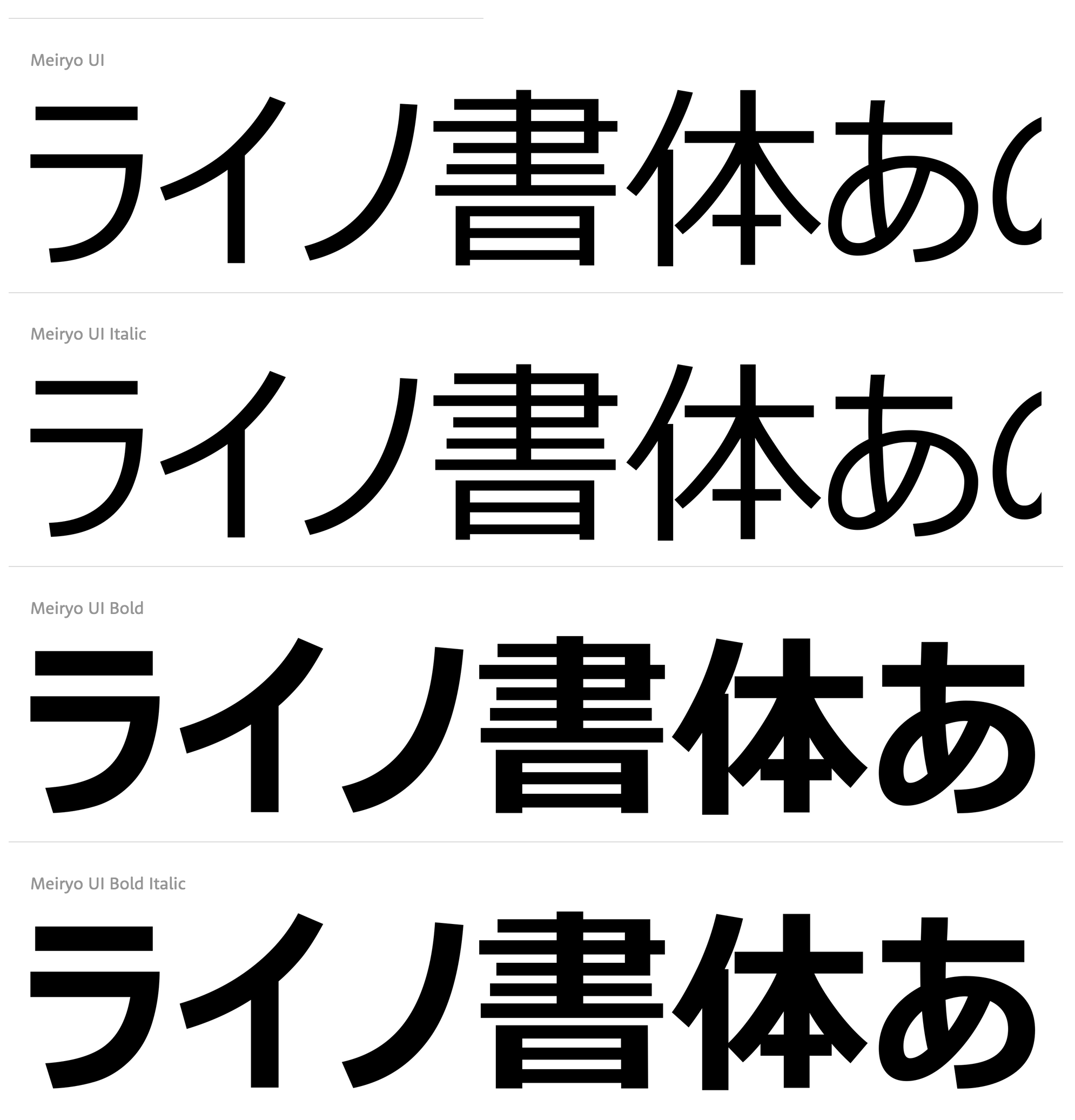
Typophile discussion on the merits of Microsoft's ClearType font package. Some quotes: - Bill Troop: [...] What is clear is that this new group of fonts (with the stellar exception of Meiryo by Eiicho Kono and Matthew Carter) does not come anywhere close to the quality previously achieved by Microsoft with Verdana and Georgia, for example. Not to mention that even Courier looks sensational in ClearType. And not to mention, for example, the ClearType version of Frutiger that was done for eBooks - why on earth can't that be made available for general use when it is so obviously the best candidate for a general purpose ClearType font? It is so much better than these new fonts which are at best uninspired and at worst amateurish. [...] The only four designers I can think of who are capable of consistently and creatively producing excellent type over a period of many decades, more or less unaided, are the four I mentioned: Carter, Zapf, Frutiger, Stone. Why on earth isn't Microsoft commissioning them? They would all work for rather less than 'John Hudson', I happen to know. Oh! and Berlow! These days, you could get a lot of great type out of Berlow for a hundred + grand. Where is that toweringly gifted craftsman in all of this? Robert Norton, where are you when we need you?
- More Bill Troop, who revealed that the fonts selected came out of a contest organized by Microsoft, and that each designer got more than 100k per family (I have also heard the figure 20k per weight; Simon Daniels states that he, Mike Duggan and Geraldine Wade were on the selection team): If you've got the money to spend, why not spend it on the greats? Just look at the amateurism rampant here. For example, the italic and bold italic s in Constantia - the kind of error you'd expect in someone drawing type for ten weeks. Let's take Calibri, of which Lucas, the one actual professional in this group, says 'Its proportions allow high impact in tightly set lines.' Oh yes? Then what is that river of space doing around the u? Why is the right sidebearing about twice what it should be and the left sidebearing about a quarter? Why is the color of each weight, and each weight in relationship to the other, so completely off? Look at the word exclamations in bold in that font - the color is so badly judged that the exc looks like it was smudged by comparison to the rest of the word and the diagonals in the x look too heavy. And how do those clotted g forms aid readability? And why do the bolds and bold italics in nearly all the fonts look a point size too large? You know, sometimes, even a really good designer needs a good art director to tell him where he is going wrong, and there surely wasn't one here, if what I am seeing represents final versions. Look at the italic a in Candara. It's not just that it's too narrow (where so many of the other fonts in this series have letters that are too wide); it just doesn't seem to have any relationship to the other letters in the words; it's like an ugly changeling. And that silly italic e, straight out of a Dwiggins nightmare, and again, problems with all of the s's. What is that silly filip on the stem of the p in Cambria that drags the whole letter out of true? But don't get me started. There isn't any end to the problems here. It's all amateursville, a type bakeoff. [...] Where is the expertise of a Zapf, a Frutiger, a Carter, a Stone, a Berlow? What about Dennis Pasternak, that wonderful designer who never pushes himself onto internet discussion boards and who really, really knows how to design type? What about some of the great eccentrics who we never hear from, such as that modest Canadian, Jim Rimmer, probably Canada's best designer, who might, with some guidance, have risen superbly to this kind of challenge? Or the wonderful fellow in Massachusetts - what is his name? - Dan Carr - who knows so much more about type and readability than some of the Coca-Cola belt hillbillies on display here? Was there an art director? Someone of the calibre of a Roger Black, a Sumner Stone? For Heaven's sake, great type people are a dime a dozen, and _this_ is what you have to show for 25+G a weight?
- Hrant Papazian: Only Constantia stands out as a high achievement, while Cambria is quite unappealing to me, and Consolas is superb if you buy its "foundational" logic, which I for one don't though), and I've been thinking about what might be the underlying reason. Certainly much of it is the "technology-snapping" going on, but I wonder if the rest wasn't a conscious -and perhaps pragmatically highly sound- design decision. There seems to be a certain design tentativeness in the whole, but it might strike just the balance that users need right now. My only real complaint about the overall is that renderings of a glyph vary.
|
EXTERNAL LINKS
ClearType: Typophile discussion
MyFonts search
Monotype search
Fontspring search
Google search
INTERNAL LINKS
Choice of fonts ⦿
David and Goliath ⦿
Type scene in Massachusetts ⦿
|