|
Hendrik D.L. Vervliet
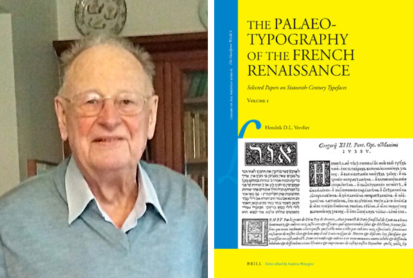
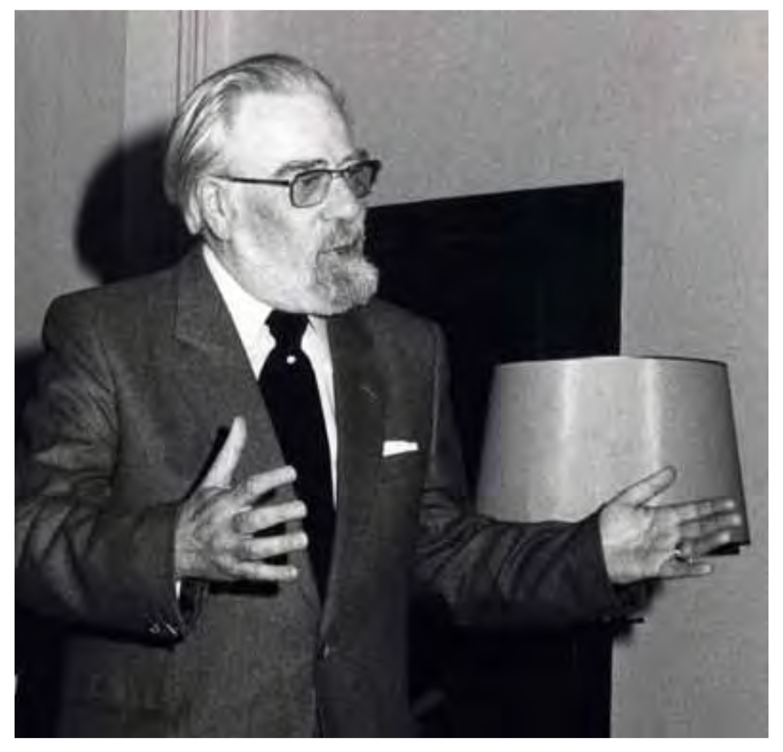
Prolific Belgian type expert (b. 1923, Antwerp; d. 2020) who graduated in philology from the University of Leuven. He became adjunct director of the Museum Plantin-Moretus in Antwerp and was on the board of governors of the Plantin Instituut voor Typografie, which he helped renovate after the second worrld war together with Albert J.M. Pelckmans. Vervliet became librarian and lecturer at the University of Antwerp, and professor at the University of Amsterdam. Obituary that uses a text by Ludo Simons at the Plantin Instituut voor Typografie. Considered as the world's top expert on 15th and 16th century typography, Vervliet leaves a wealth of books on type from the renaissance era, and book history in general. Author of - Sixteenth-Century Printing Types of the Low Countries. With a Foreword by Harry Carter, Amsterdam: M. Hertzberger, 1968. This book has 267 facsimile-illustrations depicting 147 typespecimens. It was translated from the Dutch manuscript by Harry Carter.
- Civilité Types (with Harry Carter, 1966, Oxford, University Press), for The Oxford Bibliographical Society).
- Cyrillic & oriental typography in Rome at the end of the sixteenth century: an inquiry into the later work of Robert Granjon (1578-90) (1981, Berkeley Poltroon Press, 55+3 pages).
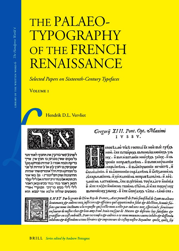
- The Palaeotypography of the French Renaissance Selected Papers on Sixteenth-Century Typefaces (Library of the Written Word, 2008, and Leiden: Koninklijke Brill NV, 2008). This is a 565-page 2-volume oeuvre about which the publisher writes: This collection of thirteen essays examines sixteenth-century type design in France. Typefaces developed during this period were to influence decisively the typography of the centuries which followed, and they continue to influence a great many contemporary typefaces. The papers' common goal is to establish the paternity of the typefaces described and critically to appraise their attributions, many of which have previously been inadequately ascribed. Such an approach will be of interest to type historians and type designers seeking better-documented attributions, and to historians, philologists, and bibliographers, whose study of historical imprints will benefit from more accurate type descriptions. The papers and illustrations focus on the most important letter-cutters of the French Renaissance, including Simon de Colines, Robert Estienne, Claude Garamont, Robert Granjon, Pierre Haultin, and also include a number of minor masters of the period.
- French Renaissance Printing Types: A Conspectus (New Castle, Delaware, and London: Oak Knoll Press, The Bibliographical Society, and The Printing Historical Society 2010). This conspectus aims at surveying exhaustively and regardless of aesthetics, all Roman, Italic, Greek, Hebrew, and Arabic typefaces made in France during the sixteenth century. Such a survey will be of interest to historians, bibliographers, and philologists wishing to identify the types used in the imprints they are investigating, as well as to type historians or type designers wishing to base their attributions on documentary evidence. The conspectus consists of introductory chapters on the sources available, the evolution of sixteenth-century type-casting and letter-engraving, biographical notices of 17 punchcutters (both famous ones, such as Colines, Garamont, Granjon, and lesser known ones, such as Vatel, Gryphius, or Du Boys) and the methodology used. The main part of the book consists of the facsimiles of 409 typefaces (216 Romans, 88 Italics, 61 Greeks, 41 Hebrews, 2 Arabics, and one phonetic) each with a short identifying notice, describing their letter family, size, punchcutter (or eponym), their first appearance in books or type-specimens, the surviving materials such as punches or matrices, and finally (for about two-thirds of them), the recent literature. Every typeface has been illustrated, several with multiple examples of their use.
- Vine Leaf Ornaments in Renaissance Typography: a survey (2012, New Castle, Delaware: Oak Knoll Press and HES & DE GRAAF Publishers). Oak Knoll writes about this 416-page book: This new survey deals with the birth and early history of the typographical ornament commonly known as a vine leaf or Aldine leaf. Starting in 1505, the introduction sketches the fleurons beginnings in handwritten form onwards to printed epigraphical handbooks. These small ornaments originated as type-cast sorts in the first decade of the sixteenth century in Augsburg and Basle at presses that attended to the interests of a humanist reading public. From the 1520s onwards, the design evolved into an all-purpose decorative motif fitting for any publication. Venice and Paris designers, such as Garamont and Granjon, cut new designs that can still be found in most digital fonts today. The main part of this book is a comprehensive catalogue of all sixteenth-century type-cast vine leaf designs. It provides a descriptive notice of each fleuron, irrespective of its aesthetic merit or country of origin.
- Robert Granjon, letter-cutter, 1513-1590: An oeuvre-catalogue (New Castle, Delaware: Oak Knoll Press, 2018, 200 pages).
- Granjon's Flowers Am Enquiry into Granjon's, Giolito's, and De Tournes' Ornaments, 1542-1586 (New Castle, Delaware: Oak Knoll Press, 2016, 248 pages). The contents include a chronology of Granjon's ornaments (1544-1586), ornaments used by Gabriele Giolito in Venice (1542-1550), and flowers and ornaments used by de Tournes in Lyons (1544-1577). Appendices include illustrated lists of ornaments by size, width, and date.
- Post-incunabula en hun uitgevers in de Lage Landen: een bloemlezing gebaseerd op Wouter Nijhoff's L'art typographique. Post-incunabula and their publishers in the Low Countries: a selection based on Wouter Nijhoff's L'art typographique (Den Haag-Boston-London: Martinus Nijhoff, 1978, 205 pages).
- Gutenberg of Diderot? De typografie als factor in de wereldgeschiedenis (Deventer: Van Loghum Slaterus, 1977, 33 pages). This is the speech he gave when he became professor of book history at the University of Amsterdam on May 16, 1977.
- Liber librorum : 5000 jaar boekkunst (by Hendrik D. L. Vervliet, Fernand Baudin and Herman Liebaers, Brussel: Uitgeverij Arcade, 1972). The French translation: Liber librorum: cinq mille ans d'art du livre., Bruxelles: Arcade, 1972. Engelse vertaling: The book through five thousand years London-New York: Phaidon, 1972. Duitse vertaling: Liber librorum: 5000 Jahre Buchkunst, Genève: Weber, 1973.
- Reproductions of Christopher Plantin's Index sive specimen characterum 1567 & Folio specimen of c. 1567, together with the Le Bé-Moretus Specimen, c. 1599 (by Hendrik D. L. Vervliet ans Harry Carter, London: Bodley Head, 1972).
- The type specimen of the Vatican Press 1628. A facsimile with an introduction and notes by H.D.L. Vervliet (by Andrea Brogiotti and Hendrik D. L. Vervliet, Amsterdam: Menno Hertzberger, 1967).
- Orientaliste [1882-1967] Specimen (by Hendrik D. L. Vervliet and René Draguet, Leuven: Drukkerij Orientaliste, 1967, 64 pages).
- Danfrie Reconsidered. Philippe Danfrié's (d. 1606) Civilité Types, in: The Library, vol 21:1, pp. 3-45, 2020.
Wikipedia link.
|
EXTERNAL LINKS
Hendrik D.L. Vervliet
MyFonts search
Monotype search
Fontspring search
Google search
INTERNAL LINKS
Books on type design ⦿
Dutch type design ⦿
The Belgian type scene ⦿
Type design in France ⦿
Civilité ⦿
Garalde or Garamond typefaces ⦿
Dingbats (original) ⦿
Floriated initial caps ⦿
|
