TYPE DESIGN INFORMATION PAGE last updated on Mon Mar 9 16:33:59 EDT 2026
FONT RECOGNITION VIA FONT MOOSE

|
|
|
|
Thomas W. Lincoln
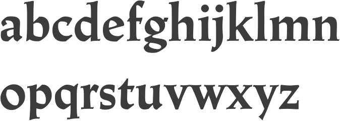
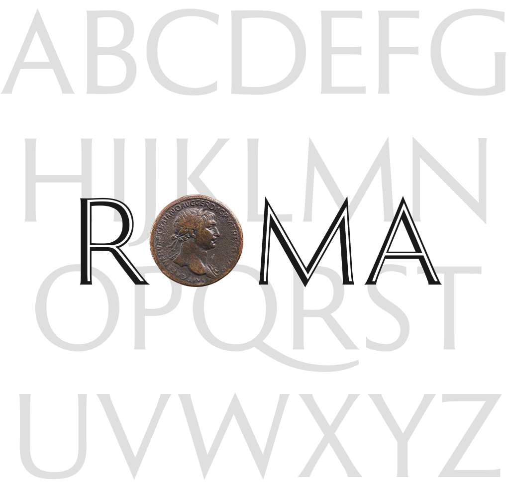
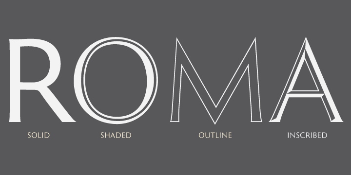
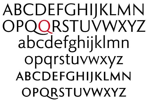
Graphic designer and lettering artist, born in 1939 in Eugene, OR. He studied with Douglas Lynch at the Museum Art School in Portland and later apprenticed with Lynch. Lincoln studied calligraphy with Lloyd Reynolds and Arnold Bank at Reed College in Portland, OR. After a stint as an agency art director producing national ads for Pendletons womens fashions, Lincoln moved to New York City, where he joined the studio of Herb Lubalin. In NYC he continued his involvement with academia, exploring film at The New School and an intensive workshop with Milton Glaser. Eventually Lincoln started his own studio (occupying the space on east 32nd Street where New York Magazine was born), combining a design practice with teaching at New Yorks School of Visual Arts. Lincoln has served as Art Director at TCA (Benton & Bowles) in Westport, CT, as Creative Director, Redington, Inc., Stamford, CT, as Principal, Thomas Lincoln Design & Motion Graphics Communication, Westport, CT, as Freelance in residence Art Director, Baden & Co., Eugene, OR, and in 1992 returned to consulting and design through his own design office, Lincoln Design, based in Eugene/Springfield, OR. Creator of typefaces at VGC, such as Lincoln Gothic (1965), which won the National Typeface Competition. His clients over the years include Acoustic Sciences Corporation, AT&T, Continental Packaging Co., The Ford Foundation, GE, IBM, PepsiCo, RCA, Showtime, Abrams, Colliers, Harpers Magazine, Macmillan, McGraw-Hill, Random House, Harcourt/ Brace, New York Times, Simon and Schuster, and Viking Press. In 2006, Bitstream published New Lincoln Gothic, a 24-weight family starting with a hairline weight. This digital version was made in Fontographer from the old typositor strips by Lincoln himself. In 2011, Canada Type and Thomas Lincoln cooperated in the production of the roman sans family Roma. This typeface was published in 2012 at P22. Lincoln himself tells the story: My intention in designing Roma was to create a definitive, contemporary sans serif expression of the classic Roman majuscule as depicted in the Trajan Inscription at the base of the Trajan Column in Rome. The Capitalis Monumentalis letter forms of the Trajan Inscription, which date to 113 Ad, have been described by the noted type scholar, calligrapher and historian, Father Edward Catich, as "the best roman letter designed in the western world, and the one which most nearly approaches the alphabetic ideal." And in the 1902 publication, "The Practice of Typography", Edmund F. Strange stated: "No single designer, or the aggregate influence of all the generations since has been able to alter the form, add to the legibility, or improve the proportion of any single letter there in." Mr. Strange's pronouncement was true in 1902 and it is true today. Through the years various type designers have been inspired by the Trajan Roman to offer their own interpretations. Most notably, perhaps, Frederick Goudy's Trajan Title (1930), Warren Chappell's Linotype Trajanus (1940) and more recently, Carol Twombly's literal rendition of Adobe Trajan (1989) and John Stevens' spirited Stevens Titling (2011). There have been many other nice interpretations by other contemporary designers, yet it may still be said that none has improved the form, the legibility or the proportion of any single letter---though it can be said that the letters J, K, U, W, Y and Z, nonexistent in the ancient alphabet, have been added. Less common has been the interpretation of Trajan in sans serif form. Hermann Zapf's Optima (1953), Sumner Stone's ITC Stone (1987) and Ronald Arnholm's Legacy Sans (2000), among other nice sans serifs, reflect characteristics of Trajan but seem influenced by other factors as well, including fonts such as Gill Sans and Syntax. And, while I don't presume to speak for their designers, none of these typefaces seem designed specifically with Trajan in mind. My own Lincoln Gothic (1965), and its subsequent expansion as New Lincoln Gothic (2006), was a deliberate attempt to interpret the particular characteristics of the Trajan majuscule in a contemporary sans serif face. The most significant change in the later version was the addition of a lower case; a challenge that had simmered on my personal bucket list for several years. Roma, though, differs from Lincoln Gothic in one significant way: while the terminals of Lincoln Gothic are flat, in Roma the vertices of letters such as A,M,N,V and Z are pointed. I believe this change is the critical difference that moves Roma closer to my objective of honoring the original Trajan. As with Lincoln Gothic, Roma's strokes have an almost imperceptible entasis that terminate in a subtle flare; a vestige of the serif. The importance of this feature is that it imbues the font with a humanist quality. The serif, as Father Catich points out in his book, "The Origin of The Serif", almost certainly derives from a combination of the flat brush and the human hand; it is what ties the letterform directly to human anatomy and craftsmanship, integrating it in a fundamental way with the nature of man---as distinct from the machine. In 2020, he released Lincoln Electric at Canada Type. Lincoln Electric started its life as an in-house experimental film type Thomas Lincoln drew shortly after concluding his work as part of Herb Lubalin's famed crew in the late 1960s. The master alphabet was drawn on illustration boards using pen and ink and press-type lines. The digital retooling of this Bifur-style typeface (after Cassandre's Bifur from 1929) was done by Patrick Griffin. |
EXTERNAL LINKS |
| | |


file name: Thomas Lincoln Canada Type Lincoln Electric 2020 368568

file name: Thomas Lincoln Canada Type Lincoln Electric 2020 368571

file name: Canada Type Lincoln Electric 2020 368572

file name: Canada Type Lincoln Electric 2020 368573

file name: Canada Type Lincoln Electric 2020 368575

file name: Canada Type Lincoln Electric 2020

file name: Thomas Lincoln Canada Type Roma 2011

file name: Thomas Lincoln Canada Type Roma 2011b
file name: Thomas Lincoln Canada Type Roma 2011c
file name: Thomas Lincoln Canada Type Roma 2011d
file name: Thomas Lincoln Canada Type Roma 2011e
| | |
|
Luc Devroye ⦿ School of Computer Science ⦿ McGill University Montreal, Canada H3A 2K6 ⦿ lucdevroye@gmail.com ⦿ https://luc.devroye.org ⦿ https://luc.devroye.org/fonts.html |