TYPE DESIGN INFORMATION PAGE last updated on Sat Jul 20 14:09:07 EDT 2024
FONT RECOGNITION VIA FONT MOOSE

|
|
|
|
Colophon
[David Bennewith]
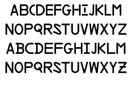
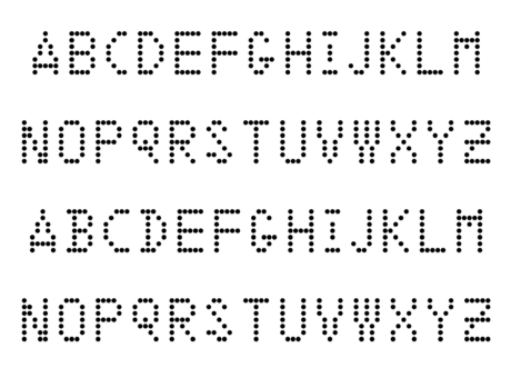
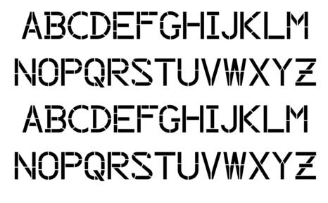
David Bennewith runs Colophon in Auckland, New Zealand. He created a few experimental typefaces in 2003-2004: Concorde (a diamond shape pattern font), Mobile Carrion (Courier-style face) and Pukeko. In 2016, he produced Lincoln Mitre, a free font with a military history. He writes: In the early 1950s the US NAVY and Air Force commissioned MIT Lincoln Laboratory (Massachusetts Institute of Technology, Lexington) to begin Research & Development for what was to eventually become SAGE (Semi Automatic Ground Environment)---a computer network designed for strategic, early warning air defence---in retort to a new technology-enabled reality of long range attack from the sky [and weapons of mass destruction], and new forms of Super Power paranoia that would lead to the Cold War. The SAGE network---capable of real-time mass data processing---worked with large computers, networking equipment and radar sites to produce an image of the protected airspace over the U.S. continent. One element of the computer network was the AN/FSQ-7 Combat Direction Central, a computerised command and control system, produced by IBM military Products Division. The AN/FSQ-7 was equipped with command post digital display desks operated by a soldier, using a light gun, push buttons and voice communication to identify and track targets, and if necessary plot an intercept course to them. Work on computer display systems began almost simultaneously with the computers operational design, leading to the design of a new typography for the console's displays, designed to mitigate human error in reading and reporting of data displayed on the screen. Taking into account that the type system would be used in situations of pressure and stress, the MIT Lincoln Laboratory and Mitre Corporation commissioned large studies into type legibility, as well as undertaking their own legibility tests. The goal being to create a type design that would work both technically, over various display systems [Cathode Ray Tube and Dot-Matrix displays], and visually (as a whole) while creating maximum visible differentiation between individual glyphs within its alphanumeric and graphic system, therefore reducing mistakes in recognition between signs that are commonly mistaken for one another: for example I, L and 1, or 0 and O. The outcome of the L/M type system is a programme for creating a typeface that doesn't necessarily aid legibility---which is arguably a context based phenomenon---but presents a solution to the problem of producing maximum letter differentiation in a given type design system – which aids character recognition and acquisition. The L/M types were never developed to render continuous text but call signs (the designation of the aircraft followed by an identification number), more visual signals, or data, than lexical semantics. Yet, these call signs find their way back into civil society via air disasters reported through media, like the disappearance of MH370 or the shooting down of MH17. The resources dedicated to the research and development of the L/M typefaces alone are remarkable, for example, declassified reports reference what appears to be all published studies in legibility available up to the time. We can see what is possible, and also what is impossible, with seemingly infinite resources. For example, it is impossible to define any particular author of the font, or ascertain how many people worked on its development. its design being part of a contingent and iterative process, over what appears to take place over many years. Curiously, to this day, the original drawings of the type system remain classified in The MITRE Corporation archives. These fonts are digitisations of the alphanumerics I found in many military and research reports connected to the L/M type system. Each font is connected to a particular visual display on which the letters, digits and symbols would be rendered. Punctuation and accents have been added for convenience in use. Library Stack link. |
EXTERNAL LINKS |
| | |
file name: David Bennewith Lincoln Mitre 2016
file name: David Bennewith Lincoln Mitre 2016
file name: David Bennewith Lincoln Mitre 2016
| | |
|
Luc Devroye ⦿ School of Computer Science ⦿ McGill University Montreal, Canada H3A 2K6 ⦿ lucdevroye@gmail.com ⦿ http://luc.devroye.org ⦿ http://luc.devroye.org/fonts.html |