TYPE DESIGN INFORMATION PAGE last updated on Mon Jul 20 21:02:55 EDT 2026
FONT RECOGNITION VIA FONT MOOSE

|
|
|
|
Clarendon
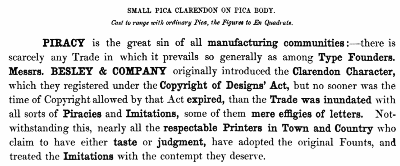
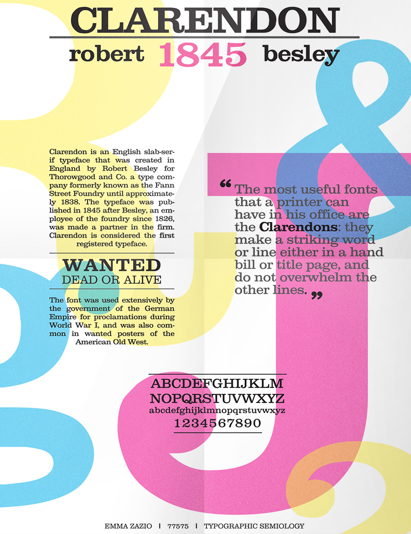
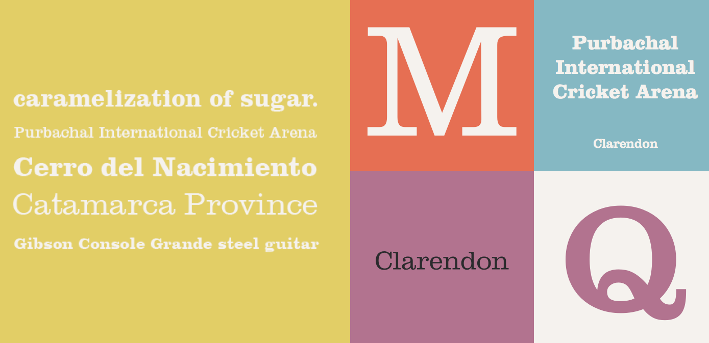
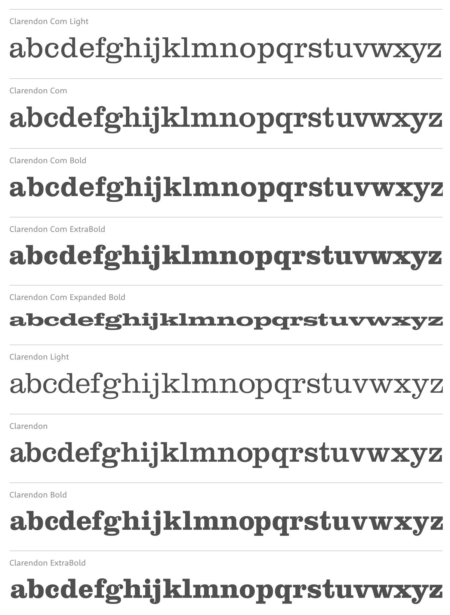
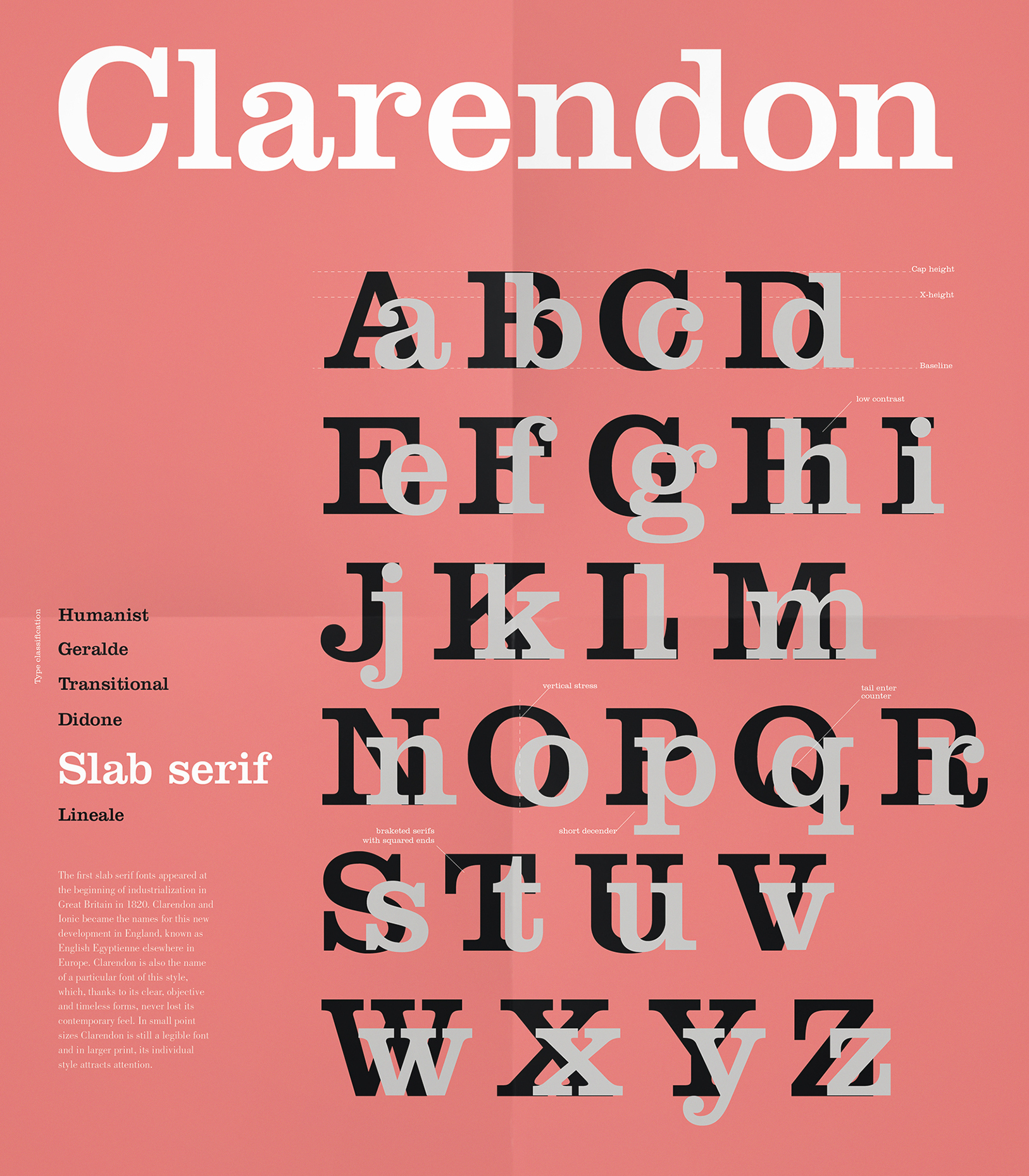
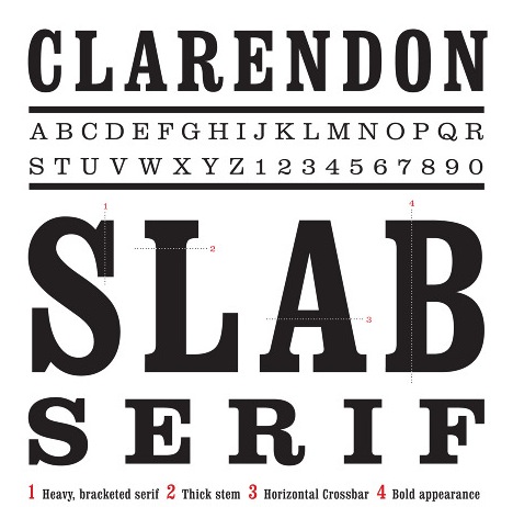
The original Clarendon is due to Robert Besley (1845). Robert Bringhurst writes: Clarendon is the name of a whole genus of Victorian typefaces, spawned by a font cut by Benjamin Fox for Robert Besley at the Fann Street Foundry, London, in 1845. These typefaces reflect the hearty, stolid, bland, unstoppable aspects of the British Empire. They lack cultivation, but they also lack menace and guile. They squint and stand their ground, but they do not glare. In other words, they consist of thick strokes melding into thick slab serifs, fat ball terminals, vertical axis, large eye, low contrast and tiny aperture. The original had no italic, as the typeface had nothing of the fluent hand or sculpted nib left in its pedigree. Mac McGrew adds: Clarendon is a traditional English style of typeface, dating from the 1840s, the name coming from the Clarendon Press at Oxford, or, according to some sources, from Britain's Earl of Clarendon and his interest in that country's Egyptian policies. (Such typefaces were classified as Egyptians, and inspired such later designs as Cairo, Karnak, Memphis, and Stymie.) Early Clarendons were used primarily as titles and display typefaces, for which their strong and sturdy nature was well suited. They have the general structure of romans, but lack the hairlines typical of those typefaces. Being heavier, the traditional Clarendons were often used as boldfaces with romans, before the family idea provided matching boldface designs. McGrew continues his discussion by pointing out various revivals and typefaces with strong similarities: Similar typefaces were known as Doric or Ionic, before more individualized type names became common; in fact, all three names were sometimes used interchangeably. Most foundries had versions of Clarendon, and sometimes Doric and Ionic, in the nineteenth century, but most of these typefaces were obsolescent by the turn of the century. However, a few were copied by Linotype, Intertype and Monotype, and thus given a renewed lease on life. Clarendon Medium of BB&S was formerly known as Caledonian. ATF had a similar typeface known as Ionic No. 522. Keystone showed Clarendon Condensed in 1890. Clarendon [No. 51 of BB&S was called Winchendon by Hansen, and extended to 48-point. Like many pre-point-system typefaces, some foundries adapted them to point-system standards by casting them on oversize bodies, others on undersize bodies with overhanging descenders. In the later 1950s Stephenson Blake in England revived several of these early Clarendons under the new name of Consort, which became a popular import (and the source of some of our specimens). Consort Bold Condensed is said to be the first Clarendon, of 1845. (Some added members of the Consort family are noted under Popular Imports in the Appendix.) In 1953 a new version of Clarendon was developed by Hermann Eidenbenz for the Haas Type foundry in Switzerland and later acquired by Stempel in Germany. The Haas Clarendon was copied by Linotype in 1966, in light and bold weights, and about the same time Ludlow brought out three weights of essentially the same face. This was created primarily to set the newspaper ads of a large department store, but it was a good addition to the resources of Ludlow. ATF commissioned a modernized rendition of Clarendon from Freeman Craw, and this was brought out in 1955 as Craw Clarendon (q.v.). About 1961 Monotype brought out Clarendon Bold Extended, similar to Craw Clarendon but heavier. Also see Ionic, News with Clarendon, Manila. |
EXTERNAL LINKS |
| | |

file name: Robert Besley Clarendon 1845 Poster by Emma Zazio 2015

file name: Robert Besley Clarendon 1845 Poster by Emma Zazio 2015b
file name: Hermann Eidenbenz Clarendon 1953 Linotype Version
file name: Hermann Eidenbenz Clarendon 1953 Linotype Version
file name: Hermann Eidenbenz Clarendon Linotype 1953 poster by Melisa Agata 2017
file name: Elizabeth West Clarendon Poster 2012
| | |
|
Luc Devroye ⦿ School of Computer Science ⦿ McGill University Montreal, Canada H3A 2K6 ⦿ lucdevroye@gmail.com ⦿ https://luc.devroye.org ⦿ https://luc.devroye.org/fonts.html |