|
Tiresias: Critique by Joe Clark
[Joe Clark]
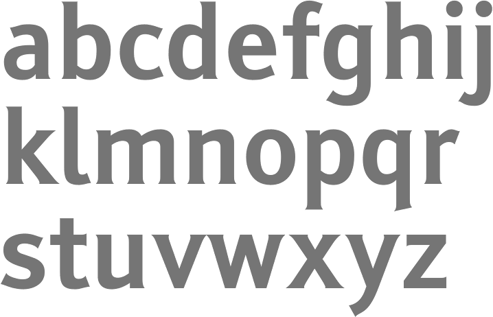
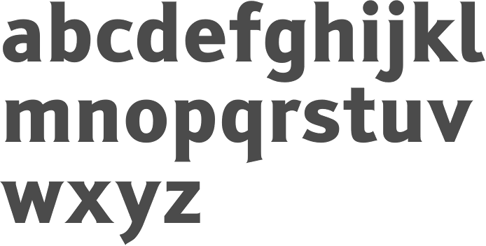
Joe Clark (Toronto) deflates the balloon blown up by Bitstream regarding John Gill's Tiresias, which was specially developed for screen captioning. His main points: - It was tested on only a few dozen people, but is marketed as a font for everyone.
- Some of the tests for this claimed caption and subtitle font used printouts, not captions or subtitles.
- It is claimed to be superior to typefaces like Times, even though what were talking about are screenfonts, not print fonts.
- It costs up to $17,500, but it does not even have an italic.
- Its researchers admit to little expertise in typography, yet the researchers parent organization receives 40% of the retail price.
- It is claimed to be a better solution to a specific problem than a generic typeface would be, but it has itself turned into a generic typeface that is misapplied to specific problems.
- The ingenious, unique typeface has already been partially cloned, via a competing knockoff typeface with a different design and identical widths.
- It is ugly by design.
|
EXTERNAL LINKS
Tiresias: Critique by Joe Clark
MyFonts search
Monotype search
Fontspring search
Google search
INTERNAL LINKS
Movie fonts ⦿
The Canadian type scene ⦿
Readability & Legibility ⦿
Type for TV ⦿
|