TYPE DESIGN INFORMATION PAGE last updated on Fri Nov 14 13:09:53 EST 2025
FONT RECOGNITION VIA FONT MOOSE
|
|
|
|
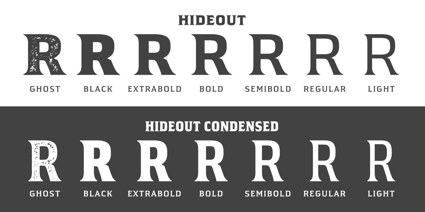
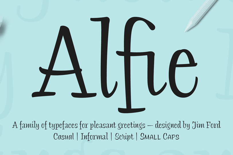
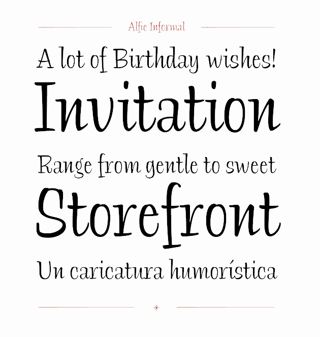
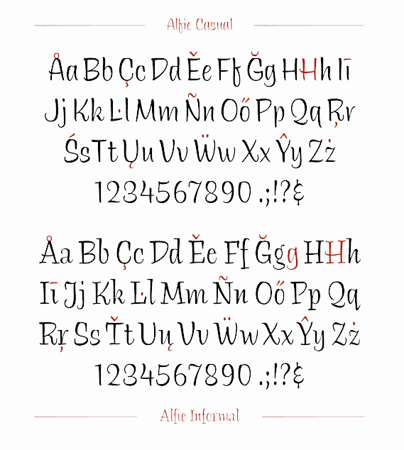
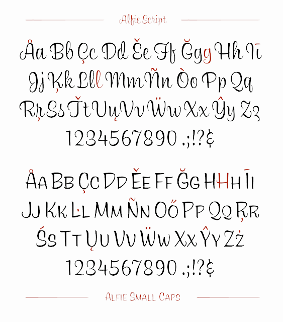
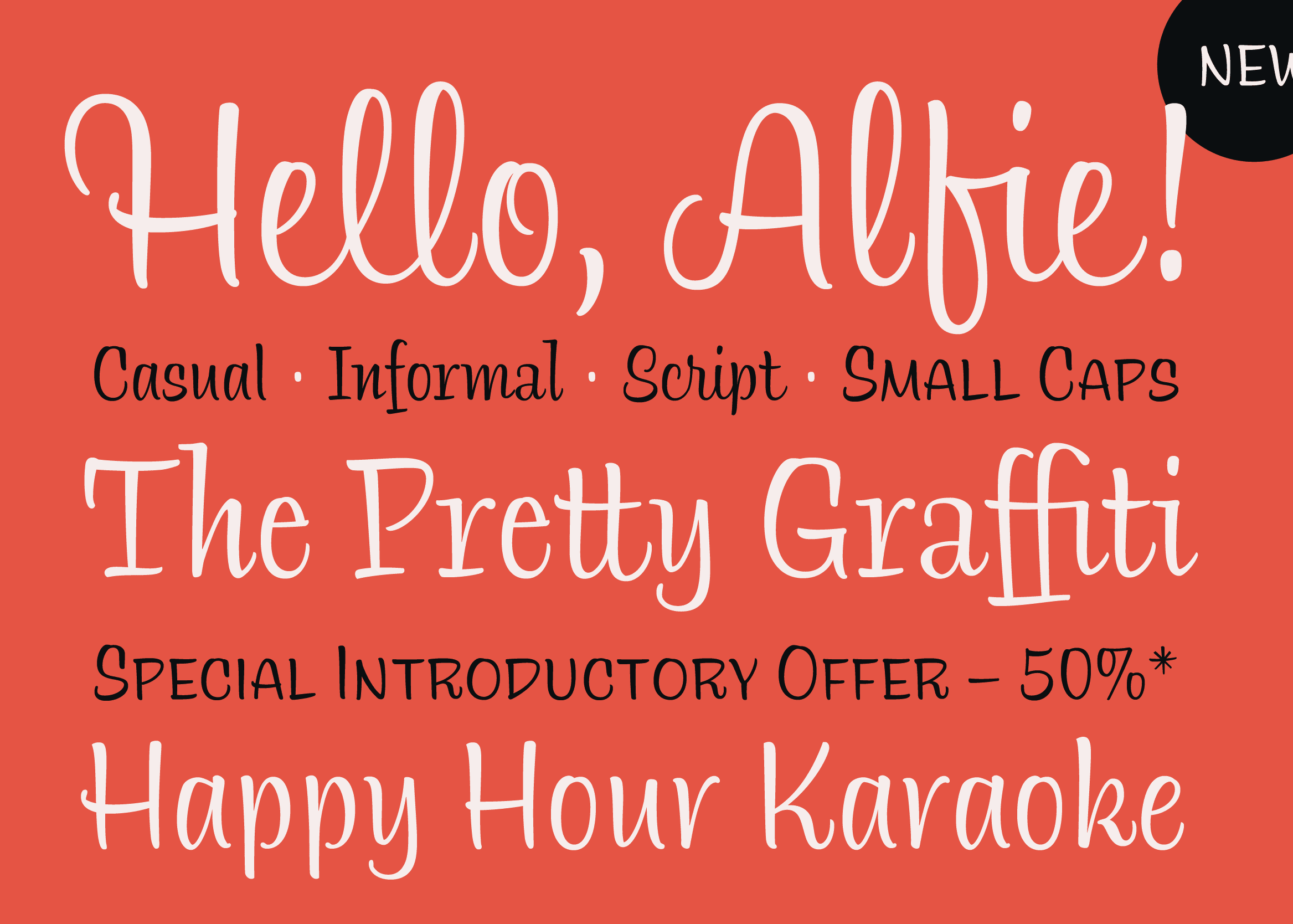
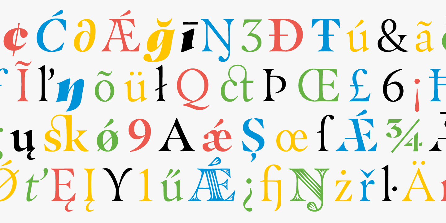
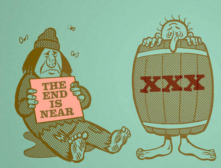
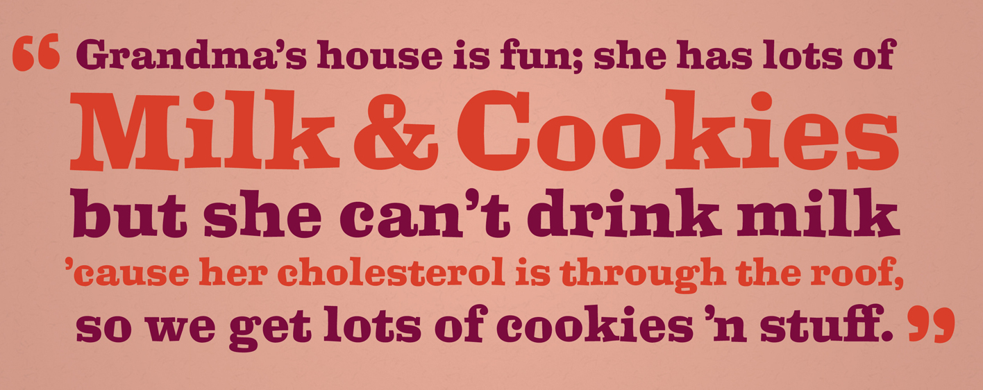
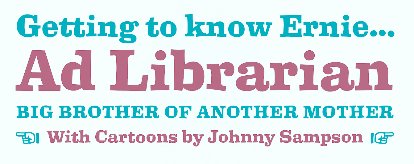
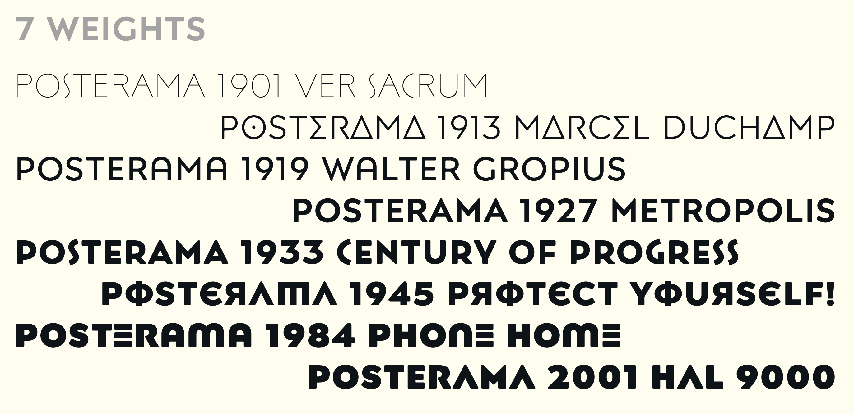
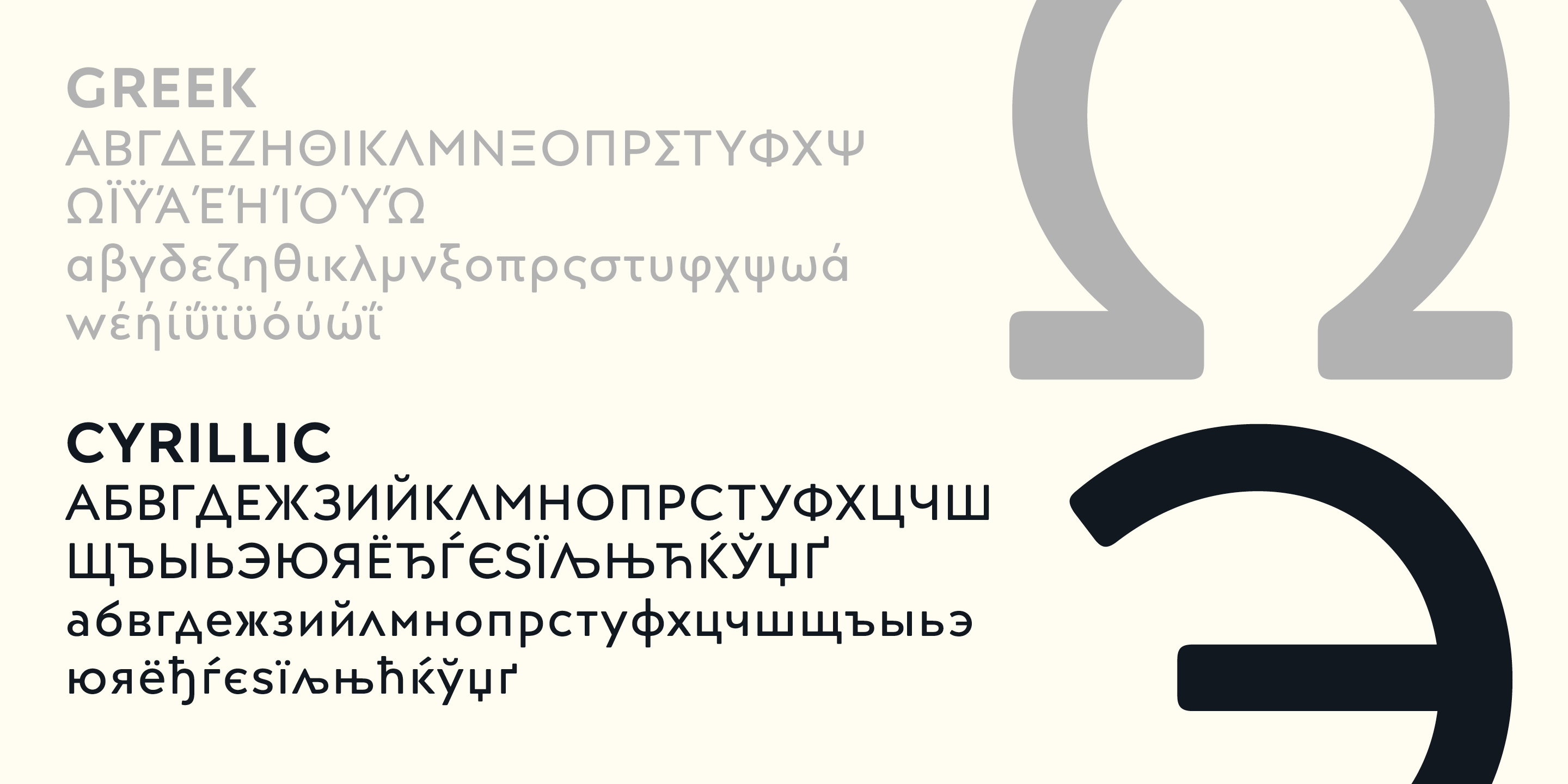
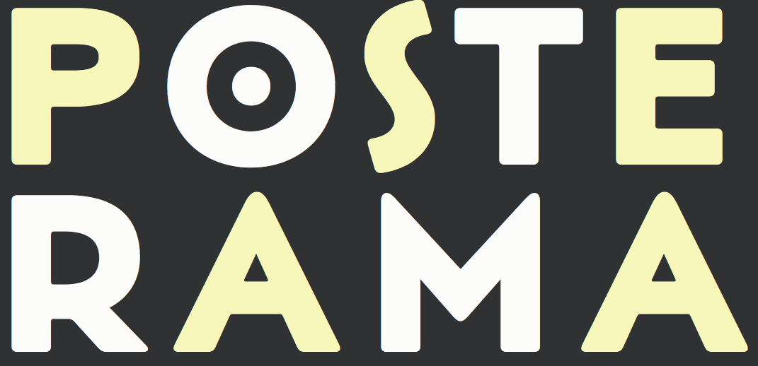
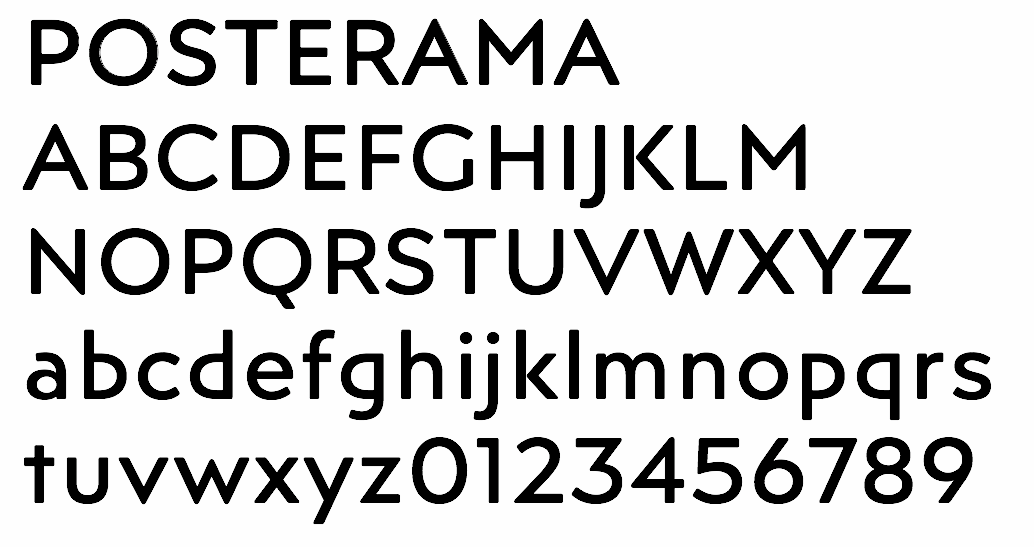
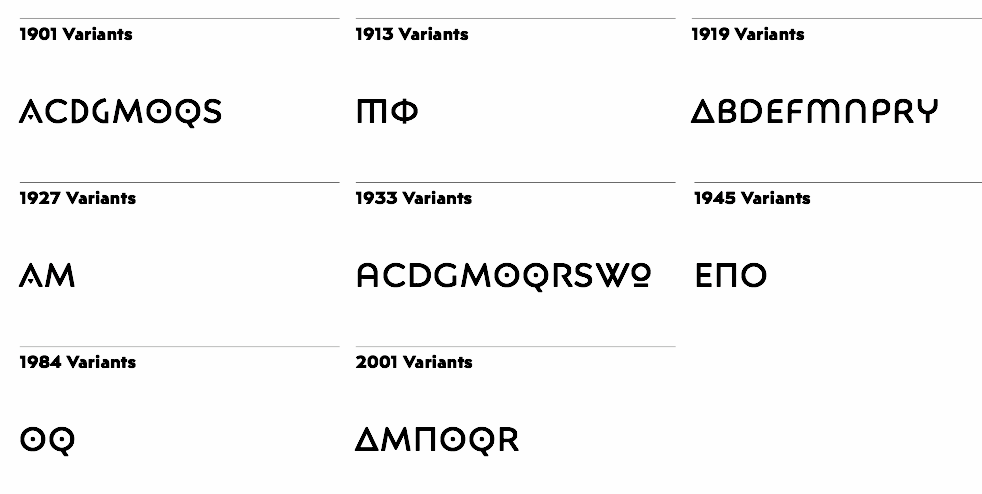
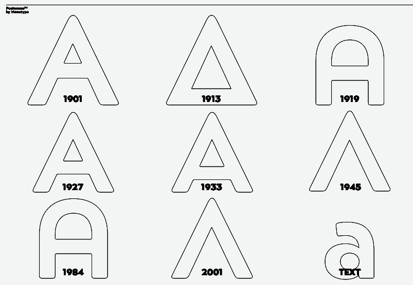
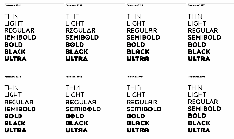
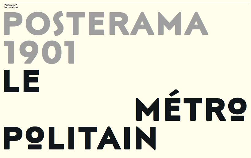
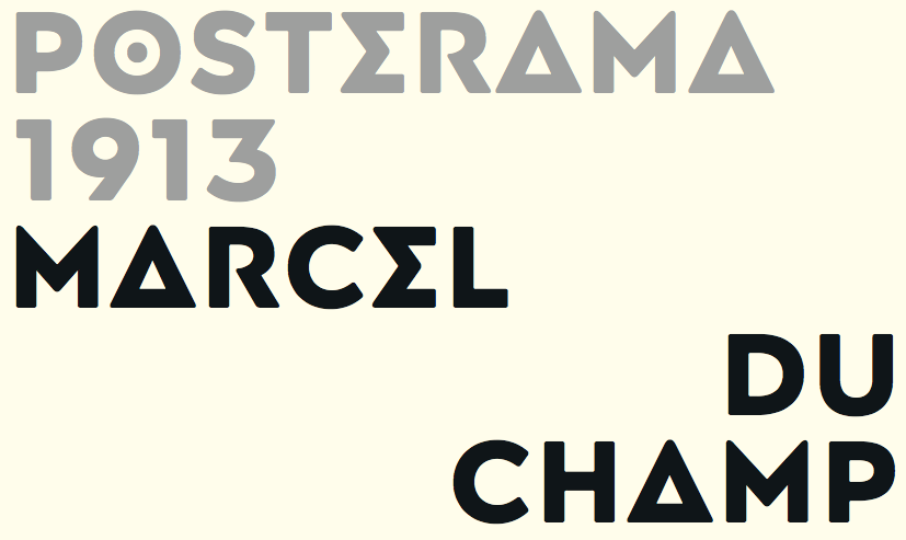
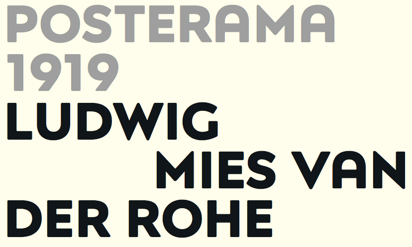
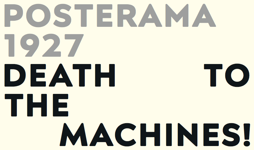
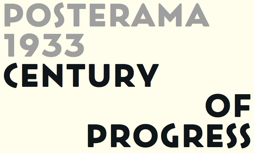
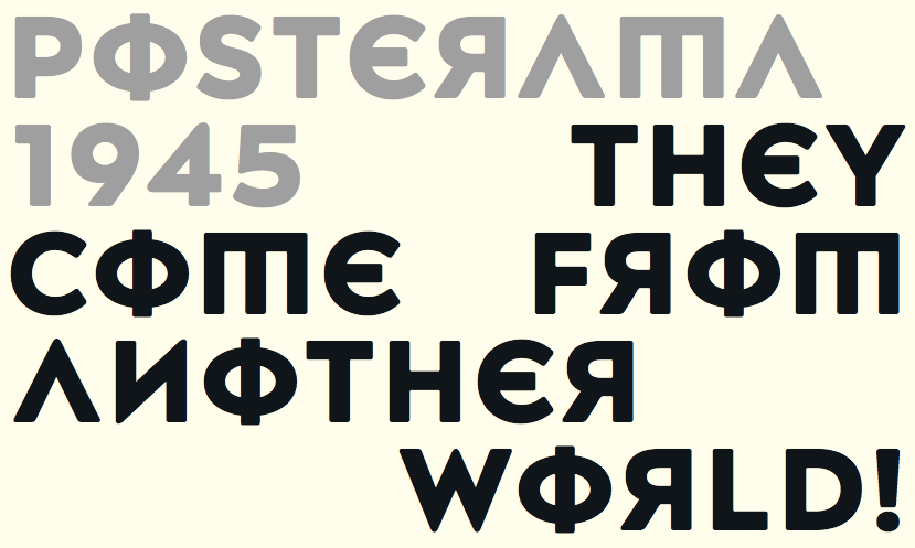
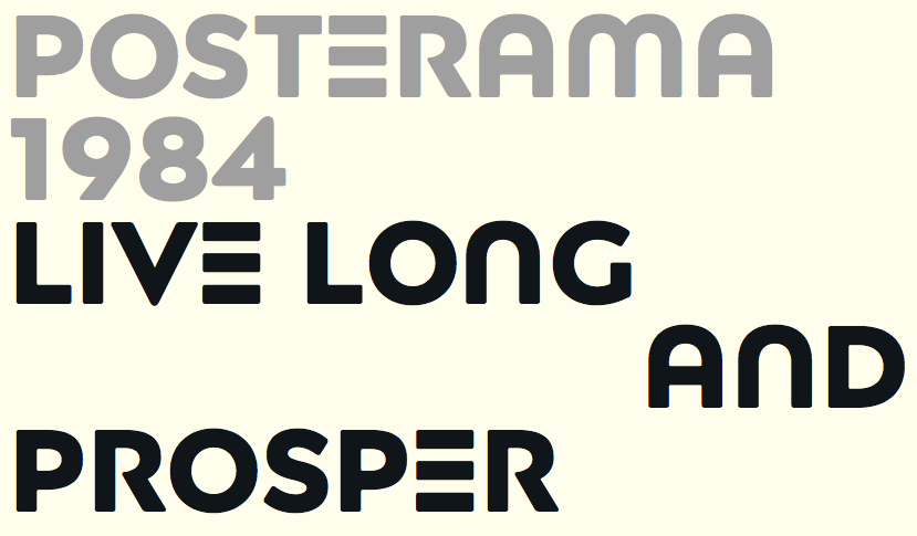
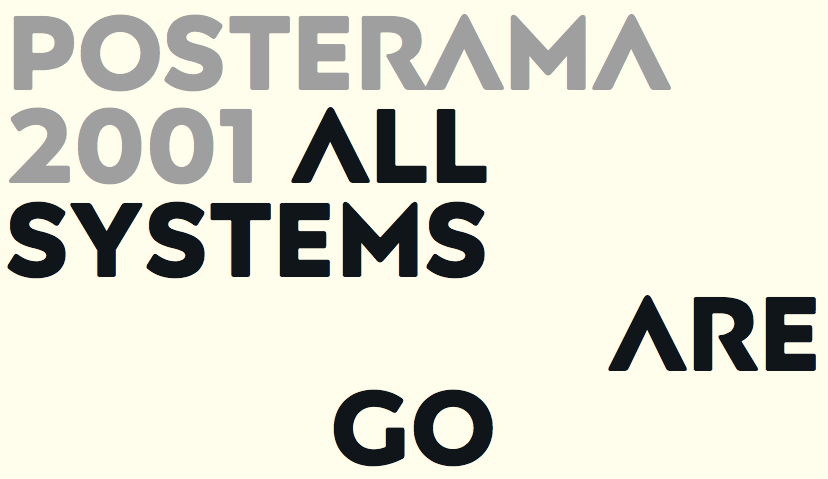
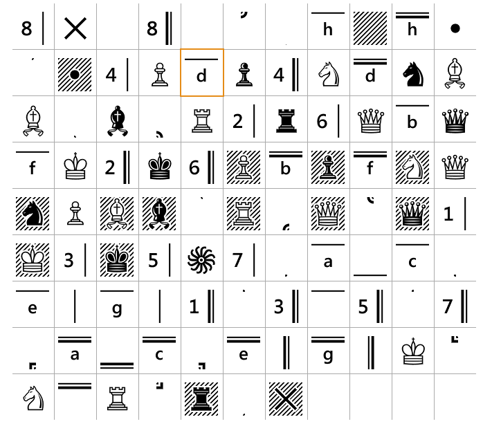
Versa Type is Jim Ford's foundry. Jim graduated in graphic design from Columbia College in Chicago. He received his BFA in Graphic Design in 2005. Jim lives in Delavan, Wisconsin. He joined Ascender Corp in 2005, and Monotype in 2013. At Ascender, he co-designed Ayita (2006), a decorative sans family, with Steve Matteson. Pokerface (2009, Ascender) is an industrious mixed-case display font devised on the theme of playing cards. Captain Quill (2008, Ascender Corp) is calligraphic. Moire (2008, Microsoft) is a sans face. Jimmy Crack Corn (2009, Ascender) is an ordinary handwriting font. Ford's Folly (2010, Ascender) is a felt tip pen face. He also made Artcraft Pro (Ascender). Dempster (2010, Ascender) is a geometric sans with angular terminals; it was reissued in 2016 and Steve Matteson's name was adeed to the list of designers. He also designed the Segoe Chess Font (2006, Ascender, with Steve Matteson). He co-designed Segoe Mono in 2012 with Steve Matteson at Ascender. In 2013, Jim joined Monotype as a type designer. The Halloween font Wolfsblood was designed in 2013. In 2014, he created Quire Sans (a humanist sans) at Monotype. In 2015, he designed Esca (Monotype). Richie (2016, Monotype) is a brush script typeface inspired by the work of Czech type designer Oldrich Menhart, who liked angular calligraphic outlines. Posterama (2016, Monotype) is a 63-font set that pays homage to the 20th century. Its base set is Posterama Text (Latin, Greek, Cyrillic). Additional subfamilies include Posterama 1901 (art nouveau), Posterama 1913 (abstract art, as seen at the Armory Show, or 1913 Exhibition of Modern Art), Posterama 1919 (Bauhaus), Posterama 1927 (related to Metropolis, The Jazz Singer and Paul Renner's Futura), Posterama 1933 (art deco), Posterama 1945 (constructivism and Russian propaganda), Posterama 1984 (sc-fi and video game era, with a bit of George Orwell thrown in), and Posterama 2001 (inspired by Stanley Kubrick's science fiction movie). Still in 2016, he designed Ernie, a funky animated typeface, intended as a complimentary serif design to Freeman Craw's fun retro hit, Ad Lib. Typefaces from 2017: Beefcakes (butcher shop type), Masqualero, a display typeface family with a luxurious look and a sparkly smooth finish: Like the legendary jazz song of the same name, Masqualero is haunting and sophisticated. Drawn as a tribute to Miles Davis, its letterforms are as beautiful as his Masqualero composition. I approached drawing the letters as if they were marble sculptures. Typefaces from 2018: Hideout (a sturdy typeface family inspired by the flared serif lettering of antique tobacco tins), Alfie (a casual script). Typefaces from 2021: Guzzo (an informal, humble and naive sans family with 18 styles that takes its name from American artist Jeremy Pinc, aka the painter Guzzo Pinc; Guzzo channels the quirky, funny and poignant qualities of his paintings). |
EXTERNAL LINKS |
| | |

file name: Monotype Guzzo 2021 5

file name: Monotype Guzzo 2021
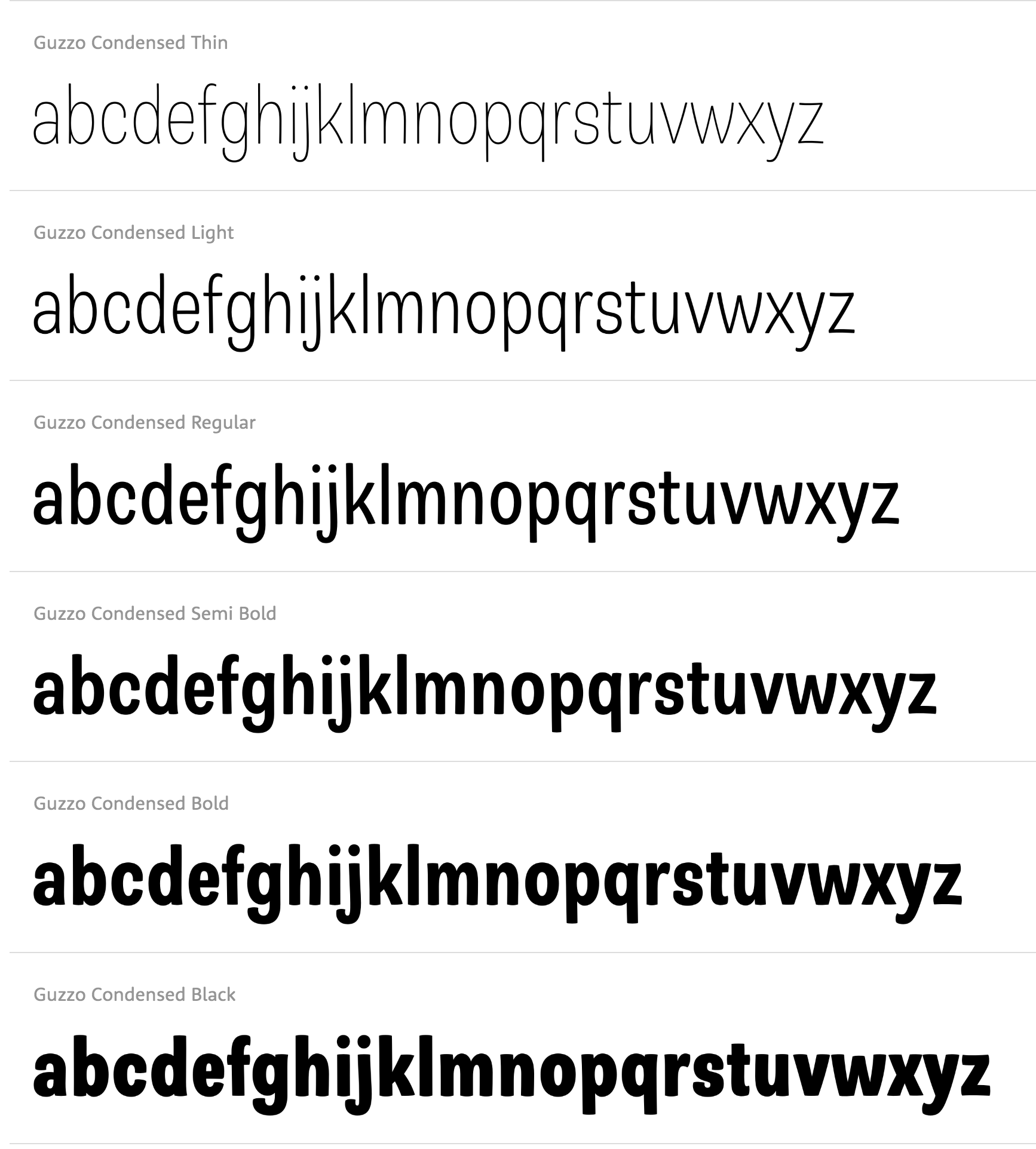
file name: Jim Ford Guzzo Condensed 2021
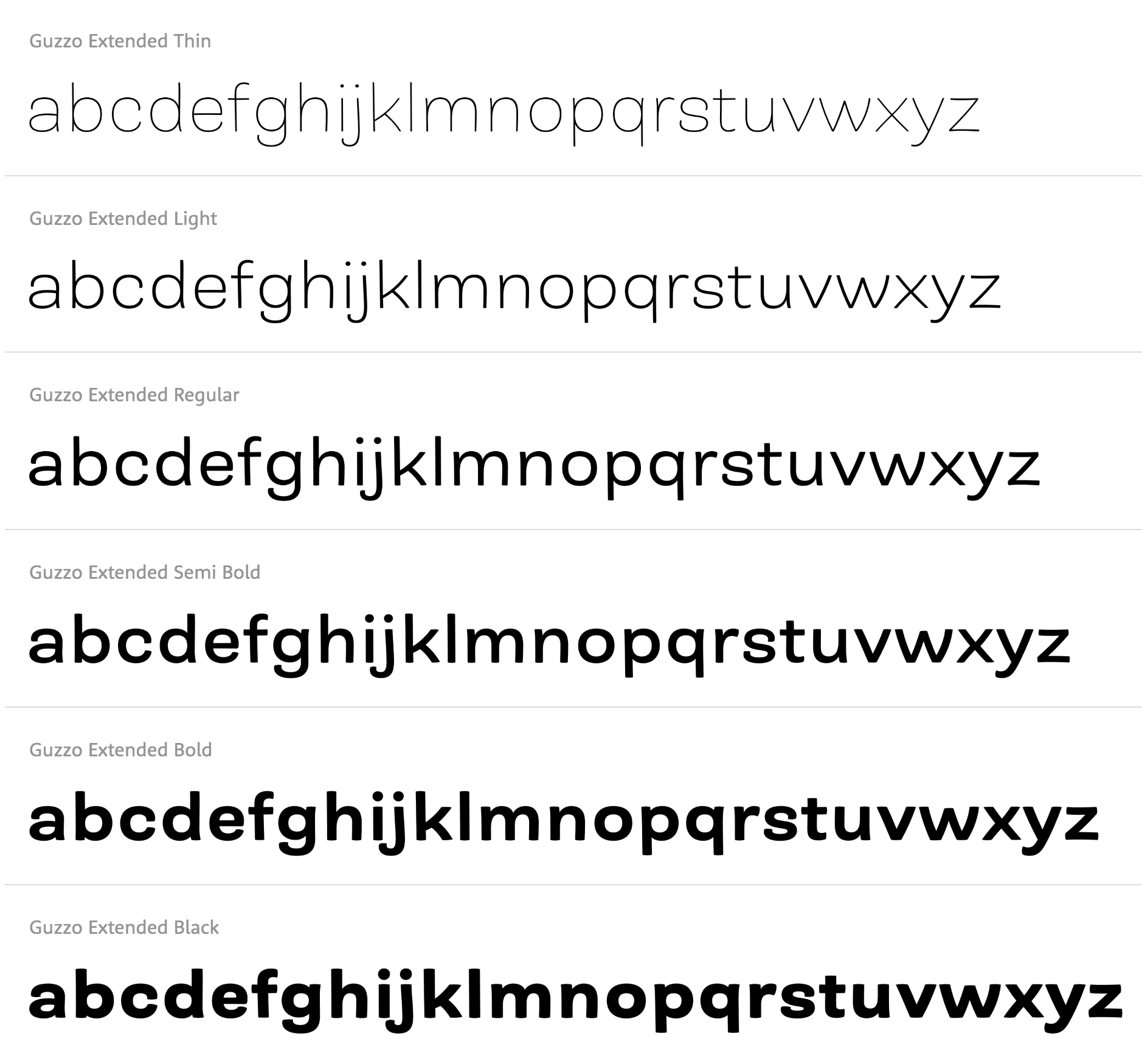
file name: Jim Ford Guzzo Extended 2021
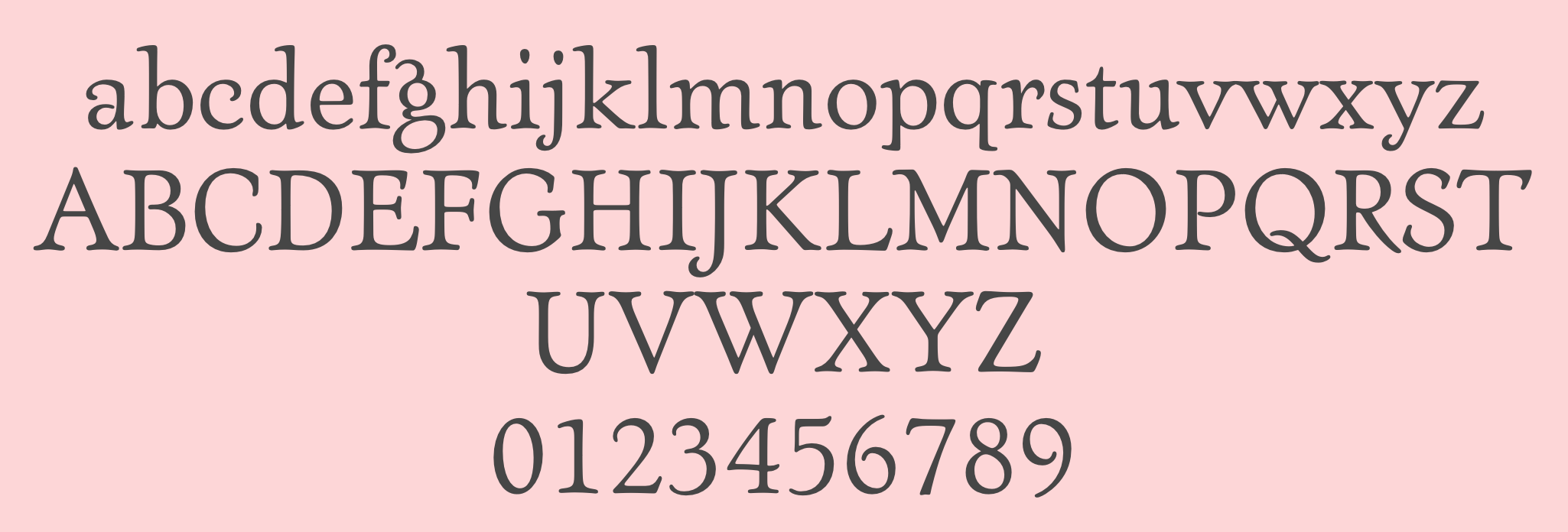
file name: Jim Ford Ascender Artcraft Pro 2007 after Robert Wiebking 1912
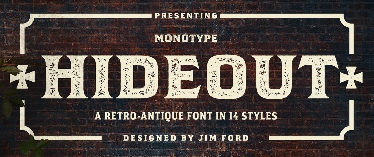
file name: Jim Ford Hideout 2018 271714 002
file name: Jim Ford Hideout 2018 271716

file name: Jim Ford Hideout 2018

file name: Jim Ford Beefcakes 2017

file name: Jim Ford Beefcakes Shadow 2017
file name: Jim Ford Alfie 2018 256257
file name: Jim Ford Alfie 2018 256258
file name: Jim Ford Alfie 2018 256260
file name: Jim Ford Alfie 2018 256260

file name: Jim Ford Alfie 2018 256262

file name: Jim Ford Alfie 2018
file name: Jim Ford Alfie 2018
file name: Jim Ford Masqualero 2017 228744

file name: Jim Ford Masqualero 2017 228745
file name: Jim Ford Masqualero 2017 228747

file name: Jim Ford Masqualero 2017 228748

file name: Jim Ford Masqualero 2017 228750
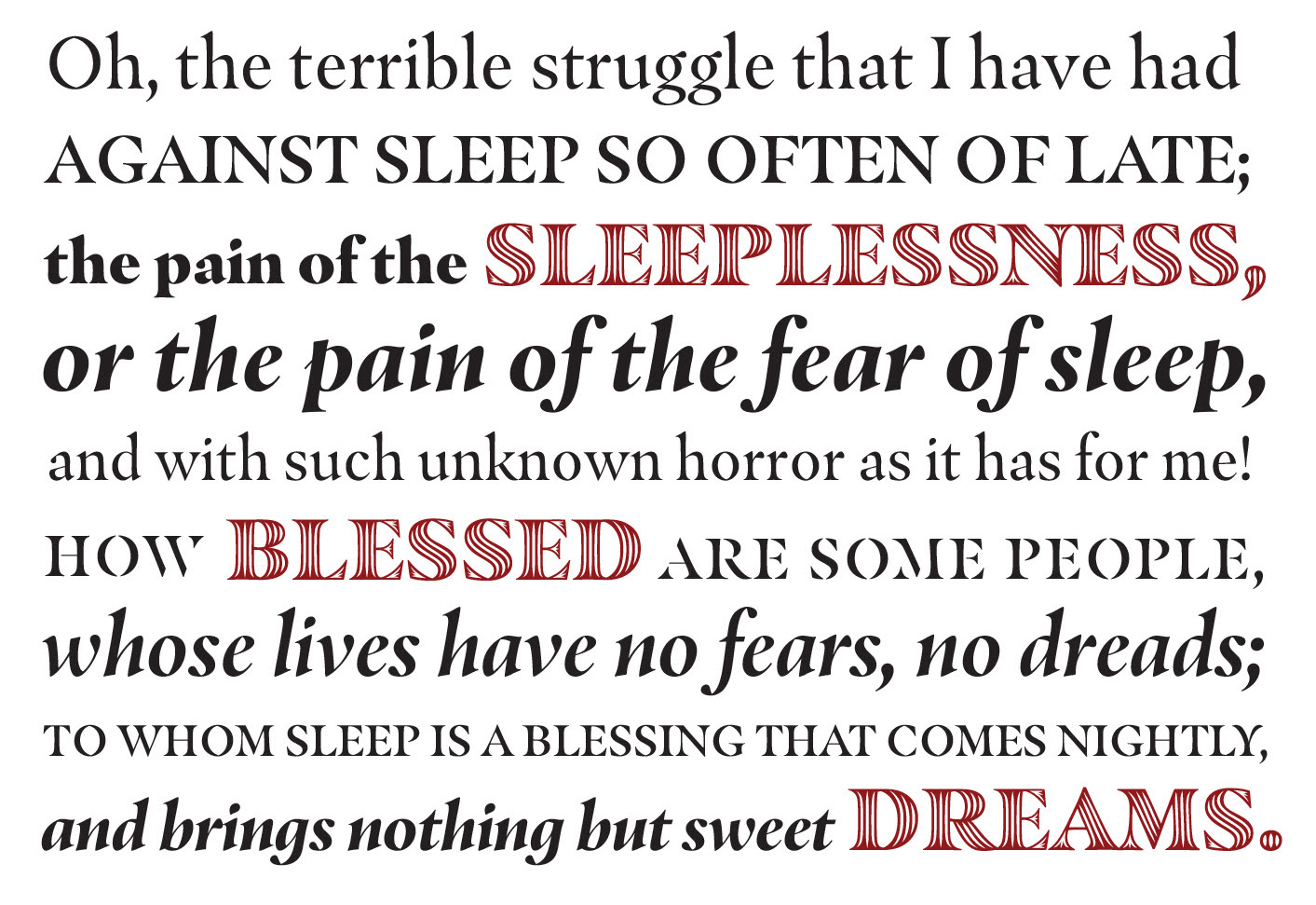
file name: Jim Ford Masqualero 2017
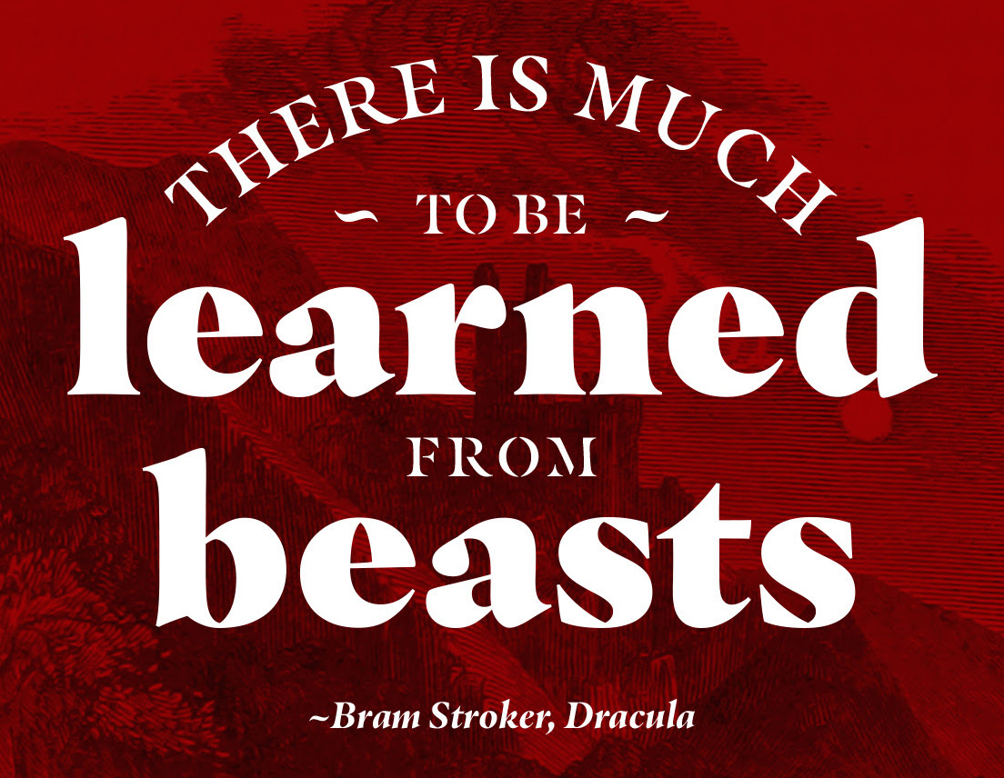
file name: Jim Ford Masqualero 2017b
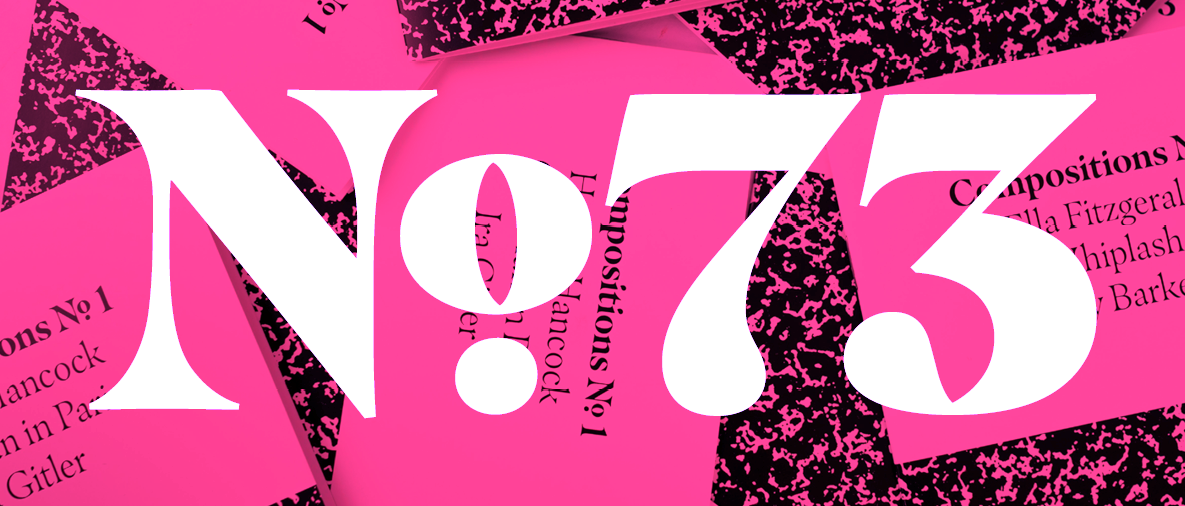
file name: Jim Ford Masqualero 2017 228752
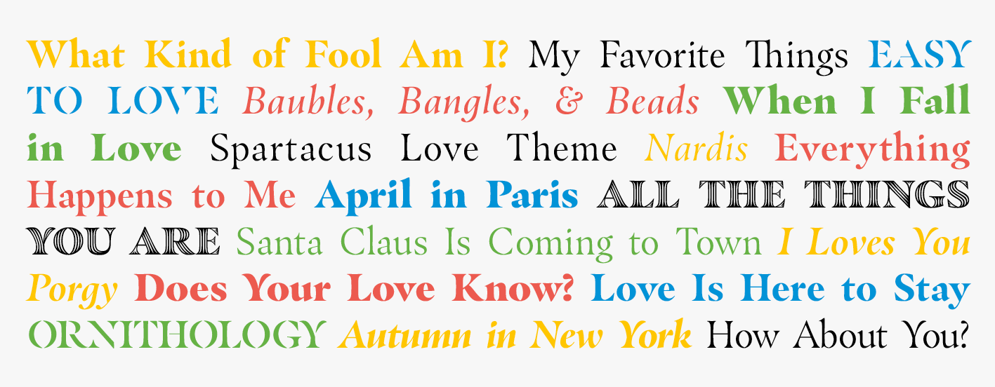
file name: Jim Ford Masqualero 2017 228753

file name: Jim Ford Masqualero 2017
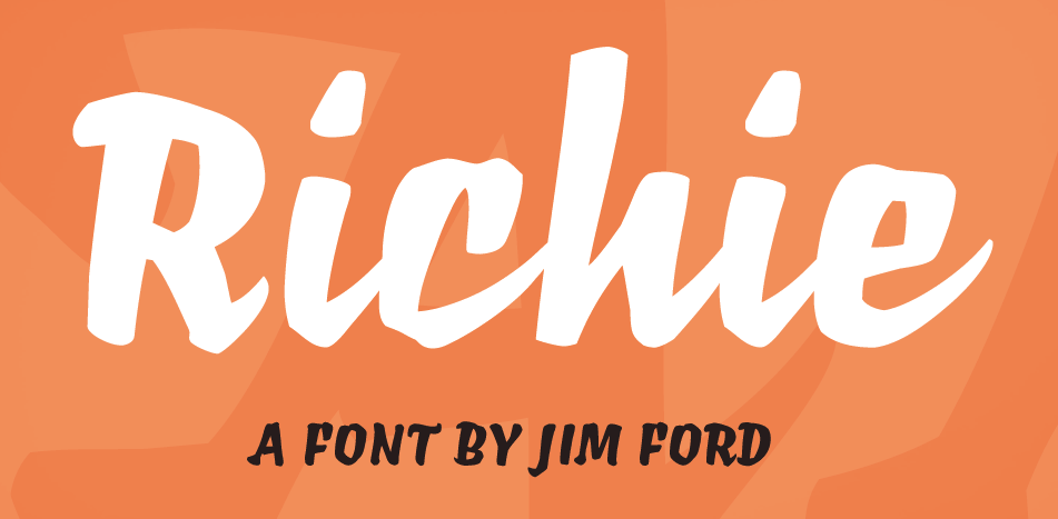
file name: Monotype Richie 2016 198434
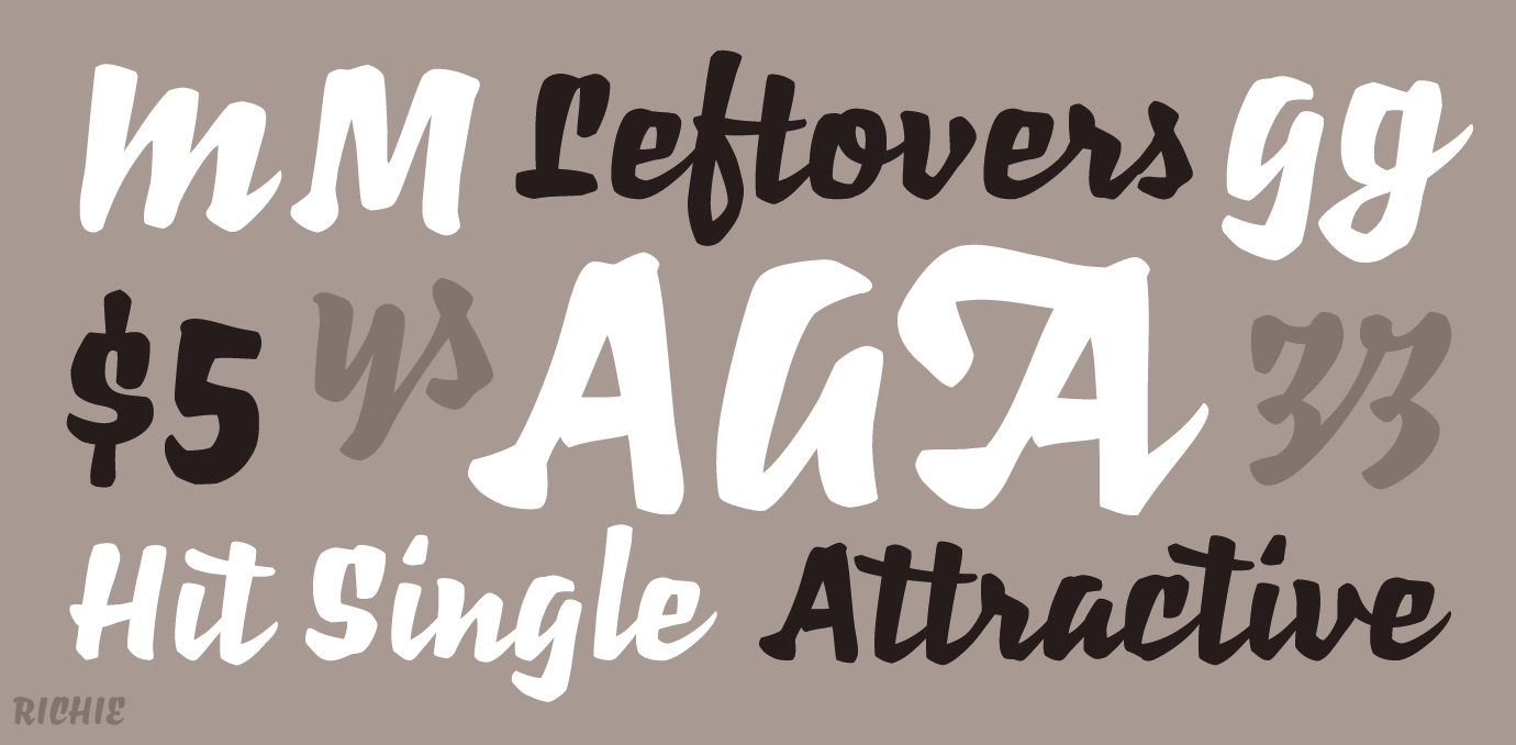
file name: Monotype Richie 2016 198435
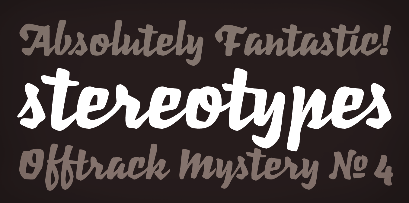
file name: Monotype Richie 2016 198436

file name: Monotype Richie 2016
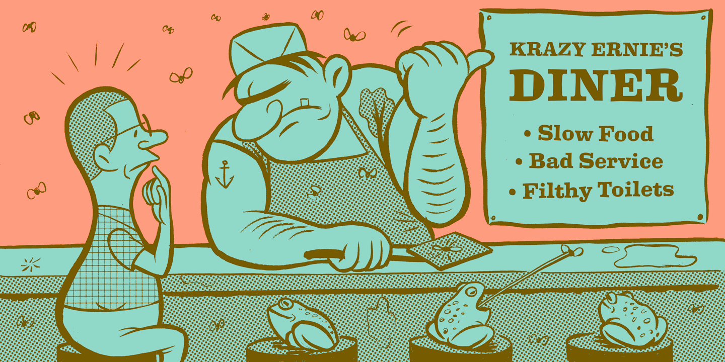
file name: Jim Ford Ernie 2016 210214
file name: Jim Ford Ernie 2016 210215
file name: Jim Ford Ernie 2016 210216
file name: Jim Ford Ernie 2016 210217

file name: Jim Ford Ernie 2016
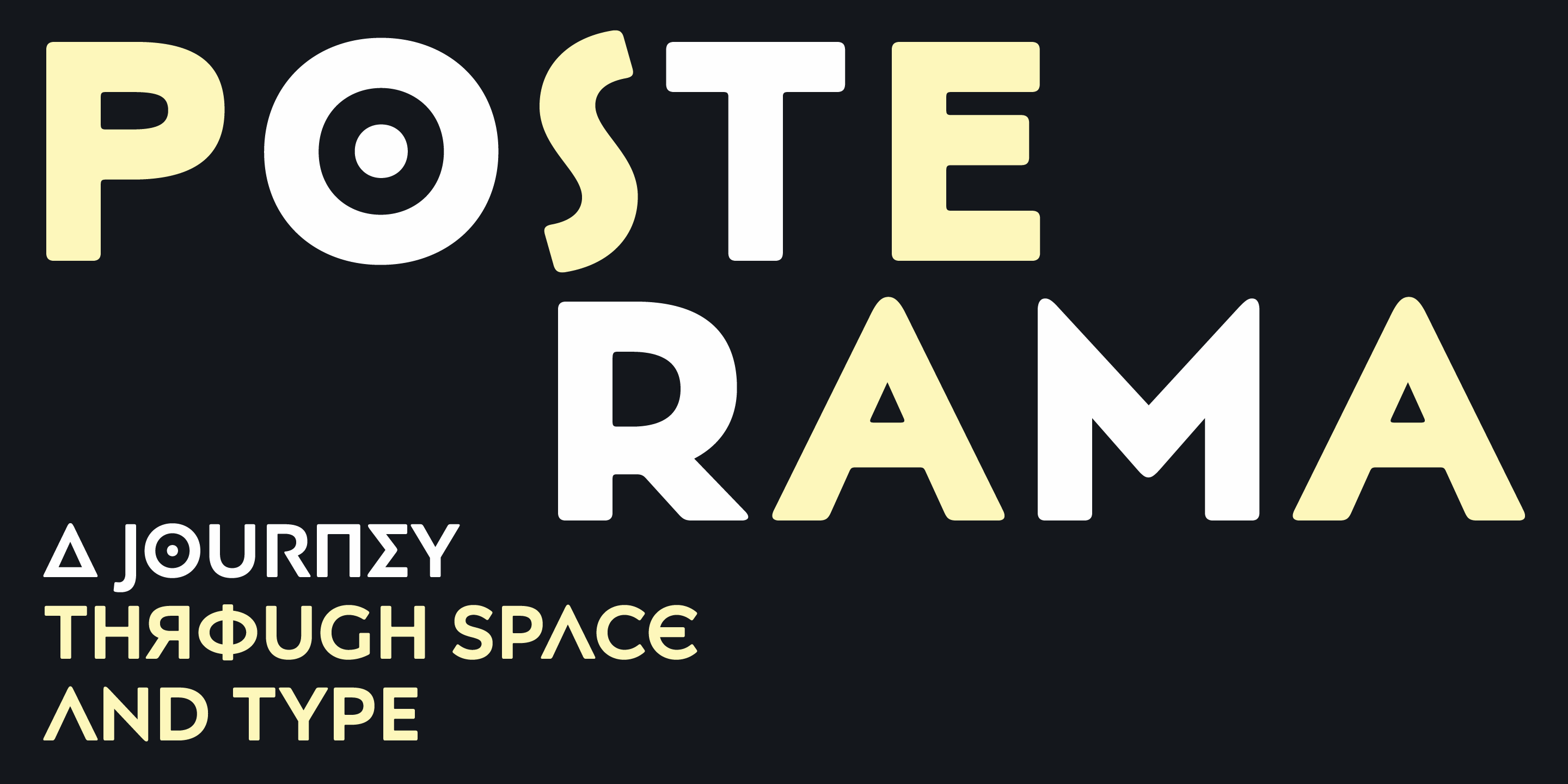
file name: Jim Ford Posterama 2016 207660
file name: Jim Ford Posterama 2016 207662
file name: Jim Ford Posterama 2016 207667

file name: Jim Ford Posterama 2016a
file name: Jim Ford Posterama 2016b
file name: Jim Ford Posterama 2016c
file name: Jim Ford Posterama 2016d
file name: Jim Ford Posterama 2016e
file name: Jim Ford Posterama 2016f
file name: Jim Ford Posterama 2016g
file name: Jim Ford Posterama 2016h
file name: Jim Ford Posterama 2016i
file name: Jim Ford Posterama 2016j
file name: Jim Ford Posterama 2016k
file name: Jim Ford Posterama 2016l
file name: Jim Ford Posterama 2016m
file name: Jim Ford Posterama 2016n

file name: Jim Ford Segoe Chess Font
file name: Jim Ford Steve Matteson Segoe Chess 2006
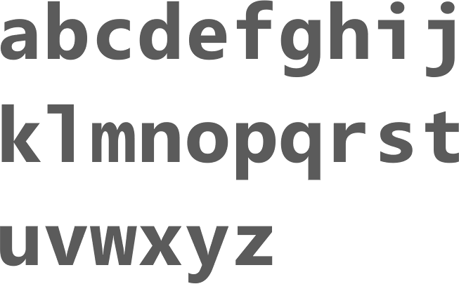
file name: Steve Matteson Segoe Mono Bold 2012
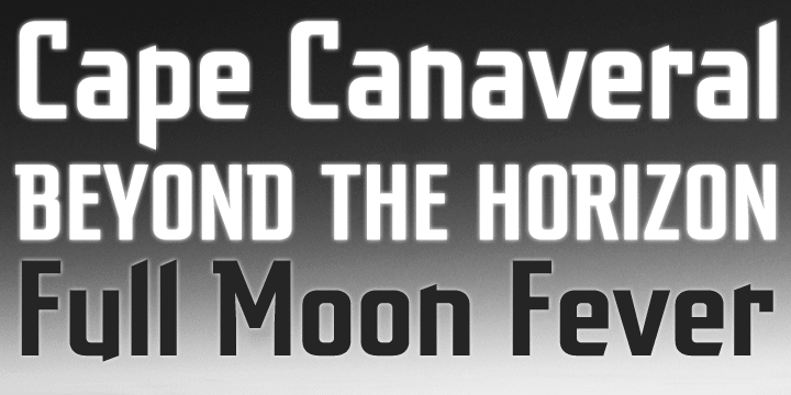
file name: Jim Ford Dempster 2010
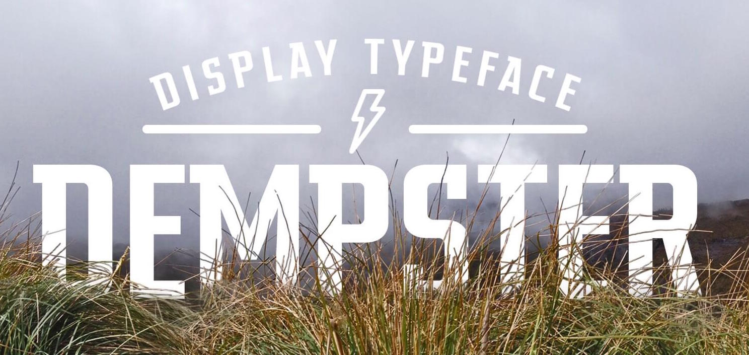
file name: Jim Ford Steve Matteson Dempster 2016b
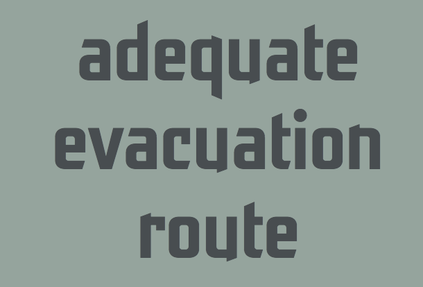
file name: Jim Ford Steve Matteson Dempster 2016 215504
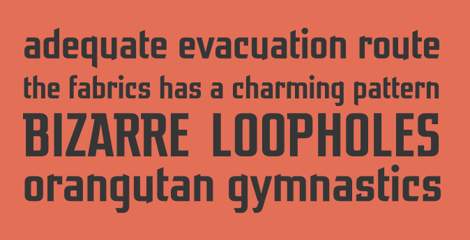
file name: Jim Ford Steve Matteson Dempster 2016 215505
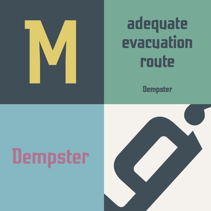
file name: Jim Ford Steve Matteson Dempster 2016 215505

file name: Jim Ford Steve Matteson Dempster 2016
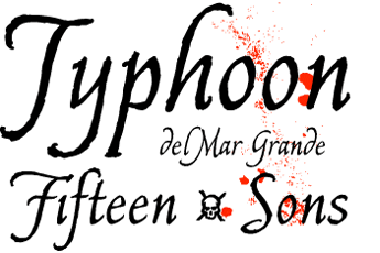
file name: Jim Ford Captain Quill 2008

file name: Jim Ford Esca 2015
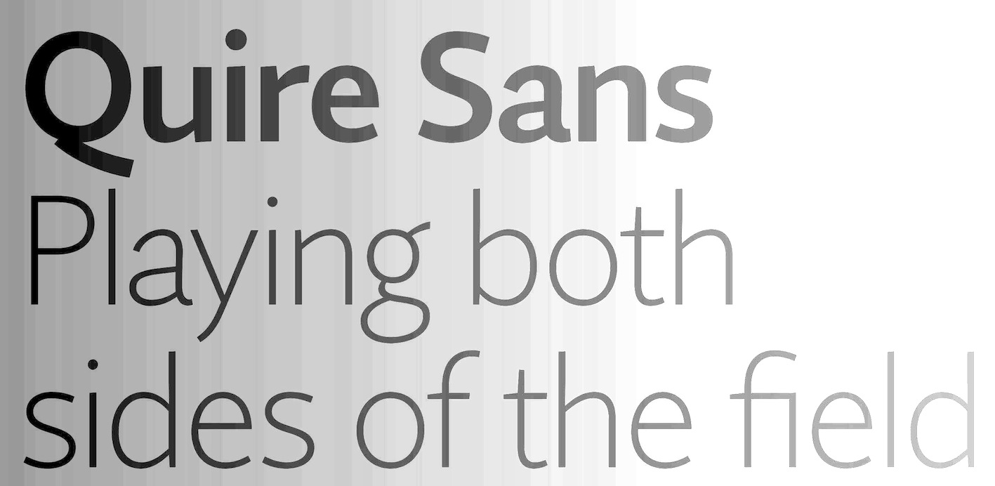
file name: Jim Ford Quire Sans 2014
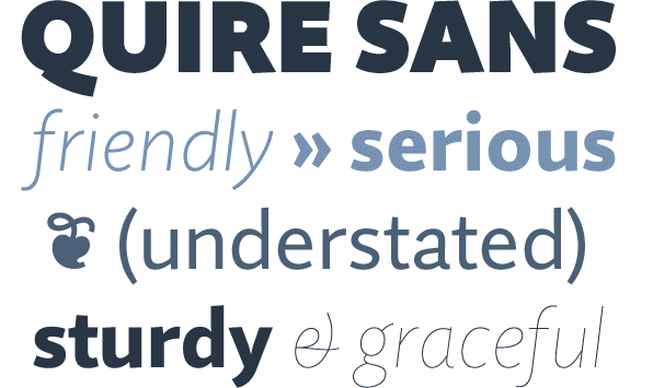
file name: Jim Ford Quire Sans 2014b
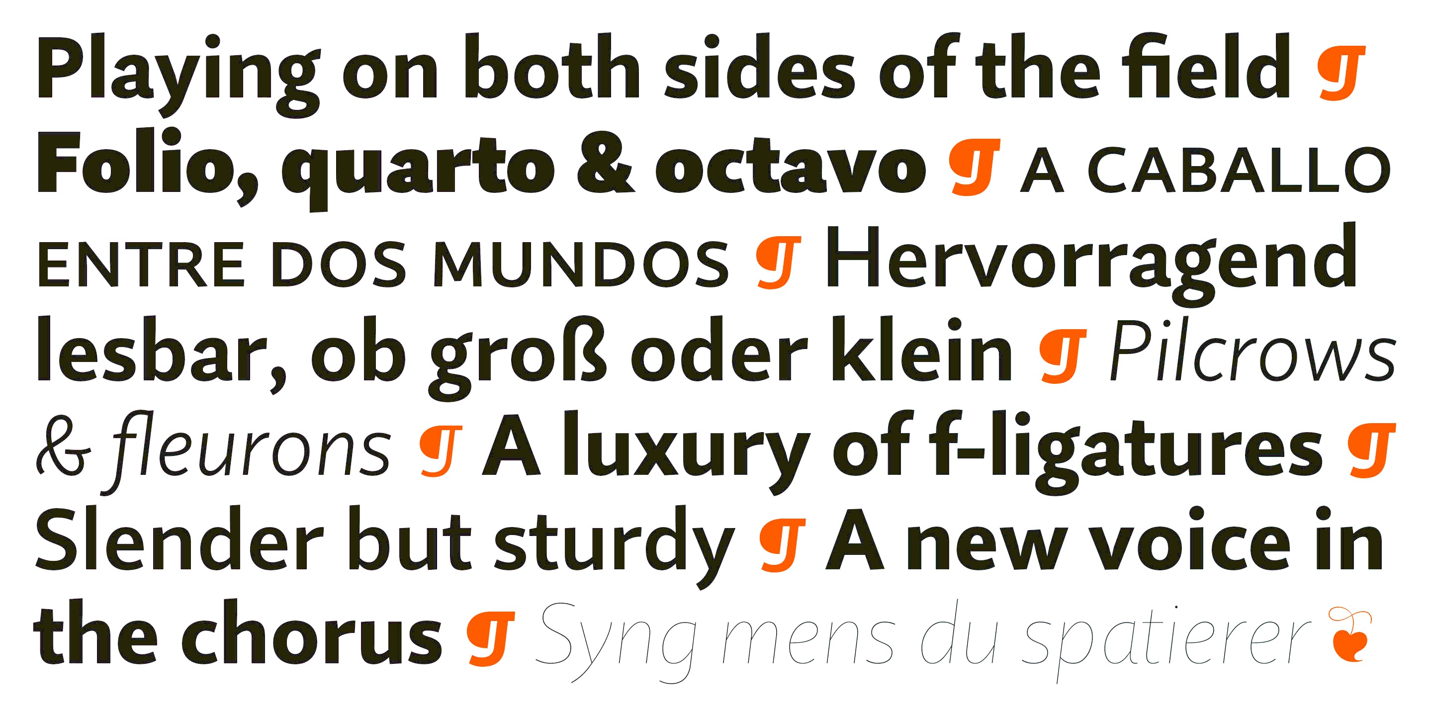
file name: Jim Ford Quire Sans 2014a

file name: Jim Ford Quire Sans 2014c
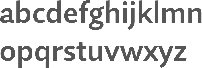
file name: Jim Ford Quire Sans Semi Bold 2014
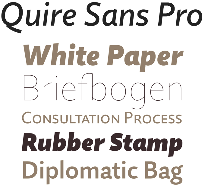
file name: Jim Ford Quire Sans 2014d

file name: Jim Ford Wolfsblood 2013
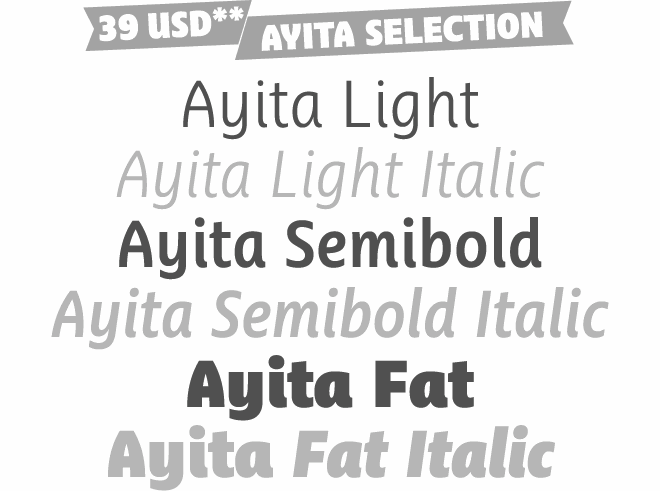
file name: Jim Ford Steve Matteson Ayita 2006
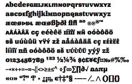
file name: Jim Ford Pokerface 2009

file name: Jim Ford Pic
| | |
|
Luc Devroye ⦿ School of Computer Science ⦿ McGill University Montreal, Canada H3A 2K6 ⦿ lucdevroye@gmail.com ⦿ https://luc.devroye.org ⦿ https://luc.devroye.org/fonts.html |

