TYPE DESIGN INFORMATION PAGE last updated on Mon Jun 8 18:03:30 EDT 2026
FONT RECOGNITION VIA FONT MOOSE

|
|
|
|
Futura: Comments at Typomancy
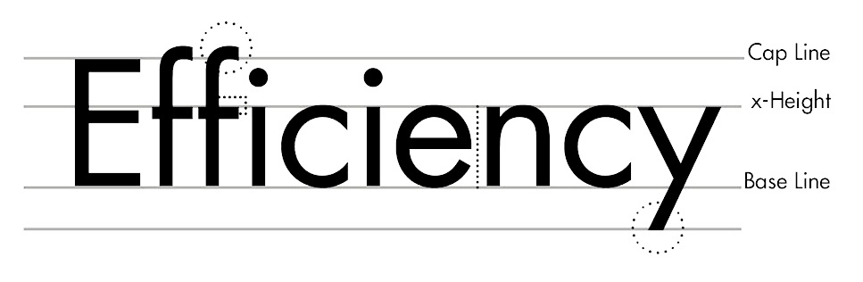
The piece starts out as follows: Futura is one of those typefaces so taken for granted that it perpetually rides on the knife-edge of backlash. Like Helvetica and Univers, its a versatile sans serif typeface that comes in a variety of widths and weights and comprises a more or less freestanding system for graphic designers who are (still) wedded to the grid. Its also a strongly geometrical, warm typeface, and is one Ive used constantly since long before I knew anything about type. Im not sure that many people pay for Futura anymore. I used it at first because it came with Adobes ATM (I thinkIm almost certain that however I got it originally was legit). Its so ubiquitous that its really easy to take for granted. But there is more than one version of Futura, and not all Futuras are created alike. Futura was created by Paul Renner at the dawn of modernism in typography, and the original version was very different from the version we see today. It had a number of alternates for many of the lowercase characters, some of which were radical, geometrically strange departures from traditional letterforms. The lowercase a and g, which can be found in Robert Bringhurst's "Elements of Typographic Style", make this most plain. From what little Ive been able to glean on the subject from the Web, Bauer quietly dropped the alternate forms when they first issued the typeface, fearing their strangeness would harm sales. Then it gives various options for picking a Futura:
|
EXTERNAL LINKS |
| | |

file name: Adrian Frutiger Avenir 1988 Poster by Tom Hayes 2016
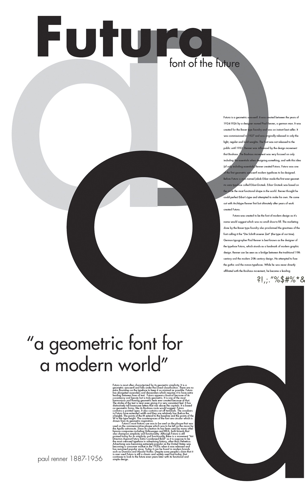
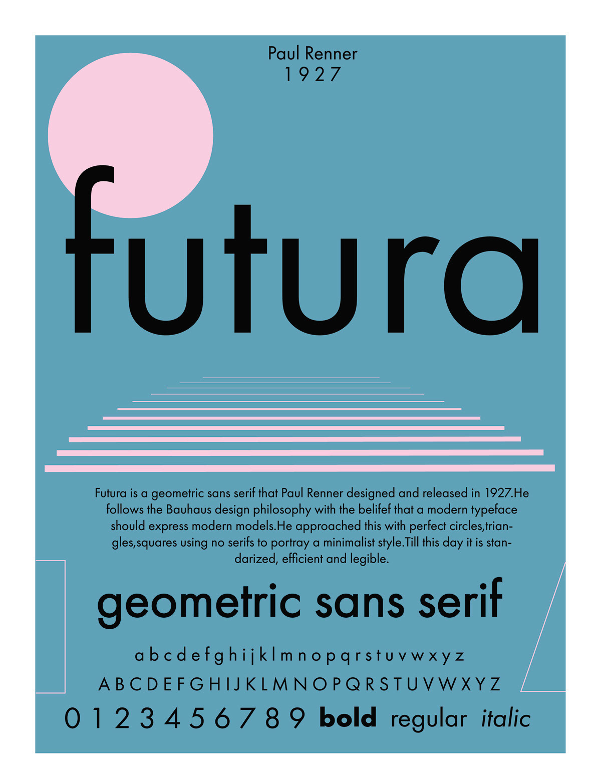
file name: Paul Renner Futura 1929 Poster by Paige Drummond 2015
file name: Paul Renner Futura 1929 Poster by Paige Drummond 2015b
file name: Paul Renner Futura 1929 Poster by Umaima Lakhani 2016
file name: Paul Renner Futura 1929 Poster by Umaima Lakhani 2016b
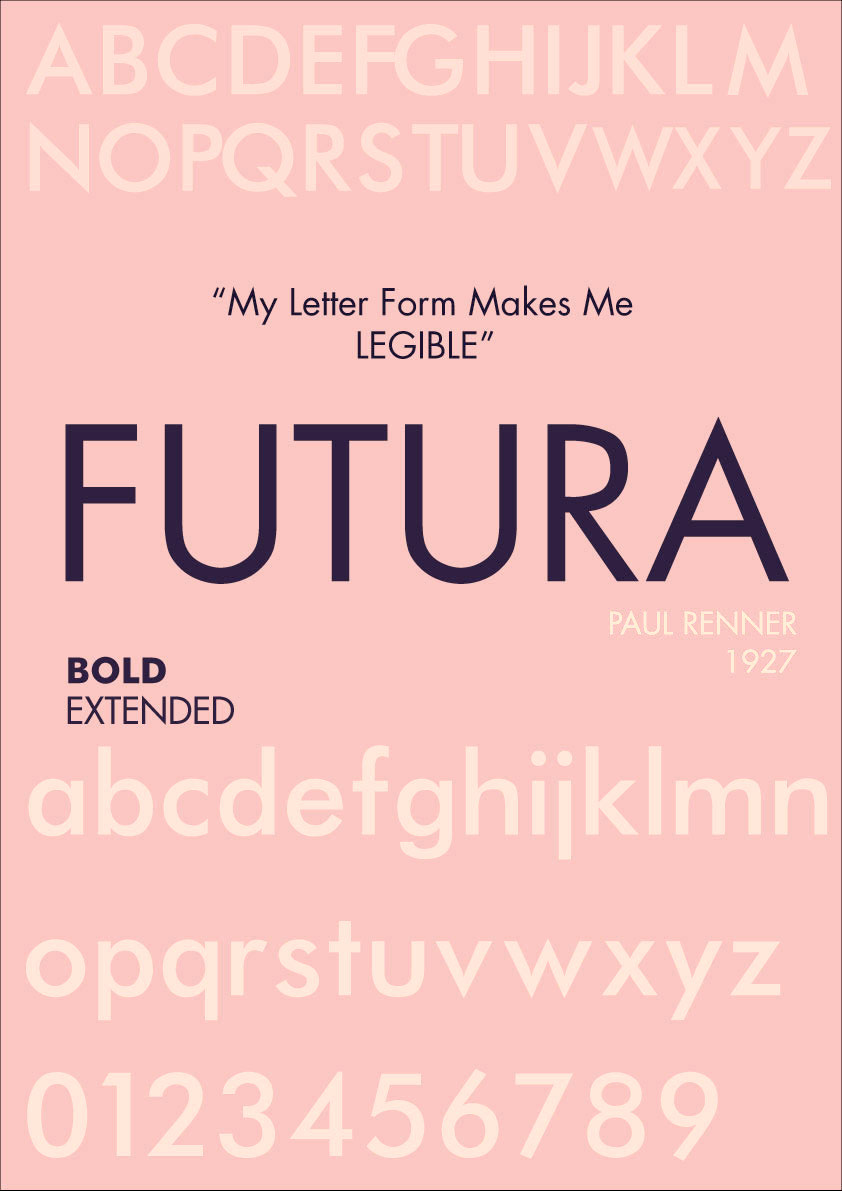
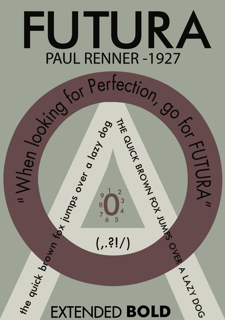
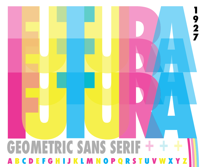
file name: Paul Renner Futura 1927 Poster by Himali Auplish 2015
file name: Paul Renner Futura 1927 Poster by Himali Auplish 2015b
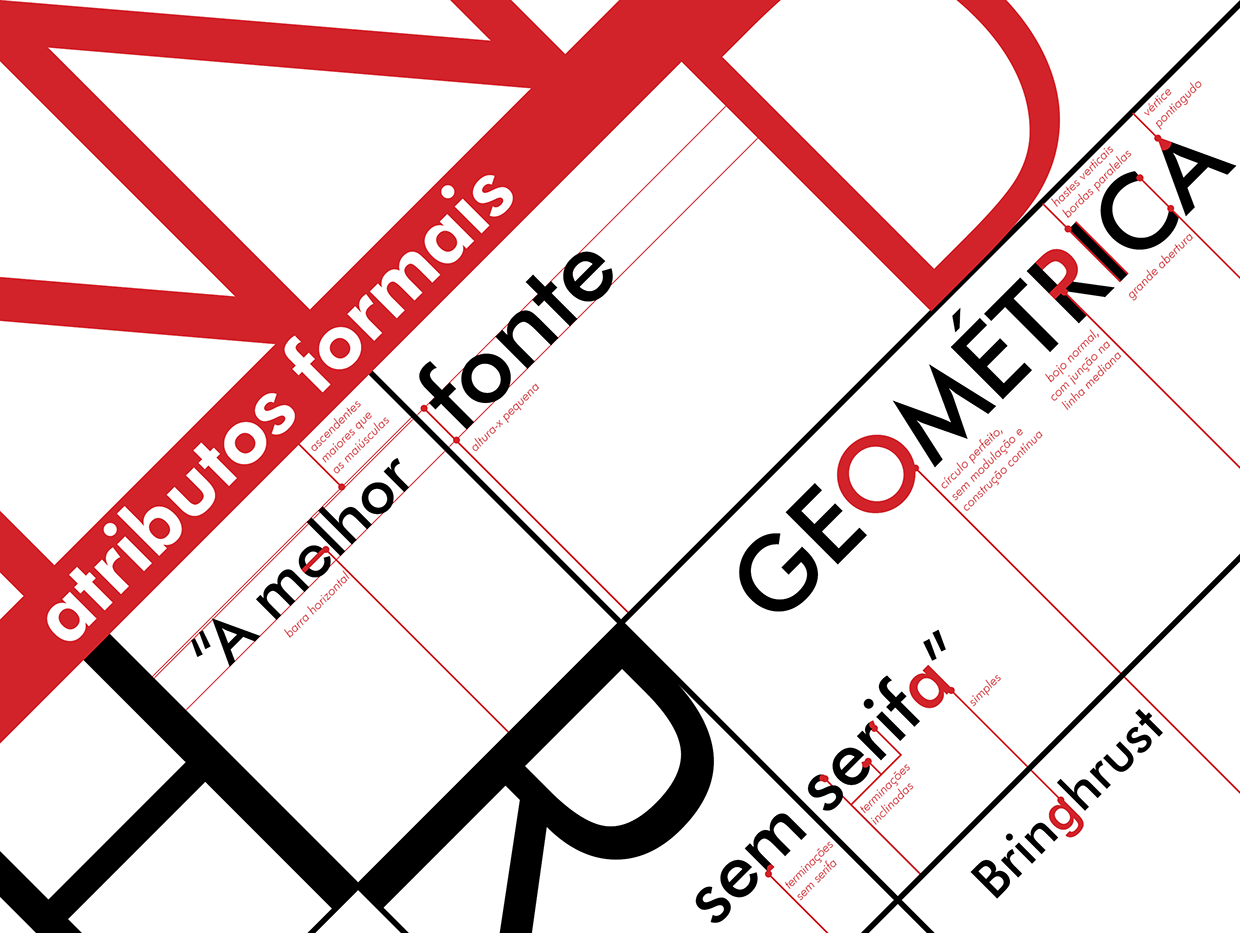
file name: Paul Renner Futura 1927 Poster by Himali Auplish 2015c
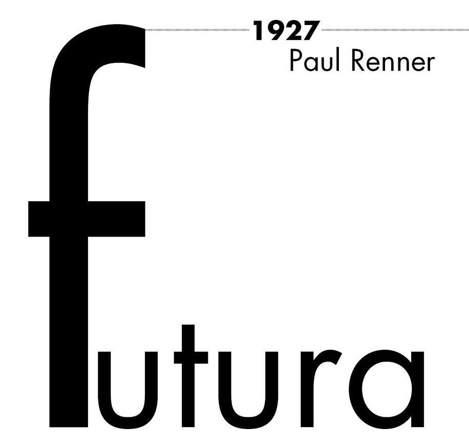
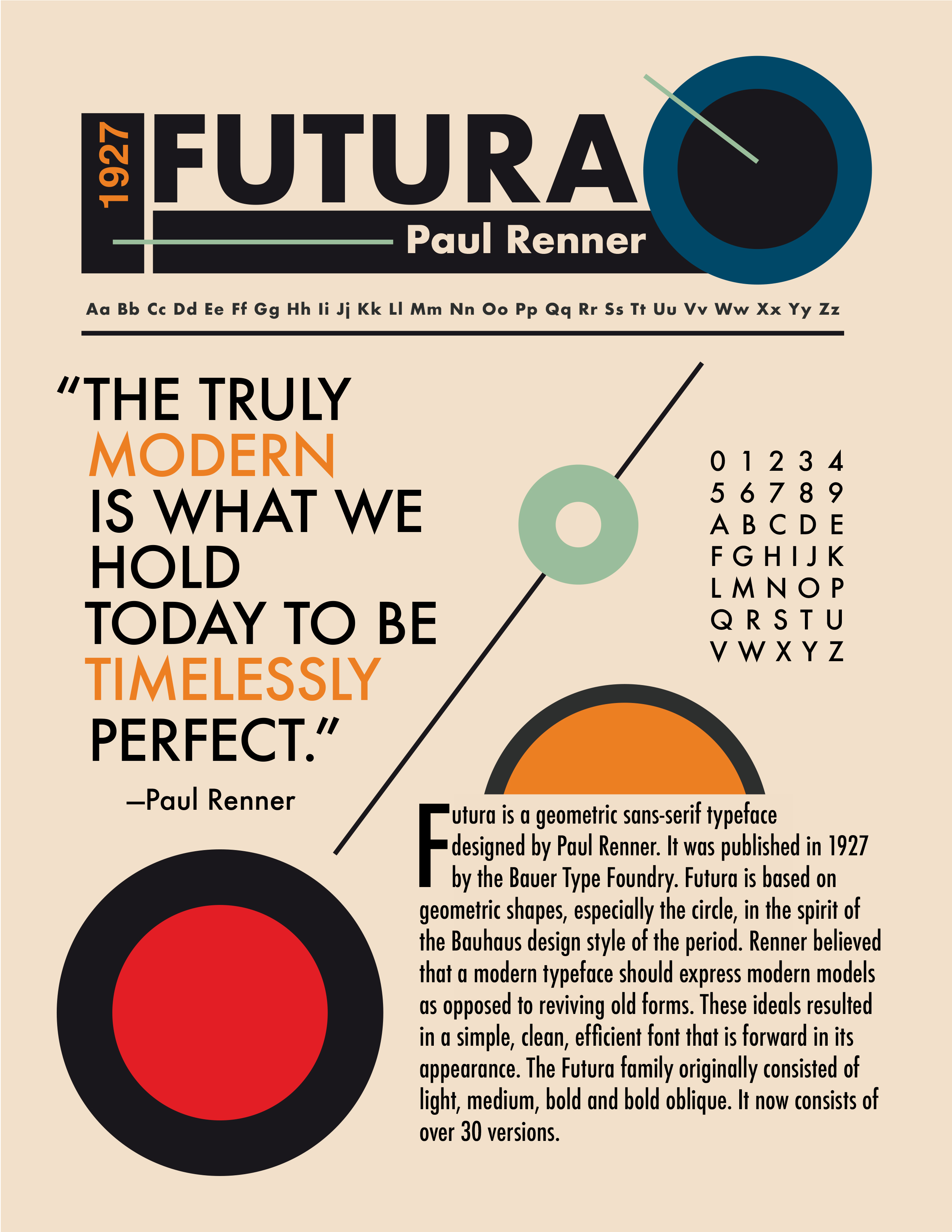
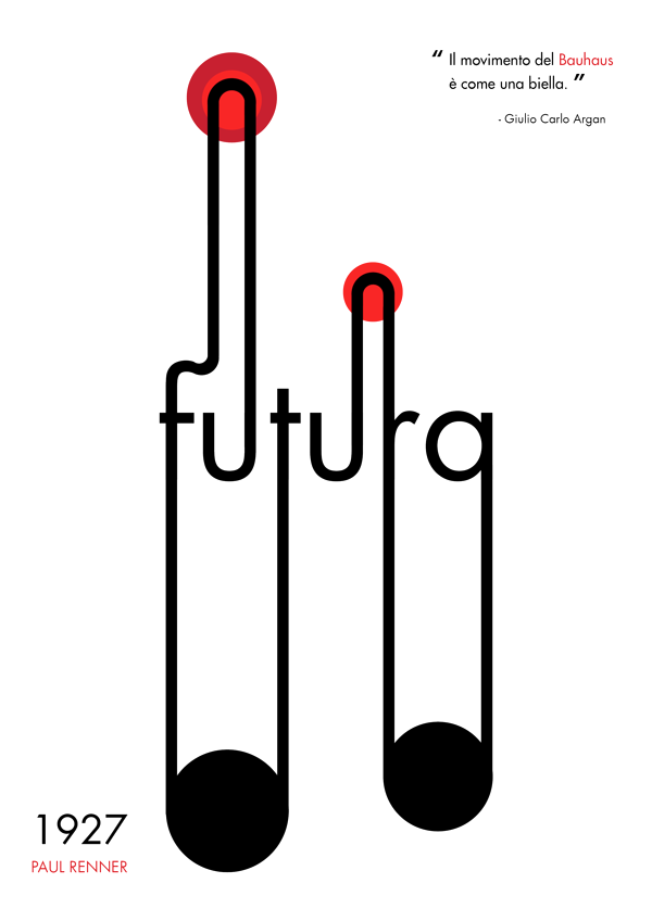
file name: Paul Renner Futura 1927 Poster by Jason Holden 2018

file name: Paul Renner Futura 1927 Poster by Jason Holden 2018

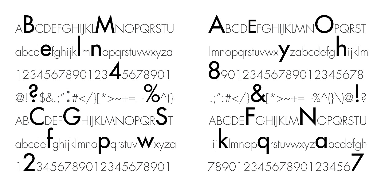
file name: Paul Renner Futura 1927 Poster by Joshua Dages 2018
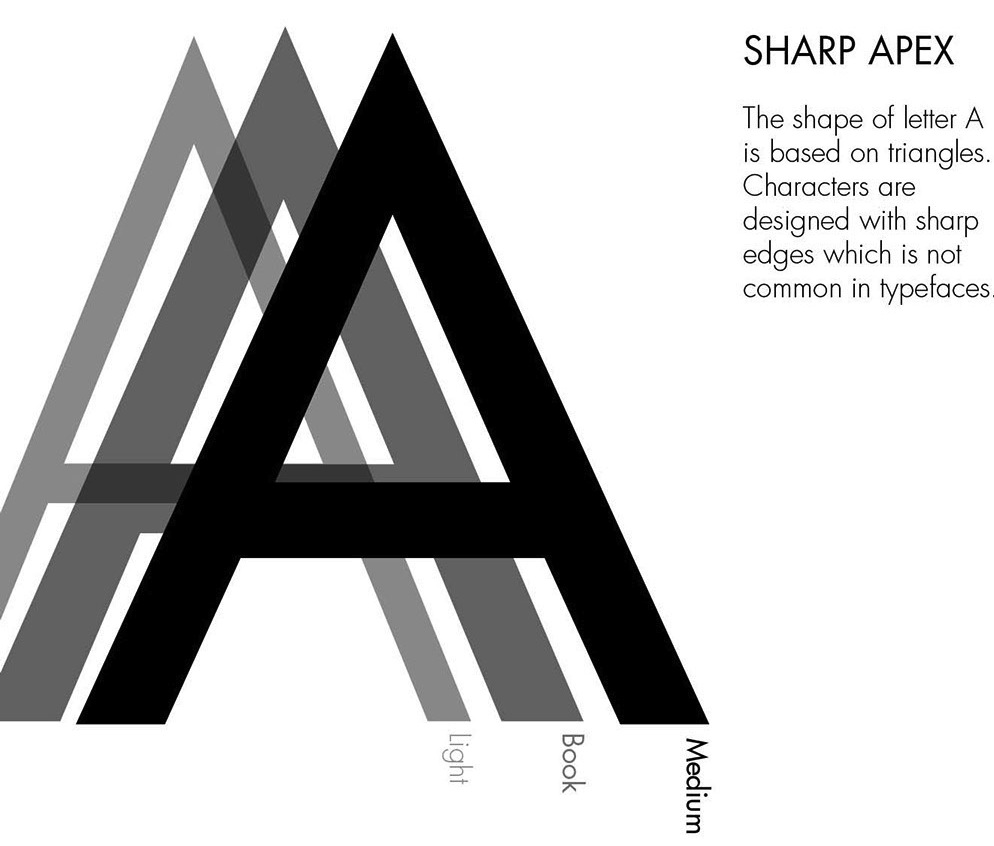
file name: Paul Renner Futura 1927 Poster by Casey Tran 2018
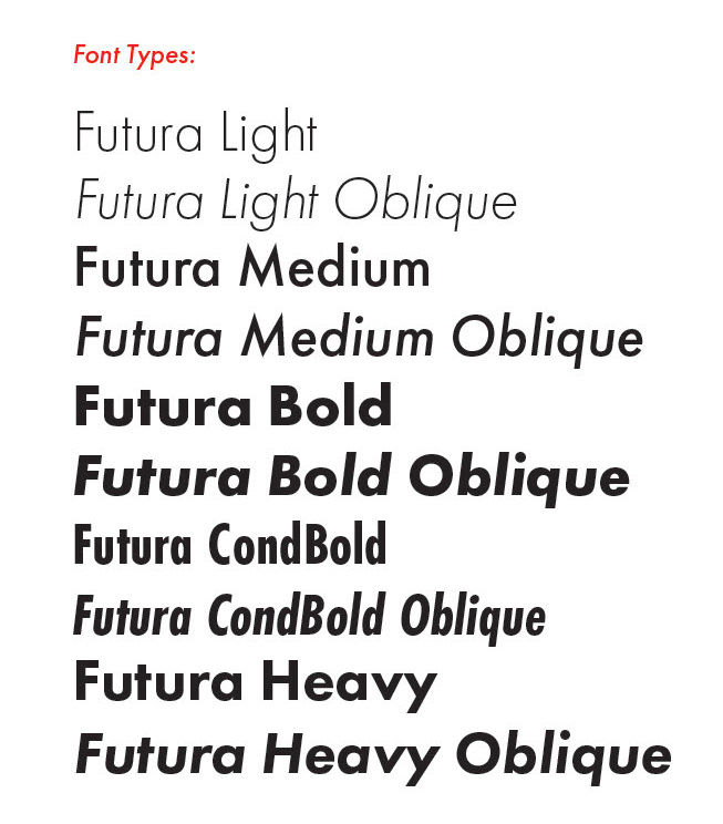
file name: Paul Renner Futura 1927 Poster by Jade Garcia 2018
file name: Paul Renner Futura 1929 Poster by Katie Slocum 2018
file name: Paul Renner Futura 1927 Poster by Himali Auplish 2015d
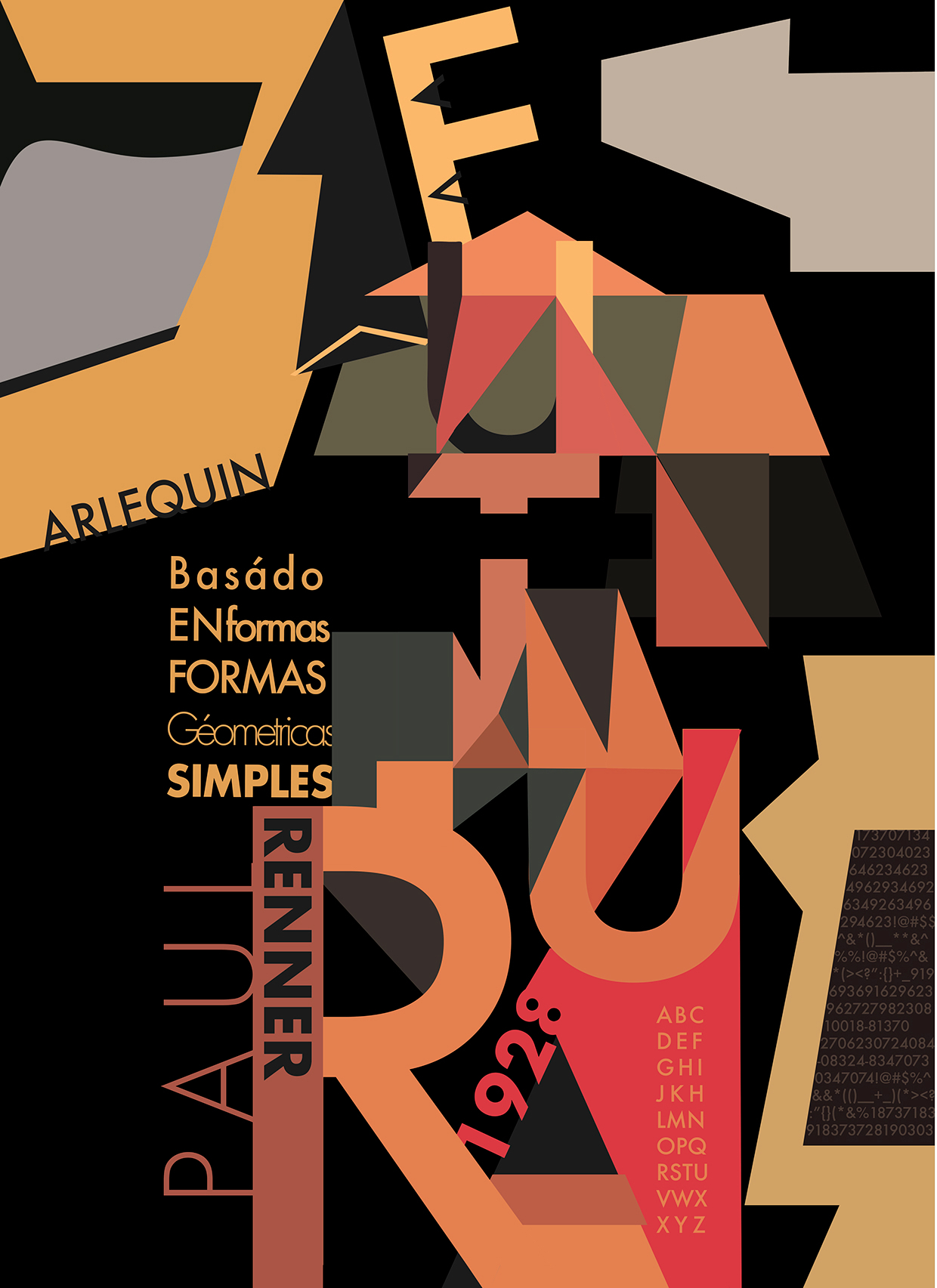
file name: Paul Renner Futura 1928 Poster by Giuliana Oliveros 2016
file name: Paul Renner Futura 1927 Poster by Felipe Oliveira 2016
file name: Paul Renner Futura 1927 Poster by Himali Auplish 2015e
file name: Paul Renner Futura 1927 poster by Verushka Galluccio 2014
| | |
|
Luc Devroye ⦿ School of Computer Science ⦿ McGill University Montreal, Canada H3A 2K6 ⦿ lucdevroye@gmail.com ⦿ https://luc.devroye.org ⦿ https://luc.devroye.org/fonts.html |