|
Best fonts of 2005 (Jan-Jun): Typographica

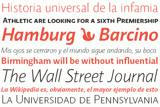
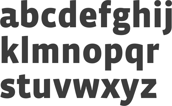
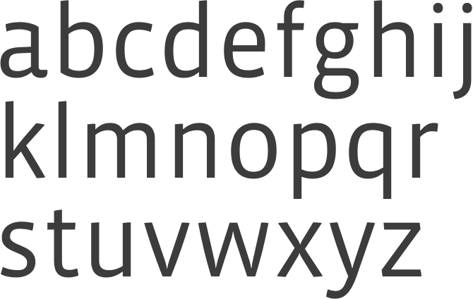
The Golden Globe Awards of type design, nominated by regulars at Stephen Coles' Typographica, a selection from the ground up. I feel these are the true winners---unlike all those awards for which one has to apply, pay a fee and be subject to the scrutiny of a "selection committee". Masterfully brought to you by Stephen Coles---bravo! As Stephen himself notes this year (2005), there are three trends: (1) Gone are the days when large commercial outfits put out the bulk of serious type. Nine of the 14 top selections come from one-man studios. Meanwhile, several of the big boys (ITC, Linotype, Monotype, URW) are absent. (2) Nearly every featured font is available in OpenType, and many exclusively so. (3) Xavier Dupré: the Cambodia-based Frenchman is perhaps todays most productive single source of creative type design, rivaled only by Christian Schwartz. Drumrolls: - Lisboa (Ricardo Santos): Hrant Papazian writes: Lisboa harbors the sagacity to merely vie for — and thereby achieve — a simple Iberian warmth, something especially difficult in a sans. In the severely over-crowded field of humanist sans-serifs, Lisboa distinguishes itself through completeness (including expert characters and two numeral styles) and technical sophistication (as in its trapping), but mostly by providing two subtly varied cuts: one that helps exhibit the design's particular character; and another that eschews detail for maximal clarity in small sizes.
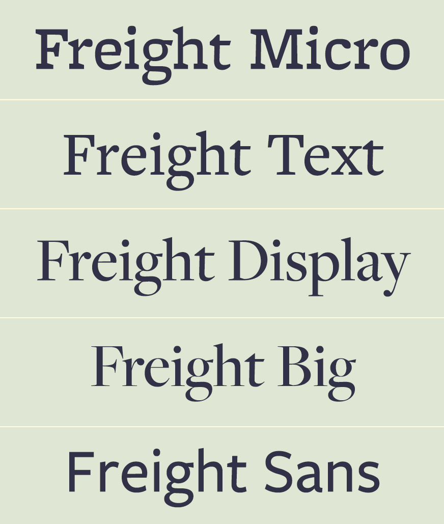
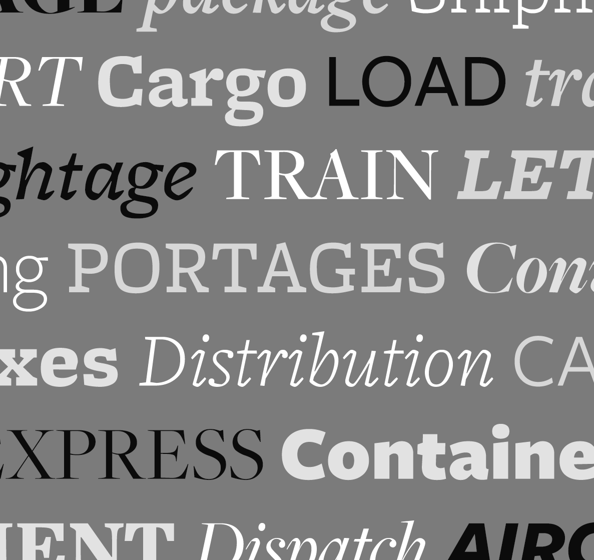
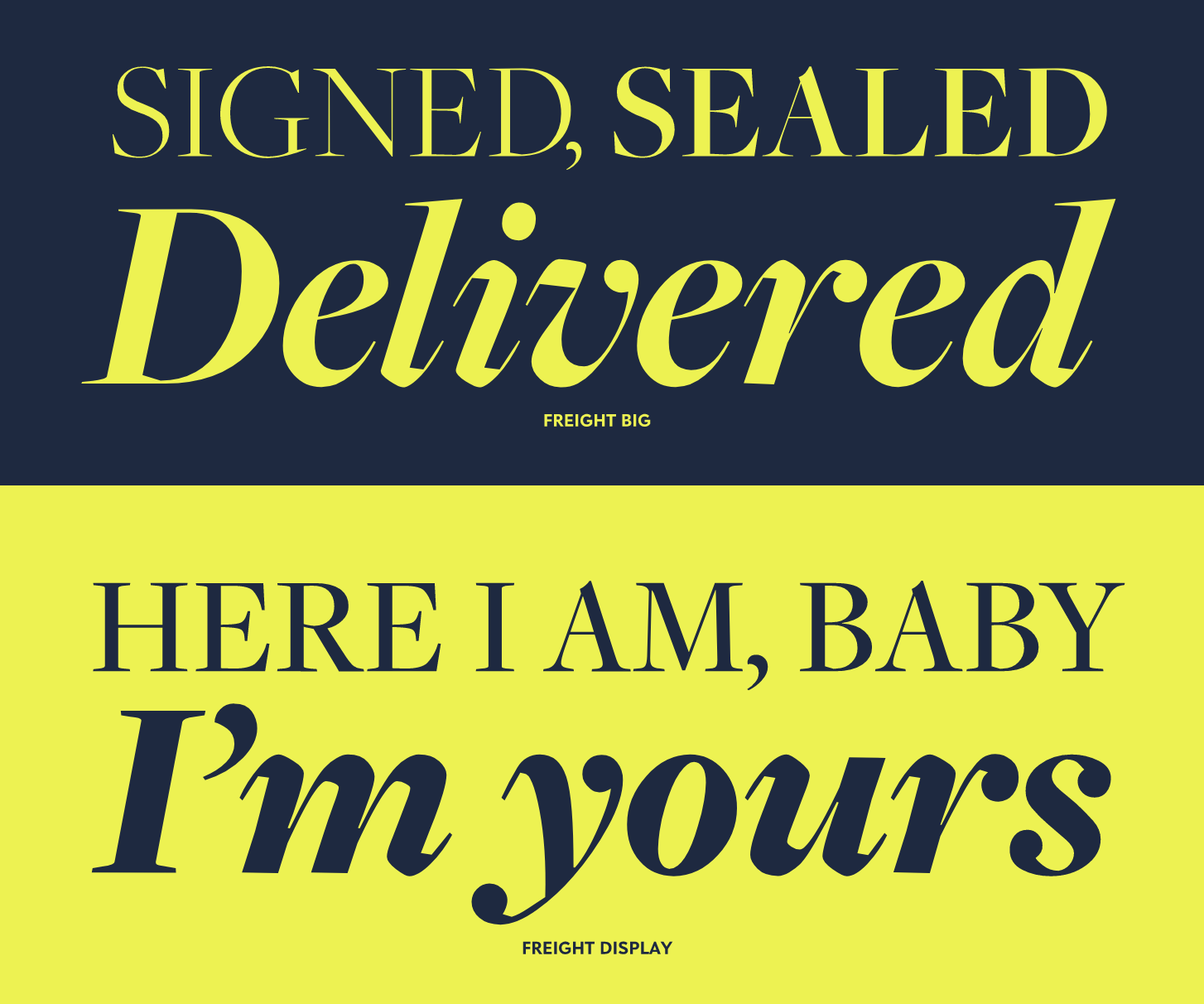
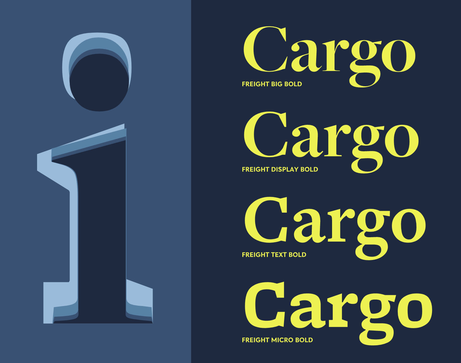
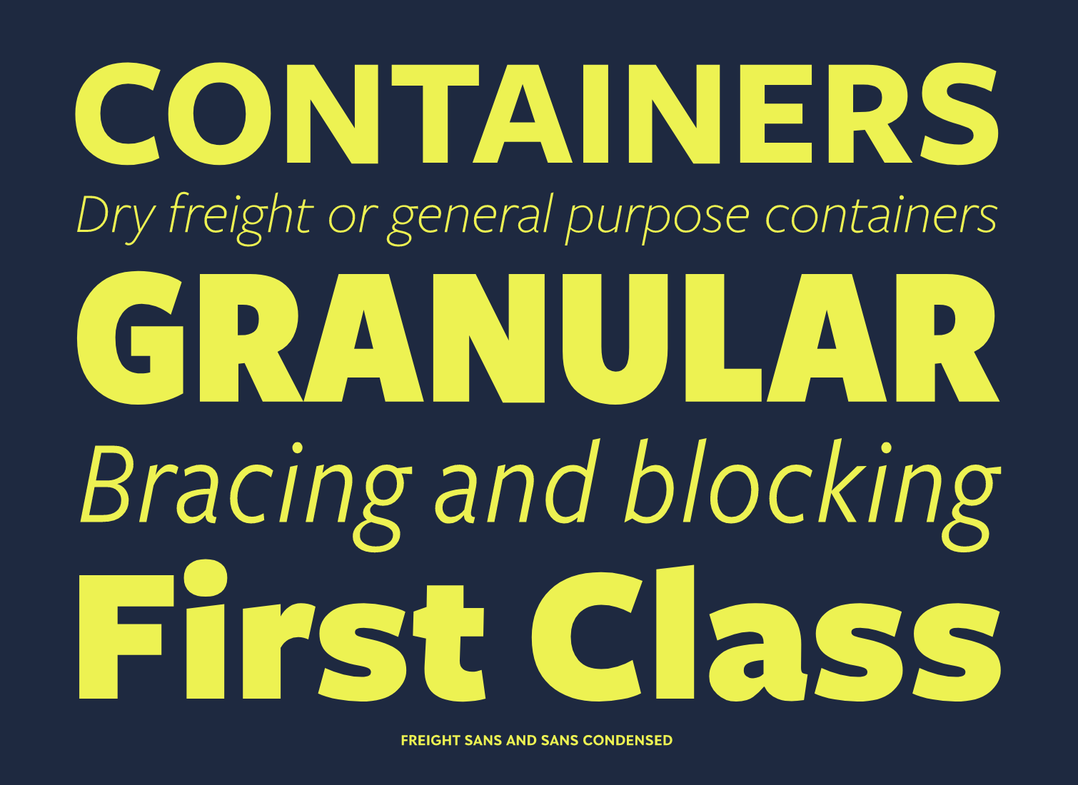
- Freight (Joshua Darden). Dyana Weissman: While we move out of the era of the antiseptic sans-serifs, Freight offers refreshing anomalies that warm up the design.[...] This family is insane. Not only because of the 100 styles, but also because of its charming little quirks.
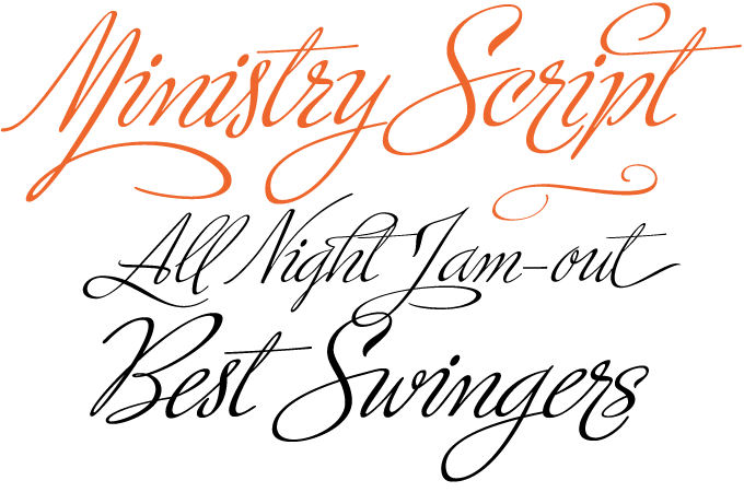
- Ministry Script (Alejandro Paul). Paul Hunt comments: How do you convey sexiness with type? Use a sultry script face. The only thing more typographically titillating might be a set of canoodling ligatures.
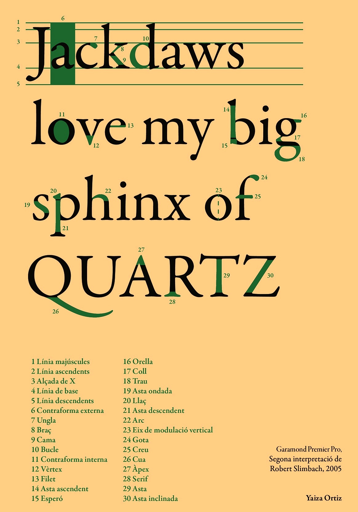
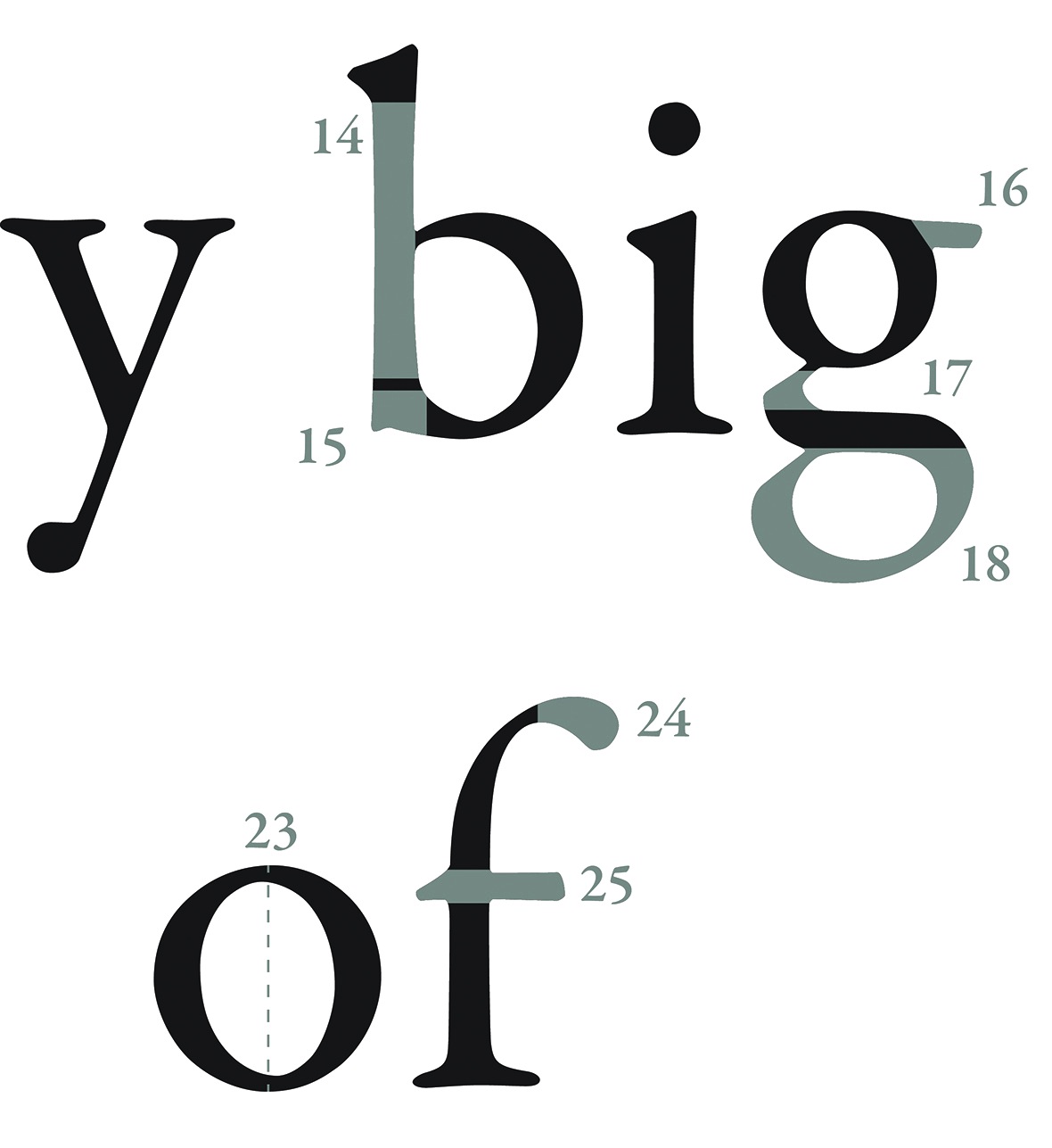
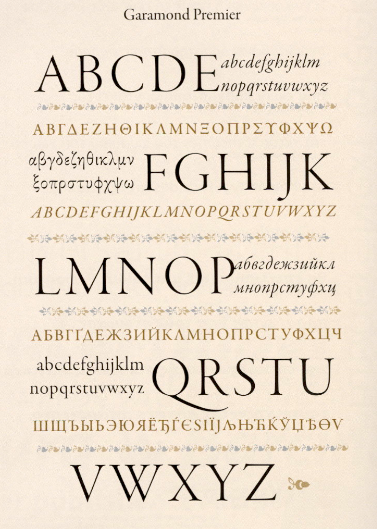
- Garamond Premier Pro (Robert Slimbach).
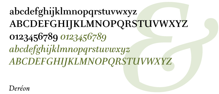
- Deréon (Jean-François Porchez). Chris Rugen writes: When I see Déreon, I see a Whitman and Dalliance mix (two of my favorites) creating something unique. Like Whitman, Deréon gets its body from the Scotch Didone Caledonia.
- Proxima Nova (Mark Simonson). Kyle Hildebrant: It nestles neatly in a place between the geometric, grotesque, and gothic. Its generous x-height, thoughtfully balanced color, and expert typographic features (small caps, text figures, lining figures, etc.) position it as a prime candidate for extended textual setting.
- Zingha (Xavier Dupré, Font Bureau). Norbert Florendo comments: Reviewing Zingha is as delightful as discovering several long lost cases of unreleased ATF hot metal typefaces.
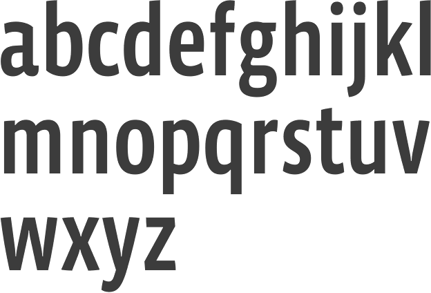
- Vista Sans (Xavier Dupré). Stephen Coles: With its friendly quirks, Vista Sans is a lot like Tarzana — another Emigre font — but succeeds everywhere Tarzana fails. The more distinctive glyphs feel harmonious with the rest of the font, never jarring. Gentle swashes and a large x-height make for a friendly sans that would work just right in so many settings.
- Cézanne Pro (James Grieshaber).
- FF Maiola (Veronika Burian). Dan Reynolds drools: Just when you thought your collection's text categories were set, Veronika Burian burst the stable doors open, reviving the Czech genre and its warm idiosyncrasies. A “warm” typeface? FF Maiola solves this puzzle using discrete play of irregularity and multiple angles, hearkening back to Menhart and Preissig's approaches.
- Maple (Eric Olson). Mark Simonson: Other type designers have mined the 19th century English grotesque, but Eric Olson gives it an energetic crispness which makes earlier attempts seem a bit stuffy. Maple captures the exuberant quirkiness of the grots without slavishly imitating them.
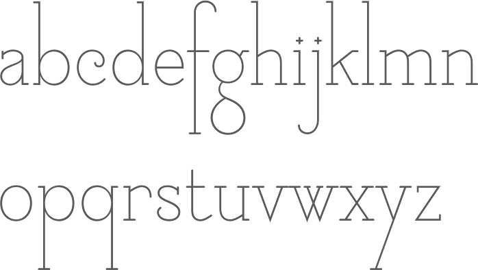
- Garda (Mario Feliciano). William Berkson notes: With great elegance and style—and alternative characters and ligatures—the set offers superb alternatives to Trajan, Optima, and Futura for titling.
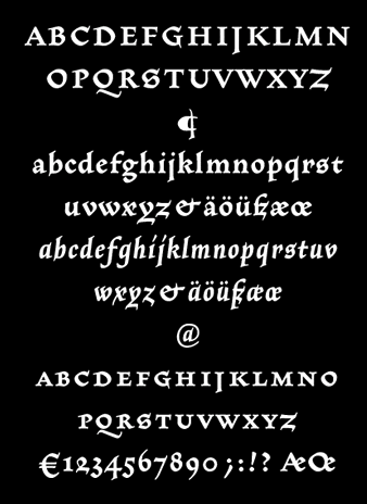
- Litteratra (Karsten Lücke). Yippie! Keep it up, Karsten! Joshua Lurie-Terrell: It's a sort of roman amalgam of textura and Schwabacher, channeling the expressionist spirit of Vojtech Preissig. [...] It's an entire historical movement.
- Relato (Eduardo Manso). My compatriot Yves Peters: Emtype Relato combines Dutch purposefulness with Latin sensuality. Its serifs are constructed following a clever principle, and the typefaces look simply gorgeous.
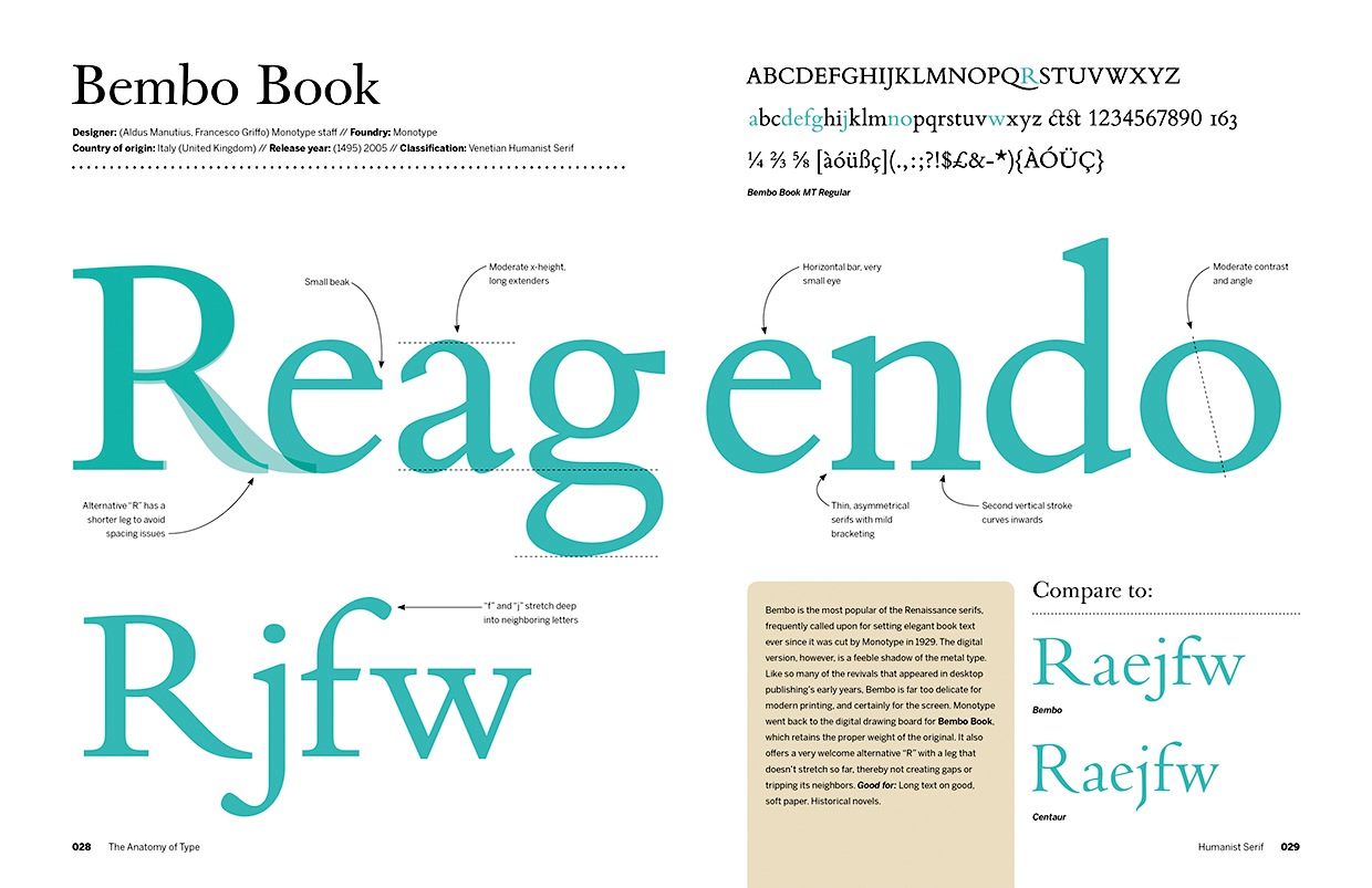
Honorable mentions: FF Absara Sans (Xavier Dupré), Amor (František Storm), Arrival (Keith Tam), Avebury Black and Open (Jim Parkinson), Ayres Royal (Gert Wiescher), Bembo Book (Robin Nicholas), Bluemlein Scripts (Alejandro Paul), Botanika (Tomáš Brousil), Cabazon (Jim Parkinson), Chocolate (Angel Koziupa and Alejandro Paul), Crank8 (Greg Lindy & Henk Elenga), Deutsche Bahn [PDF] (Christian Schwartz and Erik Spiekermann), Dynasty (Rian Hughes), Fedra Sans Display (Peter Bilak), Flama (Mário Feliciano), Galicia (Rian Hughes), Gill Sans Pro (Monotype), Groovin' (Jason Walcott), Handsome Pro (Nick Shinn), Happy Hour (Jason Walcott), Incognito (Gábor Kóthay), Kaffeesatz (Jan Gerner), Kingfisher (Jeremy Tankard), Lapture (Tim Ahrens), Mashine (Tim Ahrens), Mercury Display & Text (Jonathan Hoefler & Tobias Frere-Jones), Miserichordia (Rian Hughes), Modesto Text (Jim Parkinson), Morice (Stephen Banham), Nerva (Dino dos Santos), Nicholas (Nick Shinn), Ogravan (Tomáš Brousil), Paperback (John Downer), Propane (David Buck), Radiogram (Rian Hughes), Rough Riders and Redux (Michael Hagemann), Sculptura (Jason Castle), ITC Stone Humanist Sans (Sumner Stone), Soap (Ray Larabie), Sovereign (Nick Cooke), Tamarillo (Jason Walcott), Tourette (Jonathan Barnbrook), Wanderer (Michael Hagemann).
|
EXTERNAL LINKS
Best fonts of 2005 (Jan-Jun): Typographica
MyFonts search
Monotype search
Fontspring search
Google search
INTERNAL LINKS
Choice of fonts ⦿
Modern style [Bodoni, Didot, Walbaum, Thorowgood, Computer Modern, etc.] ⦿
Bastarda / Bâtarde / Schwabacher ⦿
Textura ⦿
Garalde or Garamond typefaces ⦿
Eric Gill and his typefaces ⦿
Bembo ⦿
|
