TYPE DESIGN INFORMATION PAGE last updated on Mon Jun 8 18:03:39 EDT 2026
FONT RECOGNITION VIA FONT MOOSE

|
|
|
|
John Moore
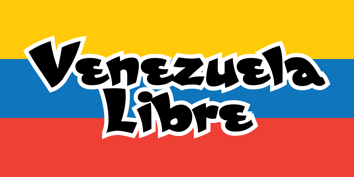
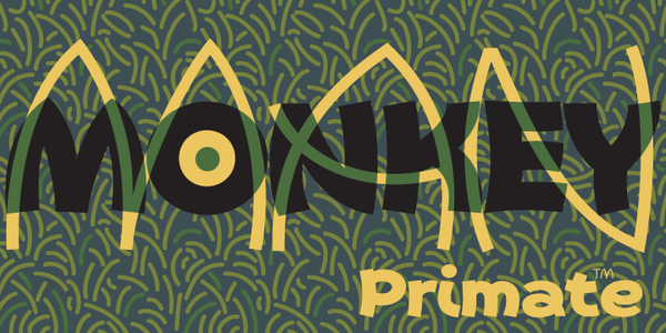
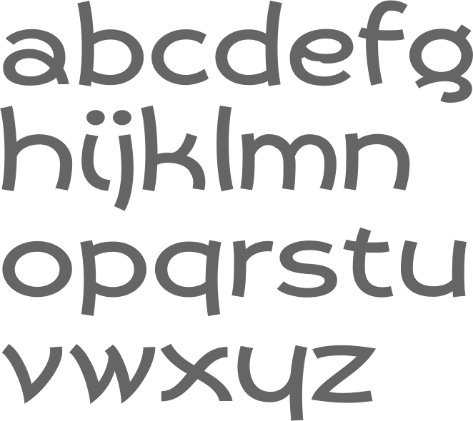
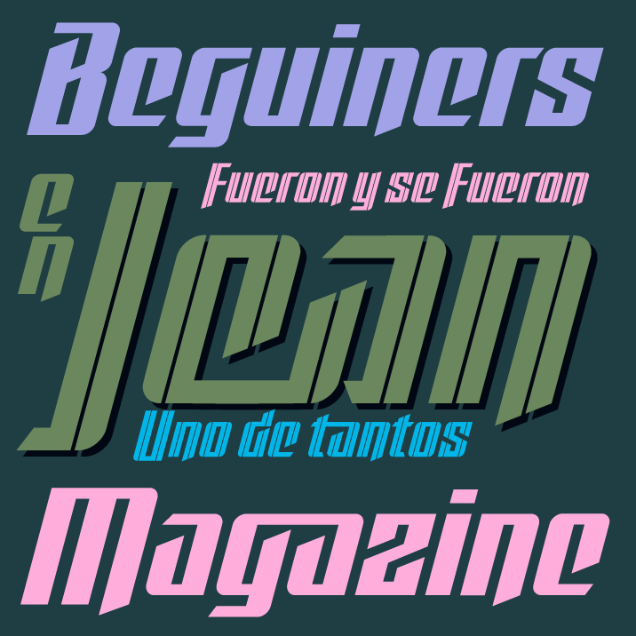
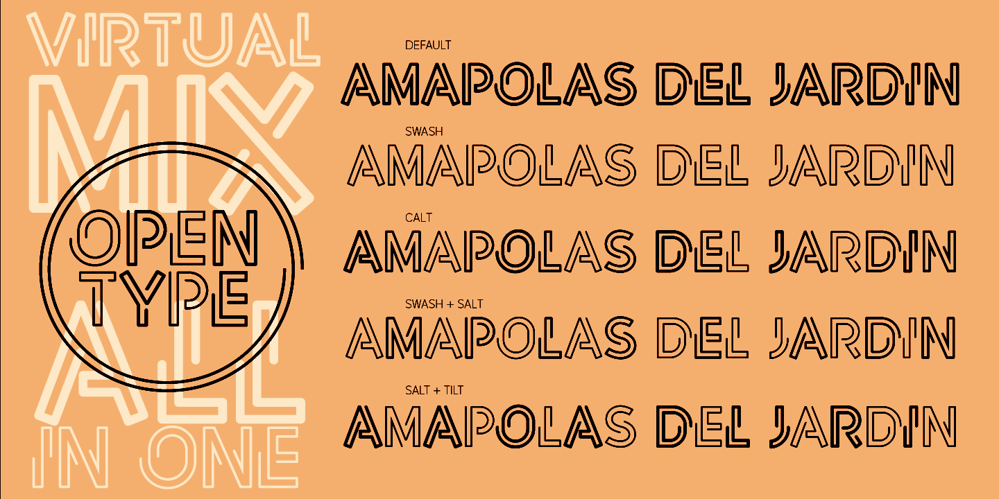
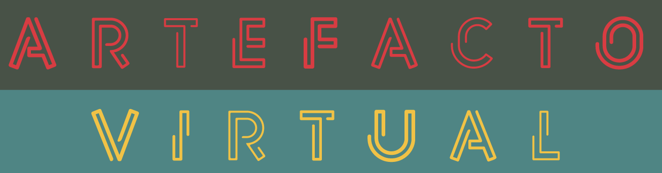
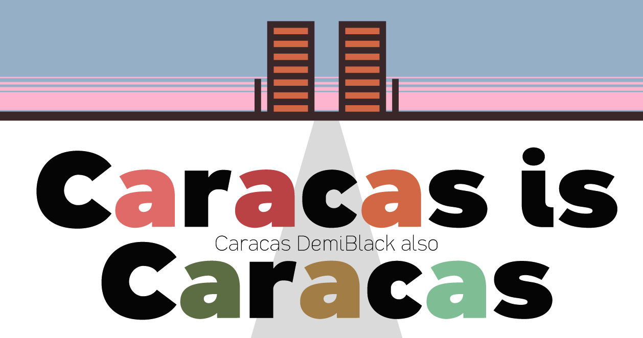
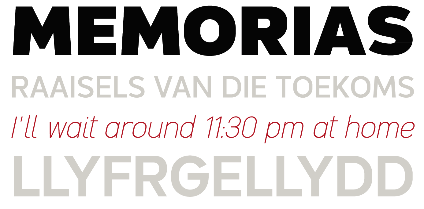
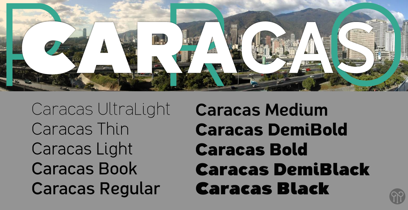
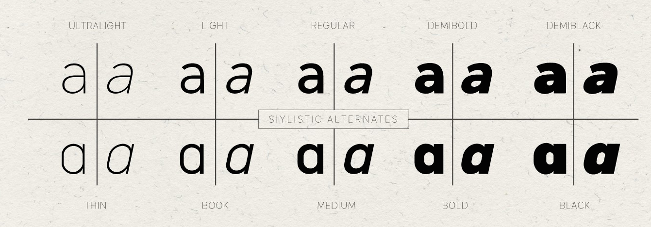
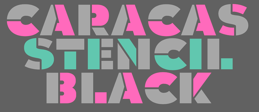
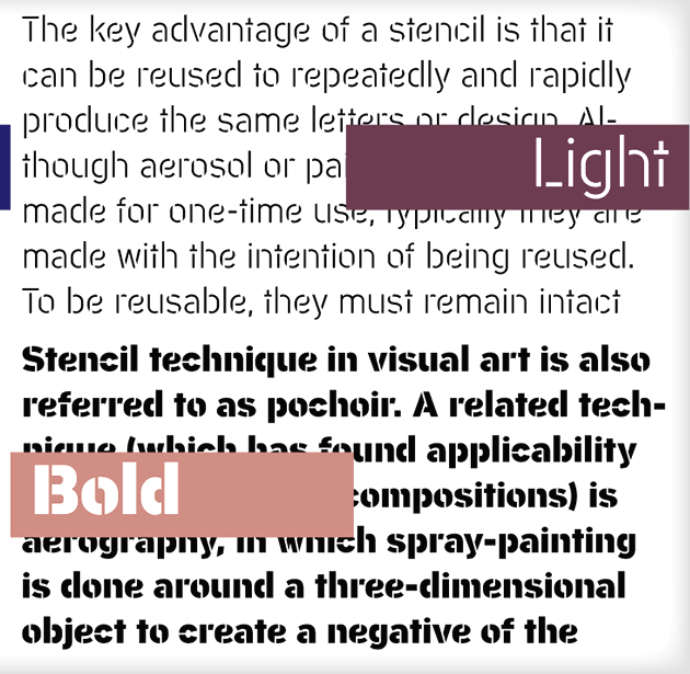
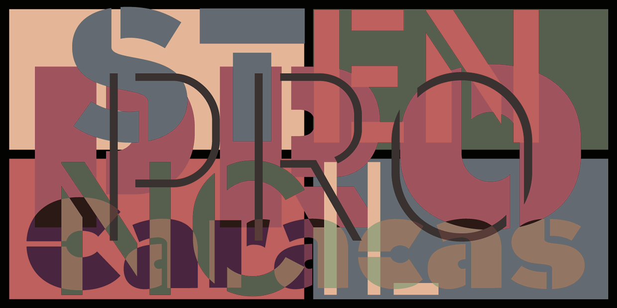
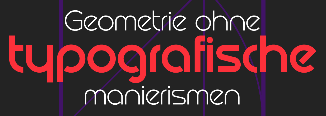
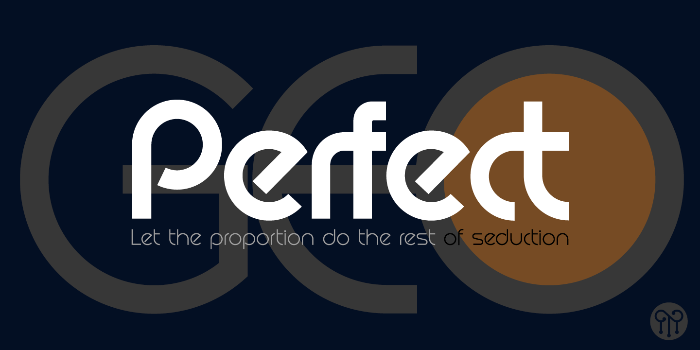
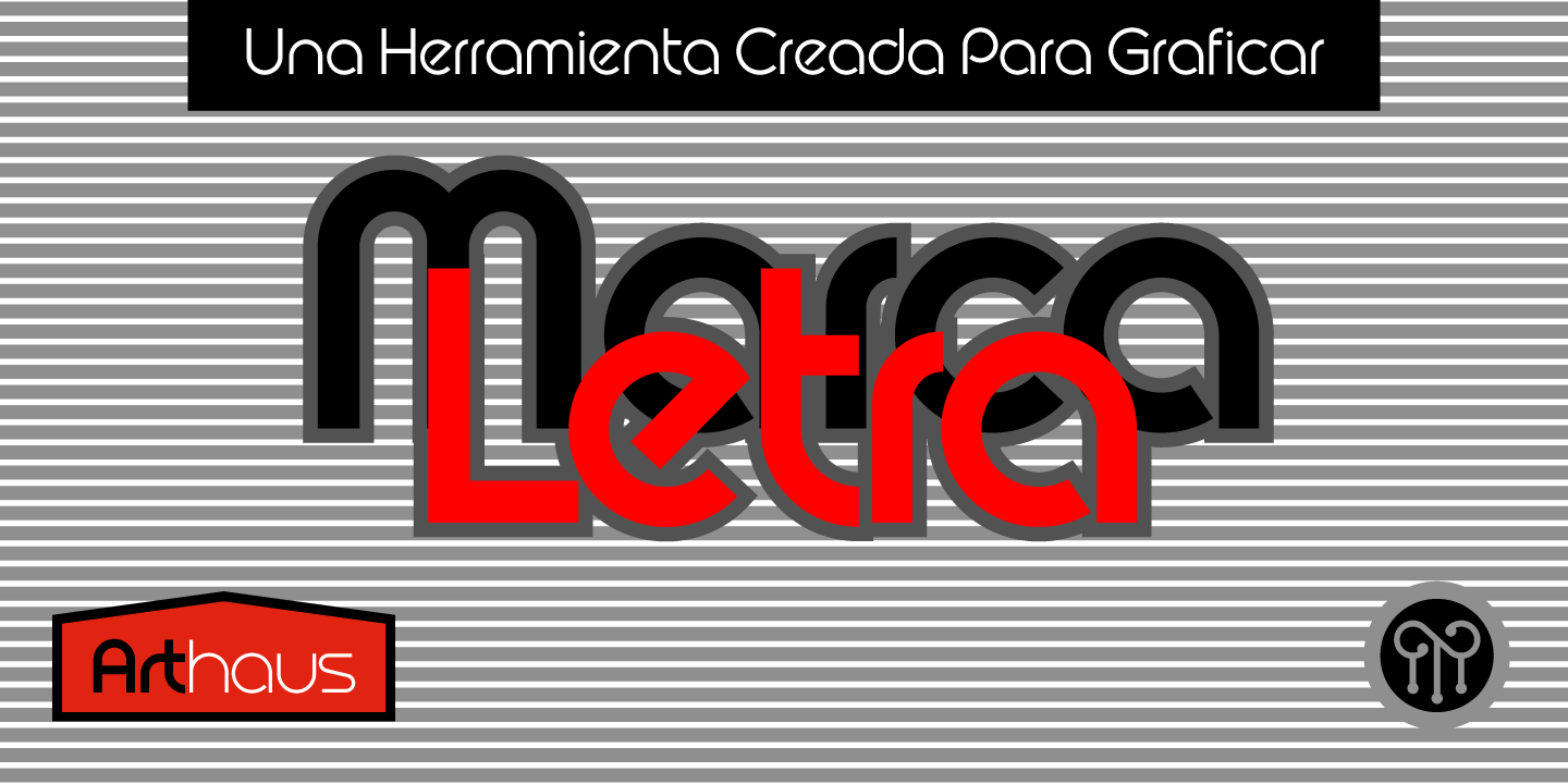
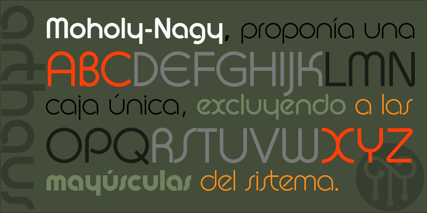
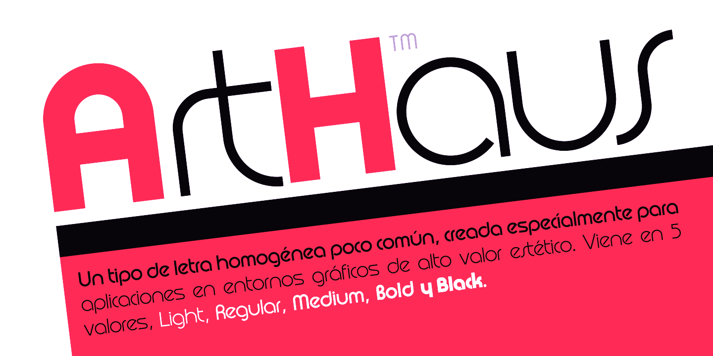
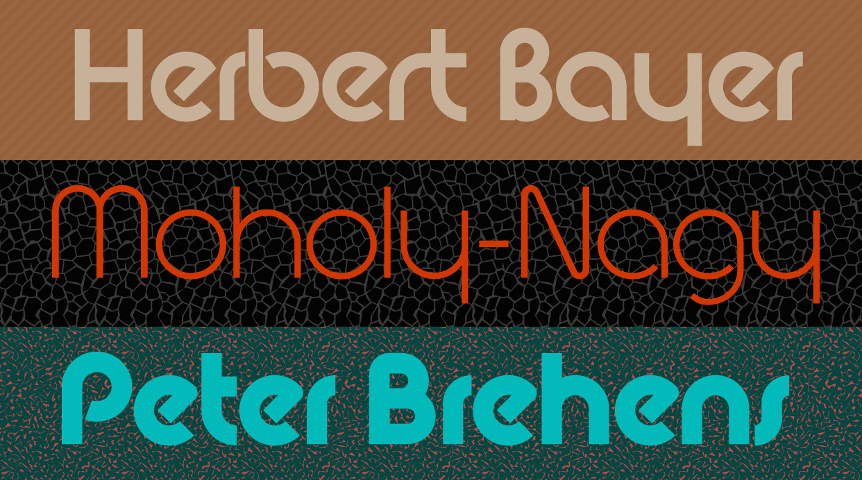
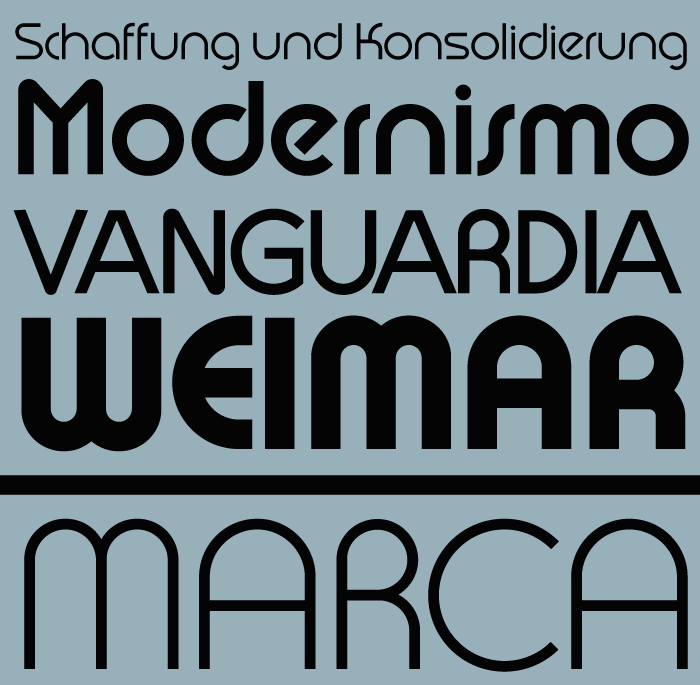
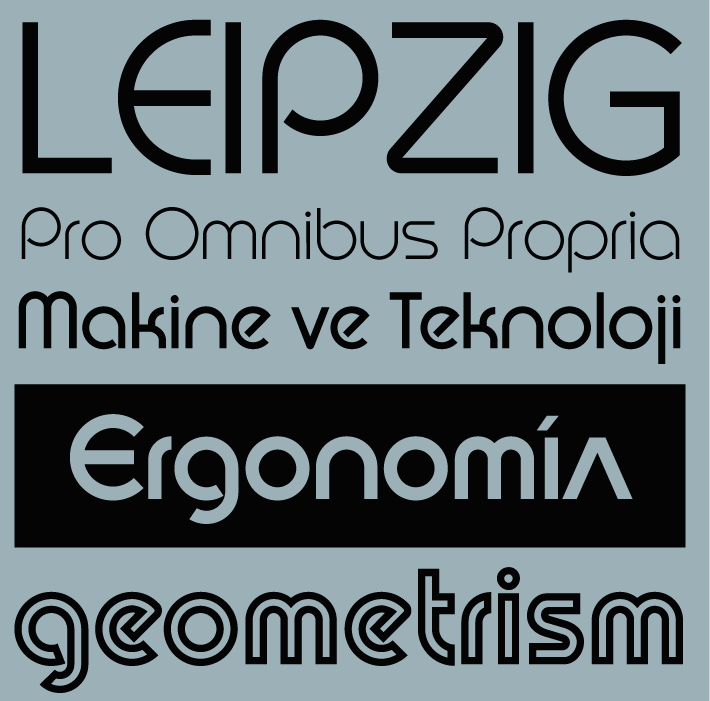
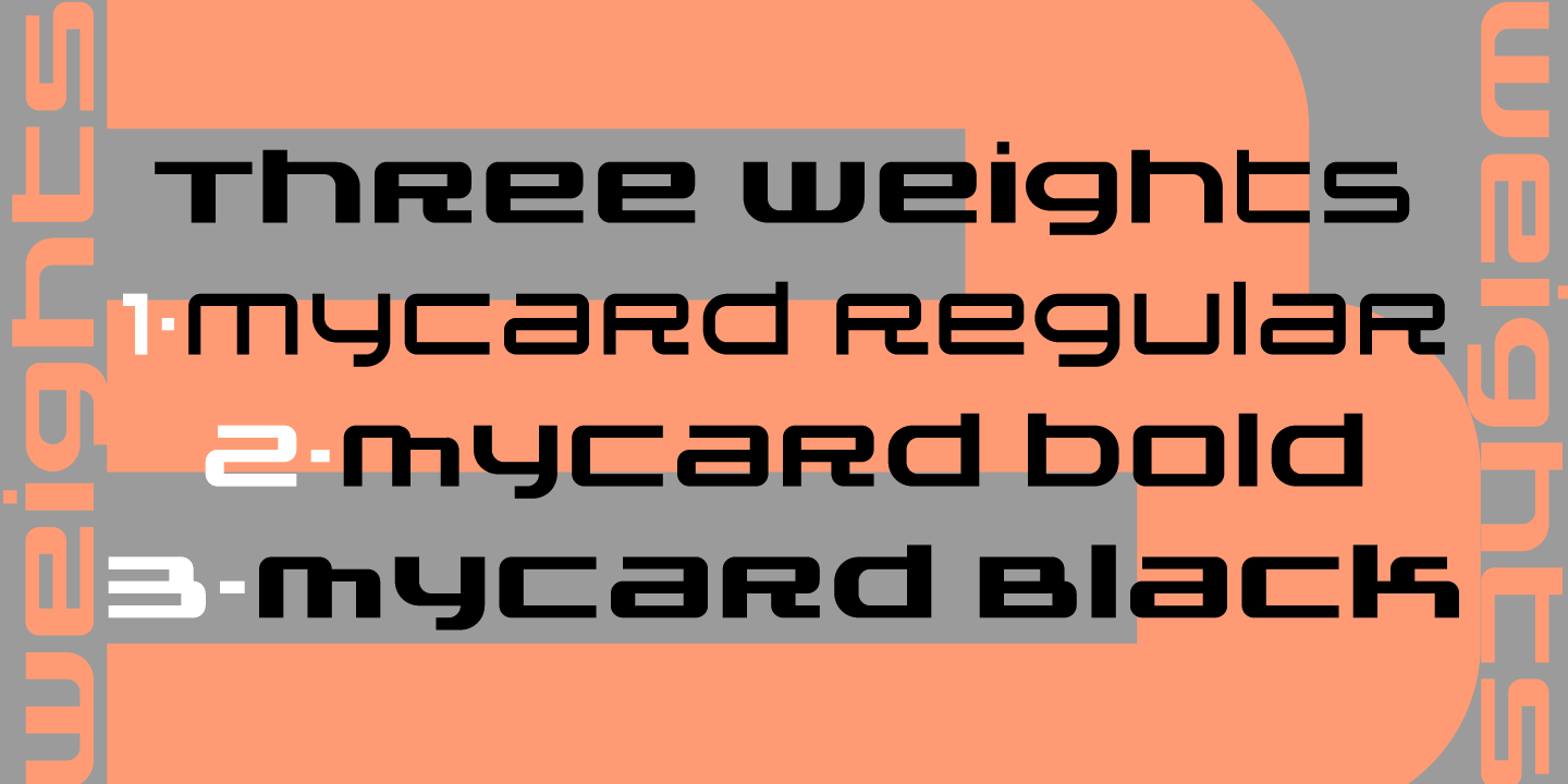
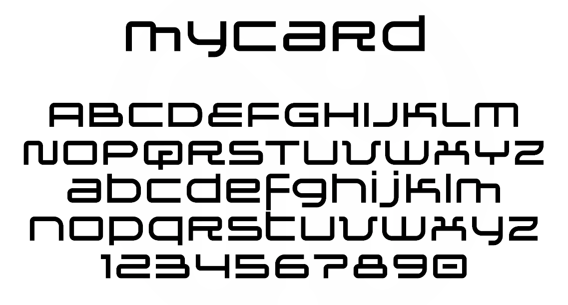
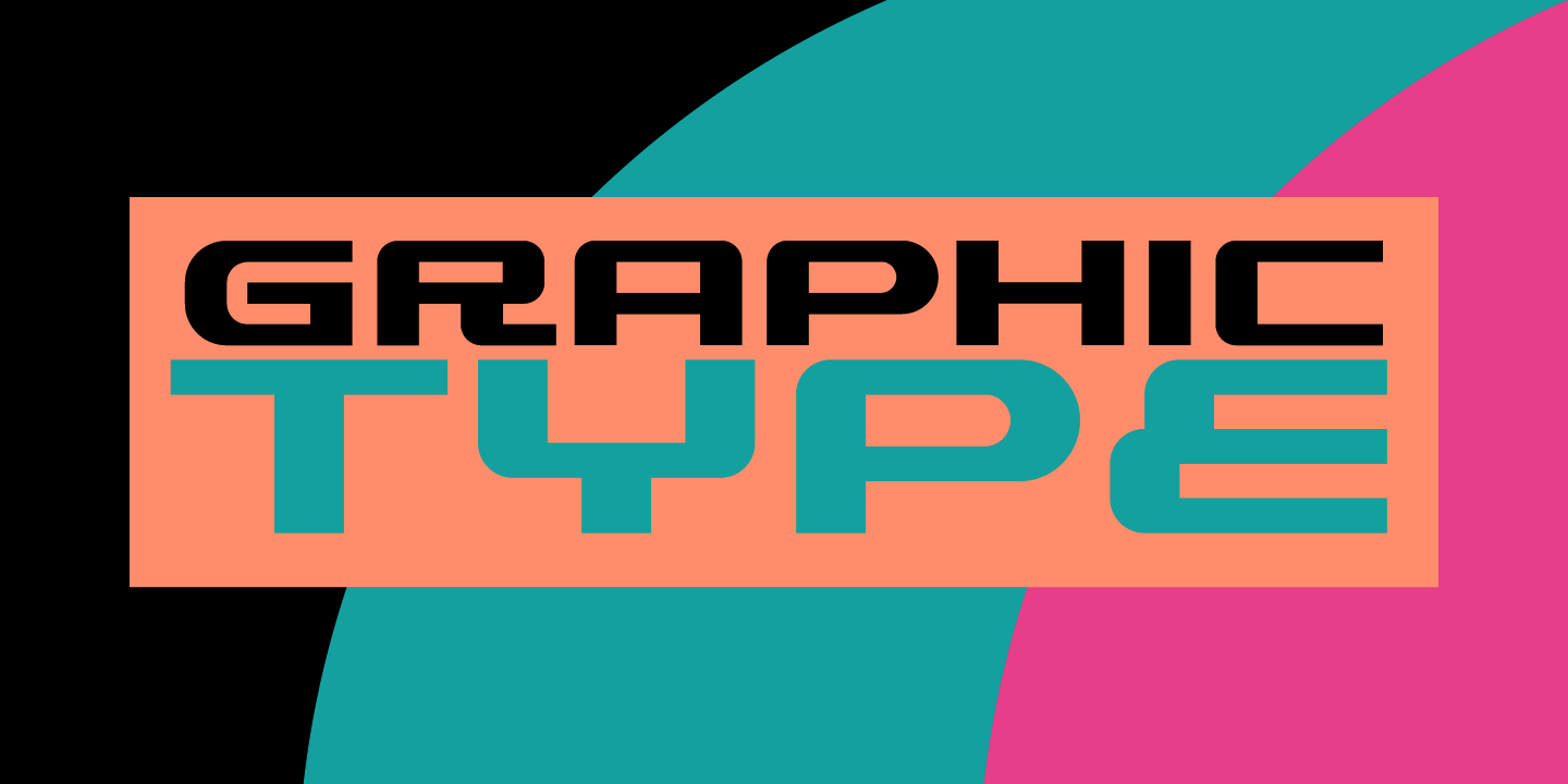
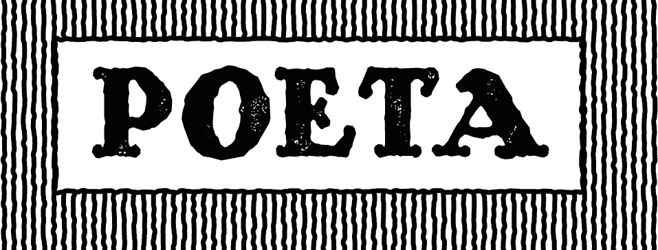
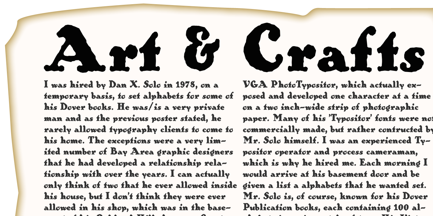
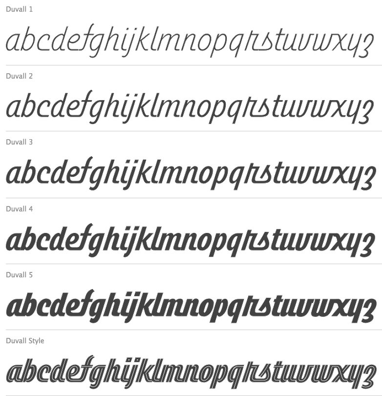
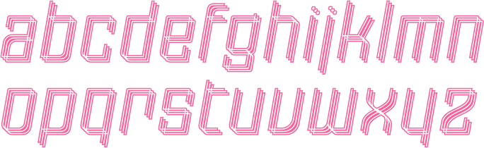
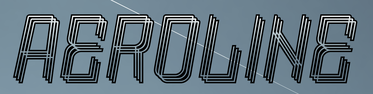
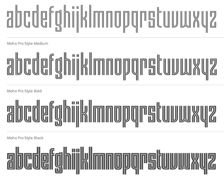
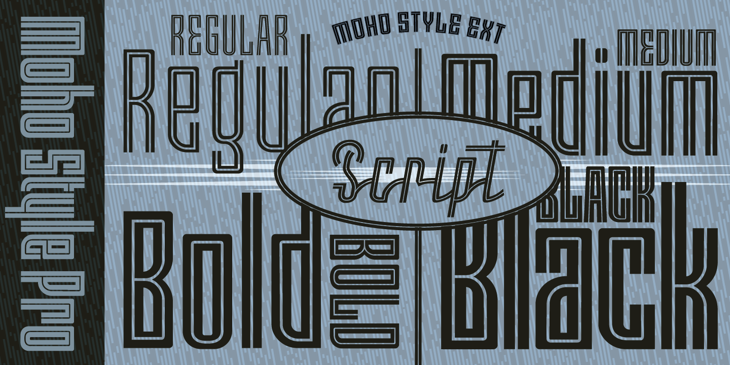
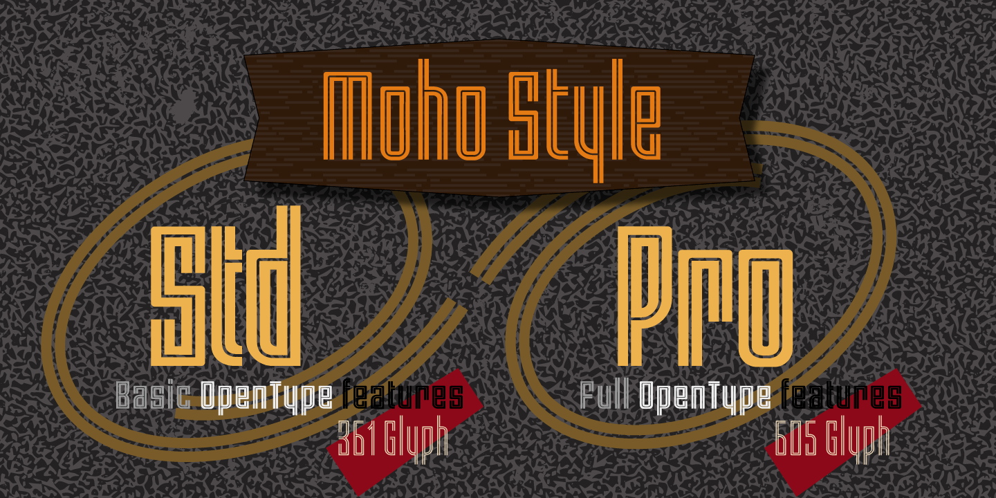
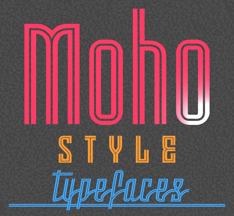
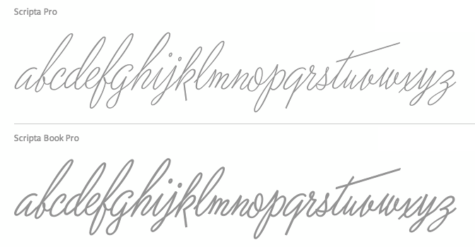
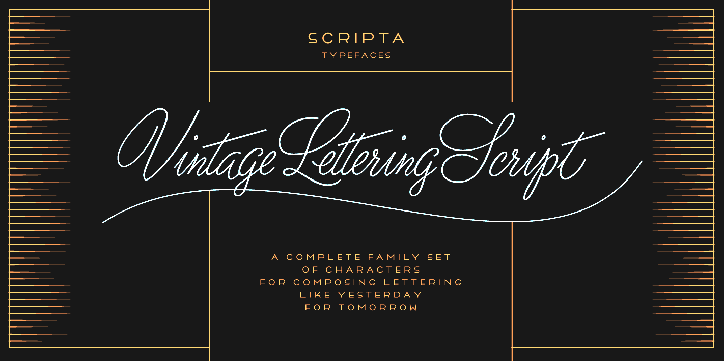
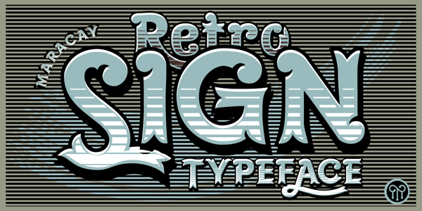
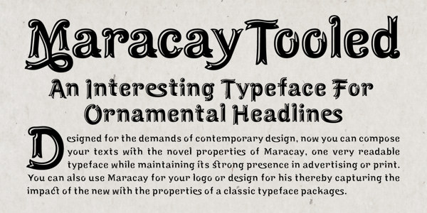
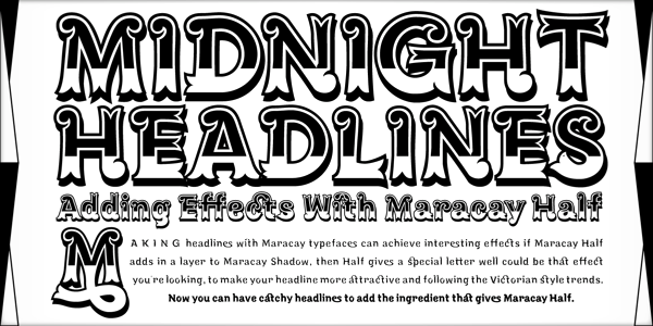
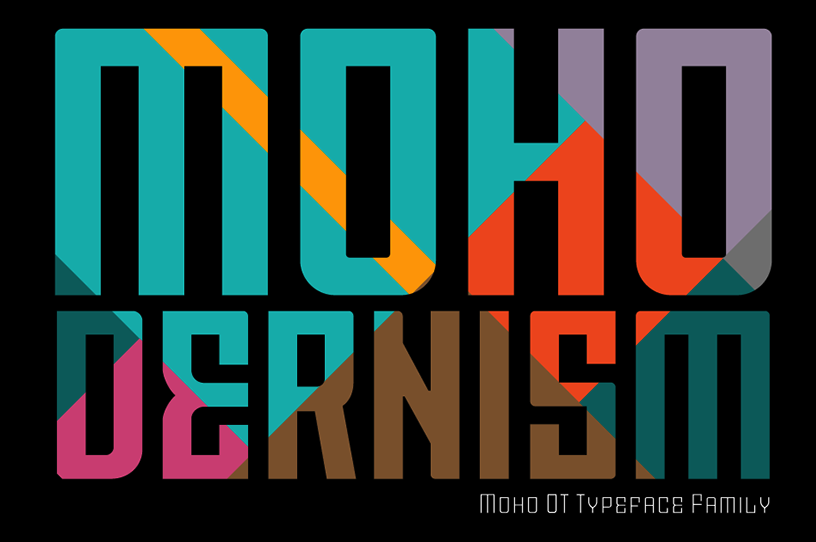
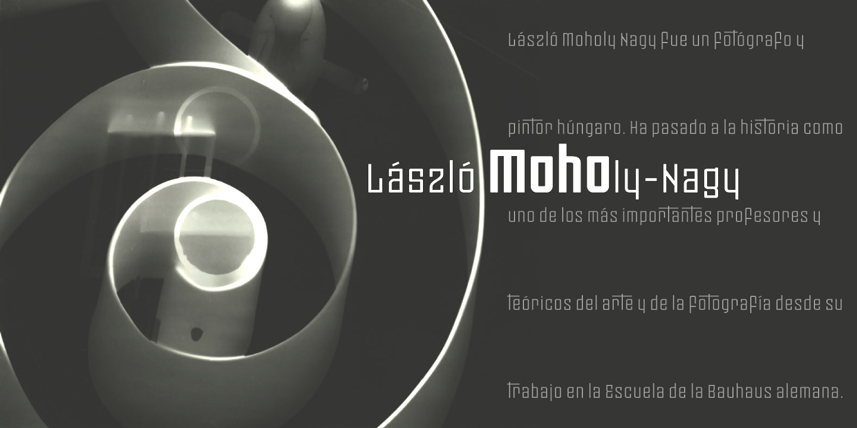
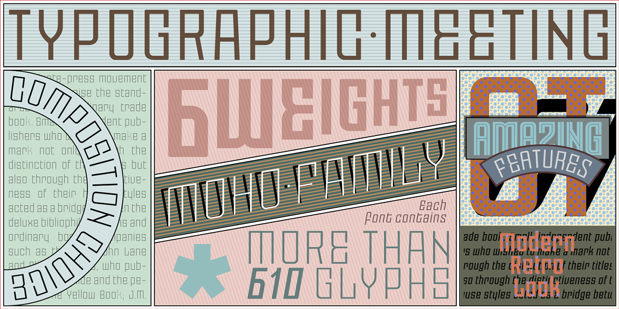
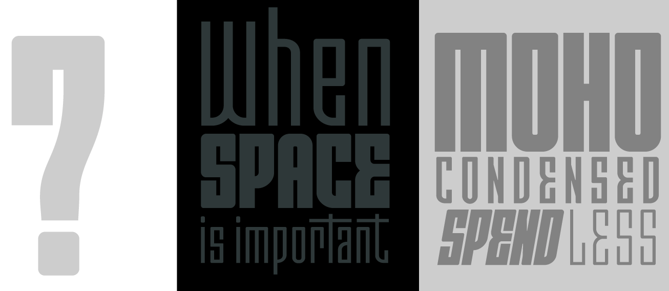
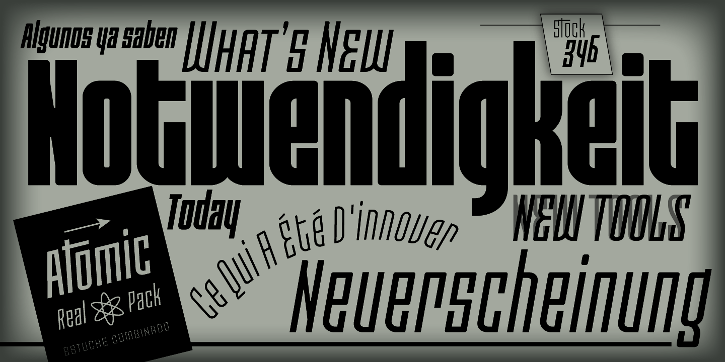
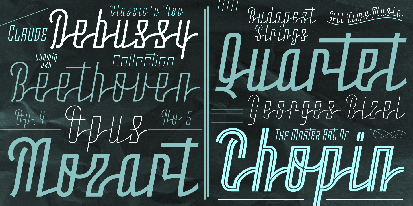
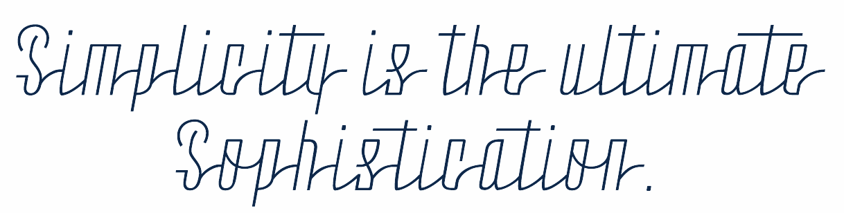
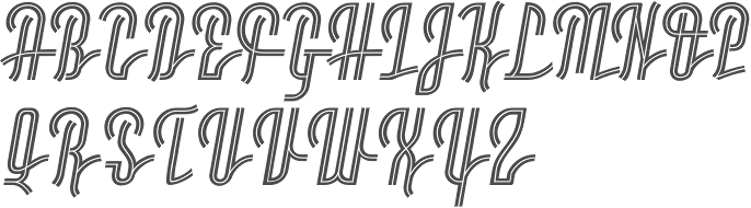
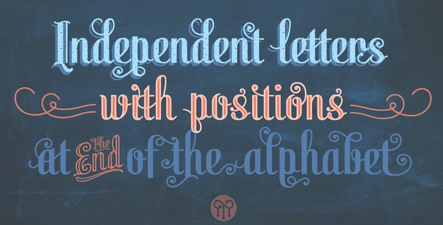
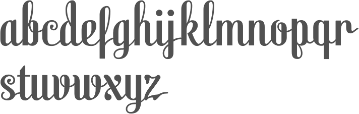
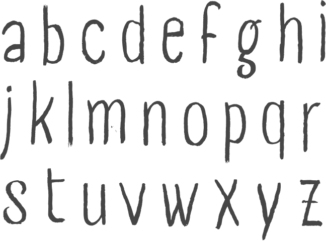
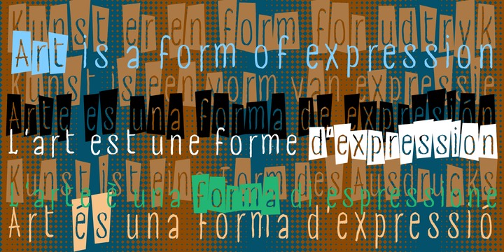
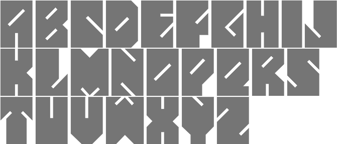
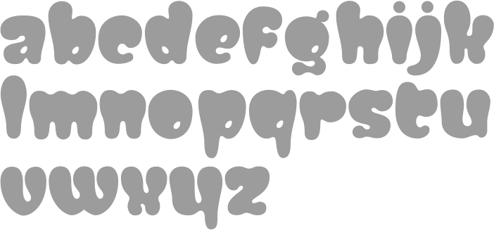
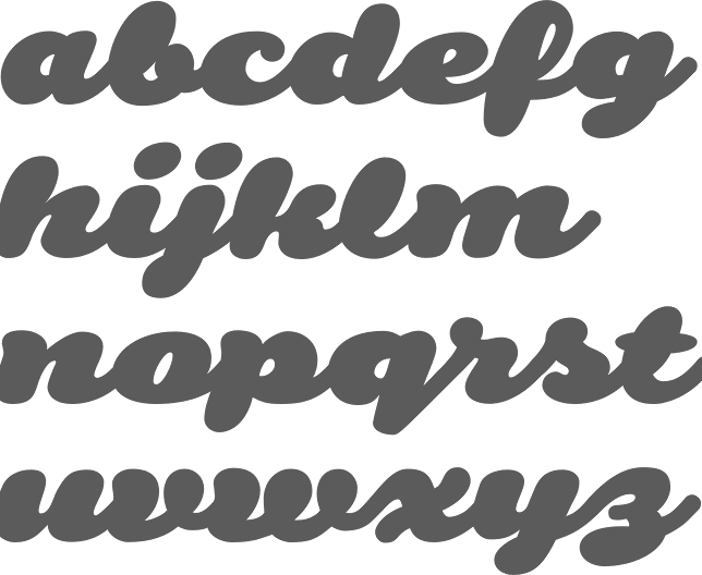
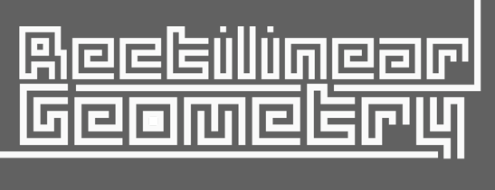
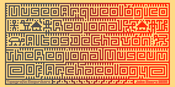
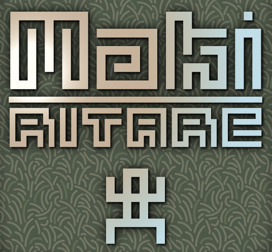
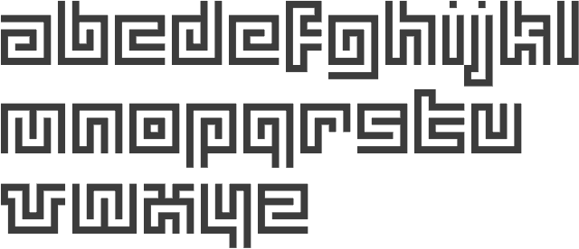
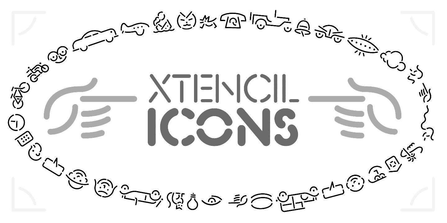
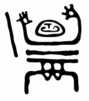
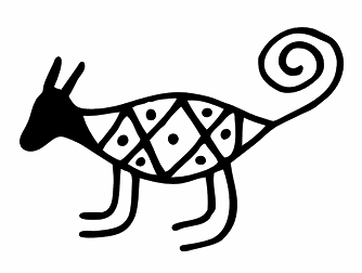
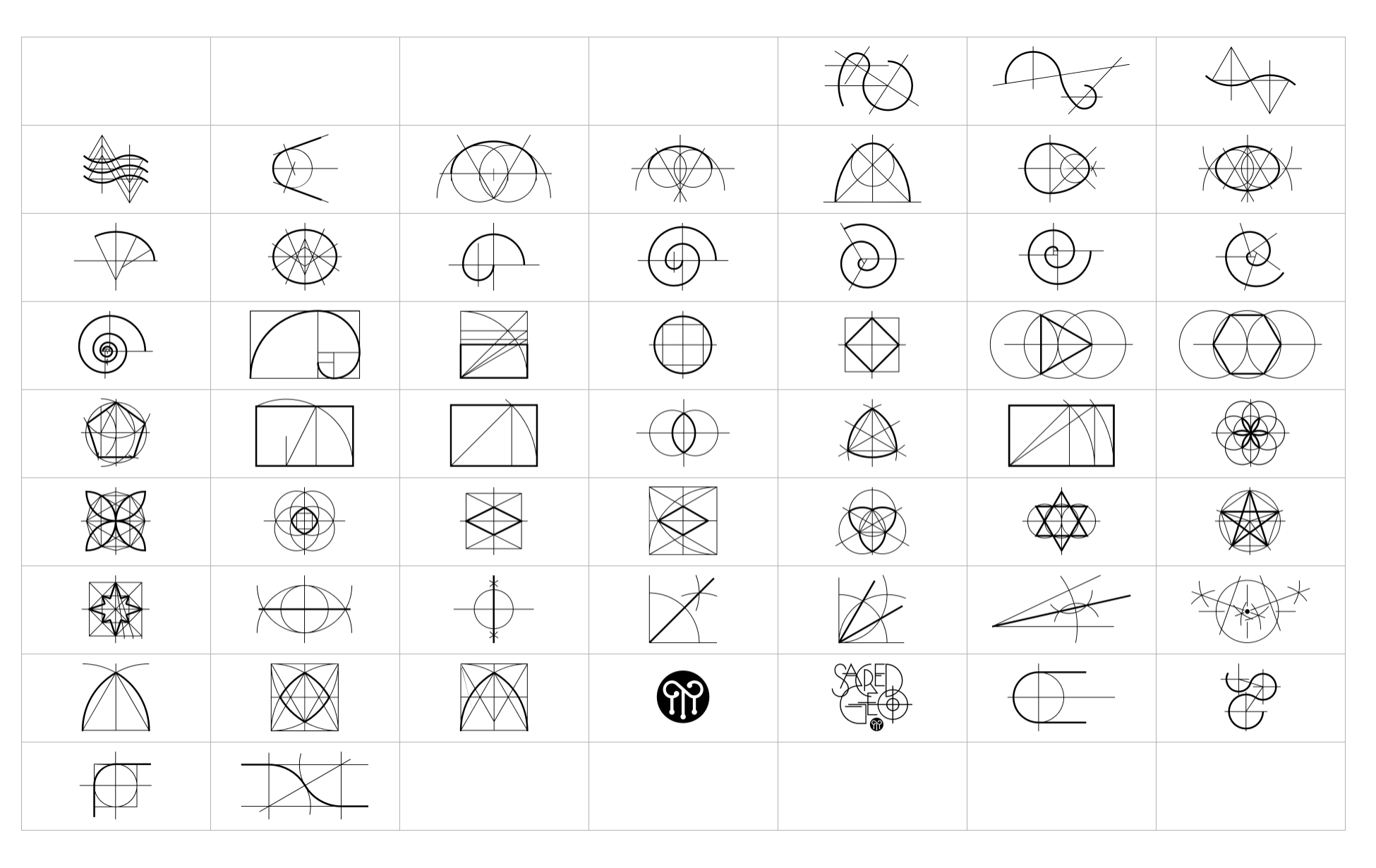
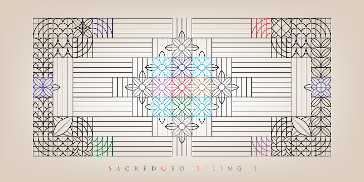
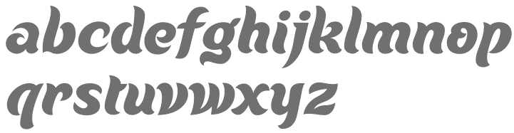
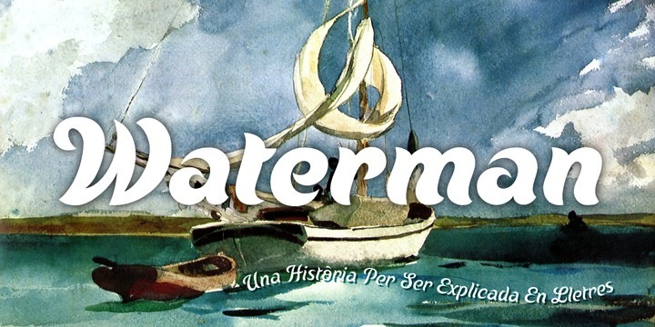
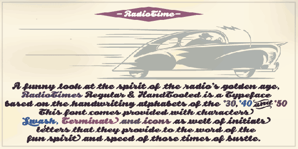
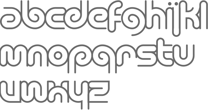
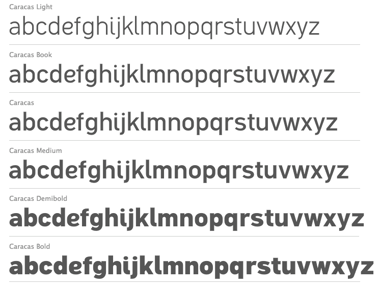
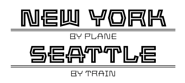
Born in 1951, John Moore is a Venezuelan type designer. He studied graphic design in the Institute of graphic design Neumann from 1972 until 1976. In 1980 he took a workshop with Milton Glaser and since 1983 he has worked as an art director and creative director in many advertising agencies. He designs type since 1976. His typefaces Gordis (a fattish comic book family) and Tepuy won awards at Tipos Latinos 2008 in the non-text and experimental typeface categories, respectively. At Tipos Latinos 2010, he won twice in the display category, for Victorina and Radio Time. His typefaces: (New) Maracay (2013, a large layered Victorian signage family), Fine Art OT (2013, brushy typeface), Roadline Italic (2013, a retro script), JMTF Robin (2013, a layered post-modernist display family), Virgin Script (2013), Radio Time (2013, fat retro signage script), Radio Time Icons (2013), Palaima (2013, an aboriginal style face), Factor (2012, a layered geometric font), Onda (2012, a wavy psychedelic face), Blockee (2012), Aliykit Open (2012, a multiline typeface), VE Inconexa (2006, outline architectural face), VE Makiritare (2006, a double labyrinthine script that is based on symbolisms used by the Makiritare or Yecuana, river people who live in the village of Santa Maria de Erebato in the Venezuelan jungle on the border with Brazil), VE Moho (2006; or simply Moho in 2014), VE Palaima (2006, futuristic, Amazonian), Radio Time (fifties style script, with Alejandro Paul at Sudtipos), Fruta (stencil, influenced by Glaser?), Glaser Stencil Round, Gothike (sharp-edges), Aqua (ultra round), Club, Caracas (sans; +Caracas Pro, 2015; see also Caracas Stencil Pro, 2015), Factor (hookish), Space Lab (futuristic family), Robin (headline), Victorina (multiline Victorian poster typeface which won an award at Tipos Latinos 2010), Victorina Black Shadow (2011), Waterman (2010, a flowing undulating script family), Spacelab (2010, futuristic) and RobinBienalII (2005). Sudtipos sells these fonts of his via MyFonts: Makiritare (bilined, based on woven baskets), Palaima (experimental, runic), Precolombino (petroglyphs), Tepuy (rounded version of Makiritare), Roadline (2009, fifties diner font), Sacred Geo (2011, a geometric dingbat font that won an award at Tipos Latinos 2012), DeCoro (2011, art deco family), Sacred Geo Tiling (2011), Primate (2012, an African look typeface family), Morenita (2012, a connected fifties or school script), Takox (2012), Petroglifos (2012), Xtencil (2012, a rounded stencil influenced by Milton Glaser; followed by Xtencil LC and UC in 2013 and Xtencil Pro in 2015). Typefaces from 2014: Moho Sport Pro (layered athletic lettering typeface family), Scripta Pro and Gothic (40s-style lettering typeface inspired by the style of L.H. Copeland), InkArt Labels, Moho (named after Laszlo Moholy-Nagy), MohoBis Pro (a multilined version of Moho), Moho Condensed, Moho Script, Duvall (named after Edward J. Duvall, who published Modern Sign Painting in the late 1940s; Duvall won an award at Tipos Latinos 2014). In 2015, the Moho series continued with Moho Style. He also made Arthaus (2015, a fantastic Bauhaus font family inspired by Herbert Bayer's universal alphabet), MyCard (a techno type), NeoScript Pro and Hierra (after a font by Dan Solo) in 2015. In 2016, he designed Artime (a sci-fi font), Virtual. Typefaces from 2017: FunFont (cartoon style). |
EXTERNAL LINKS |
| | |


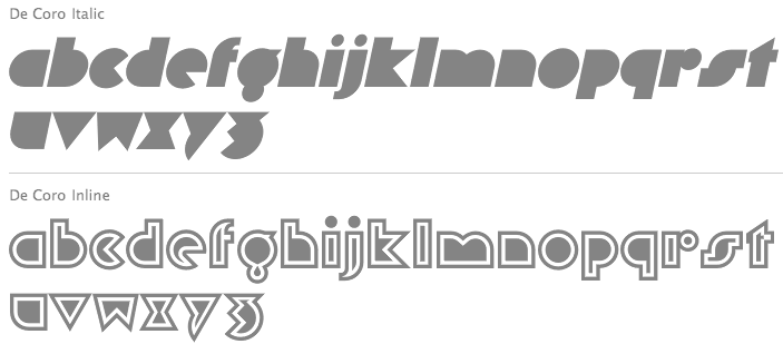
file name: John Moore De Coro 2011

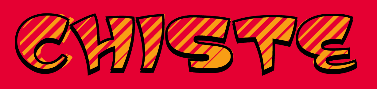
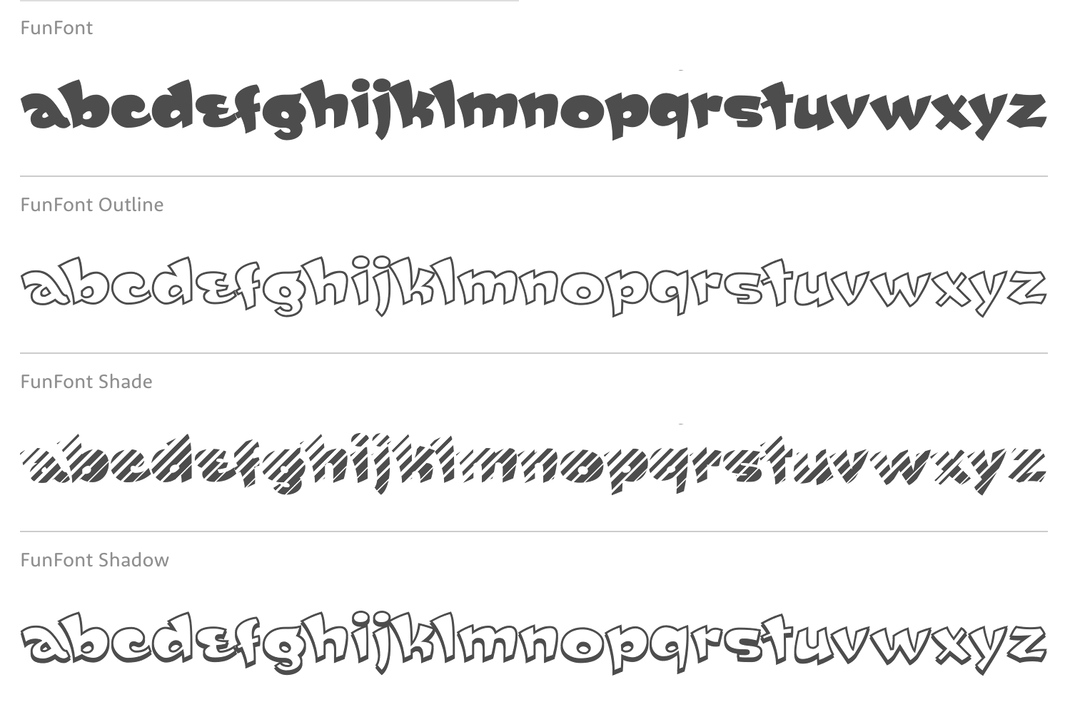
file name: John Moore Type Foundry Fun Font 2017 240219
file name: John Moore Type Foundry Fun Font 2017 240227
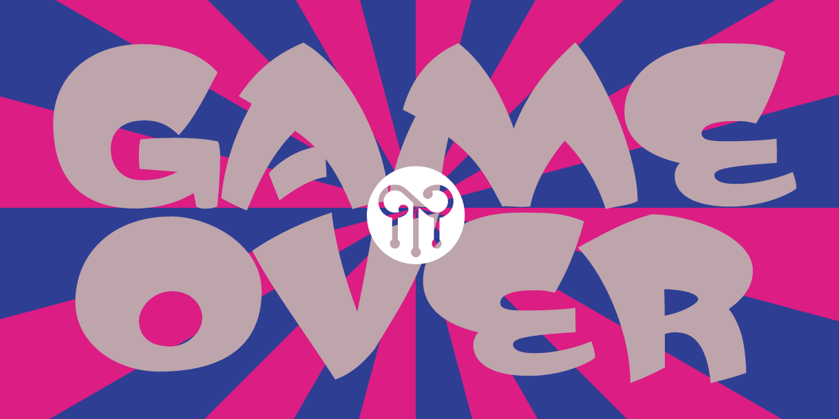
file name: John Moore Type Foundry Fun Font 2017 240285

file name: John Moore Type Foundry Fun Font 2017
file name: John Moore Fun Font 2017 240220
file name: John Moore Fun Font 2017 240222
file name: John Moore Fun Font 2017 240228

file name: John Moore Fun Font 2017 240284

file name: John Moore Fun Font 2017 240286

file name: John Moore Fun Font 2017 240287
file name: John Moore Fun Font 2017a

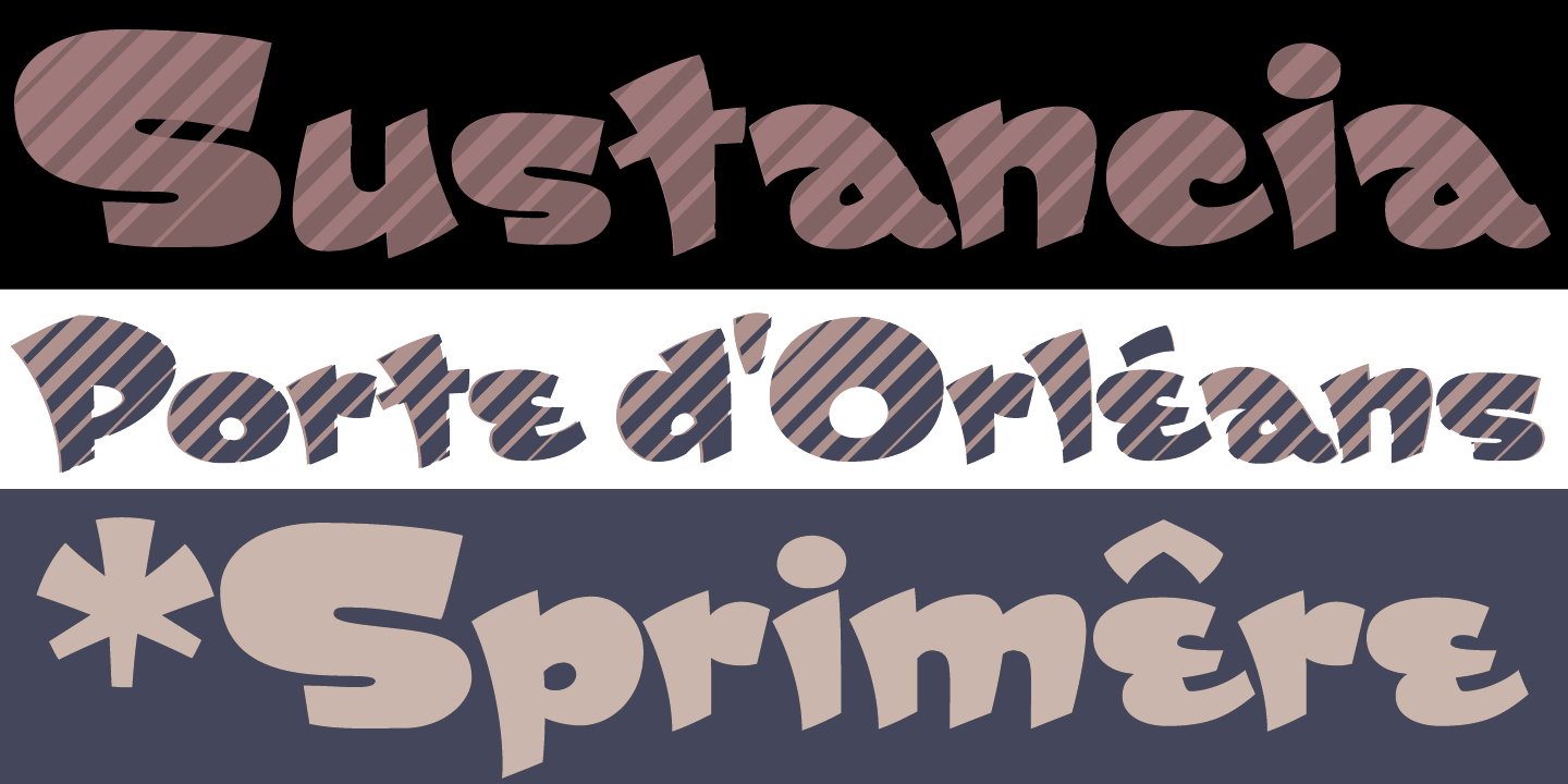
file name: John Moore Primate 2012
file name: John Moore Primate 2012b
file name: John Moore Primate 2012c
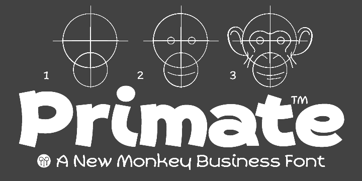
file name: John Moore Primate 2012d
file name: John Moore Type Foundry Artime 2016 214201

file name: John Moore Type Foundry Artime 2016 214206

file name: John Moore Type Foundry Artime 2016
file name: John Moore Type Foundry Virtual 2016 207889
file name: John Moore Type Foundry Virtual 2016 208003

file name: John Moore Type Foundry Virtual 2016 208011

file name: John Moore Type Foundry Virtual 2016
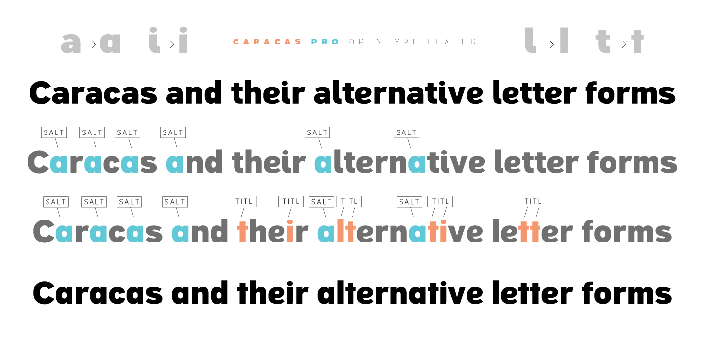
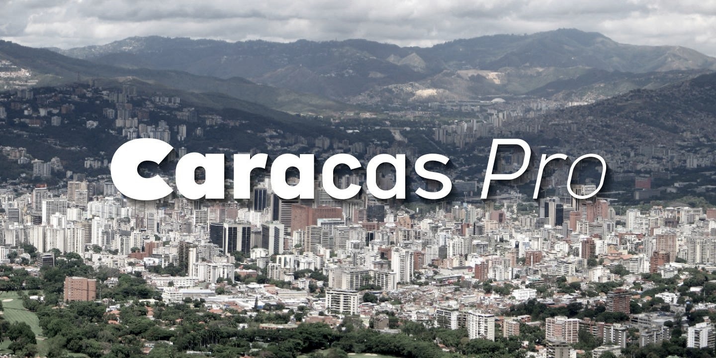
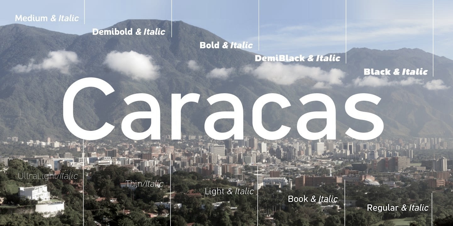
file name: John Moore Caracas Pro 2015 177613
file name: John Moore Caracas Pro 2015 177615
file name: John Moore Caracas Pro 2015 177616
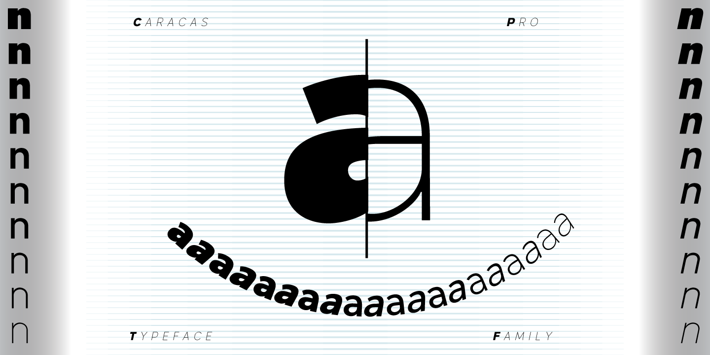
file name: John Moore Caracas Pro 2015 177621
file name: John Moore Type Foundry Caracas Pro 2014 177617
file name: John Moore Type Foundry Caracas Pro 2014 177728
file name: John Moore Type Foundry Caracas Pro 2014 177804
file name: John Moore Type Foundry Caracas Pro 2014 177807
file name: John Moore Caracas Stencil Pro 2015
file name: John Moore Caracas Stencil Pro 2015b
file name: John Moore Caracas Stencil Pro 2015c
file name: John Moore Caracas Stencil Pro 2015d
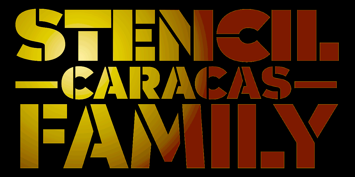
file name: John Moore Caracas Stencil Pro 2015e
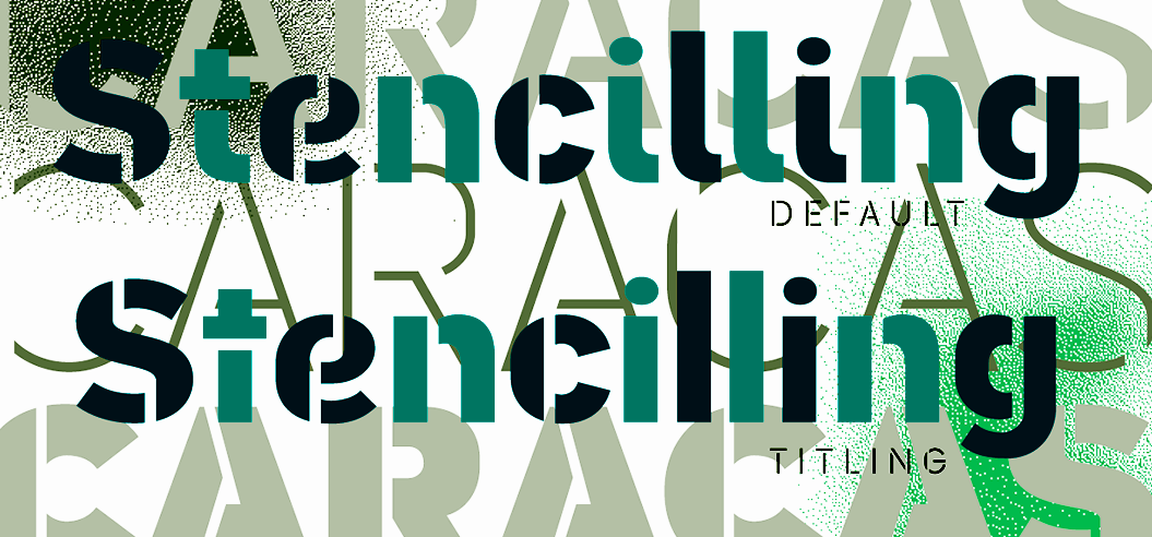
file name: John Moore Caracas Stencil Pro 2015f
file name: John Moore Type Foundry Caracas Stencil Pro 2015 179339

file name: John Moore Type Foundry Caracas Stencil Pro 2015

file name: John Moore Type Foundry Caracas Pro 2014
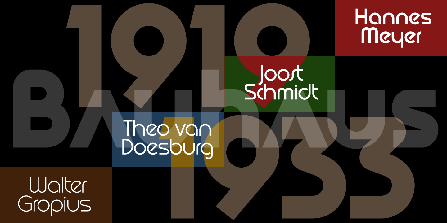
file name: John Moore Type Foundry Arthaus 2015 183711
file name: John Moore Type Foundry Arthaus 2015 183713

file name: John Moore Type Foundry Arthaus 2015 183740

file name: John Moore Type Foundry Arthaus 2015 183749
file name: John Moore Type Foundry Arthaus 2015 183750
file name: John Moore Type Foundry Arthaus 2015 183757
file name: John Moore Type Foundry Arthaus 2015 183759
file name: John Moore Type Foundry Arthaus 2015 183764
file name: John Moore Type Foundry Arthaus 2015 183765
file name: John Moore Type Foundry Arthaus 2015 183766
file name: John Moore Type Foundry Arthaus 2015 183766b
file name: John Moore Type Foundry Arthaus 2015 183767

file name: John Moore Type Foundry Arthaus 2015 183768

file name: John Moore Type Foundry Arthaus 2015
file name: John Moore Type Foundry My Card 2015 180816
file name: John Moore Type Foundry My Card 2015 180818

file name: John Moore Type Foundry My Card 2015 180821
file name: John Moore Type Foundry My Card 2015 180826

file name: John Moore Type Foundry My Card 2015 180827

file name: John Moore Type Foundry My Card 2015

file name: John Moore Hierra 2015
file name: John Moore Hierra 2015b
file name: John Moore Hierra 2015c
file name: John Moore Duvall 2014
file name: John Moore Moho Bis Pro 2014
file name: John Moore Moho Bis Pro 2014b

file name: John Moore Moho Sport Pro 2014

file name: John Moore Moho Sport Pro 2014b
file name: John Moore Moho Pro Style 2015
file name: John Moore Moho Pro Style 2015b
file name: John Moore Moho Pro Style 2015c
file name: John Moore Moho Pro Style 2015d
file name: John Moore Scripta Pro 2014
file name: John Moore Scripta Pro 2014b
file name: John Moore Scripta Pro 2014c
file name: John Moore Scripta Pro 2014d
file name: John Moore Scripta Pro 2014e
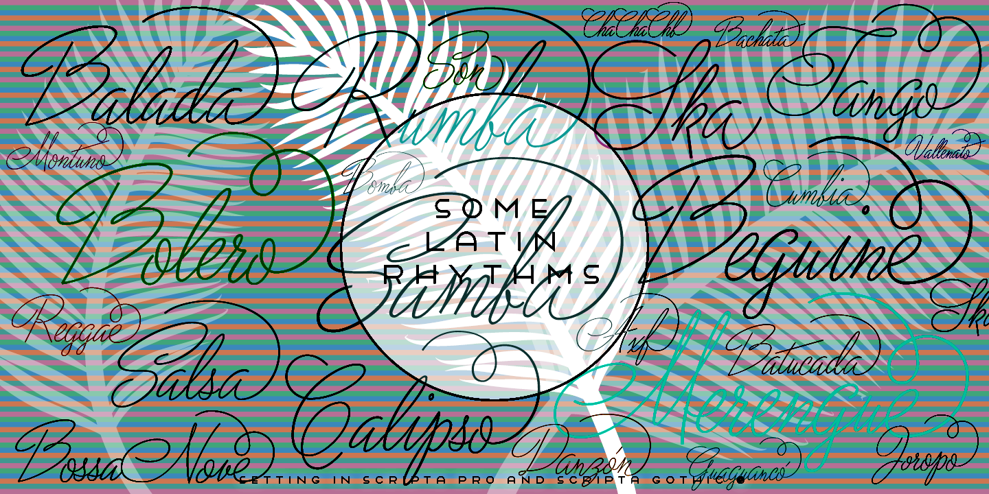
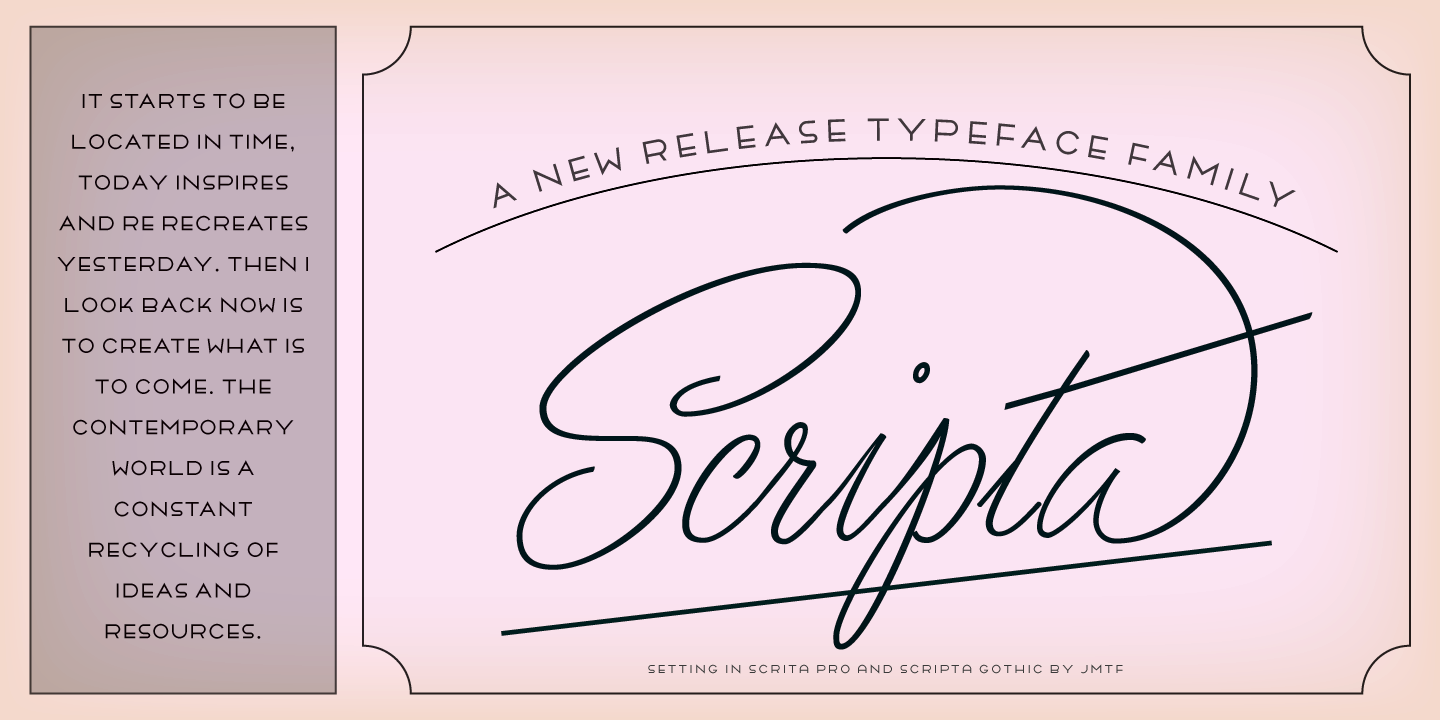
file name: John Moore Scripta Pro Gothic 2014

file name: John Moore Neoscript Pro Two 2015

file name: John Moore Neoscript Pro Two 2015b
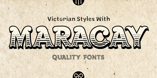
file name: John Moore New Maracay 2013
file name: John Moore New Maracay 2013b

file name: John Moore New Maracay 2013c
file name: John Moore New Maracay 2013d
file name: John Moore New Maracay 2013e

file name: John Moore New Maracay 2013f
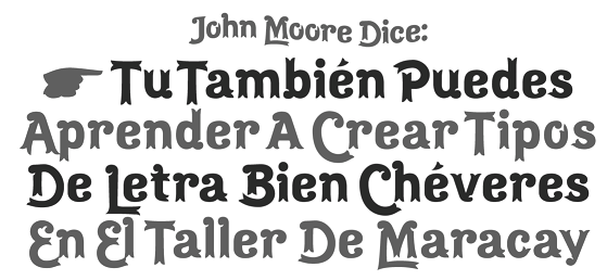
file name: John Moore New Maracay 2013g
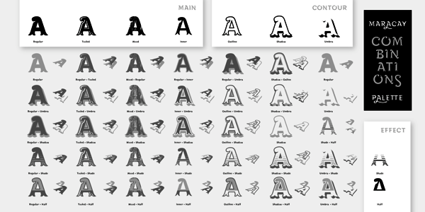
file name: John Moore New Maracay 2013h
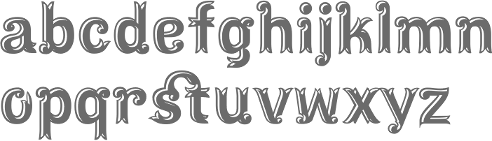
file name: John Moore Maracay Tooled 2013
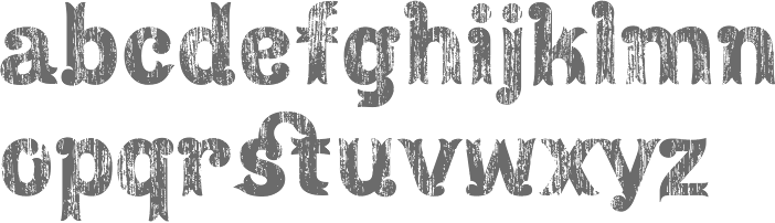
file name: John Moore Maracay Wood 2013
file name: John Moore Ink Art Labels 2014
file name: John Moore Moho 2014
file name: John Moore Moho 2014b
file name: John Moore Moho 2014c

file name: John Moore Moho 2014d

file name: John Moore Moho 2014e
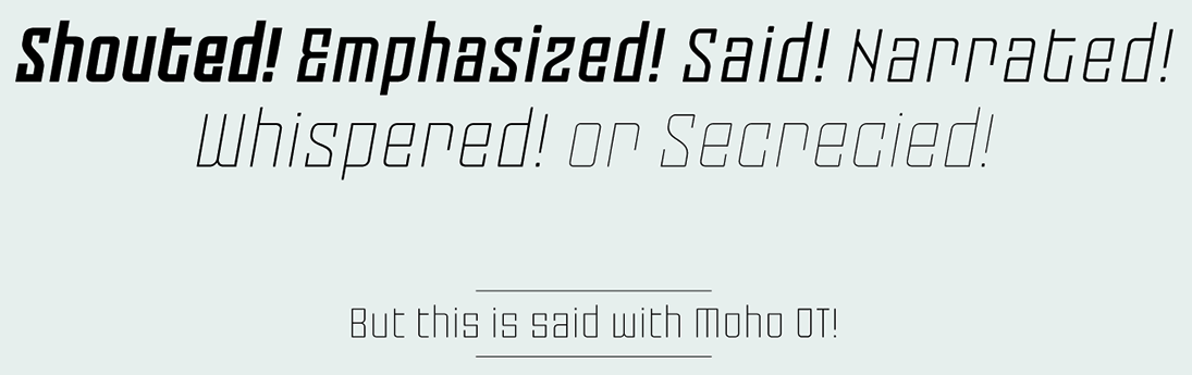
file name: John Moore Moho 2014f

file name: John Moore Moho 2014g
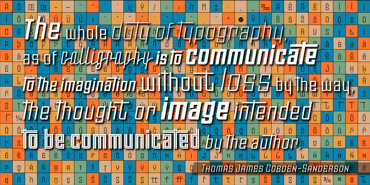
file name: John Moore Moho 2014h

file name: John Moore Moho 2006
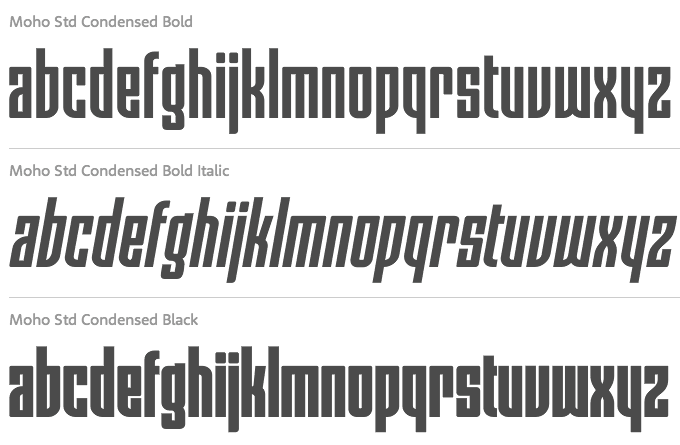
file name: John Moore Moho Condensed 2014
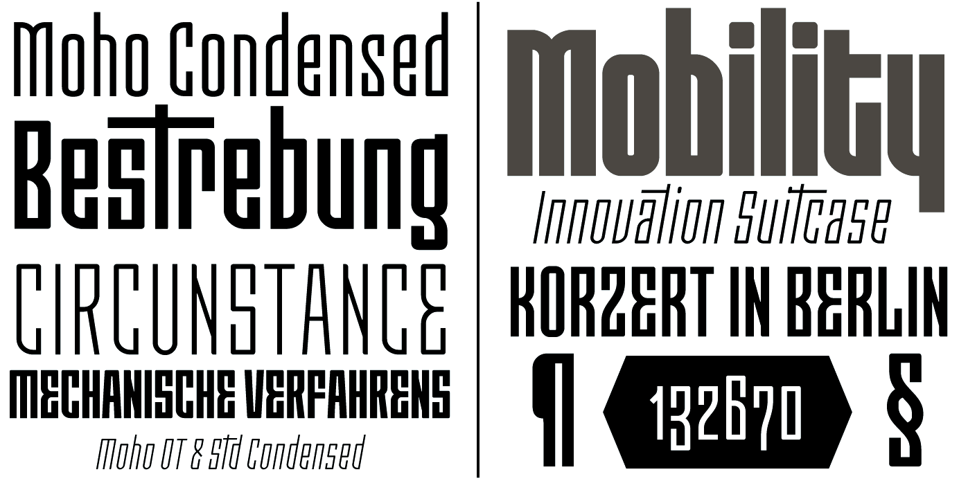
file name: John Moore Moho Condensed 2014b
file name: John Moore Moho Condensed 2014c
file name: John Moore Moho Condensed 2014d
file name: John Moore Moho Condensed 2014d
file name: John Moore Moho Script 2014
file name: John Moore Moho Script 2014b
file name: John Moore Moho Script 2014c
file name: John Moore Virgin 2013c

file name: John Moore Virgin 2013d
file name: John Moore Virgin Script Basic 2013

file name: John Moore Roadline Neon O T Italic 2013
file name: John Moore Roadline O T Italic 2013

file name: John Moore Roadline O T Italic 2013b
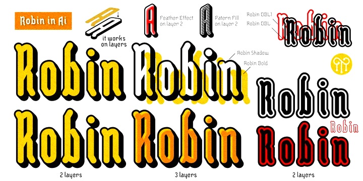
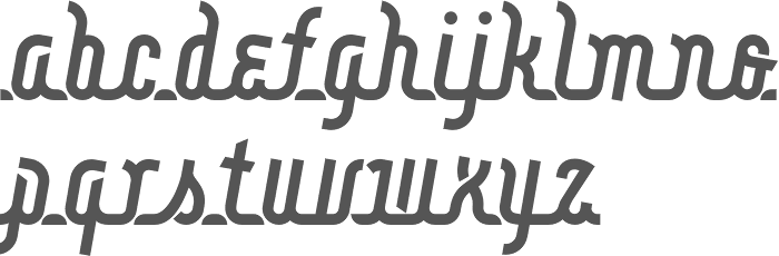
file name: John Moore J M T F Robin 2013
file name: John Moore J M T F Robin Bold 2013
file name: John Moore J M T F Robin Shadow 2013
file name: John Moore Fine Art O T 2013

file name: John Moore Fine Art O T 2013b
file name: John Moore Fine Art O T 2013c
file name: John Moore Takox 2012
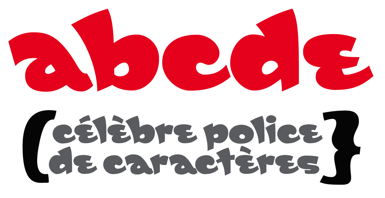
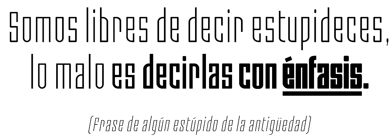
file name: John Moore Gordis 2008
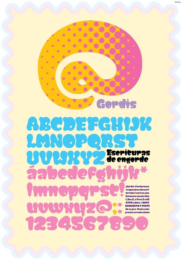
file name: John Moore Gordis
file name: John Moore Radio Time 2013

file name: John Moore Radio Time Icons 2013b
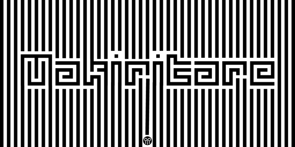
file name: John Moore Makiritare 2013
file name: John Moore Makiritare 2013b

file name: John Moore Makiritare 2013c
file name: John Moore Makiritare 2013d
file name: John Moore Makiritare 2013e
file name: John Moore Makiritare 2013f

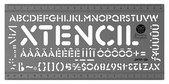
file name: John Moore Xtencil Pro 2015
file name: John Moore Xtencil Pro 2015b
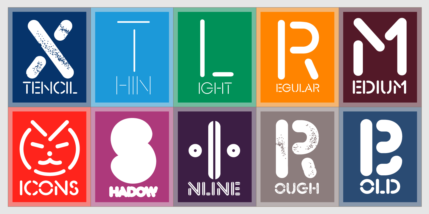
file name: John Moore Xtencil Pro 2015c
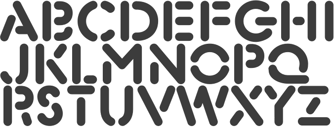
file name: John Moore Xtencil 2012
file name: John Moore Xtencil 2012b
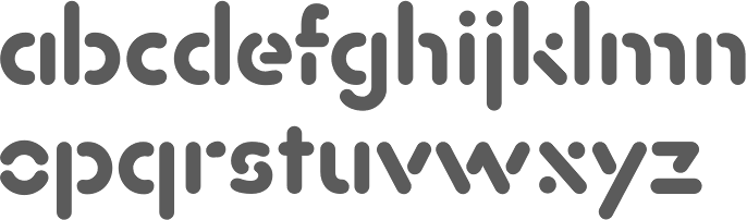
file name: John Moore Xtencil L C 2013

file name: John Moore Xtencil L C 2013b
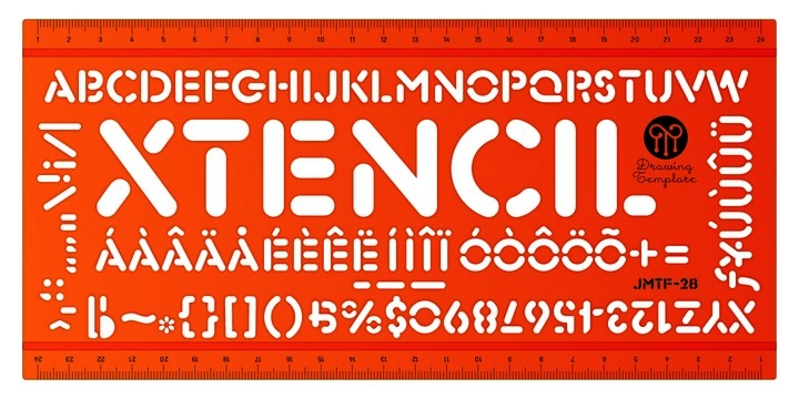
file name: John Moore Xtencil U C 2013
file name: John Moore Palaima 2012
file name: John Moore Palaima 2012b
file name: John Moore Palaima 2012c
file name: John Moore Petroglifos 2012
file name: John Moore Petroglifos 2012b

file name: John Moore Onda 2012
file name: John Moore Sacred Geo 2011
file name: John Moore Sacred Geo Tiling 2011
file name: John Moore Sacred Geo Tiling 2011
file name: John Moore Sacred Geo

file name: John Moore Aliykit Open 2012
file name: John Moore Waterman 2010
file name: John Moore Waterman 2011
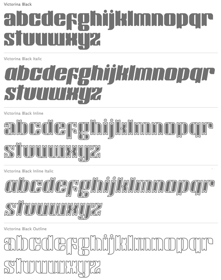
file name: John Moore Victorina 2010
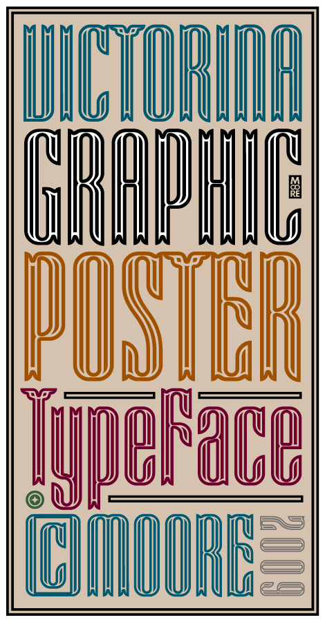
file name: John Moore Victorina 2009
file name: John Moore Victorina Black Shadow 2011

file name: John Moore Blockee 2012

file name: John Moore Morenita 2012

file name: John Moore Morenita 2012b
file name: John Moore Radio Time

file name: John Moore Radio Time 2009c

file name: John Moore Radio Time 2009d
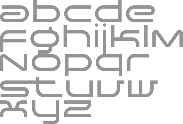
file name: John Moore Spacelab 2010
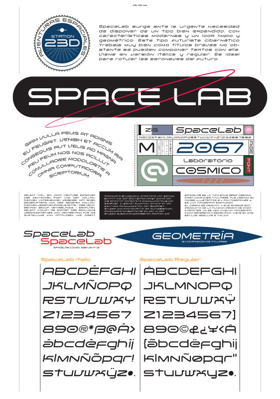
file name: John Moore Space Lab
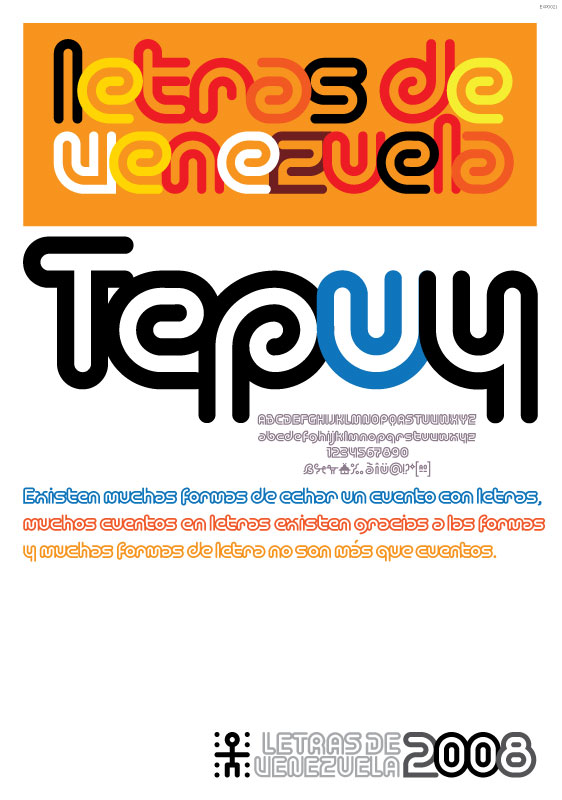
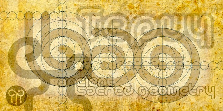
file name: John Moore Tepuy
file name: John Moore Tepuy Thin 2013
file name: John Moore Tepuy Thin 2013b
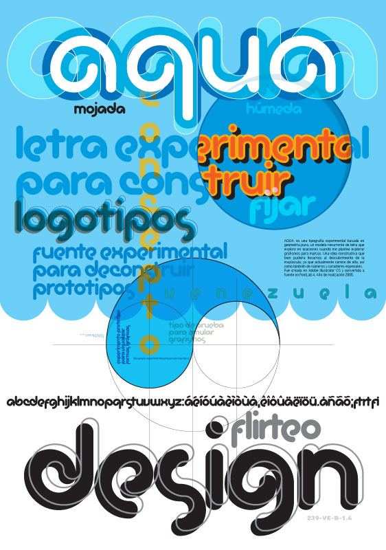
file name: John Moore Aqua
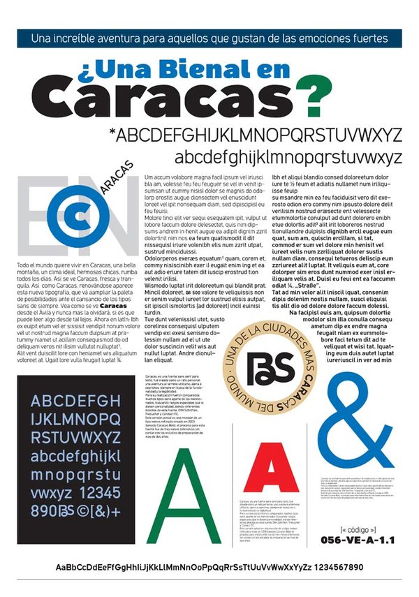
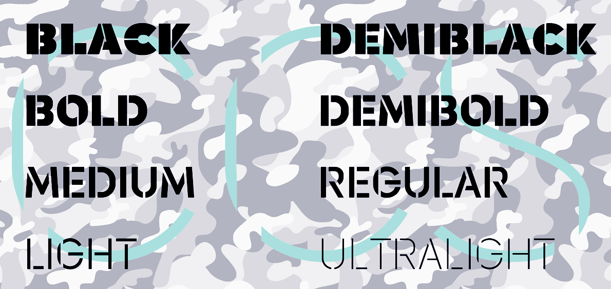
file name: John Moore Caracas
file name: John Moore Caracas 2012
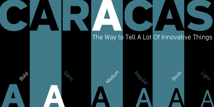
file name: John Moore Caracas 2012b

file name: John Moore Caracas 2012c
file name: John Moore Club 2006
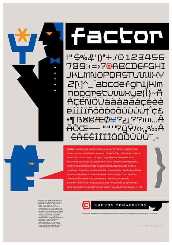
file name: John Moore Factor
file name: John Moore Factor 2012
file name: John Moore Factor 2012b

file name: John Moore Factor Black 2012
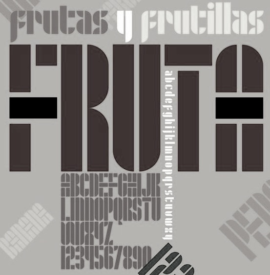
file name: John Moore Fruta
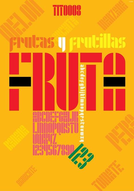
file name: John Moore Fruta
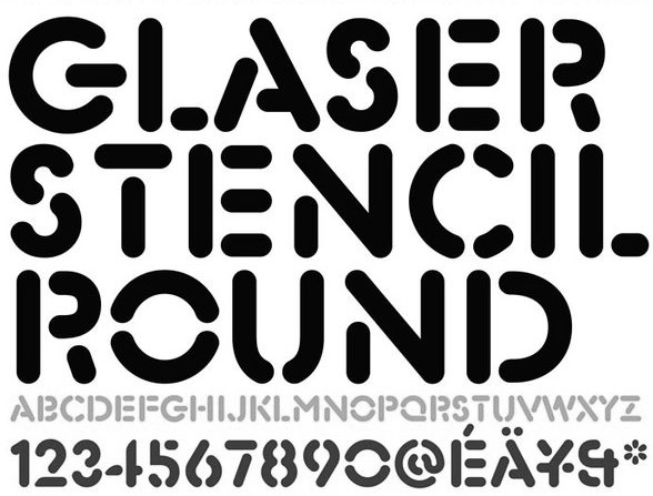
file name: John Moore Glaser Stencil Round

file name: John Moore Gothike
file name: John Moore Inconexa
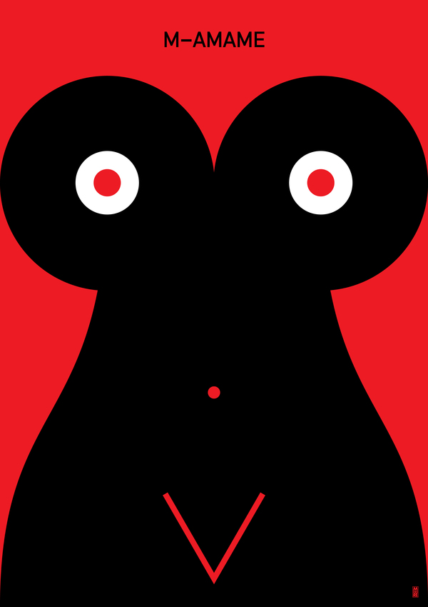
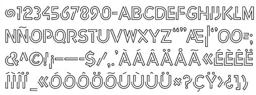
file name: John Moore M Amame Poster
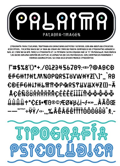
file name: John Moore Palaima
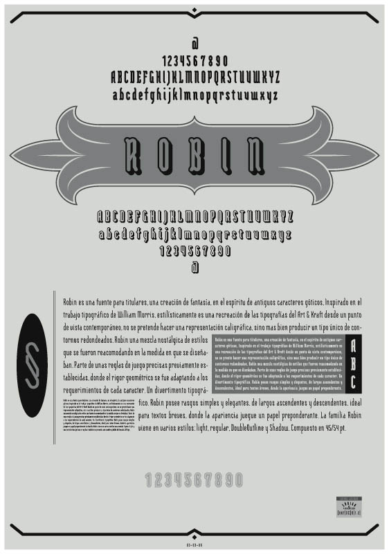
file name: John Moore Robin
| | |
|
Luc Devroye ⦿ School of Computer Science ⦿ McGill University Montreal, Canada H3A 2K6 ⦿ lucdevroye@gmail.com ⦿ https://luc.devroye.org ⦿ https://luc.devroye.org/fonts.html |