|
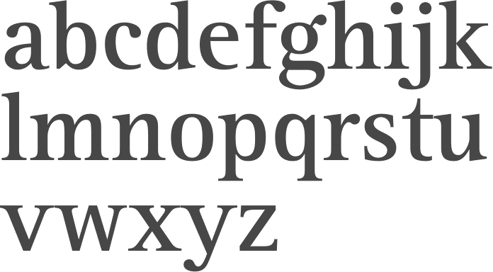
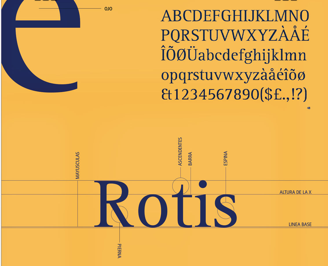
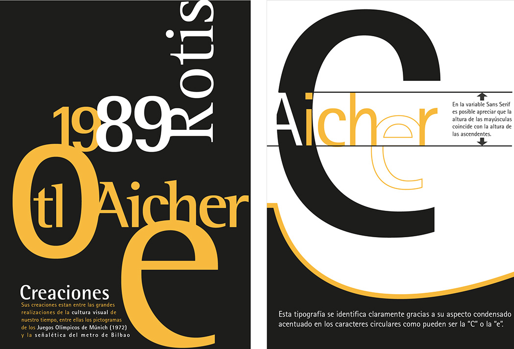
Rotis
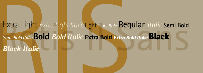
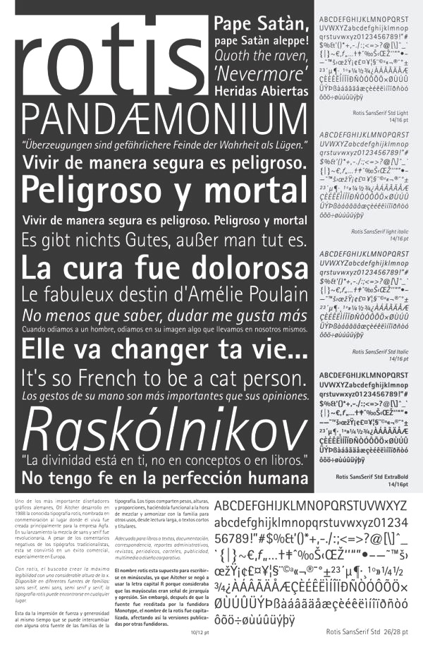
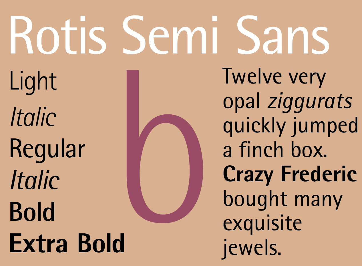
Comments on Otl Aicher's Rotis by Robert Kinross and Erik Spiekermann. Robert Kinross: Isn't the truth about Rotis, that the sans works quite well in very large sizes, as an architectural and signing letter (as Foster Associates realised); but that it is just mediocre (the sans) or actually incompetent (the seriffed fonts) as a typographic letter; ductus is pretty important in the way letters work together. I cant see that these ill-fitting, ill-suited letters are even an honourable failure, as has been suggested warm-heartedly, because its not clear that their designer had any coherent purpose in mind. Otl Aicher was a good graphic designer, a fine photographer, made some very nice posters, and did some pretty good magazine design work, but despite what he liked to think he wasn't a good typographer or book designer. His work in that sphere is very formalist: just disposing areas of grey texture around the page. He thought lines of text should form an even block of tone, without visible line space (he told me this proudly when I interviewed him, and it is explained in his book Typographie, as I remember). I suppose Rotis was made with that view of text in mind. - Erik Spiekermann: Isn't the truth about Rotis, that it has some great letters, but they never come together in one typeface. It looks best on gravestones and similar large architectural applications, as Robin suggests. We have a word for that in German: Rotis is a Kopfgeburt, it is born from (by?) the head. Aicher wrote a great theory about how one would have to make the most legible typeface ever but then proceeded to prove with Rotis that a theory makes a typeface not. He was a graphic designer, and the difference between us and them is that they start with an image of a page (preferably with all type looking evenly grey) and assemble elements images, headlines, text until that mental image corresponds to the look of the page. We the typographic designers read the text, think about who might read it and where, choose a size for the publication, a typeface, a column width, margins, etc. The resulting page may never win prizes and certainly won't be art (in the creative sense), but it will be legible, even readable and it should also be aesthetically pleasing. As many designers seem to lack critical faculties (present company obviously excepted), they judged Rotis by the theory cleverly provided and not by the evidence in front of their eyes. Whenever I speak out against Rotis, I am accused of jealousy and not giving credit to a fellow typedesigner. It is interesting to note that not one real type designer considers Rotis a typeface. Aicher certainly didn't do himself a favour by aiming so high with his first proper type design (he had previously adapted Univers for Bulthaupt and the Traffic typeface for Munich airport).
View digital typefaces that are like Rotis.
|
EXTERNAL LINKS
Rotis
MyFonts search
Monotype search
Fontspring search
Google search
INTERNAL LINKS
Choice of fonts ⦿
Typography ⦿
Architectural lettering/typefaces ⦿
|