TYPE DESIGN INFORMATION PAGE last updated on Thu Apr 16 22:05:00 EDT 2026
FONT RECOGNITION VIA FONT MOOSE

|
|
|
|
Vista fonts: a comparison
The NeoSmart blog discusses the 2006 Vista fonts. The outcome: Calibri (sans-serif), the new default for Office 2007 where it replaces Times New Roman, got good reviews. Cambria and Constantia are solid serif fonts. People liked that Cambria comes with Cambria Math. Consolas is the new typewriter font. Corbel and Candara, both thinner sans serifs than Calibri, got some support as well. Segoe UI was disliked, and not just because it is close to Frutiger. Segoe Print and Segoe Script are script fonts that are not so easy to read. And people are raving about Nyala, John Hudson's Latin component of an Ethiopian script face. It is certainly my own favorite in the bunch. |
EXTERNAL LINKS |
| | |
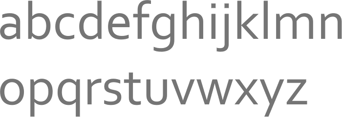
file name: Jeremy Tankard Corbel 2005
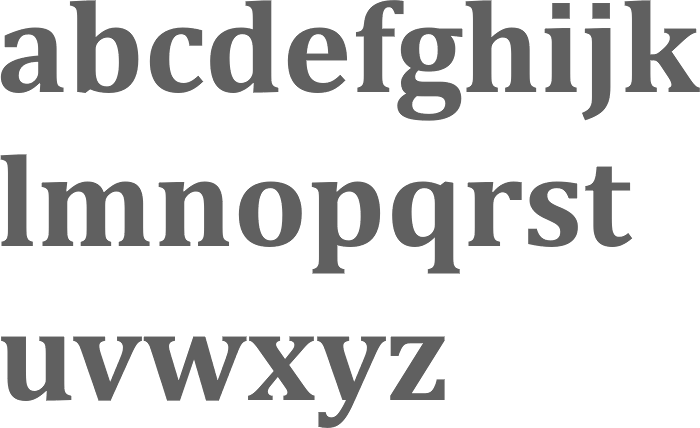
file name: Jelle Bosma Steve Matteson Robin Nicholas Cambria Bold 2006
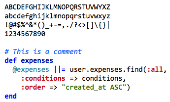
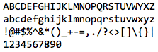
file name: Consolas Sample
| | |
|
Luc Devroye ⦿ School of Computer Science ⦿ McGill University Montreal, Canada H3A 2K6 ⦿ lucdevroye@gmail.com ⦿ https://luc.devroye.org ⦿ https://luc.devroye.org/fonts.html |