TYPE DESIGN INFORMATION PAGE last updated on Wed May 6 16:15:20 EDT 2026
FONT RECOGNITION VIA FONT MOOSE

|
|
|
|
tyPoland
[Lukasz Dziedzic]
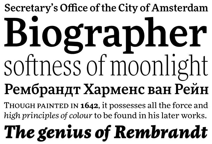
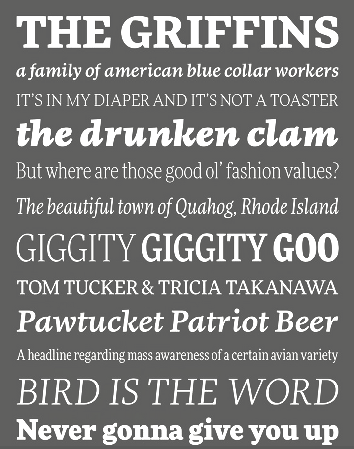
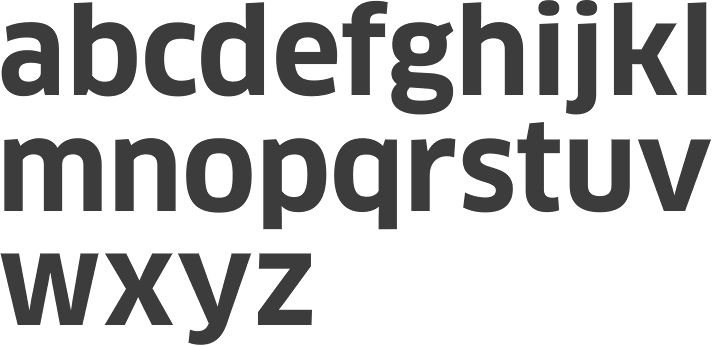
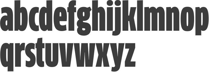
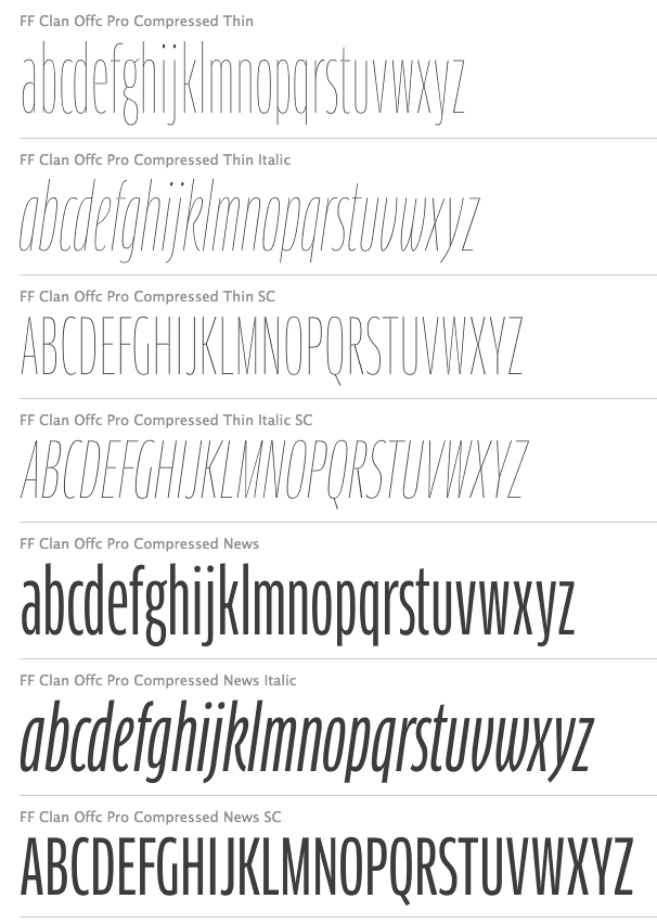
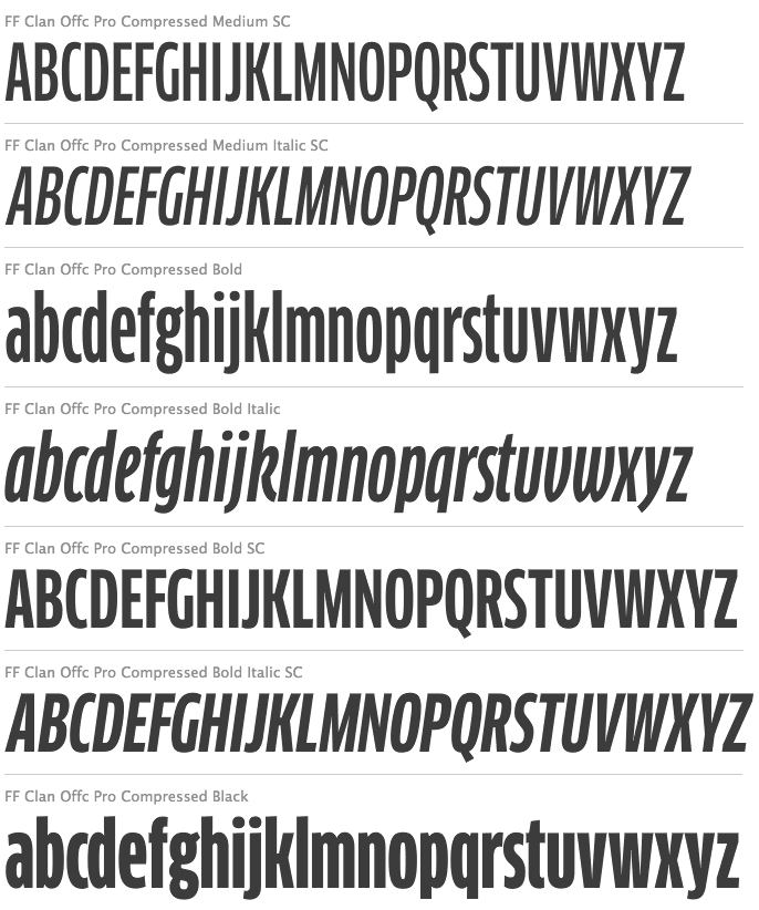
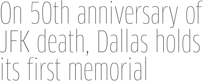
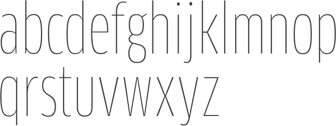
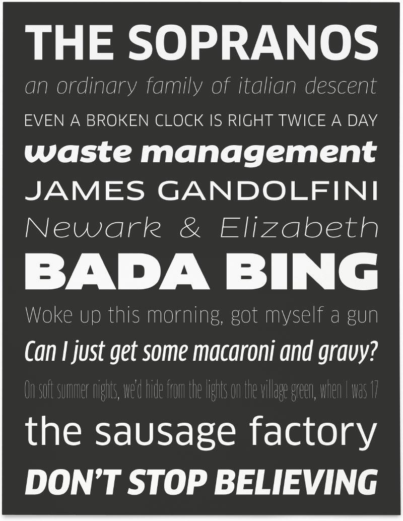
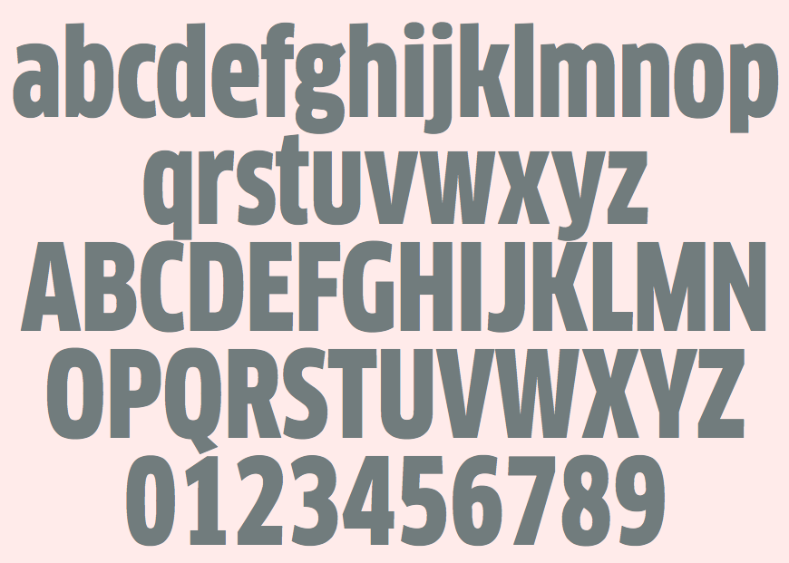
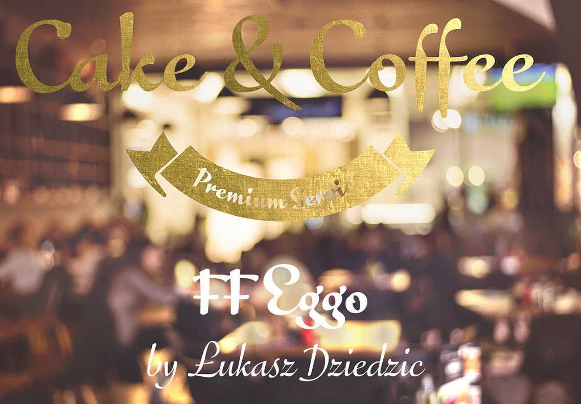
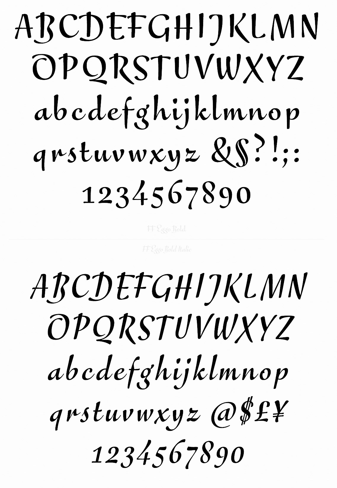
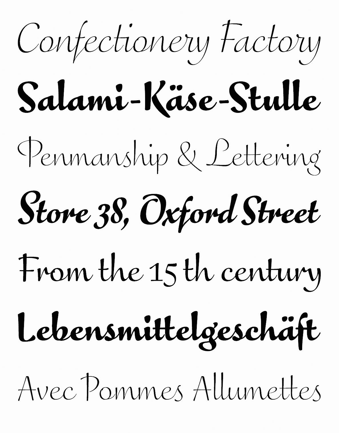
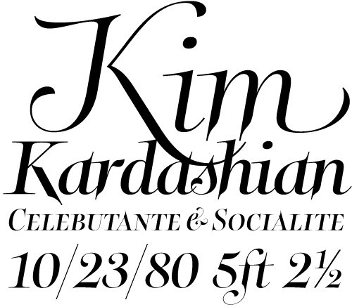
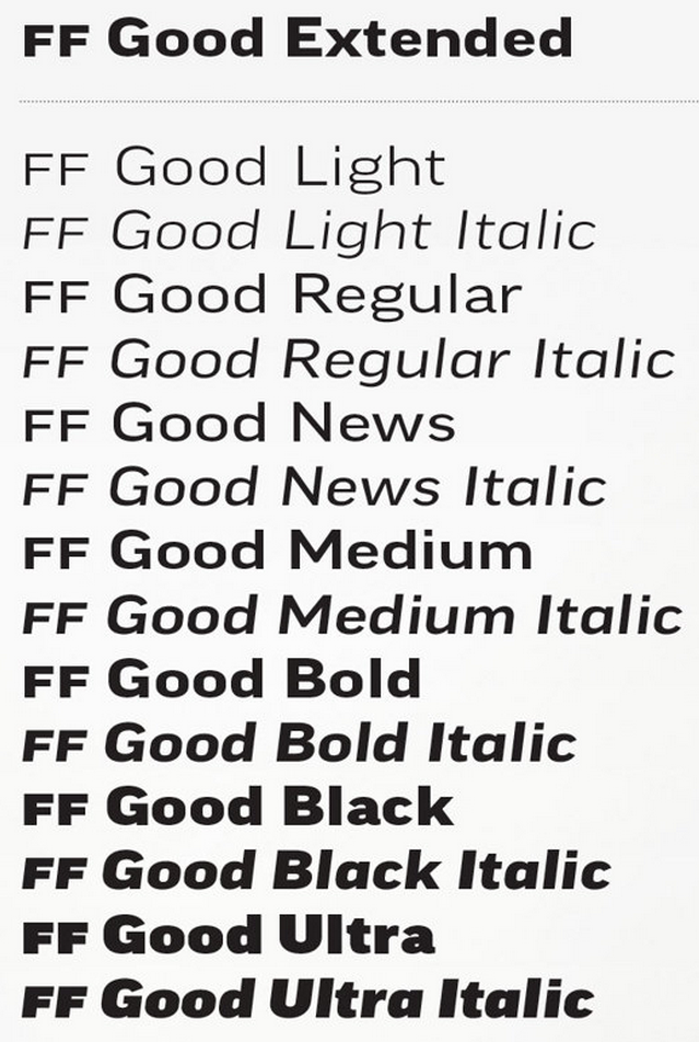
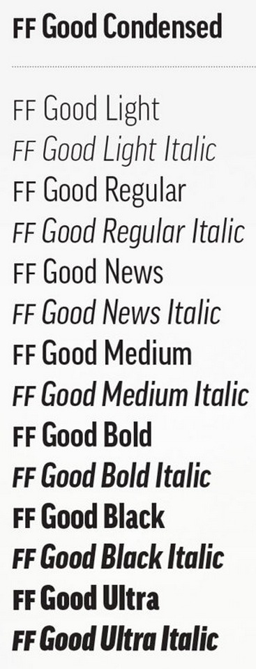
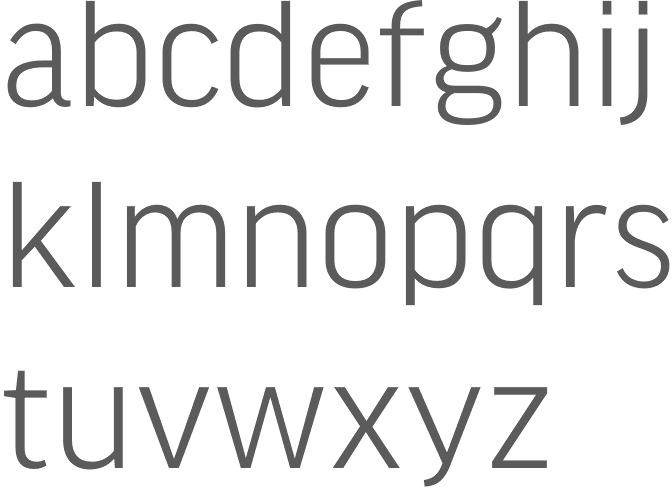
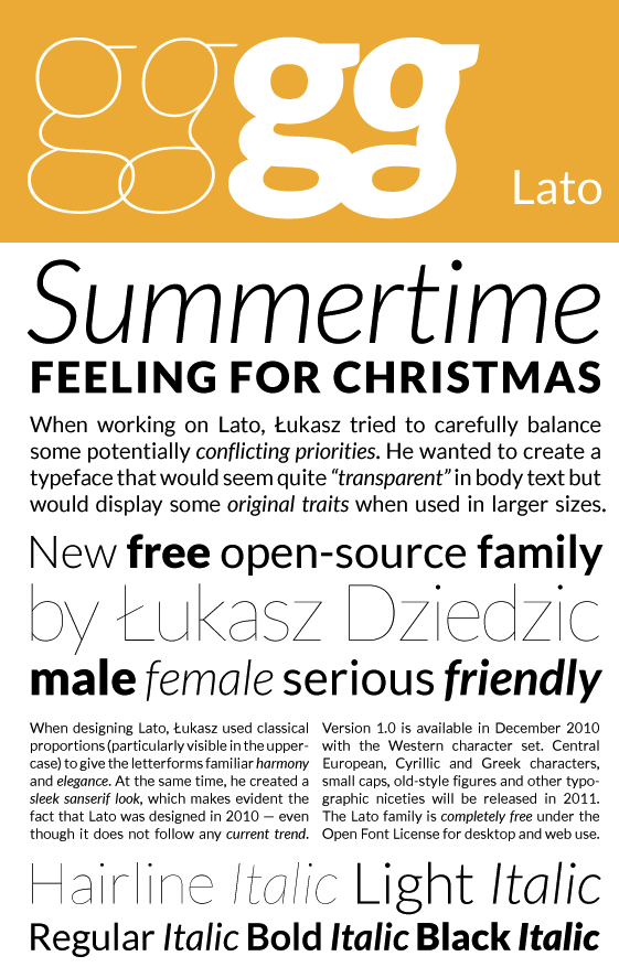
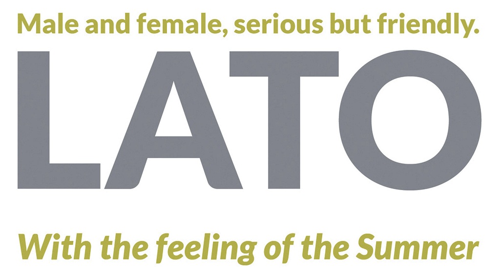
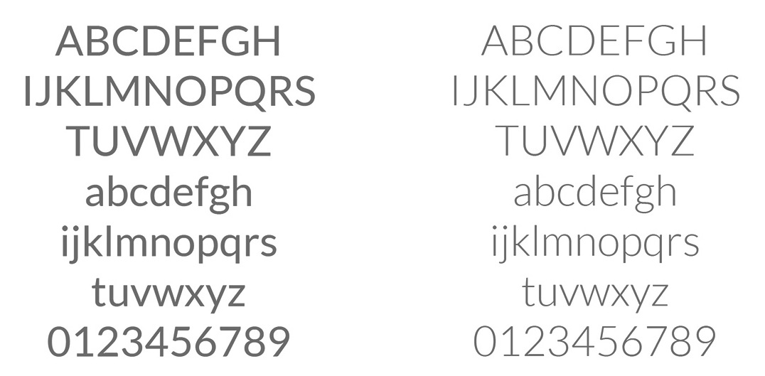
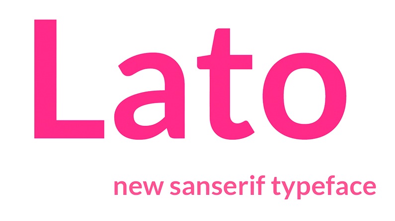
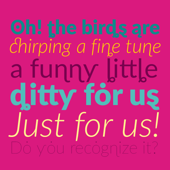
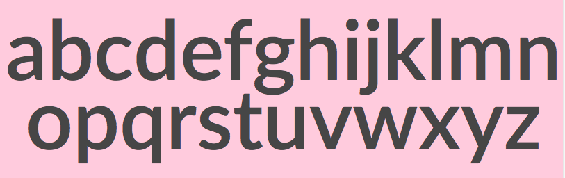
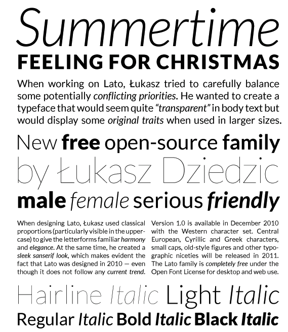
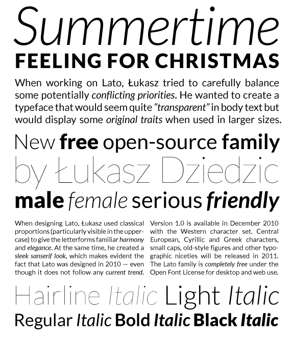
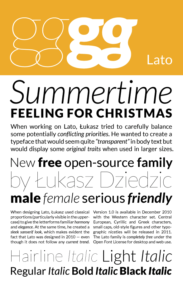
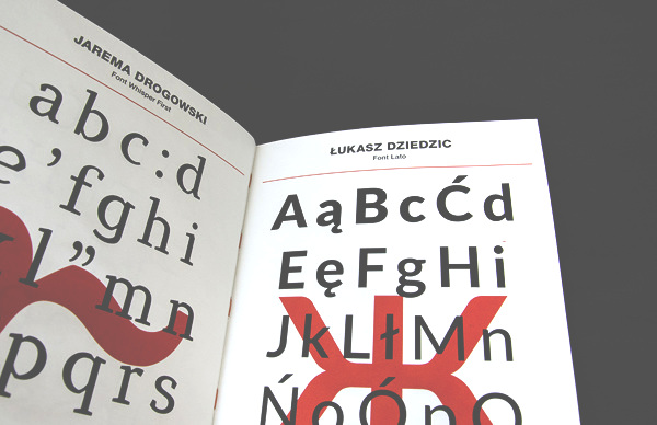
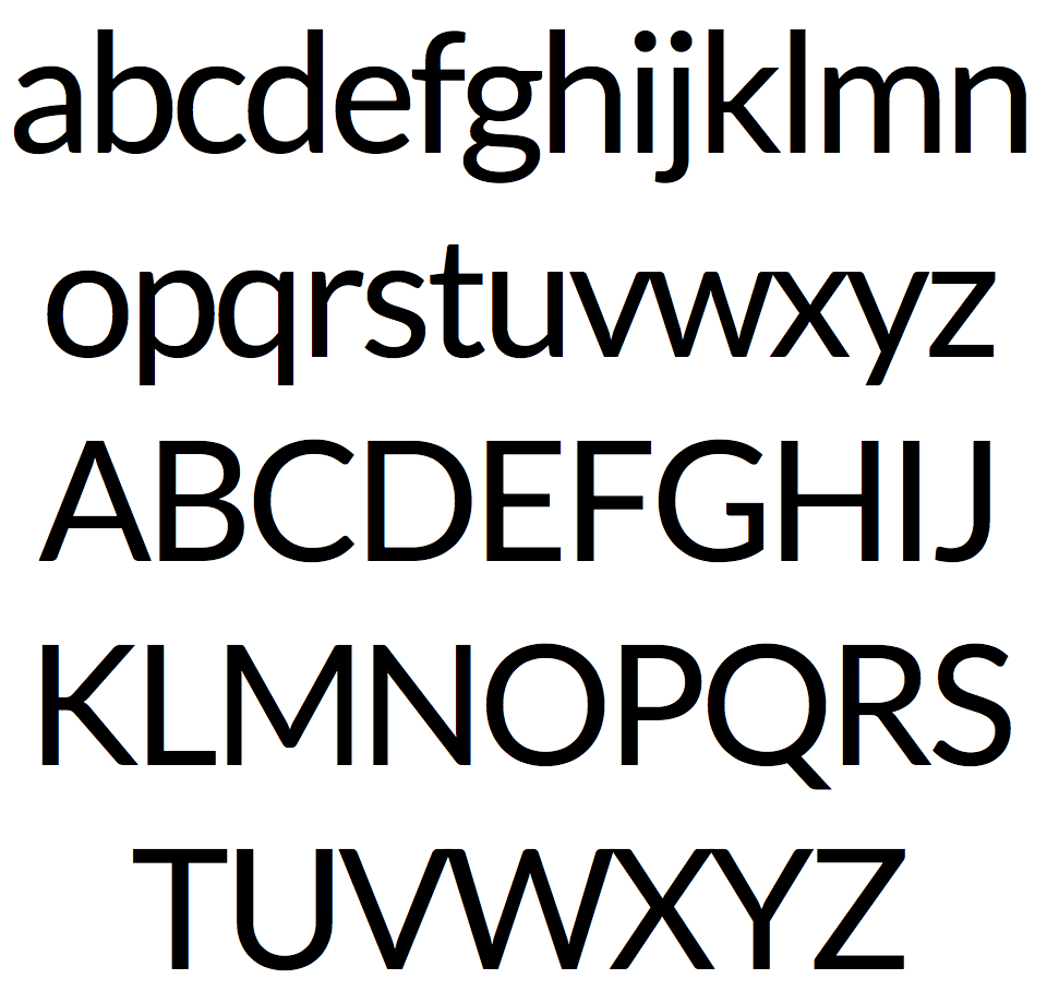
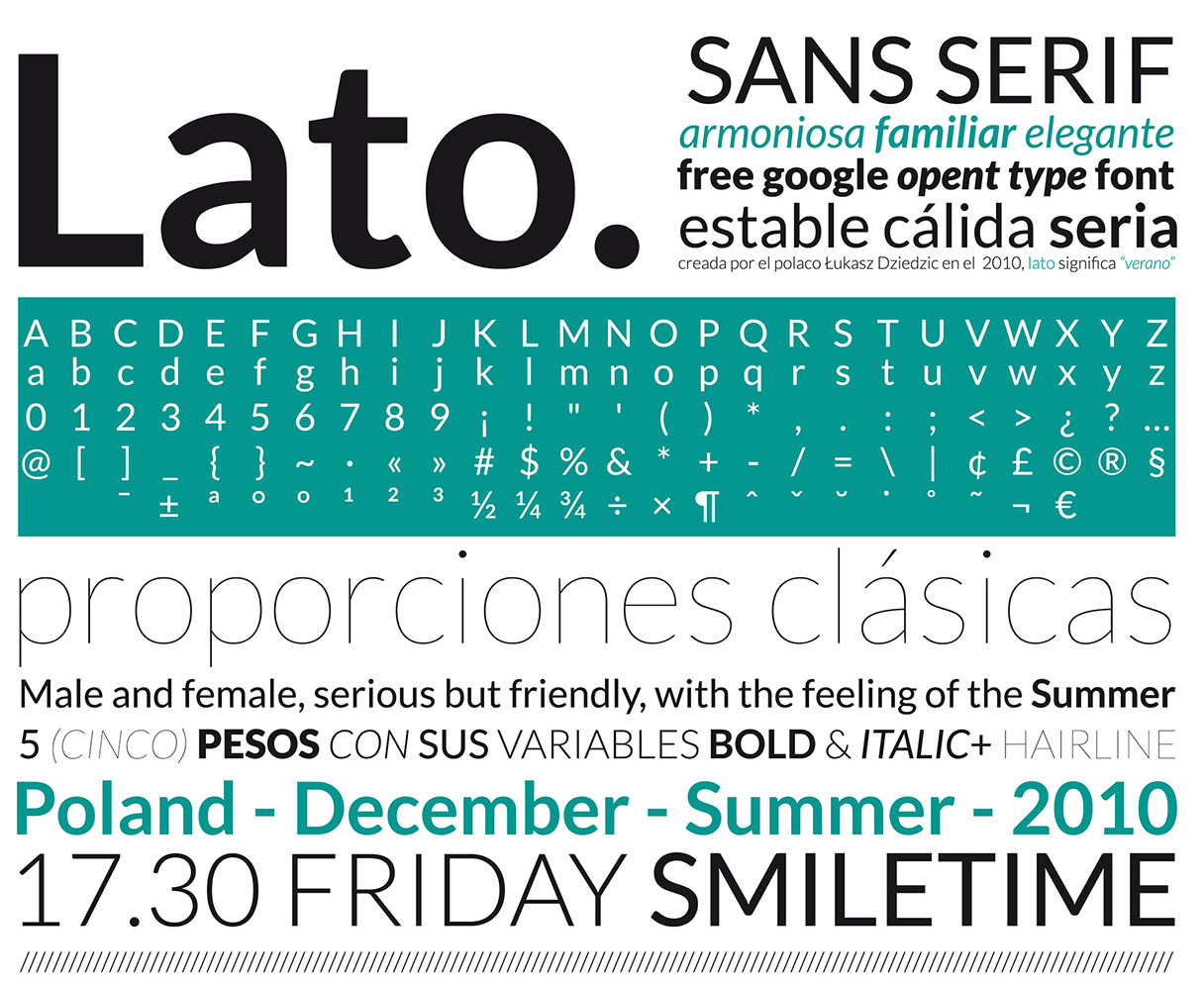
Typoland is the Warsaw-based foundry of Lukasz Dziedzic (b. 1967, Warsaw), est. 2014. Before that commercial venture, he was mostly creating free typefaces or commercial typefaces through FontShop / FontFont. Quoting Adam Twardoch: Rather than to finish high school, he worked as a sound technician and occasionally actor at a children's theatre group, spent a year working as a carpenter helper rebuilding 13th-century churches, he lent his voice and bass guitar skills to the band Dunski Jazz, and worked as a software developer at the Polish patent office. During the first free Polish elections of 1989, he briefly worked as a newsboy for Gazeta Wyborcza, the newly-launched, first independent daily newspaper in the country. A year later, he joined the design department of Gazeta Wyborcza and spent seven years there, co-creating the layouts of the main newspaper and its weekly companion magazine, for which he drew his first typeface. He later worked for several other publishing houses in Warsaw (since 2003 at Axel Springer Polska), designing newspapers and magazines. In the same time, Lukasz drew over a dozen typeface families ranging from large Latin and Cyrillic text families to single display styles. Many of these fonts were originally created for a particular newspaper or magazine layout. Some of them went into regular use or were used occasionally (in Poland: Gazeta Wyborcza, Vita, Przyjacióka, Fakt, Lub Czasopismo, Go Niedzielny, Telewiat, Komputer wiat, in Russia: OK!, in Germany: OK! and PAGE), others were never utilized. In 2007, Lukasz created a three-style Latin and Cyrillic corporate family for empik, one of Poland's largest press and music retail store networks. At the same time, FontShop International released two of Lukasz Dziedzic's families (FF Clan and FF Good). Work on FF Clan had started in 2006. In 2008, FontFont released FF Clan Italic and FF Pitu. FF Clan is a sans family in seven weights and six widths. FF Good (60 styles in all) is used in the Polish-language tech magazine Komputer Swiat. FF Good Headline followed in 2010. In 2014, FF Good and FF Good Headline were extended for a total of 196 styles. FF Clan Web has 168 styles. But most praise went to the elegant FF Pitu, about which Adam Twardoch writes FF Pitu started off in 2002 as a set of swashy capitals accompanied by lowercase that sits somewhere between a didone italic and a Copperplate script. Its most characteristic features are probably the pronounced stroke modulation and blade-shaped sharp stroke endings, which are slightly softened by generous calligraphic loops with foxtail terminals. Tiffany Wardle drools This is gorgeous. Provocative even. The stems which mimick a sharp nib pen ... well it certainly doesnt shy away from anything. This is what people should think of when they want something that looks opulent, lavish and exclusive. This is a font for a private club with high bench seat and private alcoves with velvet curtains. Lato is a sanserif typeface family designed in the summer of 2010 by Lukasz Dziedzic In December 2010 the Lato family was published under the open source Open Font License by his foundry tyPoland, with support from Google. In 2013-2014, the family was greatly extended to cover 3000+ glyphs per style with the help of Adam Twardoch and Botio Nikoltchev. The Lato 2.010 family now supports 100+ Latin-based languages, 50+ Cyrillic-based languages as well as Greek and IPA phonetics. In the process, the metrics and kerning of the family have been revised and four additional weights were created. A further update in 2019 is renamed Verano Sans. Microsite. Open Font Library link. At OFL, the help of Adam Twardoch and Botio Nikoltchev is acknowledged. CTAN link. In 2013, Lato TR (for Turkish) was published by Fatih Günes: free download. tyPoland is the foundry he started in 2010. In 2011, FontShop published the text family FF More. In 2014, he published the sans family Ringo (Typoland) and the free typeface family Carlito (a sans family adopted by Google for ChromeOS as a font-metric compatible replacement for Calibri---it would be interesting to understand the motivation for Google's decision to do that). Download Carlito here. In 2015, he published the perky script typeface family FF Eggo (FontFont). Klingspor link. FontShop link. Google Code link. Google Plus link. |
EXTERNAL LINKS |
| | |

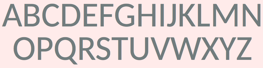
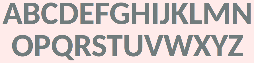
file name: Lukasz Dziedzic F F More 2011
file name: Lukasz Dziedzic F F More 2011
file name: Lukasz Dziedzic F F More 2011b
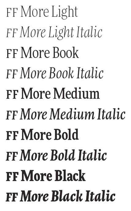
file name: Lukasz Dziedzic F F More 2011c
file name: Lukasz Dziedzic F F Clan Pro Bold 2008
file name: Lukasz Dziedzic F F Clan Pro Comp Ultra 2008
file name: Lukasz Dziedzic F F Clan Pro Compressed 2008
file name: Lukasz Dziedzic F F Clan Pro Compressed 2008b
file name: Lukasz Dziedzic F F Clan Pro Cond Thin 2008
file name: Lukasz Dziedzic F F Clan Pro Cond Thin 2008
file name: Lukasz Dziedzic F F Clan 2008
file name: Lukasz Dziedzic F F Clan 2008b
file name: Lukasz Dziedzic F F Clan 2008c
file name: Lukasz Dziedzic F F Clan 2008d
file name: Lukasz Dziedzic F F Clan Pro Cond Black 2008

file name: Lukasz Dziedzic F F Clan Pro Cond Black 2008b
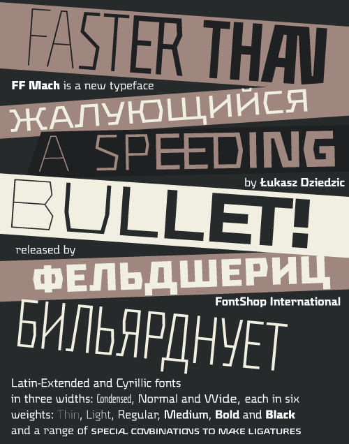
file name: Lukasz Dziedzic F F Mach 2009
file name: Lukasz Dziedzic F F Eggo 2015
file name: Lukasz Dziedzic F F Eggo 2015b
file name: Lukasz Dziedzic F F Eggo 2015c
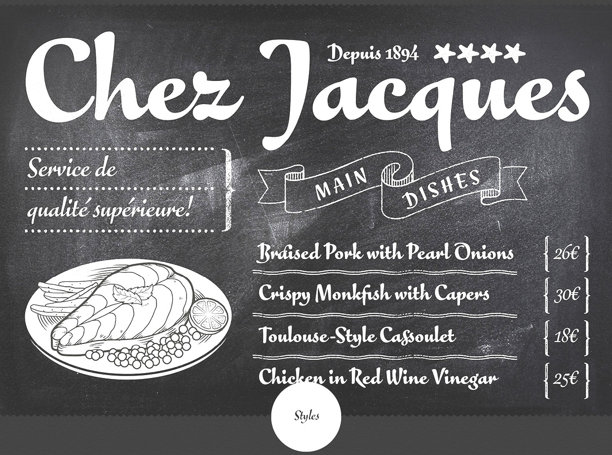
file name: Lukasz Dziedzic F F Eggo 2015d
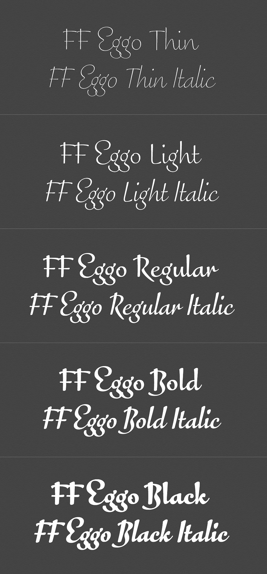
file name: Lukasz Dziedzic F F Eggo 2015e

file name: Lukasz Dziedzic F F Eggo 2015f
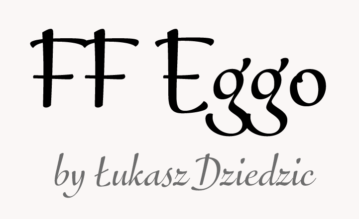
file name: Font Font F F Eggo 2015 200014
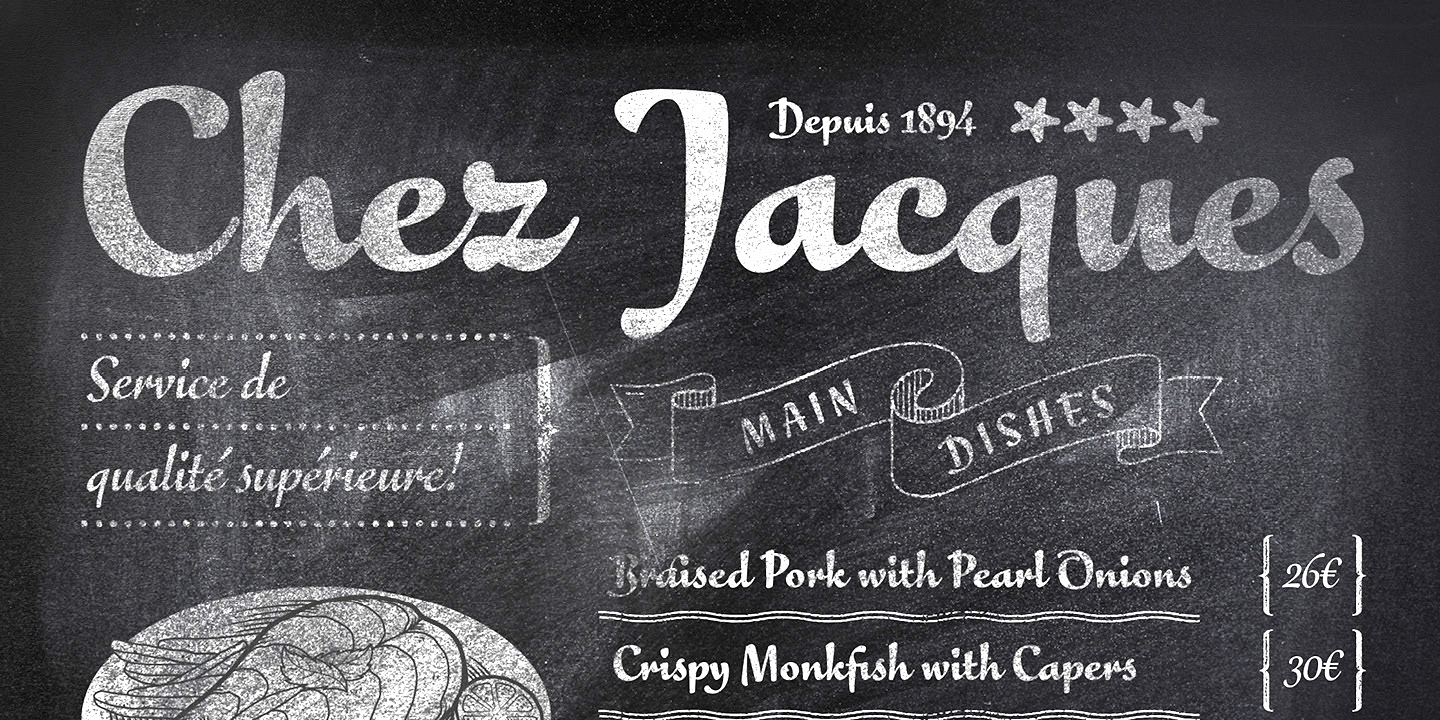
file name: Font Font F F Eggo 2015 200017

file name: Font Font F F Eggo 2015
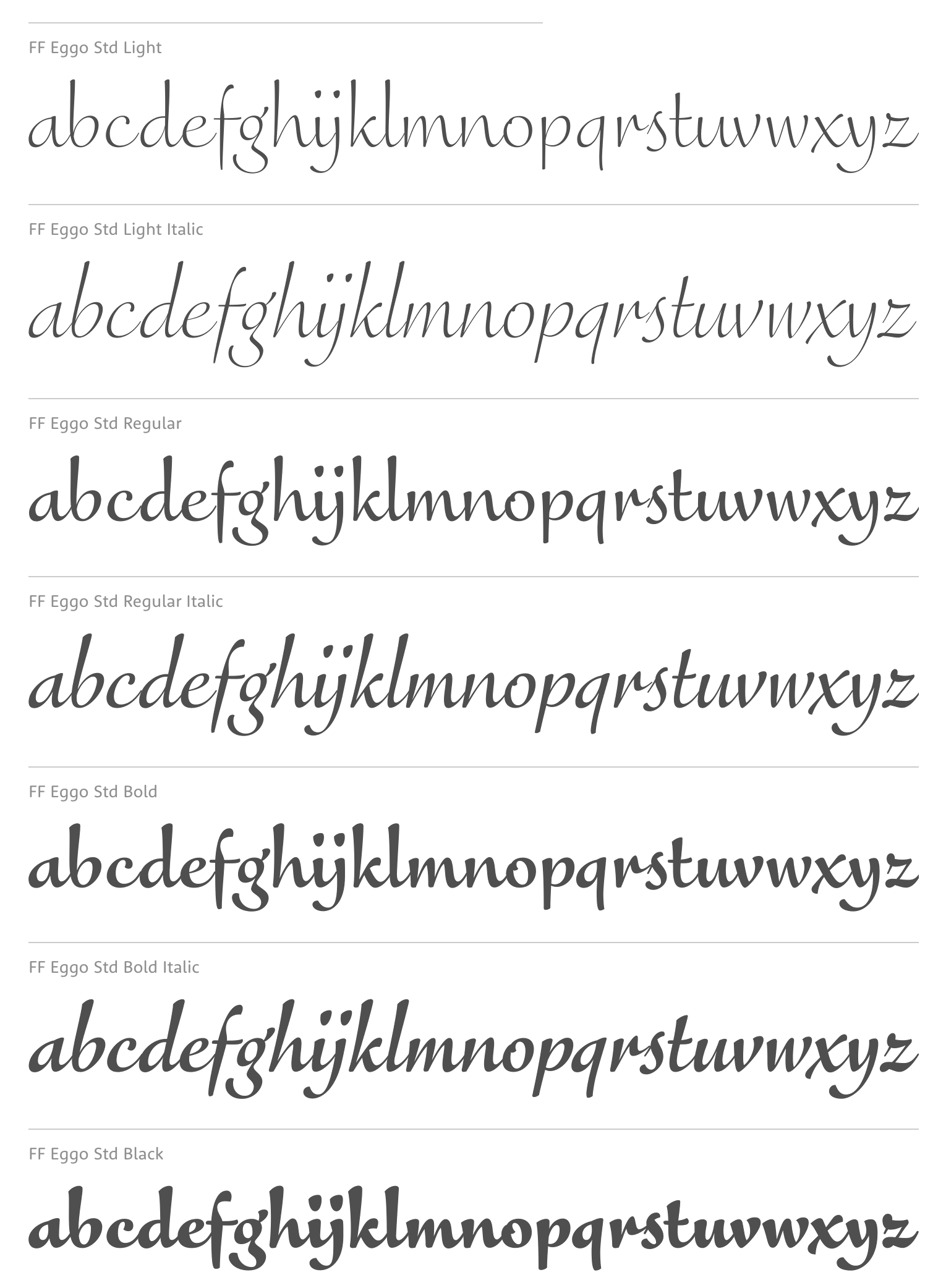
file name: Lukasz Dziedzic F F Eggo 2015
file name: Lukasz Dziedzic Carlito 2014
file name: Lukasz Dziedzic Carlito 2014b
file name: Lukasz Dziedzic F F Pitu 2008
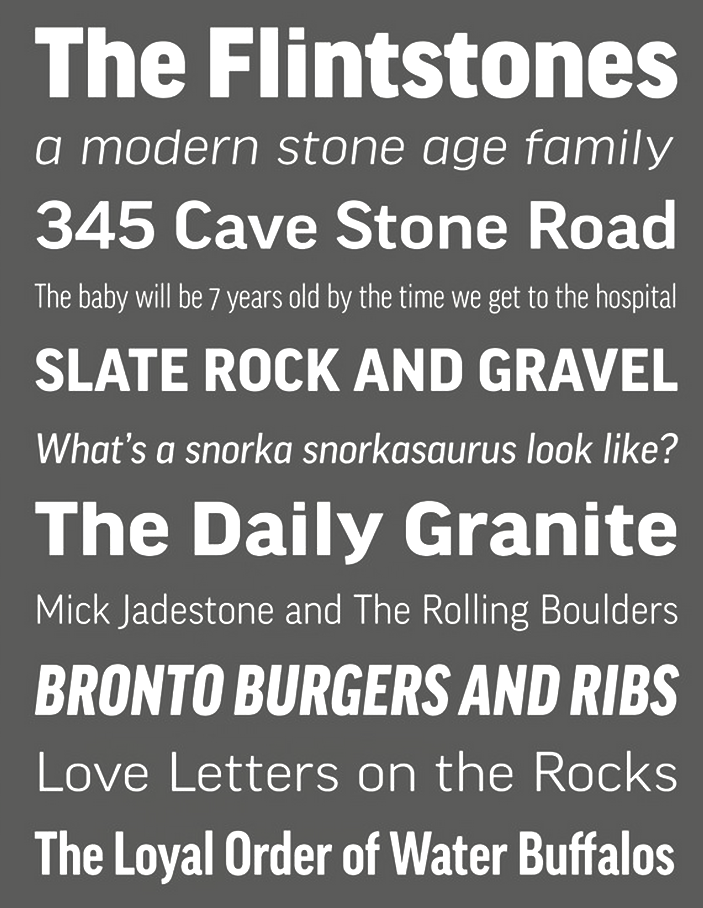
file name: Lukasz Dziedzic F F Good 2008 2014
file name: Lukasz Dziedzic F F Good 2008 2014b
file name: Lukasz Dziedzic F F Good 2008 2014c

file name: Lukasz Dziedzic F F Good Headline Black 2010
file name: Lukasz Dziedzic F F Good Headline Offc Pro Light 2010
file name: Lukasz Dziedzic Ringo Bold 2014
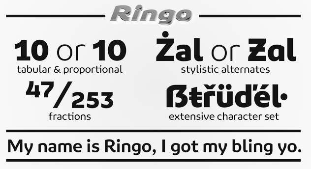
file name: Lukasz Dziedzic Ringo Bold 2014b
file name: Lukasz Dziedzic Adam Twardoch Botio Nikoltchev Verano Sans 2019
file name: Lukasz Dziedzic Lato 2010c
file name: Lukasz Dziedzic Lato 2010 Poster by Sara Makuch 2015
file name: Lukasz Dziedzic Lato 2010 Poster by Sara Makuch 2015b
file name: Lukasz Dziedzic Lato 2010 Poster by Sara Makuch 2015d

file name: Lukasz Dziedzic Lato 2010 Poster by Benjamin Coles 2015

file name: Lukasz Dziedzic Lato 2010 Poster by Angie Constante 2015
file name: Lukasz Dziedzic Lato 2010 Poster by Angie Constante 2015b
file name: Lukasz Dziedzic Lato 2010 Poster by Angie Constante 2015c
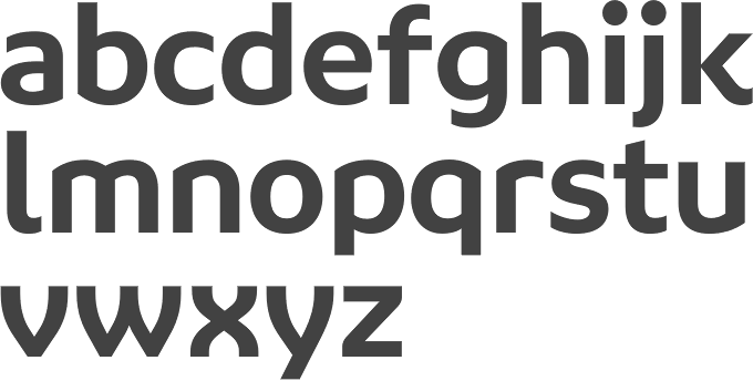
file name: Lukasz Dziedzic Lato Semibold 2014
file name: Lukasz Dziedzic Lato 2010h
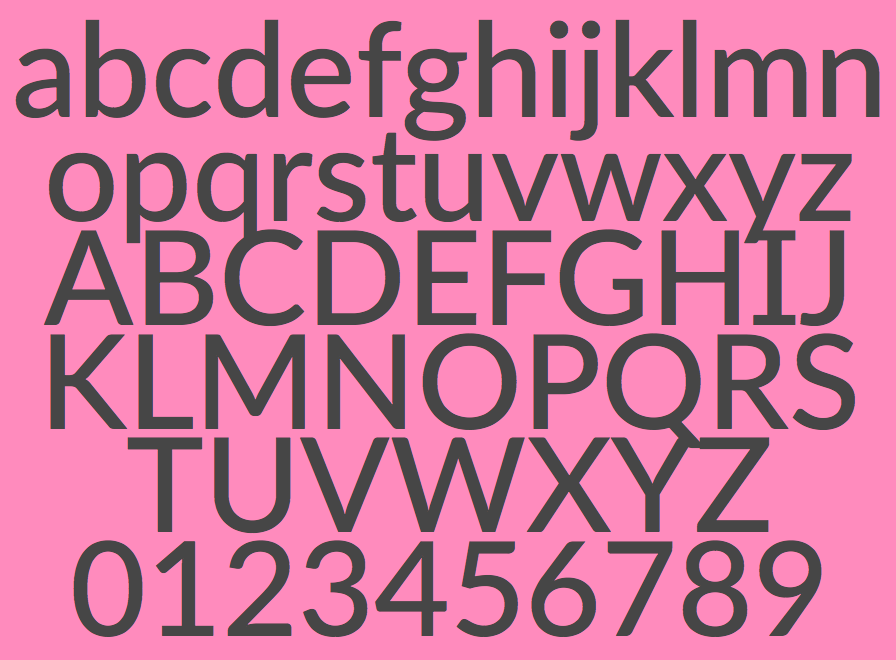
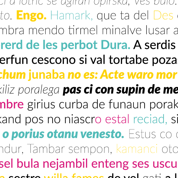
file name: Lukasz Dziedzic Lato 2010
file name: Lukasz Dziedzic Lato 2010b
file name: Lukasz Dziedzic Lato 2014
file name: Lukasz Dziedzic Lato T R 2013
file name: Lato Poster by Flor Lobo 2014

file name: Lukasz Dziedzic Pic
| | |
|
Luc Devroye ⦿ School of Computer Science ⦿ McGill University Montreal, Canada H3A 2K6 ⦿ lucdevroye@gmail.com ⦿ https://luc.devroye.org ⦿ https://luc.devroye.org/fonts.html |