TYPE DESIGN INFORMATION PAGE last updated on Mon Mar 9 16:34:51 EDT 2026
FONT RECOGNITION VIA FONT MOOSE

|
|
|
|
HVD Fonts
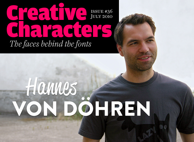
[Hannes von Döhren]
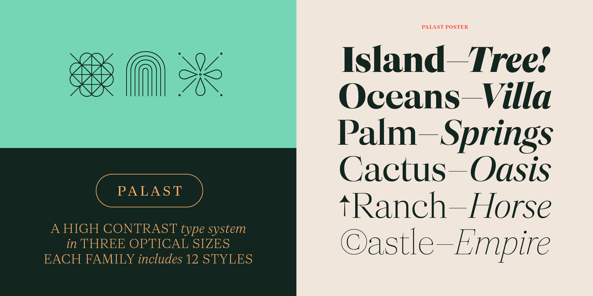
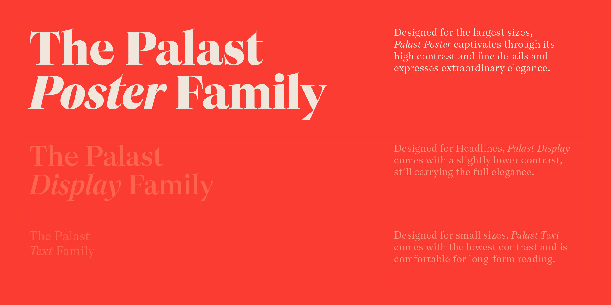
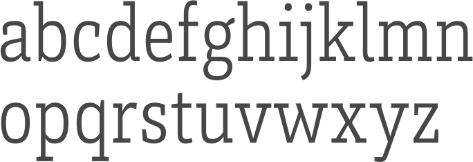
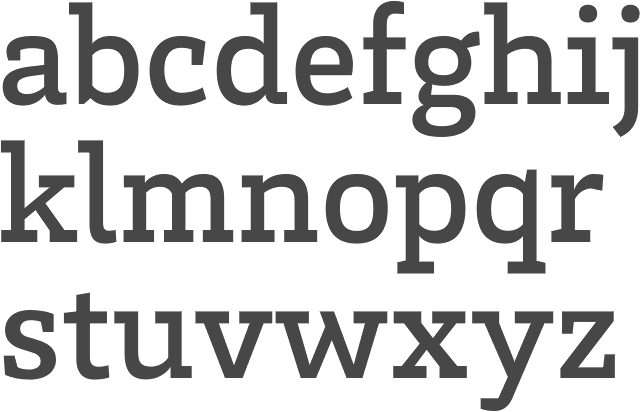
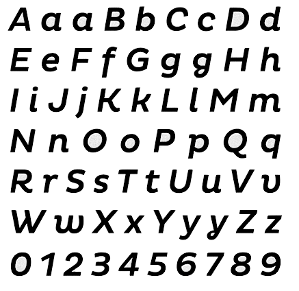
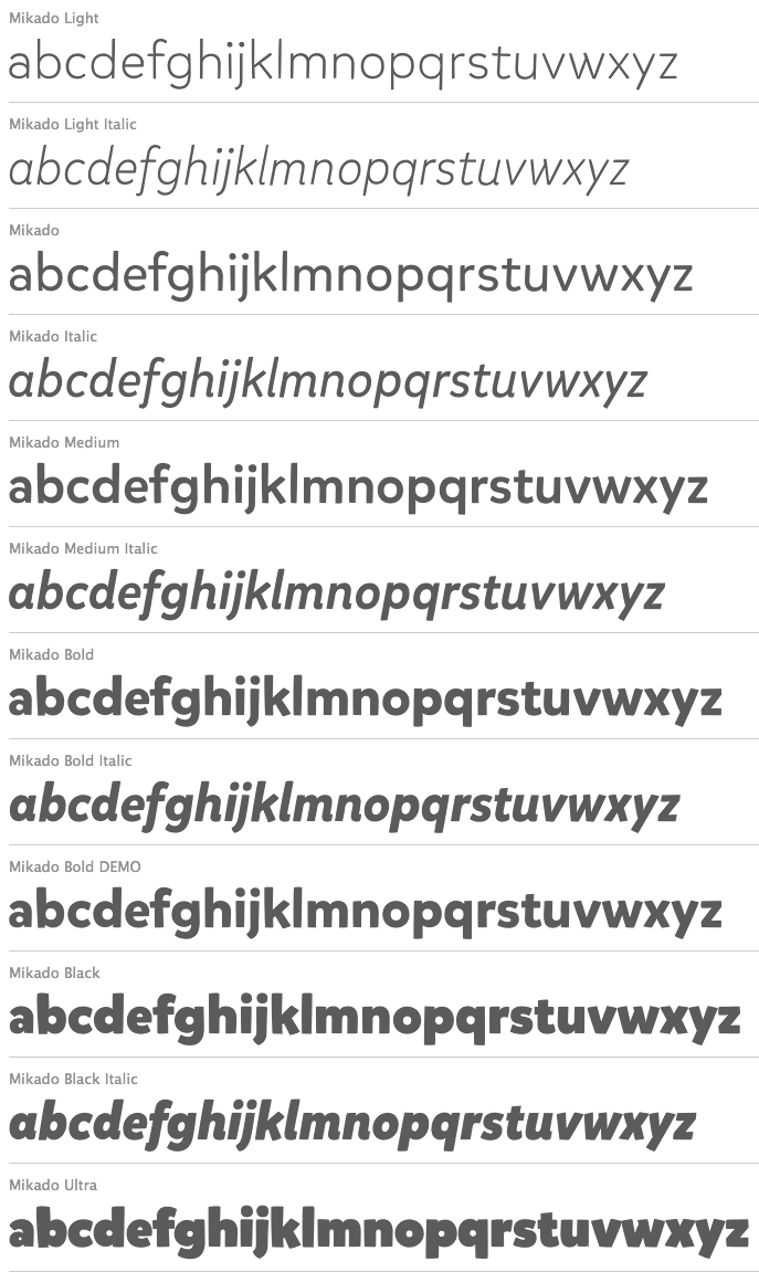
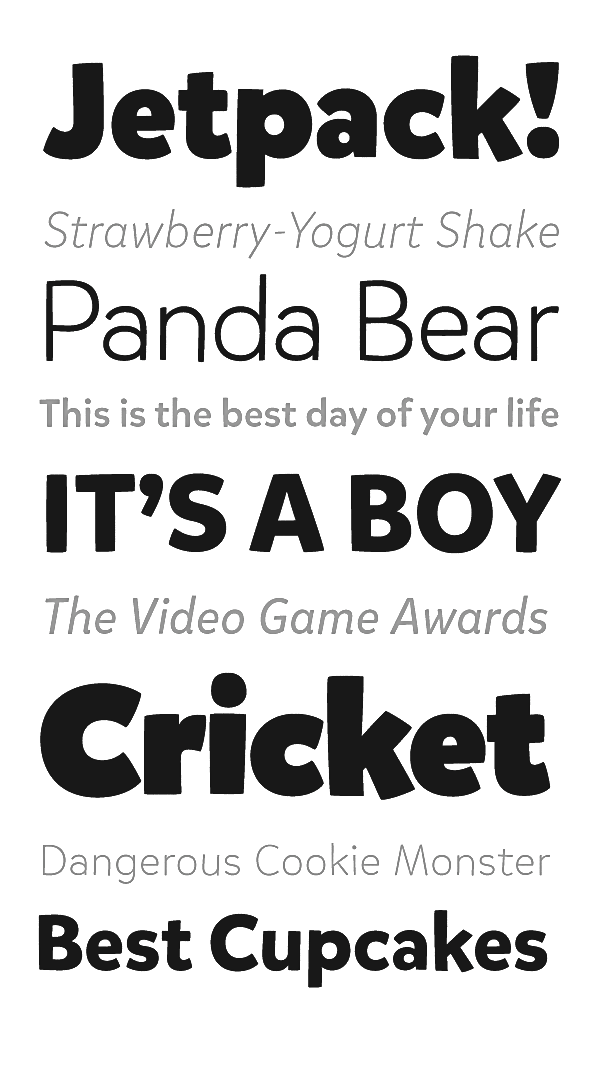
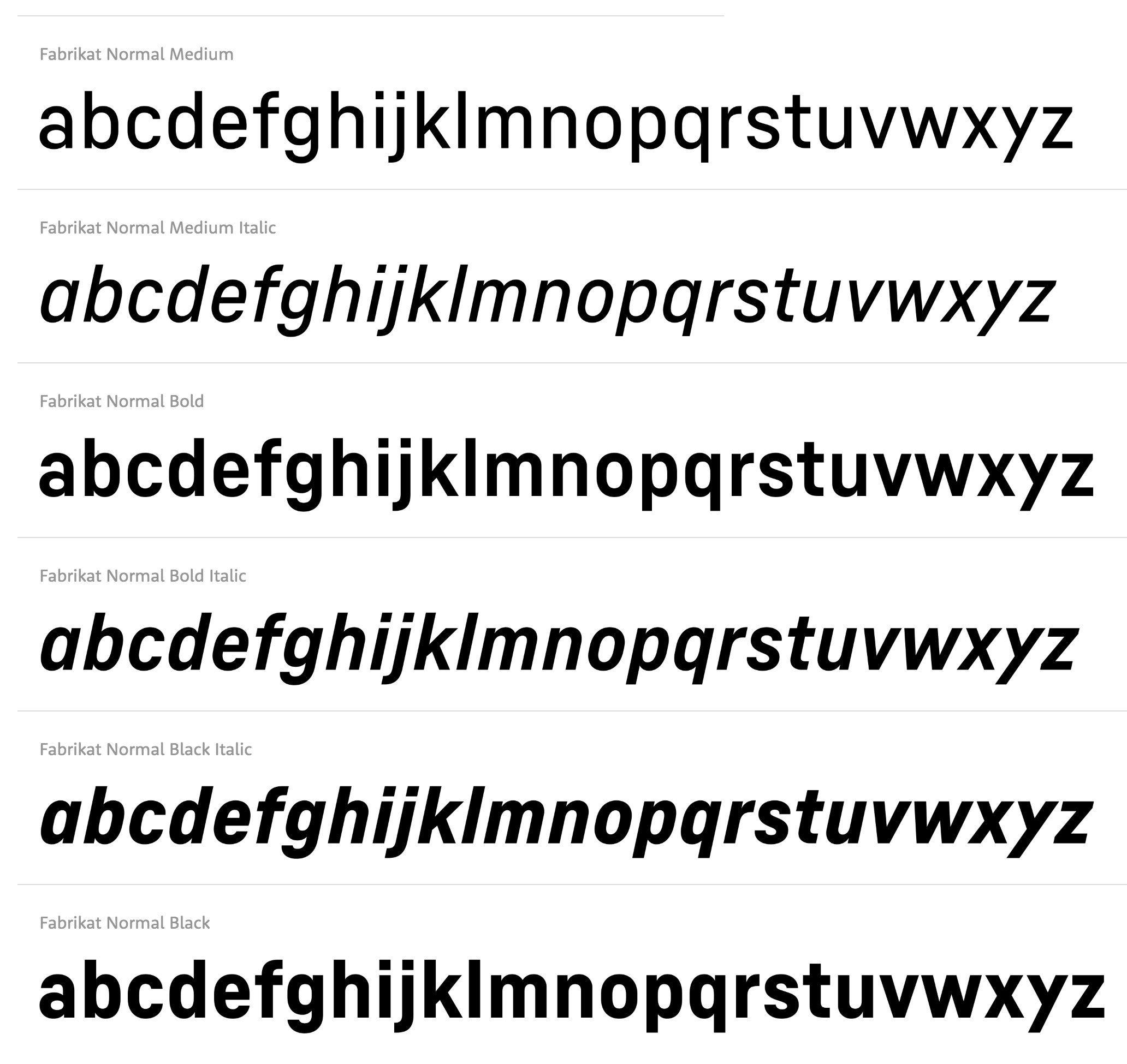
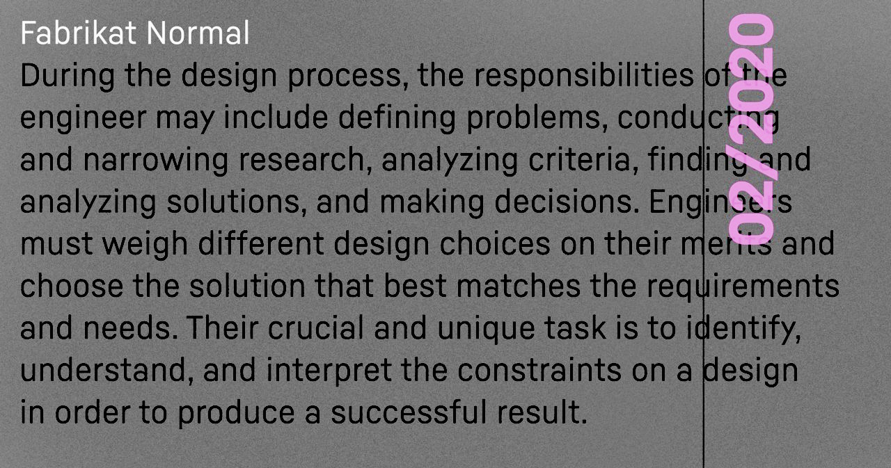
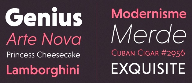
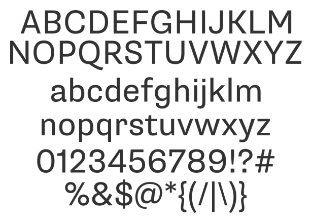
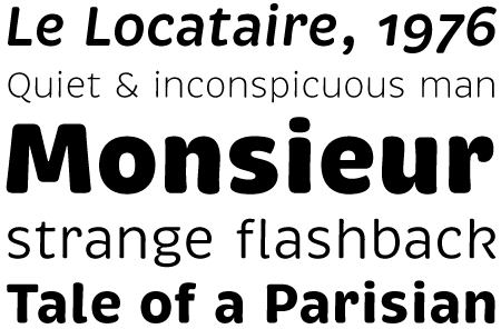
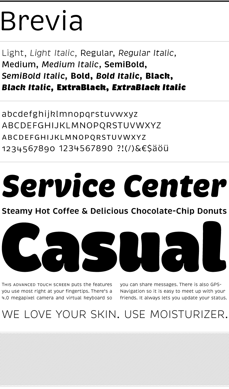
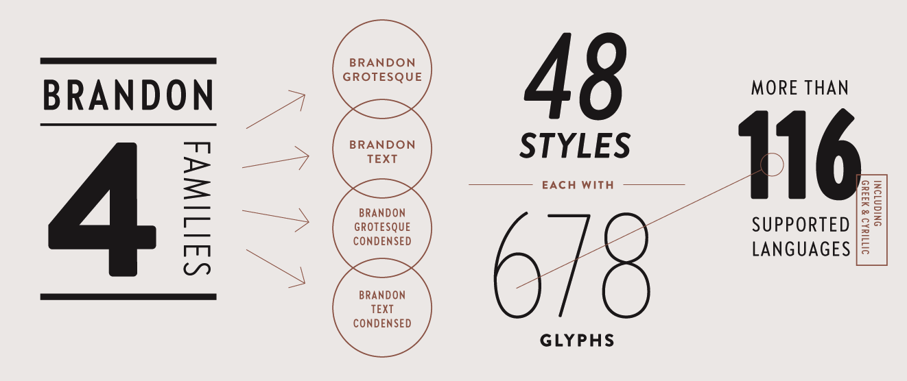
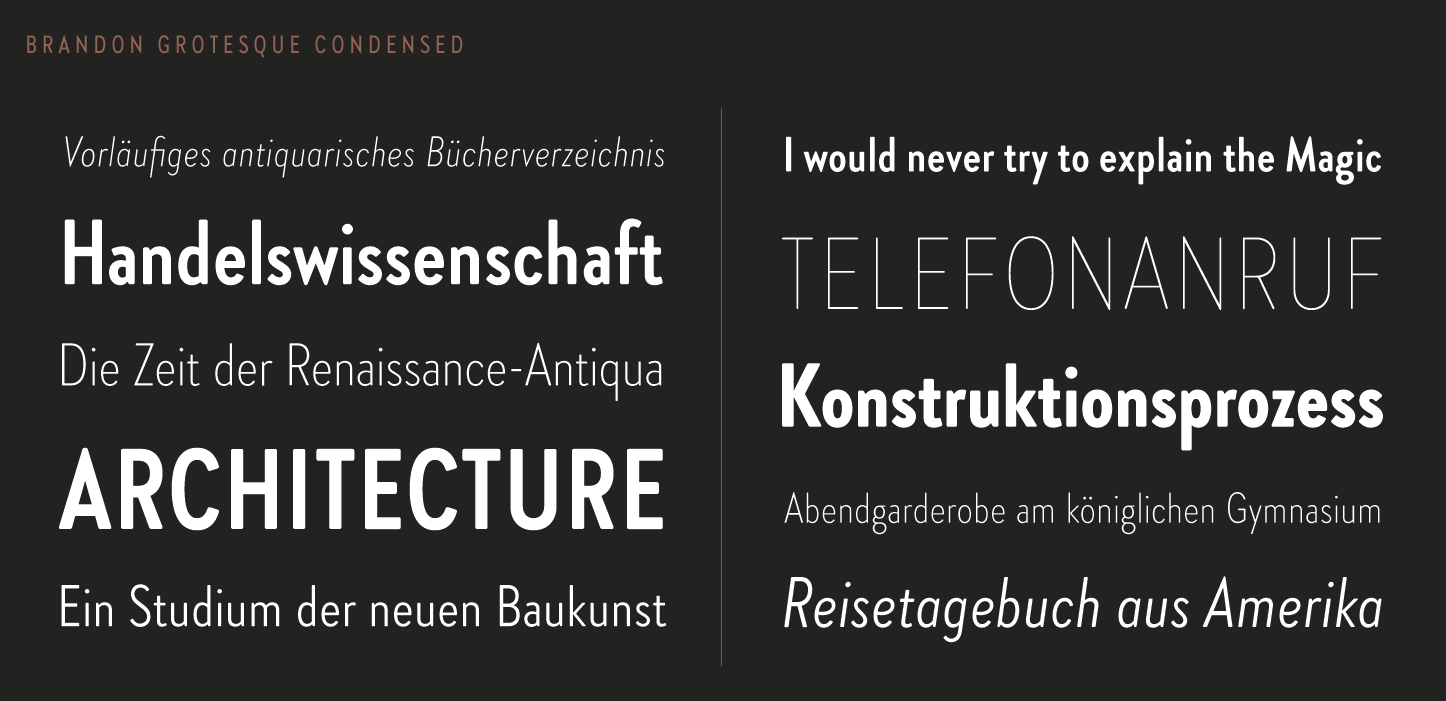
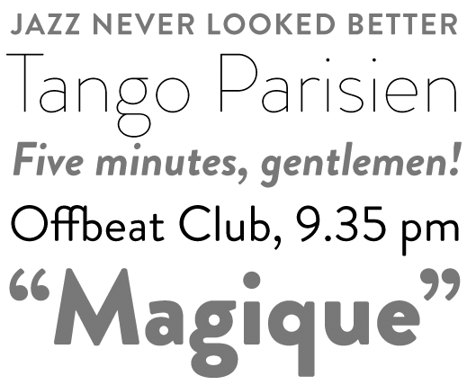
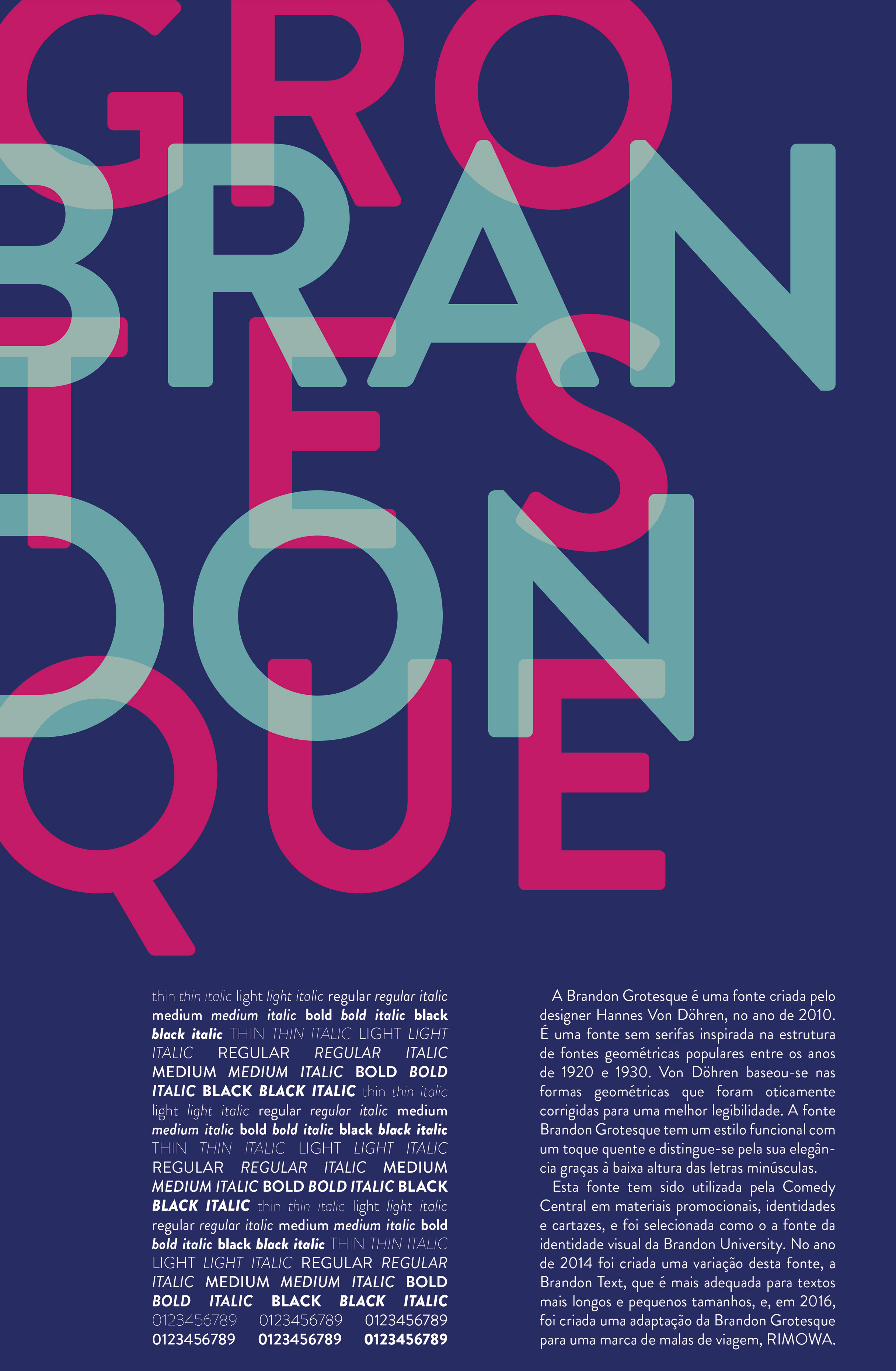
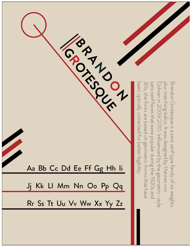
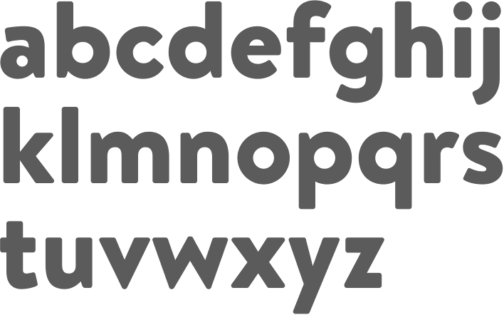
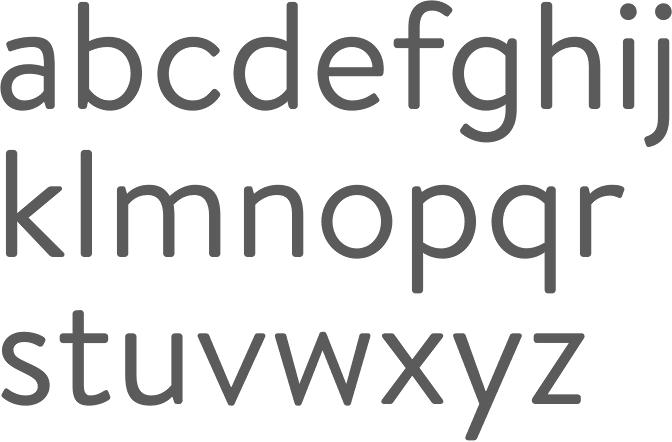
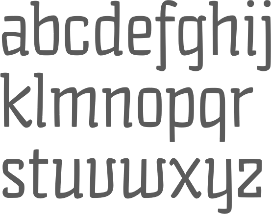
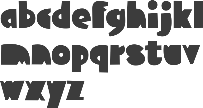
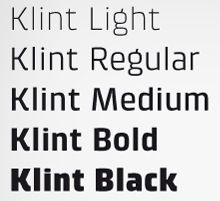
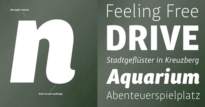
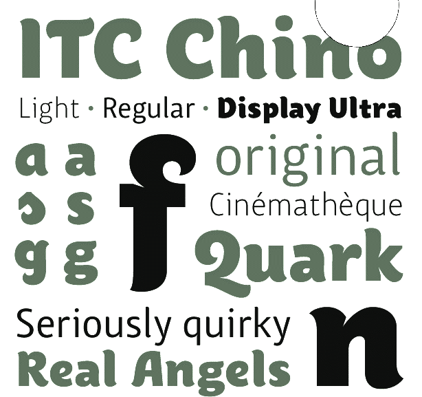
Hannes von Döhren (b. 1979, Berlin) is a Berlin-based designer (b. 1979). His foundry is HVD Fonts. He started out with free handwriting and grunge fonts such as HVD Comic Serif Pro (2009, an alternative to Comic Sans, according to HVD), The Subway Types (2009, a graffiti family: Shik (New York), Deon (Paris) and Etan (Berlin) came together to show the typical tag styles of their respective metropolitan areas. The fonts were digitized, spaced, kerned and programmed by Hannes von Döhren). Later he went commercial, first at T-26, and then under his own label, HVD Fonts. His typefaces: Shelton (2008, T-26), HVD Peace (2008, an army stencil font), HVD Comic Serif (2007, a serifed spoof on Comic Sans), HVD Rowdy (2007), HVDSpencils-Block (2007, stencil), HVDSpencils (2007, stencil), HVD Steinzeit (2005), HVD Edding 780, HVD Rawcut (2005), HVD Age 11 (2006), HVD Shelton (2008, T-26: wood type grunge), HVD Bodedo (2009, potato-Bodoni lettering), Quench Pro (2008, Linotype), HVD Peace (2008), and HVD Poster (2006, grunge). Typefaces made in 2009: Grandma (great hand-printed style---move over, Comic Sans), Christmas Dingbats, ITC Chino (a soft-edged signage and sans family, done with Livius Dietzel), Klint (sans family, +Rounded), Brevia (a soft sans in seven styles), Cowboyslang (a Western slab serif family), Embryo (superblack), Embryo Open, and Opal, a classy old style text family with tall ascenders. Bumper (2009) is an ultra-black sans family in a style related to Impact. Typefaces from 2010: FF Basic Gothic (a grotesk family done with Livius Dietzel), Reklame Script, Shelton (grunge), Blow Up is a fat balloon font. His masterpiece of 2010 and perhaps of his career thus far is the Brandon Grotesque family that relives the 20s and 30s. [A year after I wrote the previous sentence, Brandon Grotesque won an award at TDC2 2011, and all during 2011, it was the most sold typeface at MyFonts. It was followed in 2018 by Brandon Grotesque Condensed.] Livory (2010, with Livius Dietzel) is a rounded serif type family of four fonts influenced by the French Renaissance Antiquas from the 16th century. Production in 2011: Brix Slab (2011, with Livius Dietzel), Brix Slab Condensed (2011, with Livius Dietzel:(24 styles in all), Pluto (16-style semi-scriptish sans family, +Italics), Cheap Pine (a wood type caps family), Supria Sans (free web font family; +Black). Together with Supria Sans Condensed, this 36-style family is a basic sans workhorse. It won an award at TDC2 2011. Typefaces from 2012: Shelton Slab (eroded wood type or dirty letterpress look), Diamonds (geometric caps only family), Pluto Sans, Love Potion No. 10. Typefaces from 2013: Embryo Tiny, Niveau Serif (an engravers / copperplate style typeface), Niveau Grotesk, Mikado (signage family for games, food and advertising with a lot of genetic material from Brandon Grotesque: Mikado Bold Demo is free), Brandon Text (similar to, but with a higher x-height and more rounded corners than Brandon Grotesque, it is more appropriate for long texts and small print), FF Mark (together with Christoph Koeberlin and the FontFont team: this font is marketed as Ze new Germanetric sans; one weight is free). Typefaces from 2014: Brix Sans (2014, created using precisely engineered glyphs for corporate or information design; with Livius Dietzel), Brandon Printed (a caps-only letterpress version of Brandon Grotesque). Typefaces from 2015: Brandon Grotesque Office (screen-optimized; specially designed for Microsoft Office applications, it has 4 styles), Brandon Text Office (also made for Microsoft Office applications), Goodlife (a hand-lettered collection, consisting of Brush, Sans, Script, and Serif styles), Americane Condensed and Americane (based on American wood types). In 2016, Christian Koeberlin designed Fabrikat, which had creative input of Hannes von Döhren. This simple geometric sans serif family is based on the DIN style used in the 20th century by German engineers. It has a plain and precise appearance, and is a textbook example of a compass-and-ruler typeface. The monospaced almost-typewriter version Fabrikat Mono followed in 2017. Typefaces from 2018: Giulia (a creamy cutesy baby shampoo font family). Typefaces from 2020: Brandon Text Condensed (in 12 styles), Bouba Round (a round sans family for small devices and wayfinding), Fabrikat Normal. Typefaces from 2021: Palast (Text, Display, Poster; with Bernd Volmer). Abstract Fonts link. Another URL. Font Squirrel link. I Love Typography link. Fontsy link. View Hannes von Döhren's typefaces. |
EXTERNAL LINKS |
| | |


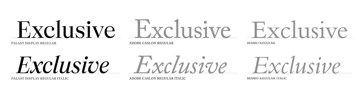
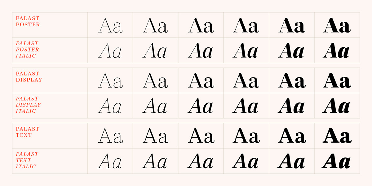
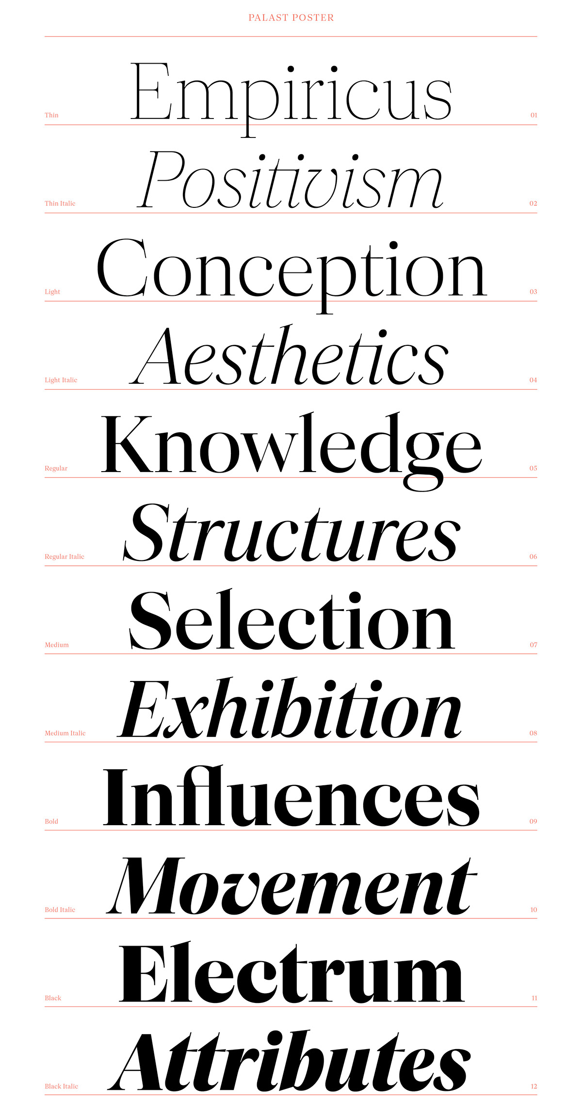
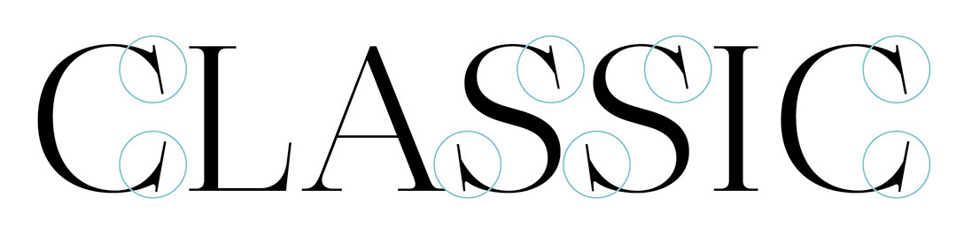
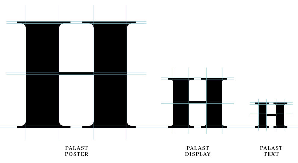
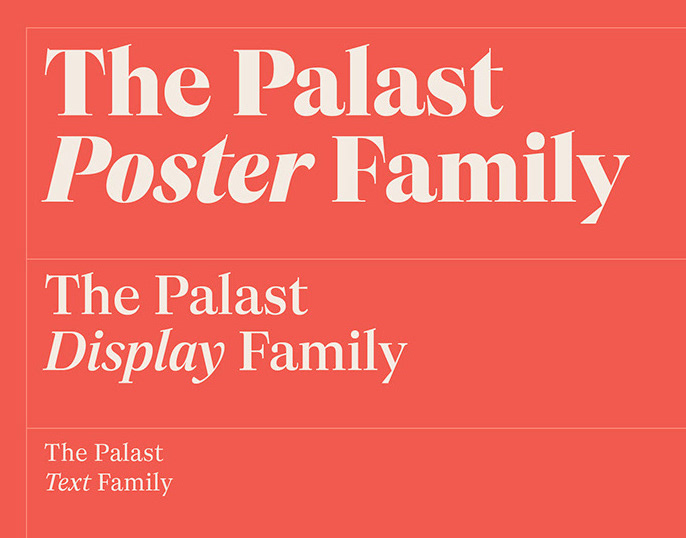
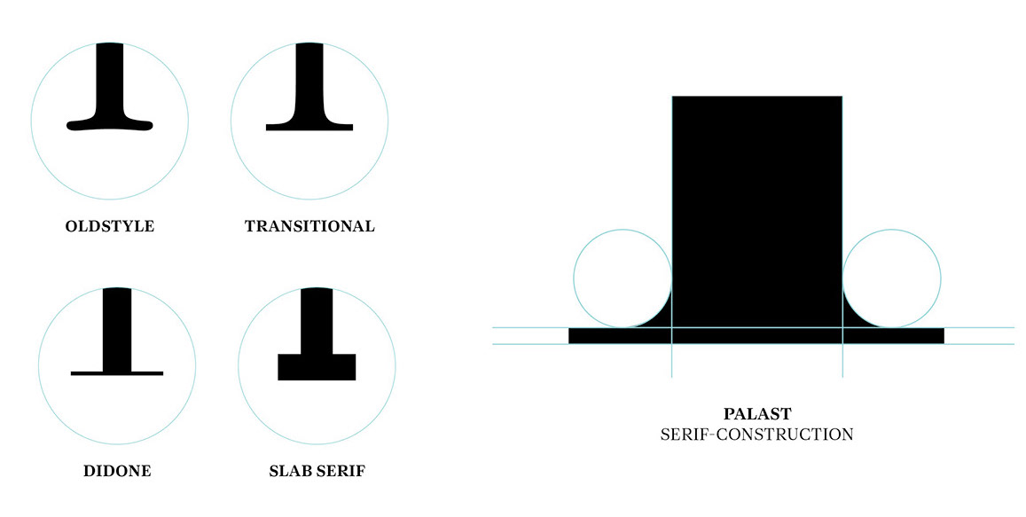
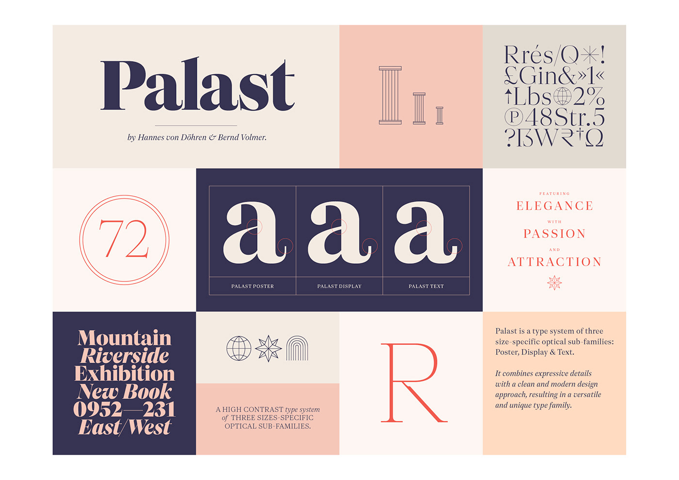
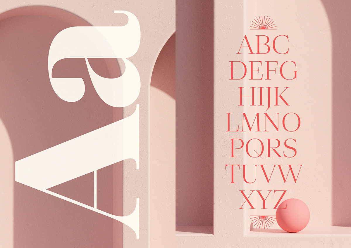
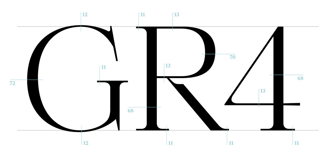
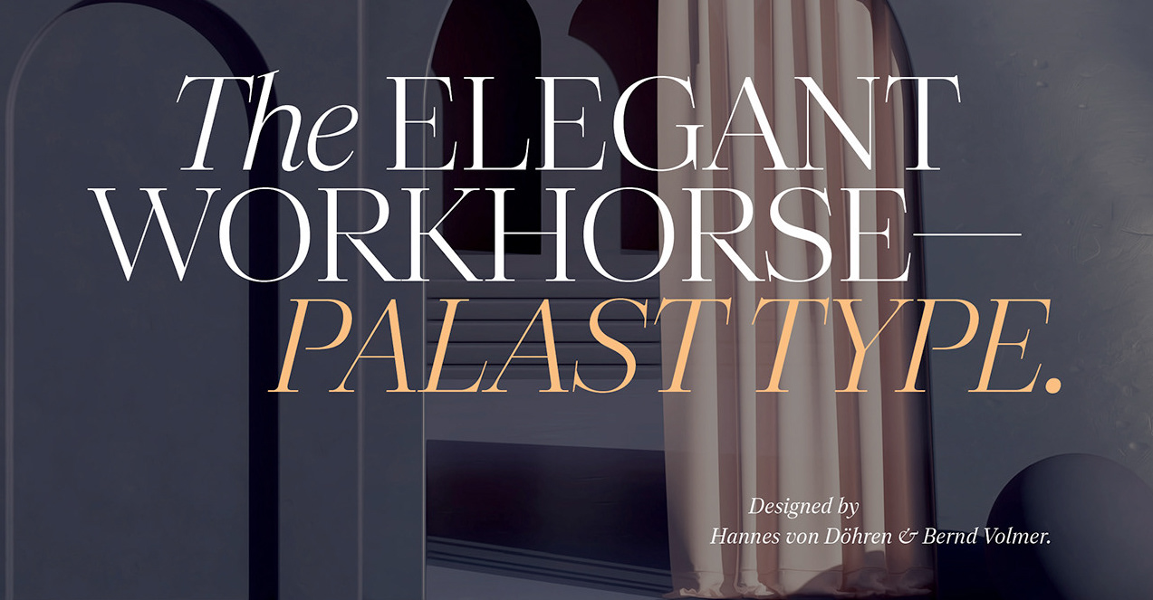
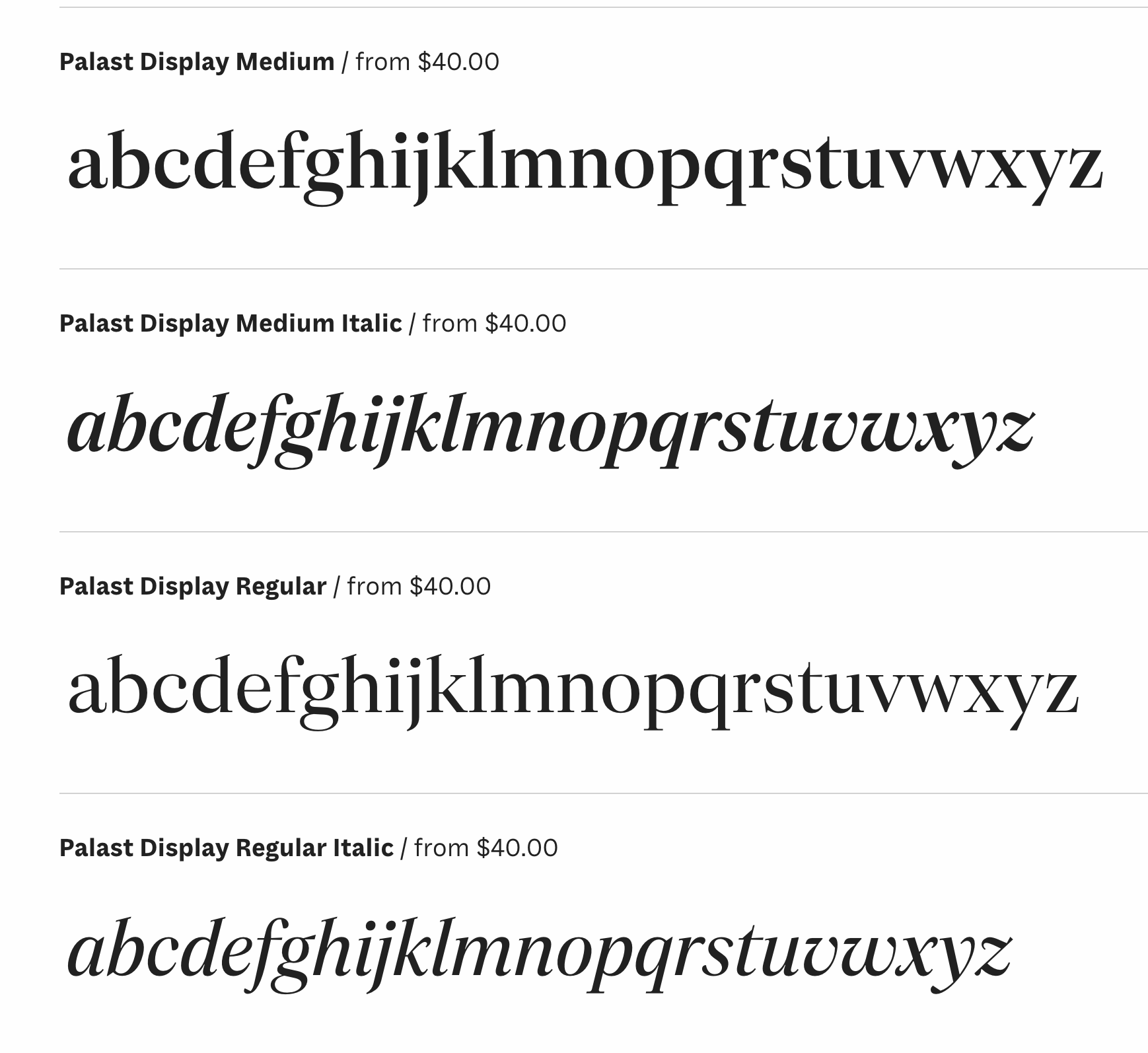
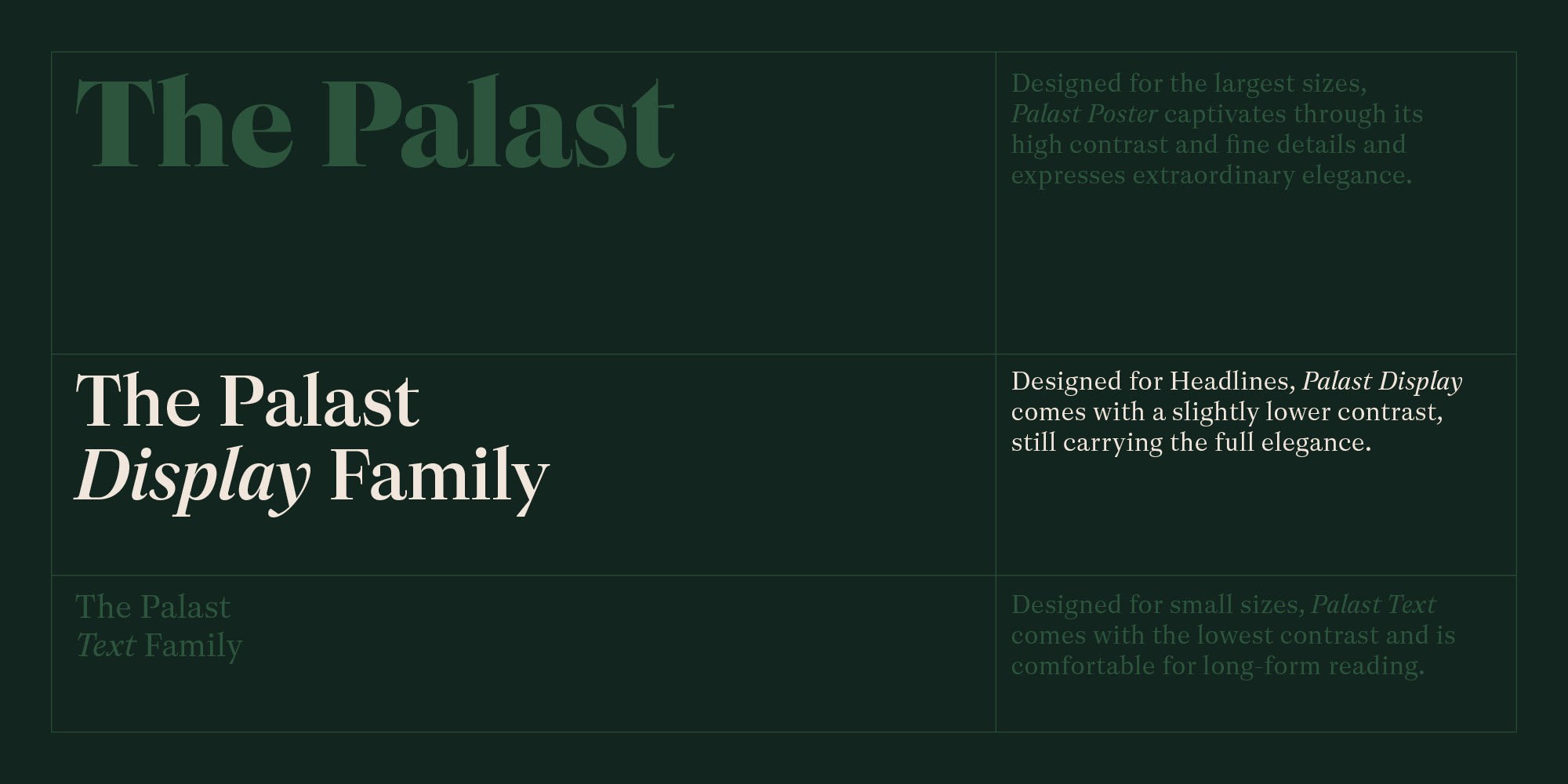
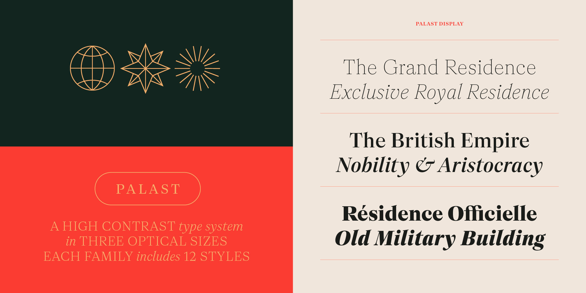
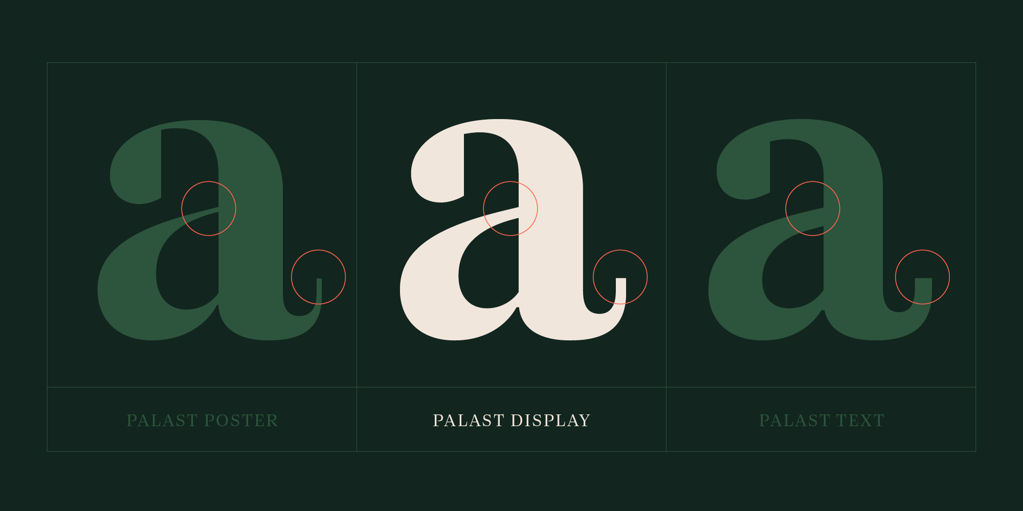
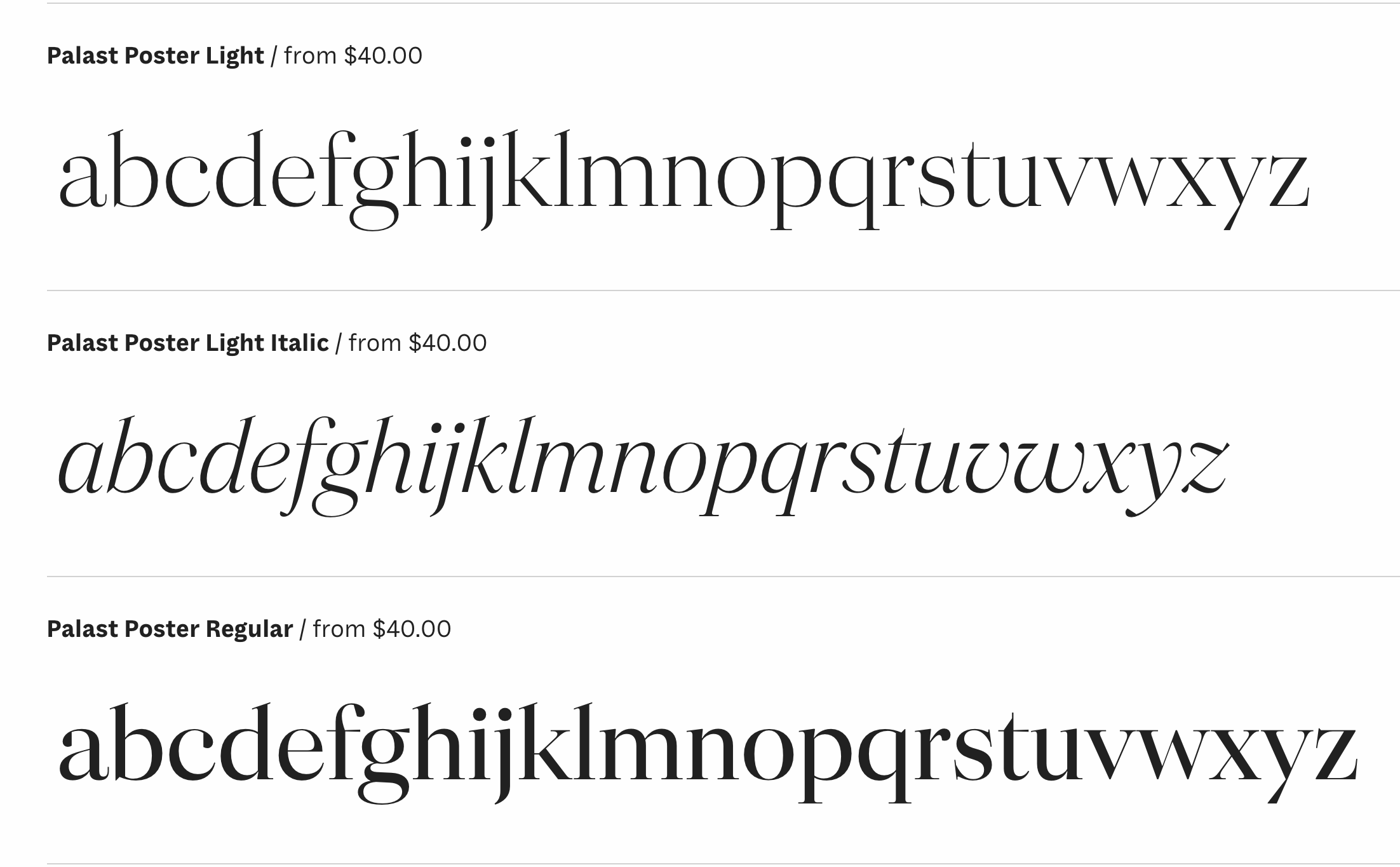
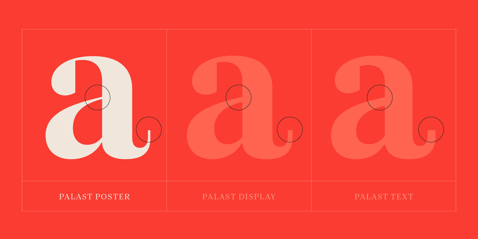
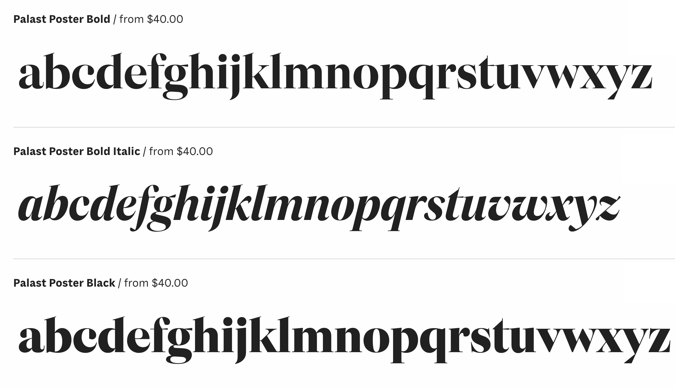
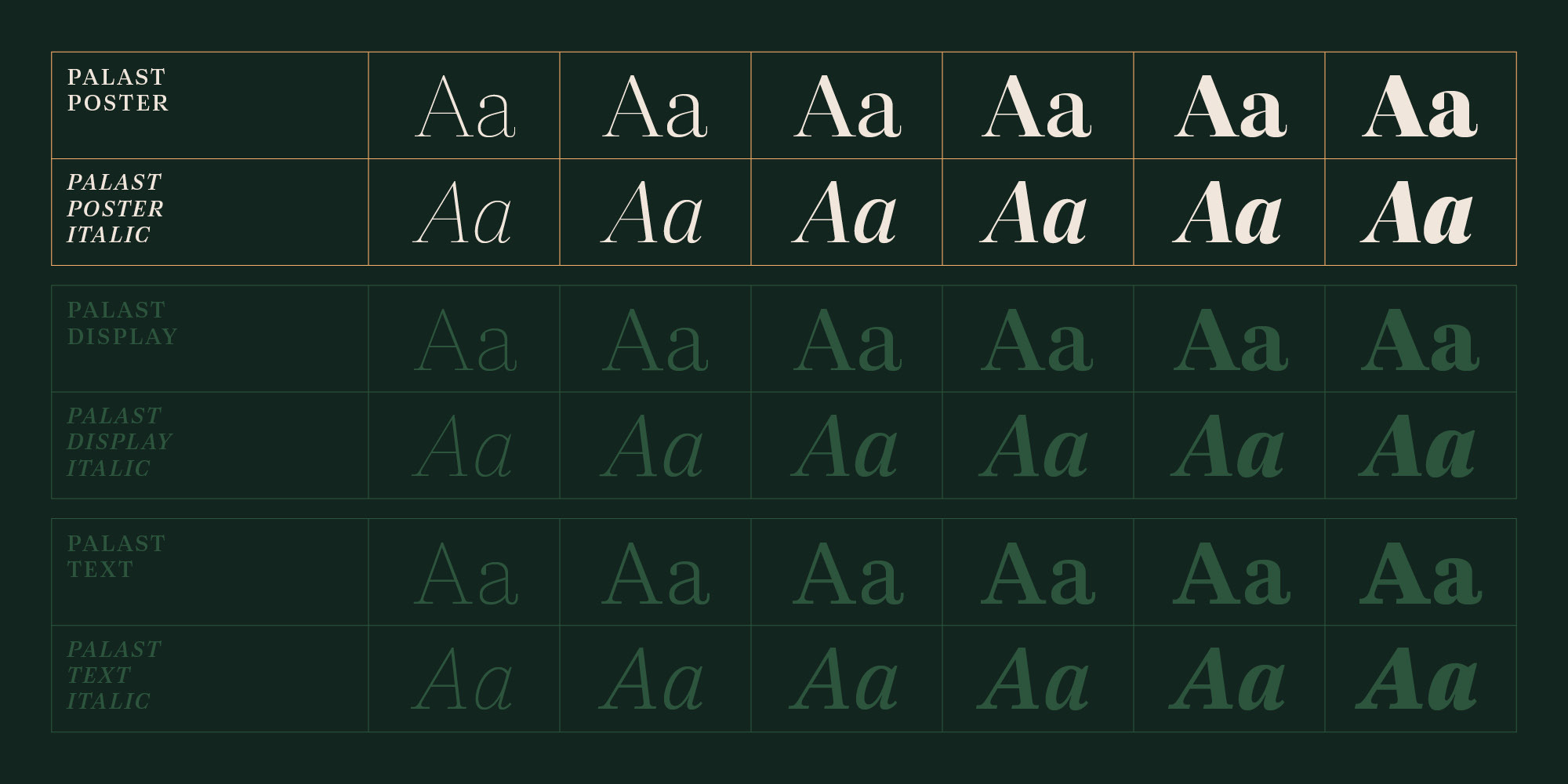
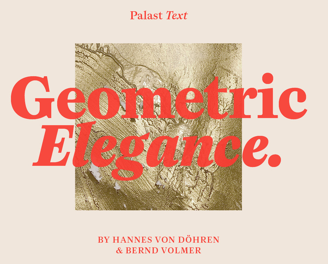
file name: Hannes Von Doehren Bernd Volmer Palast 2021
file name: Hannes Von Doehren Bernd Volmer Palast 2021
file name: Hannes Von Doehren Bernd Volmer Palast 2021
file name: Hannes Von Doehren Bernd Volmer Palast 2021
file name: Hannes Von Doehren Bernd Volmer Palast 2021
file name: Hannes Von Doehren Bernd Volmer Palast 2021
file name: Hannes Von Doehren Bernd Volmer Palast 2021
file name: Hannes Von Doehren Bernd Volmer Palast 2021

file name: Hannes Von Doehren Bernd Volmer Palast 2021
file name: Hannes Von Doehren Bernd Volmer Palast 2021
file name: Hannes Von Doehren Bernd Volmer Palast 2021
file name: Hannes Von Doehren Bernd Volmer Palast 2021
file name: Hannes Von Doehren Bernd Volmer Palast Display 2021
file name: Hannes Von Doehren Bernd Volmer Palast Display 2021
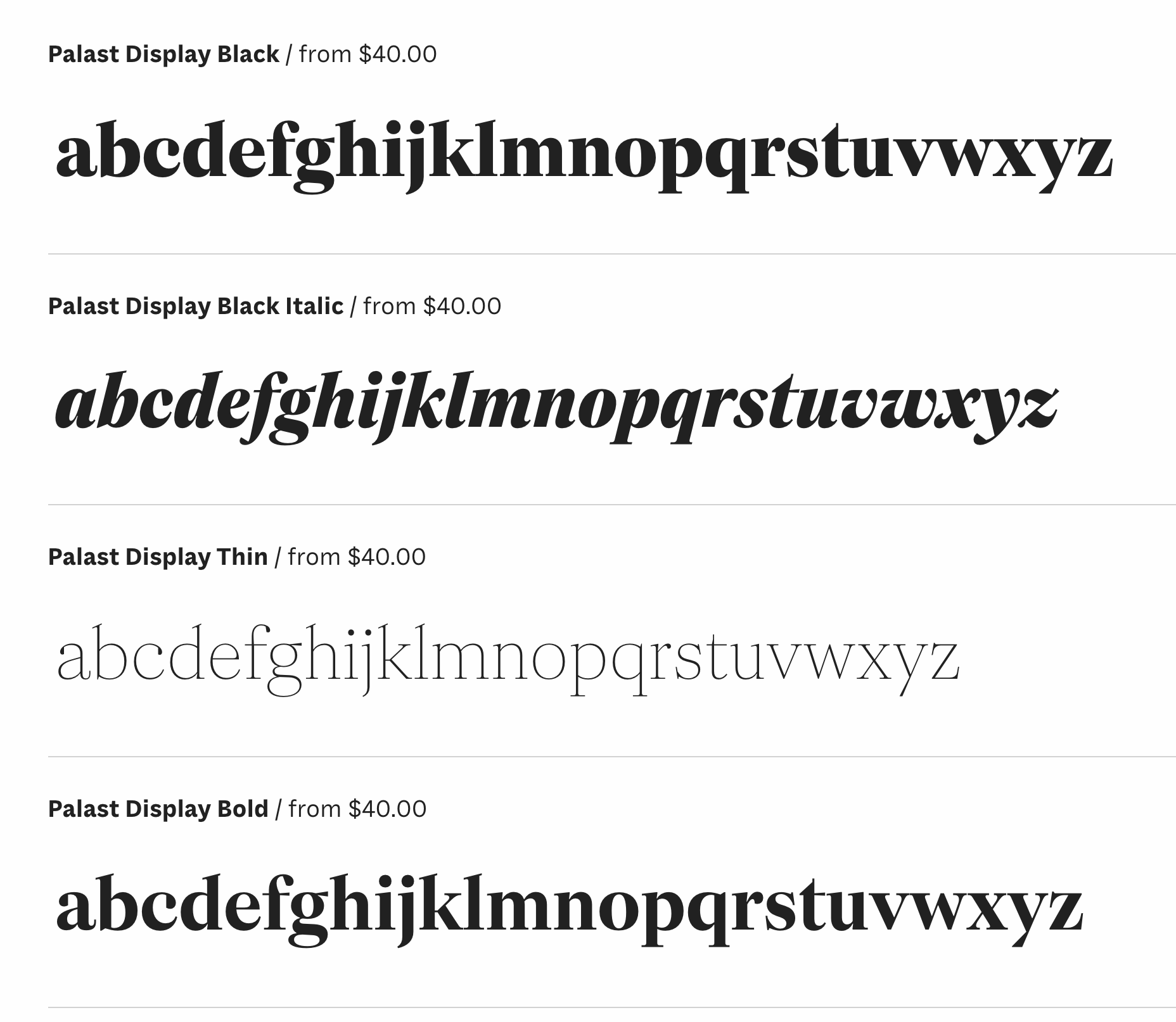
file name: Hannes Von Doehren Bernd Volmer Palast Display 2021
file name: Hannes Von Doehren Bernd Volmer Palast Display 2021
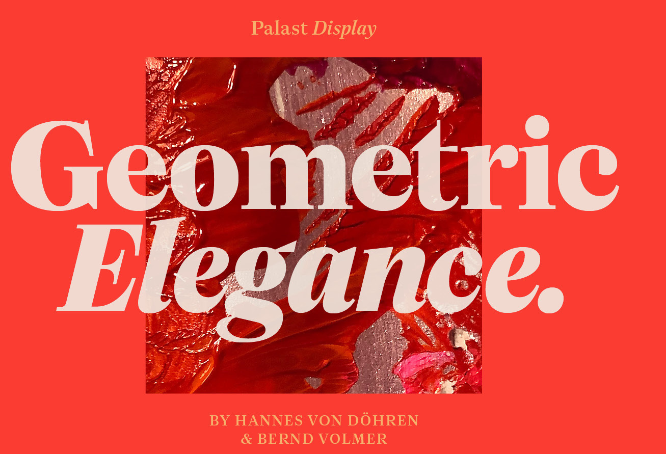
file name: Hannes Von Doehren Bernd Volmer Palast Display 2021
file name: Hannes Von Doehren Bernd Volmer Palast Display 2021
file name: Hannes Von Doehren Bernd Volmer Palast Poster 2021
file name: Hannes Von Doehren Bernd Volmer Palast Poster 2021
file name: Hannes Von Doehren Bernd Volmer Palast Poster 2021
file name: Hannes Von Doehren Bernd Volmer Palast Poster 2021
file name: Hannes Von Doehren Bernd Volmer Palast Poster 2021
file name: Hannes Von Doehren Bernd Volmer Palast Poster 2021
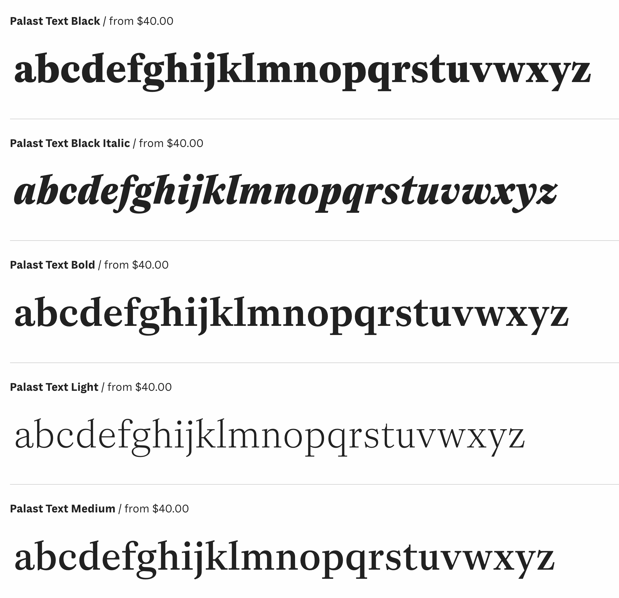
file name: Hannes Von Doehren Bernd Volmer Palast Text 2021
file name: Hannes Von Doehren Bernd Volmer Palast Text 2021
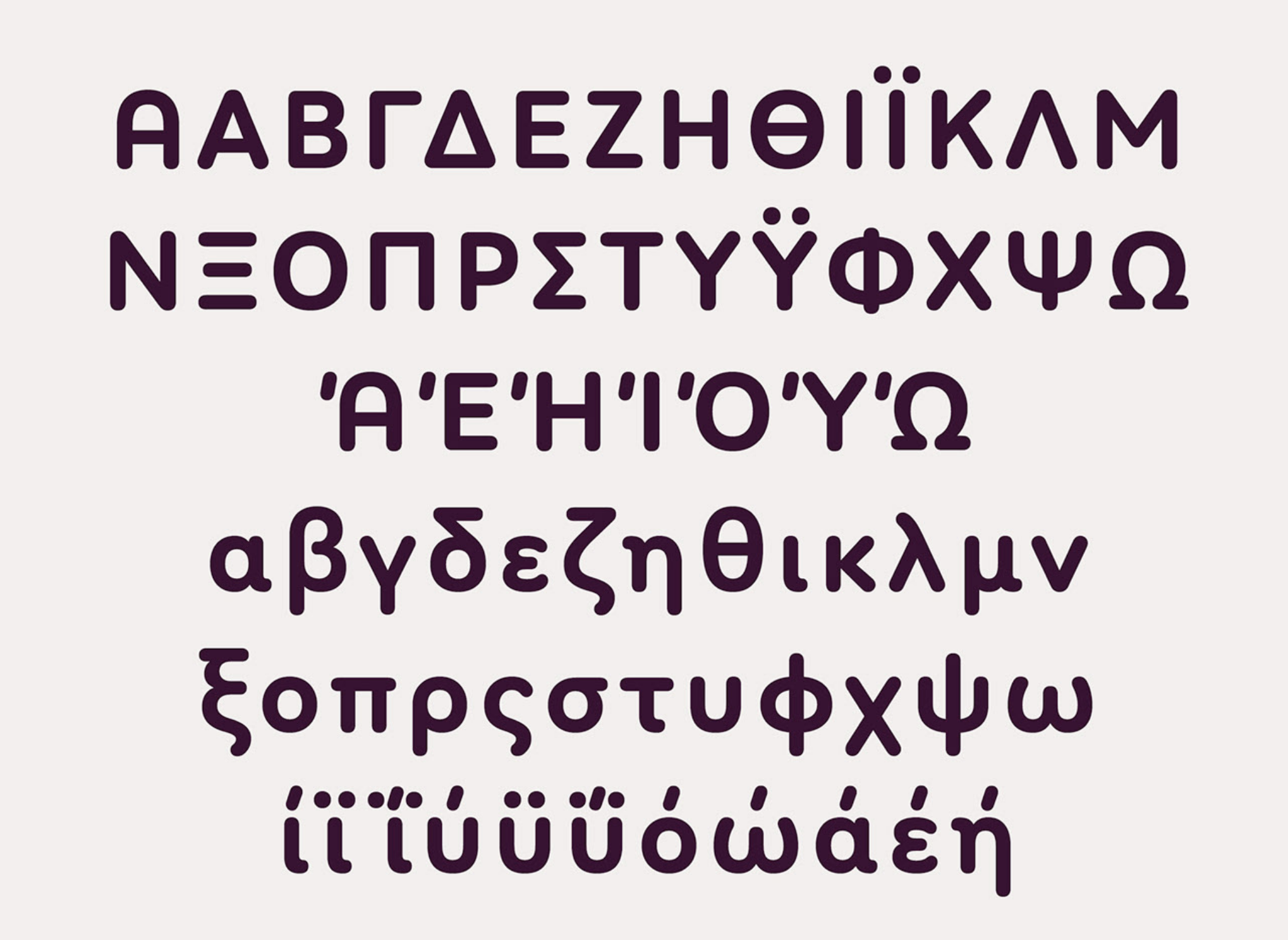
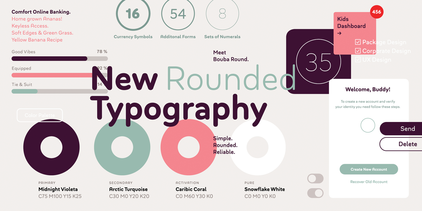
file name: Hannes Von Doehren Bouba Round 2020
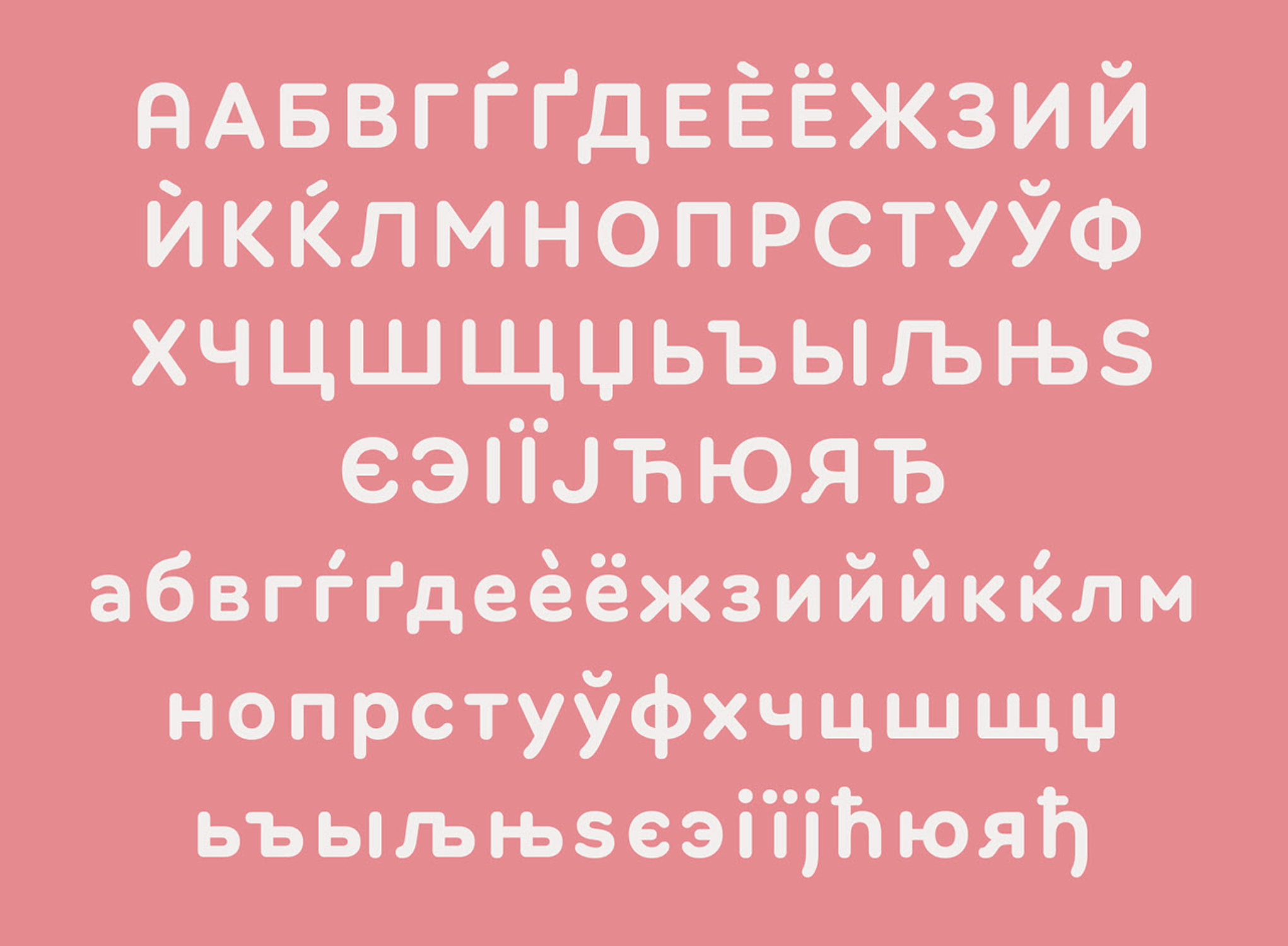
file name: Hannes Von Doehren Bouba Round 2020

file name: Hannes Von Doehren Bouba Round 2020
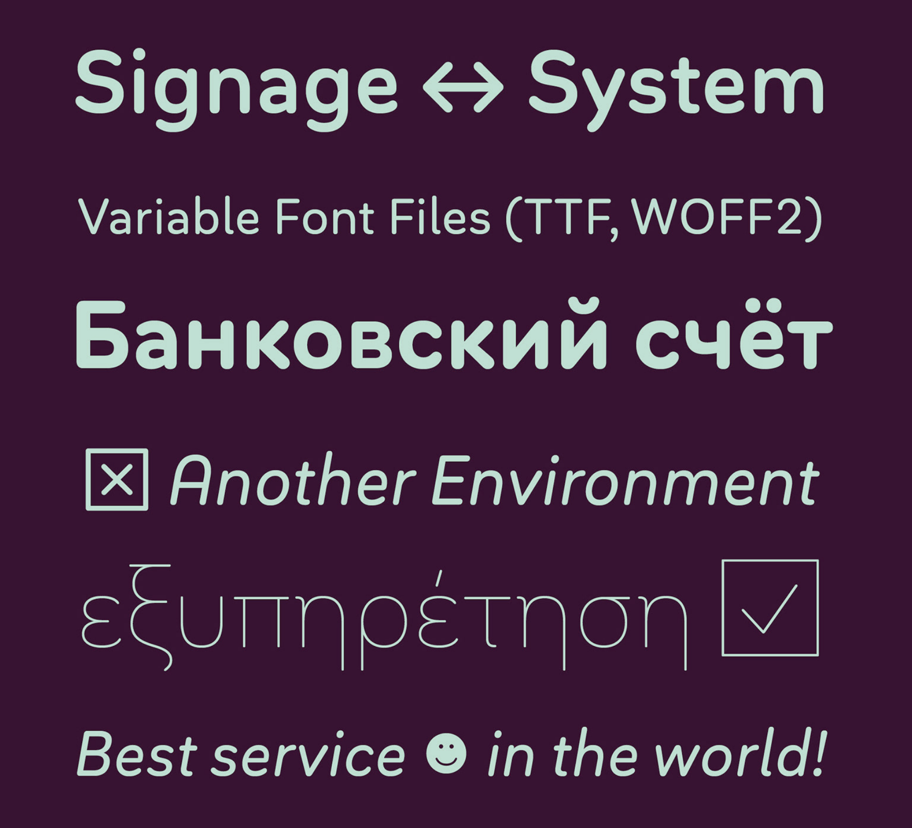
file name: Hannes Von Doehren Bouba Round 2020

file name: Hannes Von Doehren Bouba Round 2020
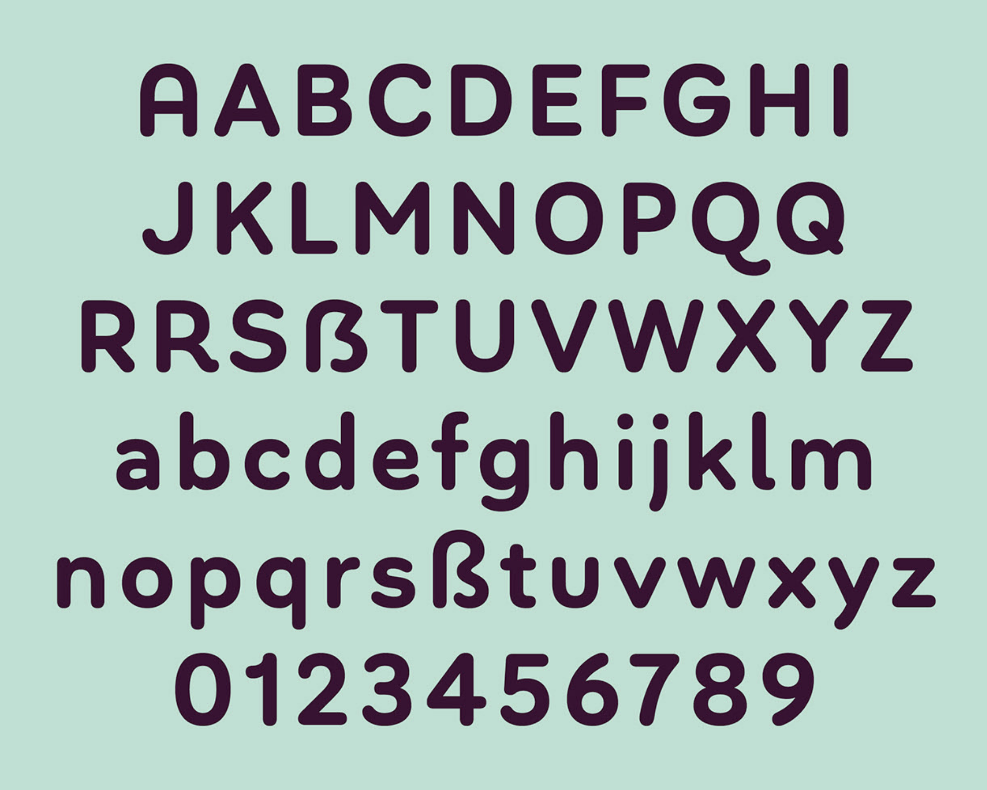
file name: Hannes Von Doehren Bouba Round 2020

file name: Hannes Von Doehren Bouba Round 2020
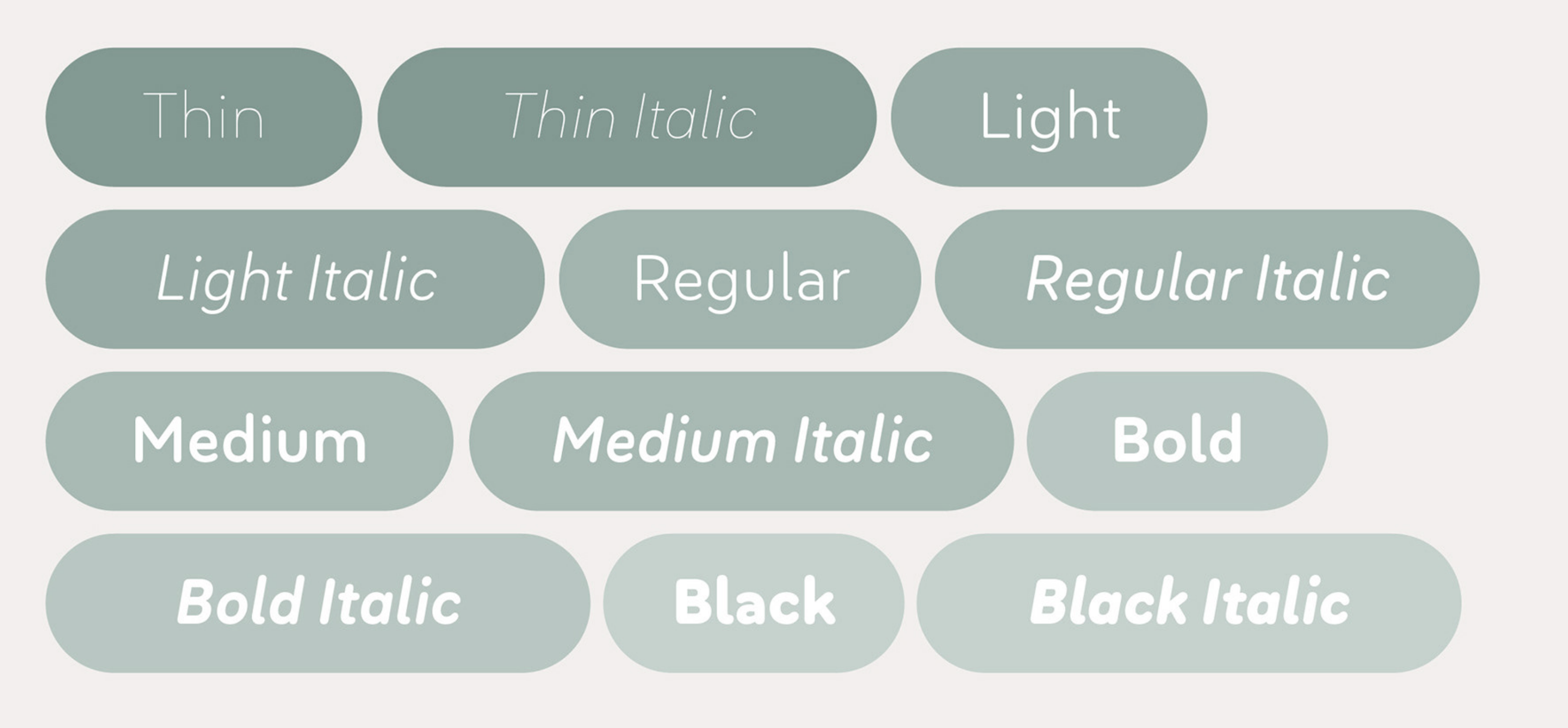
file name: Hannes Von Doehren Bouba Round 2020
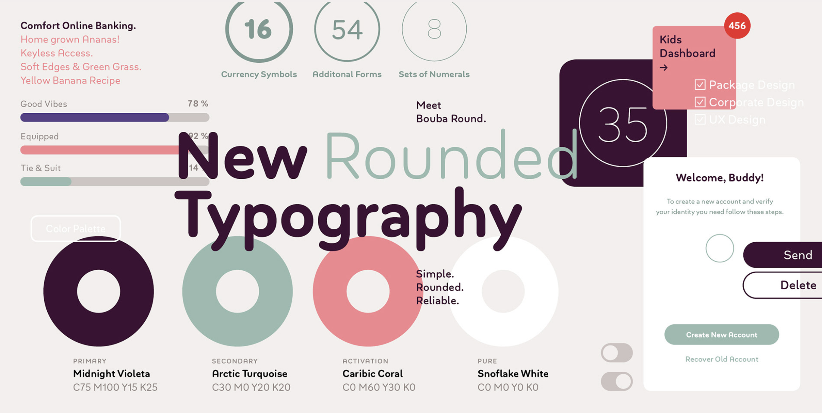
file name: Hannes Von Doehren Bouba Round 2020

file name: Hannes Von Doehren Bouba Round 2020

file name: H V D Fonts Bouba Round 2020 1
file name: H V D Fonts Bouba Round 2020 2
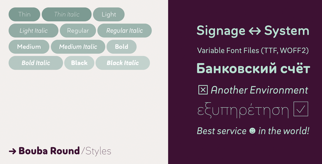
file name: H V D Fonts Bouba Round 2020 3
file name: H V D Fonts Bouba Round 2020 4

file name: H V D Fonts Bouba Round 2020

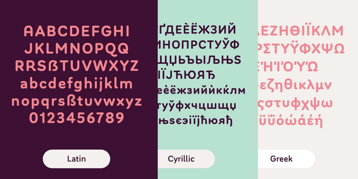
file name: Hannes Von Doehren Giulia 2018 265428
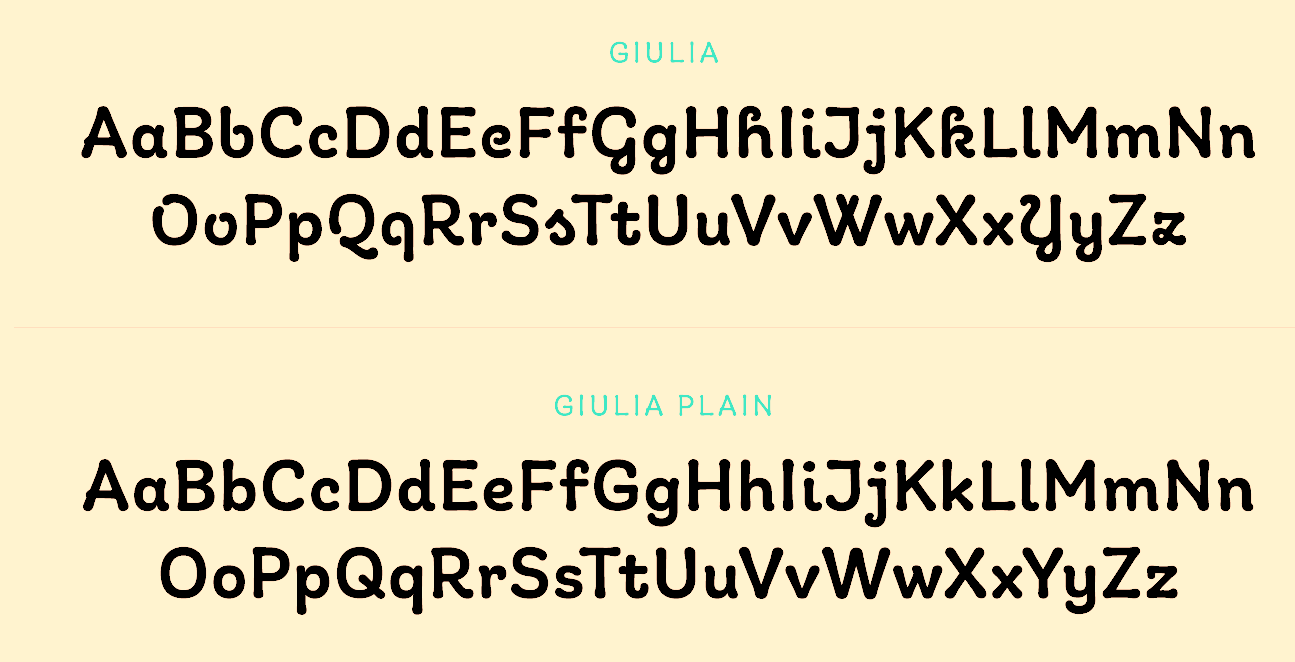
file name: Hannes Von Doehren Giulia 2018 265630
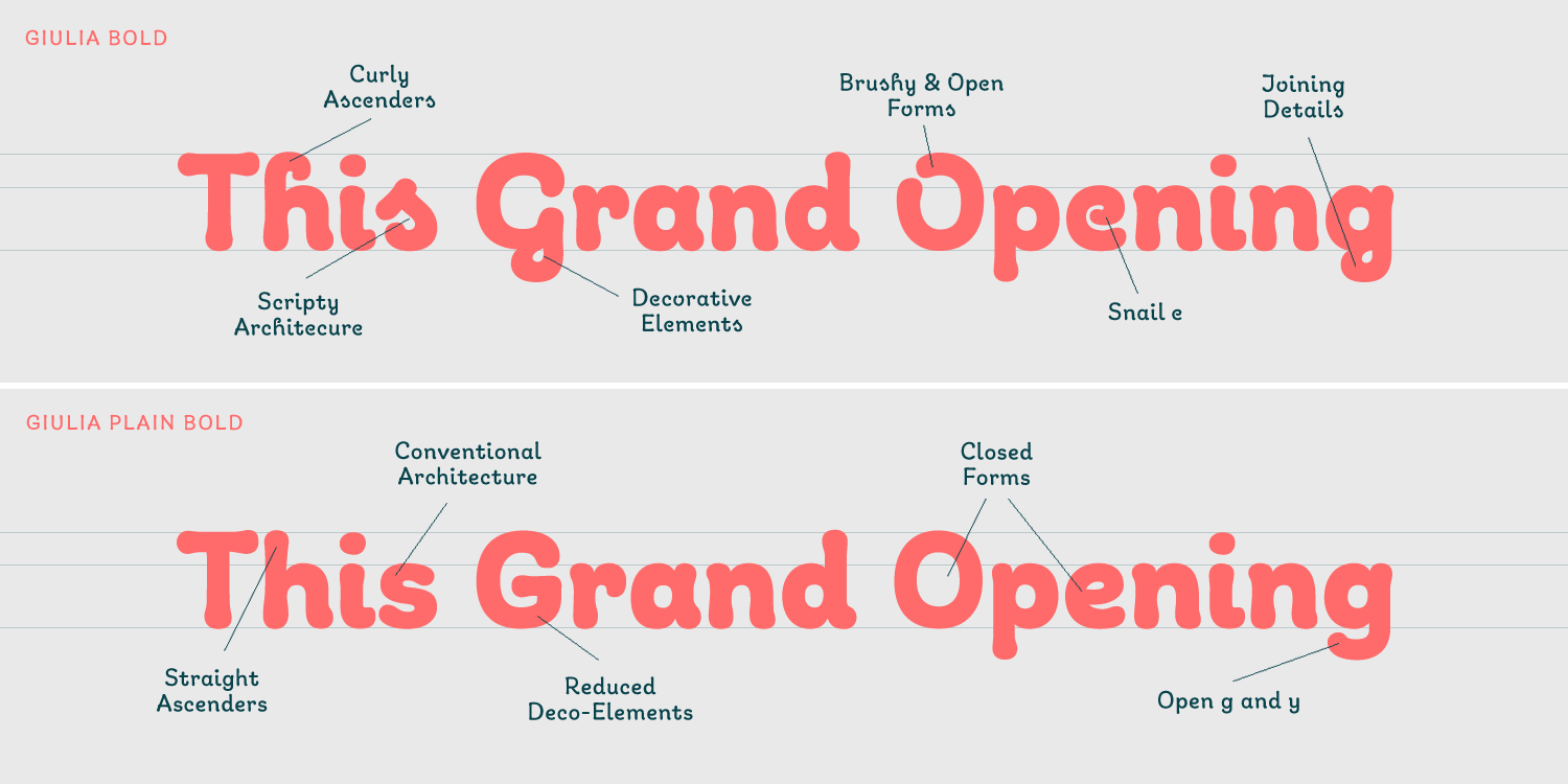
file name: Hannes Von Doehren Giulia 2018 265631

file name: Hannes Von Doehren Giulia 2018 265632
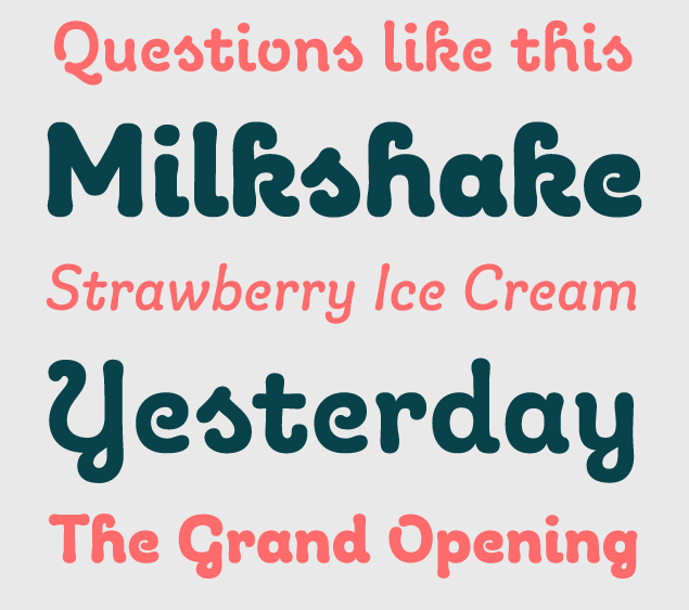
file name: Hannes Von Doehren Giulia 2018 265632
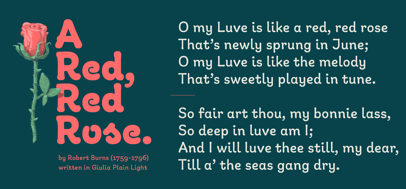
file name: Hannes Von Doehren Giulia 2018 265633
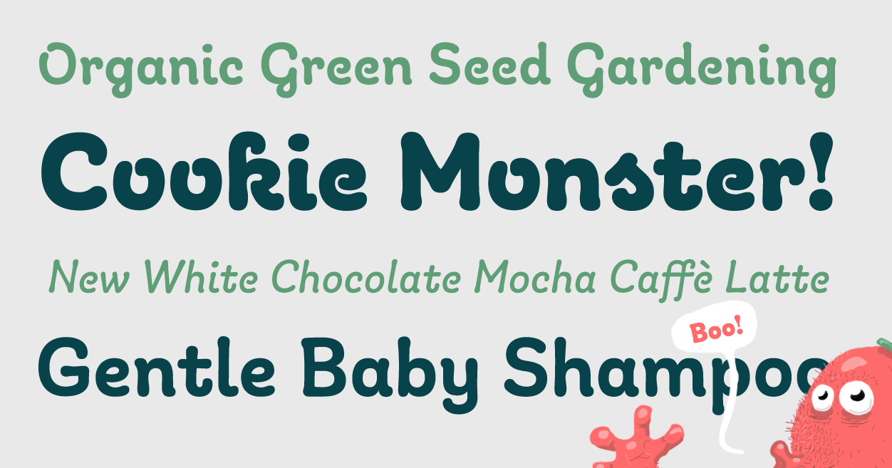
file name: Hannes Von Doehren Giulia 2018 265634

file name: Hannes Von Doehren Giulia 2018 265635

file name: Hannes Von Doehren Giulia 2018
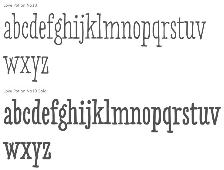
file name: Hannes Von Doehren Love Potion No10 2012
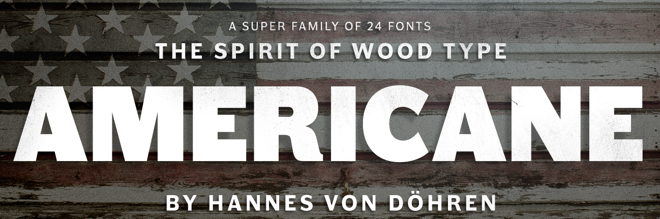
file name: Hannes Von Doehren Americane 2015b

file name: Hannes Von Doehren Americane 2015c
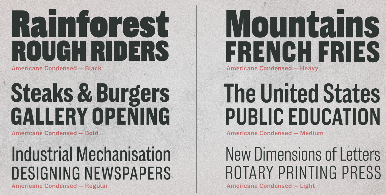
file name: Hannes Von Doehren Americane Condensed 2015
file name: Hannes Von Doehren Americane Condensed Black 2015

file name: Hannes Von Doehren Americane Heavy 2015

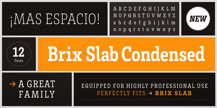
file name: Hannes Von Doehren Brix Slab 2011
file name: Hannes Von Doehren Brix Slab 2011b
file name: Hannes Von Doehren Brix Slab Condensed 2011
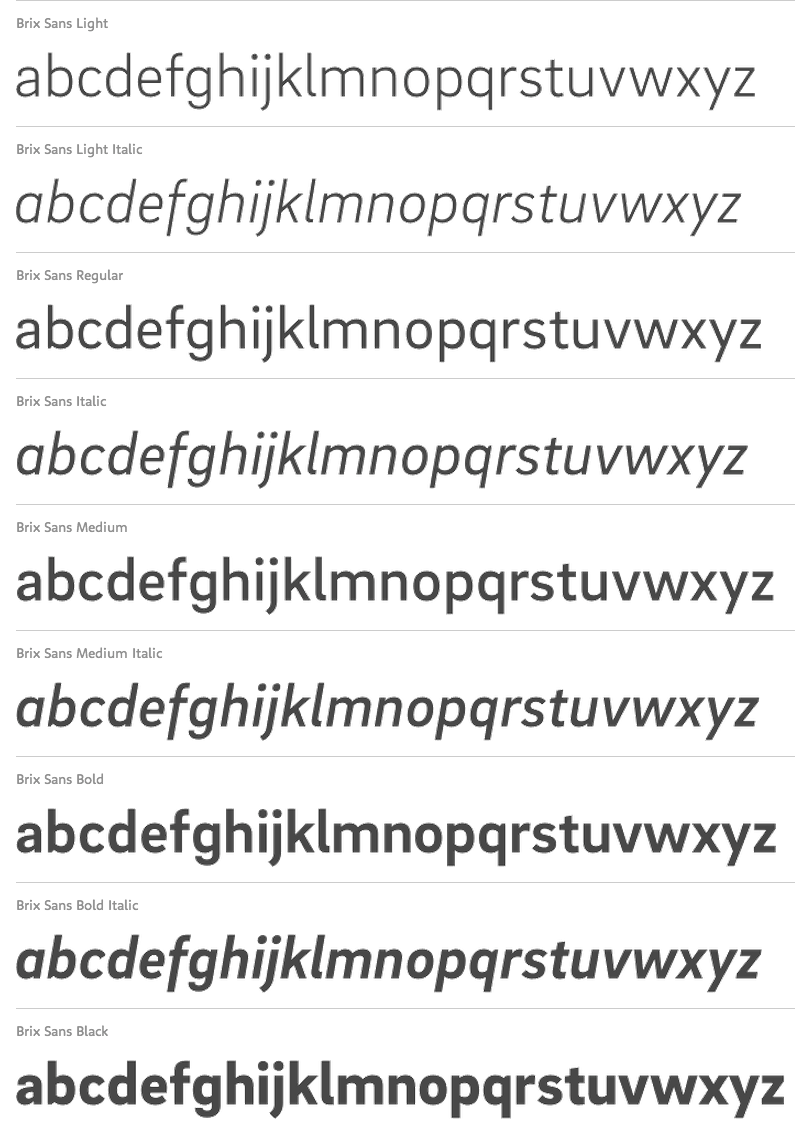
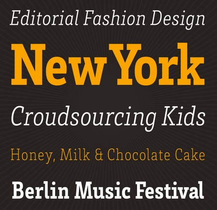
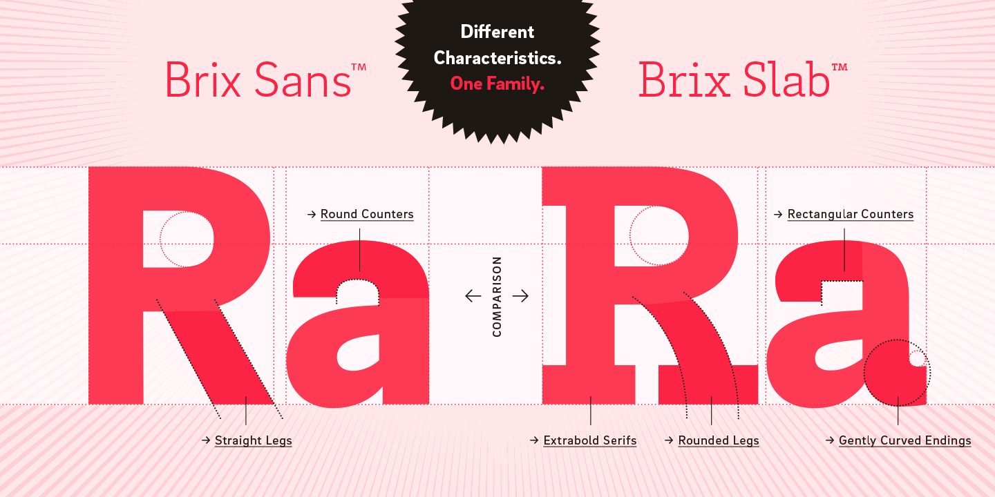
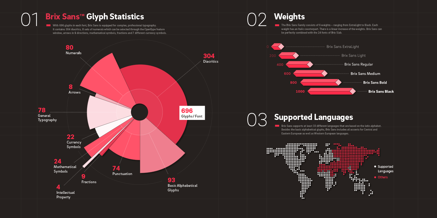
file name: Livius Dietzel Hannes Von Doehren Brix Sans 2014
file name: Livius Dietzel Hannes Von Doehren Brix Sans 2014b

file name: Livius Dietzel Hannes Von Doehren Brix Sans 2014c
file name: Livius Dietzel Hannes Von Doehren Brix Sans 2014d
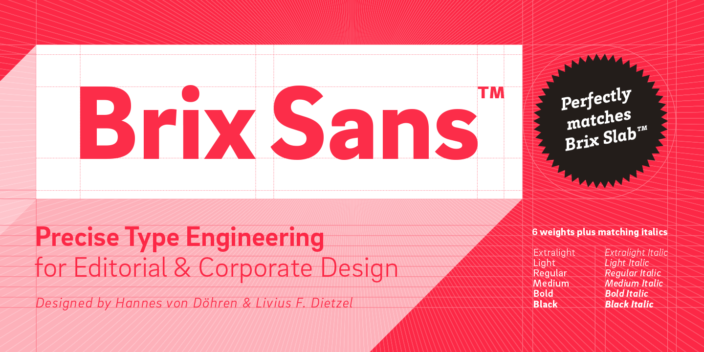
file name: Livius Dietzel Hannes Von Doehren Brix Sans 2014e
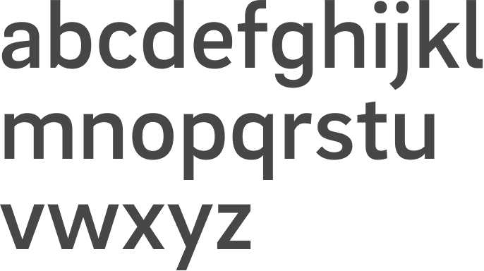
file name: Livius Dietzel Hannes Von Doehren Brix Sans Medium 2014.
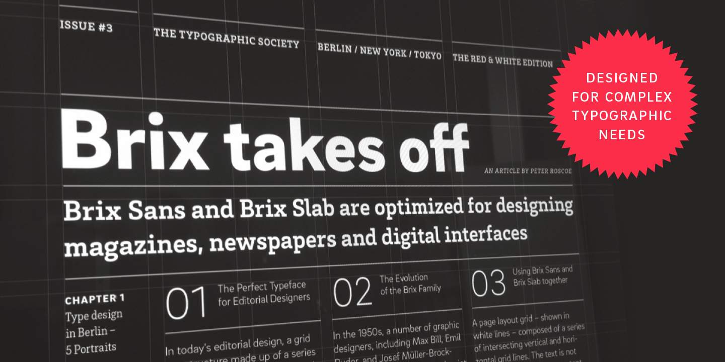
file name: Livius Dietzel Hannes Von Doehren Brix Sans Brix Slab 2014

file name: Livius Dietzel Hannes Von Doehren Brix Slab Black 2011
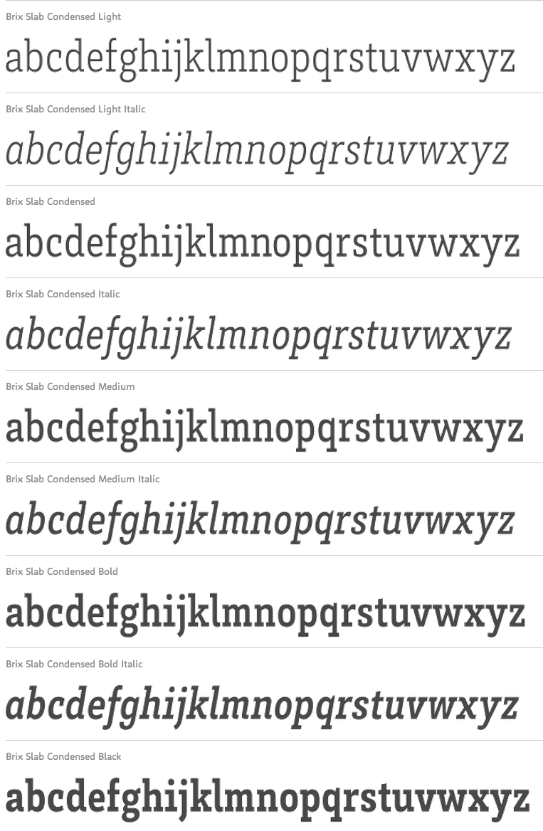
file name: Livius Dietzel Hannes Von Doehren Brix Slab Condensed 2011
file name: Livius Dietzel Hannes Von Doehren Brix Slab Condensed 2011b
file name: Livius Dietzel Hannes Von Doehren Brix Slab Condensed Light 2011
file name: Livius Dietzel Hannes Von Doehren Brix Slab Medium 2011
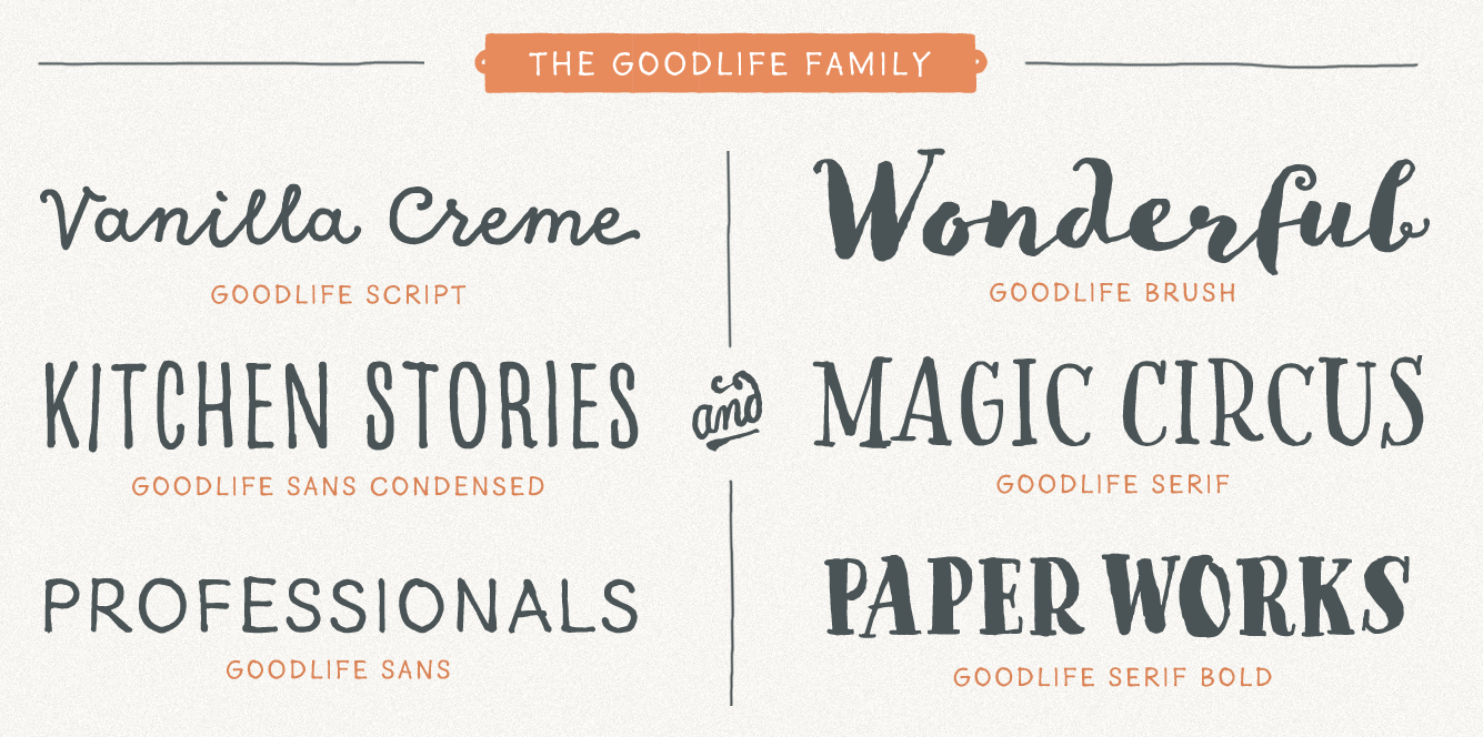
file name: H V D Fonts Goodlife 2014 177818
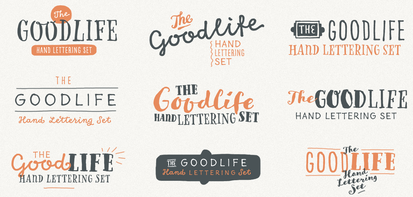
file name: H V D Fonts Goodlife 2014 177819
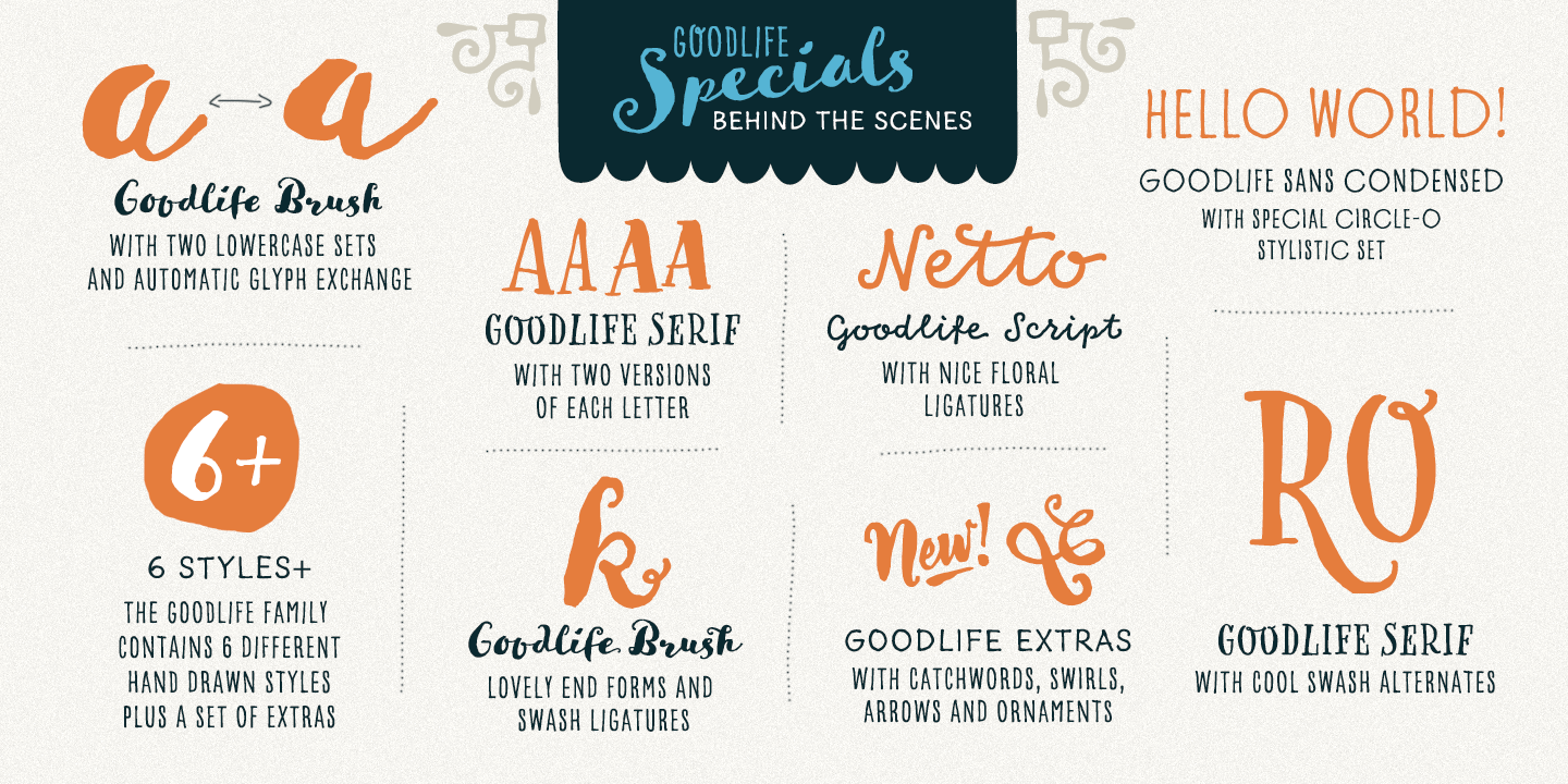
file name: H V D Fonts Goodlife 2014 177820
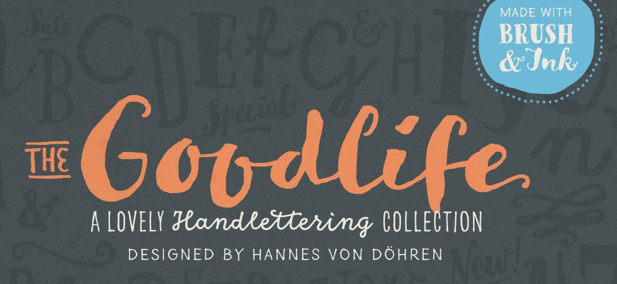
file name: H V D Fonts Goodlife 2014 177840

file name: H V D Fonts Goodlife 2014
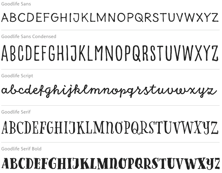
file name: H V D Fonts Goodlife 2014b

file name: H V D Fonts Cheap Pine 2011
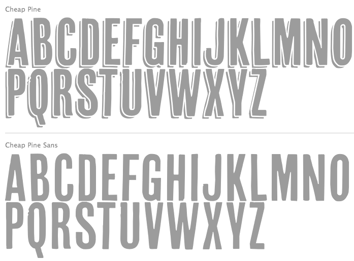
file name: Hannes Von Doehren Cheap Pine 2011

file name: H V D Fonts Pluto 2011

file name: H V D Fonts Pluto 2012 05 01

file name: Hannes Von Doehren Pluto 2011
file name: Hannes Von Doehren Pluto Italics 2011b
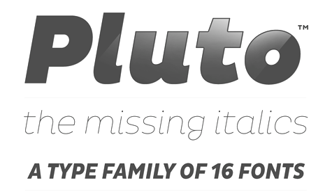
file name: Hannes Von Doehren Pluto Italics 2011

file name: Hannes Von Doehren Pluto Mediums 2011

file name: Hannes Von Doehren Pluto Italics 2011
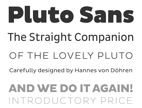
file name: Hannes Von Doehren Pluto Sans 2012
file name: Hannes Von Doehren Pluto Sans 2012b

file name: Hannes Von Doehren Pluto Sans Cond Heavy Italic 2012
file name: Hannes Von Doehren Pluto 2011 poster by Kamshat Bekturgan 2018
file name: Hannes Von Doehren Pluto 2011 poster by Kamshat Bekturgan 2018b
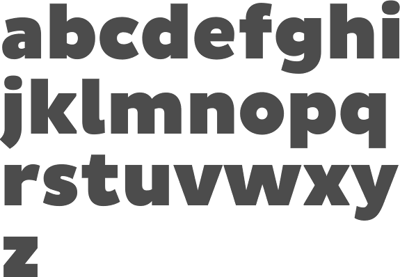
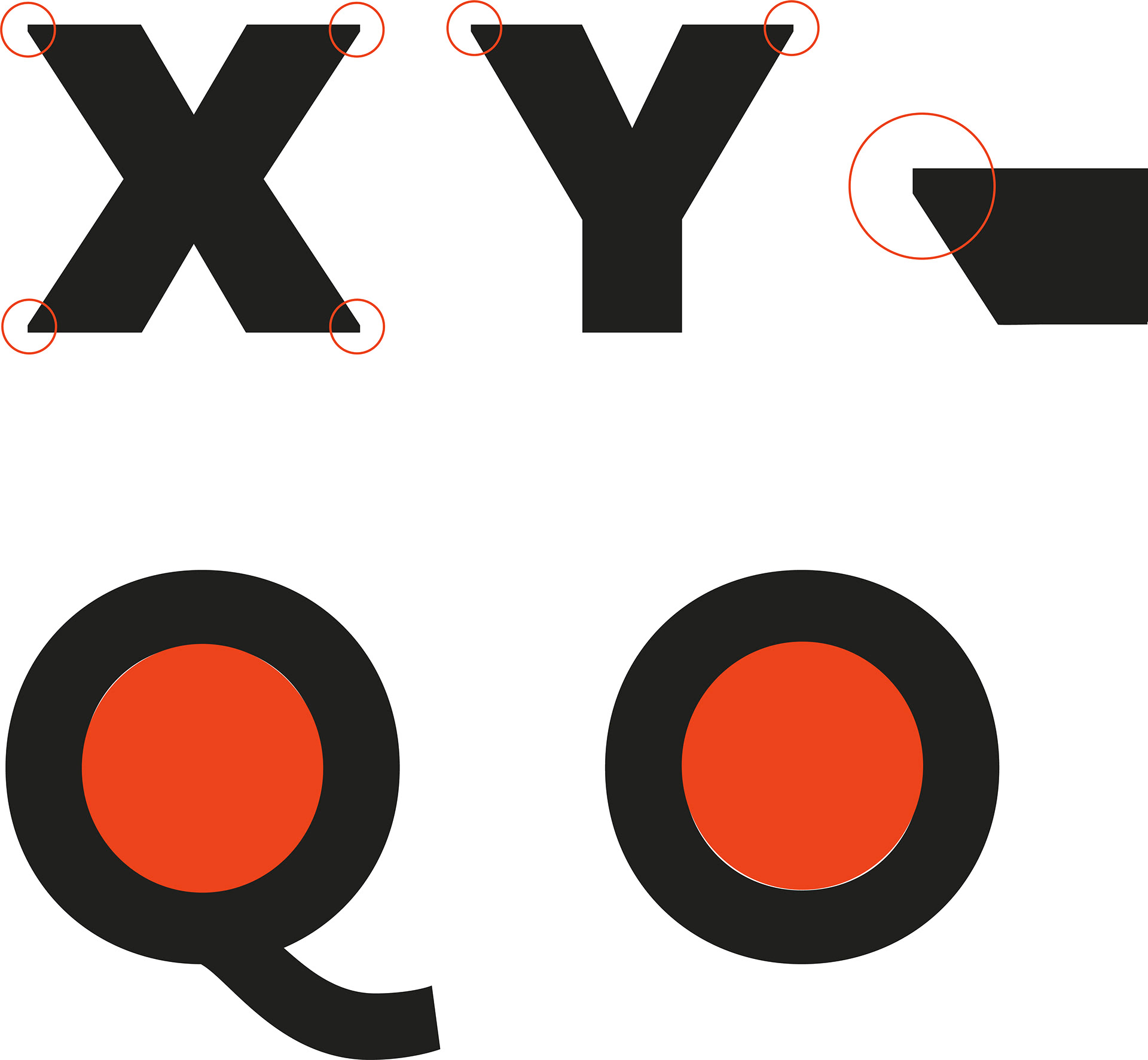
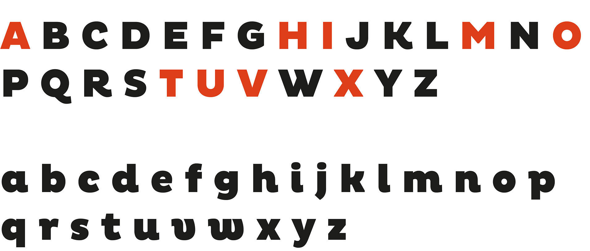
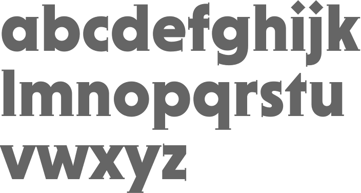
file name: Hannes Von Dohren Mikado 2013

file name: Hannes Von Dohren Mikado 2013c
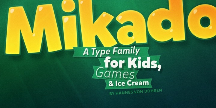
file name: Hannes Von Dohren Mikado 2013b

file name: Hannes Von Dohren Mikado Black 2013
file name: Hannes Von Dohren Mikado 2013d
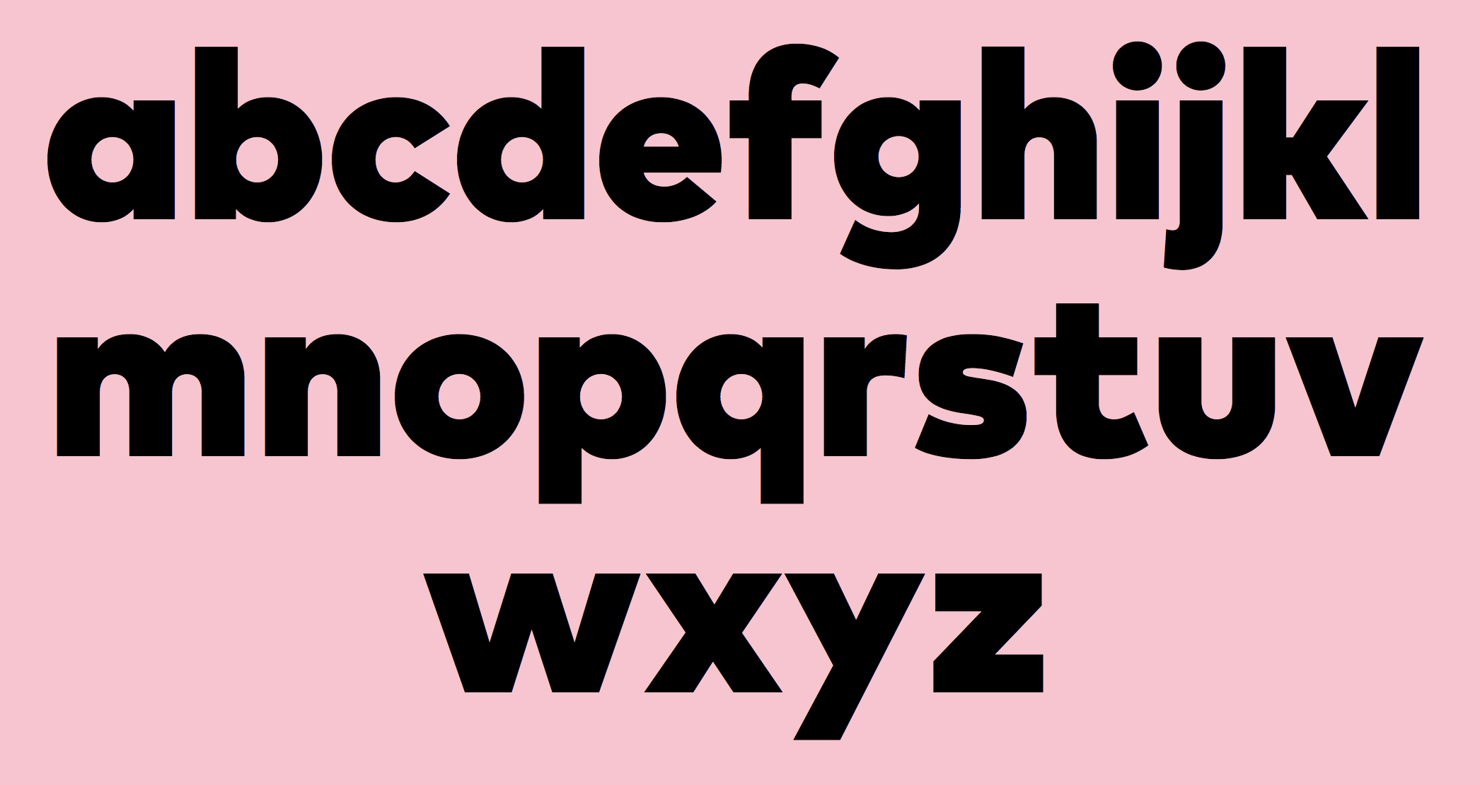
file name: H V D Fonts Fabrikat Normal 2020
file name: H V D Fonts Fabrikat Normal 2020 349864
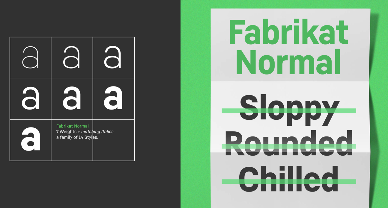
file name: H V D Fonts Fabrikat Normal 2020 349865
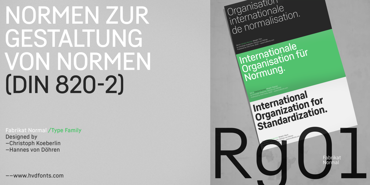
file name: H V D Fonts Fabrikat Normal 2020 349866
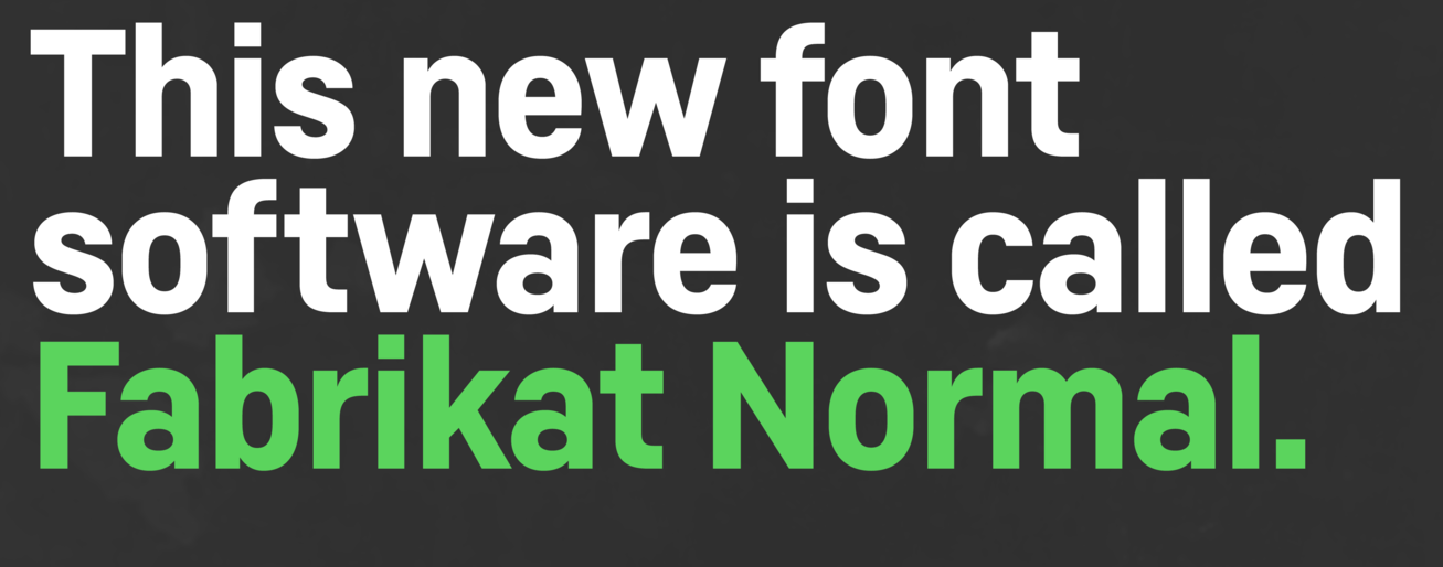
file name: H V D Fonts Fabrikat Normal 2020 349868

file name: H V D Fonts Fabrikat Normal 2020
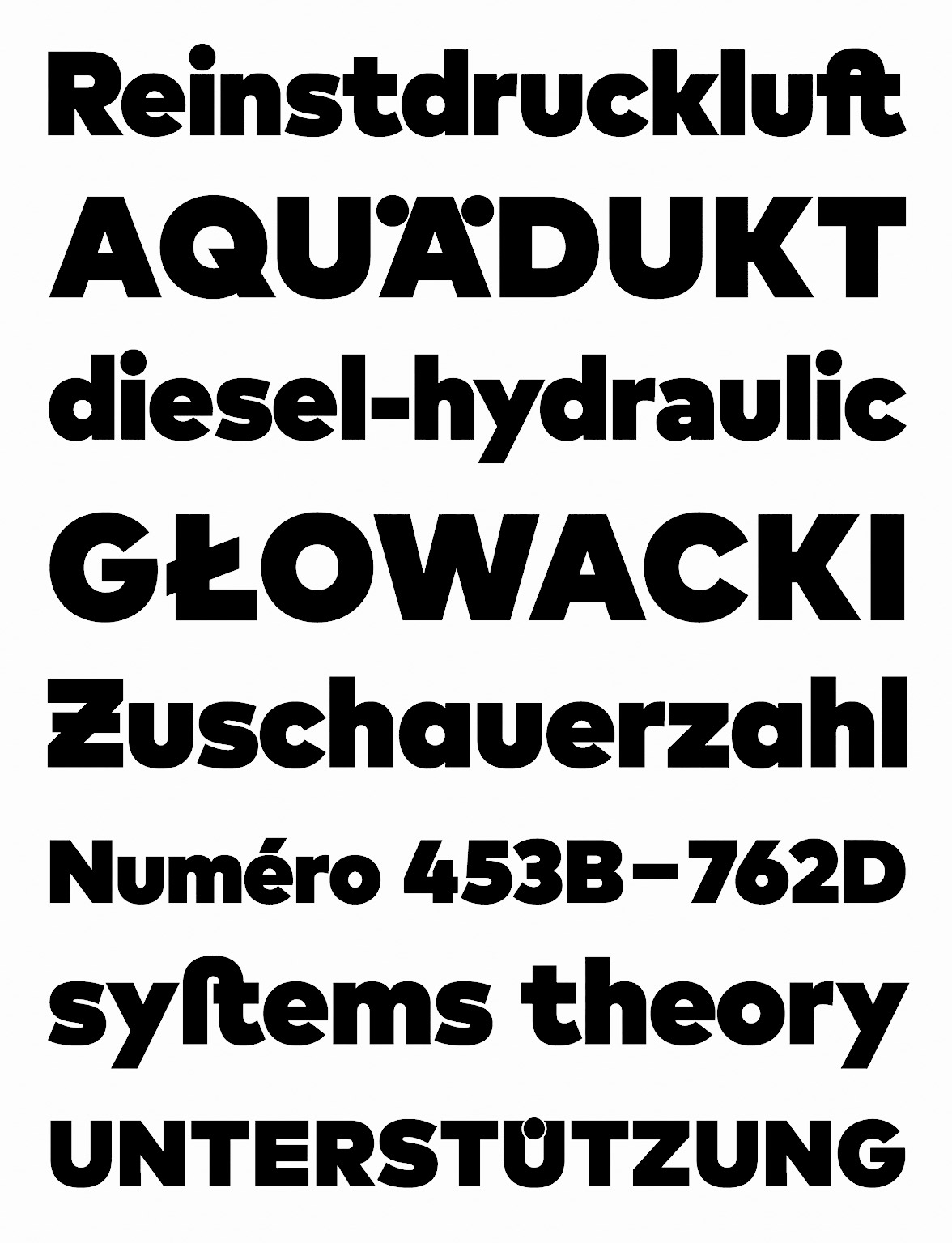
file name: Hannes Von Doehren Christoph Koeberlin Mark Pro Black 2013
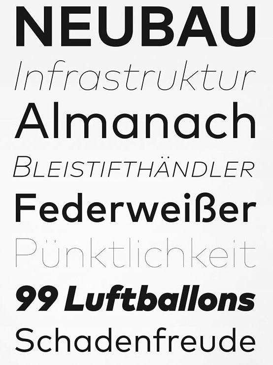
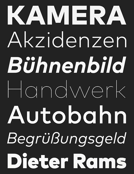
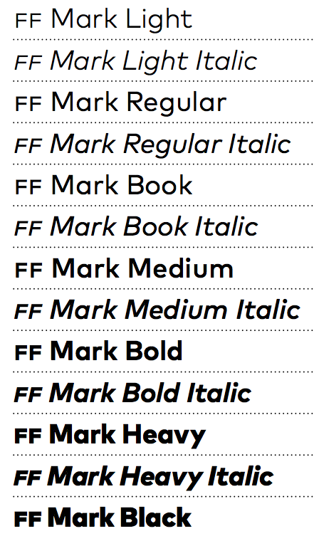
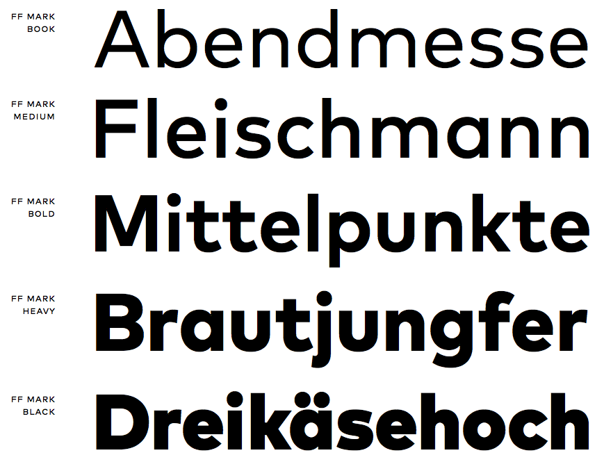
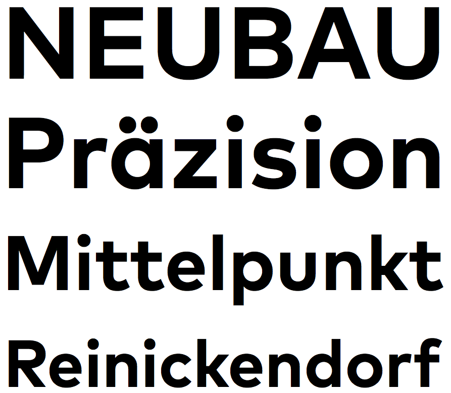
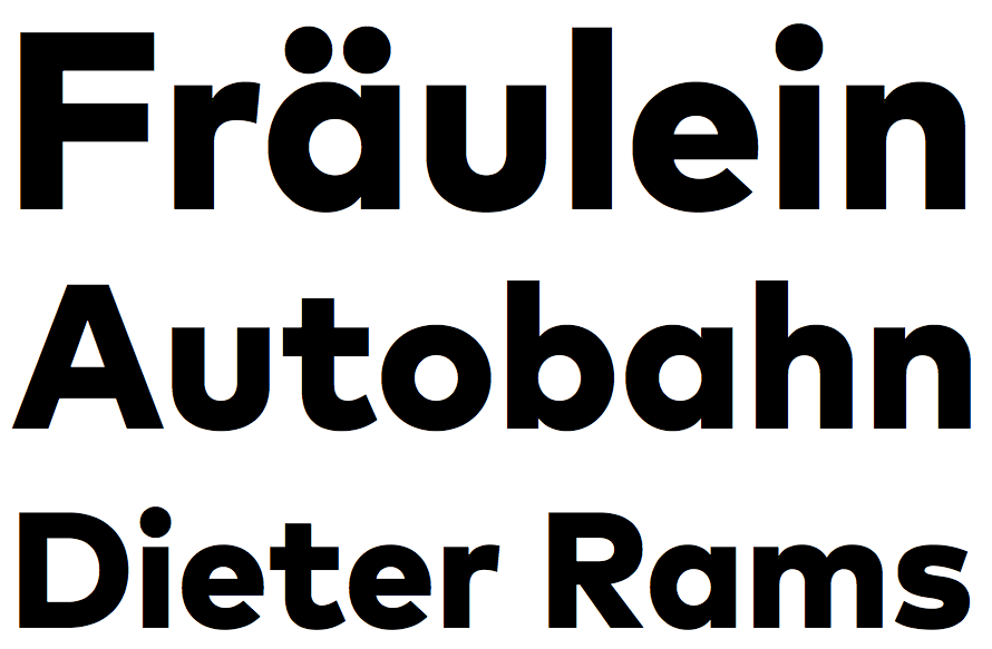
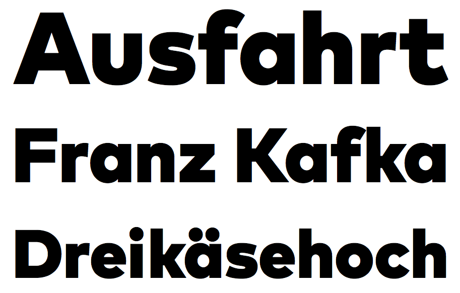
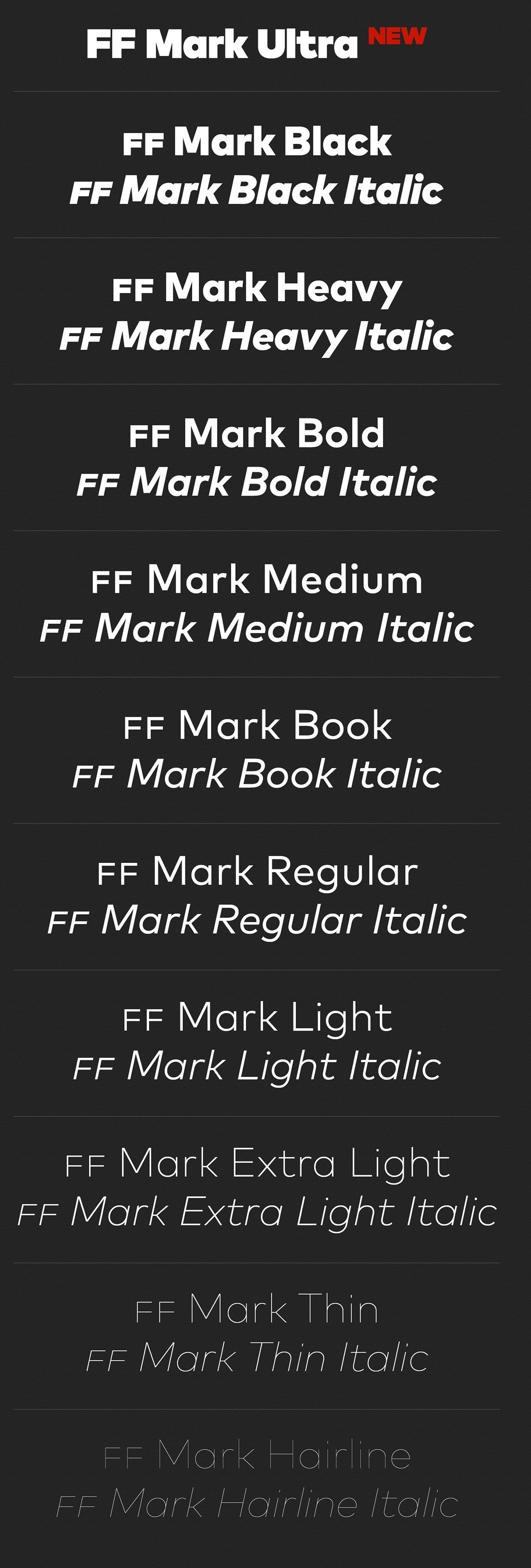
file name: Hannes Von Doehren Christoph Koeberlin F F Mark 2013
file name: Hannes Von Doehren Christoph Koeberlin F F Mark 2013b
file name: Hannes Von Doehren Christoph Koeberlin F F Mark 2013d
file name: Hannes Von Doehren Christoph Koeberlin F F Mark 2013e
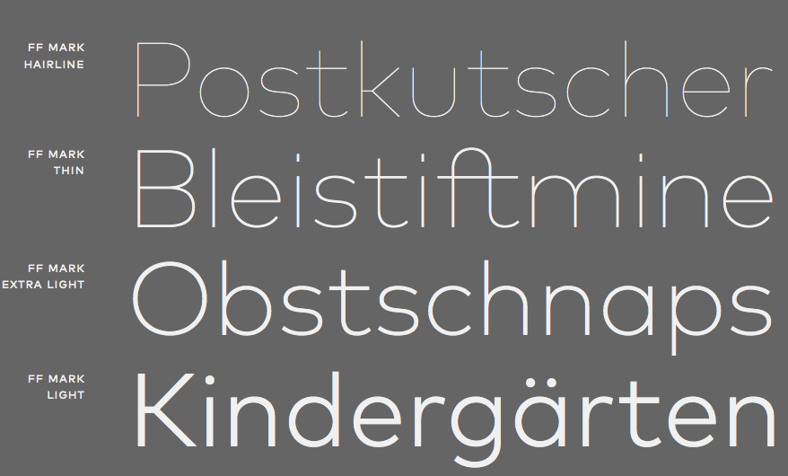
file name: Hannes Von Doehren Christoph Koeberlin F F Mark 2013f
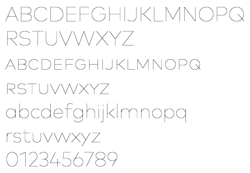
file name: Hannes Von Doehren Christoph Koeberlin F F Mark 2013g
file name: Hannes Von Doehren Christoph Koeberlin F F Mark 2013h
file name: Hannes Von Doehren Christoph Koeberlin F F Mark 2013i
file name: Hannes Von Doehren Christoph Koeberlin F F Mark 2013j

file name: Hannes Von Doehren Christoph Koeberlin F F Mark 2013k
file name: Hannes Von Doehren Christoph Koeberlin F F Mark 2013l

file name: Hannes Von Doehren Christoph Koeberlin F F Mark 2013m
file name: Hannes Von Doehren Christoph Koeberlin F F Mark 2013n
file name: Hannes Von Doehren Christoph Koeberlin F F Mark 2013o

file name: Hannes Von Doehren Christoph Koeberlin F F Mark 2013p
file name: Hannes Von Doehren Christoph Koeberlin F F Mark 2013q
file name: Hannes Von Doehren Christoph Koeberlin F F Mark 2013r
file name: Hannes Von Doehren Christoph Koeberlin F F Mark 2013s
file name: Hannes Von Doehren Christoph Koeberlin F F Mark 2015k
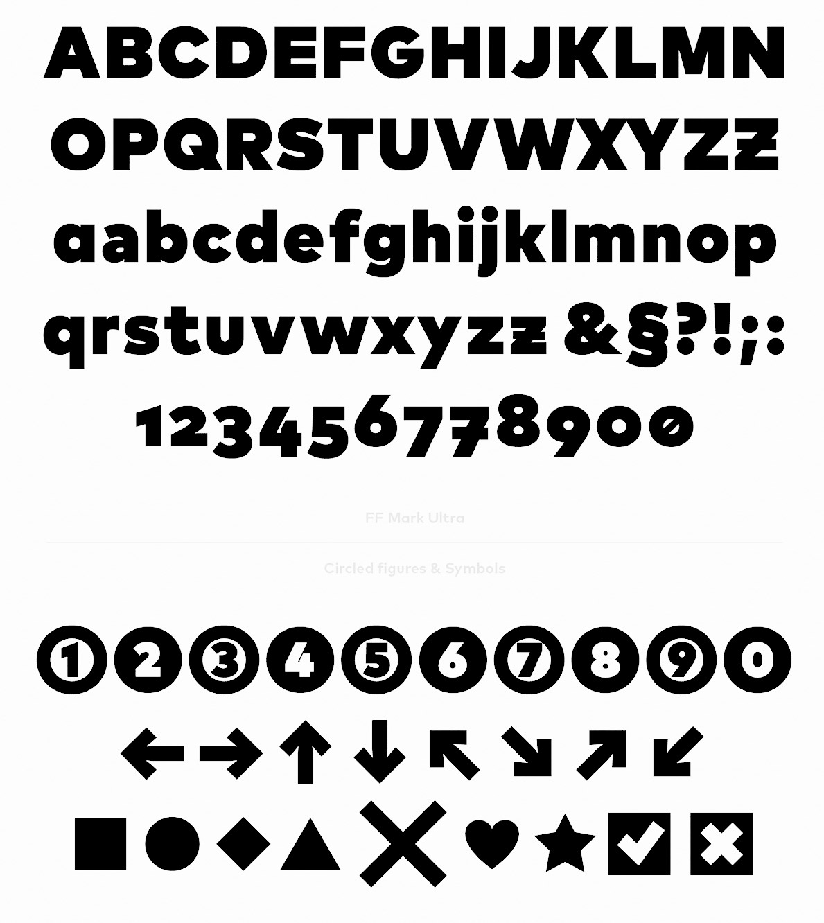
file name: Hannes Von Doehren Christoph Koeberlin F F Mark Ultra 2015
file name: Hannes Von Doehren Christoph Koeberlin F F Mark Ultra 2015b
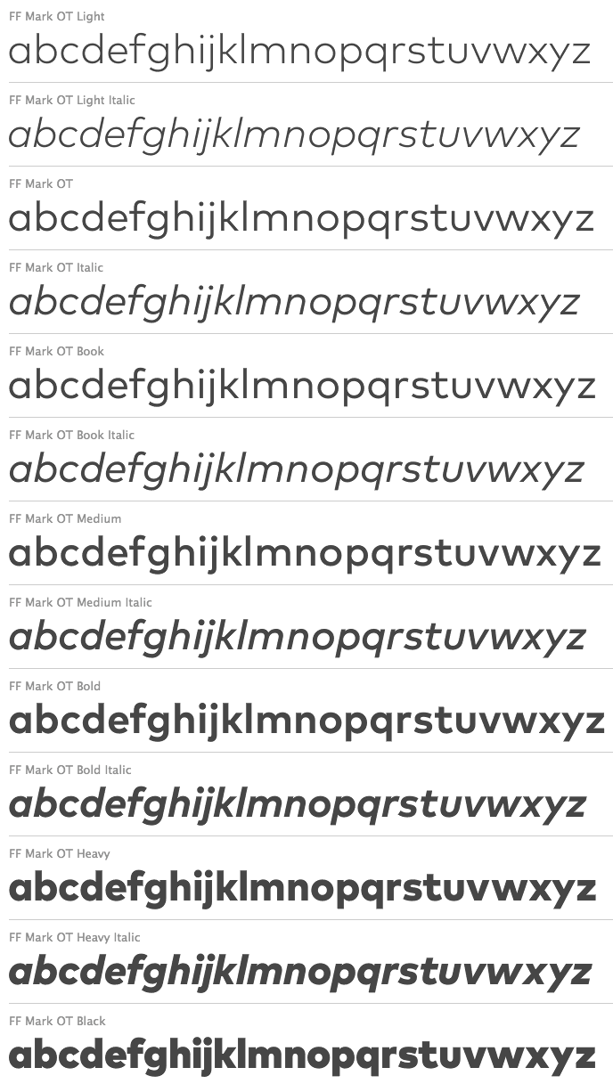
file name: Hannes Von Doehren Christoph Koeberlin F F Mark 2013t

file name: Hannes Von Doehren Christoph Koeberlin F F Mark Offc Bold 2013

file name: Hannes Von Doehren Christoph Koeberlin F F Mark Pro Hairline 2013

file name: Hannes Von Doehren Christoph Koeberlin F F Mark Pro Hairline 2013 H A I R
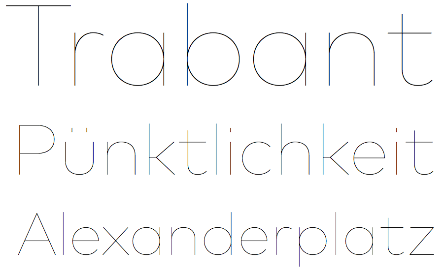
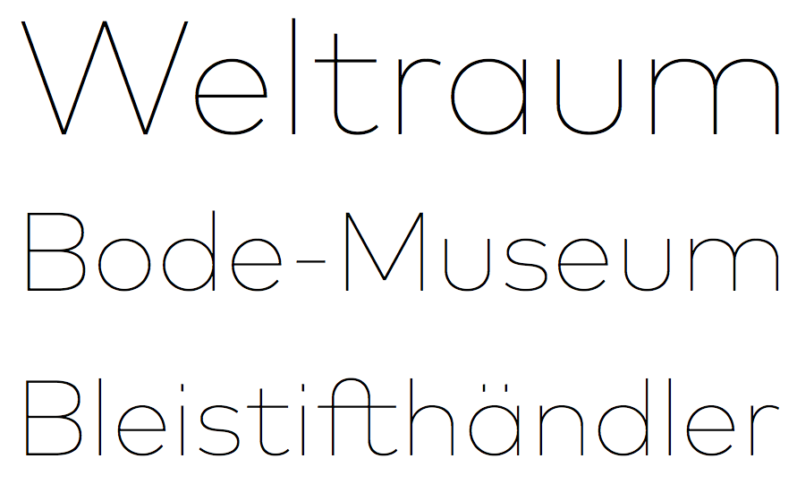
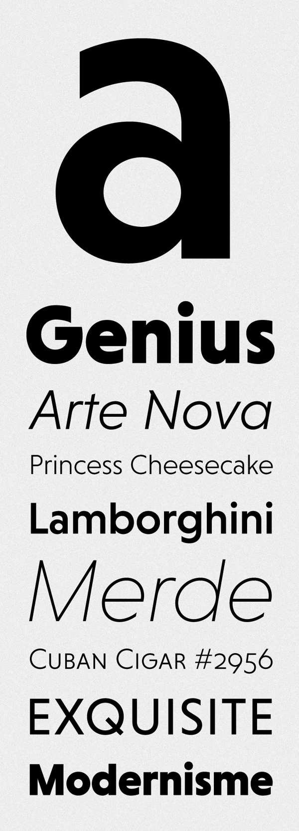
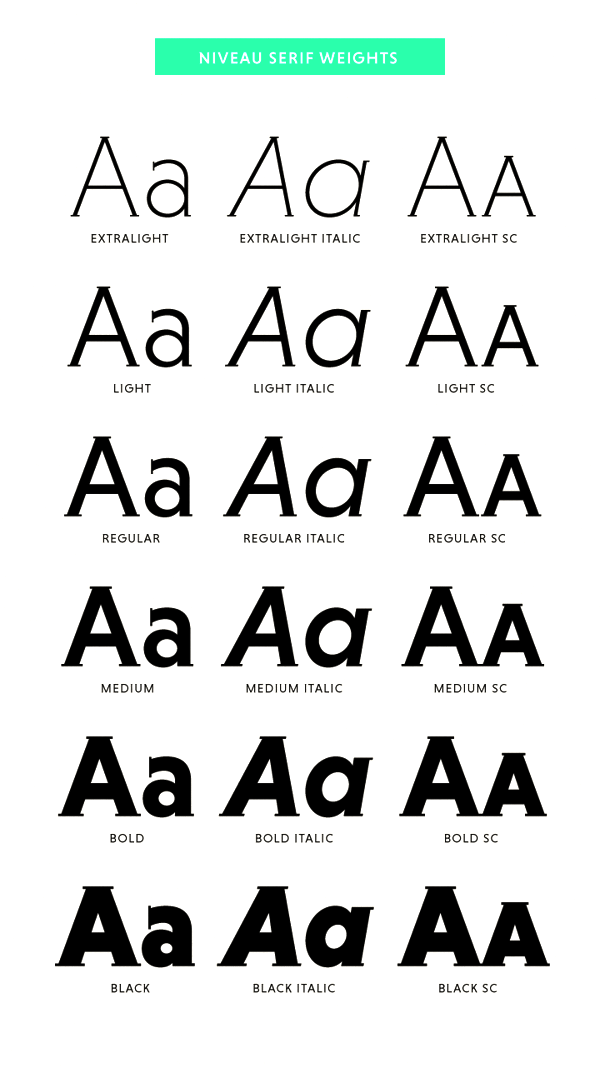
file name: Hannes Von Dohren Niveau Grotesk 2013
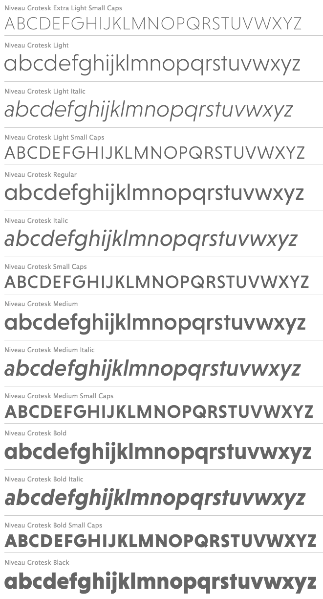
file name: Hannes Von Dohren Niveau Grotesk 2013c
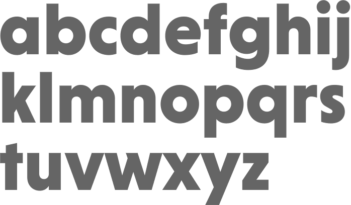
file name: Hannes Von Dohren Niveau Grotesk Black 2013
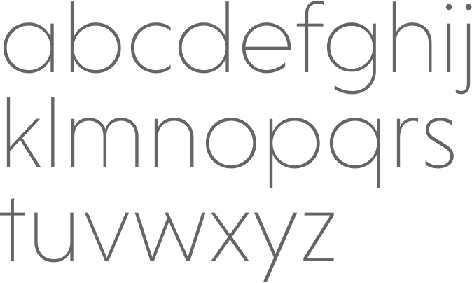
file name: Hannes Von Dohren Niveau Grotesk Extra Light 2013
file name: Hannes Von Dohren Niveau Grotesk 2013d
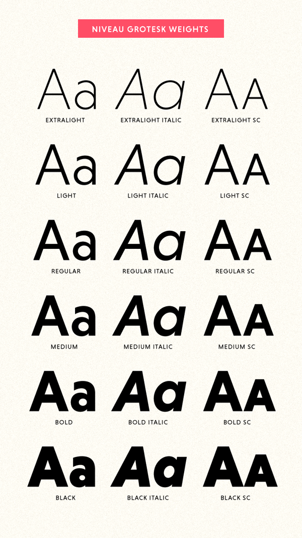
file name: Hannes Von Dohren Niveau Grotesk 2013e
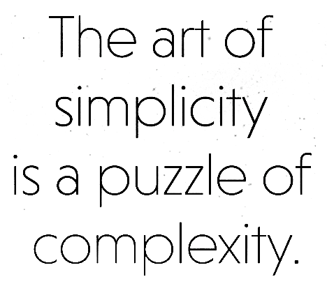
file name: Hannes Von Dohren Niveau Grotesk 2013f
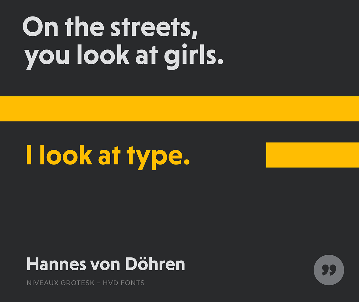
file name: Hannes Von Dohren Niveau Grotesk 2013 Poster by Bill Dawson 2015
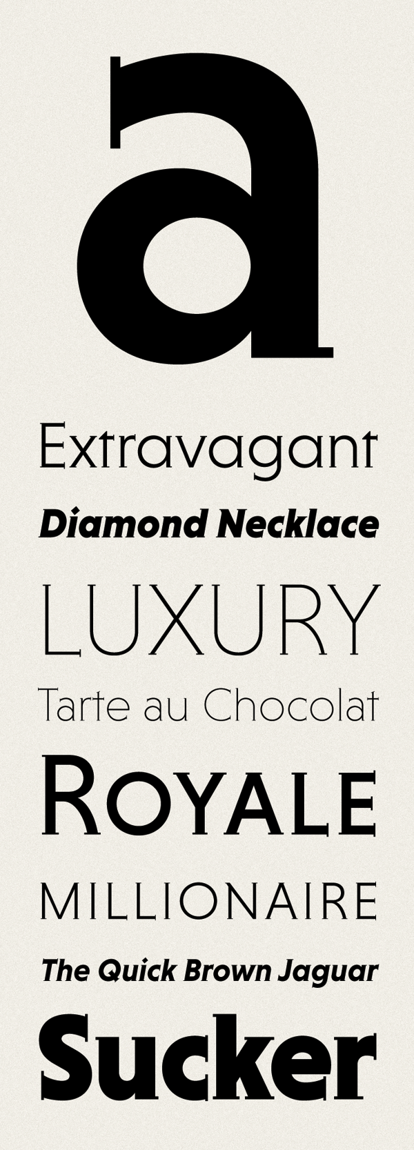
file name: Hannes Von Dohren Niveauserif 2013d
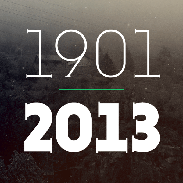
file name: Hannes Von Dohren Niveauserif 2013e
file name: Hannes Von Dohren Niveauserif 2013f

file name: Hannes Von Dohren Niveauserif 2013g

file name: Hannes Von Dohren Niveauserif 2013h

file name: Hannes Von Dohren Niveauserif 2013i
file name: Hannes Von Dohren Niveau Serif Black 2013

file name: Hannes Von Dohren Niveau Serif Medium 2013
file name: Hannes Von Doehren Diamonds 2012
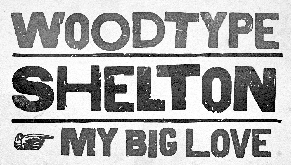
file name: Hannes Von Doehren Shelton 2012
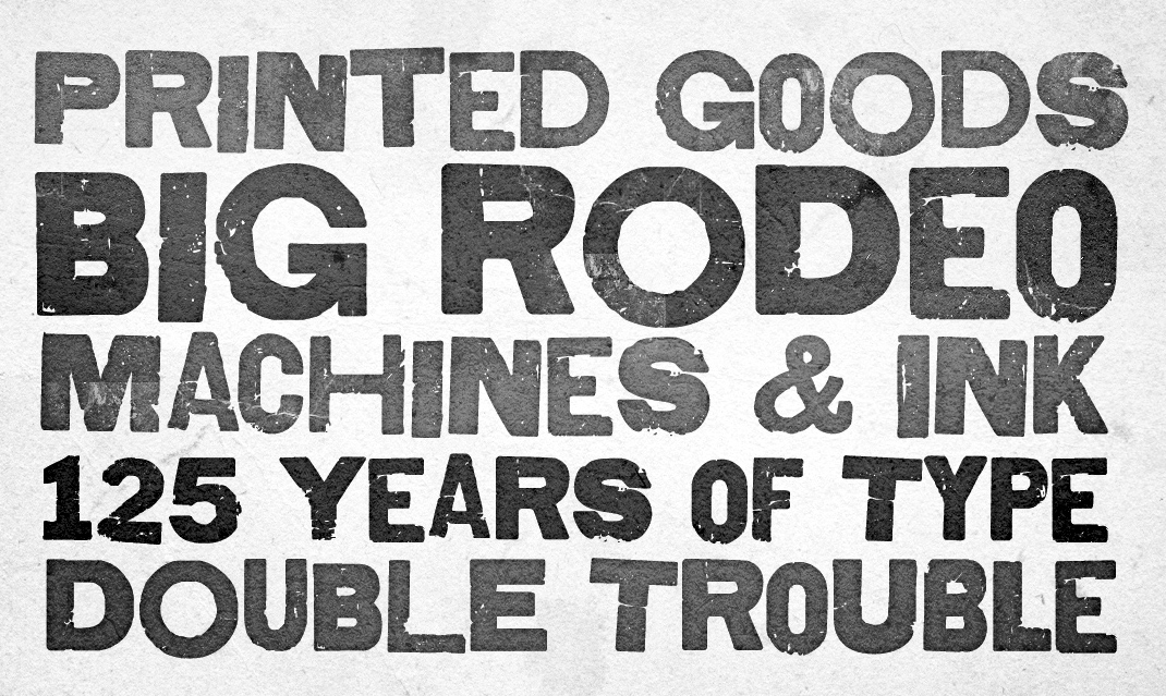
file name: Hannes Von Doehren Shelton 2012b
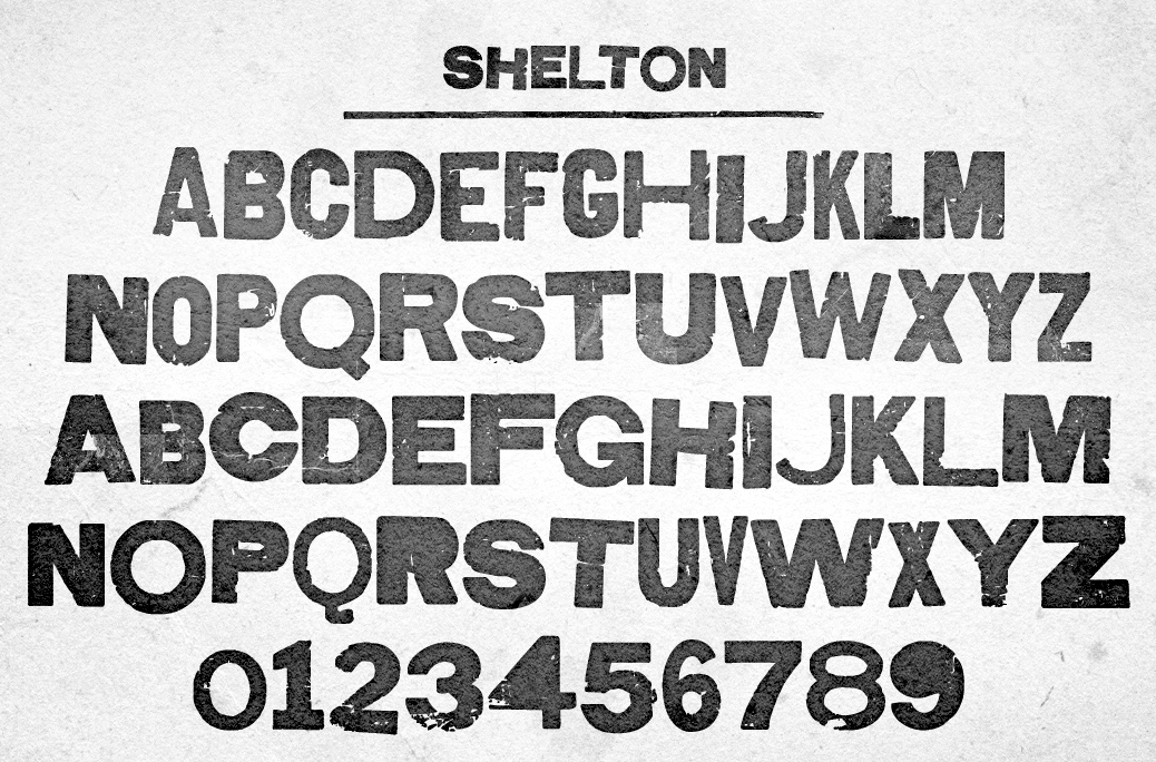
file name: Hannes Von Doehren Shelton 2012c
file name: Hannes Von Doehren Shelton 2012e
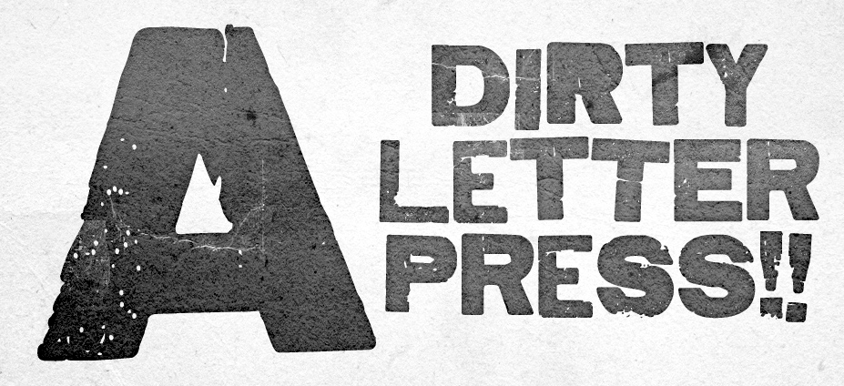
file name: Hannes Von Doehren Shelton Slab 2012b
file name: Hannes Von Doehren Shelton Slab 2012e

file name: Hannes Von Doehren Shelton Slab 2012

file name: H V D Fonts Reklame Script 2011

file name: Hannes Von Dohren Reklame Scrpt 2010

file name: Hannes Von Doehren Klint Rounded 2011
file name: Hannes Von Dohren Klint 2009 Poster by Jenna Schwarz 2016
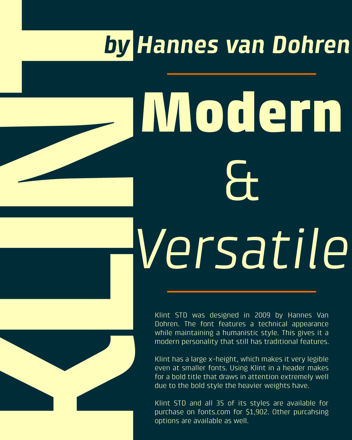
file name: Hannes Van Dohren Klint 2009 Poster by Curtis Lowe 2016
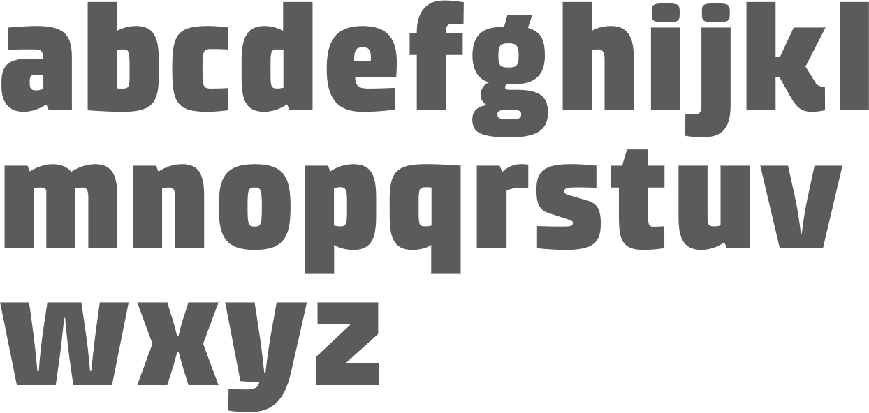
file name: Hannes Van Dohren Klint 2009b

file name: Hannes Van Dohren Klint 2009c

file name: Hannes Van Dohren Klint 2009d

file name: Hannes Van Dohren Klint 2009e
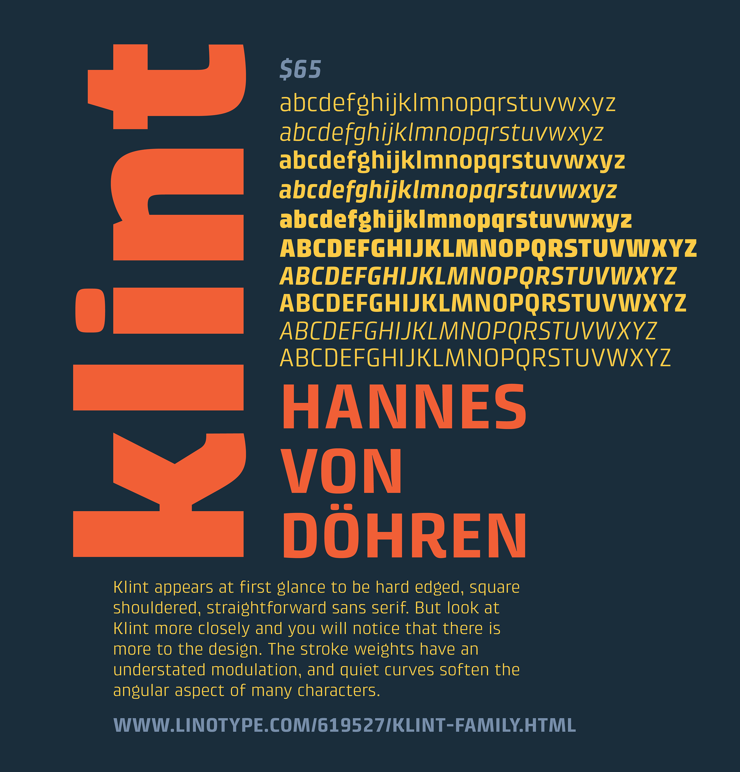
file name: Hannes Von Dohren Klint 2009 Poster by Cody Thomas 2019
file name: Hannes Von Doehren Supria Sans 2011

file name: Hannos Von Doehren Supria Sans Black 2011
file name: Hannes Von Doehren Pic
file name: Hans Van Dohren Brevia 2010
file name: Hannes Von Doehren Brevia

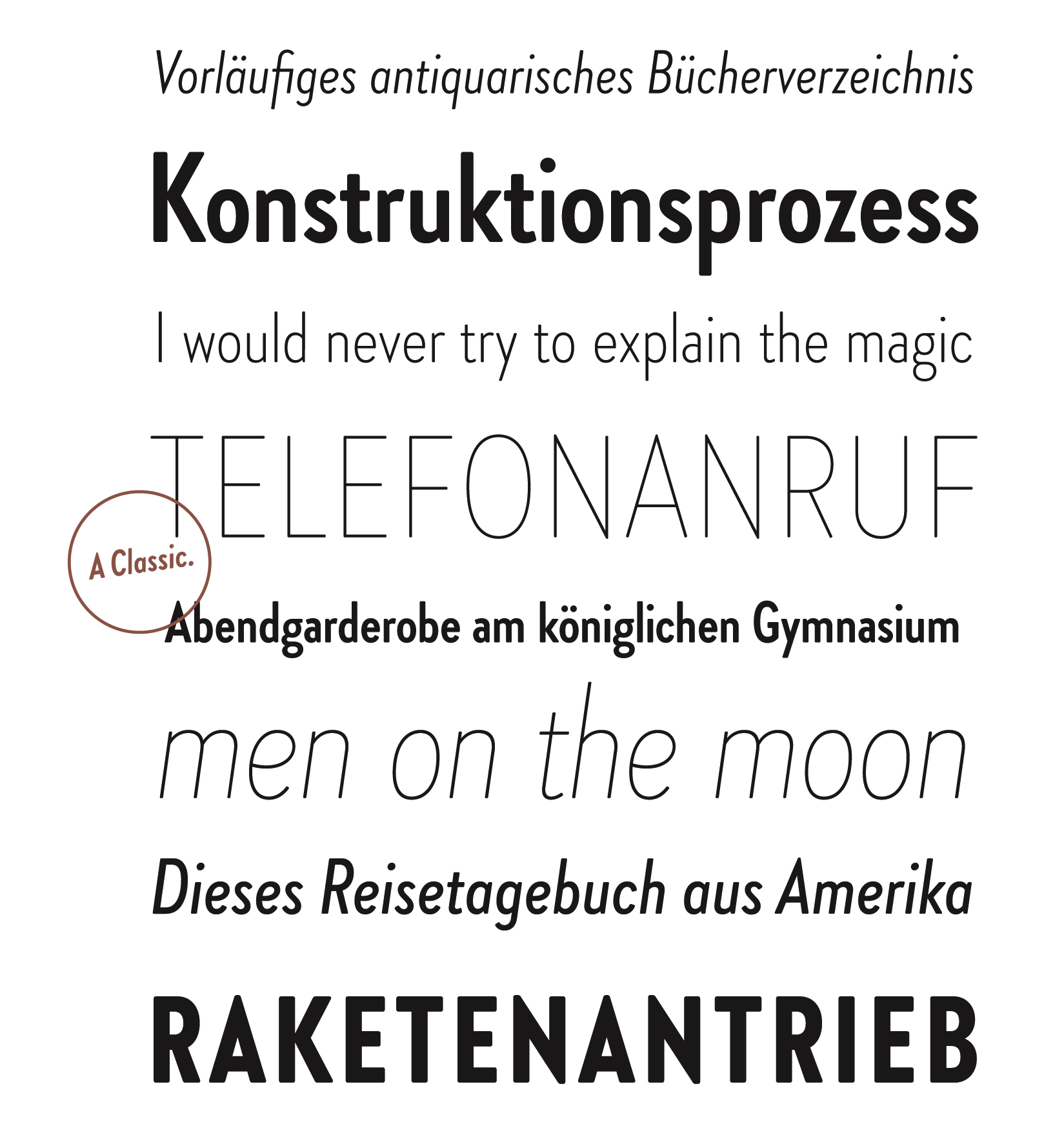
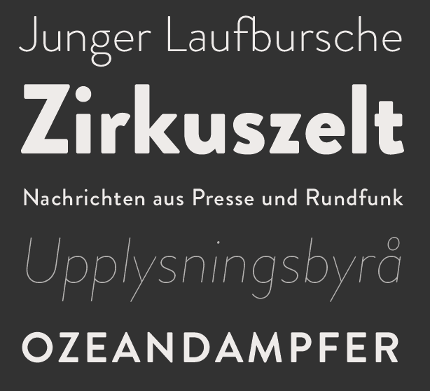
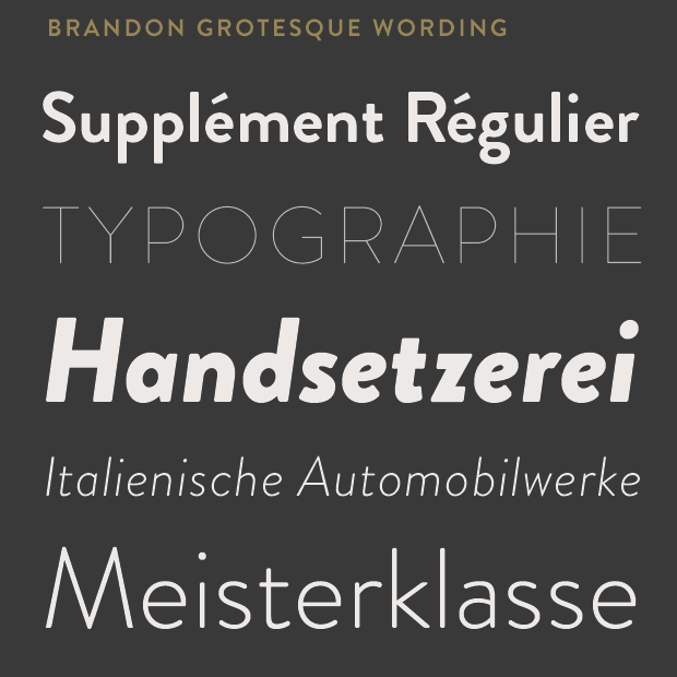
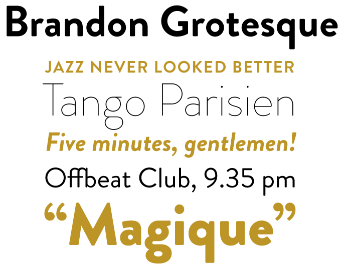
file name: H V D Fonts Brandon Grotesque 2011
file name: Hannes Von Doehren Brandon Grotesque Condensed 2018 280188

file name: Hannes Von Doehren Brandon Grotesque Condensed 2018 280190
file name: Hannes Von Doehren Brandon Grotesque Condensed 2018 280191
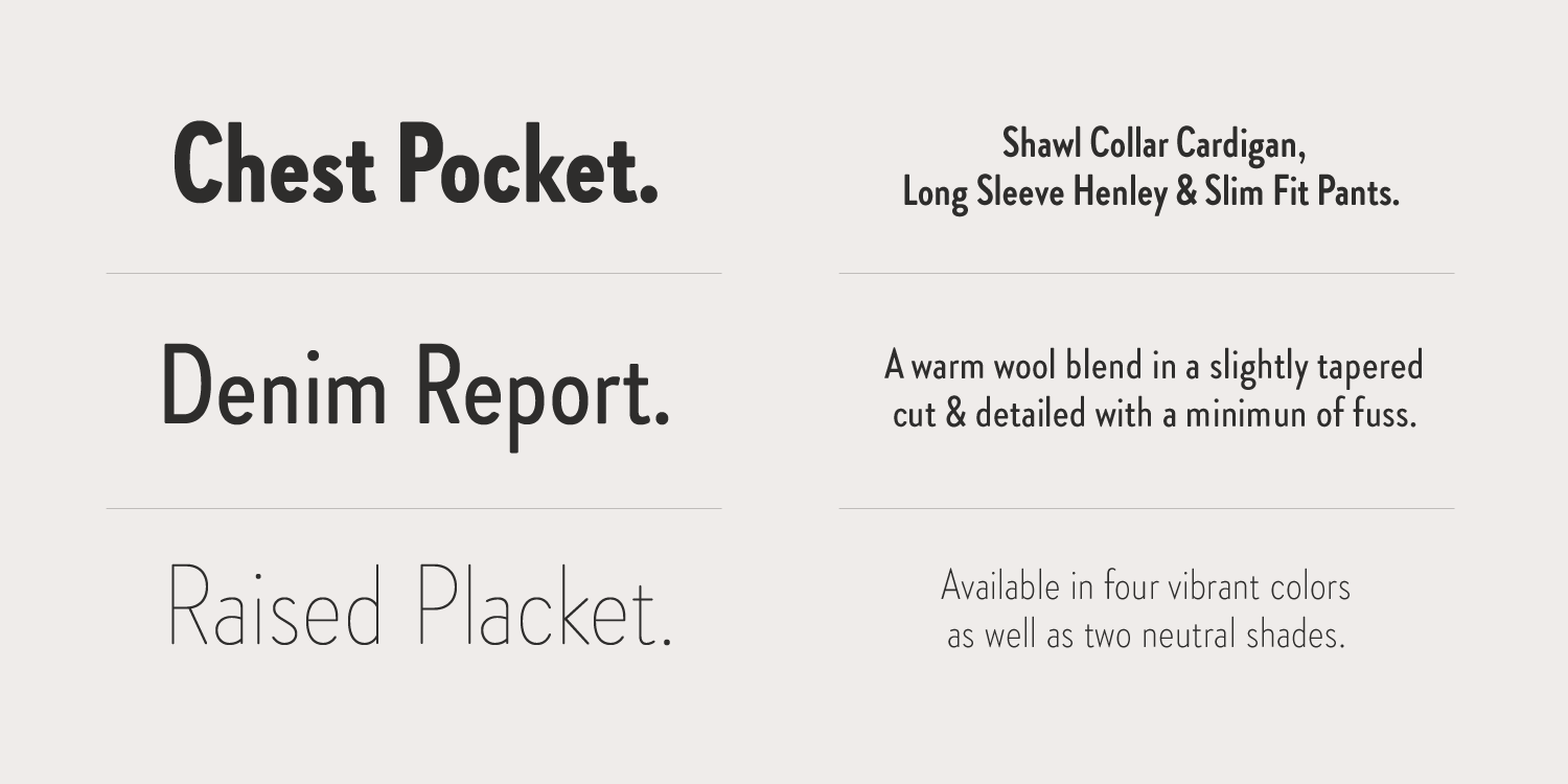
file name: Hannes Von Doehren Brandon Grotesque Condensed 2018 280192
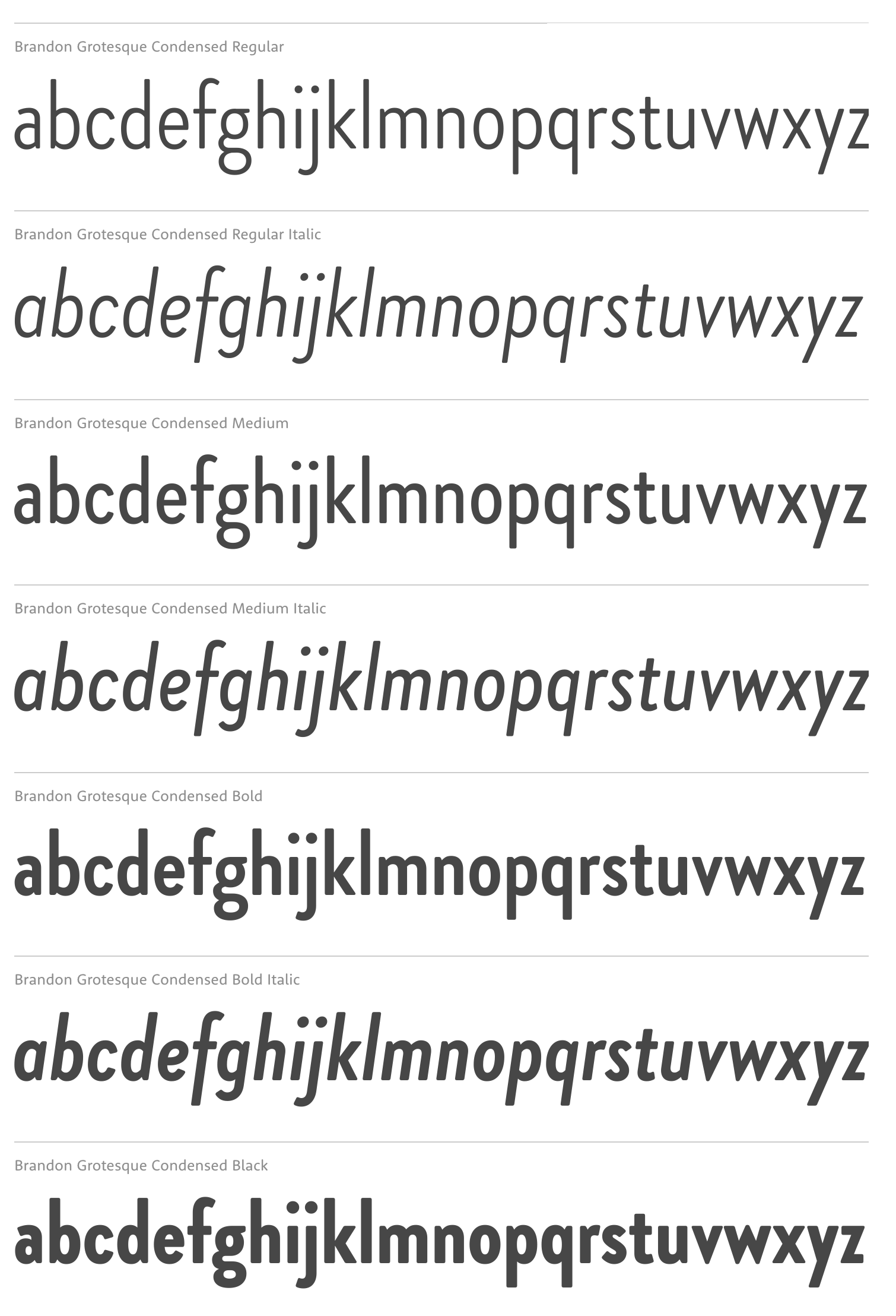
file name: Hannes Von Doehren Brandon Grotesque Condensed 2018b

file name: Hannes Von Doehren Brandon Grotesque Condensed 2018
file name: Hannes Von Doehren Brandon Grotesque Condensed 2018
file name: Hannes Von Dohren Brandon Grotesque 2010
file name: Hannes Von Doehren Brandon Grotesque 2012h
file name: Hannes Von Doehren Brandon Grotesque 2012i
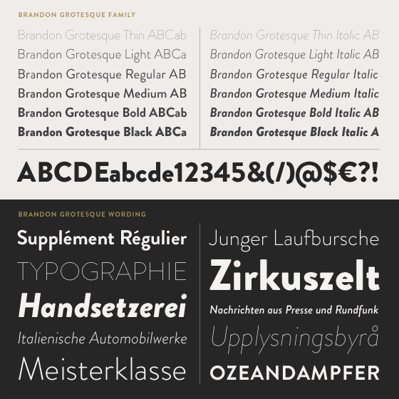
file name: Hannes Von Doehren Brandon Grotesque 2010

file name: Hannes Von Doehren Brandon Grotesque Bold 2010

file name: Hannes Von Doehren Brandon Grotesque Medium 2010

file name: Hannes Von Doehren Brandon Grotesque Thin 2010
file name: Hannes Von Doehren Brandon Grotesque 2010h
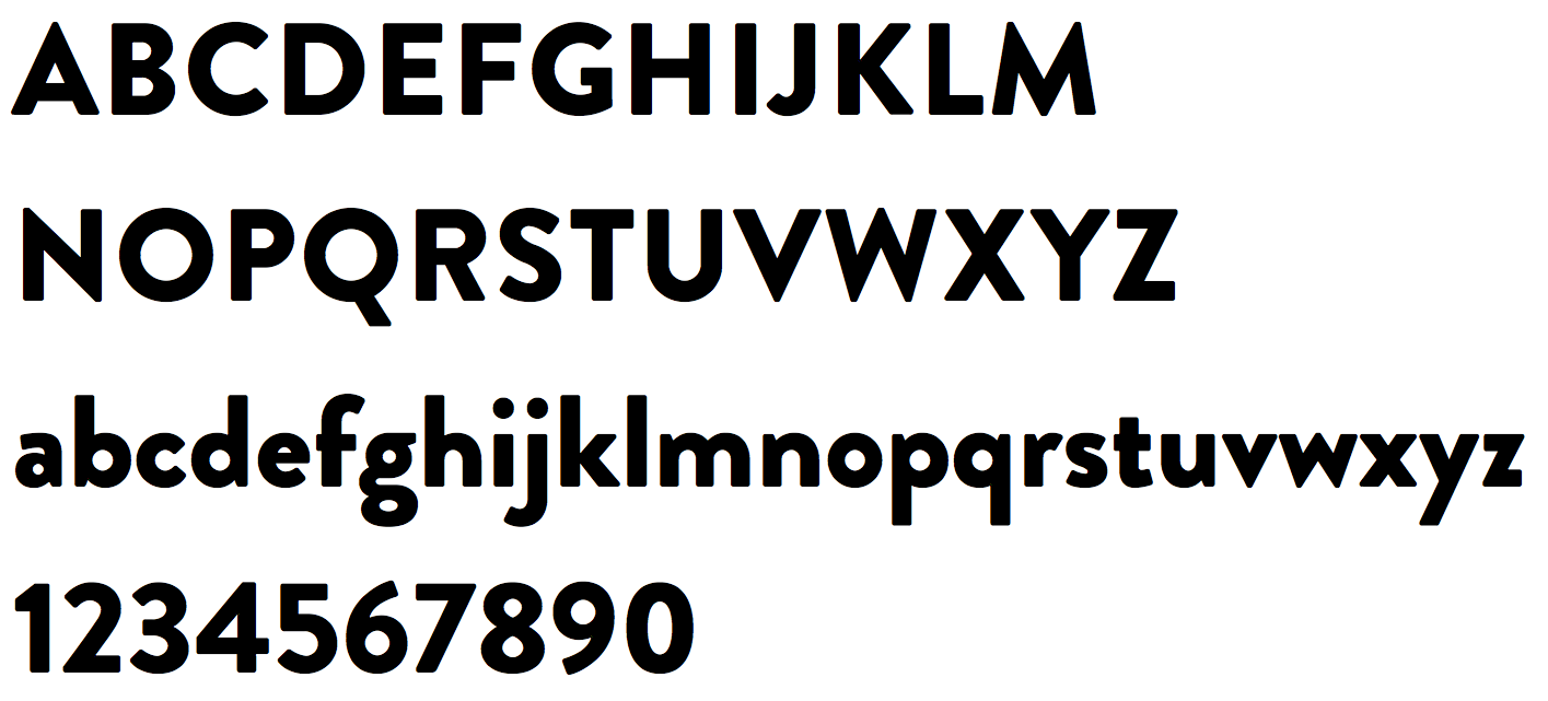
file name: Hannes Von Doehren Brandon Grotesque Black
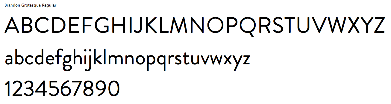
file name: Hannes Von Doehren Brandon Grotesque Regular
file name: Hannes Von Doehren Brandon Grotesque 2010 Poster by Daniela Alves 2019
file name: H V D Fonts Brandon Grotesque 2010 Poster by Diego Gomes 2012
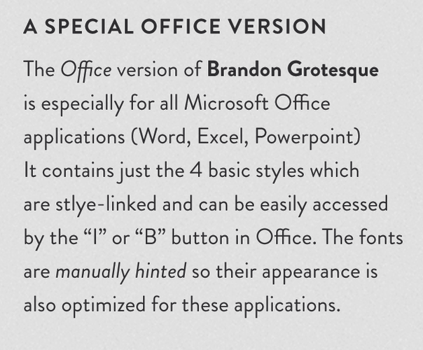
file name: H V D Fonts Brandon Grotesque Office 2015 192379
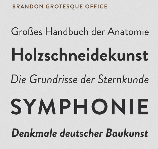
file name: H V D Fonts Brandon Grotesque Office 2015 192379

file name: H V D Fonts Brandon Grotesque Office 2015 192380

file name: H V D Fonts Brandon Grotesque Office 2015

file name: H V D Fonts Brandon Grotesque Office Bold 2015

file name: Hannes Von Doehren Brandon Printed 2014
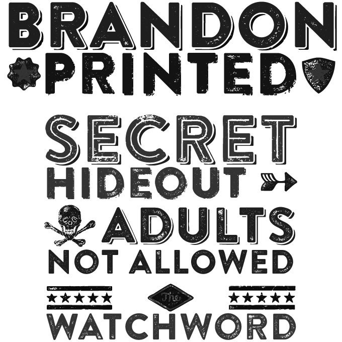
file name: Hannes Von Doehren Brandon Printed 2014f
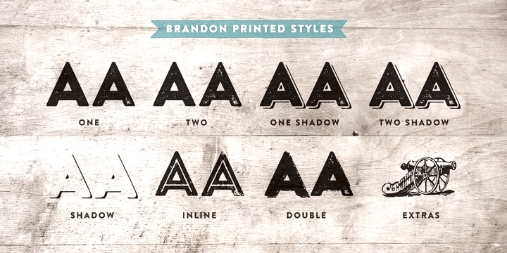
file name: Hannes Von Doehren Brandon Printed 2014b

file name: Hannes Von Doehren Brandon Printed 2014c
file name: Hannes Von Doehren Brandon Printed Inline 2014
file name: Hannes Von Doehren Brandon Printed One 2014
file name: Hannes Von Doehren Brandon Printed One Shadow 2014

file name: H V D Fonts Brandon Text Condensed 2020 1
file name: H V D Fonts Brandon Text Condensed 2020 2
file name: H V D Fonts Brandon Text Condensed 2020 4

file name: H V D Fonts Brandon Text Condensed 2020

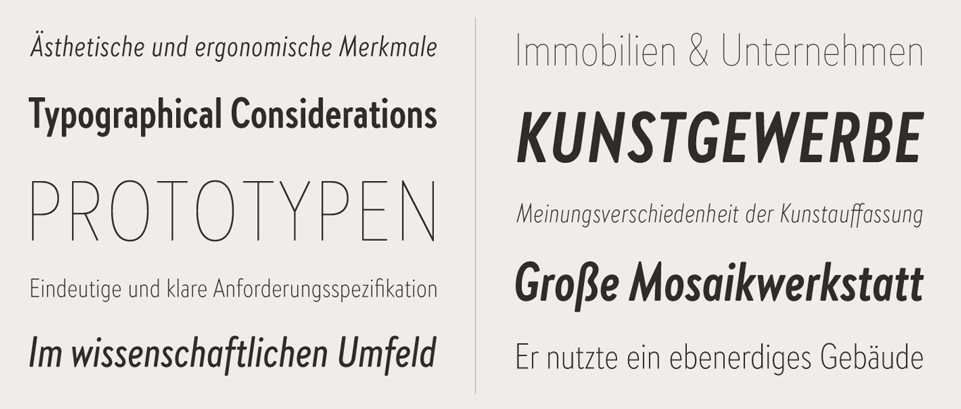
file name: Hannes Von Doehren Brandon Text 2013
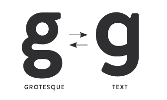
file name: Hannes Von Doehren Brandon Text 2013b

file name: Hannes Von Doehren Brandon Text 2013c
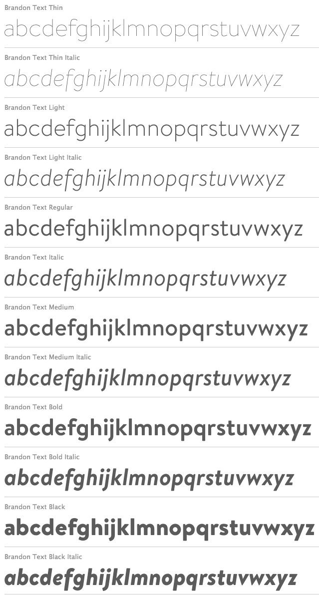
file name: Hannes Von Doehren Brandon Text 2013h
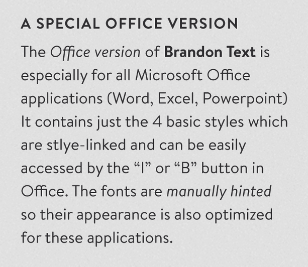
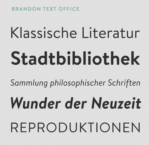
file name: H V D Fonts Brandon Text Office 2015 192382
file name: H V D Fonts Brandon Text Office 2015 192382

file name: H V D Fonts Brandon Text Office 2015 192383

file name: H V D Fonts Brandon Text Office 2015
file name: Hannes Von Doehren Brandon Text Black 2013

file name: Hannes Von Doehren Brandon Text Black 2013b
file name: Hannes Von Doehren Brandon Text Regular 2013

file name: Hannes Von Doehren Pic
file name: H V D Quench L T Pro
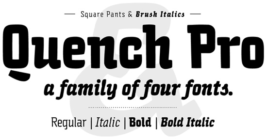
file name: Hannes Von Dohren Quench Pro2009
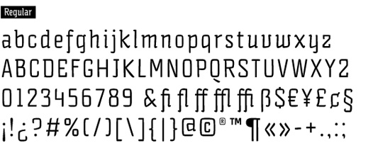
file name: Hannes Von Dohren Quench Pro2009b
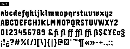
file name: Hannes Von Dohren Quench Pro2009c
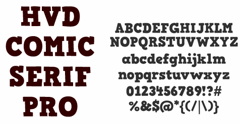
file name: Hans Van Dohren H V D Comic Serif
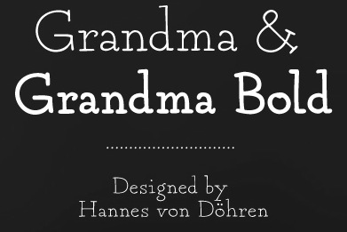
file name: Hannes Von Dohren Grandma 2009

file name: H V D Bodedo2009c
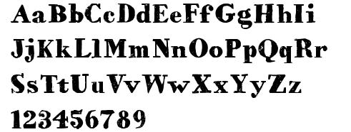
file name: Hans Van Dohren H V D Bodedo Medium
file name: H V D Bodedo2009

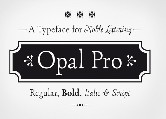
file name: Hannes Von Dohren Opal2009

file name: Hannes Van Doehren Opal 2008

file name: Hannes Von Dohren Opal2009 2
file name: Hannes Von Dohren Opal2009
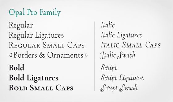
file name: Hannes Von Dohren Opal2009b
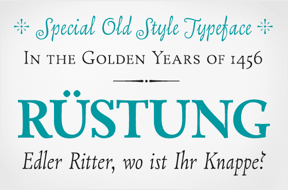
file name: Hannes Von Dohren Opal2009c
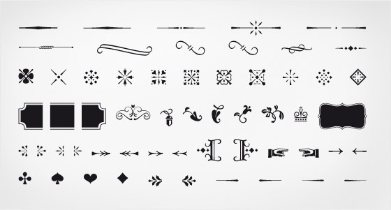
file name: Hannes Von Dohren Opal2009d
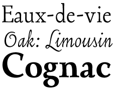
file name: Hannes Von Dohren Opal2009e
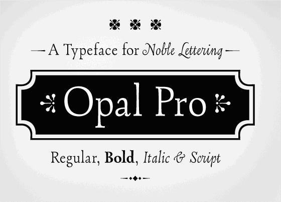
file name: Hannes Von Dohren Opal Pro 2009
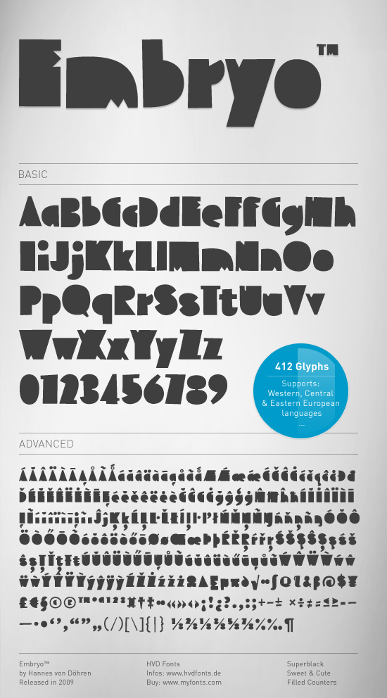
file name: Hannes Von Dohren Embryo2009
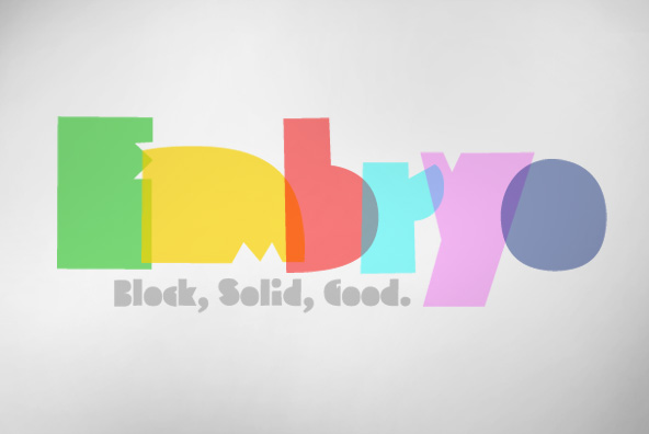
file name: H V D Embryo
file name: Hannes Von Doehren Embryo Open 2009
file name: Hannes Von Doehren Embryo Tiny 2013
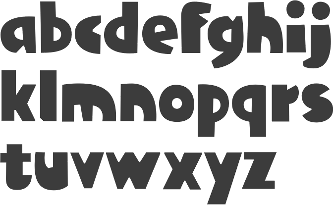
file name: Hannes Van Dohren Klint 2009
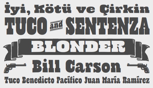
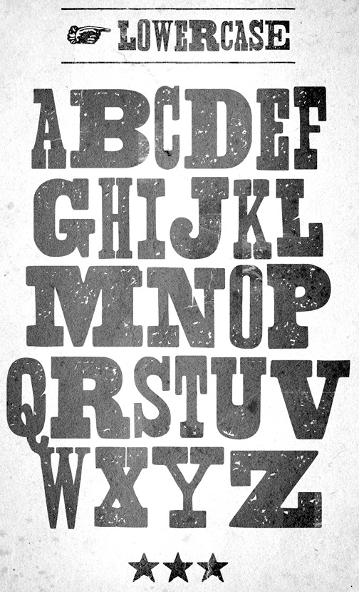
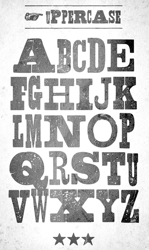
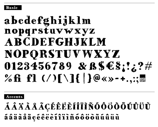
file name: Hannes Von Doehren Cowboyslang 2009
file name: Hannes Von Doehren Cowboyslang 2010
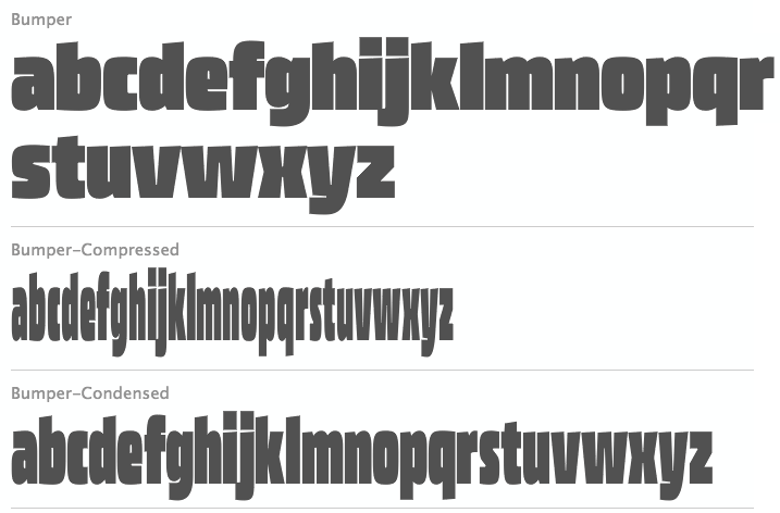
file name: Hannes Von Doehren Bumper 2009d
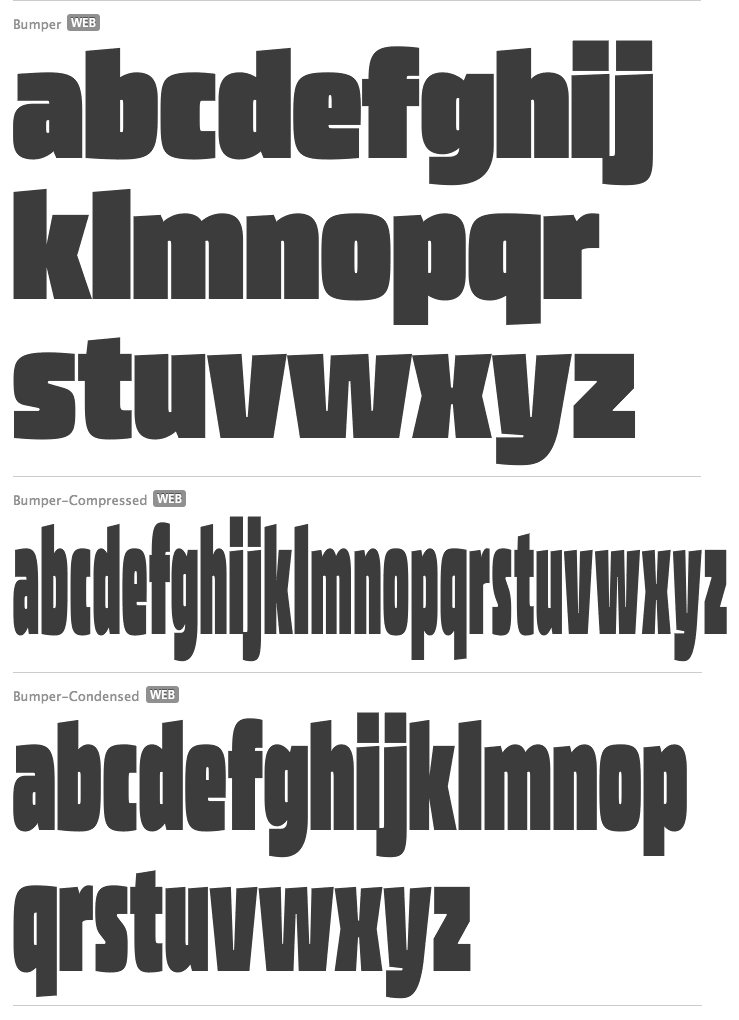
file name: Hannes Von Doehren Bumper 2009
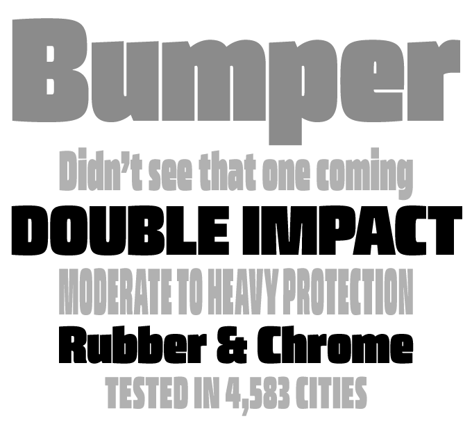
file name: Hans Van Dohren H V D Bumper 2009
file name: H V D Fonts Livory 2011

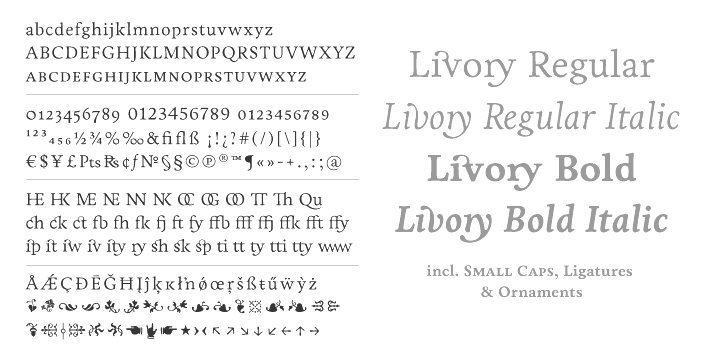
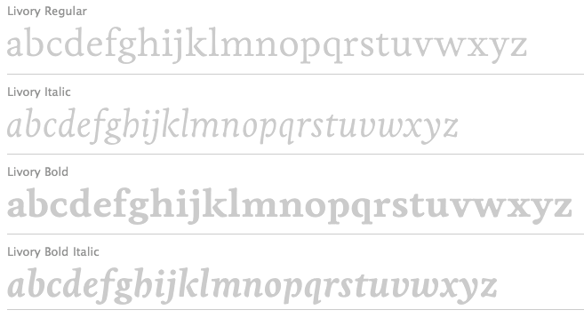
file name: Hannes Von Doehren Livius Dietzel Livory 2010
file name: Hannes Von Doehren Livius Dietzel Livory 2010b
file name: Hannes Von Doehren Livius Dietzel Livory 2010c
file name: Hannesvon Dohren Livius Dietzel I T C Chino 2009d

file name: Hannesvon Dohren Livius Dietzel I T C Chino 2009e
file name: Hannesvon Dohren Livius Dietzel I T C Chino 2009c
| | |
|
Luc Devroye ⦿ School of Computer Science ⦿ McGill University Montreal, Canada H3A 2K6 ⦿ lucdevroye@gmail.com ⦿ https://luc.devroye.org ⦿ https://luc.devroye.org/fonts.html |