TYPE DESIGN INFORMATION PAGE last updated on Mon Mar 9 16:34:59 EDT 2026
FONT RECOGNITION VIA FONT MOOSE

|
|
|
|
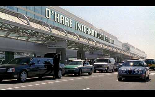
Chicago O'Hare
[Matt Soar]
Matt Soar points out a good one: the O'Hare airport sign is set in the typeface Chicago: There's a scene early on in the movie Meet the Fockers where Ben Stiller and his bride-to-be fly off to see her parents. The establishing shot (above) cleverly reminds us exactly which city they're leaving. Which brings us to the big, helpful sign: first, it was clearly comped in during post-production; and, second, it's typeset in, wait for it, Chicago. Now there's inspired design for you. Chicago - the font, not the city - was designed in 1983 as a system font for the Apple Macintosh by Susan Kare. Its design has absolutely nothing to do with the city of the same name. In fact, according to Kare herself, the set of fonts she designed for Apple "were named after Philadelphia suburbs", until management decided otherwise. The moral, as ever, is: don't select type based on its name. |
EXTERNAL LINKS |
| | |
file name: Meet The Fockers
| | |
|
Luc Devroye ⦿ School of Computer Science ⦿ McGill University Montreal, Canada H3A 2K6 ⦿ lucdevroye@gmail.com ⦿ https://luc.devroye.org ⦿ https://luc.devroye.org/fonts.html |