TYPE DESIGN INFORMATION PAGE last updated on Mon May 5 19:51:09 EDT 2025
FONT RECOGNITION VIA FONT MOOSE

|
|
|
|
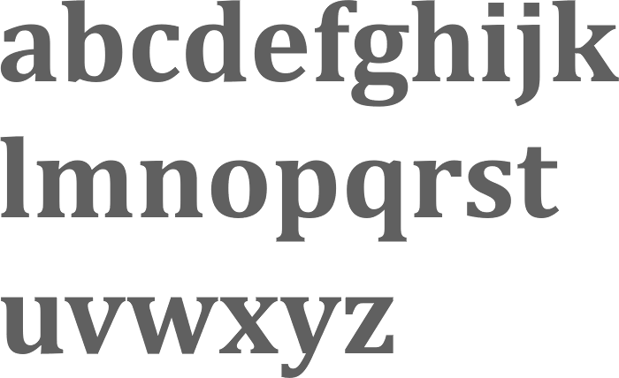
Cambria, Constantia, Times New Roman
A legibility study in 2006 at Wichita State University (Kansas) by Barbara S. Chaparro, A. Dawn Shaikh and Alex Chaparro shows that Cambria is more legible than Constantia, and both are far more legible than Times New Roman. |
EXTERNAL LINKS |
| | |
file name: Jelle Bosma Steve Matteson Robin Nicholas Cambria Bold 2006
| | |
|
Luc Devroye ⦿ School of Computer Science ⦿ McGill University Montreal, Canada H3A 2K6 ⦿ lucdevroye@gmail.com ⦿ https://luc.devroye.org ⦿ https://luc.devroye.org/fonts.html |