TYPE DESIGN INFORMATION PAGE last updated on Sat Jul 20 14:12:16 EDT 2024
FONT RECOGNITION VIA FONT MOOSE

|
|
|
|
A Comparison of Popular Online Fonts: Which is Best and When?
A study in 2007 at Wichita State University (Kansas) by Michael Bernard, Melissa Mills, Michelle Peterson and Kelsey Storrer compared these font types: Agency FB (Agency), Arial, Comic Sans, Tahoma, Verdana, Courier New (Courier), Georgia, Goudy Old Style (Goudy), Century Schoolbook (Schoolbook), Times New Roman (Times), Bradley Hand ITC (Bradley), Monotype Corsiva (Corsiva). They conclude: First, no significant difference in actual legibility between the font types were detected. There were, however, significant differences in reading time, but these differences may not be that meaningful for most online text because these differences were not substantial. It may, on the other hand, be helpful to consider using font types that are perceived as being legible. In this study, the font types that were perceived as being most legible were Courier, Comic, Verdana, Georgia, and Times. Courier and Times were perceived as being the most business-like, whereas Comic was perceived as being the most fun and youthful. |
EXTERNAL LINKS |
| | |
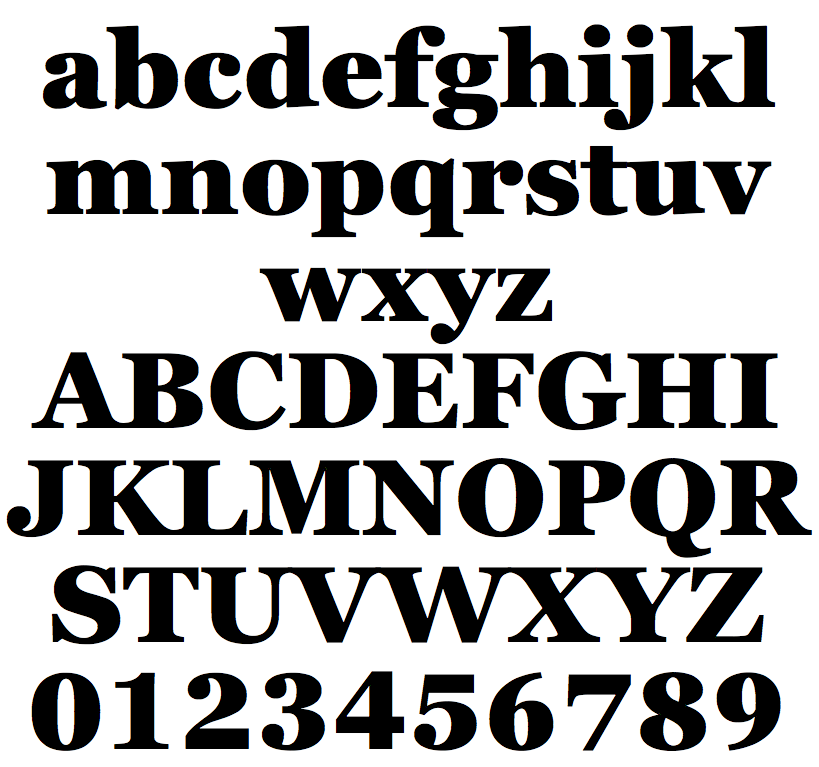
file name: Matthew Carter Font Bureau Georgia Heavy 2011

file name: Matthew Carter Font Bureau Georgia Heavy 2011b
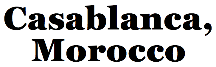
file name: Matthew Carter Font Bureau Georgia Heavy 2011c
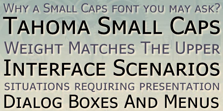
file name: Matthew Carter Tahoma 1994 23177
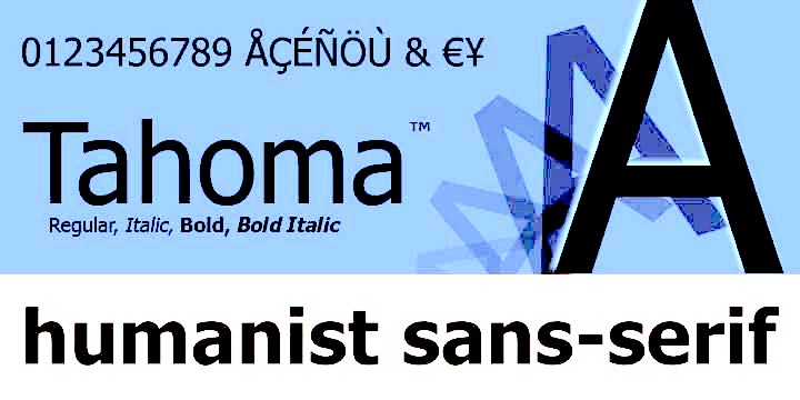
file name: Matthew Carter Tahoma 1994 44933

file name: Matthew Carter Tahoma 1994

file name: Matthew Carter Tahoma 1994a
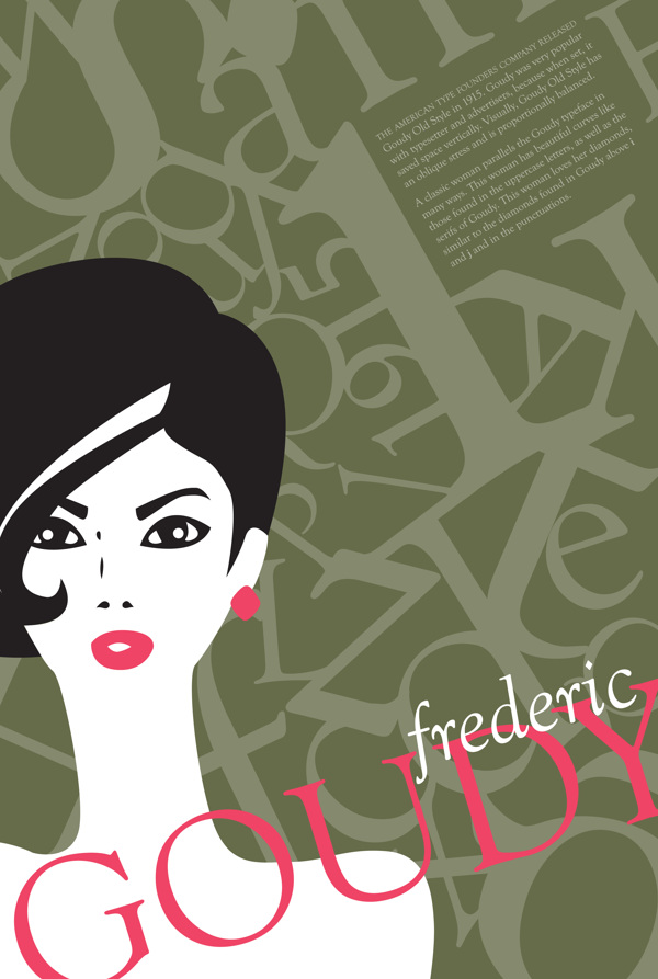
file name: Frederic Goudy Goudy Old Style 1915 Poster by Maddie Simon 2013
| | |
|
Luc Devroye ⦿ School of Computer Science ⦿ McGill University Montreal, Canada H3A 2K6 ⦿ lucdevroye@gmail.com ⦿ http://luc.devroye.org ⦿ http://luc.devroye.org/fonts.html |