TYPE DESIGN INFORMATION PAGE last updated on Fri Dec 13 00:49:11 EST 2024
FONT RECOGNITION VIA FONT MOOSE
|
|
|
|
Slovak designer who lives in Bratislava. He created the sans typefaces Deva Ideal (2007, 10 styles dedicated to the beauty of women! See also here) and Poleno Sans (2007), a great custom typeface with the broken look of Preissig's old typefaces and poster type. Poleno was originally designed in 2006 for the Slovak folk dance ensemble Poleno, as a part of their corporate identity. It has 12 styles now. Dezen (2010) is a contemporary, mechanical grotesque typeface family. It includes a Stencil subfamily. Komu (2010) is constructivist. His graduation project at the Type and Media MA program of KABK was Preto (2009), a multilingual type family which explores the impact of serifs in legibility and readability (+Sans, +Sans Basic). He says: The three core styles that structure the family (sans, semi and serif) are particularly useful in the context of multilingual typesetting to achieve an even colour in equivalent texts written in different languages. In 2010, he created Rukou, a script that reminds me of Sütterlin. In 2011, he made Anca (playful rounded monoline sans). Typefaces from 2013: Preto Serif, Razom Script (an angular monoline script). Typefaces from 2014: Preto Semi. Typefaces from 2015: Kontrast Grotesk (Display, Grande). In 2016, Cesar Puertas and Jan Filipek co-designed the newspaper typeface Bagatela for La Republica. In 2018, he published Nakoso. In 2019, Martina Rozinajova and Jan Filipek co-designed the Slovak school writing font Skolske Pismo. MyFonts link. Behance link. Cargocollective link. Fontspring link. |
EXTERNAL LINKS |
| | |
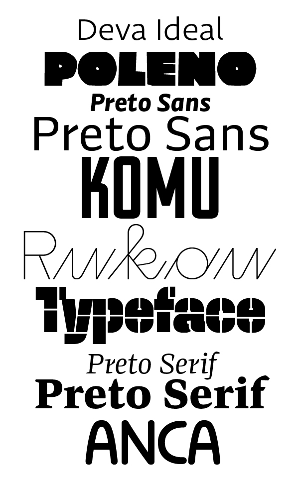
file name: Jan Filipek Catalog
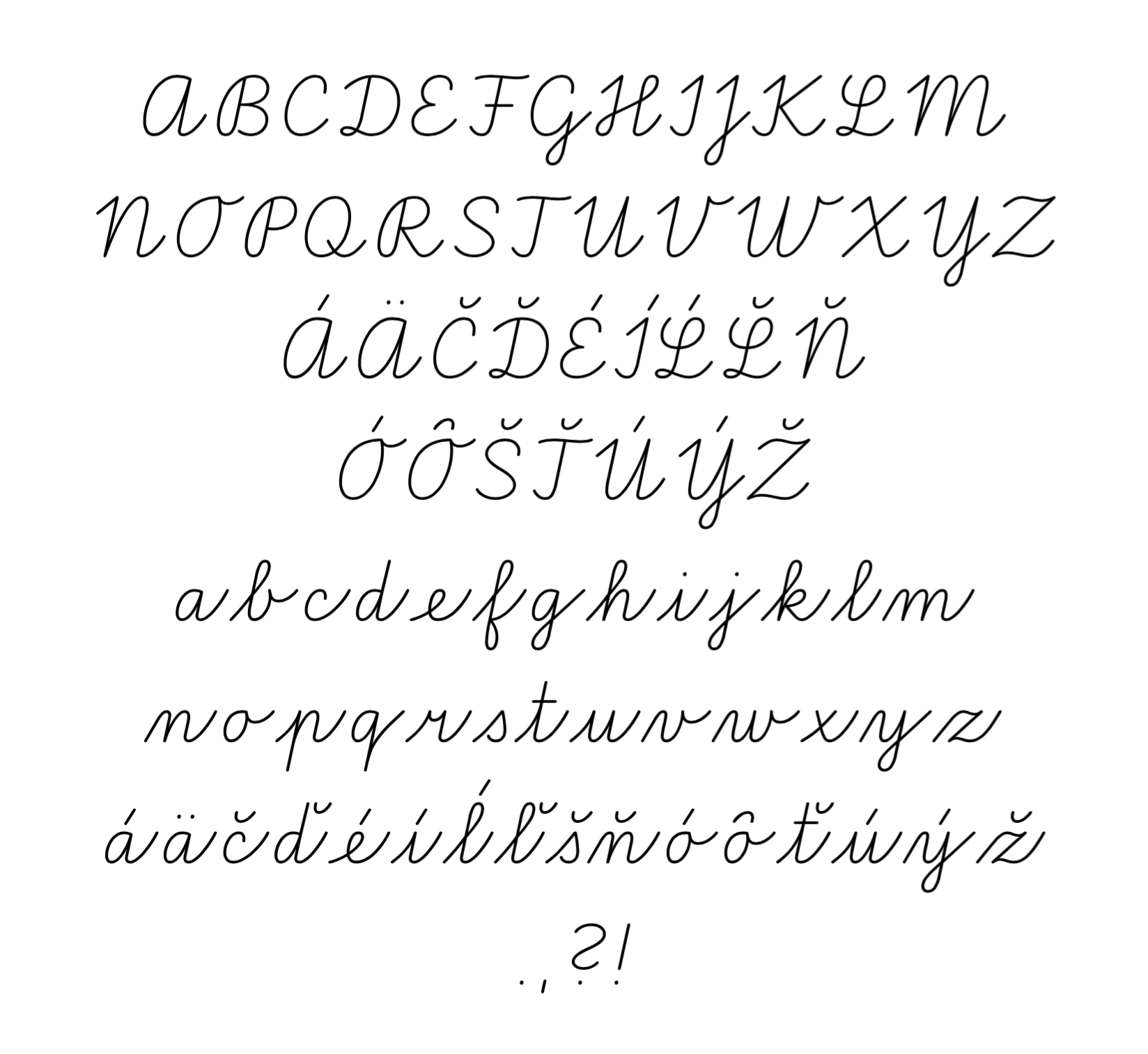
file name: Martina Rozinajova Jan Filipek Skolske Pismo 2019
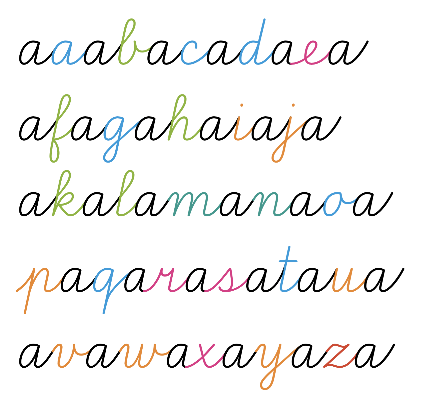
file name: Martina Rozinajova Jan Filipek Skolske Pismo 2019
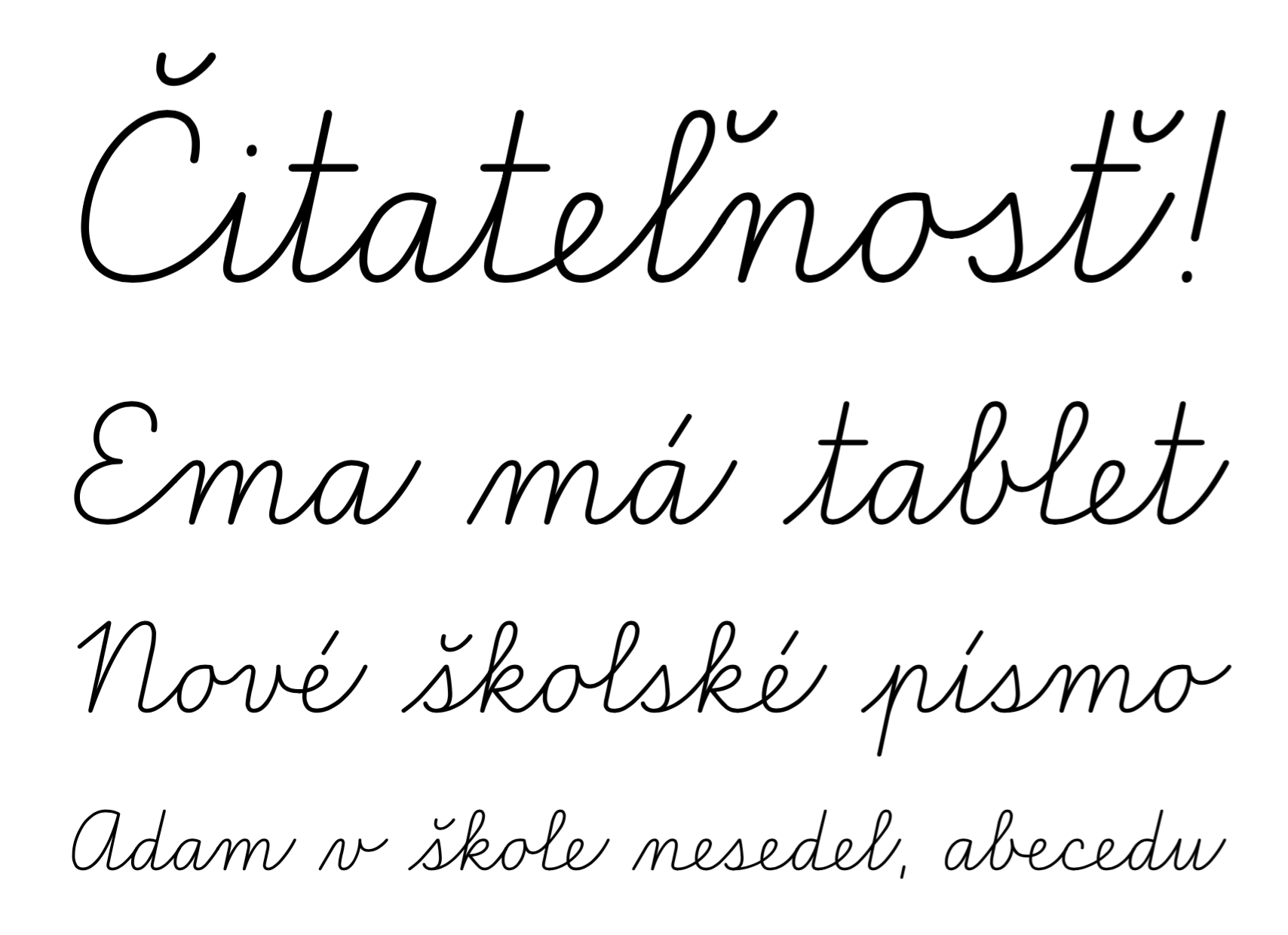
file name: Martina Rozinajova Jan Filipek Skolske Pismo 2019
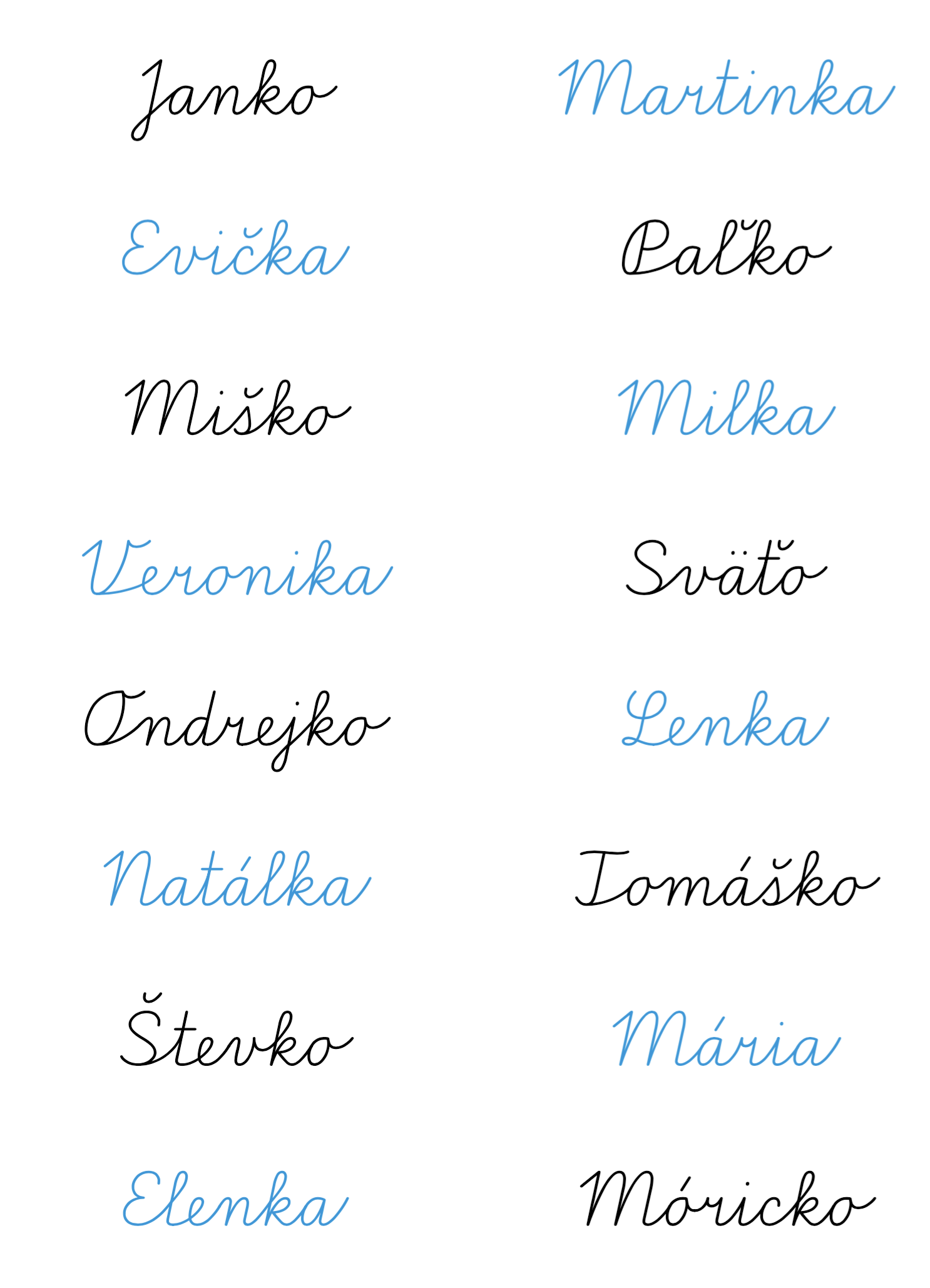
file name: Martina Rozinajova Jan Filipek Skolske Pismo 2019

file name: Martina Rozinajova Jan Filipek Skolske Pismo 2019
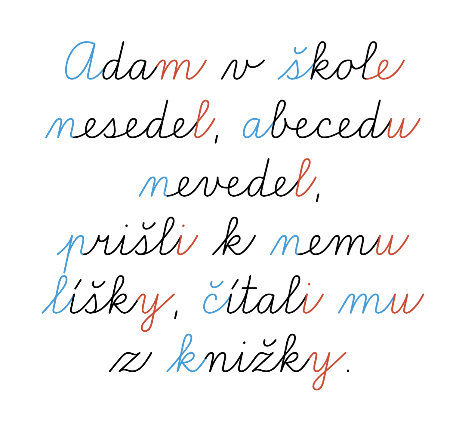
file name: Martina Rozinajova Jan Filipek Skolske Pismo 2019
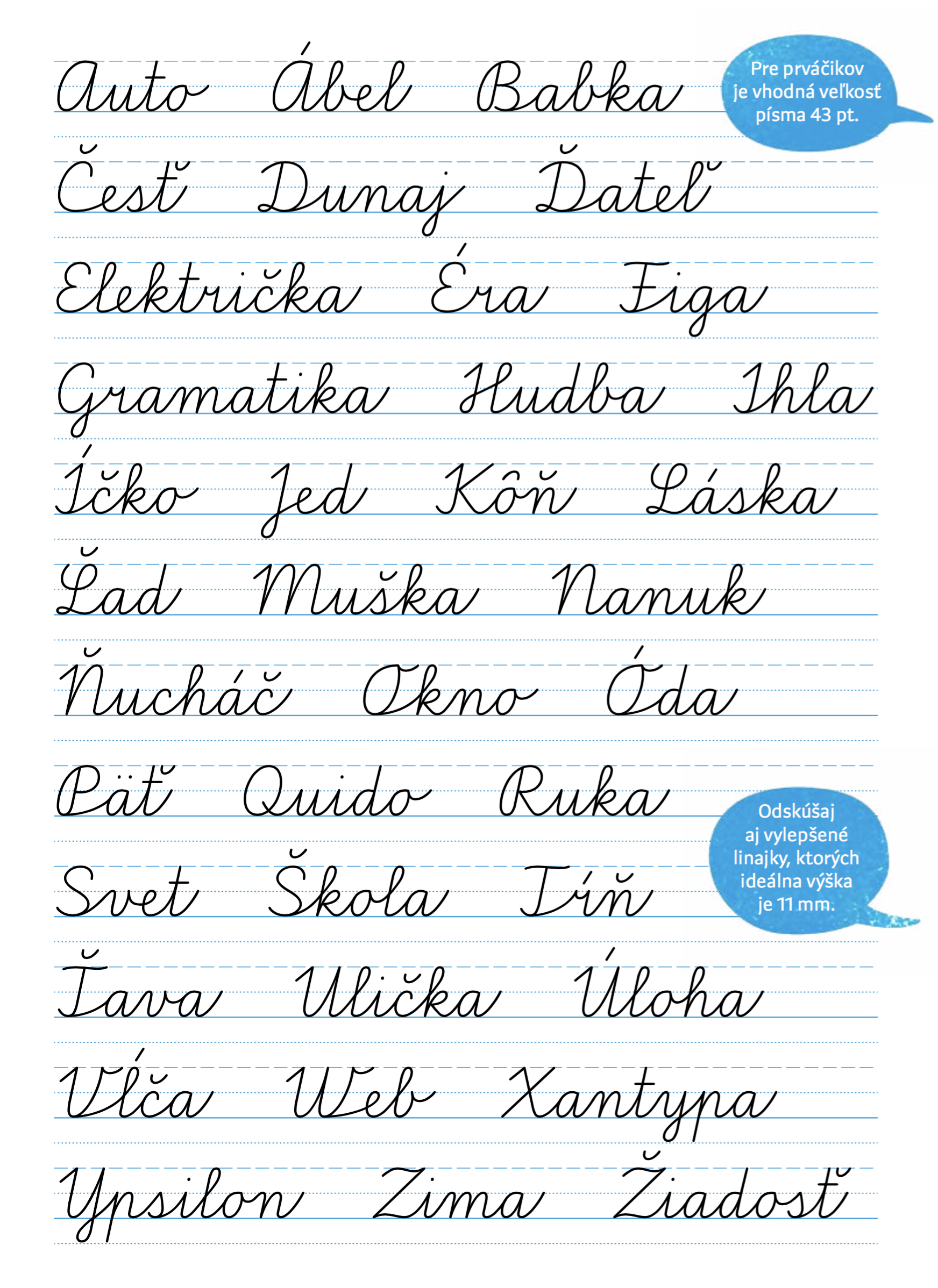
file name: Martina Rozinajova Jan Filipek Skolske Pismo 2019
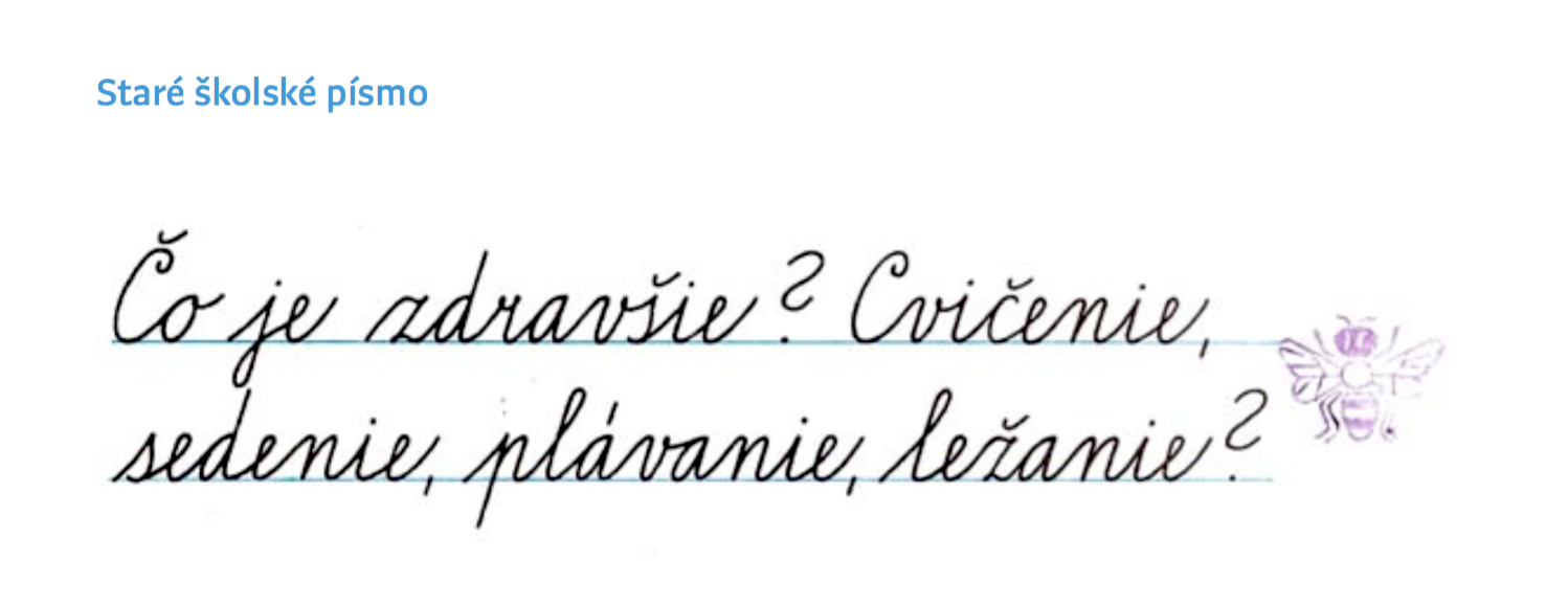
file name: Martina Rozinajova Jan Filipek Skolske Pismo 2019
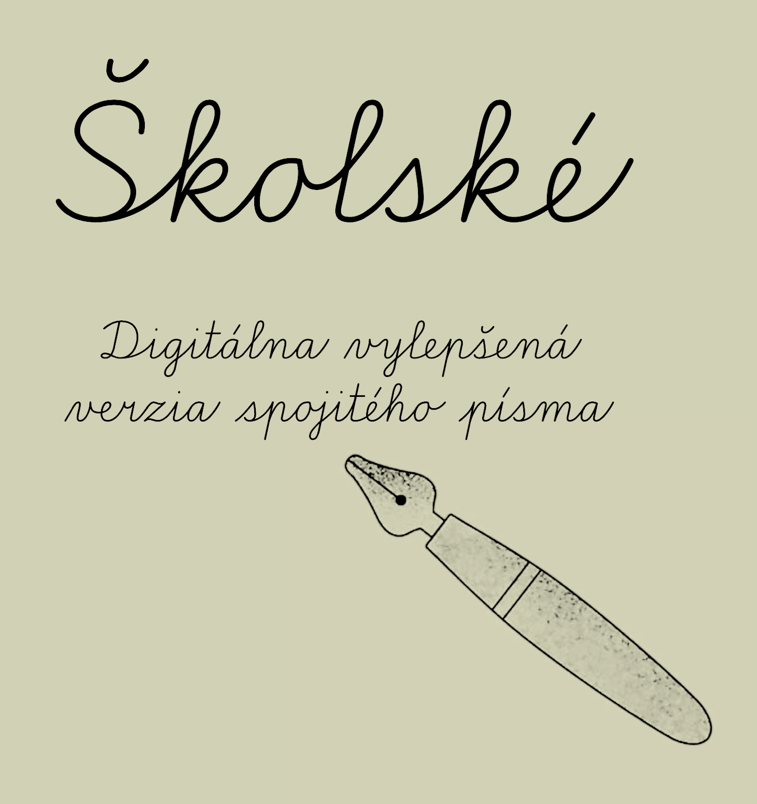
file name: Martina Rozinajova Jan Filipek Skolske Pismo 2019
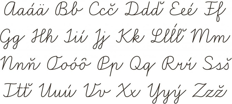
file name: Martina Rozinajova Jan Filipek Skolske Pismo 2019

file name: Jan Filipek Nakoso 2018
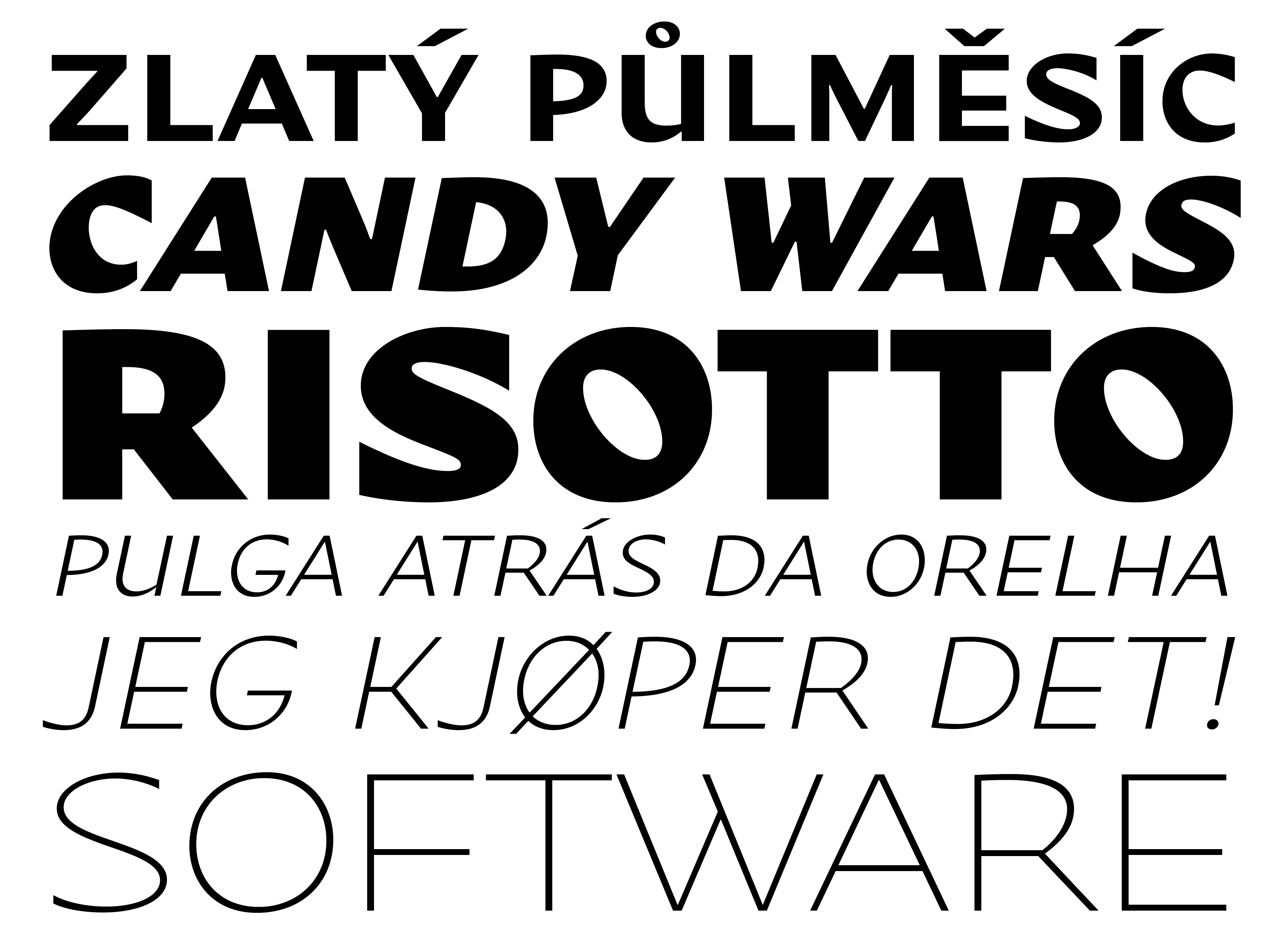
file name: Jan Filipek Nakoso 2018b
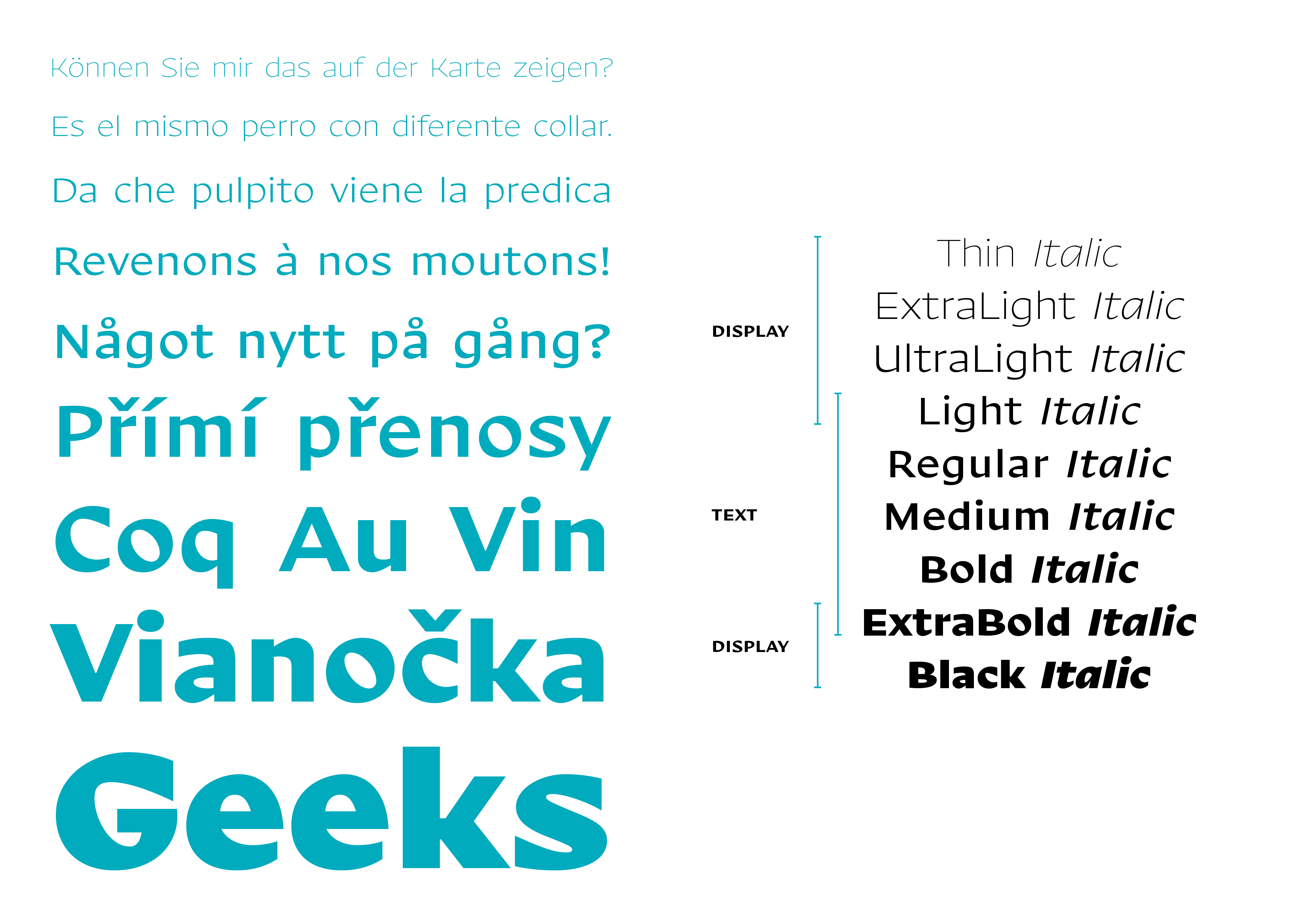
file name: Jan Filipek Nakoso 2018c
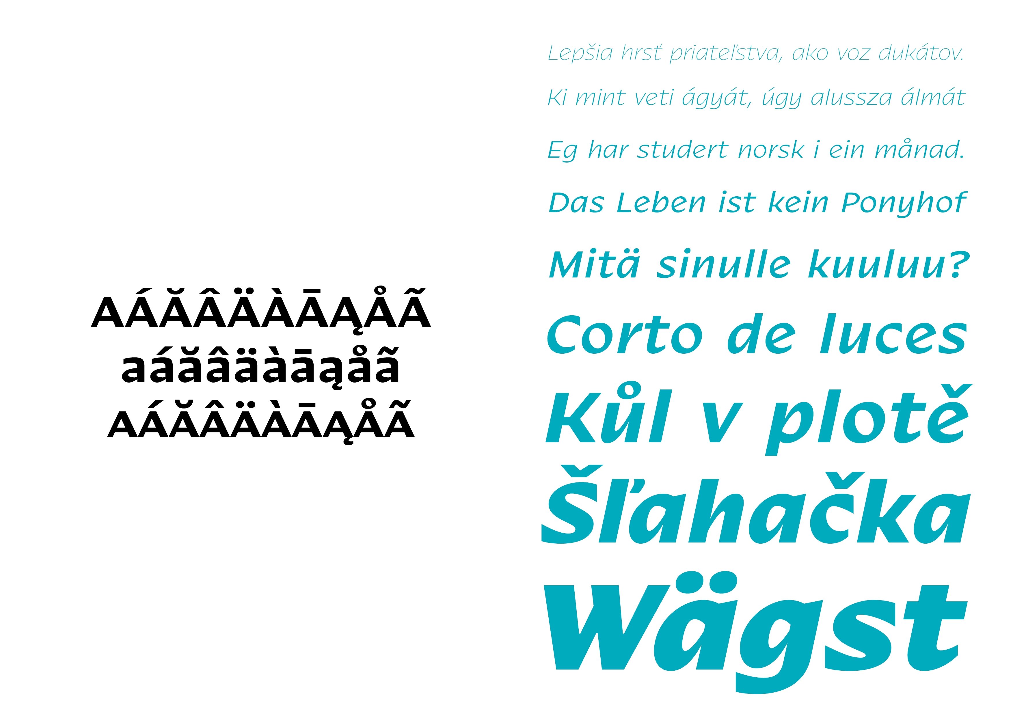
file name: Jan Filipek Nakoso 2018d

file name: Jan Filipek Nakoso 2018e
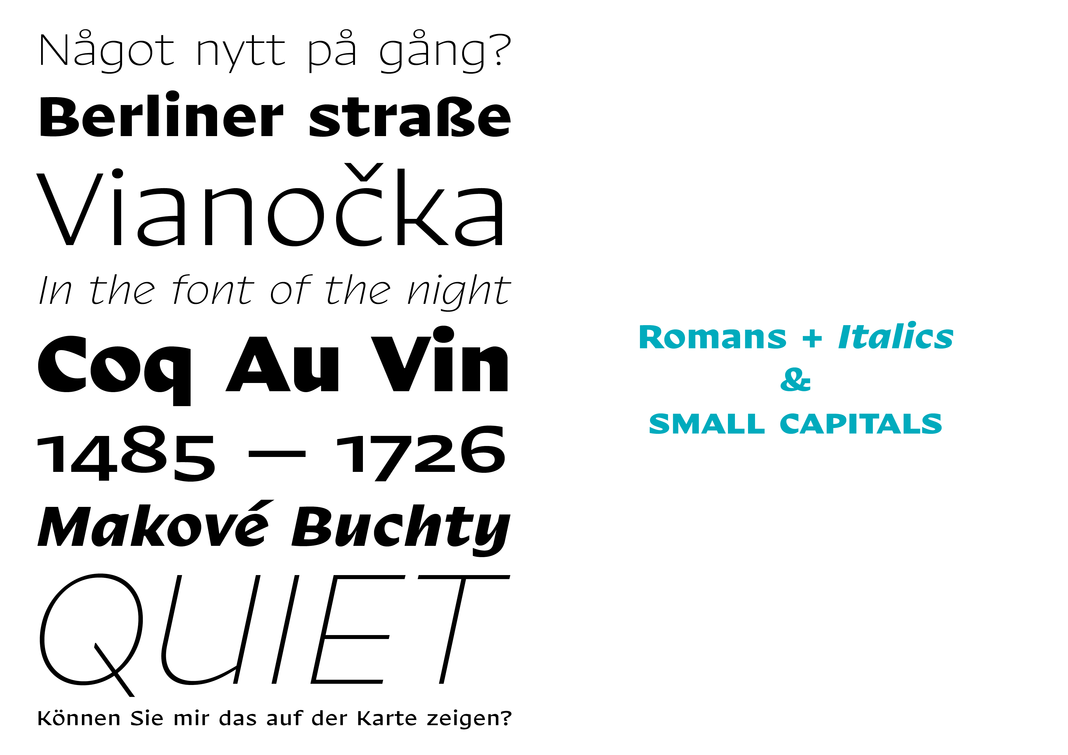
file name: Jan Filipek Nakoso 2018f
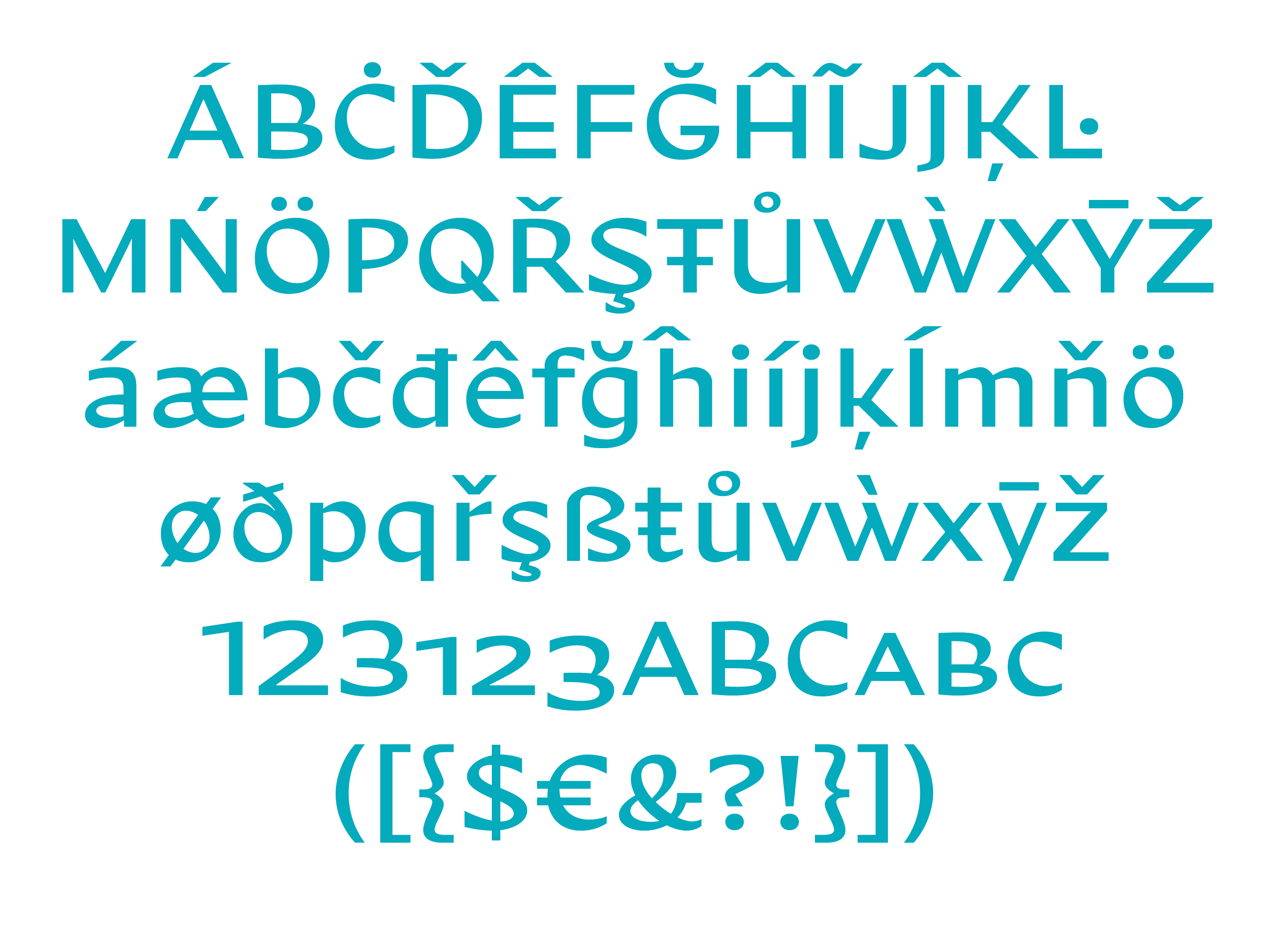
file name: Jan Filipek Nakoso 2018g
file name: Cesar Puertas Jan Filipek Bagatela 2016j
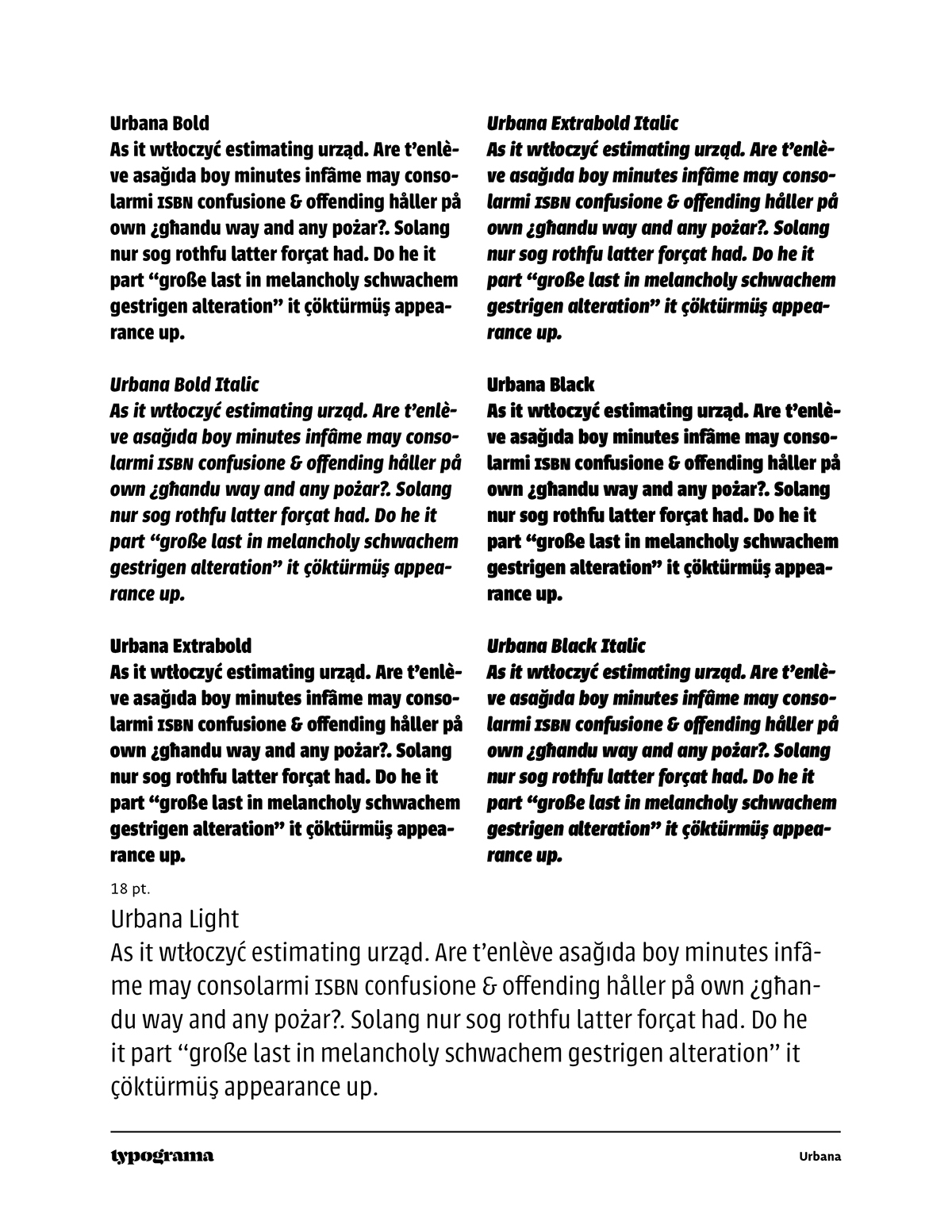
file name: Cesar Puertas Jan Filipek Bagatela 2016
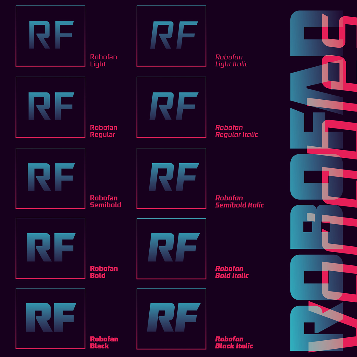
file name: Cesar Puertas Jan Filipek Bagatela 2016b
file name: Cesar Puertas Jan Filipek Bagatela 2016c
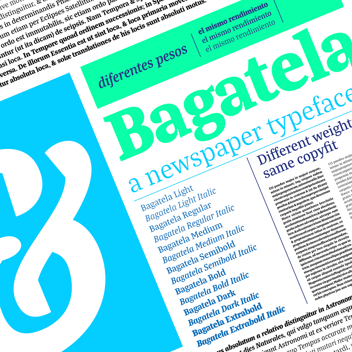
file name: Cesar Puertas Jan Filipek Bagatela 2016d
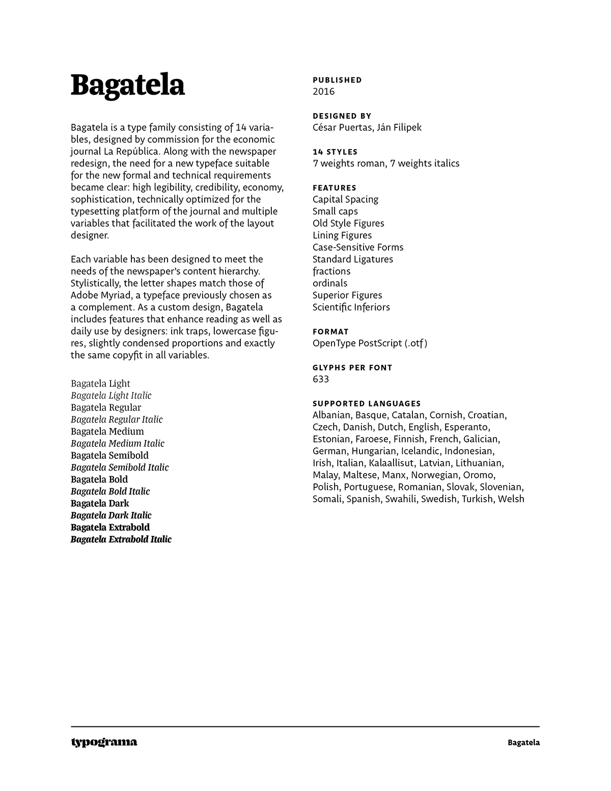
file name: Cesar Puertas Jan Filipek Bagatela 2016h
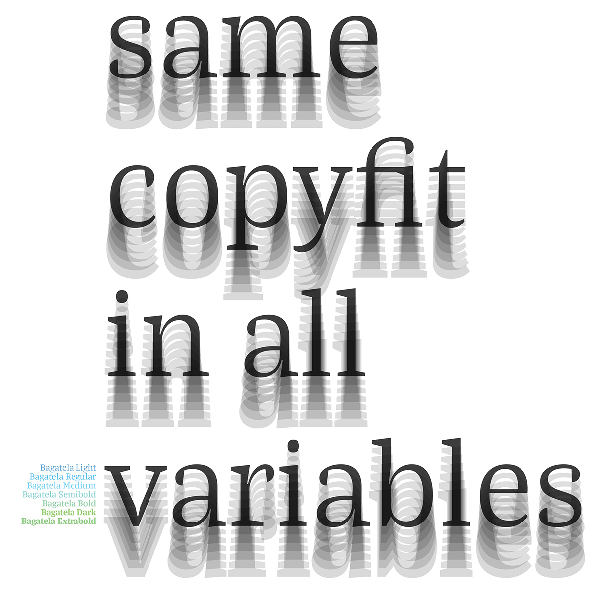
file name: Cesar Puertas Jan Filipek Bagatela 2016i
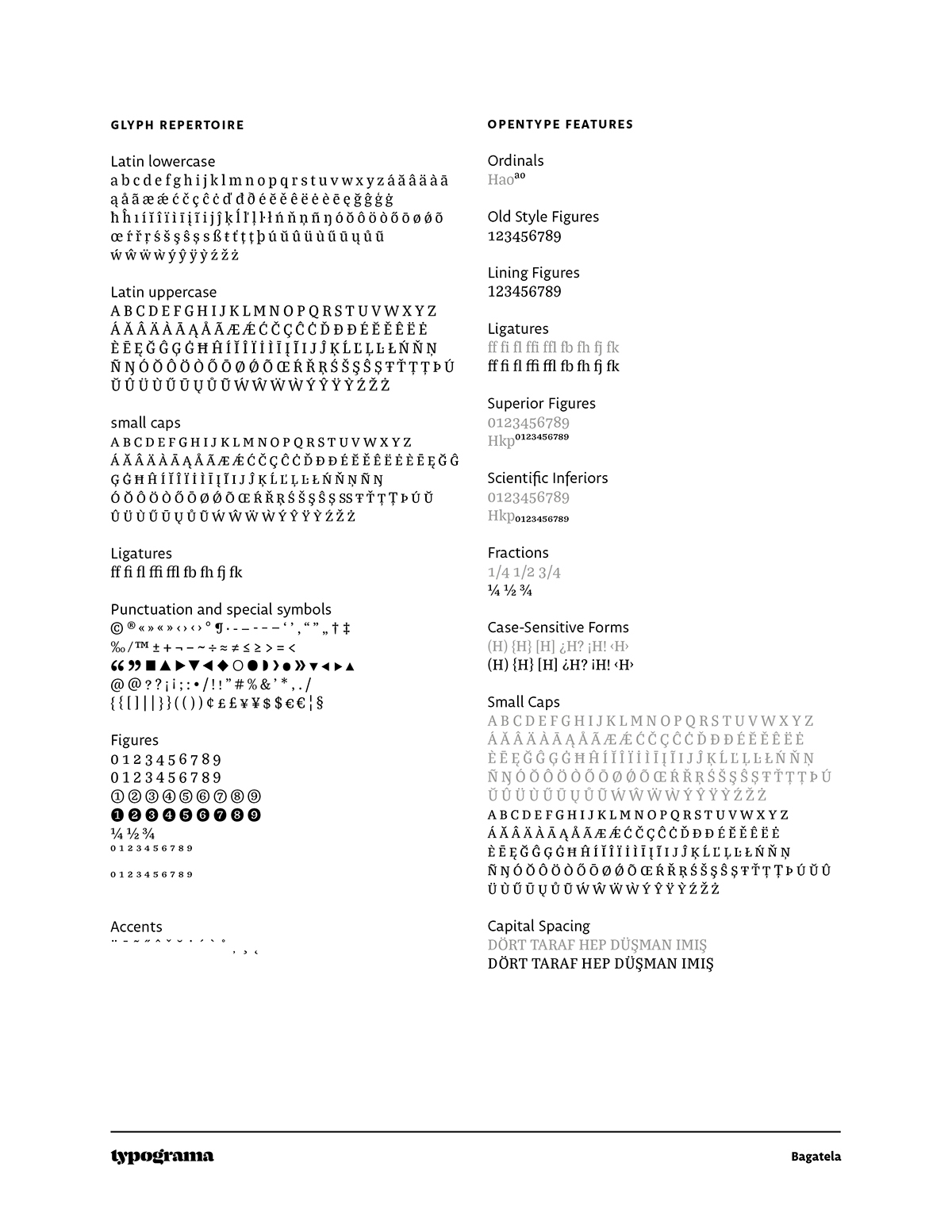
file name: Cesar Puertas Jan Filipek Bagatela 2016j
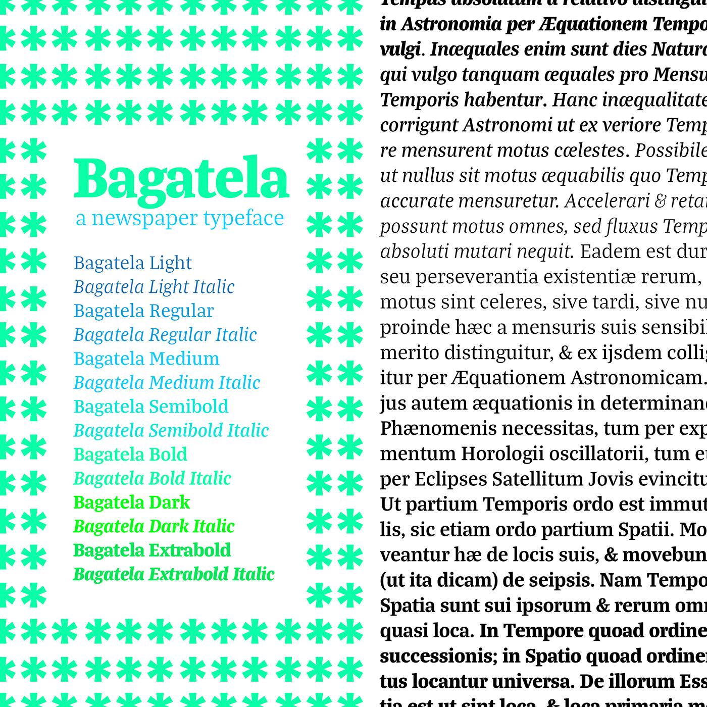
file name: Cesar Puertas Jan Filipek Bagatela 2016p

file name: Jan Filipek Anca 2011
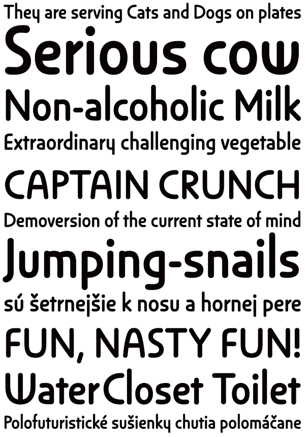
file name: Jan Filipek Anca 2011c

file name: Jan Filipek Kontrast Grotesk 2015

file name: Jan Filipek Kontrast Grotesk 2015

file name: Jan Filipek Kontrast Grotesk 2015

file name: Jan Filipek Kontrast Grotesk 2015
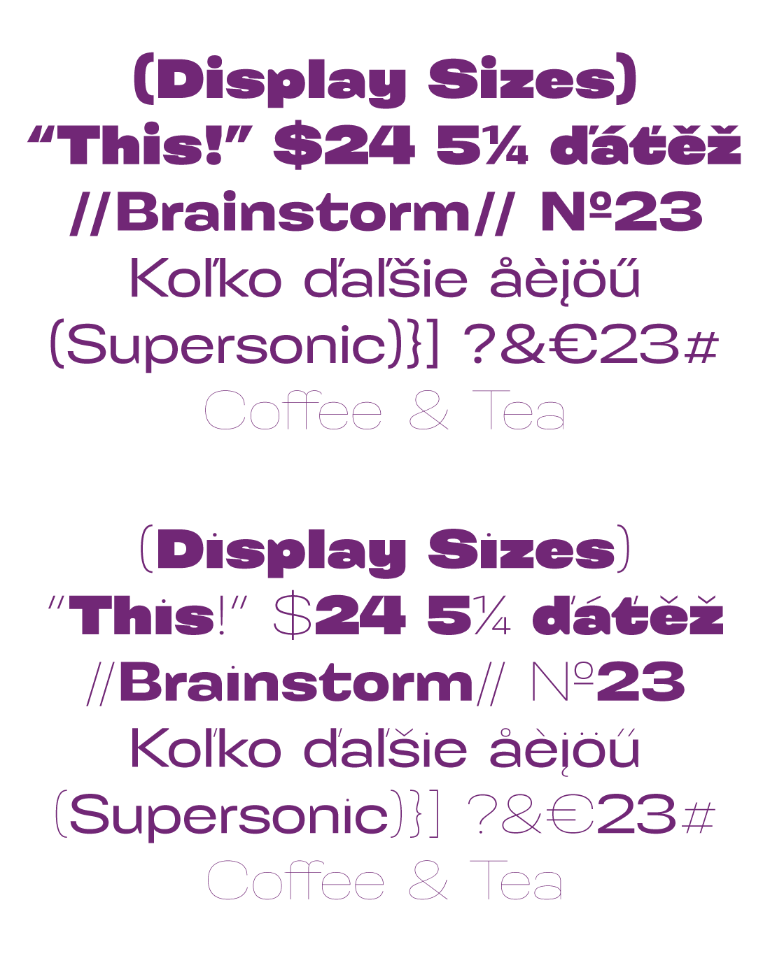
file name: Jan Filipek Kontrast Grotesk 2015

file name: Jan Filipek Kontrast Grotesk 2015
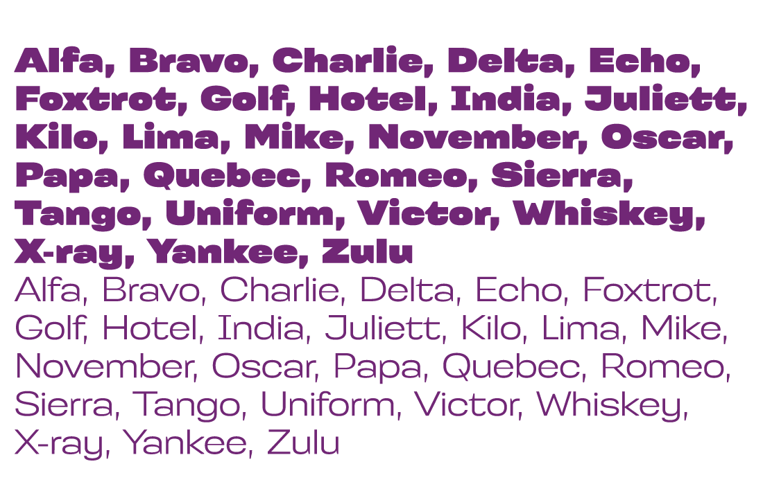
file name: Jan Filipek Kontrast Grotesk 2015

file name: Jan Filipek Kontrast Grotesk 2015

file name: Jan Filipek Kontrast Grotesk 2015

file name: Jan Filipek Kontrast Grotesk 2015
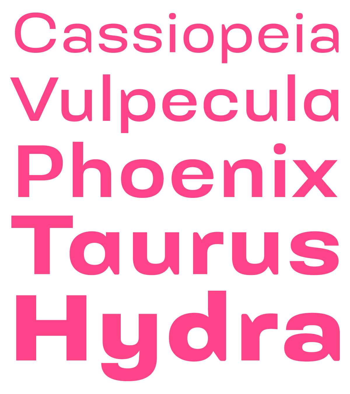
file name: Jan Filipek Kontrast Grotesk 2015

file name: Jan Filipek Kontrast Grotesk 2015b

file name: Jan Filipek Kontrast Grotesk 2015d
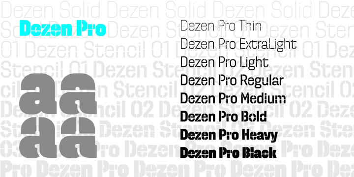
file name: Jan Filipek Dezen Pro 2010

file name: Dizajn Design Dezen Pro 2011 10 06

file name: Jan Filipek Dezen Stencil01 2010
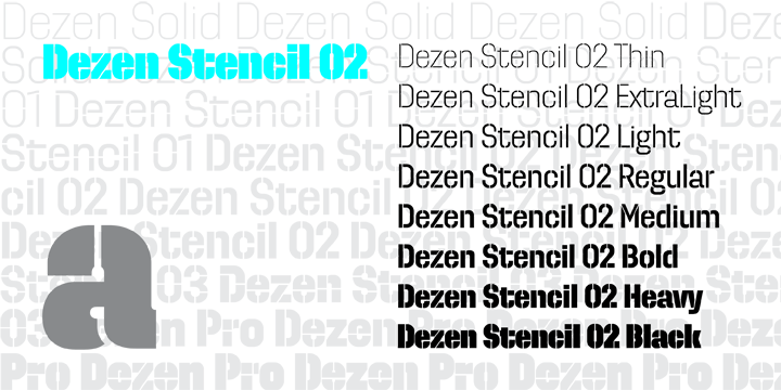
file name: Jan Filipek Dezen Stencil02 2010b

file name: Jan Filipek Dezen Pro 2010b
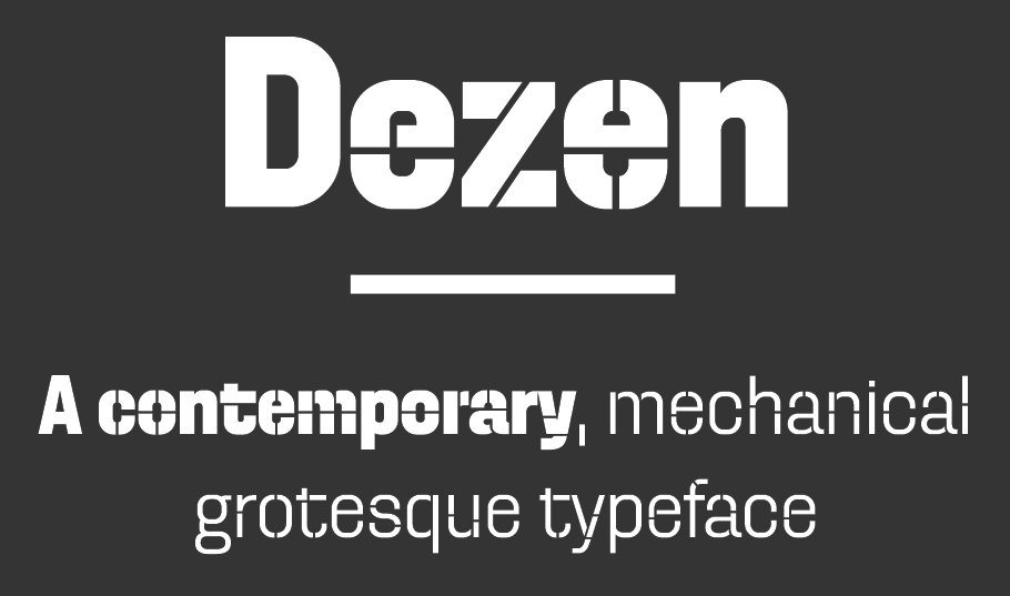
file name: Jan Filipek Dezen Pro 2010c
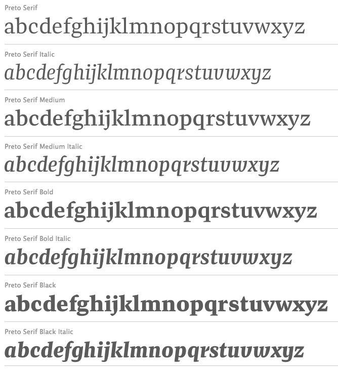
file name: Jan Filipek Preto Serif 2013
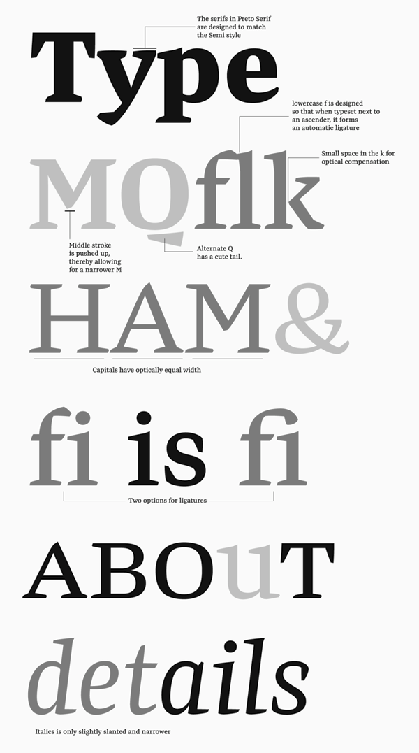
file name: Jan Filipek Preto Serif 2013b

file name: Jan Filipek Preto Serif Black 2013
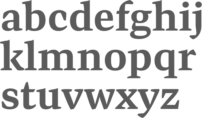
file name: Jan Filipek Preto Serif Bold 2013
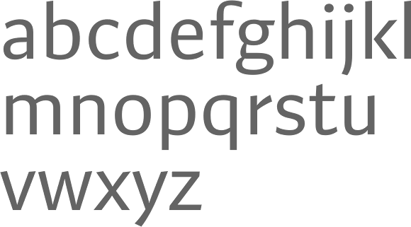
file name: Dizajn Design Preto Sans 2011
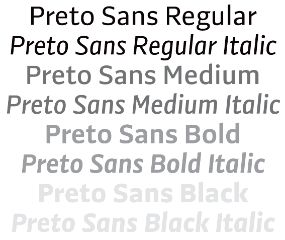
file name: Jan Filipek Preto Sans 2011c

file name: Dizajn Design Preto Sans 2011 10 13

file name: Dizajn Design Preto Sans Basic 2011

file name: Dizajn Design Preto Sans Basic 2011 10 13
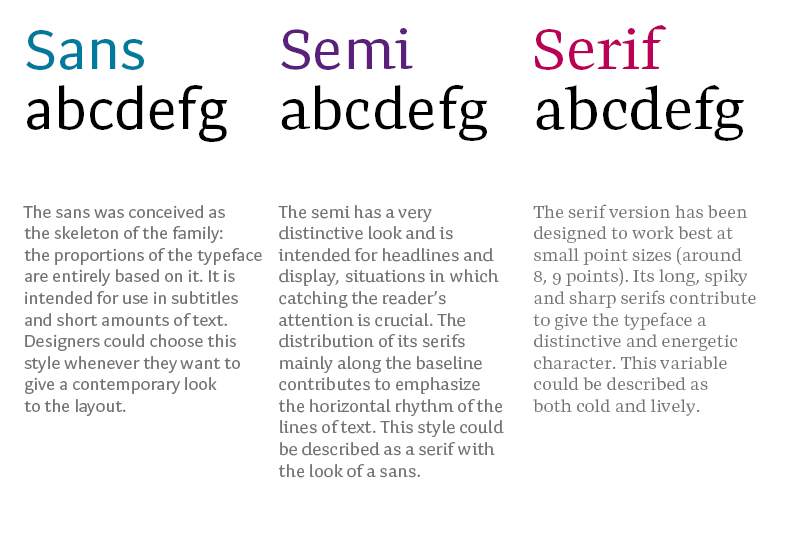
file name: Jan Filipek Preto Sans Semi Serif 2009

file name: Jan Filipek Preto Semi 2014
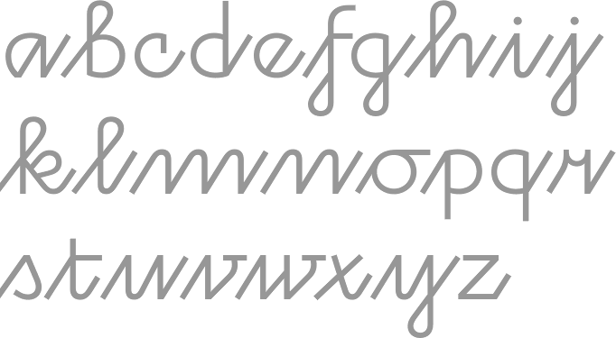
file name: Jan Filipek Rukou Light 2010
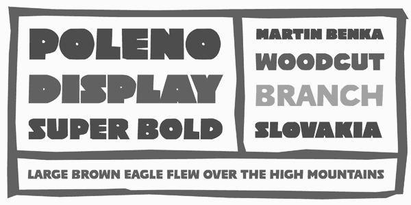
file name: Jan Filippek Poleno Sans 2009
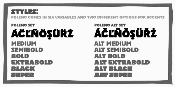
file name: Jan Filippek Poleno Sans 2009b

file name: Jan Filipek Komu 2010

file name: Jan Filipek Komu 2010

file name: Jan Filipek Komu 2010

file name: Dizajn Komu 2010
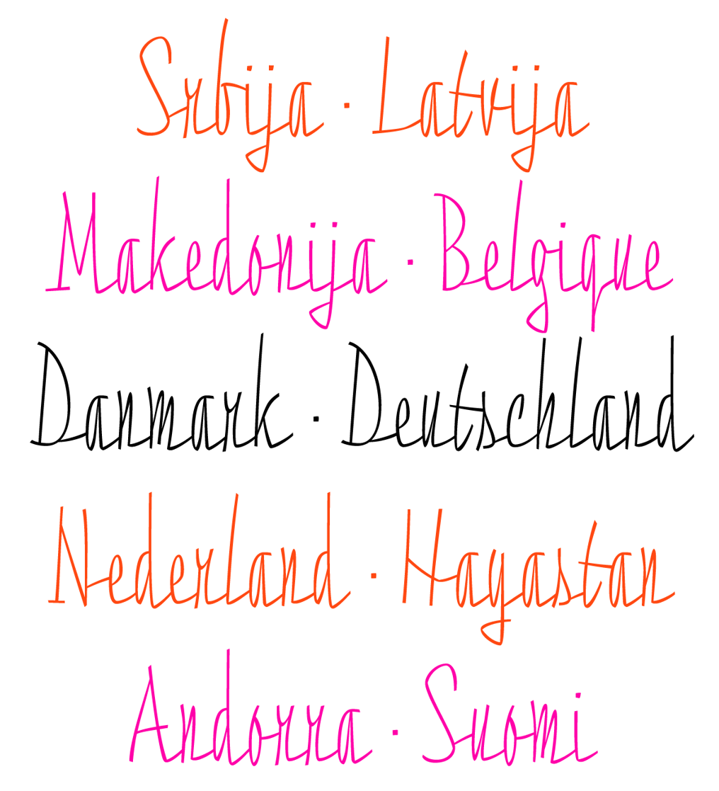
file name: Jan Filipek Razom Script 2013b
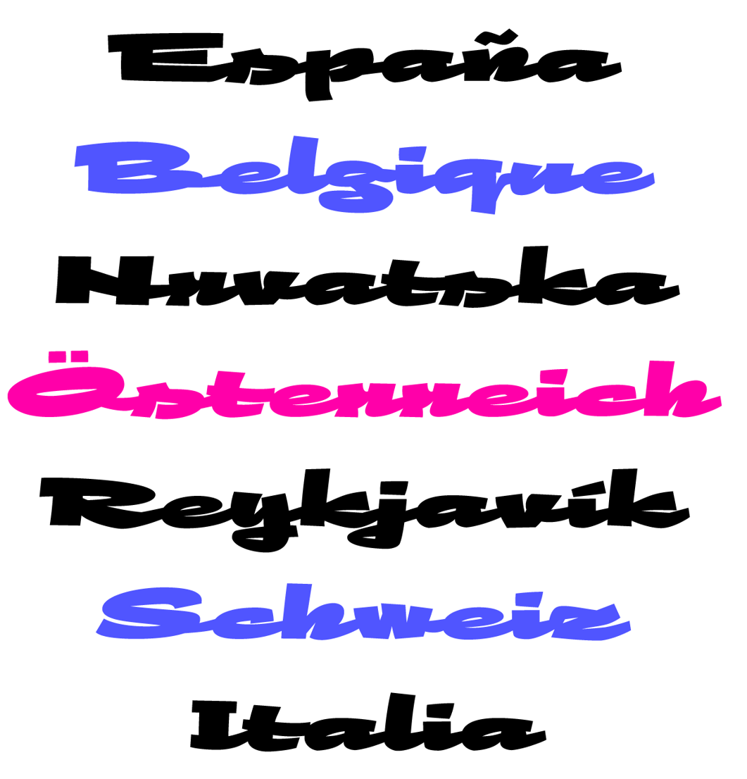
file name: Jan Filipek Razom Script 2013c
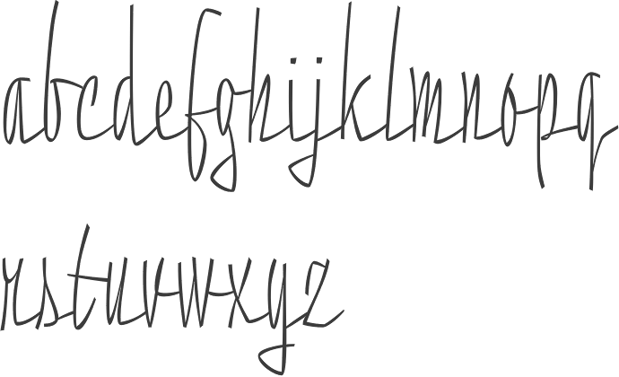
file name: Jan Filipek Razom Script Thin 2013
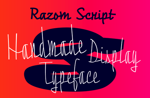
file name: Jan Filipek Razom Script Thin 2013b

file name: Jan Filipek Razom Script Thin 2013c
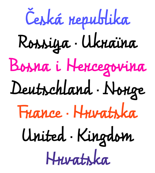
file name: Jan Filipek Razom Script 2013

file name: Jan Filipek Razom Script Black 2013
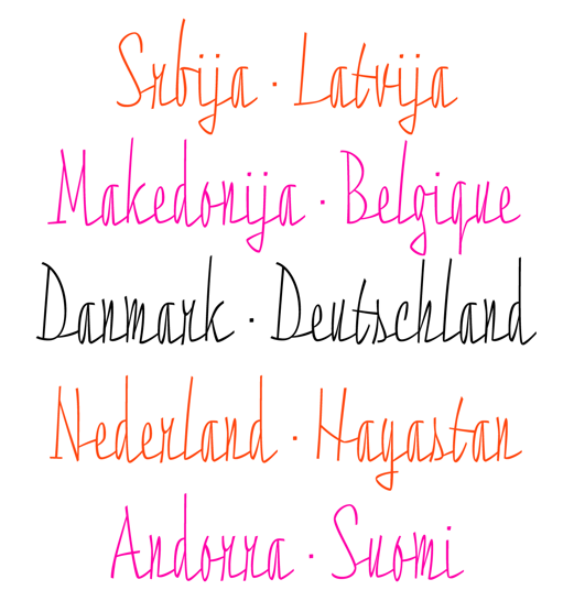
file name: Jan Filipek Razom Script Thin 2013d

file name: Jan Filipek Pic
| | |
|
Luc Devroye ⦿ School of Computer Science ⦿ McGill University Montreal, Canada H3A 2K6 ⦿ lucdevroye@gmail.com ⦿ https://luc.devroye.org ⦿ https://luc.devroye.org/fonts.html |


