TYPE DESIGN INFORMATION PAGE last updated on Thu Aug 15 18:21:07 EDT 2024
FONT RECOGNITION VIA FONT MOOSE
|
|
|
|
Leo Maggs
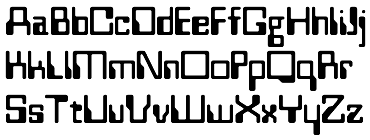
Designer of Westminster (1973, Berthold), related to VGC's Amelia (1967) and based in the look of the magnetic ink bank cheque font MICR E-13B that was developed in the mid 1950s and is used by banks from the 1960s onwards. Klingspor's site says that he is German, but that is wrong---he is British. In an interview, the writer says: There is one space age one called One Up, a ghastly 60s thing, and the guy who designed that, Leo Maggs, talks about how he wished he hadn't designed it. "Way back in the swinging 60s," he says, "when my youthful soul was consumed with enthusiasm, if not naked ambition, I was surprised and delighted to have my first typeface, Westminster, accepted by Robert Norton. I produced several further designs, most of which were properly strangled at birth. One Up unfortunately survived... Looking at it now I feel much as I imagine a mature film star must feel when, 30 years after the event, she comes across photographs of herself as a struggling starlet revealing all for the readers of popular girly magazines, and I wish I hadn't done it." |
EXTERNAL LINKS |
| | |

file name: Leo Maggs Westminster 1973

file name: Leo Maggs Westminster
| | |
|
Luc Devroye ⦿ School of Computer Science ⦿ McGill University Montreal, Canada H3A 2K6 ⦿ lucdevroye@gmail.com ⦿ http://luc.devroye.org ⦿ http://luc.devroye.org/fonts.html |

