TYPE DESIGN INFORMATION PAGE last updated on Thu Jul 16 06:53:52 EDT 2026
FONT RECOGNITION VIA FONT MOOSE

|
|
|
|
Karl Petter Sandbæk
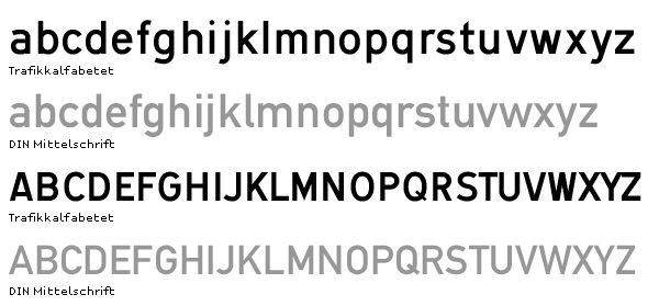
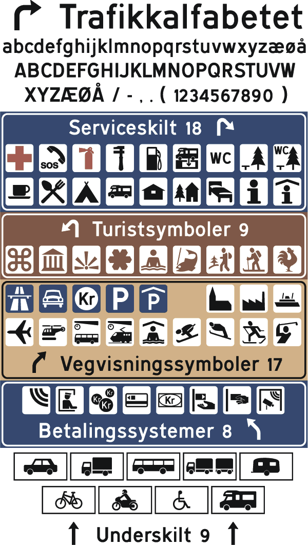
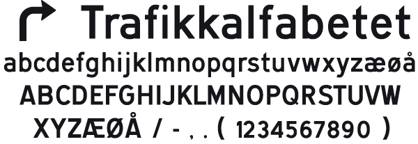
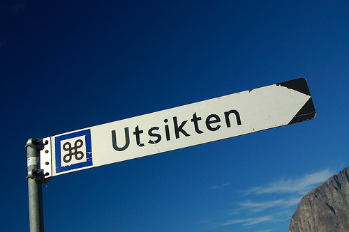
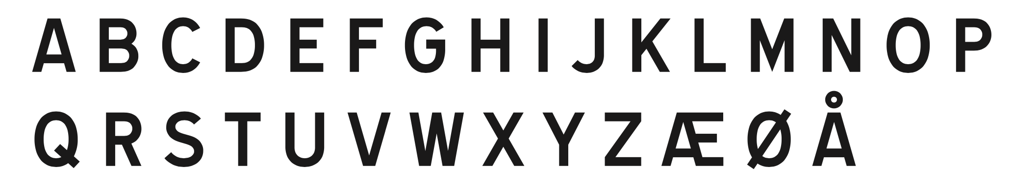
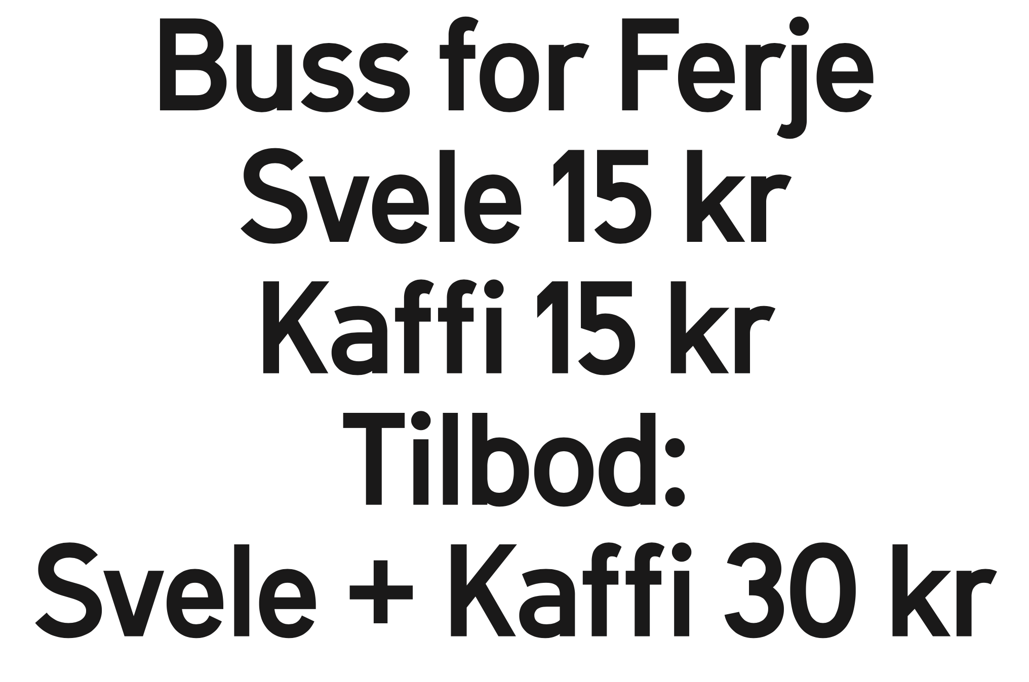
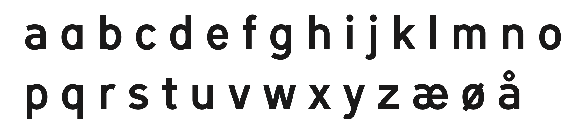
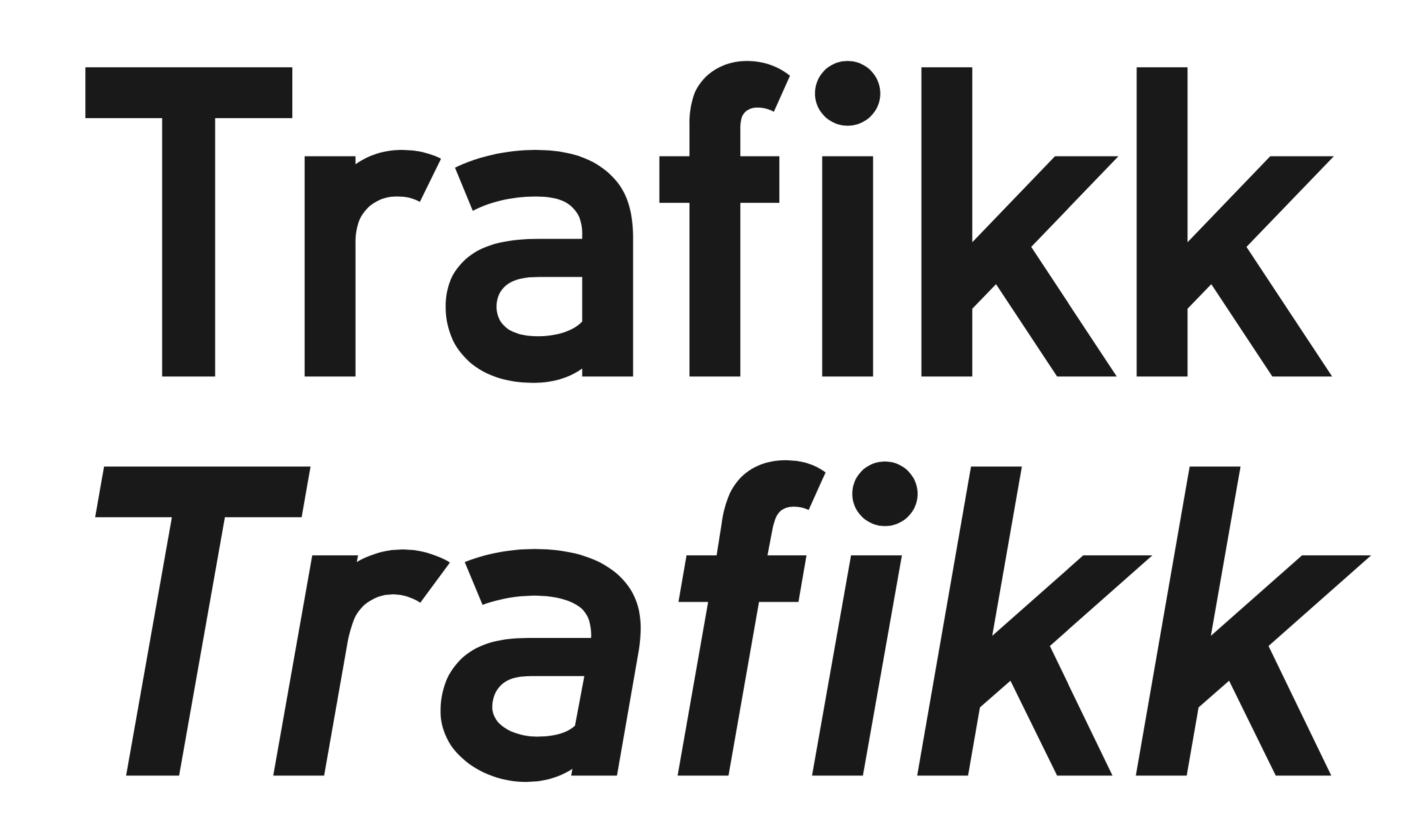
Designer of the lettering for traffic signs in Norway, called Trafikkalfabet (1965). This was digitized in 2006 by Jacob Øvergaard and from 2014-2020 by Arve Båtevik as Store Norske Trafikk. Examples here and here. In the last link, Ralf Herrmann explains the flaws: It bears a resemblance to the German DIN typeface, but it also has some unique features, some of them are good, some are bad. Both typefaces share a very simple geometric design and they are good examples of typefaces, that look like they were made on the drawing-board of an engineer rather than designed by a type designer. [...] A type designers knows how to optically adjust geometrical shapes to make them look right. The tip of the M needs to go below the baseline and the dot of the i needs to be wider than the stem. But the design of the Trafikkalfabetet typeface rather aims at consistent values. As a result, the dot of the i is way too small, especially for a typeface that should be legible at great distance. The spacing of the typeface has the similar problems. Uniform values for left and right sidebearings cannot create uniform spacing. |
EXTERNAL LINKS |
| | |

file name: Karl Petter Sandbaek Trafikkalfabet 1965 Versus D I N Mittelschrift
file name: Karl Petter Sandbaek Trafikkalfabet 1965c
file name: Karl Petter Sandbaek Trafikkalfabet 1965
file name: Karl Petter Sandbaek Trafikkalfabet 1965b
file name: Karl Petter Sandbaek Trafikkalfabet 1965c

file name: Arve Batevik Store Norske Trafikk 2014 2020
file name: Arve Batevik Store Norske Trafikk 2014 2020
file name: Arve Batevik Store Norske Trafikk 2014 2020
file name: Arve Batevik Store Norske Trafikk 2014 2020
file name: Arve Batevik Store Norske Trafikk 2014 2020
| | |
|
Luc Devroye ⦿ School of Computer Science ⦿ McGill University Montreal, Canada H3A 2K6 ⦿ lucdevroye@gmail.com ⦿ https://luc.devroye.org ⦿ https://luc.devroye.org/fonts.html |