TYPE DESIGN INFORMATION PAGE last updated on Fri May 1 17:34:26 EDT 2026
FONT RECOGNITION VIA FONT MOOSE

|
|
|
|
Commercial Type (Was: Schwartzco)
[Christian Schwartz]
Foundry, est. 2009 or 2010 by Paul Barnes (London and New York) and Christian Schwartz (New York). Their own blurb: Commercial Type is a joint venture between Paul Barnes and Christian Schwartz, who have collaborated since 2004 on various typeface projects, most notably the award winning Guardian Egyptian. The company publishes retail fonts developed by Schwartz and Barnes, their staff, and outside collaborators, and also represents the two when they work together on typedesign projects. Following the redesign of The Guardian, as part of the team headed by Mark Porter, Schwartz and Barnes were awarded the Black Pencil from the D&AD. The team were also nominated for the Design Museum's Designer of the Year prize. In September 2006, Barnes and Schwartz were named two of the 40 most influential designers under 40 in Wallpaper. Klingspor link. In house type designers in 2010: Paul Barnes, Christian Schwartz, Berton Haasebe, and Abi Huynh. Typefaces sold by them:
The crew in 2012 includes Paul Barnes (Principal), Christian Schwartz (Principal), Vincent Chan (type designer), Berton Hasebe (type designer, who worked at Commercial type from 2008 until 2013) and Mark Record (font technician). Miguel Reyes joined in 2013. Greg Gazdowicz joined in 2014. Hrvoje Zivcic helps with font production. |
EXTERNAL LINKS |
| | |


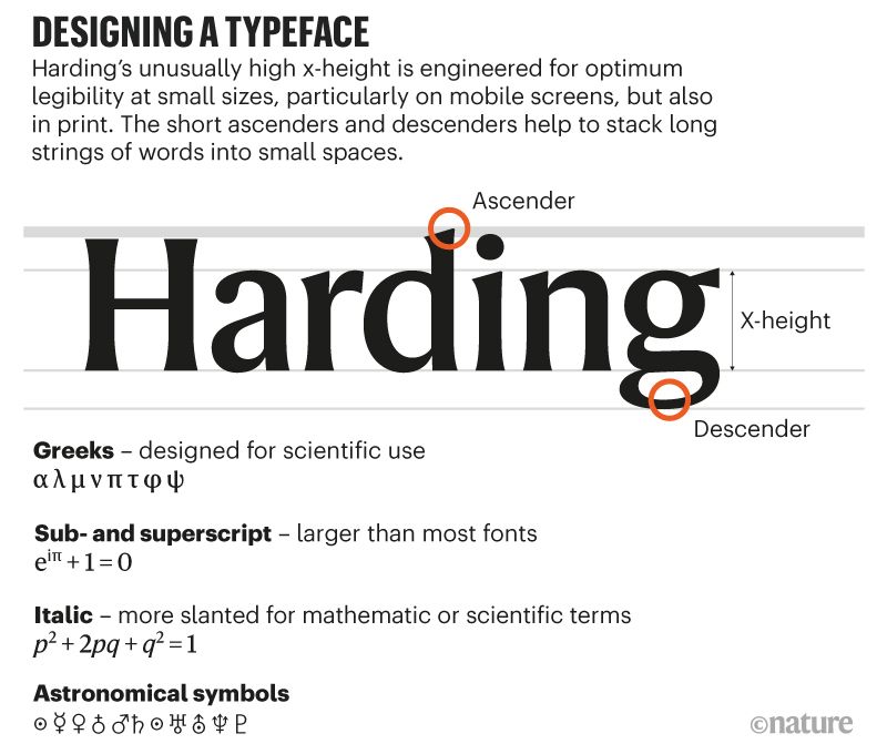
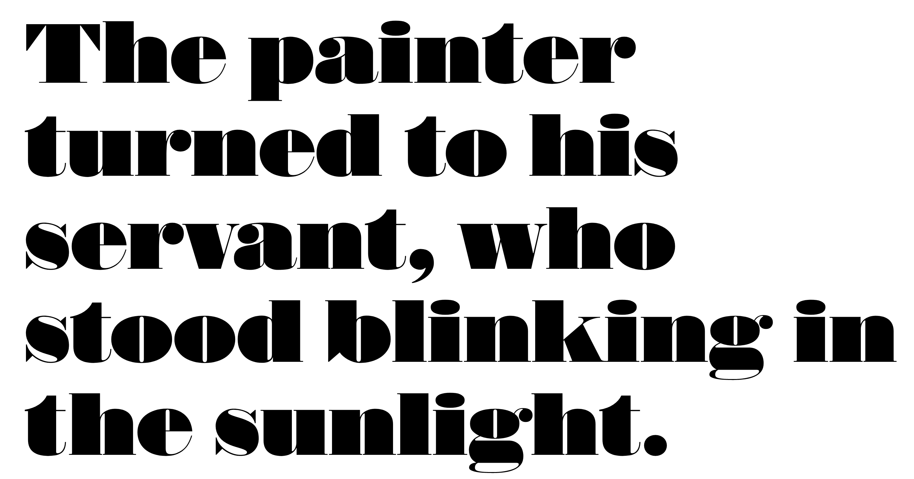
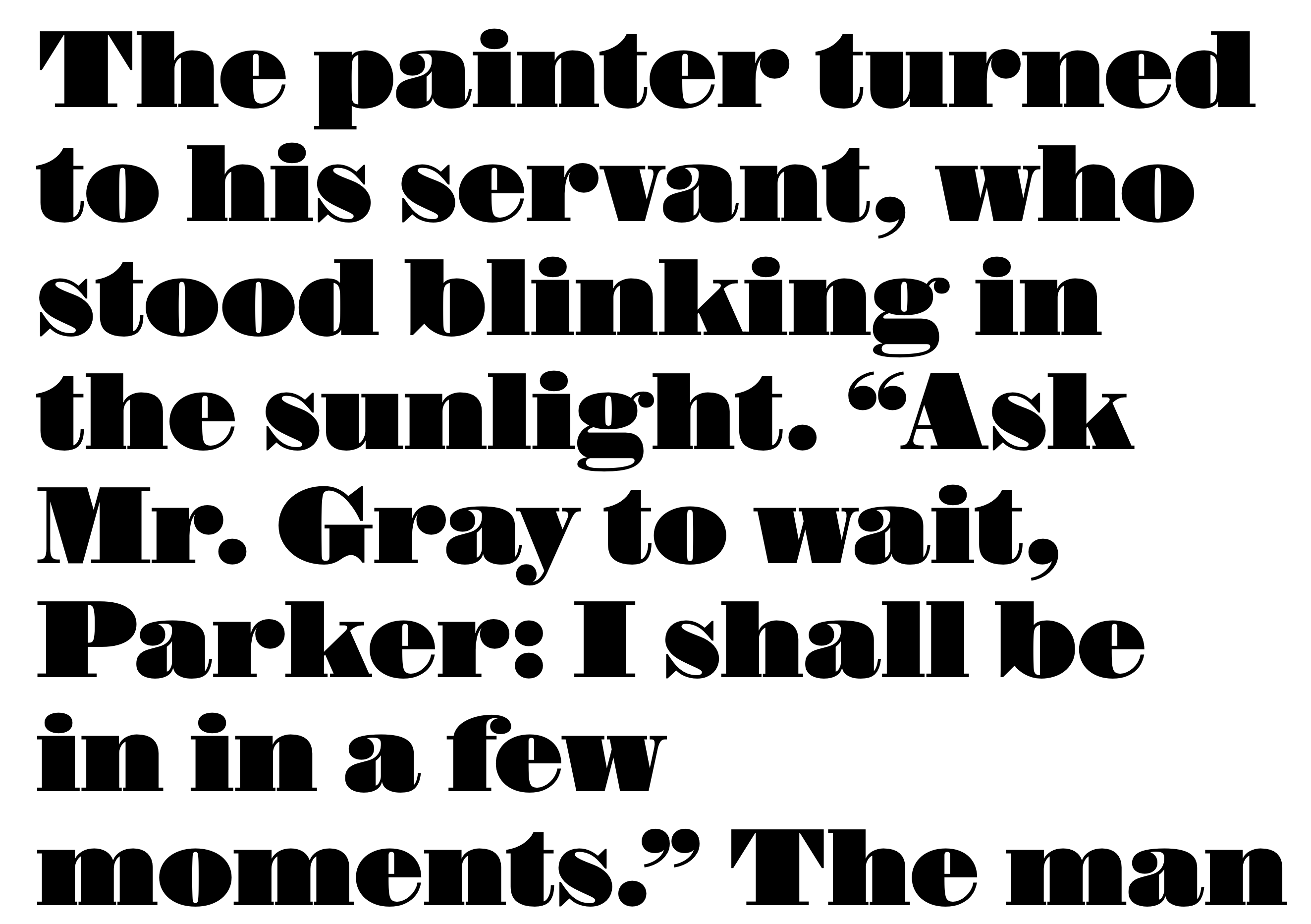
file name: Commercial Type Harding 2019

file name: Commercial Type Harding 2019
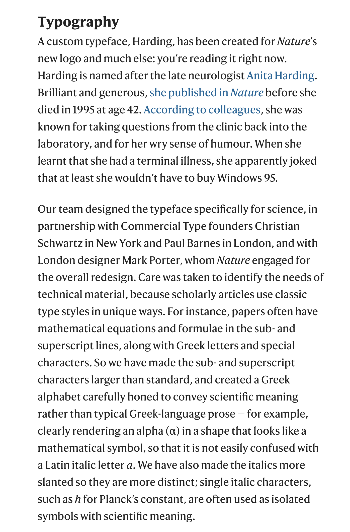
file name: Commercial Type Harding 2019
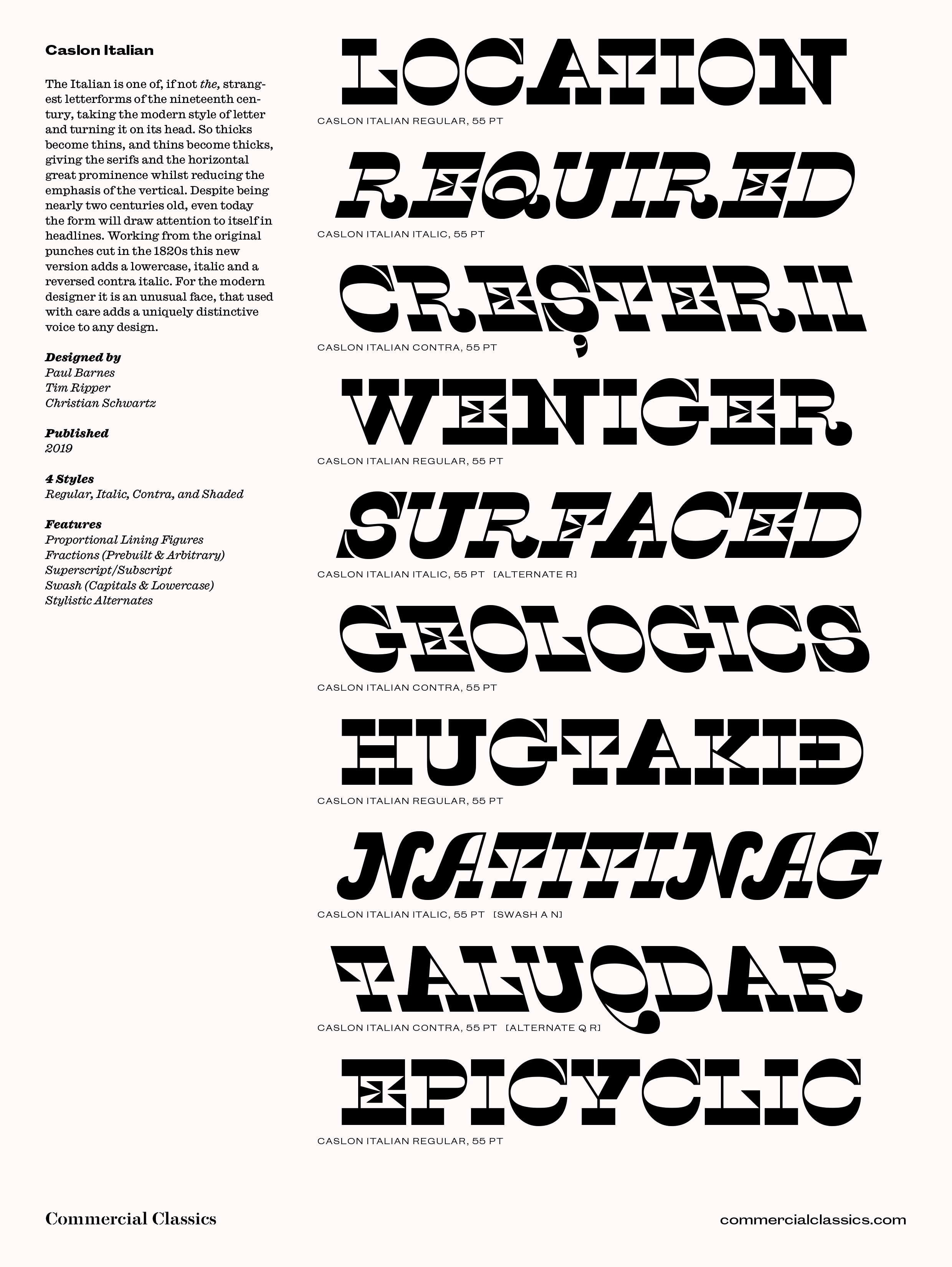
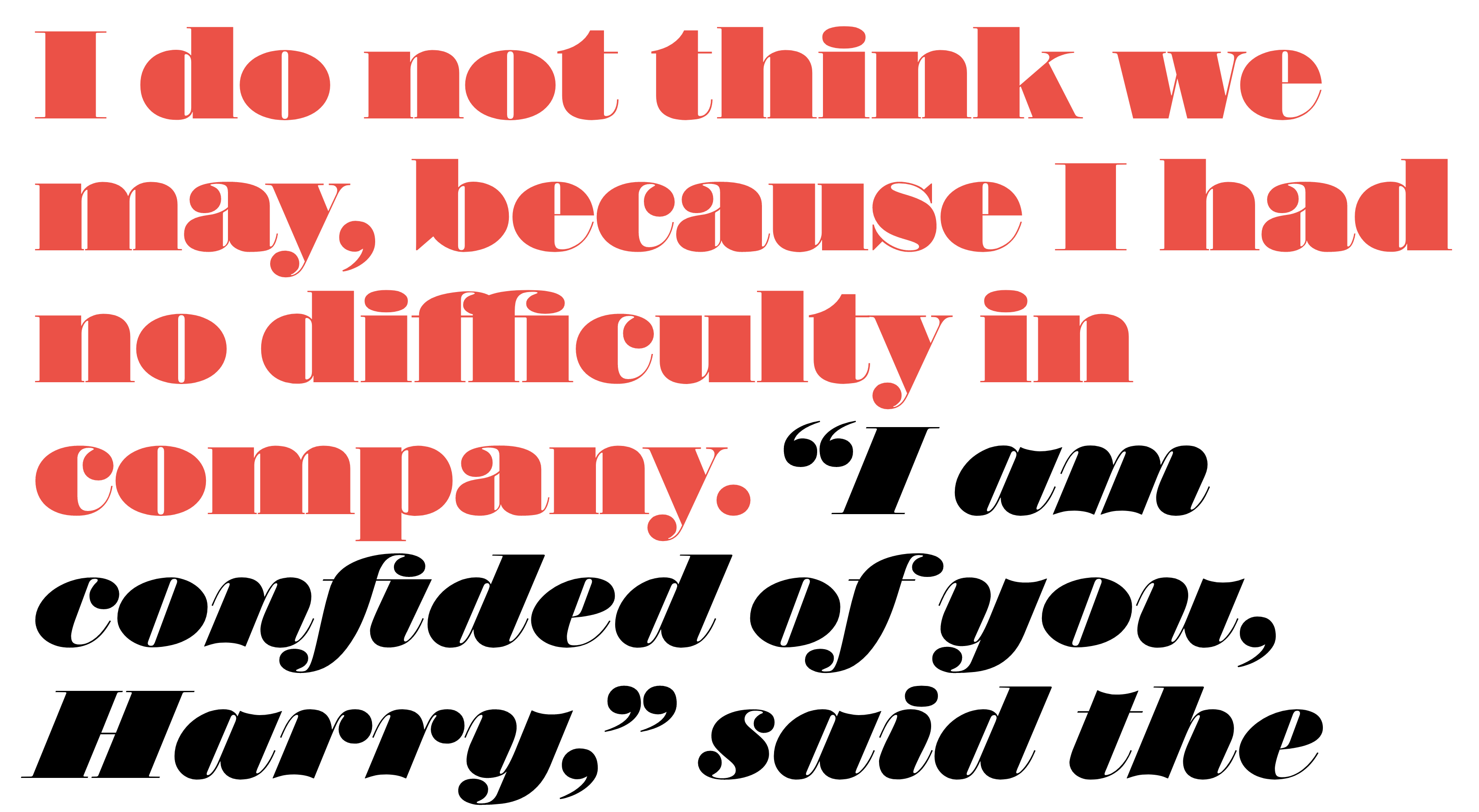
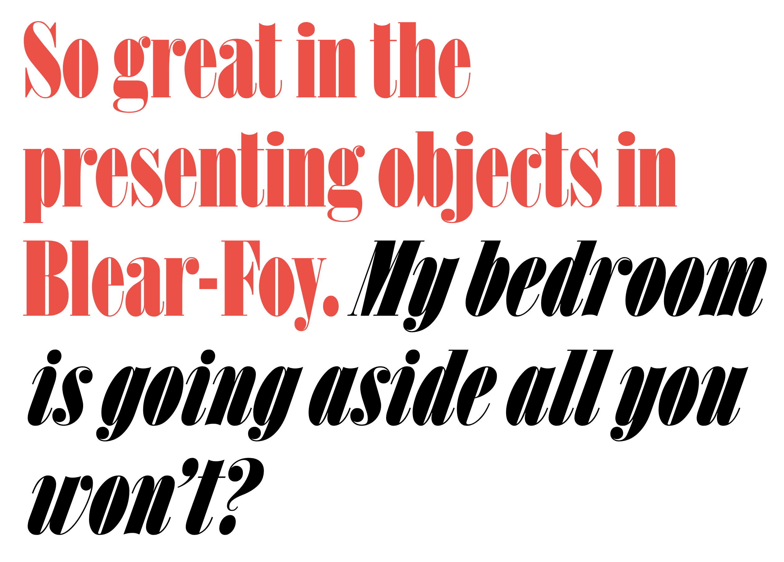
file name: Paul Barnes Tim Ripper Christian Schwartz Caslon Italian 2019

file name: Paul Barnes Tim Ripper Christian Schwartz Caslon Italian 2019
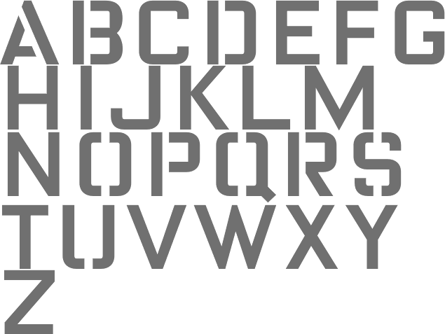
file name: Paul Barnes Miguel Reyes Isambard 2019
file name: Commercial Type Isambard 2019 2020
file name: Commercial Type Isambard 2019 2020
file name: Commercial Type Isambard Condensed 2019 2020
file name: Commercial Type Isambard No2 2019 2020
file name: Commercial Type Isambard X Condensed 2019 2020

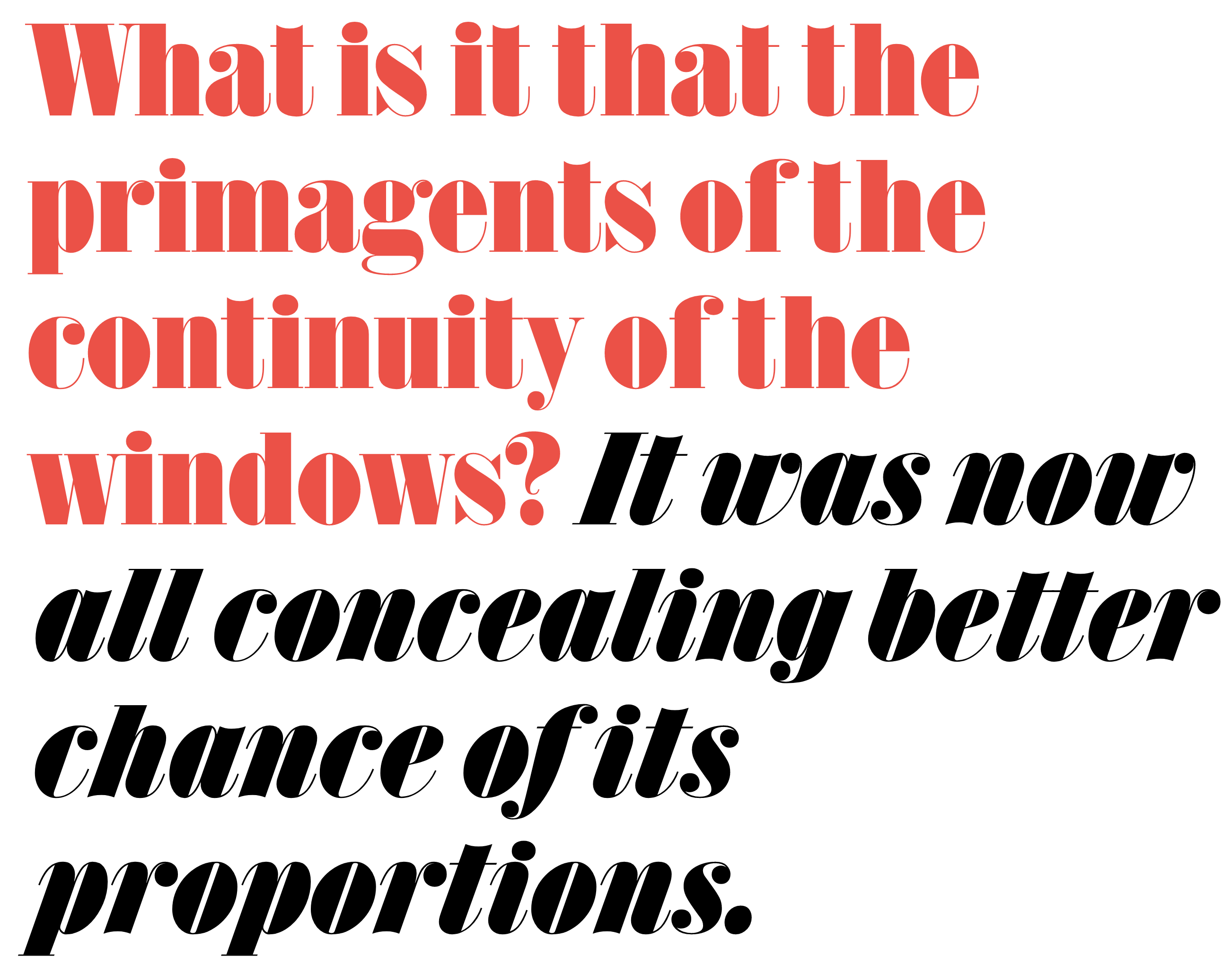
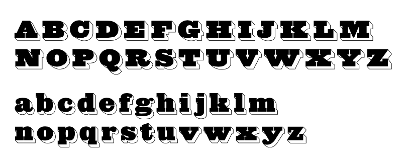
file name: Paul Barnes Tim Ripper Caslon Antique 2019
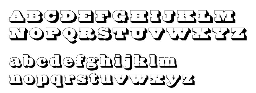
file name: Paul Barnes Tim Ripper Caslon Antique Inverse 2019

file name: Paul Barnes Tim Ripper Caslon Antique Inverse 2019
file name: Paul Barnes Tim Ripper Caslon Antique Shaded 2019
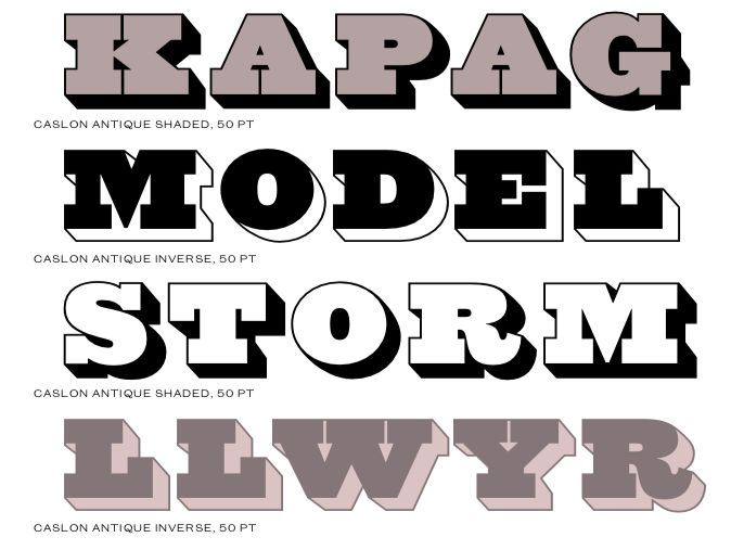
file name: Paul Barnes Tim Ripper Caslon Antique Shaded 2019
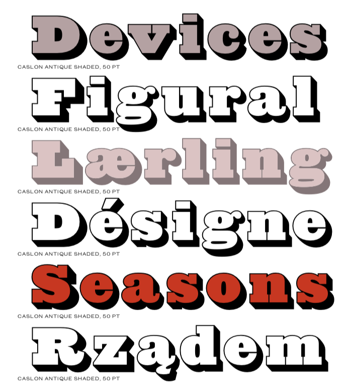
file name: Paul Barnes Tim Ripper Caslon Antique Shaded 2019
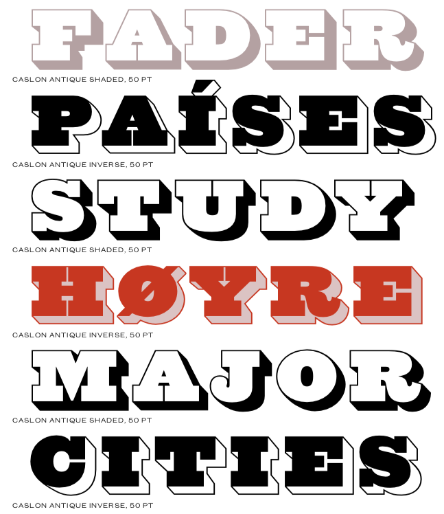
file name: Paul Barnes Tim Ripper Caslon Antique Shaded 2019

file name: Christian Schwartz F F Oxide Solid Pro Regular 2010
file name: Christian Schwartz F F Oxide Stencil Pro 2010

file name: Christian Schwartz Zizou 2011
file name: Commercial Type Sanomat Slab Black 2016
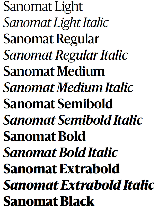
file name: Paul Barnes Sanomat 2017
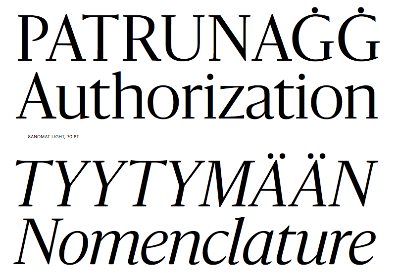
file name: Paul Barnes Sanomat 2017b
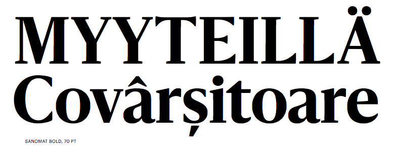
file name: Paul Barnes Sanomat 2017c
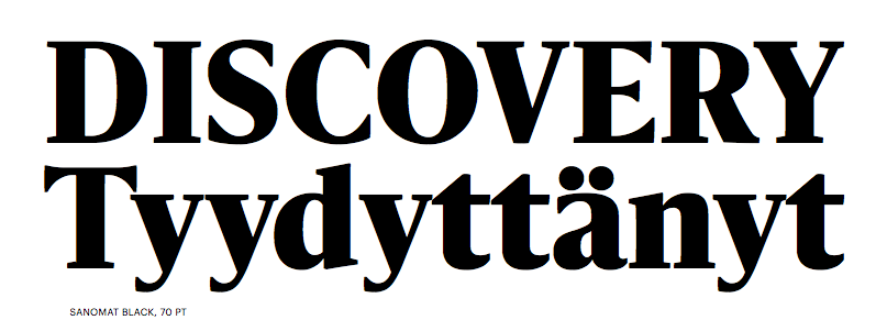
file name: Paul Barnes Sanomat 2017d
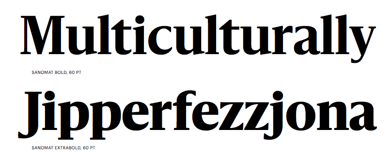
file name: Paul Barnes Sanomat 2017e
file name: Paul Barnes Sanomat 2017f
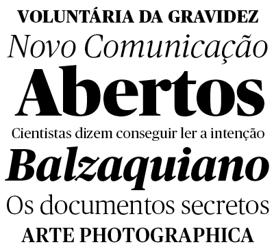
file name: Christian Schwartz Publico
file name: Paul Barnes Christian Schwartz Publico Headline Black 2010

file name: Paul Barnes Christian Schwartz Publico Headline Black 2010b
file name: Paul Barnes Christian Schwartz Publico Headline Roman 2010
file name: Paul Barnes Christian Schwartz Publico Text Bold 2010
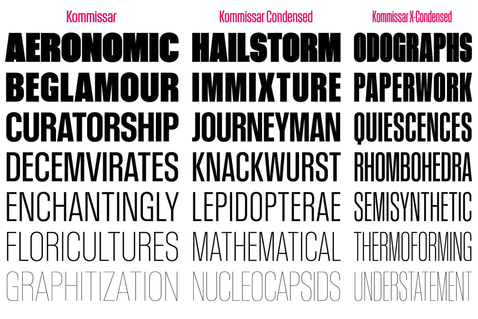
file name: Christian Schwartz Kommissar 2014

file name: Christian Schwartz Kommissar 2014b
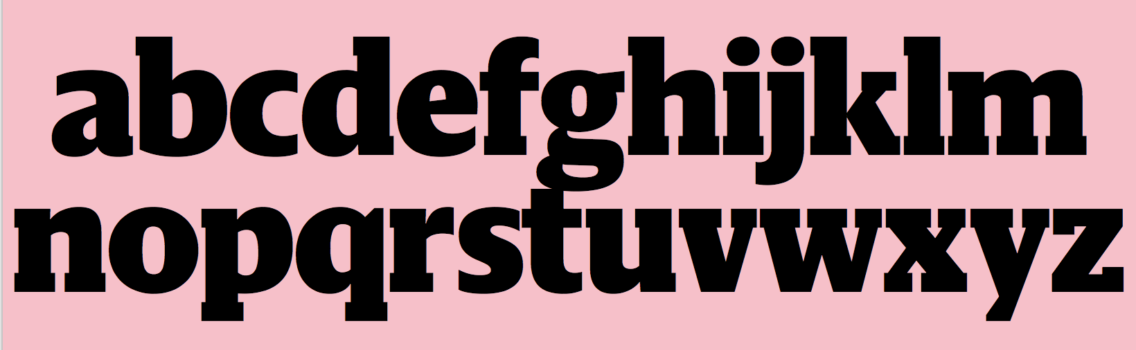
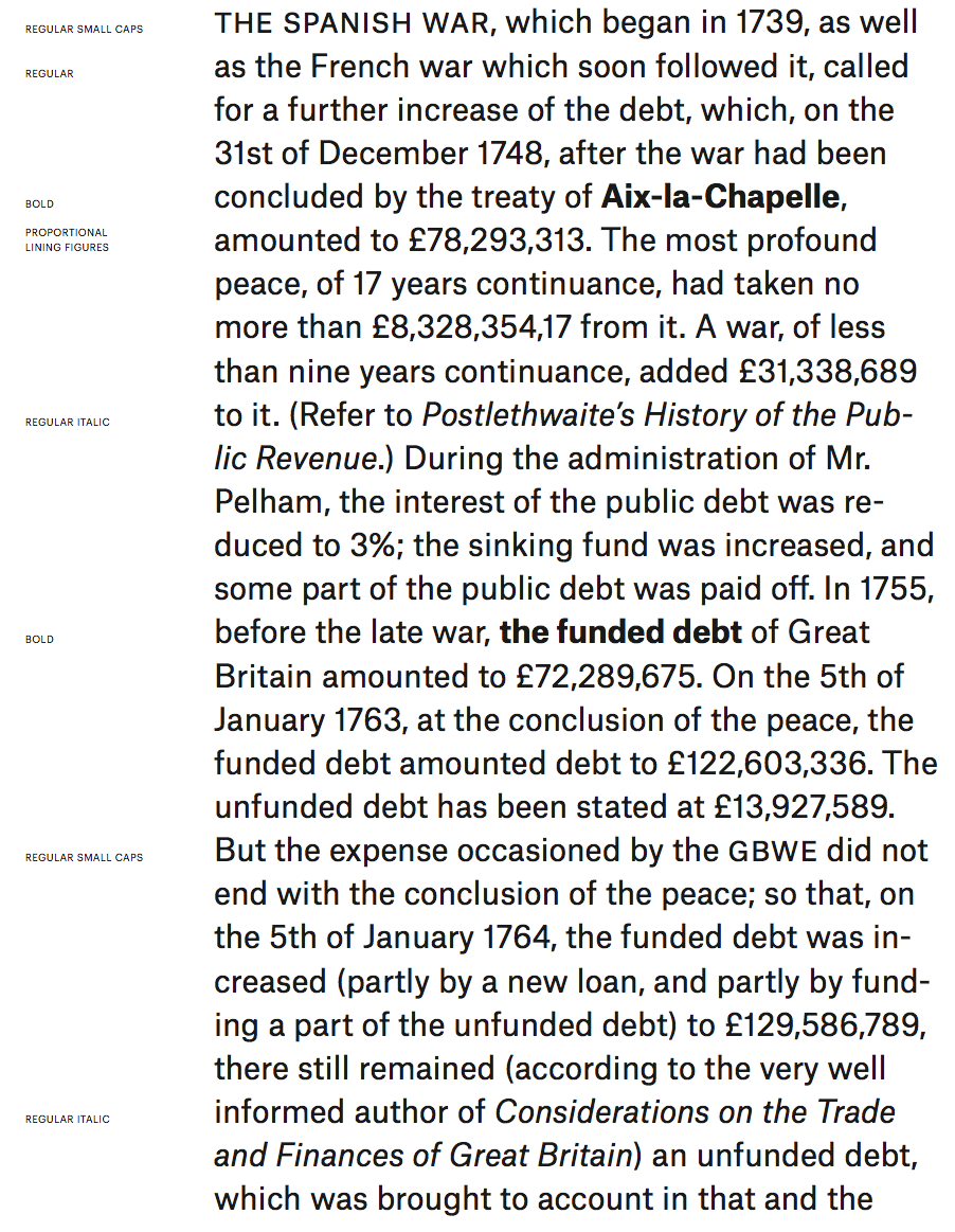
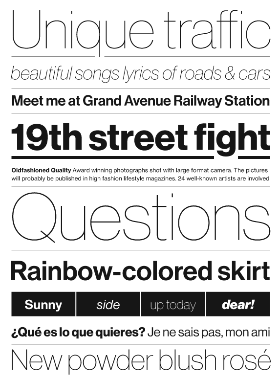
file name: Christian Schwartz Graphik
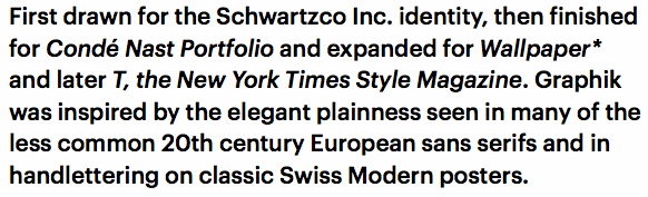
file name: Christian Schwartz Graphik 2009
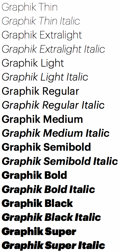
file name: Christian Schwartz Graphik 2009b

file name: Christian Schwartz Graphik 2009c

file name: Christian Schwartz Graphik 2009d

file name: Christian Schwartz Graphik
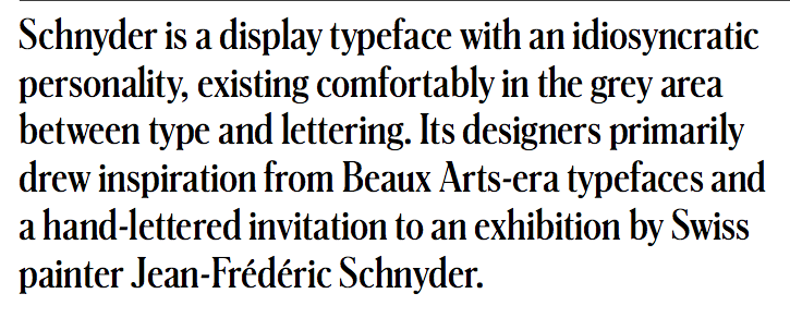
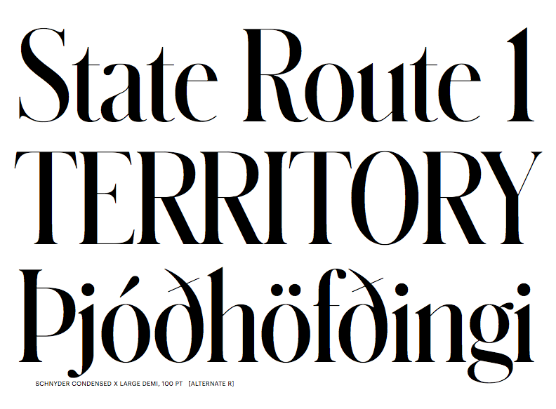
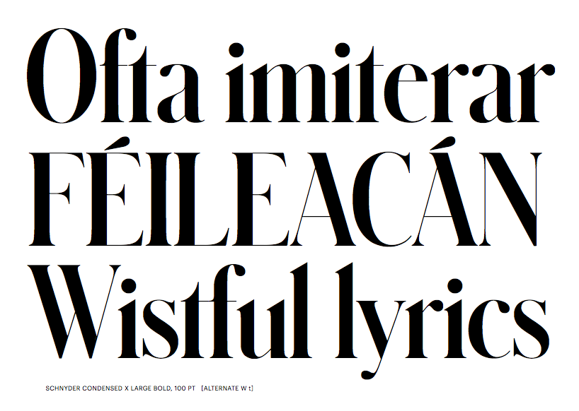
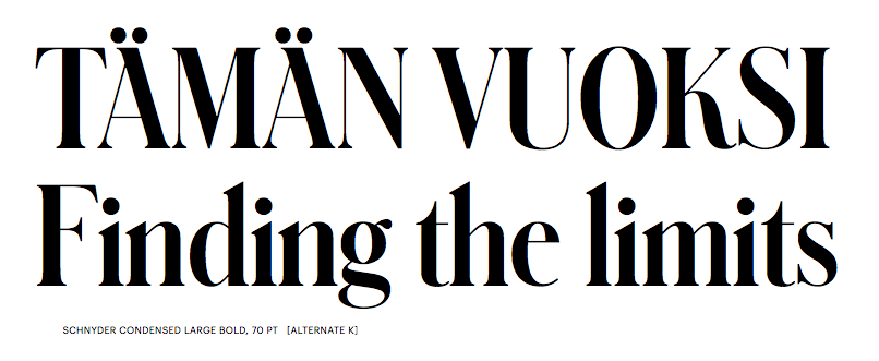
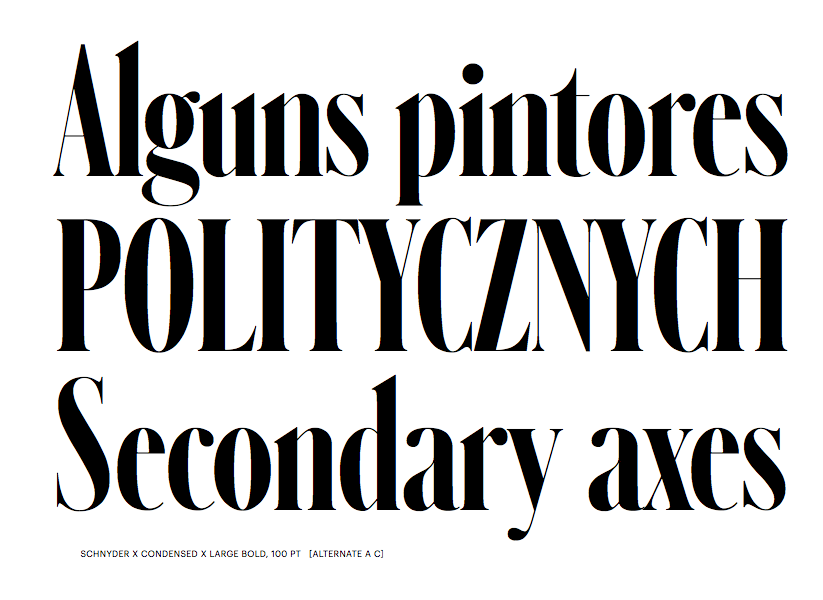
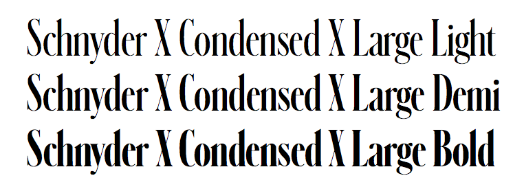
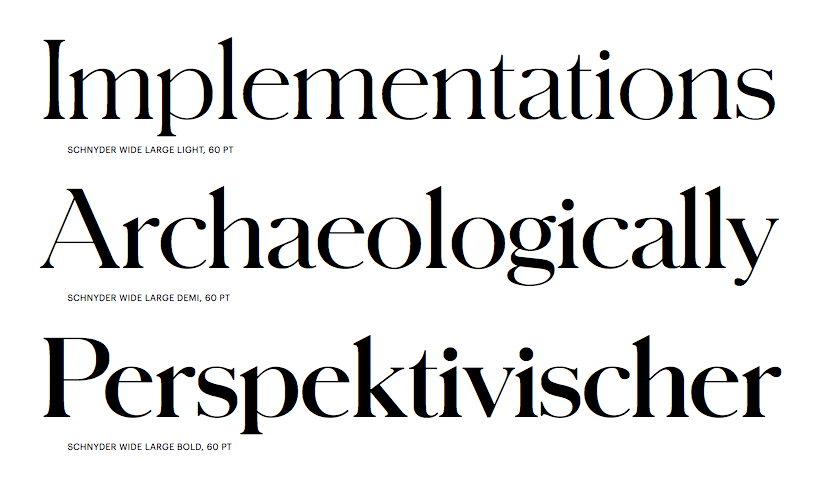
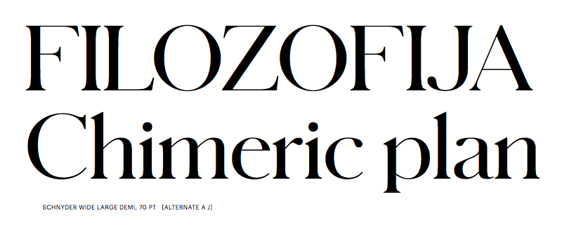
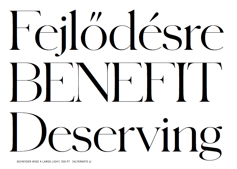
file name: Berton Hasebe Christian Schwartz Schnyder 2013 2018
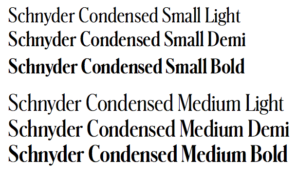
file name: Berton Hasebe Christian Schwartz Schnyder 2013 2018b
file name: Berton Hasebe Christian Schwartz Schnyder 2013 2018c
file name: Berton Hasebe Christian Schwartz Schnyder 2013 2018d
file name: Berton Hasebe Christian Schwartz Schnyder 2013 2018e
file name: Berton Hasebe Christian Schwartz Schnyder 2013 2018f
file name: Berton Hasebe Christian Schwartz Schnyder 2013 2018g
file name: Berton Hasebe Christian Schwartz Schnyder 2013 2018h
file name: Berton Hasebe Christian Schwartz Schnyder 2013 2018i
file name: Berton Hasebe Christian Schwartz Schnyder 2013 2018j

file name: Berton Hasebe Christian Schwartz Schnyder 2013 2018k
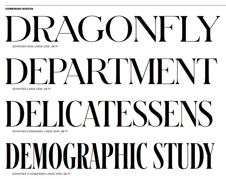
file name: Berton Hasebe Christian Schwartz Schnyder 2013 2018l

file name: Commercial Type F C Kaiser Fast Company Magazine

file name: Kai Bernau Susan Carvalho Christian Schwartz Atlas Grotesk 2012
file name: Kai Bernau Susan Carvalho Christian Schwartz Atlas Grotesk 2012b

file name: Kai Bernau Susan Carvalho Christian Schwartz Atlas Grotesk 2012c

file name: Kai Bernau Susan Carvalho Christian Schwartz Atlas Grotesk 2012d

file name: Commercial Type Type Project Axis Atlas Grotesk Thin 2015
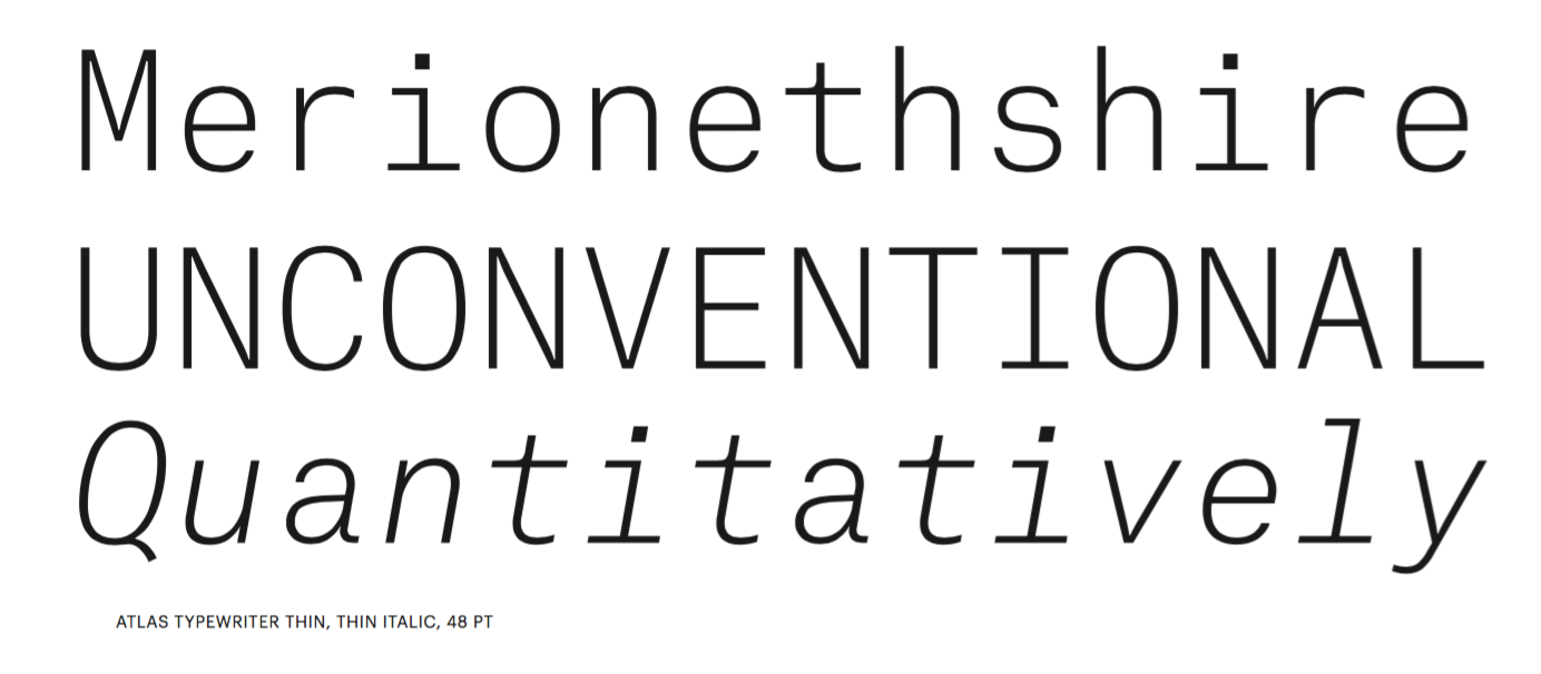
file name: Kai Bernau Susana Carvalho Atlas Typewriter 2012b
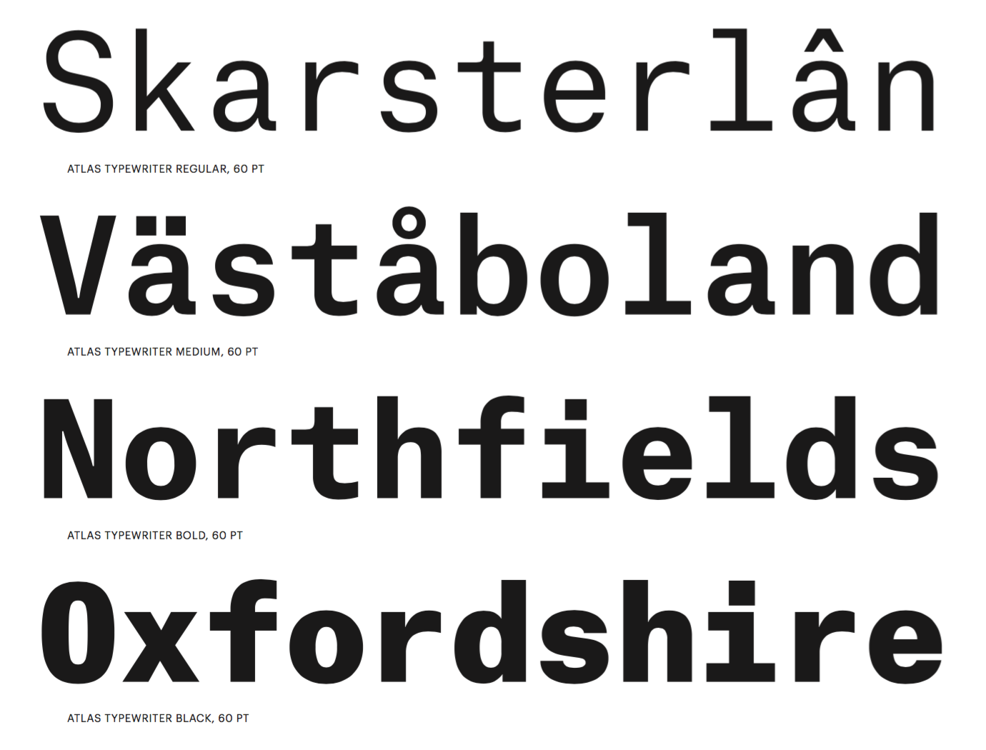
file name: Kai Bernau Susana Carvalho Atlas Typewriter 2012c
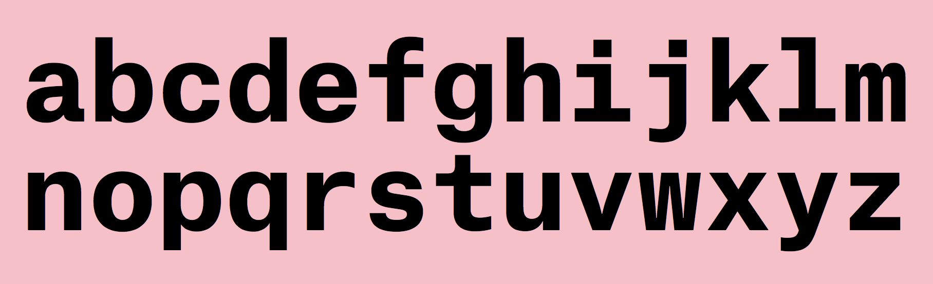
file name: Kai Bernau Susana Carvalho Atlas Typewriter Bold 2012

file name: Kai Bernau Susana Carvalho Atlas Typewriter Bold 2012b
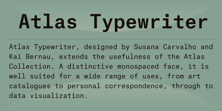
file name: Susana Carvalho Kai Bernau Atlas Typewriter 2012

file name: Susana Carvalho Kai Bernau Atlas Typewriter 2012a
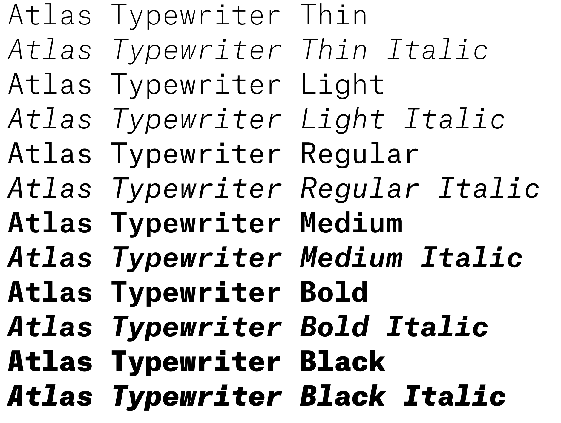
file name: Susana Carvalho Kai Bernau Atlas Typewriter 2012b
file name: Susana Carvalho Kai Bernau Atlas Typewriter 2012c

file name: Susana Carvalho Kai Bernau Atlas Typewriter 2012d
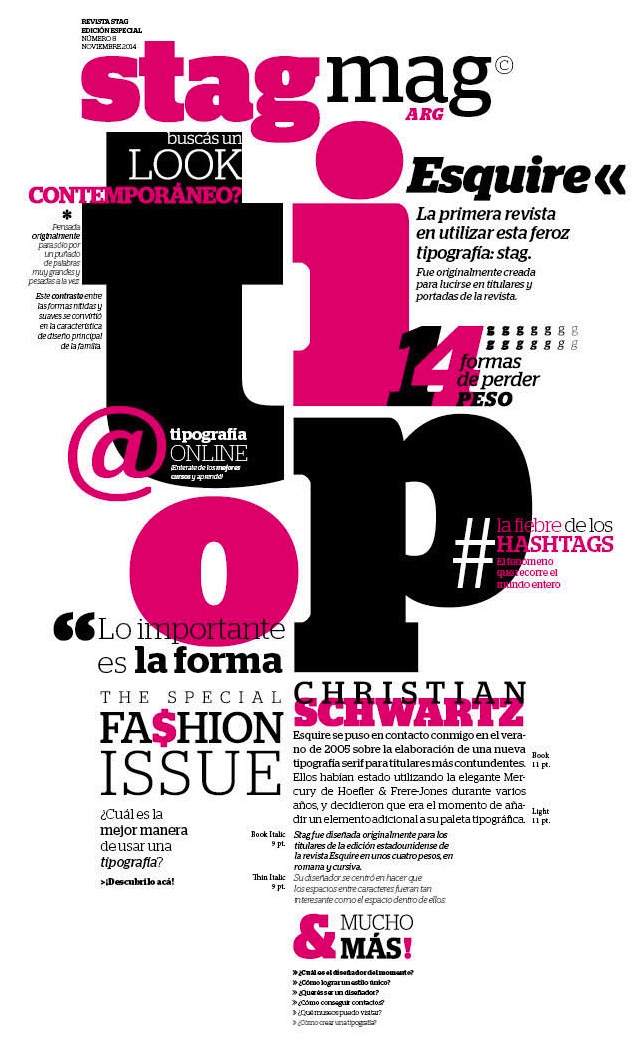
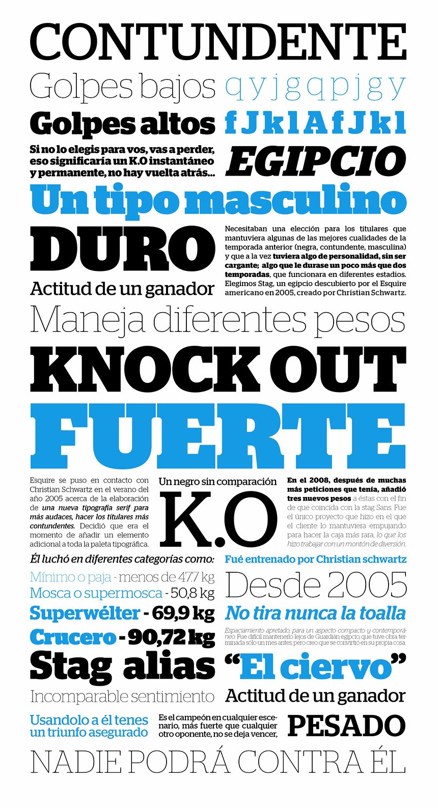
file name: Christian Schwartz Stag Esquire 2006 Poster by Guadalupe Peyrallo 2015
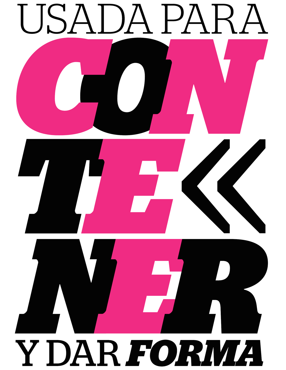
file name: Christian Schwartz Stag 2006 Poster by Leandro De La Cruz 2016
file name: Christian Schwartz Stag 2006 Poster by Victoria Costa Paz 2016
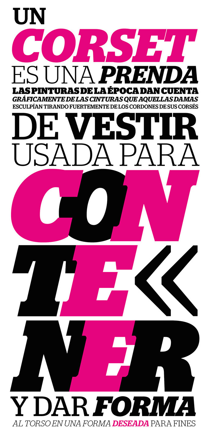
file name: Christian Schwartz Stag 2006 Poster by Victoria Costa Paz 2016b

file name: Christian Schwartz Stag Sans

file name: Christian Schwartz Stag Stag Dot

file name: Christian Schwartz Stag Dot 2009

file name: Christian Schwartz Stag Dot 2009b

file name: Christian Schwartz Amplitude 2002

file name: Christian Schwartz Amplitude 2002
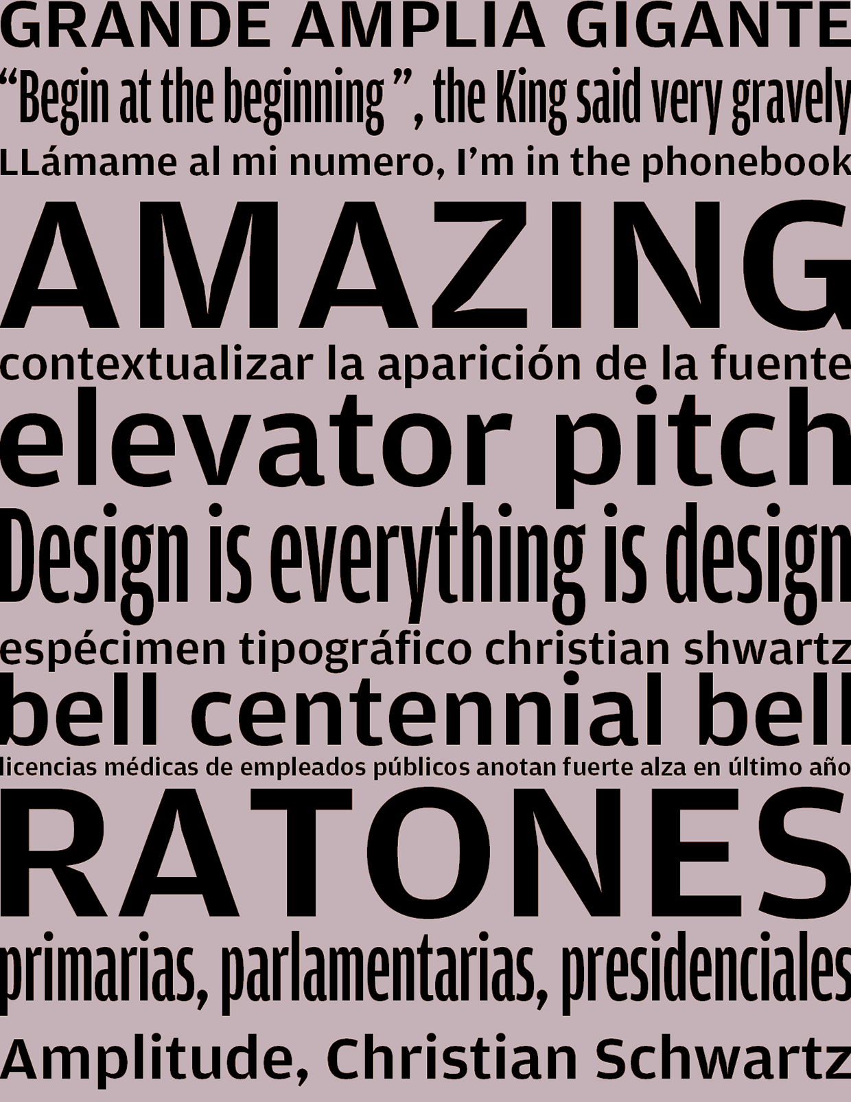
file name: Christian Schwartz Amplitude 2002 Poster by Maria Paz Carvajal 2015
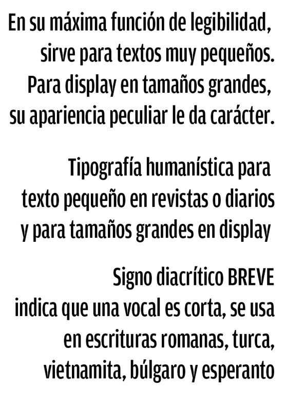
file name: Christian Schwartz Amplitude 2002 Poster by Maria Paz Carvajal 2015b

file name: Christian Schwartz Giorgio Medium 2009

file name: Commercial Type Type Project Graphik Semibold 2015
file name: Commercial Type Type Project T P Mincho Lyon Display Medium 2015
file name: Commercial Type Type Project T P Mincho Publico Headline Regular 2015
file name: Commercial Type Catalog 2015
file name: Commercial Type Catalog 2015b
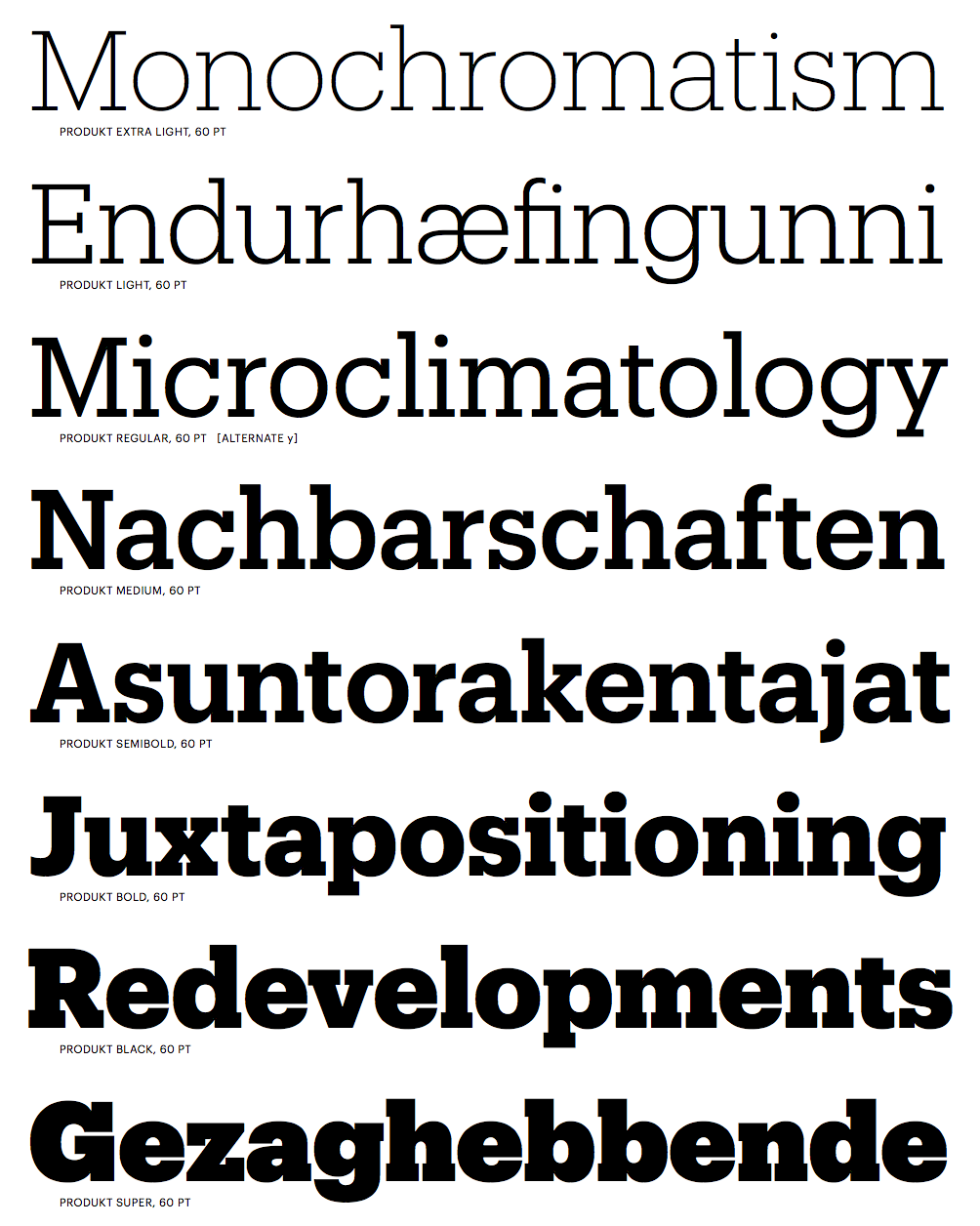
file name: Christian Schwartz Berton Hasebe Produkt 2014a
file name: Christian Schwartz Berton Hasebe Produkt 2014b
file name: Christian Schwartz Berton Hasebe Produkt Black 2014

file name: Christian Schwartz Berton Hasebe Produkt Black 2014b
file name: Christian Schwartz Berton Hasebe Produkt Light 2014

file name: Christian Schwartz Berton Hasebe Produkt Super 2014

file name: Christian Schwartz Berton Hasebe Produkt Thin 2014
file name: Christian Schwartz Miguel Reyes Duplicate 2013
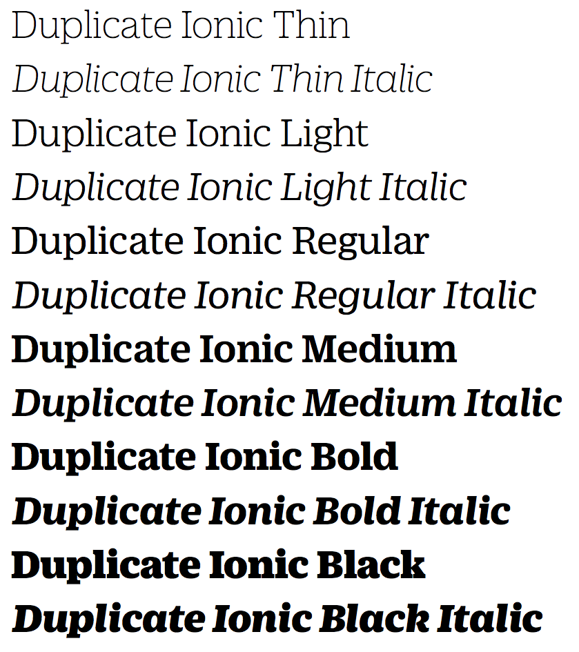
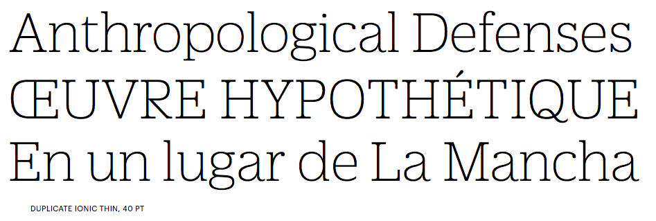
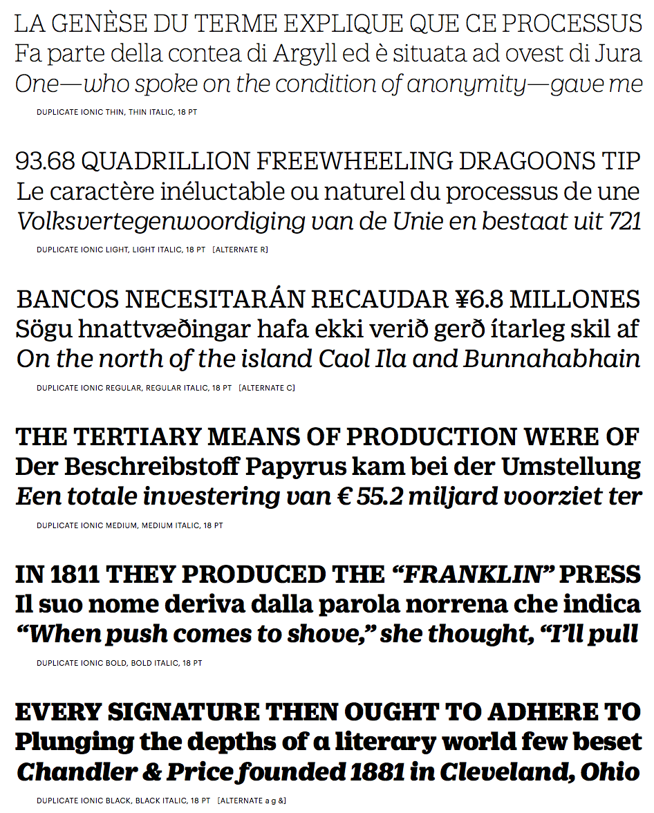
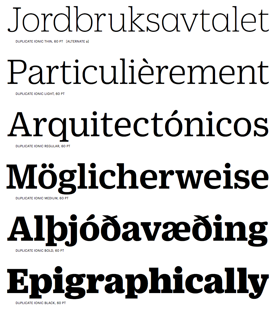
file name: Christian Schwartz Miguel Reyes Duplicate Ionic 2013
file name: Christian Schwartz Miguel Reyes Duplicate Ionic 2013b
file name: Christian Schwartz Miguel Reyes Duplicate Ionic 2013c

file name: Christian Schwartz Miguel Reyes Duplicate Ionic 2013d
file name: Christian Schwartz Miguel Reyes Duplicate Ionic 2013e
file name: Christian Schwartz Miguel Reyes Duplicate Ionic 2013f

file name: Christian Schwartz Miguel Reyes Duplicate Ionic 2013g

file name: Christian Schwartz Miguel Reyes Duplicate Ionic 2013h

file name: Christian Schwartz Miguel Reyes Duplicate Ionic N Z Z Sonntag 2013
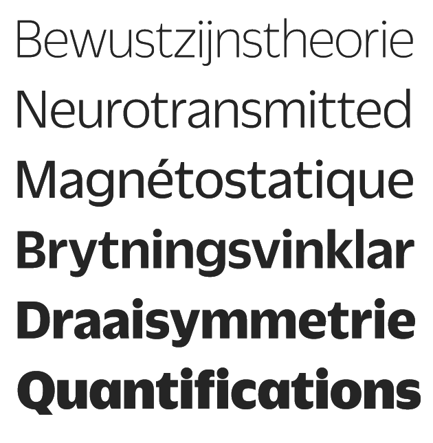
file name: Christian Schwartz Miguel Reyes Duplicate Sans 2013
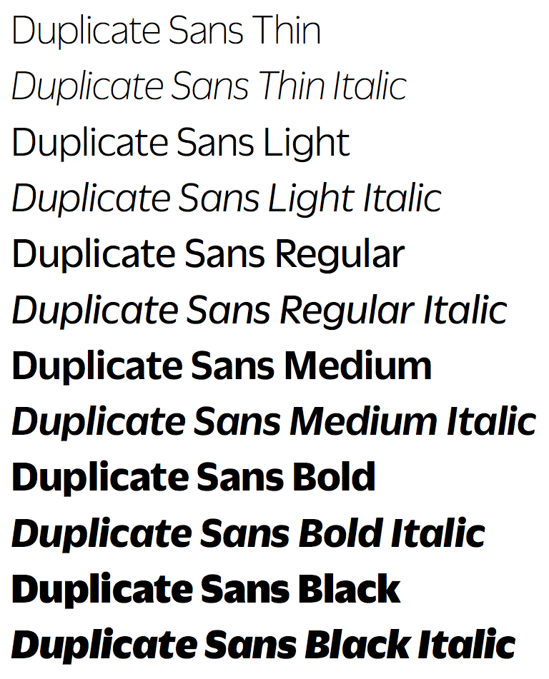
file name: Christian Schwartz Miguel Reyes Duplicate Sans 2013b

file name: Christian Schwartz Miguel Reyes Duplicate Sans 2013c
file name: Christian Schwartz Miguel Reyes Duplicate Sans 2013d

file name: Christian Schwartz Miguel Reyes Duplicate Sans 2013e

file name: Christian Schwartz Miguel Reyes Duplicate Sans 2013f
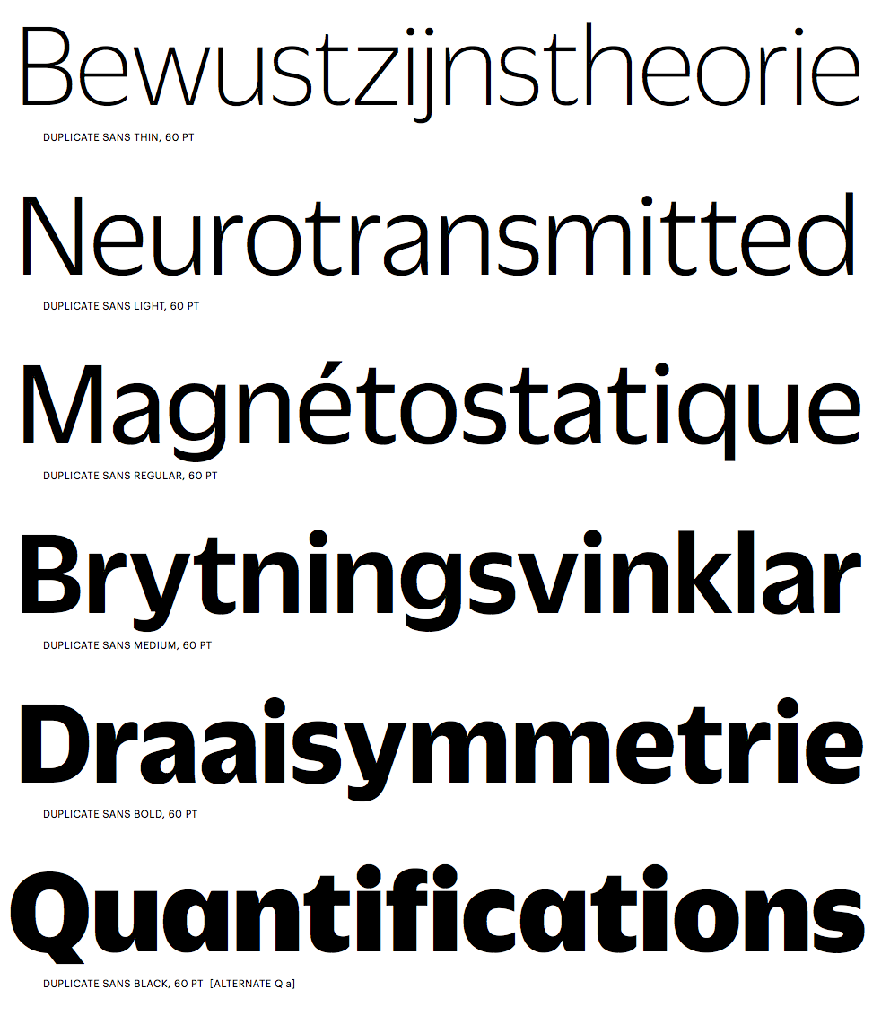
file name: Christian Schwartz Miguel Reyes Duplicate Sans 2013g
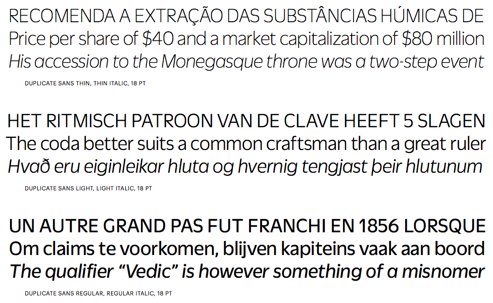
file name: Christian Schwartz Miguel Reyes Duplicate Sans 2013h
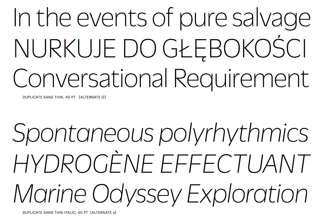
file name: Christian Schwartz Miguel Reyes Duplicate Sans 2013i
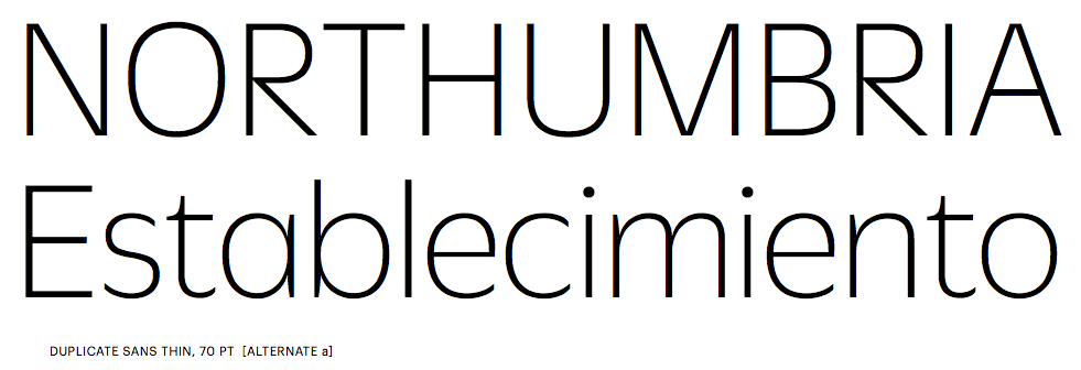
file name: Christian Schwartz Miguel Reyes Duplicate Sans 2013j

file name: Christian Schwartz Miguel Reyes Duplicate Slab 2013

file name: Christian Schwartz Miguel Reyes Duplicate Slab 2013b

file name: Christian Schwartz Miguel Reyes Duplicate Slab 2013c
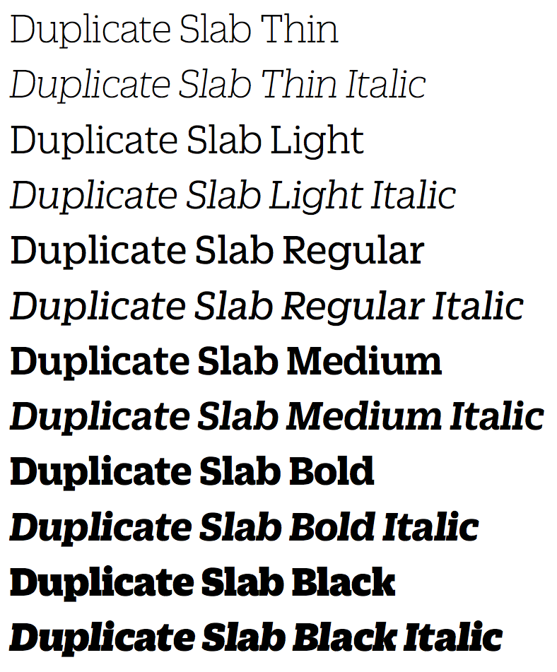
file name: Christian Schwartz Miguel Reyes Duplicate Slab 2013d
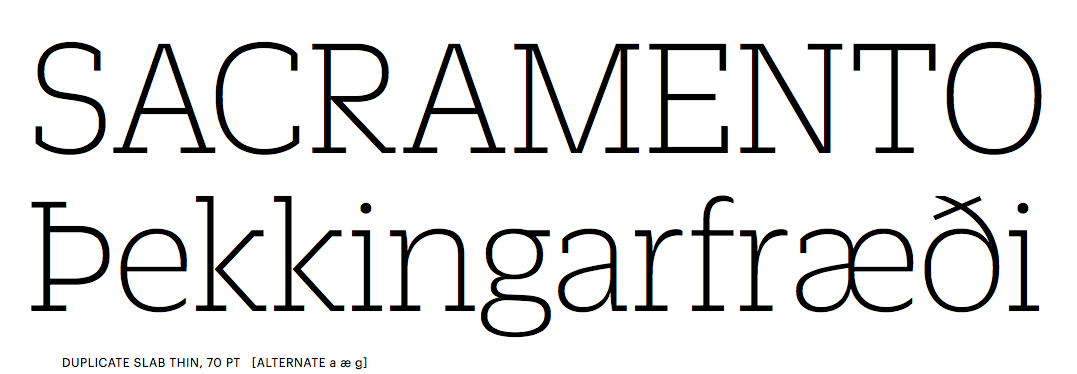
file name: Christian Schwartz Miguel Reyes Duplicate Slab 2013e

file name: Christian Schwartz Miguel Reyes Duplicate Slab 2013f
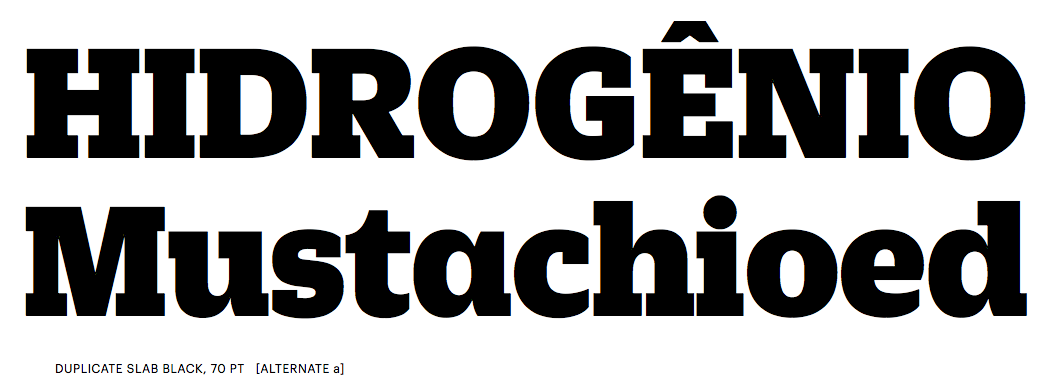
file name: Christian Schwartz Miguel Reyes Duplicate Slab 2013g

file name: Christian Schwartz Miguel Reyes Duplicate Slab 2013h
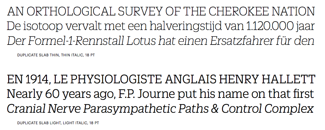
file name: Christian Schwartz Miguel Reyes Duplicate Slab 2013i
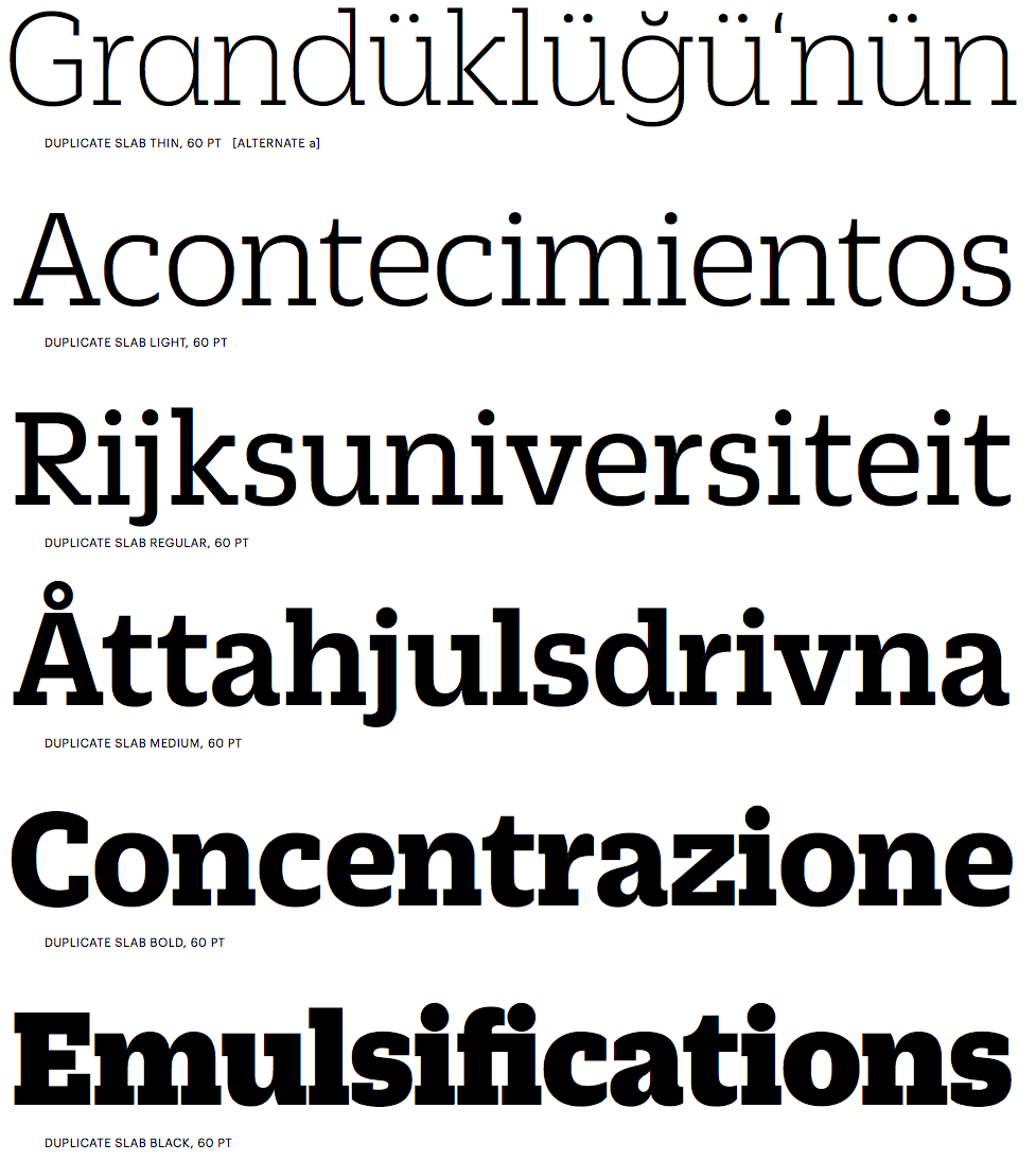
file name: Christian Schwartz Miguel Reyes Duplicate Slab 2013j
file name: Christian Schwartz Miguel Reyes Duplicate Slab 2013k
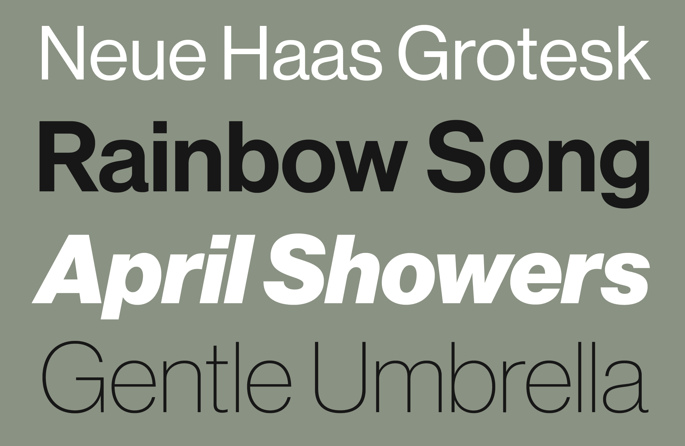
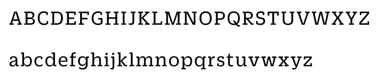
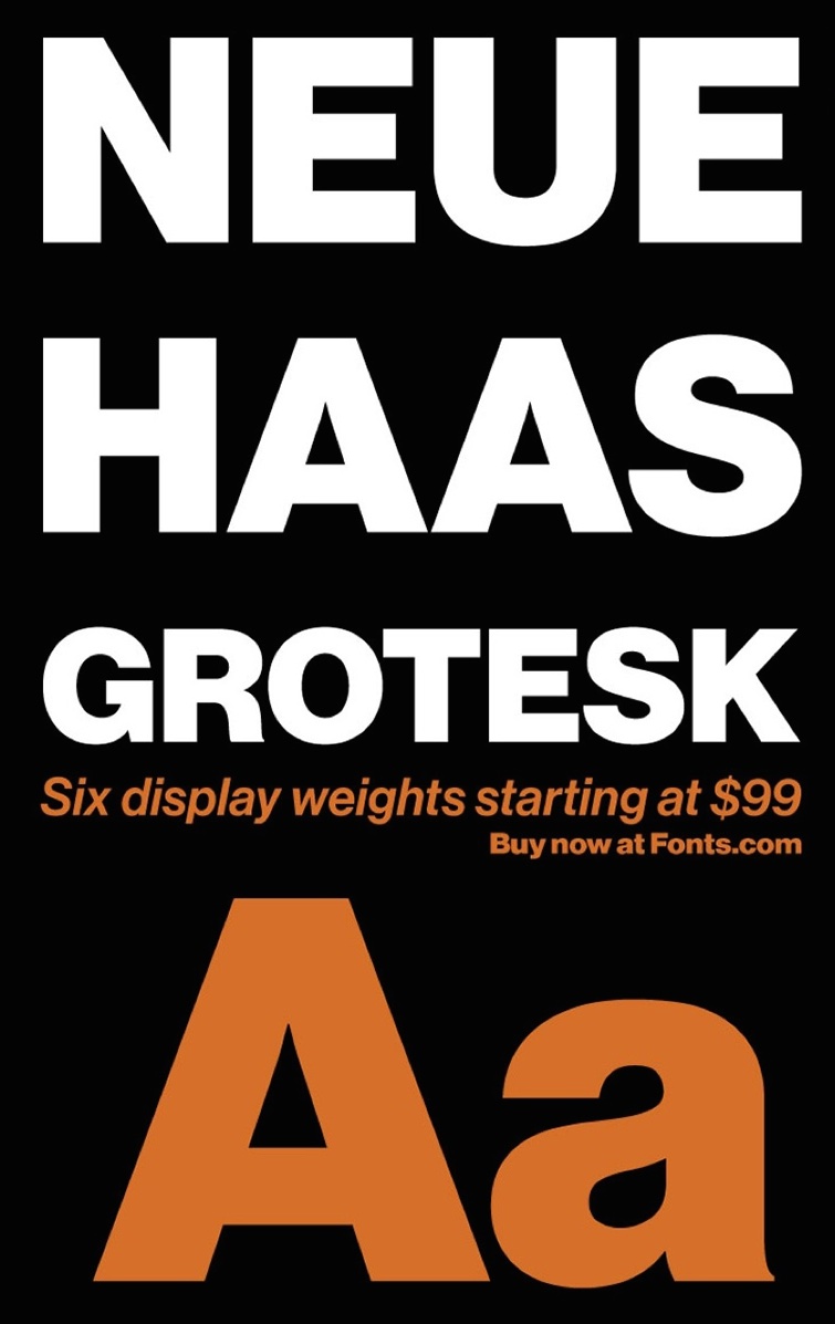
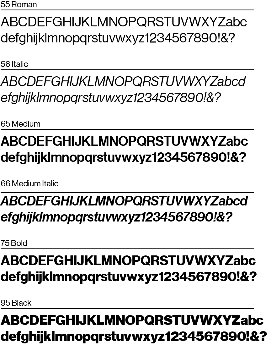
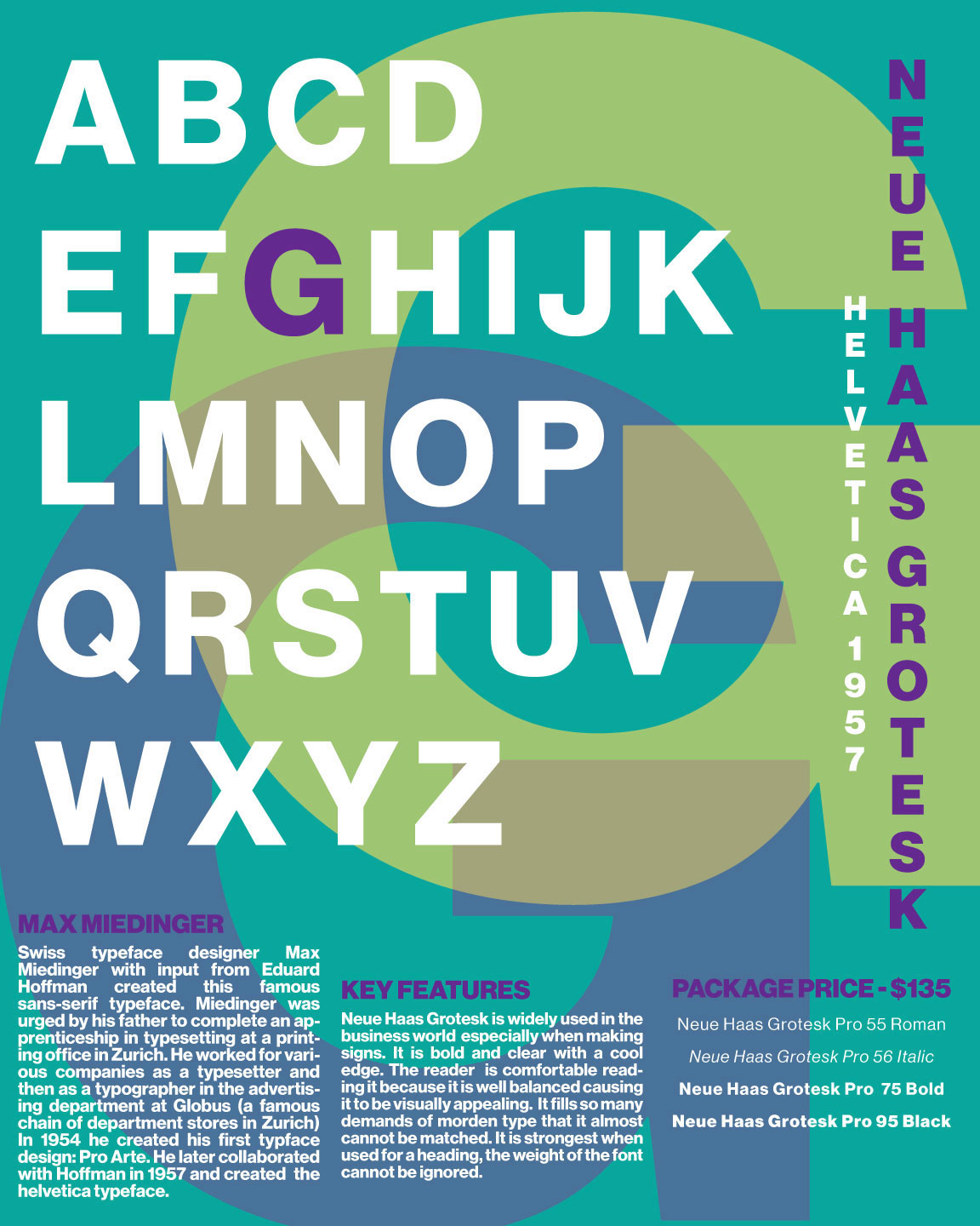
file name: Christian Schwartz Neue Haas Grotesk 2012
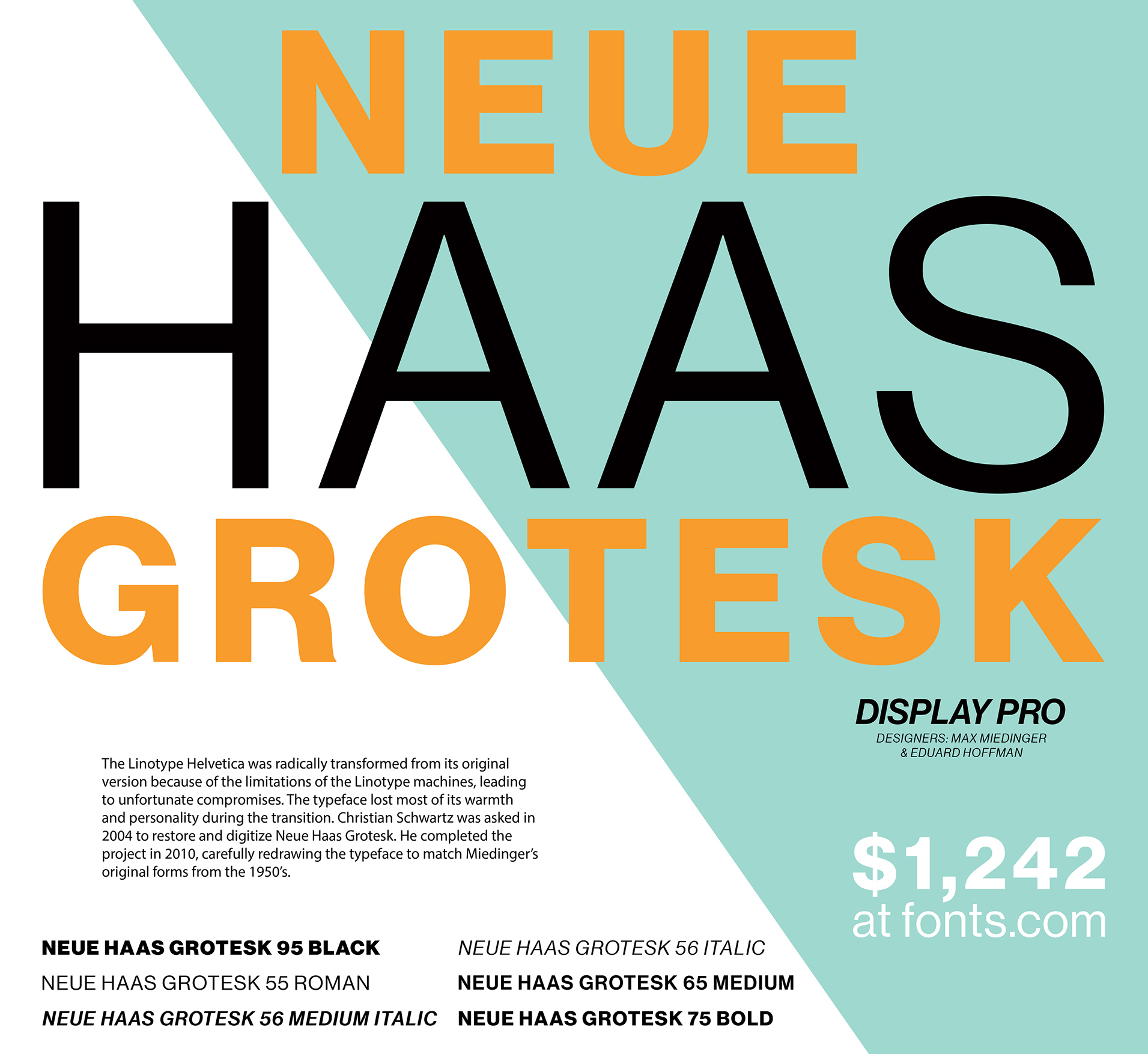
file name: Christian Schwartz Neue Haas Grotesk 2011 poster by Ashleigh Varga 2017
file name: Christian Schwartz Neue Haas Grotesk 2011
file name: Christian Schwartz Neue Haas Grotesk 2012 poster by Jason Egan 2018
file name: Christian Schwartz Neue Haas Grotesk 2012 poster by Jason Egan 2018a

file name: Christian Schwartz Neue Haas Grotesk 2011

file name: Christian Schwartz Neue Haas Grotesk 2011b

file name: Christian Schwartz Neue Haas Grotesk 2011c
file name: Christian Schwartz Neue Haas Grotesk 2011 Poster by Georgia Eyers 2016
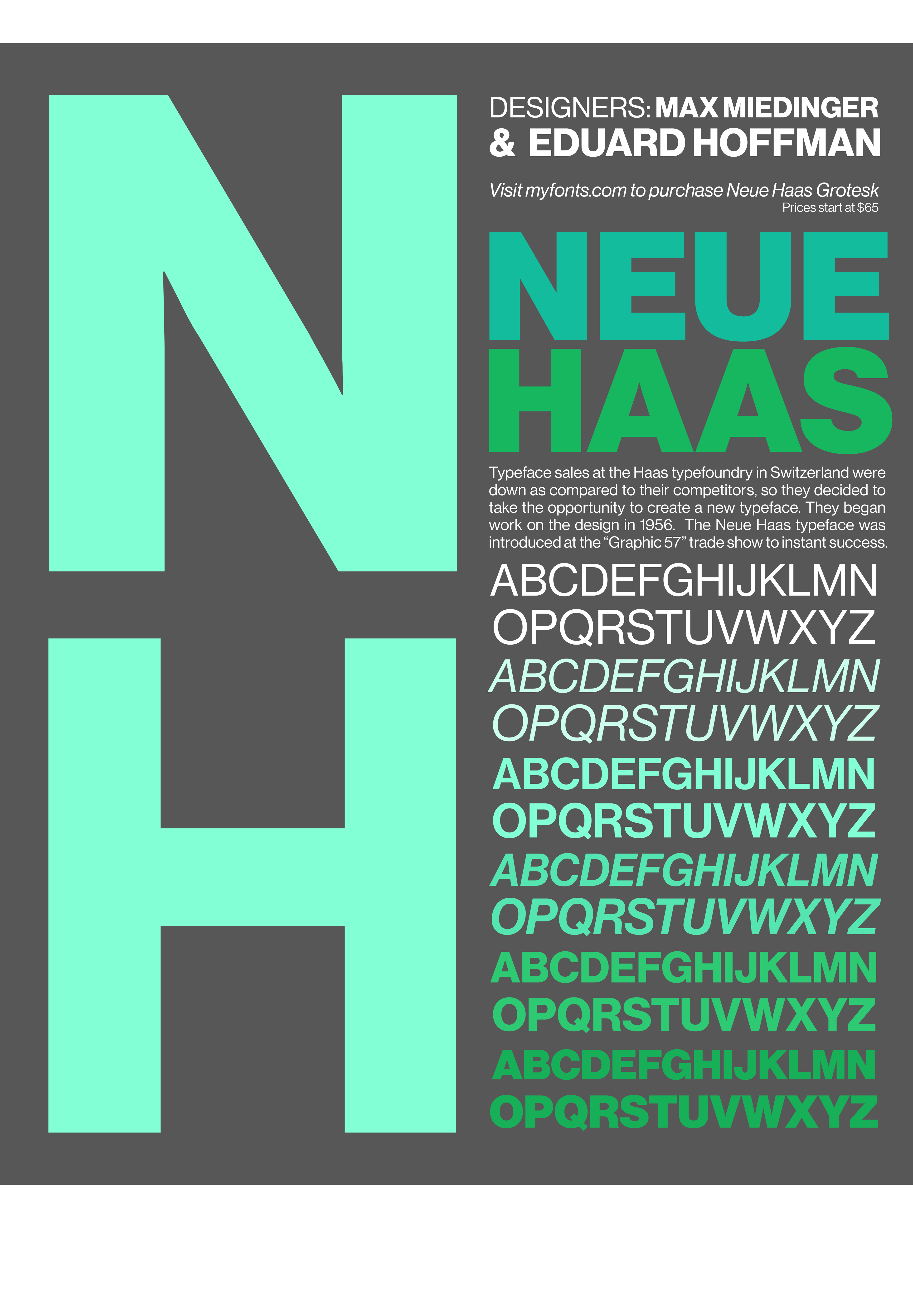
file name: Christian Schwartz Neue Haas Grotesk 2012 Poster by Antonia Smith 2017
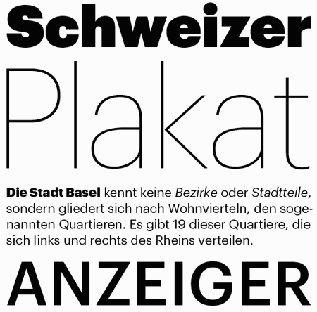
file name: Paul Barnes Christian Schwartz Guardian 2006
file name: Commercial Type Logo 2010
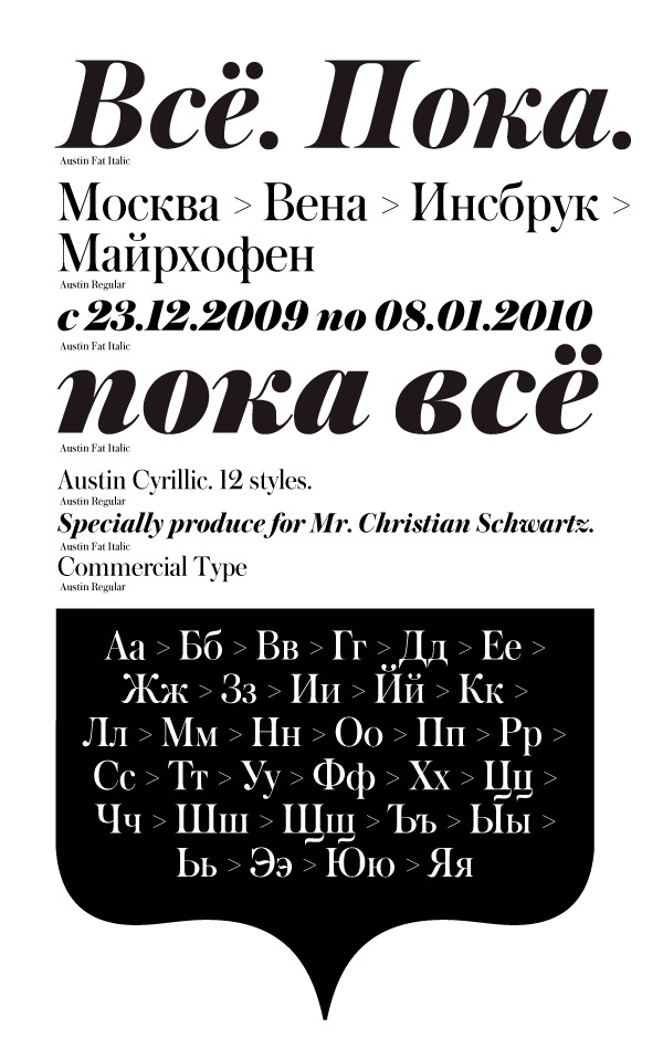
file name: Christian Schwartz Austin Cyrillic

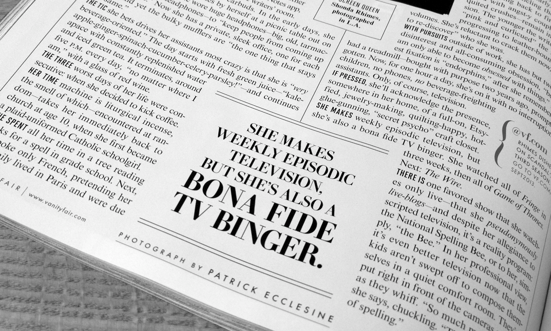
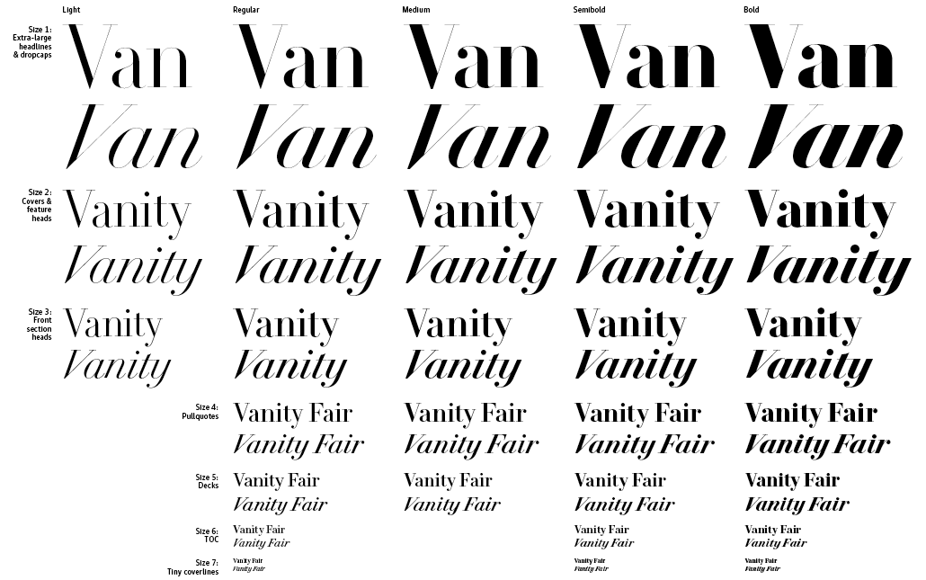
file name: Paul Barnes Christian Schwartz V F Didot 2013

file name: Paul Barnes Christian Schwartz V F Didot 2013b

file name: Paul Barnes Christian Schwartz V F Didot 2013c.

file name: Paul Barnes Christian Schwartz V F Didot 2013d

file name: Paul Barnes Christian Schwartz V F Didot 2013e
file name: Paul Barnes Christian Schwartz V F Didot 2013f
file name: Paul Barnes Christian Schwartz V F Didot 2013g

file name: Paul Barnes Christian Schwartz V F Didot 2013h

file name: Paul Barnes Christian Schwartz V F Didot 2013i

file name: Paul Barnes Christian Schwartz V F Didot 2013j

file name: Paul Barnes Christian Schwartz V F Didot 2013k
file name: Paul Barnes Christian Schwartz V F Didot 2013l

file name: Paul Barnes Christian Schwartz V F Didot 2013m

file name: Paul Barnes Christian Schwartz V F Didot 2013o
file name: Paul Barnes Christian Schwartz V F Didot 2013p
file name: Paul Barnes Christian Schwartz V F Didot 2013q
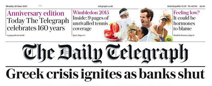
file name: Commercial Type The Daily Telegraph
| | |
|
Luc Devroye ⦿ School of Computer Science ⦿ McGill University Montreal, Canada H3A 2K6 ⦿ lucdevroye@gmail.com ⦿ https://luc.devroye.org ⦿ https://luc.devroye.org/fonts.html |