TYPE DESIGN INFORMATION PAGE last updated on Mon Jun 8 18:04:54 EDT 2026
FONT RECOGNITION VIA FONT MOOSE

|
|
|
|
Berton Hasebe
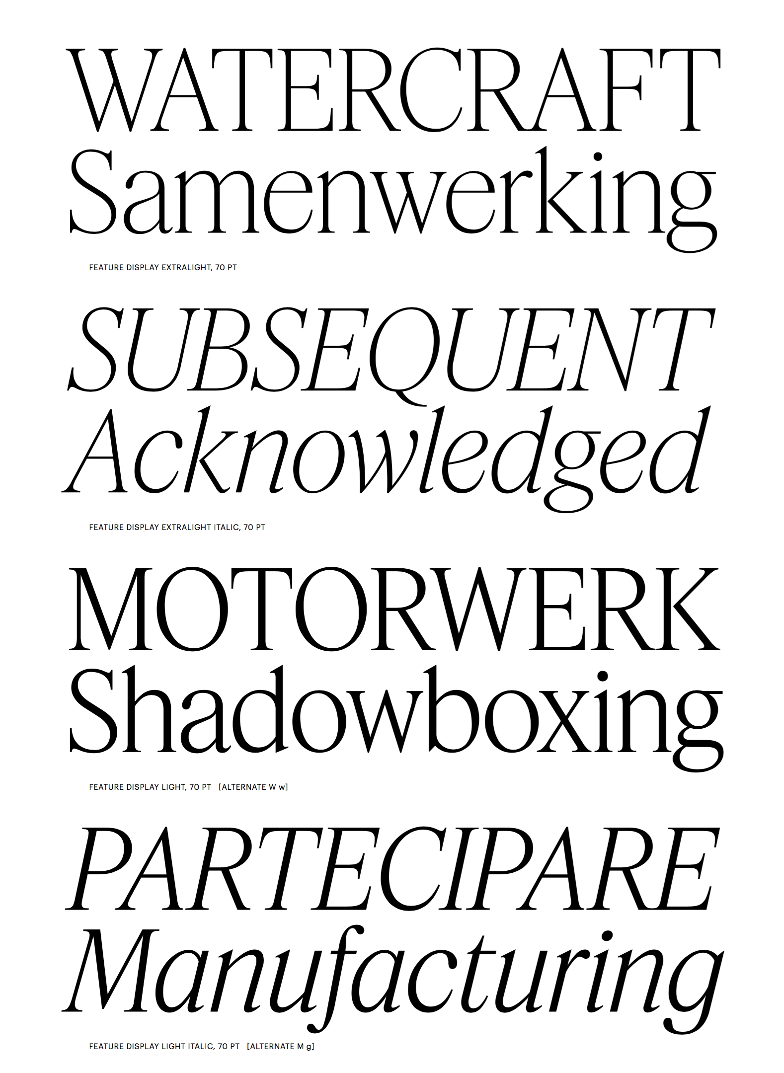
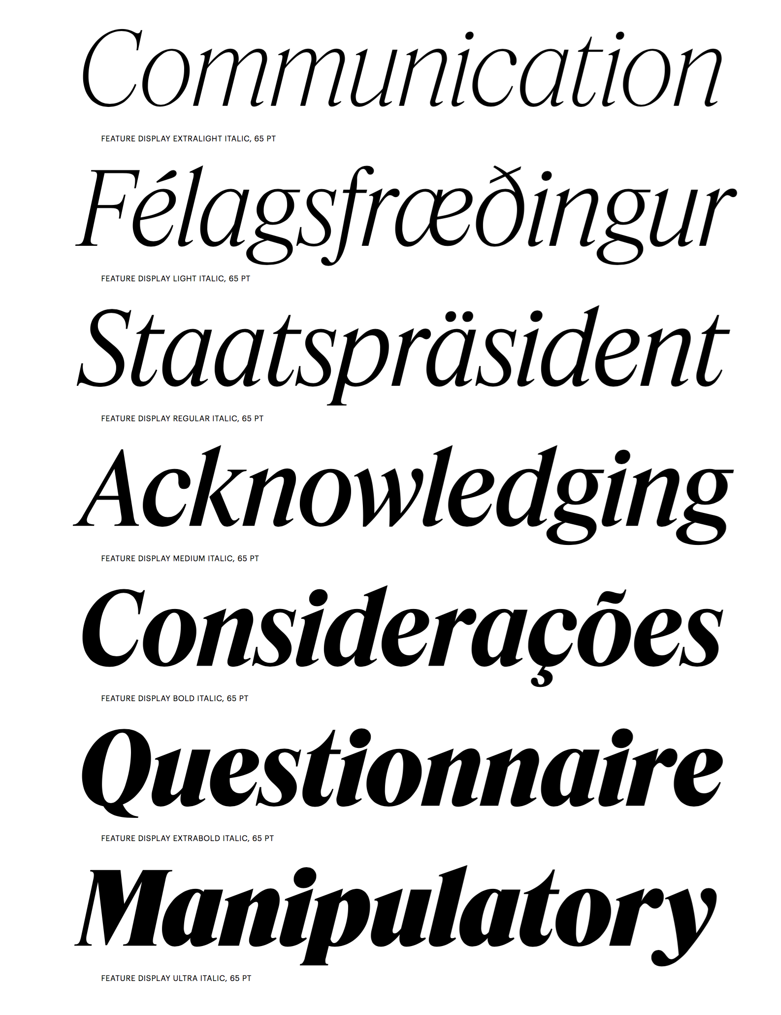
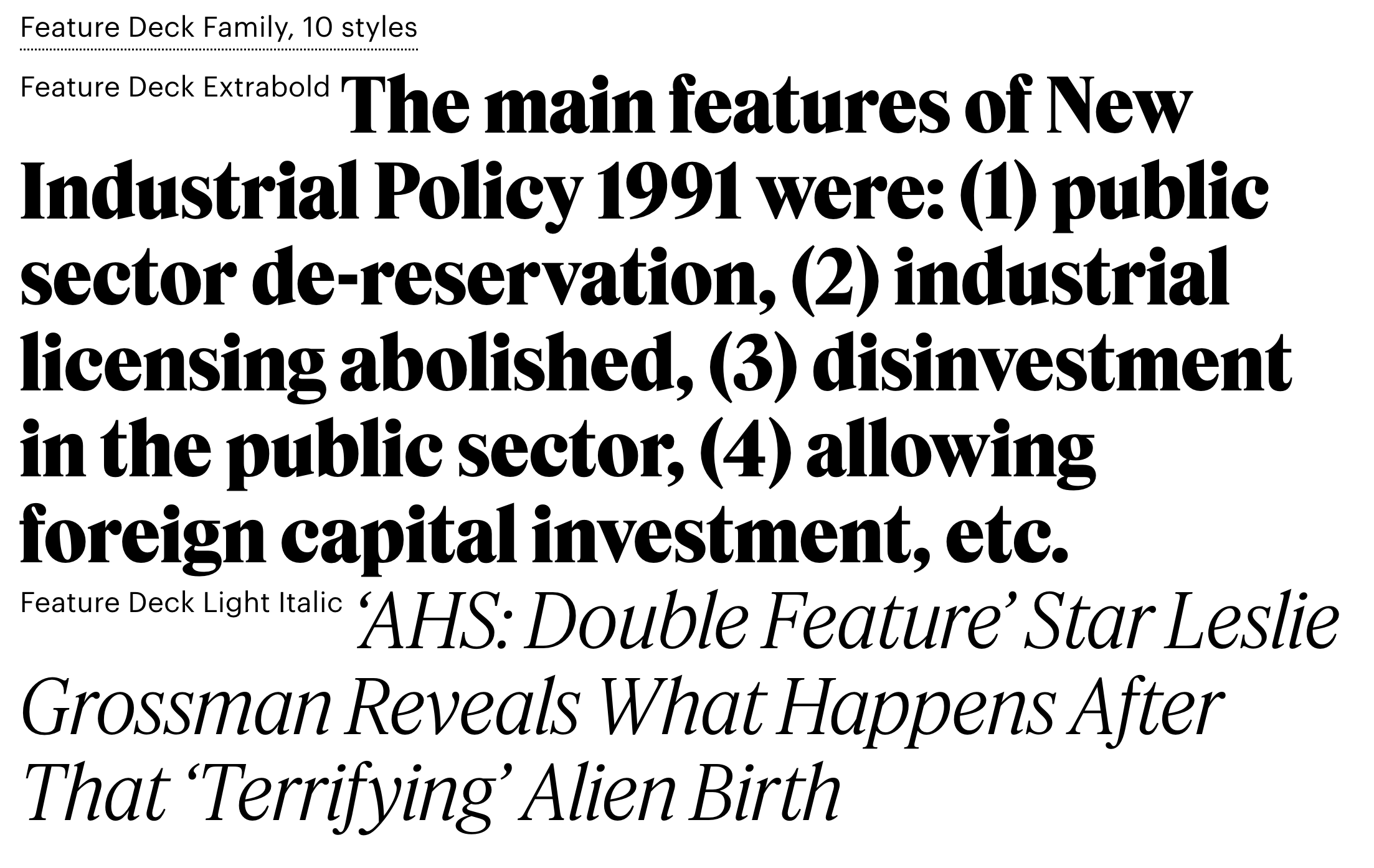
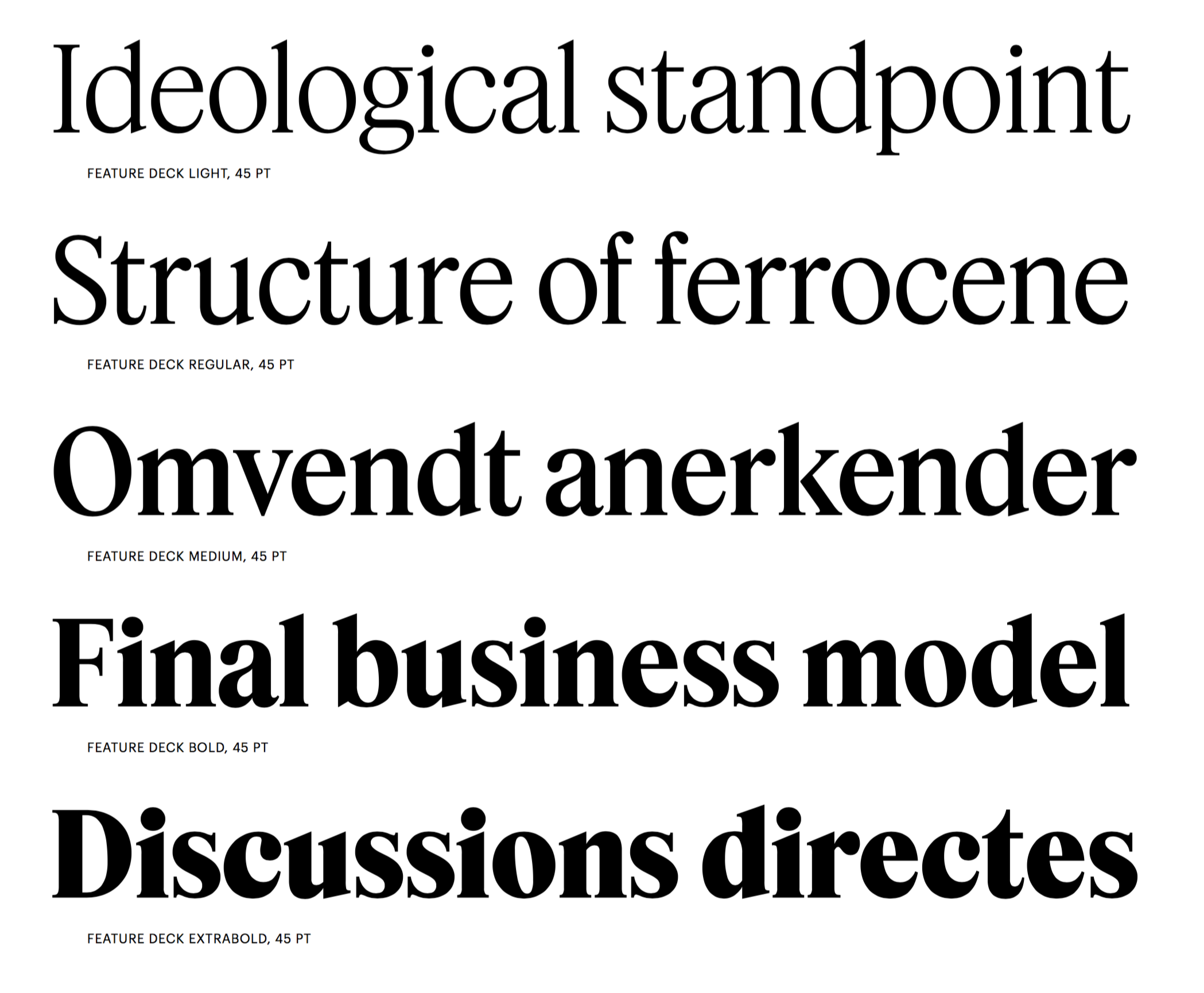
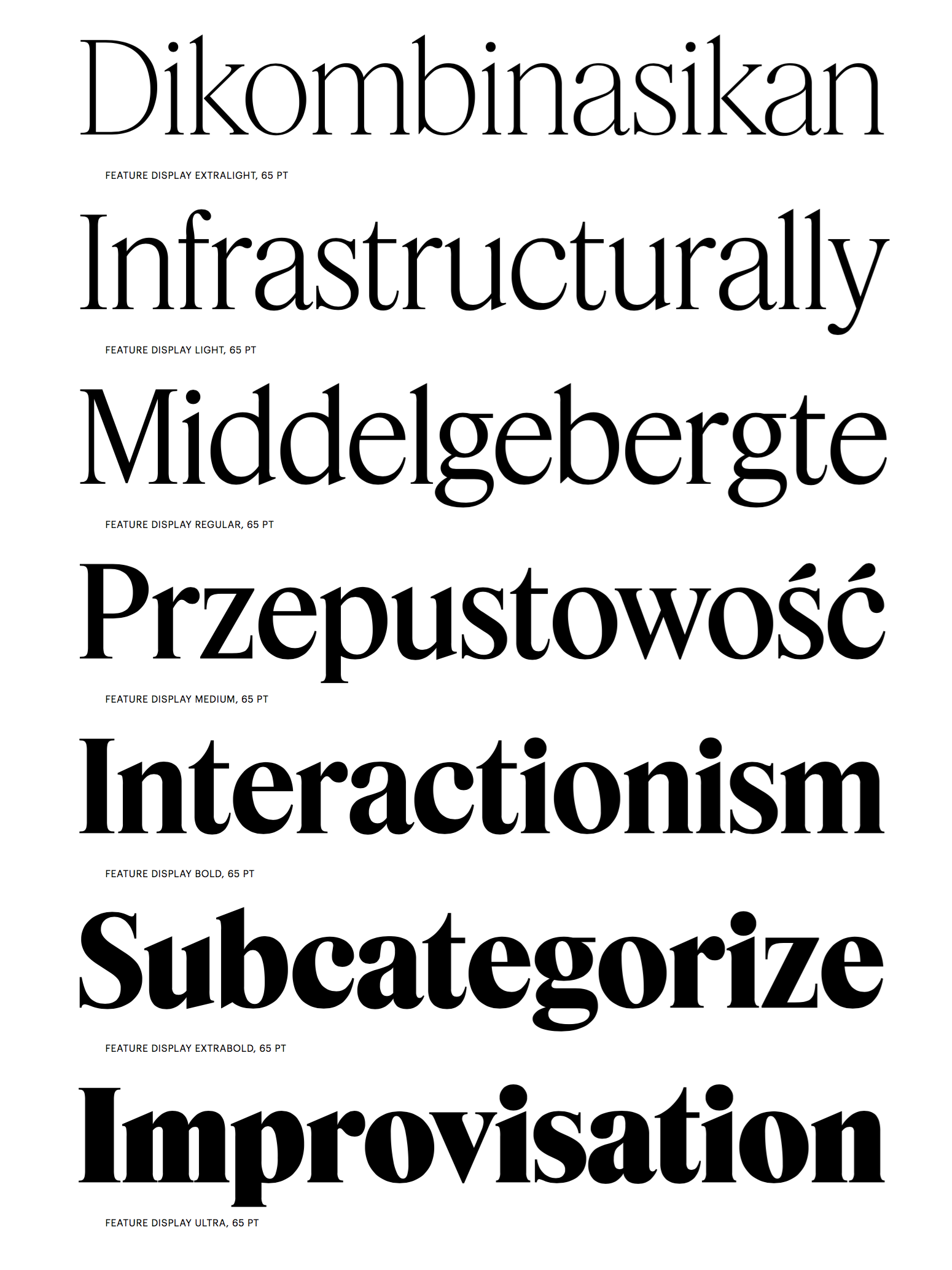
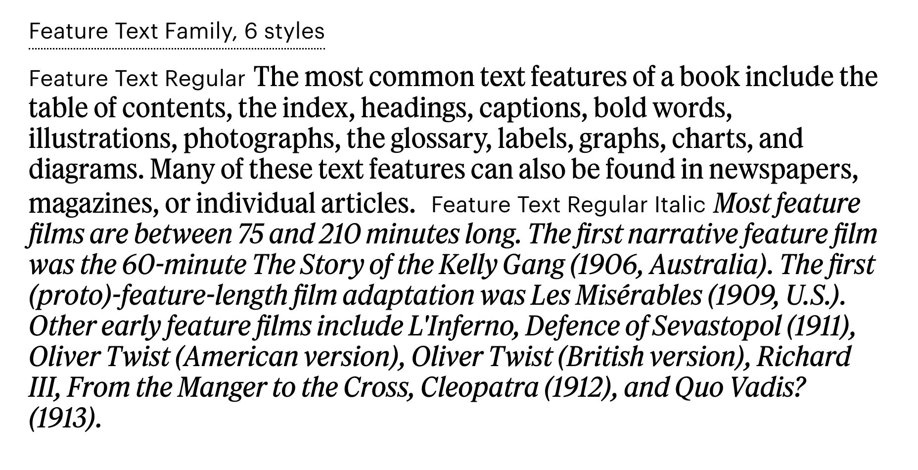
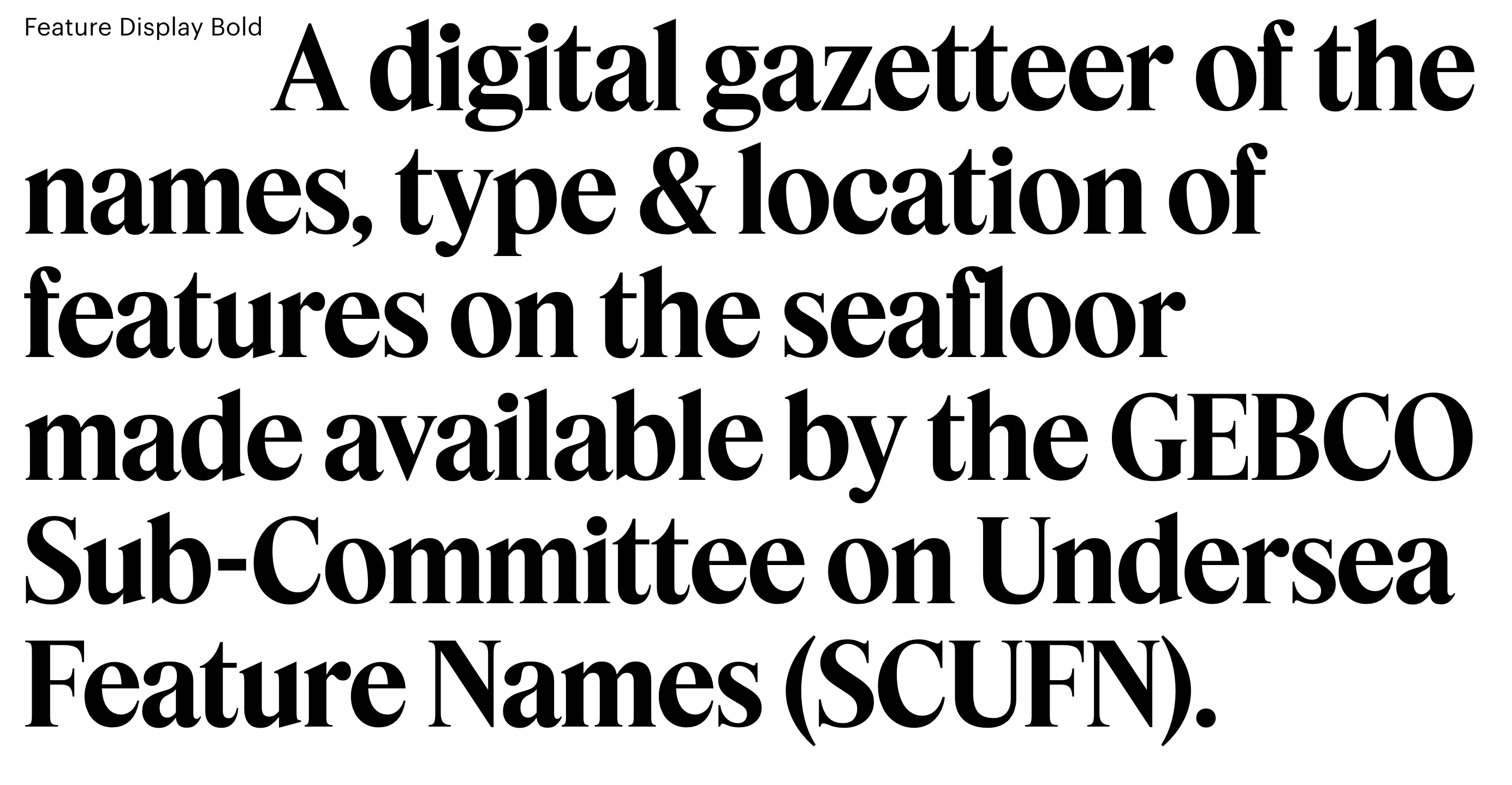
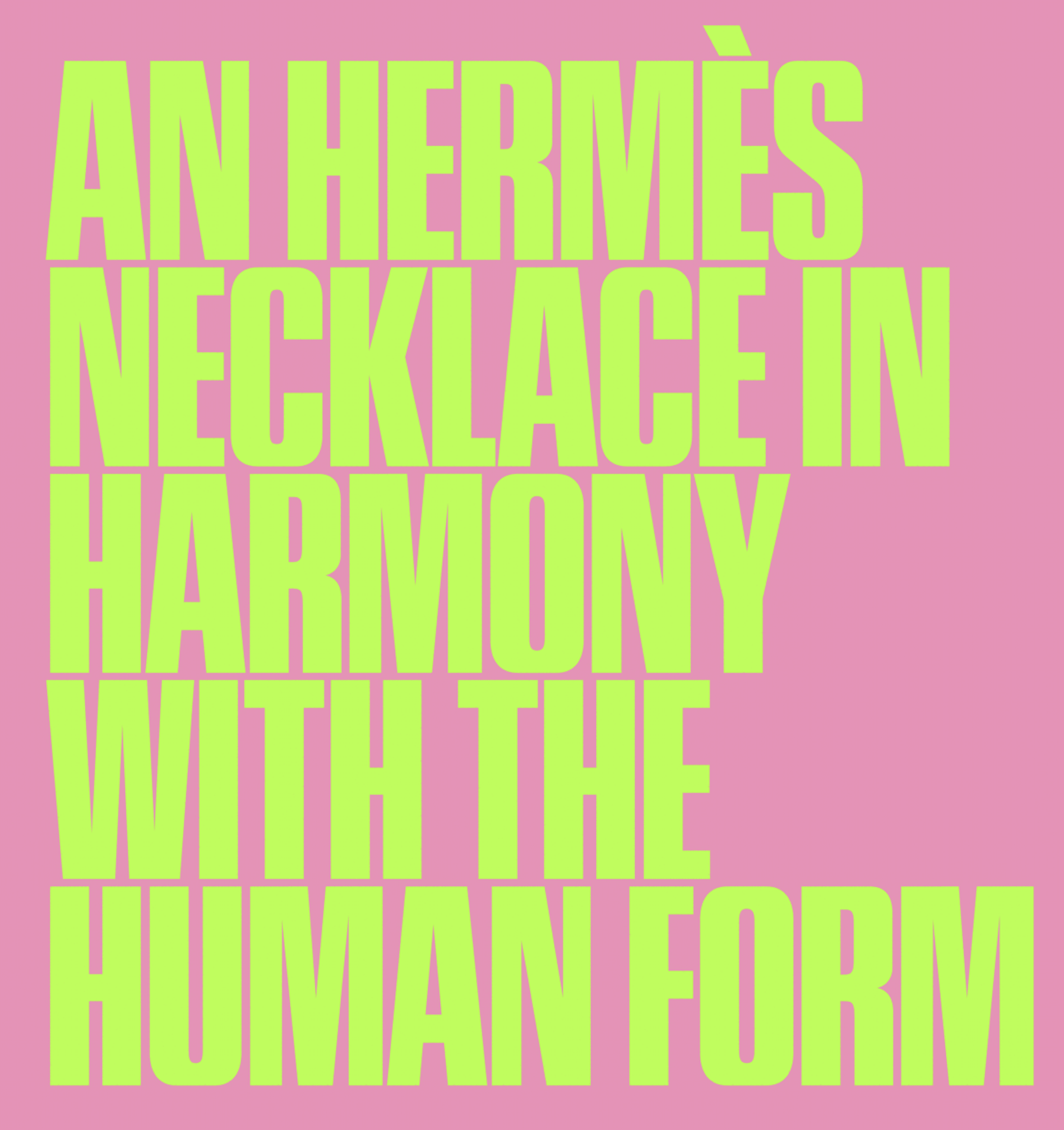
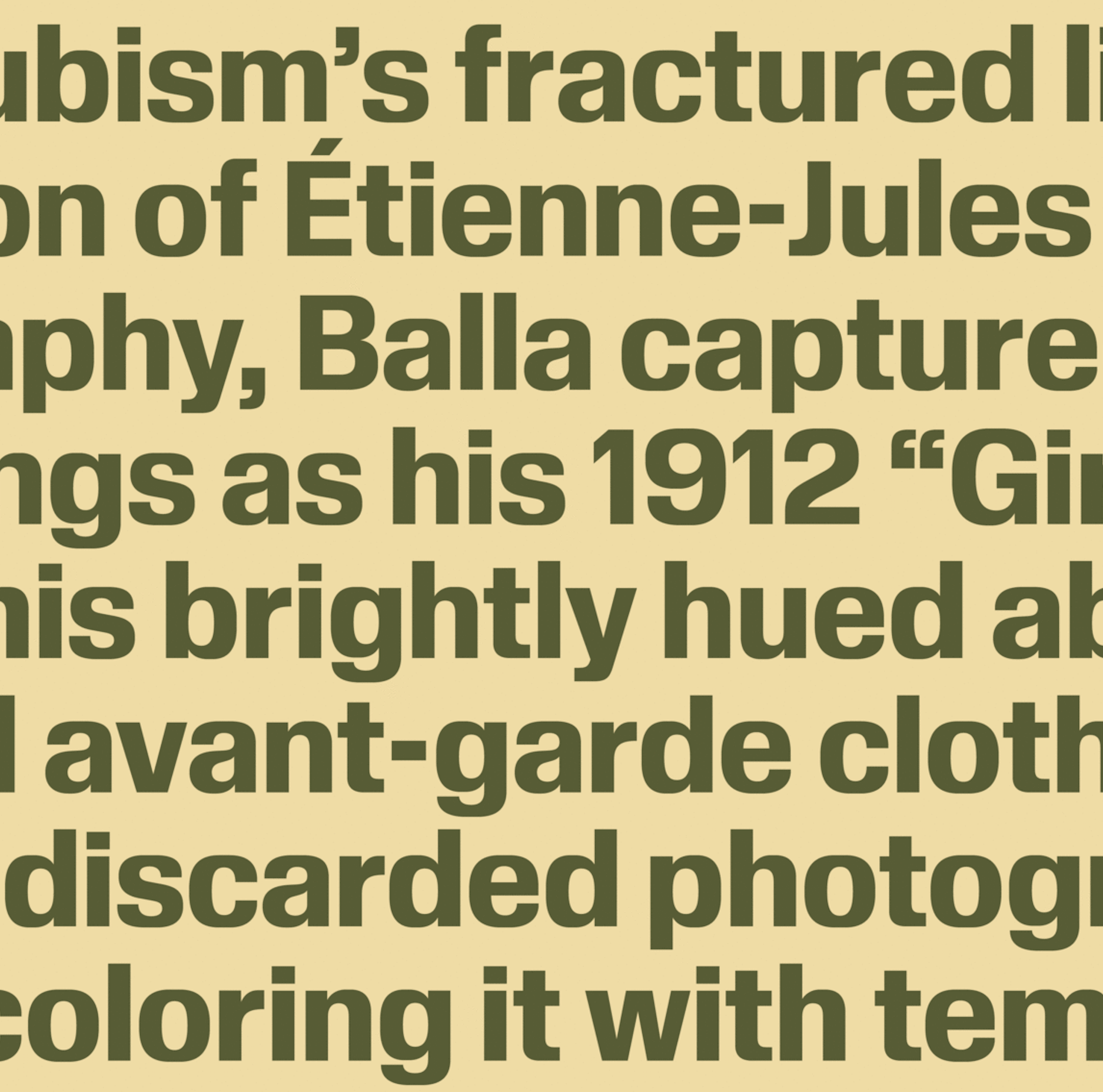
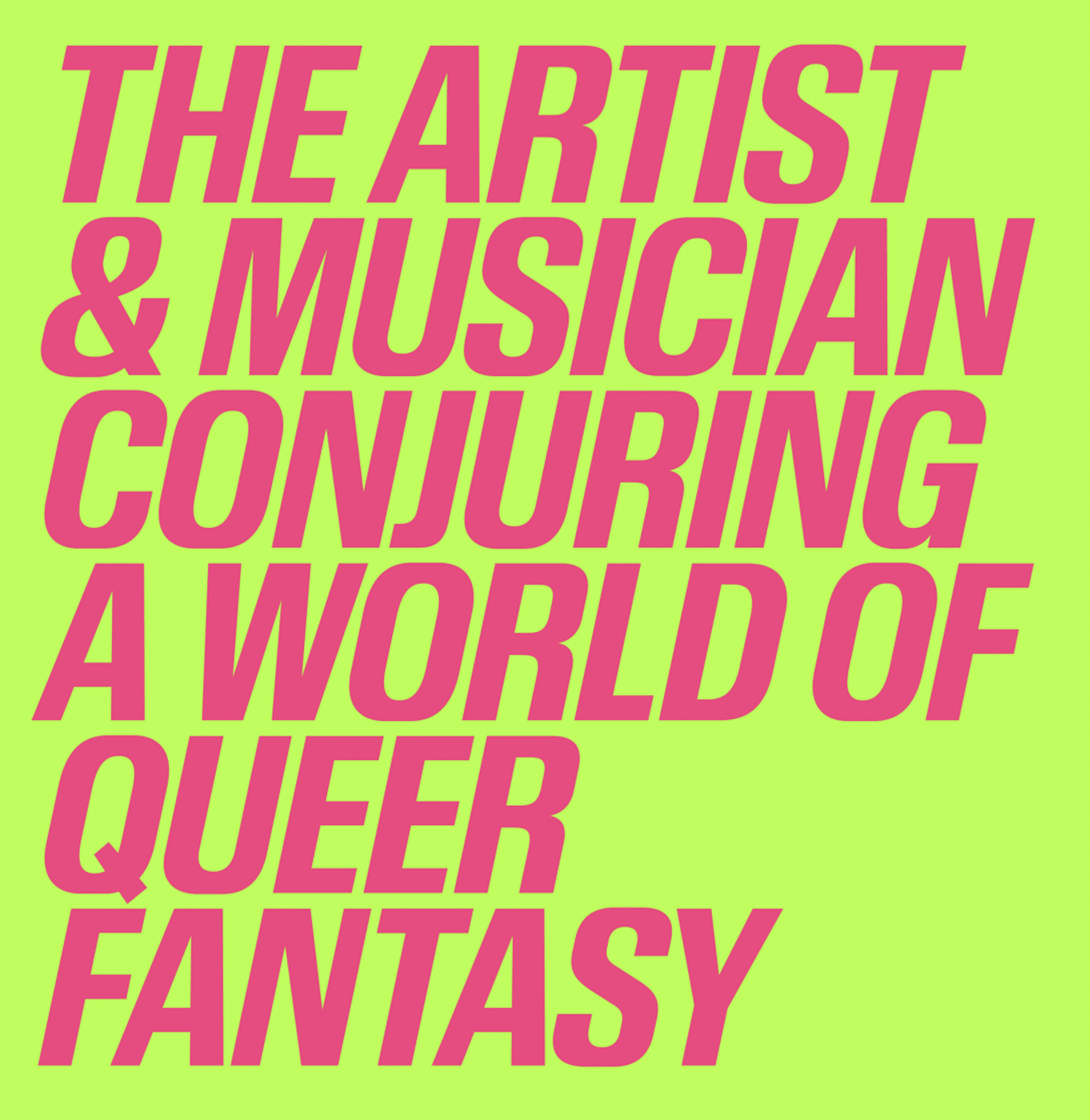
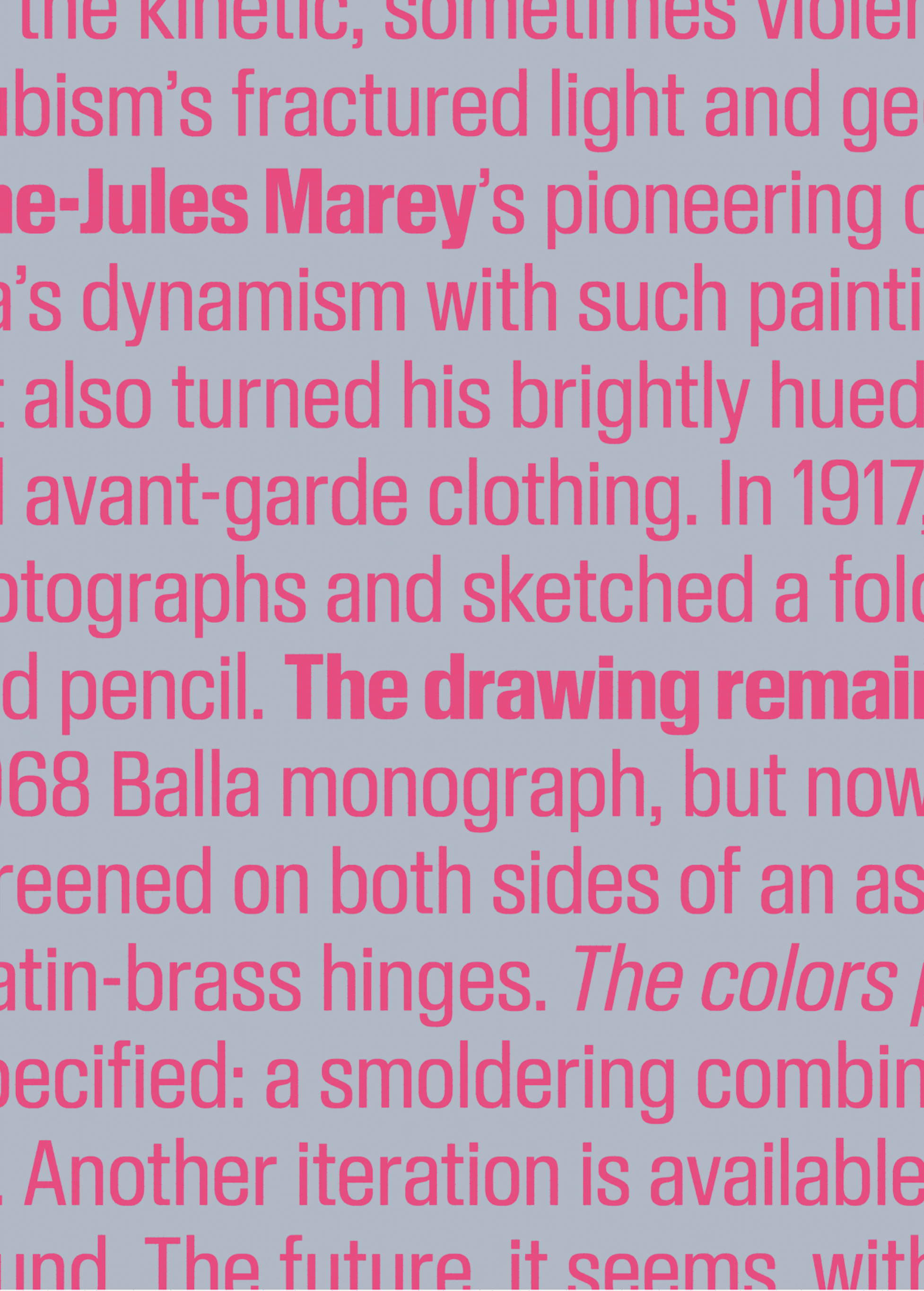
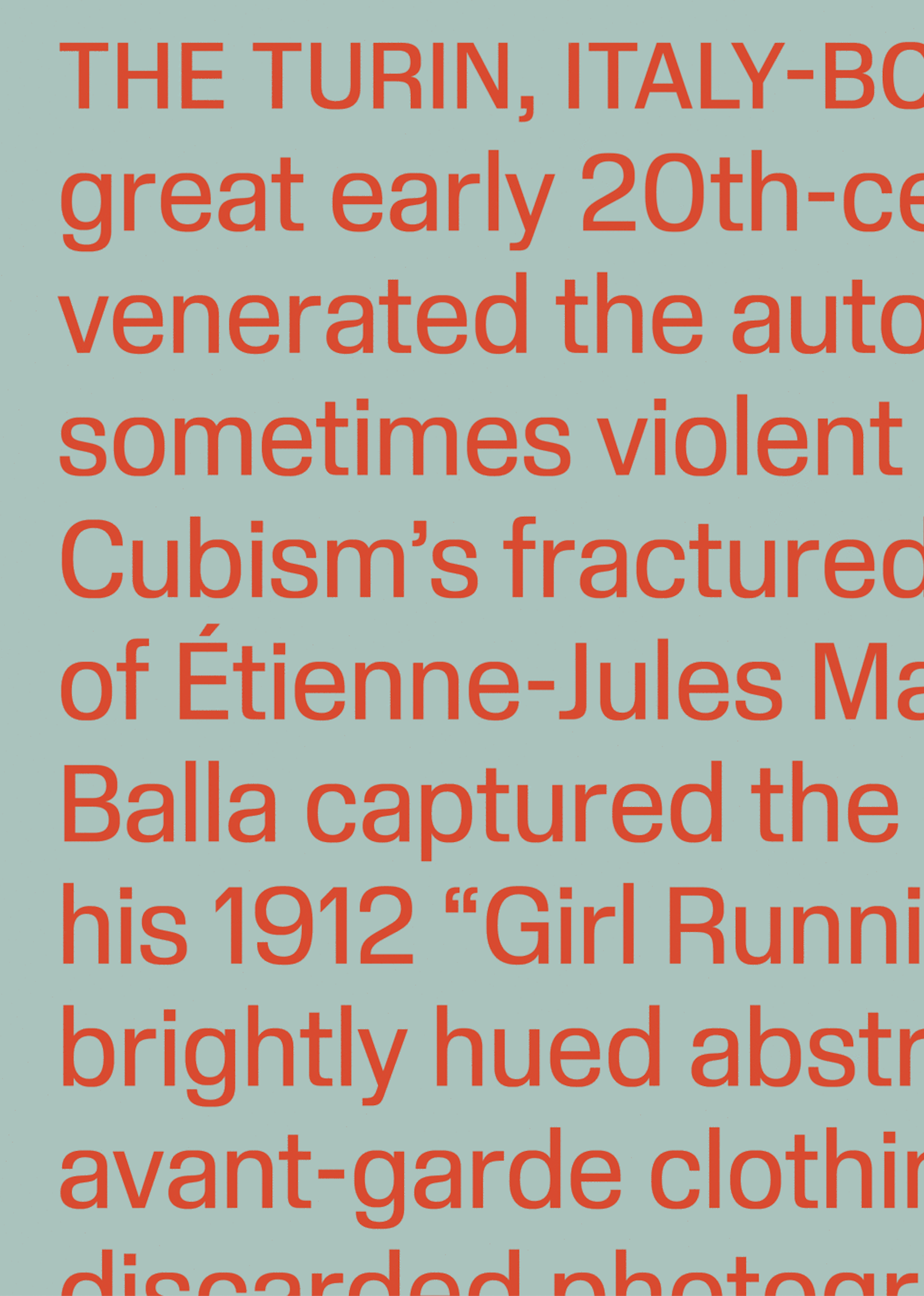
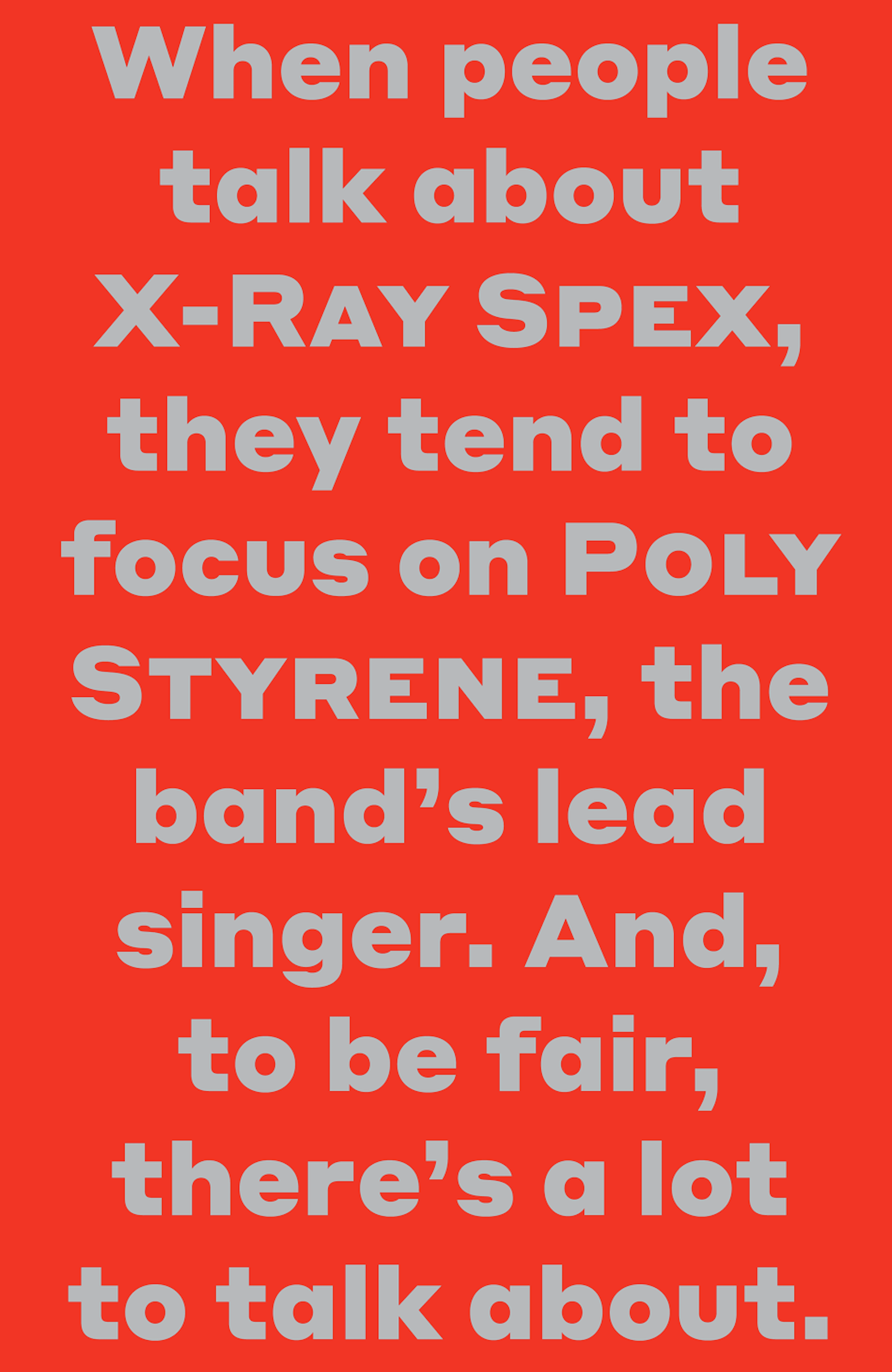
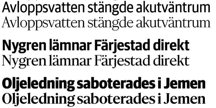
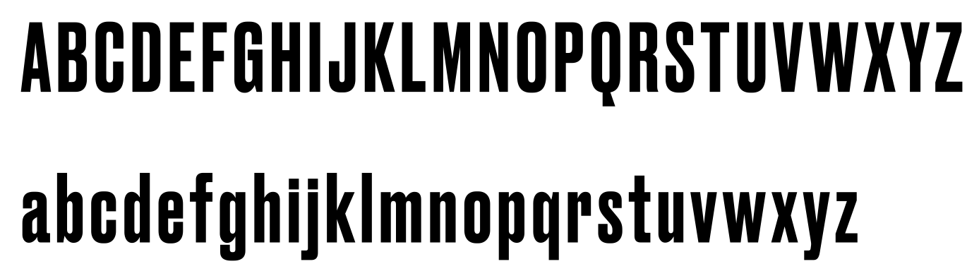
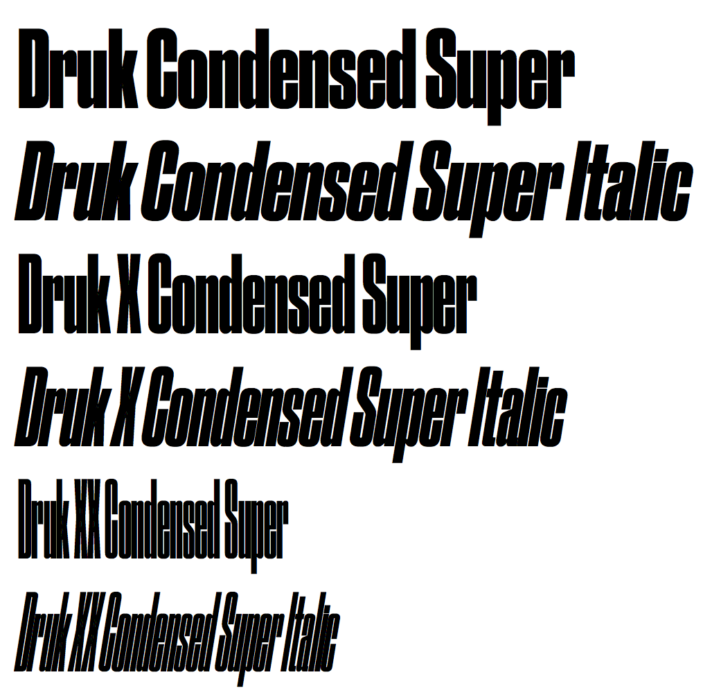
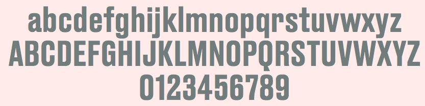
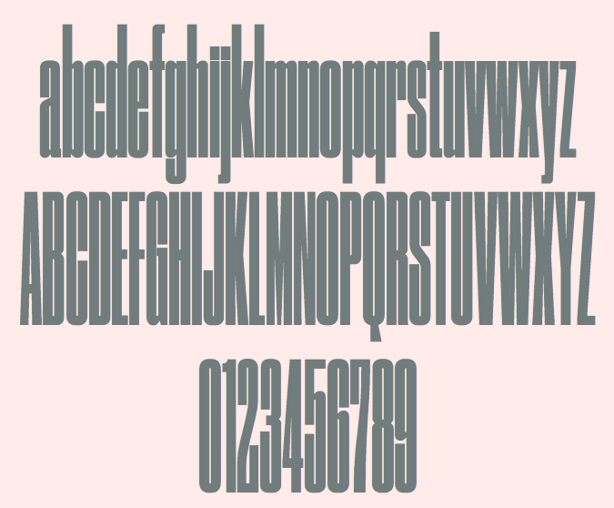
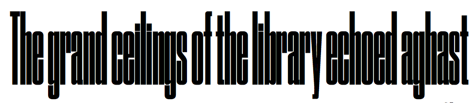
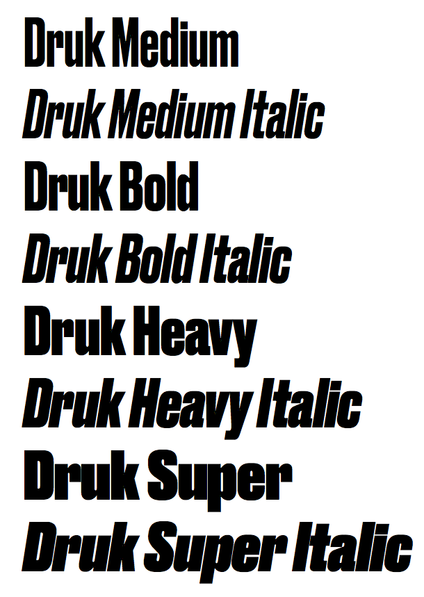
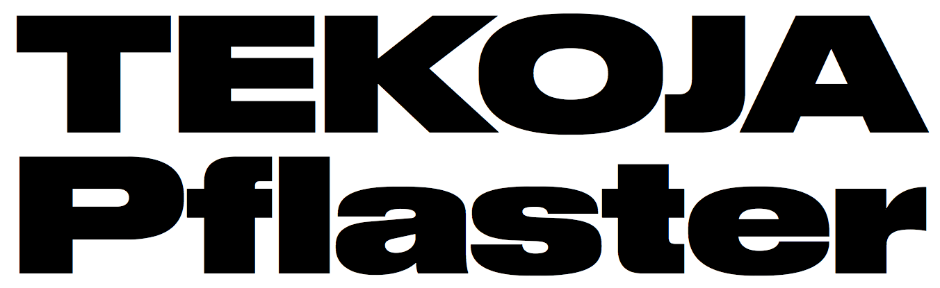
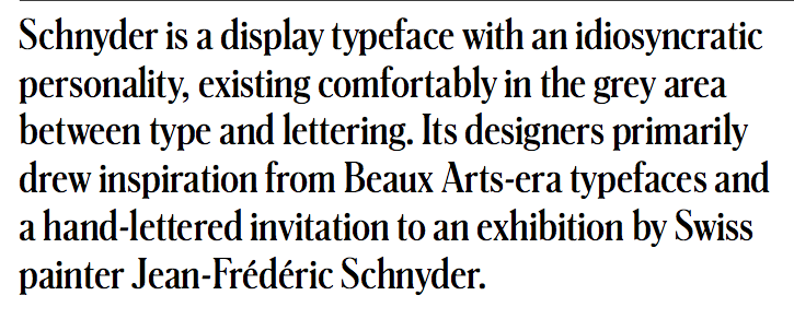
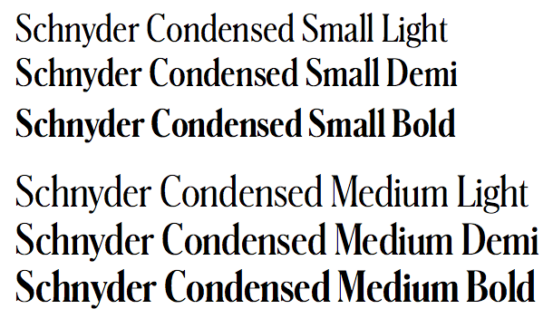
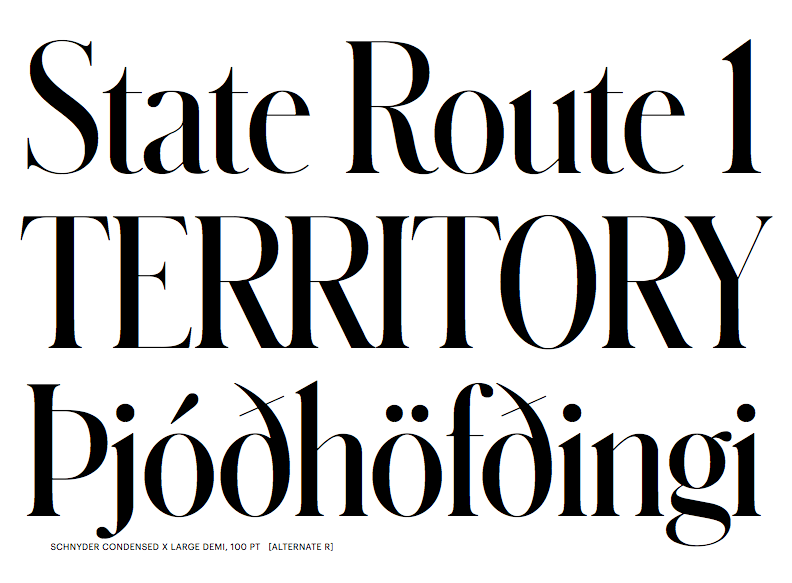
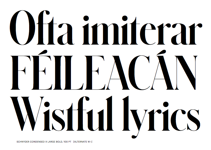
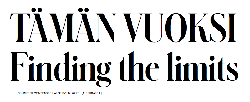
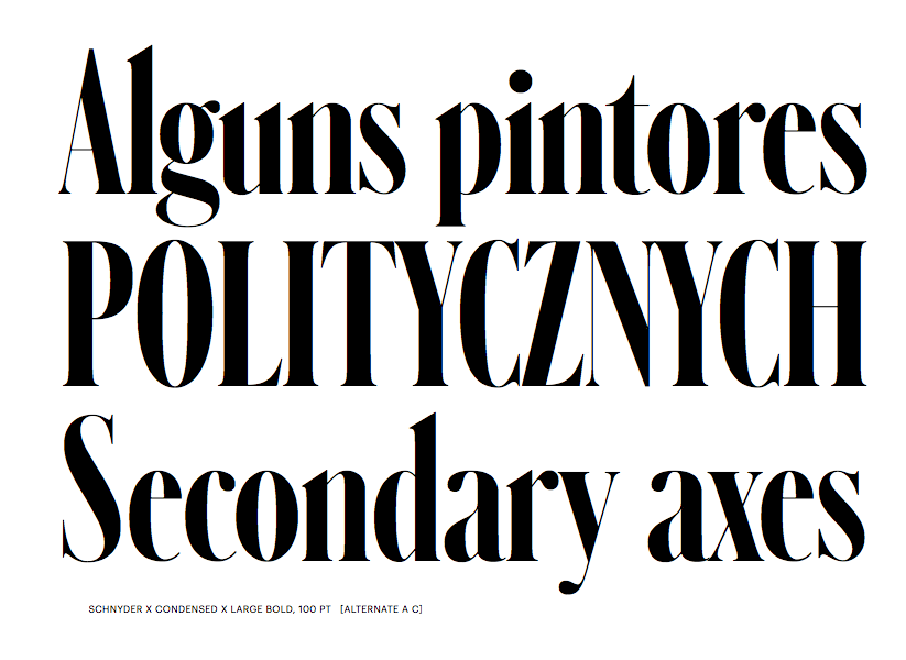
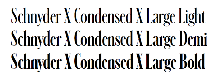
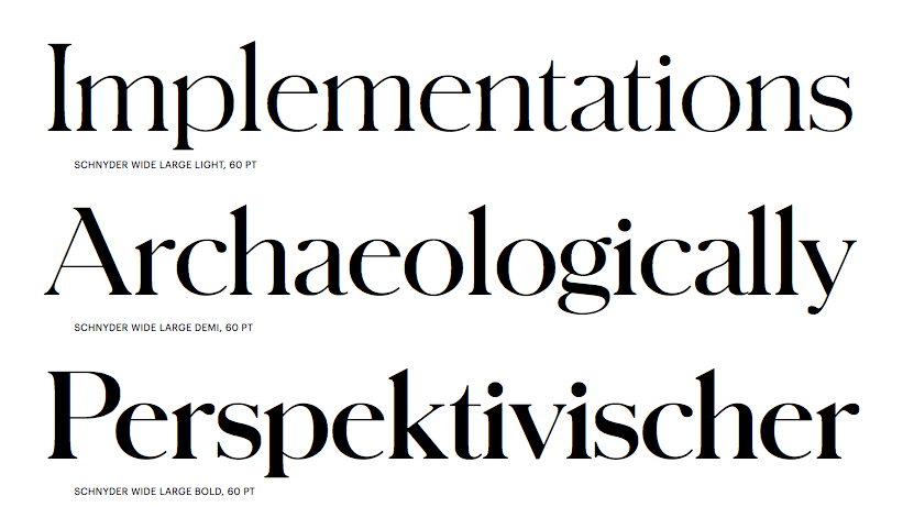
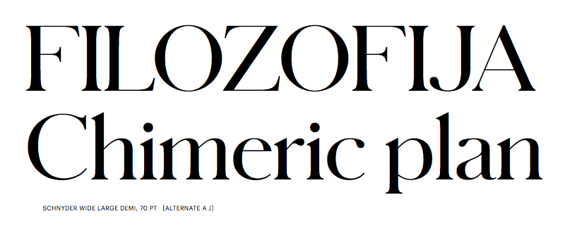
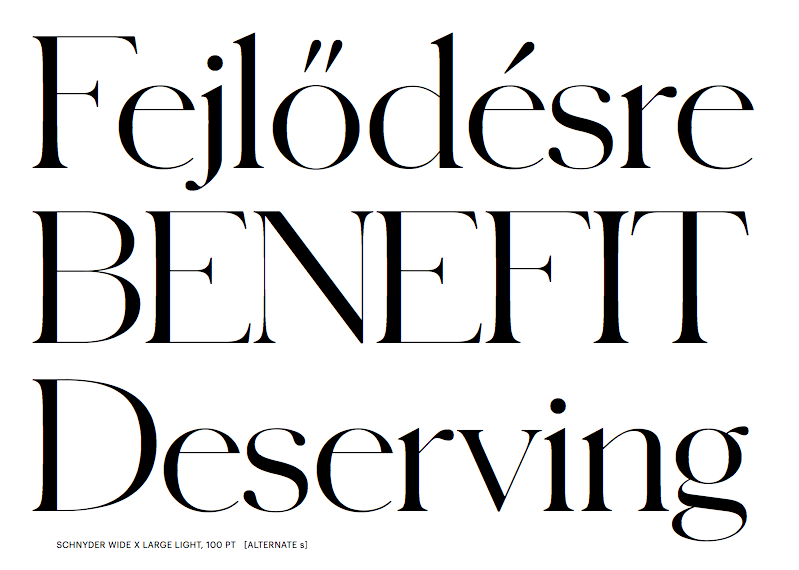
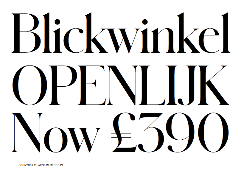
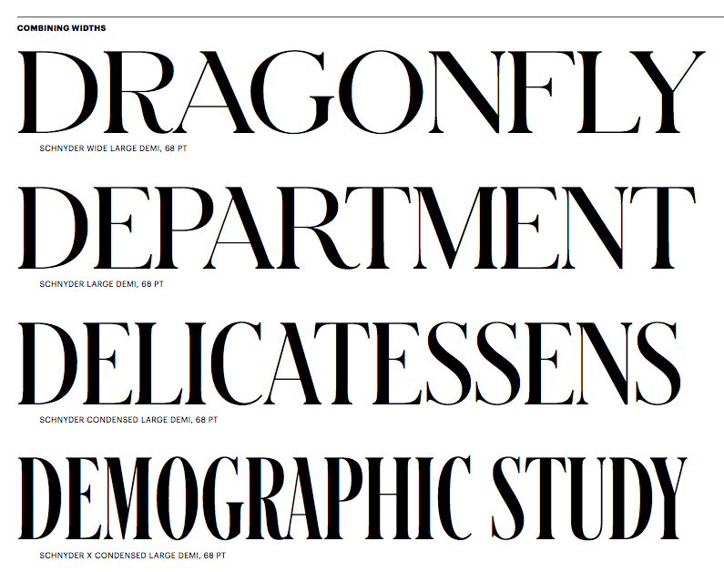
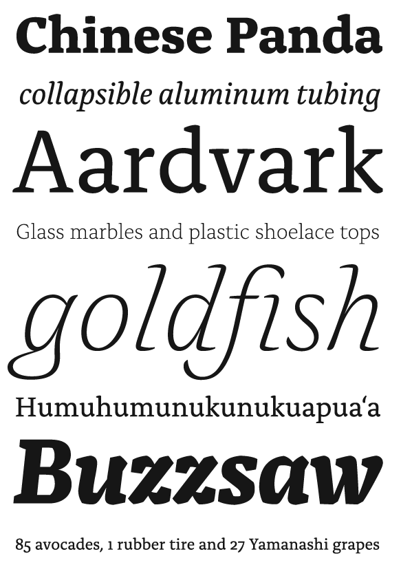
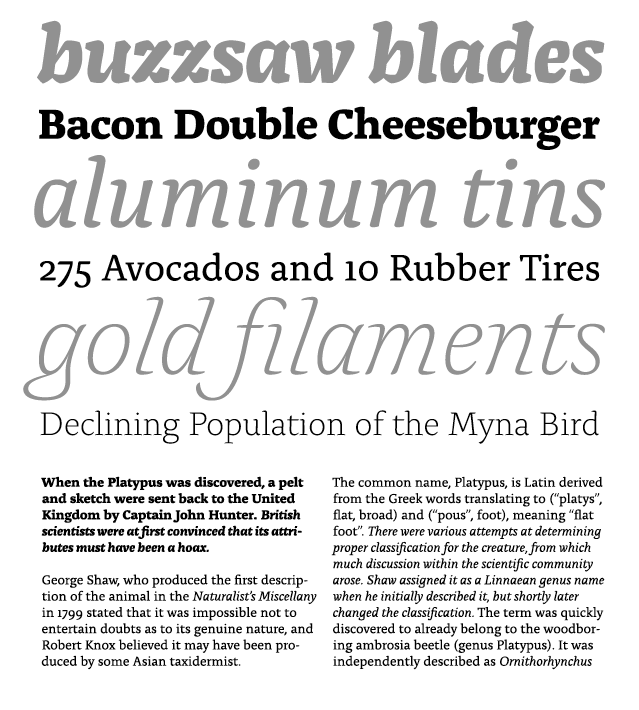
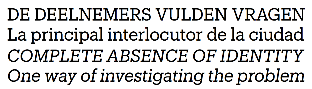
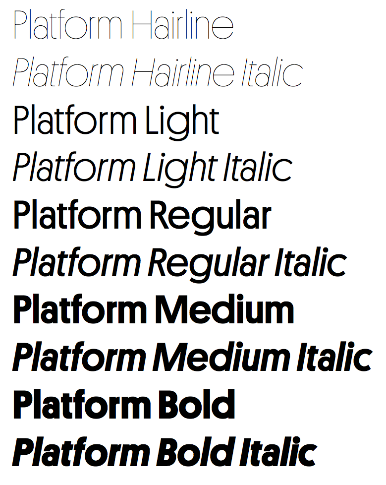
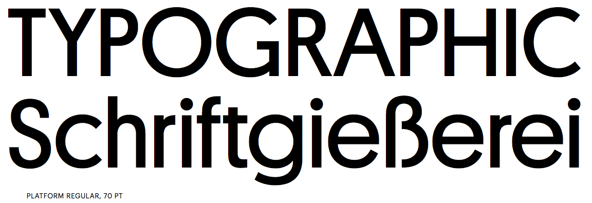
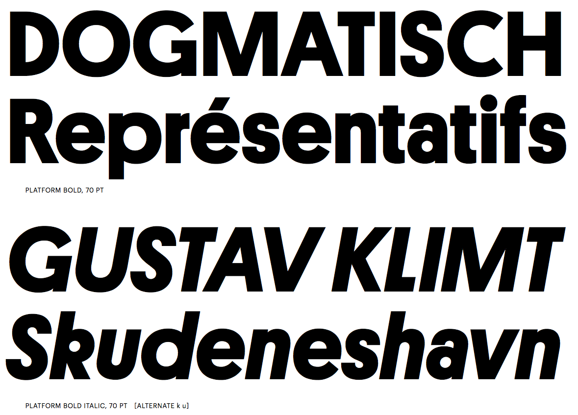
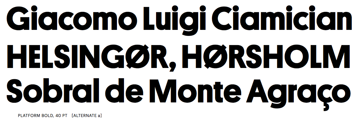
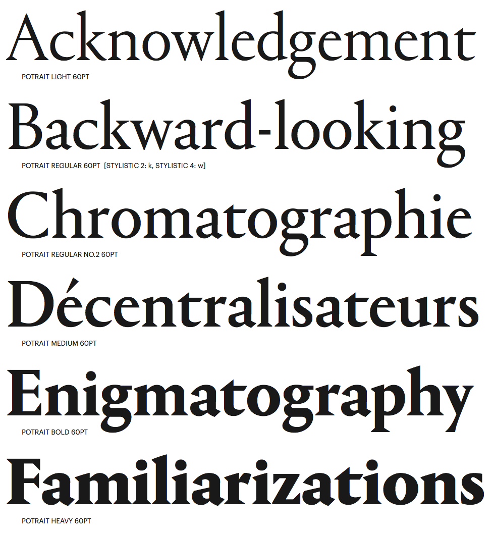
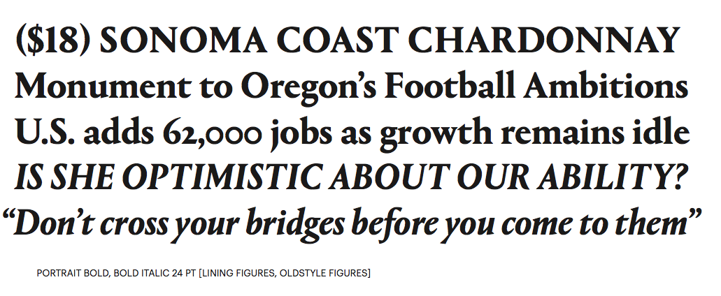
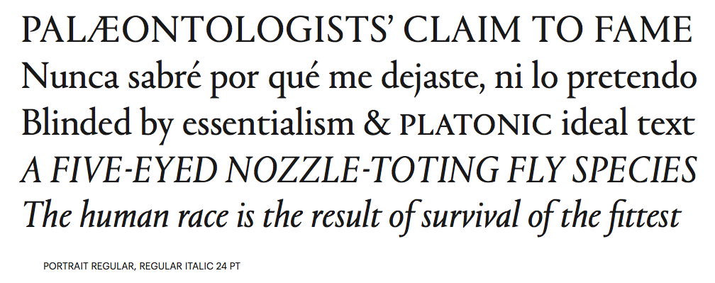
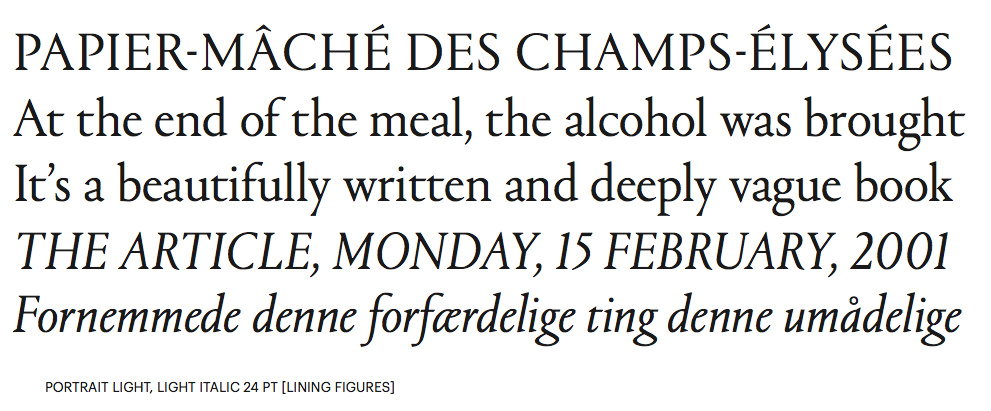
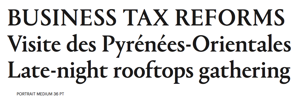
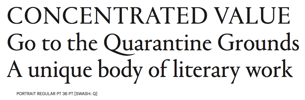
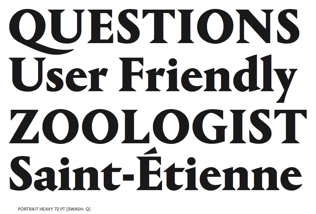
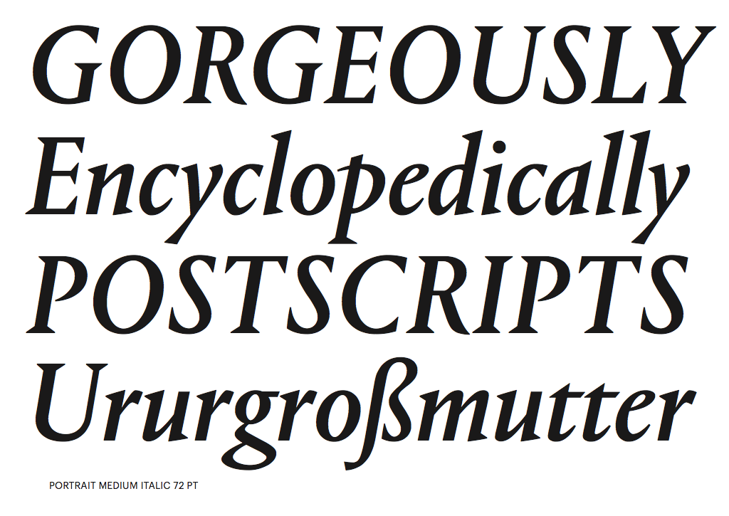
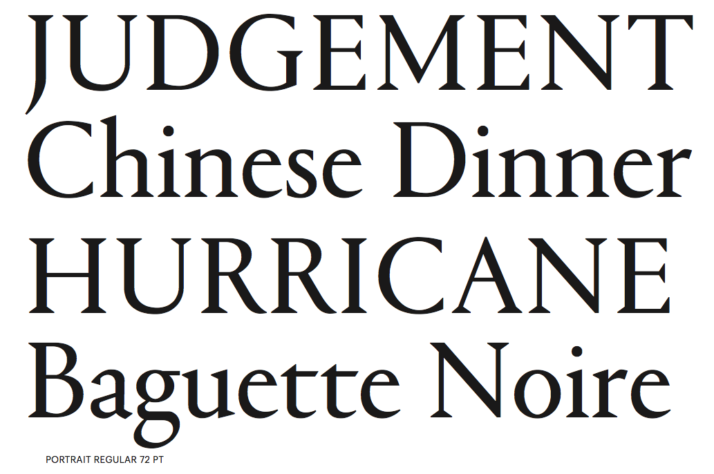
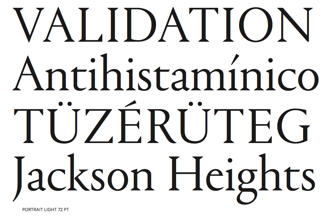
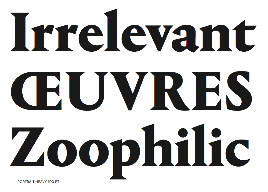
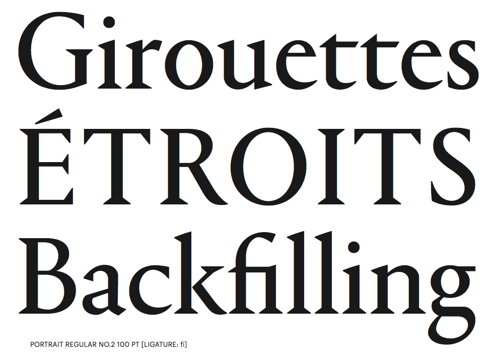
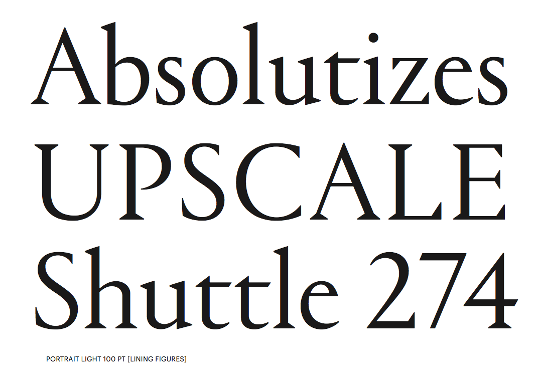
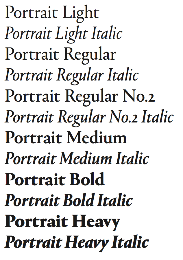
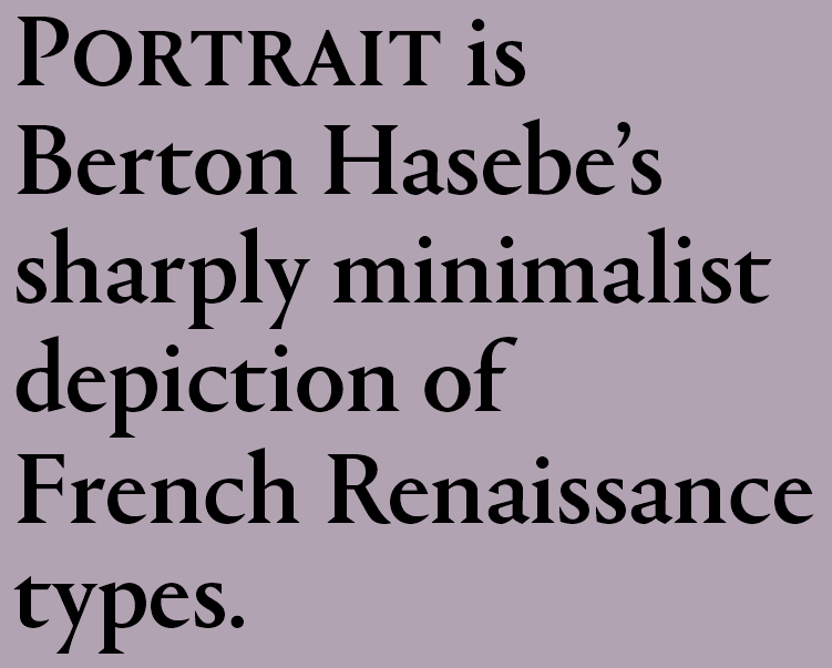
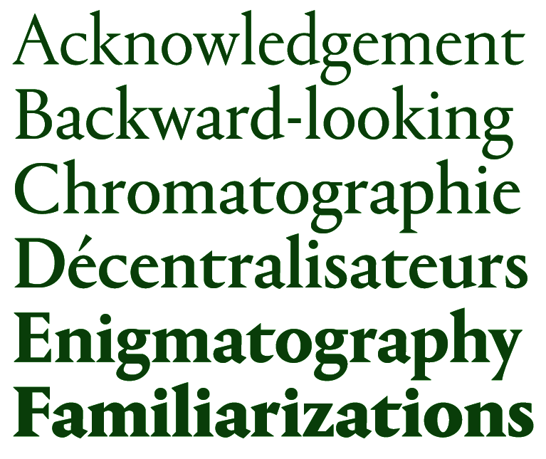
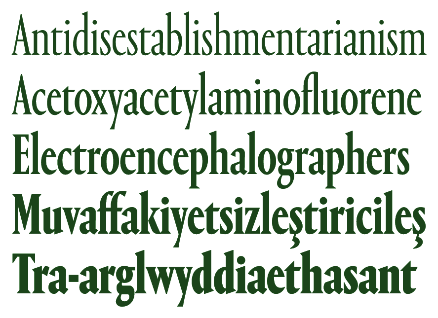
Berton Hasebe (b. 1982, Honolulu, HI) moved from Hawaii to study and work in Los Angeles, where he obtained a BA from Otis College of Art and Design in 2005. In 2007 he moved to the Netherlands to study type design through the Type and Media Masters course at The Royal Academy of Art in the Hague (KABK). Berton has resided in New York since 2008, and was a staff designer with Commercial Type from 2008 to 2013, when he left to start his own studio. Berton's typefaces have been awarded by the New York and Tokyo Type Directors Club, the ATypI, and the Brno Biennial. In 2012 he was awarded Print magazine's 20 Under 30 Award. Berton currently teaches typography at Parsons and has taught type design at The University of the Arts in Philadelphia and the Type@Cooper Extended Program at The Cooper Union in New York. His typeface Alda was designed to function at very small sizes while remaining expressive. The bold is macho and delicate at the same time. Alda won an award at TDC2 2009. In the same year Alda was also selected by the Tokyo Type Directors Club to be included in its annual publication. It was published by Emigre. At Commercial Type he co-designed the extensive family Stag with Christian Schwartz and Ross Milne. Stag started as a small family of slab serifs commissioned for headlines by the US edition of Esquire magazine and eventually grew into a sprawling multi-part family including a flexible sans companion and two additional special effects display variants. Stag Stencil followed in 2009. In 2010, he published the geometric sans serif family Platform at Commercial Type. It has a gorgeous circle-based hairline. In 2013, he published a 4-family 20-style French Renaissance typeface family called Portrait (+Text, +Inline, +Text), still at Commercial Type: Portrait started out as an experiment in drawing a display typeface that managed to be both beautiful and brutal, and both classical and minimalist. While its lighter weights are quietly elegant, the heavier weights show the influence of chiseled woodcut forms. Portrait draws its primary inspiration from the Two-line Double Pica Roman (equivalent to 32pt in contemporary sizes) cut by French punchcutter Maître Constantin around 1530 for the printer Robert Estienne. Portrait replaces the delicately modeled serif treatments of Constantin's original with simple, triangular Latin serifs, reimagining the Renaissance forms in a contemporary light. Portrait Text resembles the text types attributed by the printing historian Hendrik Vervliet to Constantin and used by the printer Estienne in the 1530s, which had a lighter and more open texture than the text types that preceded them, and marking the move to more elegant type that culminated in the work of Claude Garamont. The stripped-back simplicity of the Latin serifs gives Portrait a cleaner and sharper tone than a typical Renaissance oldstyle-influenced text face, bringing an active personality to text. In 2015, he created the sans headline typeface families Druk, Druk Text, Druk Wide, Druk Condensed and Druk Text Wide: Druk is a study in extremes, featuring the narrowest, widest, and heaviest typefaces in the Commercial Type library to date. Starting from Medium and going up to Super, Druk is uncompromisingly bold. It was meant as a companion of Neue Haas Grotesk. Of the families in the Druk collection, Druk Condensed is the most explicit homage to Willy Fleckhaus. Originally designed for the 2011 Year in Review issue of Bloomberg Businessweek, its flat sides make letters and words snap together in a clean and satisfying way. For MittMedia, he made the corporate sans typeface Duplex (2016). Still in 2016, Berton Hasebe published Styrene at Commercial Type. Their blurb: Styrene, a new sans serif by Berton Hasebe, is his latest exploration of proportion and simplicity in type design. The initial inspiration for the family was a charmingly awkward sans serif shown in an early 20th century Dutch type specimen. However, Styrene has an entirely ahistorical attitude. Its name was inspired by the purposefully synthetic feeling to its curves and geometry. The family is characterized by its proportions: typically narrow characters like f j r and t are hyperextended and flattened, adding openness in unexpected places. Styrene's two widths offer different textures in text: version A is dogmatically geometric, with a stronger overall personality, while version B is narrower for more reasonable copyfit, though not truly condensed. Schnyder (Commercial Type) was designed by Berton Hasebe and Christian Schwartz for the 2013 redesign of T, the New York Times Style Magazine by creative director Patrick Li and his team. Schnyder has the high contrast typical of a fashion typeface and has a large number of alternates. The stem thicknesses in each weight are identical across the widths, an unusual feature that allows the widths to be mixed freely in headlines, even within single words. It features three weights, four widths, and four optical sizes. Production assistance by Hrvoje Zivcic and Miguel Reyes. Schnyder Wide, Condensed and X Condensed were published in 2018. In 2020, he released Review (Condensed, Poster, Regular) at Commercial Type, which writes: Berton Hasebe originally drew Review (née Kippenberger) for T: The New York Times Style Magazine. In 2018, a new editor in chief pushed for a complete reimagining of the magazine. What had primarily been an image-focused publication evolved into a text-driven one, with the squarish, commanding Review doing much of the heavy lifting. To facilitate tight setting both horizontally and vertically, Hasebe sheared off Review's overshoots and blunted its exterior curves, producing a dynamic tension with its round counters. Produkt (2014, Christian Schwartz and Berton Hasebe) is Graphik with slabs added on. Christian Schwartz and Berton Hasebe originally designed Feature for T: The New York Times Style Magazine in 2018, and wrote: Diagonal stress, mismatched contrast between main strokes and serifs, and sharply angled head serifs conspire to give the face tension, dynamism, and immediacy. The collection has been expanded in 2021 for release by Hrvoje Zivcic, who expanded the weight range and drew italics for the entire collection. Feature Collection now includes Feature Text, Feature Display and Feature Deck. Feature |
EXTERNAL LINKS |
| | |


file name: Berton Hasebe Christian Schwartz Hrvoje Zivcic Feature 2018 2021
file name: Berton Hasebe Christian Schwartz Hrvoje Zivcic Feature 2018 2021
file name: Berton Hasebe Christian Schwartz Hrvoje Zivcic Feature 2018 2021
file name: Berton Hasebe Christian Schwartz Hrvoje Zivcic Feature 2018 2021
file name: Berton Hasebe Christian Schwartz Hrvoje Zivcic Feature 2018 2021
file name: Berton Hasebe Christian Schwartz Hrvoje Zivcic Feature 2018 2021
file name: Berton Hasebe Christian Schwartz Hrvoje Zivcic Feature 2018 2021
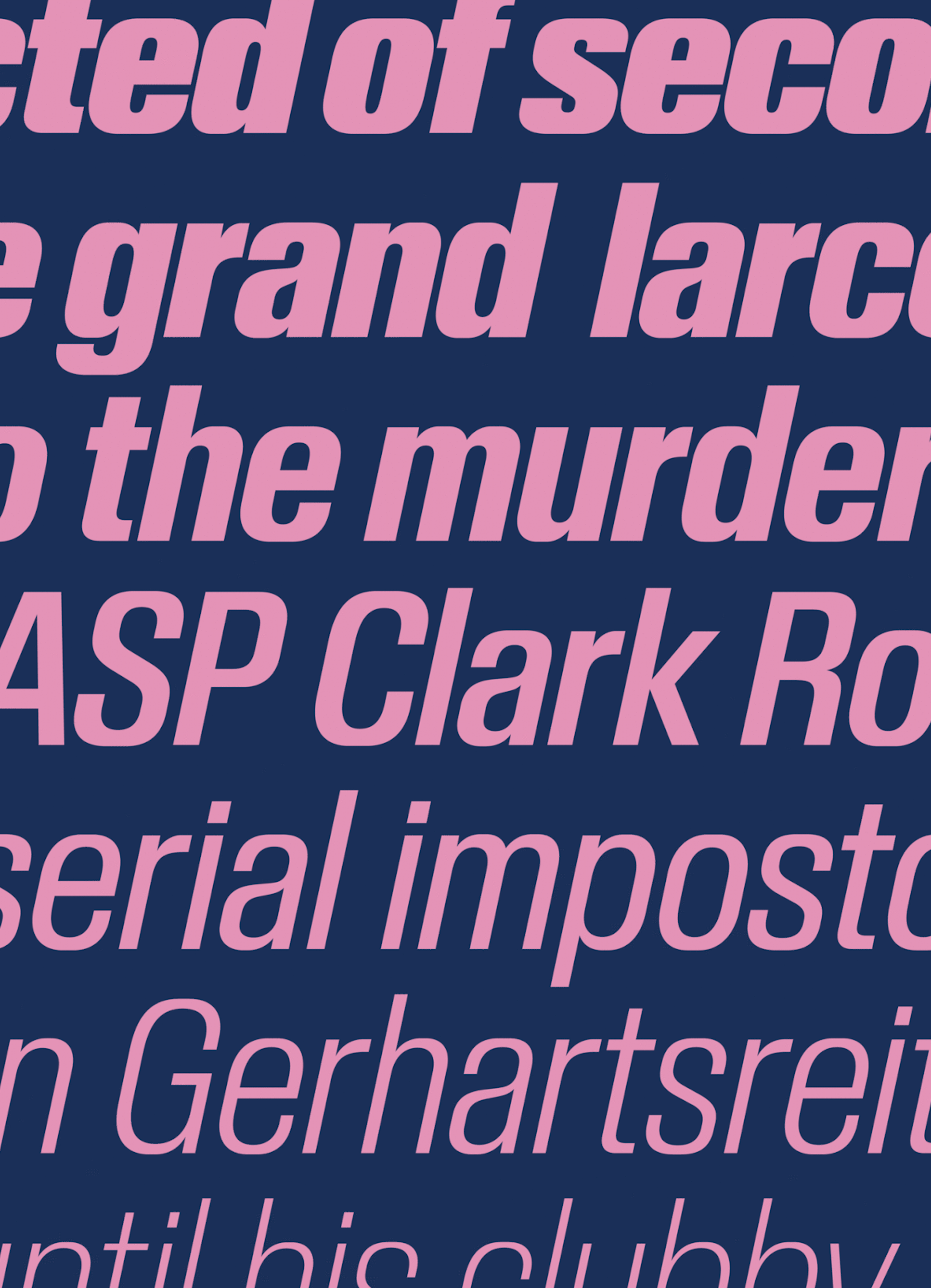
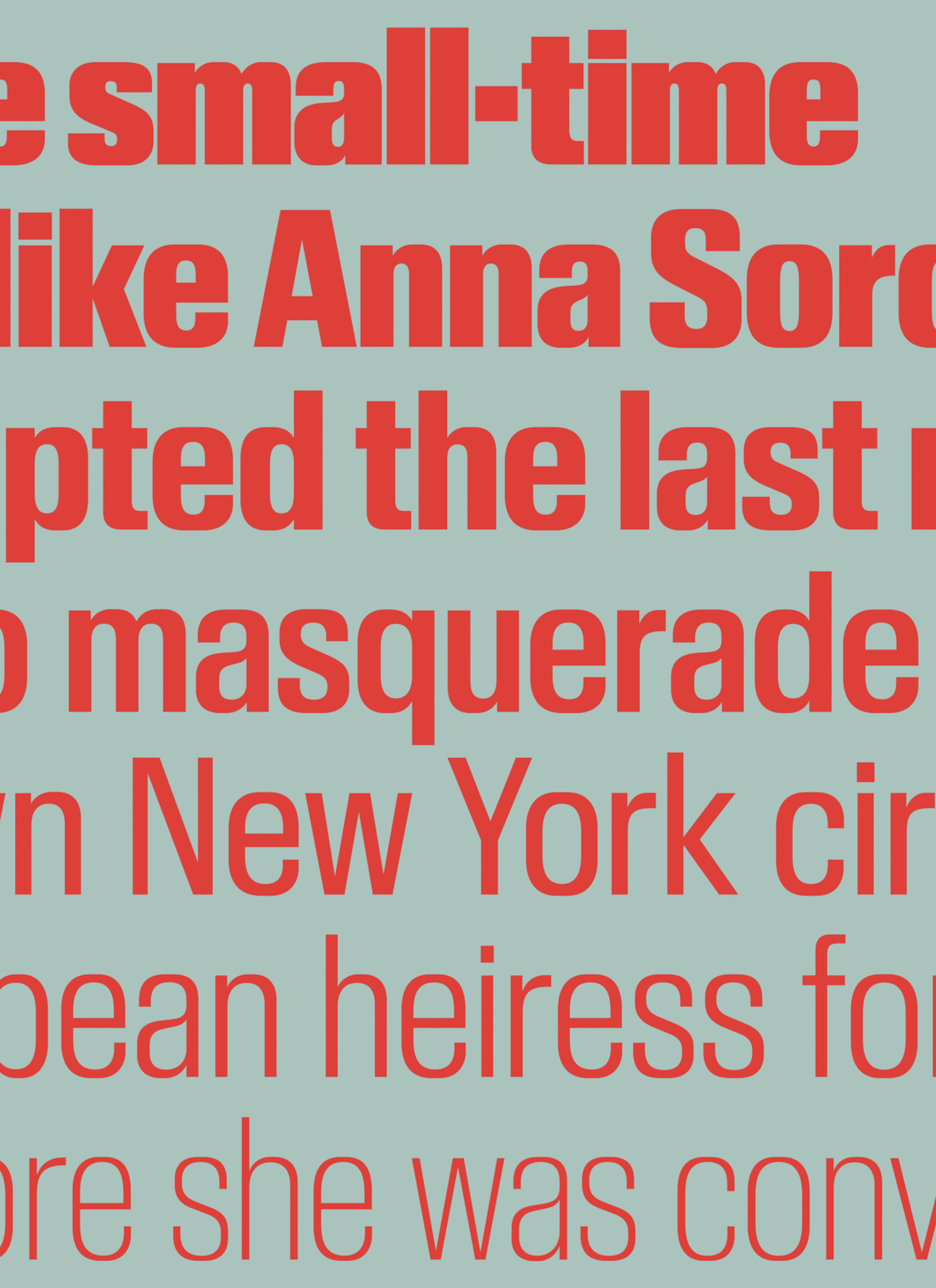
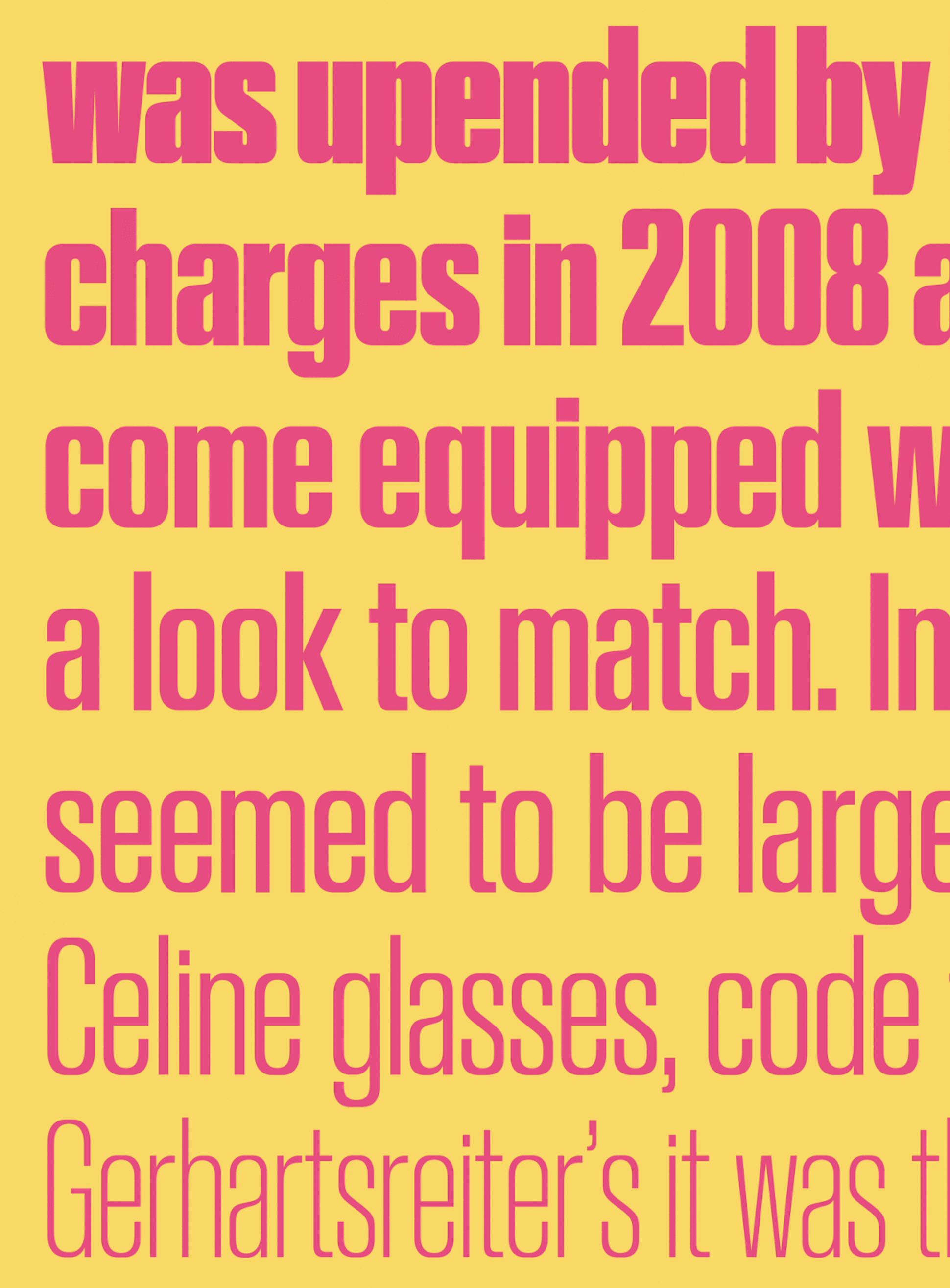
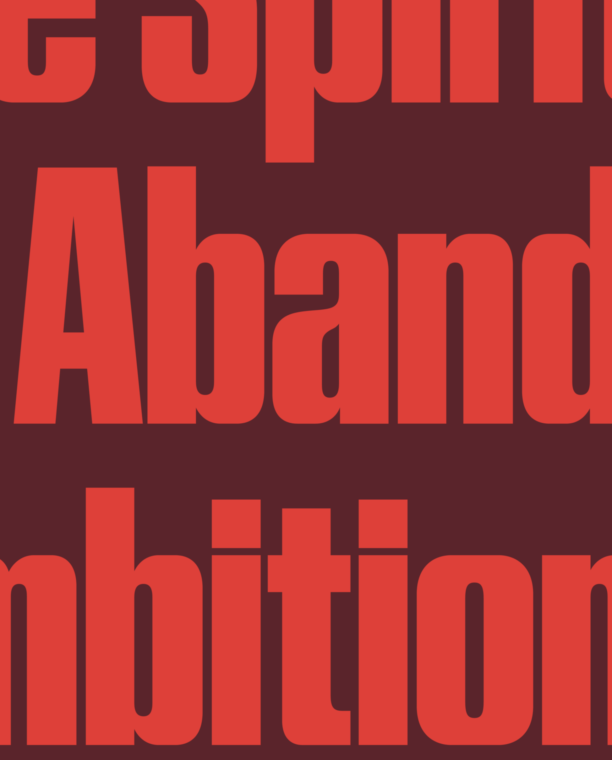
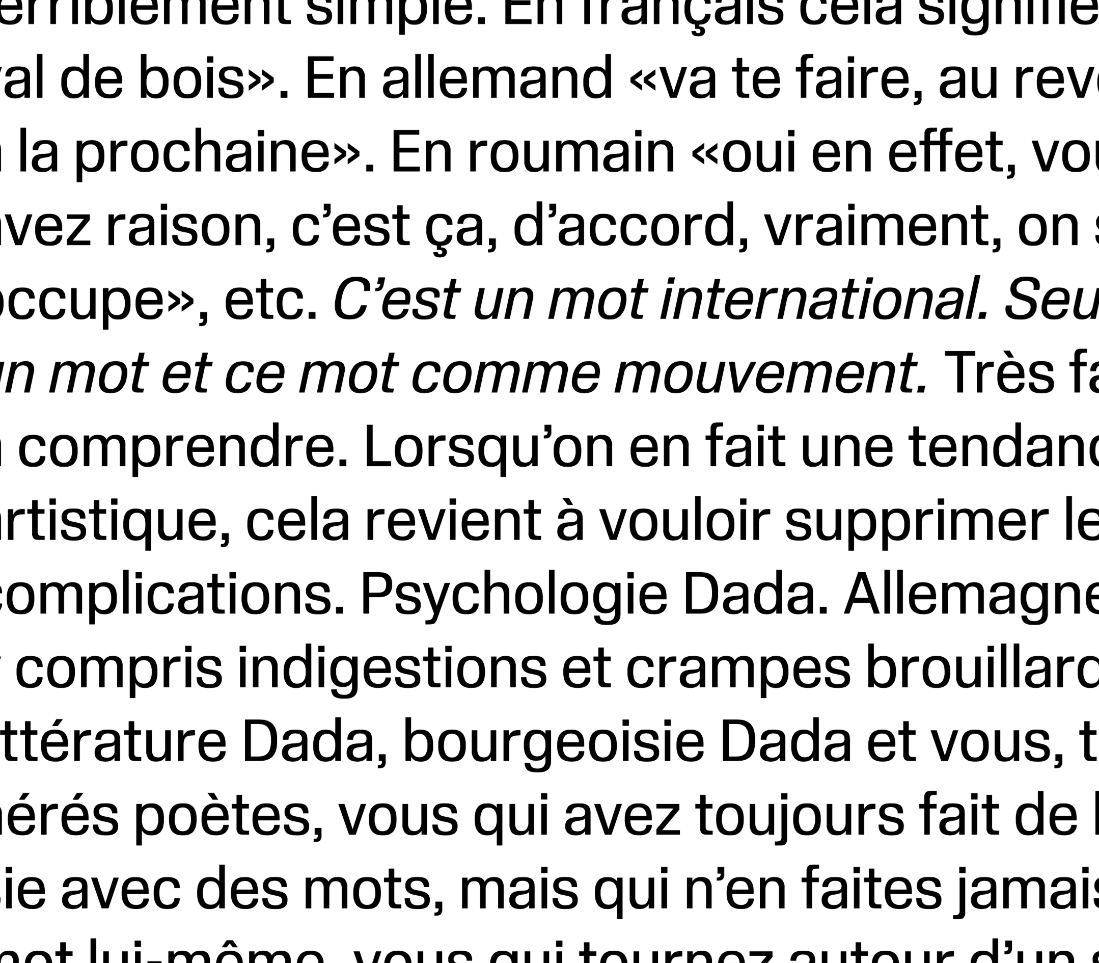
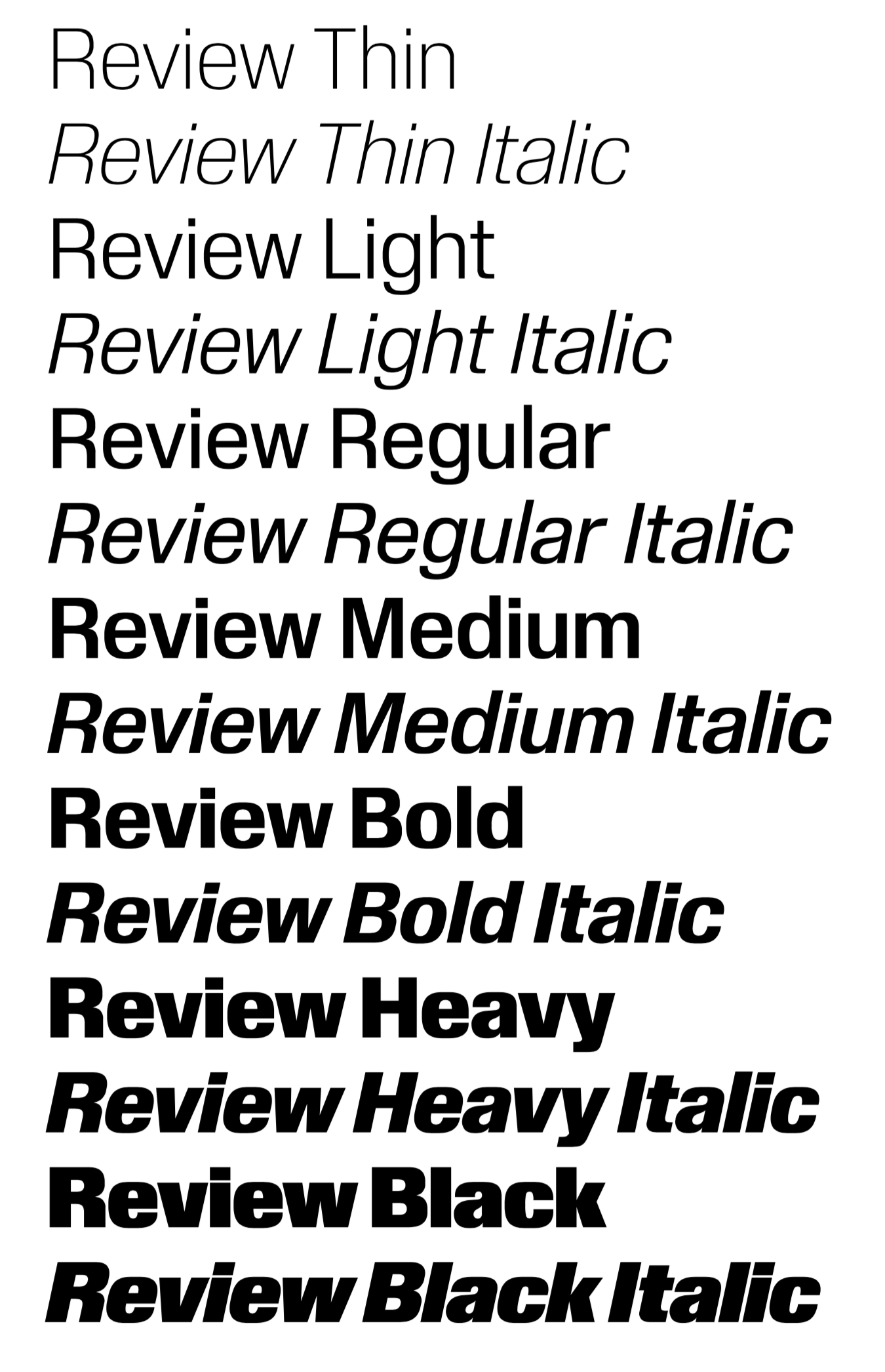
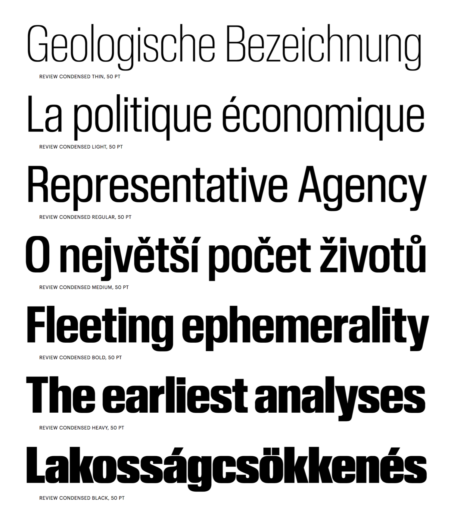
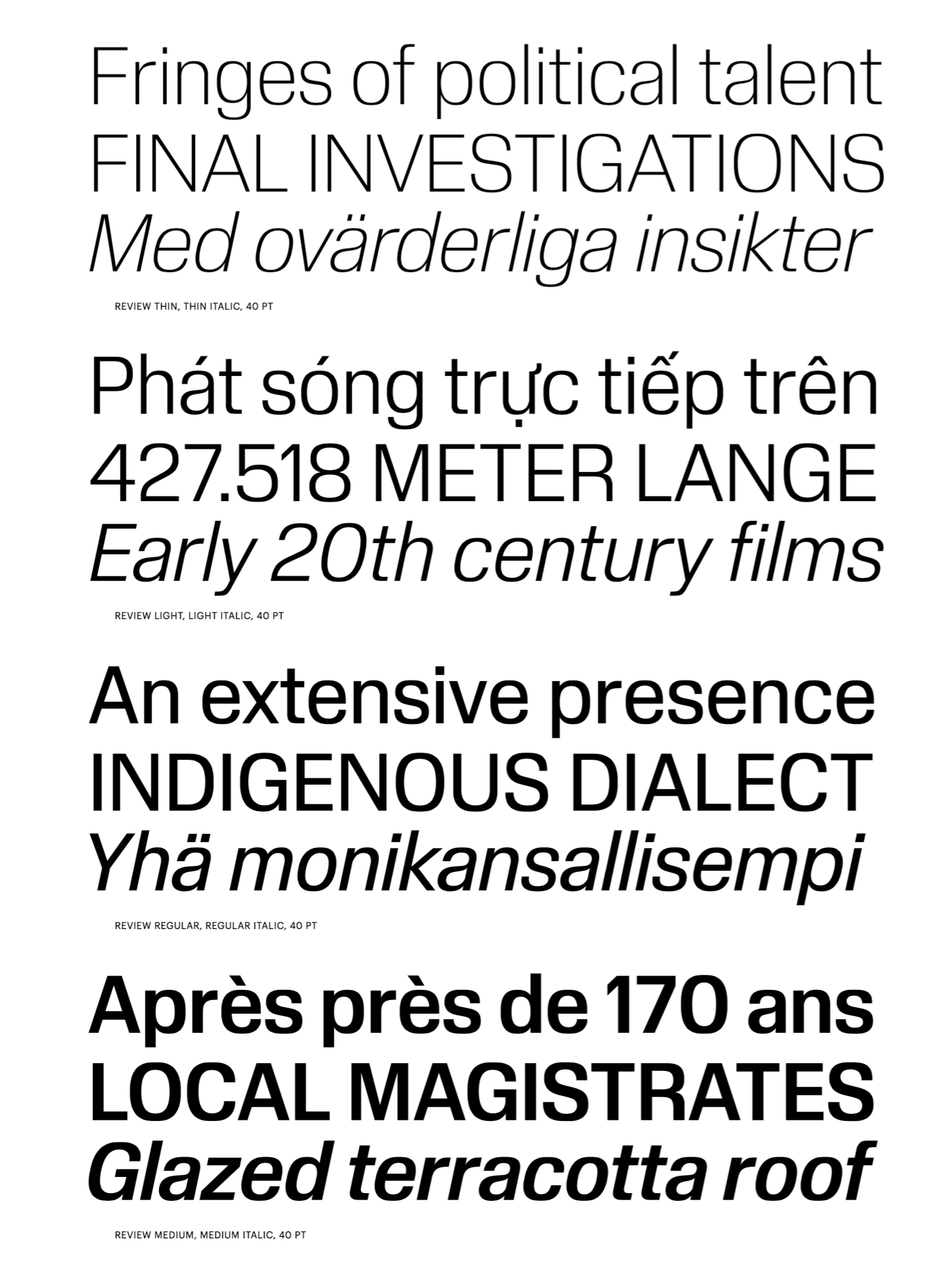
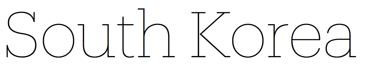
file name: Berton Hasebe Review 2020
file name: Berton Hasebe Review 2020
file name: Berton Hasebe Review 2020

file name: Berton Hasebe Review 2020
file name: Berton Hasebe Review 2020
file name: Berton Hasebe Review 2020
file name: Berton Hasebe Review 2020
file name: Berton Hasebe Review 2020
file name: Berton Hasebe Review 2020

file name: Berton Hasebe Review 2020
file name: Berton Hasebe Review 2020

file name: Berton Hasebe Review 2020

file name: Berton Hasebe Review 2020
file name: Berton Hasebe Review 2020
file name: Berton Hasebe Review 2020

file name: Berton Hasebe Review 2020
file name: Berton Hasebe Review 2020
file name: Berton Hasebe Review 2020
file name: Berton Hasebe Review 2020
file name: Berton Hasebe Review 2020
file name: Berton Hasebe Review 2020

file name: Berton Hasebe Review 2020

file name: Berton Hasebe Review 2020
file name: Berton Hasebe Review Condensed 2020
file name: Berton Hasebe Review Condensed 2020
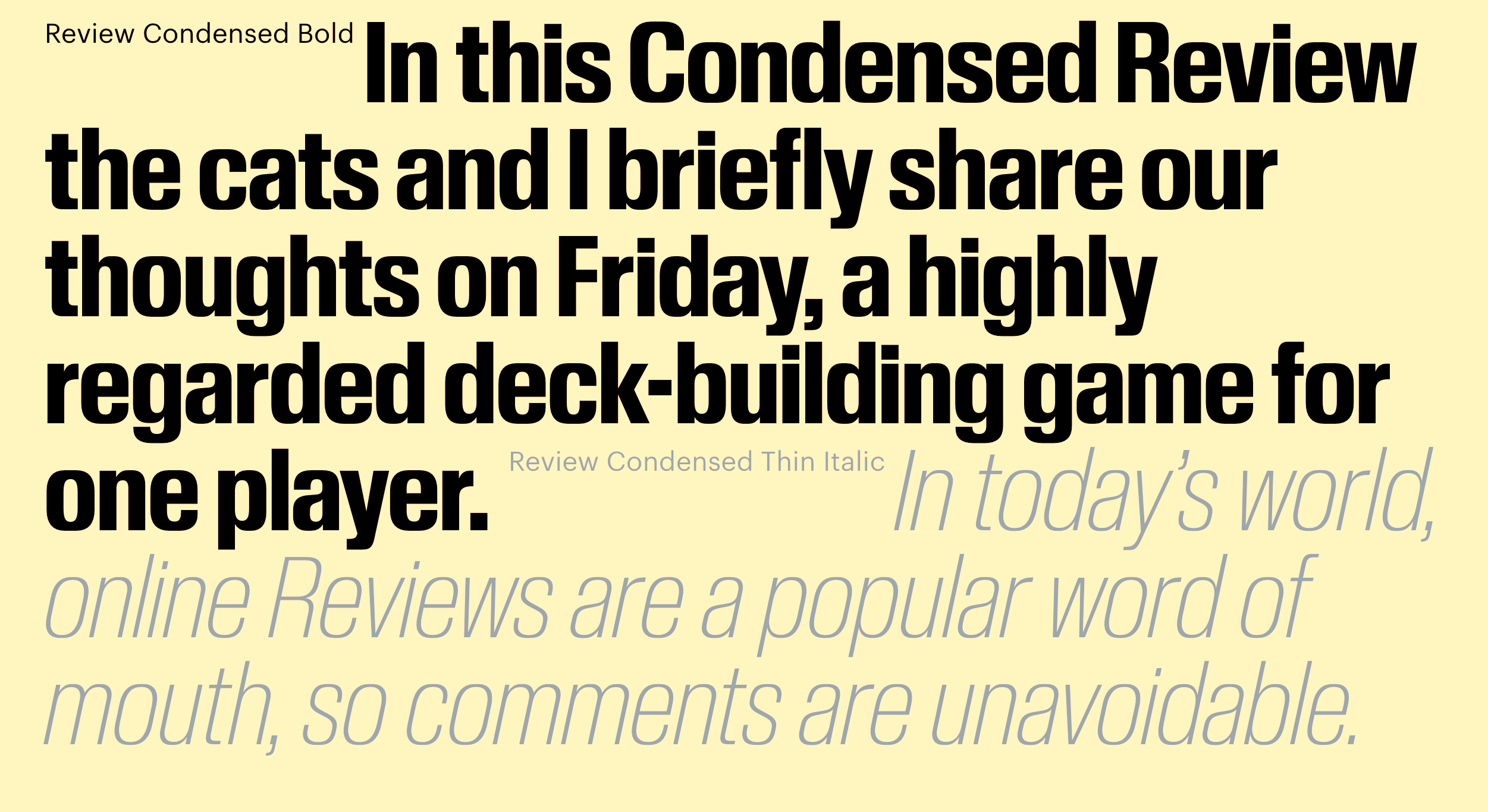
file name: Berton Hasebe Review Condensed 2020
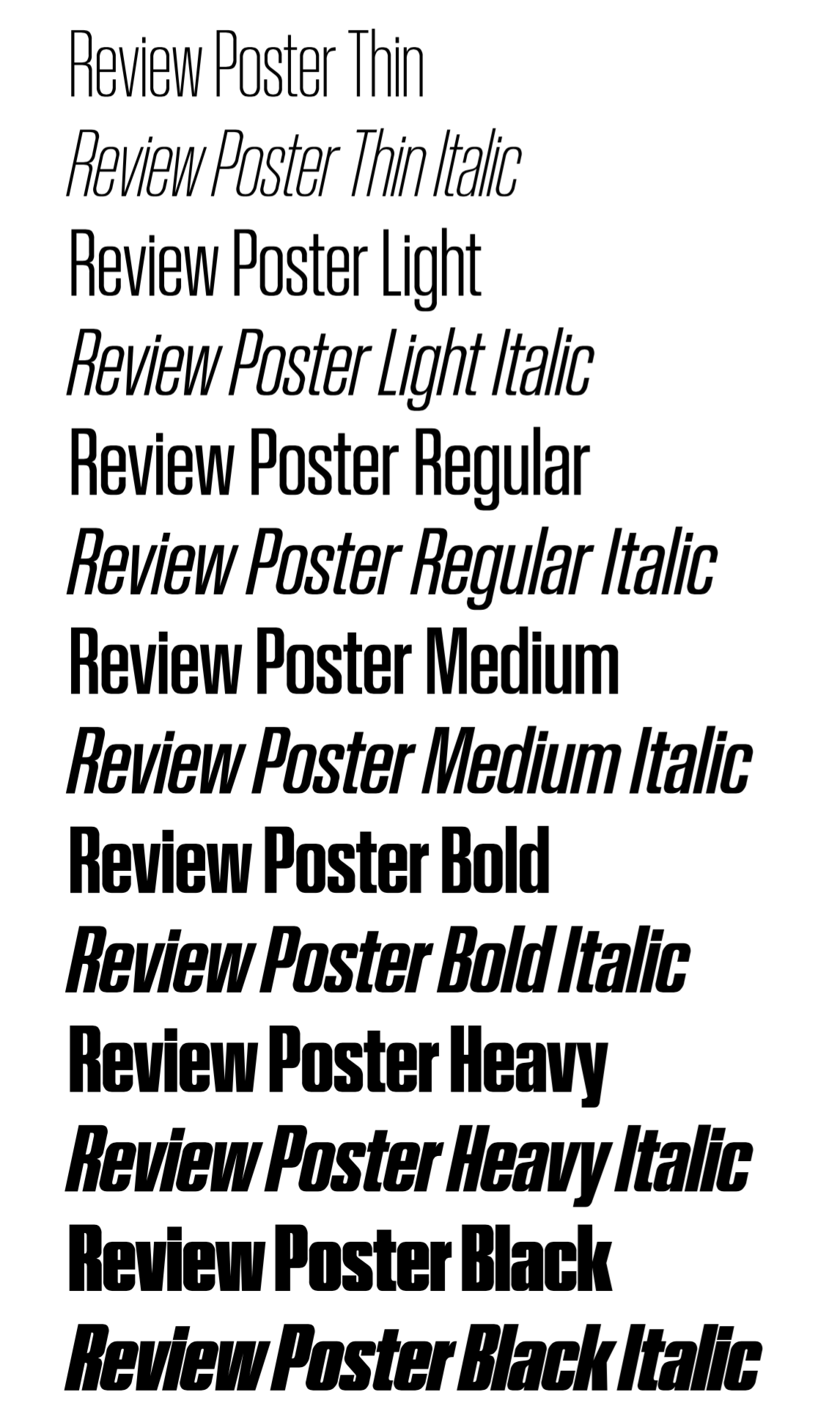
file name: Berton Hasebe Review Poster 2020
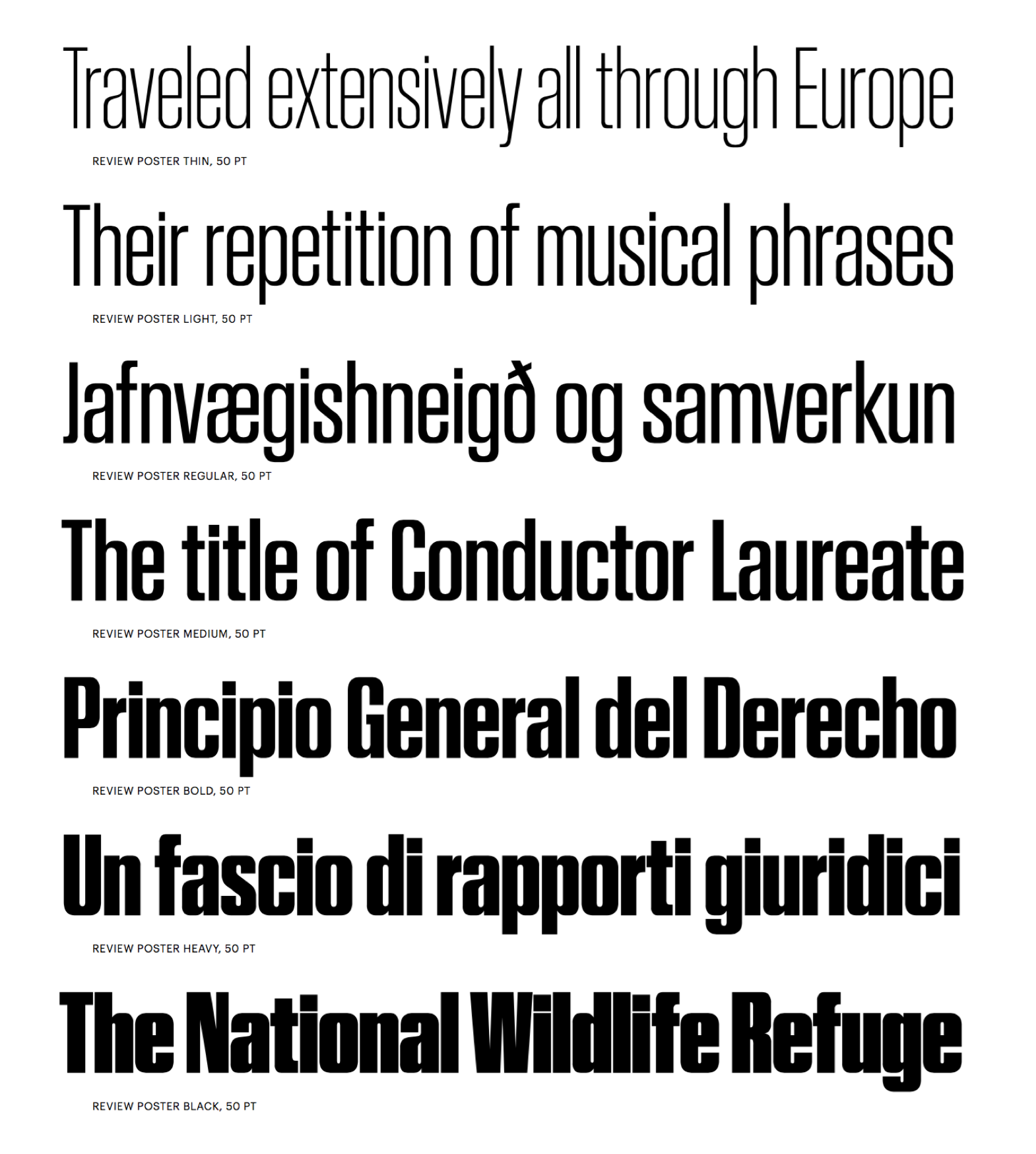
file name: Berton Hasebe Review Poster 2020
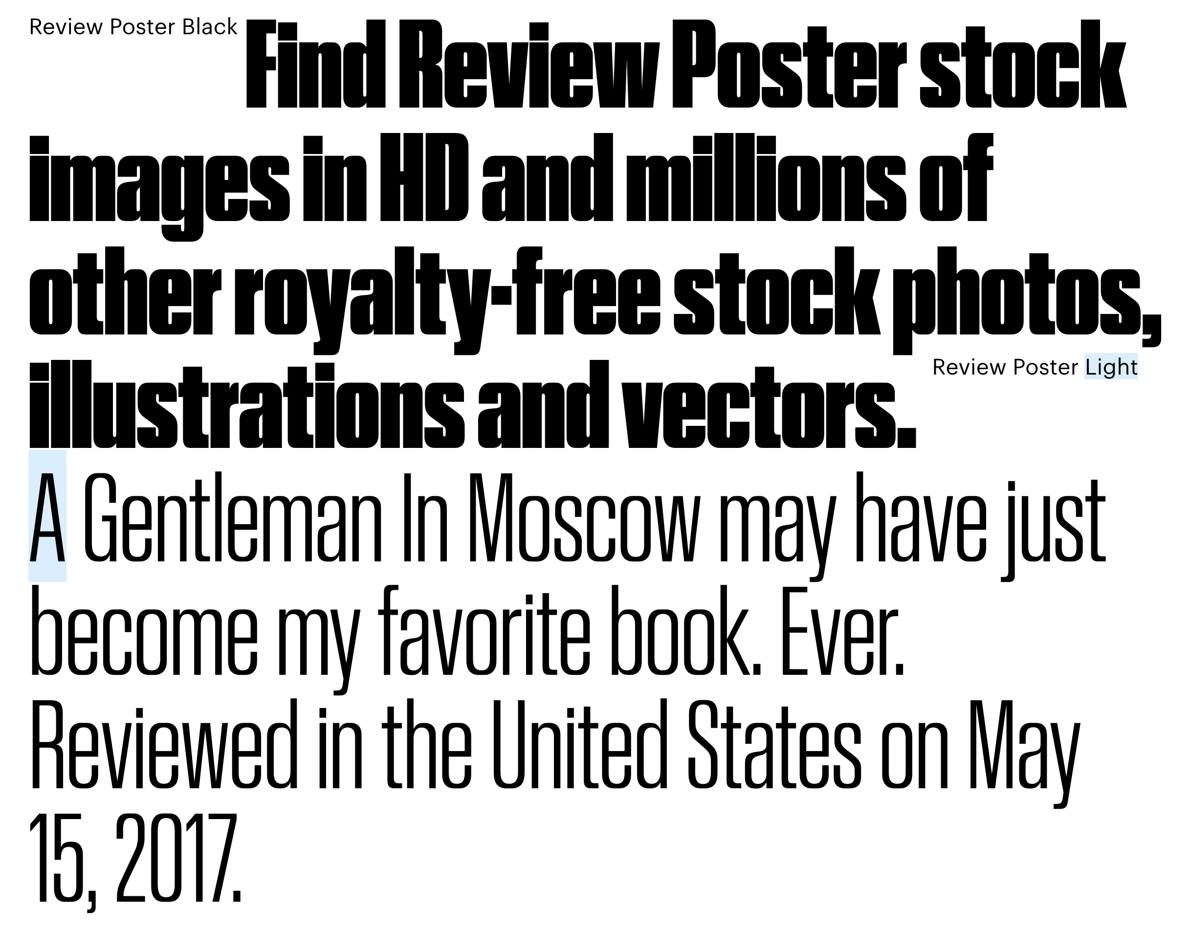
file name: Berton Hasebe Review Poster 2020
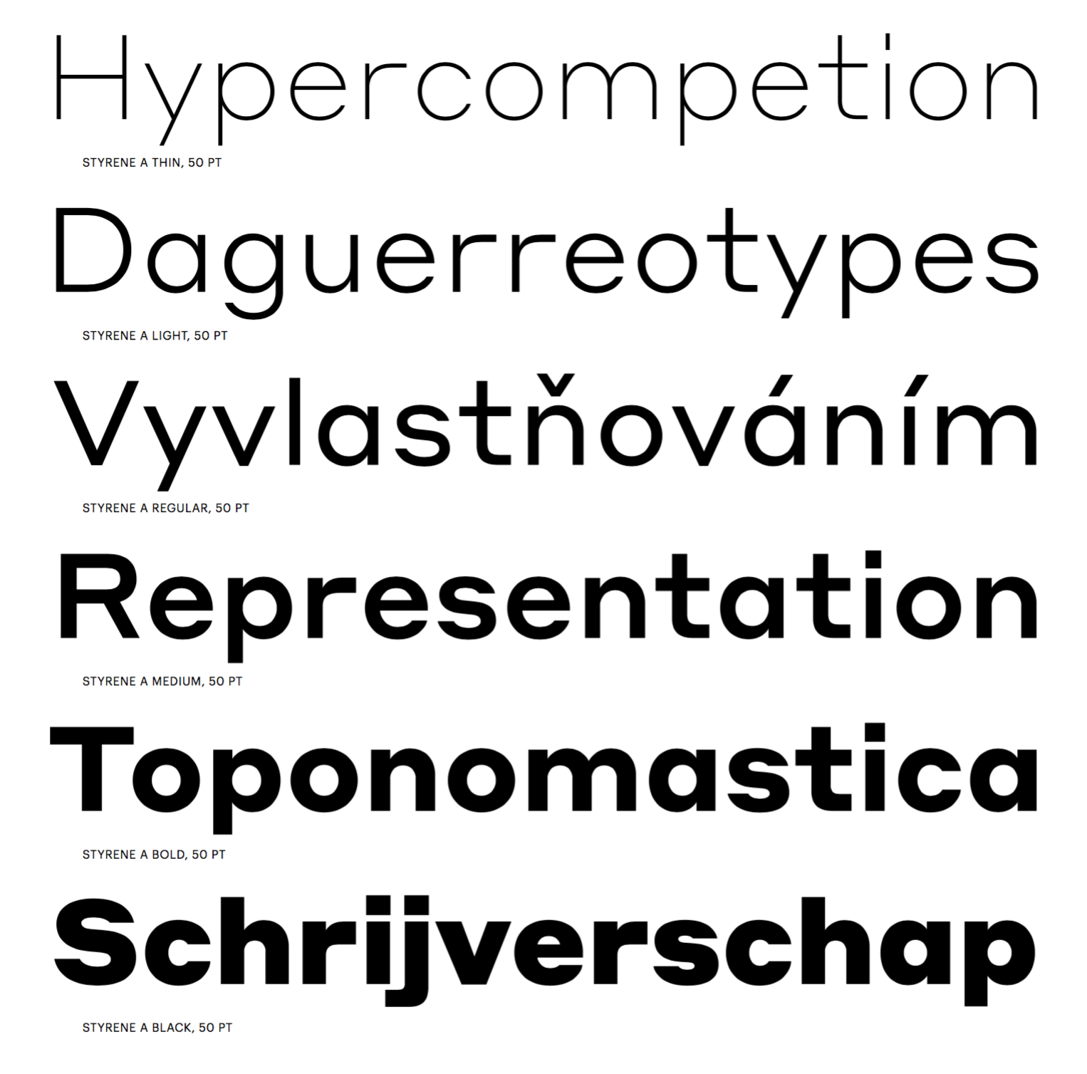
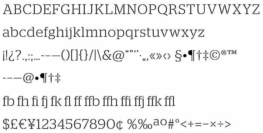
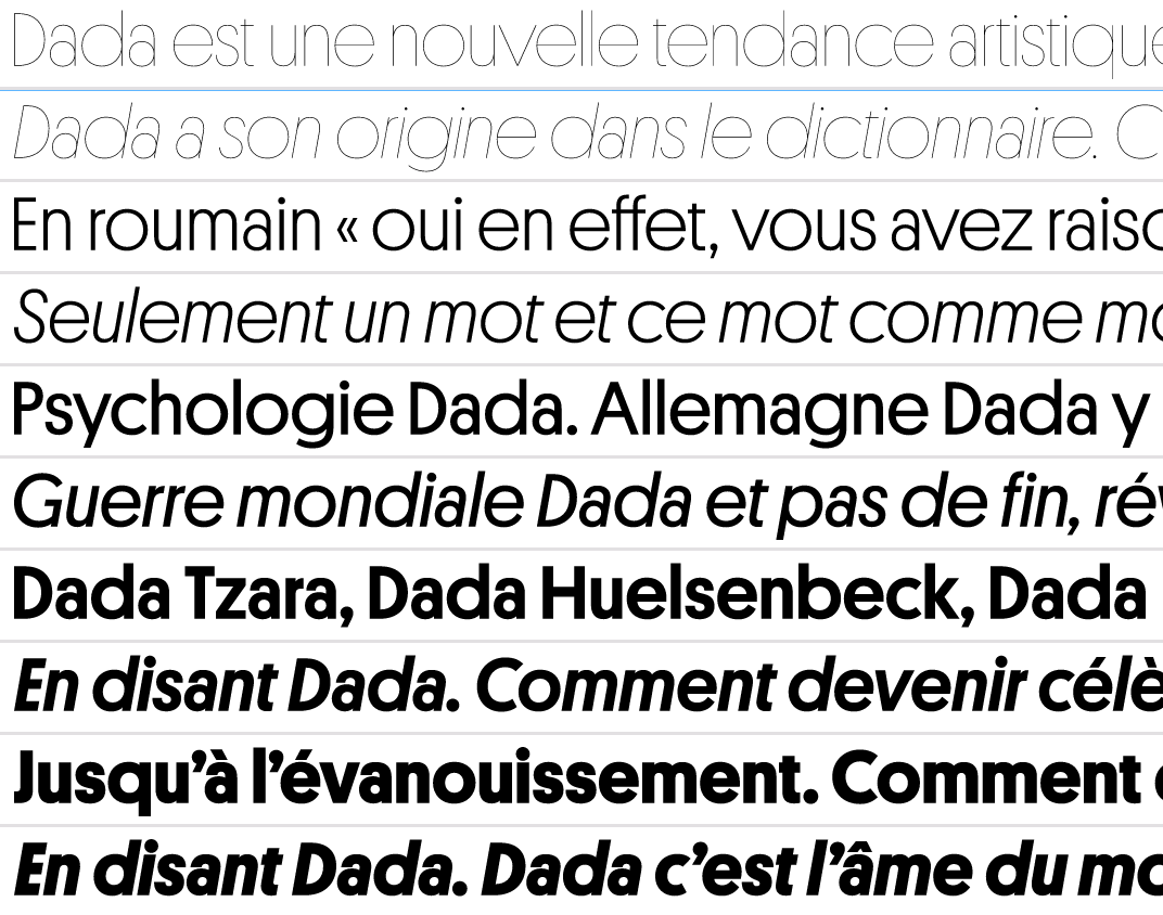
file name: Berton Hasebe Styrene 2016b
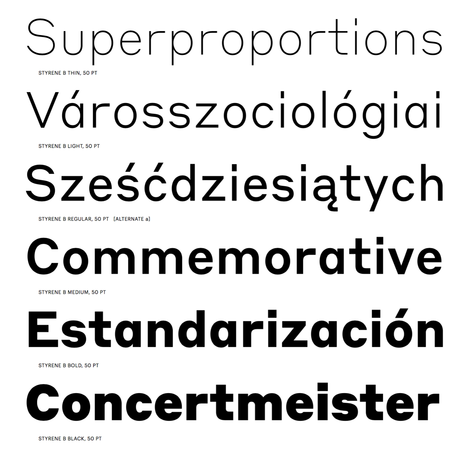
file name: Berton Hasebe Styrene 2016c
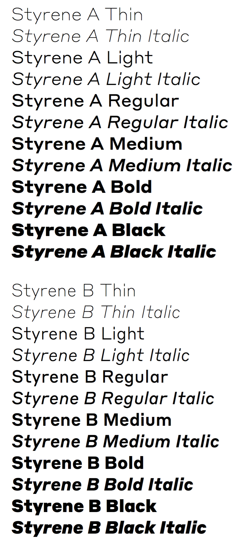
file name: Berton Hasebe Styrene 2016

file name: Berton Hasebe Styrene 2016d
file name: Berton Hasebe Styrene 2016e
file name: Berton Hasebe Styrene 2016f
file name: Berton Hasebe Styrene 2016g
file name: Berton Hasebe Styrene 2016h
file name: Berton Hasebe Duplex 2016
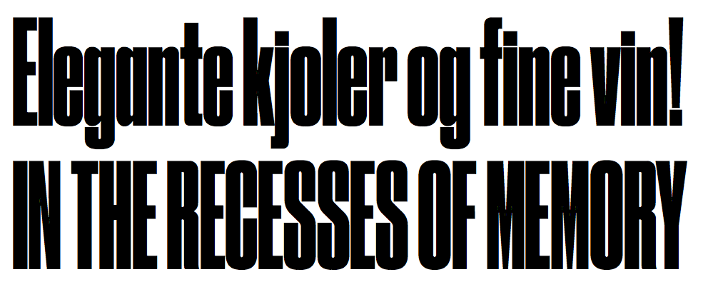
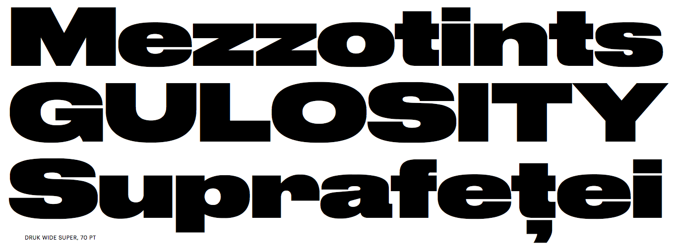
file name: Berton Hasebe Druk 2015
file name: Berton Hasebe Druk Condensed Super 2015

file name: Berton Hasebe Druk Heavy 2015

file name: Berton Hasebe Druk Heavy 2015b

file name: Berton Hasebe Druk Super 2015
file name: Berton Hasebe Druk Text Medium 2015
file name: Berton Hasebe Druk Text Medium 2015b

file name: Berton Hasebe Druk Text Medium 2015c
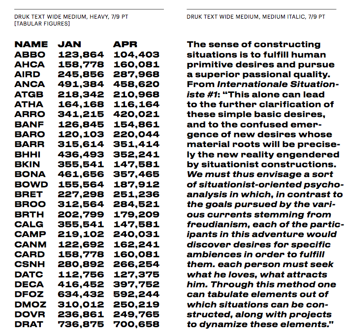
file name: Berton Hasebe Druk Text Wide Medium 2015
file name: Berton Hasebe Druk X X Cond Super 2014
file name: Berton Hasebe Druk X X Condensed Super 2015
file name: Berton Hasebe Druk X X Condensed Super 2015b
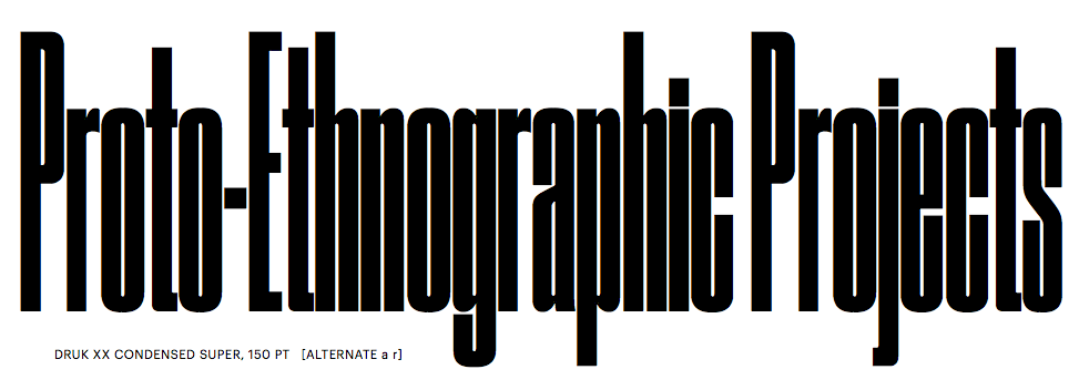
file name: Berton Hasebe Druk X X Condensed Super 2015c

file name: Berton Hasebe Druk X X Condensed Super Italic 2015
file name: Berton Hasebe Druk 2015
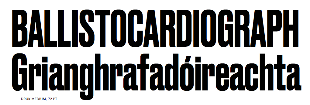
file name: Berton Hasebe Druk Medium 2015
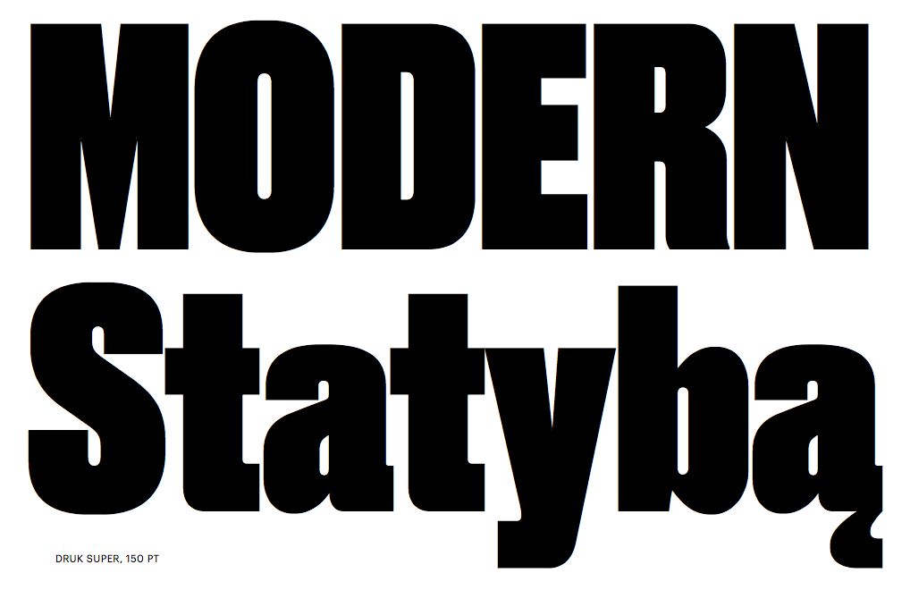
file name: Berton Hasebe Druk Super 2015

file name: Berton Hasebe Druk Text Wide 2015
file name: Berton Hasebe Druk Wide Heavy 2015
file name: Berton Hasebe Druk Wide Super 2015
file name: Christian Schwartz Schnyder Wide L Bold 2018

file name: Christian Schwartz Schnyder Wide L Bold 2018b
file name: Berton Hasebe Christian Schwartz Schnyder 2013 2018
file name: Berton Hasebe Christian Schwartz Schnyder 2013 2018b
file name: Berton Hasebe Christian Schwartz Schnyder 2013 2018c
file name: Berton Hasebe Christian Schwartz Schnyder 2013 2018d
file name: Berton Hasebe Christian Schwartz Schnyder 2013 2018e
file name: Berton Hasebe Christian Schwartz Schnyder 2013 2018f
file name: Berton Hasebe Christian Schwartz Schnyder 2013 2018g
file name: Berton Hasebe Christian Schwartz Schnyder 2013 2018h
file name: Berton Hasebe Christian Schwartz Schnyder 2013 2018i
file name: Berton Hasebe Christian Schwartz Schnyder 2013 2018j
file name: Berton Hasebe Christian Schwartz Schnyder 2013 2018k
file name: Berton Hasebe Christian Schwartz Schnyder 2013 2018l
file name: Berton Hasebe Christian Schwartz Schnyder S Web Cond Bold Regular 2016

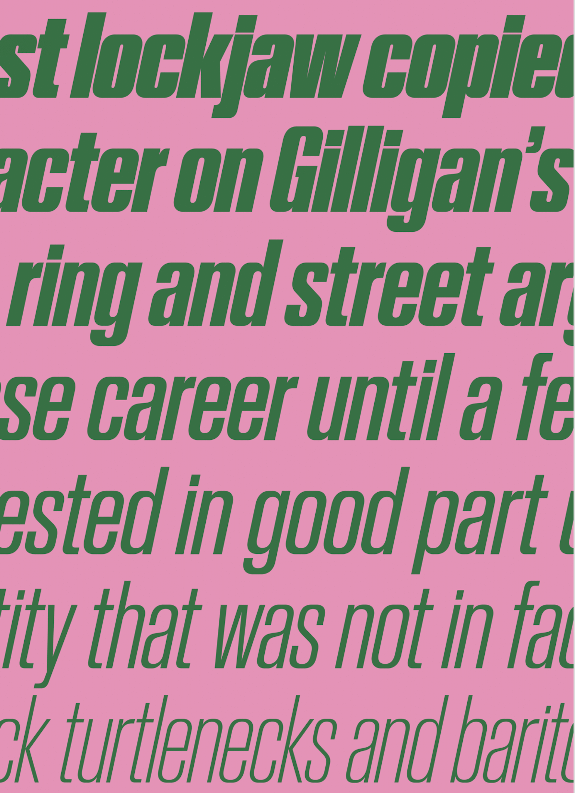
file name: Commercial Type Stag Stencil 2009

file name: Commercial Type Stag Stencil 2009

file name: Commercial Type Stag Stencil 2009b
file name: Commercial Type Stag Stencil 2009c
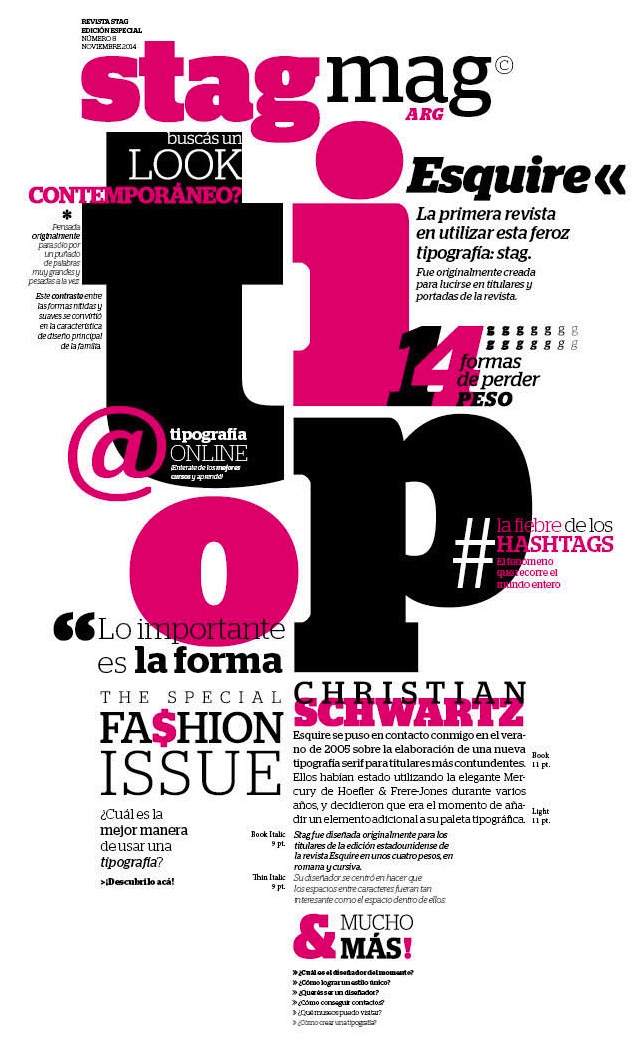
file name: Christian Schwartz Stag Esquire 2006 Poster by Guadalupe Peyrallo 2015
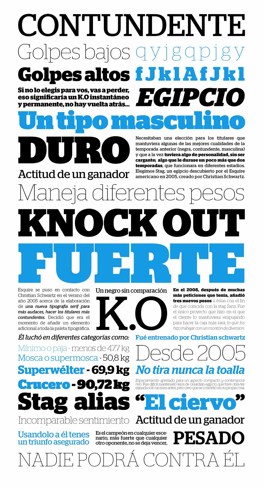
file name: Christian Schwartz Stag 2006 Poster by Leandro De La Cruz 2016
file name: Christian Schwartz Stag 2006 Poster by Victoria Costa Paz 2016
file name: Christian Schwartz Stag 2006 Poster by Victoria Costa Paz 2016b
file name: Berton Hasebe Alda 2011
file name: Berton Hasebe Alda T D C55 Award
file name: Berton Hasebe Alda 2011b
file name: Berton Hasebe Alda Bold 2008
file name: Berton Hasebe Alda Open Type 2008
file name: Berton Hasebe Alda Open Type 2008b
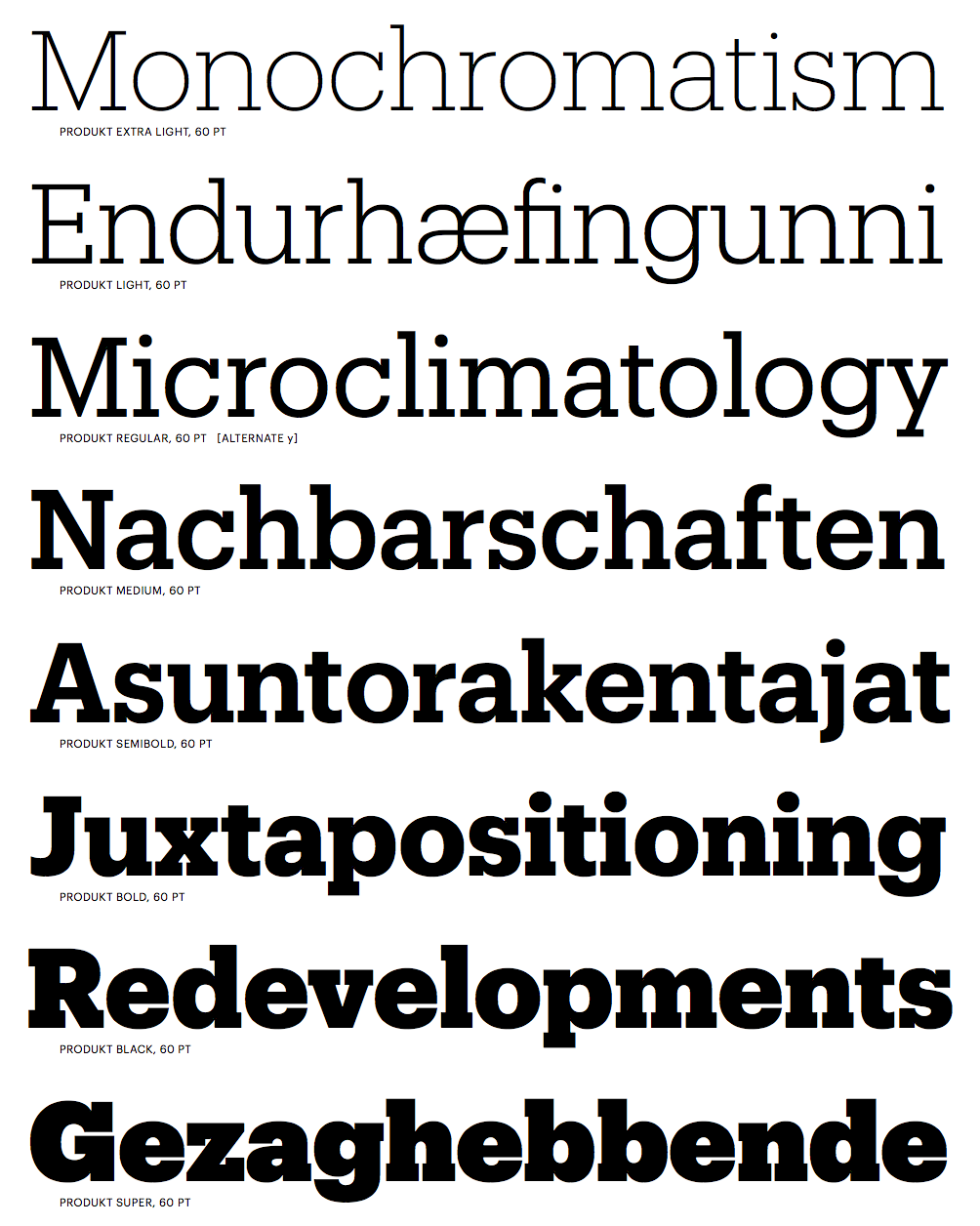
file name: Christian Schwartz Berton Hasebe Produkt 2014a
file name: Christian Schwartz Berton Hasebe Produkt 2014b
file name: Christian Schwartz Berton Hasebe Produkt Black 2014

file name: Christian Schwartz Berton Hasebe Produkt Black 2014b
file name: Christian Schwartz Berton Hasebe Produkt Light 2014

file name: Christian Schwartz Berton Hasebe Produkt Super 2014
file name: Christian Schwartz Berton Hasebe Produkt Thin 2014
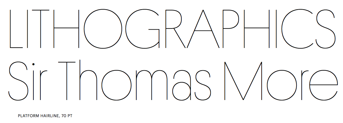
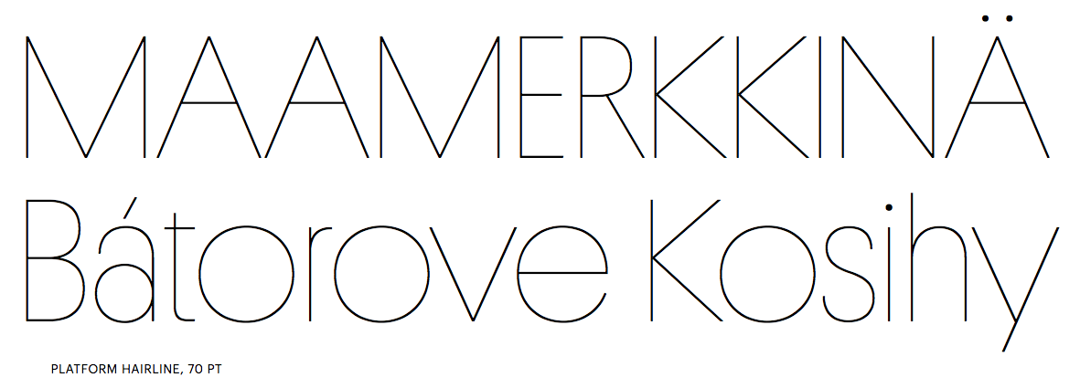
file name: Berton Hasebe Platform 2010

file name: Berton Hasebe Platform 2010b
file name: Berton Hasebe Platform 2010c
file name: Berton Hasebe Platform 2010d
file name: Berton Hasebe Platform 2010e
file name: Berton Hasebe Platform 2010f
file name: Berton Hasebe Platform 2010g
file name: Berton Hasebe Platform 2010h
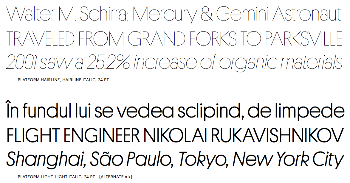
file name: Berton Hasebe Platform 2010i
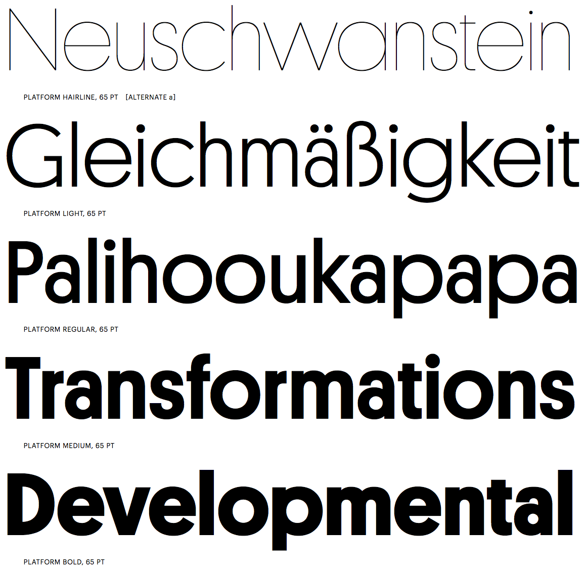
file name: Berton Hasebe Platform 2010j
file name: Berton Hasebe Platform 2010k

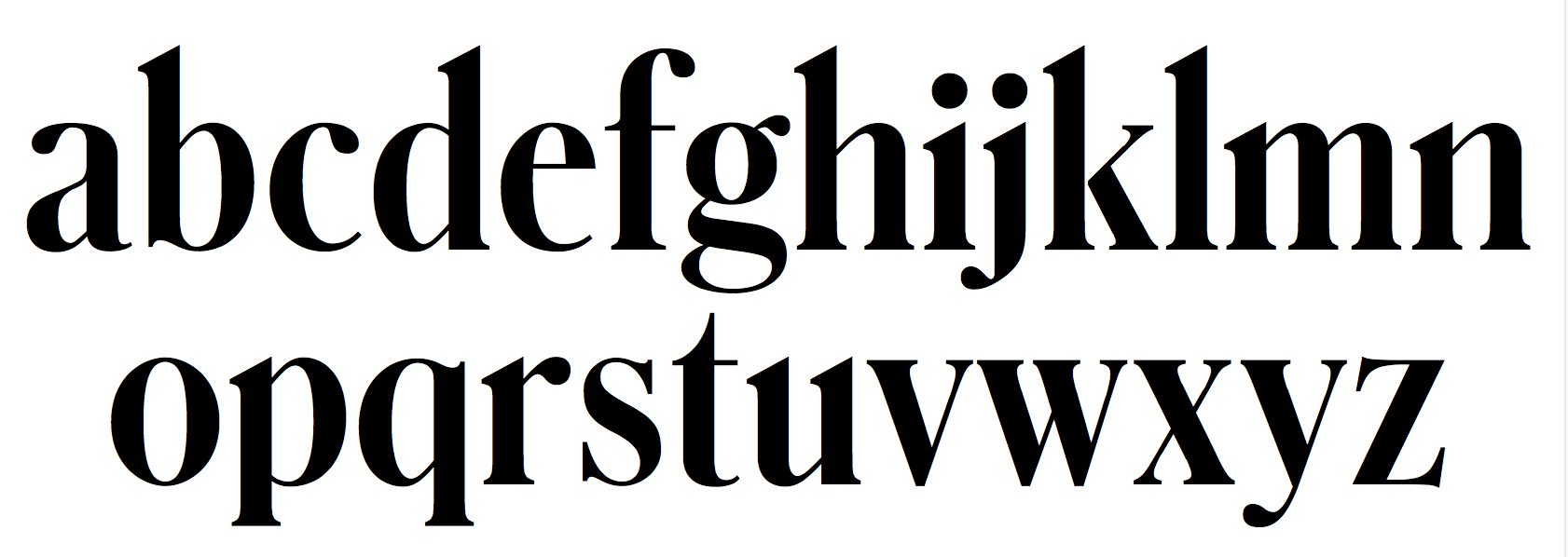
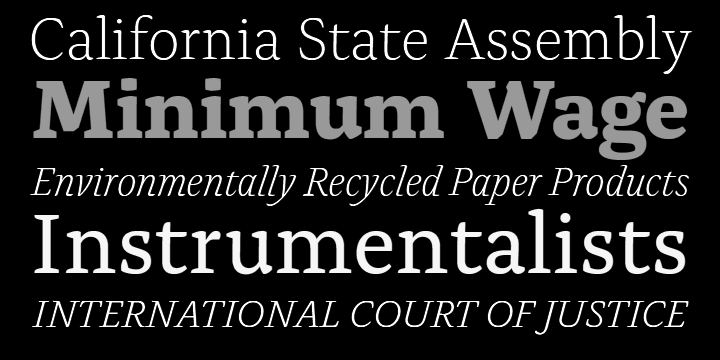
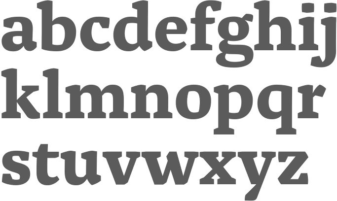
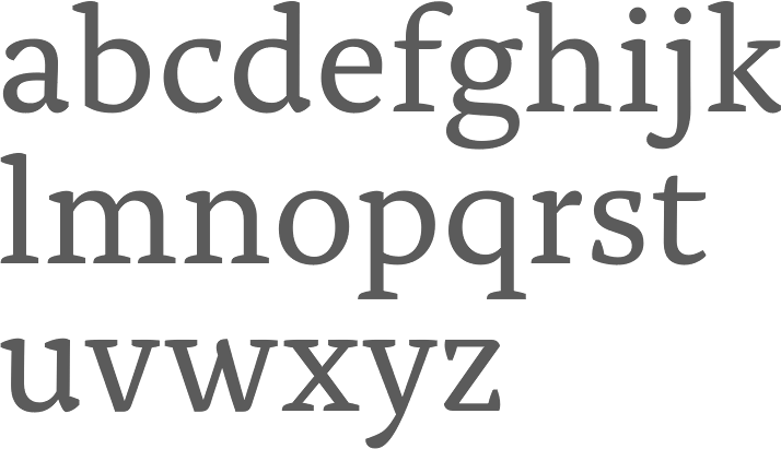
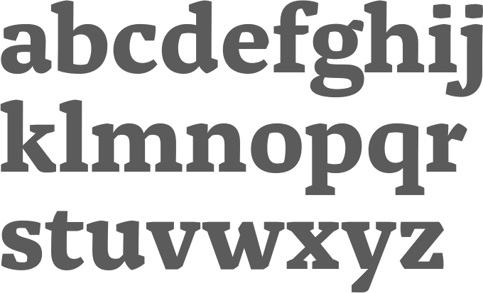
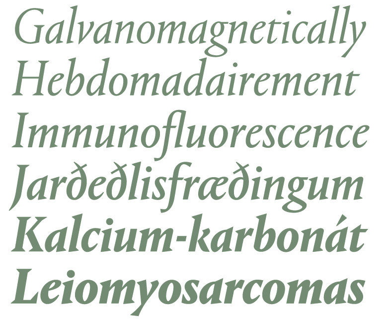
file name: Berton Hasebe Portrait 2013
file name: Berton Hasebe Portrait 2013b

file name: Berton Hasebe Portrait 2013c
file name: Berton Hasebe Portrait 2013d
file name: Berton Hasebe Portrait 2013e
file name: Berton Hasebe Portrait 2013f
file name: Berton Hasebe Portrait 2013g
file name: Berton Hasebe Portrait 2013h
file name: Berton Hasebe Portrait 2013i
file name: Berton Hasebe Portrait 2013j
file name: Berton Hasebe Portrait 2013k
file name: Berton Hasebe Portrait 2013l
file name: Berton Hasebe Portrait 2013m
file name: Berton Hasebe Portrait 2013n
file name: Berton Hasebe Portrait 2013o
file name: Berton Hasebe Portrait 2013p
file name: Berton Hasebe Portrait 2013q

file name: Berton Hasebe Portrait 2013r

file name: Berton Hasebe Portrait 2013s

file name: Berton Hasebe Portrait 2013t
file name: Berton Hasebe Portrait 2013
file name: Berton Hasebe Portrait 2013b
file name: Berton Hasebe Portrait 2013c
file name: Berton Hasebe Portrait 2013d
file name: Berton Hasebe Portrait 2013e
file name: Berton Hasebe Portrait 2013f

file name: Bertot Hasebe Pic
| | |
|
Luc Devroye ⦿ School of Computer Science ⦿ McGill University Montreal, Canada H3A 2K6 ⦿ lucdevroye@gmail.com ⦿ https://luc.devroye.org ⦿ https://luc.devroye.org/fonts.html |