TYPE DESIGN INFORMATION PAGE last updated on Wed May 6 16:16:37 EDT 2026
FONT RECOGNITION VIA FONT MOOSE

|
|
|
|
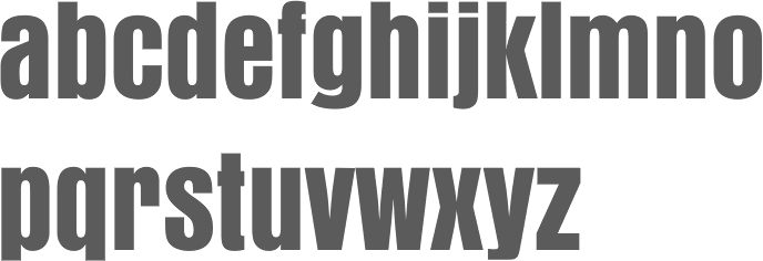
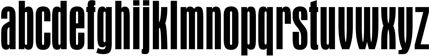
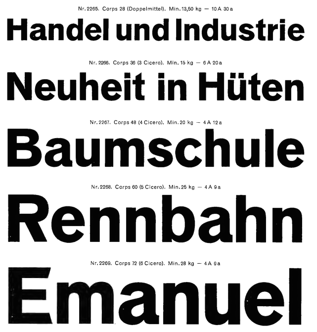
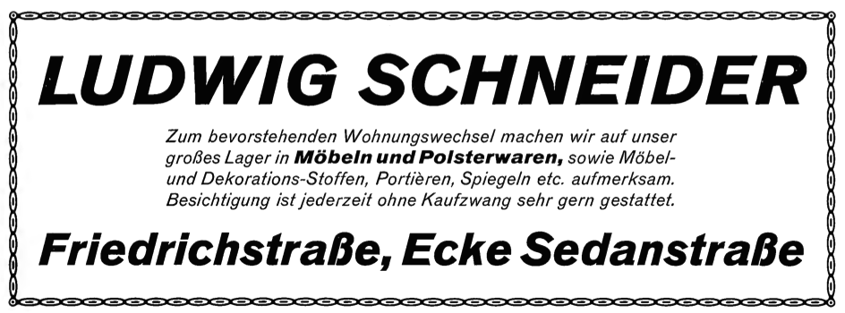
Aurora Grotesk
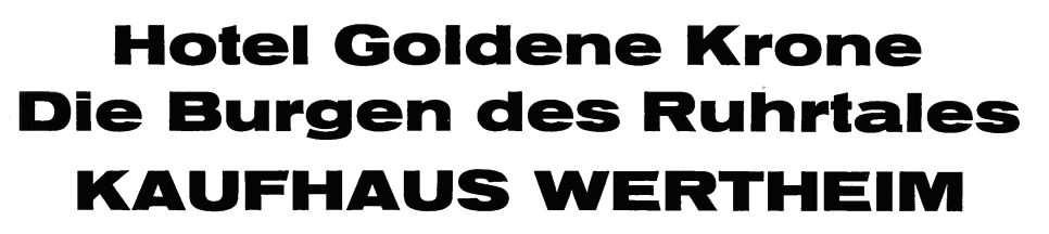
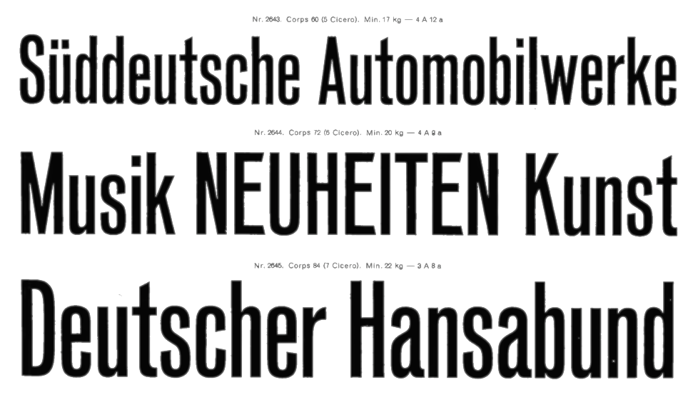
The original Aurora Grotesk dates back to the Johannes Wagner Foundry (1912), but Paul Barnes points out that the same typeface appears under multiple names in the Handbuch der Schriftarten, 1926:
On the digital side, in chronological order:
|
EXTERNAL LINKS |
| | |


file name: Castcraft O P T I Aurora Bold Condensed

file name: Castcraft O P T I Aurora Condensed

file name: Castcraft O P T I Aurora Grotesk No 8

file name: Castcraft O P T I Aurora Grotesk No 9

file name: U R W Anzeigen Grotesk

file name: Haas Anzeigen Grotesk 1943b
file name: Haas Anzeigen Grotesk 1943
file name: Bitstream Aurora Condensed 144742
file name: Bitstream Aurora Condensed a

file name: Bauersche Giesserei Venus Breit Fett
file name: Bauersche Giesserei Venus Breit Fett
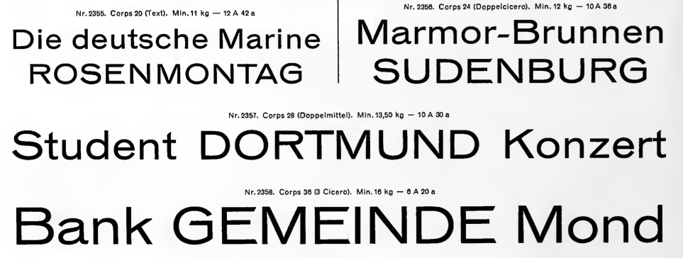
file name: Bauersche Giesserei Venus Breit Halbfett
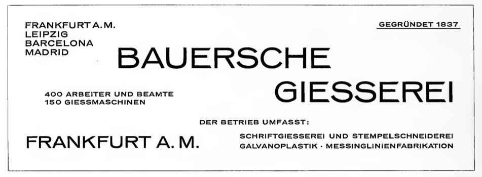
file name: Bauersche Giesserei Venus Breit Halbfett
file name: Bauersche Giesserei Venus Breit Mager
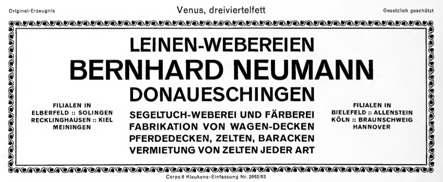
file name: Bauersche Giesserei Venus Dreiviertelfett
file name: Bauersche Giesserei Venus Fett
file name: Bauersche Giesserei Venus Fette Kursiv
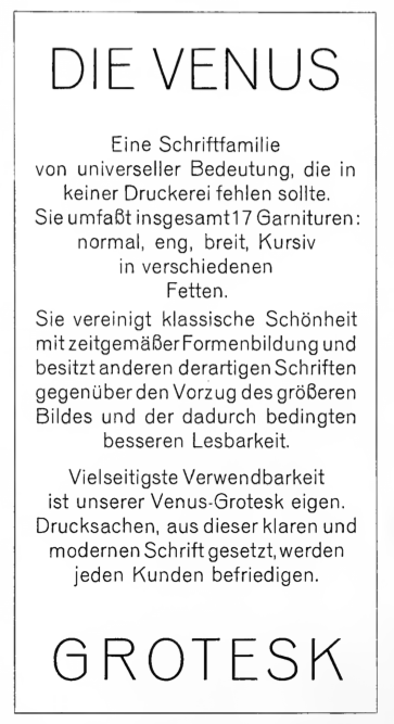
file name: Bauersche Giesserei Venus Grotesk
file name: Bauersche Giesserei Venus Magere Kursiv

file name: Bauersche Giesserei Venus Schmal Dreiviertelfett
file name: Bauersche Giesserei Venus Schmal Halbfett

file name: Bauersche Giesserei Venus Schmal Mager

file name: C E Weber Aurora Grotesk 1912
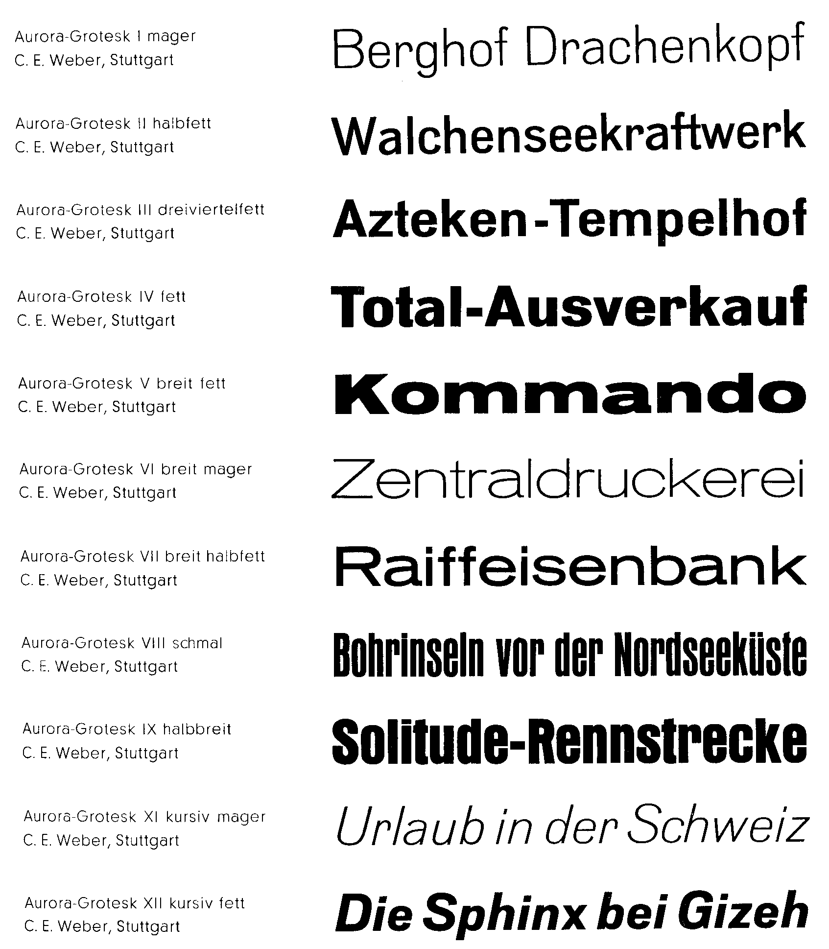
file name: Weber Aurora Grotesk
| | |
|
Luc Devroye ⦿ School of Computer Science ⦿ McGill University Montreal, Canada H3A 2K6 ⦿ lucdevroye@gmail.com ⦿ https://luc.devroye.org ⦿ https://luc.devroye.org/fonts.html |