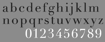
TYPE DESIGN INFORMATION PAGE last updated on Fri Nov 14 13:11:54 EST 2025
FONT RECOGNITION VIA FONT MOOSE
|
|
|
|
Didot or Bodoni
The typophiles discuss some Didot choices and tell us the best ways for recognizing a Didot from a Bodoni. On the choices for Didot:
|
EXTERNAL LINKS |
| | |

file name: Original Bodoni 1789

file name: Original Didot
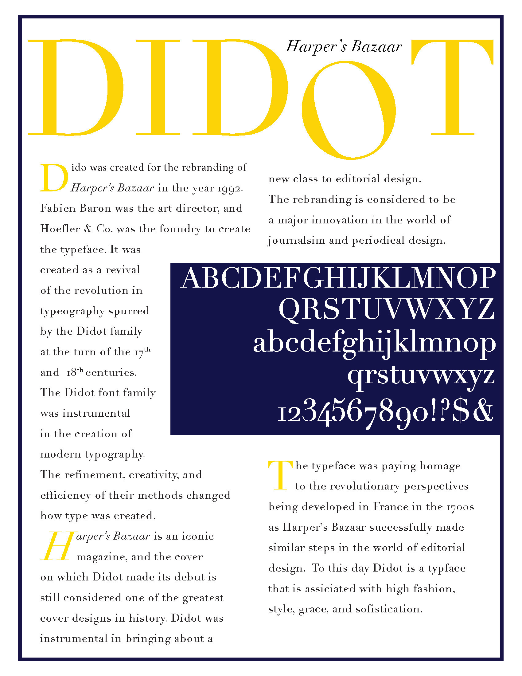
file name: Hoefler H T F Didot 1991 Poster by Tony Mungiguerra
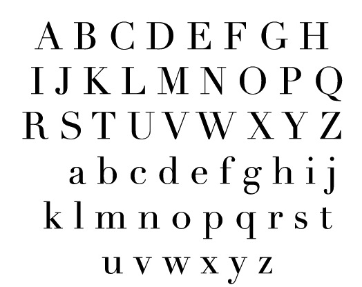
file name: Hoefler H T F Didot 1991
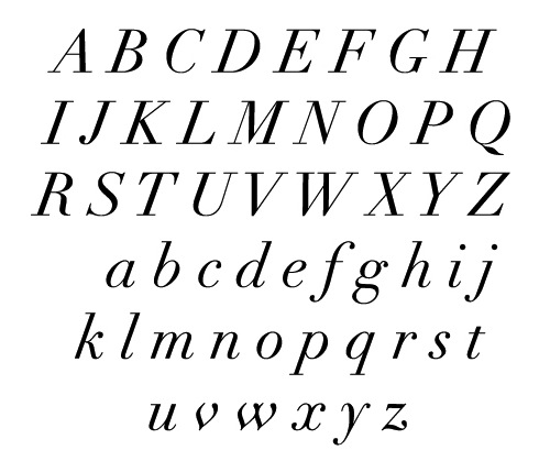
file name: Hoefler H T F Didot 1991b
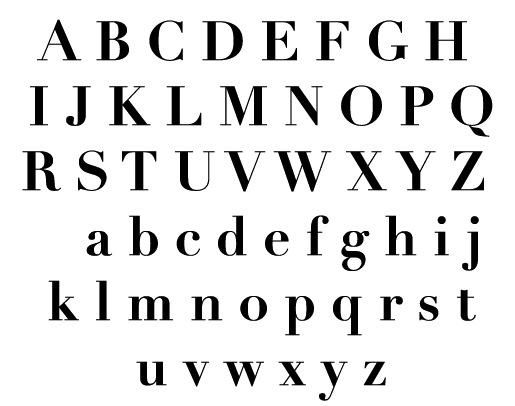
file name: Hoefler H T F Didot 1991c
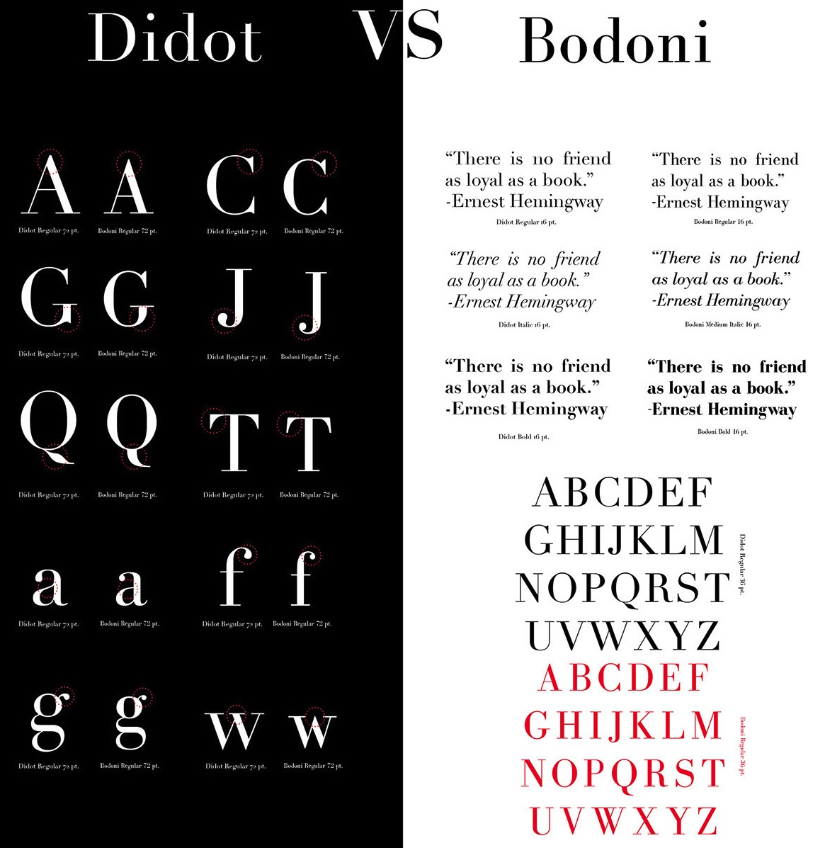
file name: Didot vs Bodoni by Lisa Ashley 2014
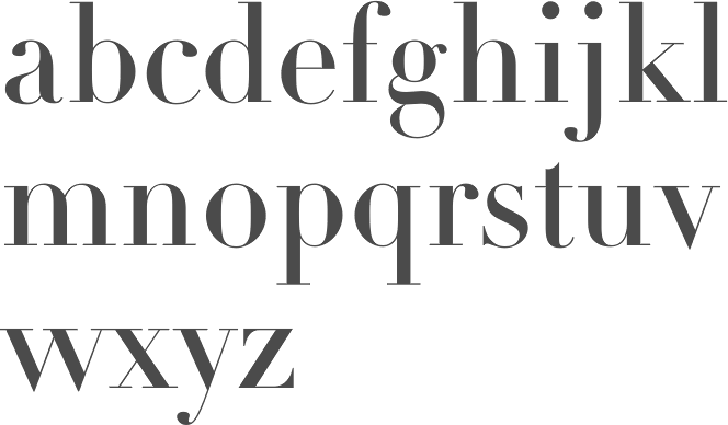
file name: Adrian Frutiger Didot L T Pro Headline 1991
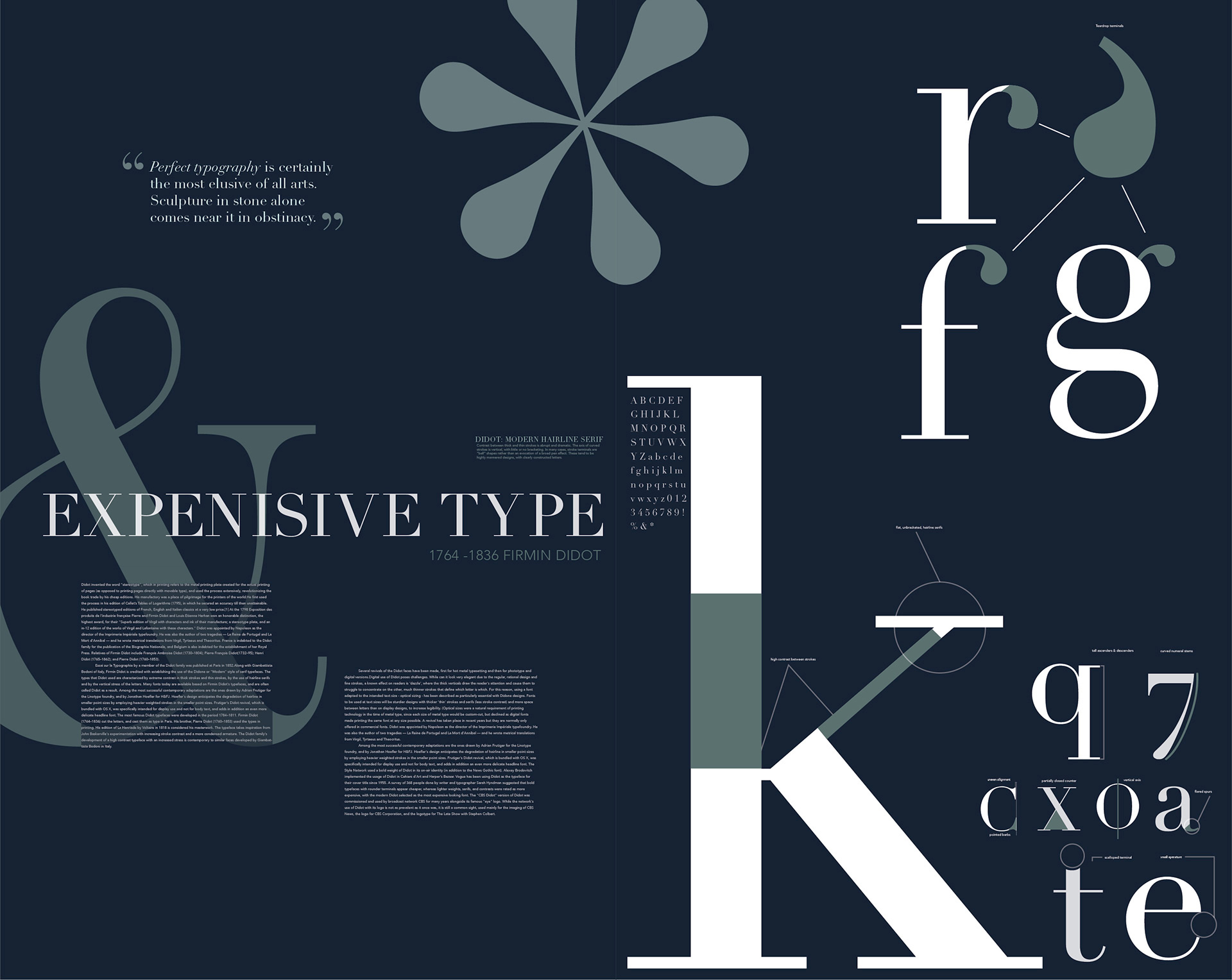
file name: Adrian Frutiger Linotype Didot 1991 Poster by Emma Froberg 2017
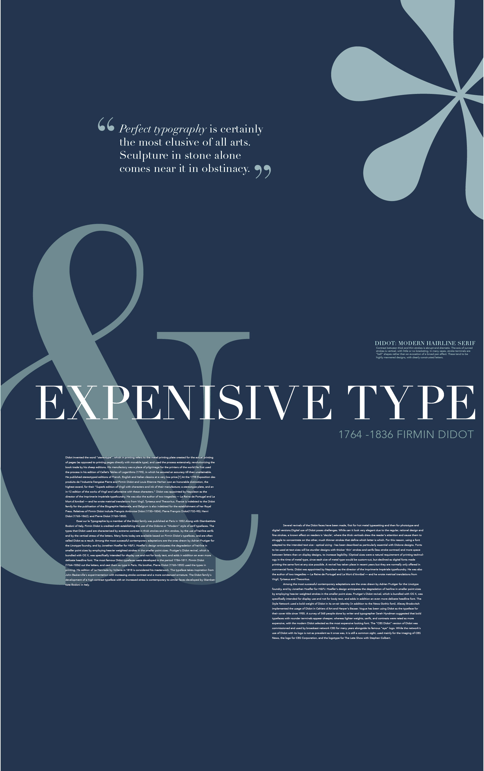
file name: Adrian Frutiger Linotype Didot 1991 Poster by Emma Froberg 2017b
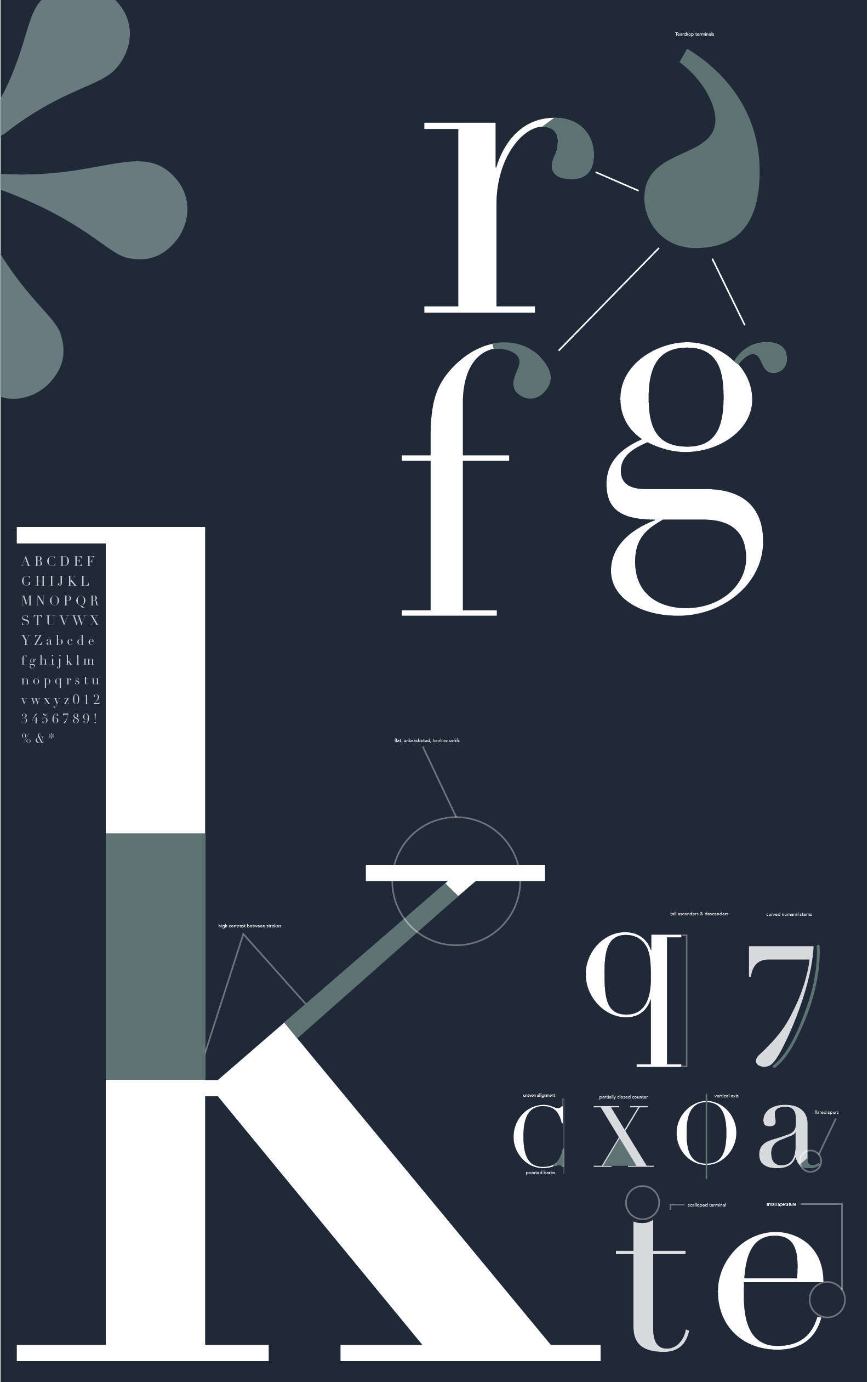
file name: Adrian Frutiger Linotype Didot 1991 Poster by Emma Froberg 2017c
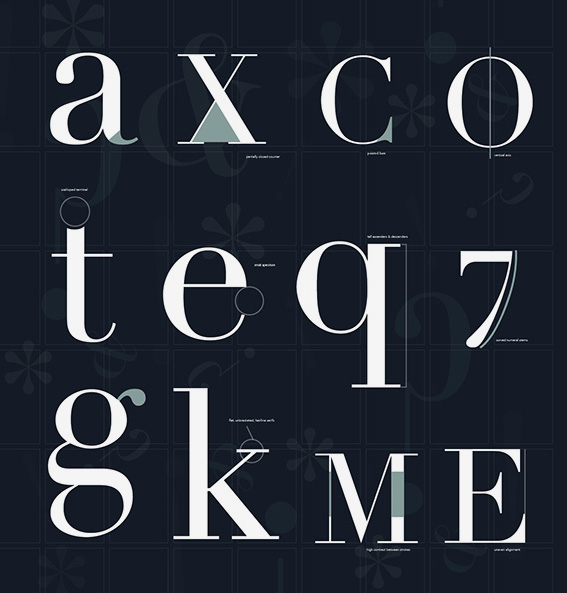
file name: Adrian Frutiger Linotype Didot 1991 Poster by Emma Froberg 2017d
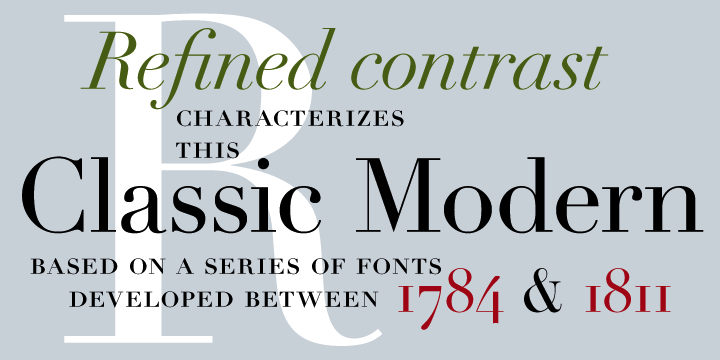
file name: Adrian Frutiger Linotype Didot 1991
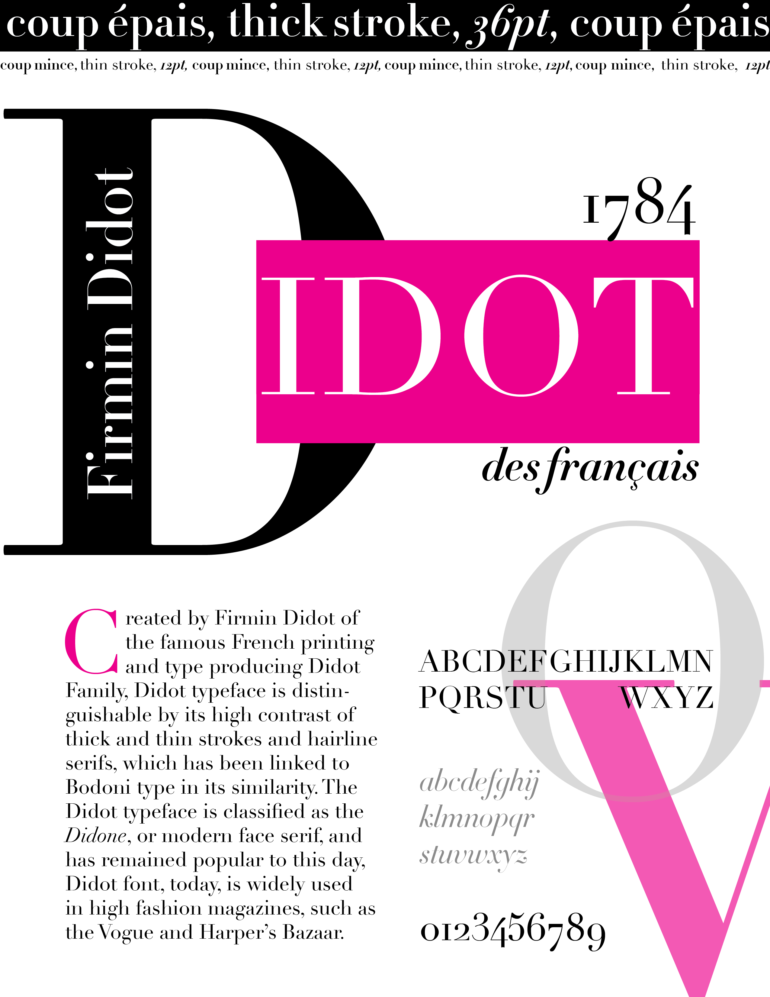
file name: Adrian Frutiger Linotype Didot 1991 Poster by Helen Ju 2017
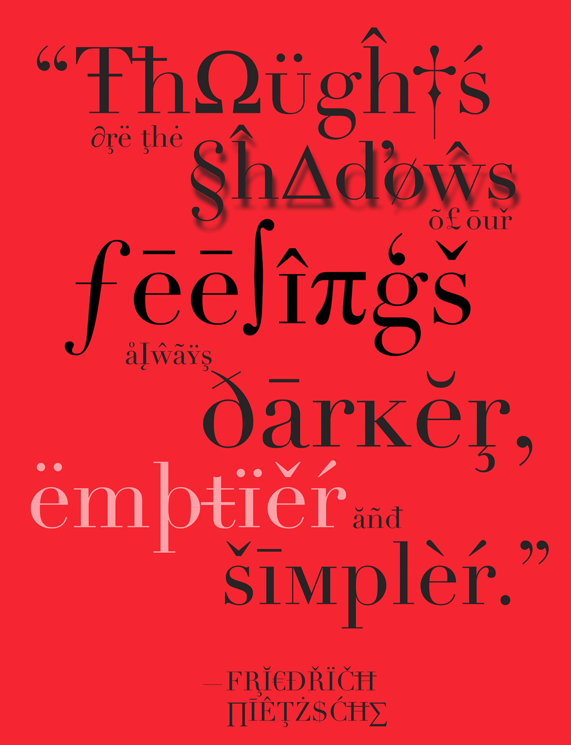
file name: Adrian Frutiger Linotype Didot 1991 Poster by Jessica Marinelli 2016
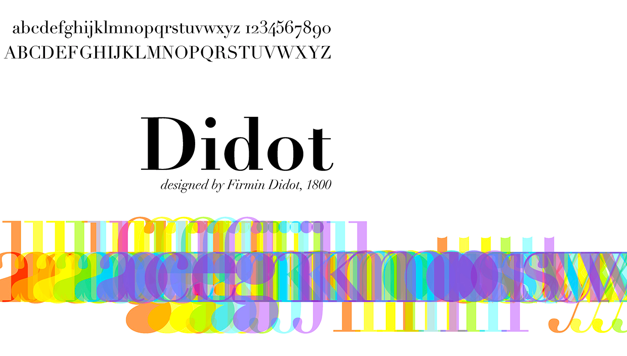
file name: Adrian Frutiger Linotype Didot 1991 Poster by James Musson 2016
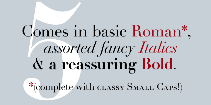
file name: Adrian Frutiger Linotype Didot 1991b
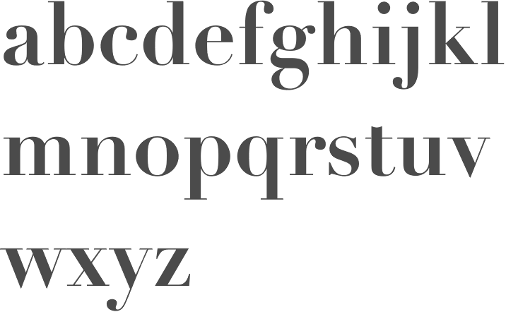
file name: Adrian Frutiger Linotype Didot Bold 1991
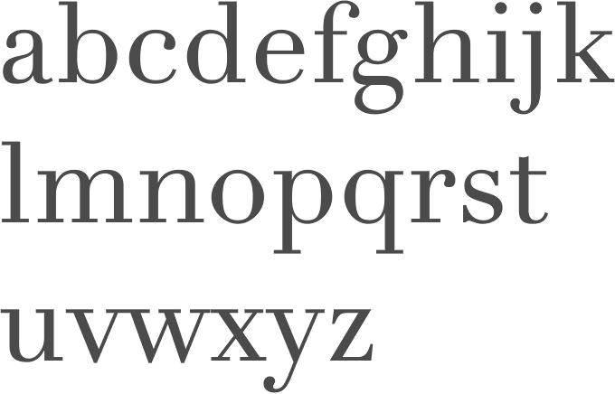
file name: Adrian Frutiger Linotype Didot Etext Pro 2013
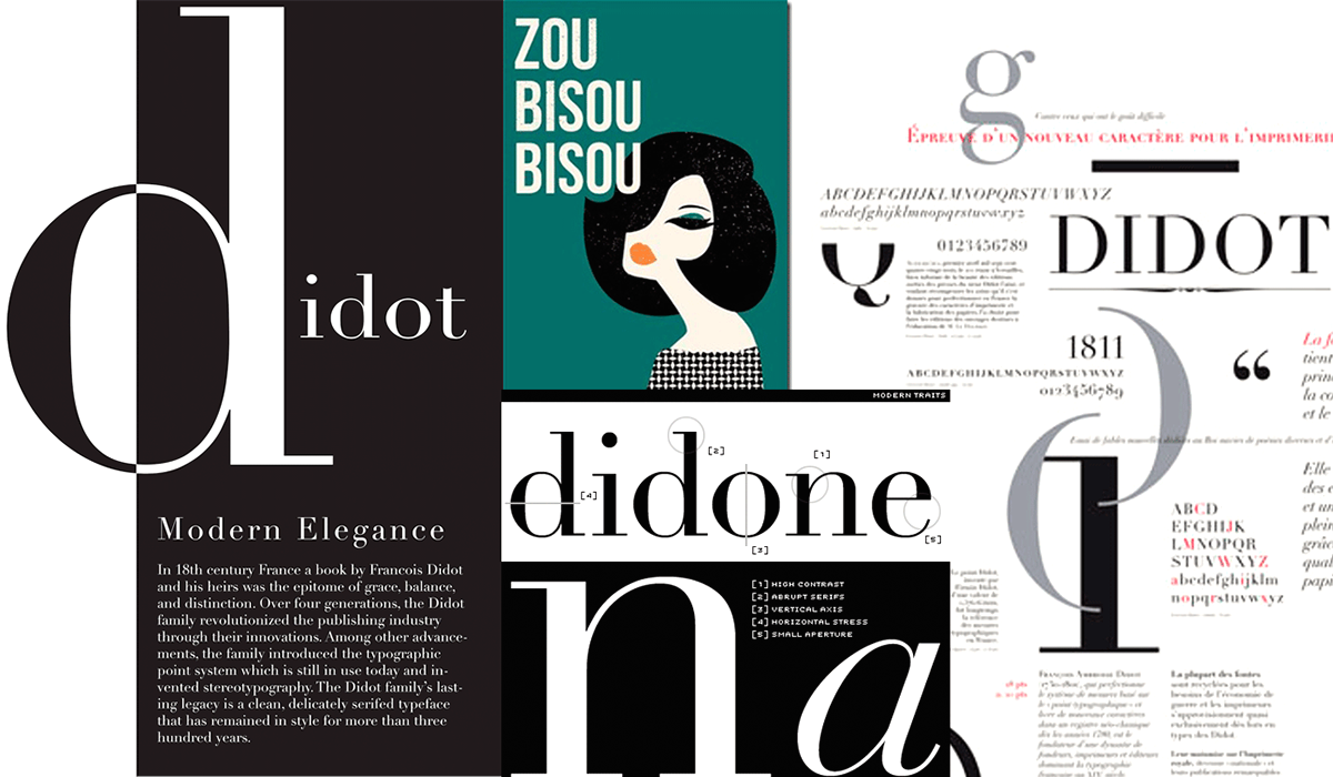
file name: Xiana Abella Didot Poster 2016
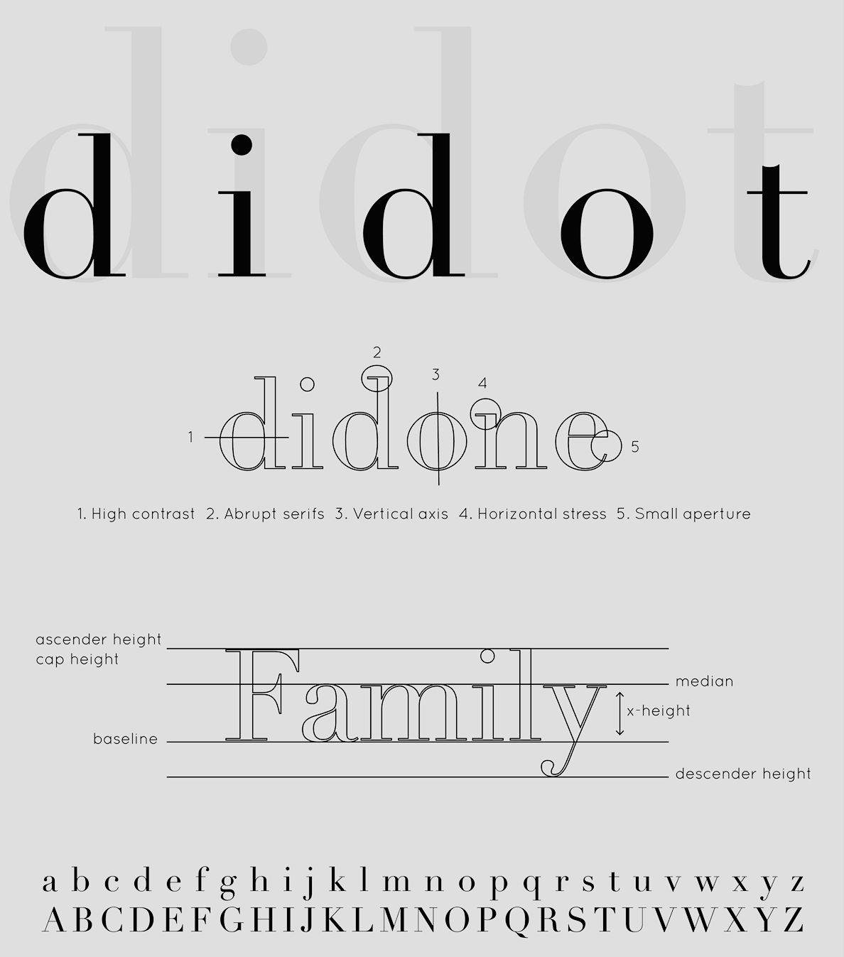
file name: Xiana Abella Didot Poster 2016
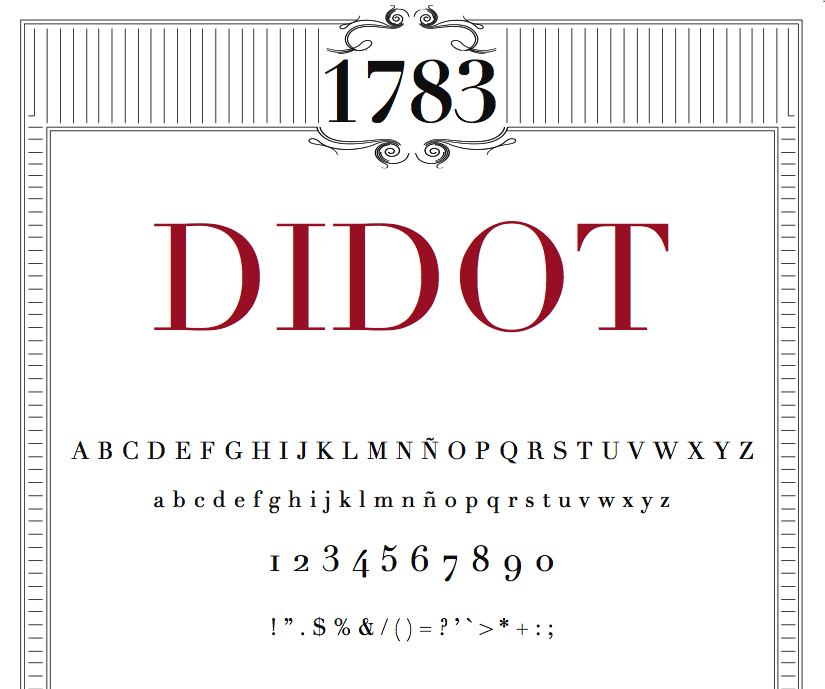
file name: Linotype Didot Poster by Martina Rodriguez Saavedra 2015
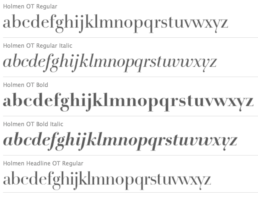
file name: Per Baasch Jorgensen F F Holmen 2012

file name: Per Baasch Jorgensen F F Holmen 2012b
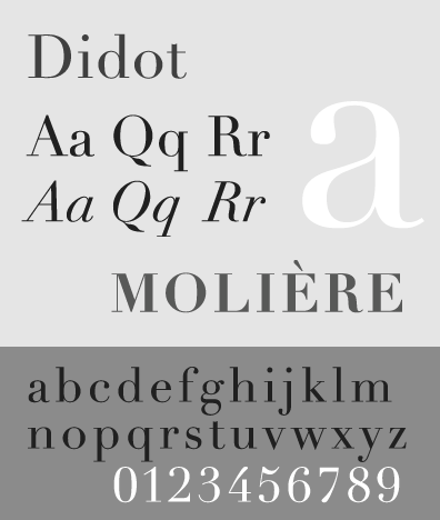
file name: Didot S P
| | |
|
Luc Devroye ⦿ School of Computer Science ⦿ McGill University Montreal, Canada H3A 2K6 ⦿ lucdevroye@gmail.com ⦿ https://luc.devroye.org ⦿ https://luc.devroye.org/fonts.html |

