|
Hivelogic: Top 10 Programming Fonts
[Dan Benjamin]
Hivelogic is published by Dan Benjamin, a writer, software developer, usability designer, and broadcaster. He listed his top ten fonts for showing computer code in (all comments are quotes by Dan, not me): - 1. Inconsolata: Inconsolata is my favorite monospaced font, and it's free. Shortly after discovering it, it quickly supplanted Deja Vu Sans Mono as my go-to programming font. I use it everywhere, from Terminal windows to code editors. It has a certain sublime style that's unique without being over the top, and it looks fantastic at both large and small sizes. I use this font when I show code samples in a presentation, and it's the font we use in Terminal and TextMate windows when filming PeepCode screencasts. Inconsolata is designed to be used with anti-aliasing enabled, but it's surprisingly legible even at very small sizes. A big thanks to Raph Levien for creating this font, and for making it free.
- 3. Deja Vu Sans Mono: The Deja Vu family of fonts are one of my favorite free font families, based on the excellent Vera Font family. The Deja Vu fonts have been updated with a wider range of characters while maintaining a similar look and feel to that of Vera. This was my go-to font family for many years. It looks great at any size with anti-aliasing turned on. Panic ships a font with it's Coda application called “Panic Sans” which is based on this font. Gruber says via email that when he compared Panic Sans against Vera, he noted that “Panic had noticeably crisper punctuation chars” and that it seemed like they had improved the hinting on some characters as well.
- 4. Droid Sans Mono: The Droid font family (available for download here) is a nice font family designed for use on the small screens of mobile handsets, like Android, and licensed under the Apache license. Droid Sans Mono makes for a great programming font. It's got a bit of flair, and stands out among the other monospace fonts I've listed, and its only real flaw is the lack of a slashed zero.
- 5. Proggy: Proggy is a clean monospace font that seems to be favored by Windows users, although it works fine on a Mac. It's a clean font intended to be used only at smaller points, and without anti-aliasing.
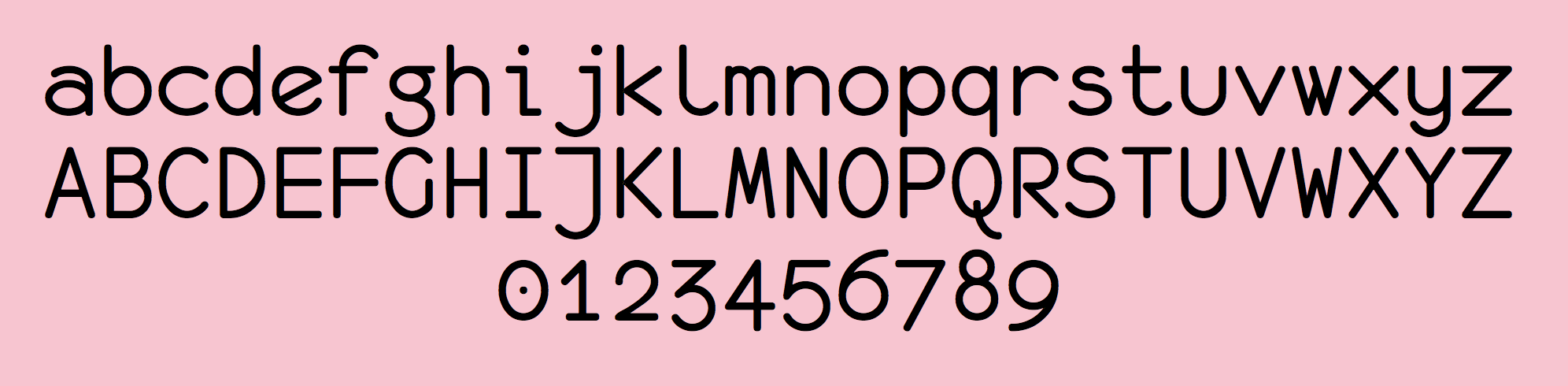
- 6. Monofur: Monofur is a unique monospace font that looks great anti-aliased at all sizes. It's a fun font with a distinct look that is vaguely reminiscent of Sun's OPEN LOOK window manager, which ran Solaris (aka SunOS) systems back in the late 80's. If you're looking for something a bit different, try this font, but make sure you have anti-aliasing turned on, even at small sizes.
- 7. Profont: Profont is a Monaco-like bitmap font available for Mac, Windows, and Linux (there's also a modified version for Mac OS X called ProFontX by a different author). They're best at smaller sizes, and make a great alternative to Monaco if you're on a non-Mac platform and want really tiny fonts and the eyestrain that goes along with them. Profont (and ProFontX) is intended for use at 9-points with anti-aliasing turned off.
- 8. Monaco: Monaco is the default monospace font on the Mac and has been since its inclusion in System 6. It's a solid, workhorse font that really shines at smaller font sizes with anti-aliasing turned off. I loved this typeface back when my eyes could tolerate staring at a 9-point font for hours, but those days are behind me. This font looks great at 9 or 10-points (Figure 4), and doesn't look too shabby anti-aliased at higher sizes (Figure 3). As far as I know, you can only get Monaco as a part of Mac OS, but there are alternatives, so keep reading.
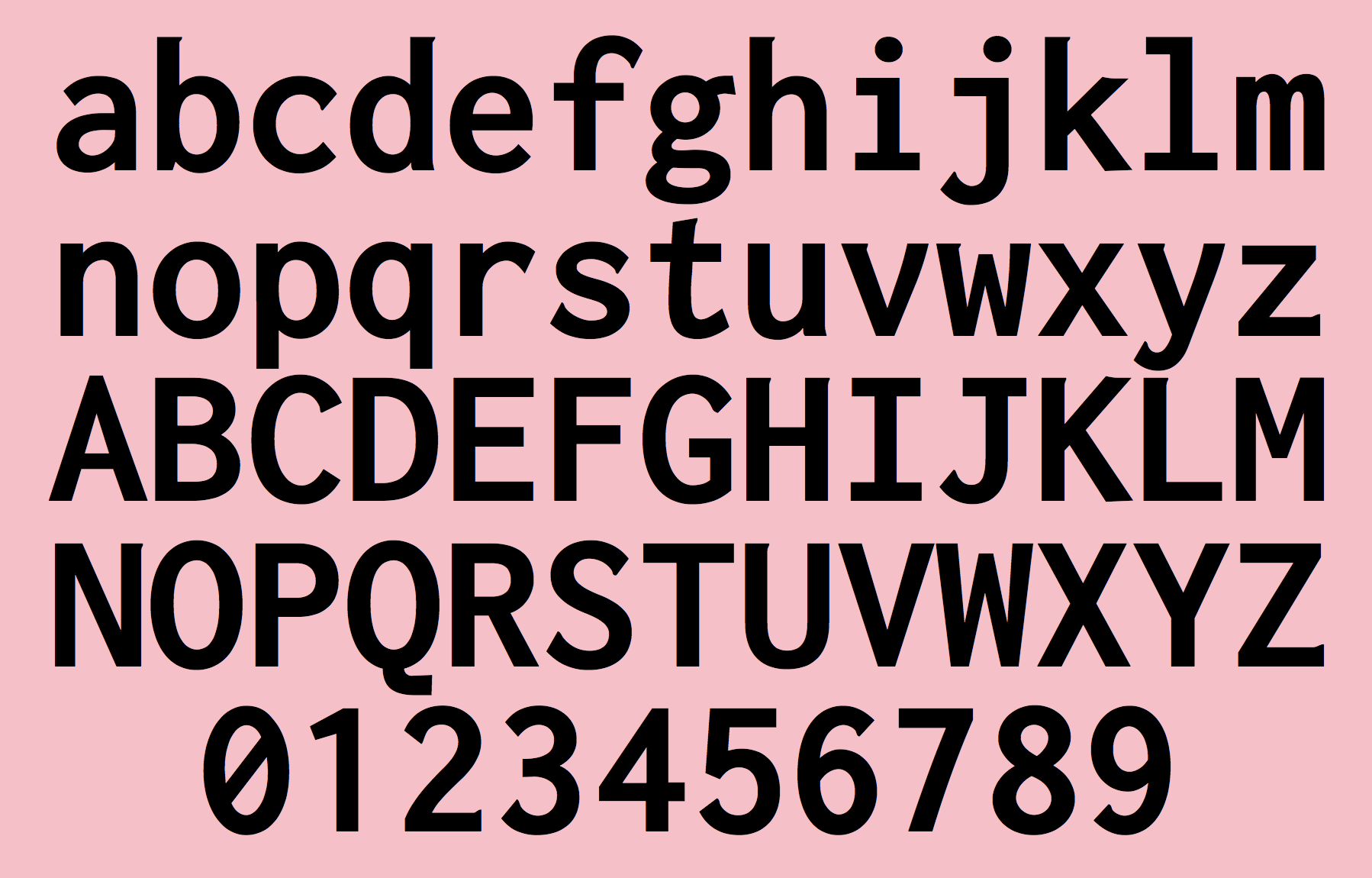
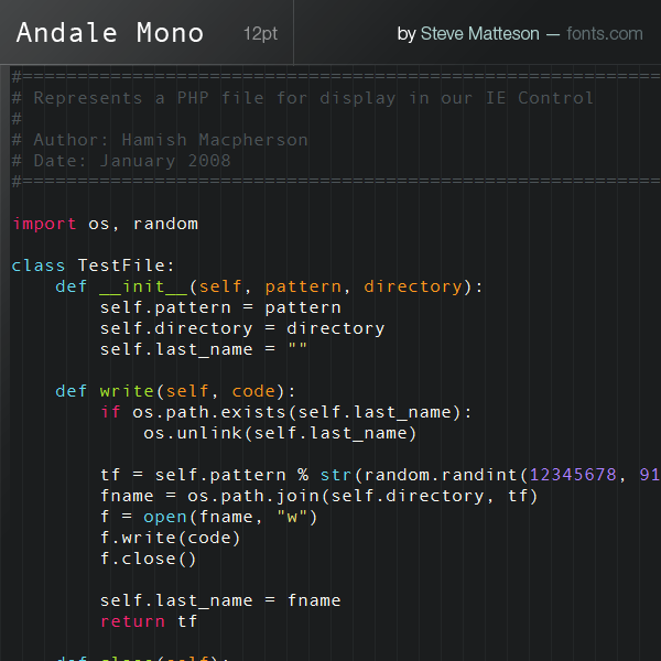
- 9. Andale Mono: A bit better than the Courier family, Andale Mono is still relegated to the “default font” category as it ships with some systems, and you wouldn't want to download or use it if it wasn't already there. The character-spacing is a bit too clumsy and the letters are a bit too wide for my tastes.
- 10. Courier: All systems ship with a version of Courier (sometimes Courier New), and unfortunately, many have it set as the default font for terminal and editor windows. It does the job, but it's a bit dull and boring, lacking style and class. I don't recommend this font if you have any other choice — and fortunately, you do. If you use this font, please bump the size and turn on anti-aliasing.
|
EXTERNAL LINKS
Dafont page
MyFonts search
Monotype search
Fontspring search
Google search
INTERNAL LINKS
Choice of fonts ⦿
Fonts for programming ⦿
|