TYPE DESIGN INFORMATION PAGE last updated on Mon Jun 8 18:05:33 EDT 2026
FONT RECOGNITION VIA FONT MOOSE

|
|
|
|
Dean Morris
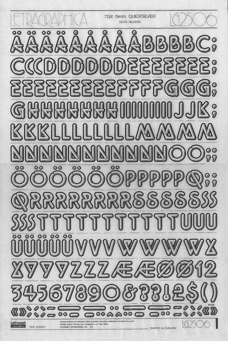
Born in Bay City, MI. New-York based designer of Quicksilver (1976, Letraset), a neon / glass tube chrome all caps display typeface from the disco era. He writes: I am Dean Morris, the designer of the typeface "Quicksilver" that came out in 1976 as part of Letraset's Letragraphica range of rub-down fonts, the stylishly aggeressive ones in the yellow pages of the catalog. I named the typeface "Quicksliver" because it looked like bent thermometers - quicksilver being a nickname for mercury (I never meant it to suggest neon), and because "Quicksilver" had some of the cooler letters such as Q, K, E, and R. The name was my second choice, however. Letraset Englishly felt that my first choice, "Polished Sausage", would be "rather unpopular iln foreign markets". About the genesis, e says: I designed it as a 16 year-old kid in John Glenn High School in Bay City, Michigan, and sent Letraset a xerox of a tight sketch of 3" letters kerned with the heavy outlines slightly overlapping as I originally intended. I drew only the skinny S without an alternate and submitted no punctuation (what did I know?). Letraset must have wanted it real fast (fifties nostalgia and disco were WHITE HOT then, remember), because they did the finished art themselves at 5" high (they can't have known my age, maybe they had no confidence in my technical talent), starting with the E as did I in the design stage. And what a gorgeous rendering job they did in the pre-Mac days of ruling pens, straightedges, and hand-drawn curves (those aren't compass curves)! Letraset stayed very close to my tight sketch, designed the punctuation, and suggested an alternate but wierd wide S, which I approved, figuring there was probably no other decent way to design it. I imagined the punctuation would match the stroke width of the letters but they drew them narrower and slightly oddly, but I figured what the hell. If you wondered, "What was I thinking?" when you looked at the A, B, E, F, K, N, Q, R, and Y, I'll tell you. I was simply trying to describe part of the letter being drawn in the wrong direction. I thought I was so clever. For instance the E cross-stroke goes from right to left rather than from left to right like, oh, any other Roman cap E in history. R and Q diagonals came from waaaaaaaay on the other side, N goes waaaaaaay around the wrong way before starting the diagonal. "Chrome" letters can branch but these "glass tube" letters don't! And then the seventies ended. Dean: Alas, digitization came along eventually and fontographer technology followed. Crash went sales of rub-down type, and control of artwork was pirated without my knowledge and beyond my control, which I don't condone but I totally understand. The first album cover I saw with Quicksilver was Men At Work's first smash LP, then punk pioneer Stiff Records' logo appeared on 45 rpm labels with a clearly Quicksliver-inspired F. For about ten years I, family, and friends collected food packages, posters, took photos of signs, etc. with Quicksliver from around the world. I think it's about the easiest typeface to mishandle ever. Eventually I stopped trying to keep track of it. Maybe I'm overestimating its popularity now after 30 years (I totally forgot about it for about a decade), but to me seeing it around at all is itself a rave. Ray Larabie published Tight in 2007 at Typodermic, which is a digital revival of Quicksilver. |
EXTERNAL LINKS |
| | |

file name: Dean Morris Quicksilver1976

file name: Ray Larabie Tight 2007 after Dean Morris Quicksilver
| | |
|
Luc Devroye ⦿ School of Computer Science ⦿ McGill University Montreal, Canada H3A 2K6 ⦿ lucdevroye@gmail.com ⦿ https://luc.devroye.org ⦿ https://luc.devroye.org/fonts.html |