TYPE DESIGN INFORMATION PAGE last updated on Mon Jul 13 21:25:28 EDT 2026
FONT RECOGNITION VIA FONT MOOSE

|
|
|
|
Photo-Lettering Inc
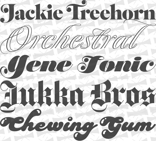
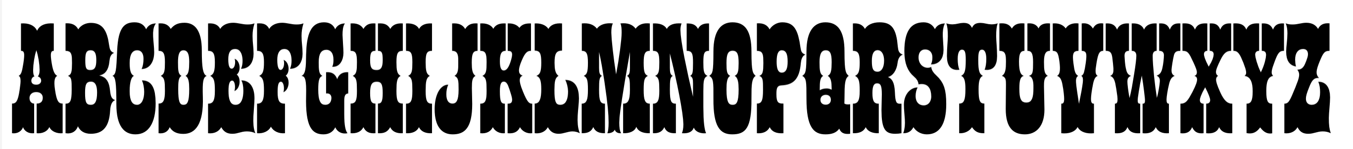
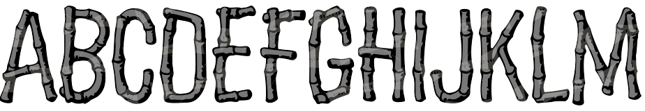
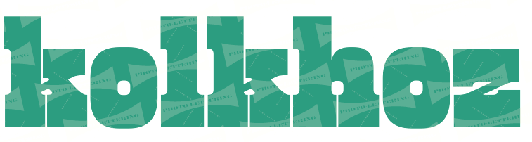
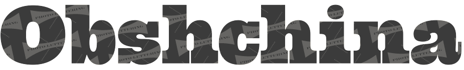
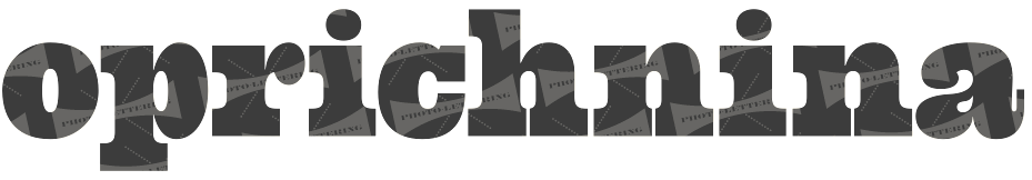
A subsidiary/part of House Industries in Yorklyn, DE. I quote: Photo-Lettering was a mainstay of the advertising and design industry in New York City from 1936 to 1997. PLINC, as it was affectionately known to art directors, was one of the earliest and most successful type houses to utilize photo technology in the production of commercial typography and lettering. It employed such design luminaries as Ed Benguiat and sold type drawn by the likes of Herb Lubalin, Milton Glaser and Seymour Chwast as well as countless other unsung lettering greats. The company is best known by most of today's graphic designers for its ubiquitous type catalogs. Physically, the collection takes up about 1500 cubic ft (42 cubic meters) of space and consists of film negatives and positives of most of the 6500 fonts produced in the company's 55 years. There are also countless patterns, cartouches, borders and dingbats, all of which have been preserved in film negative form. Each negative is approximately 28 in (71 cm) by 5 in (13 cm) high. House Industries, a Yorklyn, Delaware-based independent type foundry, purchased the entire physical assets of Photo-Lettering in April of 2003. Through a partnership with Ken Barber, Christian Schwartz and Erik van Blokland, House Industries is carefully digitizing select alphabets from the collection and plans to offer them through a modern web-based interface. The Photo-Lettering interface has allowed us to reach beyond the rigid confines of typography to offer extended features such as layering, color control and multiple master interpolation over six axes. With some of the most talented minds in display typography behind this new display lettering system, users of the system will enjoy the same refined typography as the original Photo-Lettering customers. A snapshot of their production, as of mid 2012, in alphabetical order:
|
EXTERNAL LINKS |
| | |

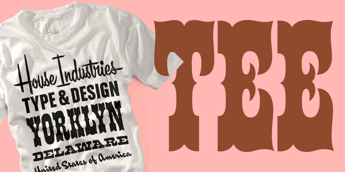
file name: House Industries Photo Lettering 2011
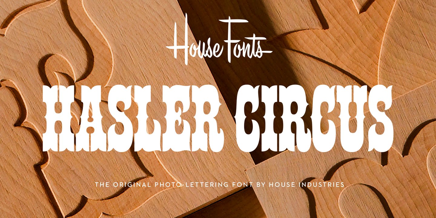
file name: House Industries Plinc Hasler Circus 2021 1
file name: House Industries Plinc Hasler Circus 2021 2
file name: House Industries Plinc Hasler Circus 2021 4

file name: House Industries Plinc Hasler Circus 2021 5
file name: House Industries Plinc Hasler Circus 2021

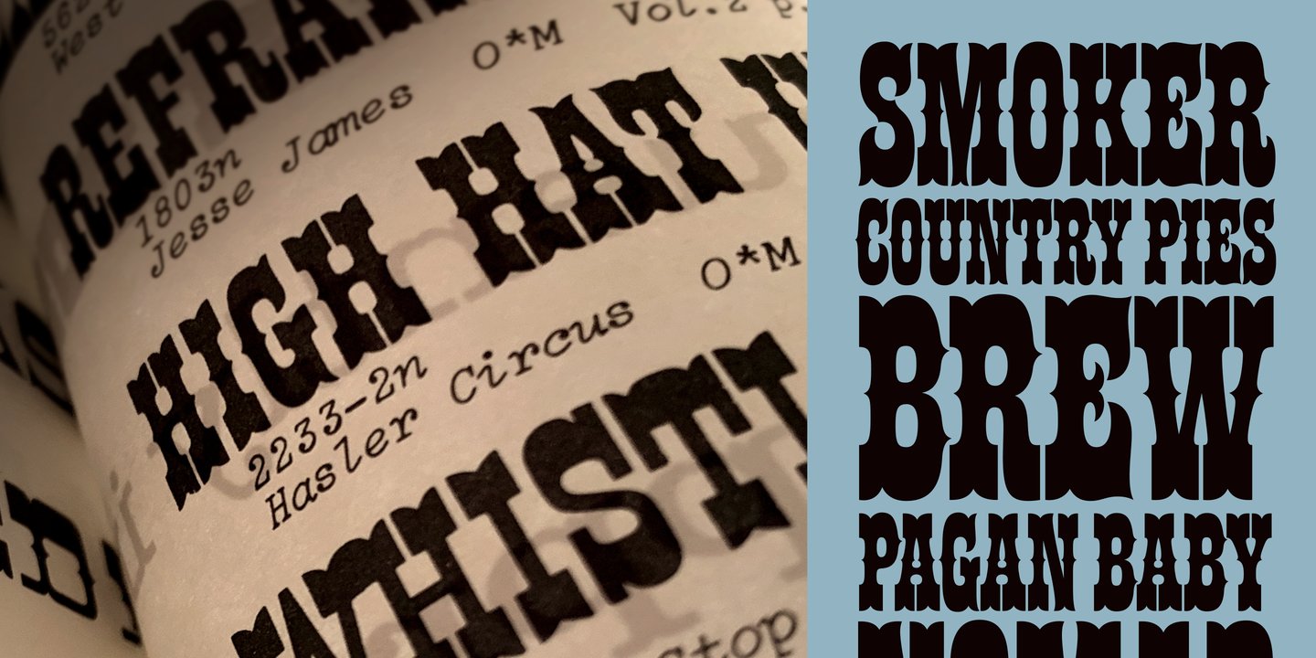
file name: Photo Lettering Hasler Circus 2012b
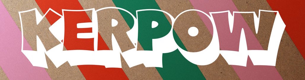
file name: House Industries Plinc Kerpow 2021 1
file name: House Industries Plinc Kerpow 2021 2

file name: House Industries Plinc Kerpow 2021 4
file name: House Industries Plinc Kerpow 2021 5

file name: House Industries Plinc Kerpow 2021

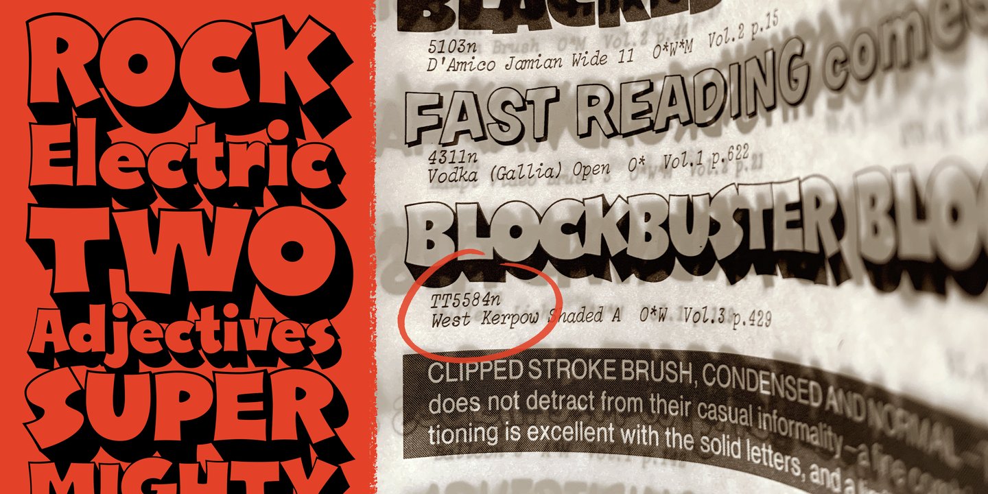
file name: Allen Mercer Plinc Kerpow 2011 after Dave West West Kerpow 1960s

file name: Photo Lettering Benguiat Caslon 2012

file name: Photo Lettering Benguiat Caslon 2012b

file name: Photo Lettering Benguiat Caslon 2012d

file name: Photo Lettering Benguiat Caslon 2012e

file name: Photo Lettering Benguiat Caslon Outline 2012

file name: Photo Lettering Brixen 2012

file name: Photo Lettering Federal Reserve 2012

file name: Photo Lettering Federal Reserve 2012 b

file name: Photo Lettering Federal Twelve Horizontal 2012

file name: Photo Lettering Quicksilver 2012

file name: Photo Lettering Quaint after Paul Carlyle Gus Oring Quaint 1938

file name: Photo Lettering Stan Slope 2012

file name: Photo Lettering Swiss Two Tone 2012
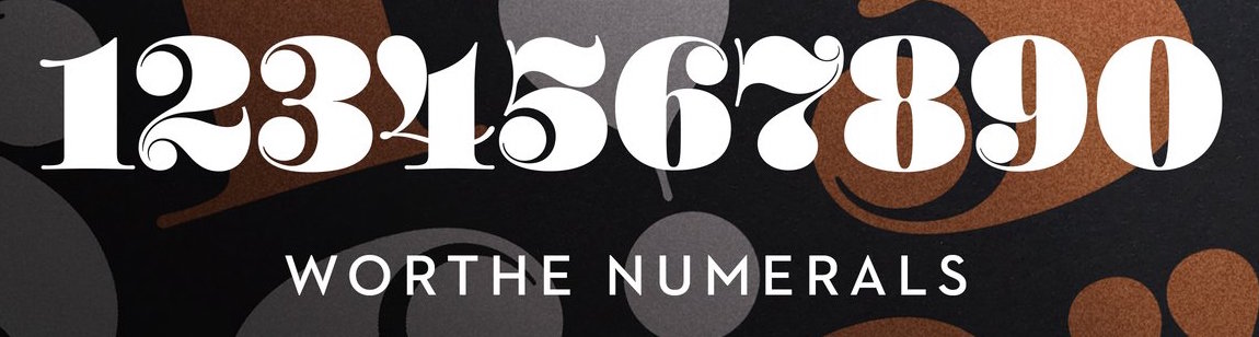
file name: Ben Kiel Worthe Numerals 2012
file name: Ben Kiel Worthe Numerals 2012
file name: Ben Kiel Worthe Numerals 2012
file name: Ben Kiel Worthe Numerals 2012
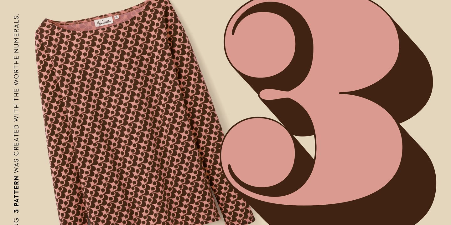
file name: Ben Kiel Worthe Numerals 2012
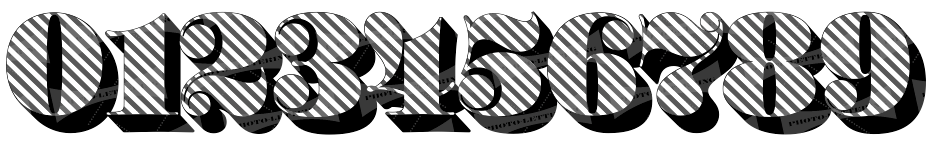
file name: Photo Lettering Worthe Numerals 2012

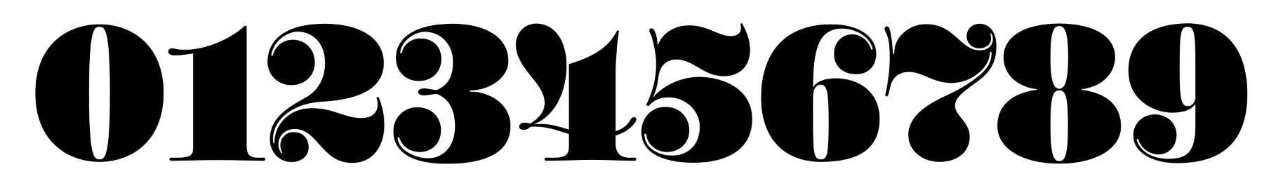
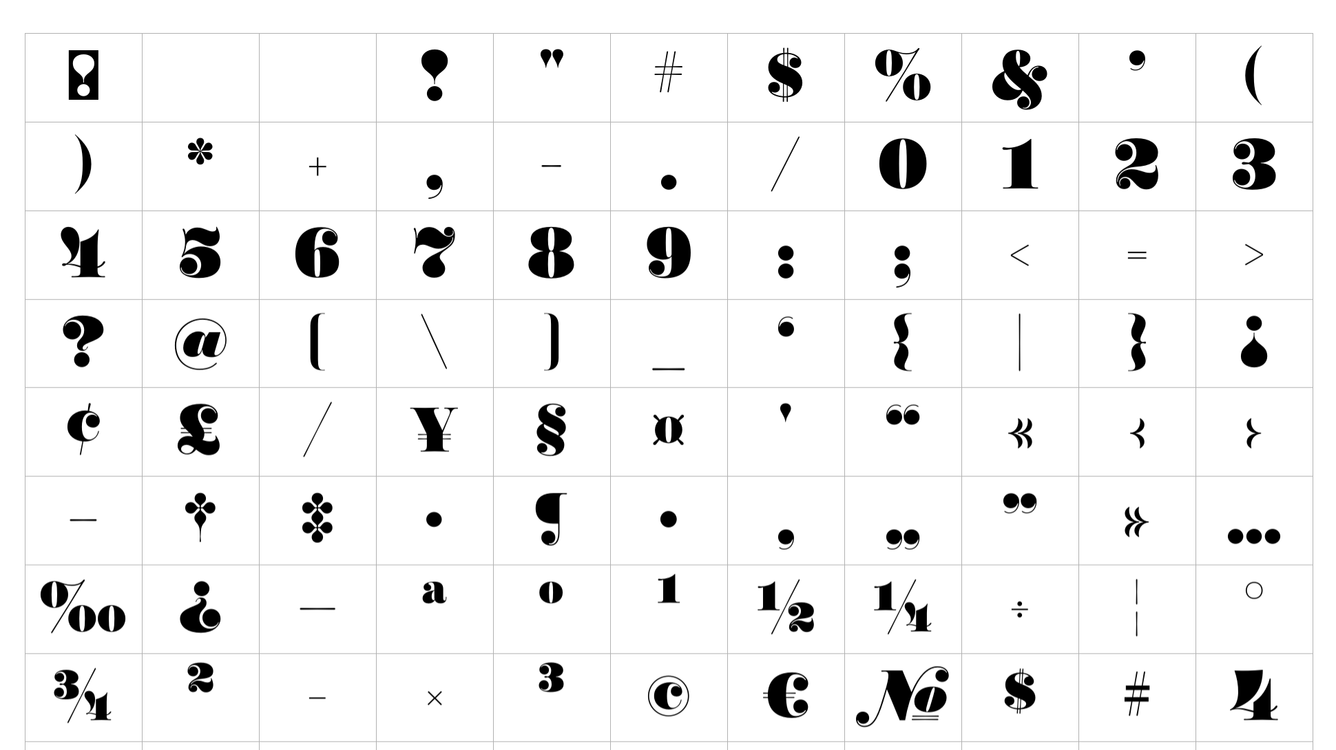
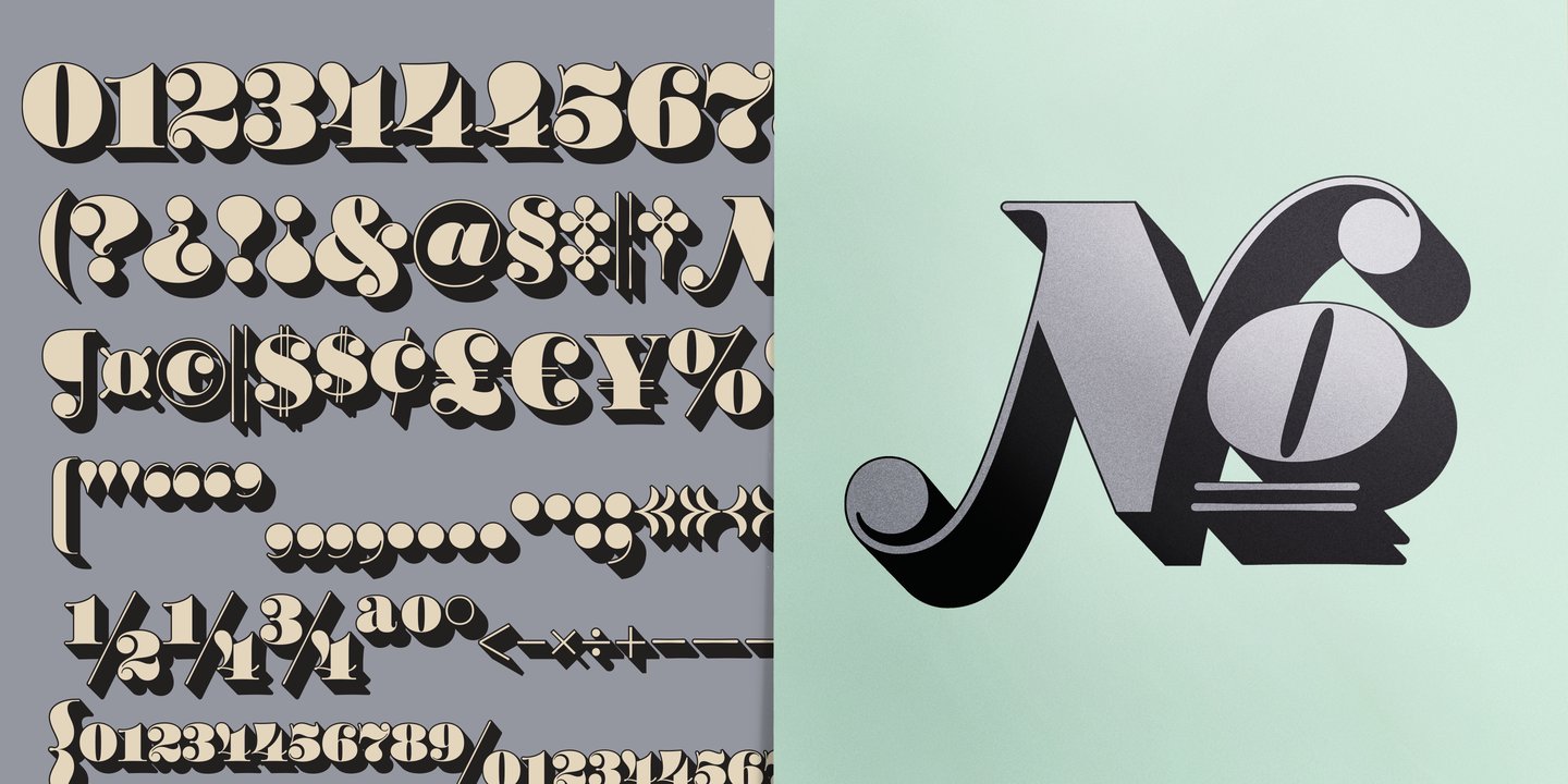
file name: House Industries Worthe Numerals 2012b

file name: House Industries Worthe Numerals 2012c
file name: House Industries Worthe Numerals 2012d
file name: House Industries Worthe Numerals 2012e

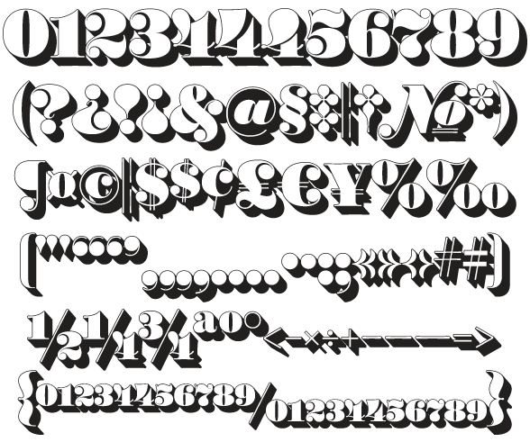
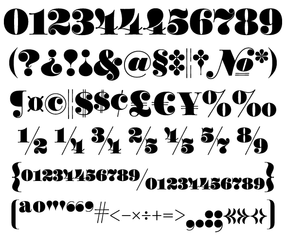
file name: Photo Lettering Galaxy Didot after C E Coryn

file name: Photo Lettering Galaxy Didot after C E Coryn

file name: Photo Lettering Galaxy Didot after C E Coryn

file name: Photo Lettering Galaxy Didot after C E Coryn

file name: Photo Lettering Galaxy Didot after C E Coryn

file name: Photo Lettering P L Barclay Outline
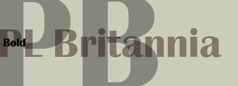
file name: Photo Lettering P L Britannia

file name: Photo Lettering P L Britannia
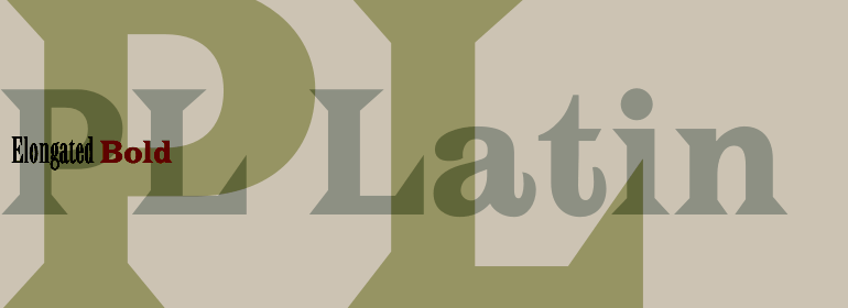
file name: Photo Lettering P L Latin

file name: Photo Lettering P L Latin

file name: Photo Lettering P L Modern Heavy Condensed

file name: Photolettering P L Fiorello

file name: Photolettering P L Fiorello
file name: Monotype P L Westerveldt

file name: Photo Lettering Atrax 2012

file name: Photo Lettering Banjo Playbill 2012

file name: Photo Lettering Benguiat Buffalo 2012

file name: Photo Lettering Brickhouse 2012

file name: Photo Lettering Bubble Gum 2012

file name: Photo Lettering Bubble Gum Drop 2012

file name: Photo Lettering Carlyle Eventide 2012

file name: Photo Lettering Chicamakomiko 2012
file name: Photo Lettering House Industries Chicamakomiko 2015

file name: Photo Lettering Copeland Milo 2012

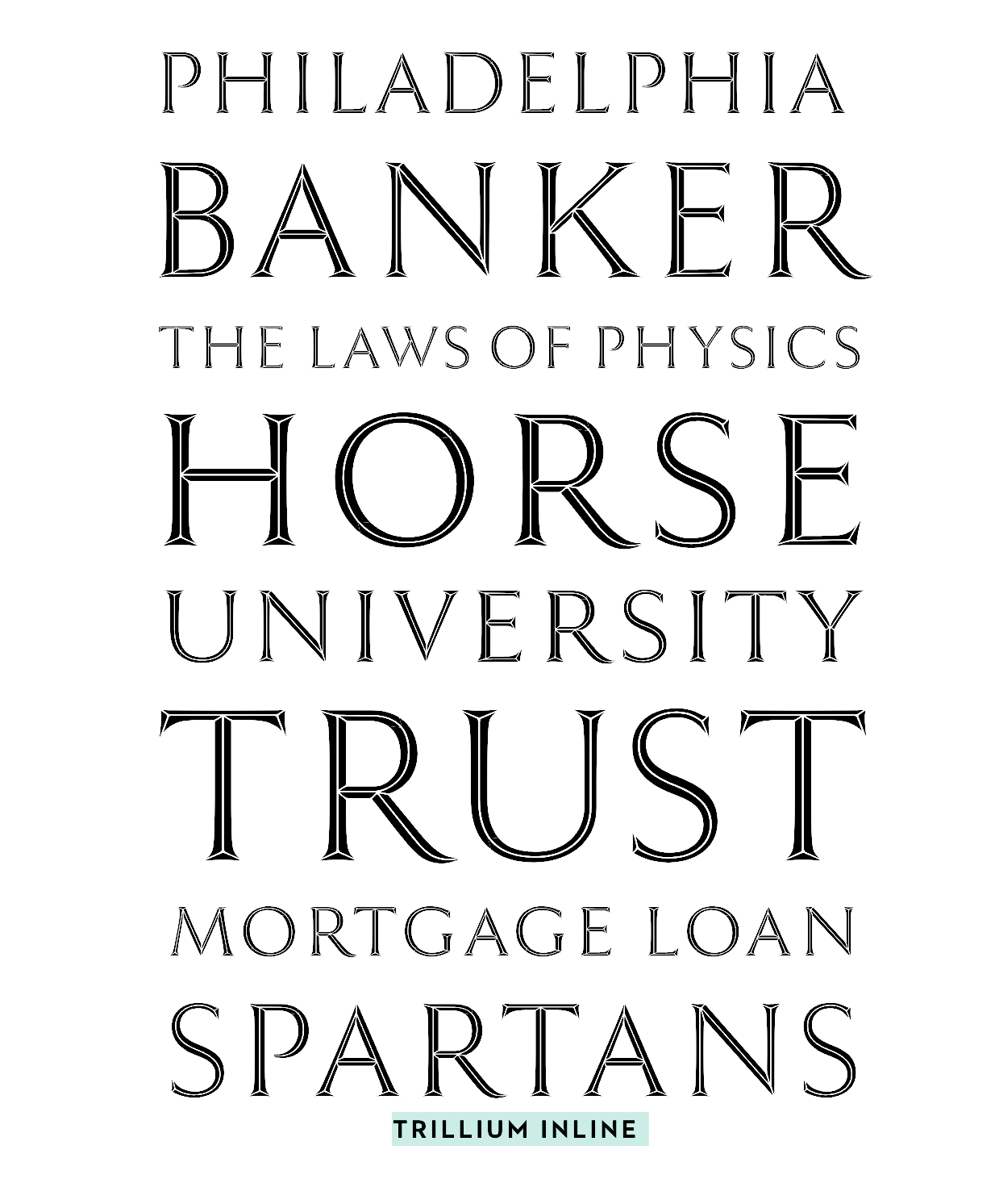
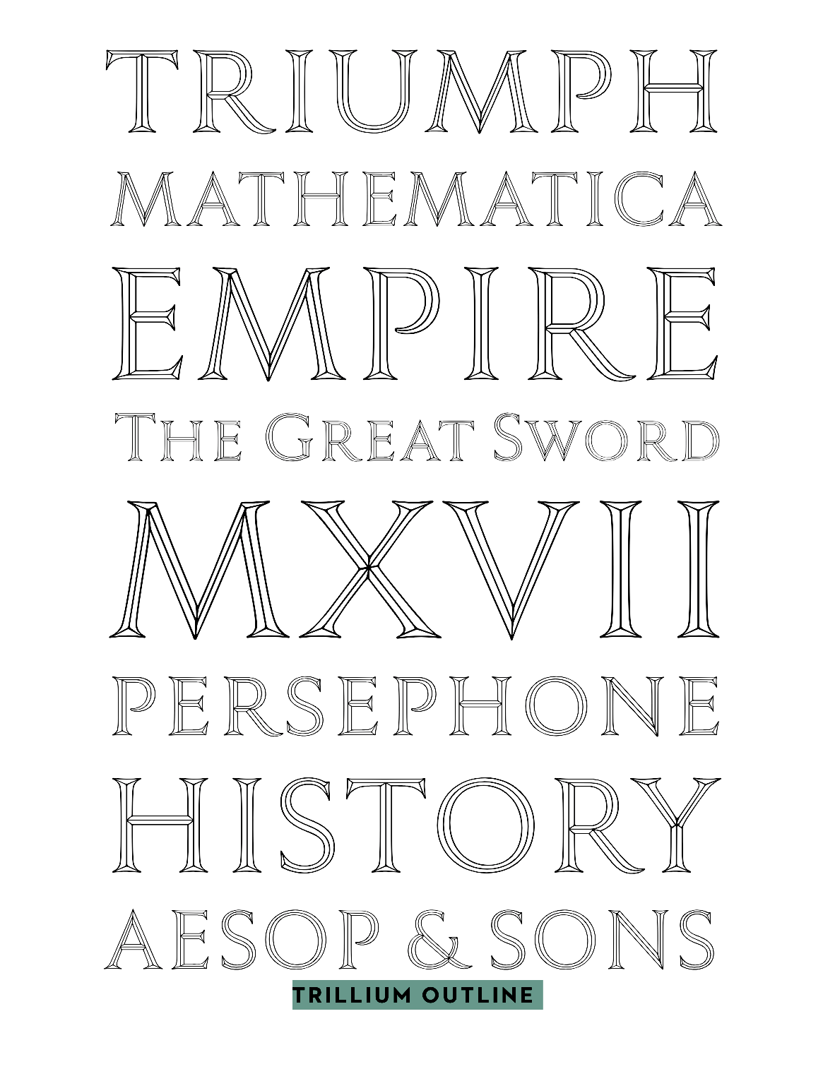
file name: Photo Lettering Copeland Trillium 2012
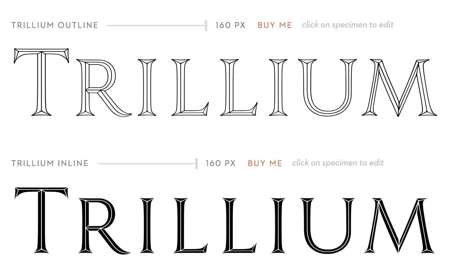
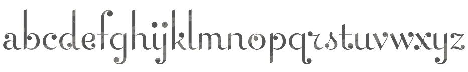
file name: Jeremy Mickel Trillium 2011 based on L H Copeland Trillium
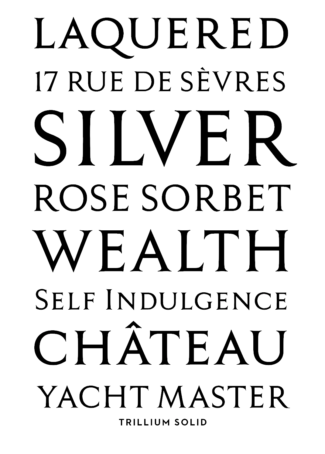
file name: Jeremy Mickel Trillium 2011 based on L H Copeland Trillium
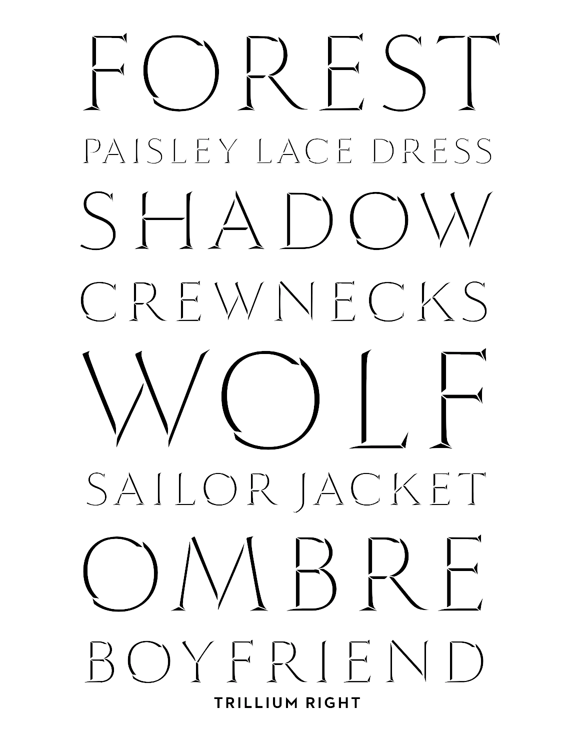
file name: Jeremy Mickel Trillium 2011 based on L H Copeland Trillium
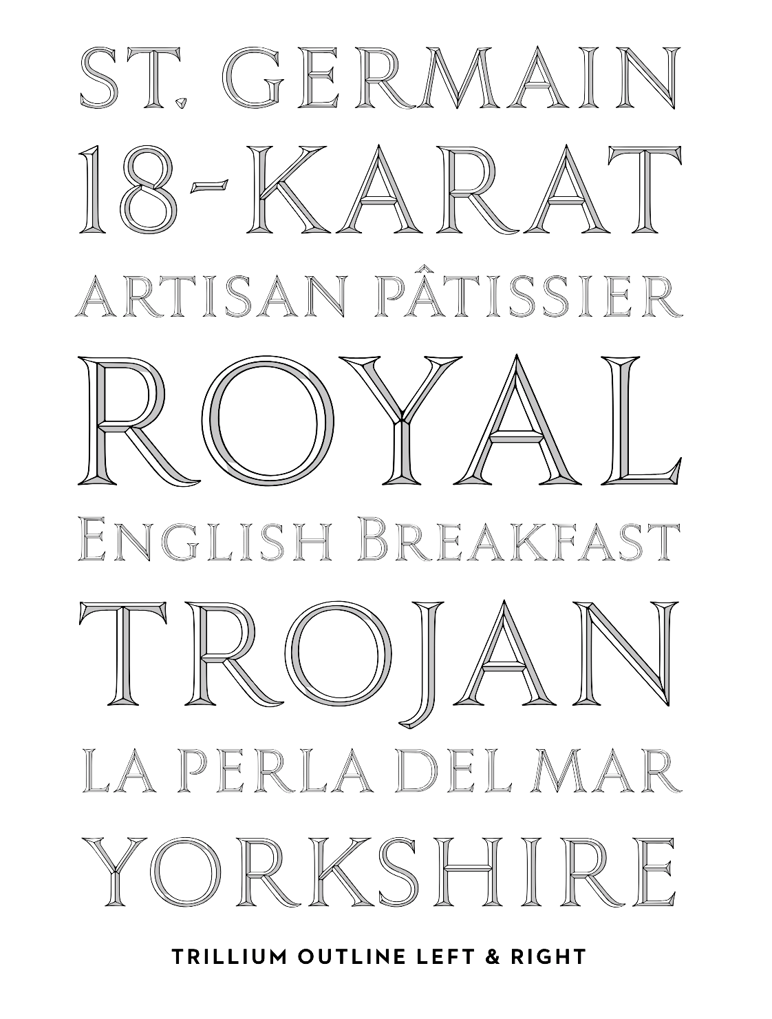
file name: Jeremy Mickel Trillium 2011 based on L H Copeland Trillium
file name: Jeremy Mickel Trillium 2011 based on L H Copeland Trillium
file name: Jeremy Mickel Trillium 2011 based on L H Copeland Trillium

file name: Photo Lettering Damico Gothic 2012

file name: Photo Lettering Davison Baroque 2012b

file name: Photo Lettering Exotique J Split 2012

file name: Photo Lettering Goliath 2012

file name: Photo Lettering Hanover Bold 2012

file name: Photo Lettering Hanover Bold 2012b

file name: Photo Lettering Henrion 2012

file name: Photo Lettering House Gothic 2012

file name: Photo Lettering Housebroken 2012

file name: Photo Lettering Housebroken 2012b

file name: Photo Lettering Mierop Inline 2012
file name: Photo Lettering Millstein Flourish 2012

file name: Photo Lettering Neutra Inline 2012

file name: Photo Lettering Neutra Thin 2012
file name: Photo Lettering Neutra Thin 2012b
file name: Photo Lettering Norton Slapstick 2012

file name: Photo Lettering Norton Tape 2012
file name: Photo Lettering Quintet 2012
file name: Photo Lettering Quintet 2012b

file name: Photo Lettering Raymund Circus 2012

file name: Photo Lettering Raymund Circus Inline 2012

file name: Photo Lettering Regatta 2012

file name: Photo Lettering Smidgen 2012

file name: Photo Lettering Sodachrome 2012

file name: Photo Lettering Superstar 2012
file name: Photo Lettering Swiss Interlock 2012
file name: Photo Lettering Tiki Palms 2012

file name: Photo Lettering Tuggle 2012b
file name: Photo Lettering West Barnum Ultra 2012

file name: Photo Lettering West Barnum Ultra 2012b

file name: Photo Lettering West Barnum Ultra Drop 2012b
file name: Photo Lettering West Behemoth 2012
file name: Photo Lettering West Behemoth 2012b

file name: Photo Lettering West Elephant 2012

file name: Photo Lettering West Emperor Script 2012

file name: Photo Lettering West Emperor Script 2012b
file name: Photo Lettering West Italiano 2012

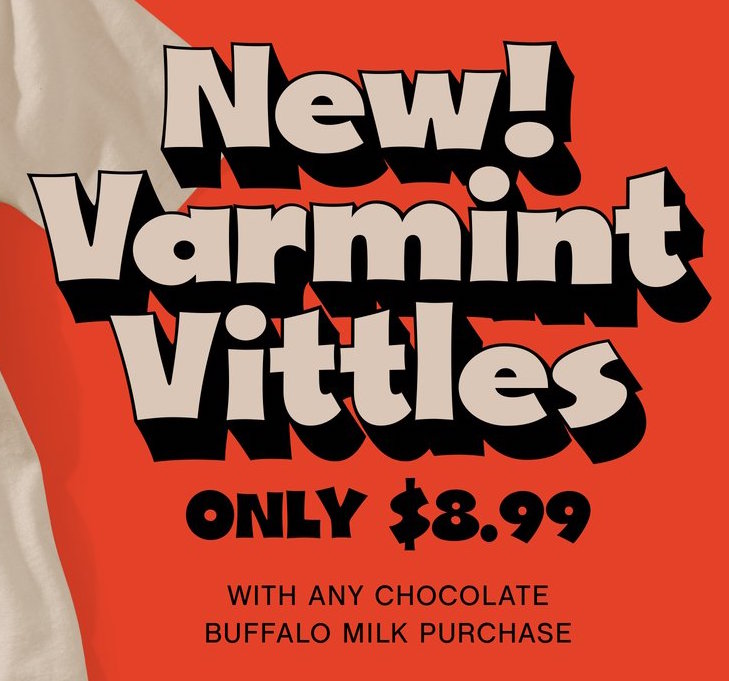
file name: Photo Lettering West Kerpow 2012

file name: Photo Lettering West Thud 2012

file name: Photo Lettering Whimsy 2012
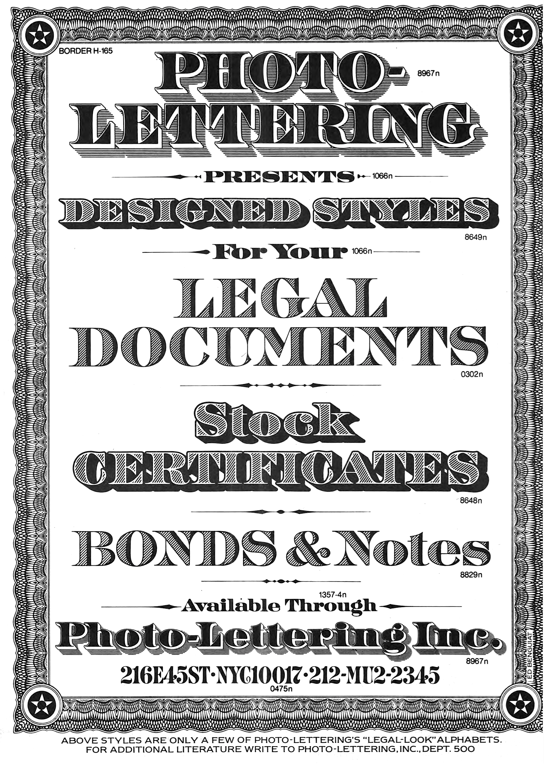
file name: Photo Lettering Ad 1974
| | |
|
Luc Devroye ⦿ School of Computer Science ⦿ McGill University Montreal, Canada H3A 2K6 ⦿ lucdevroye@gmail.com ⦿ https://luc.devroye.org ⦿ https://luc.devroye.org/fonts.html |