TYPE DESIGN INFORMATION PAGE last updated on Thu Apr 16 22:06:56 EDT 2026
FONT RECOGNITION VIA FONT MOOSE
|
|
|
|
Olympic Games: pictograms
Creative Review introduces the pictograms for the 2012 London Olympics in their blog. The consensus there is that they lack creativity and pizzazz [and I strongly agree]. The article also mentions that the medal for Olympic pictogram design goes to Otl Aicher for the 1972 Munich Games. Before that, pictogram design started with the Tokyo Olympics in 1964 (by Masasa Katzumie as artistic director and Yoshiro Yamashita as graphic designer), and continuing with the 1968 Olympics in Mexico (by artistic directors Manuel Villazon and Mathias Goerlitz, and graphic designers Lance Wyman and Eduardo Terrazas). In 1976 in Montreal, Aicher's 1972 pictograms were reused. In 1980 in Moscow, Nikolai Belkow, a graduate from the Mukhina Art School in Leningrad, was selected to design the pictograms. The LA 1984 pictograms were done by Bright and Associates. Seoul 1988 did its own pictogram design in-house. Both Seoul and LA were only slight modifications of Aicher's creations. Josep M. Trias and his crew broke with that and represented the body in three parts in his redesign of the pictograms for the 1992 Barcelona games. The Atlanta 1996 and Athens 2004 pictograms were less abstract than all the ones used since Munich. Sydney decided to go more abstract and artistic in 2000. The China Central Academy of Fine Arts and the Academy of Arts and Design jointly designed the more abstract Beijing 2008 pictograms. London 2012 switched back to realism, but, as discussed earlier, the pictograms for 2012 are quite lacklustre. Another blog on Olympic pictograms, with images courtesy of Wei Yew, a graphic designer in Edmonton, Canada, author of The Olympic Image--The First 100 Years. |
EXTERNAL LINKS |
| | |
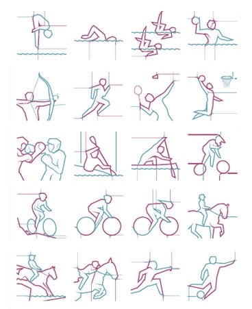
file name: Olympics2012 London Pictogram Sketches
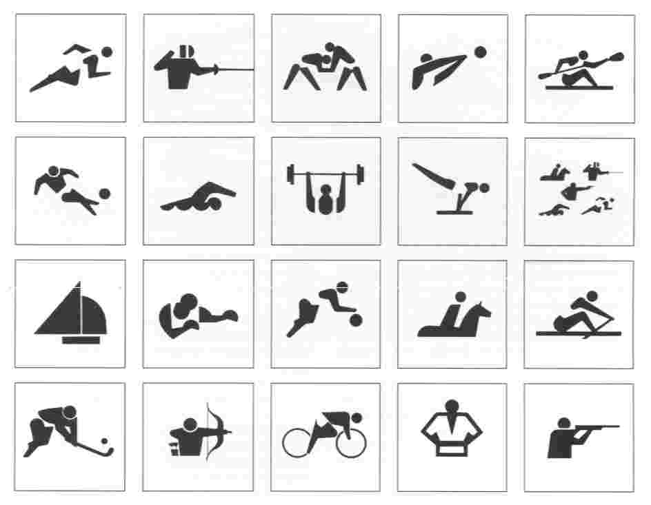
file name: Olympic Games Pictograms Tokyo1964
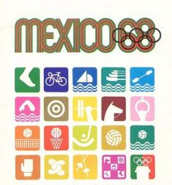
file name: Olympic Games Pictograms1968 Mexico City 5625504

file name: Olympic Games Pictograms1968 Mexico City

file name: Olympic Games Pictograms1980 Moscow

file name: Olympic Games Pictograms1984 Los Angeles
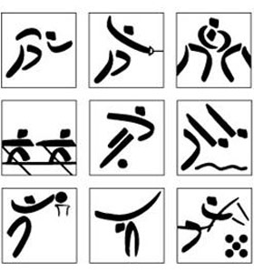
file name: Olympic Games Pictograms1992 Barcelona
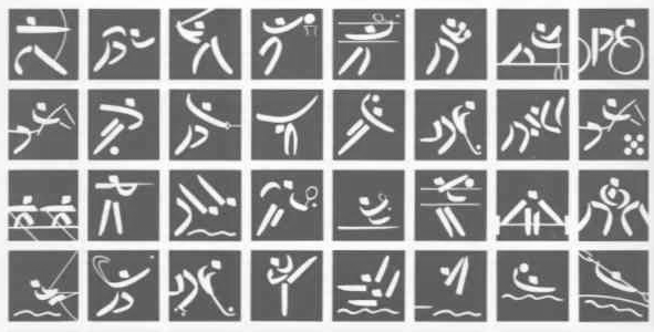
file name: Olympic Games Pictograms1992 Barcelona
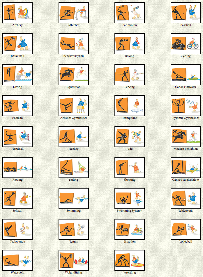
file name: Olympic Games Pictograms2004 Athens 6484904
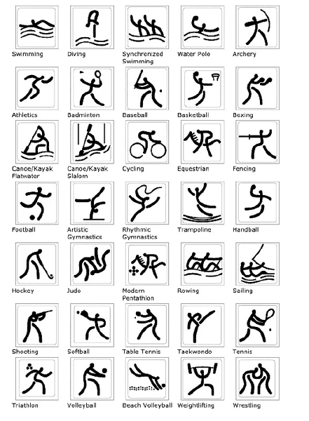
file name: Olympic Games Pictograms2008 Beijing

file name: Olympic Games Pictograms2008 Beijing 6470833
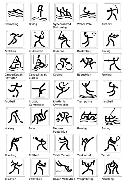
file name: Olympic Games Pictograms2008 Beijing

file name: Olympic Games Pictograms2012 London

file name: Olympic Games Pictograms Sydney2000
| | |
|
Luc Devroye ⦿ School of Computer Science ⦿ McGill University Montreal, Canada H3A 2K6 ⦿ lucdevroye@gmail.com ⦿ https://luc.devroye.org ⦿ https://luc.devroye.org/fonts.html |
